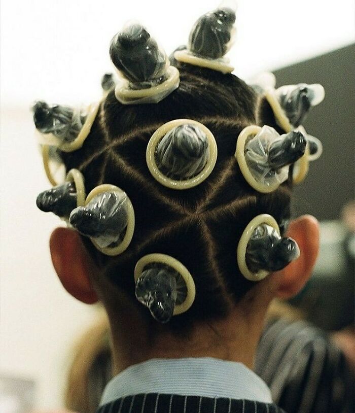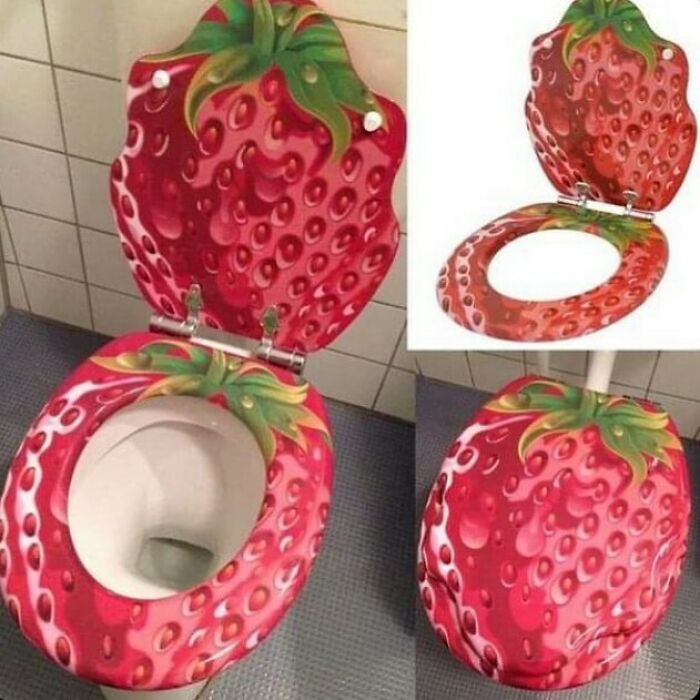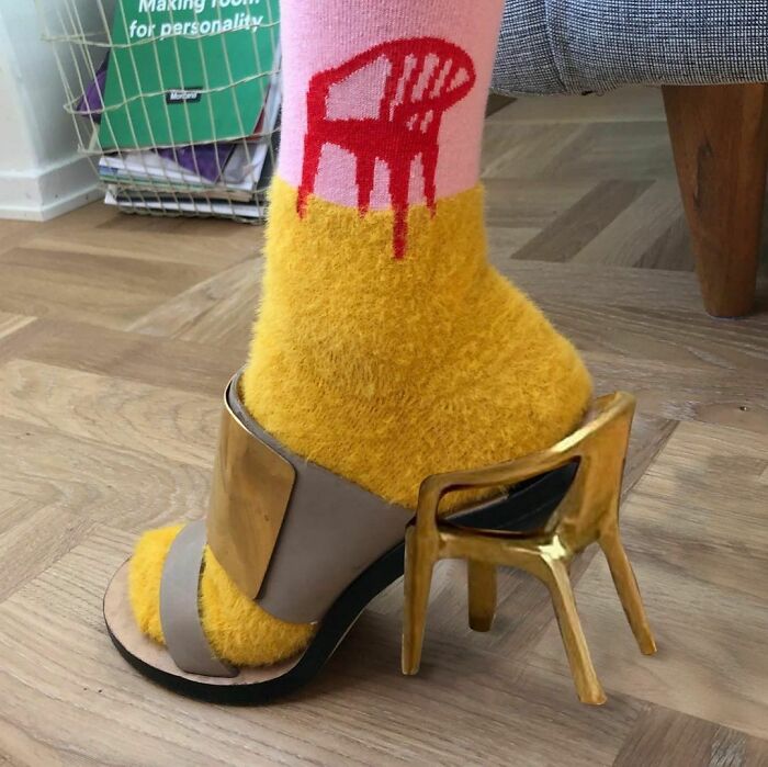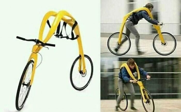
‘Ugly Design’ Instagram Is Full Of Pics To Make You Laugh And Cringe And Here’s 50 Of The Best (New Pics)
One famous saying assures us that beauty is in the eye of the beholder. However, some could argue that things can be objectively beautiful.
For example, colorful sunsets and ancient marble sculptures are often considered pleasing to the eye. Our inner desire for perfection also prefers symmetrical faces that stand out as examples of beauty.
The fact that there might be objectively beautiful things also lets you argue that the opposite can be true—some things can be objectively ugly. The list below is proof of that.
Uglydesign is an Instagram page curated by Jonas Nyffenegger and Sébastien Mathys. When interviewed by Bored Panda a few years back, they said that for them, this account is “an incredible source of inspiration and joy.”
Over the years, the account’s popularity only grew and now they are at 755,000 followers and counting. Scroll down to see the best of the worst of their feed.
This post may include affiliate links.
While as a word, “ugly” has a lot of negative connotations, ugliness itself does not necessarily equate to something that’s bad. A great example of that is ugly cute animals.
From the big-eyed innocent tarsiers to sleepy-looking sloths, ugly cute animals are adored by many. The reason for that is that a lot of them have baby-like features that appeal to our instincts to protect the vulnerable.
But what about those really ugly animals? Like that fish that just looks like a melting face of a chubby man. Does it really evoke our primal care instincts?
When talking to National Geographic, Hiroshi Nittono, director of the Cognitive Psychophysiology Laboratory at Osaka University, says that it's true, sometimes that's not the case. Rather, they make us experience “whimsical cuteness” that’s a little out of the ordinary. This oddness is funny, which is what makes them so appealing.
Ugliness can also be fascinating. For example, one of the most popular paintings in London’s National Gallery is a piece by the 16th-century Flemish master Quentin Matsys. The image is a portrait of a woman with a disfigured face and is commonly called “The Ugly Dutchess.”
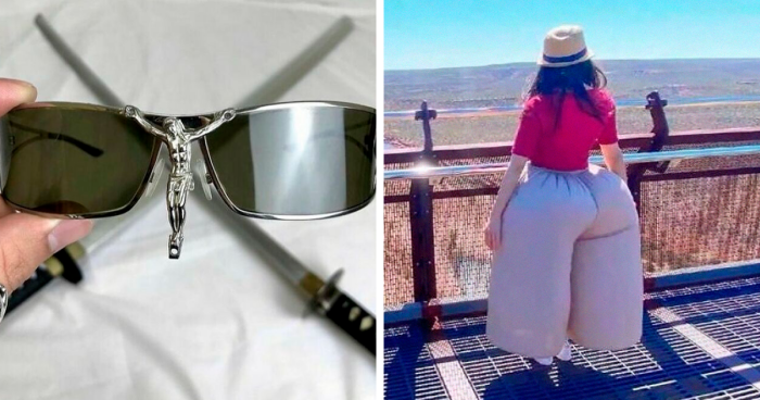
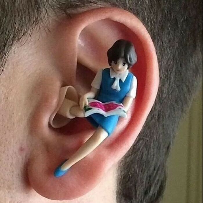
I love these. They're funny both for the scifi fans and, I suspect, some more adult oriented anime fans...
For years, many theorized that this is a piece of satirical imagery, one that is supposed to represent the difference between outside and inside beauty. Her dress is gorgeous and youthful but her face is not. However, in the late '80s, a new theory was proposed, suggesting that she might have had Paget’s disease, which causes malformed bones.
Today, this painting is the most famous work of Matsys and a hit with audiences, at least judging by the Gallery sales of the postcards featuring the portrait, which compare to Claude Monet’s famous Water-Lily Pond.
The concept of ugliness also evolves over time. Something that is perceived as ugly now could be considered beautiful in the future. The most obvious example of that is fashion and beauty trends. One day, high-rise jeans are reserved for moms only, and the next they’re the season’s hottest item. Same can be said for fanny packs, bucket hats, and flared jeans.
Something as majestic and awe-inspiring as mountains also used to be considered ugly. According to Stephen Bayley, the author of Ugly: The Aesthetics of Everything, people used to despise them. “Mountains were once thought disgusting: they were dangerous, frightening and home to nasty demons and bandits.” Certainly not a place you would sing praises to.
The best architectural example of an ugly thing that ended up being admired by everyone is the Eiffel Tower. Many contemporary minds at the time united under the common hate for the tower. Maupassant called it a “giant ungainly skeleton” while Bloy said it’s a “truly tragic street lamp.”
But this “hideous column with railings,” as Huysmans put it, is now admired by many. It is Paris’s biggest tourist attraction and is often the first thing that pops into someone’s head when they think of Paris.
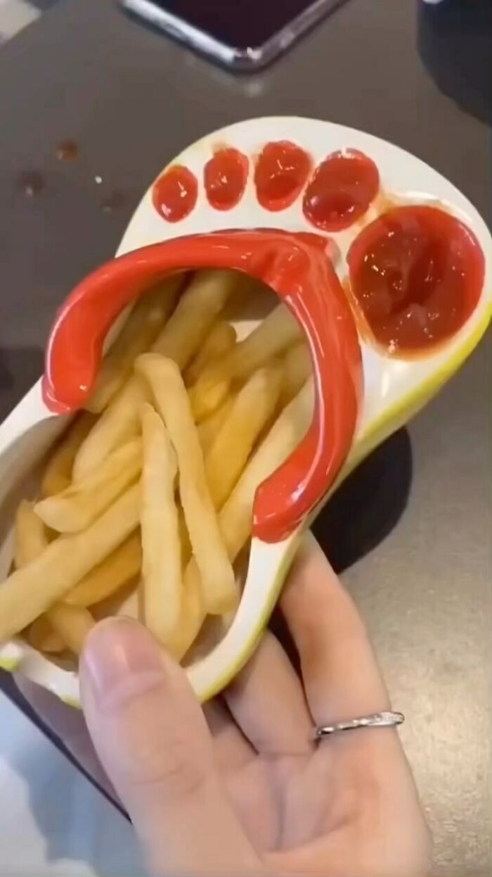
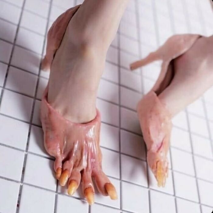
So, maybe ugliness isn’t that objective. Just like the ideals of beauty, the “ideals” of ugliness also change all the time and depend on many variables. Which means that the things on this list might not be ugly for everyone. Except for that flip-flop-shaped fry holder. Everyone agrees that’s awful, right?
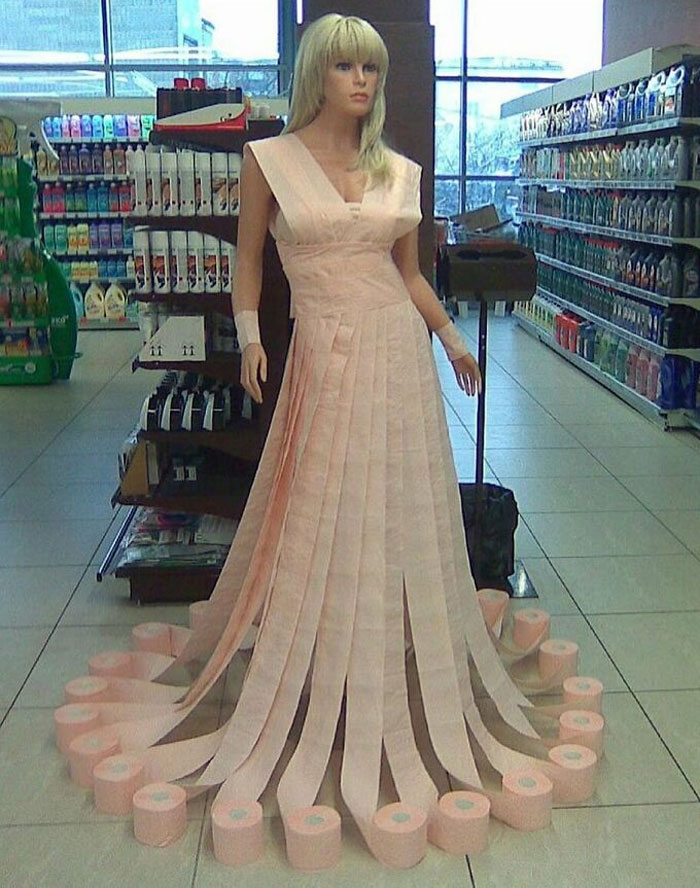
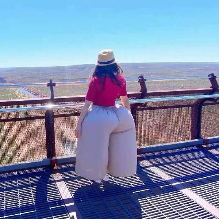
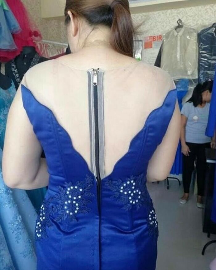
It would've been a lovely dress, if it weren't for the zipper sticking out like a sore thumb.
I don't think this is ugly, but he looks sad. (edit: spelling)
I remember that movie, So Fine, with Ryan O'Neal. That was pretty funny.
i always wonder at these posts: do i have to upvote the pics i like (maybe because i like a design and don't cringe about it) OR do i have to upvote the pictures that are truly ugly and make me cringe? it feels wrong to upvote some of the uglier pics...
Yes. (this is the standard internet answer to such questions)
Load More Replies...All the truly ugly designs are moving towards the bottom of the list, and the interesting/cool/cute designs are floating to the top. The people have spoken, it's time the BP writer change the headline.
Bad headline writer! A lot of these are funny and some are downright adorable.

 Dark Mode
  No fees, cancel anytime


