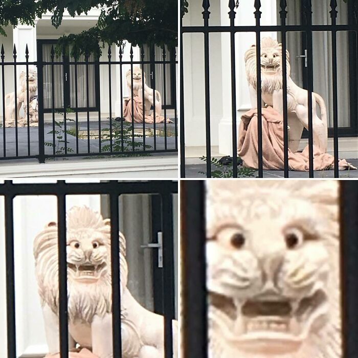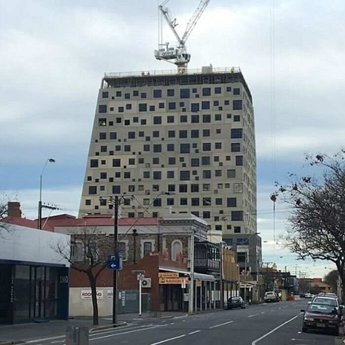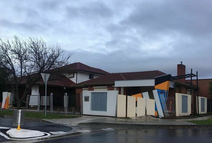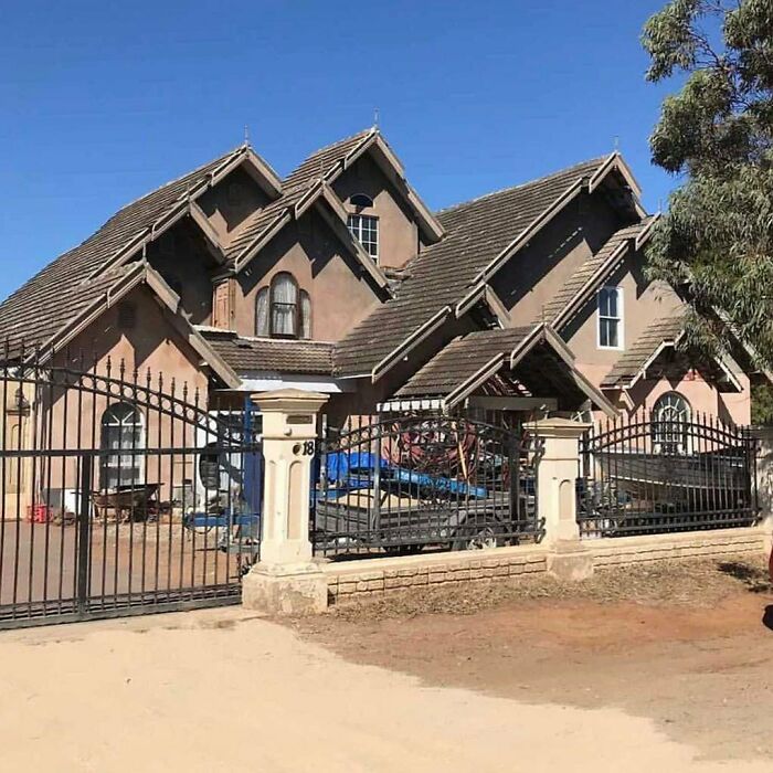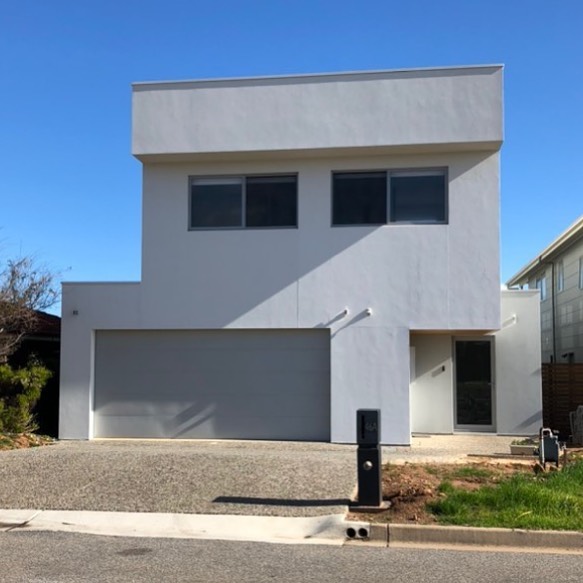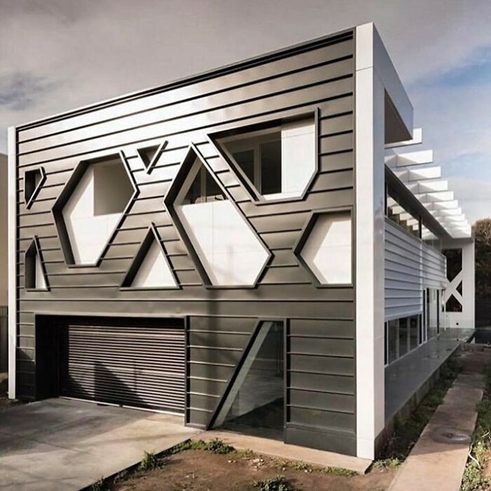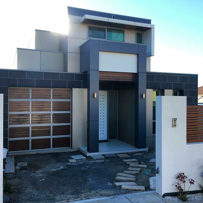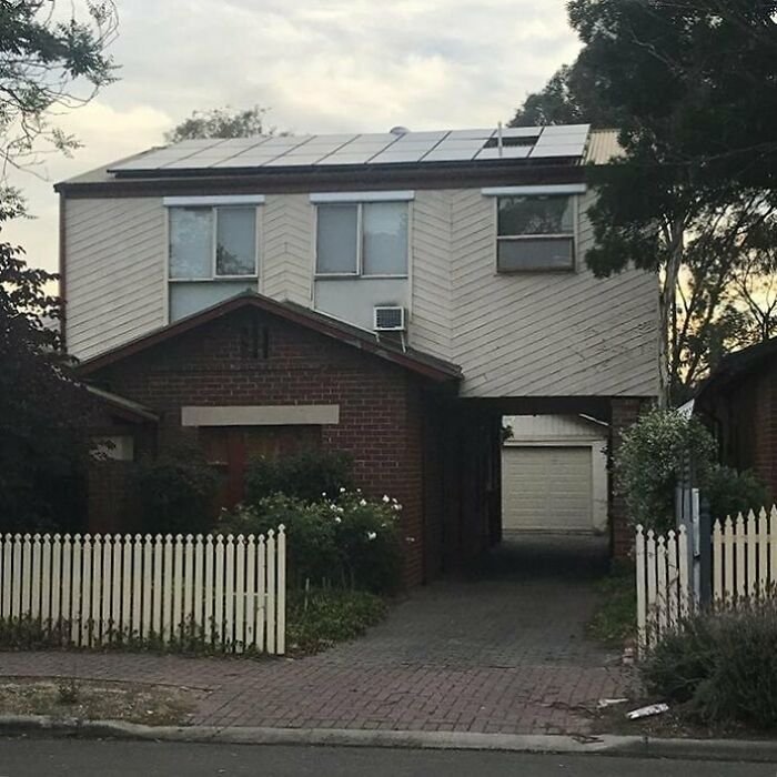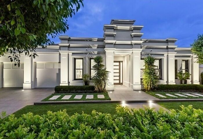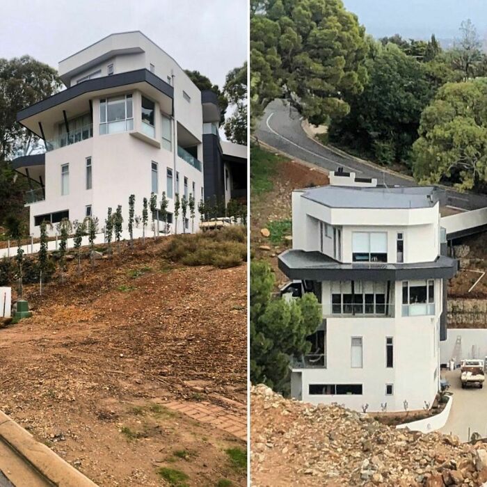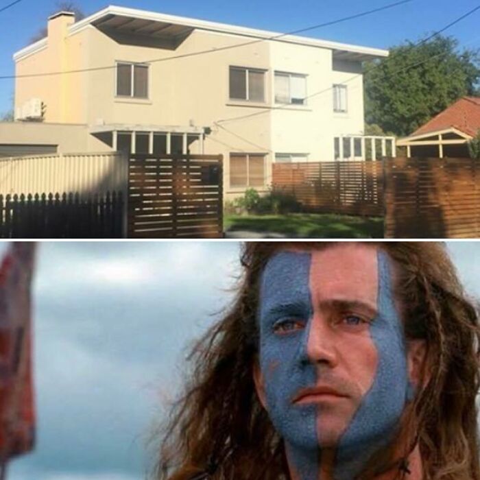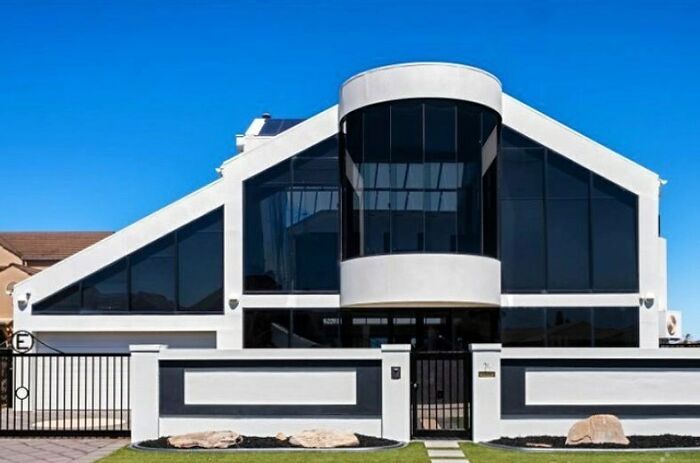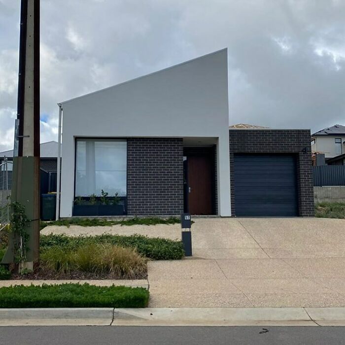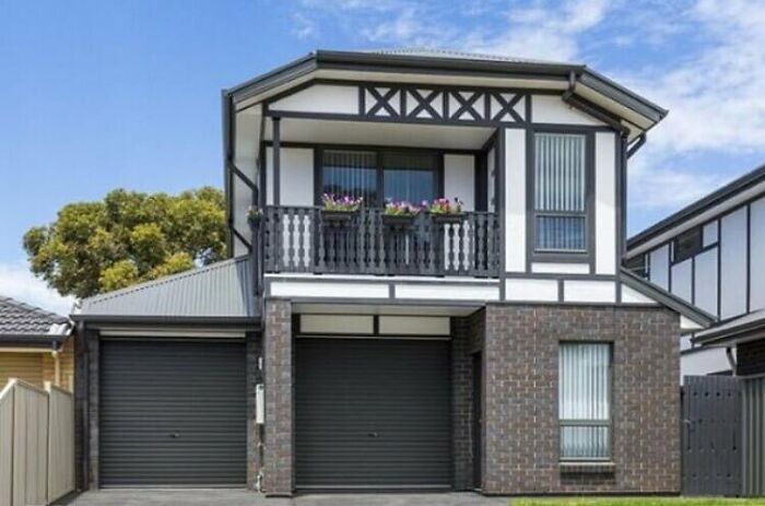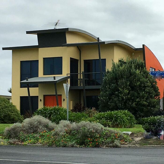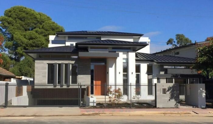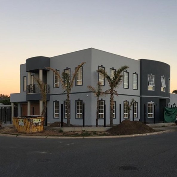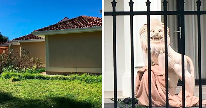
Someone Is Documenting Ugly Houses They See Around Adelaide, And These 35 Do Not Disappoint
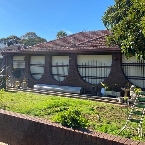
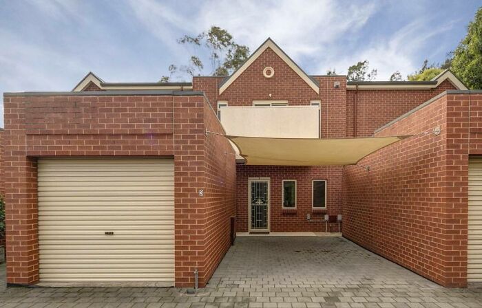
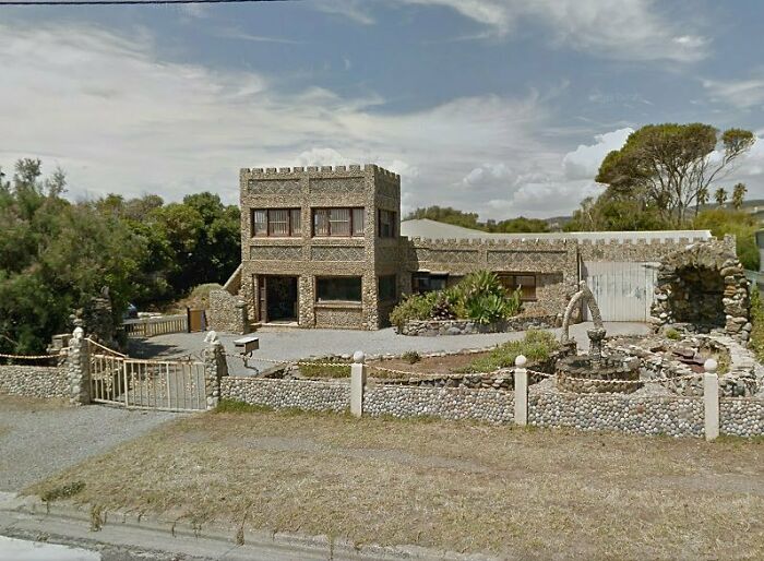
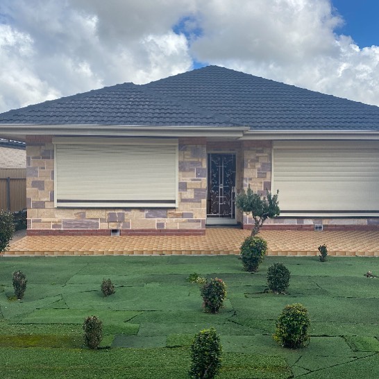
First, we had 'Ugly Belgian Houses.' Then there was 'Ugly Irish Houses.' Shortly after, 'Ugly Dutch Houses' popped up. But the latest Instagram account mocking local architectural decisions comes from the Land Down Under.
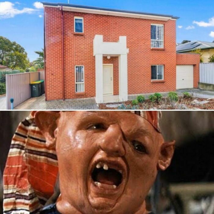
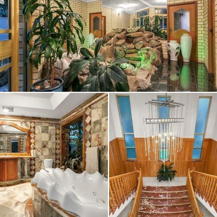
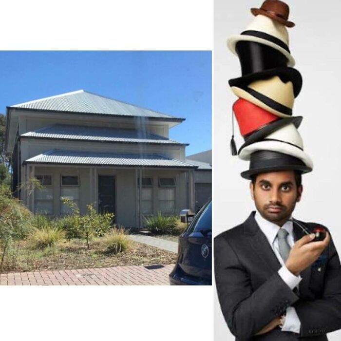
With a name similar to those of its distant cousins, 'Ugly Adelaide Houses' is also on a mission to show just how subjective human taste really is, and it's doing just as good of a job.
At the moment, the account can't brag about having too many followers — there are 3,355 of them — but this number isn't the only factor that determines how good someone's content is. Plus, everyone has to start from zero.
So continue scrolling to check out what 'Ugly Adelaide Houses' has been posting!
More info: Instagram
This post may include affiliate links.
The person (or persons) behind the account goes by the nickname Frank Gehrysh, which is an obvious reference to Canadian-born American architect and designer Frank Gehry.
His works, which include the Dancing House in Prague, Walt Disney Concert Hall in Los Angeles, and the National Dwight D. Eisenhower Memorial, are considered among the most important of contemporary architecture, leading Vanity Fair to call him "the most important architect of our age".
So with a showrunner like that, I guess we really need to think twice before talking ill of 'Ugly Adelaide Houses.'
Australian architecture has often been consistent with architectural trends of the wider Western world, with some special adaptations to compensate for its distinctive climatic and cultural factors such as Edwardian architecture and Brutalist architecture.
Indigenous Australians mostly produced semi-permanent structures from readily available materials.
During the country's early Western history, it was a collection of British colonies in which architectural styles were strongly influenced by the outsiders.
But the unique climate of Australia necessitated adaptations, and 20th-century trends reflected the increasing influence of American urban designs and diversification of the cultural tastes and requirements of an increasingly multicultural local society.
Notable Australian architectural adaptations include the Queenslander and Federation styles of residential architecture.
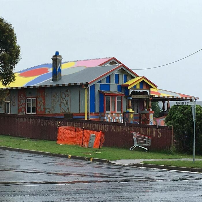
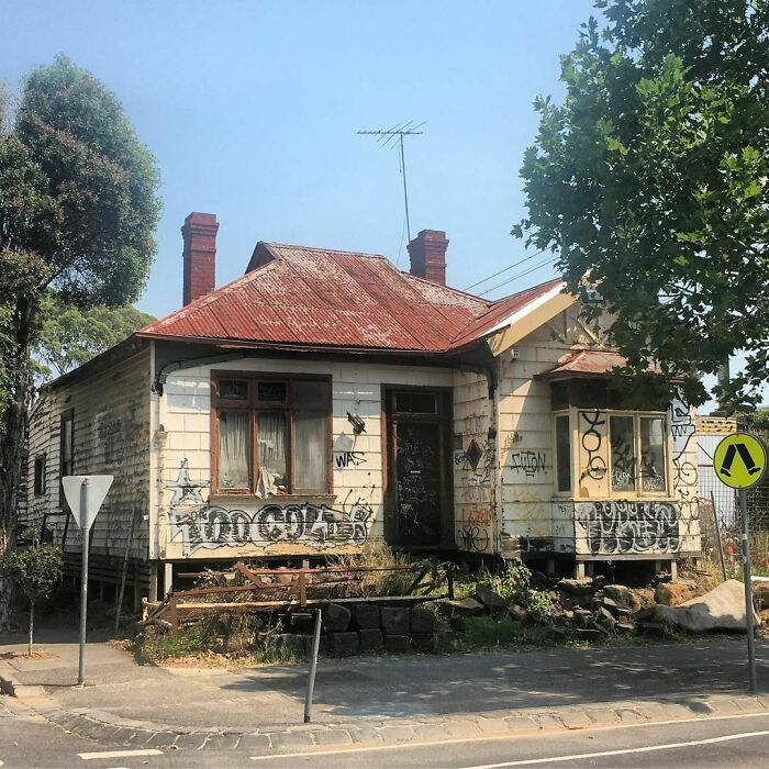
What is up with the words on the fence? "how many perverts have matching xmas..." then I can't make out the rest. Weird.
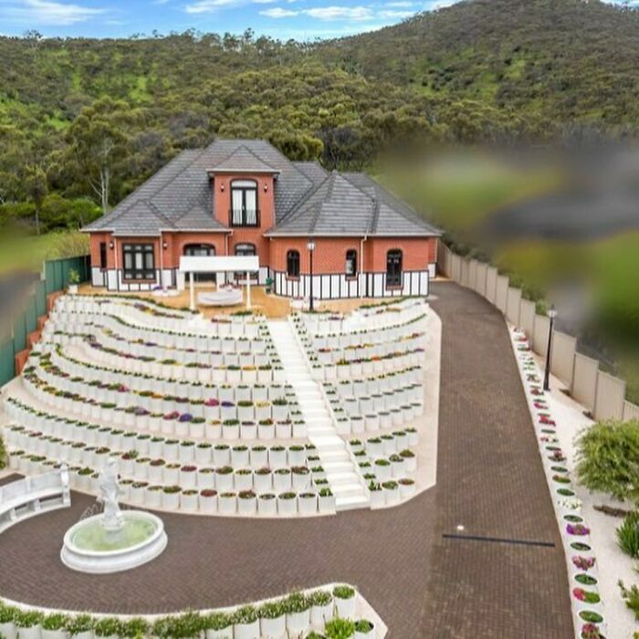
They straight up step terraced their garden. I don't think I've seen that happen before.
Iconic Australian buildings that have made a name for themselves in Australian architecture history and winning architecture competitions include the UNESCO-listed Sydney Opera House, Melbourne Royal Exhibition Building, Brisbane City Hall, and the 11 remnant penal colony sites selected for World Heritage protection in 2010.
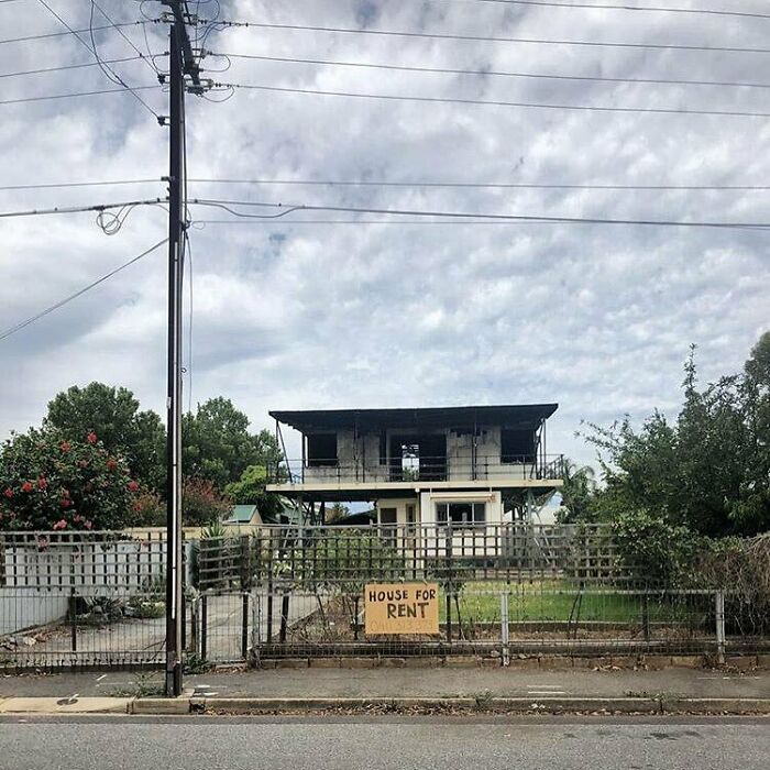
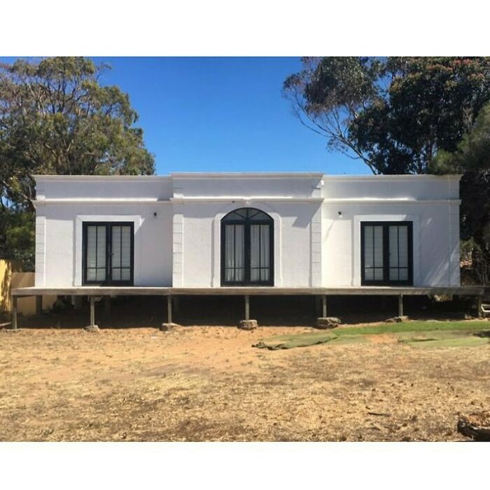
I just want to hug that house and tell it everything is going to be ok, we'll take care of it, and fix it up and make it nice and pretty again.
Australian houses and Australian buildings have evolved significantly over time, from the early structures made from relatively cheap and imported corrugated iron (which can still be seen in the roofing of historic homes) to more sophisticated ideas borrowed from other countries, such as the Victorian style from the United Kingdom, the Georgian style from North America and Europe and the Californian bungalow from the United States.
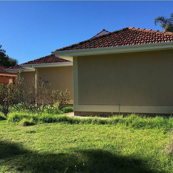
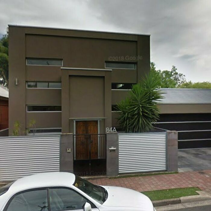
I like this one. Just add a mural onto the left bit and water the grass. Boom! Cool house.
In the 21st century, many Australian architects have taken a more avant-garde approach to design, and as you can tell from these pictures, buildings have emerged that are truly unique and reflective of Australia's culture and values. Some, of course, are more vibrant than others.
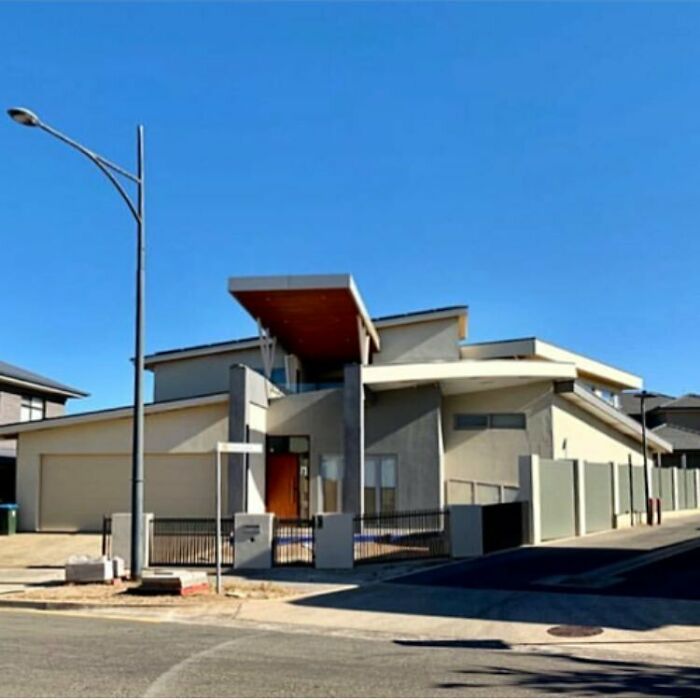
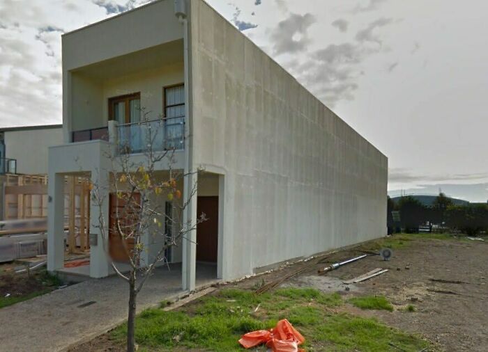
This makes it look like the first floor sunk into the ground and the second floor is all that is left.
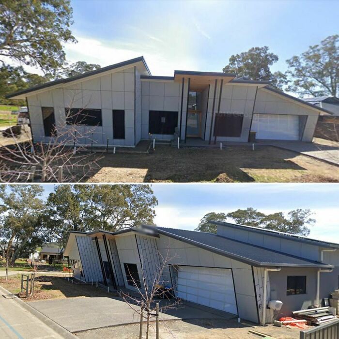
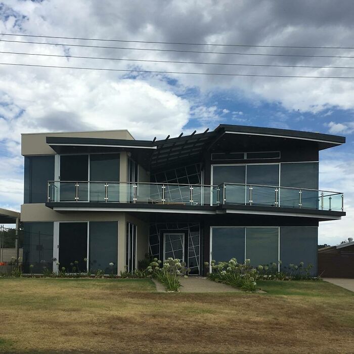
The colour difference represents the division of the house, one building, two houses
Yep, although was sure there was going to be more from up in the hills.
Load More Replies...How precious are the posters? No one is getting hurt, people have different tastes and FFS why not be a people and introduce yourself to the resident if you have that big a problem?
It’s just for fun Mich. It ate a couple minutes and got your mind off of the real problems in life for just a moment.
Load More Replies...You haven't been in Mexico lol. In the other hand, I would like to live in any of those places happily
Not Adelaide, but still Australia, this monstrosity built next to where I used to live. I couldn't find a better pic, but it is one house using two different coloured bricks. It also had a whole wall of windows that overlooked our house they somehow managed to get through planning permission. 52-Carroll...f45b95.png 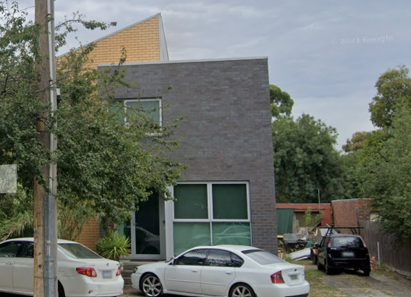
I was going to ask if their architecture school does free student projects because that is the only possible explanation
Load More Replies...I looked at this post with extreme caution, in case my house was on it. Phew, it wasn't ;)
Load More Replies...Adding the suburbs would have made it easier to identify the houses. Some of them are very familiar and now I’ll have to drive around to see if I can find them 😊
Meh, folks have different tastes. As we like to say in our home, "that's somebody's favorite pokemon'
Yep, although was sure there was going to be more from up in the hills.
Load More Replies...How precious are the posters? No one is getting hurt, people have different tastes and FFS why not be a people and introduce yourself to the resident if you have that big a problem?
It’s just for fun Mich. It ate a couple minutes and got your mind off of the real problems in life for just a moment.
Load More Replies...You haven't been in Mexico lol. In the other hand, I would like to live in any of those places happily
Not Adelaide, but still Australia, this monstrosity built next to where I used to live. I couldn't find a better pic, but it is one house using two different coloured bricks. It also had a whole wall of windows that overlooked our house they somehow managed to get through planning permission. 52-Carroll...f45b95.png 
I was going to ask if their architecture school does free student projects because that is the only possible explanation
Load More Replies...I looked at this post with extreme caution, in case my house was on it. Phew, it wasn't ;)
Load More Replies...Adding the suburbs would have made it easier to identify the houses. Some of them are very familiar and now I’ll have to drive around to see if I can find them 😊
Meh, folks have different tastes. As we like to say in our home, "that's somebody's favorite pokemon'

 Dark Mode
  No fees, cancel anytime


