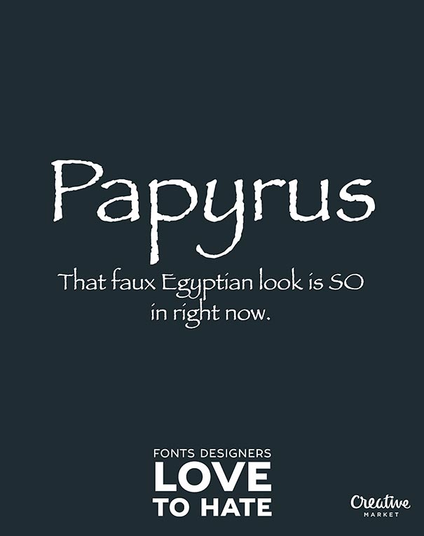
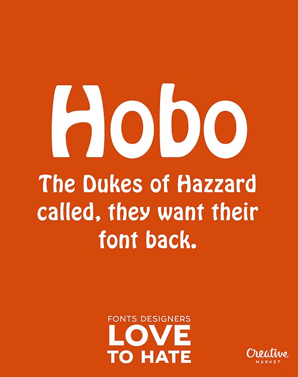
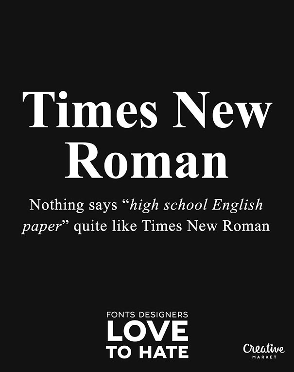
This list of the #worstFontsEver was compiled by Creative Market to poke fun at lettering designs that professionals love to hate “due to popularity, ugliness, or both.” A font is what you use, a typeface is what you see, just to dodge another designer pet-peeve before we get into some details!
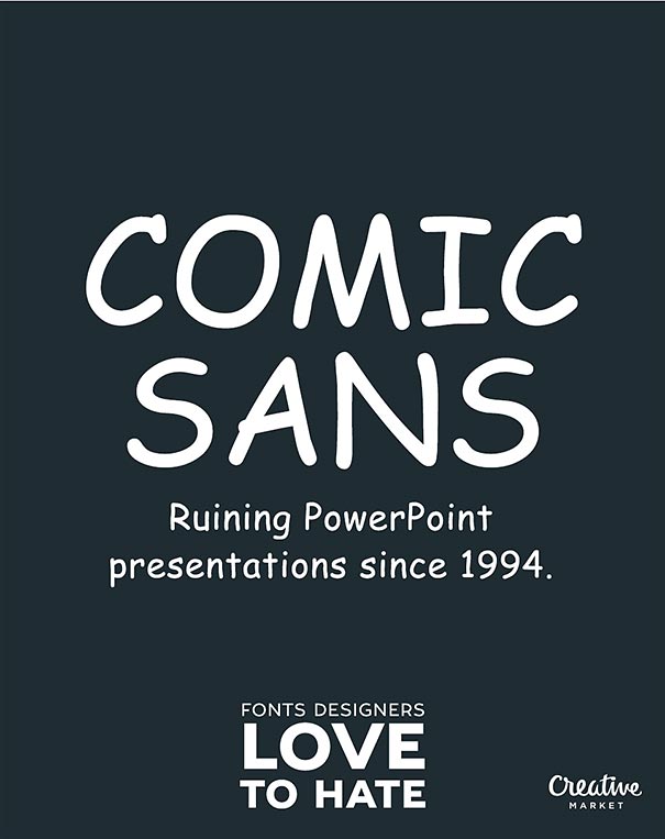
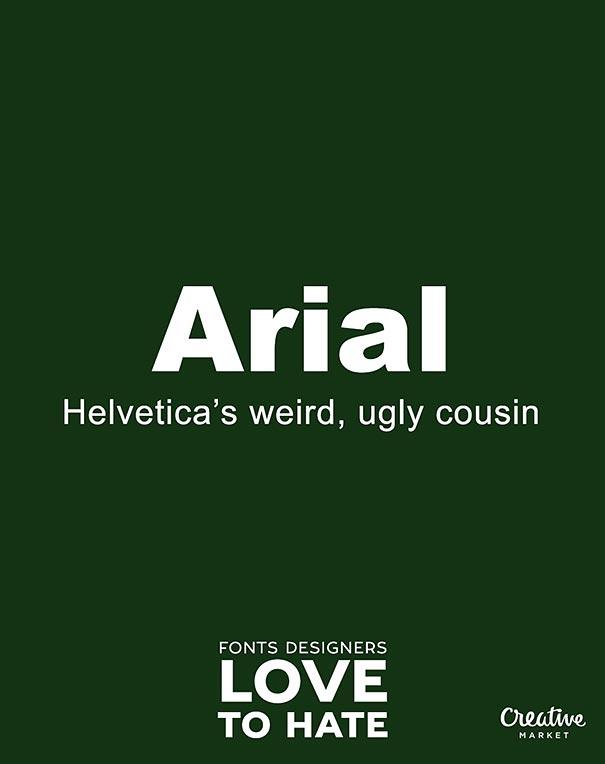
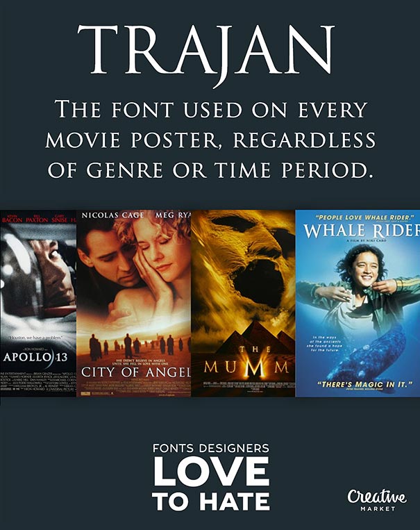
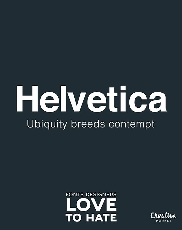
Many of these maligned letter fonts have an interesting story behind them. Trajan is based on “capitalis monumentalis” or Roman square capitals, which were used for the inscription at the base of Trajan’s Column; iconic font called Arial was created in 1982 by Microsoft to avoid paying for the Helvetica license; and the all-time funniest font Comic Sans, another Microsoft creation, was intended for use with the failed Microsoft Bob software.
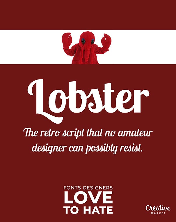
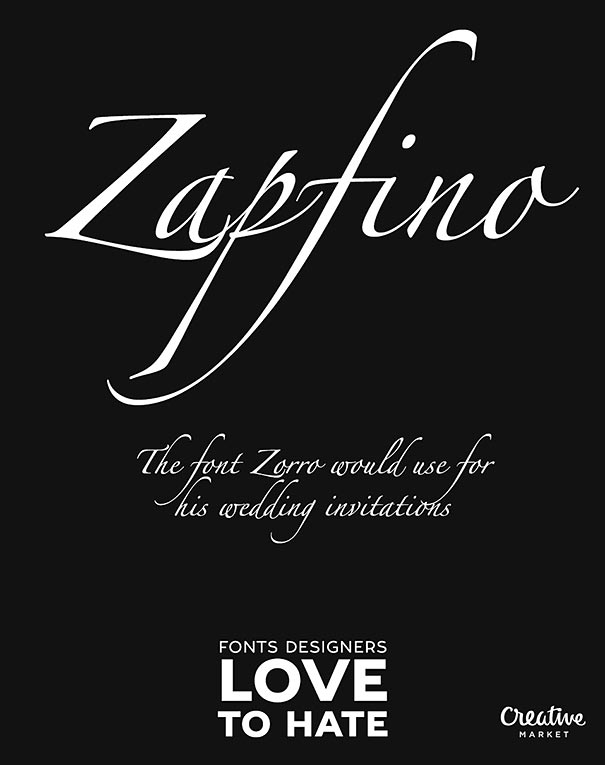
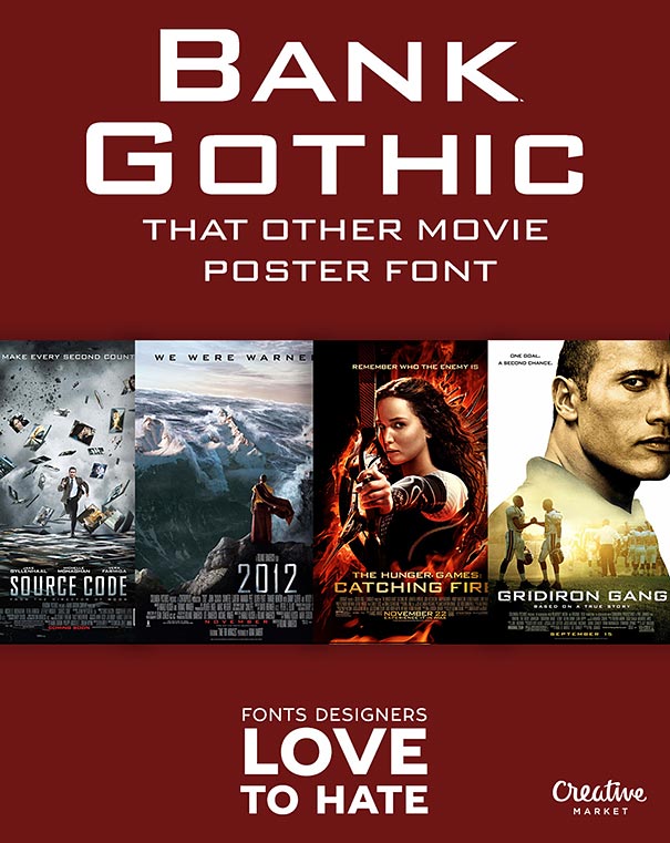
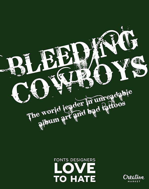
Now scroll down to check the very informative posters on popular fonts that have deserved a lot of hatred along the years of usage. Do you agree with this funny fonts list? Maybe some of these are actually cool fonts that you use every day?
More info: creativemarket (h/t: demilked, designtaxi)
254Kviews
Share on FacebookI don't hate Bleeding Cowboys. And not Arial, either. Arial is just there. It's like air... You can't go around hating something like that. Comic Sans and Papyrus though! Burn them! And you missed Monotype Corsiva...
Sans the Skeleton: *draws angry eyebrows on his forehead with a marker*
I don't hate Bleeding Cowboys. And not Arial, either. Arial is just there. It's like air... You can't go around hating something like that. Comic Sans and Papyrus though! Burn them! And you missed Monotype Corsiva...
Sans the Skeleton: *draws angry eyebrows on his forehead with a marker*

 Dark Mode
  No fees, cancel anytime




141
88