ADVERTISEMENT

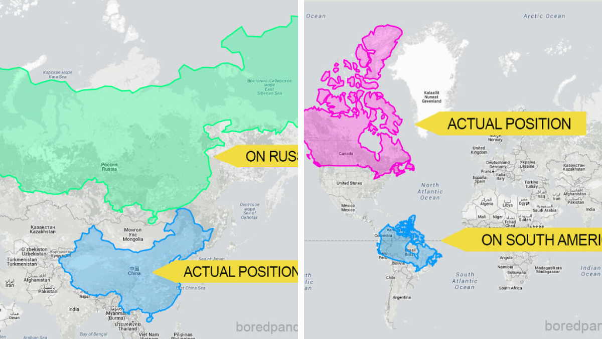
Maps have been lying to us our entire lives, and it's not entirely their fault. The challenge of depicting our round world on flat paper has created some major misconceptions about how big countries really are. Remember looking at Greenland on a standard world map and thinking it was nearly the size of Africa? Not even close – Africa is actually about fourteen times larger!

These comparison maps strip away the distortions we've grown accustomed to, revealing surprising truths about our planet's geography. When countries get dragged from their usual positions and placed alongside others for accurate size comparison, the results can be downright shocking. Russia may be the largest country by land area, but it's not nearly as massive as it appears on traditional maps. On the flip side, Vatican City is the smallest country in the world but itn't even half the size of Central Park's lake! These 29 eye-opening comparisons will forever change how you view the world, proving once again that what we think we know isn't always what is.

#1

Russia On The Equator Is Not A Giant Bear Anymore

Map comparing Russia's size at actual position and on the equator, illustrating countries' true sizes.

The True Size Report

Add photo comments
POST
RELATED:
    #2

    Brazil

    Map showing the size of Brazil overlaid on the United States and Mexico, illustrating country size differences.

    The True Size Report

    Add photo comments
    POST
    #3

    If Brazil Was In Asia It Would Be Massive

    Map showing Brazil's size compared to Russia, with overlays indicating its actual position and on Asia.

    The True Size Report

    Add photo comments
    POST
    ADVERTISEMENT
    #4

    Greenland Is Not So Big When Compared To USA And Brazil

    Greenland's size compared on USA and equator map shows distortion in country sizes.

    The True Size Report

    Add photo comments
    POST
    Jihana
    Community Member
    2 weeks ago DotsCreated by potrace 1.15, written by Peter Selinger 2001-2017

    I believe that's why Trump wants it, he doesn't understand that it's not as large as it seems.

    #5

    When You Move Canada To South America

    Map showing country size comparison with repositioned outlines of Canada and a South American country.

    The True Size Report

    Add photo comments
    POST
    ADVERTISEMENT
    #6

    China Placed On Top Of Russia

    Map comparing China's actual size and position against Russia, illustrating how countries' sizes can be perceived differently.

    The True Size Report

    Add photo comments
    POST
    I am John
    Community Member
    2 weeks ago (edited) DotsCreated by potrace 1.15, written by Peter Selinger 2001-2017

    This whole post is just "projecting 3d onto 2d distorts things".

    ADVERTISEMENT
    #7

    The Us Could Easily Cover The Whole Of Canada But It Becomes Much Smaller When It's Moved South

    Map showing countries' sizes distorted with the U.S. in Canada, the equator, and actual positions highlighted.

    The True Size Report

    Add photo comments
    POST
    I am John
    Community Member
    2 weeks ago (edited) DotsCreated by potrace 1.15, written by Peter Selinger 2001-2017

    Bit of a stretch. "Easily"? Land area of USA is 0.6% greater than Canada. If you include water Canada is 4.8% bigger I believe.

    #8

    This Is How Tiny Romania Looks In The Arctic Ocean

    Map showing Romania's size comparison with its position in the Arctic Ocean, highlighting country size misconceptions.

    The True size Report

    Add photo comments
    POST
    #9

    People Often Underestimate Australia’s Size Because It’s So Isolated. Here’s What It Looks Like When Placed Over The U.S

    Map overlay showing Australia's size compared to North America, illustrating country size misconceptions.

    The True Size Report

    Add photo comments
    POST
    PeepPeep the duck
    Community Member
    2 weeks ago (edited) DotsCreated by potrace 1.15, written by Peter Selinger 2001-2017

    It takes about 4-5 days of safe driving to get from Perth to Gold Coast (west to east), is it the same time driving safely from San fran to West Virginia? Anyone done the drive 😂 there’s two days of nothing during the Aussie crossing

    View more commentsArrow down menu
    ADVERTISEMENT
    ADVERTISEMENT
    #10

    India Over Europe

    Map showing India overlaid on Europe, illustrating the surprising size comparison of countries.

    The True Size Report

    Add photo comments
    POST
    #11

    China Over USA

    Map showing China's outline overlaid on the USA, illustrating country size differences.

    The True Size Report

    Add photo comments
    POST
    #12

    Chile

    Map showing a country overlay stretching from Greece to Norway, highlighting country size misconceptions.

    The True Size Report

    Add photo comments
    POST
    ADVERTISEMENT
    #13

    Australia Is Way Bigger Than You May Think - It Covers Almost The Whole Of Europe

    Map showing Australia's actual size compared to Europe, highlighting size misconceptions of countries.

    The True Size Report

    Add photo comments
    POST
    ADVERTISEMENT
    #14

    California Moved Onto The UK Shows They're Quite Similar In Size

    Map comparison showing UK size versus superimposed California outline, highlighting country size differences.

    The True Size Report

    #15

    Antarctica Is Not So Much Larger Than Brazil

    Map highlighting Antarctica's size compared to continents, showing how countries differ in perceived versus actual size.

    The True Size Report

    Add photo comments
    POST
    ADVERTISEMENT
    #16

    Canada Moved Down Onto The Us Reveals That Both Countries Are Pretty Much The Same Size

    Map showing Canada overlaid on the U.S. to reveal size differences between countries.

    The True Size Report

    Add photo comments
    POST
    #17

    Russia

    Map comparing the size of Russia to the United States, illustrating how countries are not the size you think they are.

    The True Size Report

    Add photo comments
    POST
    ADVERTISEMENT
    See Also on Bored Panda
    #18

    Madagascar

    Map showing country size overlay in the USA, highlighting size discrepancies.

    The True Size Report

    Add photo comments
    POST
    ADVERTISEMENT
    See Also on Bored Panda
    #19

    Vatican Over Central Park

    Map showing Central Park in Manhattan with highlighted area, illustrating size comparison.

    The True Size Report

    Add photo comments
    POST
    #20

    Greenland Over Australia

    Map showing Greenland's size compared to Australia, illustrating how countries are not the size you think they are.

    The True Size Report

    Add photo comments
    POST
    #21

    Us Moved Down Next To Australia Looks Unbelievably Small

    Map comparison showing the size difference between the United States and Australia.

    The True Size Report

    Add photo comments
    POST
    ADVERTISEMENT
    ADVERTISEMENT
    See Also on Bored Panda
    #22

    Alaska Doesn't Seem So Big When Compared To 48 Contiguous States

    Map of Alaska's size compared in actual position versus next to the contiguous U.S. states.

    The True Size Report

    Add photo comments
    POST
    #23

    New Zealand

    Map showing New Zealand compared in size to the eastern United States, highlighting how countries' sizes differ in perception.

    The True Size Report

    Add photo comments
    POST
    #24

    Belgium Over Spain

    Map showing Belgium overlay on Spain, illustrating how countries are not the size you think.

    The True Size Report

    Add photo comments
    POST
    ADVERTISEMENT
    See Also on Bored Panda
    #25

    Indonesia

    Map showing distorted country sizes overlayed on Greenland, illustrating the true size of countries.

    The True Size Report

    Add photo comments
    POST
    ADVERTISEMENT
    See Also on Bored Panda
    #26

    Indonesia Would Spread Almost Across The Whole Of Russia

    Map showing Indonesia's true size compared to its overlay on Russia, illustrating country size misconceptions.

    The True Size Report

    Add photo comments
    POST
    ADVERTISEMENT
    See Also on Bored Panda
    #27

    This Happens When You Move Australia To The North America

    "A map showing how Australia compares in size when placed over North America, illustrating country size differences."

    The True Size Report

    Add photo comments
    POST
    #28

    Poland Is Almost As Half As Big As Greenland

    Map showing Poland's actual size versus its size on Greenland.

    The True size Report

    Add photo comments
    POST
    #29

    Texas Moved On Top Of Alaska Shows That They're Almost The Same Size

    Map showing Texas overlaid on Alaska, illustrating how countries differ in perceived size.

    The True Size Report

    Add photo comments
    POST
    ADVERTISEMENT
    ADVERTISEMENT
    See Also on Bored Panda