94Kviews
Dutch Artist Reveals What’s “Trapped” Inside Popular Cartoon, Fairy Tale And Pop Culture Characters (30 Paintings)
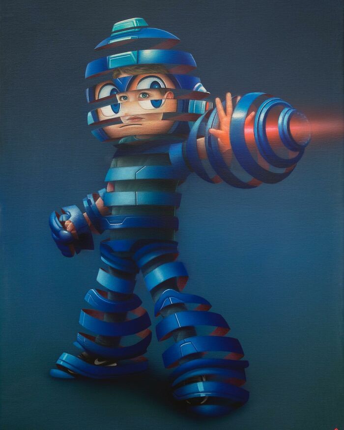
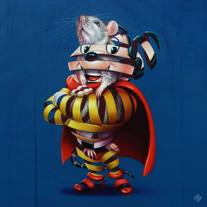
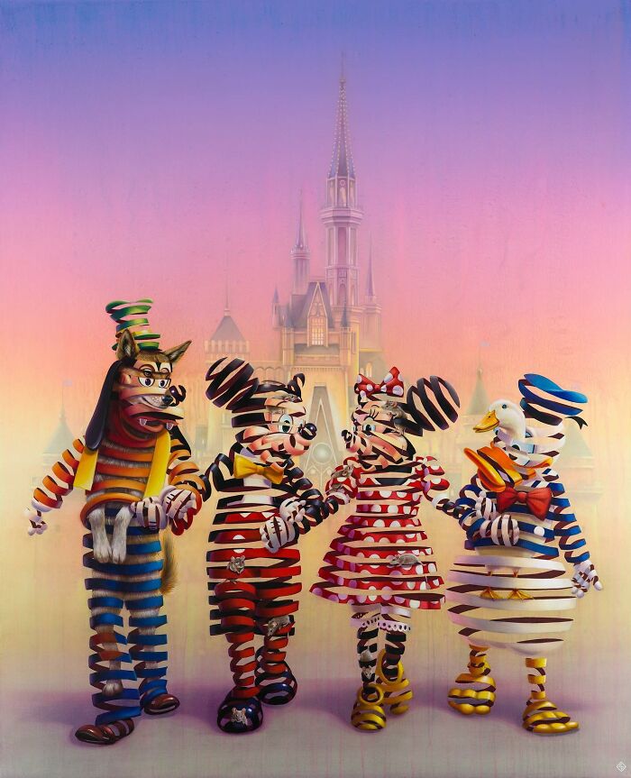
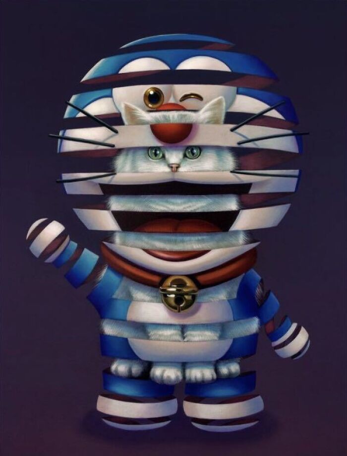
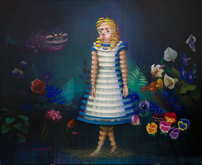
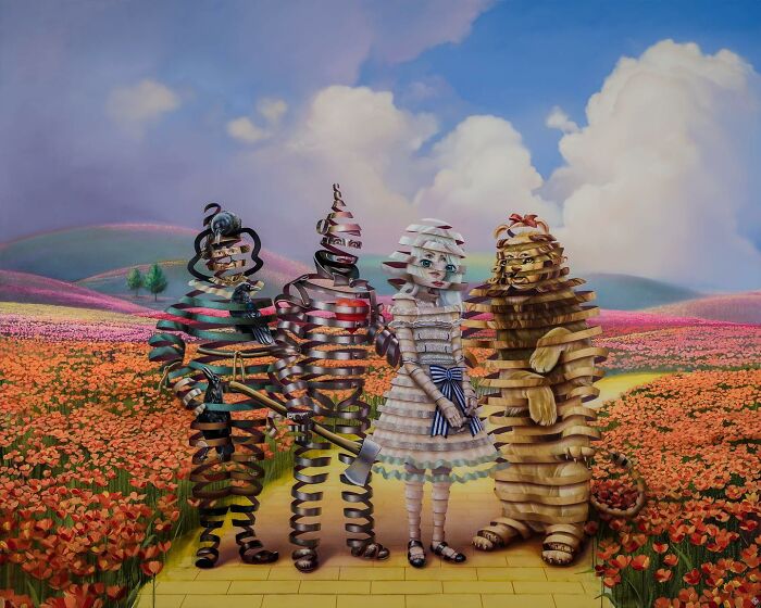
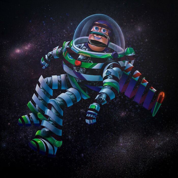
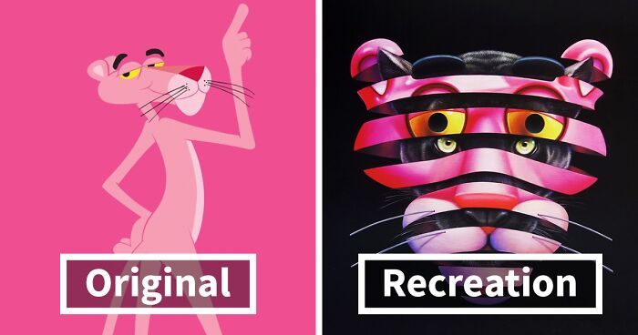
Stefan Thelen, also known as Super A, is a Dutch artist who uses traditional painting techniques to deconstruct our well-known cartoon, fairy tale and pop culture characters. He created the series "Trapped" in which he "peels away" the surface of iconic personages, revealing what's really hiding inside of them.
Scroll down to get to know the real Mickey Mouse, Garfield, Sonic, and many other iconic figures! We encourage you to upvote your favorite paintings! Let us know what you think about Stefan's work by leaving a comment!
More info: Instagram | super-a.nl
This post may include affiliate links.
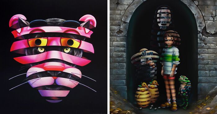
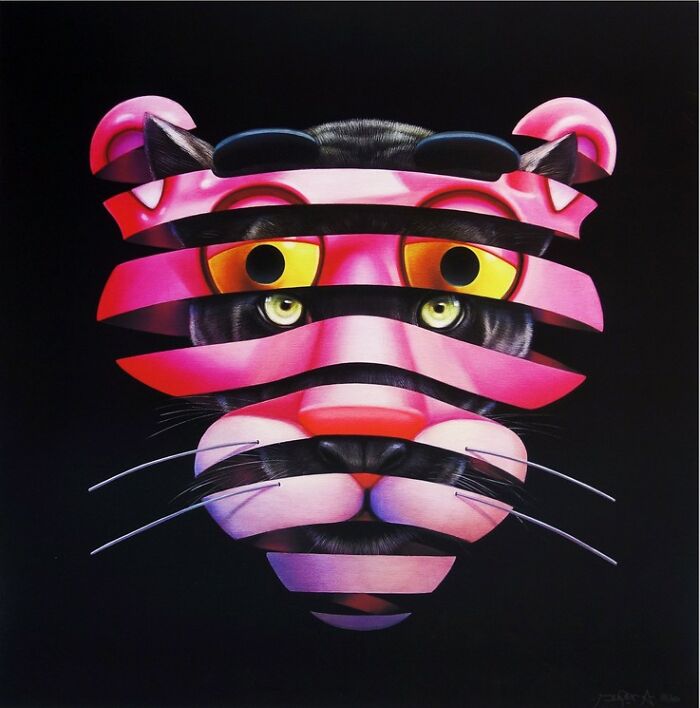
Pink Panther
Bored Panda got in touch with Stefan to get to know more about him and his creative process. We got curious about how his journey as an artist started. The artist replied that he's been drawing since he was a kid. Then, at the age of thirteen/fourteen, his brother introduced him to painting graffiti. "Hooked from day one, it was a great way to express and develop myself as a kid. After I finished my education as a house/sign painter and study in graphic design, I ended up at a studio specializing in cinema painting and set design. During the eight years that I worked at that company, I learned a lot of different crafts like sculpting, decoration and painting technics that I later started using for my personal work."
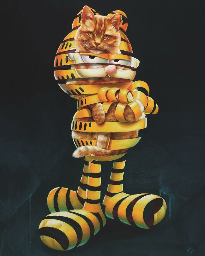
Garfield
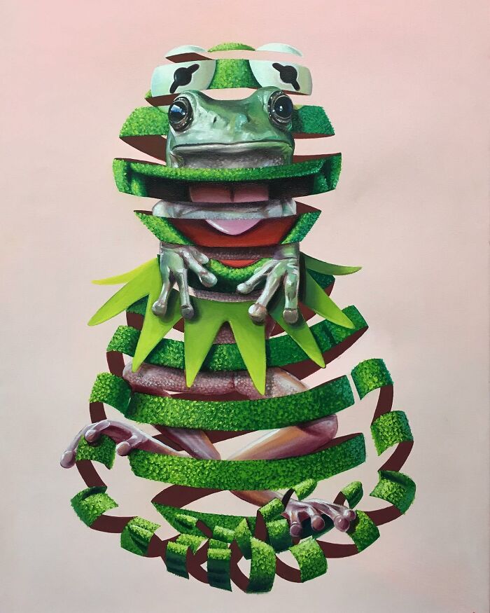
Kermit The Frog
The idea of "Trapped" came to Stefan when he was working as a sculptor and painter for amusement parks like Warner and Disney, "helping them to create a beautiful fake world which in the end isn't that beautiful after all. After a while, I found out it was time to create my own world. The trapped series is a perfect way to show these two worlds together."
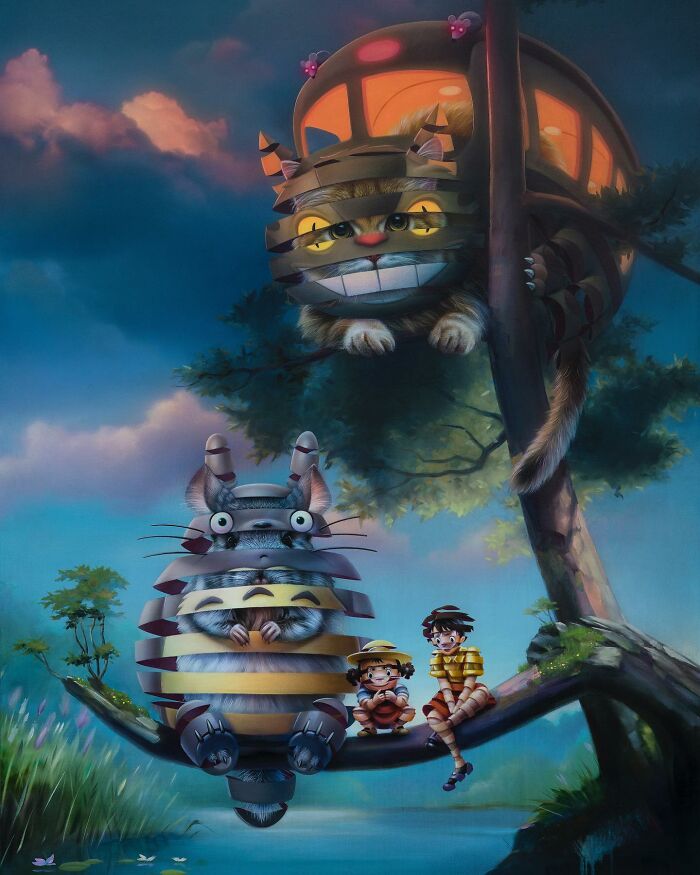
My Neighbor Totoro
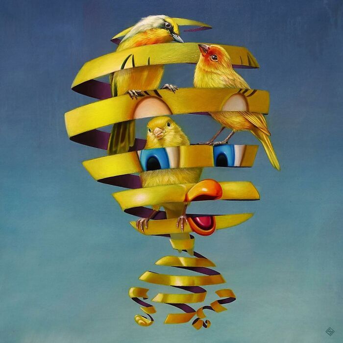
Tweety
I kinda figured it would be 3 birds. I mean 3 brains are better than one and it definitely explains so much.
I feel like this reflect on the character cause hes either as dumb, hyper or smart like he has 3 brains lol
"Every work has a story or message. One of the returning subjects in my work is a contradiction. I love to play with the contrast and tension between two opposites and show them in one work."
The artist shared that the first reaction when people see his work for the first time is probably, Hey! That's Mickey! But after a few seconds, they notice something is wrong.
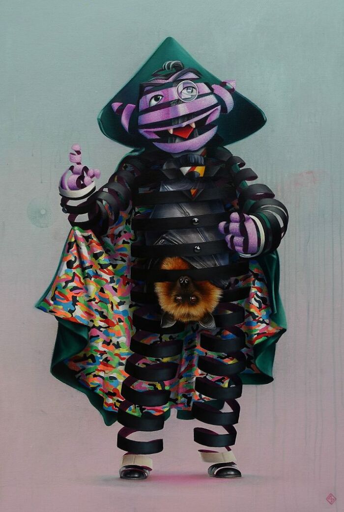
Count Von Count
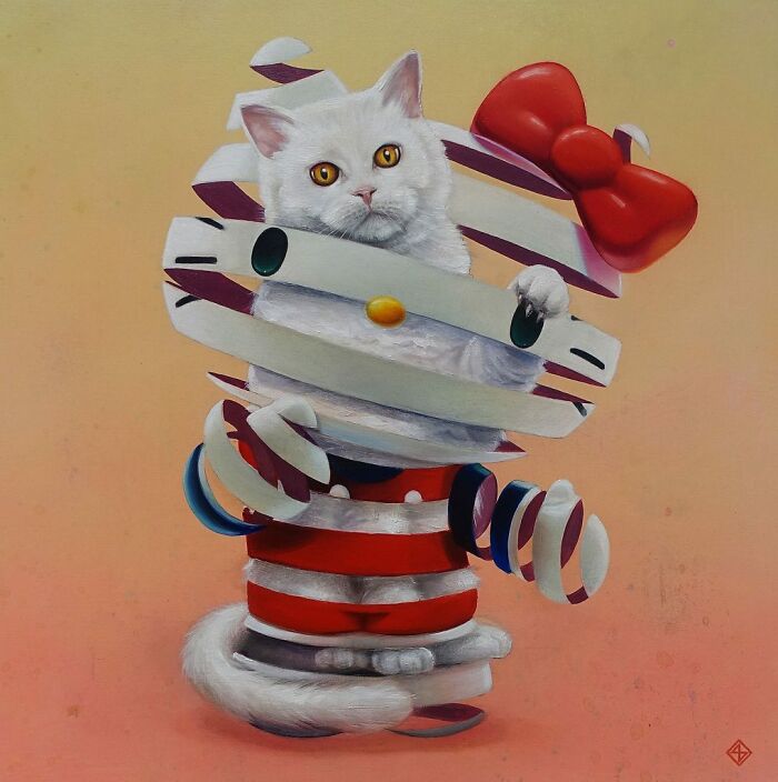
Hello Kitty
According to Stefan, the time it takes to create one painting depends on the piece. "Small pieces can take a few days while big pieces can take a few weeks. I can't spend months on work. I'll lose my patience and interest after a while. Overall I'm a fast painter. I try to paint as confidently as possible, which results in leaving parts for what they are. It doesn't need to be perfect."
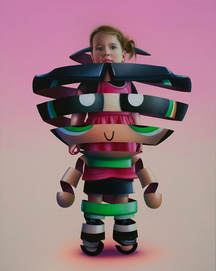
Buttercup
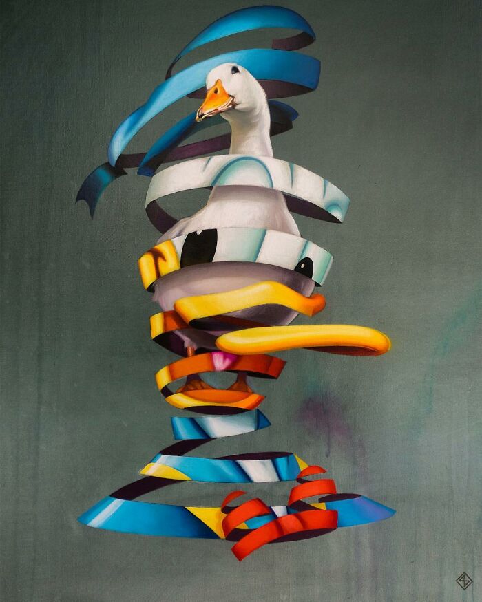
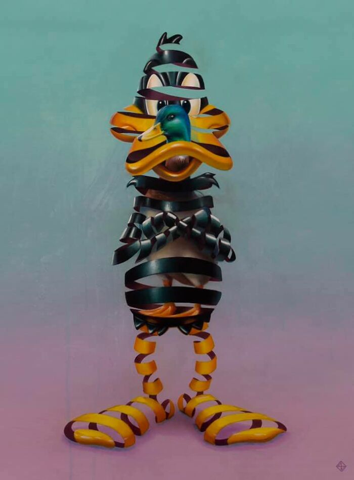
Donald Duck
"Talking about work, I'm a blessed guy. It's the only thing I want to do. I love the whole process of coming up with ideas and challenging myself to find a way to do them. One way or another.
Next to all the planned murals and shows, the most interesting project at the moment is that I'm challenging myself to slowly make a transition in my work. I have a lot of new ideas which I'm testing. So I'm doing a lot of research and figuring out ways to execute and present these concepts. So far it's a beautiful struggle."
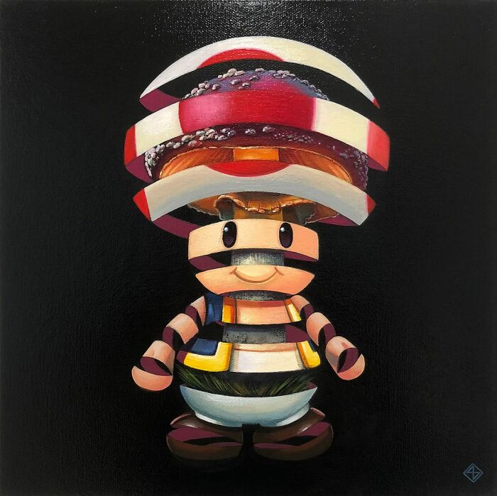
Mushroom
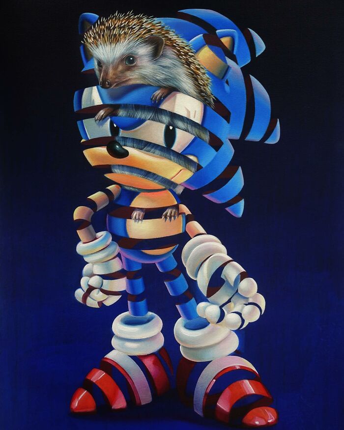
Sonic The Hedgehog
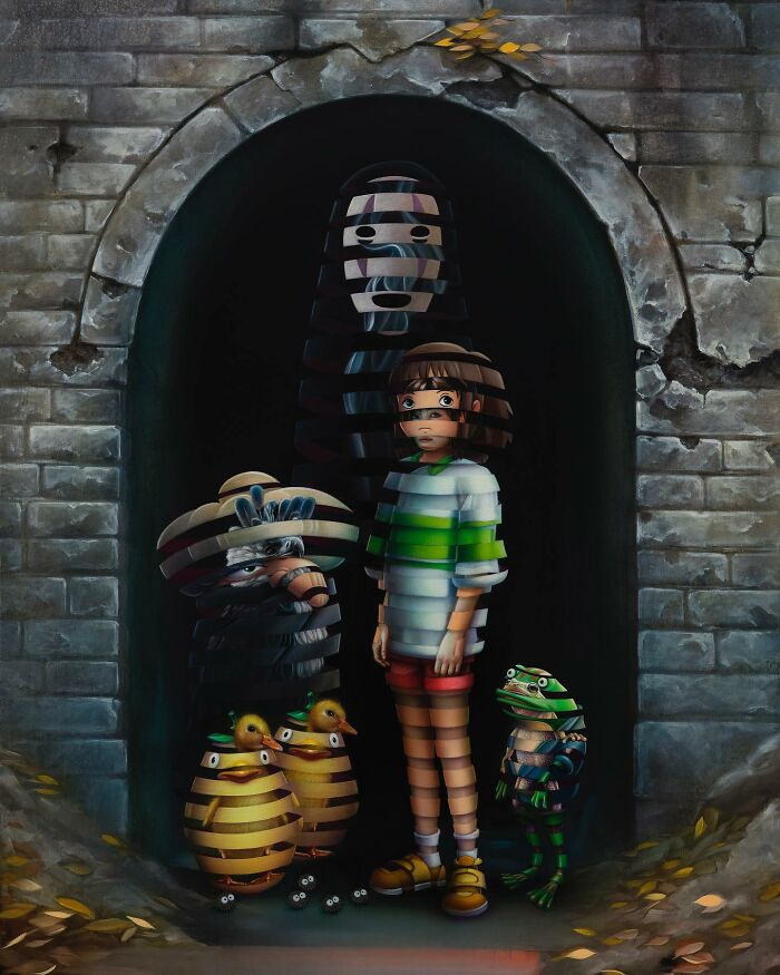
Spirited Away
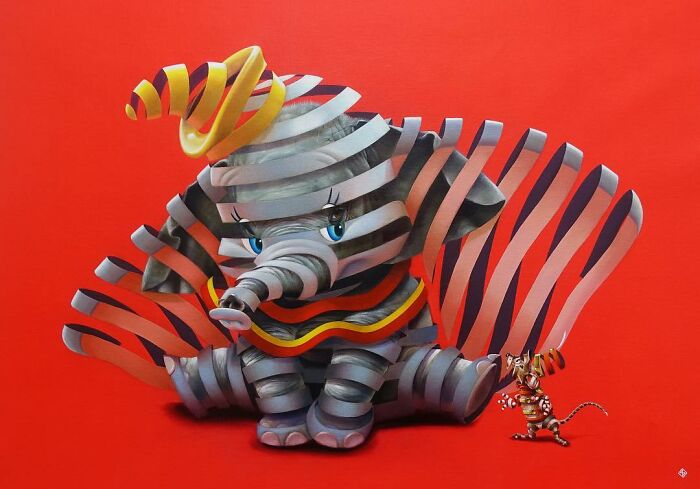
Dumbo
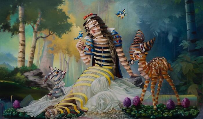
Snow White
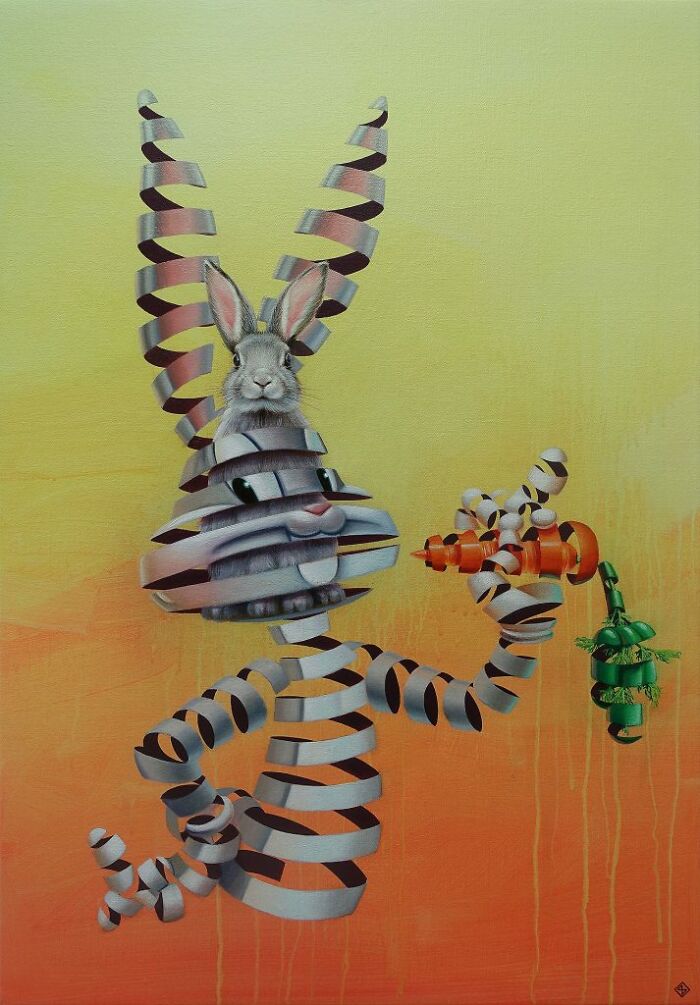
Bugs Bunny
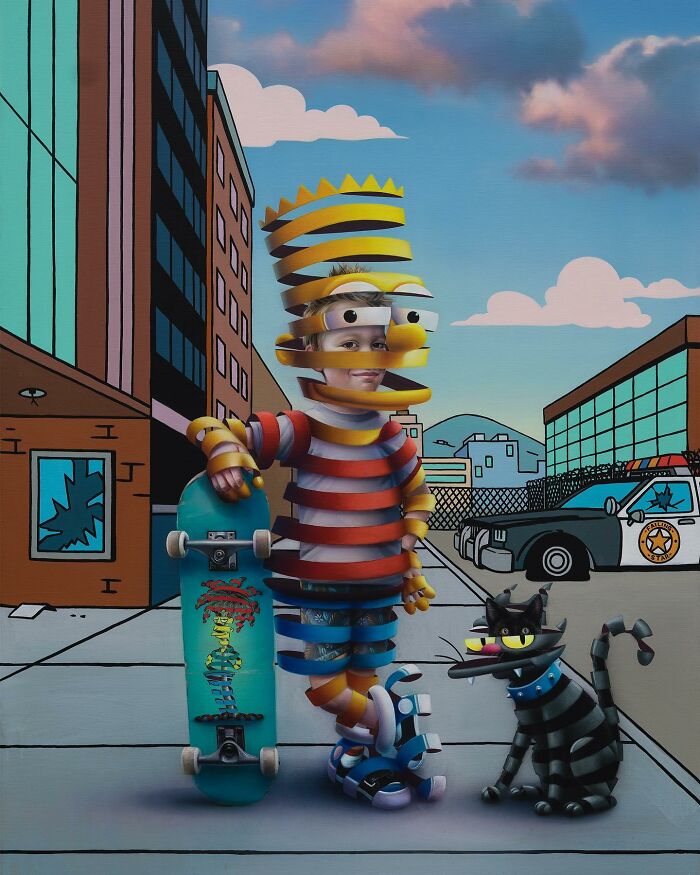
Bart Simpson
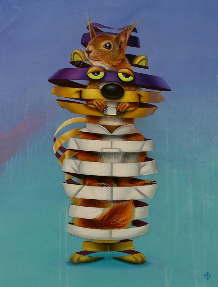
Secret Squirrel
Mickey Mouse
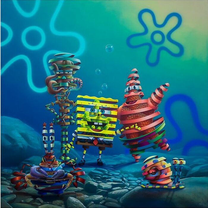
Mr. Krabs, Squidward, Sponge Bob Squarepants, Patrick Star, Gary
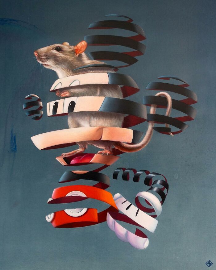
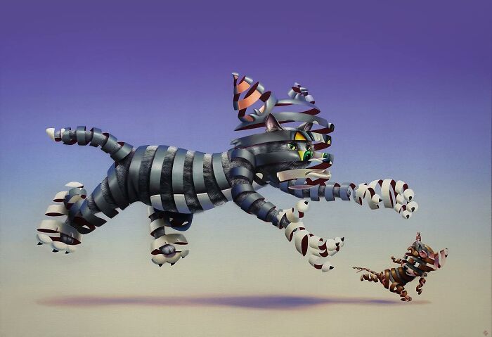
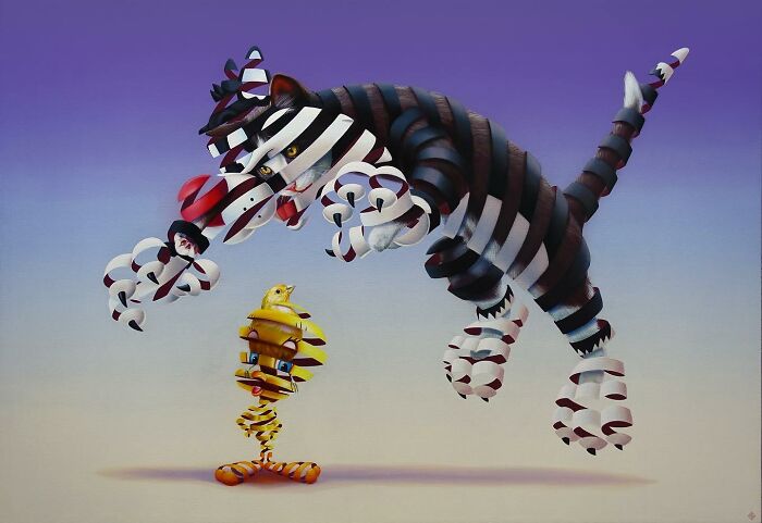
Tom And Jerry
I think Jerry is supposed to be a brown mouse, not a grey one? If I'm seeing the colours right.
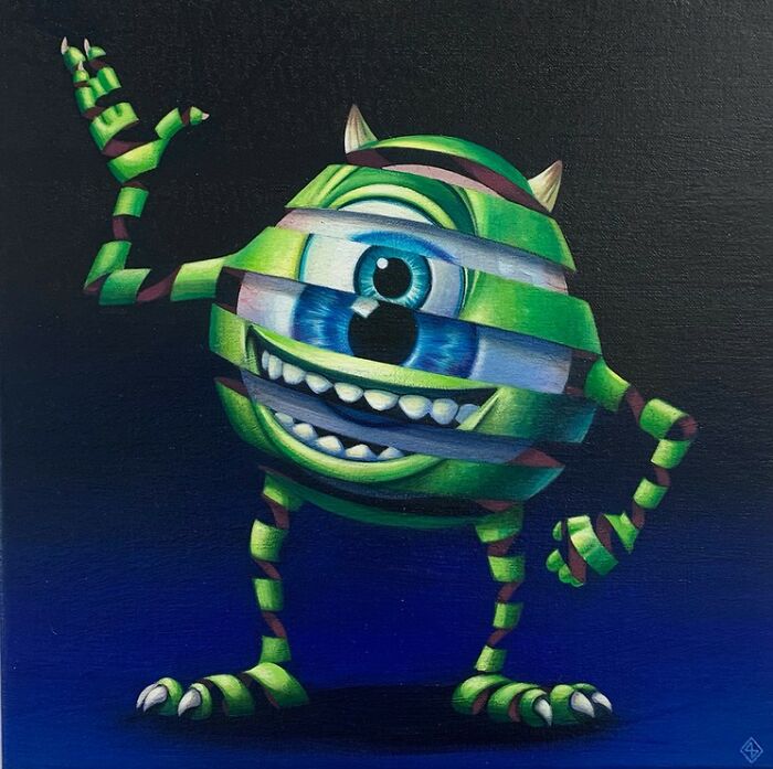
Mike Wazowski
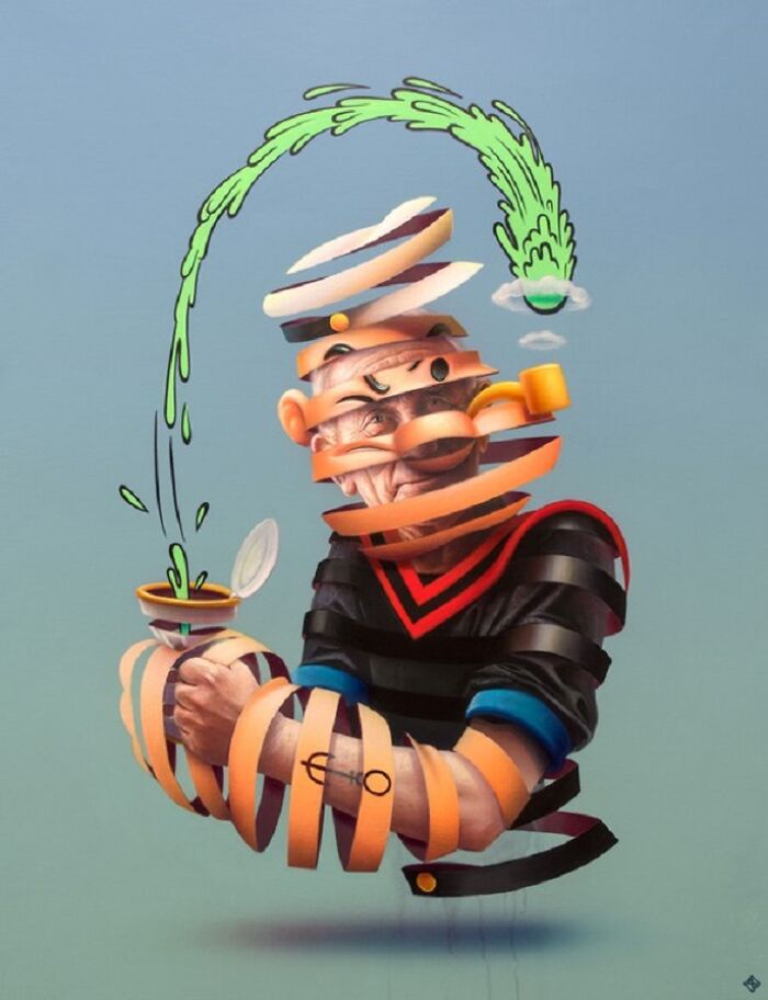
Popeye
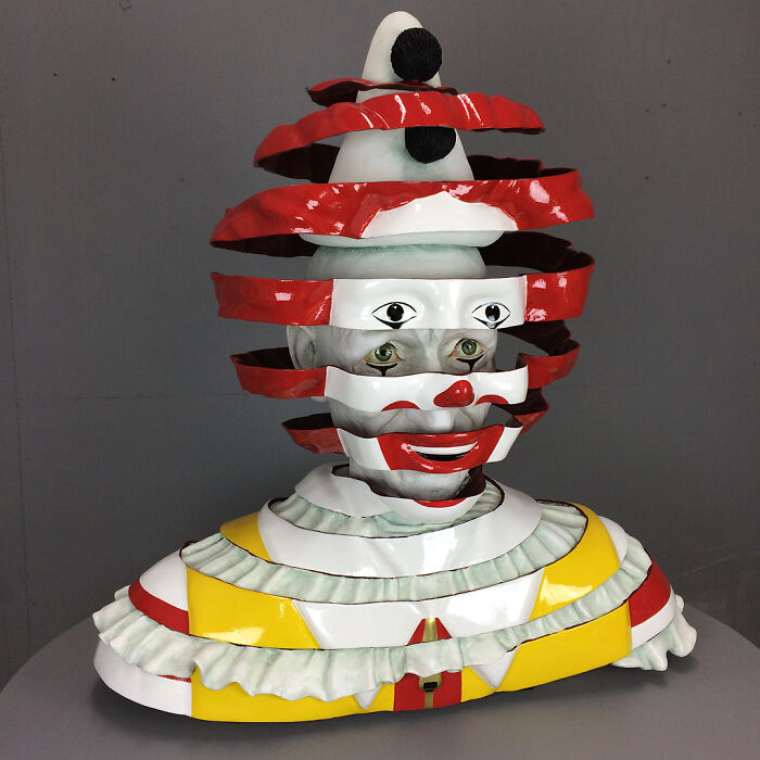
Ronald Mcdonald
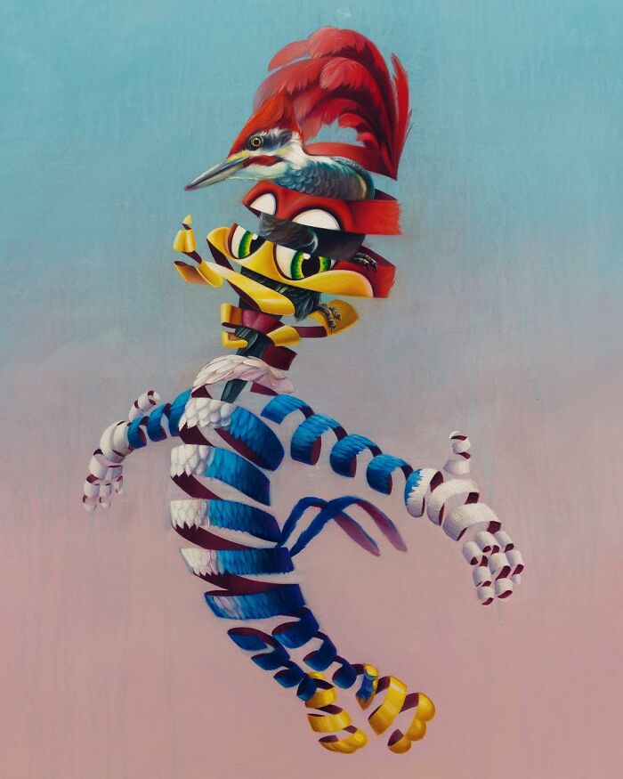
Woody Woodpecker
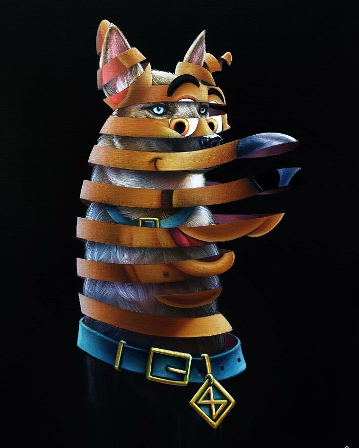
Scooby-Doo
Mega Man
Mighty Mouse
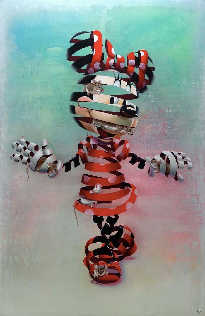
Goofy, Mickey Mouse, Minnie Mouse And Donald Duck
I'm really bothered that Goofy got pointy ears. Dogs with floppy ears do exist, ya know...
Doraemon
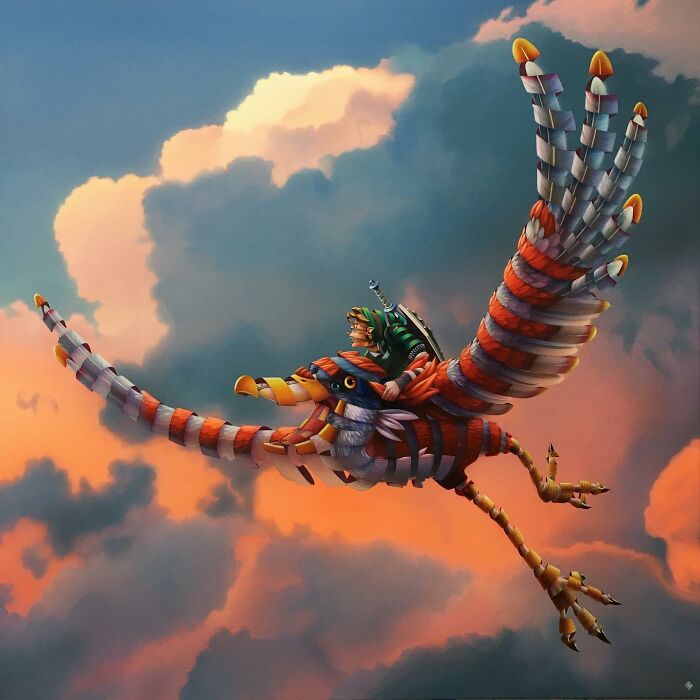
Zelda And Crimson Loftwing
Some of these are kinda dumb tbh. The hello kitty one should have been a little British girl, and Ronald McDonald should have been something like the Monopoly man. And wow! Shocker! Children just peel away into slightly different children!
I agree. This had so much potential and was mostly wasted.
Load More Replies...Wow, this has to be one of - if not the - most original 'pop' art I've seen for a while. Great work !!!
With respect, I'd strongly disagree. The first look at the thumbnail made me not open the topic, "Ah, an MC Escher clone, cute"... My point is, to you it may be wholly new, but to really everybody in The Netherlands it's very recognizable. It's technically good, no problem with that. It's just... unoriginal. If you're unfamiliar, read e.g. https://www.nationalgalleries.org/art-and-artists/features/very-serious-game-work-mc-escher (yes, it opens with the drawing that has inspired all these versions of the same idea).
Load More Replies...this artist is extremely talented. the detailing, the anatomy, & the shading are absolutely phenomenal. there's so much potential here, but in my opinion the project was greatly hindered by the art style. the overwhelming amount of details & meticulous shading on both versions of the characters makes them overwhelming to look at, especially when they're overlapped & when the cartoon version is further complicated by the ribbon effect. in addition, the color composition makes things really hard to decipher too; the eye-catching cartoons on the outside make it really hard to see the (usually) earth-toned & even more detailed realistic versions inside. this is more obvious in the posts further down on the list, the pieces where the "ribbon" is thinner, & the pieces with more than one character. it makes it really hard to see the inner & other layers seperately or even at the same time; it just looks like a mess of colors in many pieces.
perhaps a better use of this art style for this project would've been cartoon characters "meeting" their "real selves" so we can see both versions clearly. again, i think this artist is extremely talented, i just think the composition leaves a lot to be desired.
Load More Replies...These are amazing!! I really like this artist's style, quite unique ☺️👍

 Dark Mode
  No fees, cancel anytime


