30 Mind-Bending Tattoos Capturing A World Within The Skin By This Artist (New Pics)
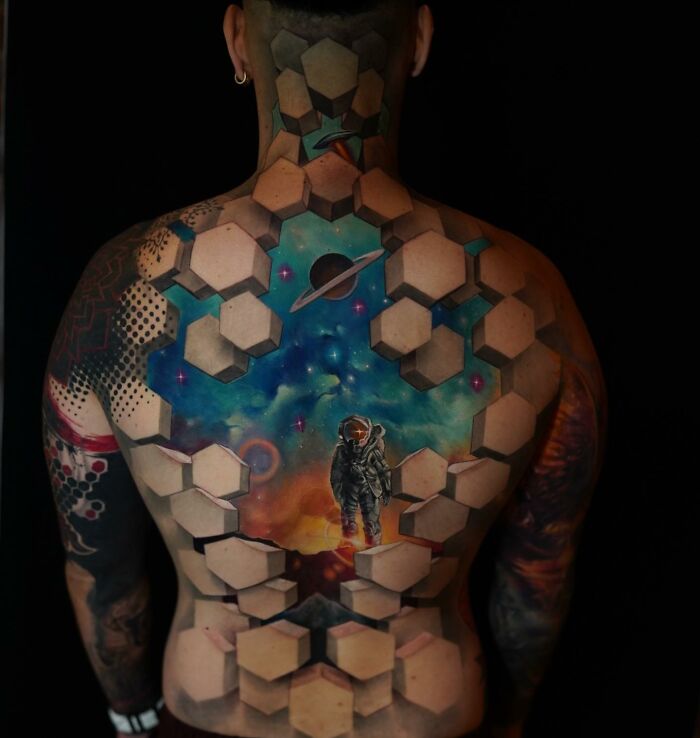
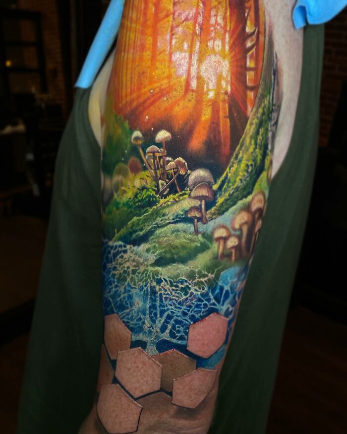
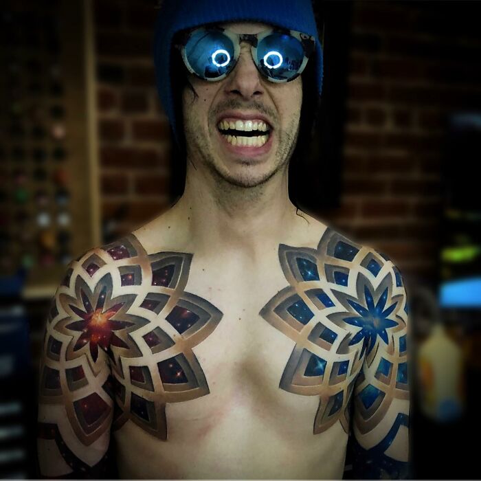
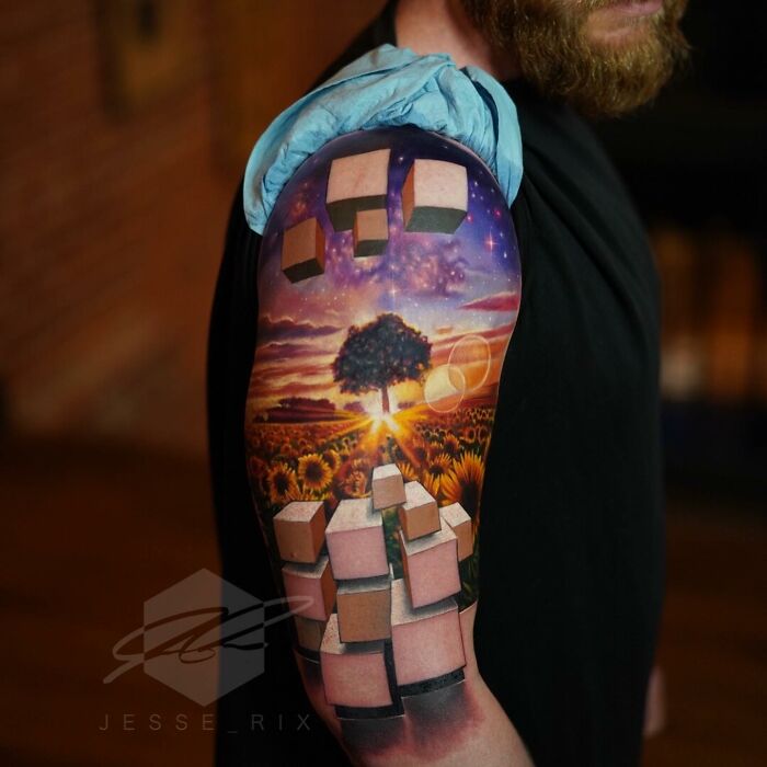
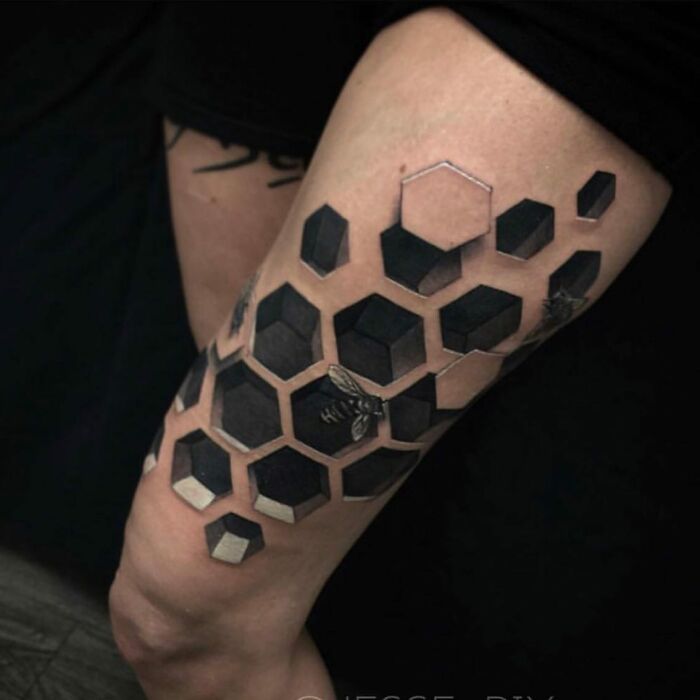
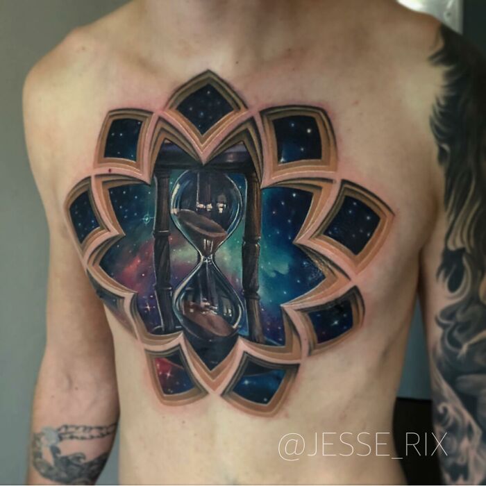
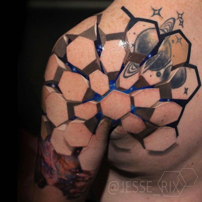
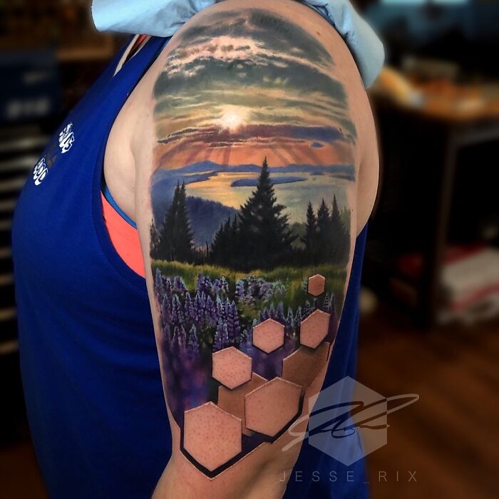
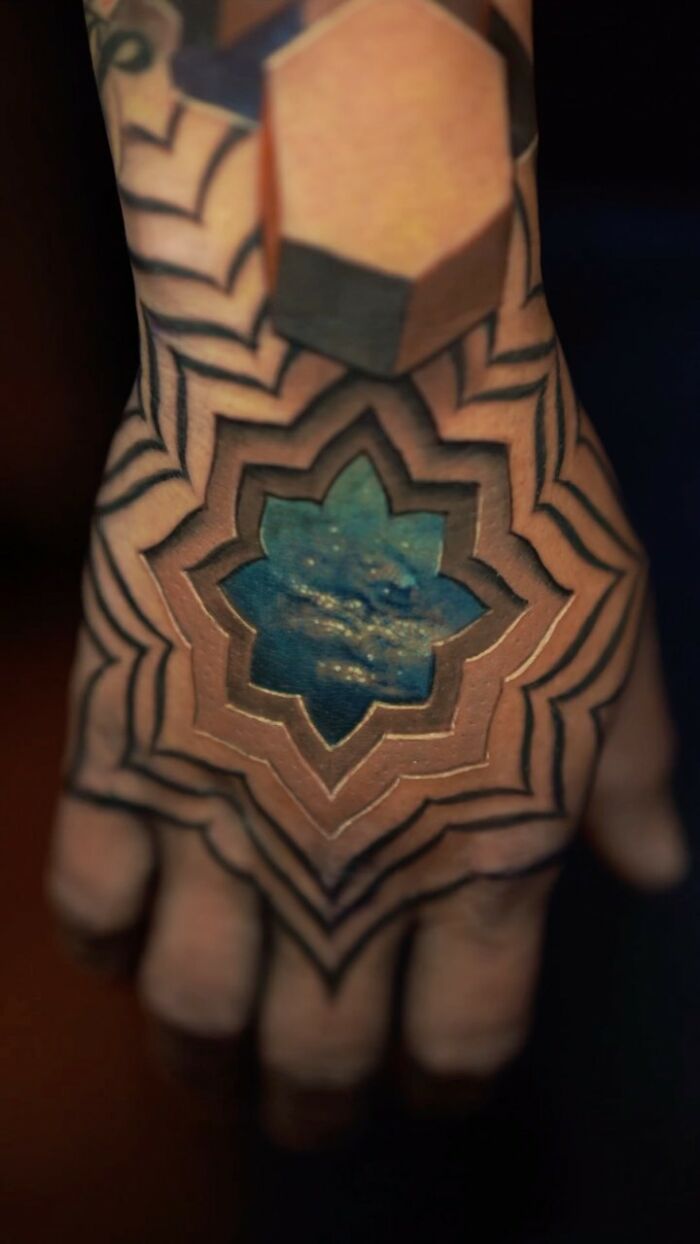
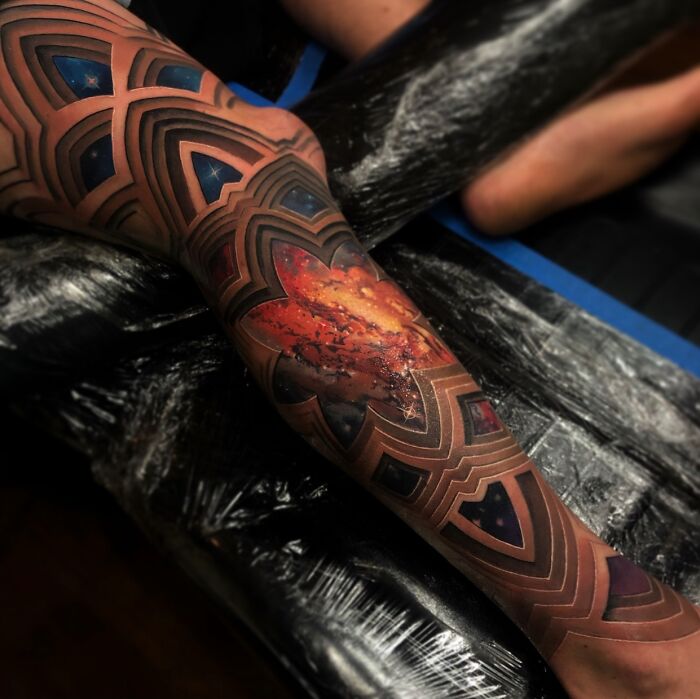
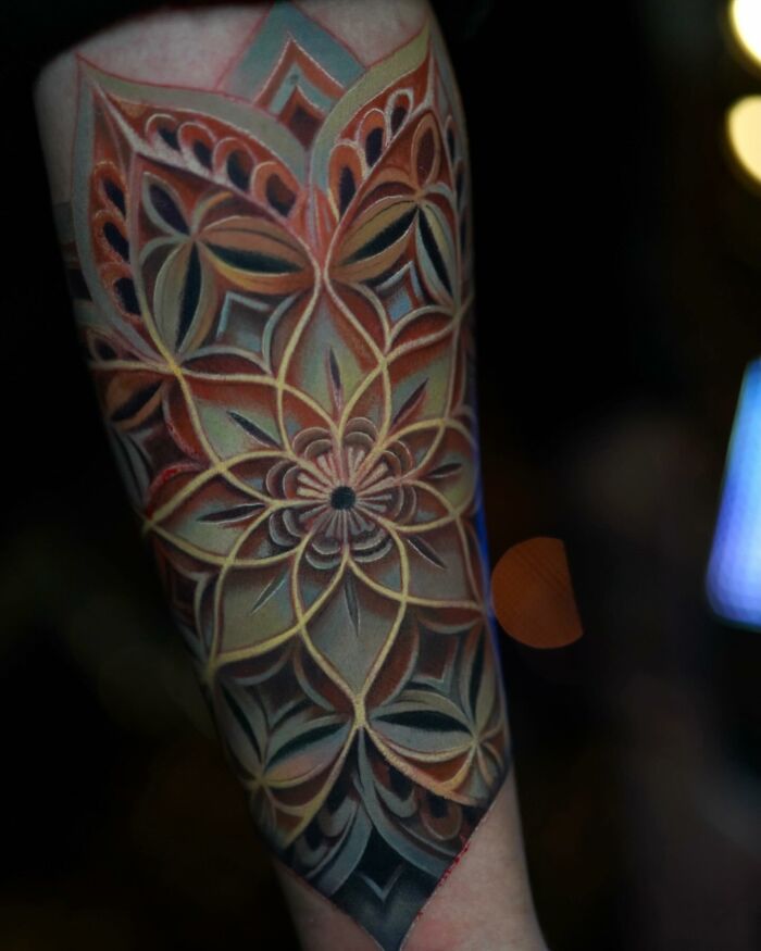
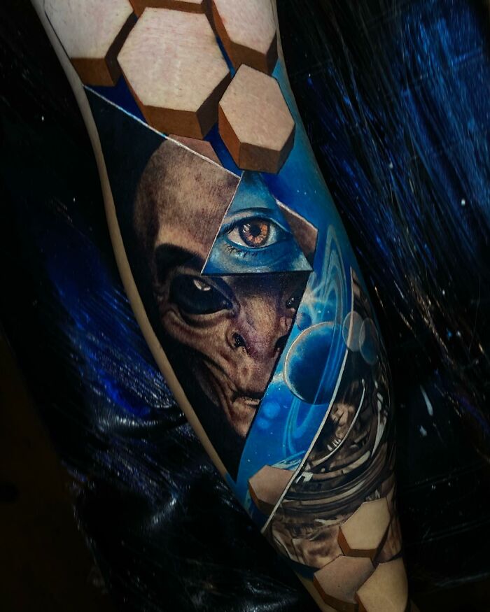
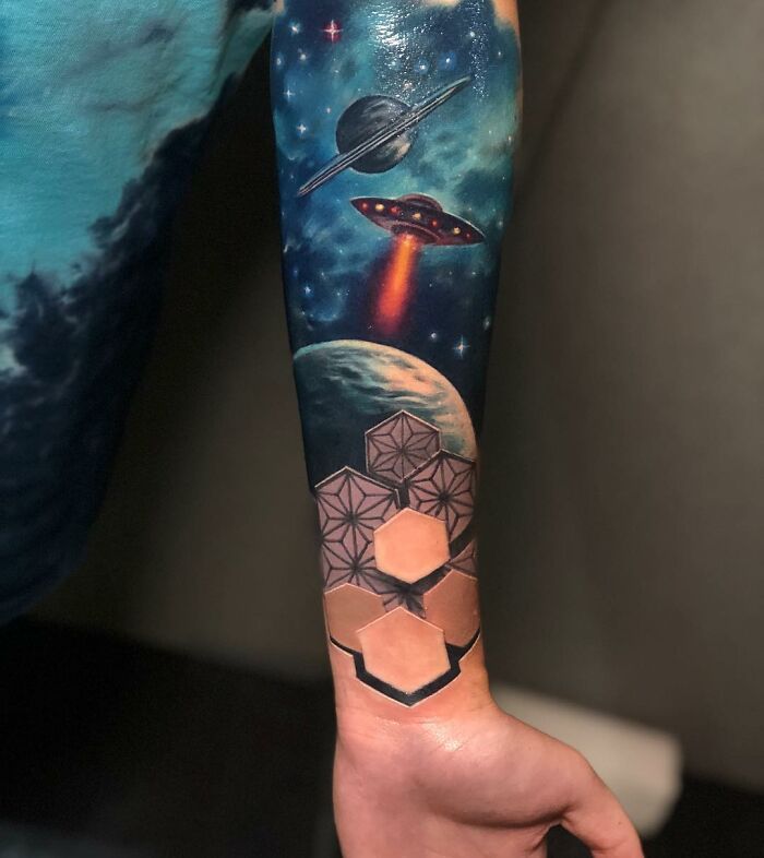
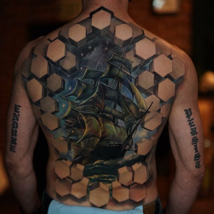
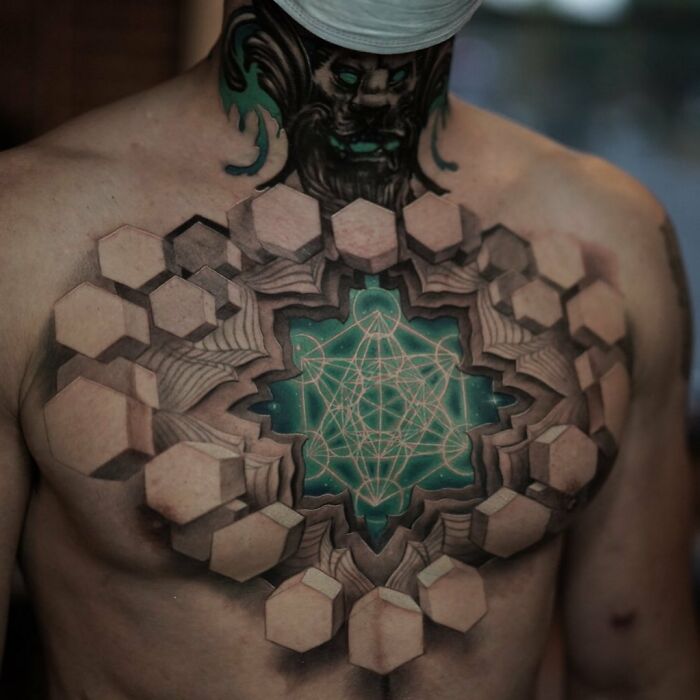
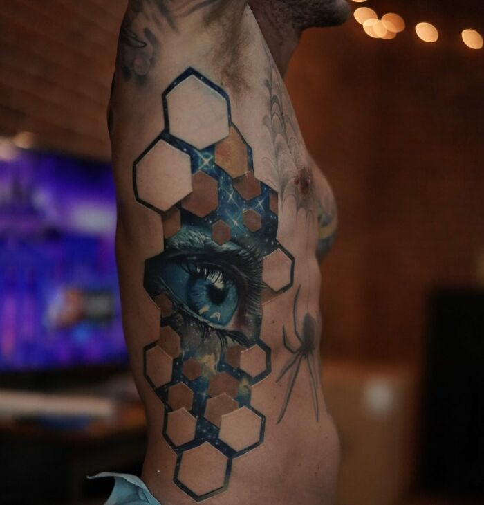
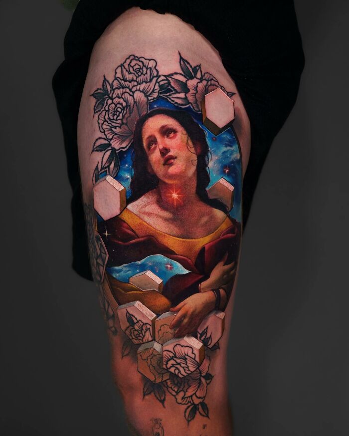
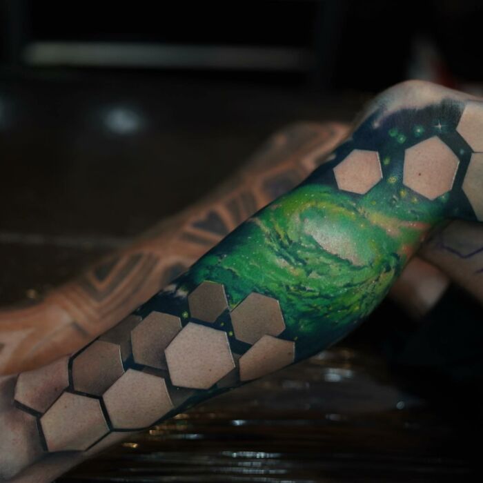
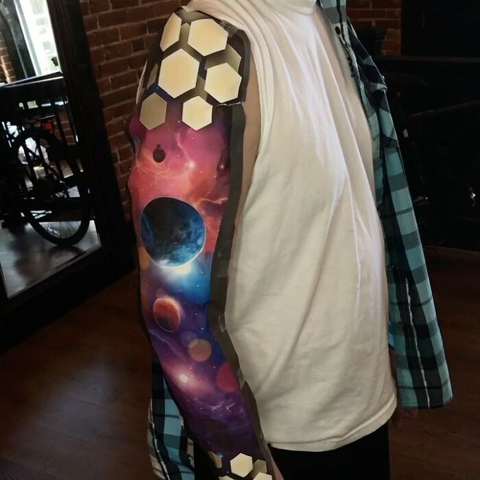
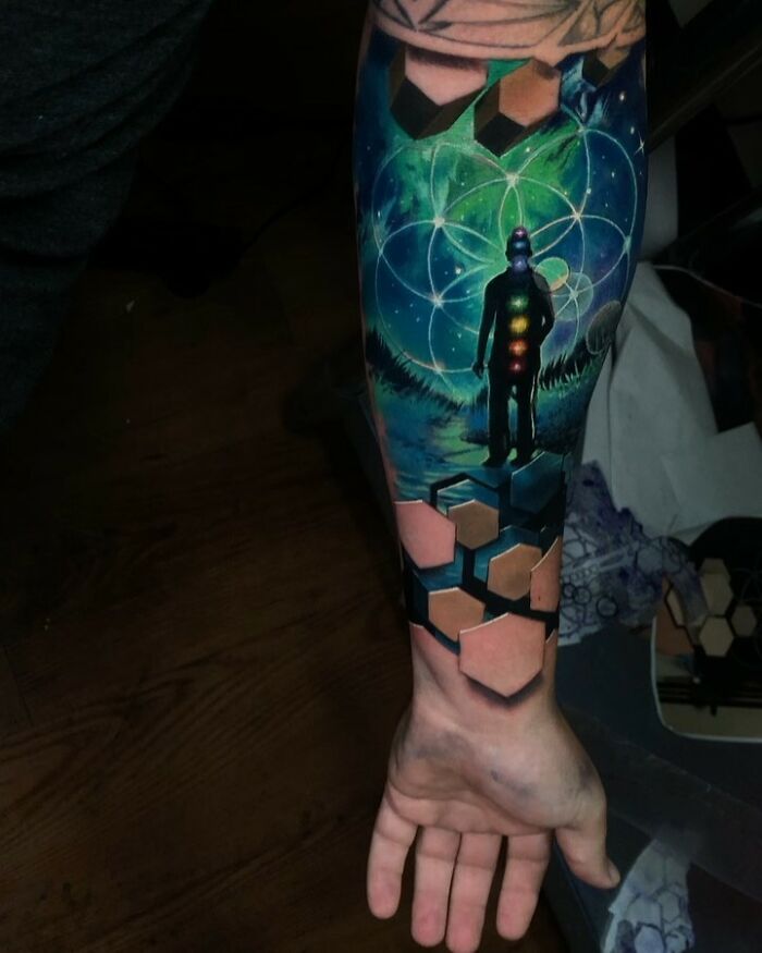
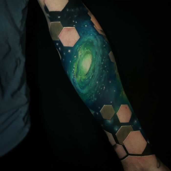
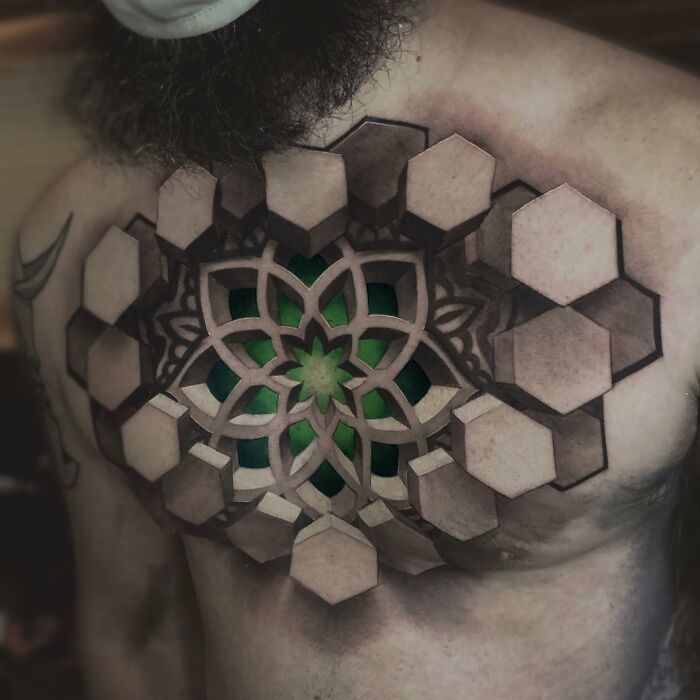
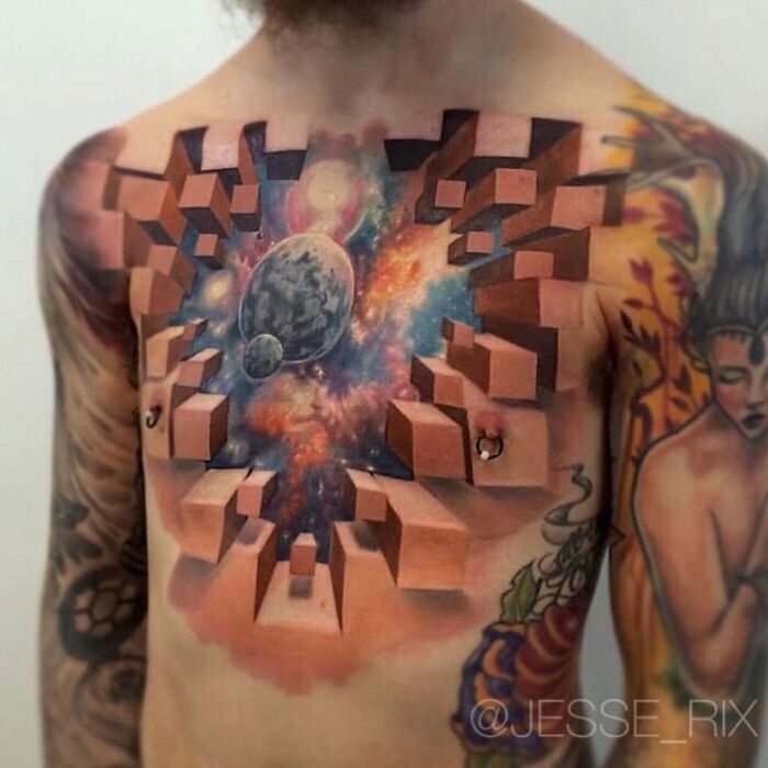
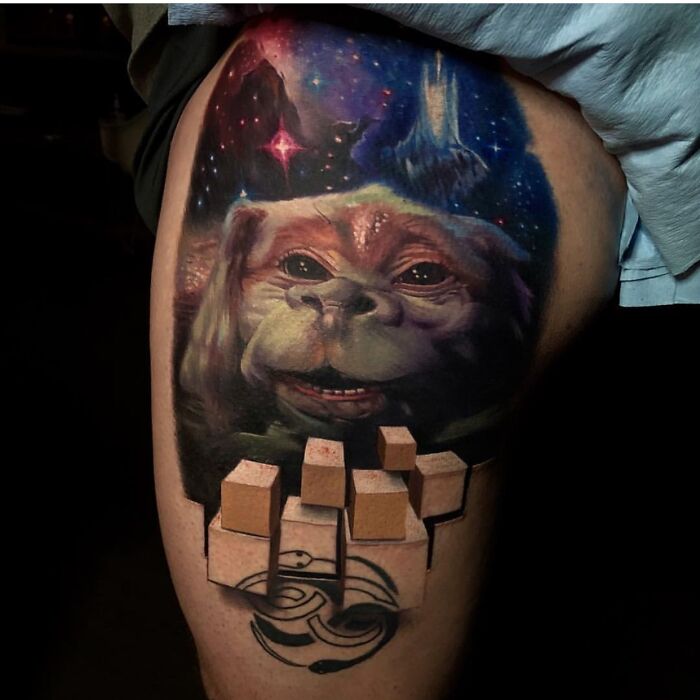
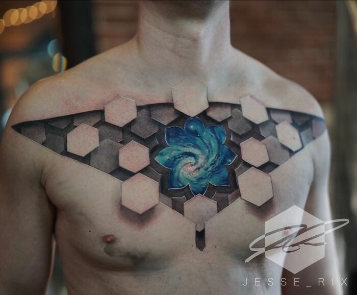
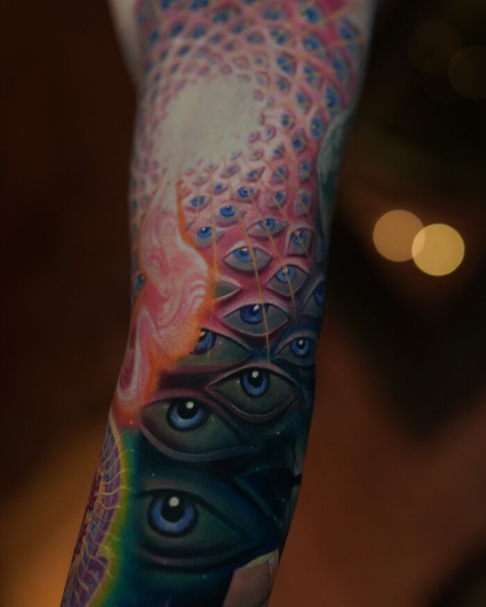
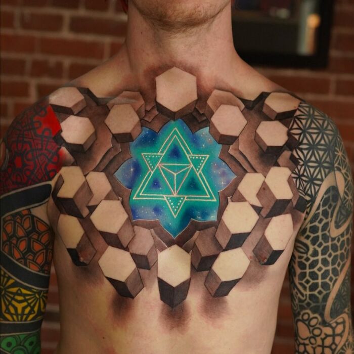
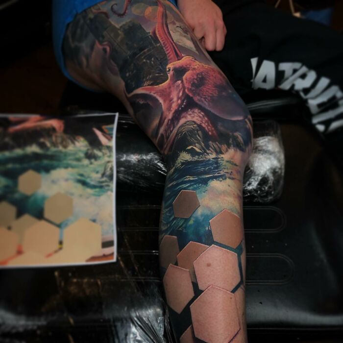
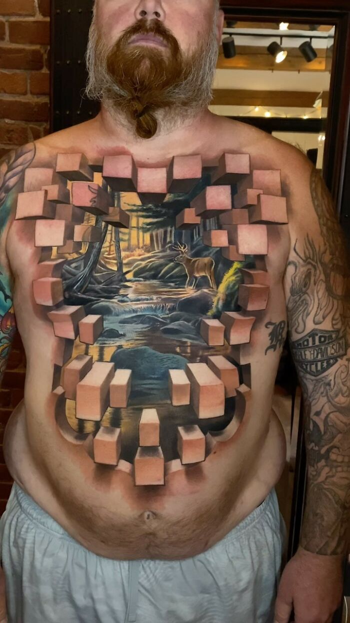
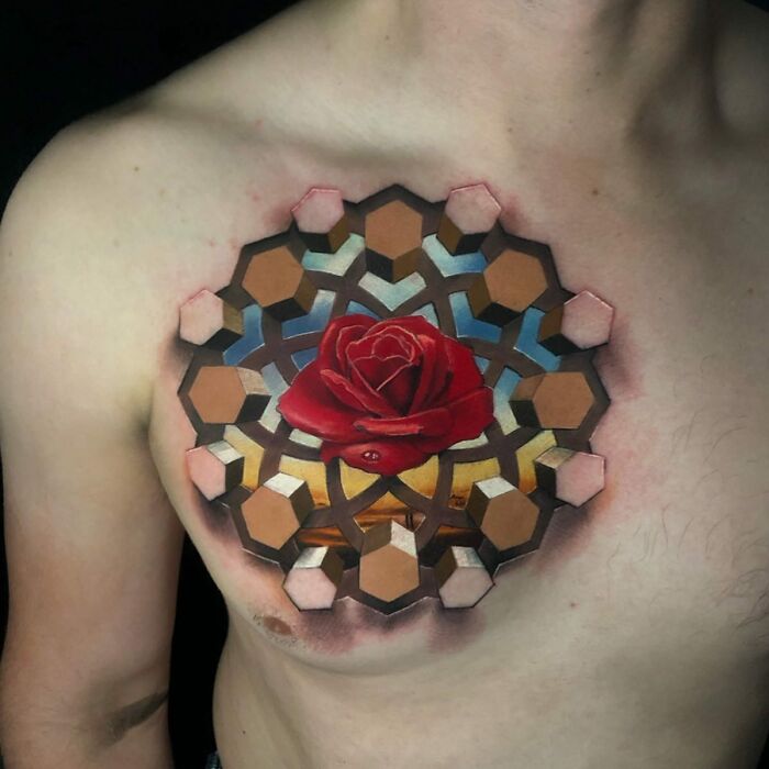
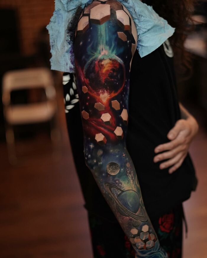
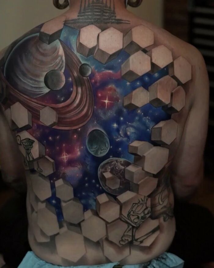
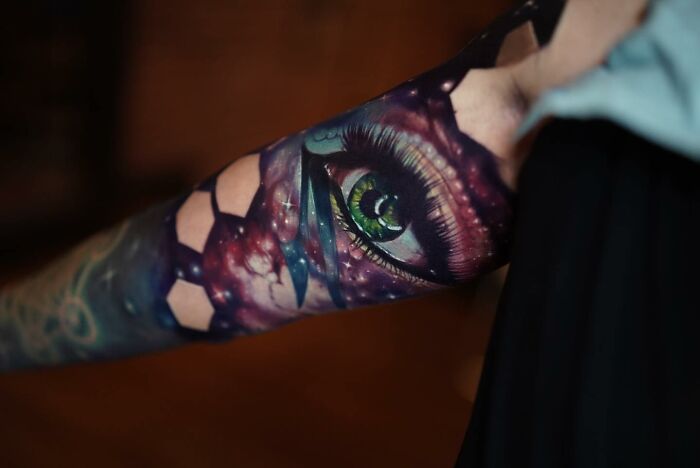
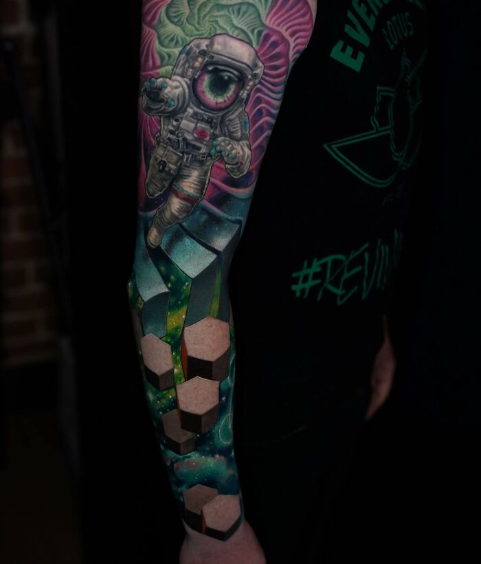
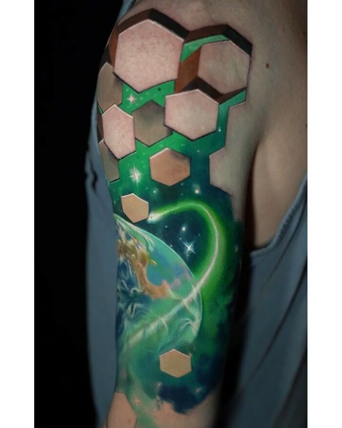
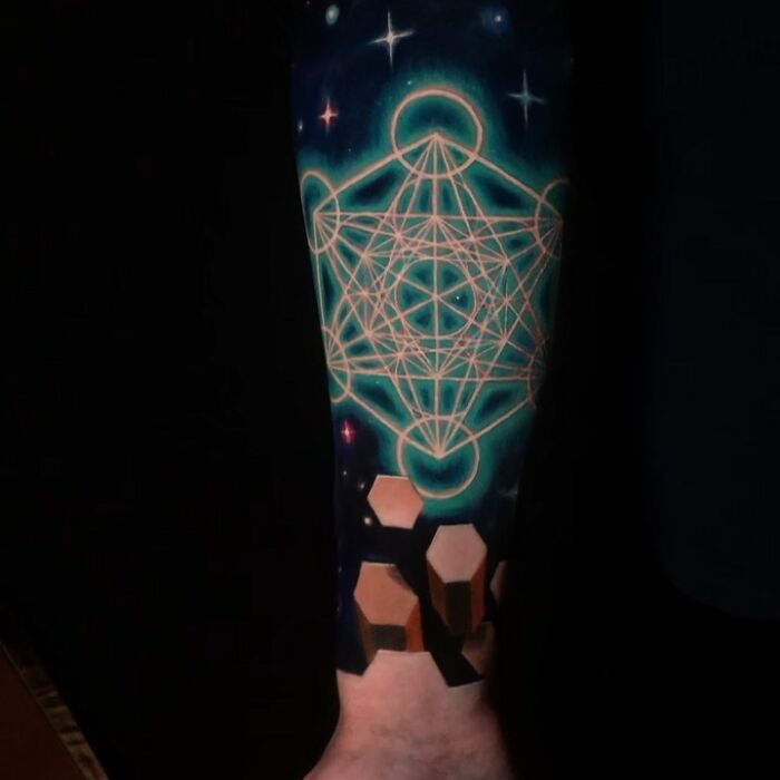
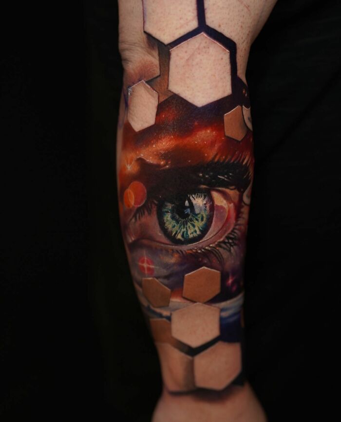
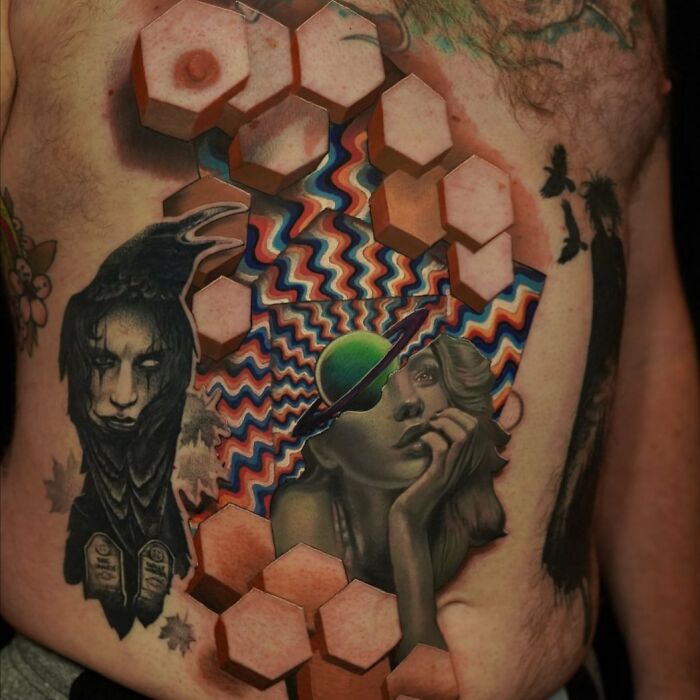
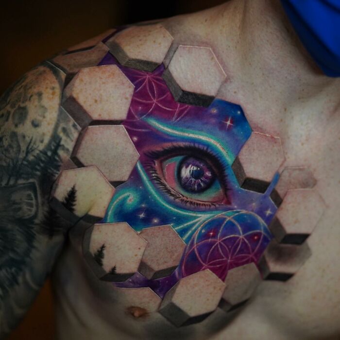
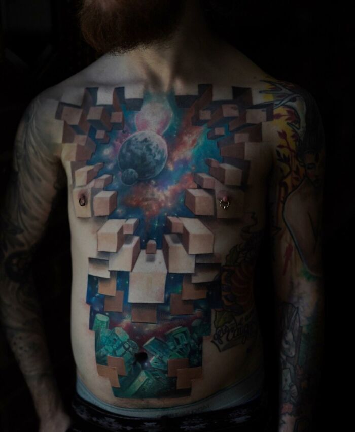
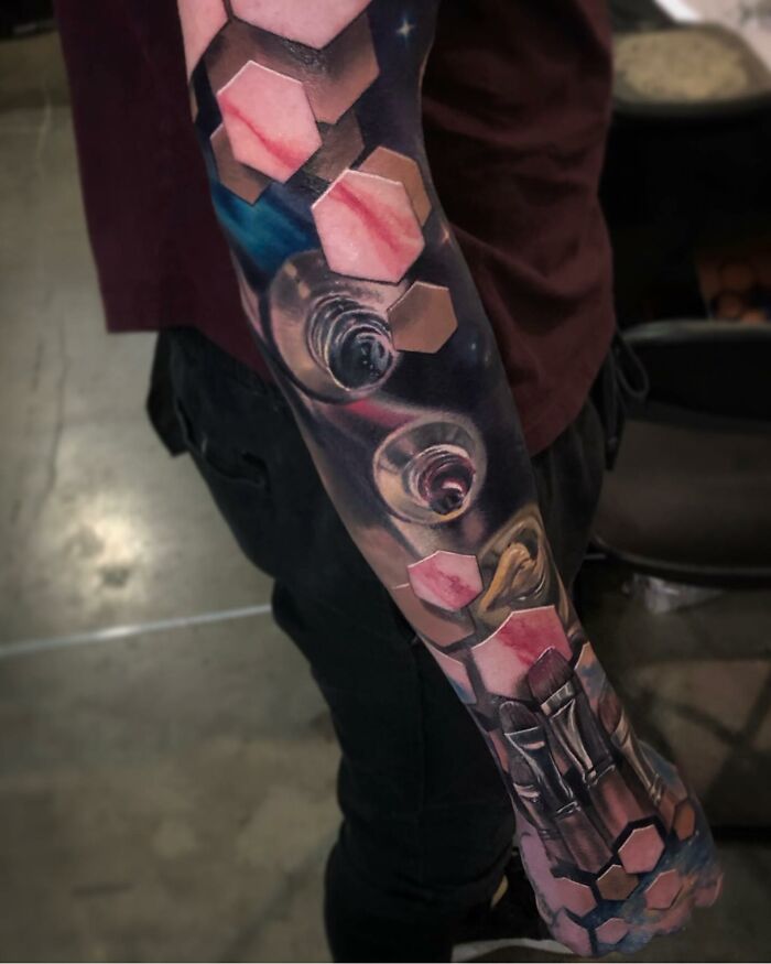
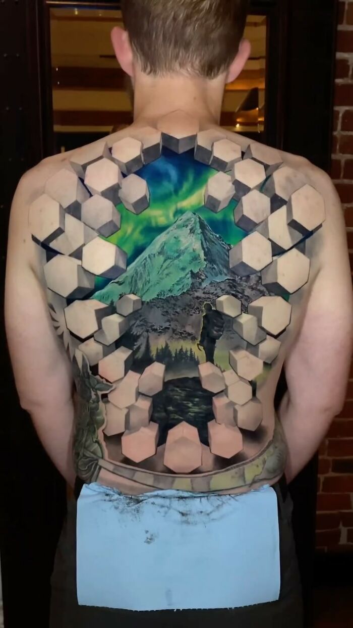
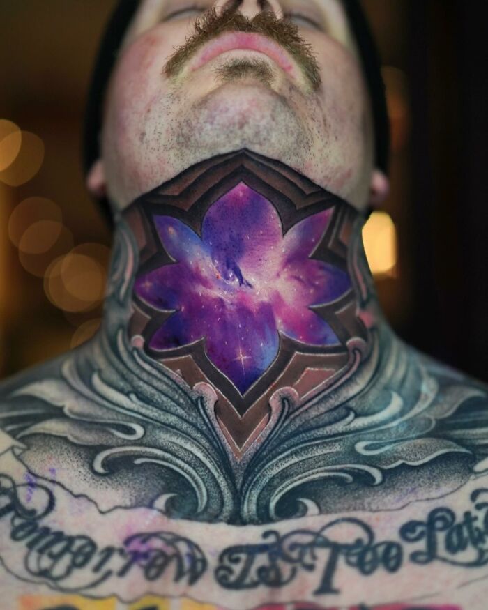
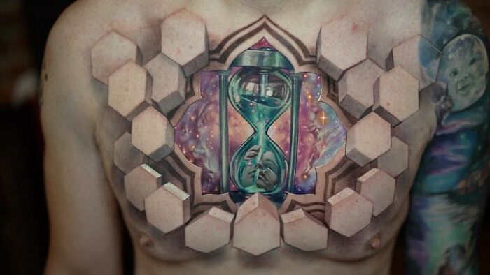
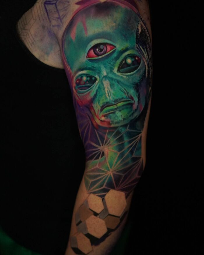
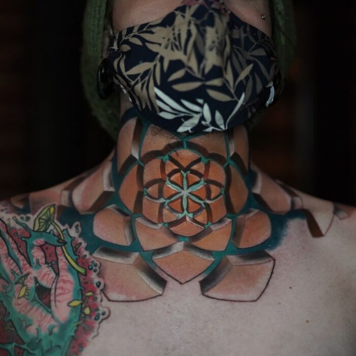
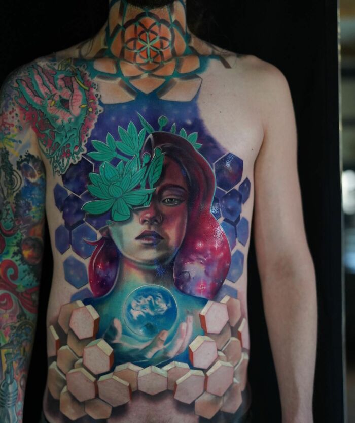
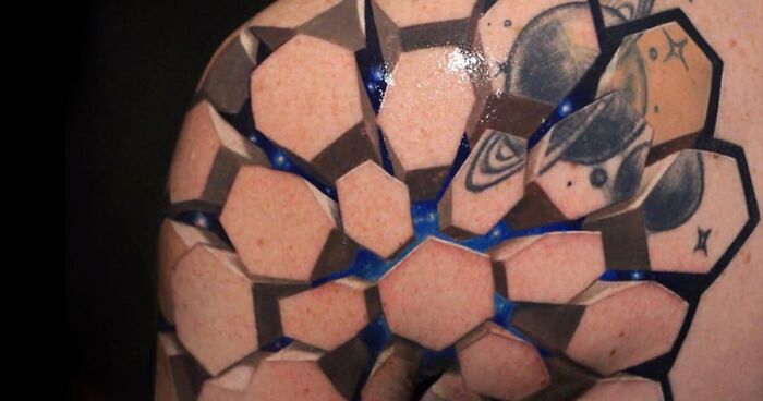
Interview With ArtistWe have an exciting treat for all tattoo enthusiasts! Jesse Rix is back on Bored Panda after some time. If you haven't seen the incredible tattoo designs by this artist, get ready to explore his latest collection of work. You can also check out our previous post where we featured his earlier 3D creations. These tattoos combine geometric shapes to reveal mesmerizing landscapes, galaxies, and other captivating images that seem to emerge from beneath the skin's surface.
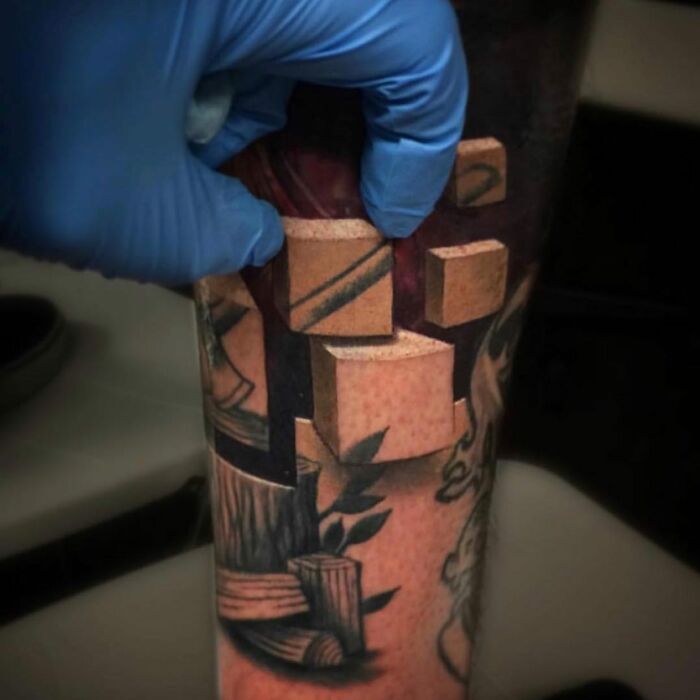
We reached out to Jesse and asked him some questions about his work. Firstly, we were eager to find out more about the inspiration behind creating unique 3D tattoos. The artist shared with us: “When I started tattooing, I mostly worked in realism. Back then most of us would just tattoo on the flat parts and add filler to fill in the gaps. I thought it would be cool to use depth and perspective to try to sculpt the body and utilize the fact that it is a moving, living canvas instead of fighting it. When I started experimenting with 3D tattoos, I was thinking of the skin as the top layer and working inward from there. Geometric shapes became a natural border to work within, and it allowed me to use classic tattoo principles with a twist that adds depth in a unique way.”
More info: Instagram | jesserix.com
This post may include affiliate links.
Jesse also told us more about sources of inspiration that have influenced his work significantly: “M.C. Escher was a big influence when I was younger and just starting out. I always loved how his work sometimes looked simple at first glance, but then as you dive deeper, you start to see that his work was very planned out.
For tattoo-specific inspiration, there were a lot of amazing artists that I loved, but I really admired Josh Duffy and Victor Portugal’s work. Their tattoos showed me how powerful negative space can be to create depth and dimension. Guy Aitchison was also someone whose work I admired. I loved how he could use different line weights and shading techniques to create flow and dimension. I wanted to find a way to incorporate that but with my own spin on it.”
The tattoo artist explained to us what his creative process looks like: “I love the idea that we are all part of the universe. We all ‘wear’ our unique sense of self; our ego on the outside, but inside we are all part of something much bigger. Usually, my themes revolve around that core concept."
Jesse continued and told us how he designs the new tattoos: “I start with a clear image of where the tattoo will be placed, considering how it will move and interact with the body. This initial step is crucial for ensuring the tattoo not only looks good but also fits perfectly on the body. From there, it's a matter of building the design from the outside in, focusing on composition and movement to create something that feels like it was always meant to be there.”
OMG, what happened to his n*****s? (Tried to beat BP to the punch by self-editing the word "nipples." Oops.)
Lastly, the tattoo artist shared with us more details about one of the most memorable projects he’s worked on: “One project that stands out is my first 3-D tattoo, which I did for a close friend. I was transitioning to a private studio to focus more on my personal art. He wanted a design that incorporated space and geometry, which I thought would work perfectly with my new direction. I loved how the tattoo came out but I wasn’t sure how other people would like it. When I put it out there for the internet to see, it got a lot of attention and really helped me shift towards this style, opening up new opportunities for my work.”
I love this composition, but that part where the background is seen through her arm is really confusing. If it were meant to be a window through to the background it would need more shading to pull off that depth, but I suppose it's meant to be a copy of that background as a pattern on top of the sleeve. If that is the case, then some shading for the sleeve creases could've helped pull off that effect. I'm just not sure what the intention is here.
Great artist. I particularly like the rose. That said, the blocks are a no for me. And yes, I realize they've become the artist's signature, but they're just too big & intrusive, taking away from his lovely drawings. I hope he finds a different way to do the 3D effect. I'd buy a print (too chicken for needles).
Great artist. I particularly like the rose. That said, the blocks are a no for me. And yes, I realize they've become the artist's signature, but they're just too big & intrusive, taking away from his lovely drawings. I hope he finds a different way to do the 3D effect. I'd buy a print (too chicken for needles).

 Dark Mode

 No fees, cancel anytime