30 Times Designers Got Rightfully Shamed For Creating Things That Look Dirty By Default
For reasons known only to them, some designers make products look dirty. And that's usually not what you want.
Whether we're talking about jeans covered in brown stains or a floor brush that looks to be constantly covered in dust, these things can really play tricks on you.
But at least you can pass it on—people who have witnessed such exhibits in the wild are sharing their photos on the Internet, trying to see if they'll fool others as well.
Bored Panda collected a list of such images just for your enjoyment, so sit back, relax, and prepare to repeat "Why would someone create this?" with a judgemental chuckle for the next few minutes.
This post may include affiliate links.
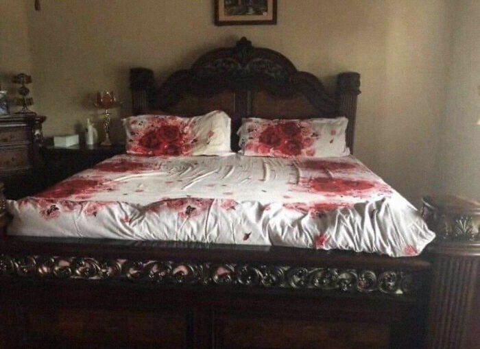
This Rose Themed Bed Spread
It looks like there is a dead body wrapped in a sheet at the end of the bed also...
Most of these images come from one subreddit, a place dedicated entirely to trashy design. In an earlier Bored Panda interview, the moderators of the online community said that most of its 2.4 million members probably go there for entertainment.
"However, it is common to have a meaningful discussion here on why or why not something is crappy design," they pointed out that some of the members actively participate in in-depth chats.
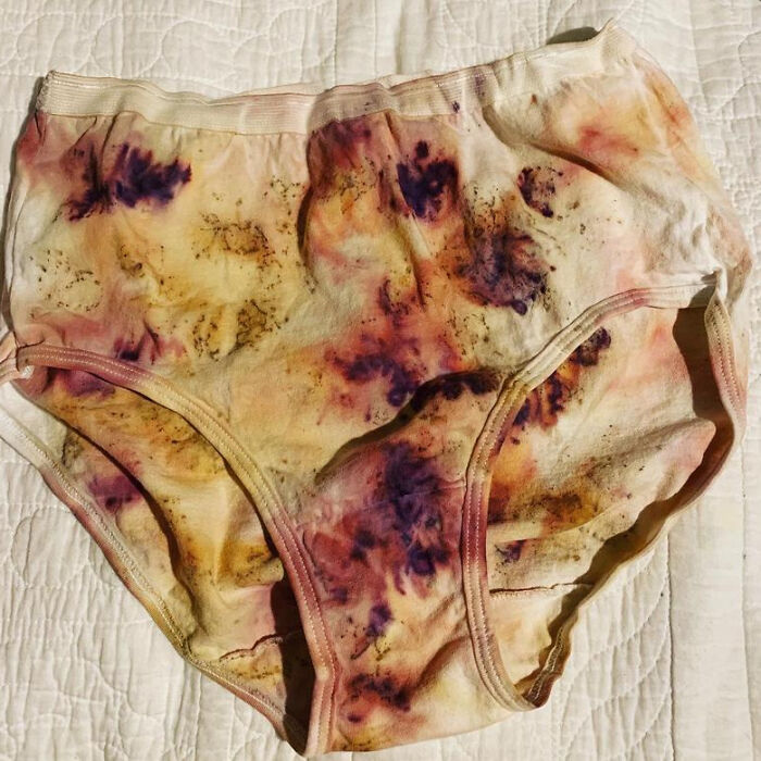
Plant Dyed Underwear On Etsy
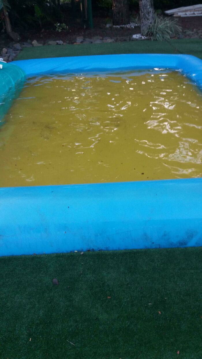
According to researcher and author Don Norman, there are principles of good design that help people to evaluate whether a product is a boon or a bust. For instance, Norman believes all good designs are innovative and push the boundaries of what an object means to us. But it doesn't mean that an inflatable pool with a yellow mat at the bottom, making it look like it is filled with urine, is to be celebrated.
Well-designed objects also have to be useful, beautiful to look at, easy to understand, and uncluttered in how they look.
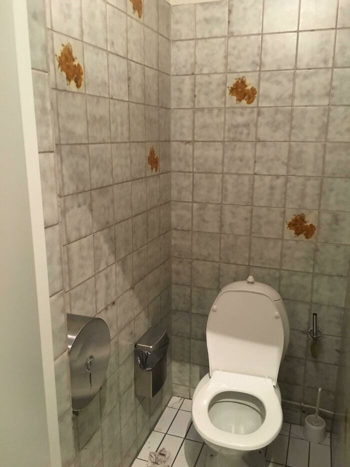
These Restroom Tiles
5 Star Hotel Has These "Clean" Looking Coffee Cups
The Interaction Design Foundation explains that bad designs are overloaded with information and force the user to do more work than is necessary. Akshayta Rao writes that we all intuitively notice badly designed items but find it difficult to explain why good designs are, well, good. According to her, a well-known example of bad design would be USB cables. She’s right because we’ve all tried plugging them in the wrong way more than once. Some of us maybe even hundreds of times.
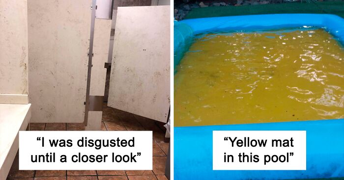
This Small Pool Has A Yellow Plastic Mat At The Bottom, Making It Look Like It Is Filled With Urine
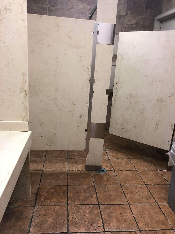
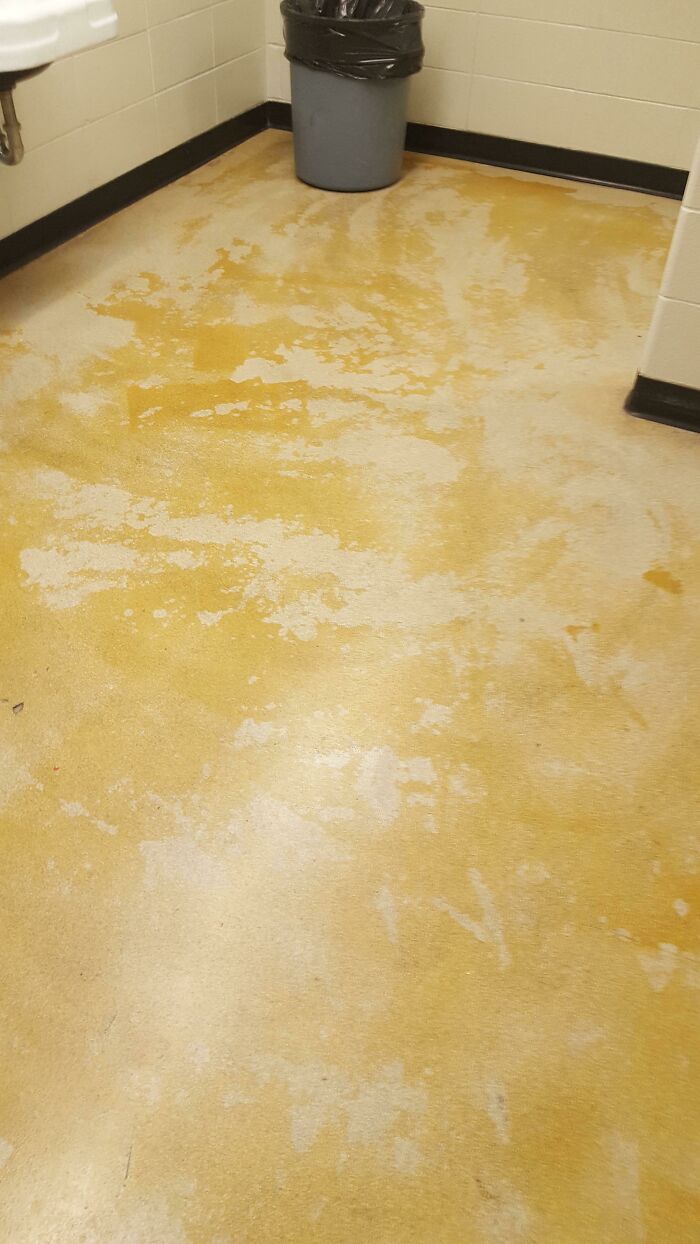
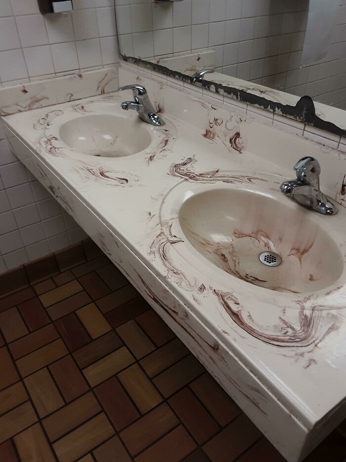
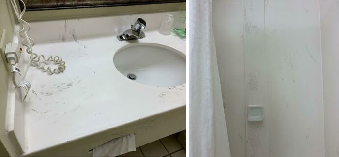
Upon Walking In This Bathroom At The Supermarket I Was Initially Disgusted At Filth And Lack Of Cleanliness Until A Closer Look Revealed It Was Designed This Way
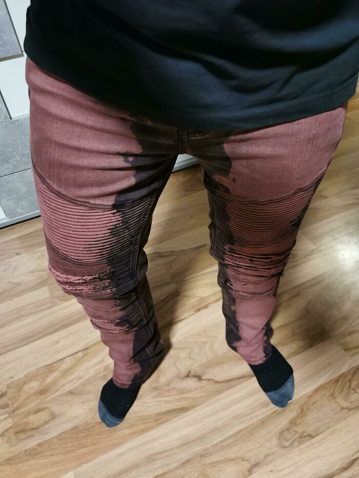
It Looks Like You Peed Your Pants
For one of our bad design lists, Bored Panda spoke about the principles of good design, the line between quality and bad design, as well as human beings' intuition to automatically feel what's designed well with Tim Antoniuk, an Associate Professor of Design Studies at the University of Alberta.
"The speed of change that we encounter today in our lives in the digital environment that we live in, I believe that some great design is not necessarily timeless. One example is seen in Interface Design, Ux Design, and in-service design. As new layers get added into our lives, things naturally have an evolutionary cycle. This is different from furniture which naturally can be more ubiquitous and designed to fit the human body. There is a great deal of fuzziness in this discussion but I do believe that the essence of this idea is true," Antoniuk explained.
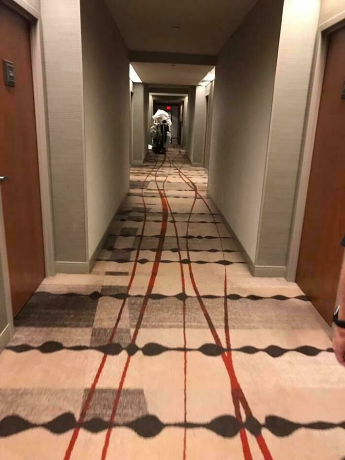
It Looks Like The Hotel Cart Ran Someone Over And Is Tracking Their Blood Through The Halls
*squeaky* *squeak* "Of course sir, those will be cleaned by our expert staff, when you return this afternoon everything will be fine again", said Mary the housemaid as she rolled on by with her cart. She seemed like such a nice lady. After his return from shopping, Jack inquired at the front desk if the cleaning was finished. Only to find out the whole floor is inaccessible because of the police investigation going on. The elderly maid was found dead and had been for at least a week...
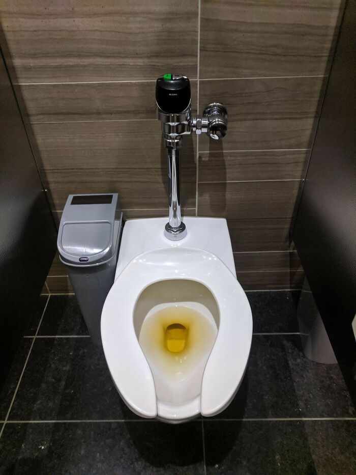
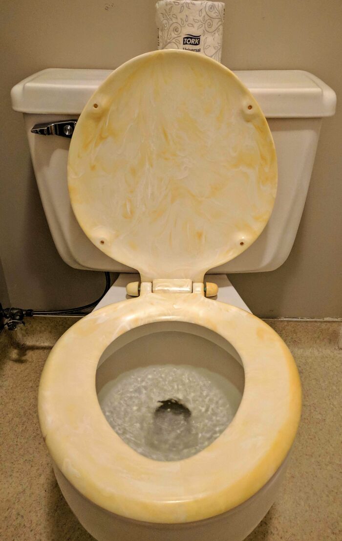
My Office's Cleaners Use A Yellow Product To Sanitize The Toilets. Makes It Look Like Someone Forgot To Flush
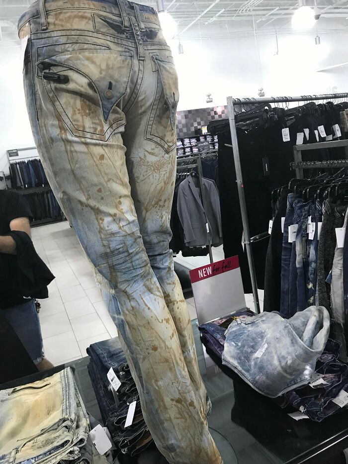
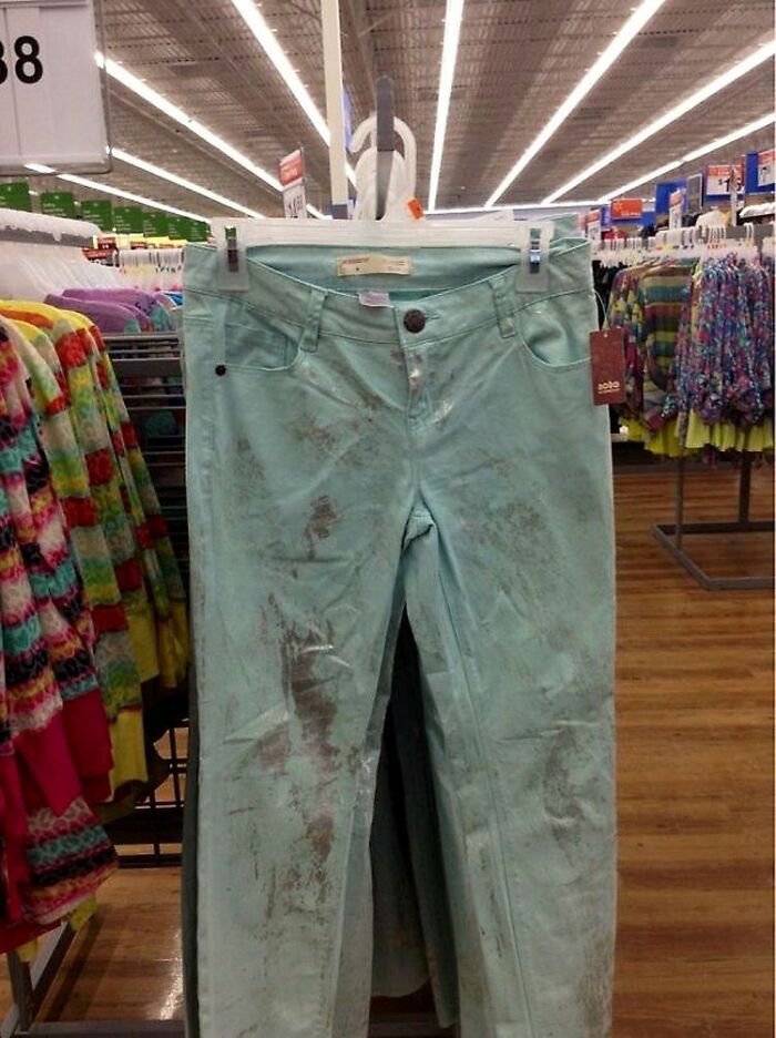
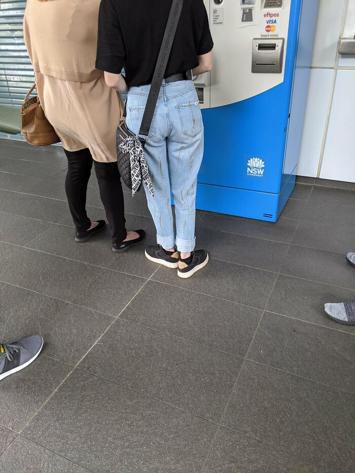
These "Designer Jeans" Look Like They're Covered In Poop Stains
In Antoniuk's opinion, there is such a thing as good and bad product, furniture, and interior design. But degrees of preference create a gray area where a clear line between quality and a lack thereof should exist. "The gray area comes in when people start to talk about taste and about degrees of aesthetic. I may love the design of Bauhaus furniture, for example, while somebody may feel that it is too cold and void of personality. Not unlike great art, I believe that much of what came from this era is ‘great design,’ in part because it represents an era and a philosophy. When we start to mix in discussions of taste and preference, that is where the gray areas of good and bad design get blurred."
Yellow Marble... Really?
This Bathroom Floor
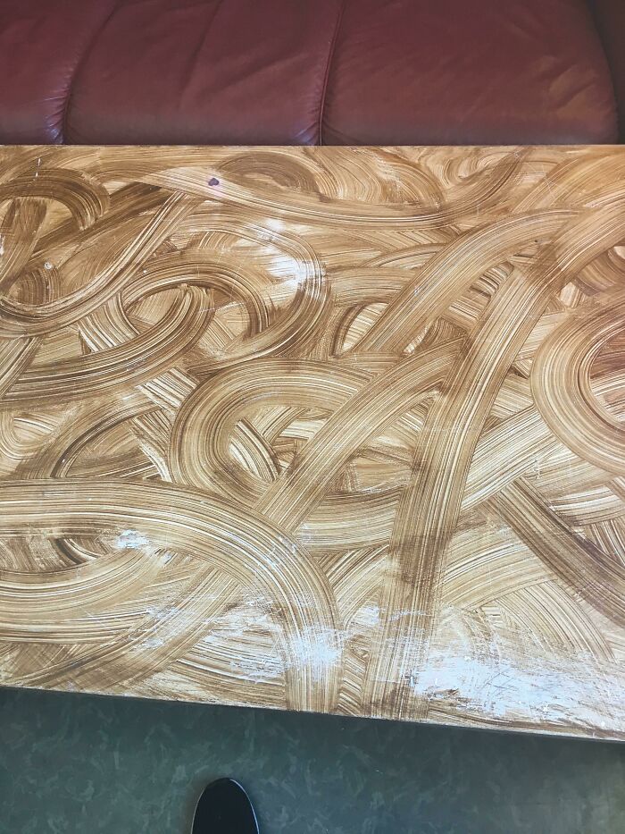
Looks Like Someone Smeared Poop On This Table
Antoniuk also believes that people can intuitively "feel" and sense good design. "Quite often, this relates to ergonomics and the usability or functionality of the products and services and systems. Having said that, I think far too many people expect poor design that doesn’t really work well," he told Bored Panda.
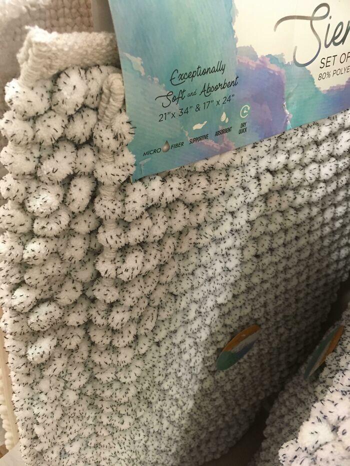
This Rug That Looks Like It’s Covered In Ants/Fleas
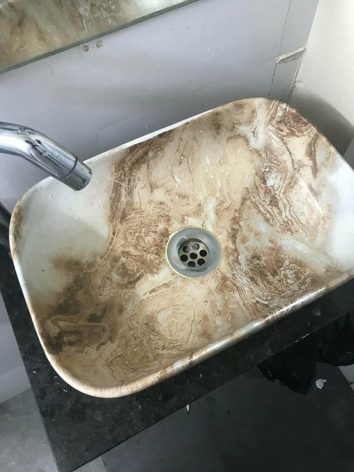
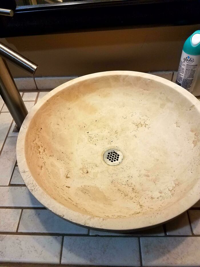
This Is Apparently A Clean Wash Basin
Look What I Found In A Bathroom
What's more, he believes that good and bad design are skills that can be learned, especially when we start diving deep into the realm of aesthetics. "For me, great design is what Dieter [Rams] talks about—it is also intuitive, it is deeply sympathetic and empathetic to the user at all levels, and at some level, it is emotional. It is a catalyst for giving us feelings."
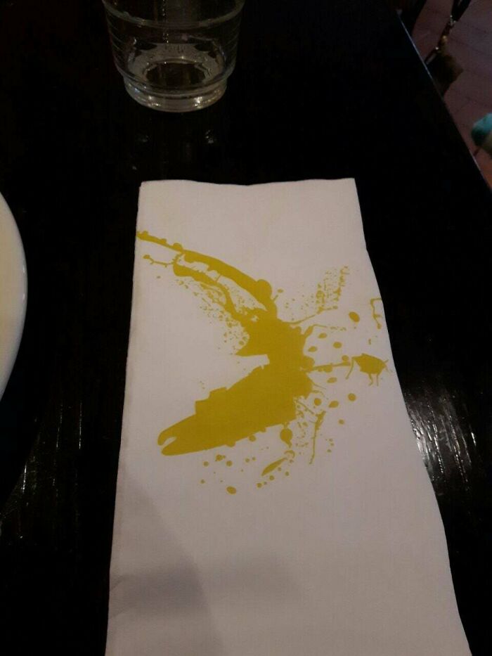
This (Clean) Napkin
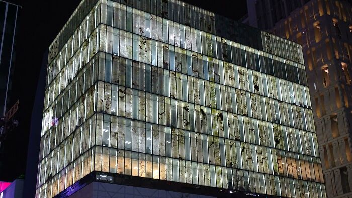
This Building I Found In Osaka With Marble Patterned Windows, Looks Like Someone Smeared Liquid Faeces On Them
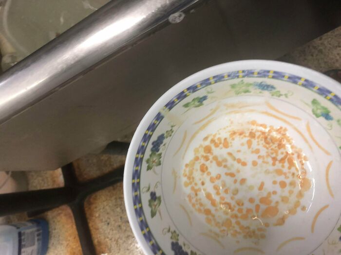
I Tried To Clean This Only To Figure Out Its The Design
Suzanne Labarre of Co.Design has a similar take in that she also believes that Rams’ principles could be updated. While Labarre has the IT and tech industry in mind, the principles for good design are pretty much universal, no matter if you’re designing an app, setting up a building’s interior, or creating a brand new product.
In Labarre’s opinion, good design has to be transparent, easy to understand, and done in a way that empowers its users, instead of overwhelming them. Furthermore, Labarre puts a lot of emphasis on each designer’s responsibility for what they create: they have to be aware of the possible consequences their creations might have, both on the consumers and on society.
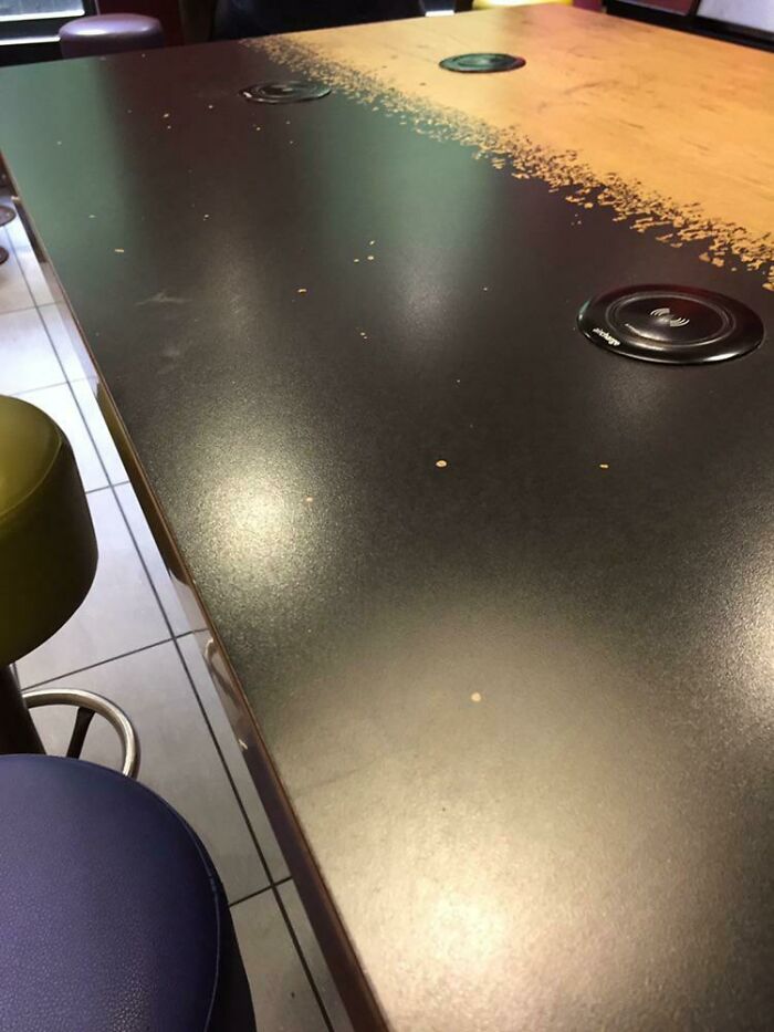
Clean Table Looks Like It’s Covered In Crumbs
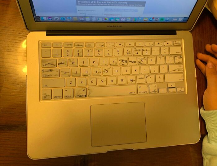
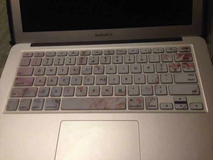
This Keyboard Cover Is Supposed To Look Like Marble But It Just Looks Dirty
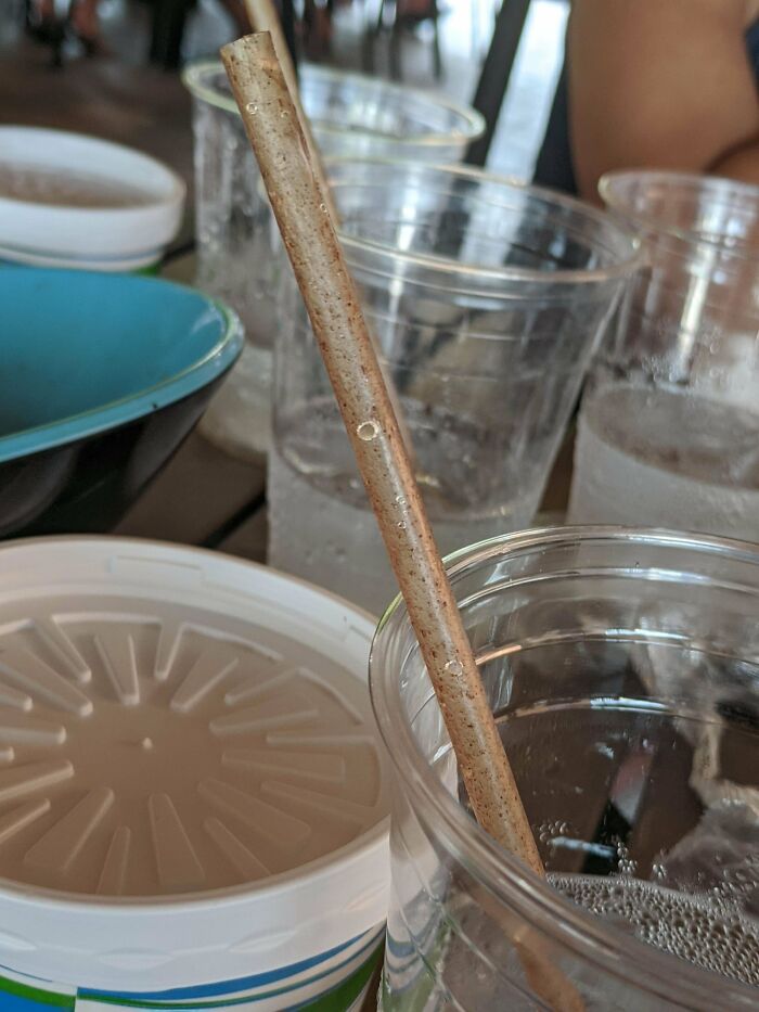
This Weird Straw That Looks Like It's Been Collecting Dirt For Three Months
How To Know When It's Time To Wash Them?
For Labarre, design is inherently political. Product design (whether physical or digital) has the ability to change how power is distributed in society. This feeds back into the point about how we should all be aware of how our designs can change the world.
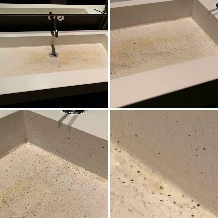
This Is A Sink At A High-Quality, Fancy French Restaurant In San Fransisco. No, That Is Not Dirt, But The *intentional* Material Of The Inside Of The Sink. Also, Those Are Not Stains (Unless The Material Soaks Up Stains, Either Way, Bad Sink Design)
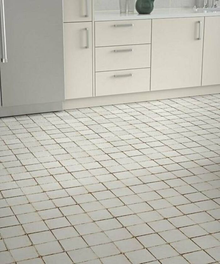
These Tiles That Are Designed Pre-Worn And Dirty
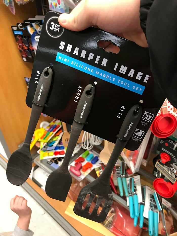
Silicone Kitchen Tools With A Marble Design That Makes Them Look Always Dirty
Yet another example that marble should remain marble and should not pretend to be marble on non marble materials. I guess.
This Sink Is Completely Clean
AAAAAH it looks like there is sand eveywheree that would drive me insane by just looking at it
This Intentional Design On This Hoodie
Technician : "There's been a problem, some bleach stained a part of the production today" Marketing : "Let's call it a limited edition and sell it at a higher price !"
Poop Smear Jeans!
The Style Is Supposed To Be In "Marble", But Instead They Just Look Dirty
This New Hotel Carpet That Looks Like It’s Worn Out Beyond Threadbare
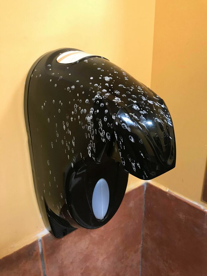
These Painted “Soap Bubbles” Just Make It Look Like The Soap Dispenser Is Dirty
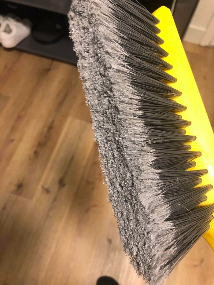
This Brand New Duster Has A Design That Makes It Look Extremely Dirty All The Time
I guess the brushes are looking like that because they are splitted to soften them so they better pick the dirt up.
This Is A Keyboard Cover. There Is No Dirt Or Food On It
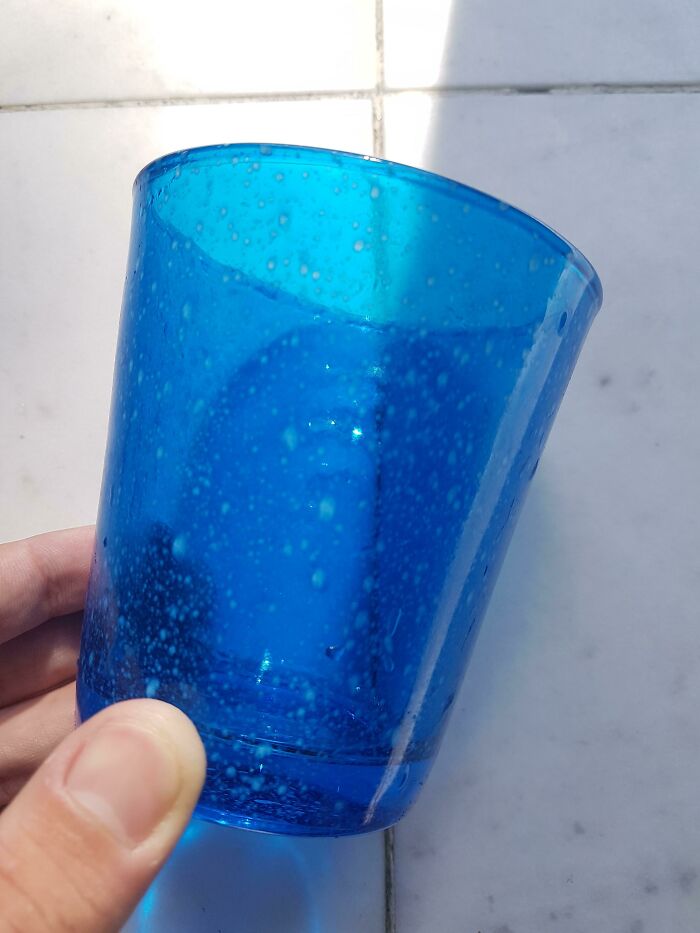
These Glasses Are New And Clean...
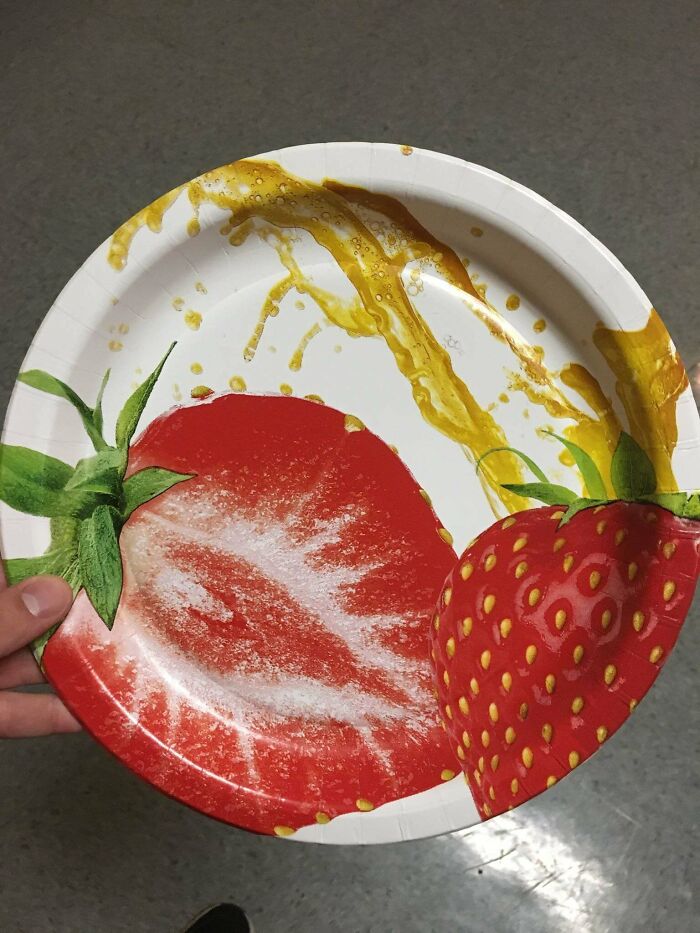
This Paper Plate Is Clean
How does strawberries and strange yellow liquid look good together? Who looked at a plain paper plate and thought, “you know, this needs some strawberries and splashed urine on it.”
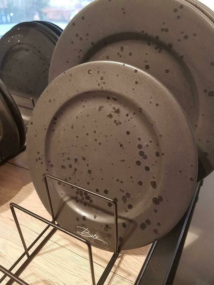
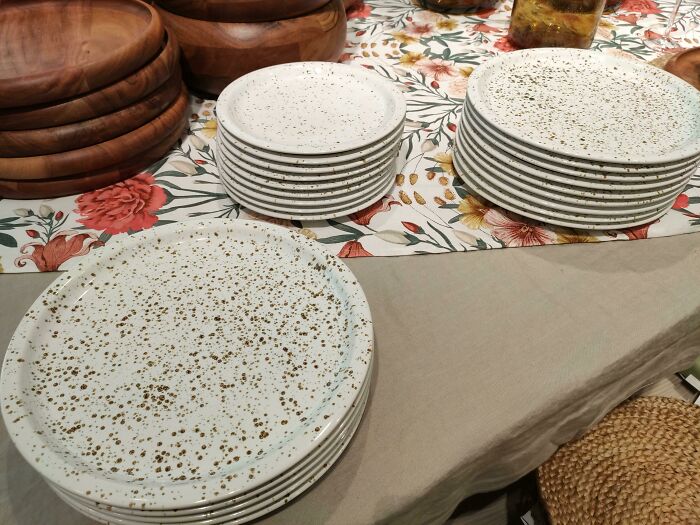
These Plates With A Glossy Splatter Effect That Will Always Look Wet/Dirty...
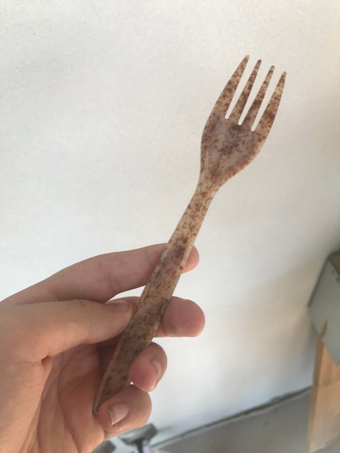
That Bio Fork Looks Like It's Super Dirty
It's Not Dirty, That Is The Actual Design...
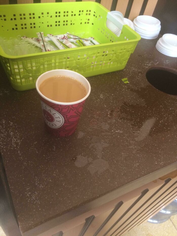
This Table In The Coffee Shop That Has Little Dots , Looks Like Sugar No Matter How Clean It Is
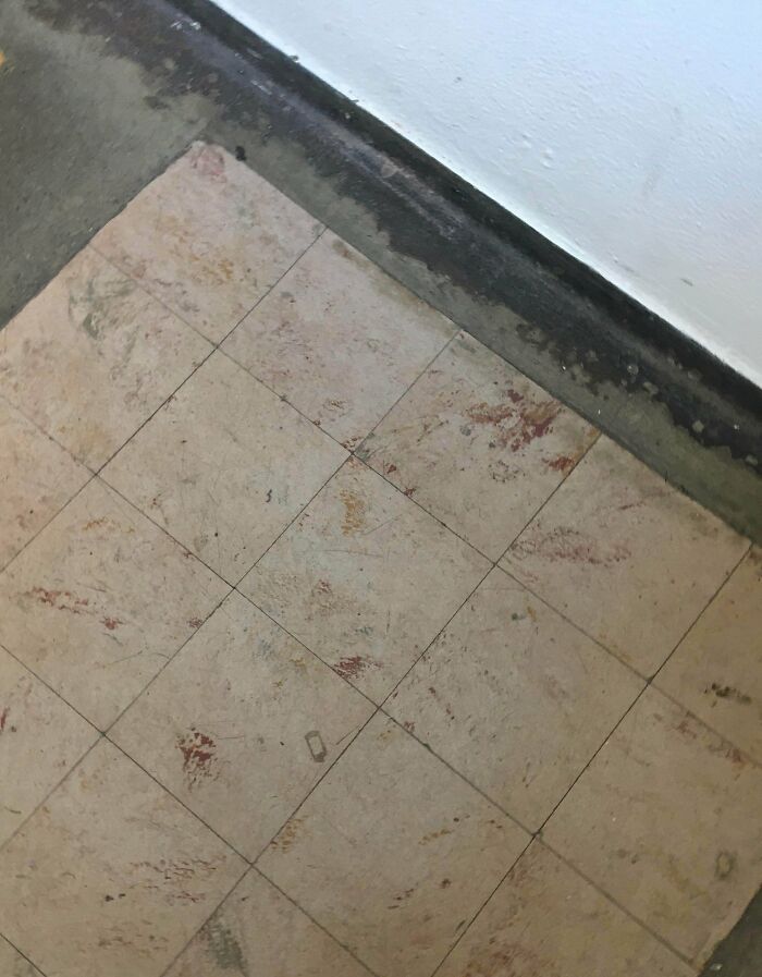
My Daughter’s School Staircase Tiles Look Like Covered With Blood And Dirt
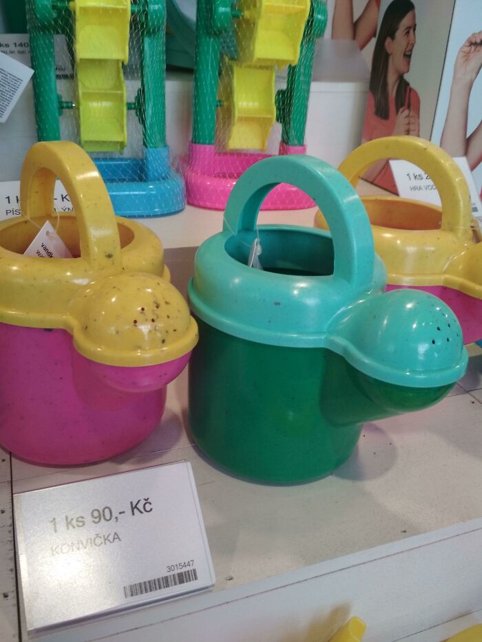
This Just Looks Like Its Covered In Dirt
It... they... they aren't just covered in dirt?! I feel like this one is ESPECIALLY bad.
My Tennis Shirt Looks Like It Is Drenched In Sweat Even When It's Clean
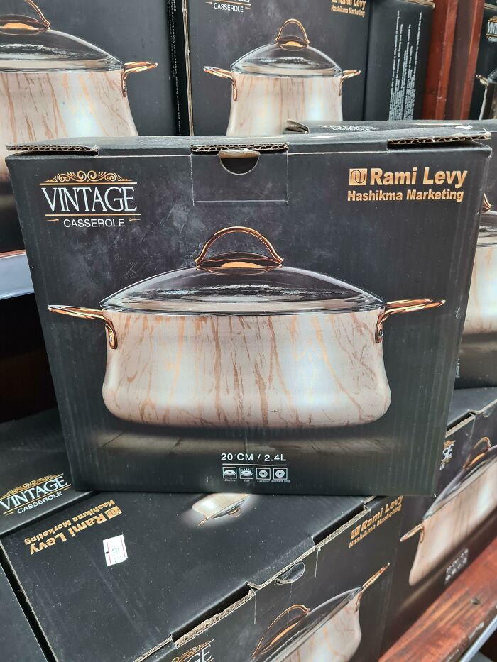
Why Would I Buy A Dirty Cooking Pot?
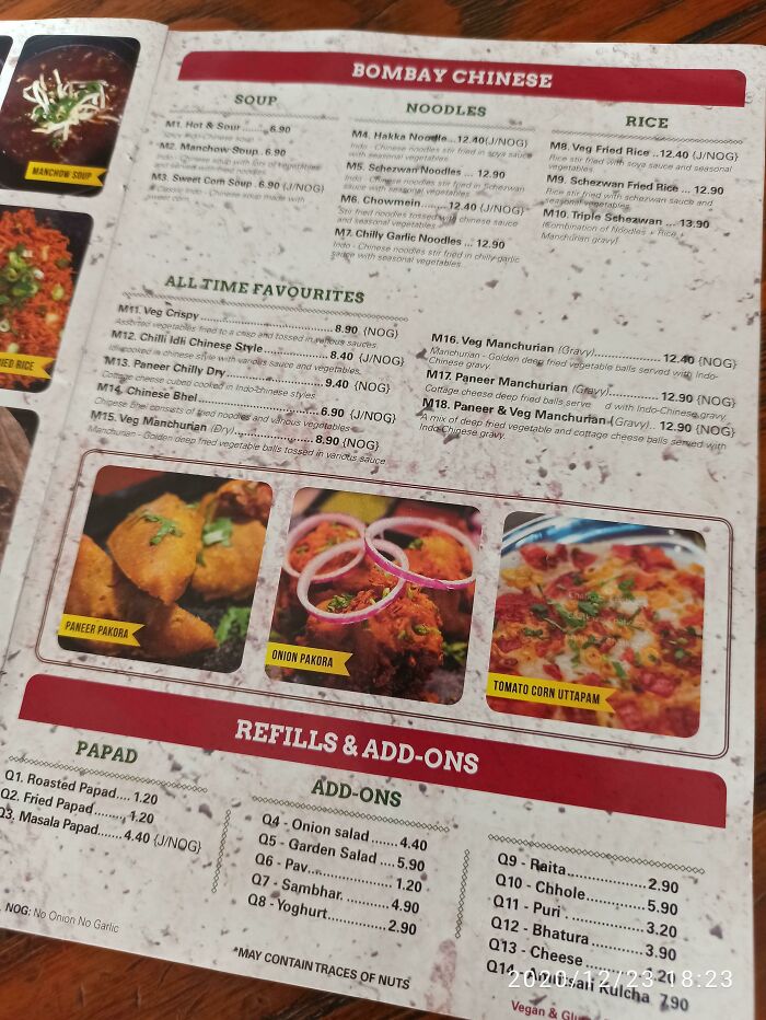
The Background On The Menu Looks Like Its Covered In Dirt
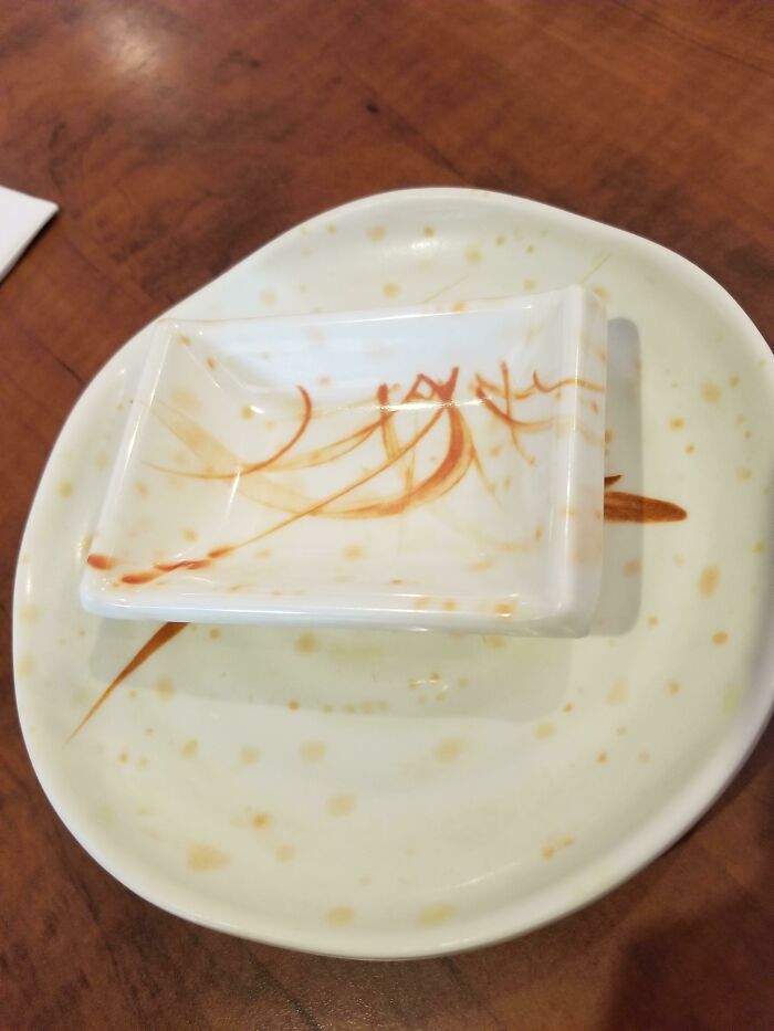
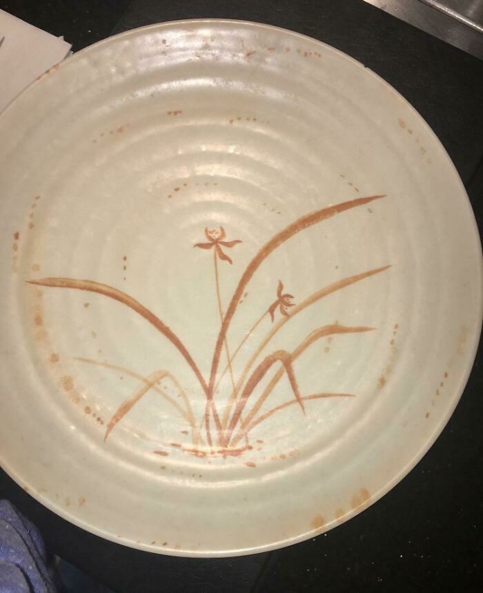
Plates At Japanese Restaurant Look Dirty When They're Clean
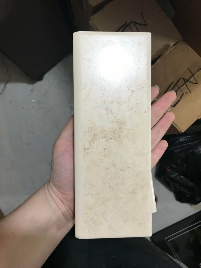
This Piece Of Tile Is 100% Clean And Brand New... The Design Makes It Look Filthy
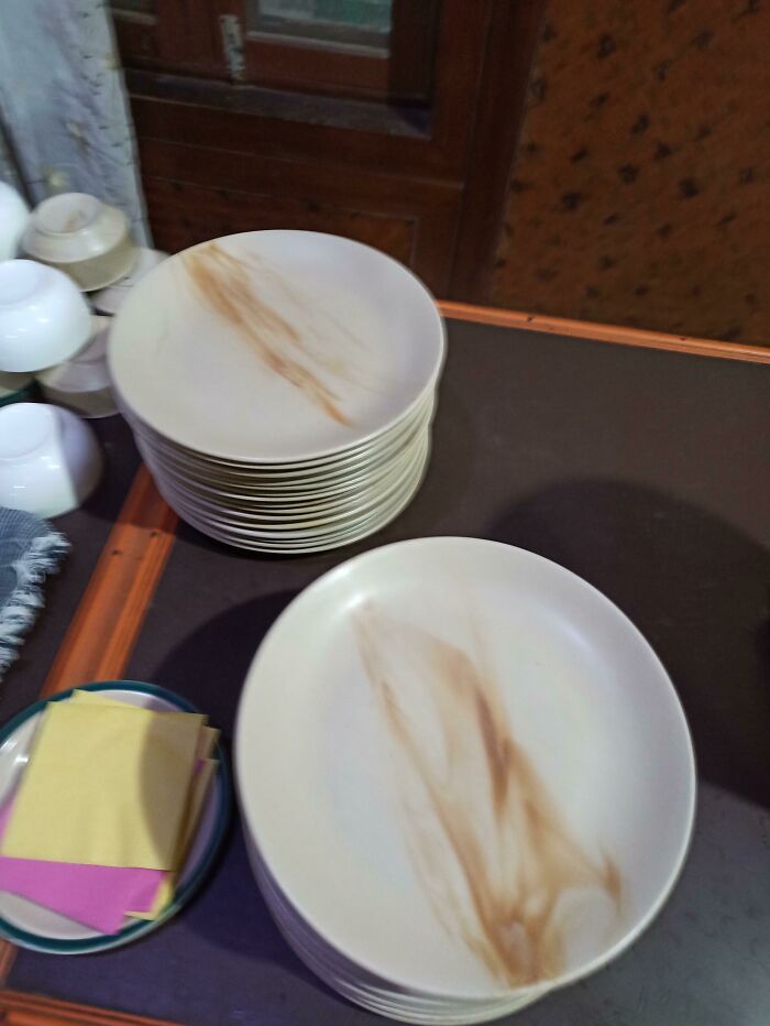
These Plates That Look Like Someone Smeared Poop On Them
This Sink Is Actually Very Clean - The Stone Pattern Initially Made Me Think Otherwise
Looks Like Your Plate Will Always Be Dirty... Found In The Wild At H&m
I Thought This Was Dirt When I Walked In The Bathroom
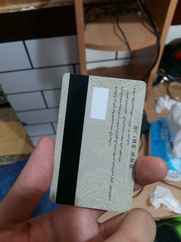
My Debit Card Looks Just Like Dirt On Both Sides. Guss What Color Is Super Common In Desert Regions?
This Is A Clean Plate
this probably gonna get disliked but some of these aren't that bad.
I kind of agree. I didn't mind most of the plates and cups, it was the 'bathroom' ones I couldn't deal with.
Load More Replies...The main theme here for me is that something that is intended to convey a perception of being clean and hygienic always need to be plain white. If you do need to put in some colour, don’t make it look like poo.
It kinda makes me think that people who purchase these know that they weren't going to be able to keep the items clean, so they make them look purposefully dirty so it'll be overlooked. Even if that's not the case, it's what I would assume if I saw any of these "in the wild".
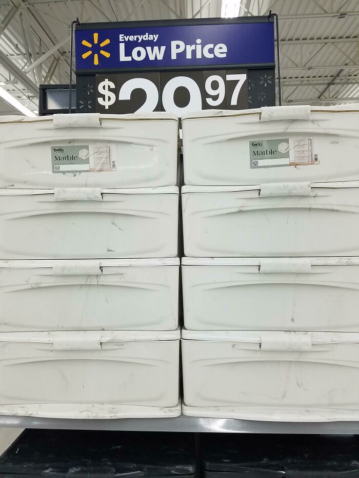
Load More Replies...The bottom line for a lot of these is "marble only looks good when it's actually marble".

 Dark Mode

 No fees, cancel anytime


