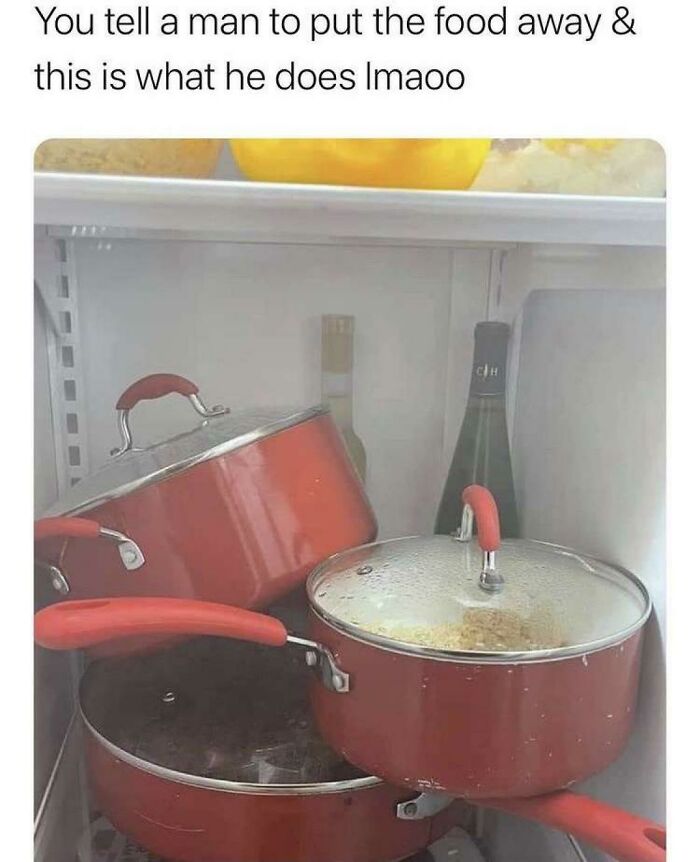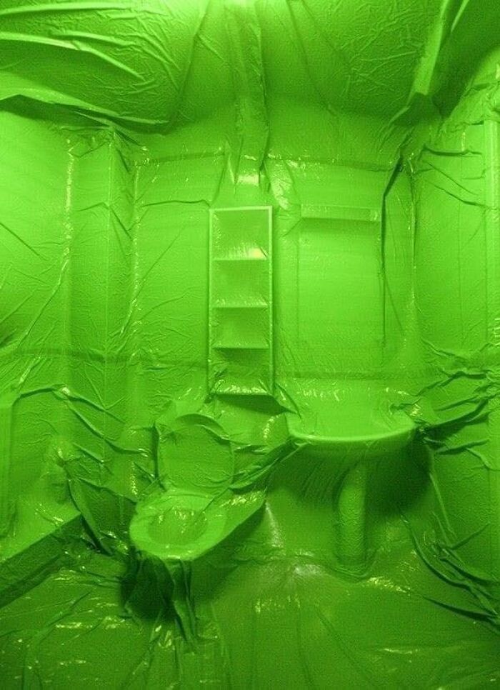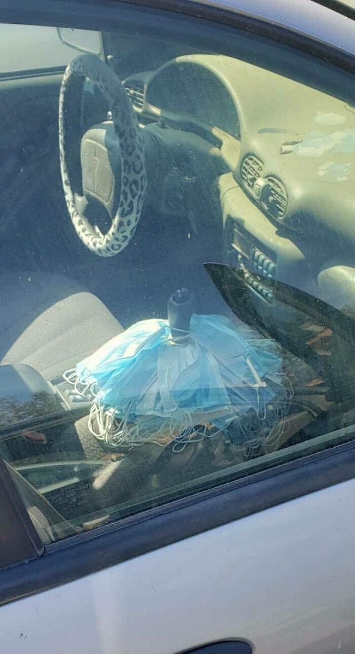
This Facebook Group Is Dedicated To Unaesthetic Images, Here Are 35 Of The Worst Ones
We’re all very mindful of aesthetics, whether we’re consciously aware of it or not. On an instinctive level, we deeply enjoy looking at beautiful things. It’s not only that, though. We want that which is beautiful. Lance Hosey writes in The New York Times: “Brain scan studies reveal that the sight of an attractive product can trigger the part of the motor cerebellum that governs hand movement. Instinctively, we reach out for attractive things; beauty literally moves us.”
However, there is a parallel narrative running alongside this. To put it bluntly—we’re also fascinated by that which is ugly and bizarre. Truly horrendous art, horrible designs, and unaesthetic projects can capture our imagination like nothing else. Whether these things are so unaesthetic they loop back around and become aesthetic becomes a moot question when you’re stuck there, looking deep into the abyss, wondering whether to run away or share the image with your friends.
Luckily, we’re not the only ones who have a fascination with the (un)aesthetic side of the internet. The ‘Things that are not aesthetic’ Facebook page with nearly 3.5 million followers is a celebration of everything that makes us uncomfortable (yet keeps our eyes glued to the screen). Check out some of the most intriguing, weird, and unaesthetic posts featured on the online group, which is part of the Dank Channel project, upvote the ones that you particularly enjoyed hating, and go join them if it’s something that’s right up your alley.
More info: Facebook | DankChannel.com
This post may include affiliate links.
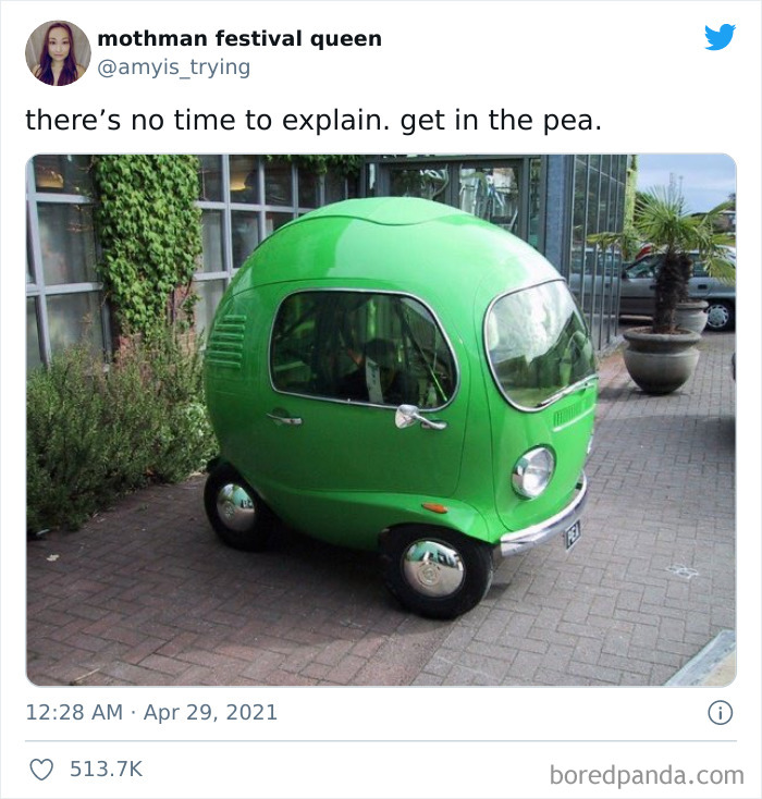
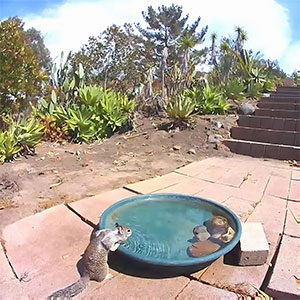
There's No Time To Explain. Get In The Pea
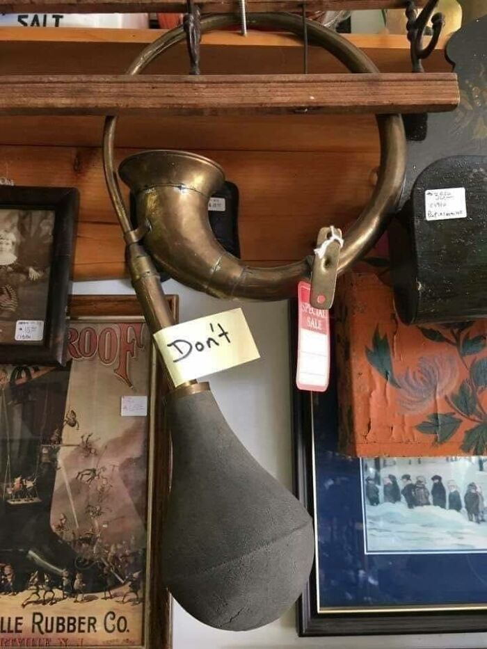
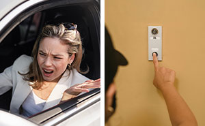
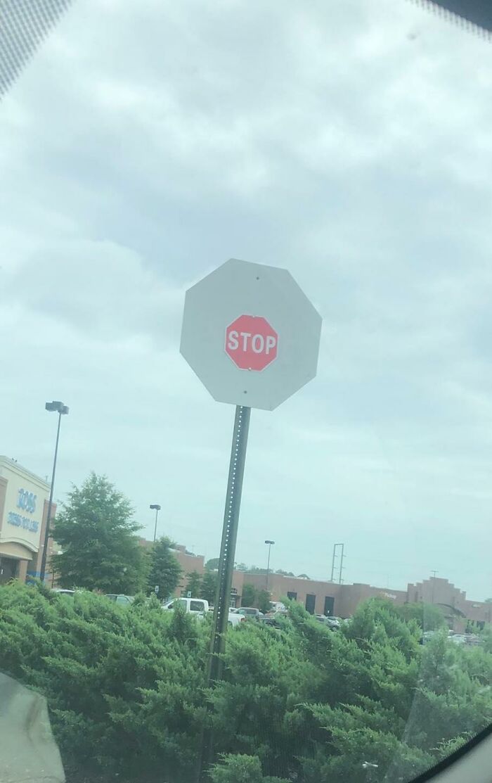
Don't
I. I. I have to leave i would honk the hell out of that. The don't is so tempting
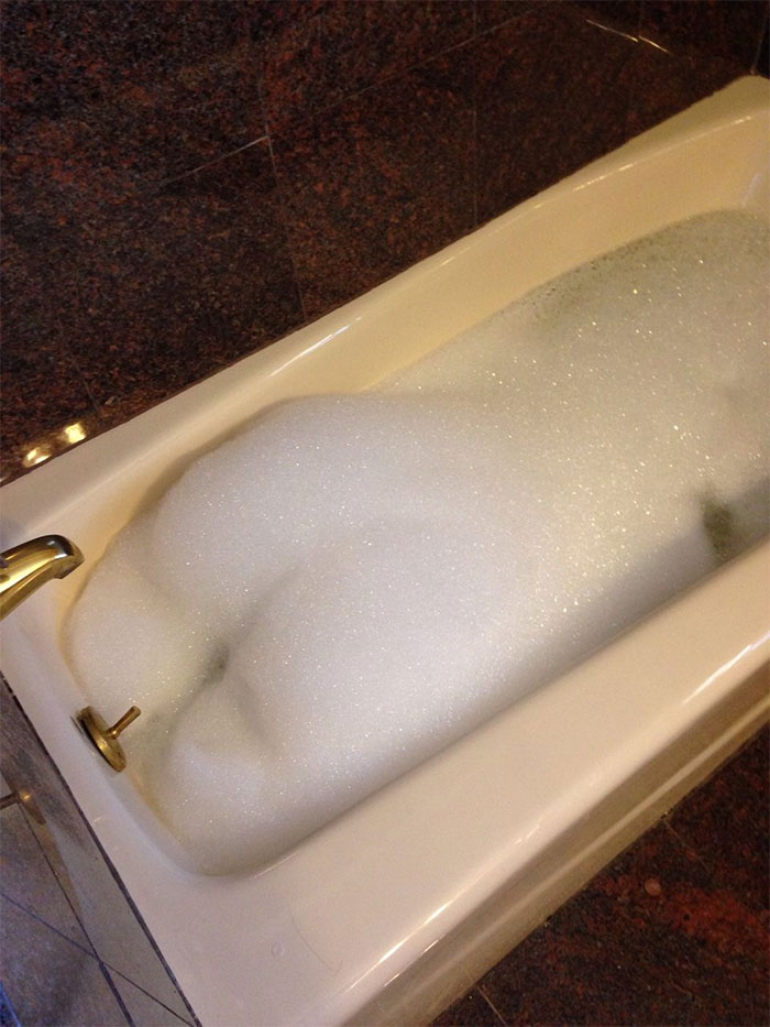
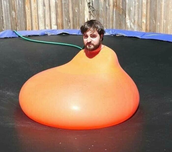
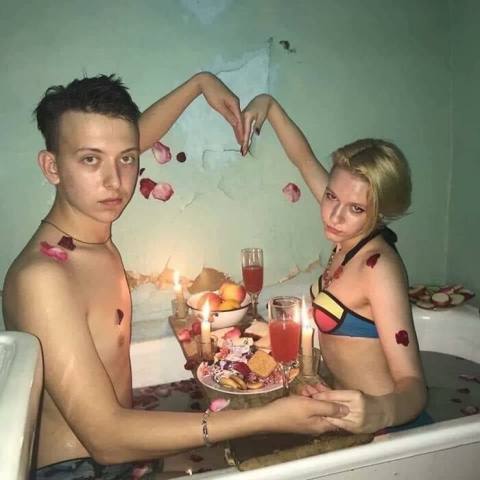
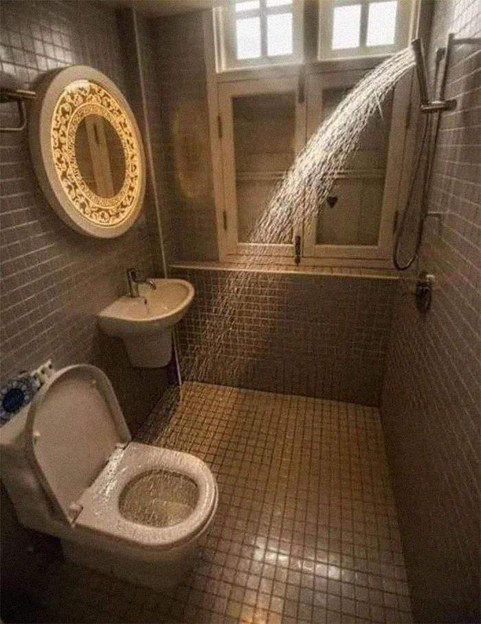
My Bubble Bath Better Calm Tf Down
The Dank Channel project was created by Levi Cameron Grenko back in 2013. The social media manager has very ambitious goals, including to "make a difference on the world as a whole" through memes.
This isn’t the first time that Bored Panda has written about crimes against good design and aesthetics. Ugliness and weirdness are both pretty popular, it seems. And they’ve got some things in common.
Recently, I spoke with Swiss design aficionados Jonas Nyffenegger and Sébastien Mathys about their ‘Ugly Design’ project over on Instagram. Ugliness, especially how it clashes with picture-perfect social media feeds, is a fascination of theirs.
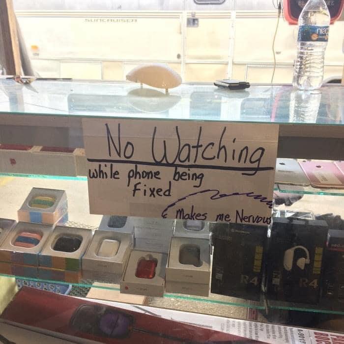
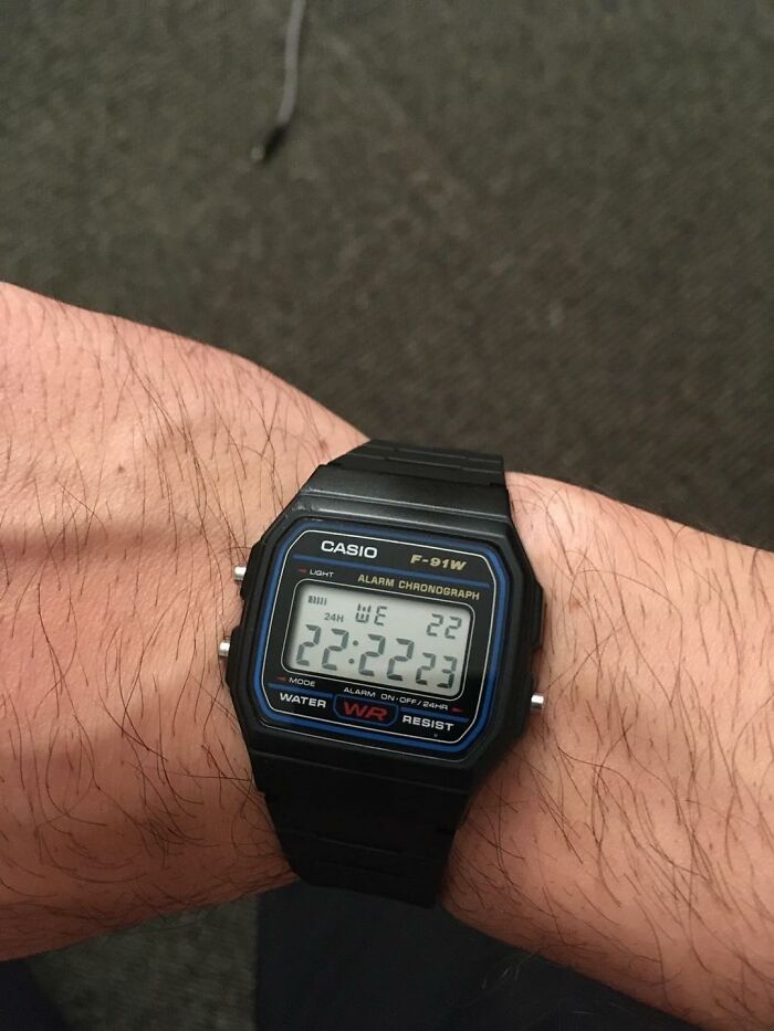
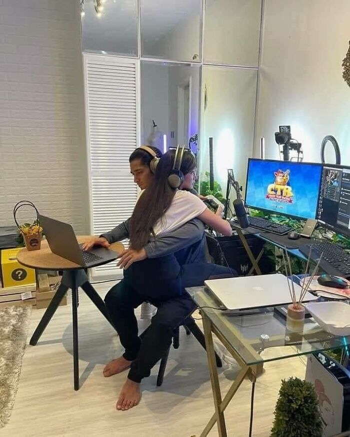
I Get It
I get that. I cant do my best work while people watch me, I fumble and panic and then fumble again coz I'm panicking etc
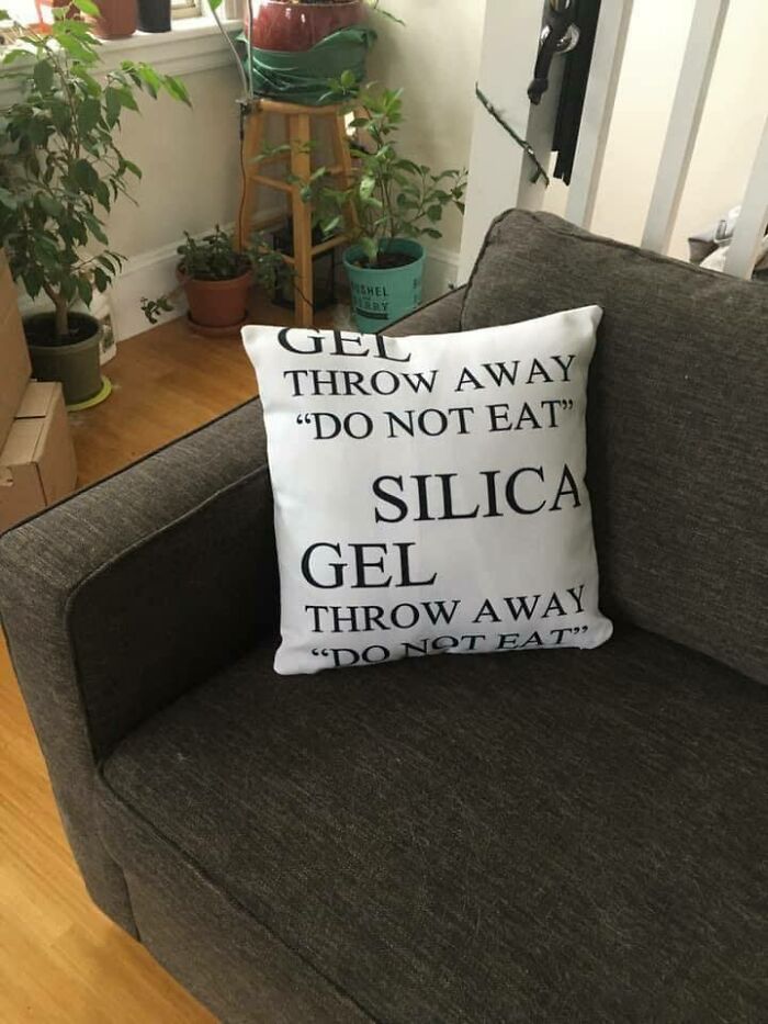
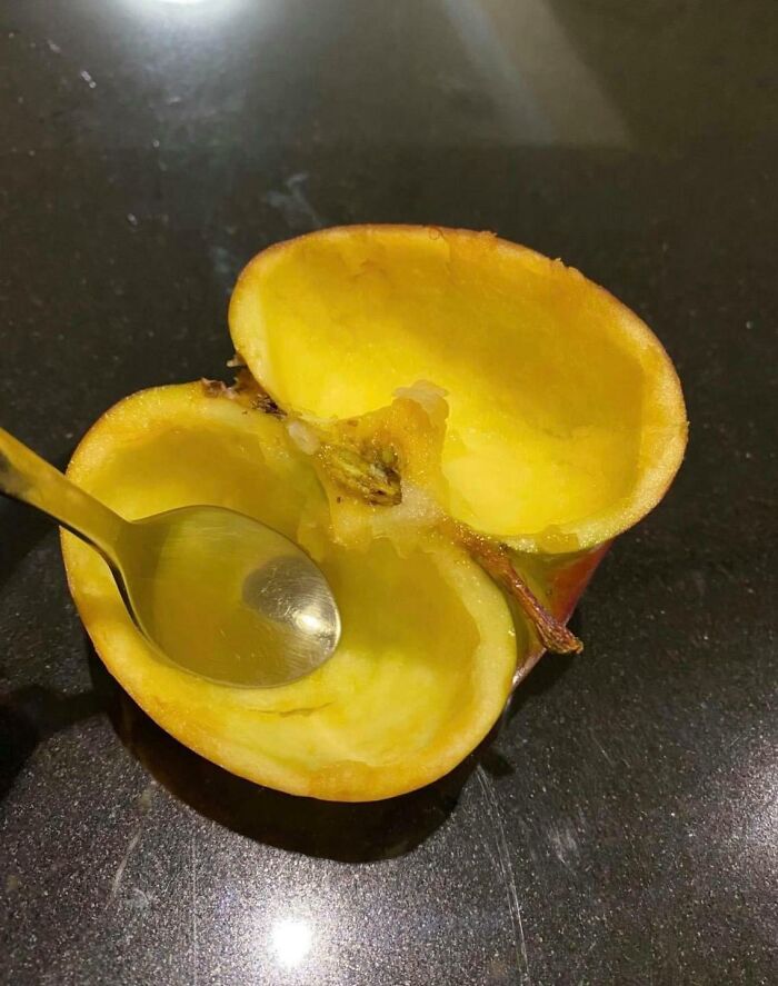
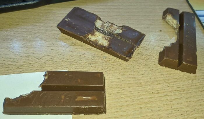
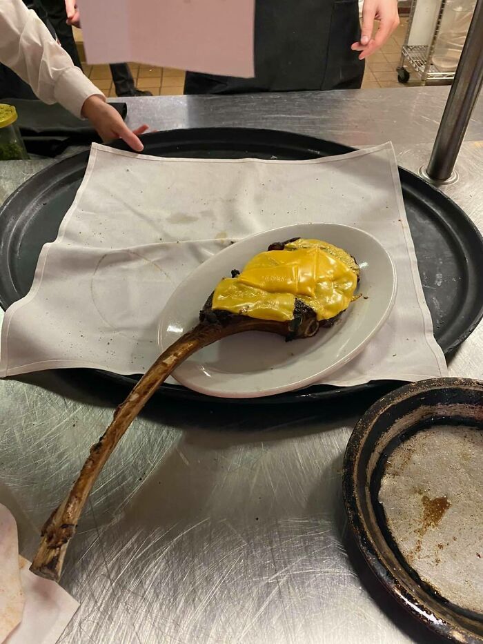
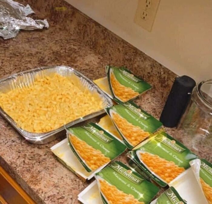
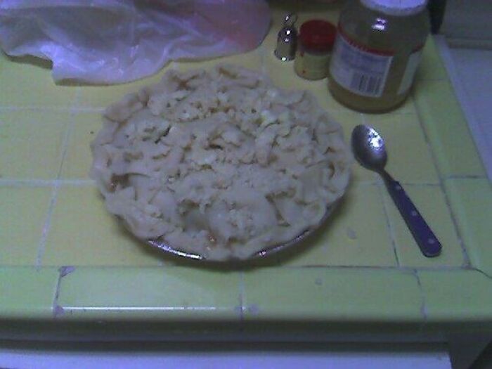
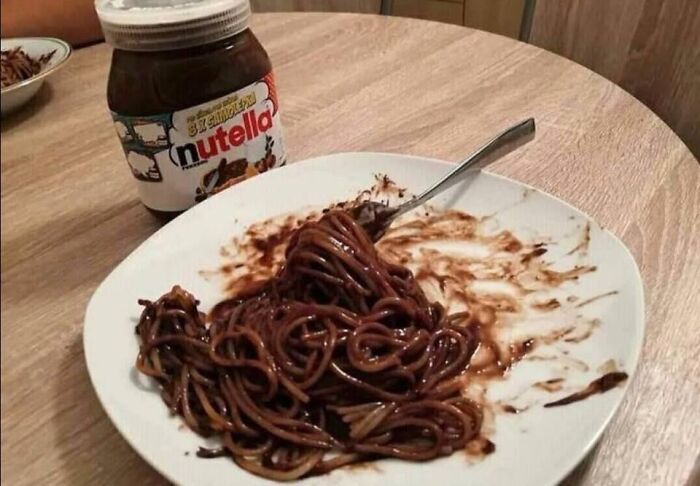
Do Not Eat
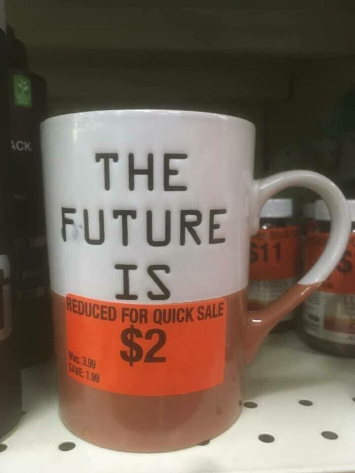
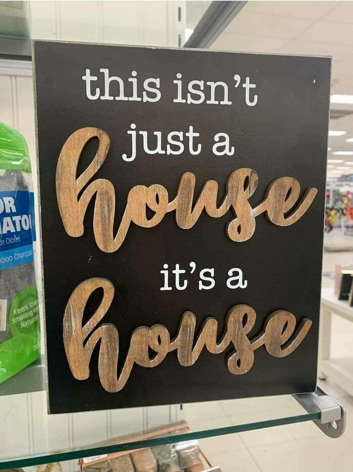
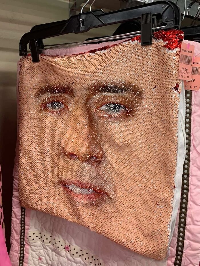
It's Bad When A Thrift Store Doesn't Like Our Odds For The Future
"As our love for ugliness keeps growing, the line between ugly and beauty is getting a bit blurred," the guys behind the ‘Ugly Design’ page told me during an earlier interview. "It appears more and more of our followers have completely lost their taste. That’s a good thing. It means they’ll have to find it again. It will most likely be forever changed."
Jonas and Sébastien told me that part of the appeal of badly designed objects is that they create a stark contrast to what you can usually find while scrolling down in your Instagram feed.
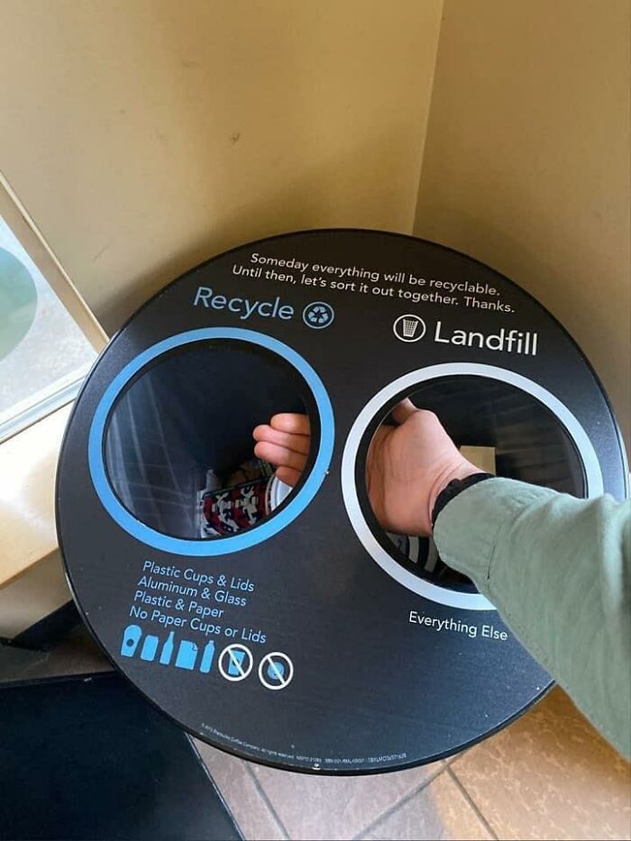
Okay
Hmmm
“When seeing an ugly design rather than perfect aesthetics (as defined in the 21st century)—scrollers takes notice. Also, @Uglydesign never gets predictable—that is key to maintain and grow followers in our opinion,” the pair noted that we should avoid predictability and conventions if we want to get noticed in a space where ‘perfection’ is, more often than not, the norm.
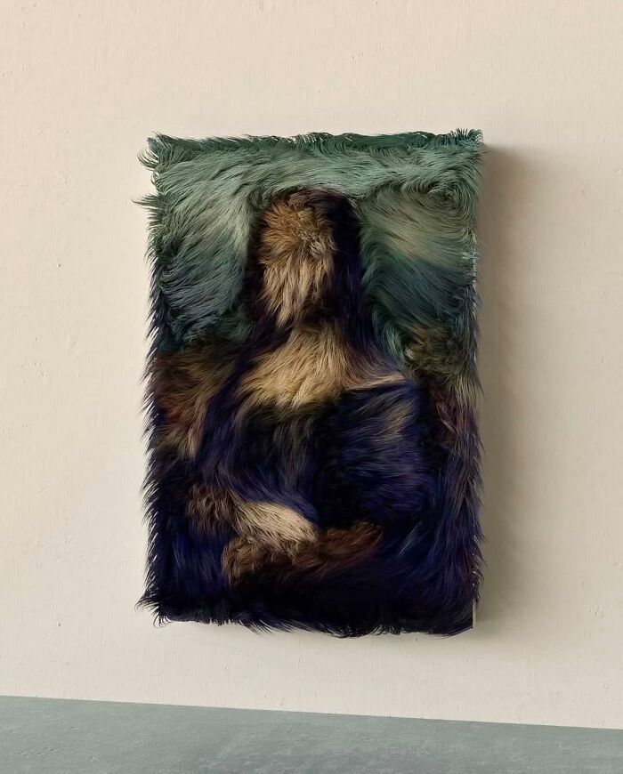
I Appreciate How Well Done This Is, But It Gives Me Severe Anxiety
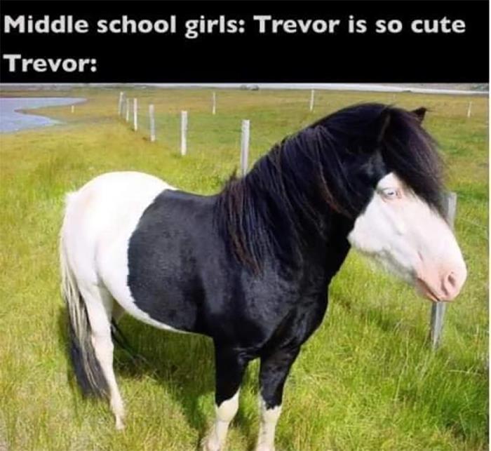
You Gotta Love Trevor, The Emo Pony
“We find it crazy that this theme can still surprise us and make us laugh so much after having dug into it for so long,” they said. “We are posting various topics under the theme of ugly design, from maximalism to design fails, covering everything from luxurious furniture, jewelry, fashion, nail art, architecture, to upcycling… And except for some designs fail, we believe it is an incredible source of inspiration and joy.”
It should be clear by now that unaesthetic things and designs are just as important as aesthetic ones, as far as inspiration and social commentary both go. However, which ones grab our attention the hardest is still up for grabs.
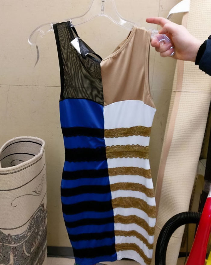
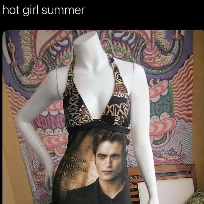
Found This Cool Dress On Clearance
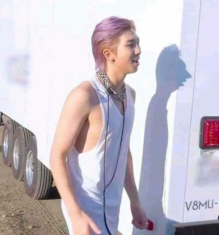
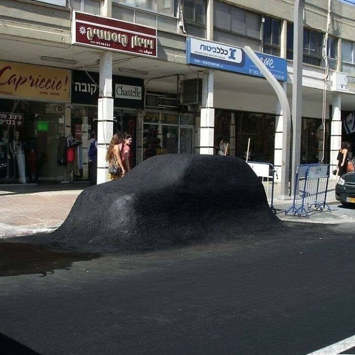
Aesthetic Shadow
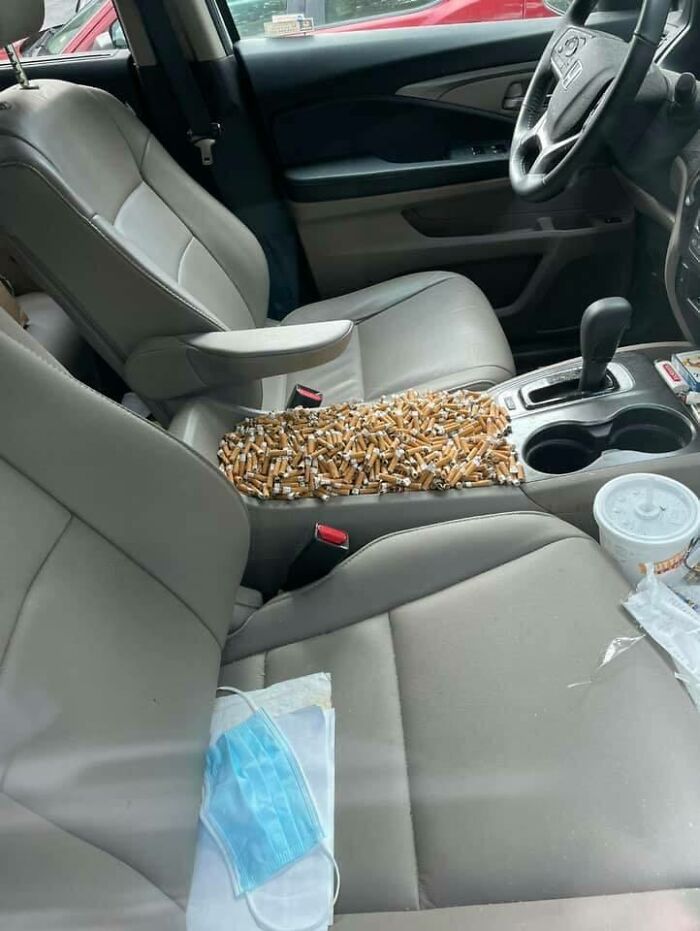
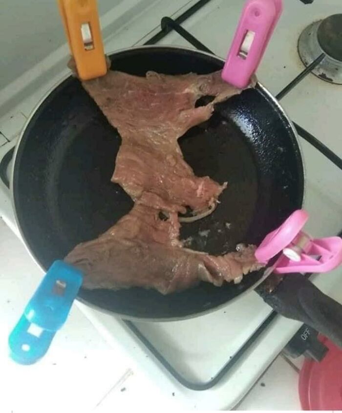
Jfc That’s Horrifying
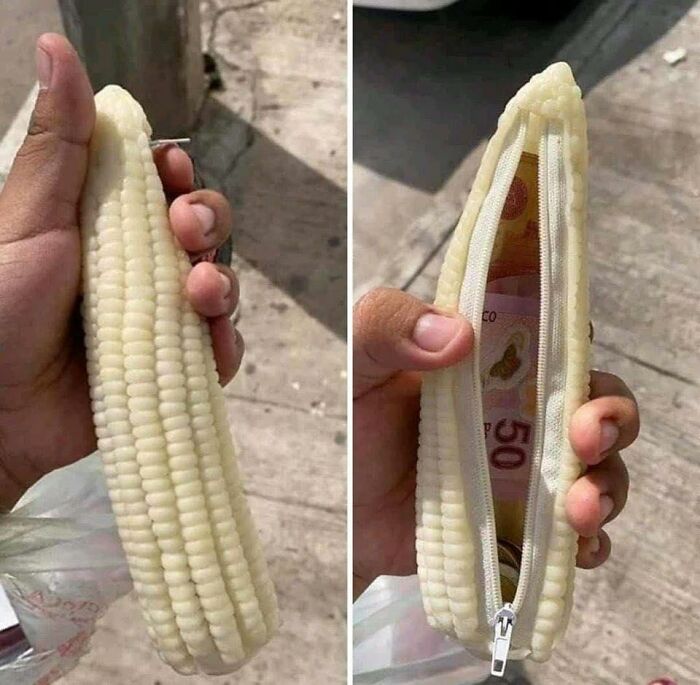
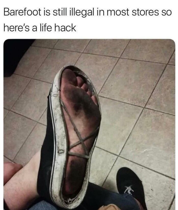
As shocking as that is, it's a good way to prevent corrupt customs officials from confiscating it for their own use.
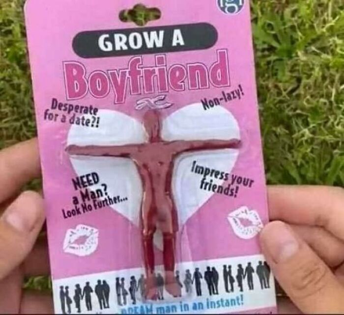
This Would Work Better Than Giving Me Flowers
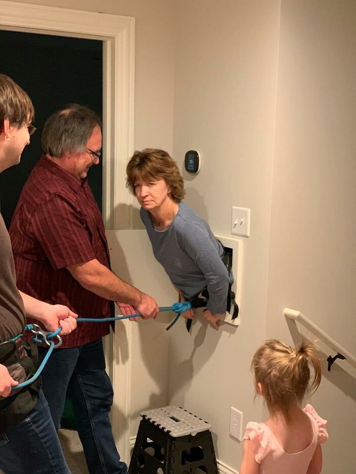
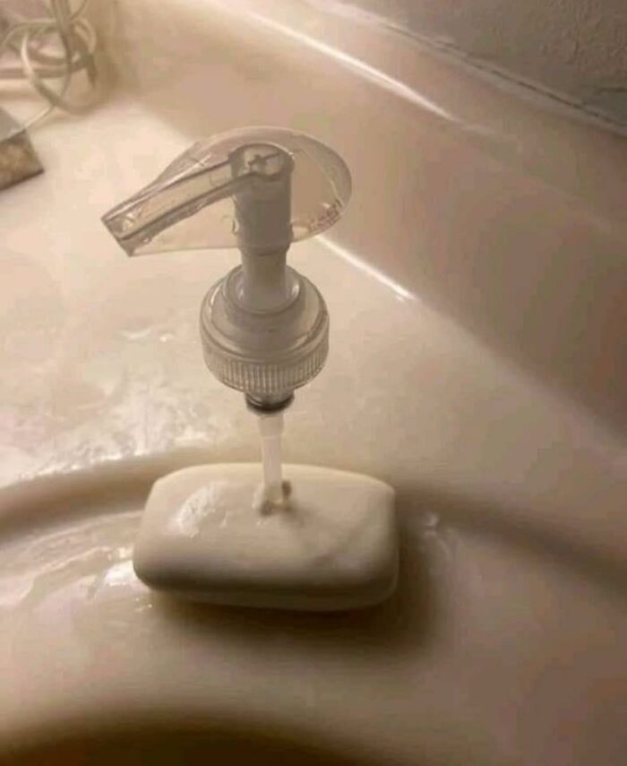
The Surgery Went Perfectly
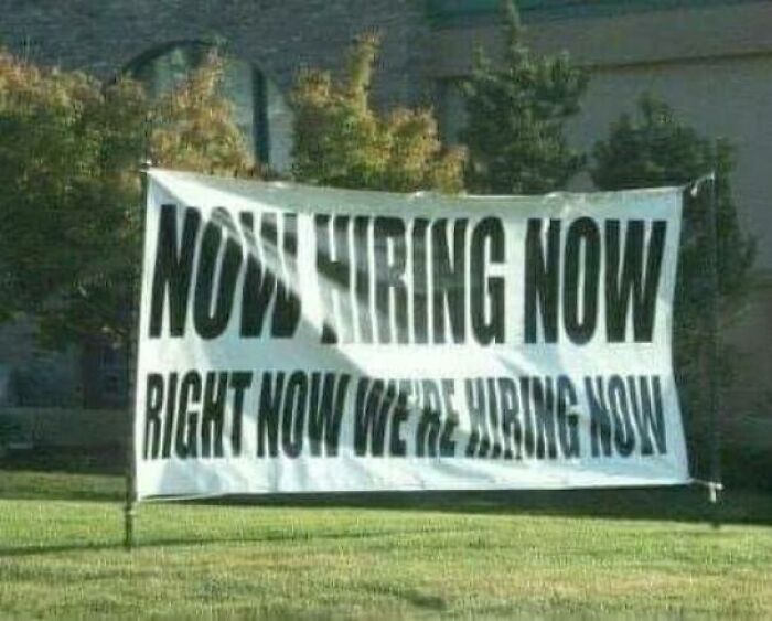
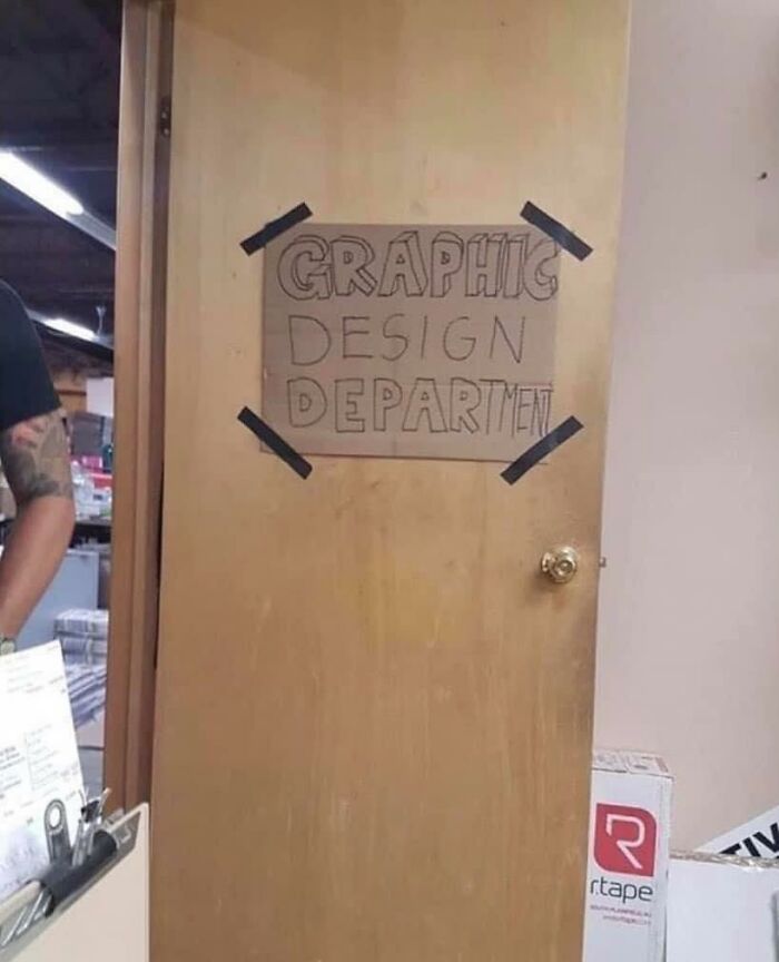
But When Are You Hiring?
Oh, Sweet Jesus
“I Don’t Need To Trace It...i Know How Big Letters Should Be.”-John Mulaney
Going Into Trendy Restaurants Like
My Dog When I'm Changing The Sheets On My Bed And She Refuses To Move
Bow Hunting With Style
I’m Intrigued
It's A Tiny Stage For A Mouse Comedian
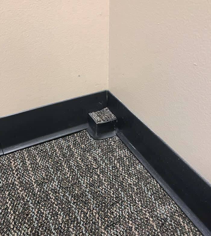
That Is Not Aesthetic
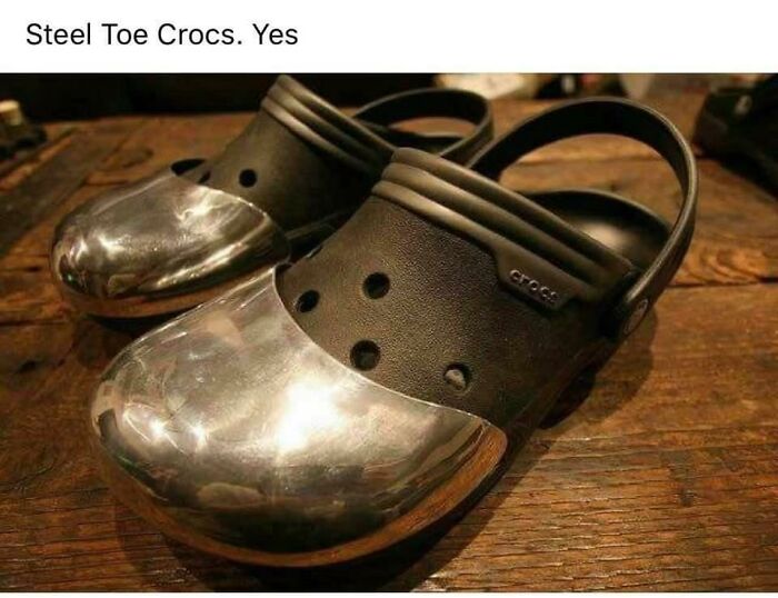
Idk What’s More Embarrassing: Owning These, Or Getting Your Ass Whooped By Someone Wearing These
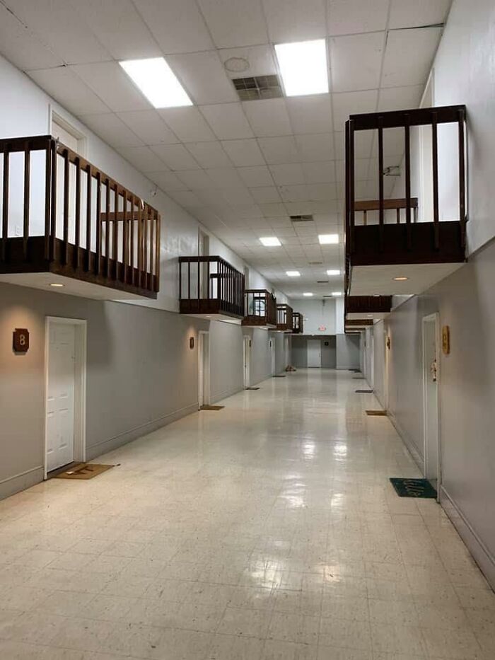
Apartment Balcony, But Inside
Looks like a remodeled prison. Kind of a clever way of handling it
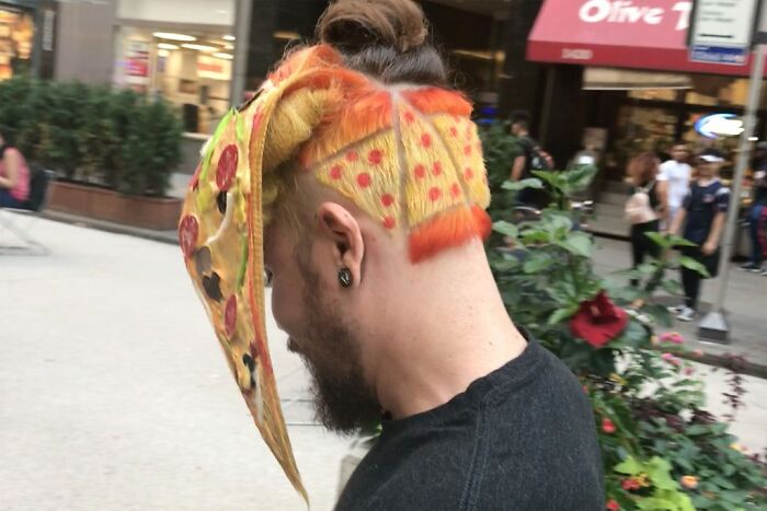
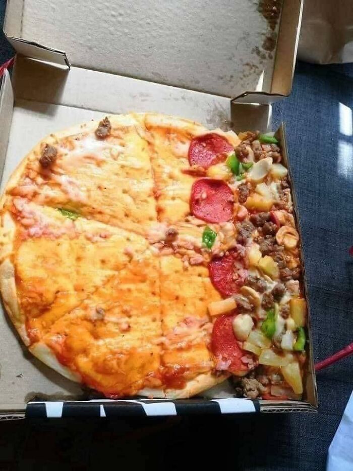
Slice Out Negativity, It’s A Lifestyle
I'm pretty sure his favorite food is pizza... just guessing so don't old me down on that
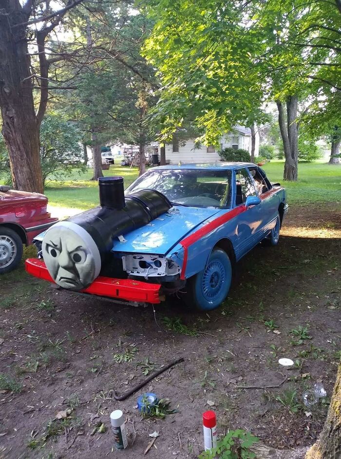
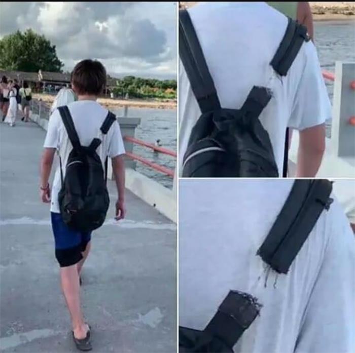
Thomas Has Never Seen Such Jerry Rigging
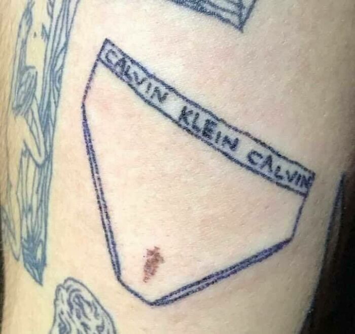
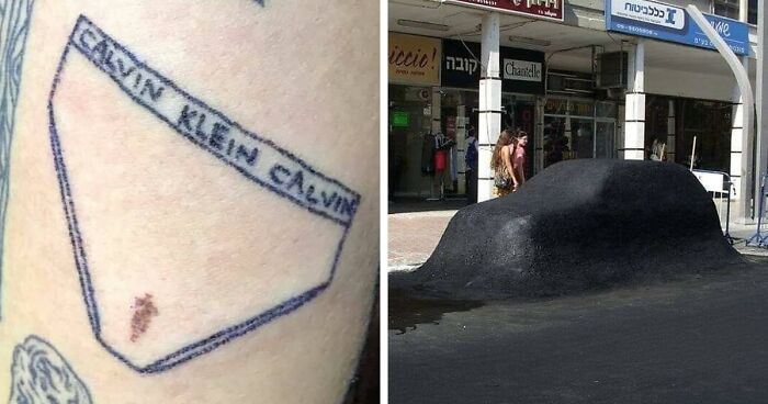
When The Birthmark Is Part Of The Tattoo
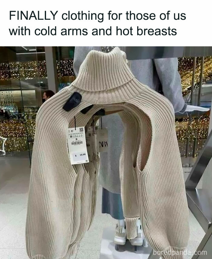
Do I Have To Wear Anything Under It? ( O Y O )
I would definitely wear this over a fitted tee. My arms get colder than my torso.
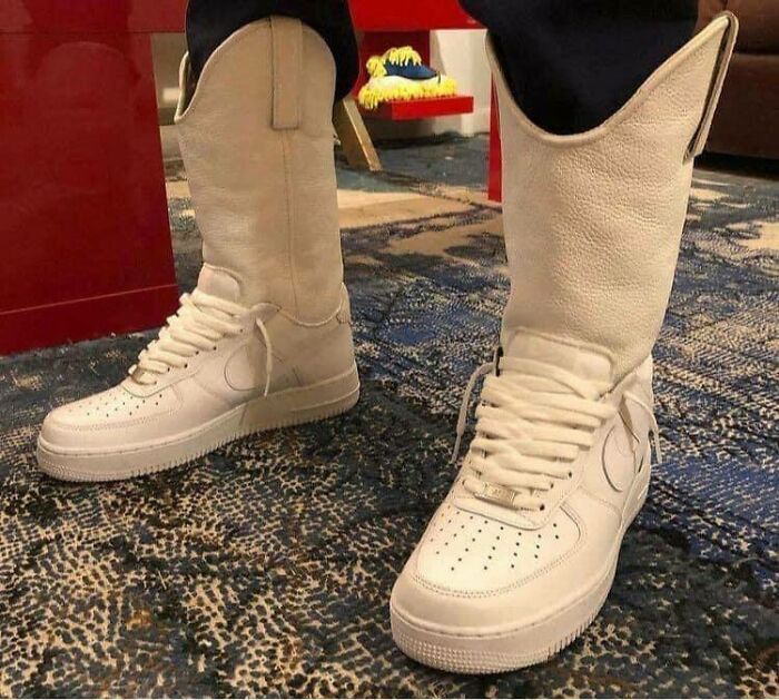
Just Yeehaw It
Oof
I mean most of these were either really funny or things I would actually want, sooo the "not aesthetic" title might be a little misleading??
After a while you realise that BP titles are not particularly well crafted, and just enjoy the ride.
Load More Replies...I mean most of these were either really funny or things I would actually want, sooo the "not aesthetic" title might be a little misleading??
After a while you realise that BP titles are not particularly well crafted, and just enjoy the ride.
Load More Replies...
 Dark Mode
  No fees, cancel anytime


