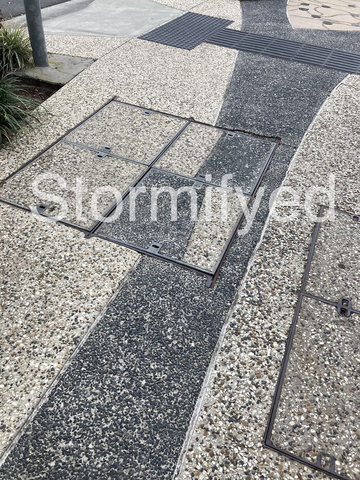
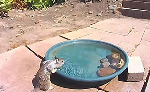
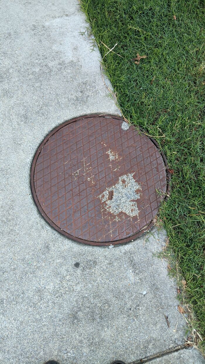
Let's be honest, some people are not meant to be designers. I'm not saying that they have no talent at all, more likely a lot of their ideas just "sound better in their heads". However, luckily for us, their creations serve as great amusement.
With that in mind, I asked our fellow pandas to share a picture of the worst design fails they've seen and was happy to receive some funny images! So, scroll down for a good dose of laughter. If you have anything to add, you're more than welcome to do that!
This post may include affiliate links.
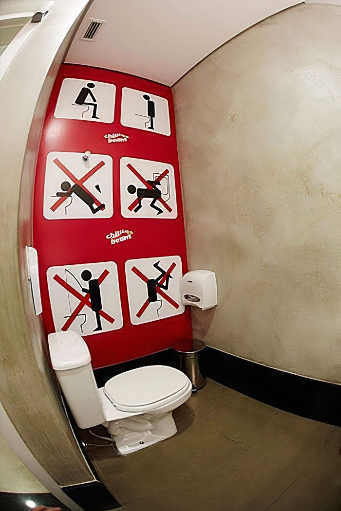
Don’t Do That
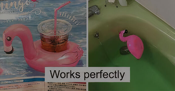
"Works A Little Bad"
Book Ad Fail
Steamy Contemporary Romance huh? For that price I'd almost think about getting one... Tomorrow
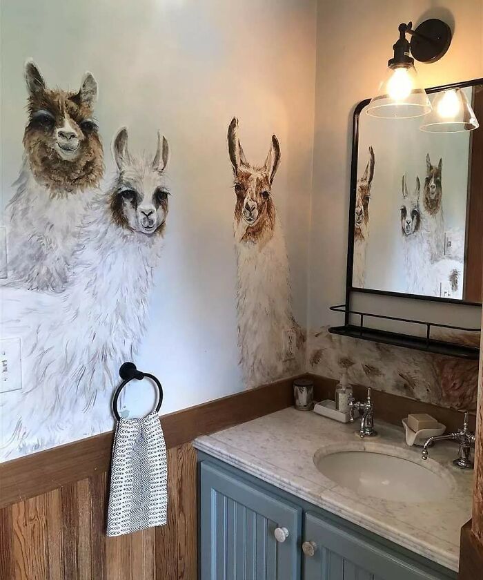
I See Your Eyes And Raise You A Trio Of Llamas
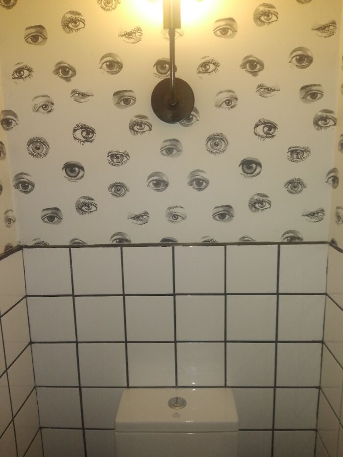
I'm Watching, I'm Always Watching
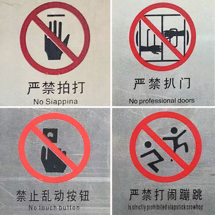
Chinese Signs At My Old House, It Was Tempting
I Have No Conceivable Clue What This Is
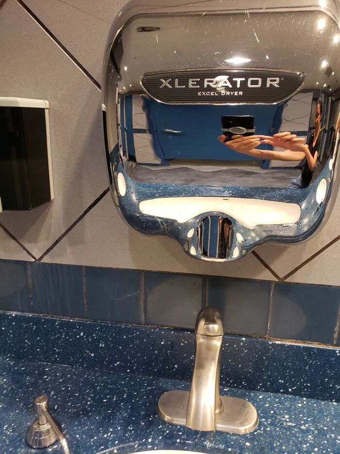
When I Turn The Faucet On The Dryer Turns On Too
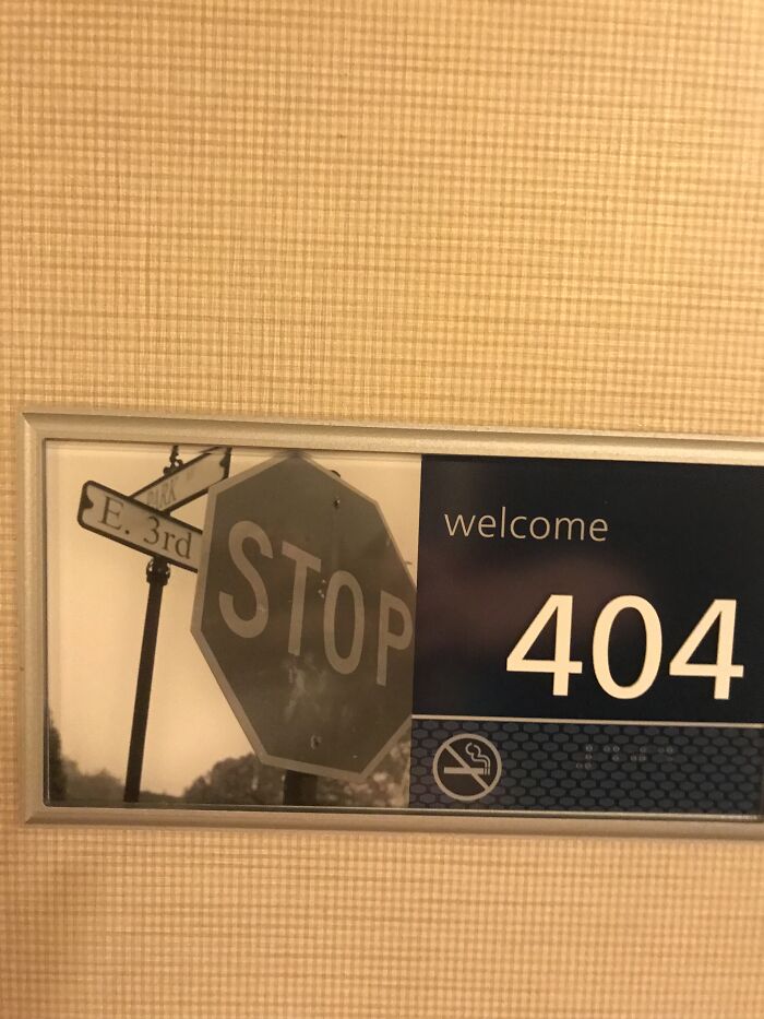
Error Sign
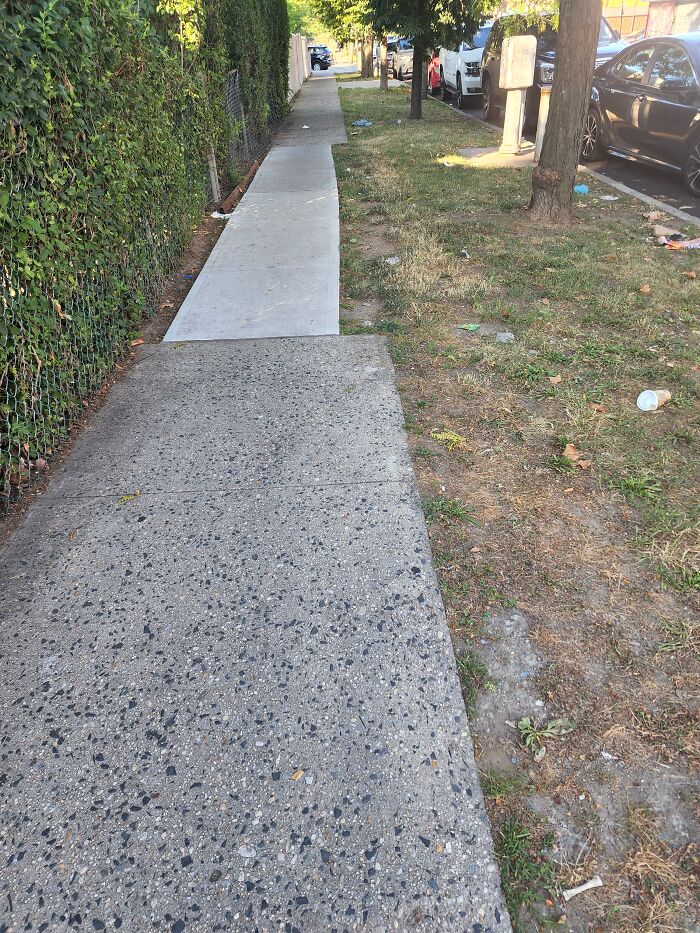
The Famous "Not My Job"
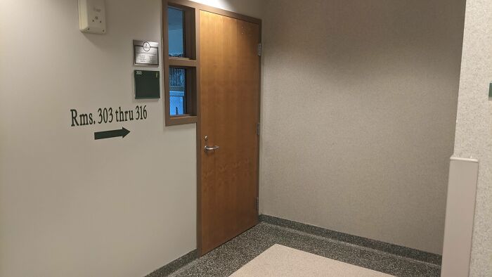
Found This While Looking For Room 305. That Door Just Leads To A Classroom
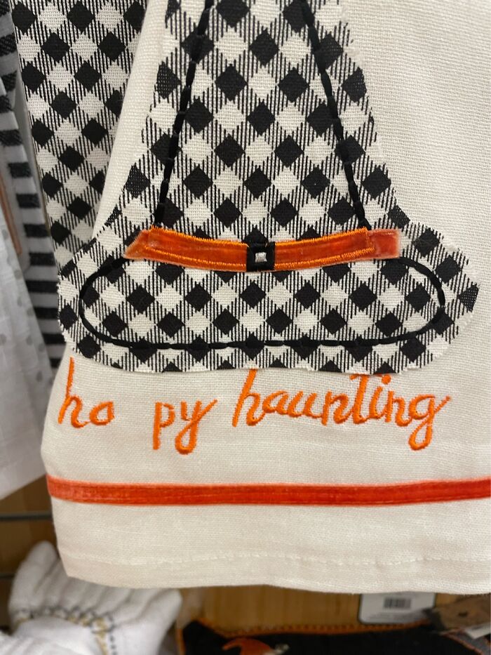
Ho Py Haunting I Guess?
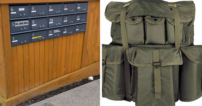
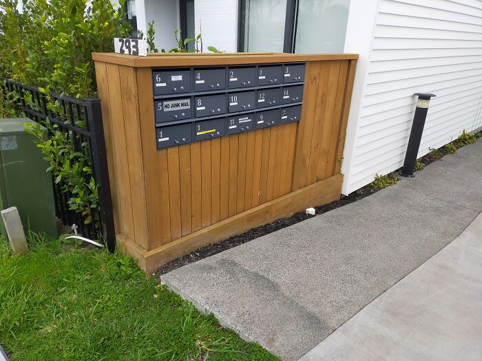
Letterbox Organization That Pains Me To Look At
Aside from them being out of any type of order whatsoever, why are there three boxes with a 1 on them?
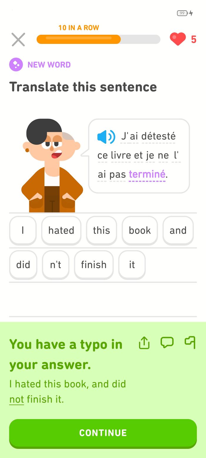
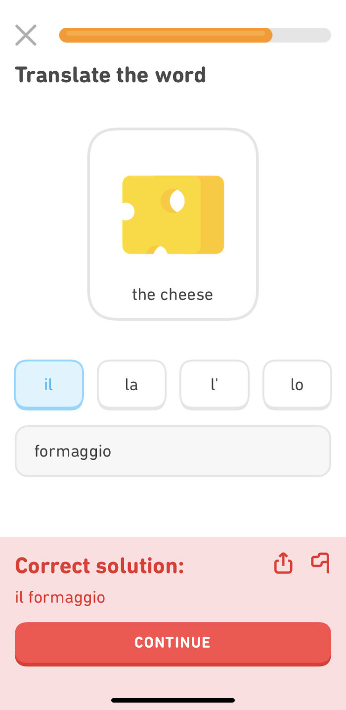
Duolingo Moment
For clarification: the circles around each word indicate that Duolingo provided these options and I had to put them in order. Duolingo is criticising it's own answer here
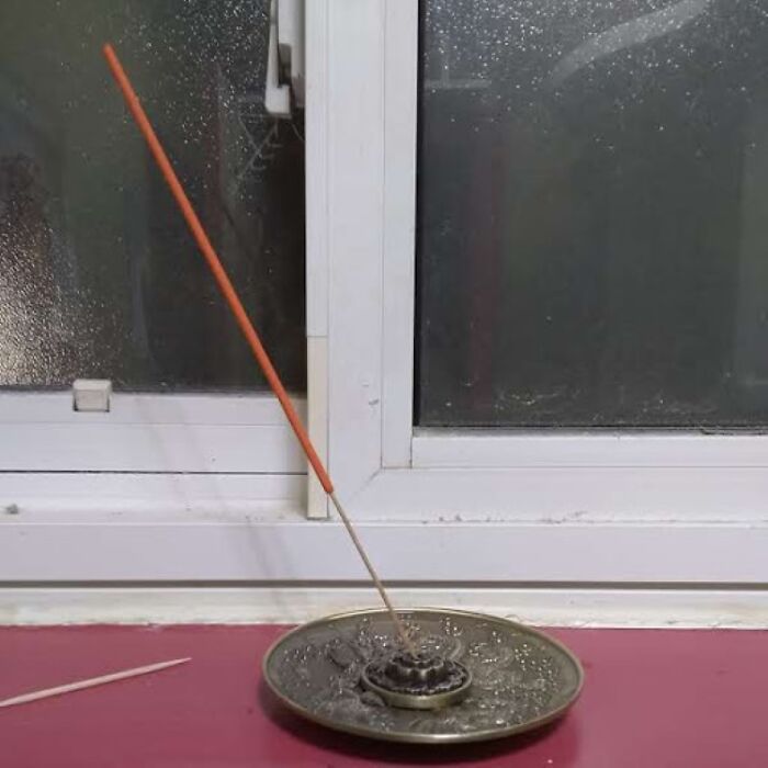
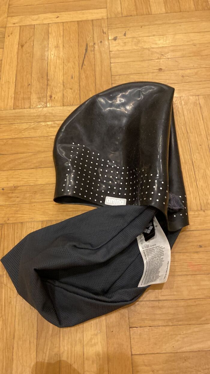
Incense Holder But The Ash Goes On My Shelf. Now I'm Using A Toothpick To Hold It Straight
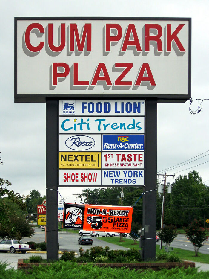
From My Hometown. They Refuse To Change The Name
I lived in Burlington too. We always thought the sign for D**k's Sporting Goods was funnier. It read, "D**k's Coming Soon".
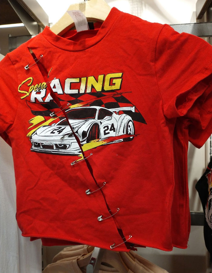
Designer: "I'm Going To Make It Look Fresh And DIY At The Same Time! Brilliant!"
Looks like something the "wannabe edgy/emo pick me girls" at my school would wear
In my day we'd buy this for a dollar at a thrift store, then cut and pin it ourselves...of course the shirt would have been all black and we'd spray paint a design on it....not a race car.
Load More Replies...Tell me you opened a box of t shirts with a razor blade without telling me
Punk style dictates that you not overuse safety pins, plus one has to pierce your nose. Punkers do not go to NASCAR races either.
When you want that "my three year old just found out about scissors " look
Looks like the shirt was cut accidentally and they tried to fix it by attempting to o make it edgy/cool?
Exactly! There was a whole display hanger of them.
Load More Replies...This looks like something Shein would sell, albeit with more lead in it.
Picture is accurate… if the car is scooting along without front wheels, the front WILL be throwing sparks, or even flames
This shirt makes a statement, and that statement is, "I should not have ever challenged samurai Jeff Gordon to a fight."
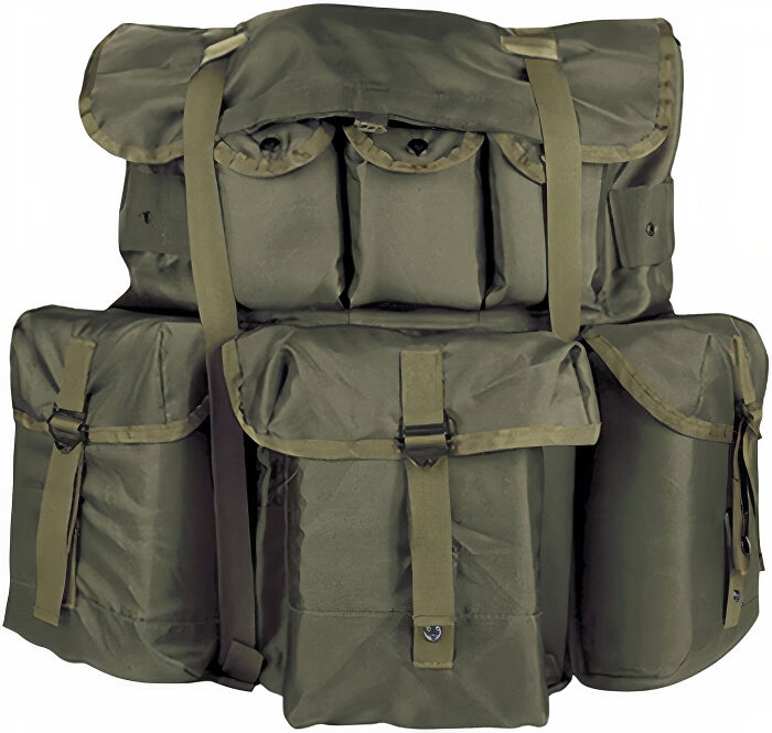
Worst Design Ever. If You Know, You Know
For those that don't know... This is a military issue bag. It takes no less than forever to get into this bag. No matter what part.
Saw This On The Front Of An Insurance Company Building In Houston
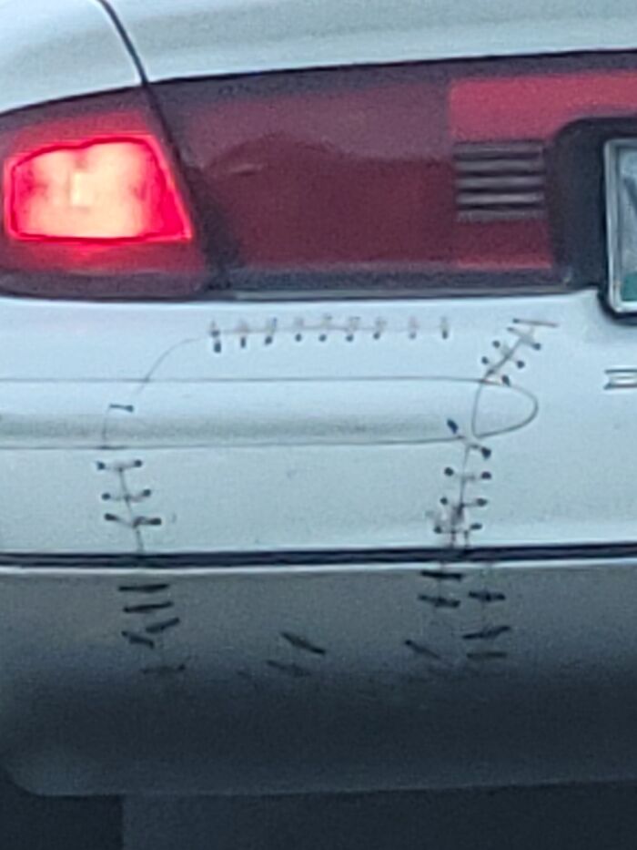
Good Job Dude. Like New!
It almost looks like they were trying to copy the stitchings on a baseball
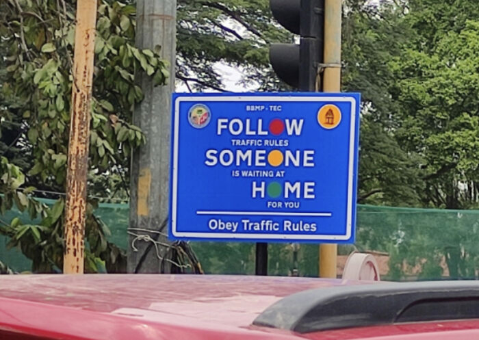
“I Don’t Get It! Ever Since We Put That Sign Up There’s Been So Many Calls For The Police!”
No Standing Anytime. My Mom The Rebel
Does no one else notice the tree in front of the sign? Nobody will see it from that side
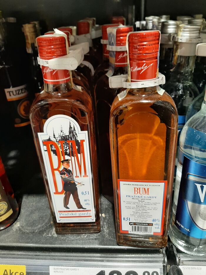
This Czech Rum
Spot The Difference
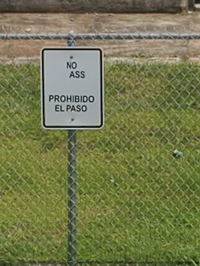
It's Supposed To Say "No Trespassing"
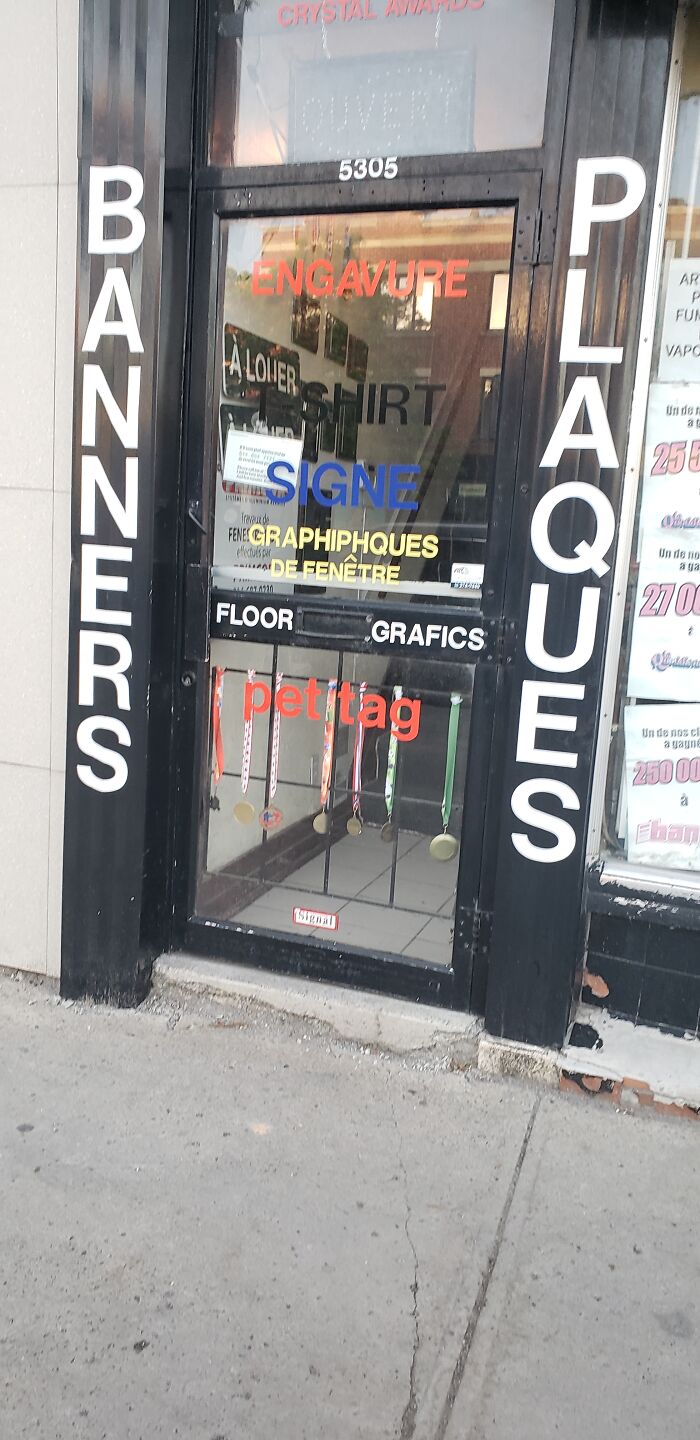
Should Be "Gravures" And "Graphiques". This Is An Advertisement For Their Signage Business. Maybe Start By Getting 1 Language Right?
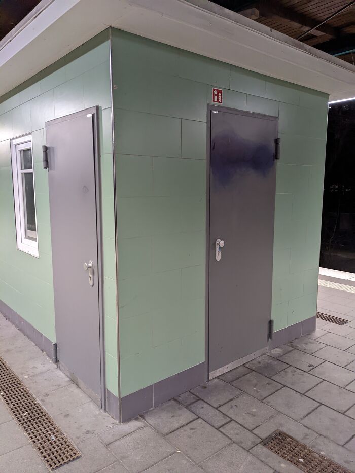
I Haven't Been Inside, But I Bet That These Two Doors Don't Lead To Different Places
I think they do go to different rooms. The one on the left goes into the shed. The one on the right might be like a closet. Hence the one on the right has signs for a fire extinguisher
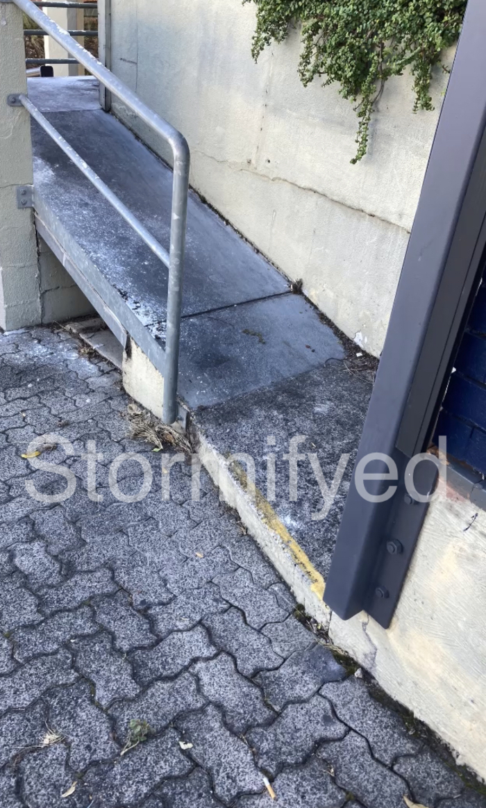
Found This Beauty Near My Doctors Office
Her Face Was At The Curve Of The Screen. (Sorry Twice Mina!)
Comening Soon!
Found This On The Way To A Café
At My School
Too Complicated And Hard
This takes the cake for worst article I have seen on the site. There were maybe 2 design fails if you are being generous.
I agree a lot are not bad 'designs'. Might retitle 'fails'. However, I am curious as to which two submissions you consider design fails? My thoughts are #2 floppy flamingo drink spiller, #13 hand dryer badly planned placement, #15 direction signs badly planned and #17 backpack badly designed.
Load More Replies...I used to have a photo of some teenage ninja turtles game with a typo, the electronic store said electorics
Wish I still had a picture of when we drove past a sign that said "Paradise" that had "closed" slapped across it. And yes, I know it made it into some book, but I did actually see it. Anyway, there are definitely some automobiles that belong on these lists, like old Fiats where you had to remove the dashboard and some other stuff to get to basic fuses, or just the rebuild of the hummer for tech bros to drive around the city.

 Dark Mode
  No fees, cancel anytime


