Design seems like such a simple, elementary thing when you think about it, but hordes of people keep getting the basics wrong, often with hilarious and side-splitting results. Buildings are hard to design, as are other objects, but we usually take the lettering and layout of sentences and phrases for granted, as though everyone will be able to understand us no matter how.we.words.our.place.
Well, the truth is, designing text so it’s readable isn’t as easy as you’d expect. There’s a system to it. There are processes that must be followed. Typography rules that ought never be broken. Except that those rules are broken all the time by some oblivious people. Bored Panda collected some of the best examples of incredibly bad text design that is wonderfully enjoyable to make fun of. From lame ads to funny posters, nodofy is safe from bad design. So upvote the best/worst fails, see if your friends can figure out what’s actually written, and let us know in the comments if you've seen design fails that compare to these ones.
We know how much you enjoy these funny fails concerning design, so you can read Bored Panda’s previous posts about them here, here, here, here, and here.
This post may include affiliate links.
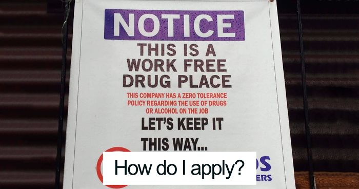
How Do I Apply?
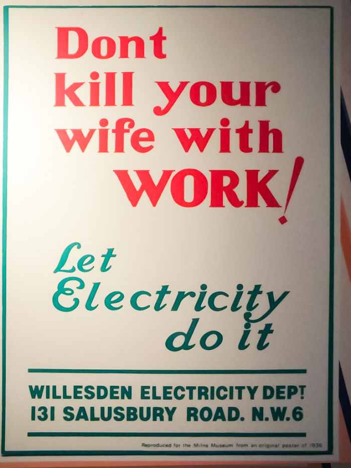
Noted
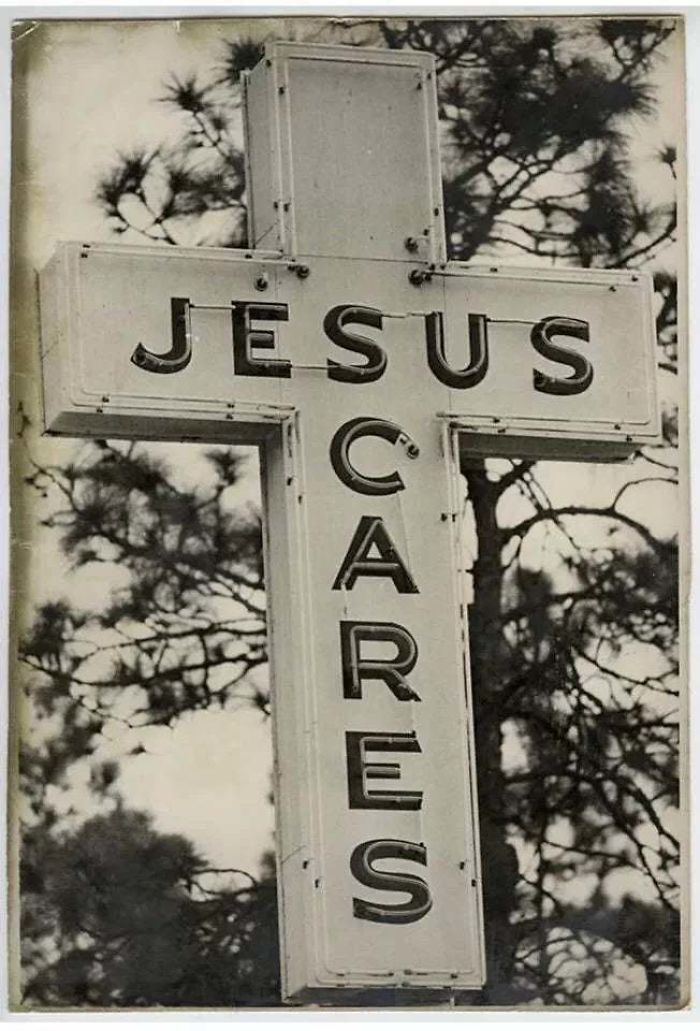
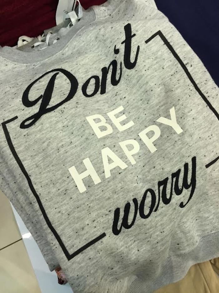
Apparently Scary Jesus Is A Thing
One of the online communities where similar text design fails are shared daily is the subreddit ‘Don’t Dead Open Inside,’ which prides itself on collecting the most egregious examples of signs and media that don’t make any sense if you read them normally. The community, which was established in May 2014, is large, having grown to over 513,000 members.
Bored Panda reached out to the 'Don't Dead Open Inside' subreddit moderators. According to one of them, the community was inspired to form because of the 'Don't Dead Open Inside' frame from the very first episode of the hit TV show The Walking Dead.
According to one moderator, people make mistakes while designing text because "they're either not thinking or they want to be original. Our main mission statement is to show them that they are wrong."
They also had advice for those individuals willing to step up their game design-wise: "People in the west read left to right, then top to bottom. Do not "liven up" your text by making it "quirky". Hard to read means lost attention which translates to lost revenue."
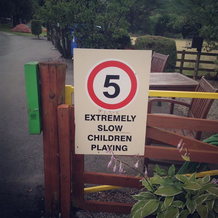
Five Extremely Slow Children Playing
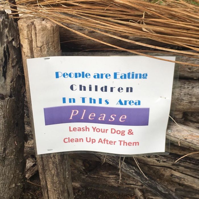
This Terribly Worded Sign I Saw Today. Sorry, I’ll Pick Up My Dog’s Poop... Wouldn’t Want To Ruin Your Child Eating Experience
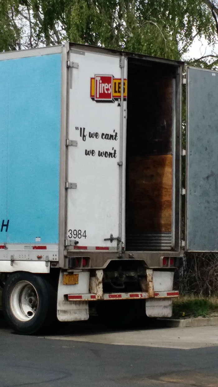
Well, Uh... I Guess That's A Good Motto
Canva has some handy tips for those of you willing to up your design game when it comes to words. For example, Canva suggests that you limit the number of fonts that you use and use simple ones, rather than complex ones that might not mesh together well.
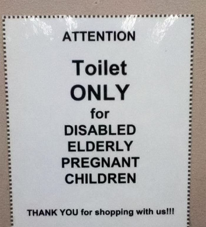
Attention
Thanks For The Advice
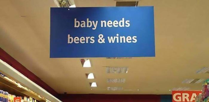
Baby Needs Beers & Wines
Spacing, something most of us rarely think about, is also important and can bring about radically different effects simply by eliminating the negative space between letters, words, and sentences.
Experience
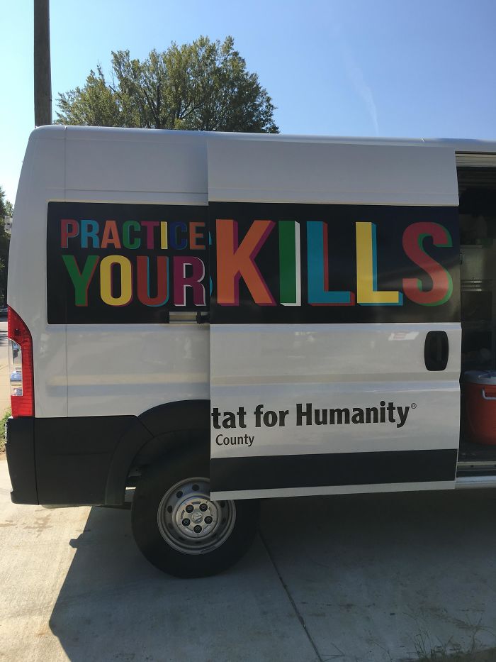
This Habitat For Humanity Van
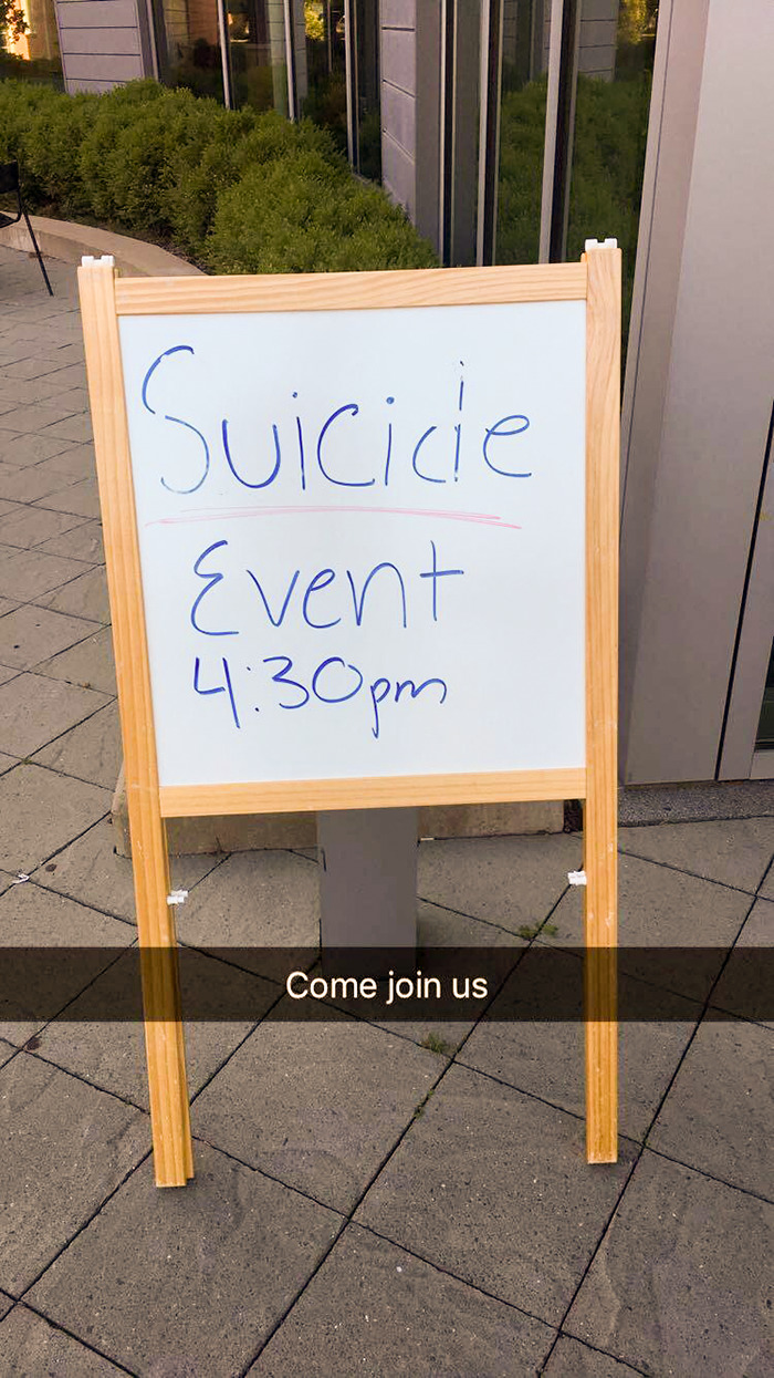
So My Campus Had A Suicide Awareness And Prevention Day
Meanwhile, colors are equally important: use them to your advantage to create harmony between different parts of the text. Use contrasting and complementary colors. Lines can be used to guide the reader’s attention and create symmetry; however, badly used lines can turn a sign or a design into a catastrophe. Think you’ve got all that? Good. Let us know how you’d fix the text designs in this list.
No Safety. Smoking First
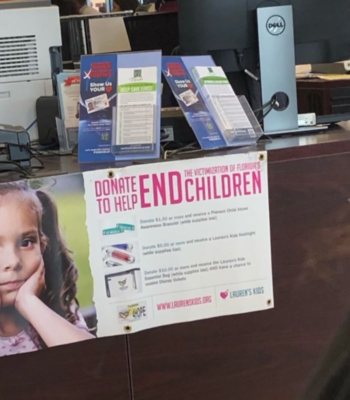
Who Else Is Donating To End Children?
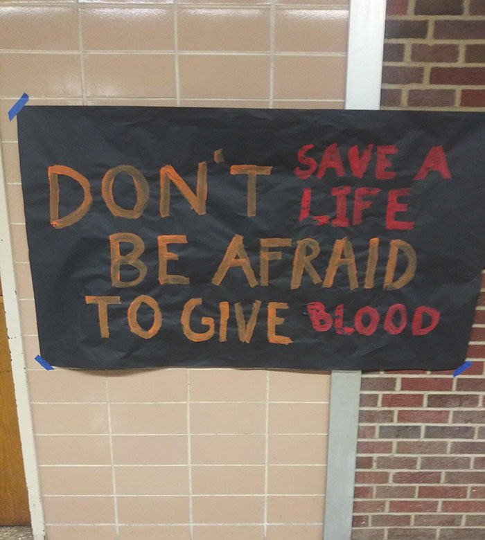
Don't Save A Life. Be Afraid To Give Blood
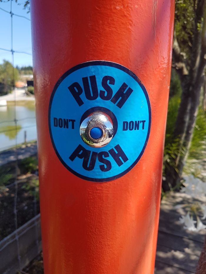
Do I Push?
If You Hard, Then You Hard
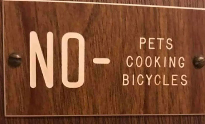
Sorry Guys, You Can’t Let Your Pets Cook Bicycles Here
Hood On vs. Hood Off
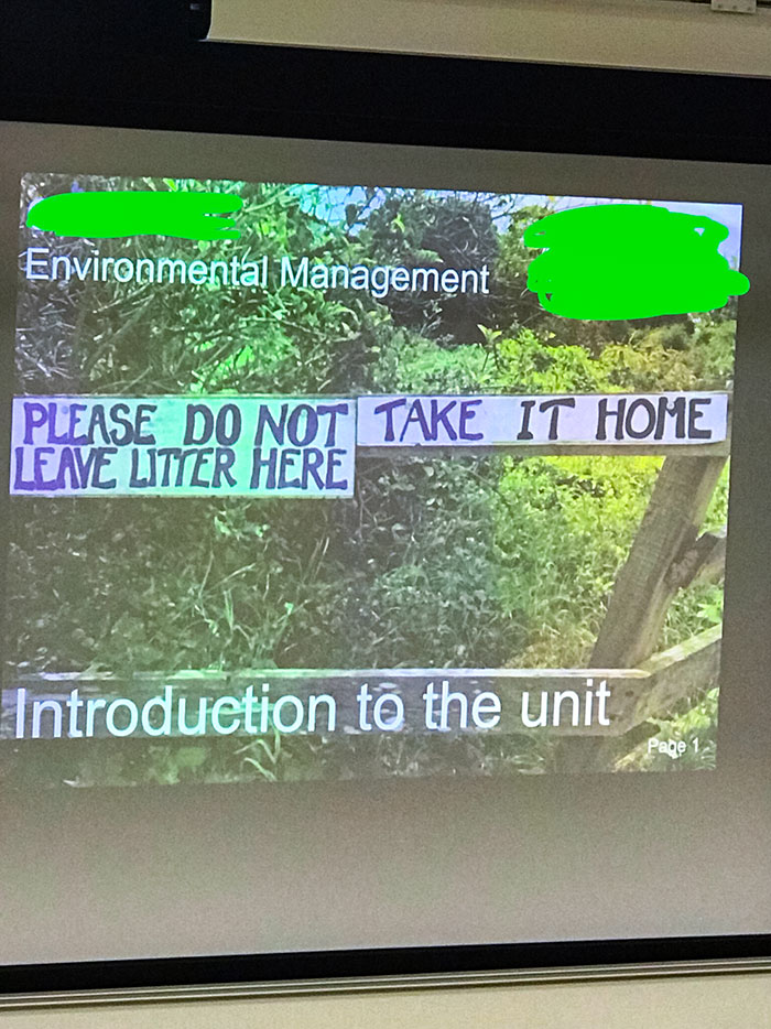
Please Do Not Take It Home. Leave Litter Here
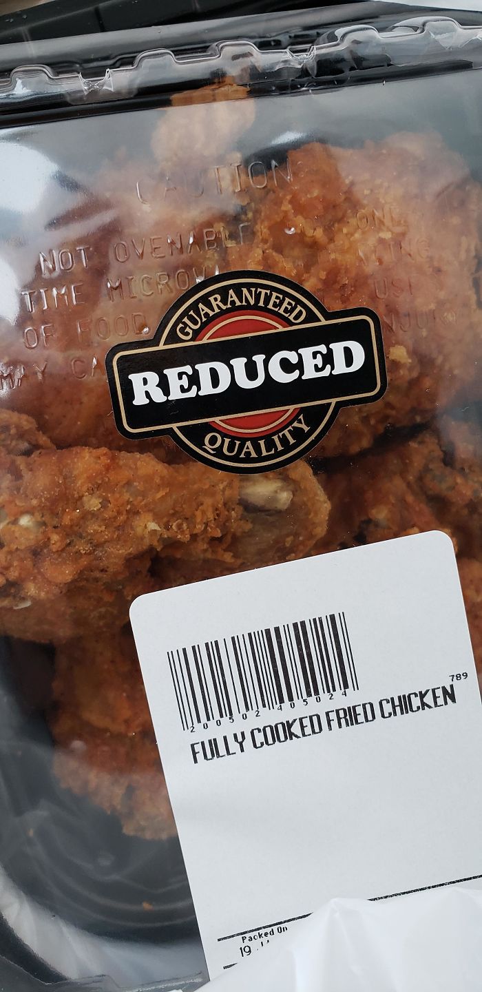
Just Purchased This Low Quality Fried Chicken At The Grocery Store
If You Were In A Car, Would You Know What Accident To Do?
This is so stressful no I wouldn't know what accident to do, this is too much responsibility
Smash Immigrants Welcome Racism
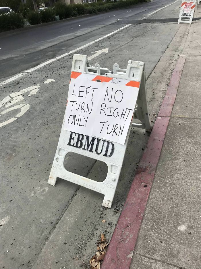
Honey, I Think We're Supposed To Turn Right
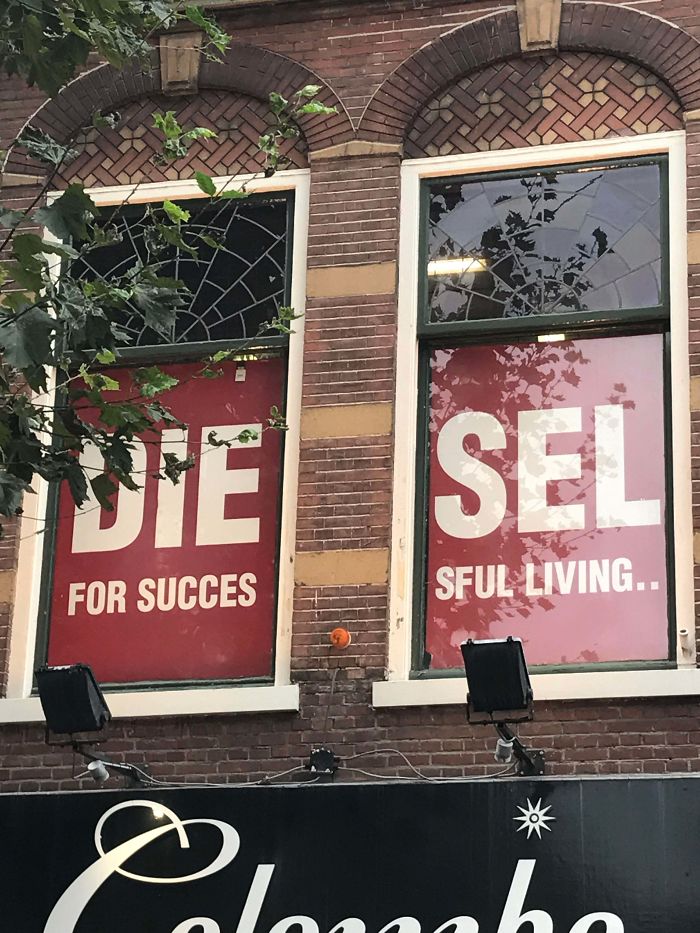
I Only Saw The Left Window At First And Got Very Confused
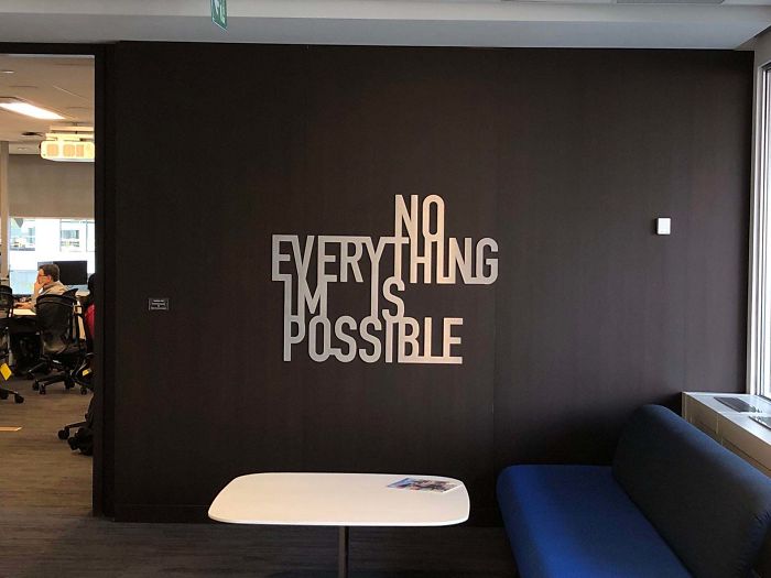
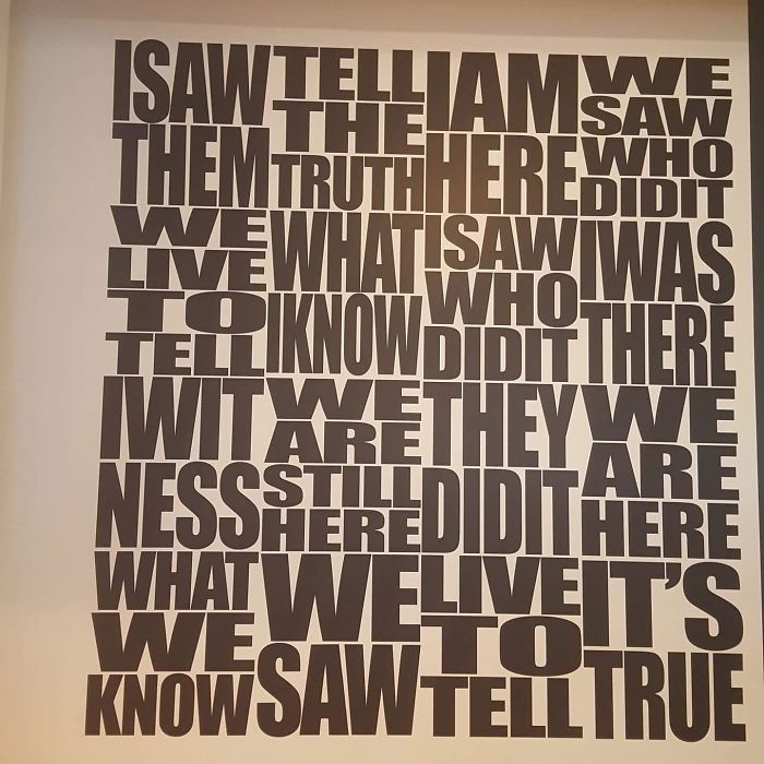
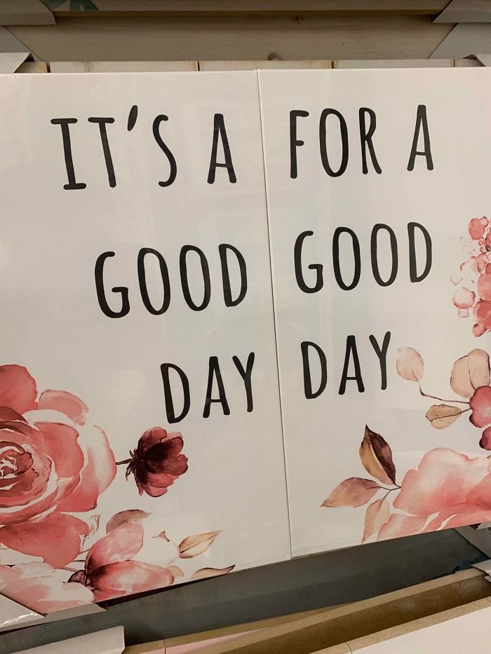
This New Wall Art In My Office
Our To Help Trollies You Move
7 Surprising Black Ways To Use Beans
I get the stupid title, but seriously black bean smoothies sounds gross!!!!!!!
So I Fart Old Dust
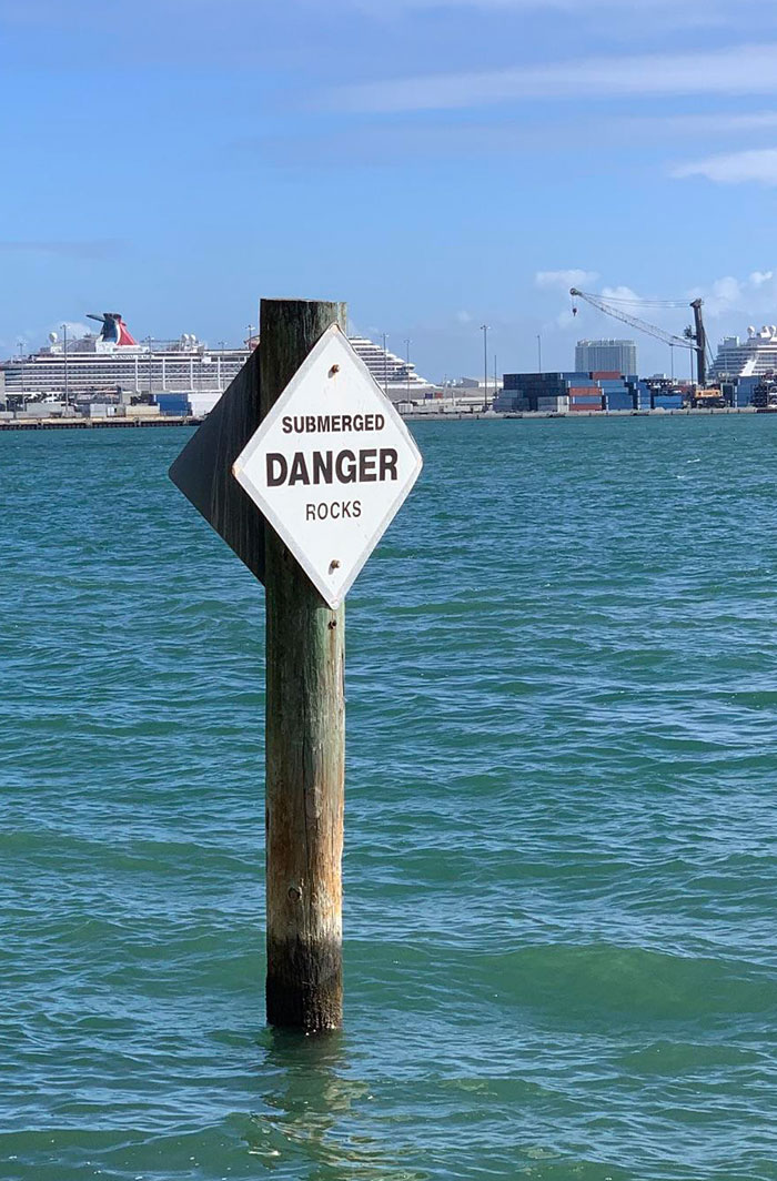
They Are, In Fact, A Particular Sub-Species Of Rock
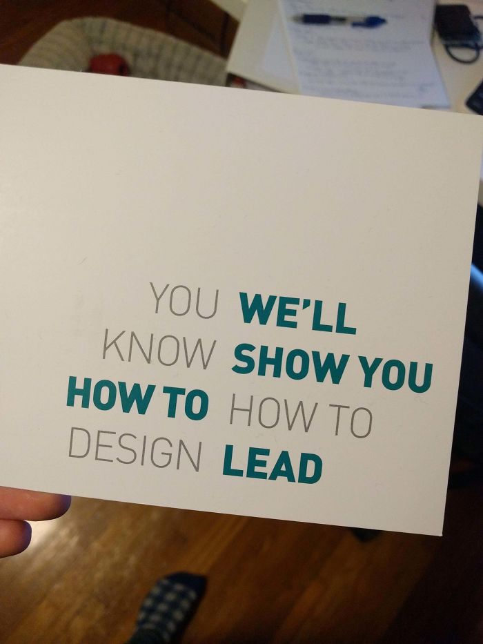
The Design School I Graduated From Sent This Postcard Out
Stand Hong With Kong
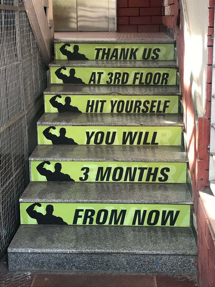
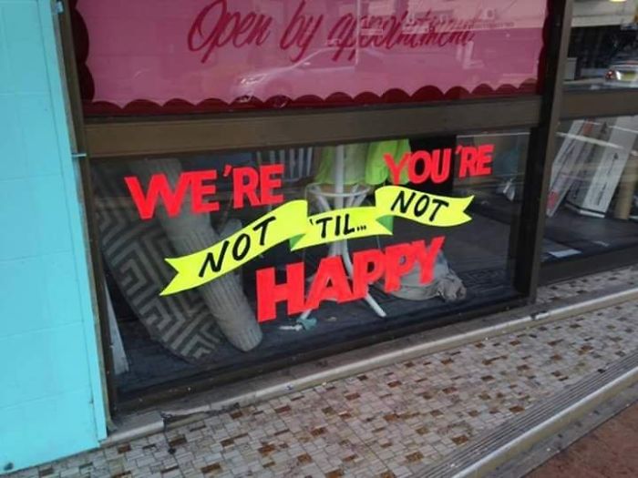
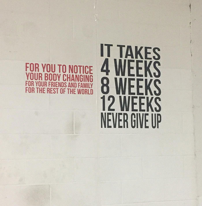
When Your Gym Tryies Hard To Motivate You But Fails To Make Any Sense
Truly Inspiring
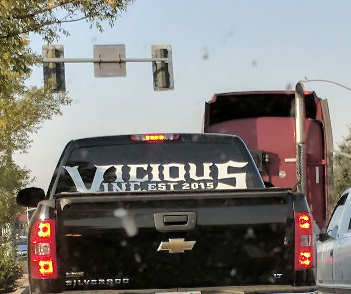
Vicious Inc... What?!
This Monstrosity
From Afar, This Sign Has A Completely Different Meaning
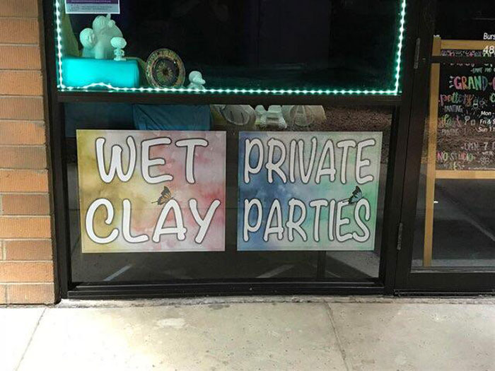
Wet Private Clay Parties
Burn Increase
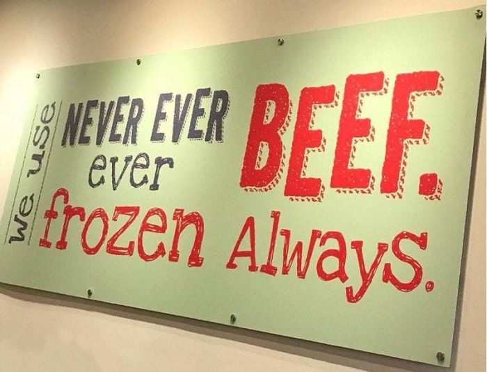
Never Ever Ever Beef. Frozen Always
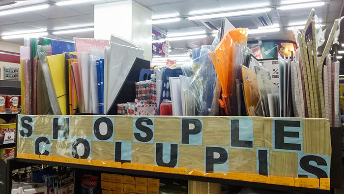
Shosple Colupis
Finally! You have no idea how hard it is to find a shop selling shosple colupis!!
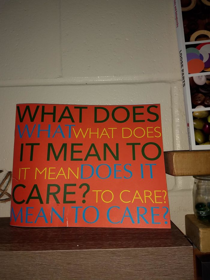
What Does What What Does?
Nono Paingain
Popped Up On My Feed
If being okay is not okay, is being not okay, okay? And if so, isn't that also not okay?
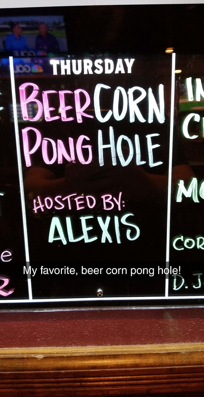
Found At A Local Bar
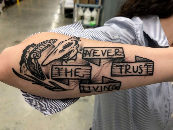
Friend Of A Friend Got A New Tattoo
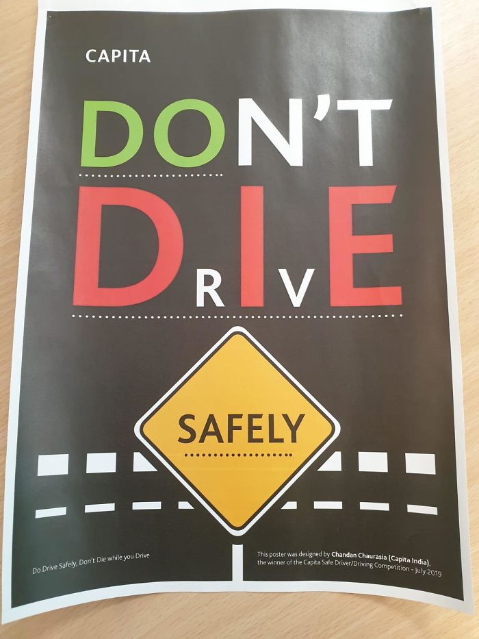
This Won The Design Competition
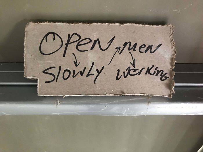
They Must Have Added The Arrows After Realising How Steamy It Was Originally
If the intention was to slow your actions down it worked very well! 10/10 success.
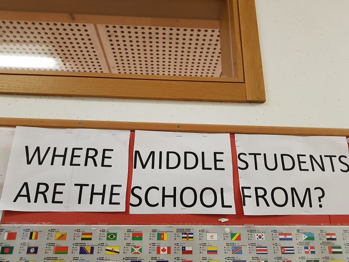
This Sign At My International School
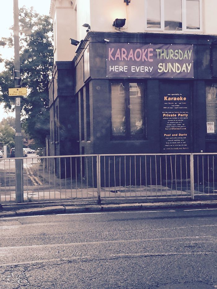
Karaoke Thursday Here Every Sunday
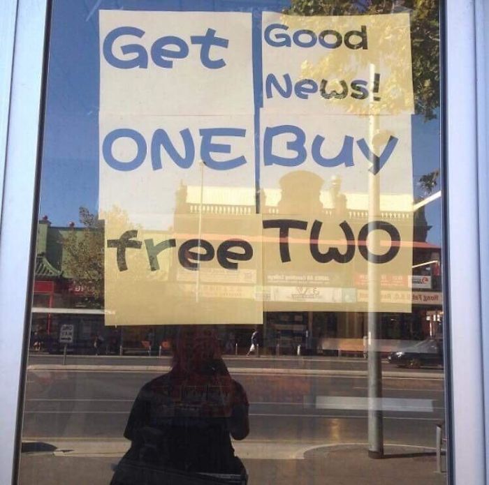
Get Good News One Buy
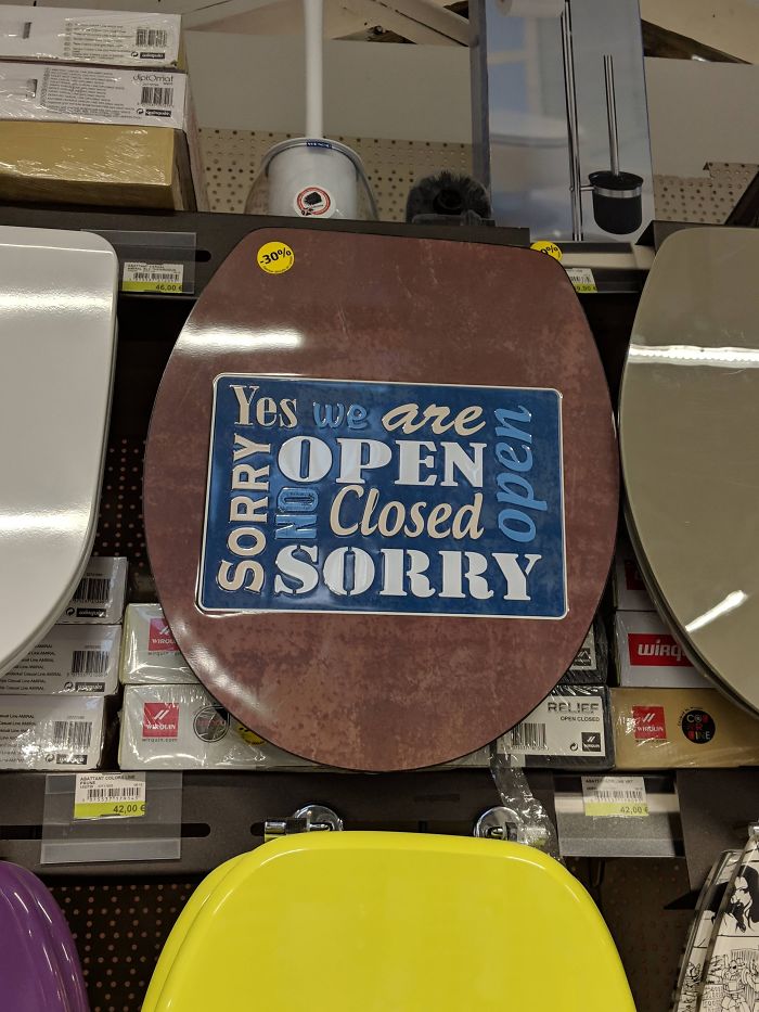
I Think The Real Question Is: Why On A Toilet Seat?
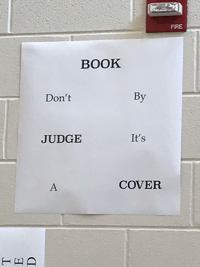
Book Don’t By Judge It’s A Cover At My High School
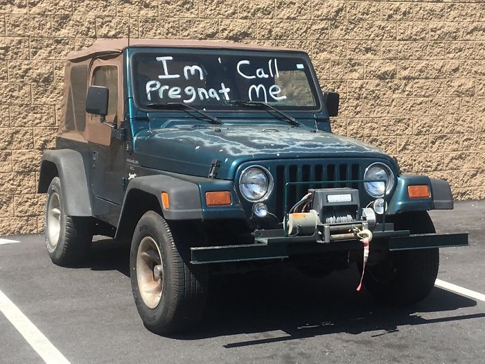
I’m Call Pregnant Me
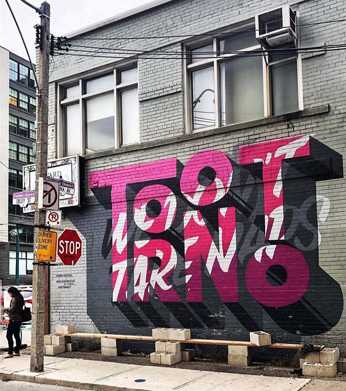
I Live In Tootrno
Wales Prince Of Hotel
To be fair, it does look like a castle, so it could be the Prince of Hotels in that sense. And it could be in Wales, as well.
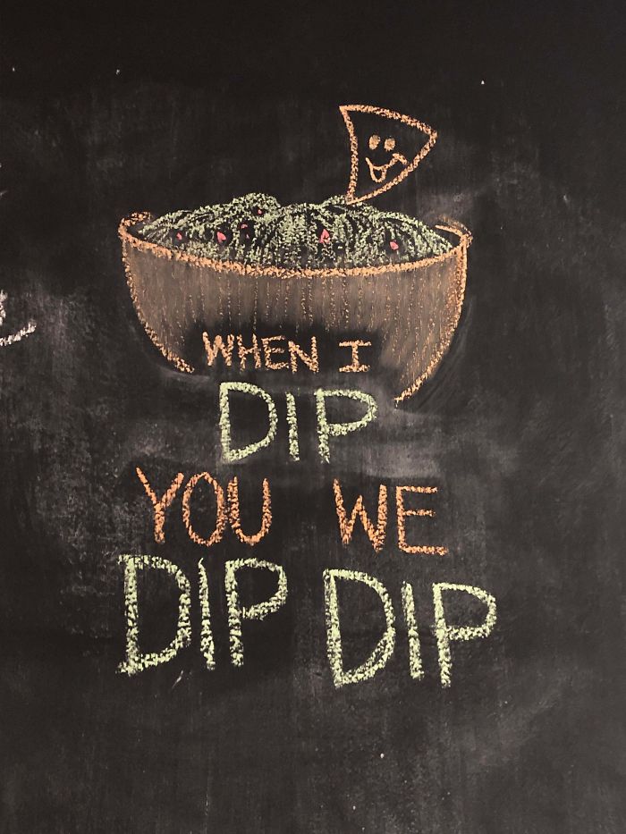
Dip Dip
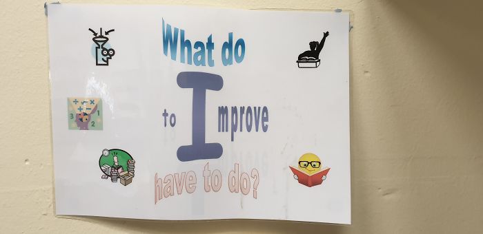
What Do?
70,000 Can’t Be Teeth, Wrong
Not to mention the fact that it's the teeth of 2,187 and a half persons
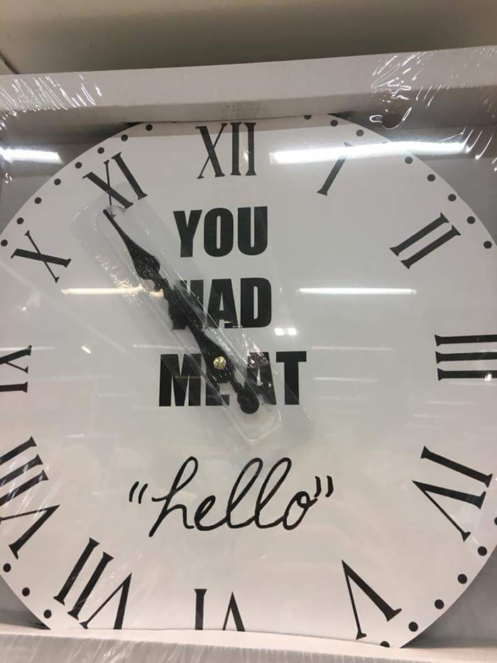
You Had Meat "Hello"
Aloha, Please Remove Your Hawaii
New Paint On The Wall At My Gym
Hear That Noise? We Are Growing. We Can Fix It Again. Apply Inside
If they have to fix it again it doesn't say much for their work...
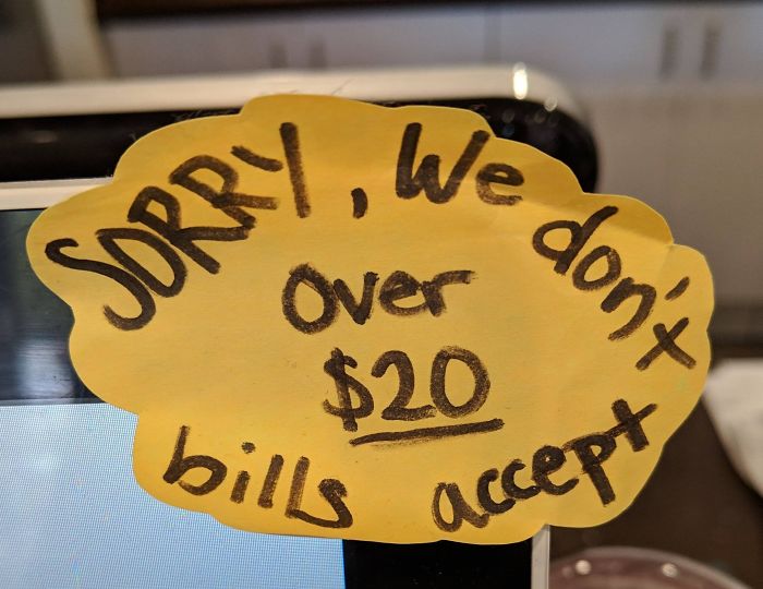
Sorry, We Don't Over $20 Bills Accept
I Give Up
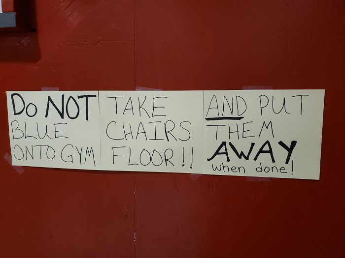
Do Not Take And Put Blue Chairs Them Onto Gym Floor! Away When Done
“So I don’t take a chair but I gotta put a chair away? That’s deep, man...”
S3adlaey
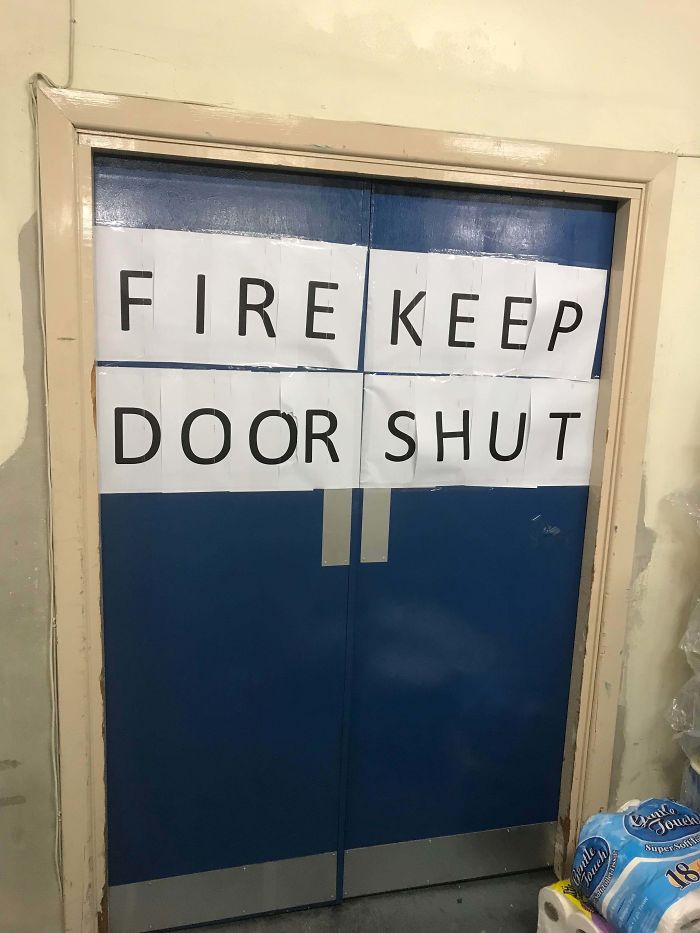
Fire Keep Door Shut
I Am Dond
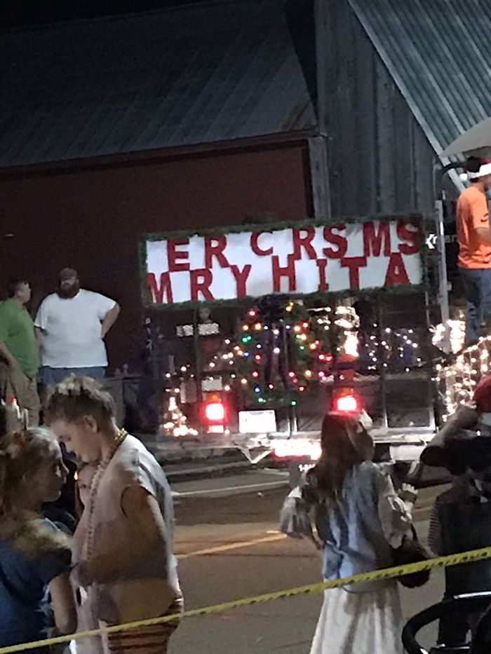
My Hometown Parade. Dear God
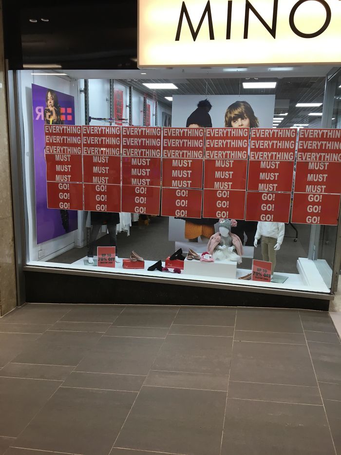
*inhales* Everything Everything Everything Everything Everything Everything Everything
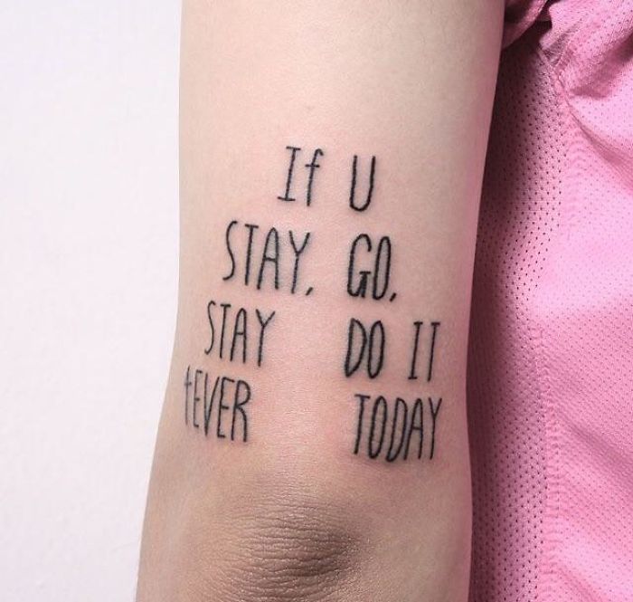
If U Stay, Go, Stay Do It 4ever Today
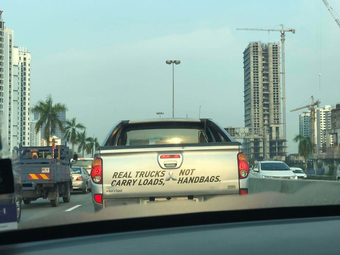
Real Trucks Not Carry Loads, Handbags
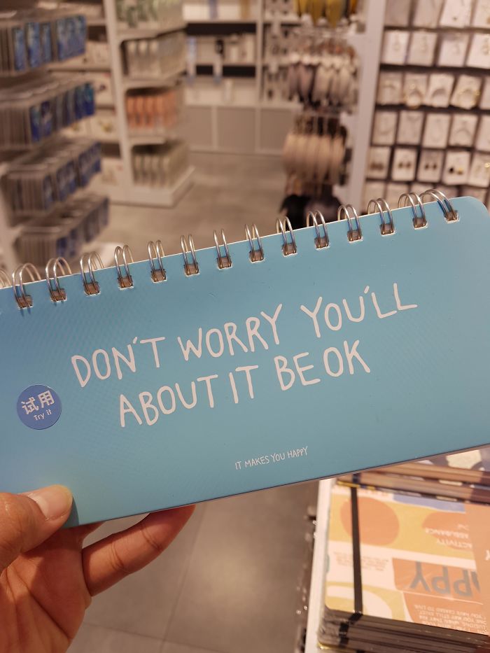
Don't Worry You'll About It Be Ok
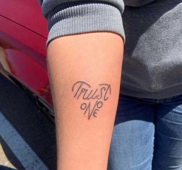
Trust Onoe
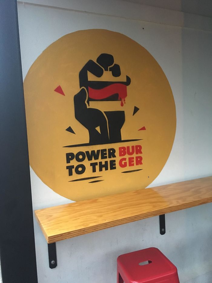
Power Bur To The Ger
Did Hurt My Your Back Knife?
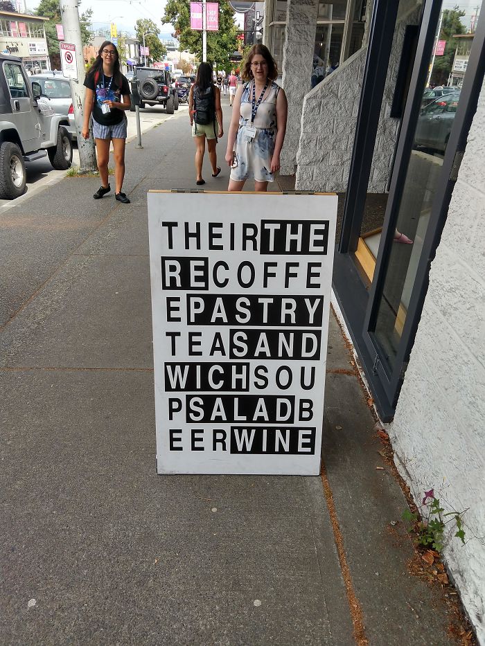
This Sign I Saw While Visiting Vancouver
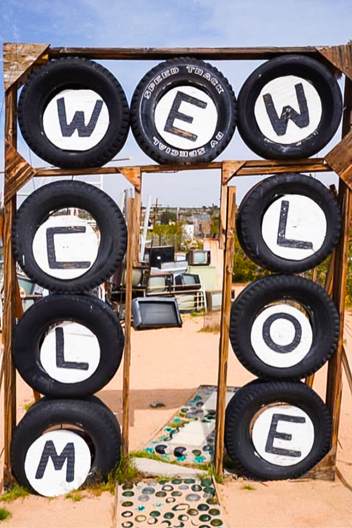
Wewclmloe
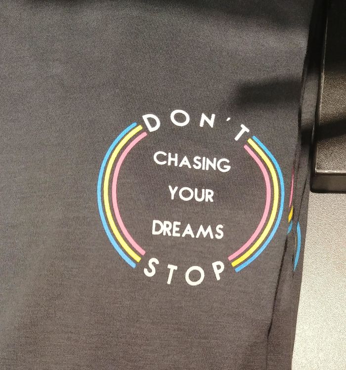
Just Stop
Either Way This Makes No Sense
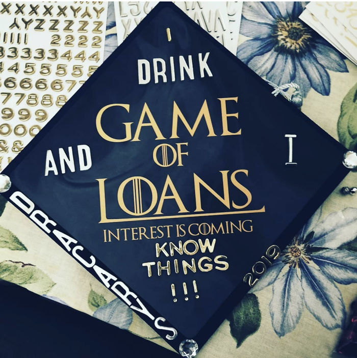
I Drink Game And Of I Loans Interest Is Coming Know Things
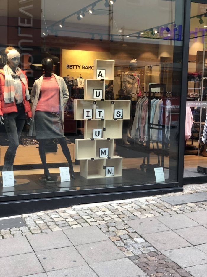
Auitsumn
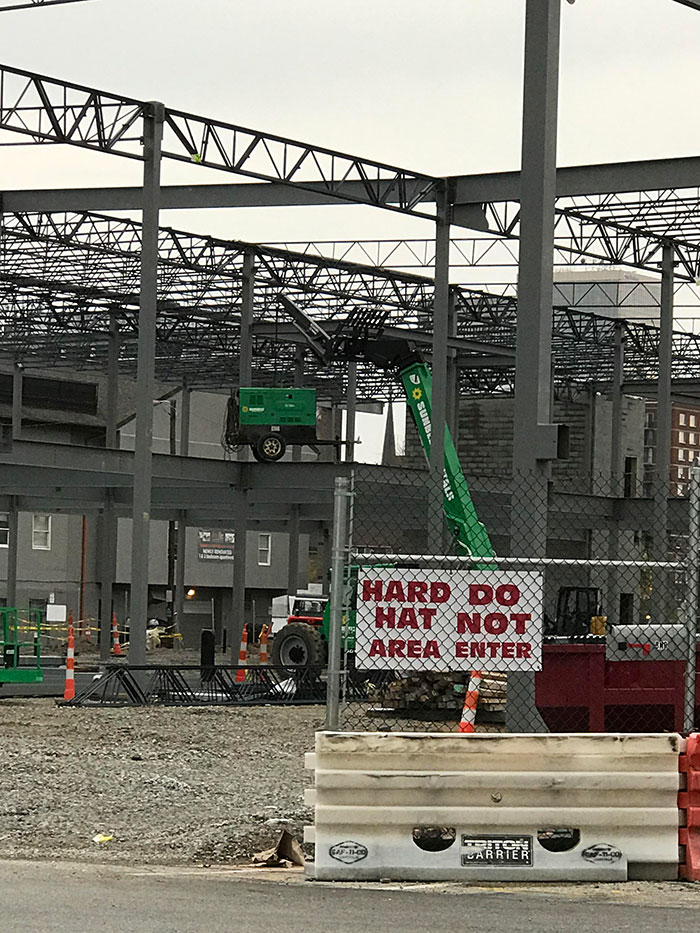
Hard Do Hat Not Area Enter
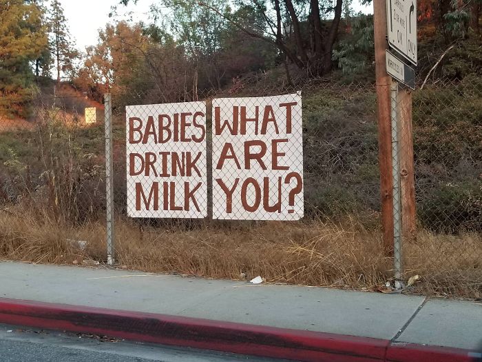
Babies What Drink Are Milk You
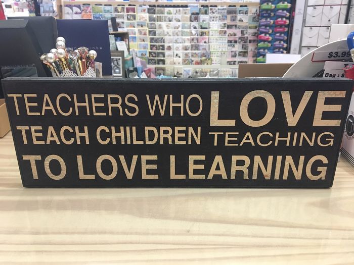
Teachers Who Love Teach Children Teaching To Love Learning
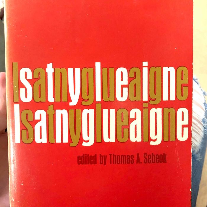
Lsatnyglueaigne Lsatnyglueaigne
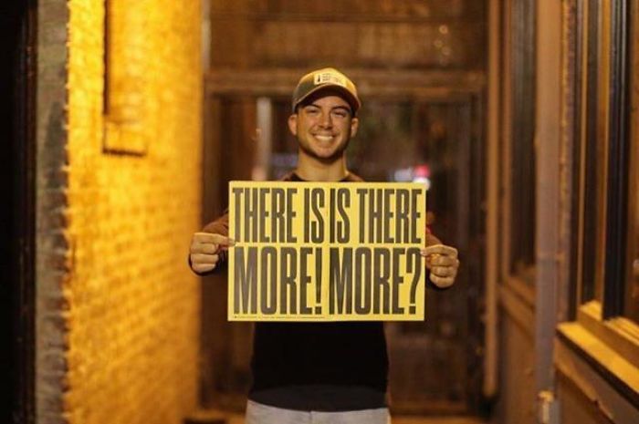
There Isis There. More! More?
Ate At A Local Restaurant
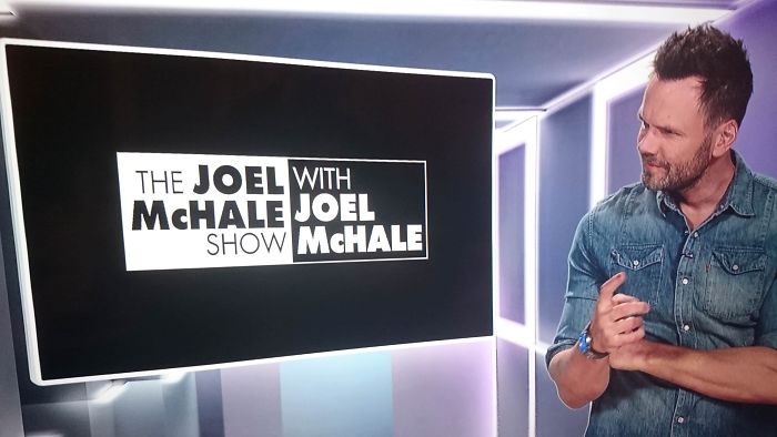
Why Did I Name My Show "The Joel With Mchale Joel Show Mchale"?
Who Thought This Was Acceptable
What a wasted opportunity, they had "TMI" in there which would certainly apply.
Carop Washen
How To Give Someone A Seizure
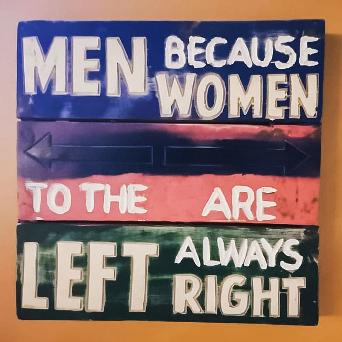
Men Because Women
I Would Like A Free Donation. Also, Here's My Lemonade
Aw but he's just a kiddo not a trained designer like some of these fails
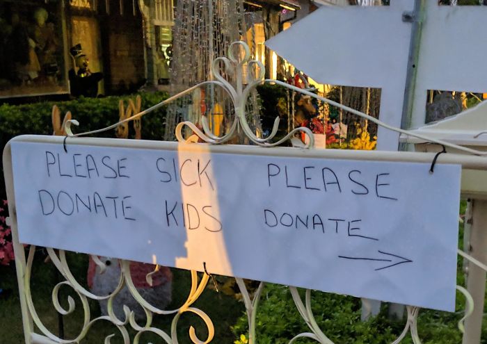
Please Sick Please Donate Kids Donate
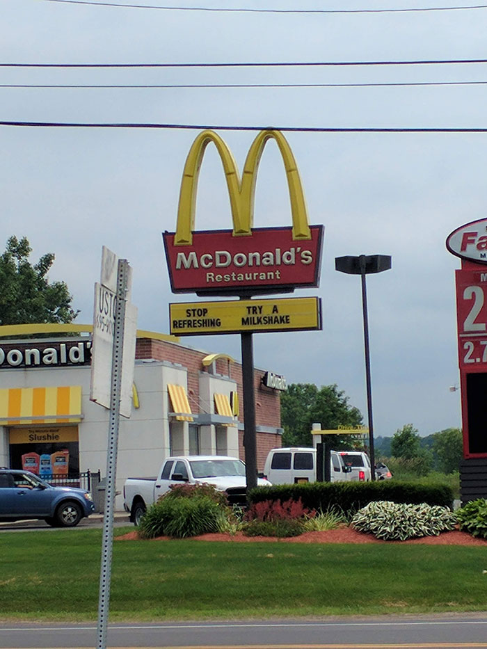
Stop Refreshing
Saw This At Work Today
No Know Jesus Jesus
My Eyes Just Died
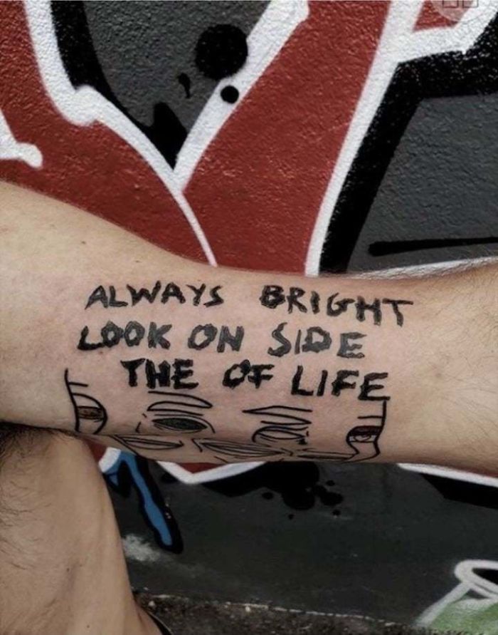
Always Bright Look On Side The Of Life
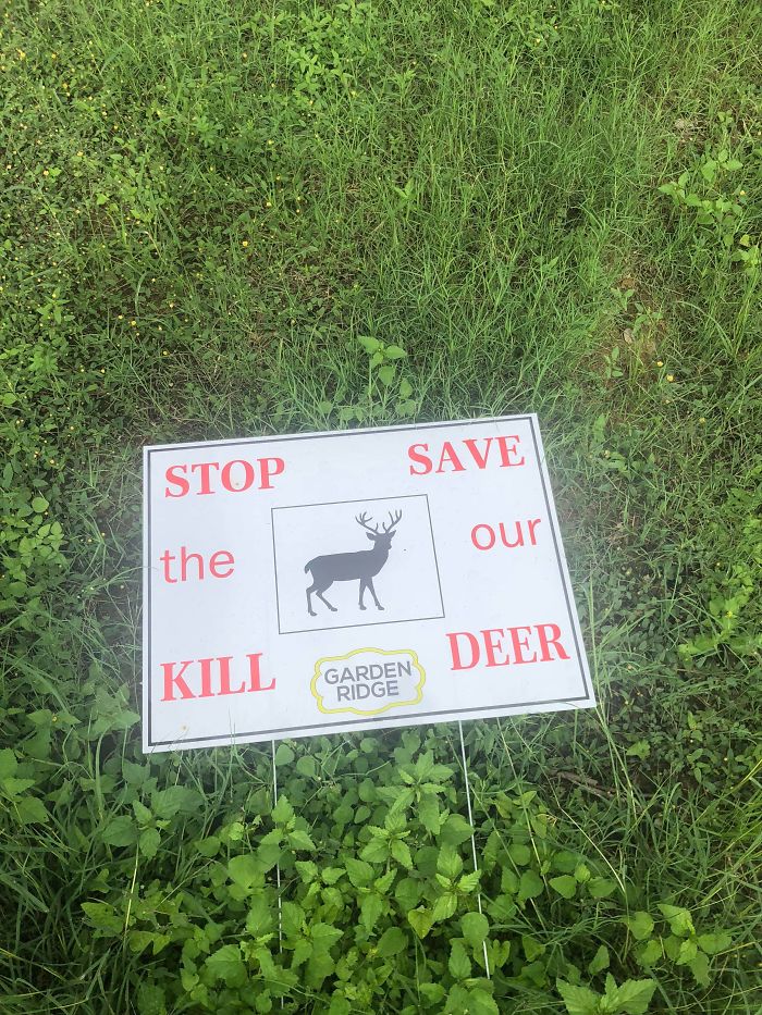
This Sign I Saw In Someone’s Yard
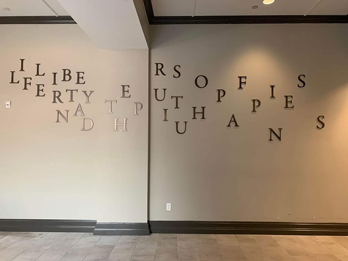
It's Supposed To Be A Quote From The Hamilton Musical. I Can See Life And Liberty But That's All I've Made Sense Of
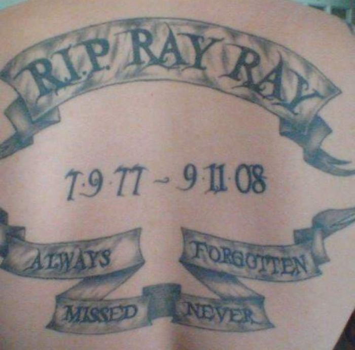
Always Forgotten - Missed Never
Well, if you follow the logic on this one, actually is correct. UP -> DOWN -> RIGHT -> UP...If you straighten the band you will see the words written correctly.
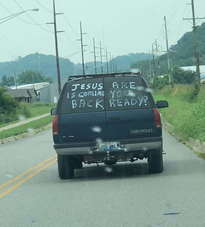
Saw This In A Store Today
Jesus Are Is Coming You Back Ready?
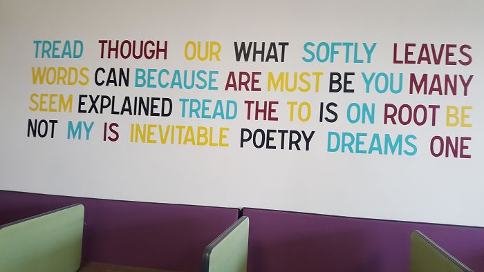
Tread Though Our What Softly Leaves Words Can Because
Catc H So Mes Tard Ust
Do people learn to read from top to bottom and then from left to right these days? In my time we went left to right, then top top to bottom...
The above photos were giving me a headache. the above headache were giving me photos. Either migraine way I have.
I understand how many of them came to be. I often have to write signs and do display boards. Sometimes you're focussing on the spacing, shapes, colours, fixing the words up etc so much you forget basic spelling.
I went to Toys R Us and used their bathroom. The sign there said For Brst Customer Service Please Flush..... how would they know? Lol
It amazes me what people write on signs don’t they read them through before putting them up.
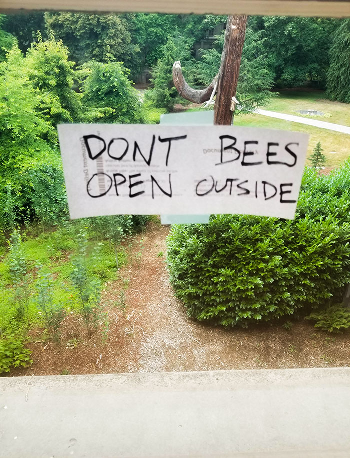
Reminds me of The Walking Dead. On the Back one side said Don't Dead-the other side said Open Inside, so it was supposed to read Don't Open Dead Inside, but it didn't really work when one of the doors was open.
Some (or maybe all!) of the people who wrote those notices will be shouting, 'You know what I mean, though!', and often, sadly, we don't.
These remind me of a Volvo TV commercial of a decade back. Touting advanced safety features, it said "Brakes apply automatically in case of an accident." Nice--but too late, no?
Proof, if more were needed, that one should never edited their own writing. On the other, these signs could have passed through several levels of management and still were approved.
I think I'm going to delete Bored Panda. I don't understand the 1st one, & can't find the other 39! Must have missed when I went straight & turned left...
I don't understand why these scrambled sentence are considered 'artistic'.

 Dark Mode

 No fees, cancel anytime


