40 Times Architects Failed To Consider Basic Functionality And Got Called Out On This Online Group
Some buildings are like terrible accidents—you can’t help but feel bad looking at them, yet can’t seem to turn your eyes away either. Whether it’s the unfortunate design or the toll time has taken on them, such constructions rarely fail to catch one’s attention.
Unsurprisingly, there is an entire subreddit devoted to this type of eyesores. Members of the 'Shitty Building Porn' community share images of buildings gone wrong, which add up to quite an impressive (sadly, not in a positive way) collection. We have found some of the most peculiar examples for you to browse that show just how important certain architectural decisions are.
This post may include affiliate links.
[terrible] Building In Philadelphia
Architecture is an intricate practice, requiring loads of knowledge and creativity, as well as a good eye for detail. It entails not only coming up with the right design for a building, but overlooking its construction as well. Both of these phases are equally important for the overall architectural integrity of the completed structure.
Taking care of responsibilities from the very first draft on a napkin to the final result on the street might be a handful. And that’s why this art form is not for everyone. However, according to 2019 data, there were over 115,000 licensed architects in the US. The same year, the number of architects' businesses reached nearly 70,000, while now it’s getting close to 75,000.
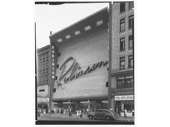
[terrible] Thin Building, Egypt
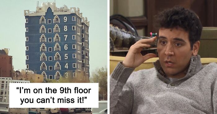
I'm On The 9th Floor You Can't Miss It! [kuwait]
Architecture is a multifaceted field; those who seek a career in it have options in what they want to narrow their focus on. However, no matter which path they choose, some rules apply to all of them—structures have to be visually appealing yet safe and functional as well.
Roman architect Vitruvius Pollio is believed to be the first one to emphasize these requirements. In the first century B.C.E. he used the Latin words firmitas (strength), utilitas (utility), and venustas (beauty) to indicate the crucial elements of a well-designed building.
Horrible Attempt At Re-Creating The Nice Architecture Of An Older Building
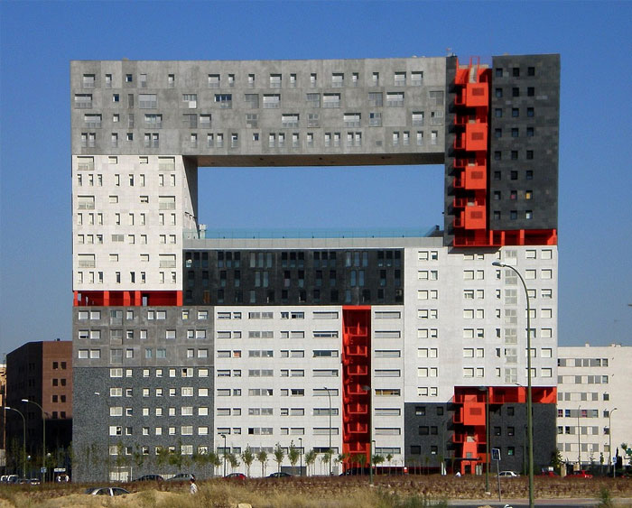
Mirador Building In Madrid
When it comes to possible career paths, Arch20 has indicated seven types of architects. There are residential and commercial architects, responsible for creating reliable dwellings as well as office buildings, shopping centers, and similar profit-generating properties. Then there’s also interior designers, who have the know-how as well as an excellent eye for what goes well together (when it comes to shapes, colors, materials and other subtleties).
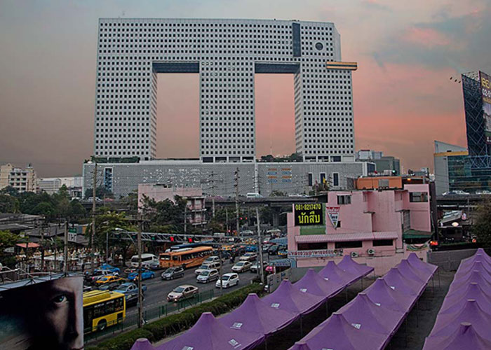
Elephant Building In Bangkok
You say elephant, but looking at that mouth instead of trunk, there is definitely some duck in that gene pool.
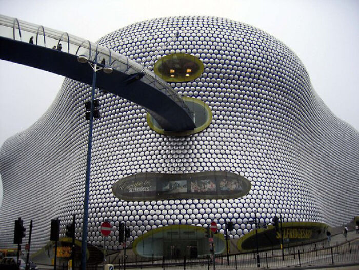
Selfridges Department Store In England
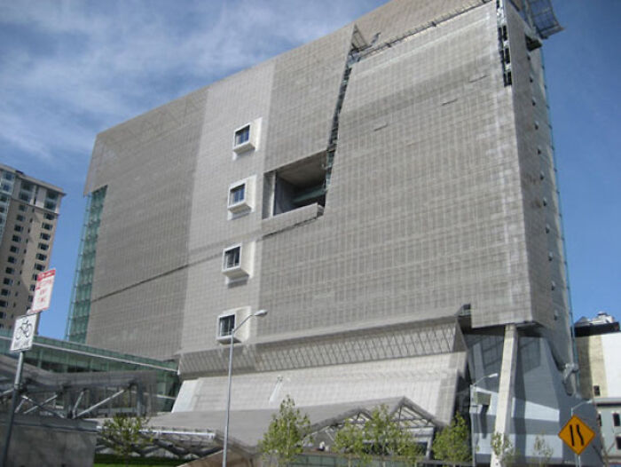
Federal Building In San Fransisco
It’s built on green (sustainability) principals (it uses natural light, more energy efficient) It’s supposed to be a healthy building - form follows function. I feel like this could have been done in a more attractive manner, it’s quite an eyesore.
Architecture takes into account people’s lifestyle, values, and needs. As we start to pay attention to eco-friendly and energy-efficient housing, creating constructions with such properties falls on the shoulders of green design architects. Other professions that are closely linked to people’s needs are landscape architects and urban designers, who make our environment a more convenient place to live. Last but not least—industrial architects, who boast specific knowledge enabling them to come up with the most suitable industry-based decisions.
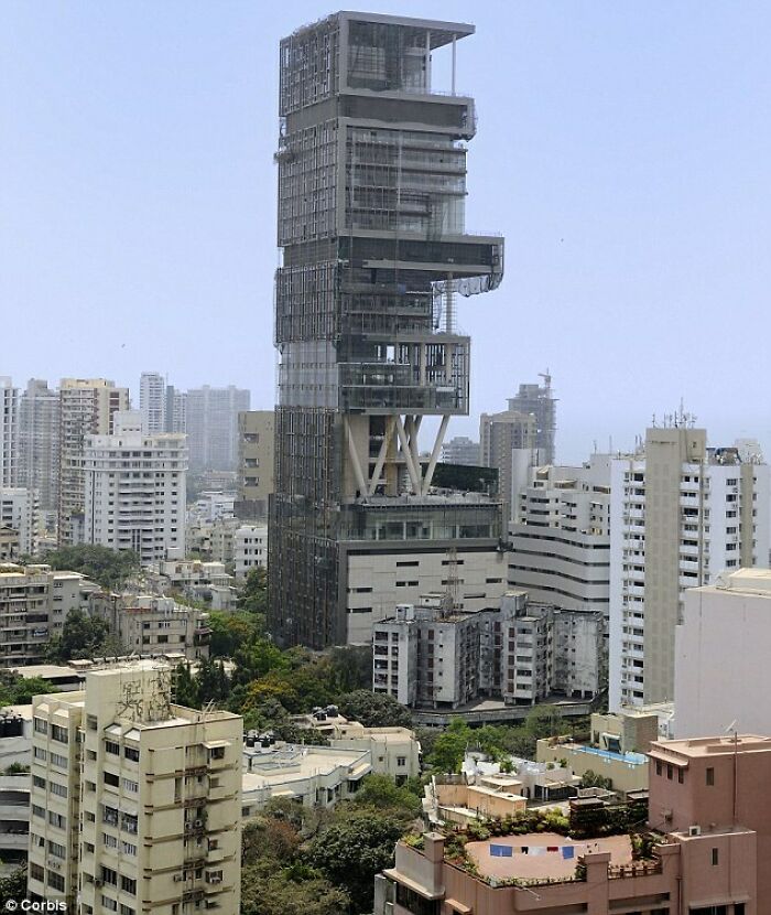
Antilia In India (Personal Home)
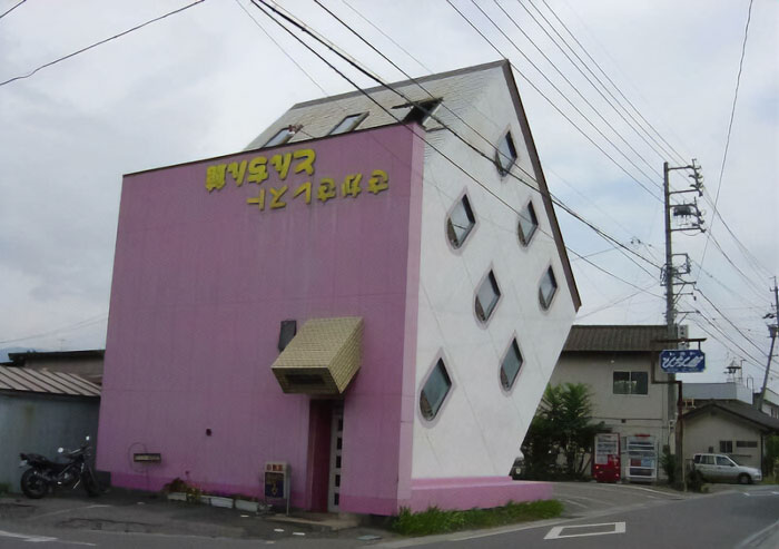
Upside-Down Building
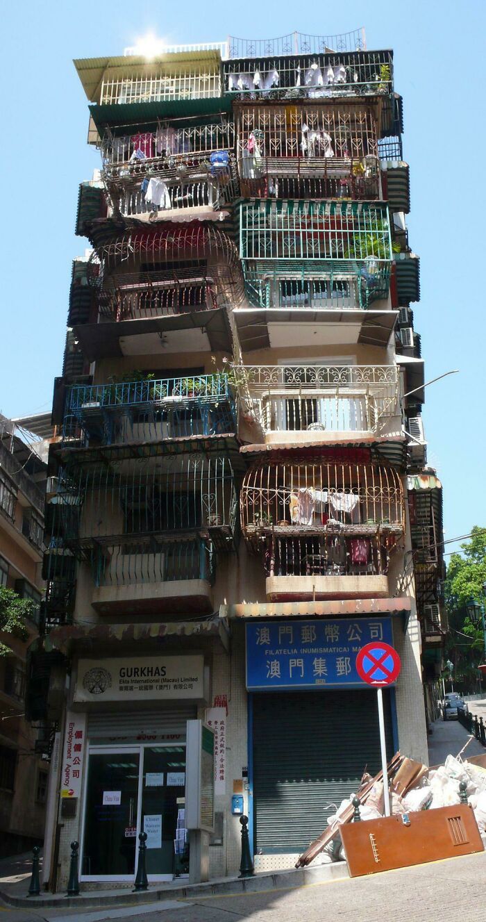
Markus Bahlmann - Macau Old Residential Building
You don’t have to be an architect to appreciate a beautiful design, though. It doesn’t matter if it’s a 19th-century Victorian-style house, an urban blocklike dwelling, or something else completely. And if there are no examples of your favored architectural style nearby, you can always go online—as with most topics, the internet is brimming with content showcasing all sorts of marvelous buildings. (Check out the amazing architecture posts on this Instagram account, for instance.)
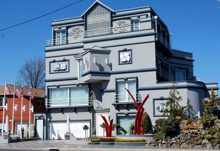
This Ugly House In Mill Basin, Brooklyn
Strange... but hardly UGLY compared the previous few. But yeah, the architect was smoking crack.
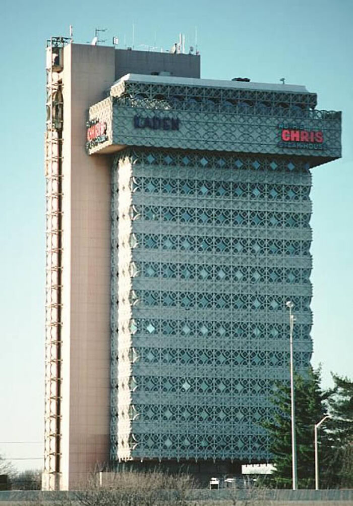
Kaden Tower In Kentucky
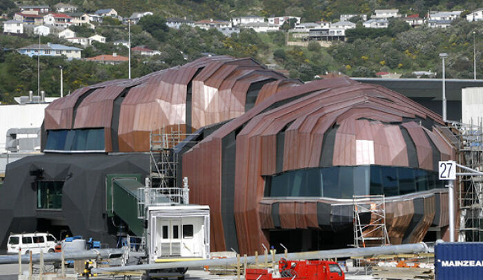
The Rock In New Zealand
When it comes to attention-worthy online content, lovers of all things architecture might appreciate ‘Architecture Hunter’, a digital media project focusing on construction and design. They shed light on extraordinary examples of human creativity that they believe have to be witnessed by the world. Deservingly so. Scroll through their Instagram if you want to see some of the visuals yourself.
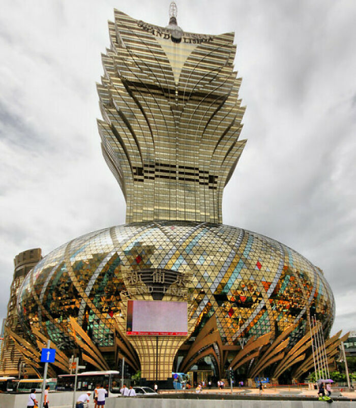
Grand Lisboa Hotel In Macau
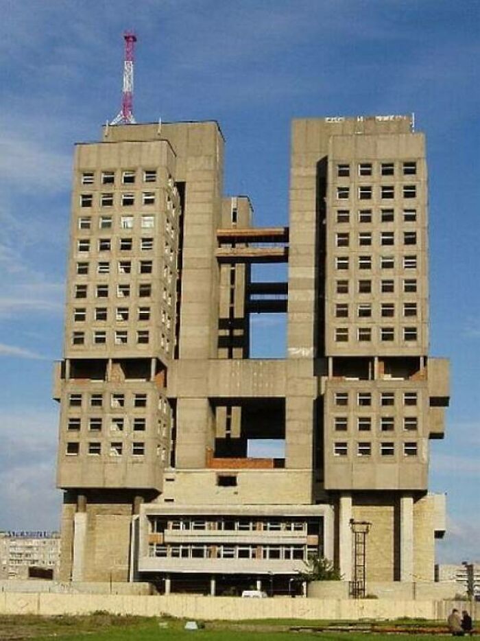
House Of Soviets In Kaliningrad
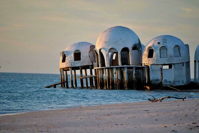
Dome Home Near The Gulf
To balance out the beautiful architecture-related content on social media, designs on the other end of the spectrum are covered online as well. Ugly Belgian Houses is an excellent example of such counterweights.
In a previous interview with Bored Panda, the mastermind behind the account, Hannes Coudenys, said: “Normally, if you like architecture, you like good houses, but in Belgium, there’s a lot of ugly architecture. So I started taking pictures of it.” (Make sure to read the full interview here.)
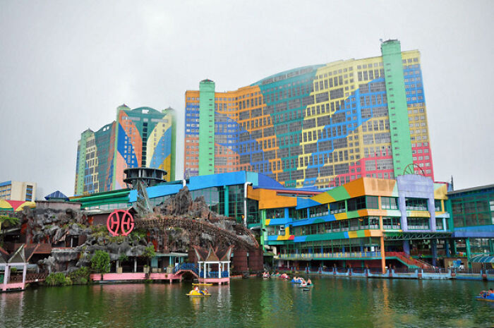
First World Hotel In Malaysia
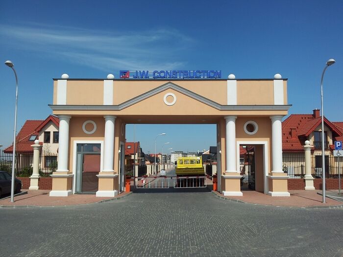
Gateway To A Residential Neighborhood In Poland
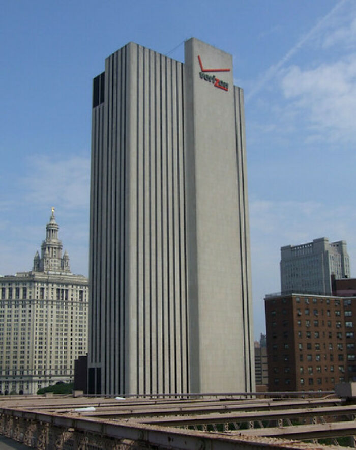
Verizon Building NYC
The way we distinguish the appealing from the appalling is very subjective. However, when it comes to architecture, people can be split into two camps—architects and designers versus the rest of the folk. This idea was analyzed by the founding director of the Penn Center for Neuroaesthetics, professor of neurology, psychology, and architecture, Anjan Chatterjee, in his article for Psychology Today.
In a previous study, he covered how the brain responds to architecture. The professor revealed that the way people experience beauty in certain interiors can correlate with neural activity responsible for the feeling of reward. “The aesthetic experience of architectural interiors draws on the same reward systems that are associated with the pleasure we experience in gazing at beautiful faces as well as in satisfying primary appetites such as food and sex,” he wrote.
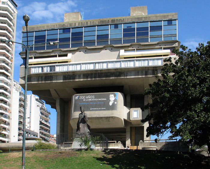
National Library In Buenos Aires, Argentina
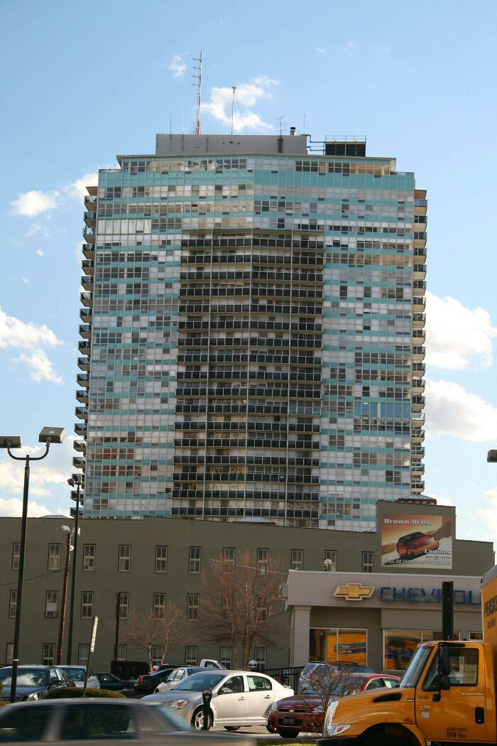
The 800 - Louisville, Ky
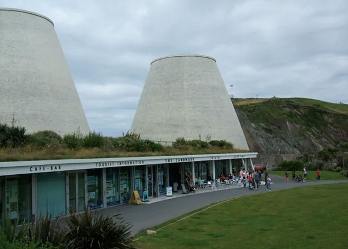
Landmark Theater In England
Did they reuse old power station cooling towers, or was it deliberately designed to look like that?
Some architectural gems ought to evoke a feeling of reward simply by marveling at them; the works of Antoni Gaudí, for instance. The intricate, colorful designs of the renowned Catalan architect are considered some of the world’s most exceptional examples of architectural heritage. Unsurprisingly, they gather thousands of people to Barcelona to witness them firsthand. (Make sure to add Park Güell, La Casa Vicens, Casa Batlló, and, of course, the iconic Sagrada Família to your itinerary, if you’re planning a visit yourself.)
Another Railway Station In Estonia
Ugly, but unremarkable. There are thousands of buildings that look like this across the USA. Then again, most of them are public toilets.
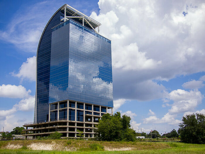
Majesty Building - Orlando
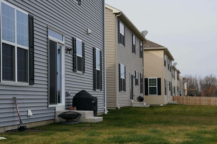
Brand New Homes In Shorewood, Illinois
Pretty sure these are the back doors/yards, judging by the items next to the houses.
If architectural wonders are your cup of tea, browsing participants (and the winners, especially) of related contests might just become your new favorite pastime. The annual Architecture MasterPrize, for instance, presents an abundance of eye-candy-like designs. If you need proof, just take a look at Bored Panda’s list of architectural masterpieces from all over the world that won the award in 2020.
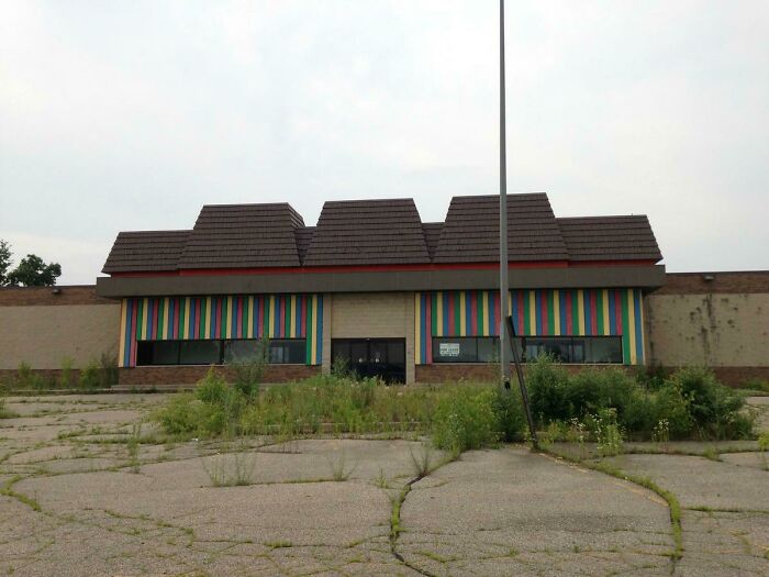
Toys R Us - Battle Creek, Mi
Sad, spent many a birthday at Toys R Us wandering the aisles with grandma looking for a toy to buy.
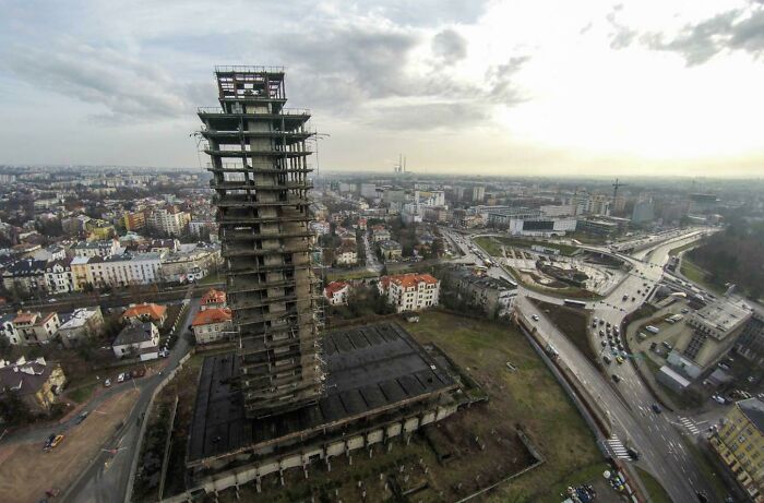
Beautiful Skycraper In Krakow, Poland
It was like that few years ago. Now it's looks quite better https://en.m.wikipedia.org/wiki/Unity_Tower
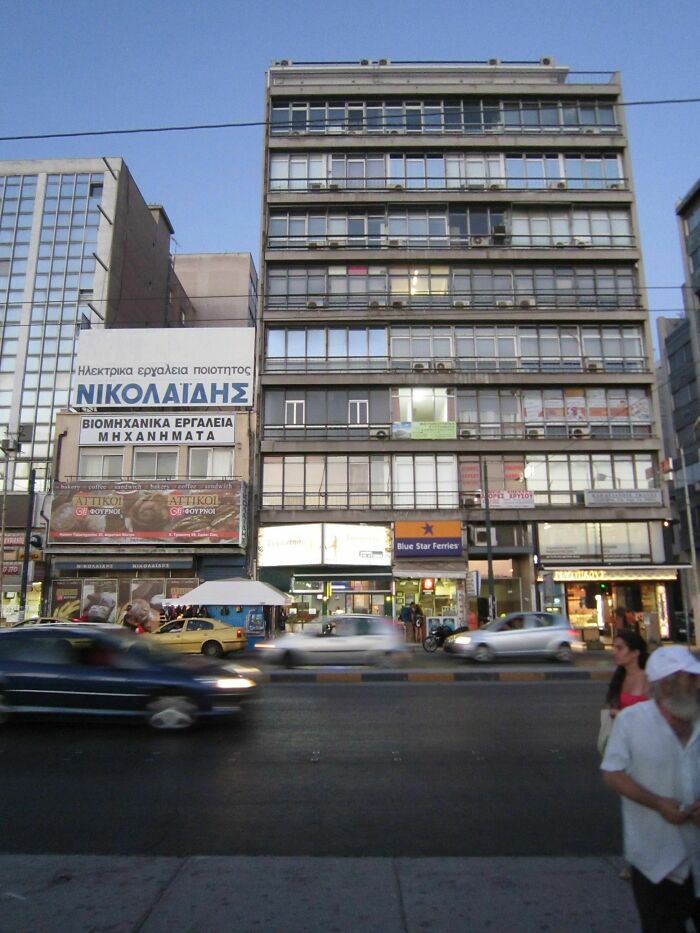
Some Ugly Building In Athens, Greece
If you prefer browsing nightmare-of-a-building design examples, this list of reasons someone should have hired a professional might be just what you need. However, in case you need a pick me up after viewing these disasters, make sure to check out some examples of ‘friendly architecture’. They will undoubtedly bring back your faith in architects.
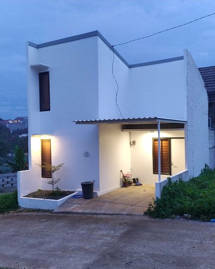
Part Of A Cookie Cutter Housing Development Project, So There Are 40 Others Like This. (Non-Us)
Literal [terrible] Building
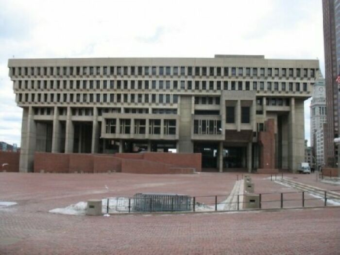
Boston City Hall In Boston
People's Park Hotel In Singapore
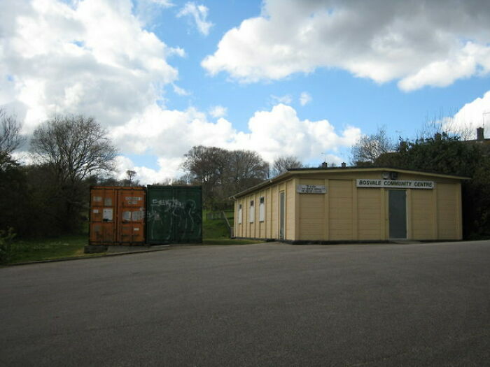
Bosvale Community Cetre, Cornwall, UK
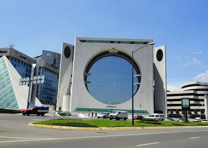
La Lavadora In Mexico City
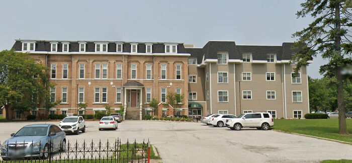
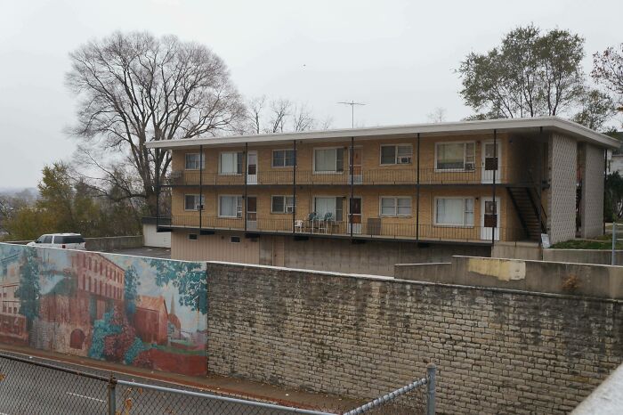
Joliet, Illinois
Nothing wrong here. There are billions of people who would be very happy to live here.
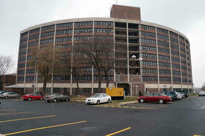
John F. Kennedy Terrace, Joliet, Illinois
Definitely doesn't belong here. Hardly stately, but average to above-average for a large-scale housing building.
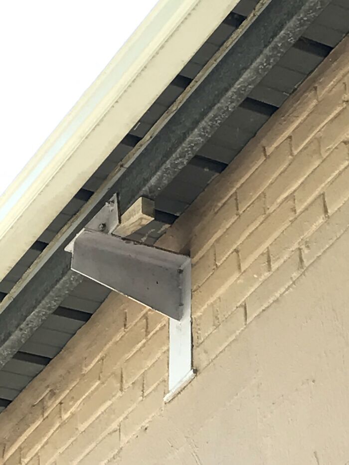
That Should Do It! (Virgin Active Gym In George, South Africa)
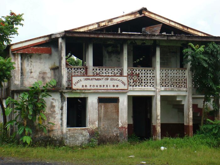
Department Of Education (Pohnpei)
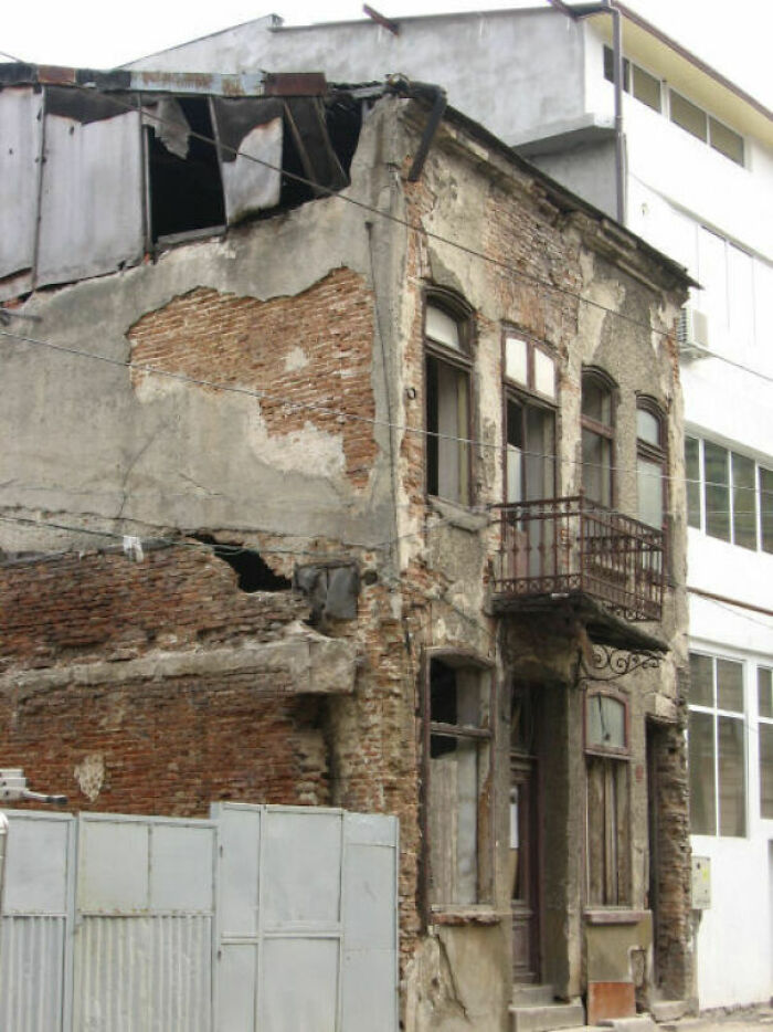
[terrible] Building In Rotterdam
I think the green factory in the background looks a might uglier than this little place. I don't find it too bad.
[terrible] Rental - Chch, New Zealand
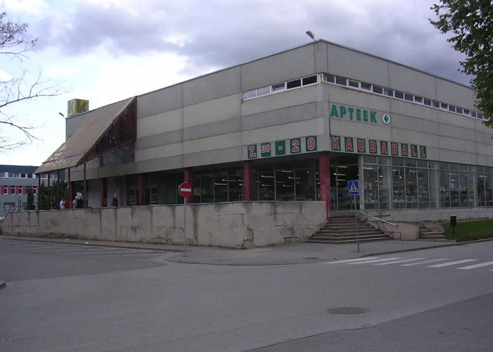
Department Store In Estonia
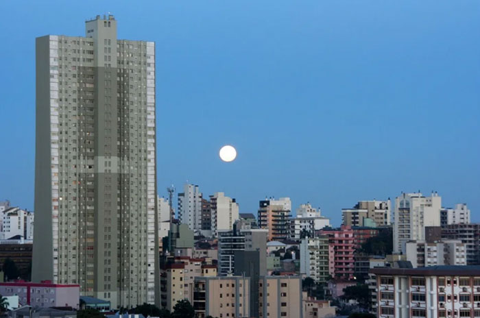
Parque Do Sol, Caxias Do Sul, Brazil
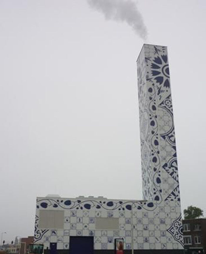
Delftware Warming Station In Netherlands
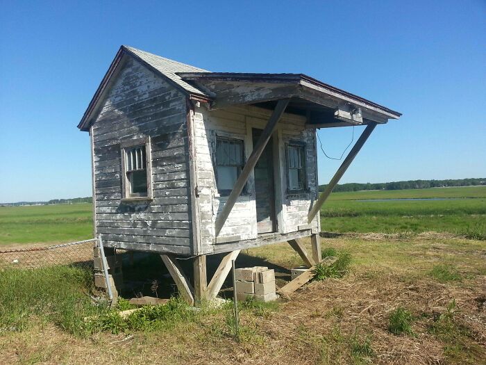
A Shack In Hampton, Nh
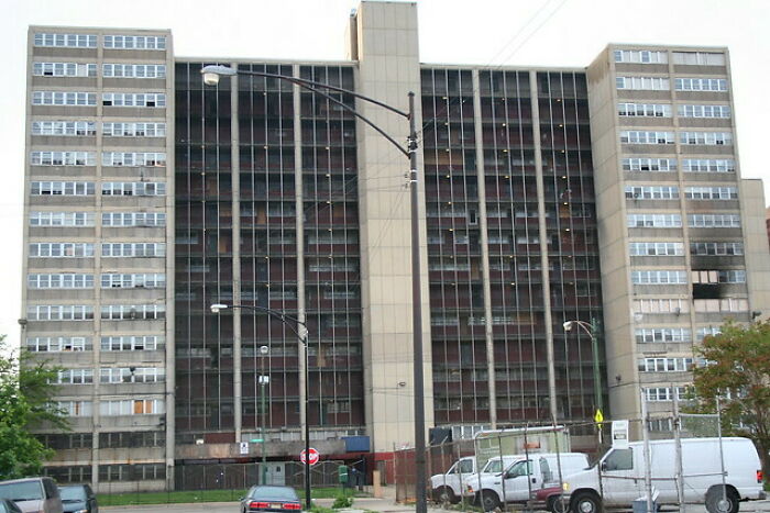
Cabrini Green - Chicago (These Are Why Chicago Is So Anti-Gun)
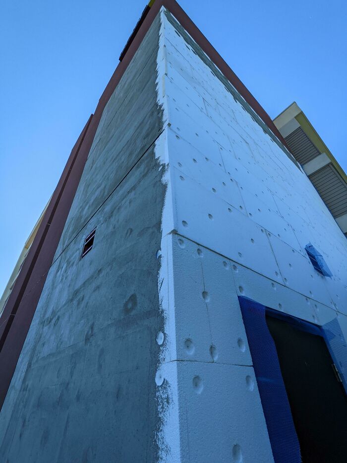
I Guess We're Using Styrofoam Brick Facades Now?
Bauhaus, Tallinn, Estonia
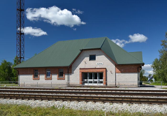
Railway Station In Estonia
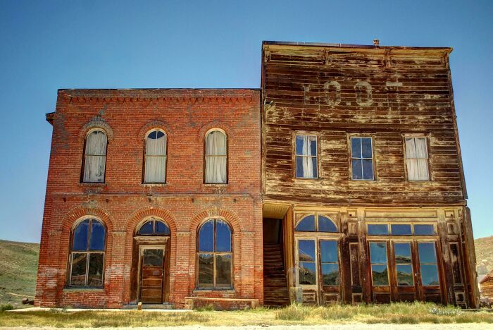
Buulding In Bodie, A Town In California
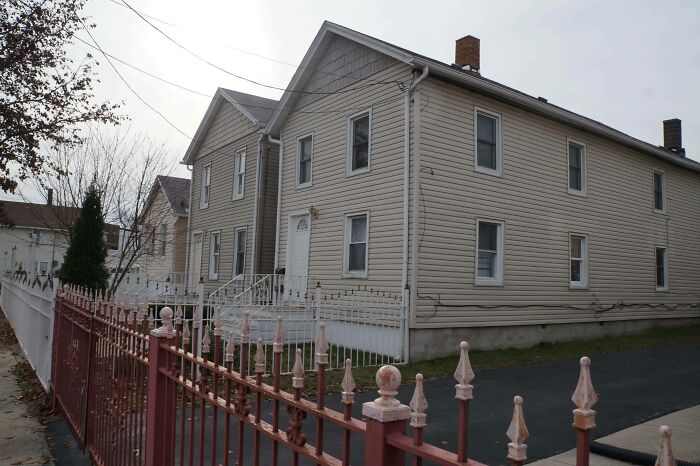
Homes In Joliet, Illinois
Joe Bar, California
House Fit For A King. (Russia)
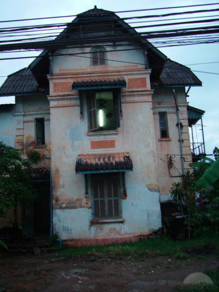
House In Vientiane, Laos
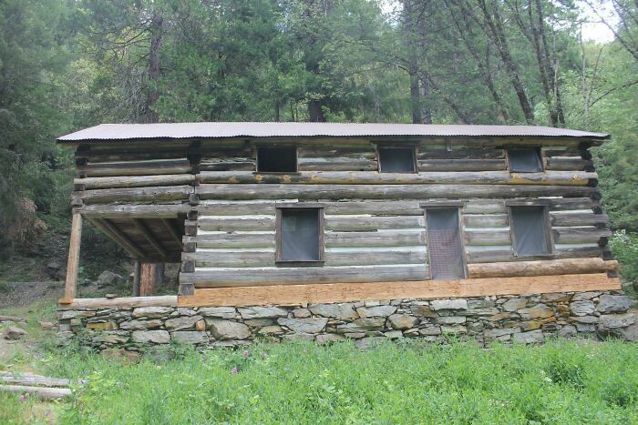
Rural Mount - Morristown, Tennessee
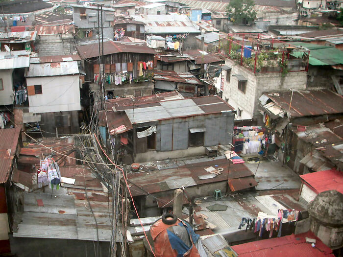
Manila Slums
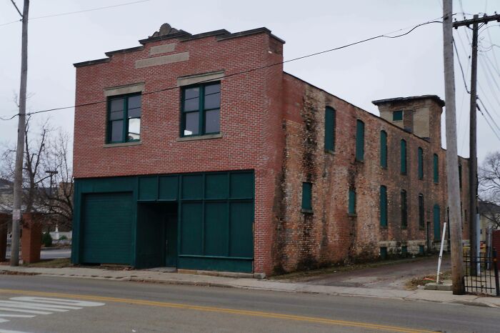
American Ice Cream Bakery Company Building, Joliet, Illinois
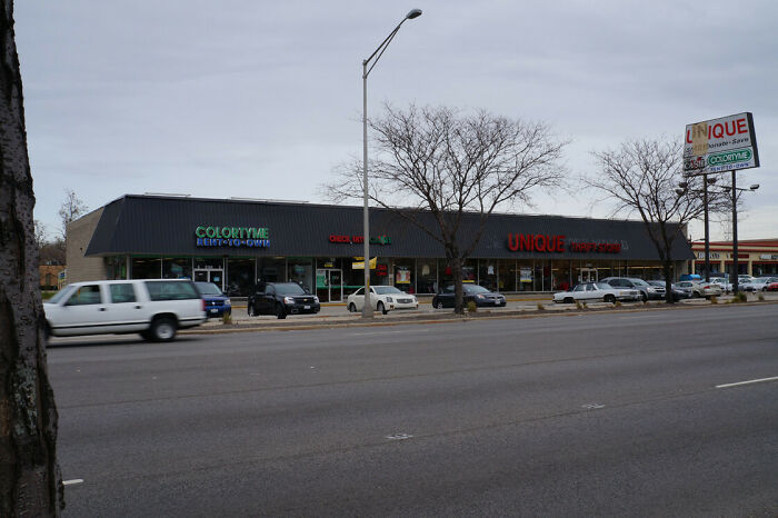
A Strip Mall In Joliet, Illinois
This list compiler really must have something against Joliet, Illinois! This is like the 5th post I’ve seen featuring architecture from there!
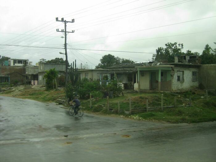
Cuban Suburbs
Please BP try and name your articles properpy. Most of this list had nothing to do with bad architecture. Now that I think of it the entire list makes no sense, it goes from architecture to slums to abandoned buildings and whatnot. Maybe should have named it "buildings"LOL.
What an appalling article. Claiming these are the products of the failure of architects is in many cases rather insulting.
What an awful, pretentious list. Really bad to include slums- obviously they aren't architectural projects, they're thrown up quickly to keep people alive. There's also a huge difference between architecture and upkeep. The majority of these just need TLC to look good again.
Made an account just to say, BP wtf is this drivel. Make a "journalist" fail list, and this can be top 10.
From the comments here, it looks like BP has already changed the title once. But it still makes no sense. "Failed to consider basic functionality"? They're all weird looking. But they all seem perfectly functional. They're interesting, unique, eccentric, quirky, have a distinctive style... any of these descriptions would work. We're all here if you need more suggestions. ;D
Really low effort on this one. They're mostly just ugly, not architectural nightmares.
Not sure I understand this either nor how it’s an architect’s fault? Slums aren’t a result of bad architecture, Toys r us going bankrupt isn’t the fault of an architect, and poor design starts with the person who wants a poor design and paid an architect to design it. It makes you wonder about the person who came up with this article…
"Great places to eat tacos" would be a better descriptor of this list, and that doesn't make sense either! BP, is your entire staff illiterate? Just asking because of the overwhelming amount of these lists where the content doesn't match the title...
To show images of homes where people live in poverty and building where someone spend millions designing and make it about architecture fails is very distasteful. I think the point should be more about wasting money on fancy bank buildings and more about using that money to help those who could truly benefit... But that's just my opinion.
I wish this article had some of those rating questions after it! This was really bad.
https://www.boredpanda.com/terribly-satisfying-buildings/ Really?

 Dark Mode

 No fees, cancel anytime


![[terrible] Building In Philadelphia [terrible] Building In Philadelphia](https://www.boredpanda.com/blog/wp-content/uploads/2023/03/6409a76aefc42_iq89sa0wuch01__700.jpg)

![[terrible] Thin Building, Egypt [terrible] Thin Building, Egypt](https://www.boredpanda.com/blog/wp-content/uploads/2023/03/terribly-satisfying-buildings-13-640b3c0618c3c__700.jpg)
![I'm On The 9th Floor You Can't Miss It! [kuwait] I'm On The 9th Floor You Can't Miss It! [kuwait]](https://www.boredpanda.com/blog/wp-content/uploads/2023/03/terribly-satisfying-buildings-10-6409e3ed5030c__700.jpg)

![Literal [terrible] Building Literal [terrible] Building](https://www.boredpanda.com/blog/wp-content/uploads/2023/03/6409a78ad0361_OWL3HHK__700.jpg)







![[terrible] Building In Rotterdam [terrible] Building In Rotterdam](https://www.boredpanda.com/blog/wp-content/uploads/2023/03/6409aafdbf94b_LpyLNAi__700.jpg)
![[terrible] Rental - Chch, New Zealand [terrible] Rental - Chch, New Zealand](https://www.boredpanda.com/blog/wp-content/uploads/2023/03/6409a7b9430ae_xlm5x3vj3qbz__700.jpg)
