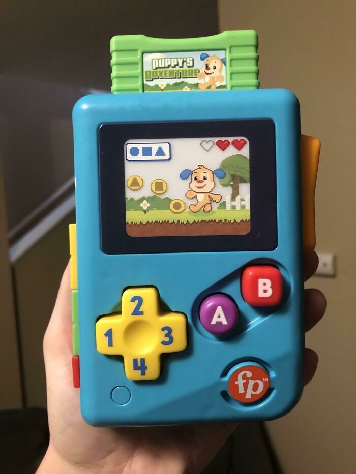
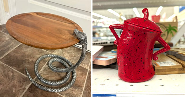
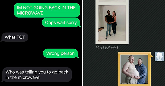
Call the aesthetics police and send a telegram to the epic fails department—we’ve got some awful design decisions to report, and we think there needs to be an official inquiry. This multi-million-member strong subreddit is devoted to showing the most awful sides of design, whether we’re talking about interiors, exteriors, or plain old products. We’ve collected some of the most egregious designs to grace the internet in recent days, so make sure your inner critic is all fired up and ready to go, cuz things are about to get real.
Bored Panda got in touch with Ariane Sherine, the new editor at These Three Rooms, the unique sister site to the Kitchens Bedrooms Bathrooms magazine, for a chat about good and bad design, and how to make your designs stand out. You’ll find our full interview with Ariane, who lent us her eye for aesthetics, below, so be sure to check it out while you’re upvoting the best of the worst design pics, Pandas.
When you’re done enjoying this utter (un)aesthetic madness in this list, you should check out Bored Panda’s recent articles about epic design fails here, here, and here.
This post may include affiliate links.
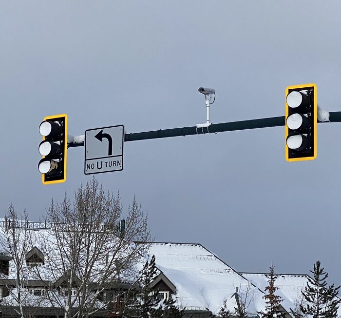
Stoplights In Lake Tahoe Filled With Snow Due To A Crappy Design Of Not Having The Bottom Cut Out To Prevent Snow Accumulation. It’s A World-Class Ski Area, Snow Should Be A Key Factor In All Design Decisions
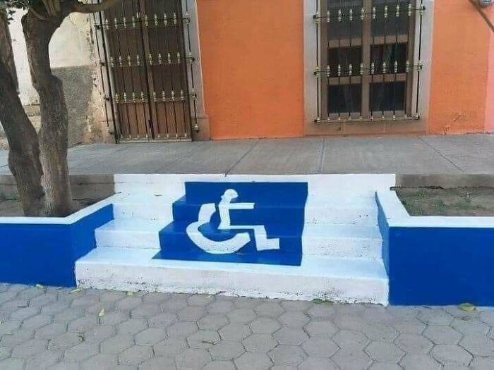
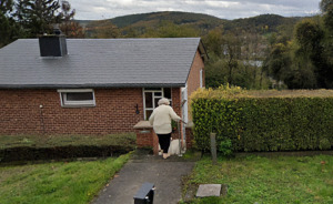
Wheelchair Friendly Stairway
Blehhh
Ariane, an editor working at These Three Rooms, was kind enough to share her thoughts about design, aesthetics, and quality with Bored Panda. Ariane believes that the designs that have the biggest impact stand out in terms of aesthetics, form, and their physical durability.
“When it comes to aesthetics, 'bad design' is a very individual thing that comes down to personal taste,” she said that our personal taste plays an important role in how we judge designs. However, we shouldn’t judge designs based on just how we feel about them. We need to take other things into account as well.
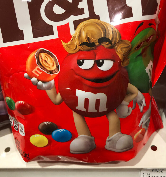
Just So We're All Clear, This Man Has Cracked Open A Child And Is Now Wearing Its Insides On His Head, Correct?
At Least They Can't See Your Face
Nice to know that they can get acquainted with your other cheeks though.
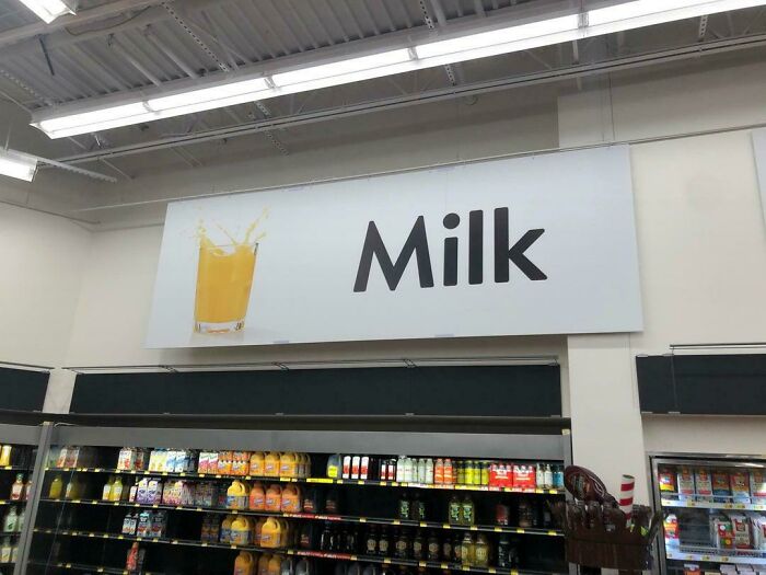
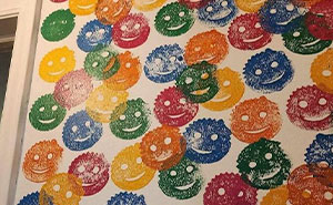
Orange Is The New Milk
Design expert Ariane gave Bored Panda an example of how our personal tastes, likes, and dislikes can affect our judgment.
“For example, I don't particularly like busy 'maximalist' designs with too many clashing prints and patterns, and I'm not keen on very dark colors, but those might be heaven for somebody else,” she said.
“It's perhaps more helpful to talk about 'bad design' as design that doesn't function as it should—for instance, a kitchen that doesn't have what's called 'good flow', where you have to walk impractical distances between complementary appliances and where the dimensions of the 'kitchen work triangle' (the distance between fridge, sink, and hob) aren't practical,” Ariane said that poor design is more related to poor functioning rather than just poor aesthetics.
Never Noticed
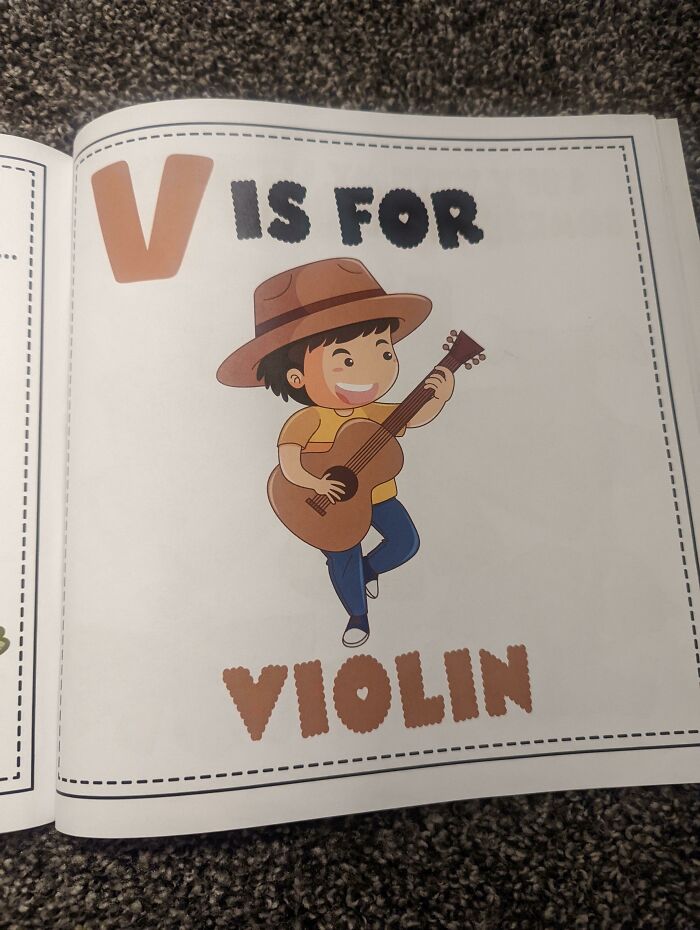
Yee-Haw A Violin!
I Wonder If She's Pregnant
“A kitchen where there isn't enough storage, where potentially dangerous appliances aren't located safely, and where cornflakes and milk are placed at opposite ends of the room is what I'd call 'bad design,'” she told us that bad design is broader and that we should look at the overall space where certain items are located, not just the individual items in isolation.
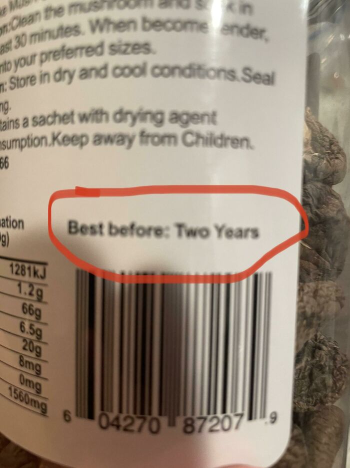
I Think I’ve Found It, The Worst Expiration Date Ever
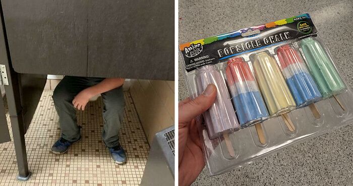
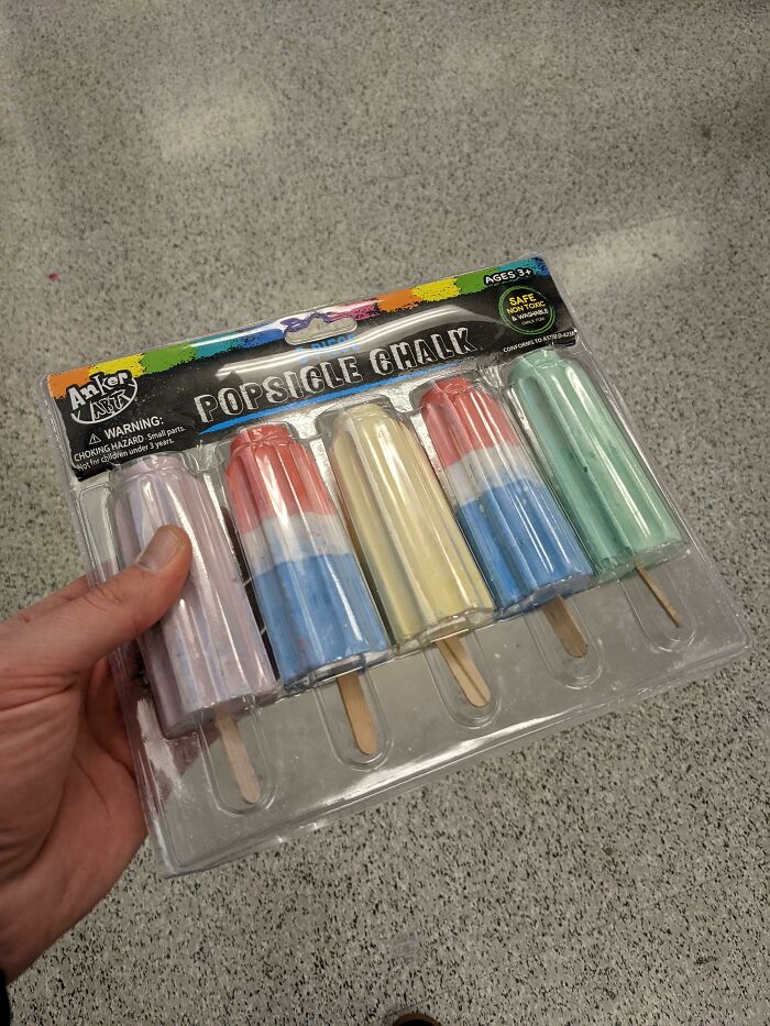
Chalk With A Popsicle Color, Shape, And Even Wood Handle. What Could Go Wrong Giving These To Kids?
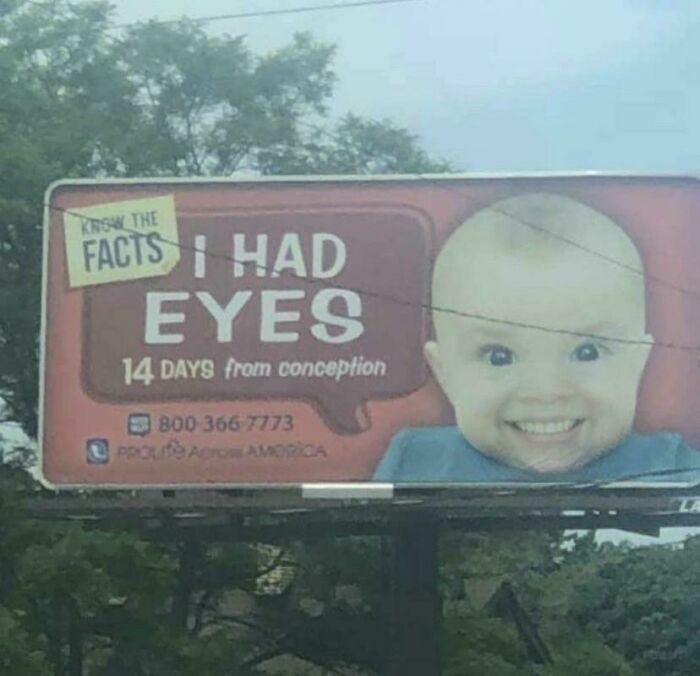
Know The Facts I Have Beautiful Teeth Too
On the flip side, what we consider to be good—or even great—design is all about putting in the energy, effort, and attention where it matters. Good design takes time, especially when it comes to our homes.
“‘Good design' is where a lot of thought and effort has been put into structuring and renovating a house so it's perfect for the people living in it. It takes account of their aesthetic preferences but also focuses on the concepts I mentioned before, paying close attention to detail,” Ariane told us.
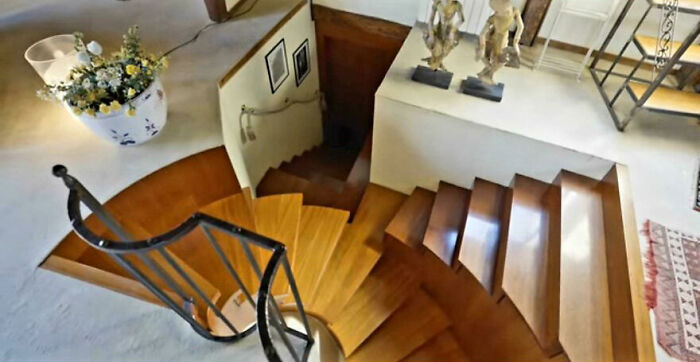
The Worst Staircase I Have Ever Seen
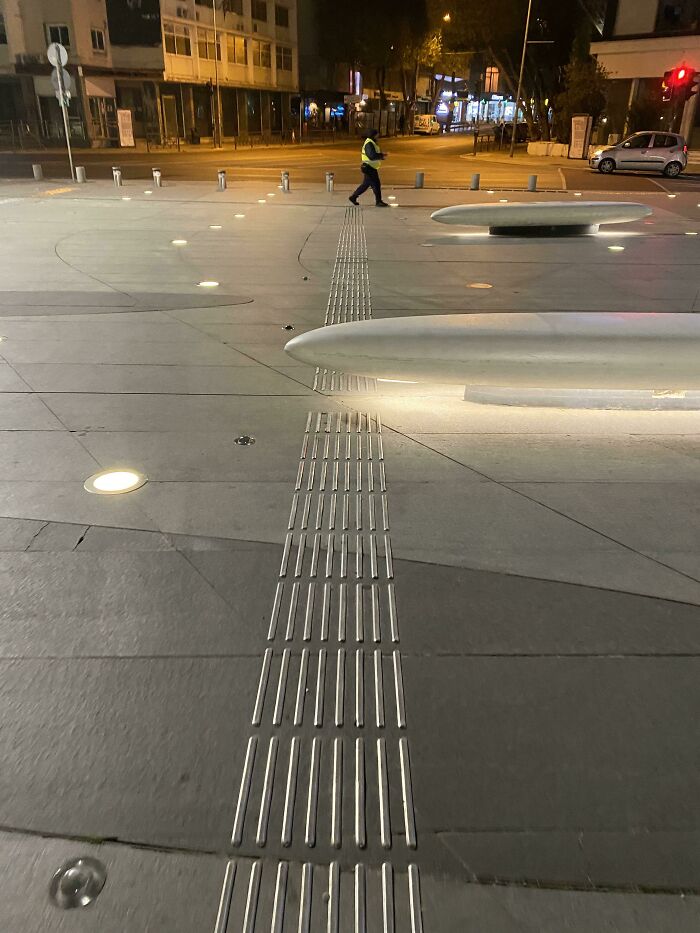
Tactile Paving For The Visually Impaired Interrupted By Giant Bench
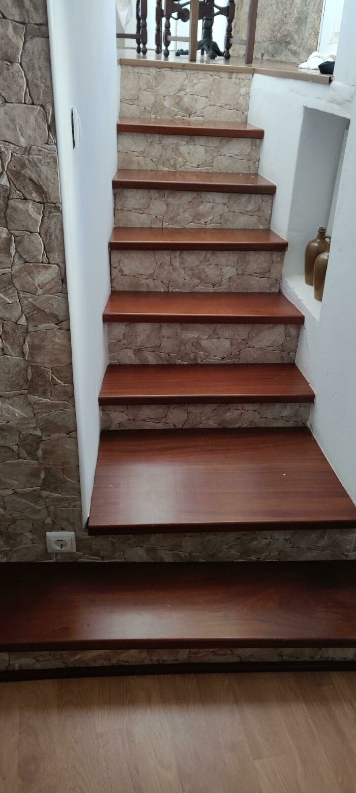
The Stairs In An Airbnb I Stayed In Where Every Step Is A Different Height, Width And Depth
The editor from These Three Rooms shared what good design looks like for her. “For me, good design is where artificial lighting is used strategically, and where the amount of natural light is maximized; where a room feels airy and spacious instead of closed in.”
This Is So Bad I Forgot How Giraffes Really Look
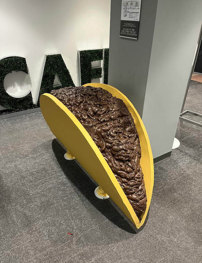
This "Taco" Someone Posted From Their Work Cafeteria
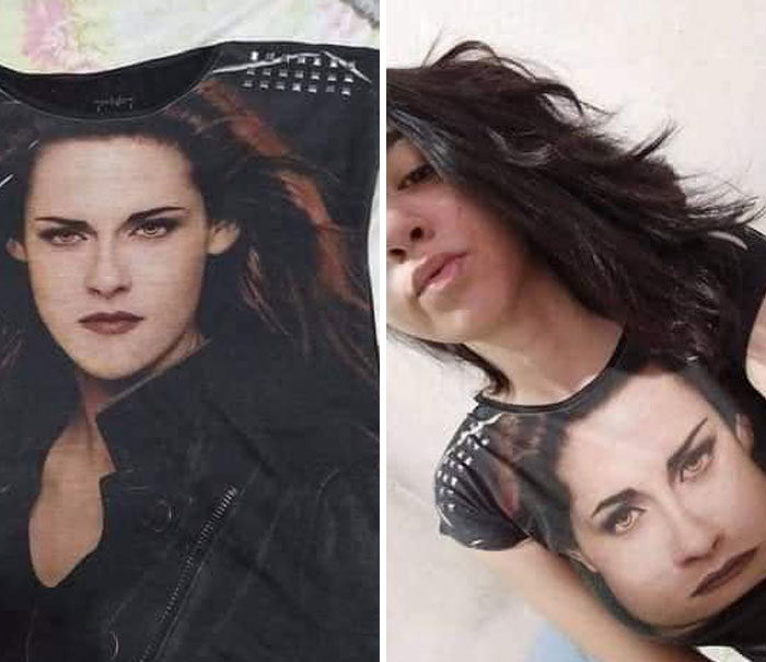
This Shirt
The design expert continued about what well-crafted spaces entail. These are designs “where the amount of walking and effort is minimized, as everything you need is to hand; where there are enough plug sockets and lights to meet the homeowner's needs; and where tables, seating, countertops, basins, etc are perfect for their height. These are classic principles that I doubt will change over time.”
This Marvel In Ohio
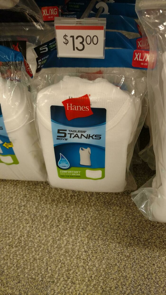
When I Almost Bought Shirts But Was Afraid Of How They Would Smell
Simple Question, Why?
According to Ariane, if you’re decorating the interior of your home, you might want to use a limited palette. “Aesthetically, I would personally only choose two or three complementary colors and whichever metallic finish you like for a color scheme, because to me that kind of coordination is stylish and beautiful, but it really comes down to individual preferences.”
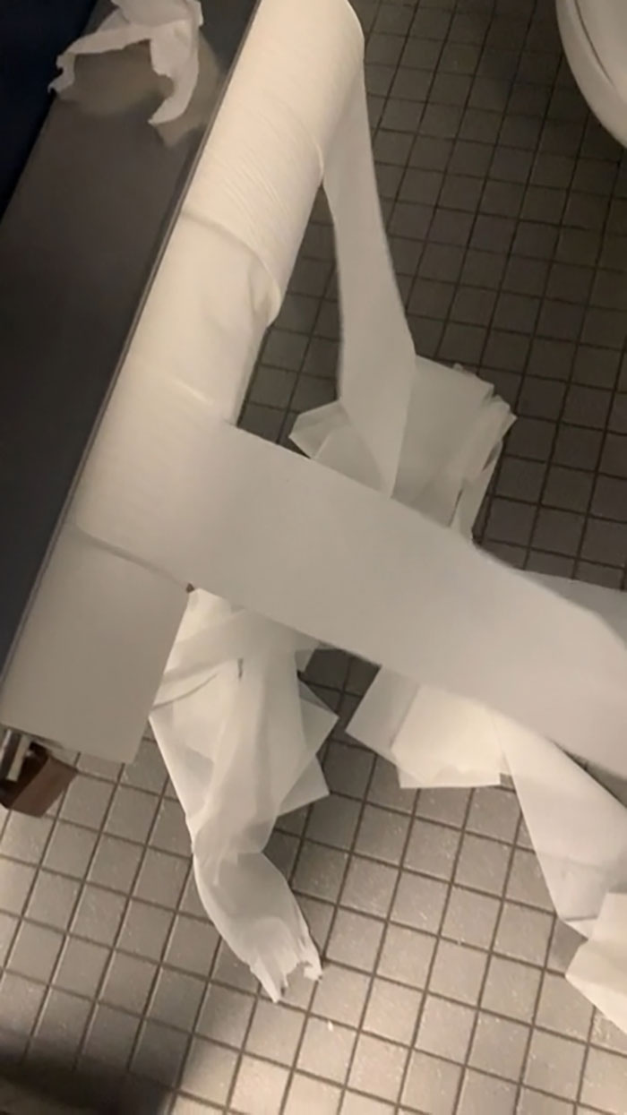
The Toilet Paper Dispenser At My University - Every Roll Spins When You Spin One
Does your university have an engineering department? I'd like to speak to them.
Can We All Admire This Majestic Beast
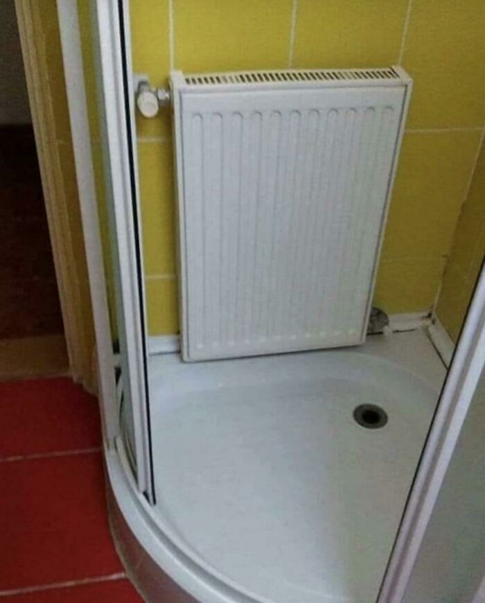
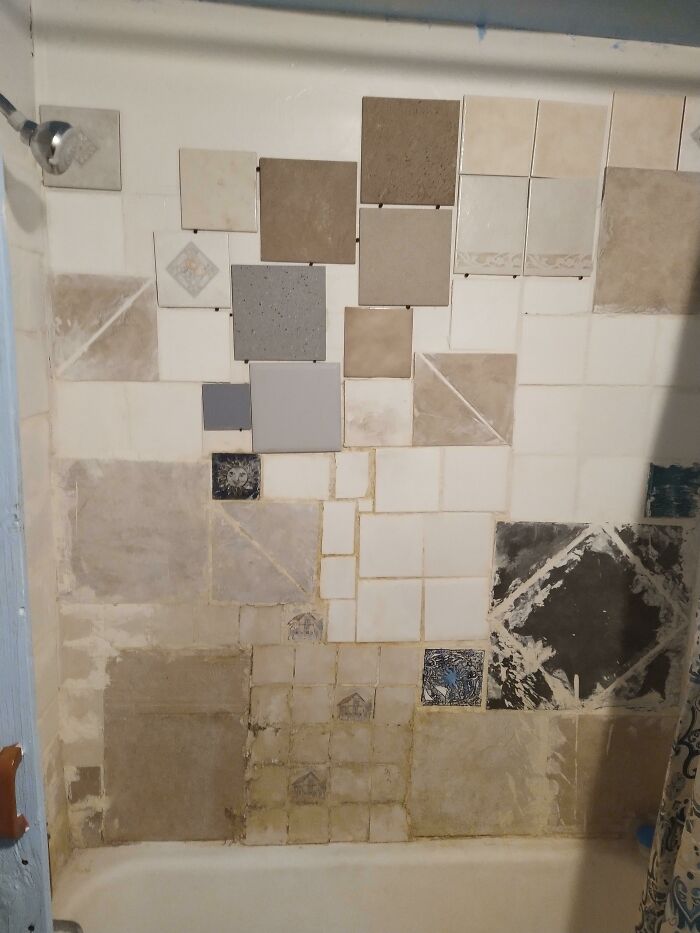
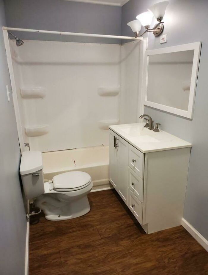
A DIY Shower I Saw While House Hunting
Meanwhile, Tim Antoniuk, an Associate Professor of Design Studies at the University of Alberta, believes there are objectively good and bad products, but our preferences create a bit of a gray area between the two.
"The gray area comes in when people start to talk about taste and about degrees of aesthetic. I may love the design of Bauhaus furniture, for example, while somebody may feel that it is too cold and void of personality. Not unlike great art, I believe that much of what came from this era is ‘great design,’ in part because it represents an era and a philosophy. When we start to mix in discussions of taste and preference, that is where the gray areas of good and bad design get blurred,” he told Bored Panda during an earlier interview.
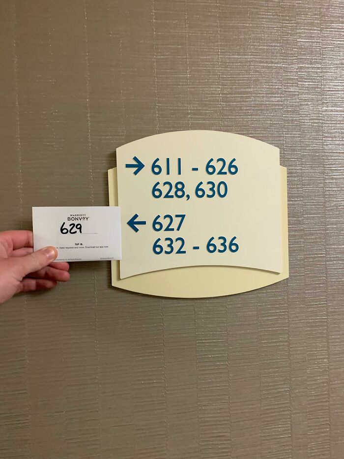
The Sign Telling Us Where Our Room Is
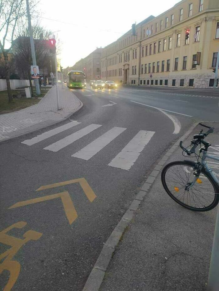
Go Ahead I Dare You. Bike Lane Ends In Oncoming Traffic
Blursed
Tim from the University of Alberta thinks that people can intuitively tell if a design is good or not. We feel it, we sense it.
"Quite often, this relates to ergonomics and the usability or functionality of the products and services and systems. Having said that, I think far too many people expect poor design that doesn’t really work well," he said, adding that for him, great design is intuitive, empathetic to the user, and emotional.
Those Columns Look Awful
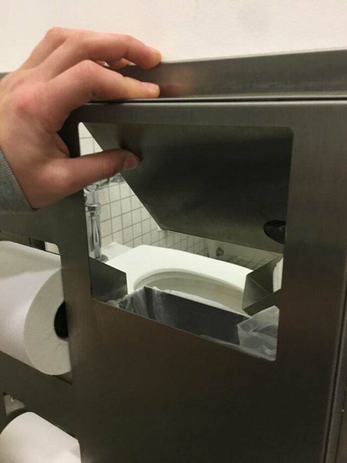
This Garbage Bin Actually Leads To Another Bathroom Stall
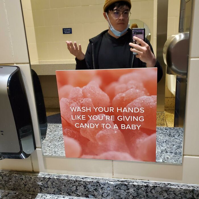
Don't Give Candy To Babies Please
Wash your hands like you're covered in hot sauce and need to go put your contact lenses in.
What has been the worst design that you have ever seen with your own two eyes, Pandas? Which of the terrible designs from this list are going to give you nightmares for many nights to come? Share your thoughts in the comment section at the bottom of the article.
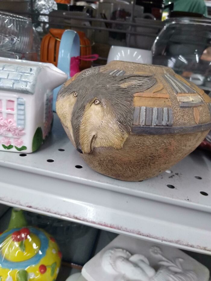
Wolf
I seen one like that at a Salvation Army once, but it was of a lion, and it was just as ugly at this wolf. They were selling the damn thing for 9 bucks, I wouldn't be surprised if it's still sitting there all covered in dust and cobwebs now, which in turn would actually make it look more appealing 😏😆
What the actual f*ck?! Poor thing looks like it's entire face was smashed with an iron...
He looks like he just found out about the hunters killing his family around yellowstone
Looks a lot like Wylie Coyote of the Roadrunner cartoons fame right after he smashed into something.
When the therapist says there's a wolf inside everyone
Anyone remember the first Ice Age? Those giant bald anteater things with floppy d*ck noses? This is all I see
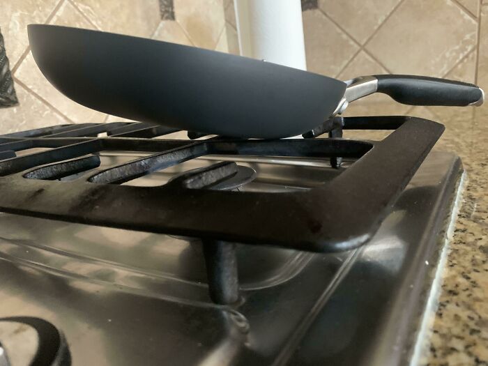
The Handle Of This Pan Is Heavier Than The Actual Pan
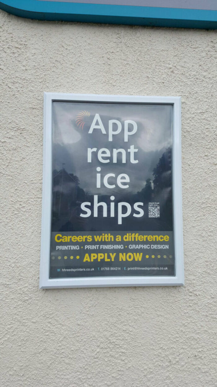
Guys I Found An App Which Rents Ice Ships
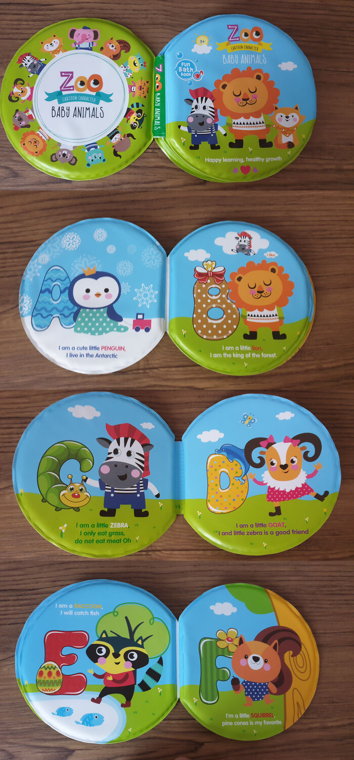
The Letters, Mason! What Do They Mean?
Oh, I thought I knew what was the worst spelling book ever (https://en.wikipedia.org/wiki/P_Is_for_Pterodactyl), but the one above even beats that.
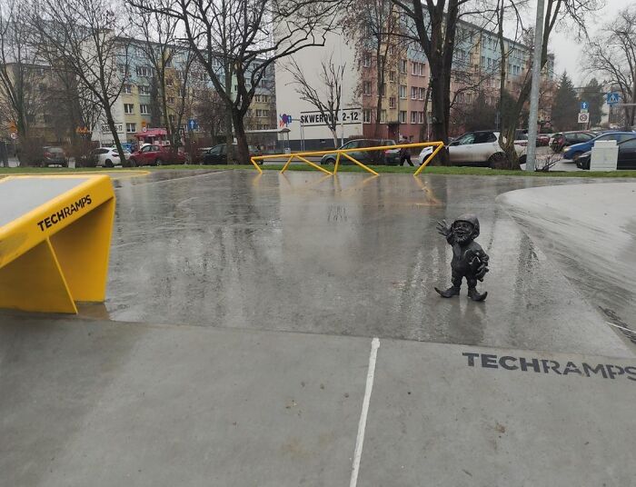
Gnomes Are Symbol Of My City. It Used To Be A City Game For Tourists To Find Them All But There Are So Many Of Them It No Longer Makes Sense. City Opened Brand New Skate Park In The City. To Celebrate It They Put A Gnome There. Metal Gnome With Pointy Bits On Top Of A Ramp Right Next To A Rail
Wroclaw, Poland. Dang it, not playing hide and seek with the gnomes now...
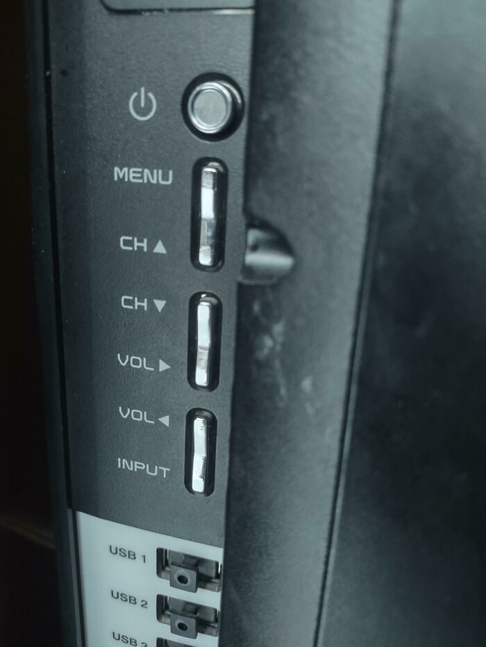
The Buttons On This TV
Could you please turn the volume right? It's a little bit too left right now.
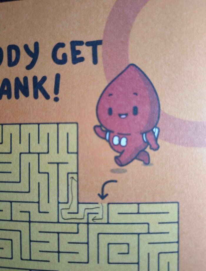
The Maze They Gave Us After Donating Blood Has No Escape
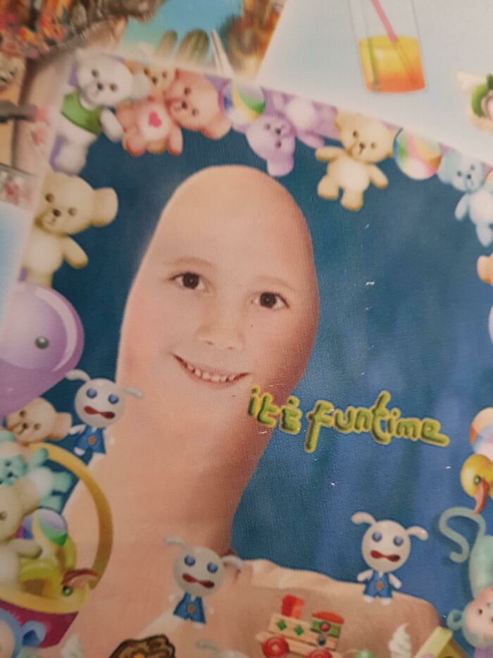
Image To Advertise A Photo Booth
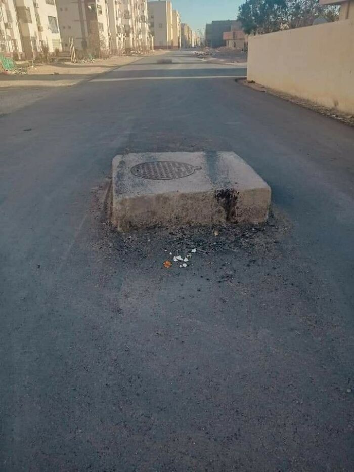
Cherry On Top Of The Road
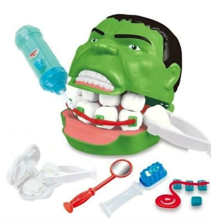
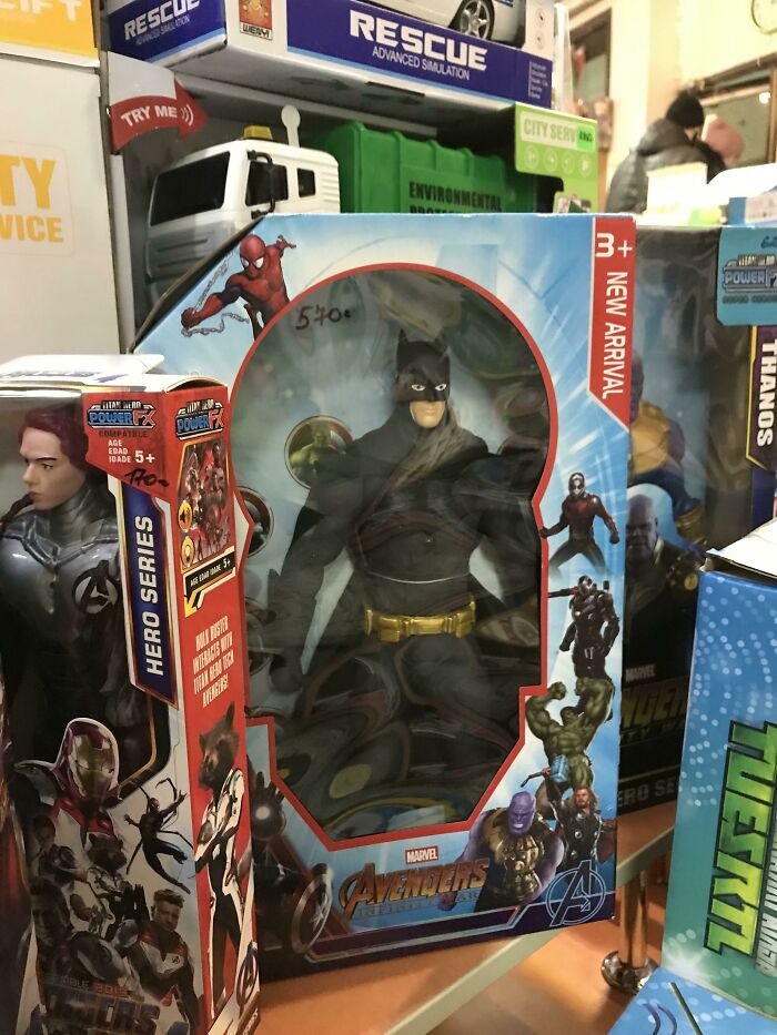
Ah Yes My Fav Avenger The Hulk With Double Layer Teeth
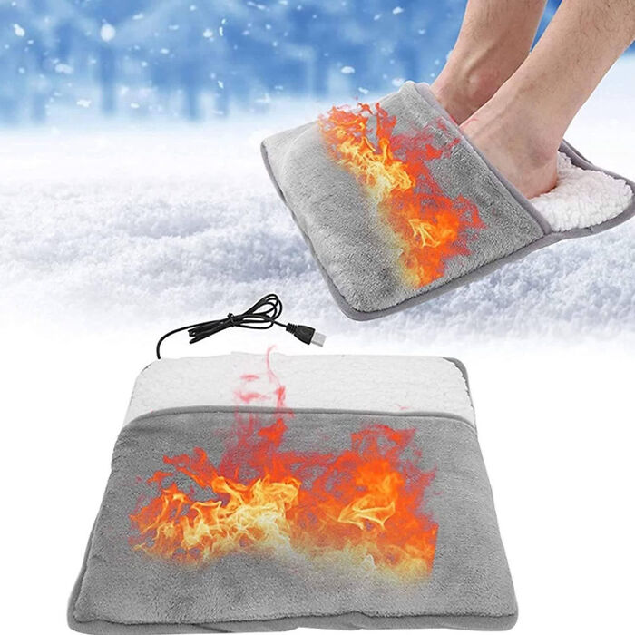
This Winter, You Can Set Your Feet On Fire
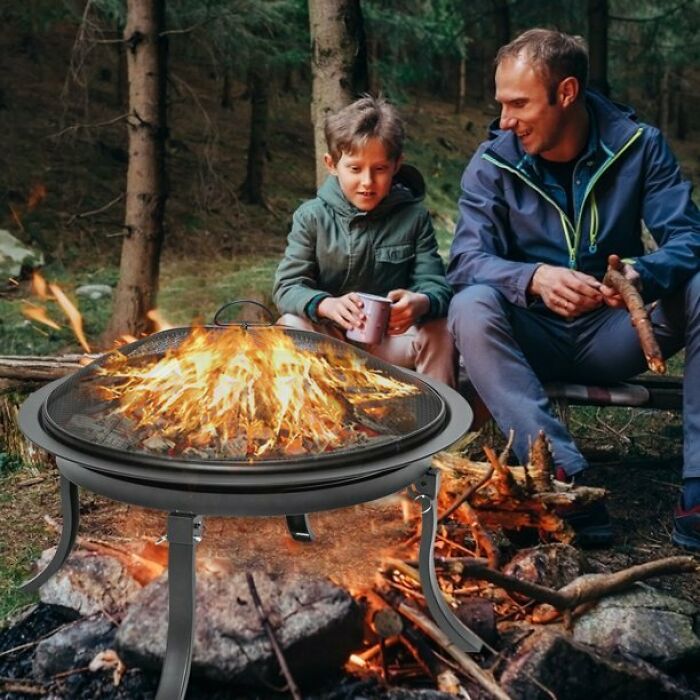
This Ad For A Fire Pit
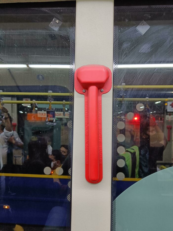
This Emergency Escape Hammer Is Placed Behind A Plastic Cover Sealed With Screws. No There Is No Emergency Screwdriver Anywhere
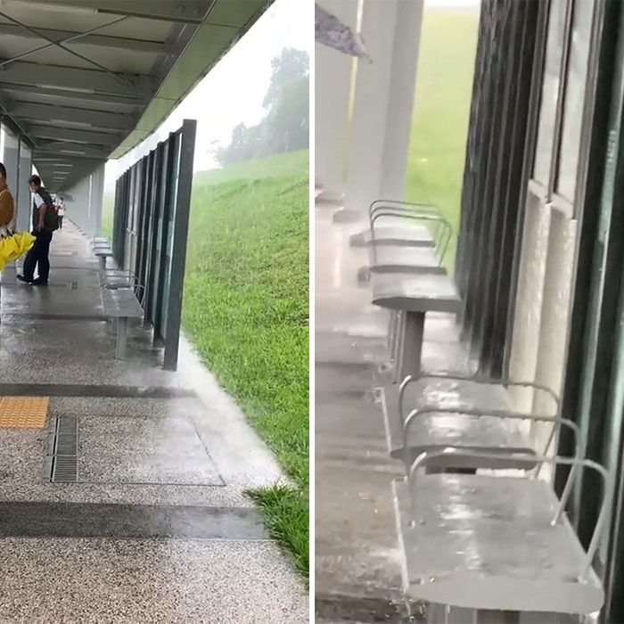
Bus Stop Shelter
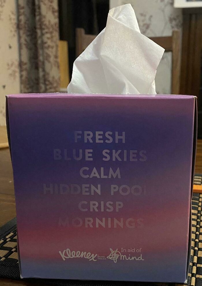
Hidden What?!
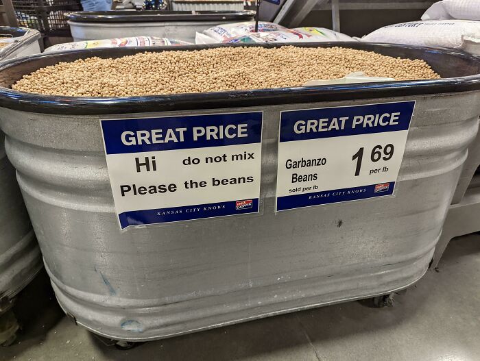
Please The Beans
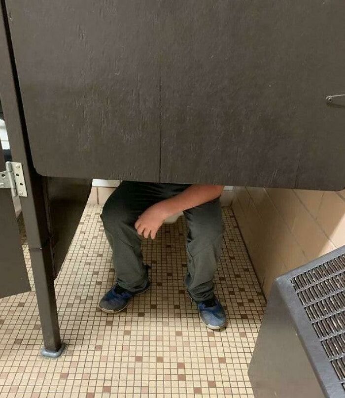
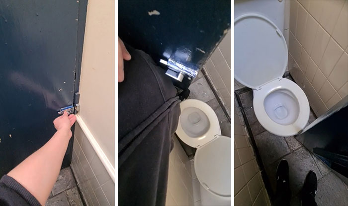
This Spacious Toilet Cubical
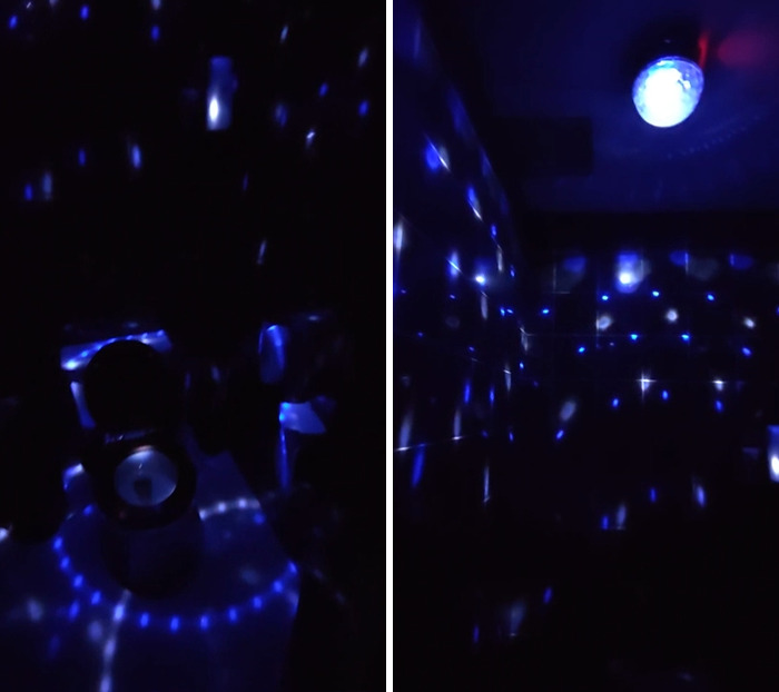
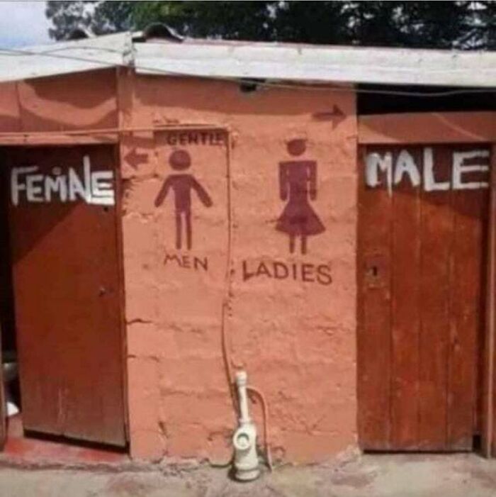
Men's Toilet In A Cafe In Shanghai
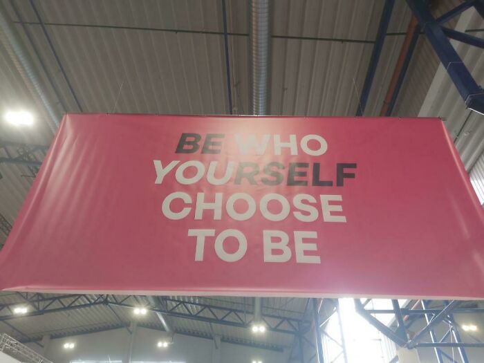
This Is A Poster By A Design School
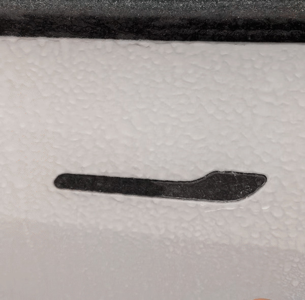
My Tesla's Door Handles When It's Icy Outside
Where Should I Go?
I Can't Tell If The Face Or The Text And Warning Are The Real Crappy Design
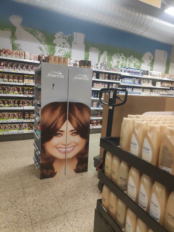
The Angle Of This Image From A Shampoo Ad Makes Them Look Like Conjoined Twins
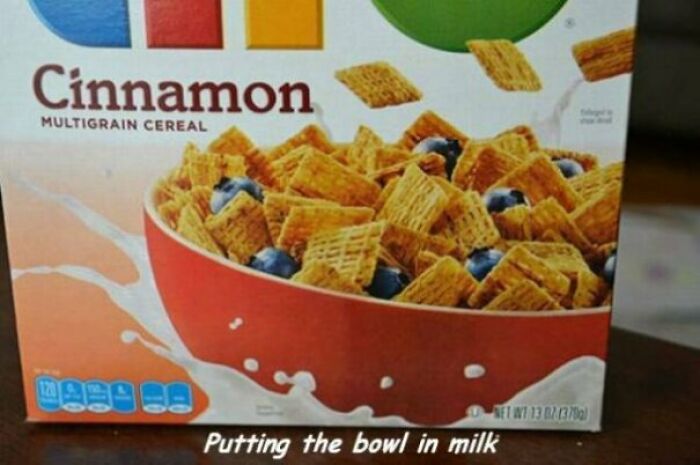
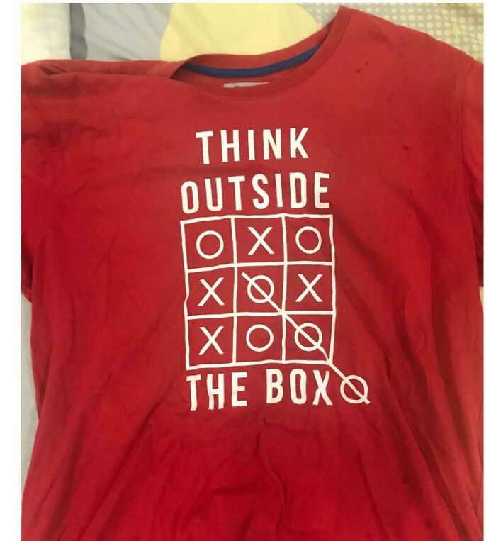
Think Inside The Box First
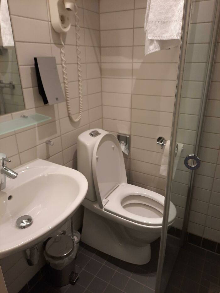
The Worst Bathroom I Have Ever Seen (In A Hotel)
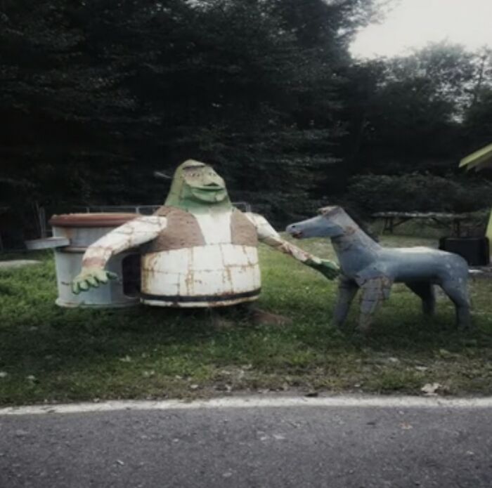
This Dystopian Shrek And Donkey
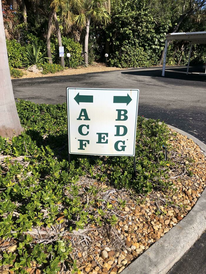
Just Got To My Condo, I’m In Unit E
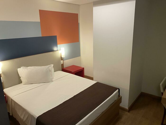
Hotel Room Has A Massive Pillar Blocking The Other Side Of The Bed, Also Makes For A Very Cozy Depression Corner
Even Their Own Model Is Not Comfortable With The Design
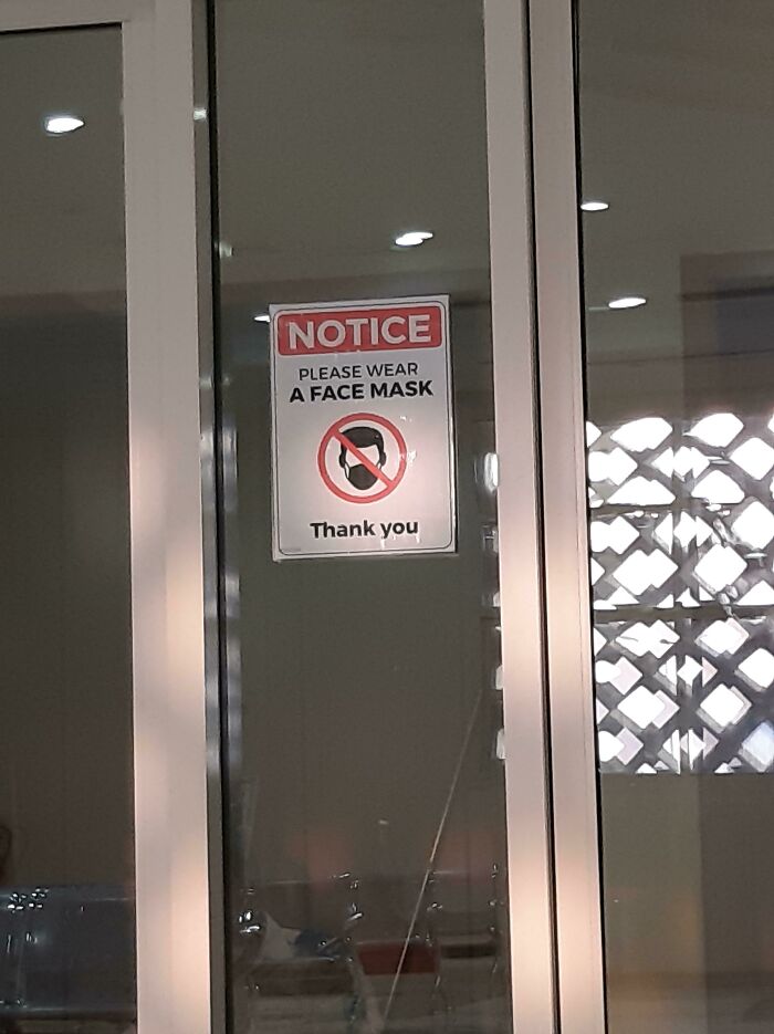
Who Is This Sign Meant For?
Don't Think That's A Dog
Crappy Slide
This Creepy Mannequin Doll
I Was Getting A Tour Of A Potential Home To Buy But As Soon As I Saw This I Left
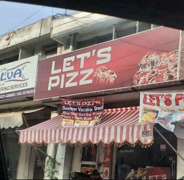
Let’s Pizz
How Tall Would One Have To Be To Set The Temperature To Bake At 350?
Found This While On An Airport Returning Home
Pe Ce N Fart
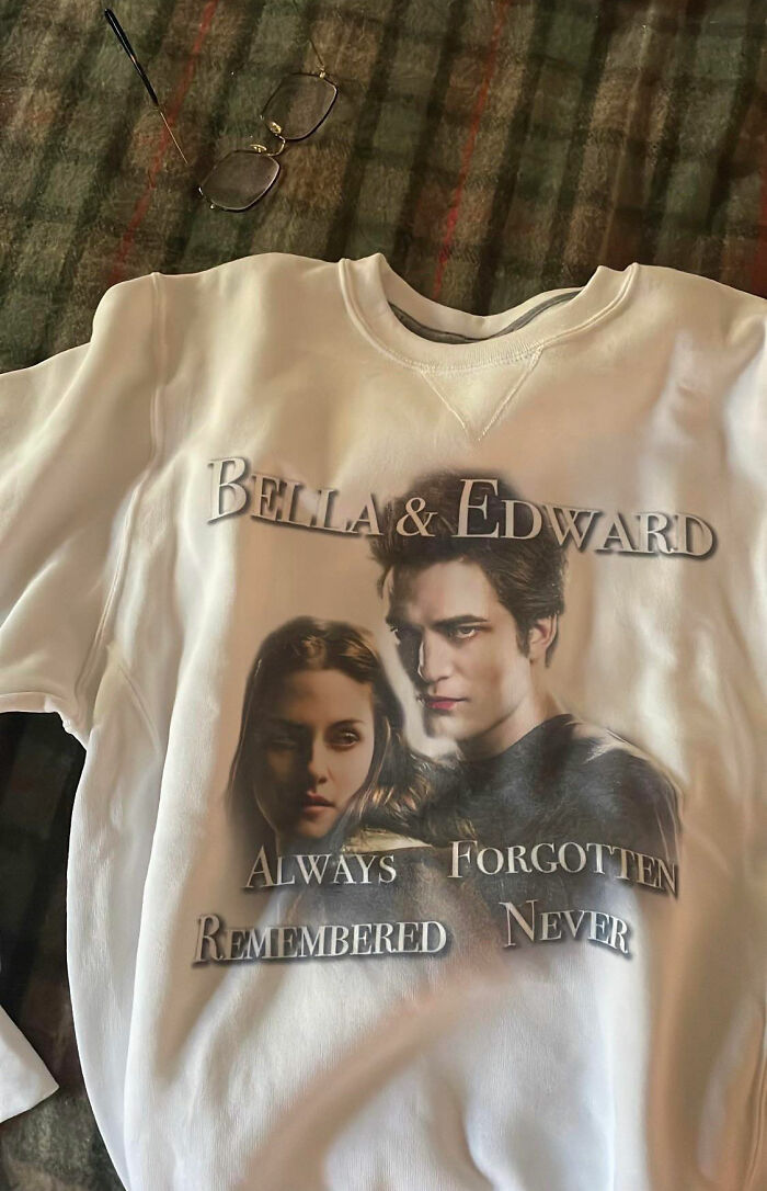
Always Forgotten Remembered Never
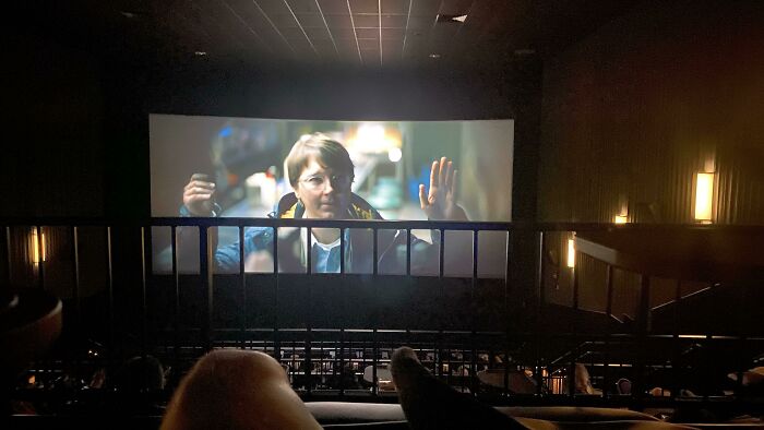
View From The Last Row Of My Local Theater
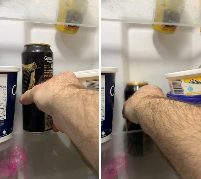
My Fridge
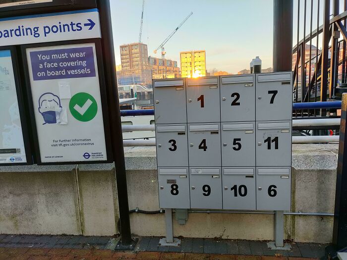
Mailboxes Not In Order
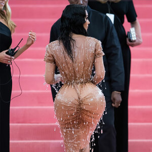
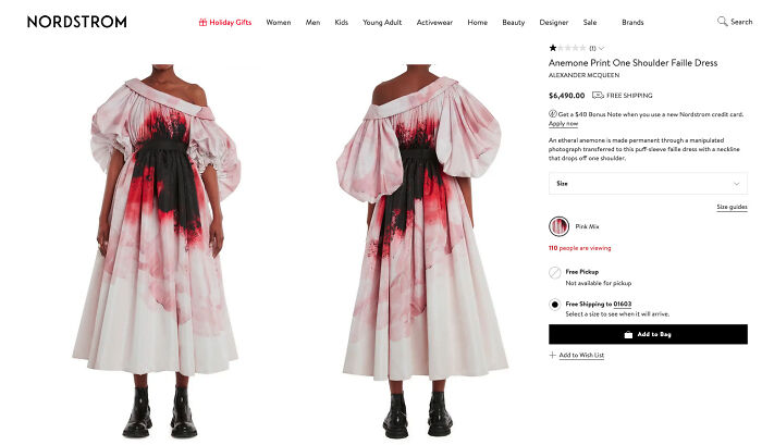
Could Be Good Camouflage For The Zombie Apocalypse. Add A Cardigan And Wedges And This Versatile Dress Transforms To Perfect Evening Wear!
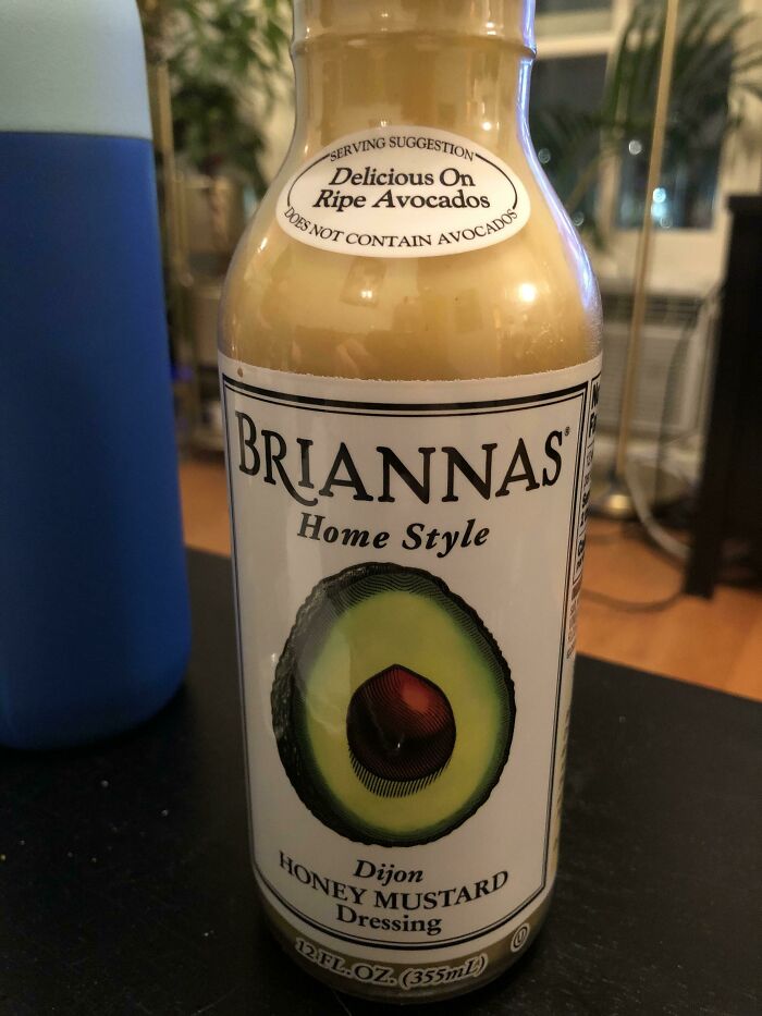
I’m Not Sure What Would Make Me Think It Contains Avocados
"So how do we get millenials to buy our mustard?" "Put an avocado on it, millenials loves that sh-" XD
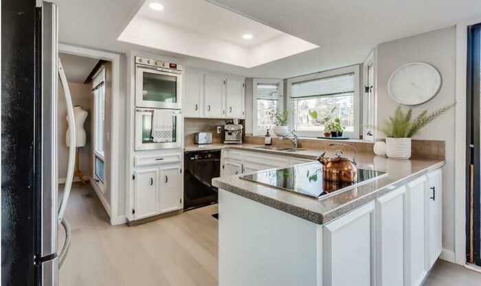
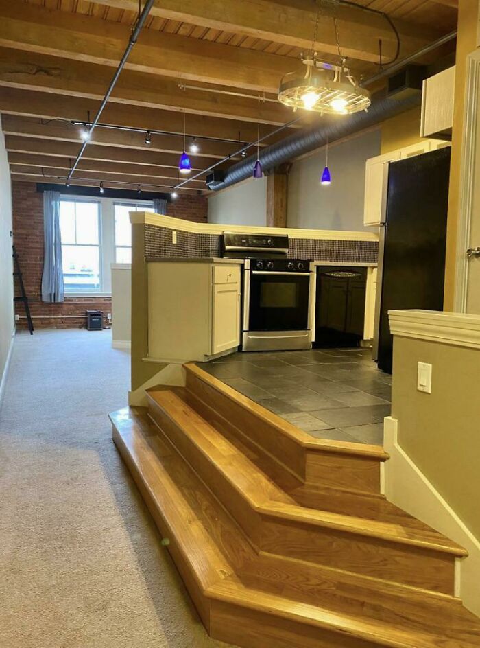
I’ve Tripped In The Kitchen But Never On My Way To The Kitchen
This looks like one of those little show kitchens that they have at the hardware stores.
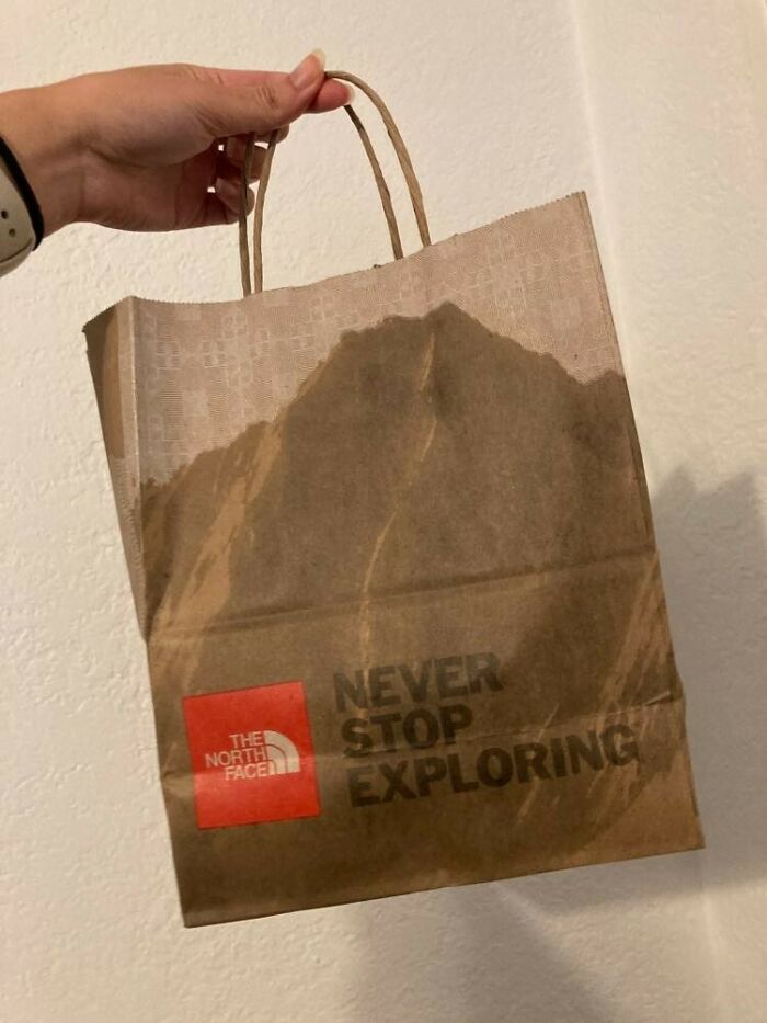
This Shopping Bag Looks Like Greasy Fast Food Takeout
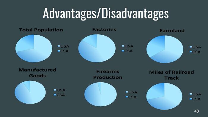
Please Don’t Use Gradients When You’re Making A Graph
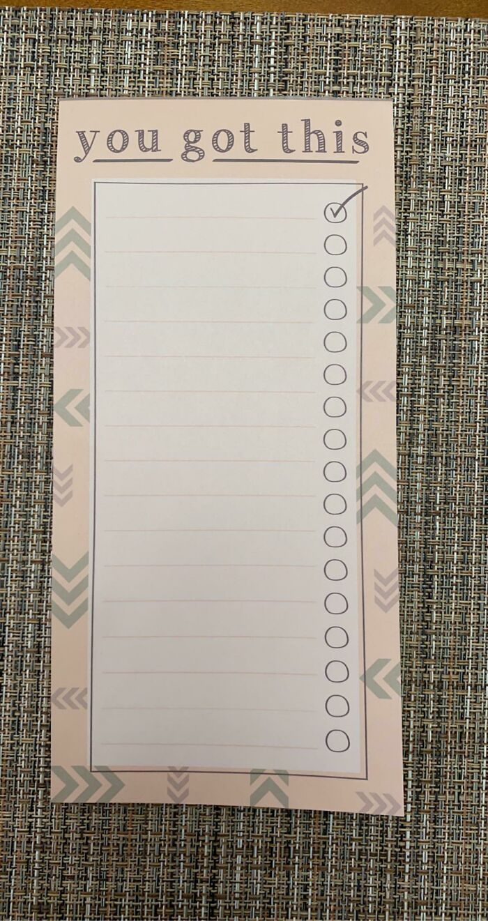
The Circles Don’t Match The Lines On My To Do Lists
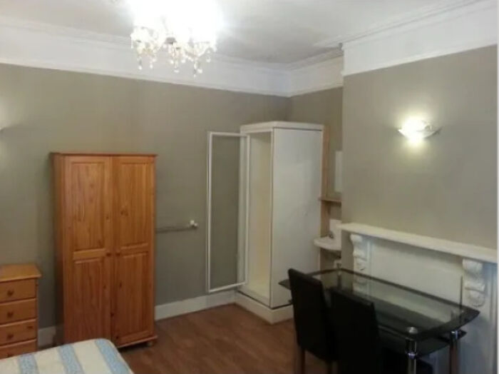
Looking For A Place To Live In London. Found One For £650 Per Month, No Bills Included. This 'Studio Flat' Has A Shower In The Living Room, If You Look Real Close, You'll See The Sink Beside It Too (Chefs Kiss)
With the added bonus that you get to warm your toes in the fireplace while you’re eating dinner
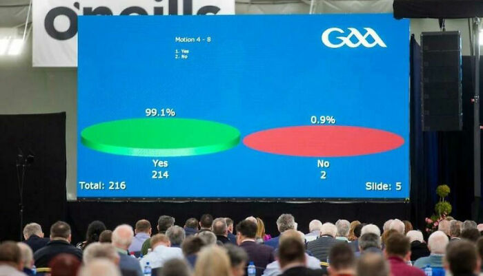
The Gaelic Athletic Association, In Ireland, Show Voting Results Like This
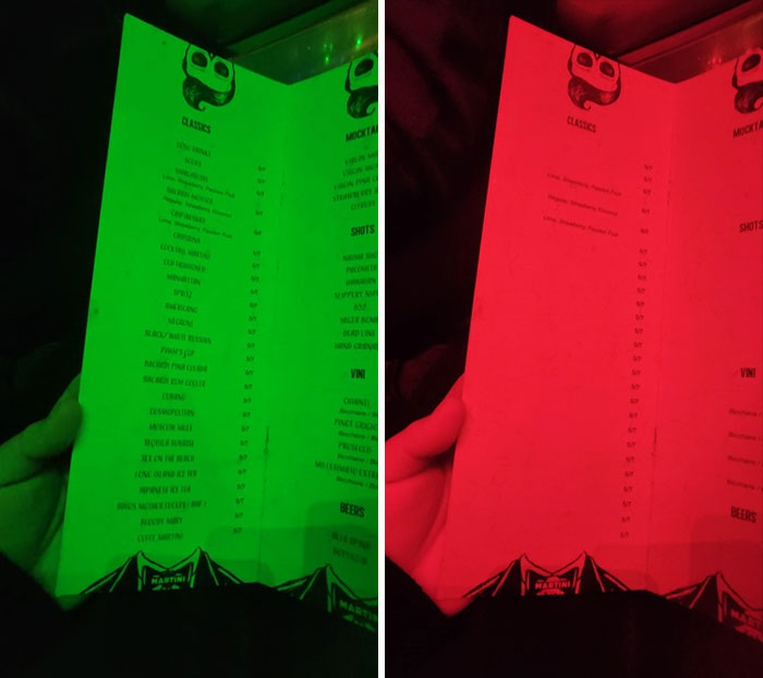
Menu With Red Letters Under Red Lights
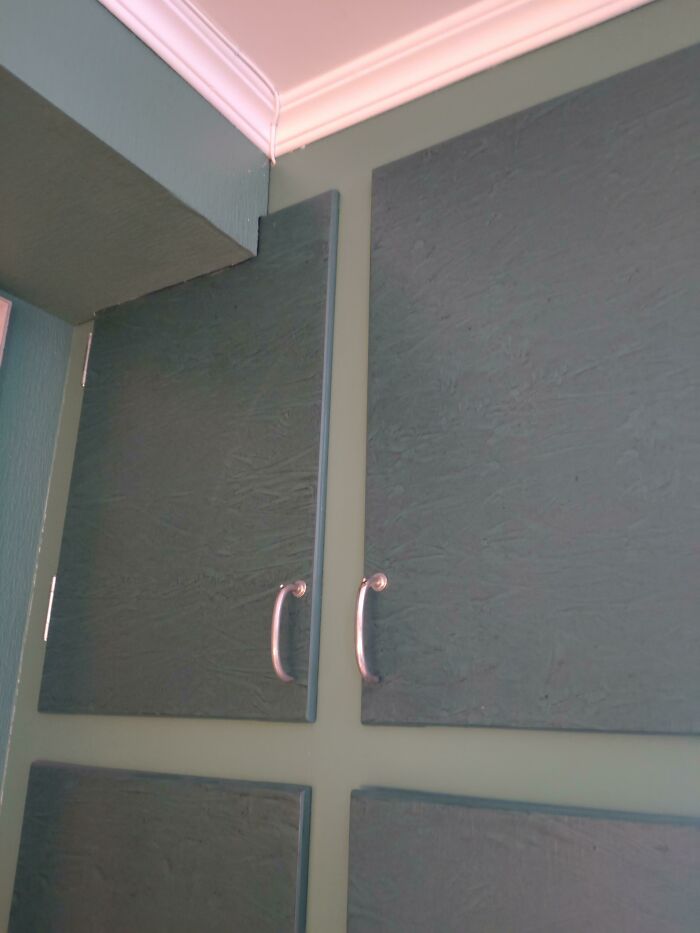
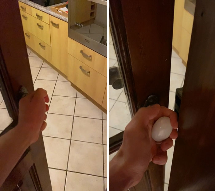
How Should I Open The Door On The Left
Finger Crushing Door Handle In A Place We’re Renting
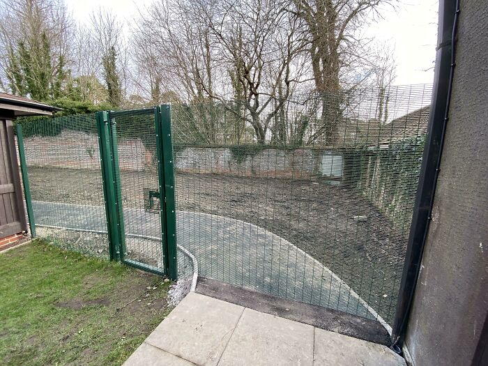
The New Footpath And Gate At My Work
The designer was on speed and the construction guy didn't know any better.
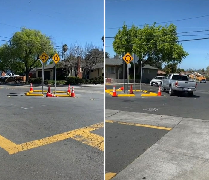
What A Terrible Design For A Roundabout
Terrific!
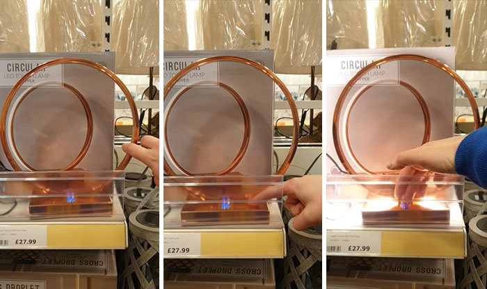
A Touch Lamp That You Can Only Touch In One Spot. You Know, Like A Regular Switch
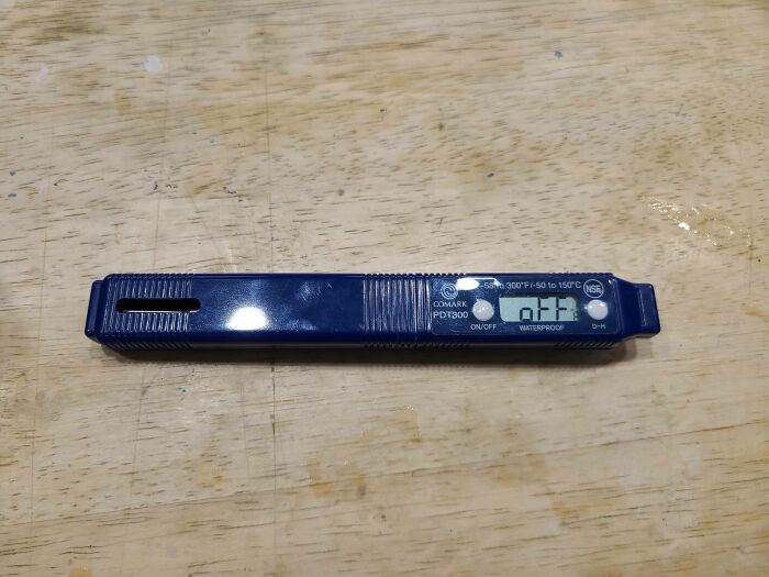
Instead Of Making These Thermometers Turn Off They Just Stay On And Display The Word "Off" Making Them Run Their Batteries Faster Than Other Models We Used To Have At My Job
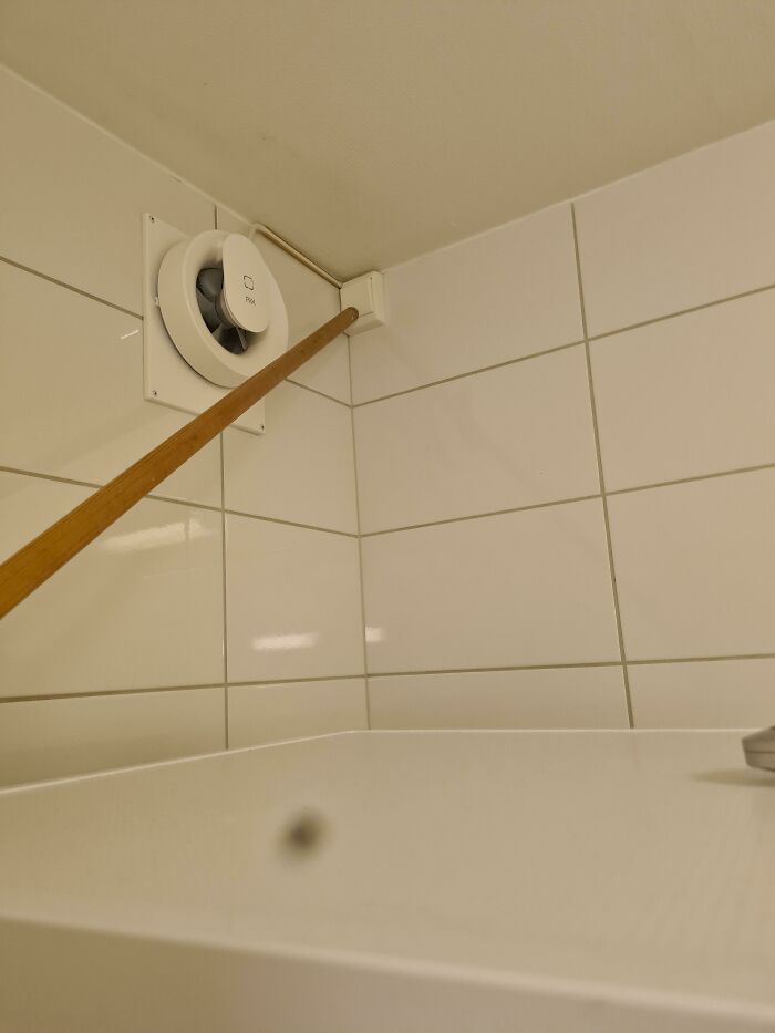
Exhaust Fan Switch In Corner Of Ceiling, Behind A Stacked Washer&dryer That You Need A Long Stick To Turn On In My New House
They’re designed to be on continuously, you rarely need to switch them off if at all.
Serpent Dolphin Is Serphin
The Seller Doesn’t Have Any Notion Of Scaling
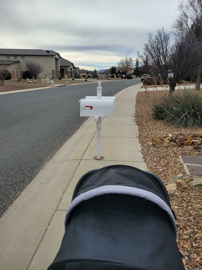
Our Neighborhood Has Every Mailbox Blocking The Sidewalks
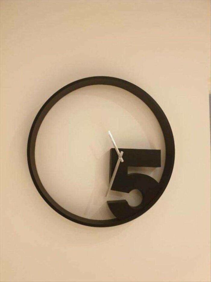
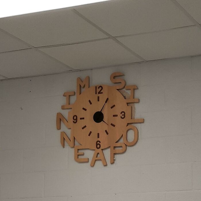
Some Poor Attempt Of A Quirky Clock
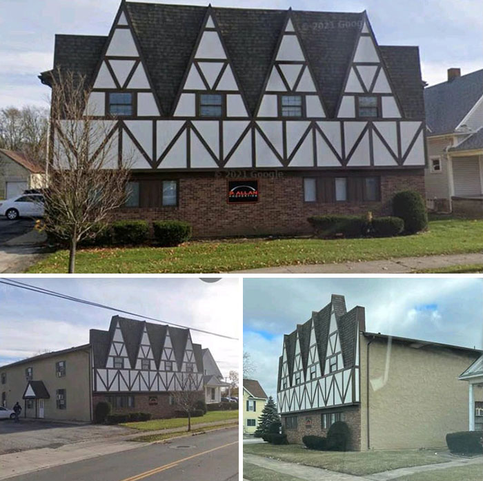
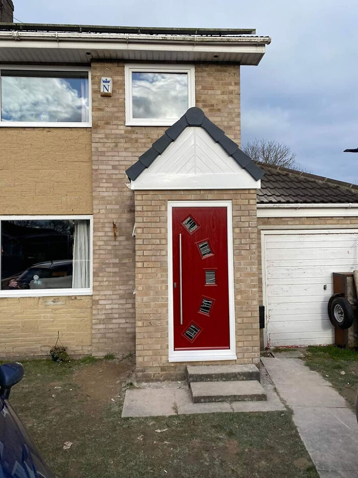
The More I Look At This House, The Worse It Gets
The architect equivalent of using to many fonts in one graphic design.
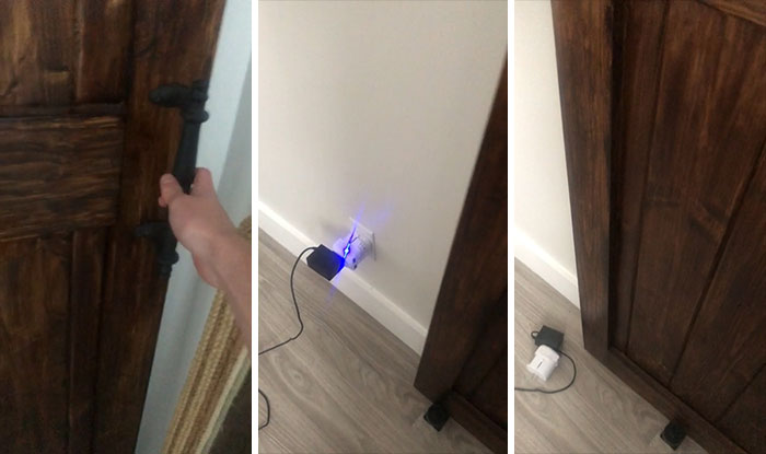
Sliding Door Smashes Outlet When You Open It
The Fabric Choice For These Cloth Diapers Makes It Look Like They Have Already Been Used
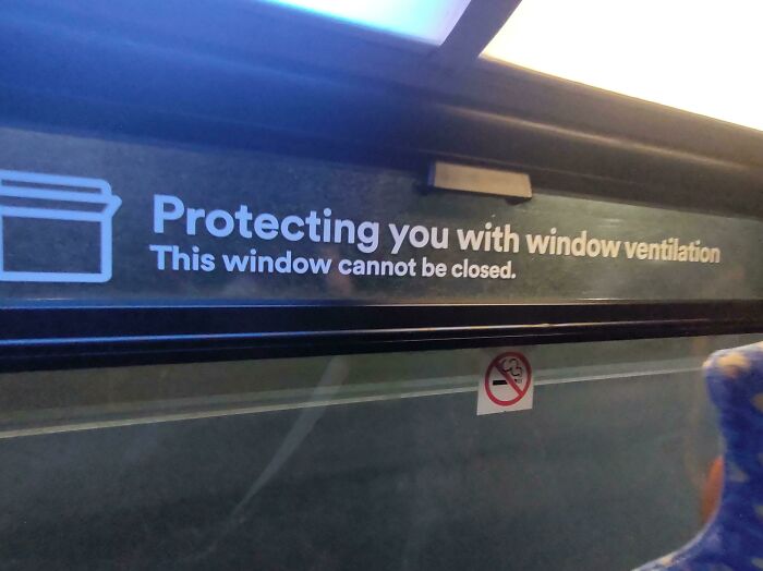
It Was Closed
It's in a bus (or tramway/metro/train). It can technically be closed, but the message asks not to do it. "Please don't close this window" would have been a beter way to phrase it, for sure.
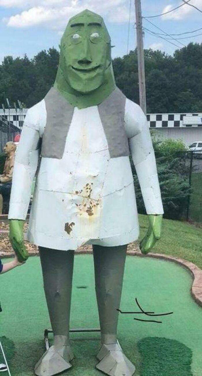
Mini Golf Shrek
A Normal Family
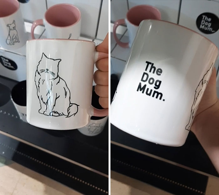
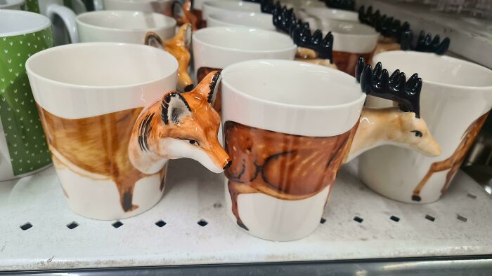
These Mug Handles. Very Uncomfortable To Hold
I Found This While Shopping, In Some Ways I Love It In Other Ways This Is Really Cursed
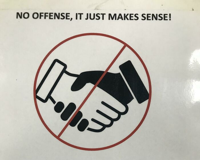
The Hr Departments Attempt To Discourage Human Contact At My Work
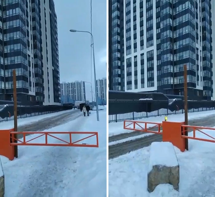
Barrier Blocks Pedestrians When It’s Open For Cars
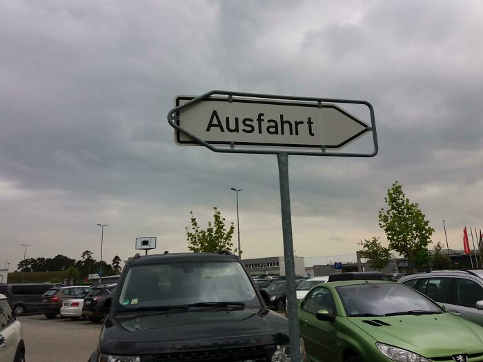
I Can't Figure Out Which Way To Go
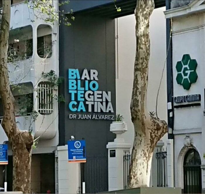
Imma Go To The Biar Blio Tegen Catina
How Are You Even Supposed To Read This?
At First Look I Thought They're Getting Hanged
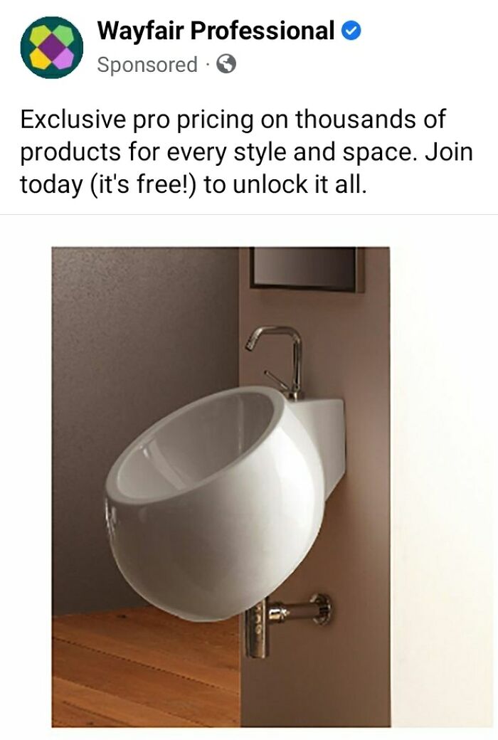
Is Wayfair Trying To Sell Me A Sink Or A Urinal? Or Both?
"Why not save time by washing your hands at the same time as your c**k"
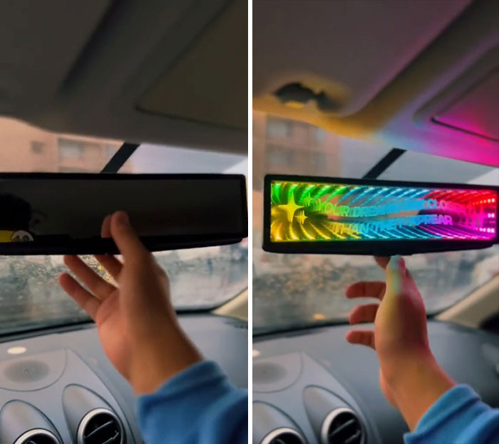
LED Rear View Mirror Advertisement On Tik Tok
A Song Plays Asking You To Press Triangle… There Isn’t A Triangle To Press
Cafe Logo: Halfcup Brunch
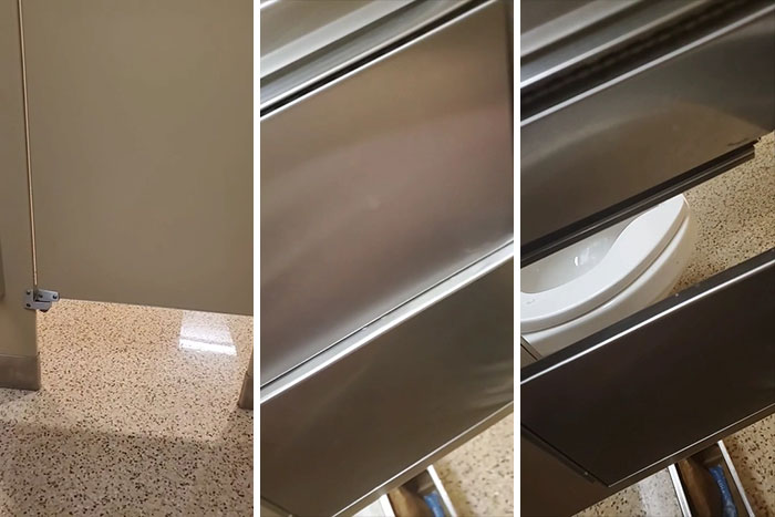
This Bathroom Stall At A Hockey Arena
I See Your Scarlett Johansson And Raise My Favourite Avenger
Toilet At My Office
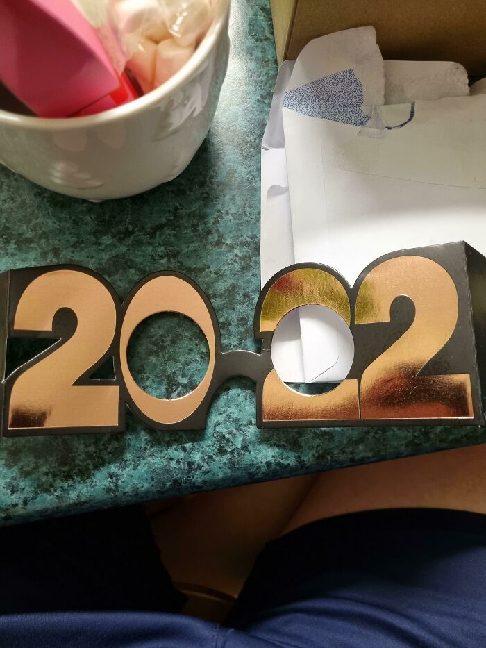
These 2022 Sunglasses
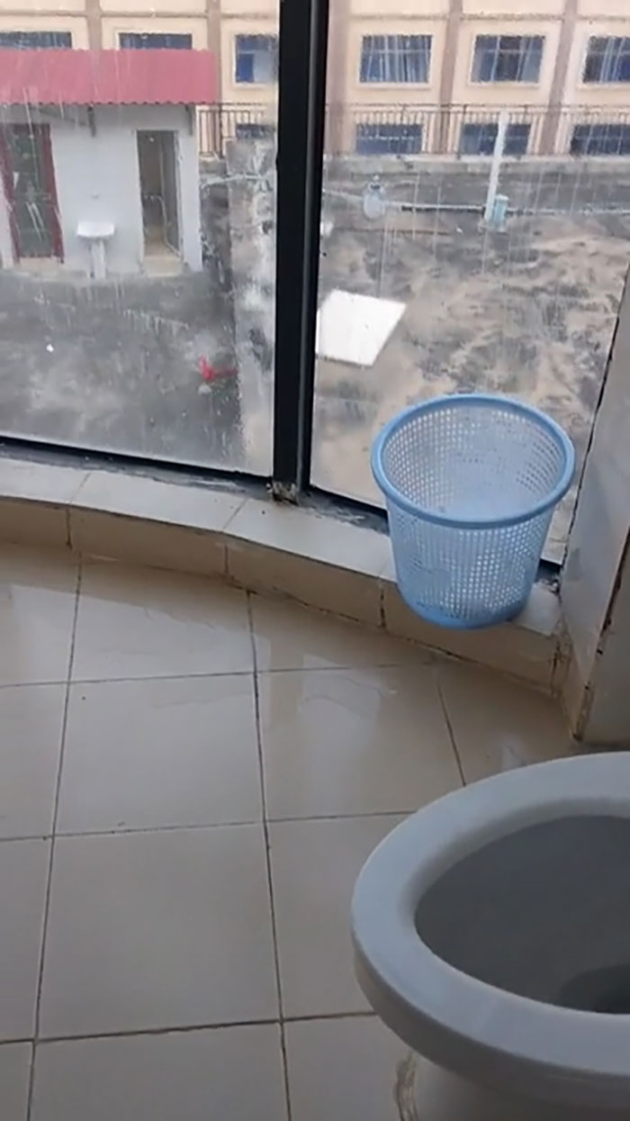
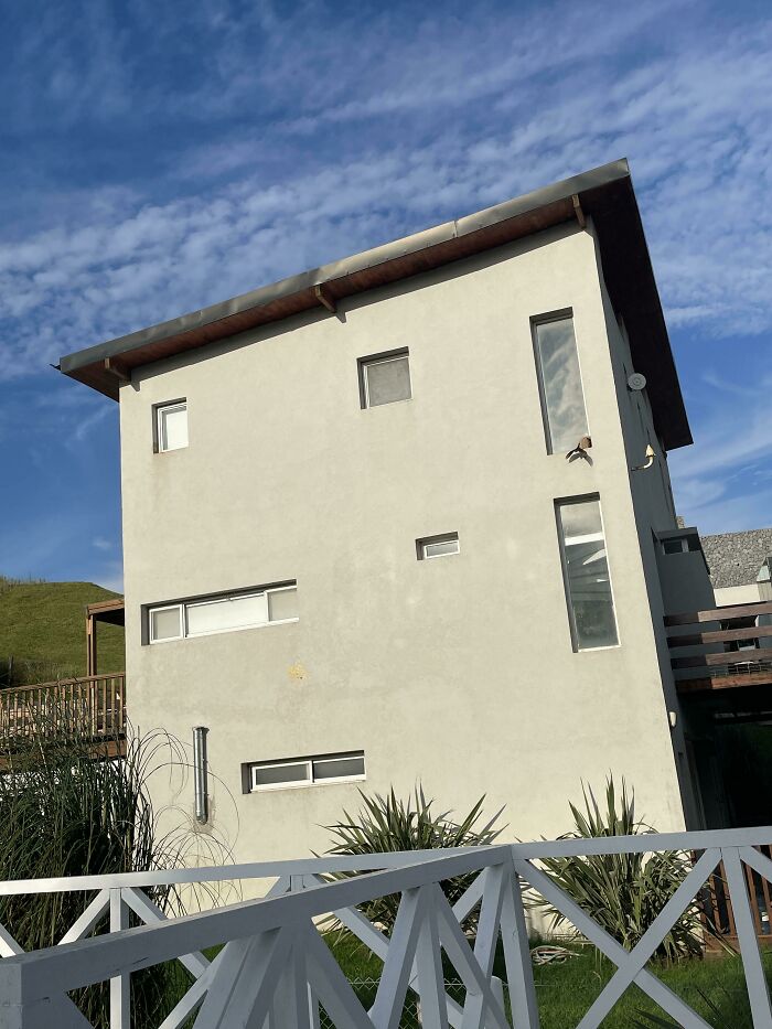
These Windows
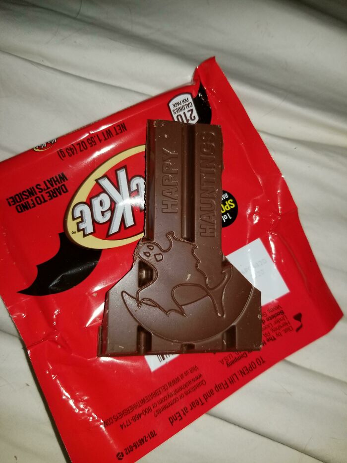
These Kit Kats Redesigned For Halloween Won't Break Right
I just bite them without breaking off the fingers. My husband hates it and looks at me like I'm crazy, so obviously I can't now break it to eat each bit - it's my duty to continue eating them like how a psychopath would - I have no other option
Found This On Douyin, Thought It Might Fit Here
What’s Does That Even Say?
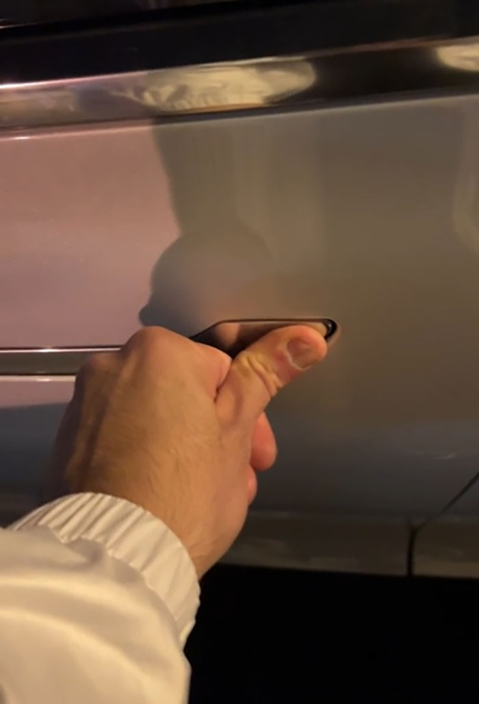
Door Handles That Freeze Way To Easy On Tesla Model 3/Y
Bought A Trailer Lock And Been Using It For A Year Or Two And Just Realized It Is Useless
These are great, but all the (current) top comments stole the show 🤣🤣 nearly pissed myself
how? how do people make these and not realize how crappy they are?
You'd be surprised. I travel often for work and see horrible designs almost every where I go, especially in public bathrooms.
Load More Replies...For the bizzarro housing designs, I never understood how one can build stairs that make zero sense and the builders are like "Yep, job done!" Like, are the builders being paid by the designer to build it exactly to the letter, no questions asked?
I think the "builders" are being paid in beer and weed and they consumed both before doing their work.
Load More Replies...A tobacco company decided to rebrand one of their products just before the pandemic. Originally, they were going to call it Red Flow and as a woman, I cracked up 🤣 I think someone must have cottoned on because when it was released, it was named Flow Red instead 😂
Can't figure out how to post a picture so I will just describe it.. While shopping I came across a parachute that attaches to your waist to put drag while running. The picture on the front of box shows someone using it on a rooftop giving the impression that it could save your life if you were to fall while running on rooftops. Then you turn it over and read the Warning: This is to be used Only as shown/illustrated/described.
A local health insurance agency (Independent Health) has as their slogan "we'll give you the red shirt treatment". Which is meaningless on it's own, they show their staff wearing red shirts, but that still doesn't mean anything. If you're at all familiar with Star Trek, you know that a red shirt is the hapless security officer that is the first one to die. Please don't give me the red shirt treatment.
At my local Burger King, both bathrooms are larger than the break room and office combined. And they are single occupancy! I have no clue why.

 Dark Mode

 No fees, cancel anytime


