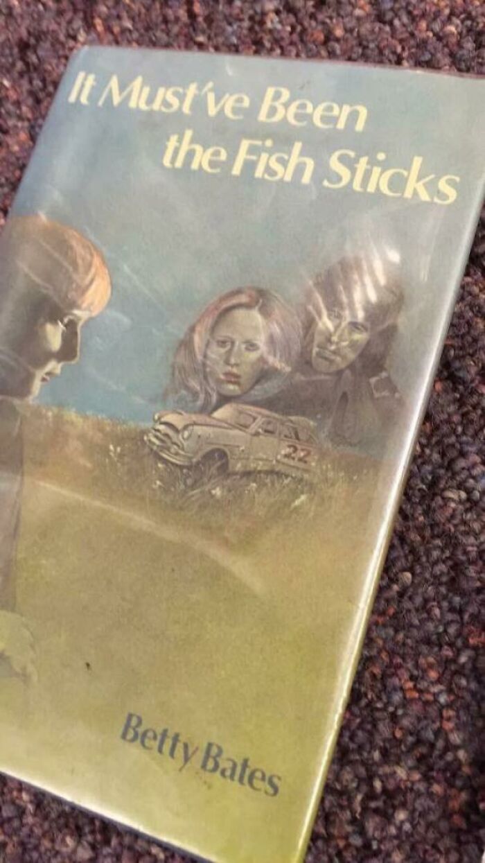
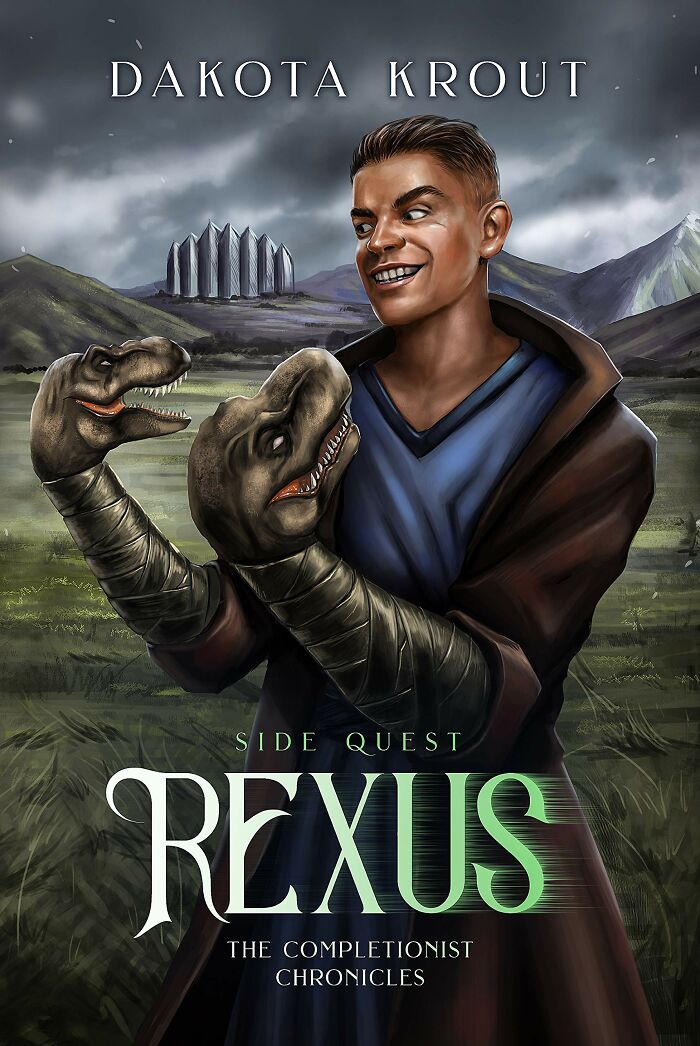
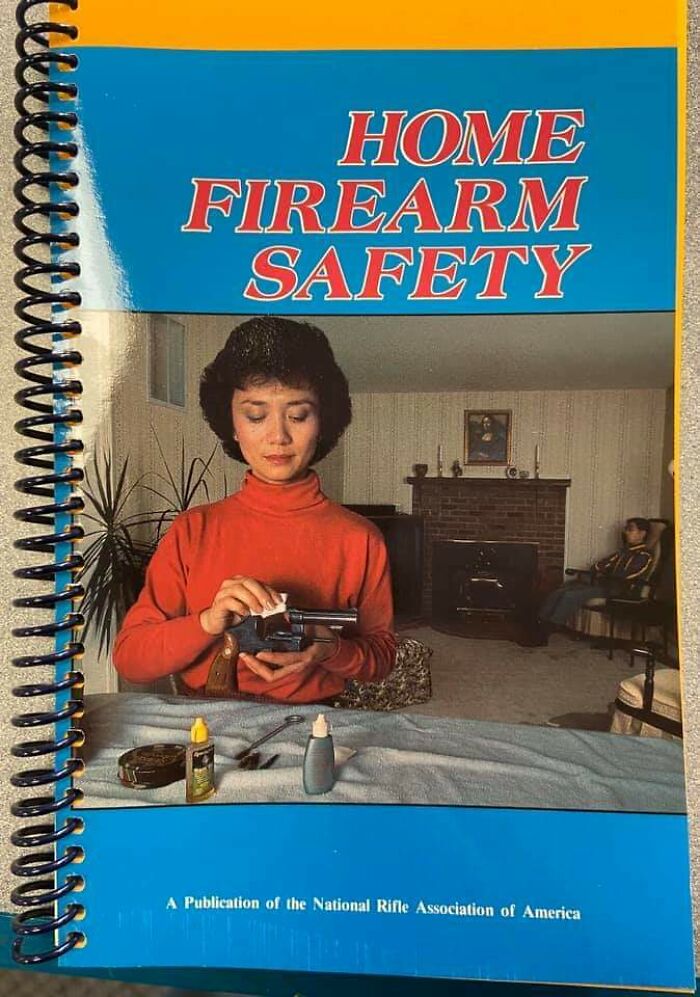
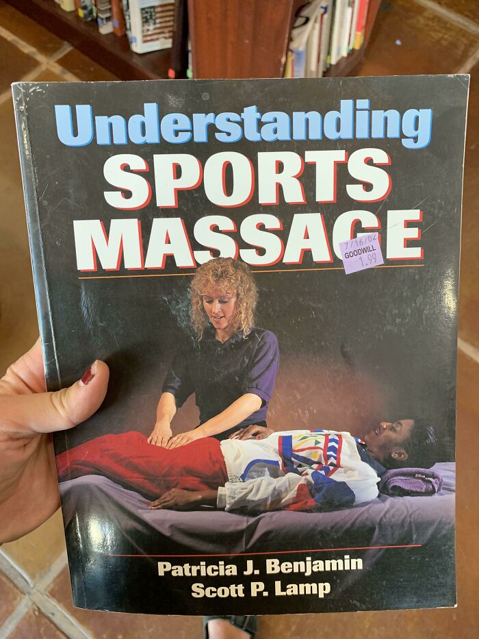
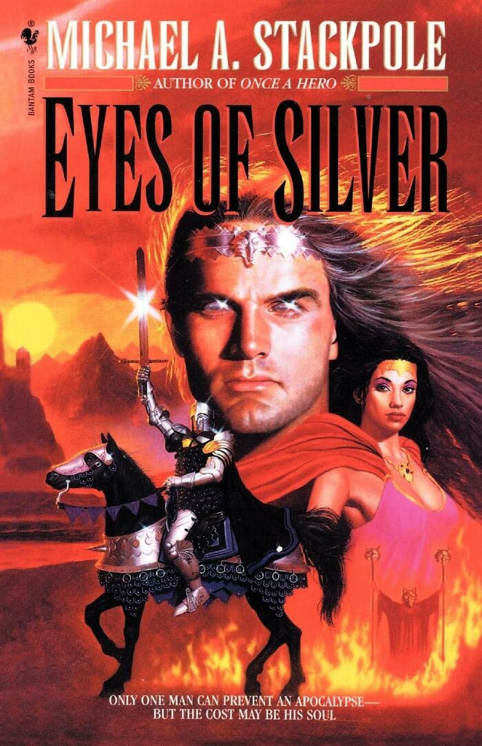
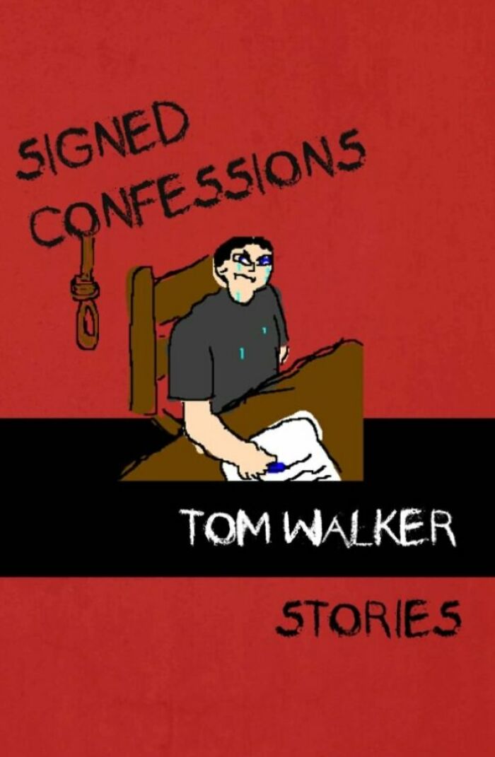
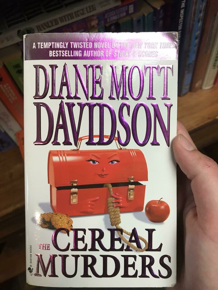
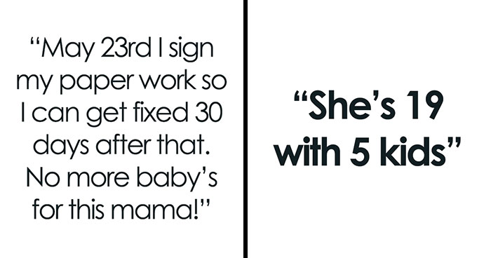
Don't judge a book by its cover, they say. But what if it looks so bad, even a five-year-old with the oldest version of MS Paint could have done a better job?
There's a subreddit, called r/TerribleBookCovers, and its members are—you guessed it—collecting the worst book covers that have ever been published. Whether it's an insulting title or a hideous drawing, they have it all. Continue scrolling and check out some of the most popular pictures within the online community.
This post may include affiliate links.
Everything About This Is Terrible
I have so many questions... but I think the word "why???????????" is the first that come to my mind.
Load More Replies...It’s a fake. The book is called Chrome. Same artwork but different title and tag lines. Someone did this to mock the artist and author. https://www.goodreads.com/book/show/2294631.Chrome
Well, the blurb on that Goodreads link is, "Enter the world of Chrome, where nothing is as it seems. In the 22nd century, a forbidden love between a man and a machine spins the Earth toward one final war." ... That's not really much better.
Load More Replies...ive ordered that as soon as i saw it-----cant wait to go get funding and make the movie
They'll add anything to keep the MCU money-machine churning.
Load More Replies...Scrolling past I thought “nah that’s just vintage illustration” but the longer I looked the worse it got
In order to understand what is a bad book cover, we can start by figuring out what is a good one instead. Renowned book designer Chip Kidd (who created the cover for Jurassic Park and many others), said that book design is all about giving form to content but also appreciating the balance between the two.
In his Ted talk, Kidd explained that on his first day of graphic design class in school, the teacher drew a picture of an apple, then wrote the word Apple and said: "Listen up. You either say this," pointing to the word apple, "or you can show this," pointing to the picture of the apple.
"But you don't do this," he said, pointing to a picture of an apple with the word Apple beneath it. "Because this is treating your audience like a moron. And they deserve better."
So a book cover can show or tell, but can't do both.
It’s Worth A Look!
This is clearly photoshopped. Very different shading and no sign of wear on those letters.
I think these are real (terrible) artworks with new titles photoshopped onto them.
Load More Replies...You know that saying, 'there are no stupid questions'? I think we've found the exception to the rule.
Wtf?
They really should have gone with the trucker mudflap girl tattoo though 🙂
Load More Replies...It's a spoof: https://www.goodreads.com/book/show/9272976-the-dragon-with-the-girl-tattoo Adam Roberts is infamous for his spoof books like "The Soddit" and "The Sellamillion".
Best-selling author Jeff Goins thinks covers should also know and respect the audience of the book.
"Books are not created in a vacuum. They are not merely a manifestation of the author's creativity. The content needs a form, and the form will influence the way the content is consumed," Goins wrote. "All art has an audience, and books are no different. Good book design, then, is not just an expression of the story or idea behind a book. It is a piece of the marketing. As such, it needs to matter to the people it was intended for."
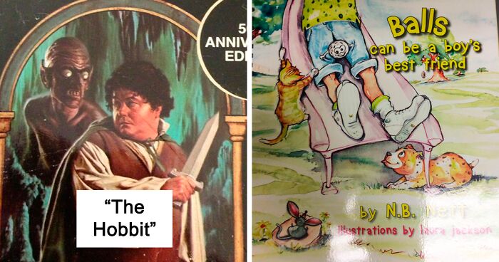
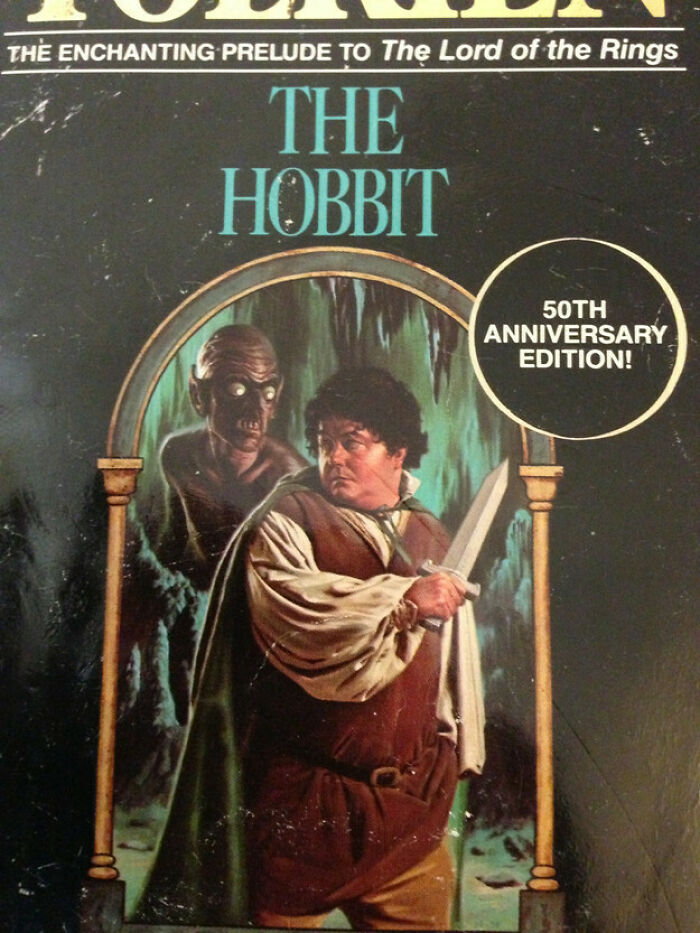
The Hobbit
I always thought Bilbo was kind of cute...NOT THIS ONE :P
Load More Replies...Tbh, this is probably more accurate to Tolkien's vision than many other versions.
He had too many second breakfasts.
Load More Replies...Oh no! Your comment had me dying of laughter. This is the part where Gollum conveniently disappears as he desperately claims that Gollum was there two seconds ago.
Load More Replies...Do Your Kids Suffer From Nightmares? No, Not Yet? Well This Should Help A Lot
My Mom Used To Read This One To Me
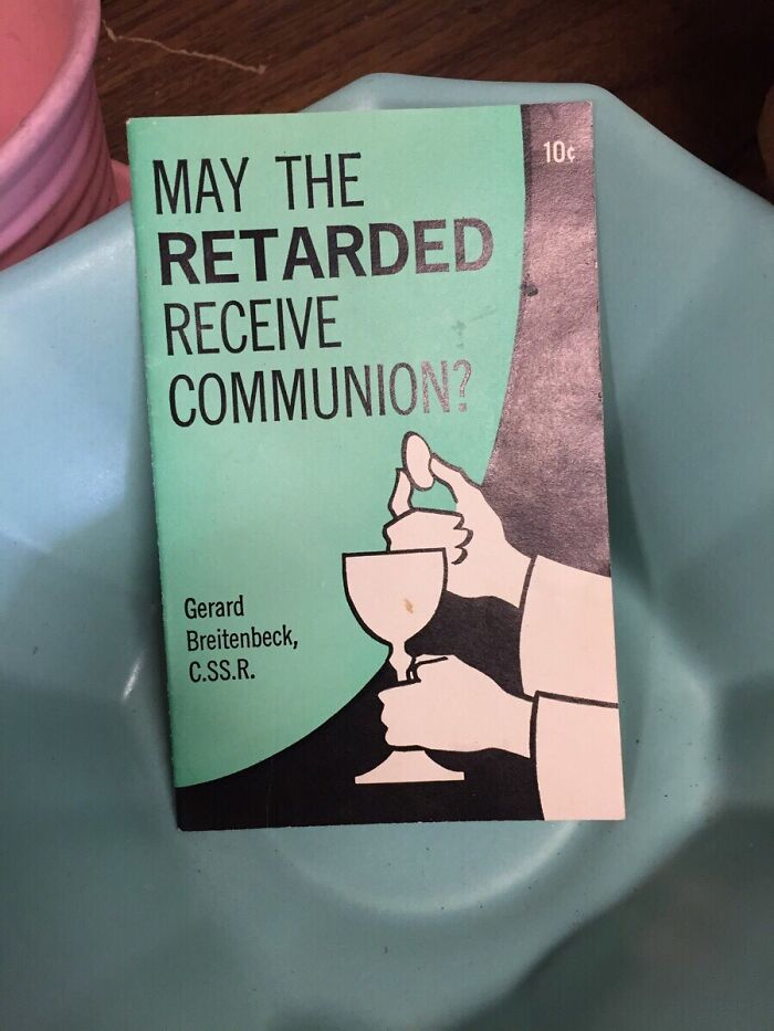
Keep in mind that the R word used to be a medically acceptable term. Let's not use modern sensitivity to judge the past.
And maybe it will come back around as an acceptable word, like "idiot" and "cretin". Both began as clinical terms.
Load More Replies...a few hundred years ago, some people decided that people with significant intellectual or developmental disabilities deserved to be treated with basic human dignity, and they said "Lets create a non-judgmental word to describe these individuals". They came up with the word "cretin". Eventually, the word cretin became an insult, so a new generation of people said, "Cretin is insulting, lets create a non-judgmental word to describe these individuals", and they came up with the word "idiot"... well you see where this is going. "Imbecile", "moron", "retarded"... they ALL started out as words that were supposed to be "clinical and non-judgmental".. and look where they ended up. Which leads me to believe that when the underlying problem is that people are judgmental jerks, changing a word doesn't solve the problem.
Yes, yes, sounds goofy, but I'm sure the point is, How can you help people with limited intellectual ability to understand this difficult concept.
Not sure what's so "bad" about this one. If it's the wording, that was just the normal term when the book was published.
NO WAY!!! Was this wrote in 20s - 30s? You wouldn't get away with publishing this nowadays
Mum was misguided perhaps or indoctrinated.. that is a dreadful title
Coming back to Chip Kidd, he said that a book designer has a responsibility to three groups of people: the reader, the publisher, and the author. So the ultimate goal of a good book design is to get people to respond. For the reader, you want people to say, "Wow! I need to read that." For the publisher, you want them to say, "This is something we can print." And for the author, you want them to say, "Yes! This expresses my idea better than I could!"
So I guess you could say that a terrible book design is boring, unmarketable, and superficial.
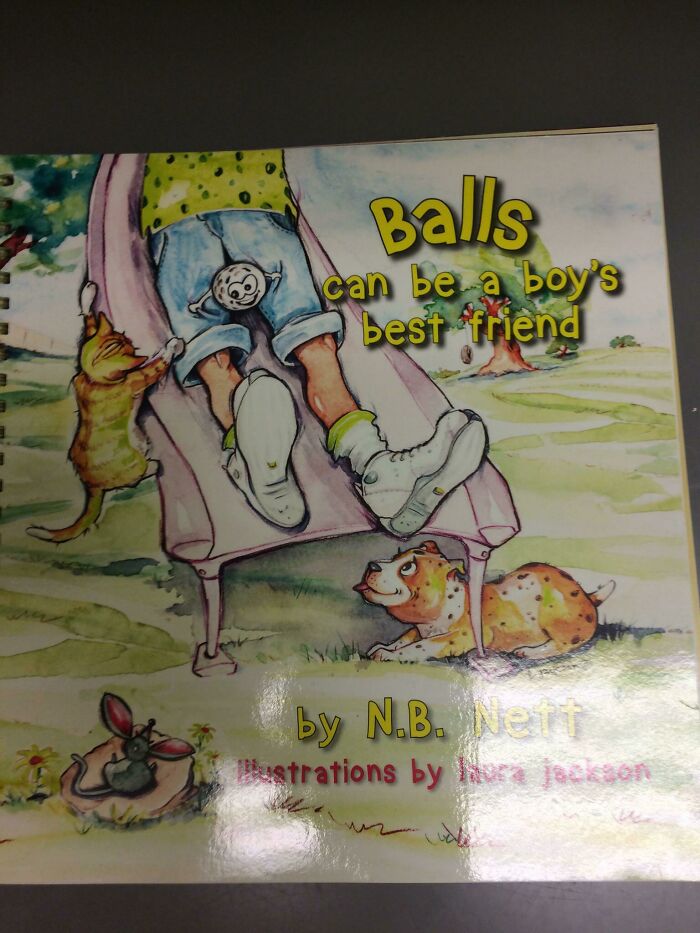
Found This In A Doctors Office A Few Years Ago. I Think About This Way Too Much
What..........The.............F***!!!!! If I saw this in my doctors office I would be seriously weirded out!!!!
I looked this one up. The story itself seems innocent enough, but why is the ball positioned THERE of all places?
The illustrator had other ideas. But why couldn't you put in the kid's hands or on the ground?
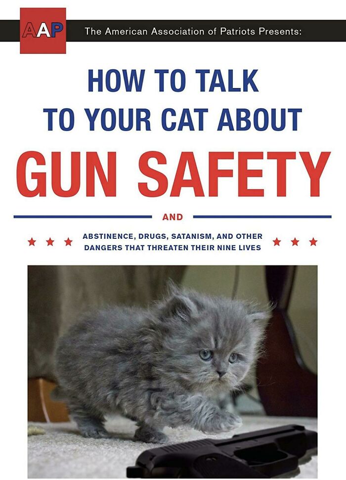
Load More Replies...Not Sure If This Has Been Posted Before, But...
If cats would have opposable thumbs nobody would laugh! XD
Load More Replies...Proud to say I own this one along with another in the series, "How to Talk to Your Cat about Evolution."
I bought this book as a stocking stuffer for Christmas. It was hilarious
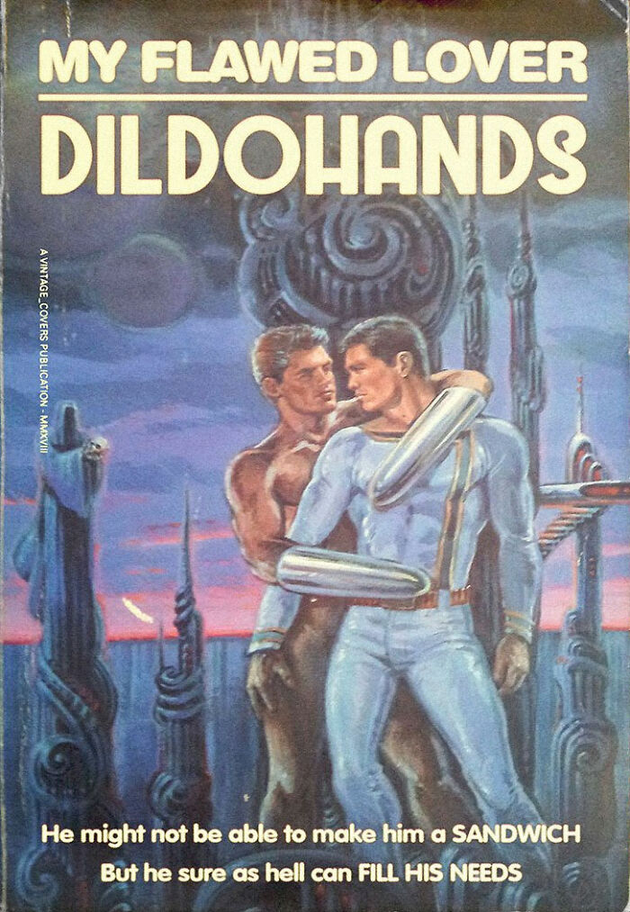
Prehistoric Passion From Mars
Just looked up the author and his covered are amazing, there is even one which has a giant guy who looks like he's about to have his way with statue of liberty 91e2GJGE9K...3d2ec7.jpg 
Excuse me? What the metric f*ck to the power of 6?
Load More Replies...I need some. Give, I SAID GIVEEEEEEEEEEEEEE!!!!!!!!!!!!!!!!
Load More Replies...They are getting worse, I'm not sure I want to keep reading the list.
I too, kiss dinosaurs in my undies while a creepy huge alien looks on.
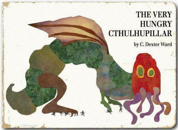
The Very Hungry Cthulupillar
Go on youtube and search The Very Hungry Cthulhupillar and you'll find a read - aloud. Very funny.
Load More Replies...instead of eating food, it e̶͈̙̭̤̙̟̻͈͍͎͌̎͌̿͋̓͊̓̌̄̍̏́̎̓͠͝a̷̡̜̺̦͎̟̥̜͔̺̬̯͂͋̔͌̀̿̓͂̍̽̈́͜͝͠t̷͎͍̠̯̠̪̳̩̞͕͍̖̦̟̍͑ş̶̡̛̟̯̤̱̹̳͖̬͙̳̔̂̒̋̊͐͐̽̈́͝ ̶̃͋̀̓̂̈́̈̉͠͝ͅy̴̡̼̦͖̰͉̝̖͖̪̳̺̣̍̇̋̈́̀̃́̀́̀̋̃̑͋́̕͝ͅo̴̡̡̝͙̘͍̞͓̣̣̊͊͐̑͊͗̾͒̆̏͝u̵̹̤̠͎͔̓r̸̙̺̮͙̦̆̄̓̉͒̀͘̕ ̴̯͔̓̓s̸̼̲̩̘̹̗͕̱̩̫͔̜̖̿̆̅̔̐̋̚o̷̞̖̪̘̘͍̻̞̎̀̓̕ų̴̢̛̺̺͔̫̳͈̫̖͔̒͋̓͛̕͝l̵̢̧̳͚͇̝̫̭̲̱̘̟̱͈̳̞͚͛̄̿̆͗̈́̆̍͋̑̃̊̿̈́͘̕
This, I would read. Hell, I'd have kids just so I could read it to them.
Cthulhu! How are you today? (is anyone else thinking of cthulhu from terraria and how it could look like this)
Ah my childhood Lol! Instead of eating ice creams and such like his caterpillar cousin, I guess the very hungry cthulupillar will have different tastes
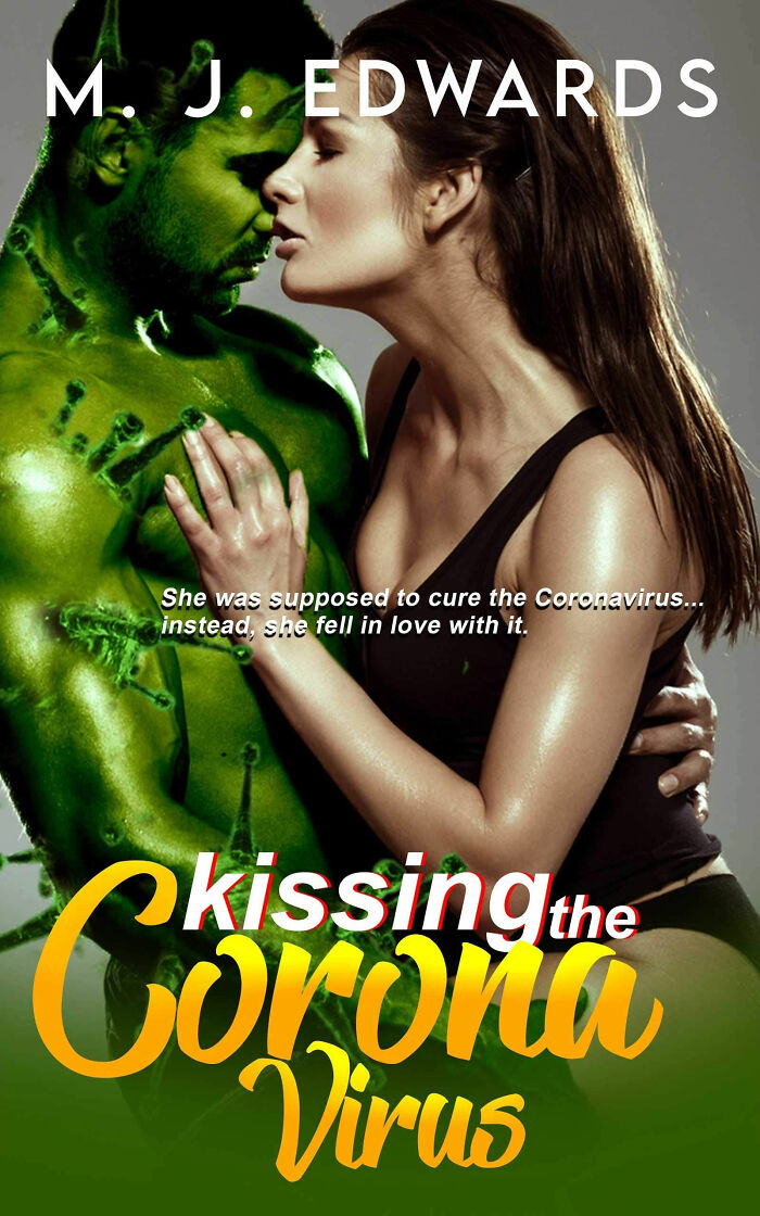
Kissing The Coronavirus (Coronavirus Erotica?!)
is this terrible book covers or terrible books? i'm pretty sure this checks both boxes (not that i wouldn't be curious enough to read a few pages though)
Those were not the words I had in mind, but they certainly express what I was thinking very well.
Load More Replies...I know the Corona virus has been mutating. I just didn't realize how much.
I think that "killing the corona virus" might be better option
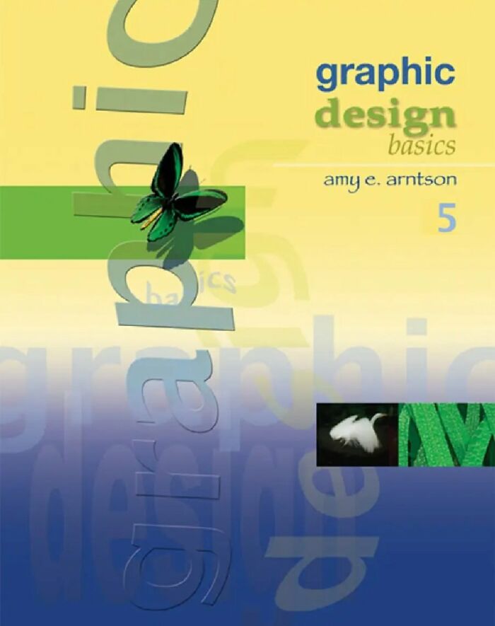
How Ironic
Amy E. Arntson is a Professor Emerita at the University of Wisconsin-Whitewater where she taught art, design, and computer graphics for over twenty years. This looks like it's from the late nineties though, wich it probably is.
Load More Replies...Many confuse graphic design with design in the sense of "easy on the eyes". Graphic design is the study of the techniques used to deal with graphic elements such as pixel data, vectors etc. but not the application of design theories. So I don't think the cover is "pretty" but absolutely suitable
Comic Sans is actually a decent font. I'm surprised they didn't use Papyrus, as Papyrus's appropriate uses are limited to school presentations about Egypt.
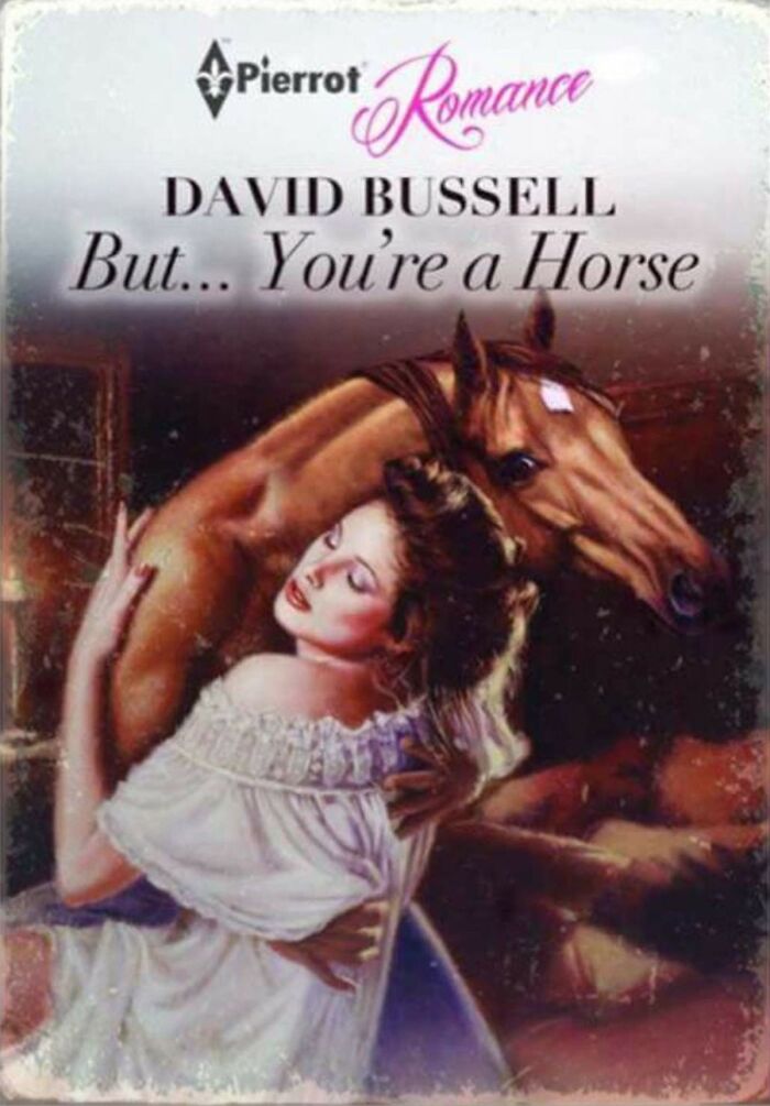
Load More Replies...I’m Just Waiting For The Film Adaptation
Why does the horse have hands? Moreover, why is the horse's anatomy my biggest issue with this? I've got some thinking to do.
I thought exactly the same.. it's physically impossible
Load More Replies...Well, I always did wonder where the horse head and neck went...
Load More Replies...This is a comedy book. It's not meant to be a serious cover. Just saying.
Well, according to the cover he's a horse HEAD, with the weird morphed body of a shirtless man with horse shoulders. Also, WHAT?
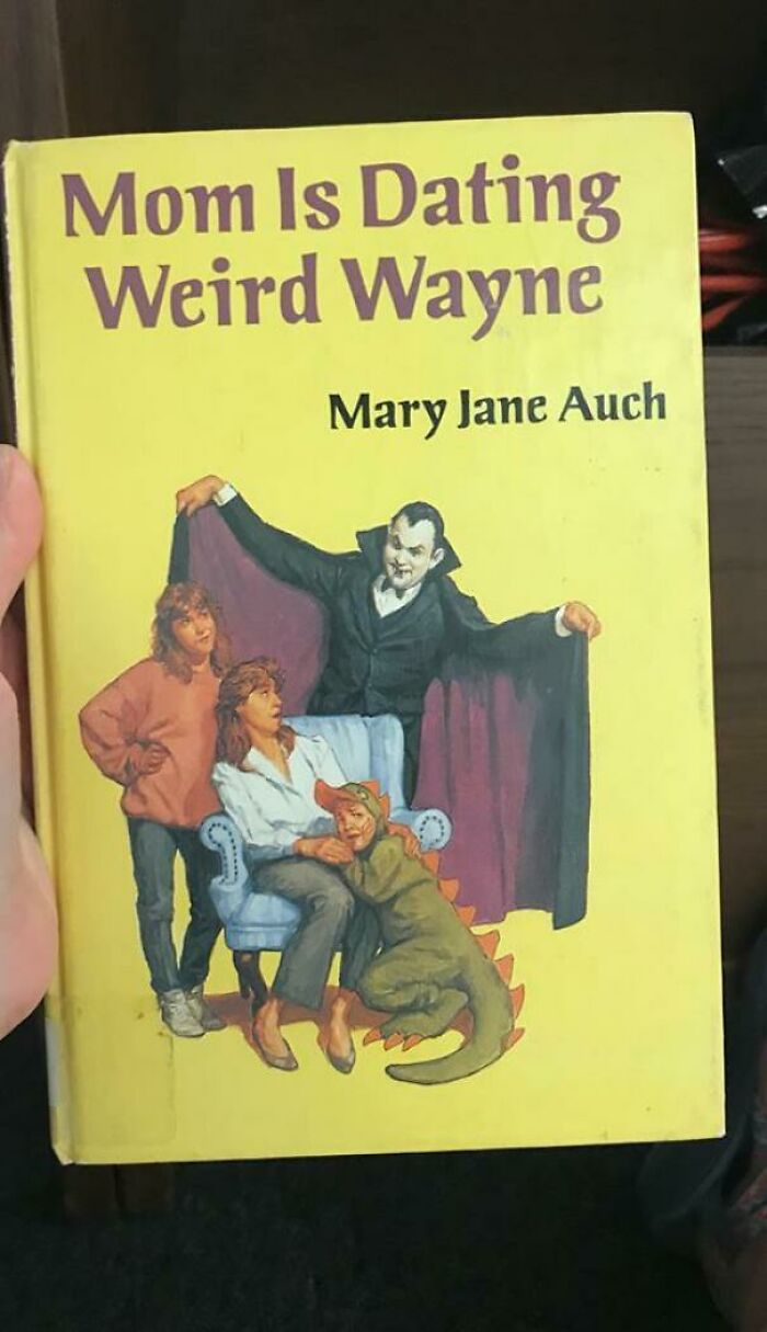
My Librarian Wife Always Has Interesting Finds
Answering the question "Whatever happened to Eddie Munster?" (Unless this is Grandpa Munster who discovered Grecian Formula...)
Mom Is Dating Weird Wayne: Or, How Eddie Munster Grew Up To Be A Sex Offender and Other Stories :-D
Load More Replies...I have so many questions, starting with why is the boy wearing a dinosaur costume?
When Your Mom Tells You To Get A Real Job, But You Double Down Trying To Prove You Can Start That Cult You Always Said You Would...
I was not interested, but then I saw, Foreward by Maxine Sanders. Hell. I’m in!
i dont question people's beliefs. If you believe in God or Satan or the weird baby lizard Dakaria who spirits your soul to another dimension, that's fine. But that haircut is disturbing.
so this is a real book? how do people react when none of the magic works?
This is a real book by an author who lives in New Orleans and runs a bookshop. He also gives tours of haunted places, as well as a vampire tour! I went on a different tour, but saw his group and heard some of his narrative.
Load More Replies...witchcraft and wicca are actual religions, but it looks as though this book is not related to the traditional practices haha
Eddie Izzard would never wear such a horrid ensemble or makeup :) he's got far better taste than that
Load More Replies...He looks like he could be a presenter on Loose Women, the British equivalent of The View. Horrifying.
Woof? I Feel So Empty
This is another photoshop. The word is Tonsils. https://www.amazon.com/Good-bye-Tonsils-Whitman-Tell-Tale/dp/B0007FB2L4
Yes and there is a girl in original instead of a dog
Load More Replies...Soooo... is this book for dogs...or the people who own the dogs...Who is this book for?
I remember reading an almost identical-looking book called Goodbye Tonsils, when my step-sister was having hers out. The author used the same cover for this book.
I'm trying to think how "Jack and Jill" fits in with castration, 'cause as best as i can remember Jack hurt the other end. But Jill doing a lot of tumbling after does makes sense
Well how else do you get someone to buy a nursery rhyme book give it a crazy title.
Call Him Xi Dada
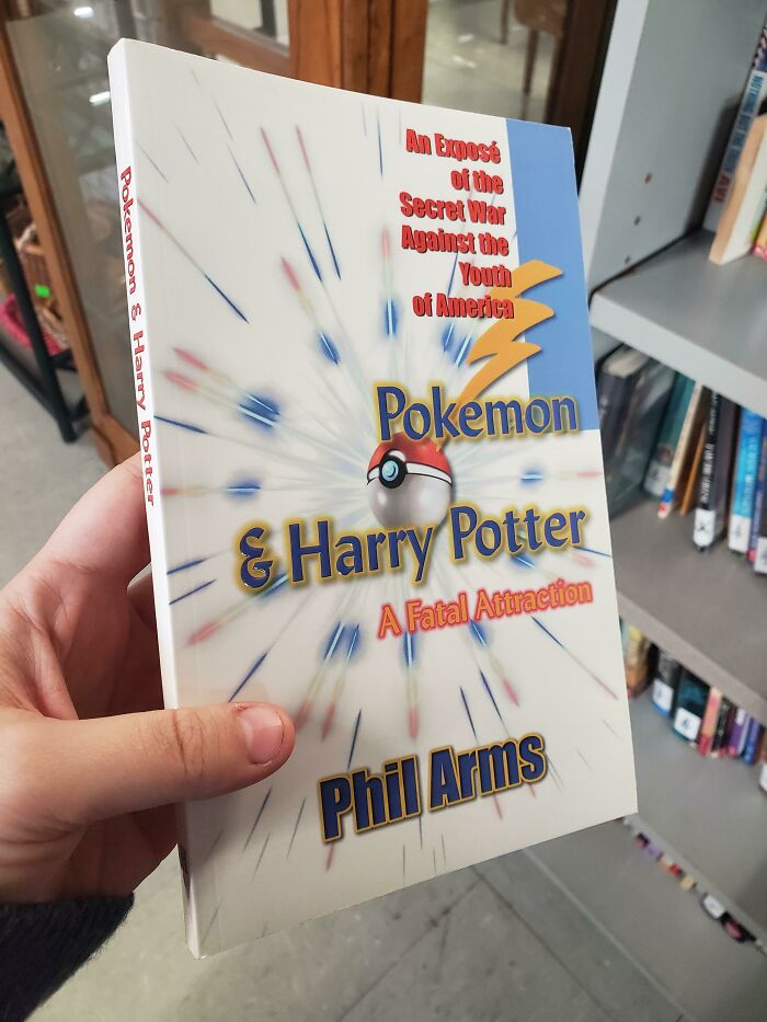
Browsing Through Books At A Thrift Store, Um...
I like the authors name. " What's your name?" "Phil Arms" " I dont want to feel your arms, I just need your name"
For decades, there have been people scamming off of "moral panics" that they just made up. Just pick whatever is popular with young people and unfamiliar with older people, make up some nonsense about Satanism or sex or whatever, et voilà, profit. Similar idea with news outlets who are always making up dangerous teen fads for parents to freak out about. You can always make money from the stupid and mentally ill this way.
Ah, a book about my weaknesses. And they called me paranoid *manic laughter*
If he thinks Pokémon is evil, wait until he sees the games that have subjects heavier than gravel.
Don't Judge A Book By Its Cover, Even If It Is A Collage Of Jpegs
Photoshop is a bit of an overstatement. It's a Paintjob.
Load More Replies...The editing is horrid, the hair is really fake and the cover is blurry. Wonder if it's a rip-off.
probably. Its actually a ripoff of the jungle book by Rudyard Kipling.
Load More Replies...Even The Price Is Questionable
Rihanna wrote the accompanying song to this book - we found love in a hopeless place
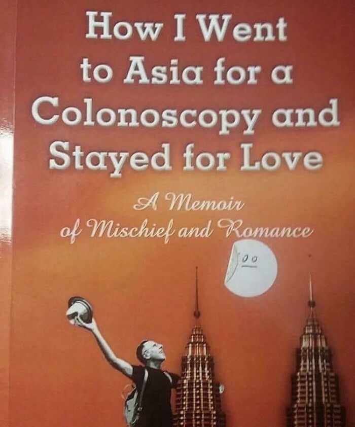
I would like to read more.. out of curiosity what more came after the colonoscopy and why?
I'm so curious about the preferences this guy selected on his Tinder account... :P
I Think I've Found It! The Most Glorious Photoshop Of All Time!
Is the creature behind her a bear, a wolf, a fox, or a tree?
Load More Replies...Remember angela anaconda? Google it and you will see what I mean
I don't understand why the pants, shirt, arms, face and hair ALL come from different bodies.
The bat wolf thing was gonna say something. Then he took an arrow in the knee.
Terrible Everything
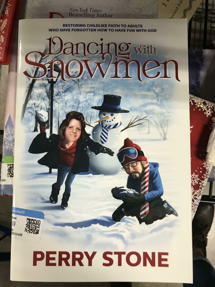
Dancing with Snowden.. I mean, that guy sitting there, doesn't he resemble..?
How do you dance with a yuge pile of slate and porphyries?
Load More Replies...Again why are all these freakn messed up titles either sx or religion related.
How To Talk With Your Dog About Homosexuality And Communism
Translation: how to talk with your puppy about homosexuality and communism (portuguese)
I'd rather the other one... porque é literalmente o que está escrito. Brasileiro tem mania de interpretar tudo...
Load More Replies...I'm starting to feel like I'm denying my pets alot of educational subjects....gun safety, Satanism, homosexuality, communism, drugs....
Im not even going to reply to this one. Oh wait a minute, i just did
That Lighthouse Imagery...
If I ever wanted to shine a light on constipation, a lighthouse would not be the first thing to come to mind.
Aww, a doctor is writing a medical book and he struggles to find a title that isn't totally technical and boring. Give the guy a break.
As a colon cancer survivor and subject of countless colonoscopies, PLEASE not the lighthouse!
The lighthouse is no doubt the symbol of constipation ..isn't it? Why?
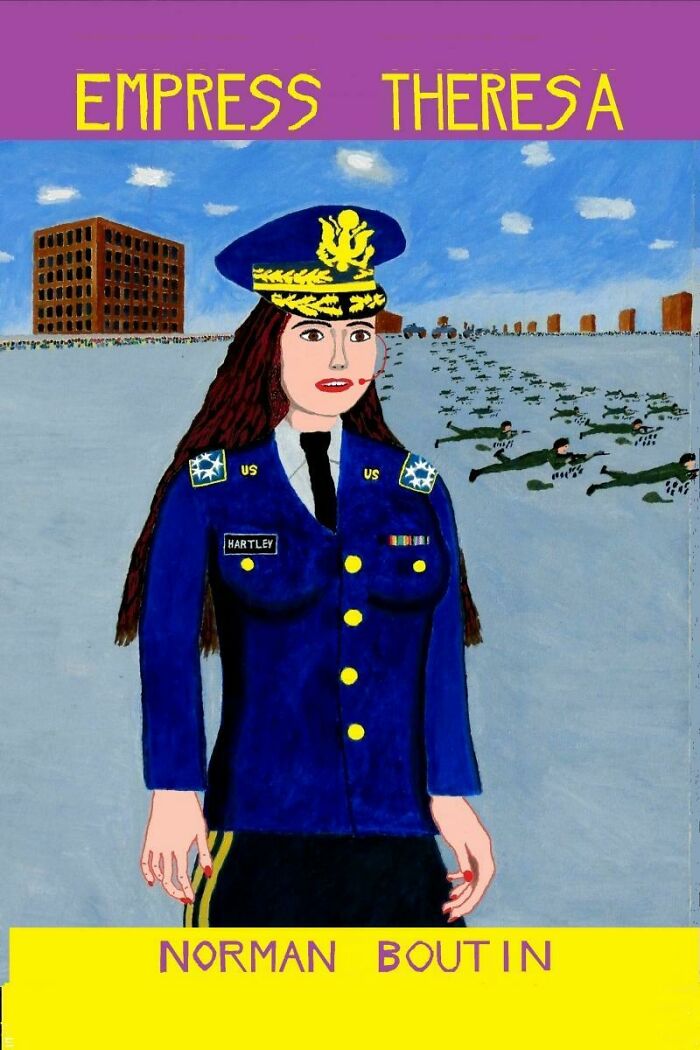
Empress Theresa - Final Cover
This one is a whole rabbithole. It's an awful book (as in boring and poorly written) but the author believes it's the best book ever and will write long rants as replies to bad reviews on amazon.
Load More Replies...I salad with my touch fingers. You ain't special.
Load More Replies...They were crushed by the mechanism in that sign!
Load More Replies...It looks like they had a art competition in a primary/grade school, or whatever you call it, and this was the winner, done by little Shawn in Primary/Year/Grade 3
His Leg On Ready Player One’s Cover
I thought this was photoshopped at first....I looked at my copy its real!!!!
i hope it's photoshopped... if not it must be a pain in the a$$ to walk with that
Load More Replies...Both his legs are streched.. this is what happens when you "look yourself blind on it" as we say in Norwegian (directly translated). Not sure what it's called in English. Anyway, it means you work on something for so long that you fail to see mistakes that are blatantly obvious to others. Was probably too focused on making the pants look right etc. Why the legs needed stretching in the first place I don't know, tho.
it's a good movie and i've never read the book, but the leg...the rest is fine though lol.
I don't get it.. is one leg longer than the other..and also the same leg? Or just a twisted sneaker?
I'm not seeing it either; one leg is bent and the other is stretched. Maybe it's like that black & blue/white & gold dress syndrome.
Load More Replies...5'3" standing on his left leg, and 6'8" standing on his right. Way to go, photo editors.
Kissing The Coronavirus Is Back!
This is horrible. Stop making me look at it please, BP!
Kill it! Destroy everything! Go absolutely Russian on their asses! Steal their cable!
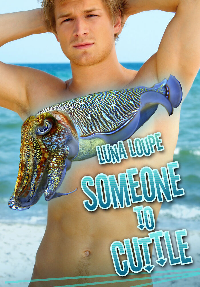
Load More Replies...Romance Is The Gift That Keeps On Giving
...and this is where he regrets that stock photo modelling job.
I'm assuming that there's probably a cuttlefish merperson in this book.
i'd totally cuddle a cuttlefish, that thing is so cute! i want a cuttlefish pillow.
I Can’t Believe It’s Real
Because he is smaller, so he is supposed to be in the background, but look at her hair : he is closer than her... It is a very unsettling perspective.
Load More Replies...At least it's better than My Trumper Lover. That one's classed as "horror" in the library.
I believe those are under "psychological torment".
Load More Replies...I have never met an ANTIFA do anything more violent than be dull at parties
Then you probably don't go out much. ANTIFA are both mentally and physically weak fascists that caused 200+ riots and took control of Seattle among other things. Of course, these cowards hide their face and only attack in packs.
Load More Replies...Man these libtards really get excited about fascist terrorists like antifa. Ps Biden is destroying this country and Trump was an awesome president.
*Libtard Fantasy. Republicans are much smarter and would never fall for some mentally/physically weak fascists like antifa who call themselves anti-fascists but are too dumb to see that they are fascists themselves. Also, it seems you aren't very original as Libtard was coined and then liberals tried to copy the name for themselves but instead attack Republicans (superior intellects) with it because regressives (liberals) are too dumb to think of their own insults.
Load More Replies...I first thought looking at the top of the photo " I can't believe it's not butter" remember that old a with Fabio? :+}then totally lost the plot with the rest of it..
Complete with phallic gun placement. Fiverr cover art at its finest.
Librarian Wife Comes Through Again
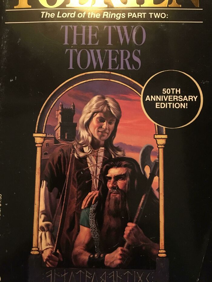
The 50th Edition Lotr Covers Are Something Else...
They turned him into the singer from an 80s soft rock band
Load More Replies...I Don't Even Know What To Say About This Book Cover
The first attempt to masturbate would be the last attempt to masturbate.
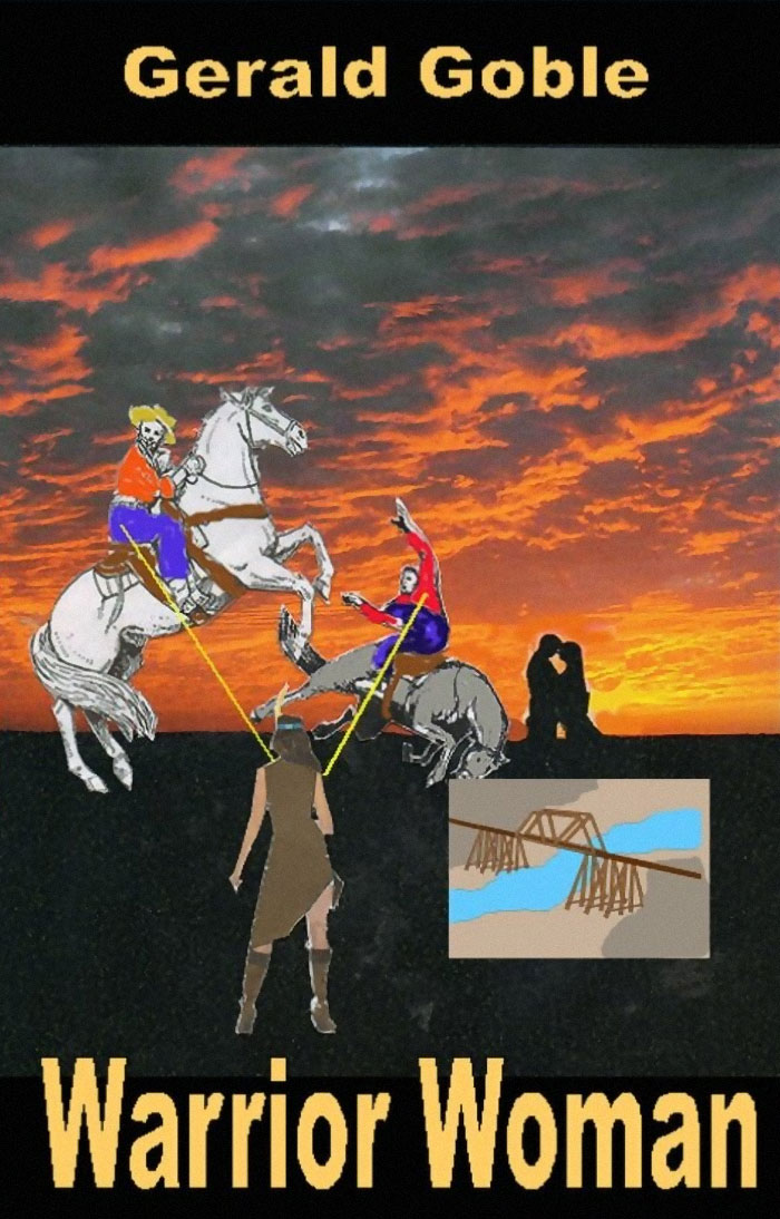
Til That Native American Women Shot At Cowboys With Lasers (Also There Was Young Love In The Wild West)
I don't want to think about where those lasers are coming from.....
Load More Replies...anything you can do in photoshop, I can do in pa-aint *melody*
In the movie Flesh Gordon, one woman had "power pasties" that shot lasers. I think that's what she's using here.
Wtf
Chuck has written dozens of books. None of them good.
Load More Replies...whywhywhywhywhywhywhywhywhywhywhywhywhywhywhywhywhywhywhywhywhywhywhywhywhywhywhywhywhywhywhywhywhywhywhywhywhywhywhywhywhywhywhywhywhywhywhywhywhywhywhywhywhywhywhywhywhywhywhywhywhywhywhywhywhywhywhywhywhywhywhywhywhywhywhywhywhywhywhywhywhywhywhywhywhywhywhywhywhywhywhywhywhywhywhywhywhywhywhywhywhywhywhywhywhywhywhywhywhywhywhywhywhywhywhywhywhywhywhywhywhywhywhywhywhywhywhywhywhywhywhywhywhywhywhywhywhywhywhywhywhywhywhywhywhywhywhywhywhywhywhywhywhywhywhywhywhywhywhywhywhywhywhywhywhywhywhywhywhywhywhywhywhywhywhywhywhywhywhywhywhywhywhywhywhywhywhywhywhywhywhywhywhywhywhywhywhywhywhywhywhywhywhywhywhywhywhywhywhywhywhywhywhywhywhywhywhywhywhywhywhywhywhywhywhywhywhywhywhywhywhywhywhywhywhywhywhywhywhywhywhywhywhywhywhywhywhywhywhywhywhywhywhywhywhywhywhywhywhywhywhywhywhywhywhywhywhywhywhywhywhywhywhywhywhywhywhywhywhywhywhywhywhywhywhywhywhywhywhywhywhywhywhywhywhywhywhywhywhywhywhywhywhywhywhywhywhywhywhywhywhywhywhywhywhywhywhywhywhywhywhywhywhywhywhywhywhywhywhywhywhywhywhy
Chuck Tingle is a wellspring of books like these; If you want a good laugh, honestly, it's worth a couple of bucks to read any of them if you can go into it knowing not to take any of it seriously
This guy is hilarious. Please go check out Chuck's full list of titles immediately. (He's also a fun account to follow on Twitter.)
Chuck Tingle is legitimately a good author and his "bizarre romances" prove that love is real no matter what kind of love it is. He is also good guy.
Ten Things Doctors Won't Tell You About Your Cpap Machine
Looks like someone going for a sleep test. I know as I've been there. Very uncomfortable and they expect you to sleep
Load More Replies...CPAP user here. Can confirm that image is 100% accurate. Absolutely. Oh yes, very accurate, as accurate as a Haddock doing its weekly shopping in Waitrose. Yes, you see, accurate. Very verily.
Yeah, my husband does too. And I was thinking this pic looks more like a sleep study.
Load More Replies...They can break down without anyone noticing and permanently damage your ability to breathe normally.
People Who Need To Die: Cell Phones
What have we learned today, children? We’ve learned that you can kill someone will a phone.
Having a series of books "people who need to die"....I'm gna have to bust out my special only red semaphore flags and warn people!
The Union of Soviet Socialist Republics wants to: Know your location.
Load More Replies...This Is Bad Even For The Low Bar Of Dinosaur Erotica
Can you imagine being the stock model for these photographs? "Yeah, I posed in a bikini. Probably get used for some generic beach images. Wait, they put me on WHAT book cover?!!"
I can't speak for anyone else but I'd be delighted if I was the face of dinosaur erotica.
Load More Replies...(puts on nerd glasses) Ahem, ACTUALLY, that is a Pteranodon, and that young woman has no business being on the beach during the Cretaceous era!
Yeah, she'll get eaten, probably by a rotund thing with multiple fins and pain teeth!
Load More Replies...And why they all dudes? They're not even capitalizing on the full potential of this trainwreck genre?
Load More Replies...Oh nooo... I think I've actually heard part of one of these books, many years ago the Youtuber Emma Blackery read part of one.
This lowered the bar so far it undid all the work done by Half-Life 2's beta.
Imagine Getting Kilt
my dad has Scottish descent and uses this as a dad joke all the time X'D scottish-6...f8347a.jpg 
when you open the book, there is a single page with a scrap of kilt, and it says "you've been kilt"
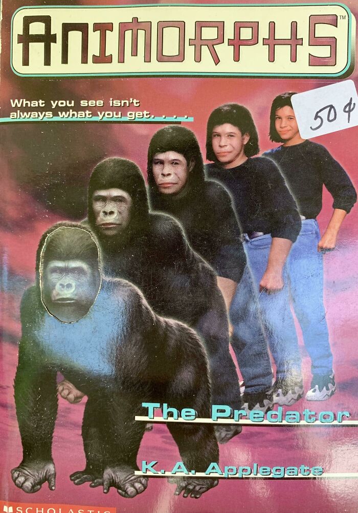
Don’t Steal This Kids Lunch
The book covers do look odd, but the story was really amazing to me as a kid. Not only you get really dark stories, with reasonable gore and proper risks, but you also get a lot of character development through the books. It's an alien war story, that is weird but rather charming. I read all 65 books
I looooved this series as a kid. I'm not sure I read more then 10 or so, I think my library stopped buying them for a while.
Load More Replies...It's a very good war story that doesn't hold back from the horrors of war. It exists for being a good story.
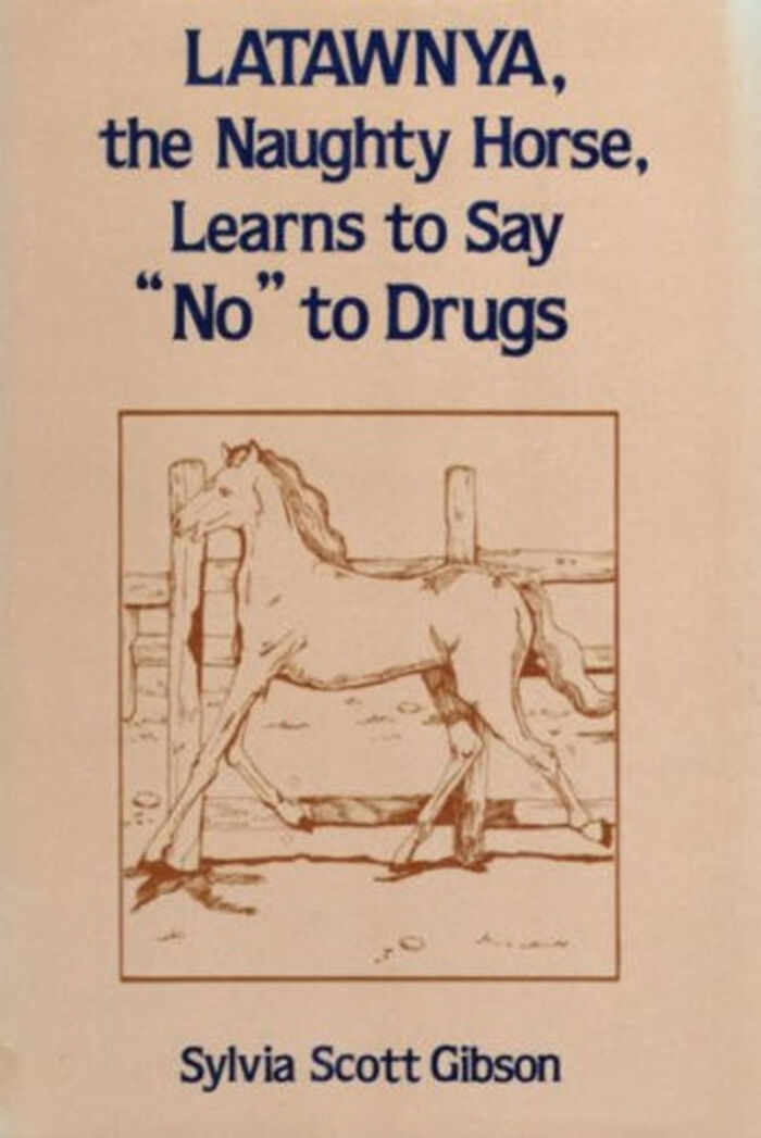
Load More Replies...Just Say "No"!
Lucky. My palomino jus started smoking, and I'm afraid that my bay will follow suit.
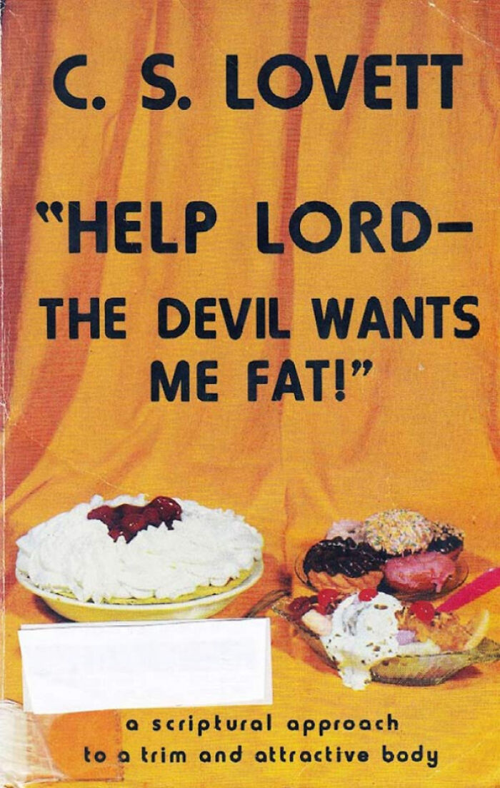
If You Fail You Can Always Say, "The Devil Made Me Do It!"
I just have so many things to say that I'm just. Fhjsdhfjgkdhahfugkdhdh
I Don’t Even Know What To Say About This One
Or a creation made by a first time user of photoshop
Load More Replies...wow how did they get all those people, foxes and dragons to pose together in that hall!? skillz
Much like 5 Minute Crafts, many here see to be able to appreciate the true genius evident before their eyes
I'm Impressed By Her Balance
STOP WITH THE SEQUELS. I COULD BARELY HANDLE THE FIRST BOOKS
Great. They've biked all the way to the Trinity nuclear test site. nuclear-te...f3-png.jpg 
This guy likes to write sex with dinosaurs do they even have the parts
Apparently Hitler & Co Invented Time Travel
Just tot get the point across the dino is a Nazi it need a Hitler mustache.
Religious Fruitcake 101
If I were a parent I wouldn't want God's rod anywhere near my child's bod.
...if You Say So!
The title is a quote from the Bible. It's talking about obedience to God. That is, God said that it is more important to him that people obey his moral laws than that they give money.
Can't Stop Staring In Puzzlement At The Perfectly Matching Hemline
These kids look like they’re winning at life, no change necessary
Load More Replies...Chrissakes the real ones are the worst. Sorry kids - Tough Love for you!
This Series Of Books Is A Goldmine
I don’t mind white, black, or Asian Jesus (whichever way helps people relate to Him better), but it’s definitely cool they have middle eastern Jesus in this book!
Load More Replies...If this cover is any clue, I'd say Jesus was either a Pez dispenser or a bobble-head.
Well, who was makes heads really big, that’s just their style
From The Author Of Kissing The Coronavirus!
Therapist: Joe Irwin isn't real, he can't hurt you. Joe Irwin: Joe-Irwin-...c8-png.jpg 
Can anyone get me some good ol' unsee juice? I think I need it for the whole article...
AHHHHHHHHHHHHHHHHHHHHHHHHHHHHHHHHHHHHHHHHHHHHHHHHHHHHHHHHHHHHHHHHHHHHHHHHHHHHHHHHHHHHHHHHHHHHHHHHHHHHHHHHHHHHHHHHHHHHHHHHHHHHHHHHHHHHHHHHHHHHHHHHHHHHHHHHHHHHHHHHHHHHHHHHHHHHHHHHHHHHHHHHHHHHHHHHHHHHHHHHHHHHHHHHHHHHHHHHHHHHHHHHHHHHHHHHHHHHHHHHHHHHHHHHHHHHHHHHHHHHHHHHHHHHHHHHHHHHHHHHHHHHHHHHHHHHHHHHHHHHHHHHHHHHHHHHHHHHHHHHHHHHHHHHHHHHHHHHHHHHHH (dies)
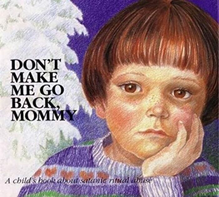
Don't Make Me Go Back, Mommy: A Child's Book About Satanic Ritual Abuse By Doris Sanford
Is this from that scare where they got a bunch of kids to "remember" that they were satanically abused? it was all hooey turned out. fake memories.
C'mon Everyone, Let's Join In On The Fun!
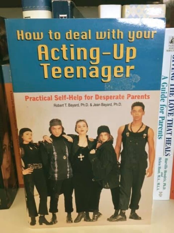
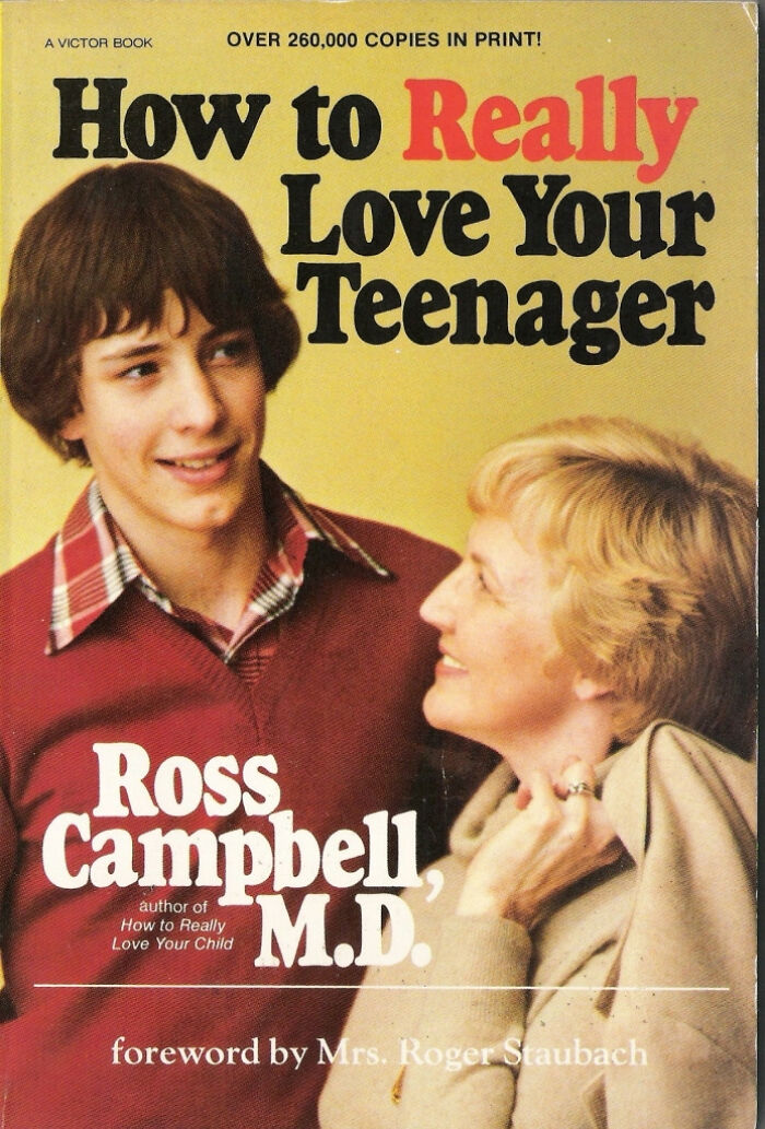
I Think Mom Has Taken This Too Literally...
Break both their arms. eeh? eeh? anyone? gosh this would kill on reddit
Maybe my mind just isn't twisted enough to see the humor in this. A book about raising teenagers that shows a picture of a mother and a teenage boy. I wouldn't call the cover artistically brilliant but it's a pretty straightforward picture to go with the subject of the book.
I agree the cover is benign but It's the 'really' love emphasized in red that gets me. "How to really raise your teenager" would have been a way better title or 'ways to emotionally support your teenager' or something. The 'how to really love' implies loving them as people do normally is not what the author intends, which makes it look funny to me. You also are implying that the book is about raising a kid right when it doesn't actually say raise anywhere.
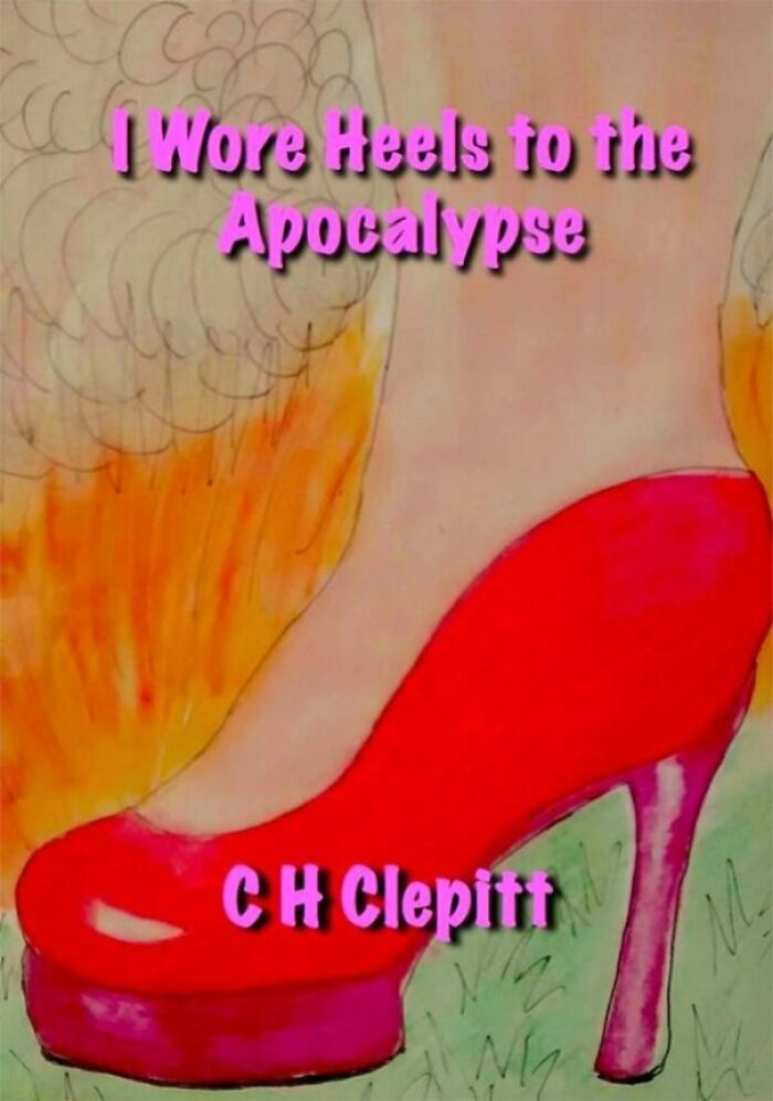
Load More Replies..."These Heels Were Made For Walking, Through The Apocalypse"
Honestly, I probably would, too. The world's ending, might as well look good doing it.
This Author Is Cancer
Step outside the box... And then the mortician will put you in a new one.
i was scrolling and i saw the top half and went, "oh, this isnt that bad", and then i saw the bottom and went, "oh wait nvm".
God, not Ty Bollinger. He and wife run an equally fact-free and dangerous website full of this s**t. According to them, the only way to cure cancer is to make your body "alkaline" through dieting because cancer cells die in an alkaline environment. It's awful, read it if you want to lose faith in humanity
Our Library Was Trying To Get Rid Of This One
Yeah, that's right! Flash mother nature! Defecate onto low-quality cyberpunk!
Found This On Facebook
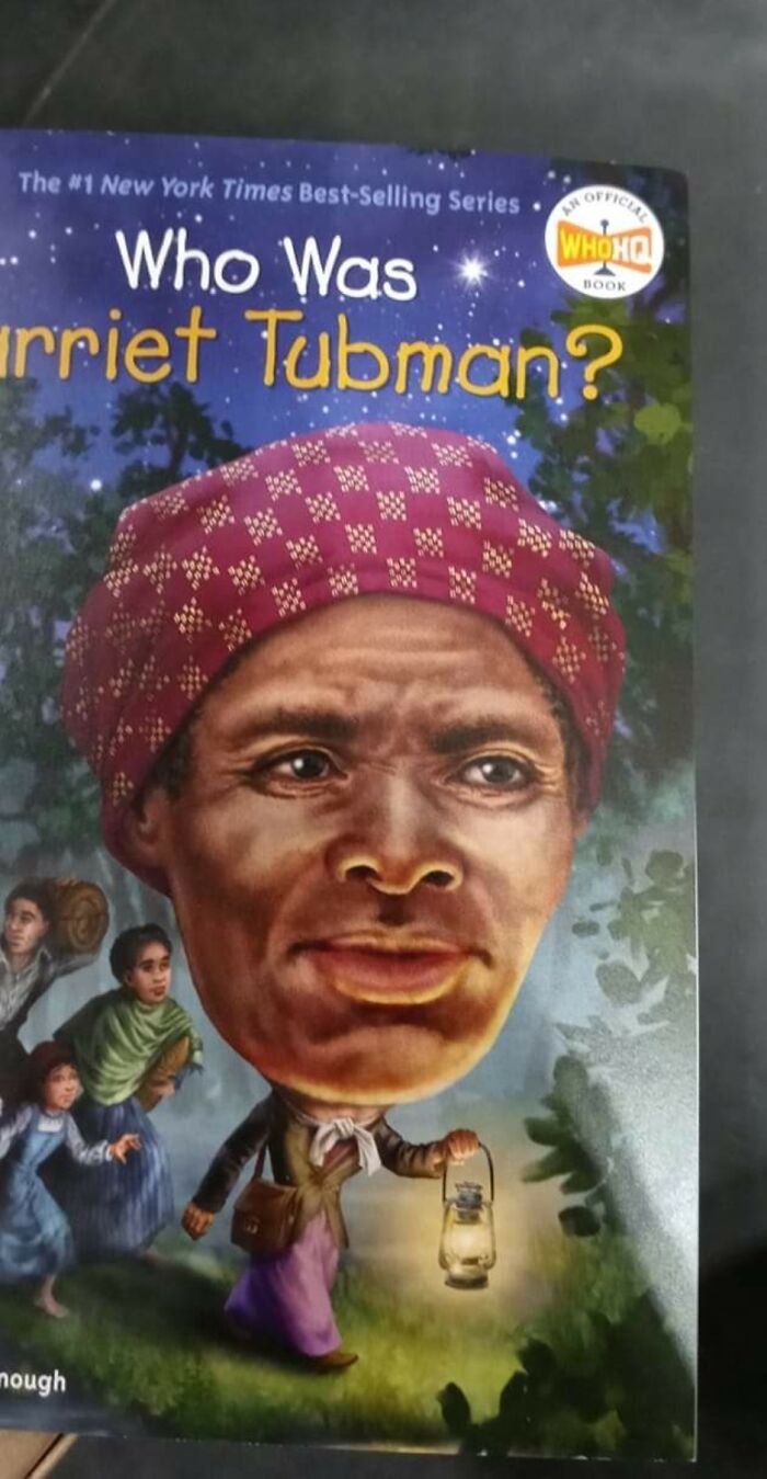
*Celebrity heads on "WHO WAS" covers may be smaller than they appear*
....someone who could be seen from 10 miles away when she inflated her head to get a better look at her surroundings.
This Belongs Here
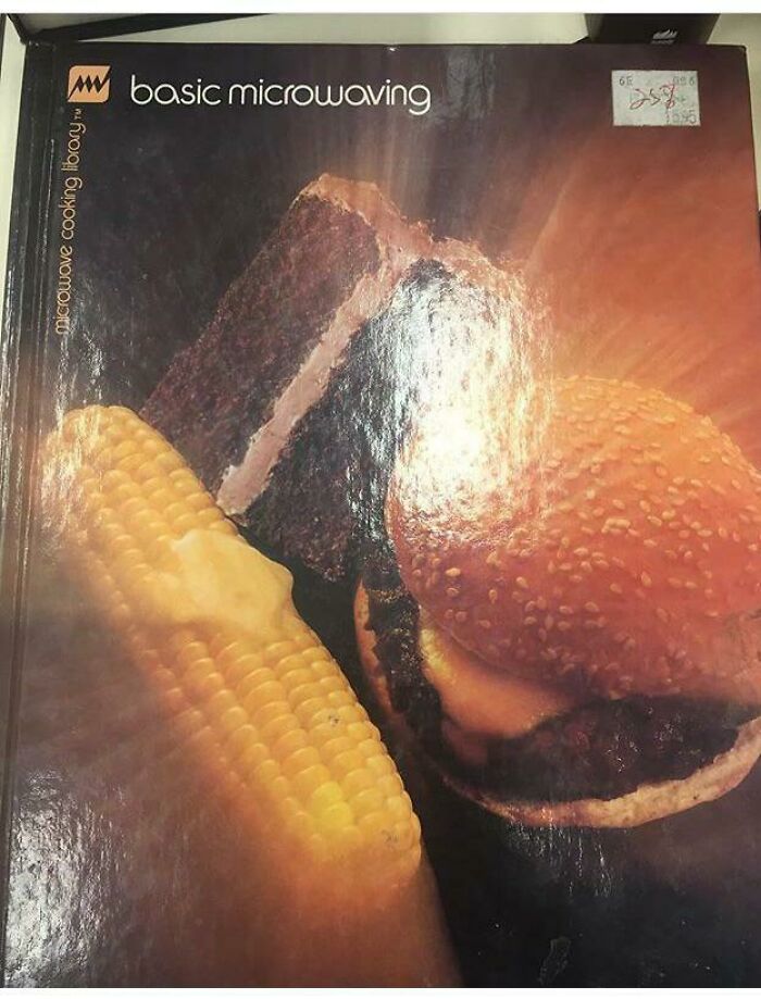
My stepmom's great aunt had a bunch of microwave cookbooks from when they first became available...not sure that a lot of what's in then qualifies as edible recipes
Secrets
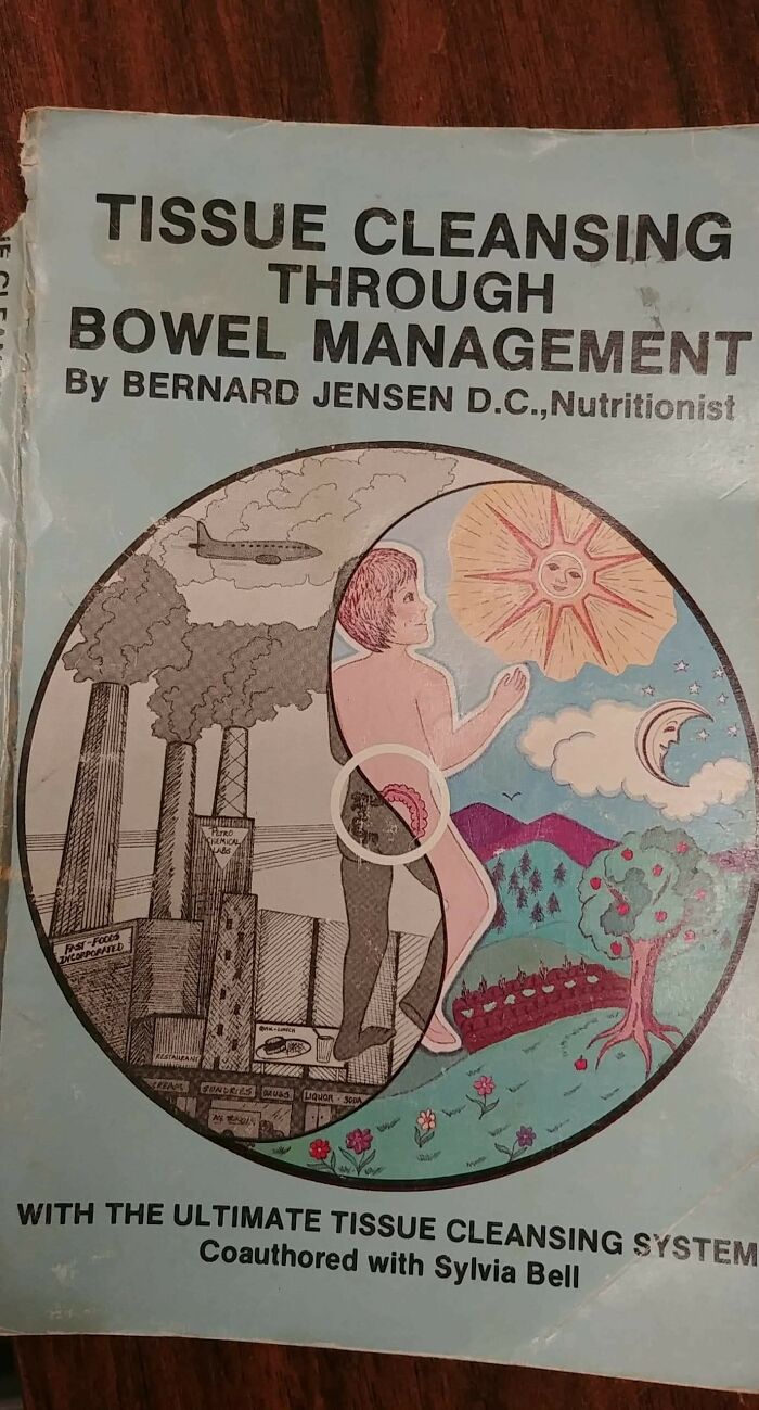
Do any of those abbreviations after his name mean anything or is he just BS'iing?
Why The Hell Was This In The School Library?
I had to use translate for that and holy s**t, why was it in your school library?
Lisa Simpson Grew Up To Be A Hitchhiker
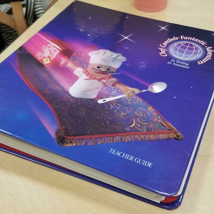
It Came With A Poster As Well
And looking at the title, I think it’s supposed to be for little kids and probably encourages the use of a puppet.
Load More Replies...Tractor Teacher
To be fair, it doesn't claim he knows a lot about women - just that what he does know was taught to him by his tractor.
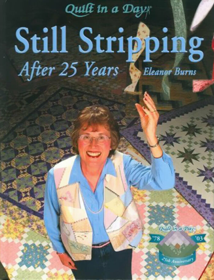
Not A Strip I'd Want To See
Bruh, so, in quilting there’s this thing called stripping. Eleanor Burns (who is a TREASURE) knows that stripping also means something else. It’s a joke. Don’t do my girl Eleanor like that.
I can't remember the author's name off the top of my head, but there's a series of knitting books called Stich n Bitch, and her crotchet book is called the Happy Hooker
Is This What Happens When You Build Your House On An Ancient Wolf Burial Ground?
Yes they do and that's why dogs love to burry bones. It's in their genes.
Load More Replies...With One Breath (Czech For "Reading In One Sitting"): Pillar Of Fire (And Other Short Stories)
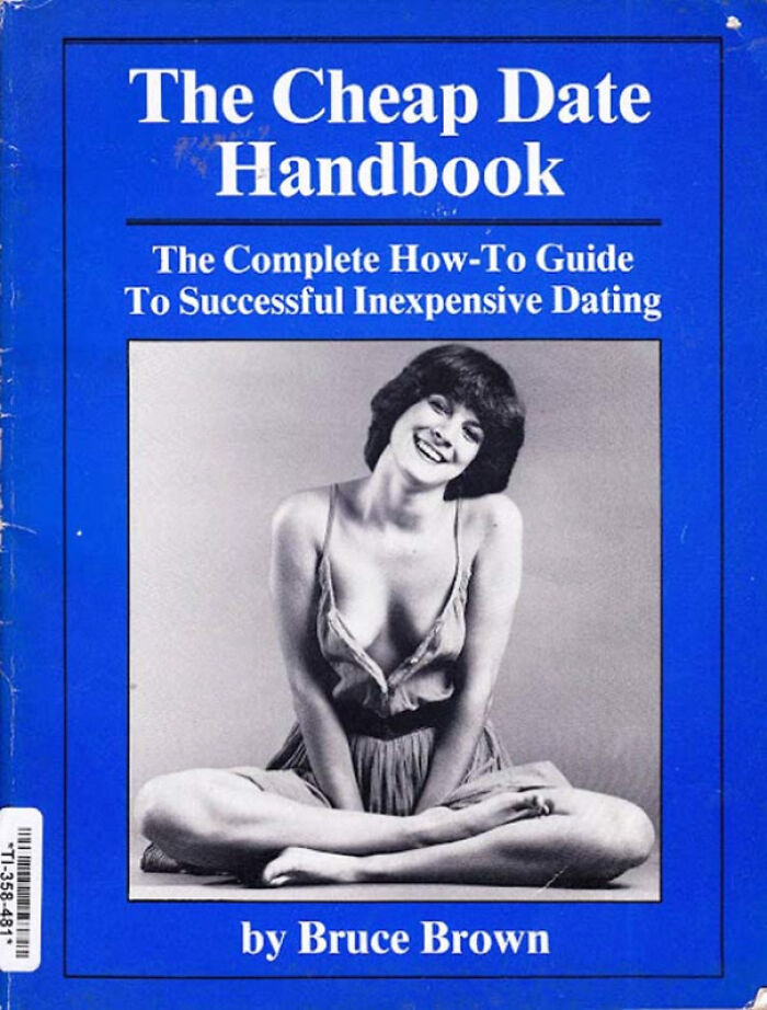
Cheap Date?
Netfix and pop tarts, Netflix and pop tarts
Load More Replies...Photoshop? I've Got My Kids!
Why did anyone down vote this? on bored panda I have seen that if one person downvotes something then everyone else will too☹️
Load More Replies...Aww, Why Bakugou get downvotes? This is positive!
Load More Replies...Beneath The Half Ass Photoshop
if the author's name is also in a 'creepy' font, you know you're in trouble.
Some "Goosebumps" books have the author's name in a similar "creepy" font ( I have never been a fan of "Goosebumps").
Load More Replies...Yeah It Does...
I Met The White House!
Had to look this guy up. According to Wikipedia: "George Edward Allen (February 29, 1896 – April 23, 1973) was an American political operative and crony ("poker-playing intimate" and even "court jester") for US Presidents Franklin D. Roosevelt, Harry S. Truman, and Dwight D. Eisenhower (as well as one-time head football coach of Cumberland University's football team in their lopsided match against Georgia Tech.)"
George needs a trip to dc... that’s not what the White House looks like
Why The Chinese Are The Way They Are
Why are you the way that you are? Every time I try to do something fun...
Can You Feel The Love Tonight?
Excuse Me, Are You Talking To Me?
Old book, when it was written r-word might have been a medical term still.
People forget this. Yes, there was a time when this was an acceptable medical term. Before that, idiot and moron also were.
Load More Replies...Ok
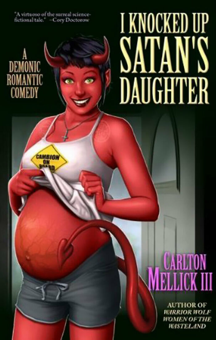
nonononono it will be satan but also it will be the doom guy with the shotgun
Load More Replies...Who wants to see the cover of "Warrier Wolf Women of the Wasteland"? That's got to be worth an image search! Edit: uh....
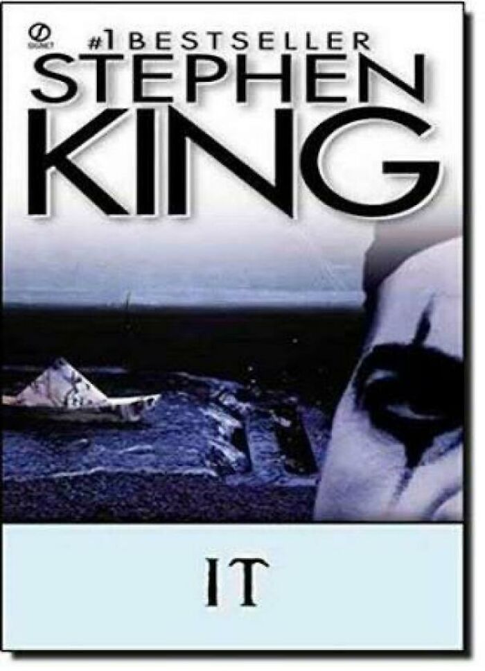
The 1987 Berkley Reprint Cover Of ‘It’ Is Really, Really Bad...
Well, I see a boat and an eye covered in soot or something.
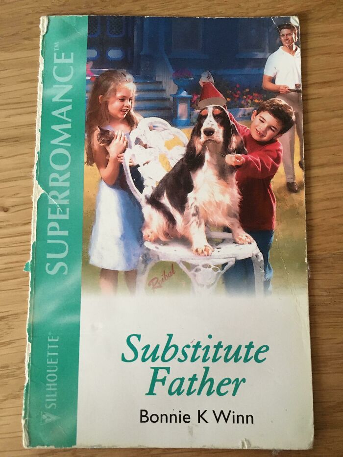
Load More Replies...Substitute Father
The heartwarming story of a dog adopting a kitten because their owners were too busy drinking and engaging in animal abuse to care for them
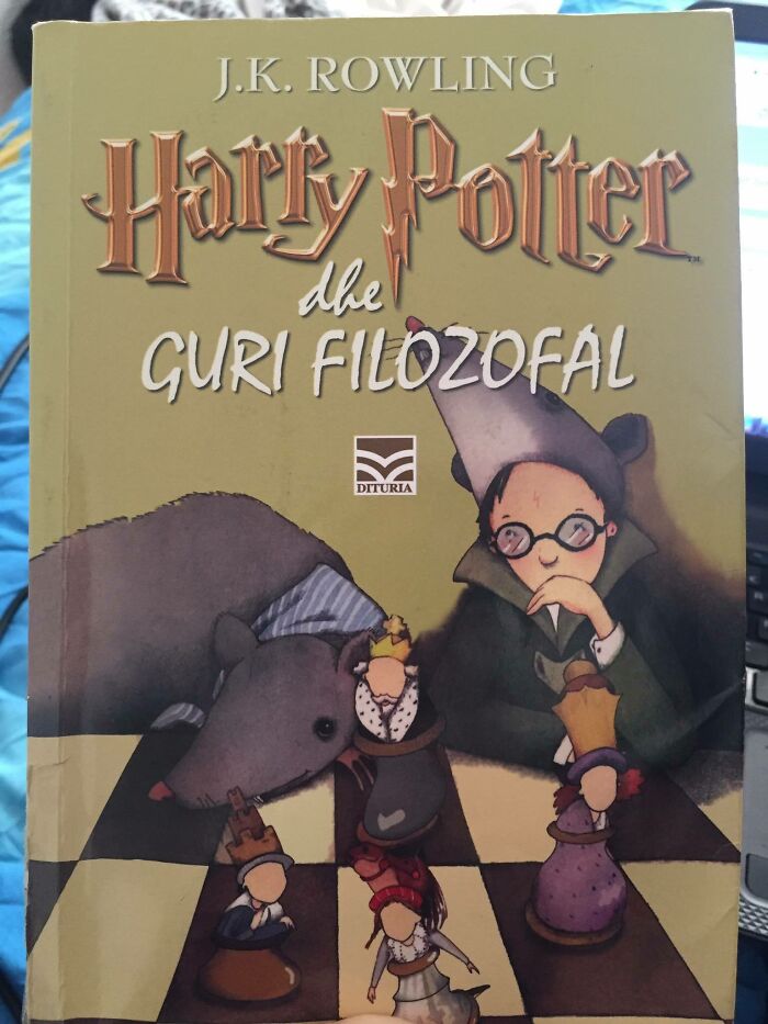
Philosopher's Stone, Albanian Version. Not Sure What's Going On Here
We have a giant rat (Scabbers?) and Harry wearing a giant rat head, and the ‘alive’ chess pieces. My guess is the artist hadn’t read the book, but was told there was a rat and moving chess pieces, then this is what she/he/they came up with.
My Anaconda Just Don't...
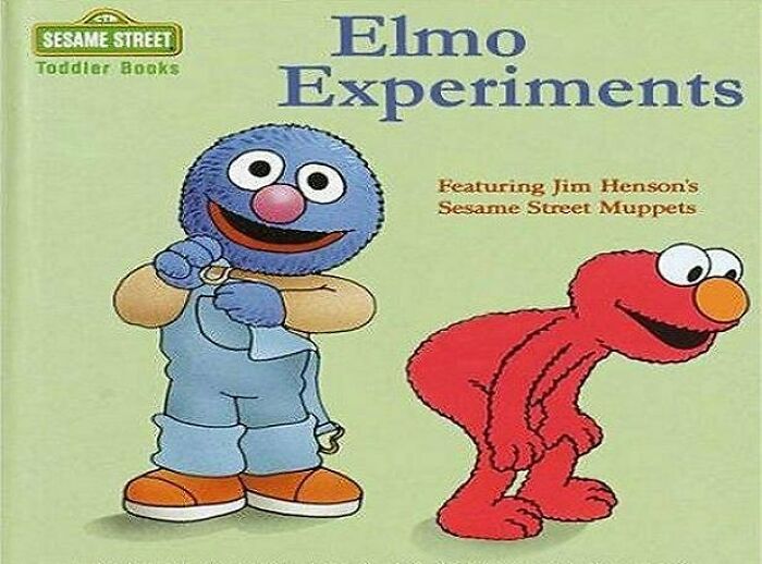
Odd Experiment I'd Expect This From Bert And Ernie But Not Elmo And Grover
The Title Was Weird Enough To Get My Attention At The Library
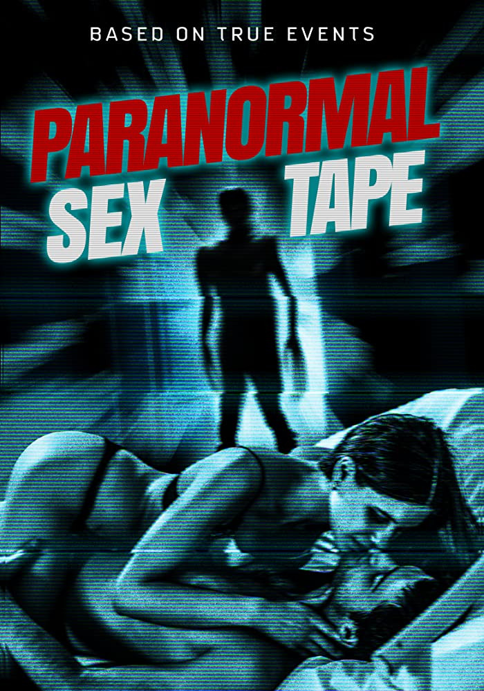
Do Movie Covers Count?
Milk: The Deadly Poison
What The... What??
Honest question: do native speakers also find it difficult to read When English Titles Longer Than 10 Words Have Every Word Capitalized?
I'm Not Entirely Sure What That Is But I'm Not Convinced Kids Would Eat It
Oof No Thanks
I live in America, and can tell you that not even the prostitutes dress like this. (No personal experience, but a friend has some...interesting...pictures.)
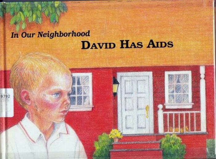
In Our Neighborhood David Has Aids By Doris Sanford
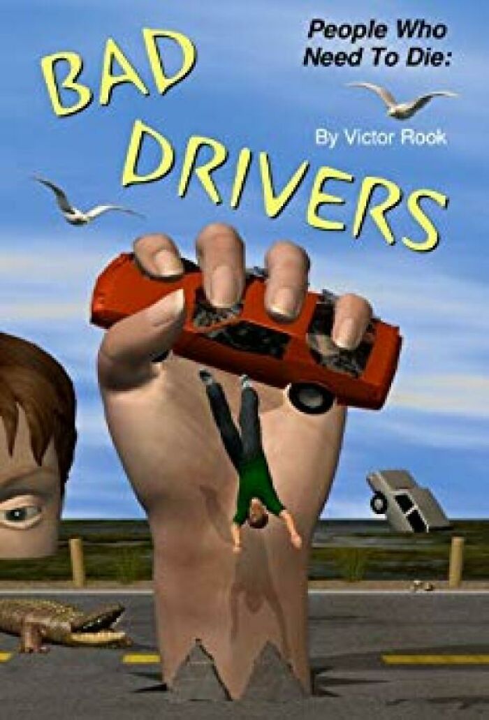
People Who Need To Die: Bad Drivers
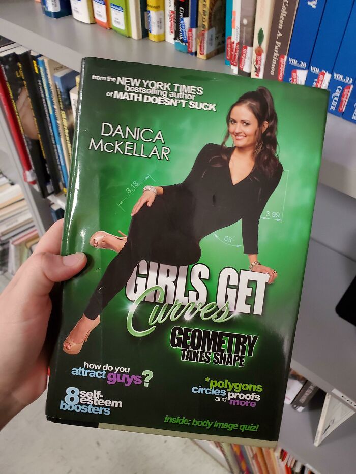
Maybe I Would Have Been Better At Geometry If I Had This In High School
I'm not sure whether this is a book about how to get guys or how to solve geometry equations, help
The author played Winnie in 'The Wonder Years'. She's a mathematician who co-authored a scientific paper titled, "Percolation and Gibbs states multiplicity for ferromagnetic Ashkin–Teller models on {\displaystyle \mathbb {Z} ^{2}}\mathbb {Z} ^{2}". Her books focus on getting young girls/women to become interested in math.
Noble cause, awful way to go about it! We shouldn't have to make maths sexy, we should tell young people that it's okay to like things which aren't sexy.
Load More Replies...this is too bad--she's a great teacher and her whole goal is to get girls into math. Whoever designed this did Danica wrong.
Check This Kindle Author’s Sweet Photoshop Skillz
how- who in the world would make this cover and say “ah yes, this is terrific!”
This Infamous Serbian 8th Grade Biology Textbook... With Nicolas Cage On The Cover, For Some Reason
You Gotta Love The Covers Kai Chooses For His Books
Didn’t know snorkeling was a part of the diet. Wait that is how you get the fish.
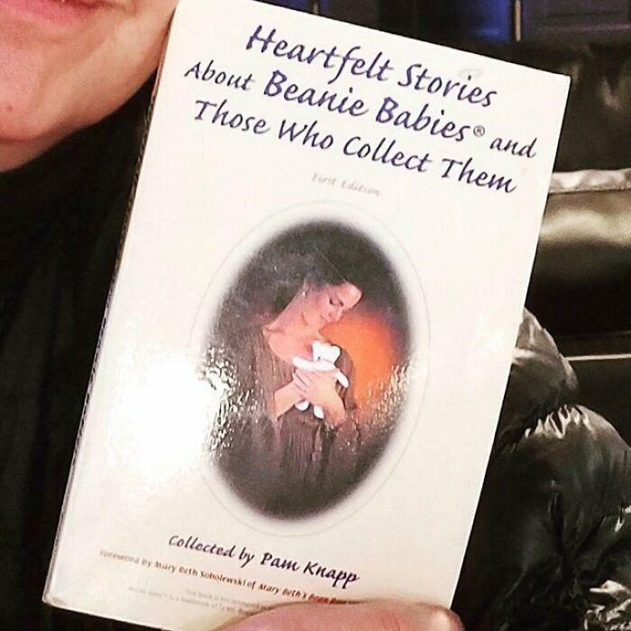
Warm Fuzzies For Lonely People, Now With Beanie Babies!
This Title Is Surprisingly Relevant Nowadays
This Book Cover I Found On Amazon...
Empress Theresa - "Improved" Edition
I Feel Violated
Ah Now This Is Modern Art
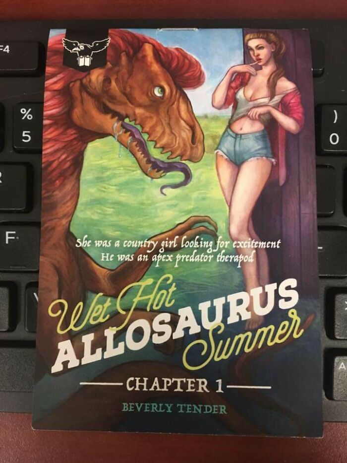
Maybe there are still some pervy dinosaurs hidden in a remote area who order it from Amazon.
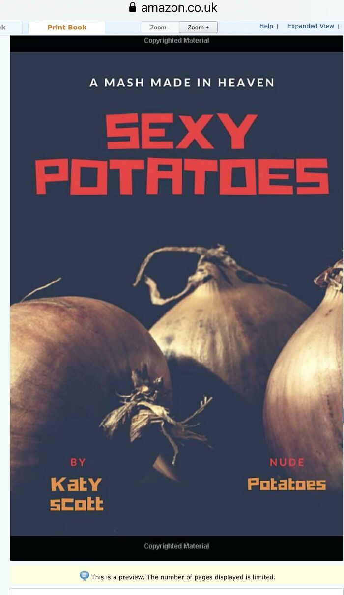
Load More Replies...À Mash Made In Heaven. The Title Is Sexy Potatoes. I’m Sure They’re Onions
My Latest Purchase
Presenting To You: The Very First Draft Of "Stranger Things"
Picked This One Up At A Thrift Store
It’s Actually A Good Book
Found In One Of Those Trashy Book Apps
1 Will Protecc, Rest Will Attacc. Choose Wisely
That Man Is Most Assuredly Deceased
Cookbook Covers Shouldn't Be Uncomfortable
This could be seamlessly inserted the article about mansplaining. Men explain how to use a knife in the kitchen.
I Found This At My School's Library
Yes, there's Sane People and then there's The Rednecks. We don't talk about The Rednecks.
Load More Replies...The Dangers Of Kissing... Or Whatever These People Are Doing
Ok guys apparently kissing is sin so I guess from now on it’s “you may now fist-bump the bride”
With this fingerring I take you as my bride.
Load More Replies...Why Are His Feet So Detailed
Found This Beauty At Goodwill
No This Is Not Lord Of The Rings
Uncanny Valley Much?
I Think The Title Is Just As Bad As The Photo
Easy to guess. A Catholic woman would only want an army of children and to serve her man's needs and wants and one more child. --- Don't hate, you asked.
Load More Replies...This Book Was Recommended In A Thread About Power Armor, But The Cover Is Ridiculous
The Gears Are My Favorite Part
When you wish to have legs just as the dark elves are shutting down the magic abilities of earth:
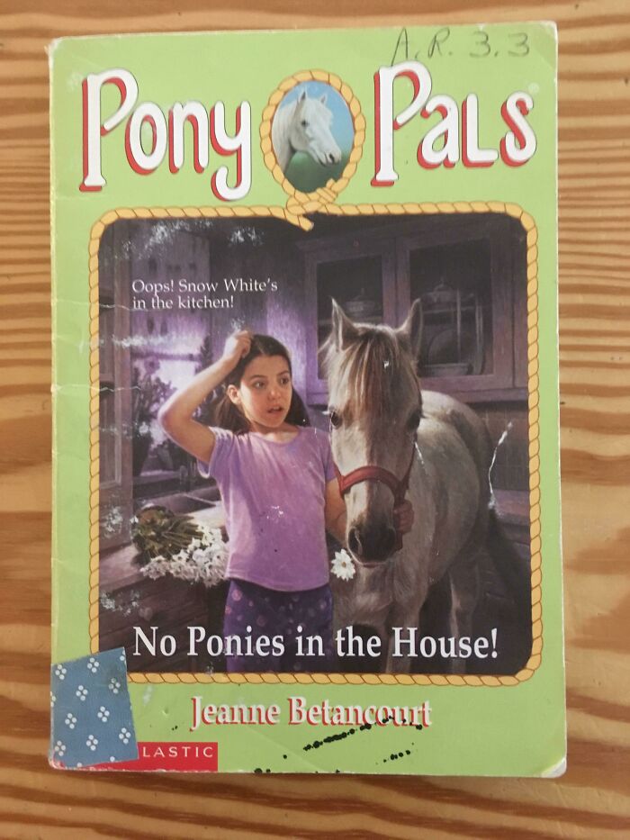
No Ponies In The House!
Yeah, some of these books are perfectly fine, especially for the time they were printed.
Load More Replies...Oh No
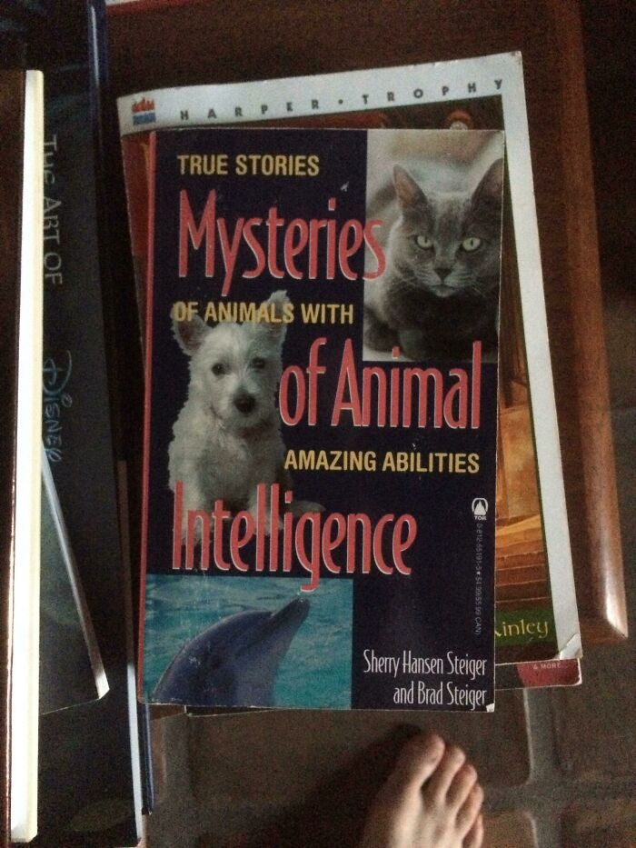
Of Animals, With... Of Animals
True Stories Mysteries Of Animals With Of Animal Amazing Abilities Intelligence
I'm Not Sure Why You'd Pick Such An Utterly Terrifying Cover For A Joke Book
3 Hands
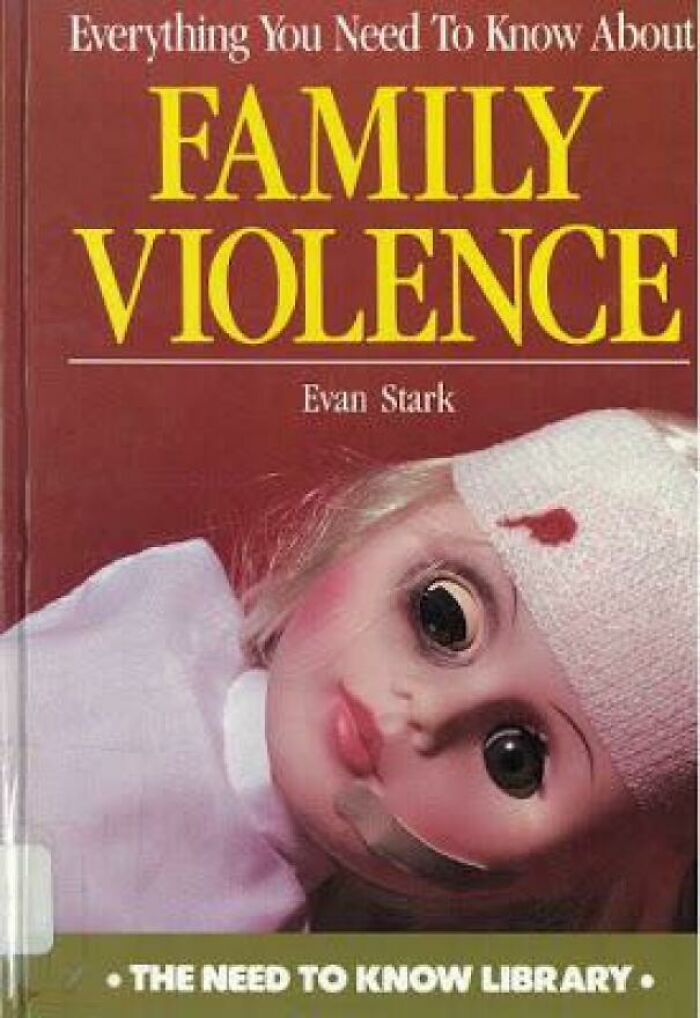
Who Decided This Was A Good Idea For A Book About Family Violence?!
Things Were Different Back Then
Someone else has pointed out that it's a case of terminology marching on. It was once an appropriate medical term (retarded development). What's more concerning to me is they are ALL religious books.
Load More Replies...How Do You Even Begin
Hey Girl... I Heard You Like Book Covers
Give that guy a cell phone and there'd be D**k pics flying all around the world
I Have Spoken Too Soon...
I'm getting a hunch that Lawrence Ambrose is not the guy you want as a neighbor, looking at his oeuvre.
I dunno... Might be fun stealing a dragon egg and raising it from a kit!
Load More Replies...Going To Learn This Language Just To Read This Book. Art
Do Online Book Covers Count? Because, Yikes
(over a barfaded sun and a neon pink grid mountain range)
Load More Replies...I will sh*t fury down your throat and call the Free Breast Inassociation.
I Loved These Books When I Was Younger But This Is Just Horrible
im reading that book rn! its a good book but not this... just no...
Subtlety Is The Key
Amazing Book, Hilarious Cover
"He A Little Confused, But He Got The Spirit"
Trump himself tweeted that there was no evidence that he won the elections because of Russian interference. That was before he became the first president in history who was officially declared a troll and got banned from mainstream social media.
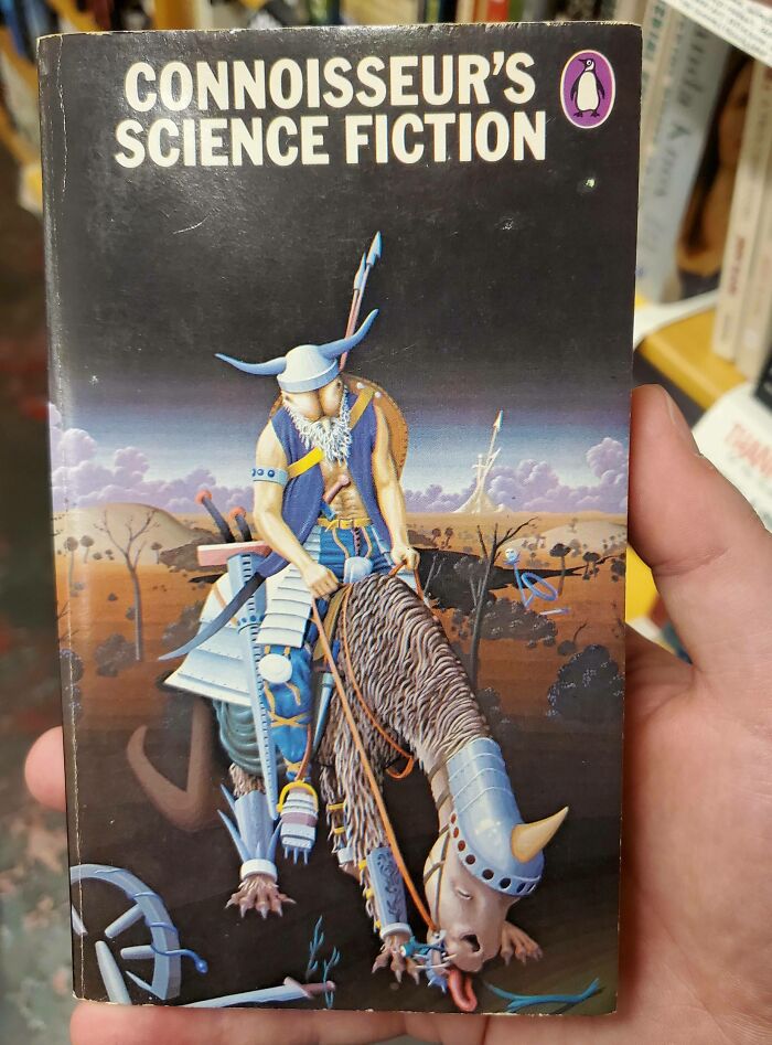
This Butt-Faced Alien Viking
It is Penguin but whatever bird they have a lot to answer for here.
Load More Replies...What Even
No
A Shell Of A Read
How To Make Beautiful Food In A Mold
Ms Paint! I Have Missed You So Much!
Wat
Not Another Lotr Fanfic!
Sexy Lunchbox Mystery
I Can’t Believe This Is A Real Book
Some of these books are parodies that I've seen on other humor sites.
Yeah kinda disappointed, thought these would be natural monsters...
Load More Replies...If you want some more of these, this website has some: https://alwaysjudgeabookbyitscover.com/ It has some of the ones on here, but there's more and they're really funny :)
second one i saw “how to play with a lions testicles”
Load More Replies...Some of these are obviously parodies, but I'm truly disappointed that some of these aren't, like the LaCroix erotica or the Covid smut

 Dark Mode

 No fees, cancel anytime


