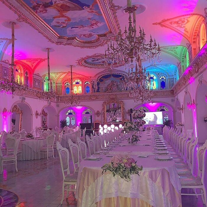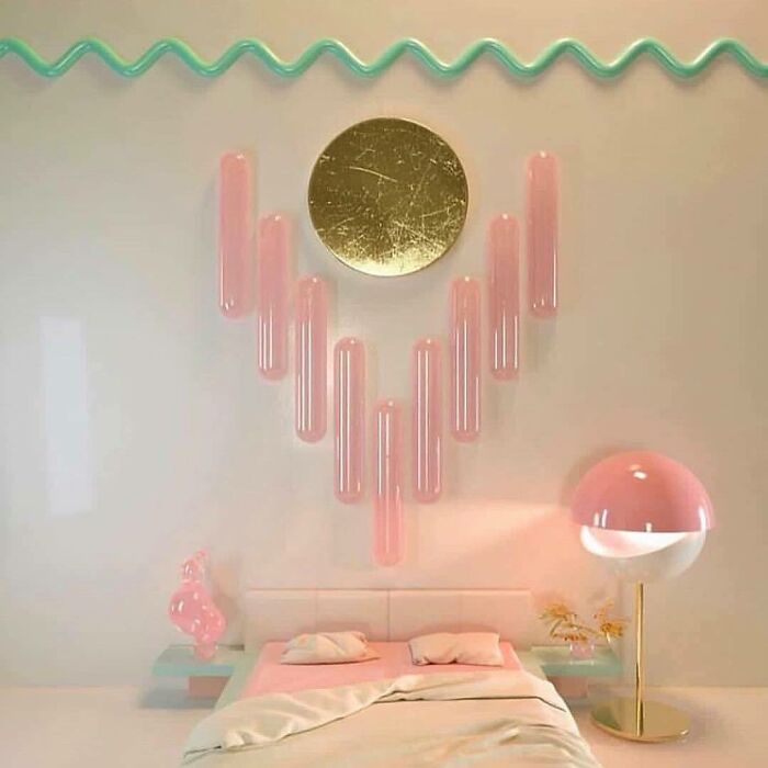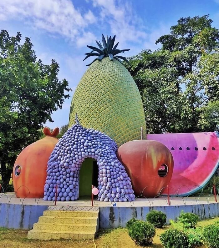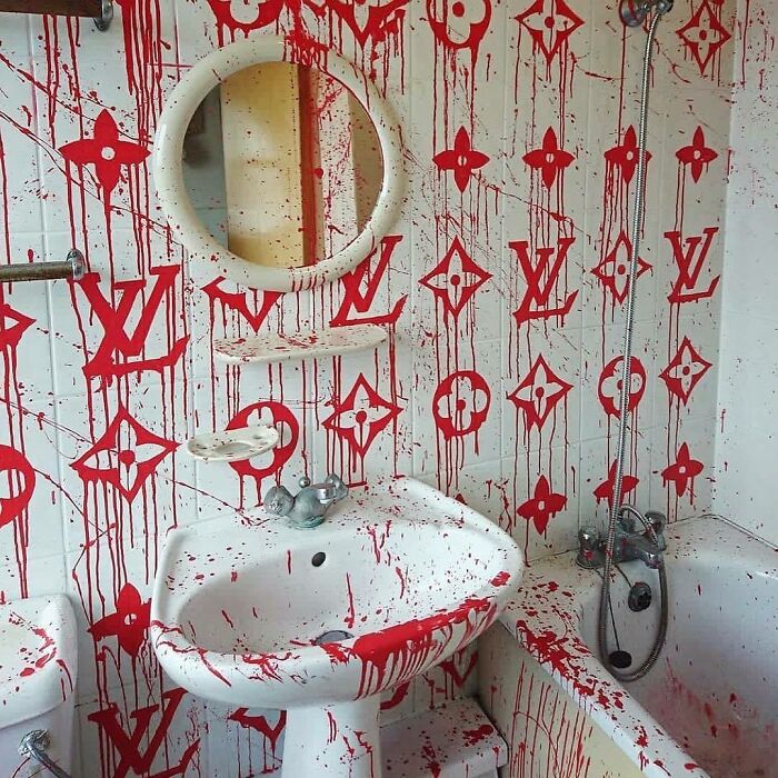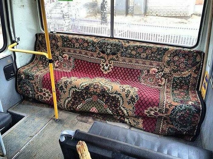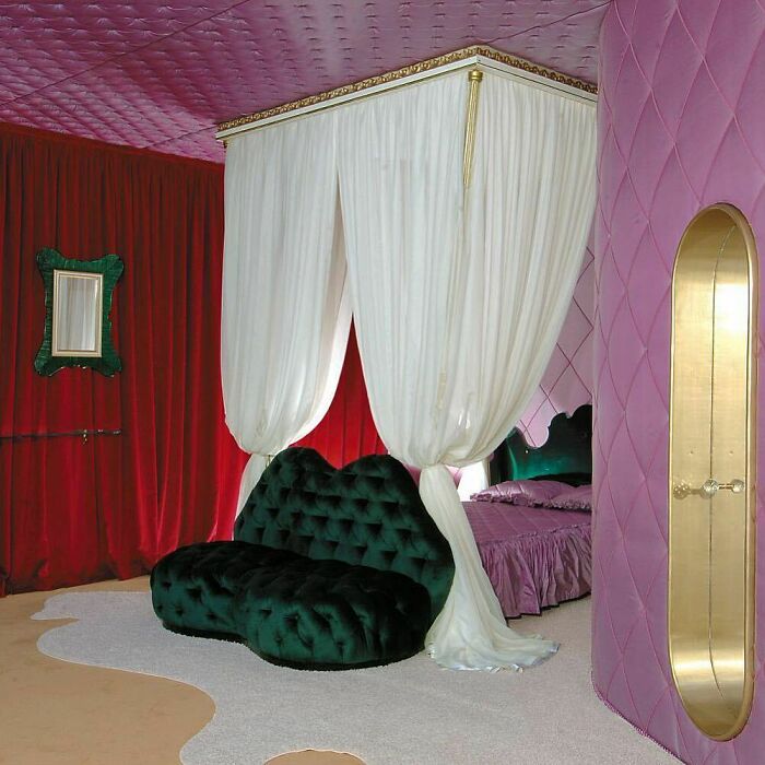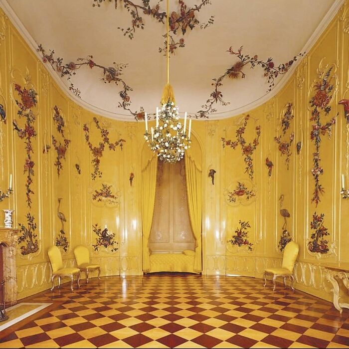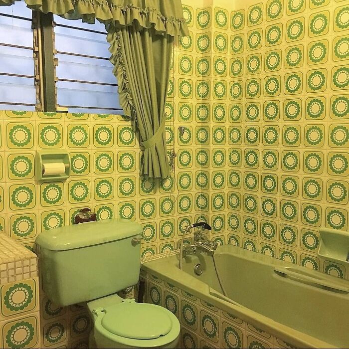
“Hardcore Is Not For Everybody”: This Instagram Account Collects Decor Items That Capture The Essence Of Bad Taste (35 Pics)
Taste is subjective, isn’t it? While some people find minimalist interior designs and perfectly staged aesthetics inspiring, others see them as downright boring. Getting sick and tired of posts where everything is filtered and carefully arranged, we love a bizarre-looking account that challenges our perspective.
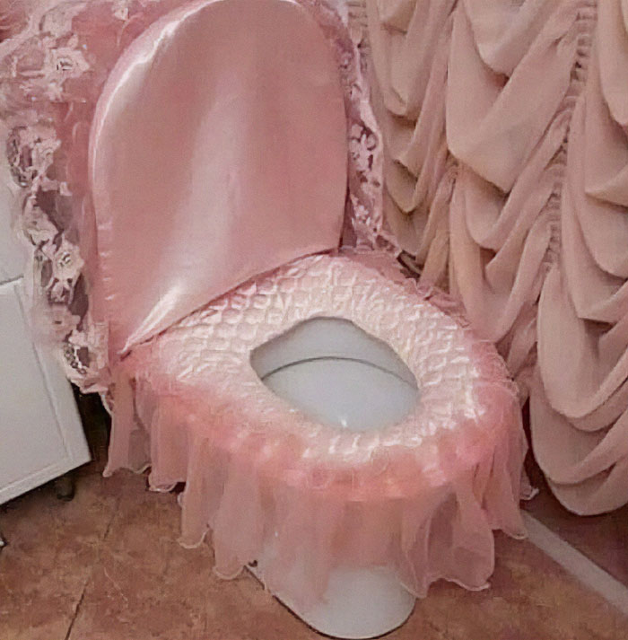
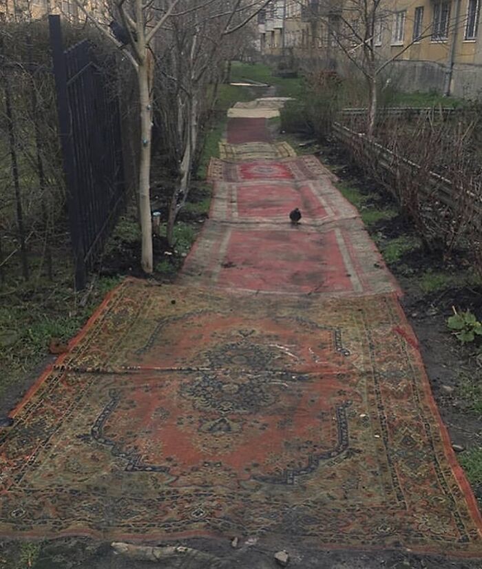
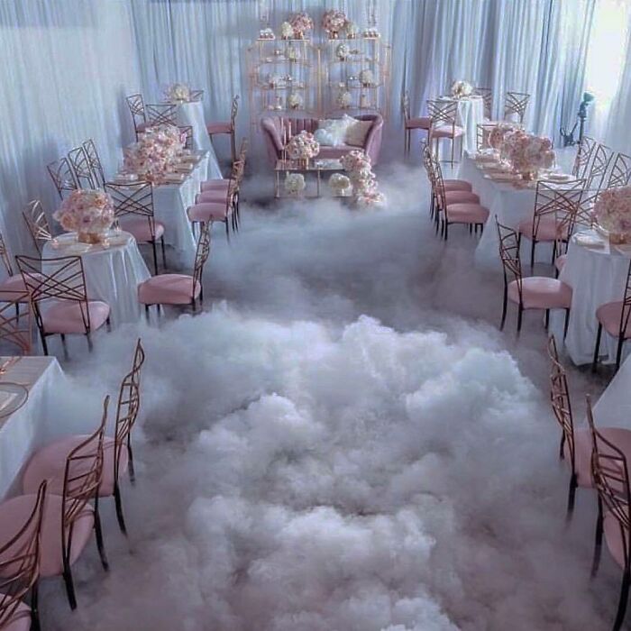
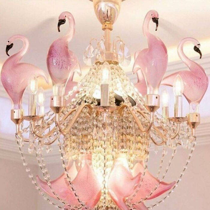
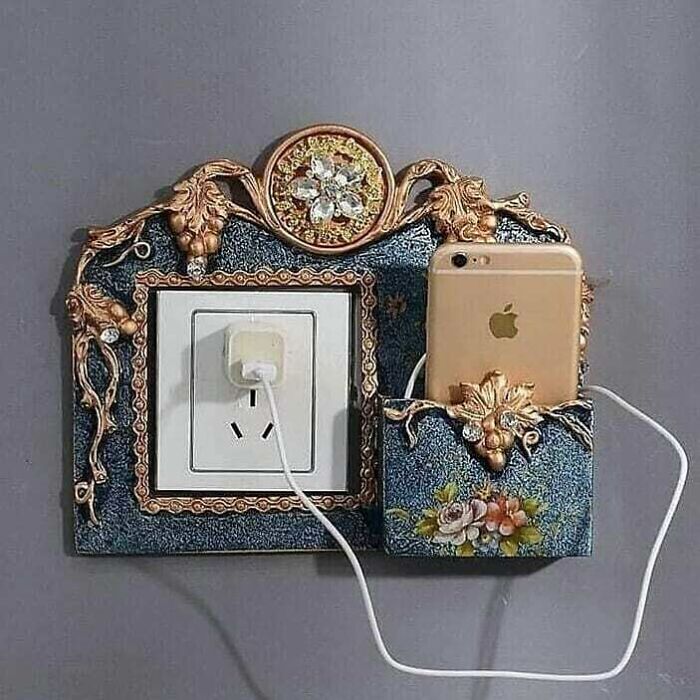
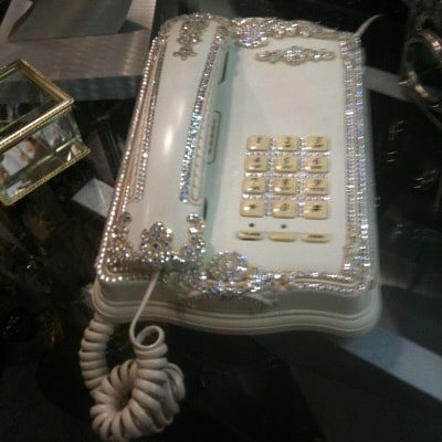
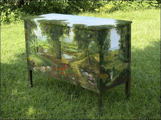
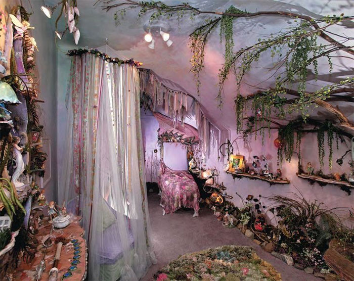
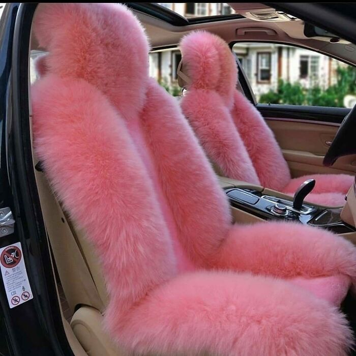
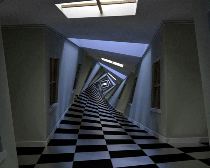
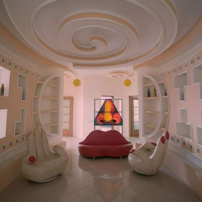
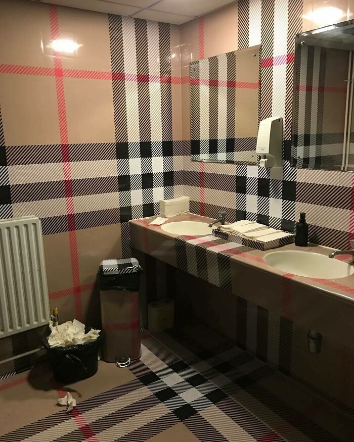
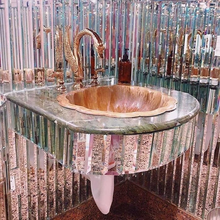
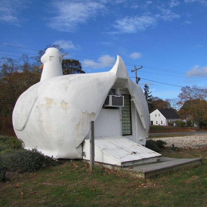
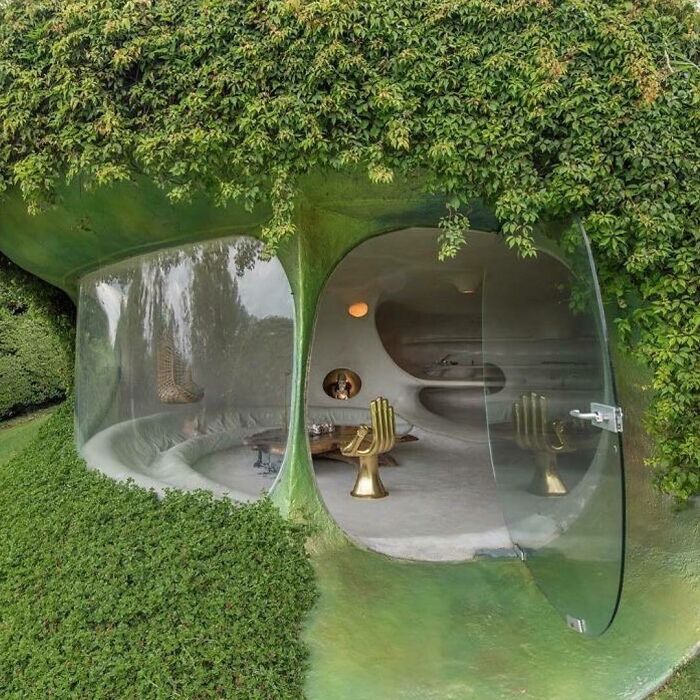
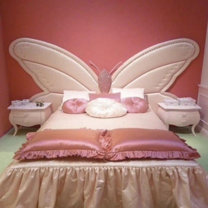
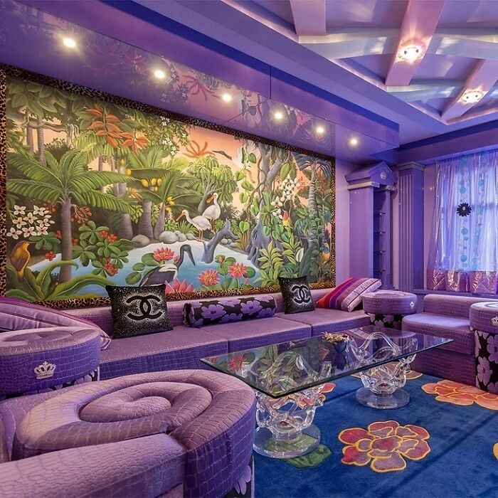
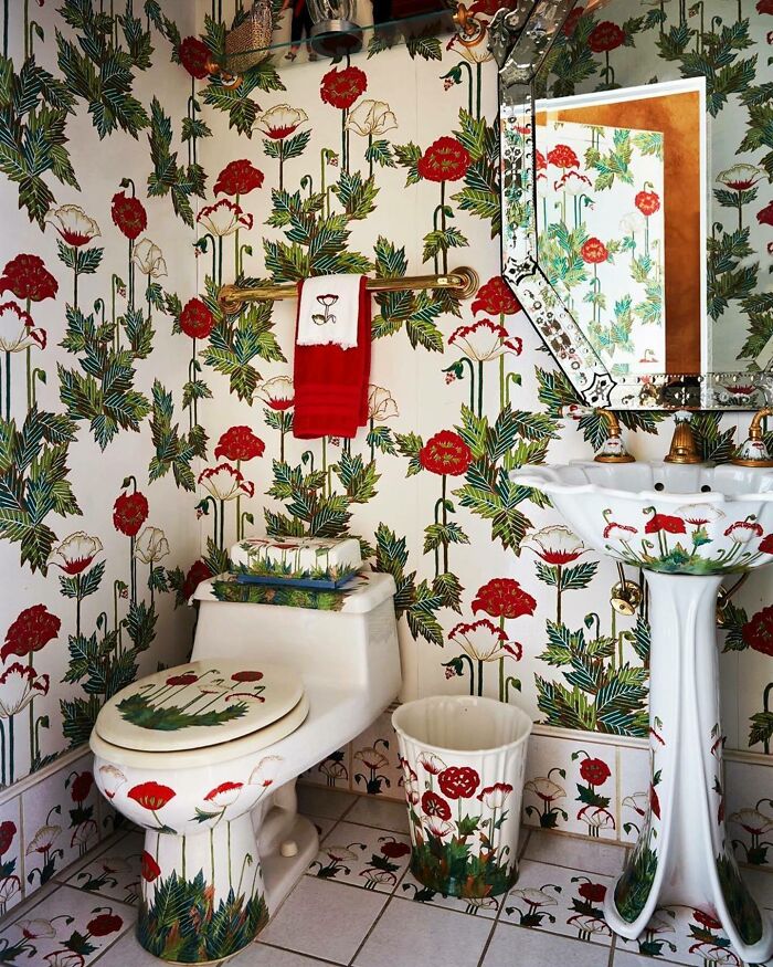
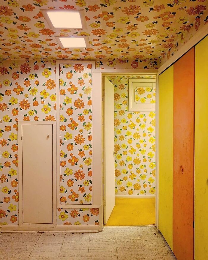
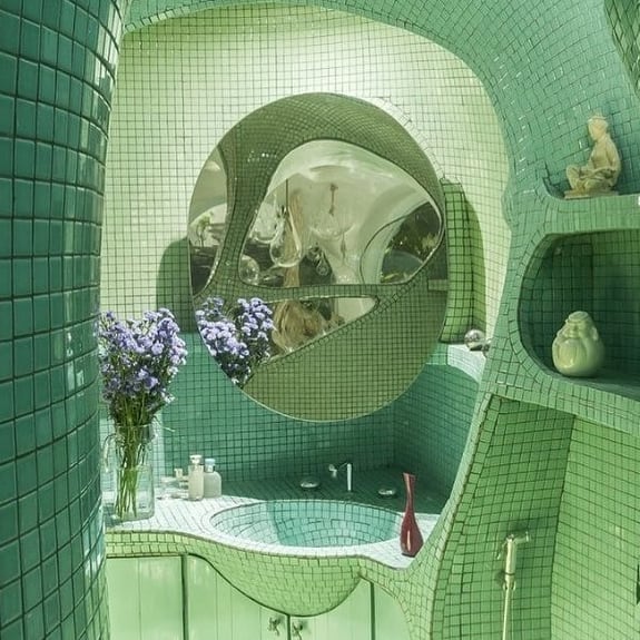
We're talking about Decor Hardcore, an Instagram account that offers anything but bland, basic, or benign. Created by Berlin-based designer Ksenia Shestakovskaia, it showcases some of the most peculiar design choices out there. "Hardcore is not for everybody," she wrote in the description, and from the looks of it — she has a point.
If you have a passion for strange, wacky, and tacky things, this post might be just what you were looking for. Bored Panda has selected some of the most over-the-top images the account had to offer, so check them out right below. Upvote on the ones you liked most, and be sure to let us know what you think about them in the comments!
This post may include affiliate links.
It might come as no surprise that bizarre-looking items and weird design solutions are things that tend to grab our attention and not let it go. After all, there’s some amount of beauty in any imperfection, even when it leaves us surprised, delighted, or a bit shocked.
Today, people and projects that show the opposite of what is considered to be good taste often get branded as bold, courageous, and adventurous. And Ksenia Shestakovskaia is one of them. The textile and graphic designer created Decor Hardcore in 2015 as a collection of unusual images of curiosities she came across on the web.
"I was running into quite specific images and I started to collect them. I had to share it! I’d show these crazy pictures to people and they’d say, 'I remember my Grandmother had something like that,'" she told AnOther Magazine.
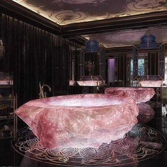
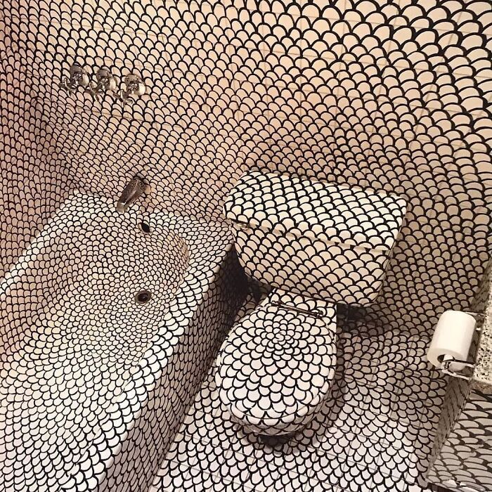
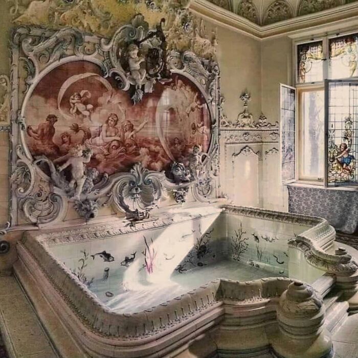
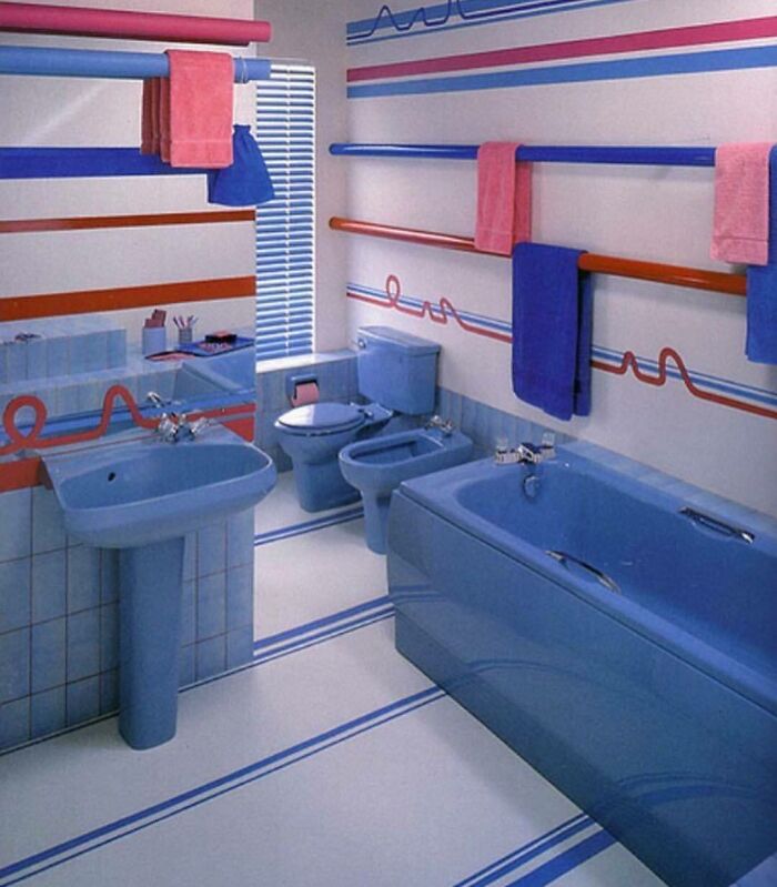
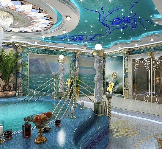
I actually kind of like this, I’d feel like a mermaid princess or something sitting in that tub
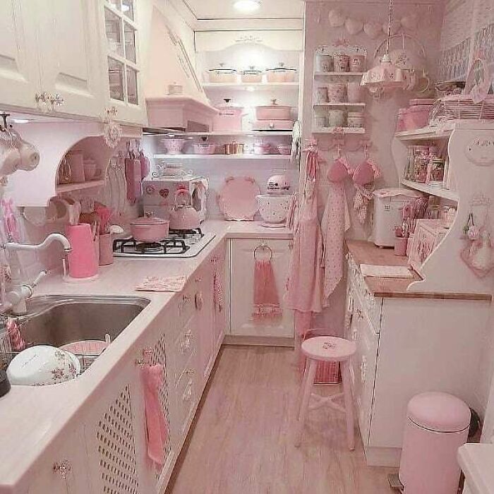
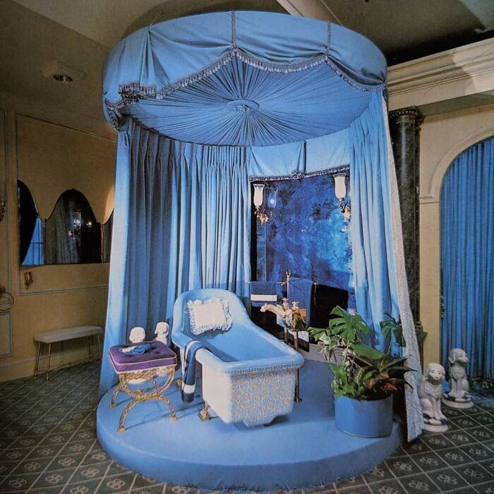
Ever since she started posting on Instagram, she has amassed quite the audience. As of today, the account has more than 375K devoted fans who admire her online collection full of pink living rooms and rose quartz baths. "At the beginning, I was wondering what would happen if I ran out of material because I post a lot," she said. "But every time I went on, I realized it was endless. It’s like an ocean of treasures! So I’m not concerned."
When it comes to design, she mentioned that she sees emotional connection as the most important thing. "It has to create a little heart-pinch. I’m pinched quite often when I see these pictures, I’m completely overwhelmed." Other times, she comes across objects that are very aesthetically displeasing but deserve to be noticed. "Sometimes it’s so extreme that I have to post it! These might be things I would never buy for myself, or as a present, but the pictures are incredible."
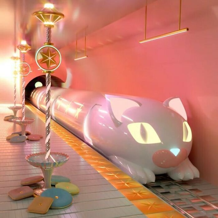
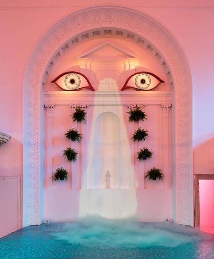
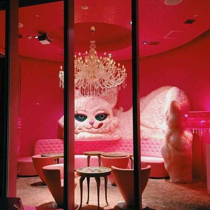
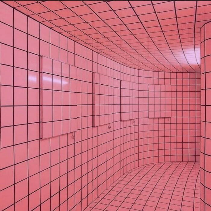
I want one with a Cheshire Cat and Alice Through The Looking Glass theme.
Michael Garrett, one of her best friends and business partner, later joined curating the account and helped develop Decor Hardcore even further. The duo has created a line of merch, a creative studio, and they’ve even got the opportunity to partner up on campaigns and projects with brands like Gucci and Versace.
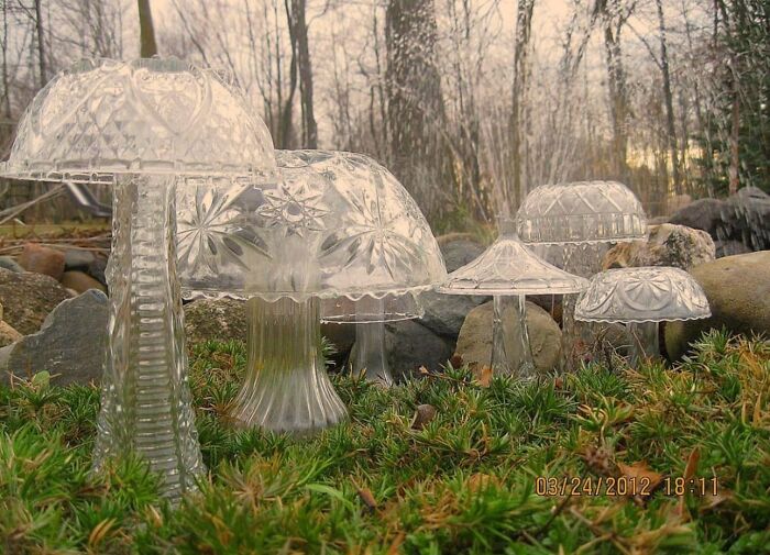
Sorry it is the law. Someone has to do it. Why did the mushroom go to the party? Because he's a fungi!
No need to apologise, you are a pretty fungi yourself
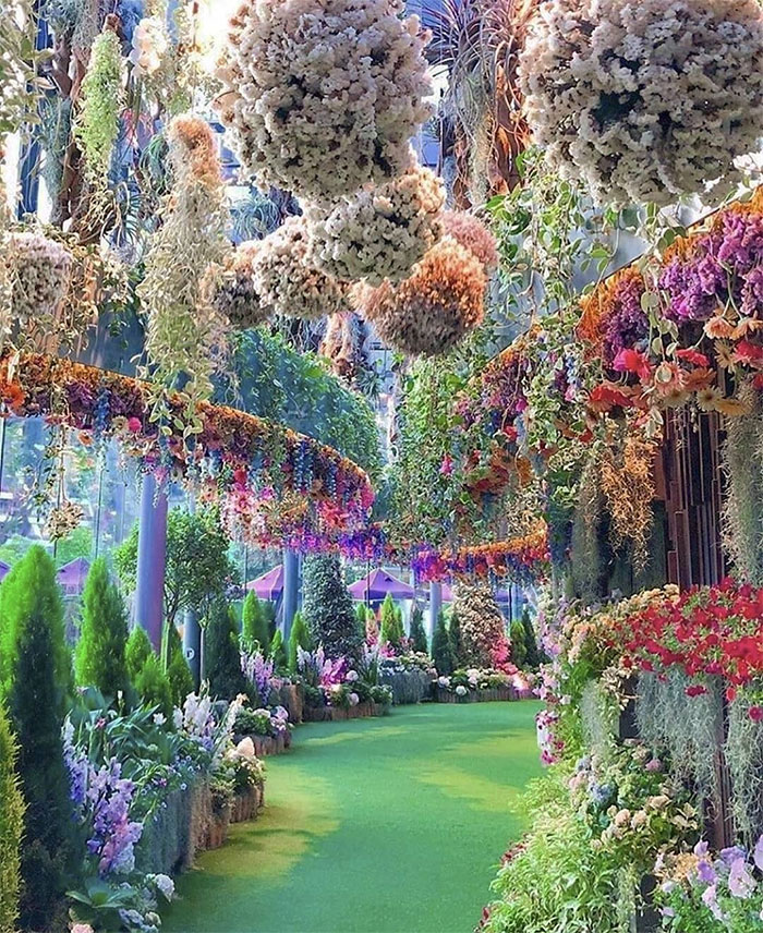
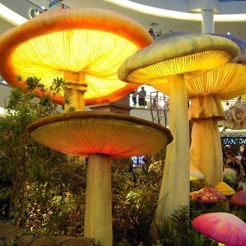
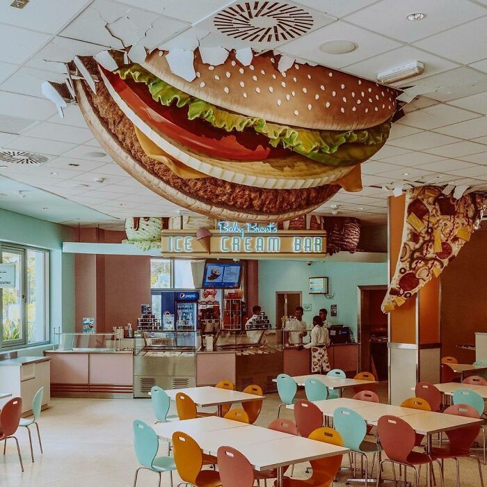
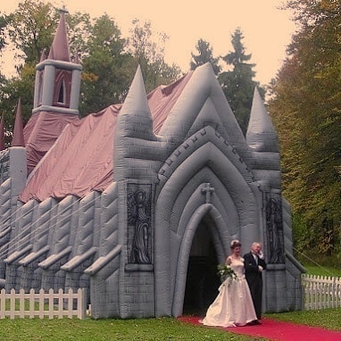
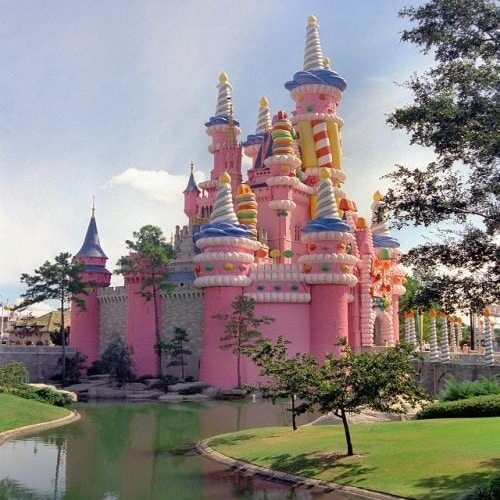
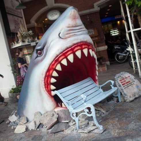
Load More Replies...Took a little digging, but this is part of a promotion for Tim Burton's "Alice in Wonderland" movie premiere in 2010 at the Mid Valley Megamall in Kuala Lumpur, Malaysia. The artist, Hawari Ismail, has more pics on their portfolio (https://www.coroflot.com/toyol/Setup-for-Alice-in-Wonderland-Movie-Premier-2010-at-Mid-Valley-Megamall-KL1) and there's a brief video here: https://www.youtube.com/watch?v=q_L3SUa23c0
I LOVE THIS SO MUCH I WANT THIS IN MY FRIGGIN BACKYARD, YOU KNOW WHAT I WANT IT IN MY FRIGGIN ROOM!!!!
I specially love these I would love to have a few scaled down to fit in my house
That moment when you recognise a fantasy game spawn point in a hotel lobby...
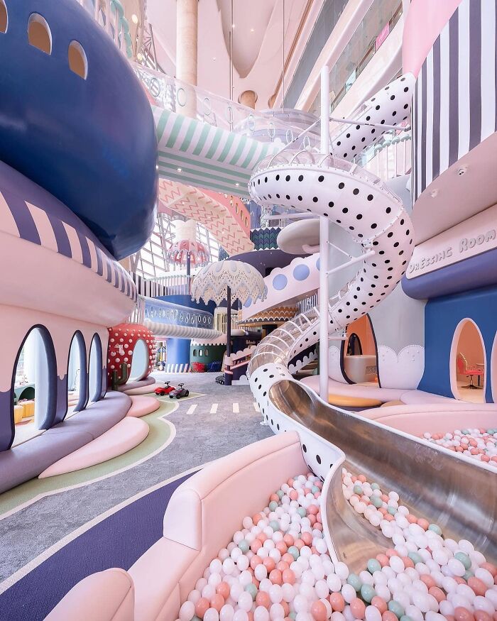
Might be an interesting attraction if you're walking through a mall.....
My only complaint is that it looks very fake. For tge rest, it's awesome
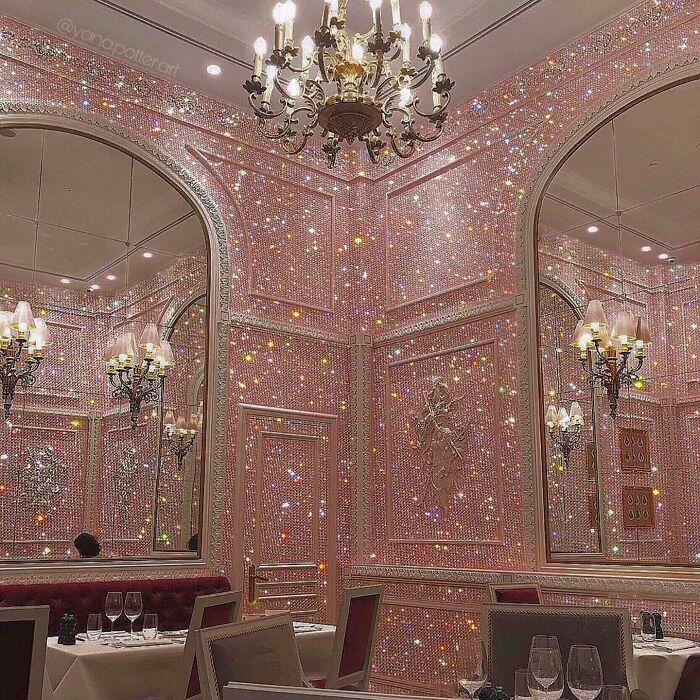
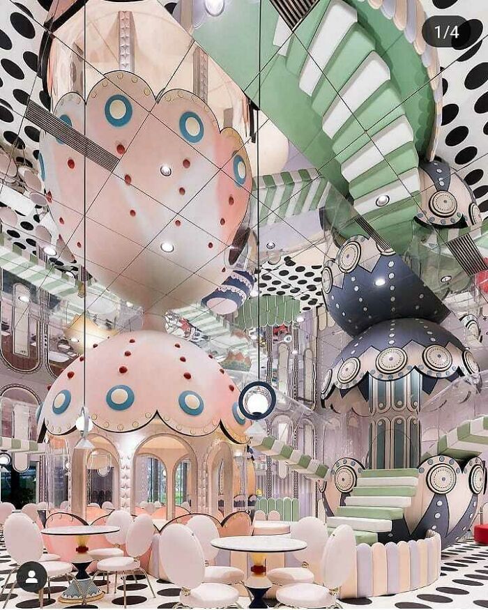
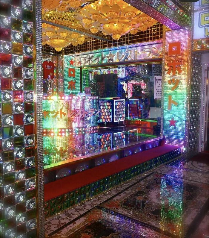
It looks like the interior of some of the theme restaurants we have around my town. It's OK to be over the top in a restaurant or bar...it often becomes tacky when you try to pull it off in a private home.
"Fashion started to bore me to death," Shestakovskaia told Vogue. "I was in the same place with fashion, bored and disillusioned," added Garrett. "When Ksenia began showing me early glimpses of Decor Hardcore, which at the time was still just her private collection of eBay images, I got hooked."
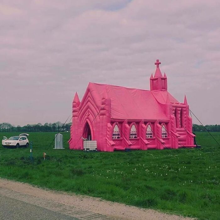
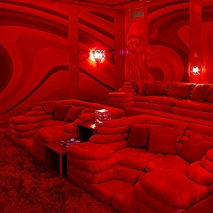
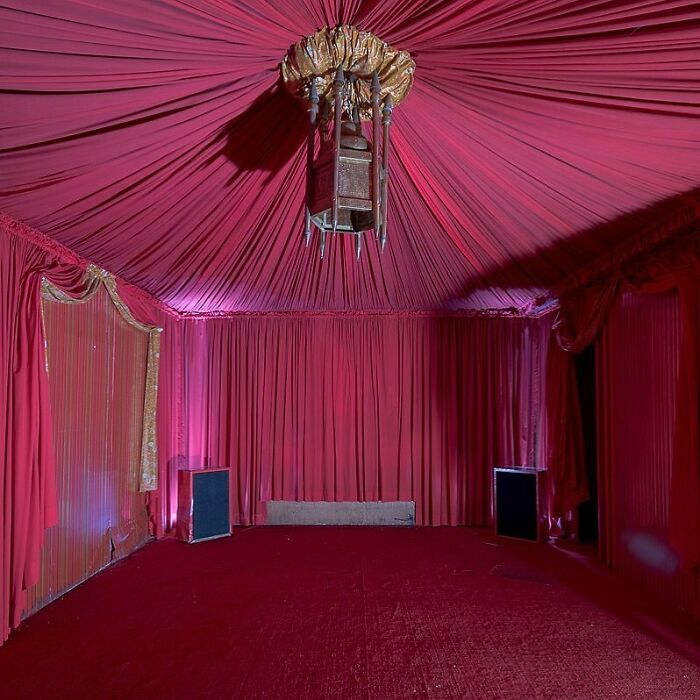
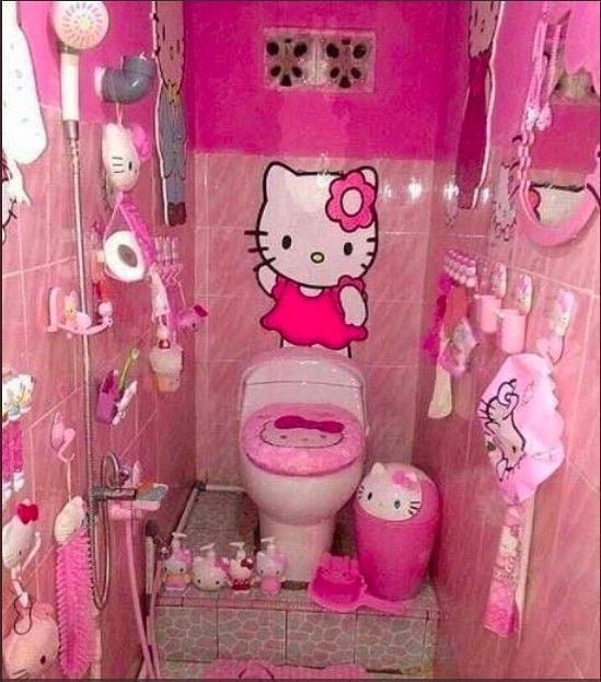
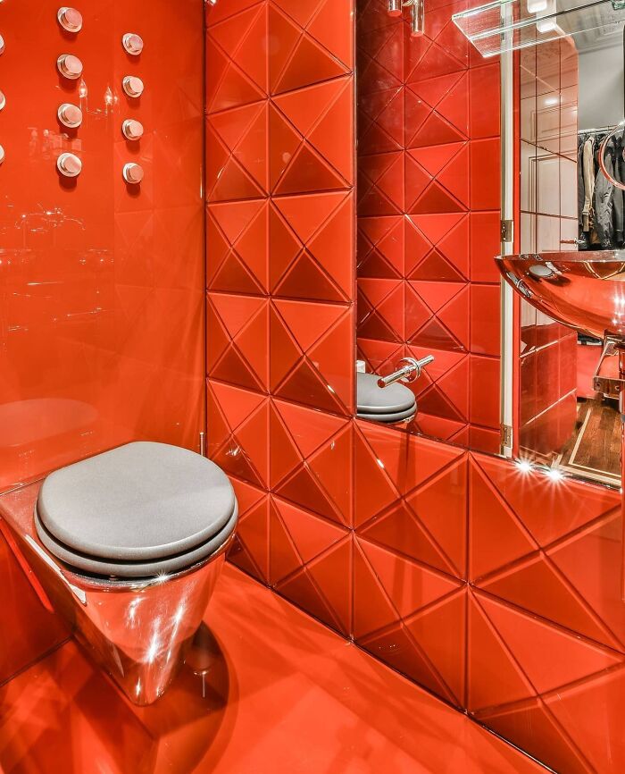
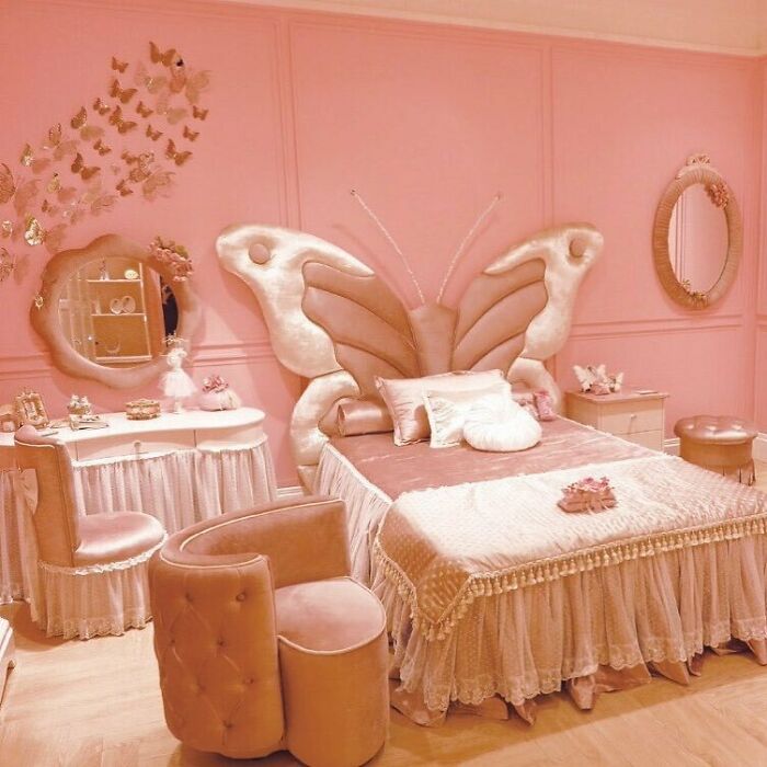
Their vision "is all about not taking design or anything too seriously, and proving that heaven is indeed a place on earth," she told i-D. Well, if heaven is full of pink velvet, over-the-top bathrooms, and inflatable bouncy castles, it seems they have succeeded.
Shestakovskaia is constantly keeping an eye out for the perfect picture and looks for a range of criteria, whether it’s unexpected solutions or simply lucky accidents. The designer enjoys coming across the story behind an image, feeling the atmosphere, and understanding people’s decisions. "Decor is not only my work, it's my entire approach to life, my attitude, dreams, and sometimes nightmares," she said. "When I'm not working on it, I'm fantasizing about situations or things, and then I try to discover if they exist."
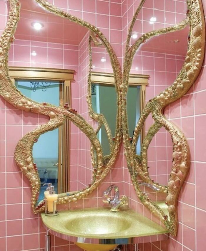
"Decor Hardcore is about the variety of choices, not about certain aesthetics," Shestakovskaia added. "So much design is confined to 'must have' or 'must be,' looking proper, and trying to make sense. Our brand fulfills the lack of a certain offer for fun, and something unpolished or unexpected. To me, it's natural that a girl would have a bath that looks like a seashell because it's beautiful and magical. I just look around myself, or I search for things that entertain and make me happy. Apparently, they make many other people happy, too!"
Does anyone else feel we need more context on a lot of these images?
Many are over the top and tacky, but there are so many on here that should not be in a list of "bad taste" decor.
Most of these are awesome. The only tacky thing about this is the dull and lifeless ones who think these are tacky. Get a life.
According to this post, my taste is pretty bad. I enjoyed most of them as I found them creative, bold and different. Nothing I want in my own home, but fun to look at.
It seems like the people who live there would be fun to hang out with
Load More Replies...Some of these should come with an explanation as to what we are looking at.
Gotta admit I liked quite a few of these. But then I've never been accused of being tasteful.
I liked quite a few, some where ok and only a few I disliked. I thought they were fun and joyful.
Most of these were fun! I wouldn't decorate my house that way. But I'd definitely go visit somewhere like that!
So many of these are nice, but over the top. Not bad taste per se, but definitely too much of a good thing.
Some of them would be nice to visit, a hotel say, just not to live with
Some things are not "bad taste". Why does everything needs to be "same"? Some of the designs are just fun, funny, whimsy...
I would love to eat a bunch of mushrooms and go to anyone of these places
Half of these I refuse to believe are real, they just look too perfect
My takeaway here is that waaaaay too many people are over the top obsessed with the colour pink.
I disagree with these all being bad taste. A lot of them are a ton to take in, even difficult to do so. But a lot of them are cute and pleasant in a way that like. I respect it and if I lived in, I would be super obsessed with it. Because they are beautiful from different sorts of beauty. Not being minimalist doesn't make something ugly.
I think most of these are beautiful and imaginative and I wish I could afford them!
mane of these are definitely not "bad taste"- the title is extremely misleading

 Dark Mode
  No fees, cancel anytime


