40 Crimes Against Good Taste, As Featured On The ‘Ugly Design’ Instagram Page (New Pics)
InterviewThere’s nothing more beautiful than an ugly product! While that might sound counterintuitive, you might soon realize that perfection is boring and it’s actually imperfection that can capture our imaginations in a far deeper and more satisfying way.
Founded back in 2013 by Swiss design wunderkinds Jonas Nyffenegger and Sébastien Mathys, the Ugly Design Instagram project has since then won over the hearts of over 668k fabulous fans. And they can’t wait for their latest posts about design decisions that break norms and jump into the deep end of what’s traditionally considered to be bad design.
Have a look through some of the best (or is that worst) new designs, as featured on the Ugly Design page, upvote the ones that got a reaction out of you, and let us know which ones you loved to hate the most in the comment section. Oh, and if you haven’t had your fill yet, check out Bored Panda’s first article about Jonas and Sébastien’s awesome project right over here.
The founders of the Ugly Design account shared with Bored Panda that there are "a lot of exciting projects" in the works. However, we'll have to patient, as they teased that there will be "more info next" year, so we'll have to wait for 2022 to see them. You'll find the rest of our interview with Jonas and Sébastien below.
More info: Instagram | Tumblr | Ugly.Design
This post may include affiliate links.
"We try to keep posting as regularly as possible the crème de la crème of the latest ugly design but also reposting some of our old favorites," the founders told Bored Panda that they're continuing pretty much the same trend of content creation as a year earlier when we wrote our first article about the infamously brilliant Instagram account.
"As our love for ugliness keeps growing, the line between ugly and beauty is getting a bit blurred," the team behind the Ugly Design project shared. "It appears more and more of our followers have completely lost their taste. That’s a good thing. It means they’ll have to find it again. It will most likely be forever changed."
Previously, the founders of Ugly Design, Jonas and Sébastien, told me that they believe their project has been extremely successful because of the contrast they create between their content that the “norm-perfect” posts that we’re used to seeing in our Instagram feeds.
“When seeing an ugly design rather than perfect aesthetics (as defined in the 21st century)—scrollers takes notice. Also, @Uglydesign never gets predictable—that is key to maintain and grow followers in our opinion,” they told Bored Panda in an interview, earlier.
Both of the founders are big fans of the unexpected and the surprising. And that’s what keeps them passionate about the Ugly Design project. “We find it crazy that this theme can still surprise us and make us laugh so much after having dug into it for so long,” the duo told me.
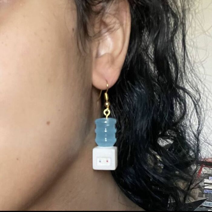
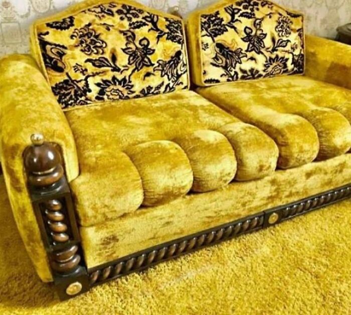
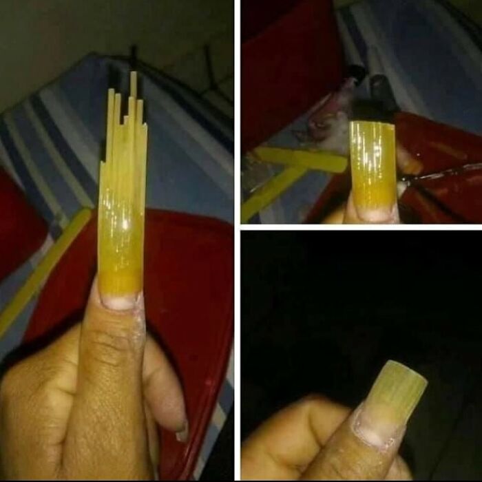
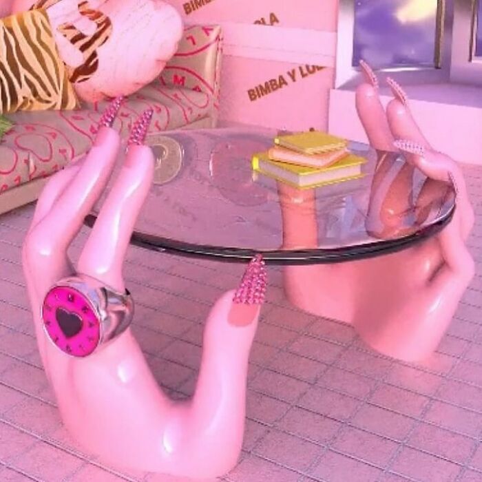
“We are posting various topics under the theme of ugly design, from maximalism to design fails, covering everything from luxurious furniture, jewelry, fashion, nail art, architecture, to upcycling… And except for some designs fail, we believe it is an incredible source of inspiration and joy,” Jonas and Sébastien added that even ugly designs can inspire us and bring us joy with their (very different expression of) beauty.
It is on purpose, so it does not count, like Crocs and bauhaus.
Ugly Design spent the first two years of its existence on Tumblr. However, in 2015, the project made the jump over to Instagram where it’s enjoying all of its well-earned success. It’s a constant reminder in our otherwise ‘perfect’ social media feeds that the world is more varied and far more interesting than the sanitized and curated image we’re presented.
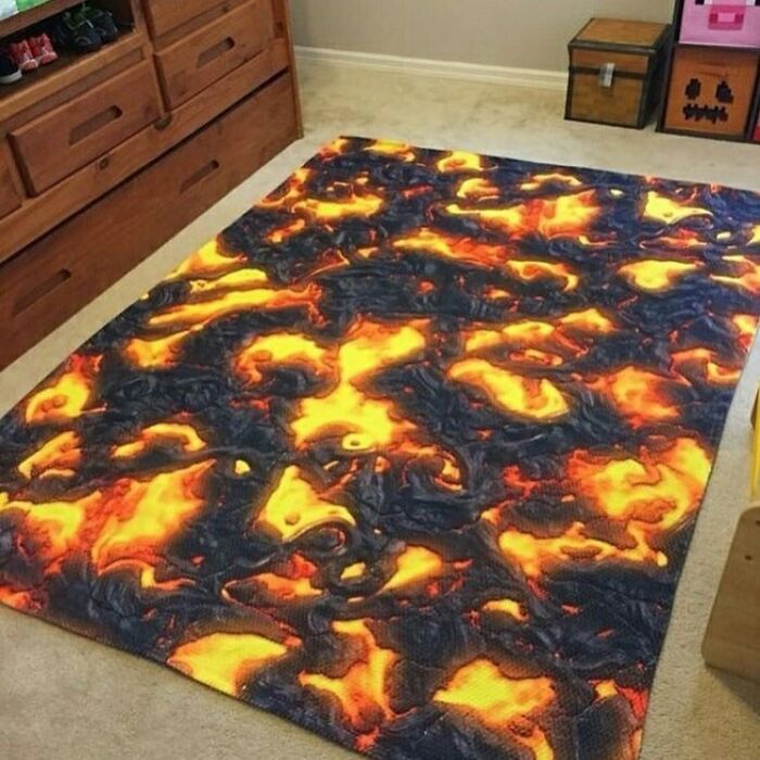
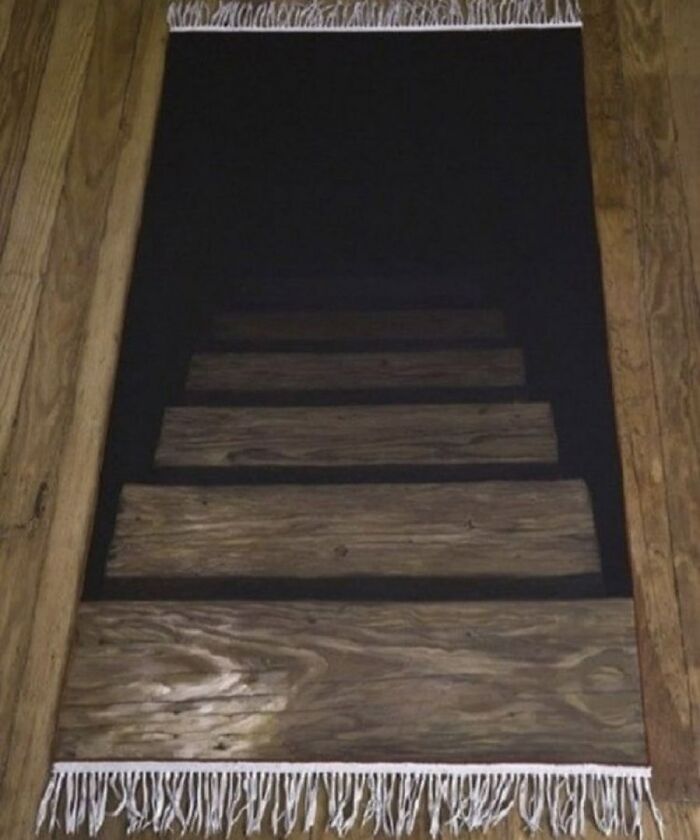
Nobody: ... Someone: hey, let's make the 'The Floor Is Lava' game more immersive?
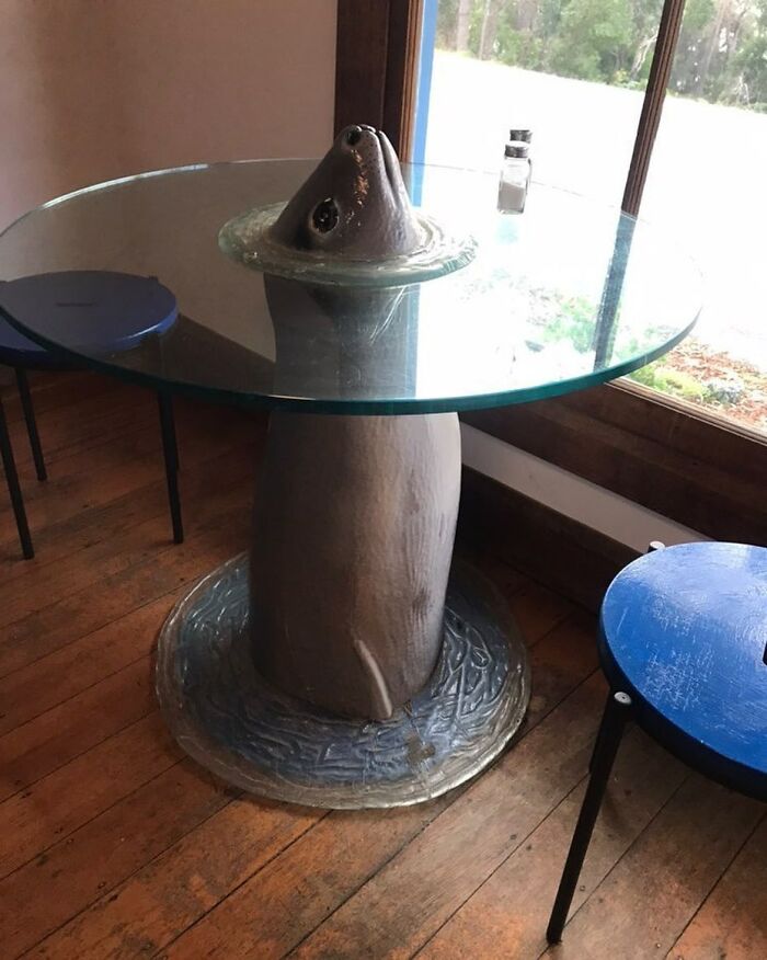
Just needs a bowl in the top and you can do your own christenings at home.
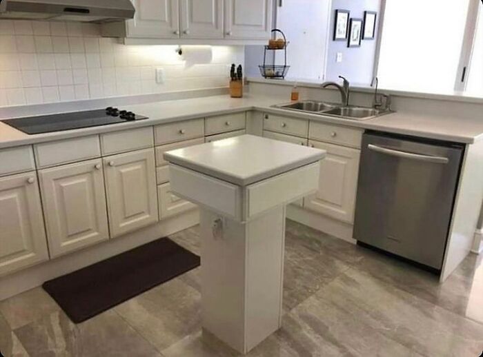
"I want an island. -But there is not enough... -I said I want an island!!!"
I thought exactly the same. Here's your upvote, mindmate!
Load More Replies...Now that you mention 'drawer', why are there drawer pulls under the sink?
Load More Replies...If you have limited kitchen space, even this tiny island would be helpful - it's got a storage drawer and a power outlet, so seems pretty useful.
Agree but this kitchen appears big enough for more
Load More Replies...I can totally see how that went: "I realy want an isle in my kitechn." "Ma'am, you don't have enough roon in your kitchen." "But I REALY, REALY want and isle."
So....what's wrong? This is just where you put your iPhone! Comes with built-in charger outlet, see?
Honestly this is kinda cool especially for someone who collects bugs or something
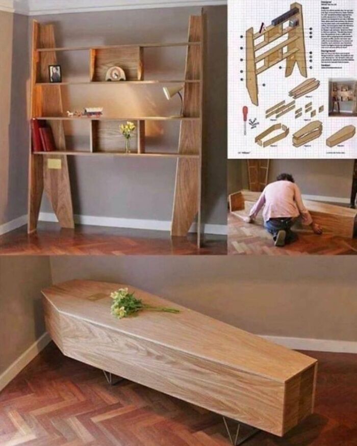
This bookshelf is not ugly at all, it does not belong here. Also, it is a good saving for your funeral.
Well, we can say that is it... a "failure" ! Lol! hahahahaha... It is funnier in French...
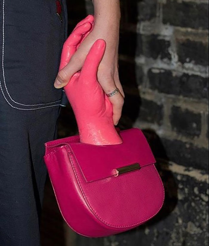
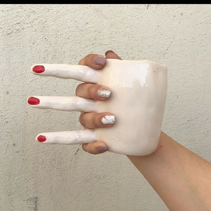
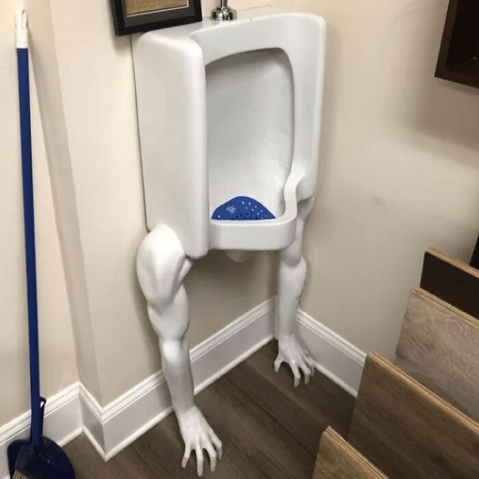
If you're feeling lonely and need a hand to hold, this cup is for you!
A strange mix of entries showing purposeful silliness, "redneck engineering" and only a minority of true design failures.
Gotta admit...some of these are pretty funny & I would TOTALLY rock them!
A strange mix of entries showing purposeful silliness, "redneck engineering" and only a minority of true design failures.
Gotta admit...some of these are pretty funny & I would TOTALLY rock them!

 Dark Mode
  No fees, cancel anytime


