ADVERTISEMENT

In typography, kerning is the process of adjusting the space between two specific characters. Most of us never give it a second thought, but it’s wild how much that tiny detail can matter.

Put two letters a little too close together, or leave too much room between them, and suddenly a perfectly normal phrase can take on a completely different meaning. Sometimes, the result is hilariously unfortunate.

To show you what we mean, we’ve rounded up the funniest spacing fails from the subreddit r/keming. Scroll down to check them out.

#1

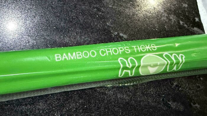
Bamboo Chops Ticks

Green packaging for chopsticks with improper spacing on BAMBOO CHOPS TICKS, demonstrating typography fails.

risingkirin Report

Jane Doe
Community Member
11 hours ago

scissors cut bamboo, bamboo chops ticks, ticks swarm rock

View more comments
RELATED:
    #2

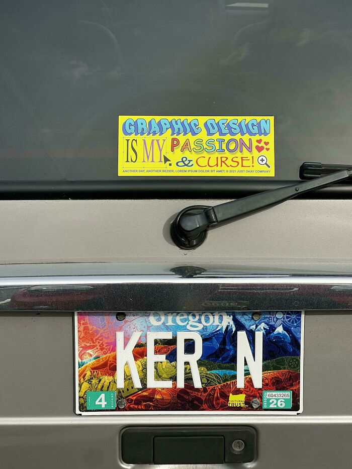
    I Was Told To Put This Here

    A car bumper with an Oregon license plate reading KER N, showing typography fails in letter spacing.

    Galaaska Report

    RS
    Community Member
    11 hours ago

    Love it

    View more comments
    #3

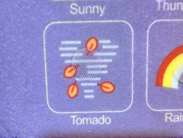
    Tomado

    A weather icon on felt fabric misspelled as Tomado due to poor letter spacing

    friedcircuitry Report

    UKGrandad
    Community Member
    13 hours ago

    You say tomado, I say tomahdo.

    View more comments
    #4

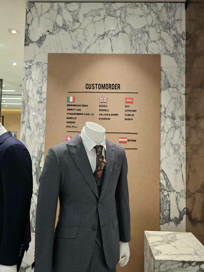
    One Does Not Simply Walk Into Mordor

    A custom order sign on a clothing store wall with bad letter spacing making it read customorder

    Sanctioned-PartsList Report

    Riley Quinn
    Community Member
    12 hours ago

    Cus to Mordor? Shouldn't cus have two ss's?

    View more comments
    ADVERTISEMENT
    #5

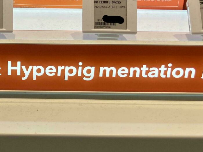
    Hyperpig

    A shelf label in a store showcasing bad letter spacing and typography fails on the word hyperpigmentation.

    cambriancalcite_eyes Report

    Al Fun
    Community Member
    13 hours ago

    Hyperpig hyperpig, does whatever a hyperpig does…

    View more comments
    ADVERTISEMENT
    #6

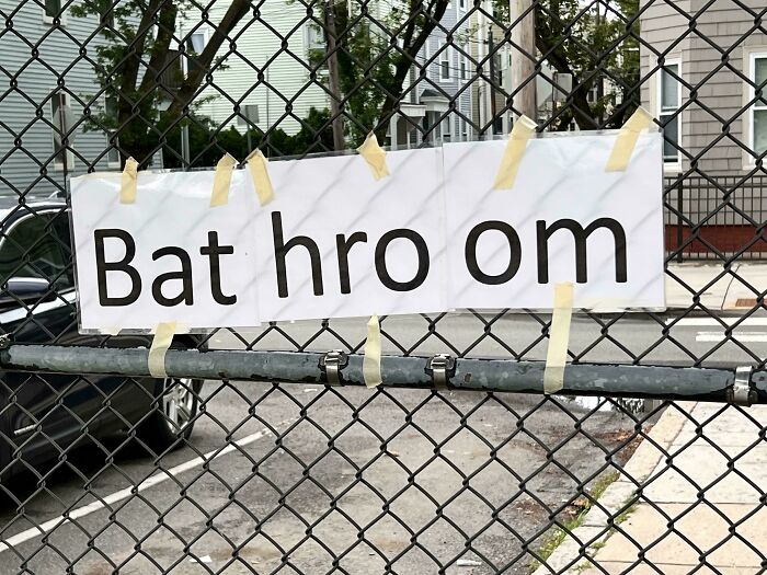
    Bat Hro On

    Homemade sign on chainlink fence reading Bat hro om as bad letter spacing example

    Far_Violinist_1333 Report

    G A
    Community Member
    14 hours ago

    A bat would have to fly really fast to go 'hro om'

    View more comments
    #7

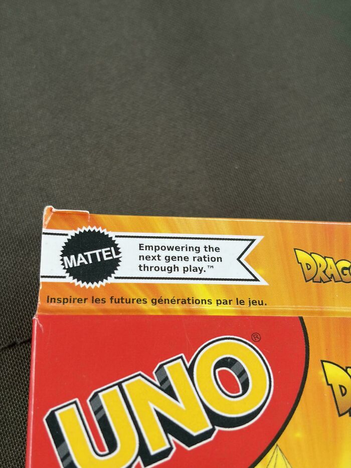
    Empowering The Next Gene Ration

    A typography fail on a Mattel card game box showing bad letter spacing in the word generation

    boredlong Report

    Grace Sssssss
    Community Member
    13 hours ago

    It's not *un*true...the next generation is our next ration of genes... /s

    View more comments
    #8

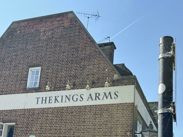
    Thekings Arms

    A brick pub building displaying one of several typography fails with THEKINGS ARMS painted on the side.

    dangerduhmort Report

    G A
    Community Member
    14 hours ago

    Theking thumone with some lithp.

    View more comments
    ADVERTISEMENT
    #9

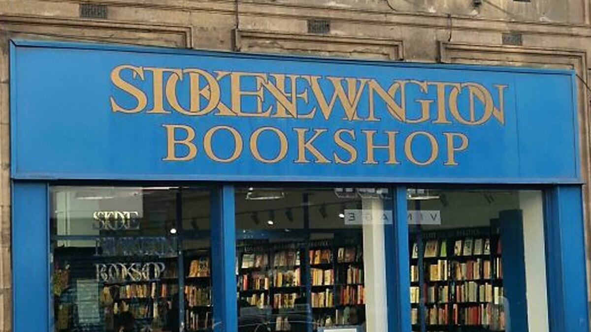
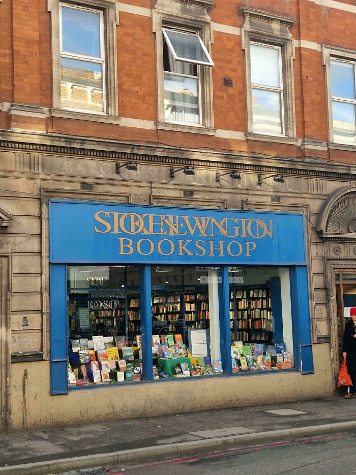
    Not Even Sure What To Title This

    Bookshop storefront with overlapping letters on the blue sign showing typography fails

    dogt0wel Report

    G A
    Community Member
    14 hours ago

    Stoke Newington Book Shop. Should have done the 2nd word in a different colour.

    View more comments
    ADVERTISEMENT
    #10

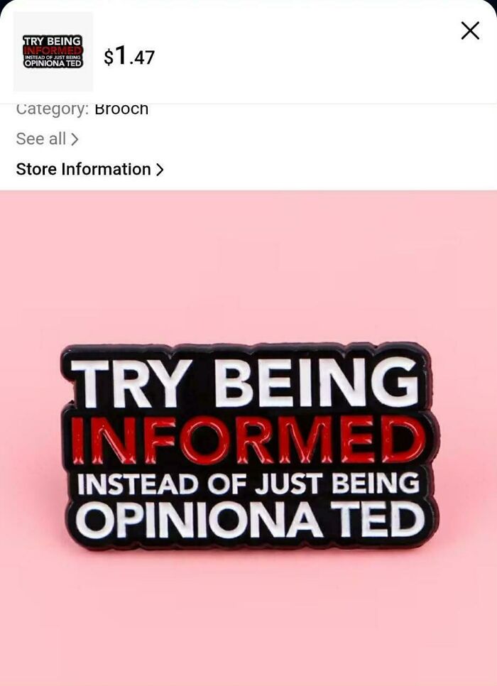
    Opiniona Ted

    An opinionated pin badge with bad letter spacing on the word opinionated, showcasing typography fails

    zecidnac Report

    G A
    Community Member
    14 hours ago

    Yeah, Ted!

    View more comments
    #11

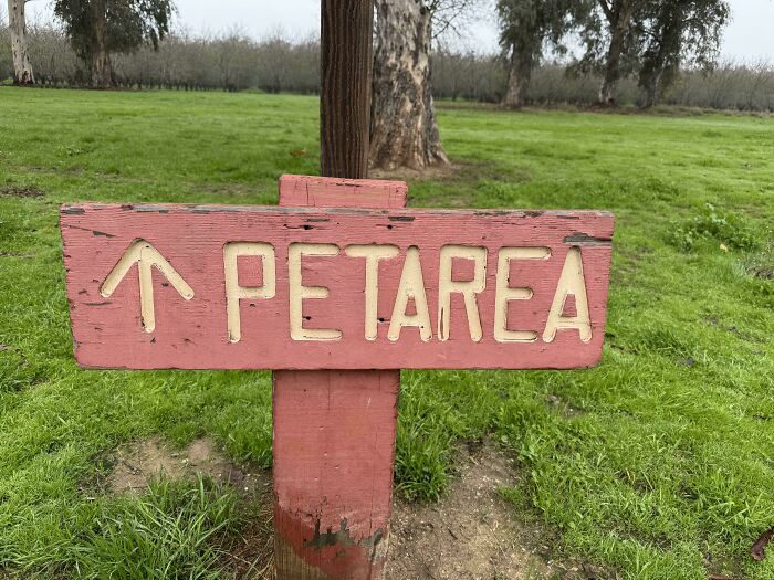
    Petarea

    Red wooden sign with poor letter spacing spelling PET AREA, illustrating a typography fail.

    humourless_radfem Report

    Stephanie Did It
    Community Member
    12 hours ago

    🎶 Oh we are marching to Petarea, Petarea, Petarea 🎶

    View more comments
    #12

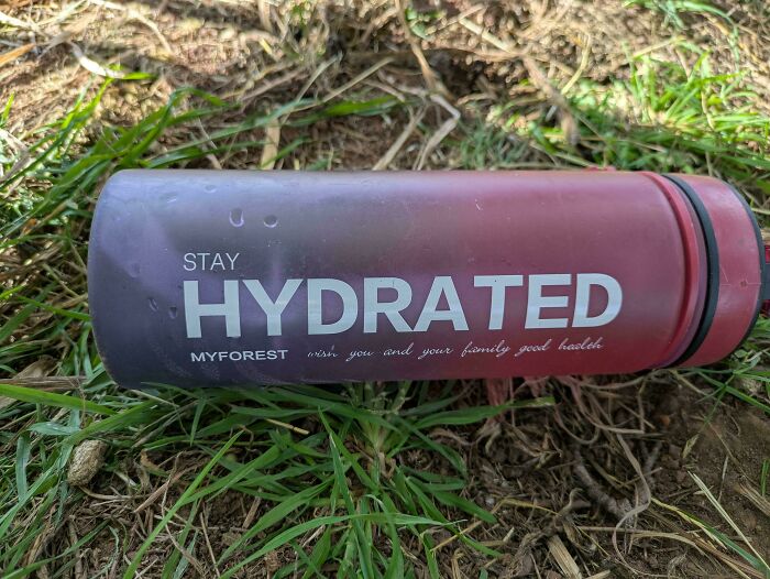
    Stay Hydra Ted

    A water bottle that shows bad letter spacing in the word hydrated, a classic typography fail

    fl_needs_to_restart Report

    G A
    Community Member
    14 hours ago

    Hail Hydra! Ted!

    View more comments
    ADVERTISEMENT
    #13

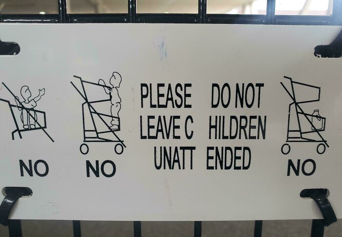
    Leavec Hildren Unatt Ended No

    Warning sign with bad letter spacing reading Please Leave C Hildren Unatt Ended

    ToomintheEllimist Report

    Riley Quinn
    Community Member
    12 hours ago

    Wait a second. You can't leave a jug of milk unattended?

    View more comments
    ADVERTISEMENT
    #14

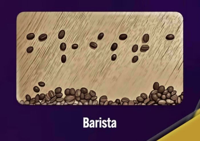
    Because The B And A At The Start Of "Barista" Are Too Close, This Actually Says "Frista" In Braille

    Braille spelling of Barista made of coffee beans on a wooden board showing typography fails

    GreatFail Report

    Robert T
    Community Member
    13 hours ago

    It doesn't say anything in Braille as it is a flat picture!

    View more comments
    #15

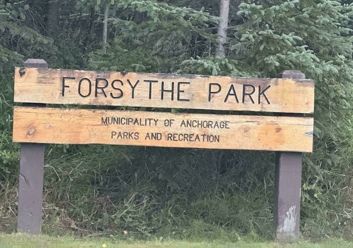
    Forsy The Park

    A wooden park sign with a bad letter spacing design fail reading FORSYTHE PARK.

    FrenchFryRaven Report

    B
    Community Member
    13 hours ago (edited)

    Where Forsy the Snowman spends his vacations.

    View more comments

    Never miss a story that brings joy to the world. Add us on Google

    #16

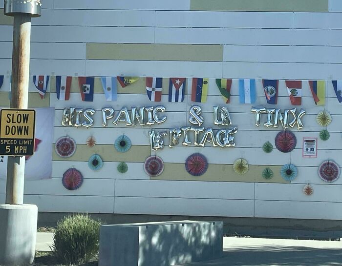
    His Panic And La Tinx

    Poor letter spacing in metallic balloon banner showing humorous typography fails

    soundiego Report

    Jenna Kay
    Community Member
    12 hours ago

    Hispanic and LatinX Heritage .... I think .... maybe ....

    View more comments
    ADVERTISEMENT
    #17

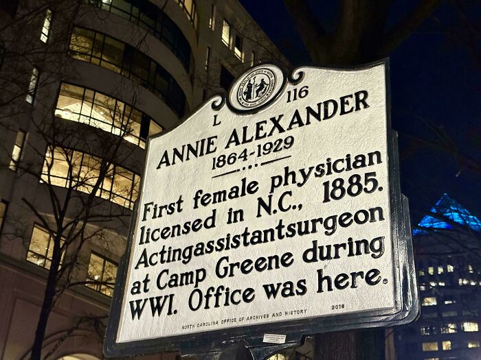
    They Did Her Wrong

    A historical sign with poor letter spacing showing typography fails on the word acting assistant surgeon.

    TenzoChris Report

    Leslie Green
    Community Member
    4 hours ago

    Well clearly the spacing here is the problem the third line. Sign was made too small.

    View more comments
    ADVERTISEMENT
    #18

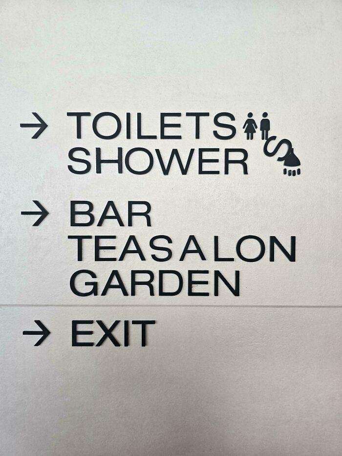
    It Gets Better The Longer I Look At It

    A directory sign with bad letter spacing reading TEASALON instead of Tea Salon, showcasing typography fails.

    comeweintounity Report

    Nikole [8647]
    Community Member
    11 hours ago

    to the Teasalon!

    View more comments
    #19

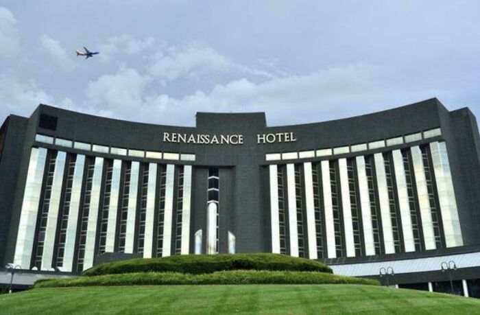
    This Hotel In St. Louis Bothers Me Every Time I Drive Past It

    The Renaissance Hotel sign displays incorrect letter spacing, highlighting common typography fails.

    Drip-Ready Report

    G A
    Community Member
    14 hours ago

    The SS always were ugly...

    View more comments
    #20

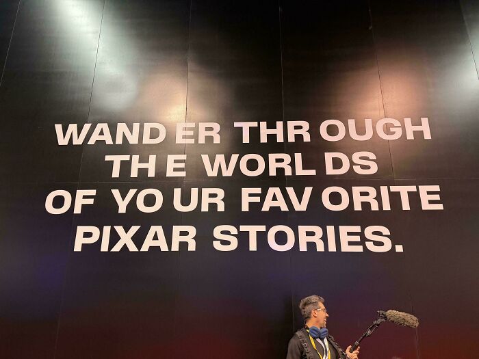
    Wand Er Thr Ough The Worl Ds

    Wall text displaying poor letter spacing on the words of a Pixar quote

    theGreyWyvern Report

    Jane Doe
    Community Member
    11 hours ago

    My guess is this was created for internal use so they created it with custom fonts. Play on another company’s computer, PowerPoint uses their default font. But what do I know? I don’t work for company that creates graphic materials like Pixar or anything!

    View more comments
    ADVERTISEMENT
    #21

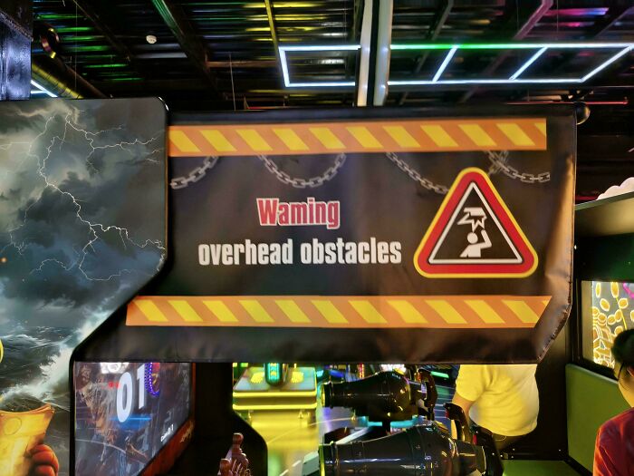
    Can You Really Blame This On Kerning?

    A warning overhead obstacles sign displaying bad letter spacing in the word warning

    Corporal_Cavernosa Report

    B
    Community Member
    13 hours ago

    Maybe it's describing what tall people are doing when they walk through there.

    View more comments
    ADVERTISEMENT
    #22

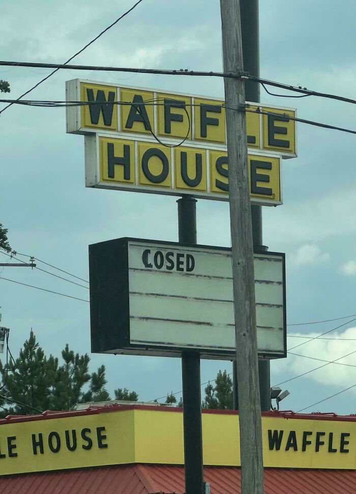
    This Waffle House Is Cosed

    Waffle House sign with missing letters and a cosed sign, displaying bad typography fails.

    winja45 Report

    Maggie Fulton
    Community Member
    13 hours ago

    Someone beat the L out of that sign…

    View more comments
    #23

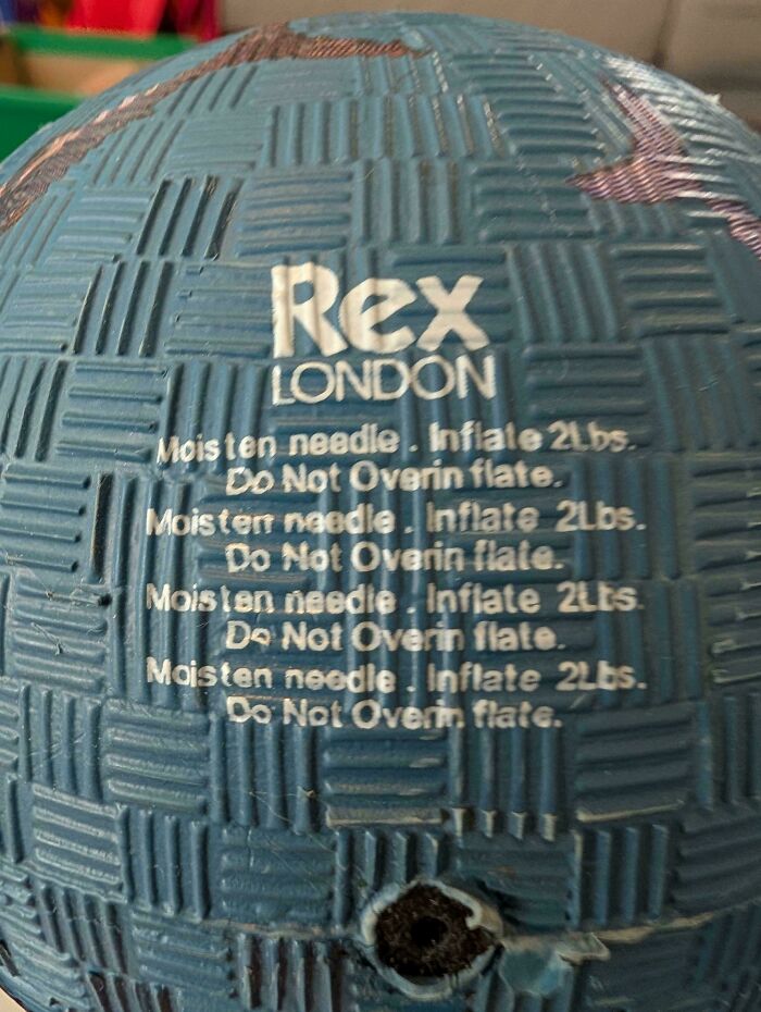
    Do Not Overin Flate

    Close-up of a blue toy ball showing repeated text with confusing spacing, showcasing typography fails.

    themaxmethod Report

    Upstaged75
    Community Member
    11 hours ago

    Wait, what am I supposed to do??

    View more comments
    #24

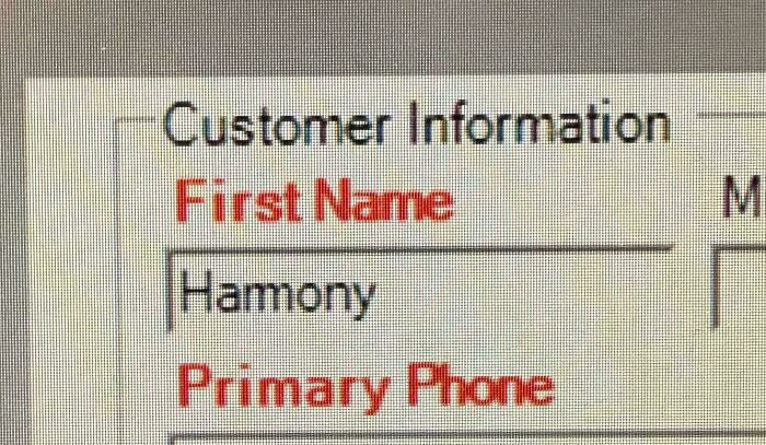
    The Font At Work. I’ve Been Dealing With This For Nearly 23yr

    Computer screen showing a typography fails example with bad letter spacing in the word Harmony.

    chadsmo Report

    Nikole [8647]
    Community Member
    11 hours ago

    From Buffy/Angel? You've been around a lot longer than 23 years, girl...

    View more comments
    ADVERTISEMENT
    #25

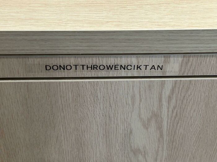
    How Do I Even Read This

    A label on a wooden cabinet drawer showing DONOTTHROWENCIKTAN as an example of typography fails

    VersatileCitrus022 Report

    Maggie Fulton
    Community Member
    14 hours ago

    I don’t even have an enciktan…

    View more comments
    ADVERTISEMENT
    #26

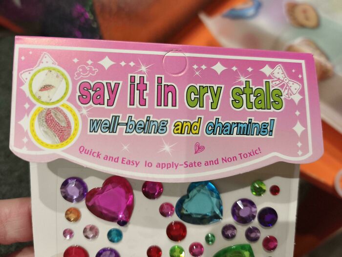
    Say It In Cry Stals

    Product packaging saying say it in cry stals displaying poor letter spacing

    TheBigMacGaul Report

    Nikole [8647]
    Community Member
    11 hours ago (edited)

    So I can say anything in these cry stals AND they're sate? Thank heavens!

    View more comments
    #27

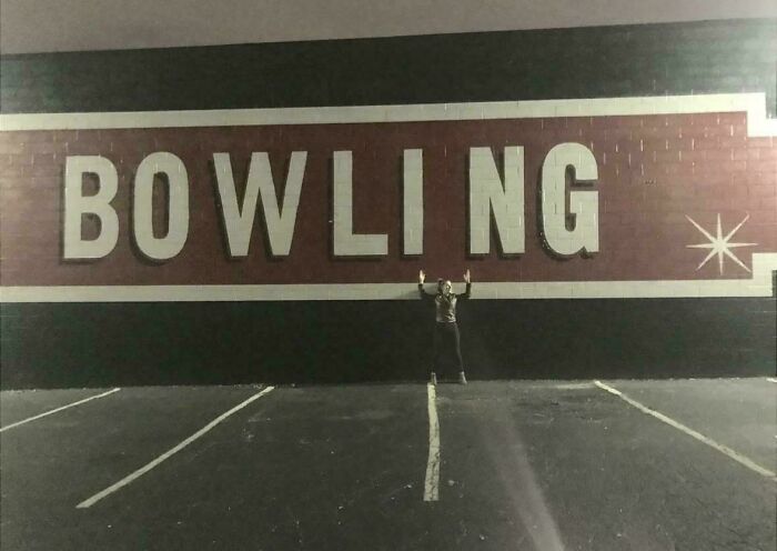
    Bo W Li Ng

    Large building wall displaying a classic typography fail with uneven letter spacing on the word BOWLING.

    Careless_Mango_7948 Report

    Jane Doe
    Community Member
    11 hours ago

    The 7 10 split in text.

    View more comments
    #28

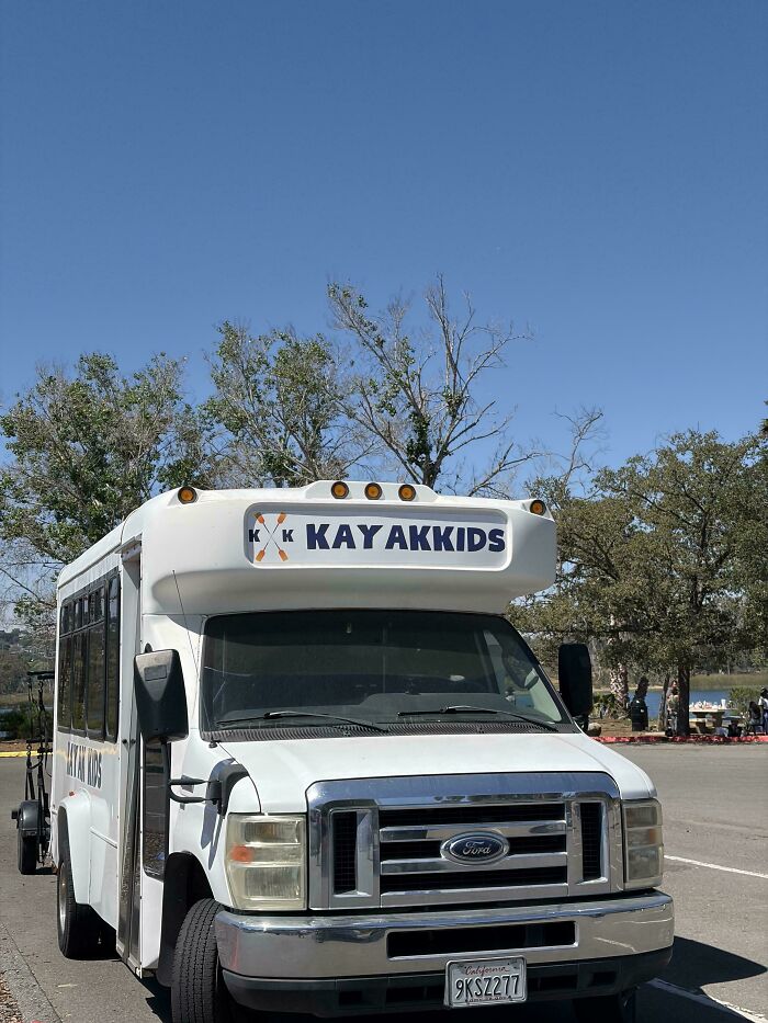
    Kay Akkids

    A white shuttle bus displaying a typography fail with awkward letter spacing for Kayak Kids

    imalonenoyourenot Report

    Sea Squirrel
    Community Member
    12 hours ago

    It's even worse. There are two smaller k's in the logo, so ik says 'k k KAY AKKIDS'
    View more comments
    ADVERTISEMENT
    #29

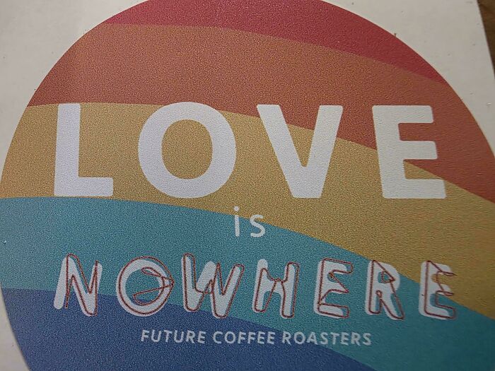
    Found One In The Wild. The Place Is Called Now Here Coffee

    A rainbow sticker with a typography fail where bad letter spacing makes it read Love is Nowhere

    lollettone Report

    Al Fun
    Community Member
    13 hours ago

    Face it, love is nowhere. Drown your depression in coffee.

    View more comments
    ADVERTISEMENT
    #30

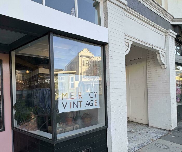
    Me R Cy Vintage

    Shop window sign showing a typography fail with wide letter spacing reading Mercy Vintage

    Gouchiano Report

    #31

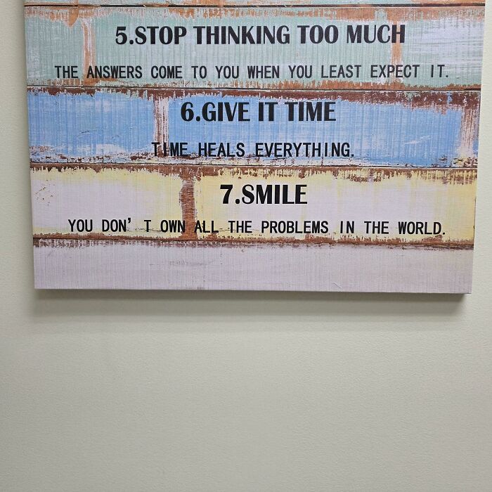
    This Inspirational Sign In My Doctor's Office Drives Me Crazy Every Time I Get To Number 7

    Spelling mistake on motivational poster showing how bad letter spacing changes meaning

    Severe_Atmosphere_44 Report

    royal crablets
    Community Member
    6 hours ago

    I might not own them, but looking at my bank account apparently I'm renting all the world's problems.

    View more comments
    #32

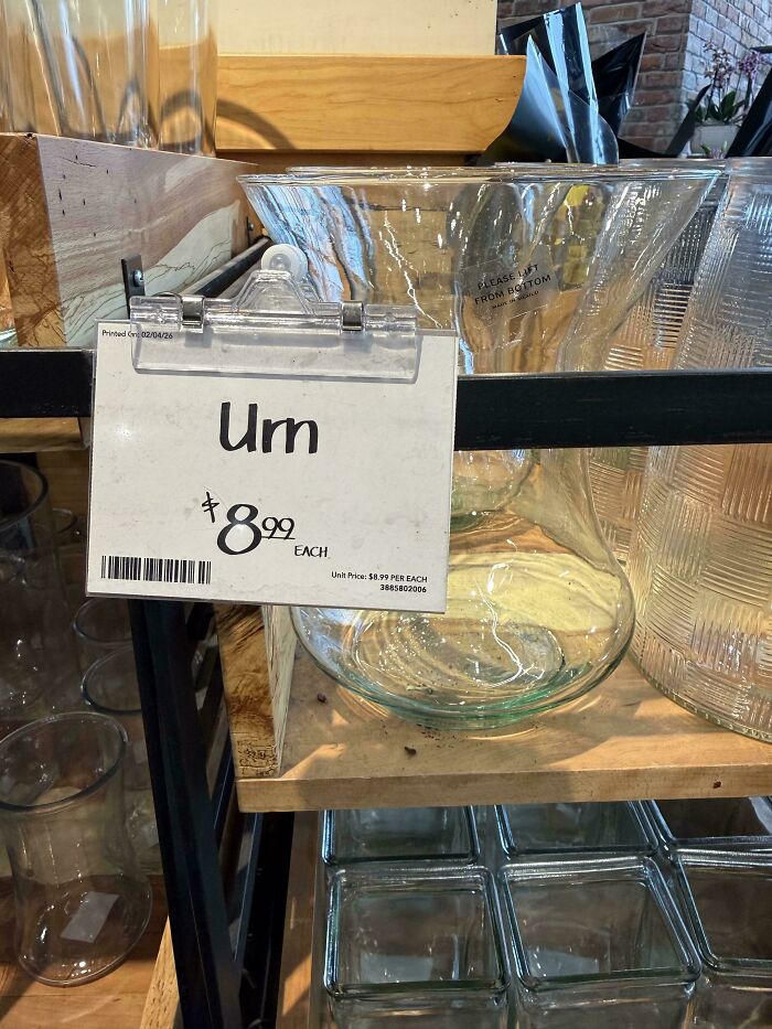
    Um Not Sure If This Belongs Here

    A price tag on a glass vase with a comical typography fails error in letter spacing making Urn look like Um.

    adamsdayoff Report

    Jen Mart
    Community Member
    11 hours ago

    how much does a Grecian urm?

    View more comments
    ADVERTISEMENT
    #33

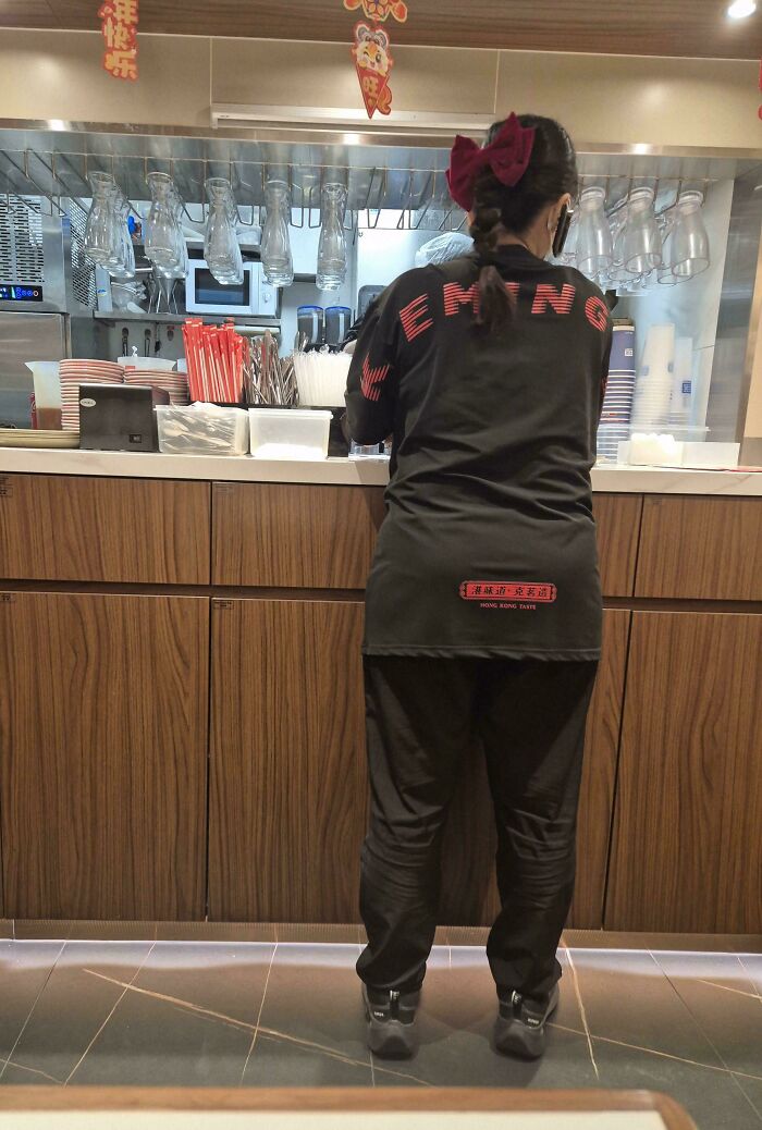
    The Back Of A Staff's Uniform At A Restaurant Called "Keming"

    Close-up on a staff member wearing a shirt with bad letter spacing, an example of funny typography fails.

    shin2112 Report

    Inservio Smurf
    Community Member
    2 hours ago

    HONG KONG TASTE.... right over her derriere?

    View more comments
    ADVERTISEMENT
    #34

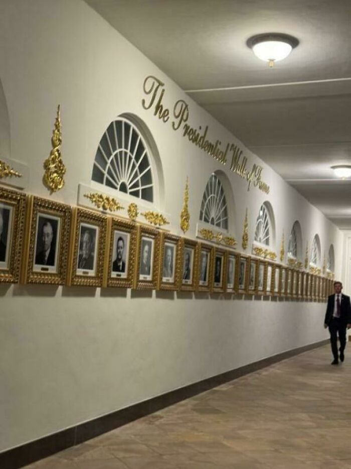
    T He P Residential Walk Of Fame

    A gold wall sign with poor letter spacing reading The Presidential Walk of Fame, showing typography fails.

    33kbps Report

    dan gerene
    Community Member
    13 hours ago

    Welcome to Tacky's Playhouse!

    View more comments
    #35

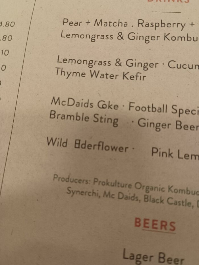
    Wild ⽇derflower

    Close-up of a menu with poor letter spacing showing typography fails in Wild Elderflower

    AmazinDood Report

    Poppy
    Community Member
    12 hours ago

    The Coke is a bit sus too.

    View more comments
    #36

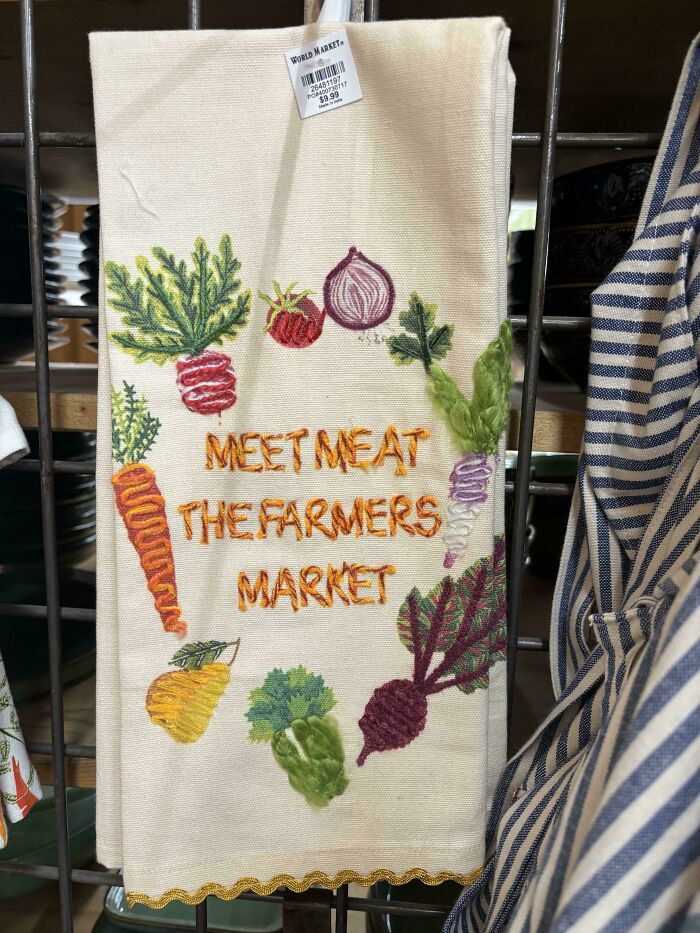
    If You Say So!

    Embroidery on kitchen towel showing bad letter spacing as typography fails example

    emmabethh Report

    Jenna Kay
    Community Member
    12 hours ago

    Meet! meat! My "happy" 😉brain read this and I heard the Roadrunner ....

    View more comments
    ADVERTISEMENT
    #37

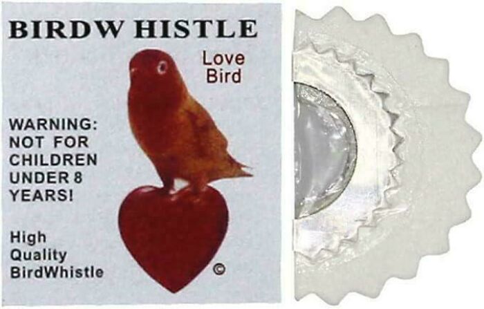
    Can't Wait To Use This While Birdw Atching

    A bird whistle package displaying bad letter spacing that reads as birdw histle

    tani_P Report

    Trip T
    Community Member
    11 hours ago

    Wow, do they sti ll make these?

    ADVERTISEMENT
    #38

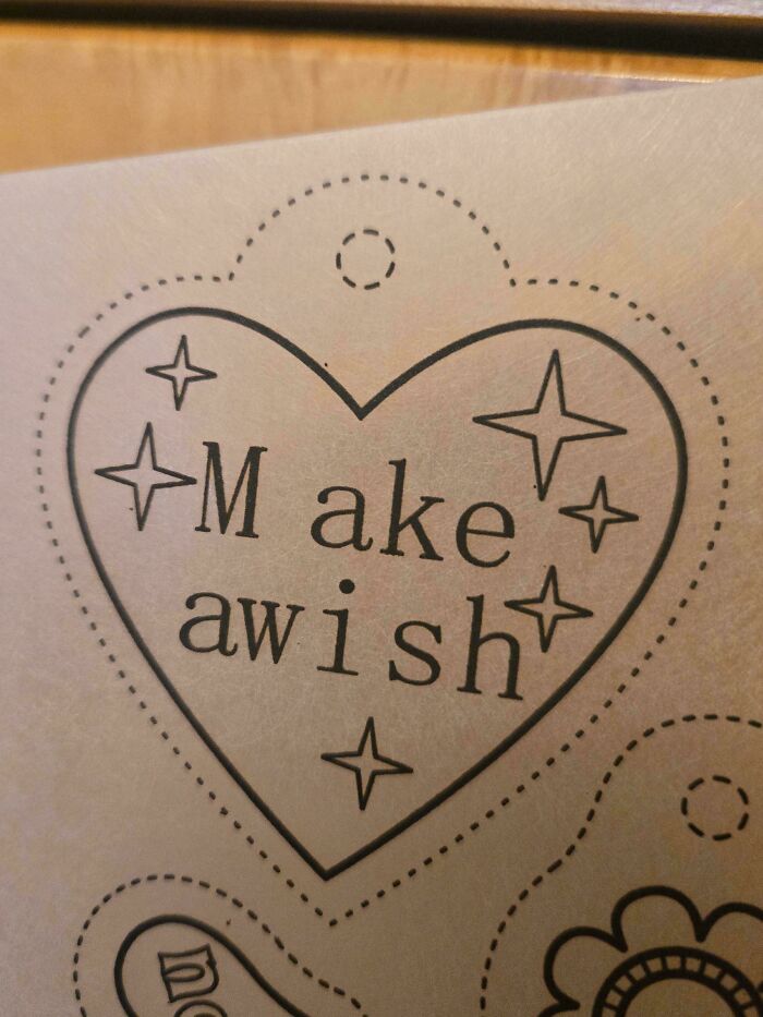
    "M Ake Aw I Sh" From A Shrinky Dink Kit

    A heart graphic showing a typography fail where Make a wish is spaced as M ake awish.

    CrimsonApostate Report

    SheamusFanFrom1987
    Community Member
    7 hours ago

    Sounds suspiciously like "M, ache. Aw I sh*t"... XP

    #39

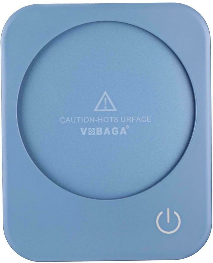
    If The Mug Warmer Hots Urface, Ur Using It Wrong

    A coffee warmer with a typography fail spelling hots urface instead of hot surface

    carsncode Report

    Upstaged75
    Community Member
    11 hours ago

    Urface is funny. 😂

    View more comments
    #40

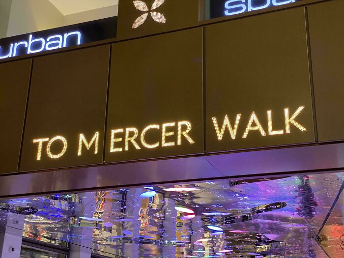
    Who’s Tom Ercer?

    Bad letter spacing on illuminated sign creating a funny gap in Mercer Walk

    IrishMacgyver Report

    SheamusFanFrom1987
    Community Member
    7 hours ago (edited)

    Maybe a tribute to Tommy Mercer (Anthony Mayweather/Crimson)...? Though if you walk this path, expect NO MERCY! XP

    ADVERTISEMENT
    #41

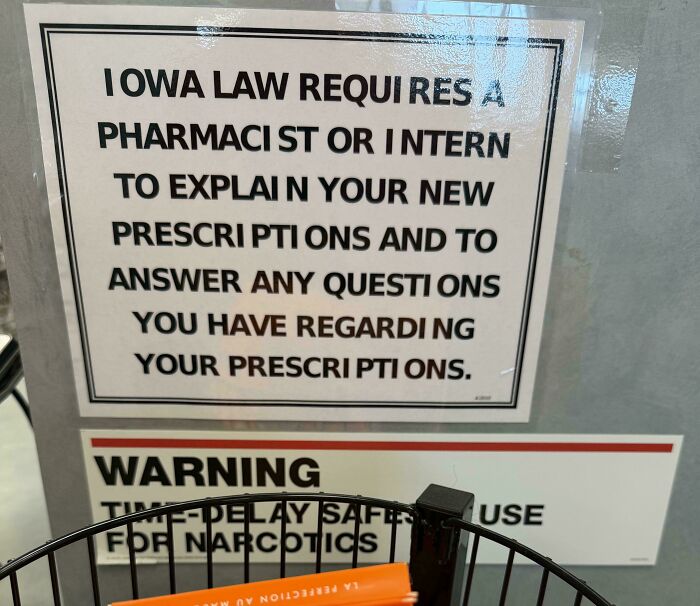
    This Sign At My Local Pharmacy Is An Abomination

    A printed sign in a pharmacy displaying bad letter spacing as an example of typography fails.

    jcarr2184 Report

    Upstaged75
    Community Member
    11 hours ago

    I owa law. 😂

    View more comments
    ADVERTISEMENT
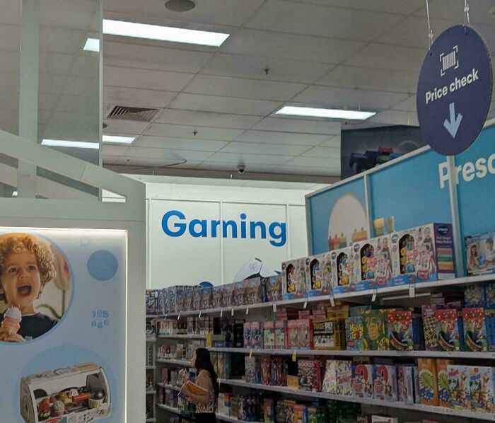
    #42

    Finally, Inverse Keming

    A retail department sign reading Garning instead of Gaming, illustrating funny typography fails.

    Mission-Impossible_ Report

    Inservio Smurf
    Community Member
    2 hours ago

    I don't know what Garning is, but I'll ask Jennifer when I next watch Alias.
    View more comments
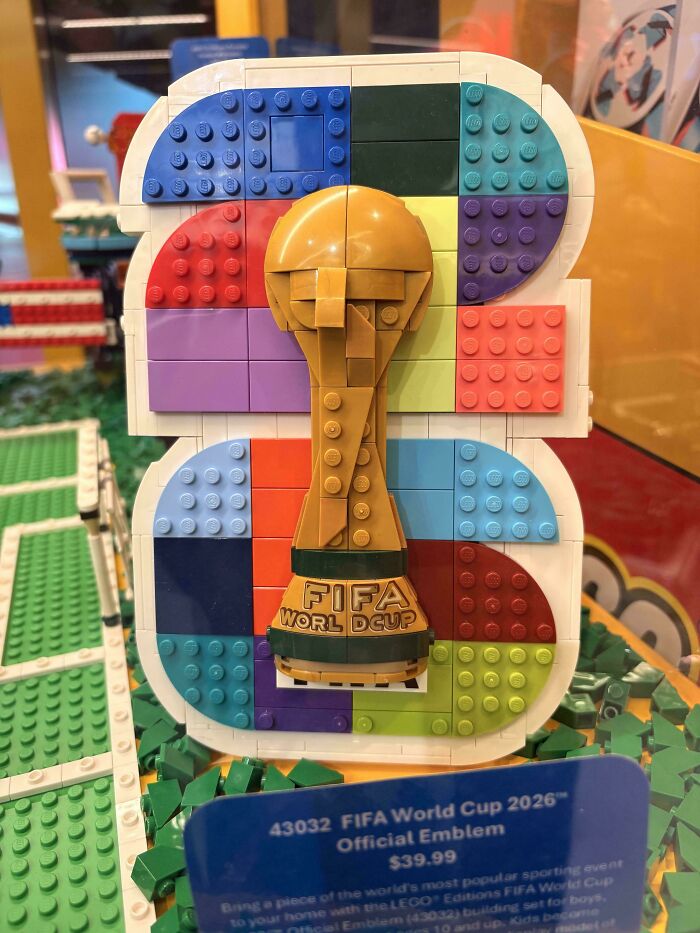
    #43

    Egregious… But Inevitable Considering LEGO Strict Sticker Placement Rules, I Suppose

    A Lego model showing bad letter spacing in the FIFA World Cup logo as a funny typography fail

    Aton_Freson Report

    Upstaged75
    Community Member
    11 hours ago

    D cup? I'm actually more of a large C. 😁

    View more comments
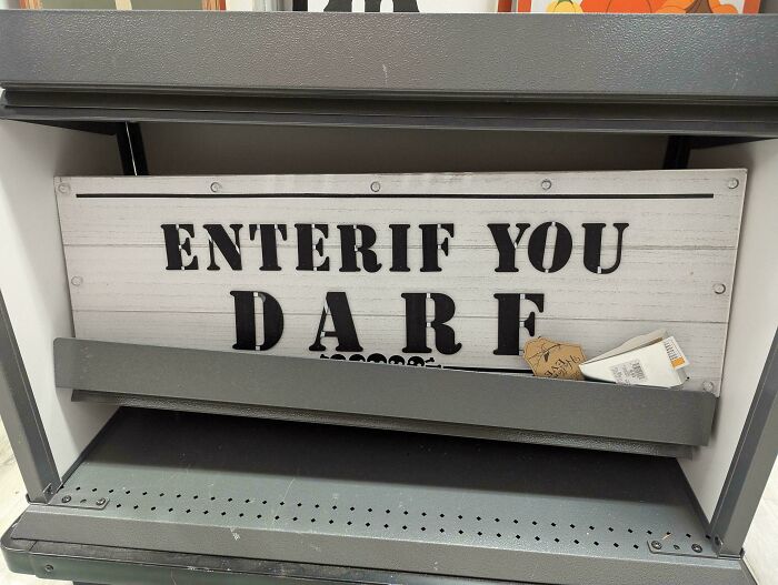
    #44

    A Waming To All

    Halloween sign displaying Enter If You Dare with bad letter spacing, showing typography fails

    phirleh Report

    Upstaged75
    Community Member
    11 hours ago

    Enter if you darf!

    View more comments
    ADVERTISEMENT
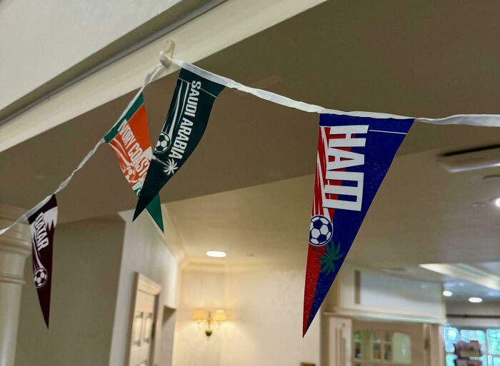
    #45

    Ham

    Flag banner showing bad letter spacing for Haiti and other countries, illustrating typography fails

    Jamnoggin Report

    Nikole [8647]
    Community Member
    11 hours ago

    HAM! GOOOOOAAALLLL!

    ADVERTISEMENT
    #46

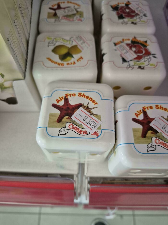
    Found In A Budget Shop In Romania

    Bad letter spacing fail on an air freshener labeled Air Fre Shener

    kloovt Report

    Inservio Smurf
    Community Member
    2 hours ago

    I wonder what they shene their liquids with?

    #47

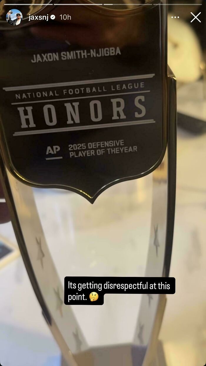
    Player Of Theyear

    An NFL trophy with Player of Theyear engraved on it showing funny typography fails

    anon Report

    Ghostchaplain16
    Community Member
    Premium
    12 hours ago

    For anyone not familiar, Smith-Njigba was the OFFENSIVE player of the Year.

    View more comments
    #48

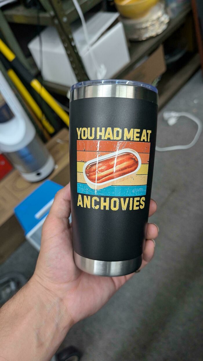
    Found This One At Work

    A black tumbler with a funny graphic and poor letter spacing reading You had meat anchovies.

    Routine_Purchase_971 Report

    Upstaged75
    Community Member
    11 hours ago

    Anchovies are already meat aren't they? 😁

    View more comments
    ADVERTISEMENT
    #49

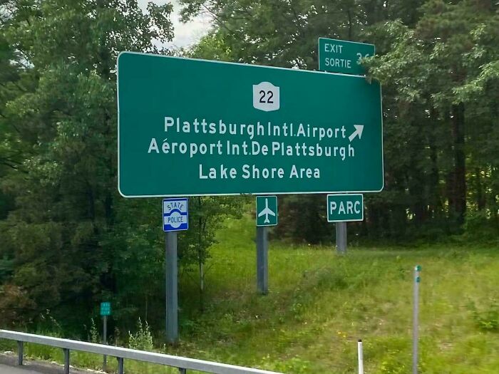
    Plattsburghintl.airport

    A green highway sign featuring a typography fail with poor letter spacing in Plattsburgh Intl Airport.

    SanibelMan Report

    Jen Mart
    Community Member
    10 hours ago

    Looks like a place in Germany

    View more comments
    ADVERTISEMENT
    #50

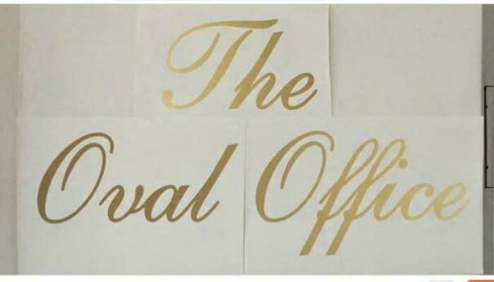
    T He O Val O Ffice

    Golden decals for The Oval Office showcasing uneven letter spacing.

    [deleted] Report

    Mavis
    Community Member
    12 hours ago

    When the orange t**d is finally gone one of the first things they should do is rip down all the stupid s**t he put up at the White House.

    View more comments
    #51

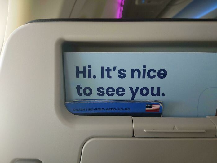
    Apostrophes Are Wider Than Spaces In Breeze Airways' Font

    An airplane seat pocket card with a subtle typography fail in the letter spacing of the word Hi.

    chikinn Report

    Jen Mart
    Community Member
    10 hours ago

    At least "it's" was spelled correctly.

    #52

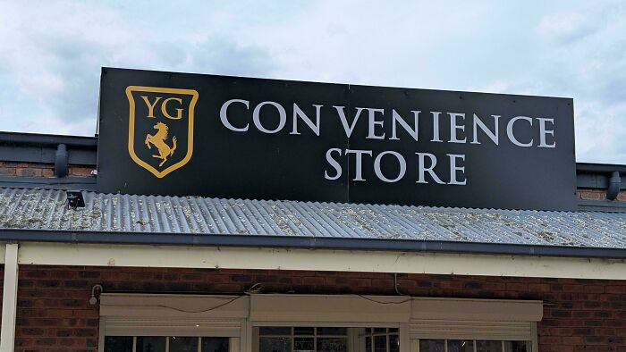
    Con Ven Ience Store

    A convenience store sign showing a typography fail with bad letter spacing in convenience and store

    peteofaustralia Report

    ADVERTISEMENT
    #53

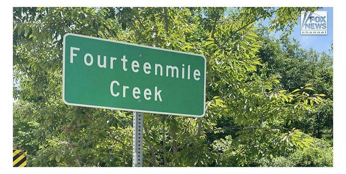
    F O Ur T E E Nmile Creek

    Green road sign with terrible letter spacing spelling Fourteenmile Creek, showcasing bad typography fails.

    No_Cook2983 Report

    ADVERTISEMENT
    #54

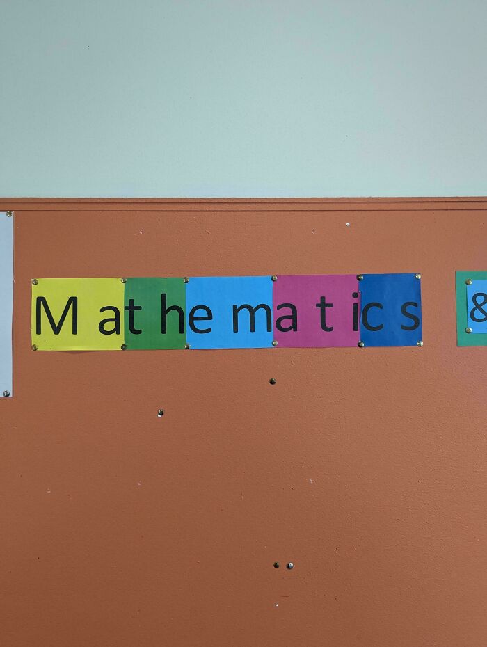
    M At He MA T Ic S

    School wall display showcasing bad letter spacing split across colored paper panels

    Inglan1 Report

    Upstaged75
    Community Member
    11 hours ago

    This one is giving me tics.

    #55

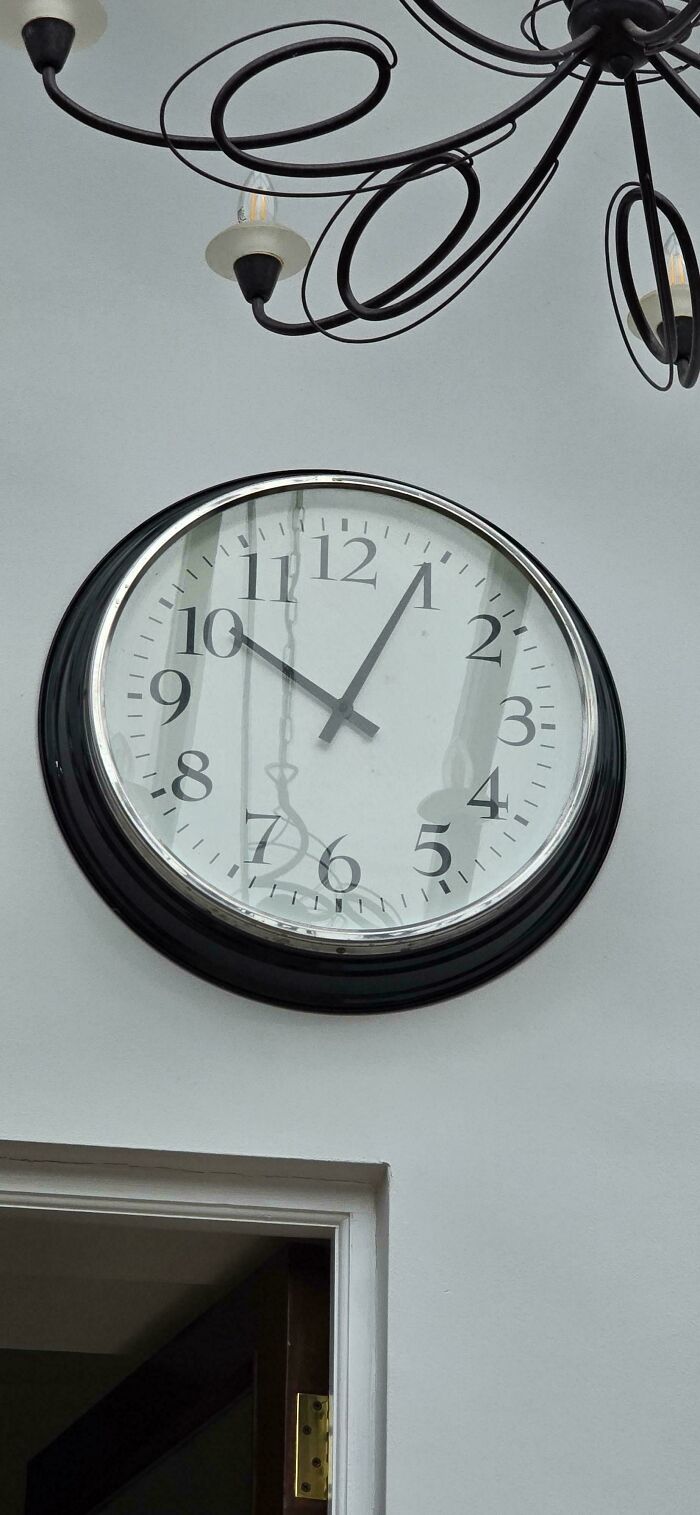
    The Number Spacing On This Wall Clock

    Large wall clock with poor letter spacing on the numbers, representing a typography fail.

    OnTheHorizon722 Report

    #56

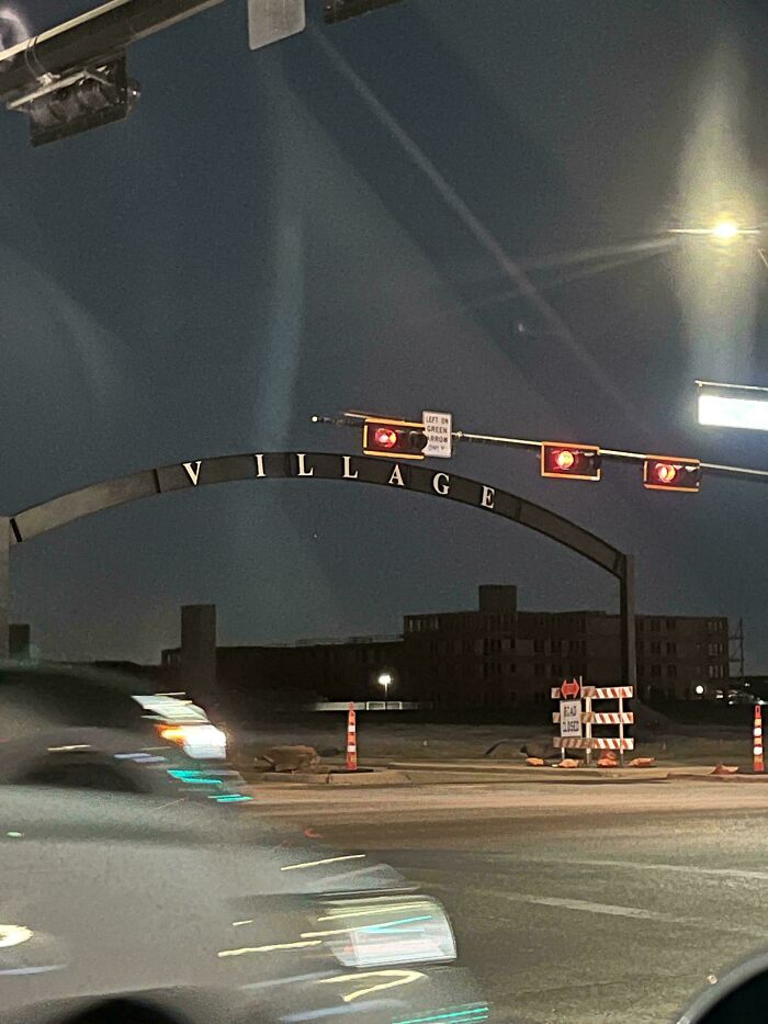
    Someone Messed Up The Spacing A Bit

    Village archway at night demonstrating poor letter spacing, an example of a typography fail.

    coding_apes Report

    Inservio Smurf
    Community Member
    2 hours ago

    Rihanna lives in the village, illage, illage, illage

    ADVERTISEMENT
    #57

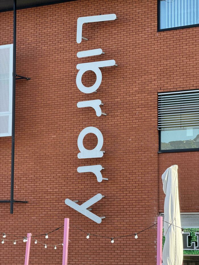
    Libr AR Y

    A brick wall displaying vertical library signage with terrible letter spacing.

    lynton123palmer Report

    ADVERTISEMENT
    #58

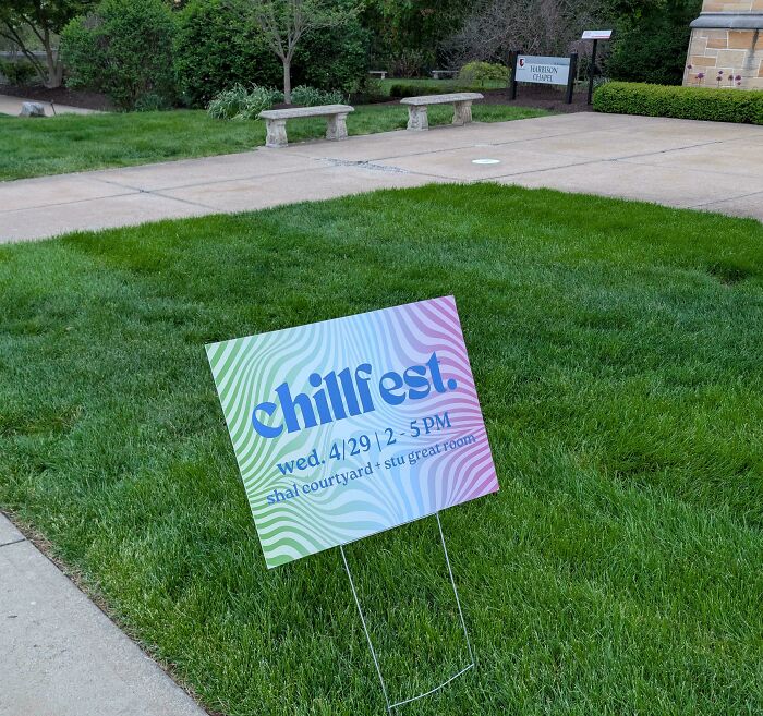
    Chillf Est Returns For A Second Year

    A chillfest yard sign displaying bad letter spacing on a green lawn.

    AccomplishedMess648 Report

    #59

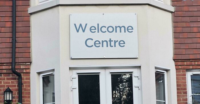
    W Elcome Centre

    A Welcome Centre building sign with a typography fail showing uneven letter spacing on the letter W

    Ruby-Shark Report

    Oskar vanZandt
    Community Member
    11 hours ago

    But that says "W elcome Centre"?

    View more comments
    #60

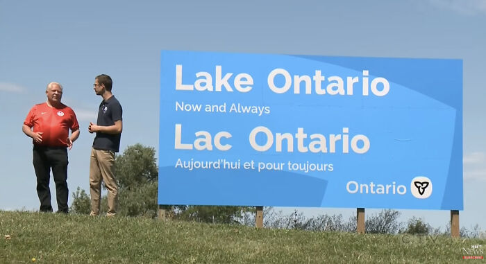
    Why Is Ontario Kerned Differently?

    A large blue sign for Lake Ontario showing bad letter spacing as a classic typography fail

    tayfife Report

    Elladine DesIsles
    Community Member
    13 hours ago

    Look, as long as it doesn't say Am Erica, I'm not complaining (despite my loathing for Premier Doug Ford, who is on the left in this photo but who is normally found on the Right).

    View more comments
    ADVERTISEMENT
    #61

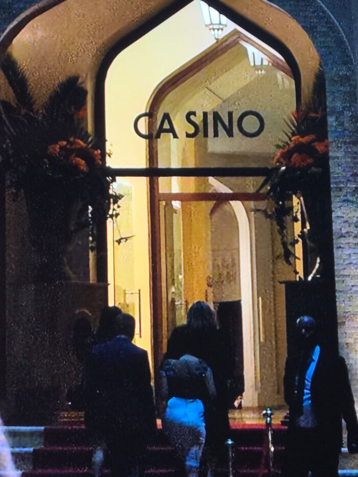
    CA Sino

    The entrance of a building with CA SINO written above, illustrating noticeable typography fails.

    evshell18 Report

    ADVERTISEMENT
    #62

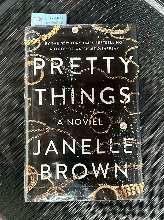
    My Wife Is A Reading A Nov El

    Book cover with a massive gap between the first and second letter, a prime example of typography fails.
    OMGLMAOWTF_com Report

    Nikole [8647]
    Community Member
    11 hours ago

    ?

    #63

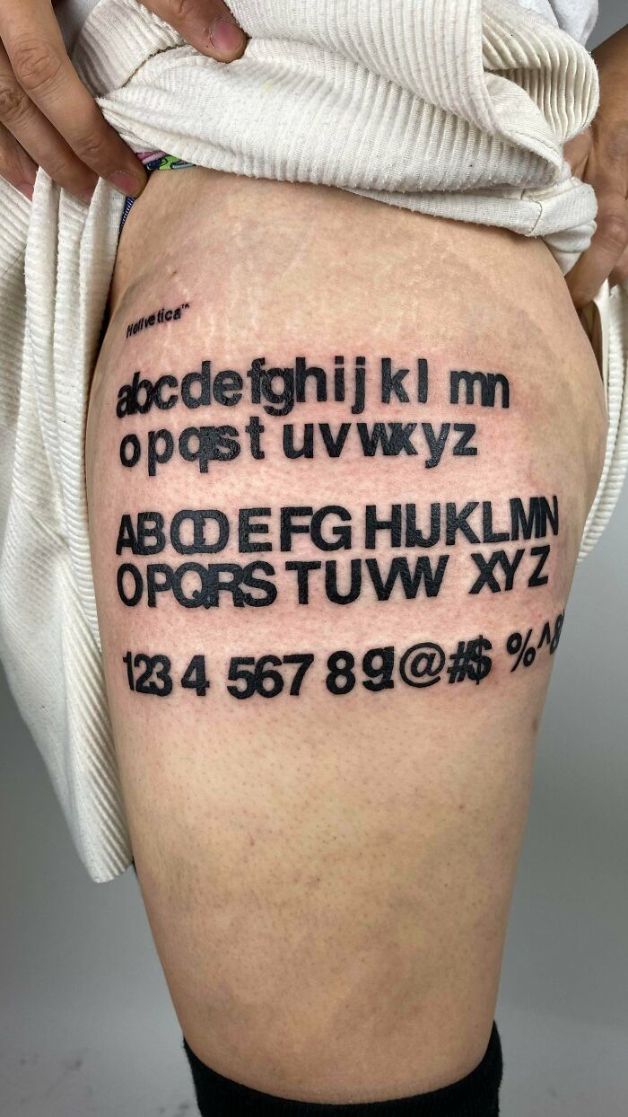
    My Leg Tattoo 😬

    Tattoo of the Helvetica alphabet with overlapping letters as typography fails

    jad3dd Report

    Oskar vanZandt
    Community Member
    11 hours ago

    Why?

    View more comments
    #64

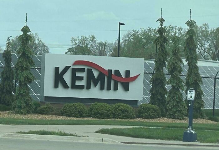
    I Visited Headquarters Today. Who The Heck Swiped The G?

    Corporate Kemin sign showcasing bad letter spacing that looks like KEMIN

    marrklarr Report

    Kira Okah
    Community Member
    11 hours ago

    Note, the subreddit is called Keming, a play on the kerning of r and n being wrong often looks like an m, this is a joke based on that.

    View more comments
    ADVERTISEMENT
    #65

    Me Me Me Me

    K-pop girl group chart showing a funny letter spacing fail with IVE stylized as ME

    zapyrum Report

    Inservio Smurf
    Community Member
    2 hours ago

    I guess I dont understand this one, I may be too old.

    View more comments
    ADVERTISEMENT
    #66

    What Type Of Meat Is Dhuck?

    A recipe list with a glaring typography fail in the spacing of the word fatty.

    ronin442 Report

    Stephanie Did It
    Community Member
    12 hours ago

    It comes from the aquatic wooddhuck.

    View more comments