15 Intricate Design Secrets That Most People Probably Haven’t Thought About, As Shared By A Designer On TikTok
InterviewHave you ever wondered why some everyday things that we see and use look one way or the other? Why there are mirrors in the elevator, or why do we sit in red-colored seats in the theatre? Answers to these and many more questions can be found on a TikTok account called @designsecretsss. Here, a concept designer and inventor reveals some design secrets by explaining how and why certain everyday objects were created. Soon his videos went viral, hitting millions of views. Have you heard about any of these design secrets? Don’t forget to share your thoughts in the comments down below!
More Info: TikTok
This post may include affiliate links.
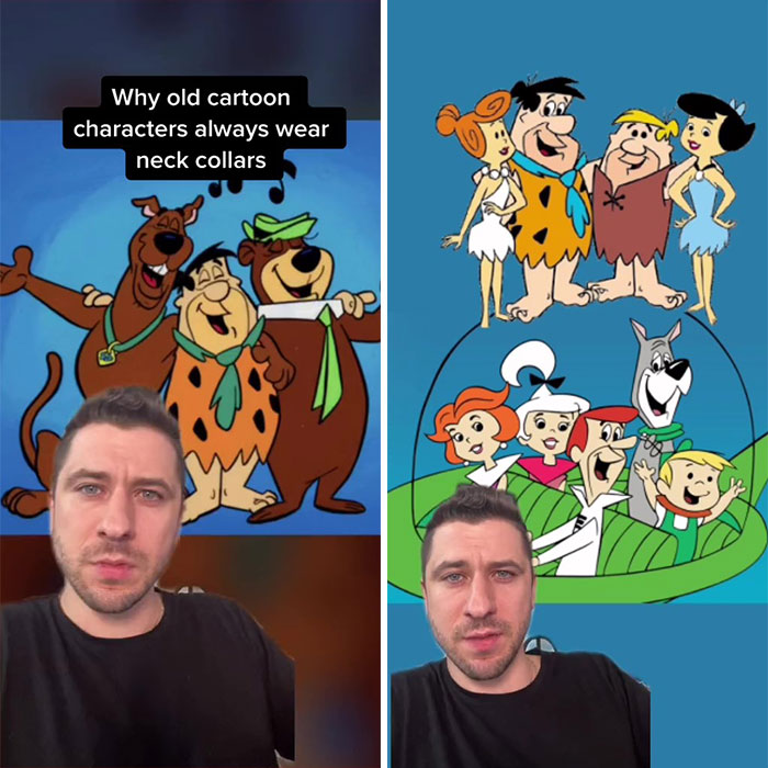
Why Old Cartoon Characters Wear Neck Collars
"If you watch a lot of old cartoons, you would notice a lot of the main characters are always wearing neckties or neck collars that are always covering their necks and disconnecting their head from their body. Once again, it’s no accident, that is by design. In the 1960s the iconic duo Hanna-Barbera were cranking out 6 hours of cartoon television every single week to over 300 million viewers around the globe. However, at the same time, the studio’s budget kept shrinking and shrinking, which actually threatened the entire hand-drawn animation industry. In a stroke of genius, they came up with a new technique that reduced the animation effort by 7000%. By giving characters something to wear around their necks, it meant that animators could keep the exact same body position and only animate the head while it was moving and talking, which not only meant that the frames required for a 7 min cartoon were reduced from 14000 down to just 2000, but this move is actually credited with saving the entire animation industry."
How An Airport Reduced Complaints Regarding The Baggage Claim Wait Times
"The Houston Airport in Texas was experiencing an extraordinary amount of complaints regarding the baggage claim wait times. Executives tried to solve this by increasing staff, which did in fact help and reduced the waiting time down to 8 minutes, which was the industry average, but despite that, the complaints still persisted. Upon further investigation, they found out that it only took passengers 1 minute to walk from their arrival gate to baggage claim and then 7 more minutes for their luggage to arrive. Which meant that 88% of the time was spent standing around doing nothing and just waiting. So the airport came up with a clever solution. They moved baggage claim as far as possible, so now it took passengers 6 times longer to get to it. And just like that, overnight complaints dropped to nearly zero."
Why Movie Theater Seats Are Colored Red
"If you ever noticed that in theatres curtains and seats tend to be the color red, that’s no coincidence, that’s by design. And that’s because the color red is the first color that the human eye loses sight of in dark and low light conditions, making it easier for you to focus on the performance or movie screen and not get distracted by the surroundings."
Huh, and I always figured it was to give an impression of wealth and luxury!
The account was created to “reveal the design secrets of everyday life” and now has more than 500k followers on TikTok. In these short videos, people can get useful and interesting information that might be too hard to grasp at first. For example, who would have thought that Pringles chips and a hyperbolic paraboloid have something in common?
Besides talking about clever design secrets, the TikToker also has a few educational videos that explain some “bad” design mistakes and give a brief insight into the history of architecture.
Amsterdam Airport Design Secret
"Amsterdam’s Schiphol Airport had a problem. Local residents were complaining about the excessive noise of airplanes constantly taking off. This problem was even worse during the wintertime because sound vibrations travel even further when the ground is wet or frozen. So the airport kicked off a study that resulted in a brilliant solution using the local landscape. They created these 10-foot-tall triangular wedges and they spaced them apart at a distance equivalent to the wavelength of the actual airplane noise, which turned out to be around 36 feet. The second layer of wedges was added at an 18-degree angle to further reduce the noise and the final result was a total reduction of about 3 to 5.5 decibels and an award-winning design."
Sounds like they used bushes to kinda make those walls in a soundproof booth/room, very cool!
Pringles Design Secrets
"Here’s a design secret about Pringles potato chips whose iconic shape is not arbitrary but actually designed by supercomputers running advanced aerodynamic simulations. Back in the day, Pringles had a manufacturing problem. The production line was moving so fast to meet the high demand that chips were literally flying off of the conveyor belts due to wind resistance. Pringles enlisted the help of supercomputers to come up with an aerodynamic shape for the potato chips known as a hyperbolic paraboloid, so the chips don’t fly off of the production line. The new design was a success but it turned out there were other benefits as well. It made the chips easier to stack, it reduced the chance of them breaking during transport, and it made it so there’s no predictable way for the chips to break in our mouth giving it that oddly satisfying crunch."
If only they were as devoted to gastronomy as they were to geometry.
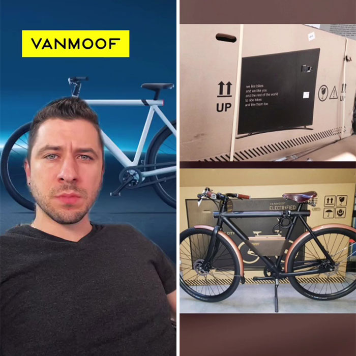
Clever Packing Design In Order To Avoid Damaged Orders
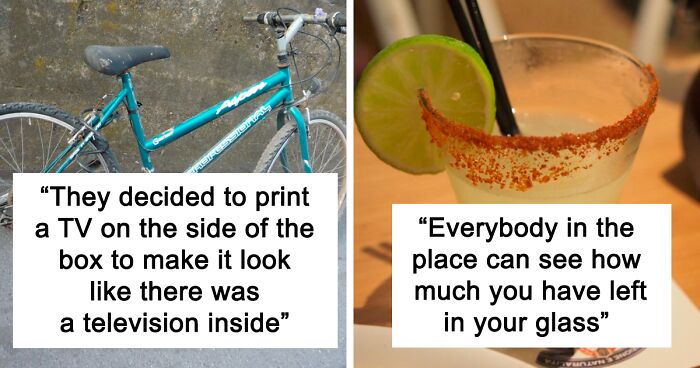
"The bicycle company 'Vanmoof' had a problem. Customers were complaining because they were receiving their online orders damaged as delivery people were mishandling packages, throwing them on and off trucks, etc. So the company came up with a brilliant solution by changing the packaging design. They decided to print a TV on the side of the box to make it look like there was a television inside and therefore encouraging the delivery people to be more careful with something as fragile as a TV. And the results – 80% decrease in damaged deliveries, saving the company a ton of money and headaches, I’m sure. Just for fun, they snuck a little Easter egg on the packaging that says: We like bikes And we like you And the rest of the world To ride bikes And like them too"
Am I the only one who thinks that delivery drivers damaging packages is the problem here?
The TikToker also has a YouTube channel called Disruption Theory. Here he talks about some design solutions, information technology, and artificial intelligence. These topics also vary in his podcast-type videos where he discusses these matters with other people.
Why London Pubs Have Weird Names
"If you’ve ever been to London, you might have noticed that a lot of pubs and even other places have these weird names like 'The White Lion,' 'Cat & Fiddle,' 'Bat & Ball,' 'Elephant & Castle,' etc. Now, this trend actually started out as a design solution to a marketing challenge. Since many of the pubs in Britain are hundreds of years old, back in those days, a lot of people were illiterate, which meant that they couldn’t easily identify and discover businesses. So business owners got creative and instead of using letters, they started using pictures of easily identifiable and recognizable objects in their logos, so that even people that can’t read can still find the business easily."
Design Secrets Of Medieval Castles
"Today we’re going medieval and discussing the design secrets of castles. Now when you picture a castle, you probably picture this moat or this body of water surrounding it and most people tend to think that’s to prevent enemies from entering the castle which is only half of the story. The more important role of a moat is in case the enemy decides to dig a tunnel and breach the castle from underground, they would eventually encounter the water, it will flood the tunnel, drown everybody in it and make the tunnel collapse on itself. And even if somehow the enemy found a way to breach the main drawbridge, they would find themselves in pretty much a death trap because this is an enclosed space with holes in the wall that allows the castle army to shoot arrows, throw rocks and pretty much decimate anybody in there. Now my favorite part is the sinister design of the castle staircases. Most castle staircases are spiraling clockwise going up, and that’s for a very clever reason. Since most people are right-handed, that means two things: 1. If the enemy has their sword in their right hand, if they’re going up, they don’t have much room to swing upwards because their right hand is closer to the edge. 2. If they chose to have their shield on the right hand, that would mean their sword will be held by their less dominant left hand, giving them a disadvantage. Another sinister design secret is that the staircase steps are not all the same height. Some are shorter, some are taller. Now you probably know from personal experience that as little as a quarter-inch of a difference can make you trip on the staircase, so imagine being the offending army, running up a dimly-lit tower, tripping over stairs left and right, meanwhile, the castle army has memorized which steps to skip, so they can make their way up the tower much quicker without tripping."
Don't forget the murder holes that they could sling boiling oil or lime down, and arrow slits which are wider on the inside allowing arrows to be shot in different directions whilst presenting a very small target to the enemy. Also, there was usually a fortified Keep in the middle which was a last defence if the walls were breached.
Psychology Behind The Color Known As Baker-Miller Pink
"Today we’re discussing the strange psychological effect of the color known as Baker-Miller Pink or P-618. It was first developed in the late '70s by Alexander Schauss who at the time was studying the physiological effects of color. He discovered that this very specific shade of pink had a very profound calming effect on people. It would make them relax, lower their heart rate, breathing, and even curb their appetite. So he set up an experiment in a correctional facility by painting some of the jail cells pink in hopes of reducing aggressive and violent behavior in inmates. And sure enough, that’s exactly what happened. Shortly after the color went up, the number of violent incidents plummeted. Now since that experiment, this color has been widely used by drunk tanks, psychiatric wards, and most controversially, in sports. Some sports stadiums, like the University of Iowa, have painted the visitor’s guest locker room in Baker-Miller Pink in hopes of pacifying and calming down their opponents before a game, giving them a home-court advantage."
Bored Panda contacted the concept designer and inventor Svilen to find out more about his work. His audience can find interesting and thought-provoking information on his YouTube channel and on his website. Svilen shared that the idea to reveal design secrets on TikTok came from his “observations during travels and personal archive over the years.”
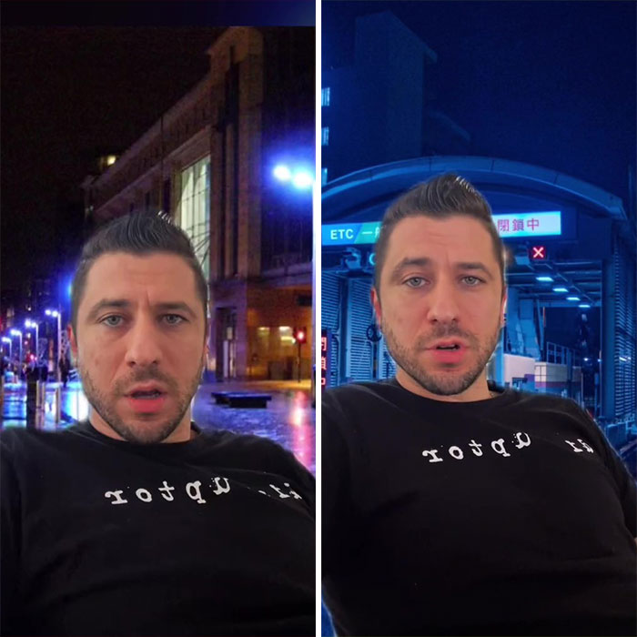
Psychology Behind Blue Street Lights
"In the year 2000, the city of Glasgow, Scotland installed blue street lights in certain parts of the city to make them more aesthetically pleasing. But shortly afterward, they noticed something surprising. Crime went down in those areas. A few years later, in 2005 the City of Nara, Japan’s police department implemented the same strategy by installing blue lights in areas with high crime and surely enough they experienced a 9% decrease in crime. Soon after, a Tokyo railroad company installed 8 blue lights at train stations that were experiencing a lot of suicides and virtually overnight after the blue lights were installed, suicide attempts went to zero. Now, this effect is not 100% scientifically proven but there seems to be some minor correlation. And while nobody’s really sure why this happens, there are a few explanations floating around. It could be that blue light is subconsciously associated with police presence or maybe just has calming properties since it is used to treat seasonal depression."
They also make it impossible for needle users to find a vein. This would move that element, and probably their suppliers, out of the area.
Why Some Sneakers Have Fabric On Their Soles
"There is a very specific reason why brand new converse sneakers come with this fuzzy fabric on the bottom of their sole. And that reason is taxes. The tax reporting for sneakers is 37.5%, but the law states that if more than 50% of the sole is covered in fabric, that legally classifies it as a slipper, which is only taxed at 3%. This legal maneuver is known as tariff engineering and it’s applied in other industries as well. For example, human action figures and toys are taxed higher than non-human action figures, which is why Marvel argued in court that the X-men are non-human to pay lower taxes. Tariff engineering is the reason why DSLR cameras can’t record longer than 30 minutes. It’s not that they’re not physically capable but if the manufacturer enabled them to record more than 30 minutes, that would legally classify them as camcorders and video recording devices, which are taxed much higher."
Nothing new about this. The beautiful mansard roofs of Paris, often multi-storied, exist because attics were taxed lower than full floors.
In his short videos, the creator manages to explain things in an entertaining and educational way. How long does it take to make one of these videos? The creator stated that after the research is done, it usually takes an hour or two to make one video. He also revealed where he gets his inspiration from: “Initially from my personal notes and research, but as of lately, friends & family and awesome fans have been sharing interesting design secrets with me.”
Clever Plumbing Design That Traps Dangerous Gases
"You’ve probably noticed this U-shaped pipe underneath most sinks, but what I bet you probably didn’t know is that this is actually an ingenious design component that serves as a one-way valve that traps nasty and dangerous gases from coming back up into your room from the sewage, yet it allows water to run through all the way. What makes this design particularly clever and elegant is the fact that it doesn’t use any extra parts or even electricity. It simply uses the water which you already use, so whenever you cut the faucet, some of the water hangs at the U-shape here, which acts as the stopper from the gasses entering back up into your room. These things are standard across most of the Western world."
Yes, this is the basic principal of a U-bend. It stops nasty niffs from coming back up the plughole. It is used on all sinks and toilets in the UK. When draining lots of water it will act like a syphon and help keep the flow going. The sink overflow normally plumbs in above the U-bend (not shown in the picture behind him).
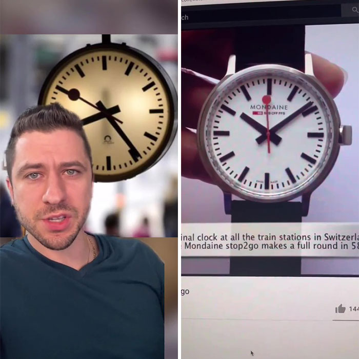
Switzerland Railway Clock Design Secrets
"Switzerland is known for timekeeping and luxury watches. So here’s a design secret that the Swiss railway clocks used to create the illusion of punctuality. All of the clocks in the train stations actually run 1.7% faster. This means that it only takes the second hand 58 seconds to complete an entire minute, after which it stops at the top and gives an extra 2 seconds for trains to leave on time, creating the illusion of punctuality. The same company actually makes wristwatches that feature the exact same mechanism."
No one really knows the recipe of how to become viral, but it seems that this creator is on the right track. When asked if he was surprised to see his content become viral, he stated that he was sure that this topic would be interesting for people, but he didn’t expect to gain so much attention. According to him, “it’s absolutely surreal” to gain more than 500k followers and over 35 million views in just 40 days.
Secret User Experience Design Of Elevators
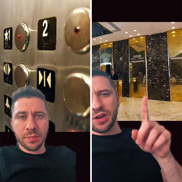
"Today we’re gonna talk about the secret user experience of elevators. So let’s start with the button panel first. You might have seen this button right here and assume that when you press it, the doors actually close, but in reality, it does nothing. This is a dummy button. Think of them as fidget spinners. They are just there to give you something to do while the doors are closing and to kinda ease your nerves. Moving on to the actual floor numbers. Next time you’re in an elevator, if you pay close attention, you might notice there is no 13th floor. It goes 10, 11, 12, 14, 15, all the way up. And that’s actually for a cultural reason. In a lot of societies, the number 13 is thought to be very unlucky, and Asian countries especially are very sensitive and superstitious of those beliefs. So elevator creators just skip over 13 and go straight to 14. Moving down to the lobby, you will notice a lot of mirrors and reflective surfaces. It could be the elevator doors themselves or just decorative mirrors hanging around. And those are there to actually distract you from the fact that the elevator is taking a long time. It creates the illusion of faster times. The same principle is used inside of elevators as well, which is why so many of them have mirrors on the inside. It gives you something to do and not notice time as you’re going from floor to floor, but also reduces anxiety and nerves because some people are genuinely scared on the elevator, so it takes the edge off."
The close button does actually work in some lifts, but it is not a direct connection to the door motors, so the lift can choose whether to prioritorise the outside call buttons, or a minimum open period. In the UK you will find many streets don't have a number 13 - I live on one of them. Also it tickles me that Otis are based in Reading and that there is the Schindler lift company.
Why Alcohol Is Served In Transparent Glasses
"There is a reason why every single club and bar in the world serves alcoholic beverages in see-through glasses, and I bet you never really thought about it. The reason is actually a genius psychological trick that leverages social shame to get you to spend more money at the bar. Just think about it: whenever you get a drink from the bar, everybody in the place can see how much you have left in your glass. And whenever you finish your drink, it’s embarrassing to stand there holding an empty glass, right? People might think that you can’t afford another one, so subconsciously you go to the bar and you buy another drink just not to stand there and hold an empty glass. And that’s how bars psychologically exploit you to spend more money."
No...I'm gonna call bullshit on this one...it's glass! And glass is transparent...that is all....
This guy is talking out his butt. His claim about animation is all wrong. I used to shoot animation for a living, as did my father and my grandfather worked for Max Fleischer studios. His calculations about number of frames is incorrect. There are still 1440 frames in a minute of film animation no matter how you simplify the motion. Referring to motion, animation is most often shot on 2s meaning there are generally only 720 setups per minute. Animation was done in layers (feet, arms, body, head, eyes, mouth, etc.) long before the 60s. Fantasia used layered animation and that was shot in the late 1930s. Additionally, animation can be shot in layers with or without neck coverings. Also, I find it highly doubtful that Hanna Barbera ever cranked out 6 hours of animation per week. From my experience you would probably need 20+ animations stands working 2 shifts a day. Not to mention the amount of ink and pain artists needed to keep 20+ stands busy operating double shifts.
I always assumed they covered the necks because it's one of the hardest parts of the body to "cartoonify" - that is, it tends to look wrong when you have the usual large cartoon heads on smaller bodies etc. It's just easier to hide it. :p
Load More Replies...That guy is completely talking out of his ass. In every single post, at least one thing is wrong...

 Dark Mode

 No fees, cancel anytime


