We all strive to have a cozy, comfortable, and stylish home. Our idea of what it should look like we gather from our environment – homes we visit, social media, or anywhere else – the options are endless.
One such place is the Instagram account called "The 60s Interior." As the name suggests, it shares photos of interiors that were popular during the 1960s, but here's a twist – it also contains pics from other decades. We created a list of these images for you to get inspired by or simply enjoy. So, how about we get into them?
More info: Instagram
This post may include affiliate links.
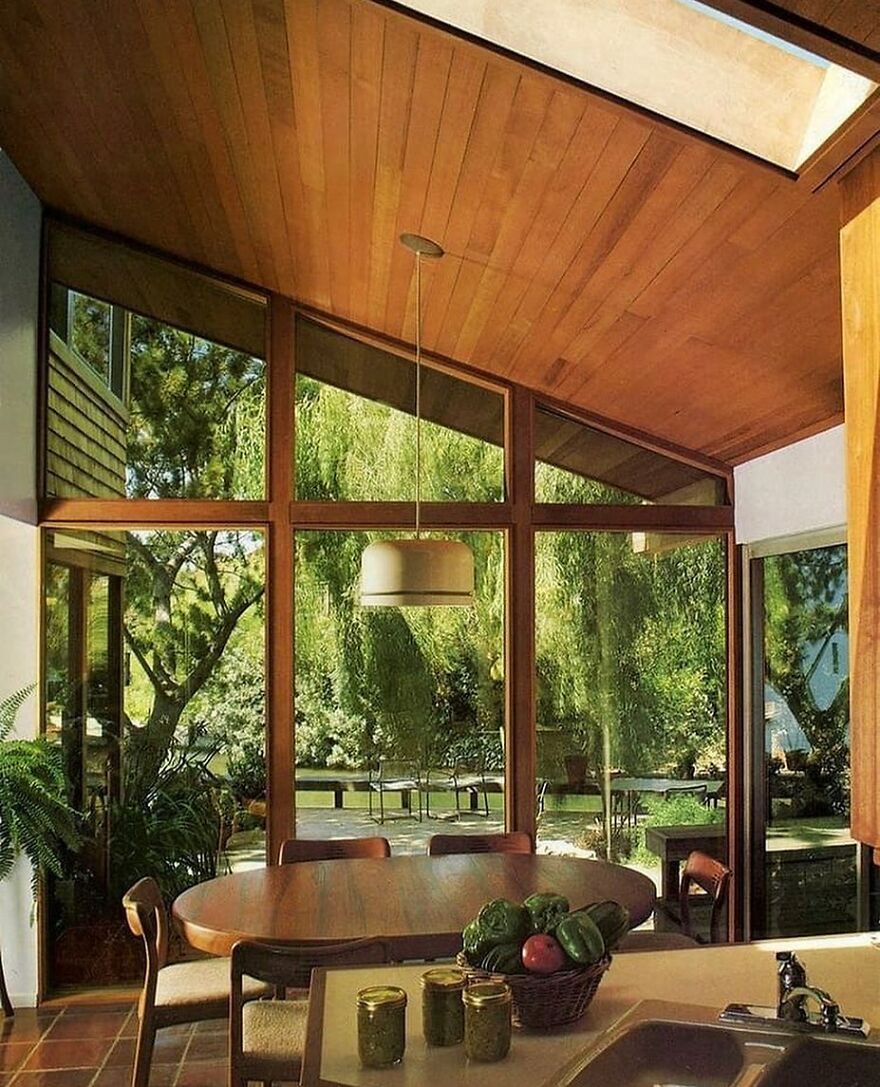
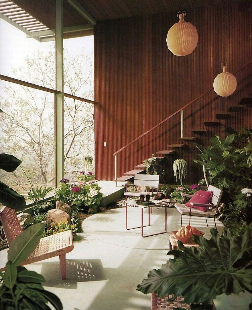
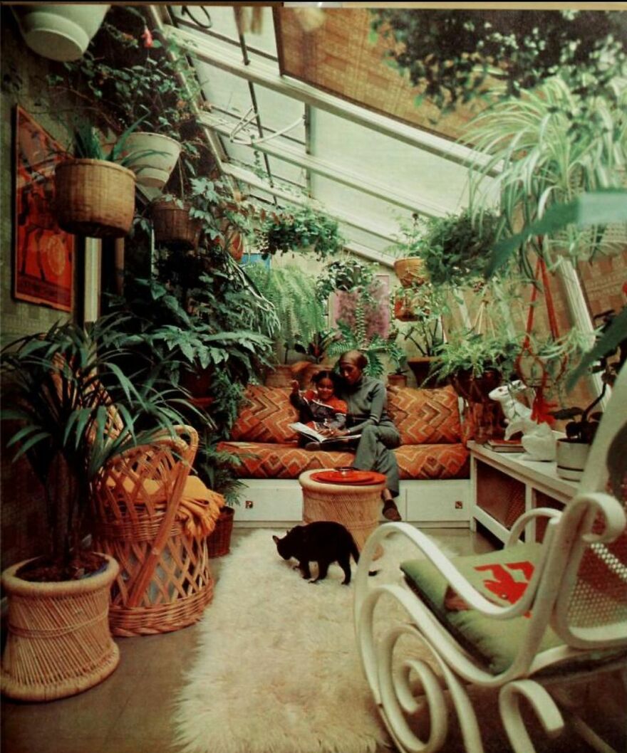
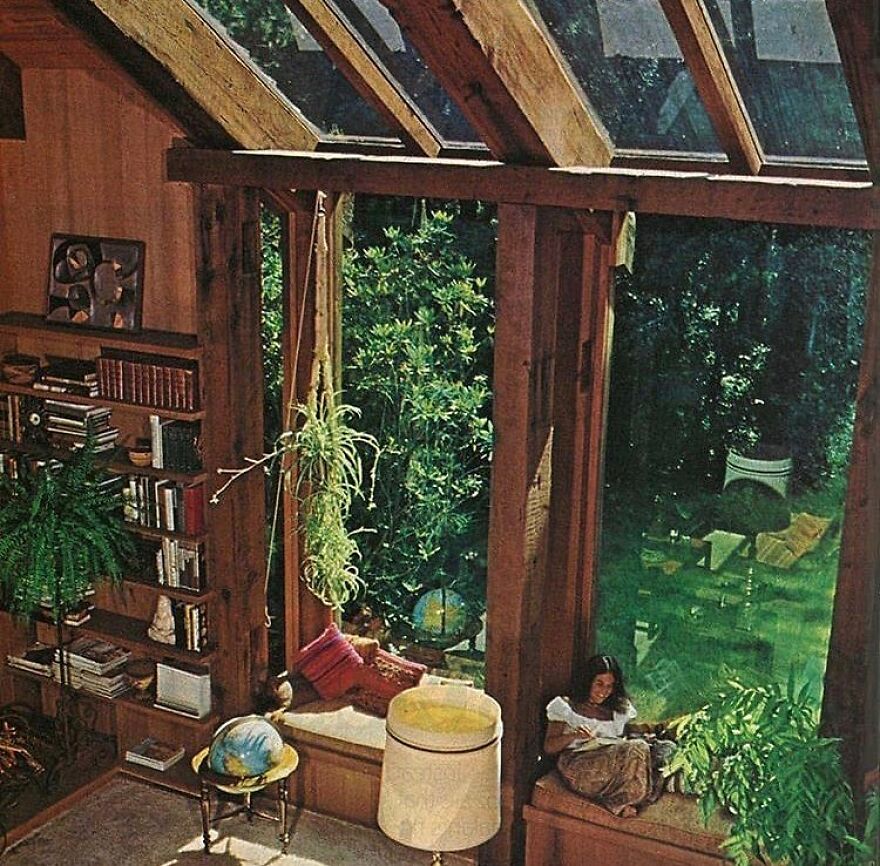
Cosy Windows And Skylight In The 1971
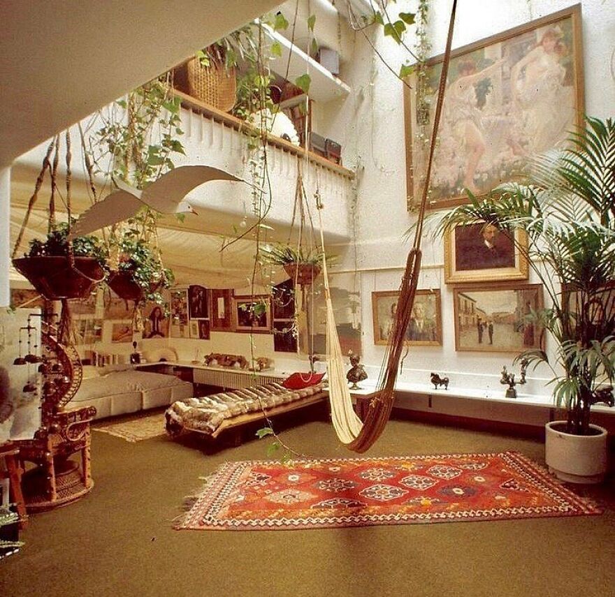
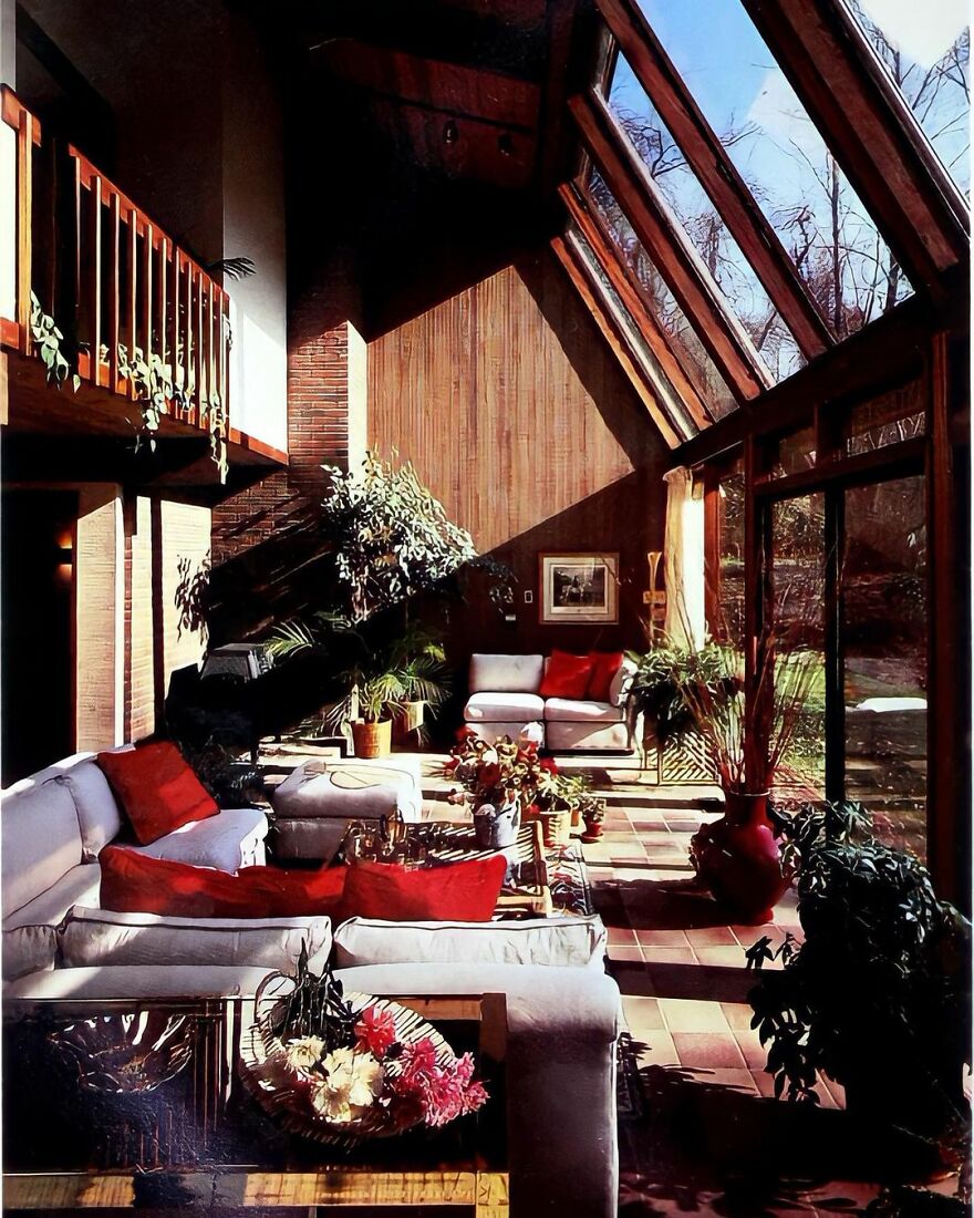
Huge Living Room From The 1970s
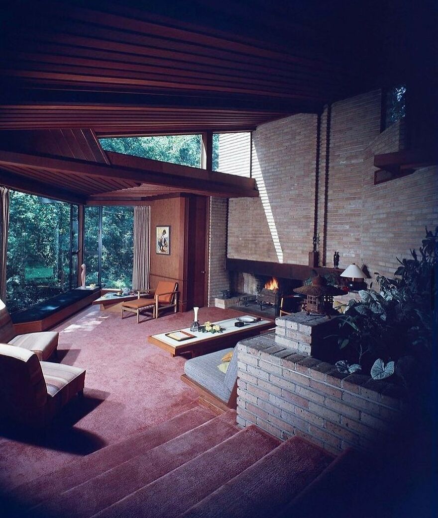
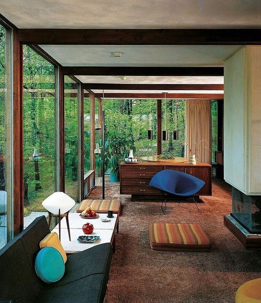
Karl Kamrath House In The 1951 That Was Designed By Frank Lloyd Wright
Ever since people existed, they've always wanted to create a pleasant environment for themselves. That’s why interior design exists.
As Encyclopedia Britannica put it, while the need to have a pleasant environment isn’t new, interior design as a thing kind of is. The term “interior decoration” was used for the first time in 1904. Years later, in the 1930s, the similar term “interior designer” was coined by an “Interior Design and Decoration” magazine. Little by little, the concept of interior design and its profession developed.
Nowadays, sources like Wikipedia describe interior design as the art and science of designing the interior of a building in a way that it becomes a safe, functional, and aesthetically pleasing environment for the people using it.
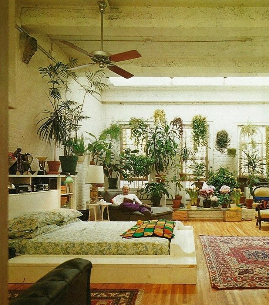
Apartment Full Of Plants From The 70s
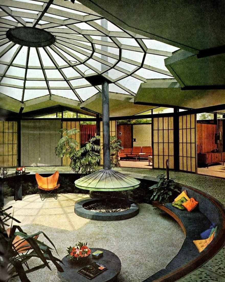
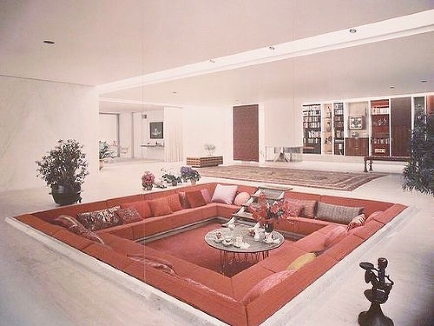
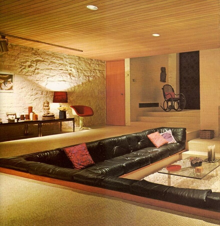
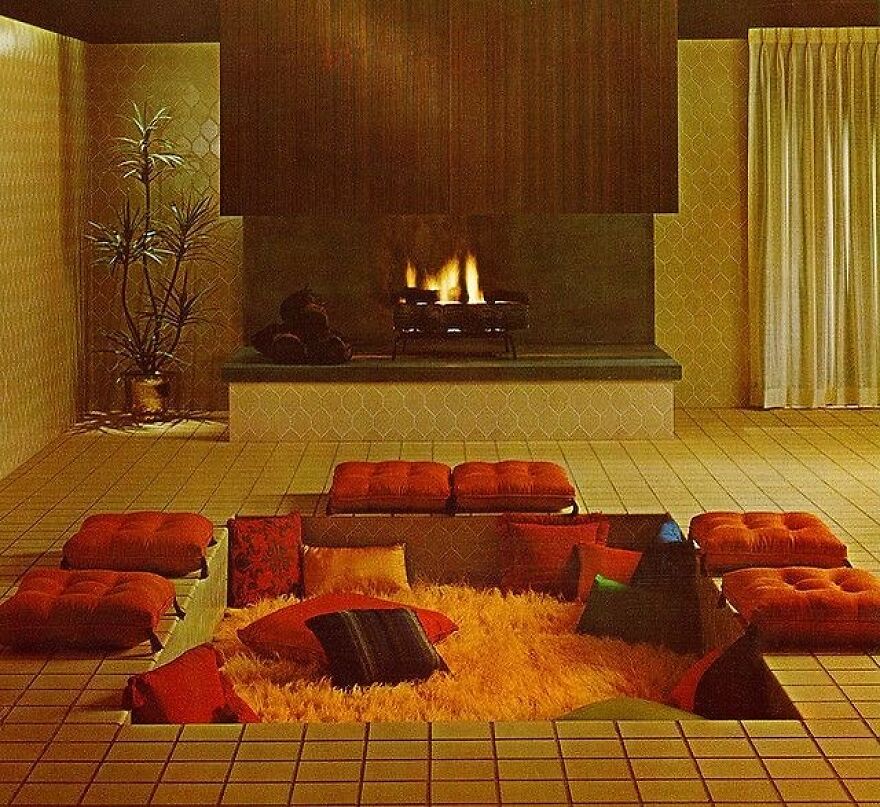
Comfy Conversation Pit From The 1960s
We had one in our 1970's home. Long, rectangular with a fireplace across one end, the step out/up at the other end and padded benches down both side. My mom called it "The PooPoo Pit."
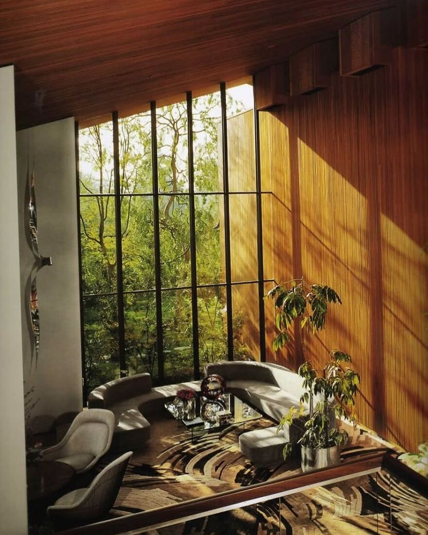
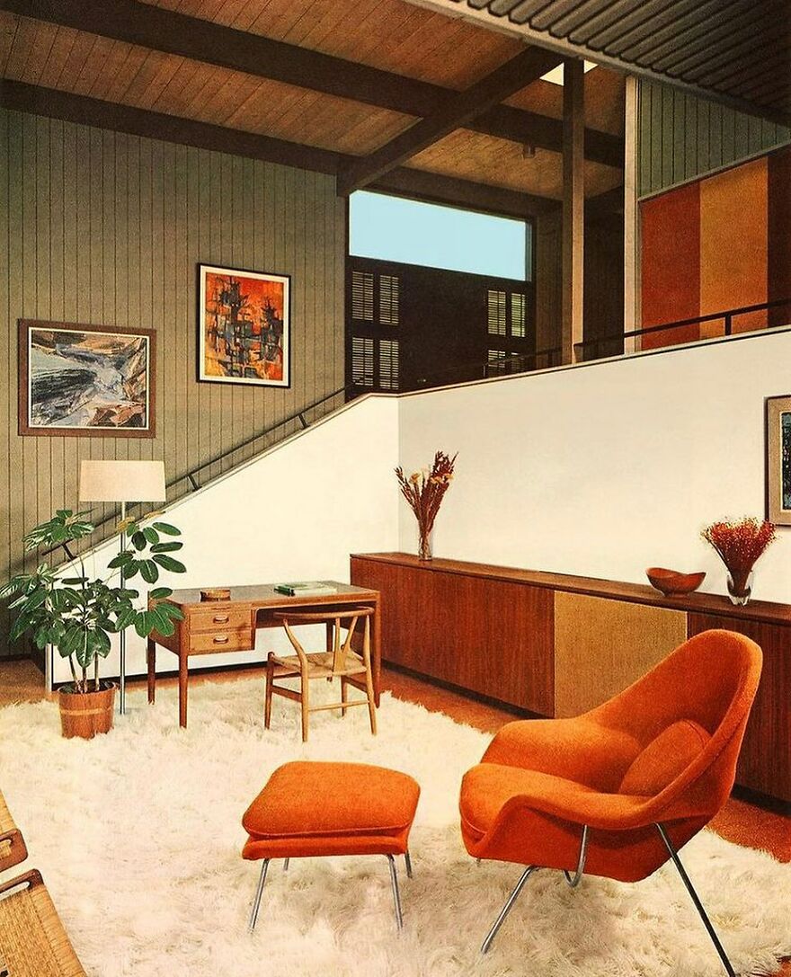
High-Ceiling Living Room From The 1950s
While the things that are considered safe or functional stay relatively similar over time, things that are considered aesthetically pleasing change quite often. In fact, usually, each new decade brings new things that are considered beautiful and throws out things that are no longer viewed as such.
As an example, let’s take the 1960s. As some of you might be aware, this decade saw the origins and spread of the hippie or counterculture movement. This movement rejected conventional customs and traditional authorities and advocated for peace, love, social justice, and revolution. The effects of it are still felt to this day.
Besides sociopolitical, fashion, and lifestyle stuff, the movement's political life influenced interior design too. The spirit of change was in the air. Apparently, hippie ideals created a desire for communal living spaces and challenged conventional home design ideas.
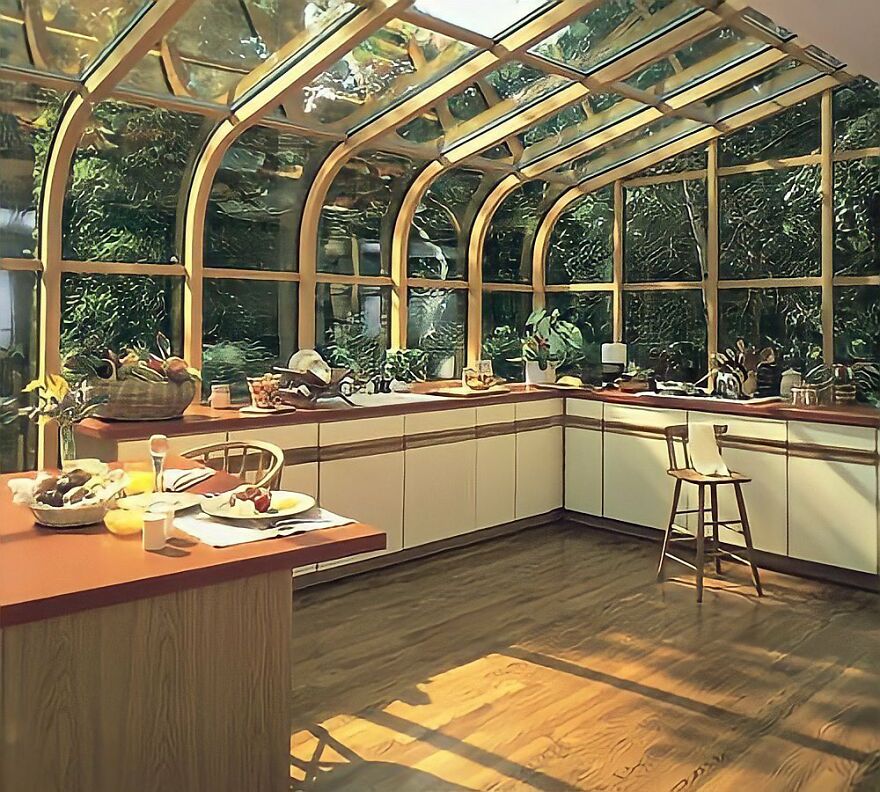
A 1980s Kitchen With A Greenhouse Vibe
Spacious Living Room From The 1970s
This is way more fashionable than most houses in the 70's. Everyone I knew had brown and orange polyester everywhere.
Mellow 1970s Sun Porch
At the same time, the counterculture movement wasn’t the only one that influenced interior design back then. The pop art movement had its say too. Just like hippies, pop art's roots were in challenging current norms. Only, it mainly opposed dominant approaches to art. The movement drew inspiration from Hollywood movies, comic books, pop music, and many other things.
So, pop art led to interiors having abstract and geometric patterns. It also had vibrant colors – for instance, orange, electric blue, and lime green paired with contrasting neutrals like white, gray, or black.
Crites House By Architect Ray Crites Designed In The 1961
Room Perfect For Sunbathing In The 1970s
A Charming Home From 1967
The decade’s advancement of technology also influenced interiors. It brought the use of materials like plastic, molded fiberglass, and acrylic. With them, the furniture embraced futuristic, unconventional shapes. The aim of the design was to be oversized and eye-catching. Think of the bubble chair, which originated during this period.
Speaking of '60s interiors, there’s a whole Instagram page dedicated to them – @the_60s_interior. Granted, the name says its focus is the '60s, but the bio adds that there are some images from the '50s, '70s, and '80s. So, maybe we could say it’s a page of vintage interior photos.
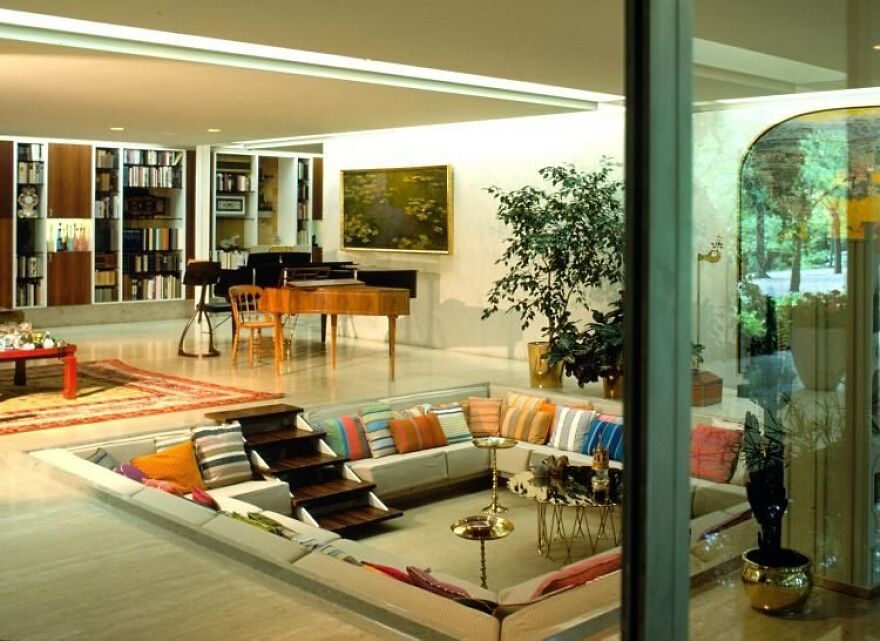
Pillow-Filled Conversation Pit In The Miller’s House That Was Built 1957
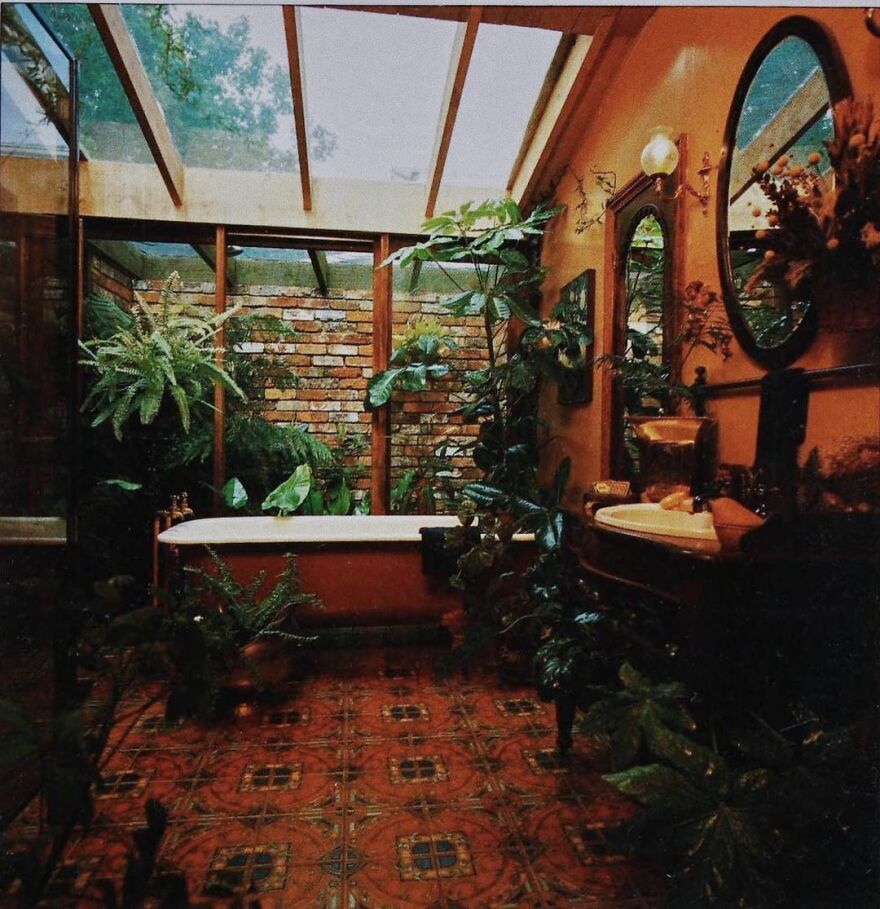
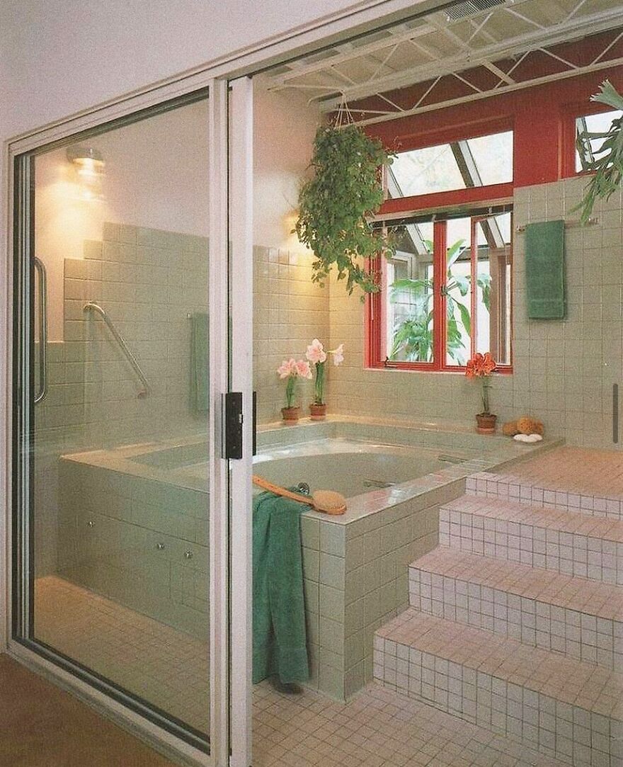
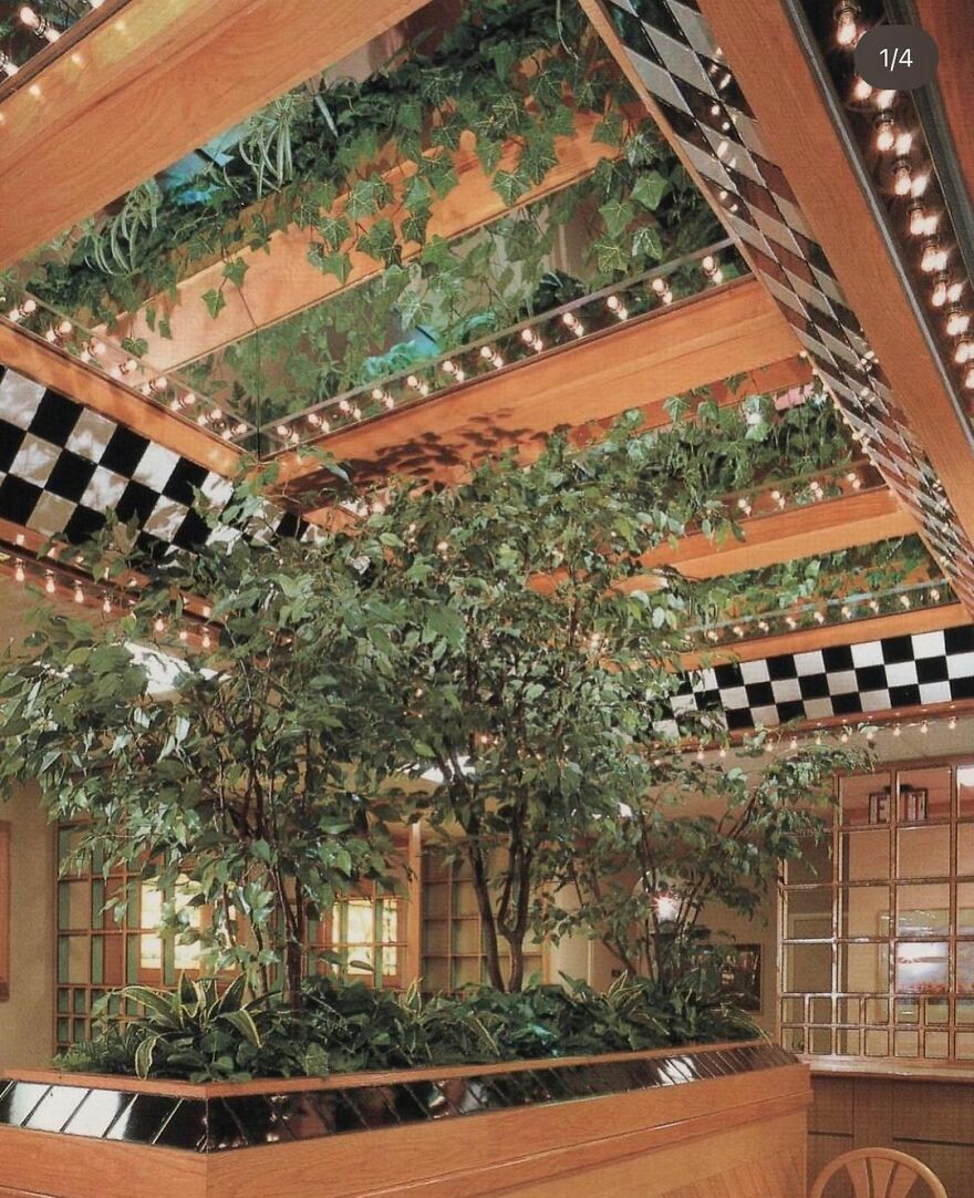
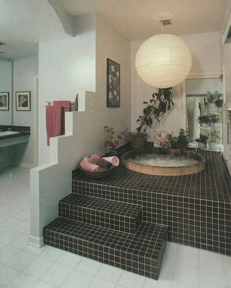
A Plant-Filled 1980s Bathroom
Huge, But Cosy Living Room From The 1970s
people don't realize how hot and cold thee rooms can get...look pretty, but just awful to live in
Either way, the images are stunning enough for the page to gather over 249K followers. Plus, each post gets at least over 700 likes, but more often than not gets over 1K or even over 2K.
Well, it’s no secret that people like peeking at interiors. After all, TV shows about them tend to be a guilty pleasure (or sometimes not even that guilty) for many. Clearly, as this account shows, not only TV shows about interiors are liked by the public, but images of them too.
That’s where our list comes in – here you can find plenty of photos of vintage interiors, collected from the @the_60s_interior page. So, now it’s your chance to decide which of these images are the most captivating by upvoting them!
Sixties-Interior-Images-Instagram
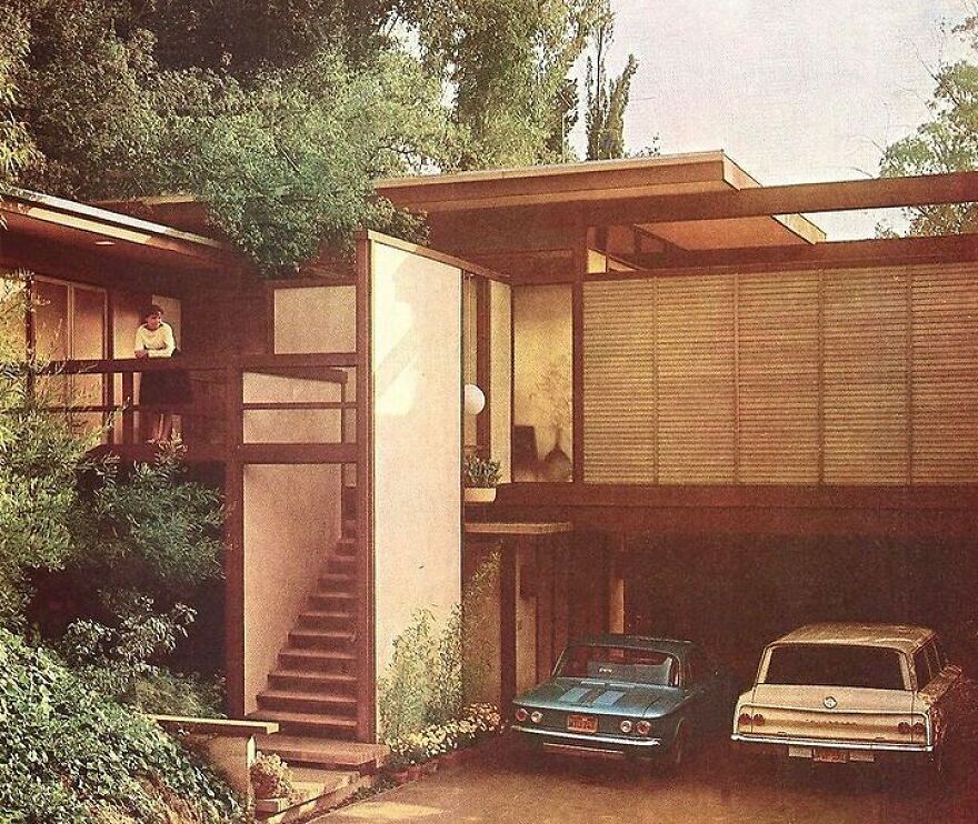
Mid Century Modern House In Weston, Connecticut That Was Designed By Thomas H. Fleming
A 1980s Kitchen Kind Of Similar To The One In Poltergeist (1982)
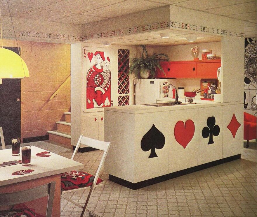
Ace Of Kitchenttes, 1970s
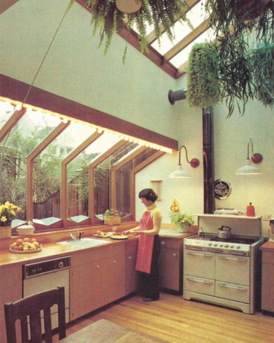
A 1980s Kitchen With Skylights And The Cook In Action
Way more stylish than any 80's kitchen I was ever in. Most of them were hideous. :)
Conversation Pit In The Miller House Built In 1957
How many friends do you need to have to fill that? Not sure I qualify...
A 1970s Conversation Pit In A Room With A Clockwork Orange Vibe
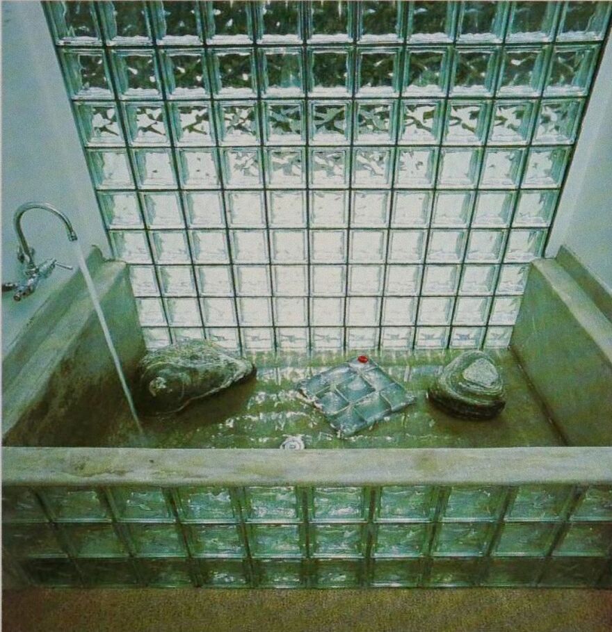
Eerie 1980s Block Cube Bathtub With A Window
Homey Bath From 1986
McDonald's Looked Very Different In 1987
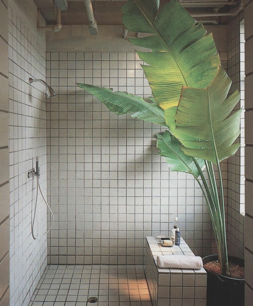
1980s Bathroom With A Huge Plant
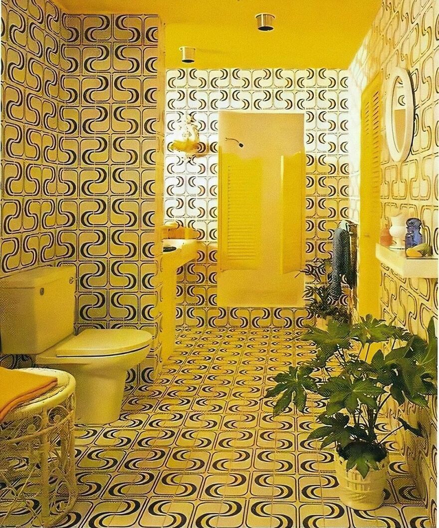
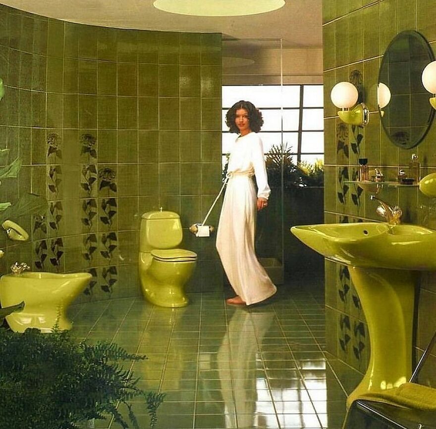
Overly Yellow 1970s Bathroom
Villeroy & Boch Bathroom Designed By Luigi Colani In 1975
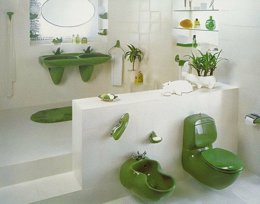
A Vibrant Green Bathroom From The 1970s
A Unique Bath Design From 1986
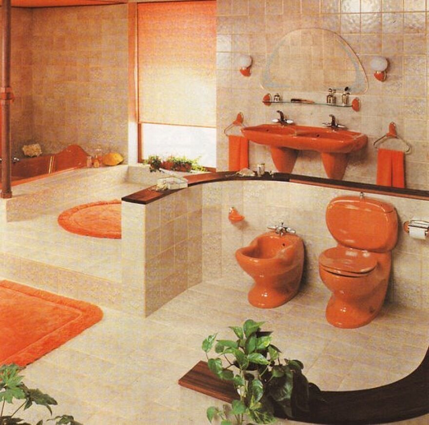
Orange Vintage Room, Decade Uncertain
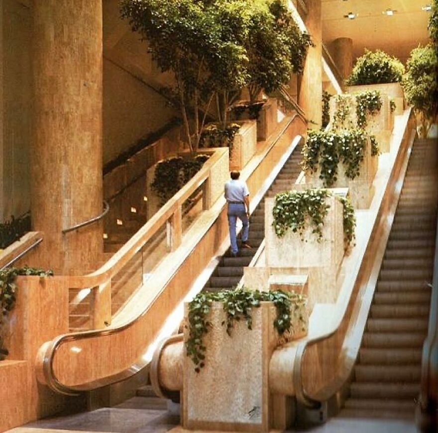
The Staircase At Water Tower Place In The 1980s, Which Has Since Been Modernized
A Relatively Tiny Conversation Pit In A 1970s Home
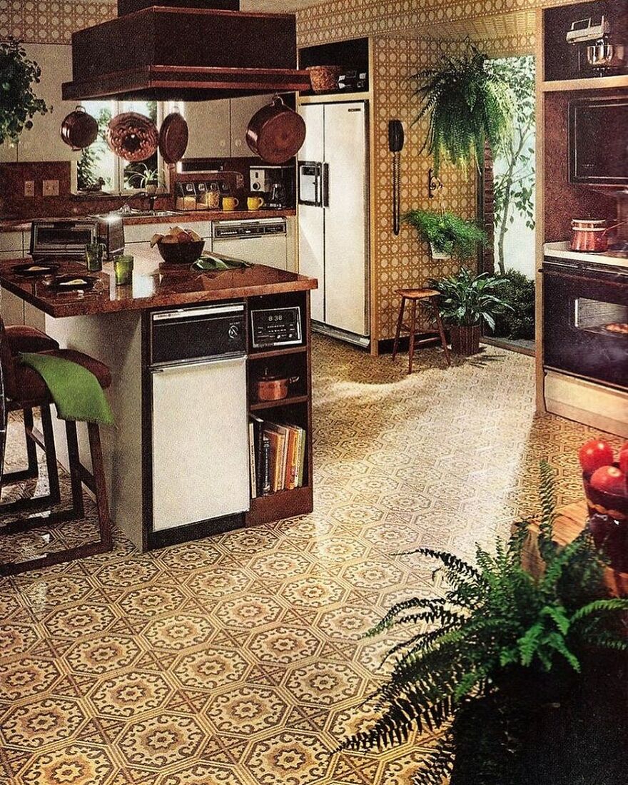
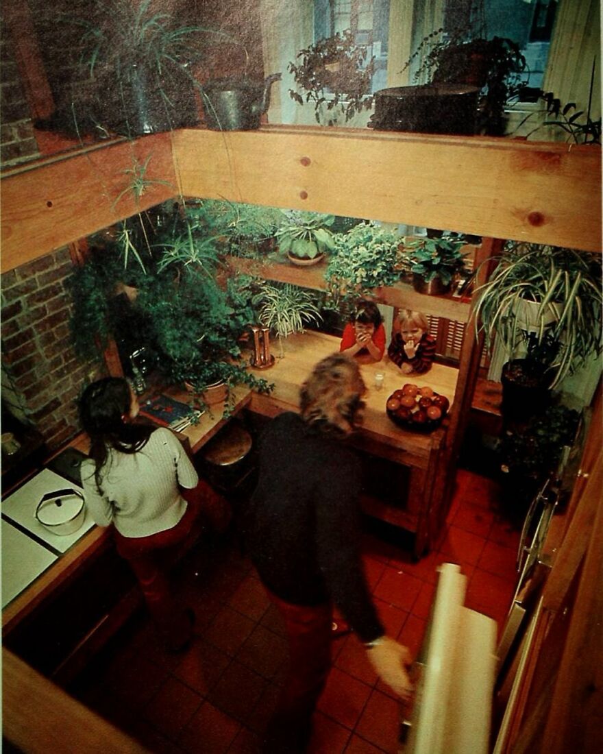
A Lived-In, Plant-Filled Kitchen From The 1970s
I've learned that kitchens in the 70''s were much smaller than they are now. The focus was more on conversation pits and large living rooms where people could gather while the host(ess) conveyed edibles from the kitchen. Since then, the kitchen has evolved into a gathering place in it's own right. Thus, doing away with some other amenities.
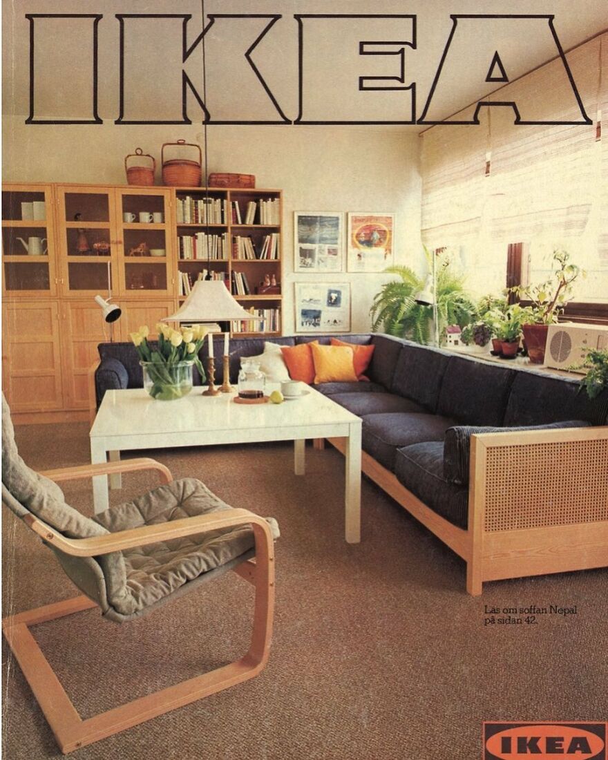
A 1977 Room From The IKEA Catalog
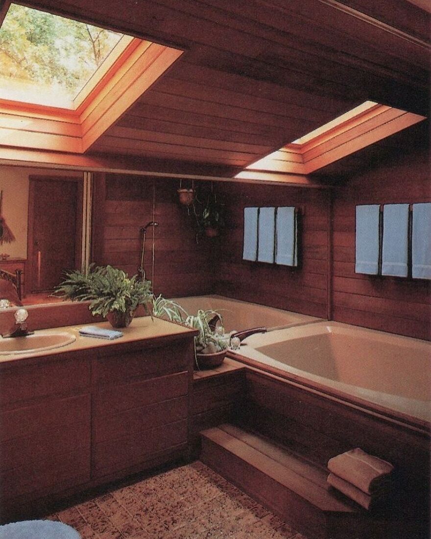
A Bath From The Rodale's Home Design Series In 1987
I wouldn't want a skylight directly over the bathtub these days on account of drones.
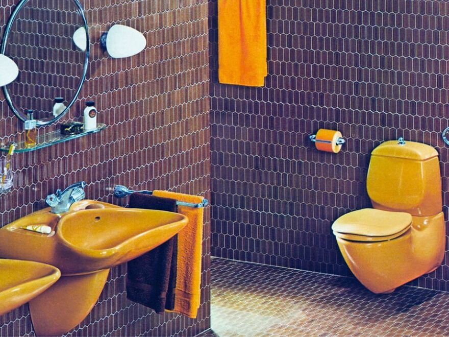
Yellow-Brown Villeroy & Boch Bathroom Designed By Luigi Colani In 1975
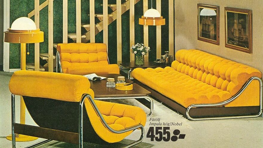
Yellow Bubble Couch And Armchair From The IKEA Catalog Of The 1970s
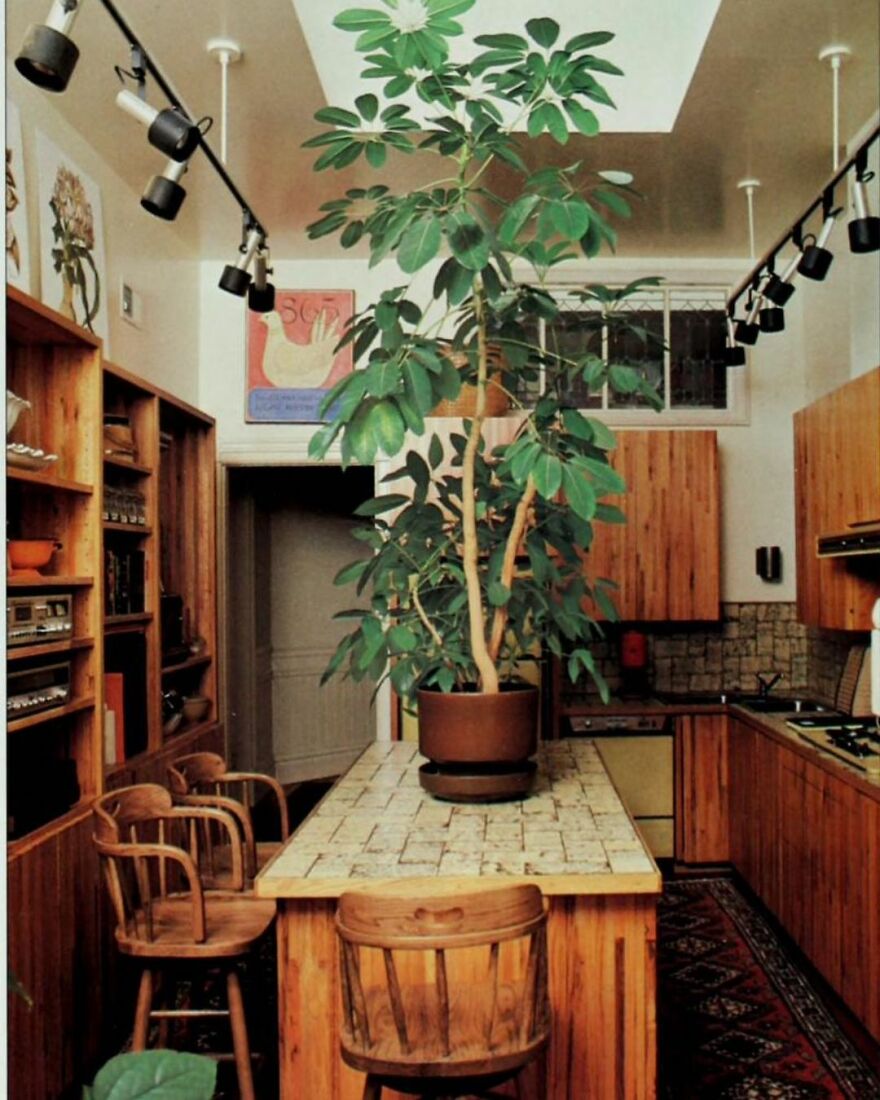
A 1970s Kitchen With A Huge Plant On The Countertop For Some Reason
Would’ve been nice to have dates on these. I’m old enough to remember decorating trends from then, plus clothes and cars do help put an approximate time period to them, but some people’s homes STILL look like some of these. Also, some designs just stuck a lot longer than you’d expect, usually because the people who bought the house from the people who decorated it couldn’t afford to renovate right away, so made do until they could—-and if it was a rental property (my particular experience), it stayed because the landlord was a cheapskate. So, if they’re pictures from magazines—-I noticed IKEA on one of them, and some of the rest look like Architectural Digest or some other periodical—-the publication date would help pinpoint them.
Late 70's / early 80's is magical to me, because I was little, then. Also, IDK what amuses me more, the designs or all the comments by young people concerned with safety.

 Dark Mode

 No fees, cancel anytime


