‘Hello I’d Like To Report A Poster Theft’: People Showcase 30 Movie Posters That Are Suspiciously Similar
We live in the age of replicas, look-alikes, and stolen ideas. It feels like everything good has been done already, whether it’s a song, a painting, or a clever TV commercial. The fear of being unoriginal is stronger than ever if you’re trying to produce something entirely new.
And while some try their best to come up with fresh ideas, others decide there’s no point in trying too hard. This time, we are looking at some examples of copycats in the film industry, where movie posters are everything but original.
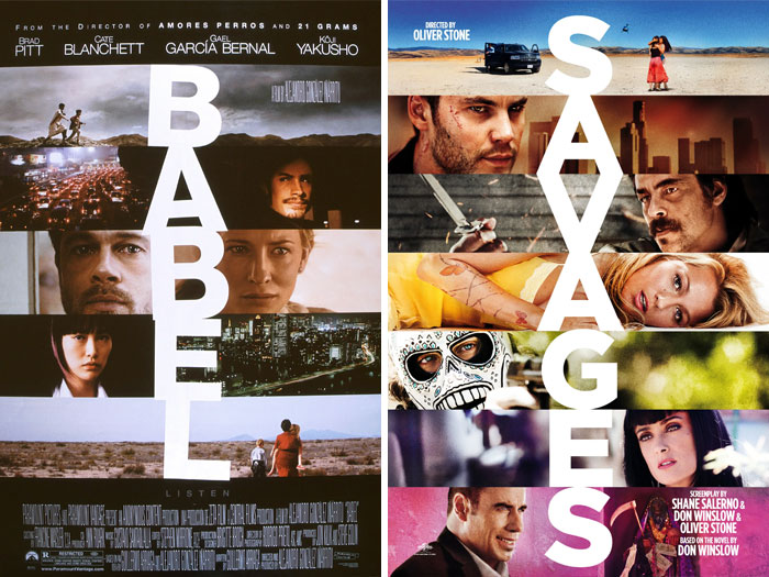
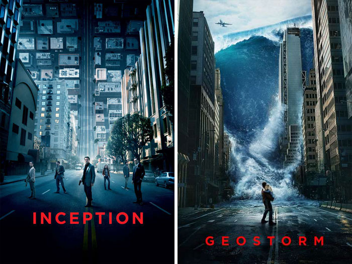
From the suspiciously similar Babel (2006) and Savages (2012) poster designs, to the look-alike Inception (2010) vs. Geostorm (2017), these can’t be just mere coincidences... or can they? Whoever came up with these poster ideas surely has no problem with being unoriginal, and this may as well be somewhat of a liberating feeling.
(h/t: Letterboxd users Bri and Malaine)
This post may include affiliate links.
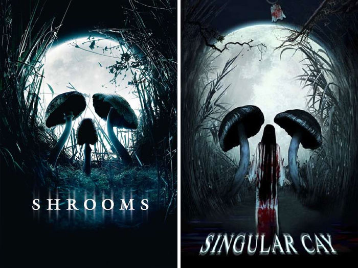
Shrooms (2007) vs. Singular Cay (2012)
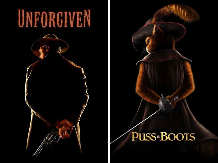
Unforgiven (1992) vs. Puss In Boots (2011)
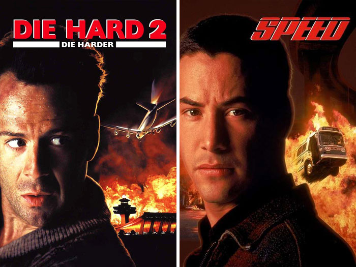
Die Hard 2 (1990) vs. Speed (1994)
I have almost forgotten those two heroes were young once. But, must say they are still handsome - Bruce not as much as Keanu, but not bad at all
Bored Panda reached out to filmmaker and entrepreneur Romina to find out if such look-alike movie posters are innocent coincidences or sinister copies. Romina explained that both things can be true in these cases: “Sometimes copies are coincidental and other times they're not. The use of similar design elements, though, is indeed deliberate.”
Romina also said that it’s quite possible that the same graphic designers were used to produce the film posters, and if that happens, “they end up with similar styles.” In that case, a look-alike poster is not a copy, but rather it reflects the style of a particular designer.
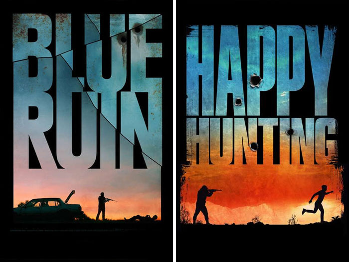
Blue Ruin (2013) vs. Happy Hunting (2017)
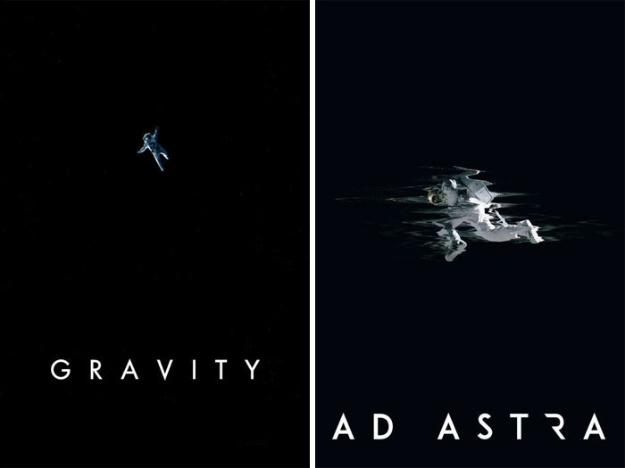
Gravity (2013) vs. Ad Astra (2019)
Gravity is better movie and have better poster! In my opinion, of course
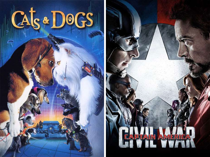
Cats & Dogs (2001) vs. Captain America: Civil War (2016)
“It is common to copy or 'take inspiration' from other works. If it isn't broken, why fix it?” Romina said this is part of the storytelling process which is as old as time itself. For example, “Shakespeare's stories have been told over and over again.”
Having said that, Romina assured that people still genuinely care about original ideas. “The possibilities are endless as new ways of storytelling are developed, like VR, for example.” It’s really up to artists and designers to decide which direction they want to go.
Ex Machina (2014) vs. A.i. Rising (2018)
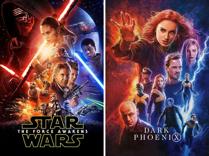
Star Wars: The Force Awakens (2015) vs. Dark Phoenix (2019)
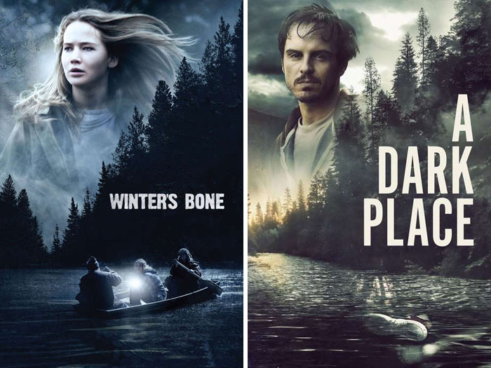
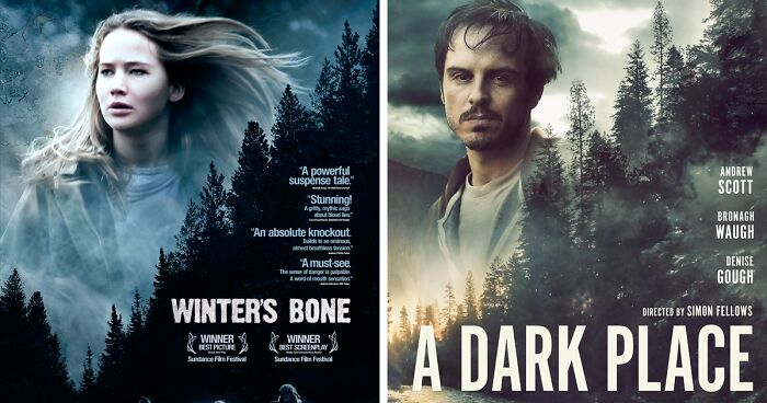
Winter's Bone (2010) vs. A Dark Place (2018)
I like much more that one with Jennifer Lawrence, must say. And movie was great also
Creating a captivating movie poster that will draw people to the cinema theaters is not as simple as you may think. The successful ones often follow a time-proven sales formula that can be traced in any movie poster you’d like to hang on your wall. It’s known as AIDA.
The first A in the AIDA formula stands for "attention." A good movie poster is one that grabs your attention on the street and steals it for some time. Whether it features the film’s main characters, establishes an intriguing level of plot, or presents a major plot point, it should be captivating.
The second part of the formula stands for iconography, which is basically showing without telling. The use of strong imagery and visual cues is what makes the design effective.
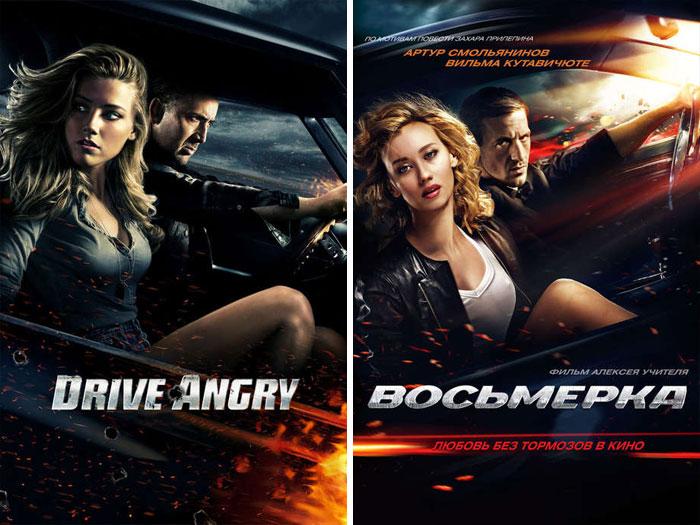
Drive Angry (2011) vs. Breaking Loose (2014)
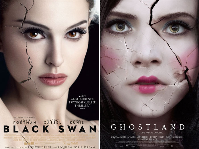
Black Swan (2010) vs. Ghostland (2018)
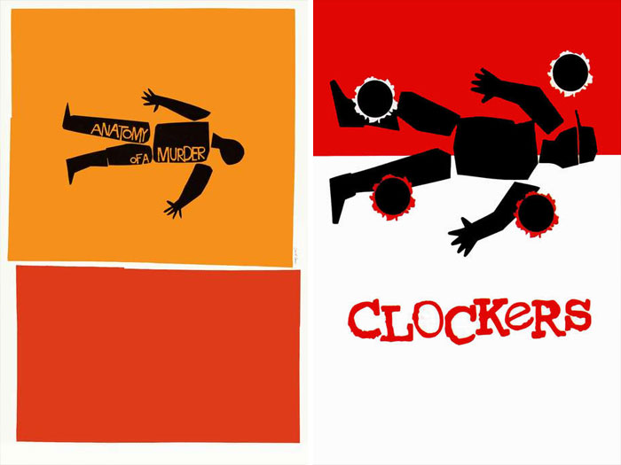
Anatomy Of A Murder (1959) vs. Clockers (1995)
Another important feature in a good film poster design is "interest." This means that your poster should offer a fresh perspective or an unusual point of view. Sometimes it puts the viewers into the middle of a scene from the film. Often, it sparks an inner curiosity as you wish to find out more.The last bit of the magic AIDA formula stands for appeal, which combines both creative and aesthetic efforts to produce a poster that will serve as a form of art on its own.
On the other hand, there’s always a danger of making your poster too artsy, as it should carry appeal for both die-hard fans and passersby on the streets alike. Long-lasting appeal in poster designs is usually found in classical movies and high-budget blockbusters.
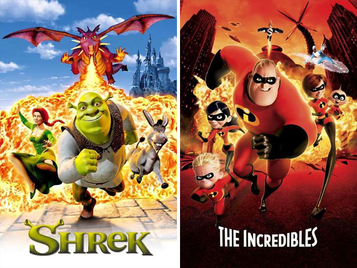
Shrek (2001) vs. The Incredibles (2004)
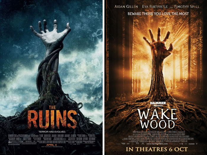
The Ruins (2007) vs. Wake Wood (2008)
Originally the movie was called Morning Wood, but then they realized the error of their ways 😂
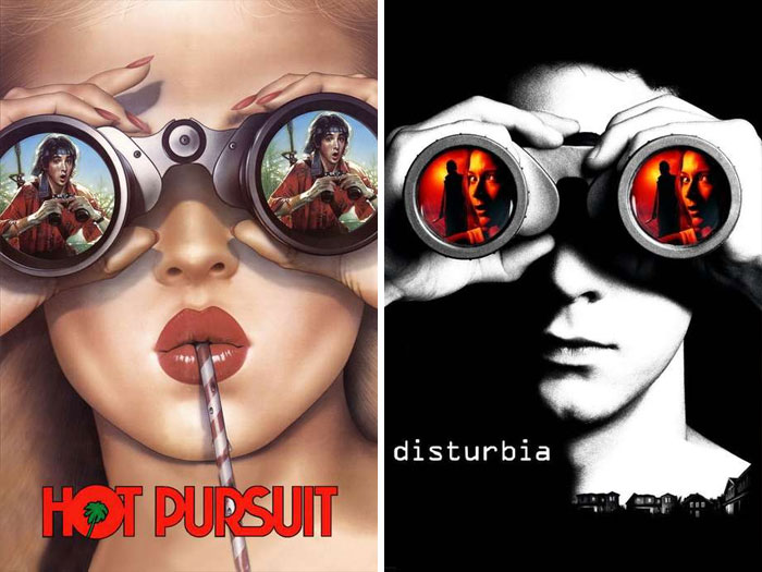
Hot Pursuit (1987) vs. Disturbia (2007)
Babel (2006) vs. Savages (2012)
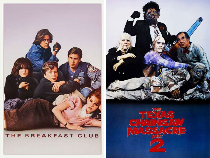
The Breakfast Club (1985) vs. The Texas Chainsaw Massacre 2 (1986)
No Country For Old Men (2007) vs. Fright Night (2011)
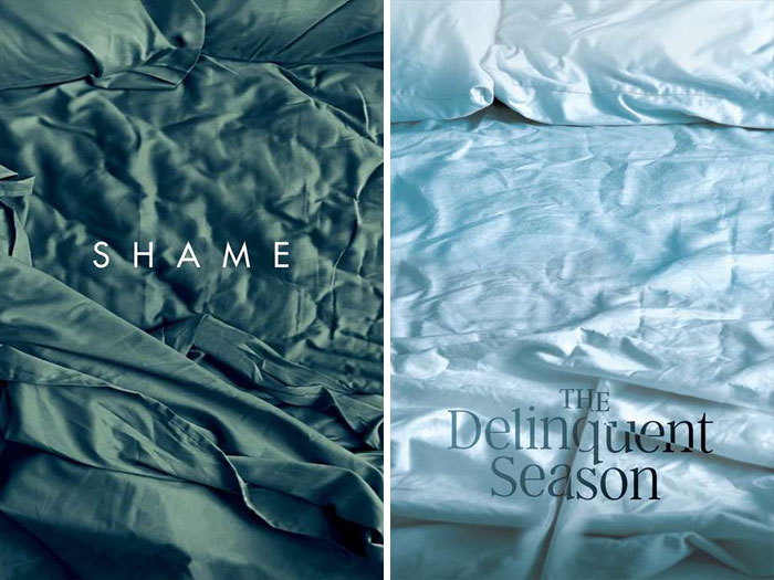
Shame (2011) vs. The Delinquent Season (2018)
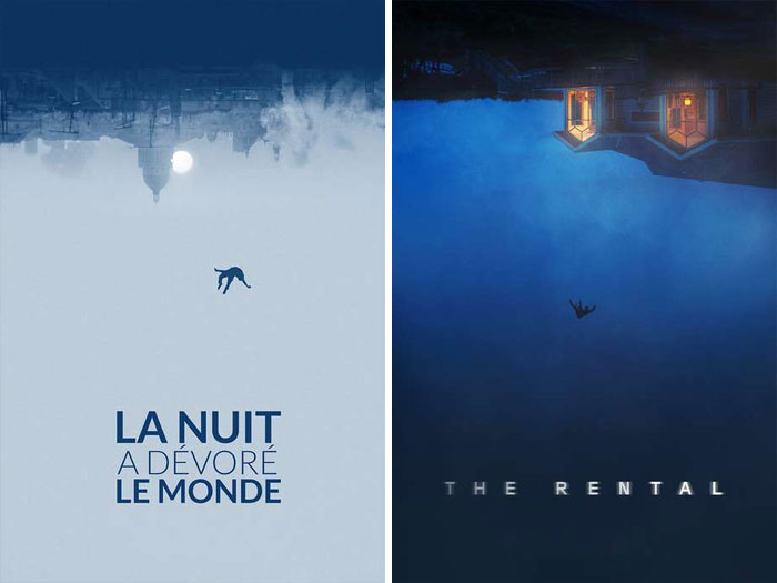
The Night Eats The World (La Nuit A Dévoré Le Monde) (2018) vs. The Rental (2020)
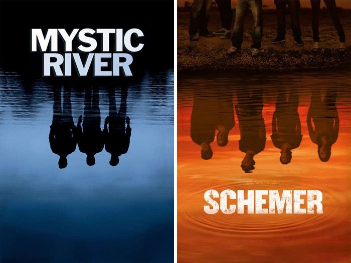
Mystic River (2003) vs. Dusk (2010)
Straw Dogs (1971) vs. Cold Fish (2010)
Lolita (1962) vs. American Strays (1996)
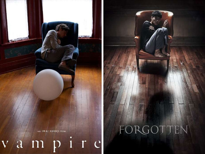
Vampire (2011) vs. Forgotten (2017)
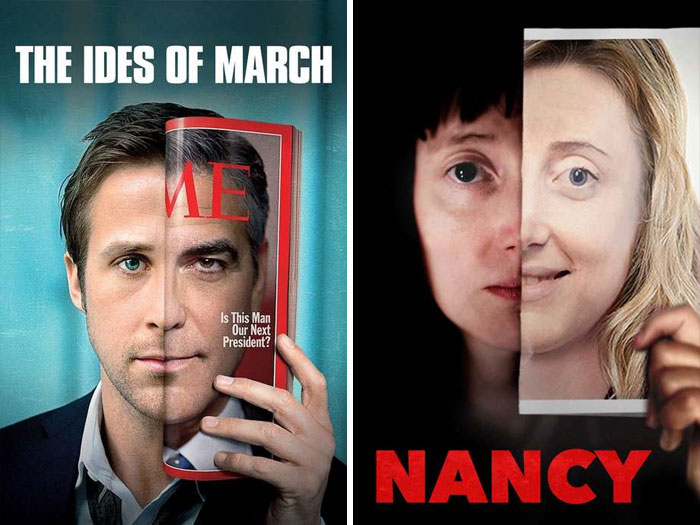
The Ides Of March (2011) vs. Nancy (2018)
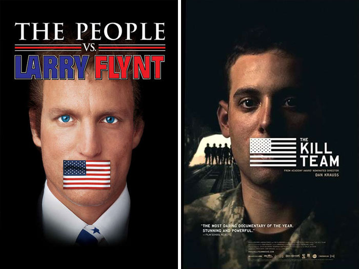
The People vs. Larry Flynt (1996) vs. The Kill Team (2013)
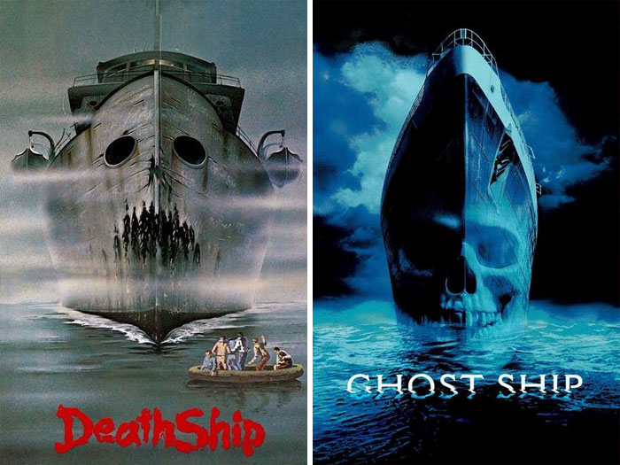
Death Ship (1980) vs. Ghost Ship (2002)
Body Snatchers (1993) vs. Berberian Sound Studio (2012)
Inception (2010) vs. Geostorm (2017)
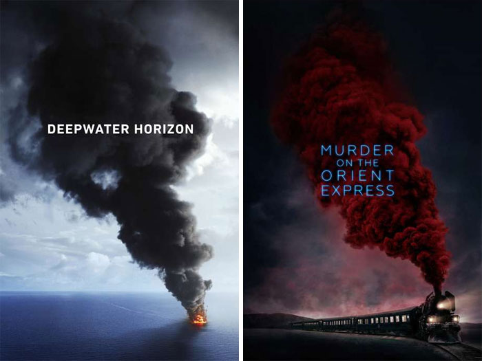
Deepwater Horizon (2016) vs. Murder On The Orient Express (2017)
The goal of the post is exactly show similar, not the same. Similar
Load More Replies...Smoke expands when it rises. This is a law of nature, not a copy cat poster.
Both plumes of smoke are traveling diagonally upward to the left and are both coming off of methods of transportation which are shown in small size in the bottom right corner. Also, a medium size font is used for the title of the film over the smoke.
Load More Replies...I prefer the colour on the "Murder on the Orient Express" poster...more ominous.
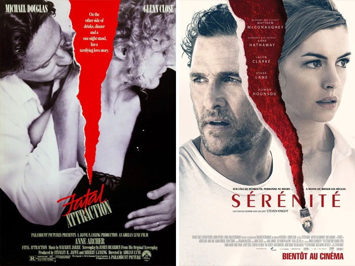
Fatal Attraction (1987) vs. Serenity (2019)
My favorite part of the second movie is when she uses her psychic abilities to save the day in bada$$ fashion.
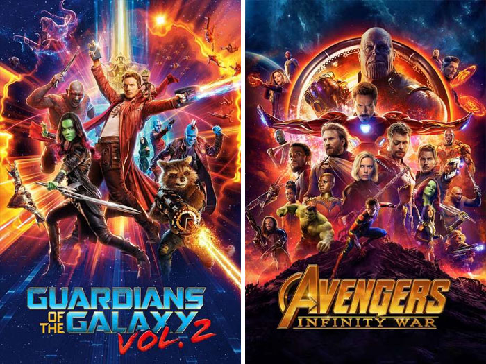
Guardians Of The Galaxy Vol. 2 (2017) vs. Avengers: Infinity War (2018)
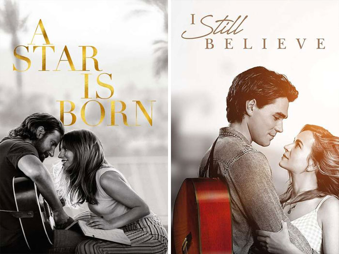
A Star Is Born (2018) vs. I Still Believe (2020)
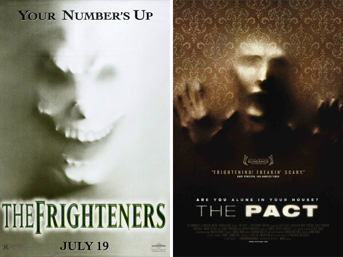
The Frighteners (1996) vs. The Pact (2012)
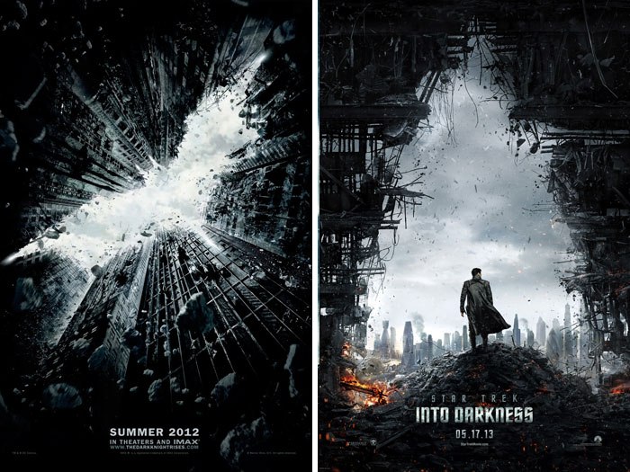
The Dark Knight Rises (2012) vs. Star Trek Into Darkness (2013)
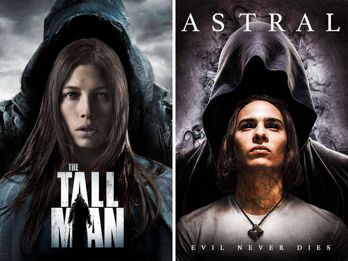
The Tall Man (2012) vs. Astral (2018)
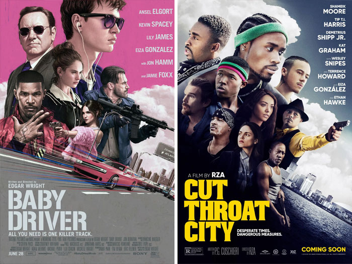
Baby Driver (2017) vs. Cut Throat City (2020)
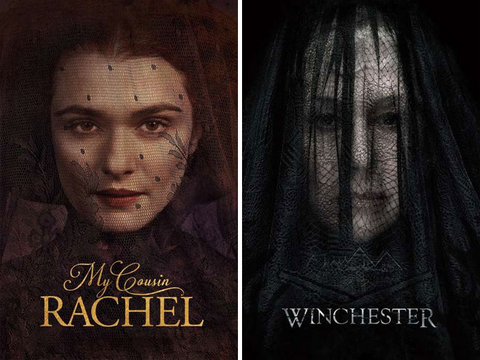
My Cousin Rachel (2017) vs. Winchester (2018)
Nothing in common! According to this, all the posters with female portraits are similar to each other. Here we have completely different views
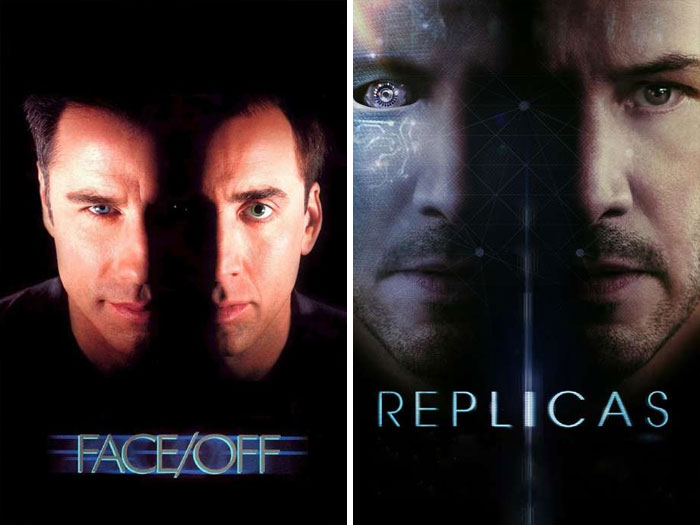
Face/Off (1997) vs. Replicas (2018)
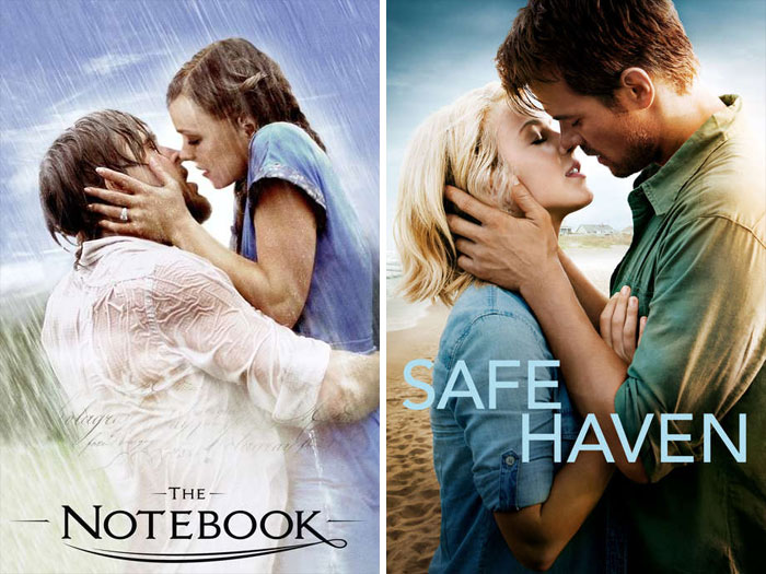
The Notebook (2004) vs. Safe Haven (2013)
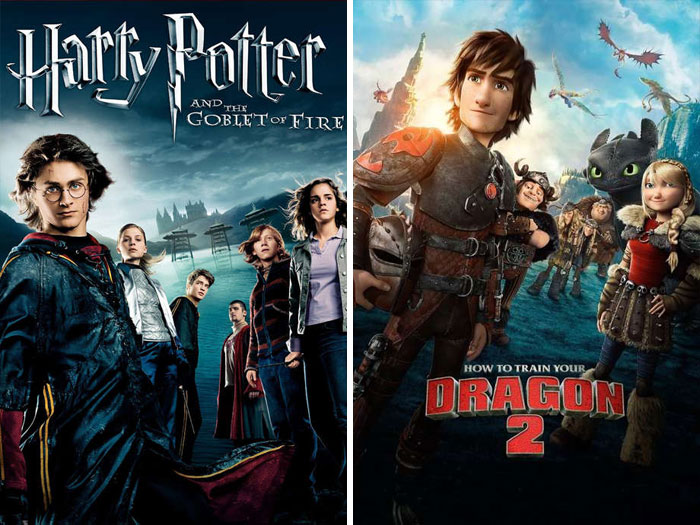
Harry Potter And The Goblet Of Fire (2005) vs. How To Train Your Dragon 2 (2014)
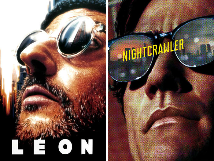
Léon: The Professional (1994) vs. Nightcrawler (2014)
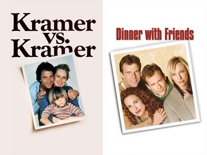
Kramer vs. Kramer (1979) vs. Dinner With Friends (2001)
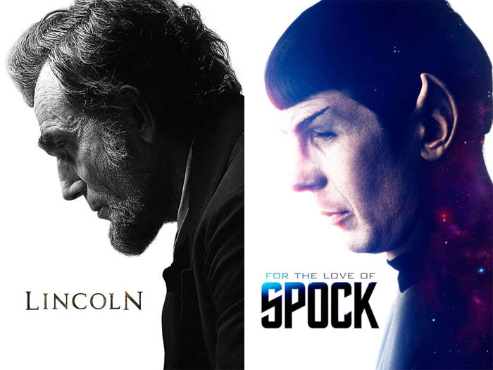
Lincoln (2012) vs. For The Love Of Spock (2016)
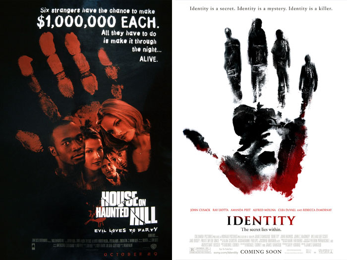
House On Haunted Hill (1999) vs. Identity (2003)
Walkabout (1971) vs. Tangerine (2015)
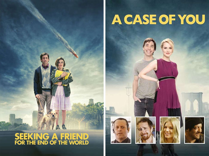
Seeking A Friend For The End Of The World (2012) vs. A Case Of You (2013)
I'd say very few of these are similar enough to be "copied" - and in the cases where they ARE similar it is sometimes obviously intentional, sometimes probably warranted by the story (like those women in veils or the two ships) and perhaps sometimes the old poster is just somewhere at the back of the mind when a new poster is made... And as has been mentioned, some compositions and colour schemes are basically standard.
I think a few months back we had a posting here showing that there is a small number of stereotypical movie poster "templates" only. Thus, similarity is no coincidence, but even likely, without ripping other works off. That with much similarity something the lightning and colour is similar would be a result of graphic design best practices...
Some look similar, a few look like copycats (one at least on purpose like Puss in Boots). You have to realize that there is a formula or set of unofficial guidelines that the art departments follow and that is why the posters look similar. Especially if you look back at the different decades the movie poster all look similar.
very interesting list - but i could tell that some of the really good ones were intentional
Eh, as someone who basically grew up in a movie theater a lot of these are genres/formula and even parodies. The enigmatic character in shadow looking over their shoulder, the eye staring/something over the eyes, red lips, the couple standing back to back to each other, the large moon background etc. Like many things in the entertainment industry, rehashes happen plus it's playing on your emotions. You really liked Die Hard, wait'll you see Speed. Wanna see something like Pretty Woman? How about How To Lose A Guy in 10 Days and so on.
Film publicity is all about marketing. A lot of these similar posters are after the same audience. I can practically hear a marketing muck instructing artists to "Do something like this."
And apparently still don't realise that everyone is watching a selection from maybe a dozen movies over, and over, and over, and over...
the only movies on this list I've seen is star wars, Shrek, Incredibles, harry potter, and how to train your dragon
Similar is not plagiarism... there are enough differences in the presentation and subject matter in the majority of these to move towards 'imitation'- and isn't that it "is the sincerest form of flattery that mediocrity can pay to greatness.” (Oscar Wilde)
its most likely if you see a movie poster and think "hey! it looks like *a different movie thats well liked* it must be simular, i should see it, paramore album, riot! looks like no doubts album, rock steady
I either watch too little movies, or I go through life blind folded. I don't know halve of these movies (or they weren't released in South Africa)

 Dark Mode

 No fees, cancel anytime