ADVERTISEMENT

We live in the age of replicas, look-alikes, and stolen ideas. It feels like everything good has been done already, whether it’s a song, a painting, or a clever TV commercial. The fear of being unoriginal is stronger than ever if you’re trying to produce something entirely new.

And while some try their best to come up with fresh ideas, others decide there’s no point in trying too hard. This time, we are looking at some examples of copycats in the film industry, where movie posters are everything but original.

From the suspiciously similar Babel (2006) and Savages (2012) poster designs, to the look-alike Inception (2010) vs. Geostorm (2017), these can’t be just mere coincidences... or can they? Whoever came up with these poster ideas surely has no problem with being unoriginal, and this may as well be somewhat of a liberating feeling.

(h/t: Letterboxd users Bri and Malaine)

#1

Shrooms (2007) vs. Singular Cay (2012)

Shrooms (2007) vs. Singular Cay (2012)

Bri Report

Bardhi's Dad
Community Member
5 years ago Created by potrace 1.15, written by Peter Selinger 2001-2017

If it's not from same studio and producer, that's clear it's plagiat

Vic
Community Member
5 years ago Created by potrace 1.15, written by Peter Selinger 2001-2017

This not a copy, the mushrooms are of a different variety :-p

Load More Replies...
sorlag110
Community Member
5 years ago Created by potrace 1.15, written by Peter Selinger 2001-2017

As much as I believe in coincidence, this has to be a ripoff, or a very very straight forward homage.

HappyPig1723
Community Member
5 years ago Created by potrace 1.15, written by Peter Selinger 2001-2017

Honestly, both look like a really creepy horror movie.

me
Community Member
5 years ago Created by potrace 1.15, written by Peter Selinger 2001-2017

They are not even trying to hide it

RELATED:
    #2

    Unforgiven (1992) vs. Puss In Boots (2011)

    Unforgiven (1992) vs. Puss In Boots (2011)

    Bri Report

    Daria B
    Community Member
    5 years ago Created by potrace 1.15, written by Peter Selinger 2001-2017

    It's almost like an adorable parody. ♡

    Bizianka
    Community Member
    5 years ago Created by potrace 1.15, written by Peter Selinger 2001-2017

    I think it was intentional

    David K
    Community Member
    5 years ago Created by potrace 1.15, written by Peter Selinger 2001-2017

    I think this was made on purpose as a tribute.

    Martin Kaine
    Community Member
    5 years ago Created by potrace 1.15, written by Peter Selinger 2001-2017

    I think this is a case of deliberate parody, not any theft.

    Lily Mae Kitty
    Community Member
    5 years ago Created by potrace 1.15, written by Peter Selinger 2001-2017

    this was done on purpose, obviously ironic.

    tangy chip
    Community Member
    5 years ago Created by potrace 1.15, written by Peter Selinger 2001-2017

    i think this was inspired by the first one. cute!

    View more comments
    #3

    Die Hard 2 (1990) vs. Speed (1994)

    Die Hard 2 (1990) vs. Speed (1994)

    Bri Report

    Bardhi's Dad
    Community Member
    5 years ago Created by potrace 1.15, written by Peter Selinger 2001-2017

    I have almost forgotten those two heroes were young once. But, must say they are still handsome - Bruce not as much as Keanu, but not bad at all

    Layla Corman
    Community Member
    5 years ago Created by potrace 1.15, written by Peter Selinger 2001-2017

    Bruce is FINE! 😍😍🔥🔥🔥 Keanu is also FINE! Both are killing their ages in totally different ways.

    Load More Replies...
    Elias
    Community Member
    5 years ago Created by potrace 1.15, written by Peter Selinger 2001-2017

    i'm sorry i just keep laughing at "die harder"

    Zophra
    Community Member
    5 years ago Created by potrace 1.15, written by Peter Selinger 2001-2017

    Never thought of it that way.... bahahaha.

    Load More Replies...
    JessG
    Community Member
    5 years ago Created by potrace 1.15, written by Peter Selinger 2001-2017

    Yeah, this was kind of a big 90’s action movie trope thing on posters fer sure

    El muerto
    Community Member
    5 years ago Created by potrace 1.15, written by Peter Selinger 2001-2017

    we need "Speed Hard" about a buss hijack by terrorist in collision course with a building hijack by other terrorist

    Bacony Cakes
    Community Member
    5 years ago Created by potrace 1.15, written by Peter Selinger 2001-2017

    And there's a runaway oil train in there too.

    Load More Replies...
    The 5-star rated 5-star rating system
    Community Member
    4 years ago Created by potrace 1.15, written by Peter Selinger 2001-2017

    Hehehe he's looking at the speed poster like: "You copied me."

    Hermien Greeff
    Community Member
    5 years ago Created by potrace 1.15, written by Peter Selinger 2001-2017

    These represent most action movie posters from the 90's.

    Bacony Cakes
    Community Member
    5 years ago Created by potrace 1.15, written by Peter Selinger 2001-2017

    Another angle of the explosion.

    ML
    Community Member
    5 years ago Created by potrace 1.15, written by Peter Selinger 2001-2017

    I think Die Hard 2 copied this from Speed

    View more comments

    Bored Panda reached out to filmmaker and entrepreneur Romina to find out if such look-alike movie posters are innocent coincidences or sinister copies. Romina explained that both things can be true in these cases: “Sometimes copies are coincidental and other times they're not. The use of similar design elements, though, is indeed deliberate.”

    ADVERTISEMENT

    Romina also said that it’s quite possible that the same graphic designers were used to produce the film posters, and if that happens, “they end up with similar styles.” In that case, a look-alike poster is not a copy, but rather it reflects the style of a particular designer.

    #4

    Blue Ruin (2013) vs. Happy Hunting (2017)

    Blue Ruin (2013) vs. Happy Hunting (2017)

    Bri Report

    Vic
    Community Member
    5 years ago Created by potrace 1.15, written by Peter Selinger 2001-2017

    Happy Hunting is like a couple of frames after Blue Ruin..

    #5

    Gravity (2013) vs. Ad Astra (2019)

    Gravity (2013) vs. Ad Astra (2019)

    Bri Report

    Bardhi's Dad
    Community Member
    5 years ago (edited) Created by potrace 1.15, written by Peter Selinger 2001-2017

    Gravity is better movie and have better poster! In my opinion, of course

    Community Member
    5 years ago Created by potrace 1.15, written by Peter Selinger 2001-2017

    personally, I didn't like ad astra. I may seem uncultured, but It seemed all over the place and it was hard to decipher what was happening at any given moment

    Sasha Kuleshov
    Community Member
    5 years ago Created by potrace 1.15, written by Peter Selinger 2001-2017

    Theme is loneliness and space so...

    JessG
    Community Member
    5 years ago Created by potrace 1.15, written by Peter Selinger 2001-2017

    Same font too? I guess (for both) there’s only so much you could put on a space movie poster

    Bored Shrimpy
    Community Member
    5 years ago Created by potrace 1.15, written by Peter Selinger 2001-2017

    It's not the same font. The R in the right poster isn't complete. The poster on the left has a complete R.

    Load More Replies...
    #6

    Cats & Dogs (2001) vs. Captain America: Civil War (2016)

    Cats & Dogs (2001) vs. Captain America: Civil War (2016)

    Bri Report

    Ava-cado
    Community Member
    5 years ago Created by potrace 1.15, written by Peter Selinger 2001-2017

    This is a hilarious comparison.

    JessG
    Community Member
    5 years ago Created by potrace 1.15, written by Peter Selinger 2001-2017

    Probably not the only two movies with the “someone vs someone” theme I would think

    Bacony Cakes
    Community Member
    5 years ago Created by potrace 1.15, written by Peter Selinger 2001-2017

    There's an entire book series that is just "someone vs someone".

    Load More Replies...
    howdylee
    Community Member
    5 years ago Created by potrace 1.15, written by Peter Selinger 2001-2017

    Nah the XMen animated series theme song did it better ;)

    Caroline Driver
    Community Member
    5 years ago Created by potrace 1.15, written by Peter Selinger 2001-2017

    Maybe Cats & Dogs was using the visual trope that comics have been using for years - I can think of at least 2 X -Men covers that had opposing characters set out like this.

    EA
    Community Member
    5 years ago Created by potrace 1.15, written by Peter Selinger 2001-2017

    Good comparison tho! Cap is a dog obviously

    Sue Sanders
    Community Member
    5 years ago Created by potrace 1.15, written by Peter Selinger 2001-2017

    I don't see a blatant conflict of design here.

    Luuta
    Community Member
    5 years ago Created by potrace 1.15, written by Peter Selinger 2001-2017

    How Hollywood regurgitates itself endlessly, and then eats it's own vomit.

    View more comments
    ADVERTISEMENT

    “It is common to copy or 'take inspiration' from other works. If it isn't broken, why fix it?” Romina said this is part of the storytelling process which is as old as time itself. For example, “Shakespeare's stories have been told over and over again.”

    Having said that, Romina assured that people still genuinely care about original ideas. “The possibilities are endless as new ways of storytelling are developed, like VR, for example.” It’s really up to artists and designers to decide which direction they want to go.

    #7

    Ex Machina (2014) vs. A.i. Rising (2018)

    Ex Machina (2014) vs. A.i. Rising (2018)

    Bri Report

    David K
    Community Member
    5 years ago Created by potrace 1.15, written by Peter Selinger 2001-2017

    Yesterday I was listening to a podcast on AI and the presenter mentioned one interesting fact - for some reason, AI is always associated with blue color. Search whatever "AI" pic on Google and you will always find blue and its different shades to be the main color.

    cybermerlin2000
    Community Member
    5 years ago Created by potrace 1.15, written by Peter Selinger 2001-2017

    HAL in 2001: a space oddesy was red. Red 'eye' and the room with his 'brain' was red too. But then evil AI's were red and good/innocent AI's were were blue. Think about I Robot. Blue until they became evil, red.

    Load More Replies...
    Luuta
    Community Member
    5 years ago Created by potrace 1.15, written by Peter Selinger 2001-2017

    I love the way the neo cortex is given it's own tubing, rather than staying with the rest of the body, where it would be better protected. The influence is from many 1950's and 1960's science fiction cover artwork, where the look was never meant to be scientific, but was a convenient genre stamp in case readers were under any illusion that they weren't reading SF.

    Zophra
    Community Member
    5 years ago Created by potrace 1.15, written by Peter Selinger 2001-2017

    Not that anyone cares, but ex machina was a surprisingly good creepy movie.

    JessG
    Community Member
    5 years ago Created by potrace 1.15, written by Peter Selinger 2001-2017

    I’ve never heard of A.I. Rising...anyone seen it? What’s it about?

    Bacony Cakes
    Community Member
    4 years ago Created by potrace 1.15, written by Peter Selinger 2001-2017

    Boston Dynamics spends a whole year coding a Spot to operate a forklift.

    Load More Replies...
    Vytas Navickas
    Community Member
    5 years ago Created by potrace 1.15, written by Peter Selinger 2001-2017

    it seems not just the poster was a rip-off, but the entire movie's plot also!

    View more comments
    #8

    Star Wars: The Force Awakens (2015) vs. Dark Phoenix (2019)

    Star Wars: The Force Awakens (2015) vs. Dark Phoenix (2019)

    Bri Report

    Troux
    Community Member
    5 years ago Created by potrace 1.15, written by Peter Selinger 2001-2017

    This is kind of a standard movie poster for big-budget, multi-protagonist movies.

    Lauren Caswell
    Community Member
    5 years ago Created by potrace 1.15, written by Peter Selinger 2001-2017

    There's oodles of these orange and blue posters, normally with protagonist, rival, love interest etc in similar locations too

    Community Member
    5 years ago Created by potrace 1.15, written by Peter Selinger 2001-2017

    dark phoenix was just sorta ok.

    Zophra
    Community Member
    5 years ago Created by potrace 1.15, written by Peter Selinger 2001-2017

    I thought the bad guy's (can't remember) makeup looked really clunky and stupid.

    Load More Replies...
    Queen fhk
    Community Member
    5 years ago Created by potrace 1.15, written by Peter Selinger 2001-2017

    Yeah don't forget stranger things also

    Torchicachu
    Community Member
    5 years ago Created by potrace 1.15, written by Peter Selinger 2001-2017

    almost the same for the big marvel movies and stuff

    Sasha Kuleshov
    Community Member
    5 years ago Created by potrace 1.15, written by Peter Selinger 2001-2017

    Warm and cool colors are kind of obvious nowadays, blame Michael Bay XD

    Luuta
    Community Member
    5 years ago Created by potrace 1.15, written by Peter Selinger 2001-2017

    Lots of deep blue and reds, suggesting hell freezing over. This isn't deliberate copying, it's sound colour and photo psychology (the rule of thirds, colour, titling positioning and even using the right side of frame to indicate stronger characters).

    View more comments
    ADVERTISEMENT
    #9

    Winter's Bone (2010) vs. A Dark Place (2018)

    Winter's Bone (2010) vs. A Dark Place (2018)

    Bri Report

    Bardhi's Dad
    Community Member
    5 years ago Created by potrace 1.15, written by Peter Selinger 2001-2017

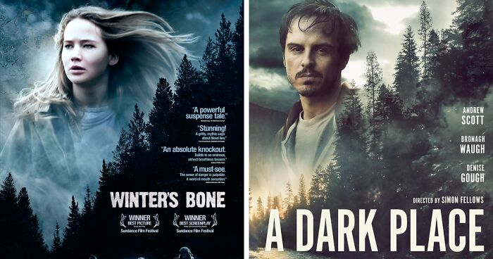
    I like much more that one with Jennifer Lawrence, must say. And movie was great also

    tuzdayschild
    Community Member
    5 years ago Created by potrace 1.15, written by Peter Selinger 2001-2017

    Wayne's World is all I can think of when I hear "Winter's Bone". Thanks Mike Myers.

    Someone
    Community Member
    5 years ago Created by potrace 1.15, written by Peter Selinger 2001-2017

    Funny how A Dark Place is brighter.

    Katka Papežová
    Community Member
    5 years ago Created by potrace 1.15, written by Peter Selinger 2001-2017

    the movies are also almost the same… - missing father/missing little boy...

    Torchicachu
    Community Member
    5 years ago Created by potrace 1.15, written by Peter Selinger 2001-2017

    if i was given these two i would think its a sequel

    tangy chip
    Community Member
    5 years ago Created by potrace 1.15, written by Peter Selinger 2001-2017

    its bit more like a dark place vs a quiet place...

    urszulat
    Community Member
    5 years ago Created by potrace 1.15, written by Peter Selinger 2001-2017

    Jennifer Lawrence was so good in that movie.

    View more comments
    ADVERTISEMENT

    Creating a captivating movie poster that will draw people to the cinema theaters is not as simple as you may think. The successful ones often follow a time-proven sales formula that can be traced in any movie poster you’d like to hang on your wall. It’s known as AIDA.

    The first A in the AIDA formula stands for "attention." A good movie poster is one that grabs your attention on the street and steals it for some time. Whether it features the film’s main characters, establishes an intriguing level of plot, or presents a major plot point, it should be captivating.

    The second part of the formula stands for iconography, which is basically showing without telling. The use of strong imagery and visual cues is what makes the design effective. 

    #10

    Drive Angry (2011) vs. Breaking Loose (2014)

    Drive Angry (2011) vs. Breaking Loose (2014)

    Bri Report

    Goo Lagoon
    Community Member
    5 years ago Created by potrace 1.15, written by Peter Selinger 2001-2017

    Didn't even try to make it different

    Samuel McFarland
    Community Member
    5 years ago Created by potrace 1.15, written by Peter Selinger 2001-2017

    what are you talking about, it's tilted the other way that makes it totally different

    Load More Replies...
    Just another bot
    Community Member
    5 years ago Created by potrace 1.15, written by Peter Selinger 2001-2017

    Is that Amber Heard? That explains why he's driving angry!

    Torchicachu
    Community Member
    5 years ago Created by potrace 1.15, written by Peter Selinger 2001-2017

    they just tipped it a little lol

    Scratch
    Community Member
    5 years ago Created by potrace 1.15, written by Peter Selinger 2001-2017

    Russians are good at stealing things. Look at Eastern Europe.

    CV
    Community Member
    5 years ago Created by potrace 1.15, written by Peter Selinger 2001-2017

    Looks like Russian adaptation of the real movie

    Layla Corman
    Community Member
    5 years ago Created by potrace 1.15, written by Peter Selinger 2001-2017

    Doesn't Gone In 60 Seconds look similar too?

    Sasha Kuleshov
    Community Member
    5 years ago Created by potrace 1.15, written by Peter Selinger 2001-2017

    If you notice most movies with cars have always similar designs :P

    View more comments
    #11

    Black Swan (2010) vs. Ghostland (2018)

    Black Swan (2010) vs. Ghostland (2018)

    Bri Report

    Doggo
    Community Member
    5 years ago Created by potrace 1.15, written by Peter Selinger 2001-2017

    I kind of like Ghostland's execution better.

    Bizianka
    Community Member
    5 years ago (edited) Created by potrace 1.15, written by Peter Selinger 2001-2017

    Broken doll/statue face is rather usual motif

    Torchicachu
    Community Member
    5 years ago Created by potrace 1.15, written by Peter Selinger 2001-2017

    although i like both of them i think the cracked face is kinda cool

    Bardhi's Dad
    Community Member
    5 years ago Created by potrace 1.15, written by Peter Selinger 2001-2017

    It's similar, or at least it have the same idea, the poster of Aronofsky's "Mother!" with Jennifer Lawrence

    Vic
    Community Member
    5 years ago Created by potrace 1.15, written by Peter Selinger 2001-2017

    Good God! I found that movie absolutely unbearable!!

    Load More Replies...
    Damon Tripodi
    Community Member
    5 years ago Created by potrace 1.15, written by Peter Selinger 2001-2017

    Uh, and they did Natalie Portman's Queen Amidala lips too?

    rabbitsrabbit
    Community Member
    5 years ago Created by potrace 1.15, written by Peter Selinger 2001-2017

    IMO this is fine. A close-up of a woman's face with cracks isn't particularly unique and the execution is different enough.

    Jamnik
    Community Member
    5 years ago Created by potrace 1.15, written by Peter Selinger 2001-2017

    Not the same. Also, if you watch Ghostland, you will see how very appropriate it is for the movie to use a dollface as the main motive on the poster.

    Community Member
    5 years ago Created by potrace 1.15, written by Peter Selinger 2001-2017

    i think this one is a slight stretch. different shot angle, different makeup, different concept, really. it's similar, but not super.

    JessG
    Community Member
    5 years ago Created by potrace 1.15, written by Peter Selinger 2001-2017

    Yeah, but that really wasn’t the main black swan poster. Also, it’s not a total copy

    View more comments
    ADVERTISEMENT
    #12

    Anatomy Of A Murder (1959) vs. Clockers (1995)

    Anatomy Of A Murder (1959) vs. Clockers (1995)

    Bri Report

    Goo Lagoon
    Community Member
    5 years ago (edited) Created by potrace 1.15, written by Peter Selinger 2001-2017

    Yeah, it's clearly an homage to a very famous classic poster.

    Layla Corman
    Community Member
    5 years ago Created by potrace 1.15, written by Peter Selinger 2001-2017

    Anatomy of a Murder is an INCREDIBLE movie! They just dont make them like that anymore!

    Another important feature in a good film poster design is "interest." This means that your poster should offer a fresh perspective or an unusual point of view. Sometimes it puts the viewers into the middle of a scene from the film. Often, it sparks an inner curiosity as you wish to find out more.The last bit of the magic AIDA formula stands for appeal, which combines both creative and aesthetic efforts to produce a poster that will serve as a form of art on its own.

    On the other hand, there’s always a danger of making your poster too artsy, as it should carry appeal for both die-hard fans and passersby on the streets alike. Long-lasting appeal in poster designs is usually found in classical movies and high-budget blockbusters.

    #13

    Shrek (2001) vs. The Incredibles (2004)

    Shrek (2001) vs. The Incredibles (2004)

    Bri Report

    JessG
    Community Member
    5 years ago Created by potrace 1.15, written by Peter Selinger 2001-2017

    Well, the Shrek one was intentional. They had more than one poster, all with different “genre feel” to them

    Goo Lagoon
    Community Member
    5 years ago Created by potrace 1.15, written by Peter Selinger 2001-2017

    The more I look, the more similarities I see. I'm surprised Pixar would do something this blatant.

    Luuta
    Community Member
    5 years ago Created by potrace 1.15, written by Peter Selinger 2001-2017

    Classic blockbuster movie feel, with a digital fish eye lens, exploding fire bombs, antagonists in the background, protagonists bursting out of the screen in the foreground. Very formulaic and unimaginative.

    Bacony Cakes
    Community Member
    5 years ago Created by potrace 1.15, written by Peter Selinger 2001-2017

    Don't remind me of the dragon or i'm stealing you lungs.

    #14

    The Ruins (2007) vs. Wake Wood (2008)

    The Ruins (2007) vs. Wake Wood (2008)

    Bri Report

    Amanda Flesher
    Community Member
    5 years ago Created by potrace 1.15, written by Peter Selinger 2001-2017

    Originally the movie was called Morning Wood, but then they realized the error of their ways 😂

    R. Lynx
    Community Member
    4 years ago Created by potrace 1.15, written by Peter Selinger 2001-2017

    And lets not forget Evil Dead, thank you very much.

    Kimberly Reetz
    Community Member
    5 years ago Created by potrace 1.15, written by Peter Selinger 2001-2017

    Stolen from the last scene in Carrie

    Luuta
    Community Member
    5 years ago Created by potrace 1.15, written by Peter Selinger 2001-2017

    Carrie, Evil Dead, you name it.

    #15

    Hot Pursuit (1987) vs. Disturbia (2007)

    Hot Pursuit (1987) vs. Disturbia (2007)

    Bri Report

    rgr8
    Community Member
    5 years ago Created by potrace 1.15, written by Peter Selinger 2001-2017

    These ones aren't really that similar. All they have in common is the binoculars.

    AzKhaleesi
    Community Member
    5 years ago Created by potrace 1.15, written by Peter Selinger 2001-2017

    love that movie! (Disturbia)

    Dana
    Community Member
    5 years ago (edited) Created by potrace 1.15, written by Peter Selinger 2001-2017

    Me too!! I totally forgot about it! EDIT: Love your name! Is it a ASoIaf/GoT reference

    Load More Replies...
    #16

    Babel (2006) vs. Savages (2012)

    Babel (2006) vs. Savages (2012)

    Bri Report

    Julius Martin
    Community Member
    5 years ago Created by potrace 1.15, written by Peter Selinger 2001-2017

    Babel was easily better, in my opinion

    Kristin Ingersoll
    Community Member
    5 years ago Created by potrace 1.15, written by Peter Selinger 2001-2017

    There are a billion movie posters with this theme - especially indie ensemble films.

    Ece Cenker
    Community Member
    5 years ago Created by potrace 1.15, written by Peter Selinger 2001-2017

    Tower of Babel = stacking up of letters. Can't remember a Savages Tower from anywhere, though.

    #17

    The Breakfast Club (1985) vs. The Texas Chainsaw Massacre 2 (1986)

    The Breakfast Club (1985) vs. The Texas Chainsaw Massacre 2 (1986)

    Bri Report

    Purple light
    Community Member
    Premium
    5 years ago Created by potrace 1.15, written by Peter Selinger 2001-2017

    Clearly intentional

    Torchicachu
    Community Member
    5 years ago Created by potrace 1.15, written by Peter Selinger 2001-2017

    yep thats what i thought like its just too perfect

    Load More Replies...
    Dreamwolf
    Community Member
    5 years ago Created by potrace 1.15, written by Peter Selinger 2001-2017

    It's like a retake of a photo they did as kids, like the tiktok trend.

    El muerto
    Community Member
    5 years ago Created by potrace 1.15, written by Peter Selinger 2001-2017

    The breakfast massacre or the chainsaw club...I don't know why am i putting together...buts it is fun and I am bored

    Gianna Clifford
    Community Member
    5 years ago Created by potrace 1.15, written by Peter Selinger 2001-2017

    omg i never noticed this! i love the texas chainsaw massacre 2.

    Community Member
    5 years ago Created by potrace 1.15, written by Peter Selinger 2001-2017

    very clearly intentional

    #18

    No Country For Old Men (2007) vs. Fright Night (2011)

    No Country For Old Men (2007) vs. Fright Night (2011)

    Bri Report

    JessG
    Community Member
    5 years ago Created by potrace 1.15, written by Peter Selinger 2001-2017

    Was Fright Night re-made in 2011? I didn’t even realize. The original poster is much better

    Bardhi's Dad
    Community Member
    5 years ago Created by potrace 1.15, written by Peter Selinger 2001-2017

    I think the author of the second poster is not hiding the source of his inspiration

    Luuta
    Community Member
    5 years ago Created by potrace 1.15, written by Peter Selinger 2001-2017

    The Fright night poster is more a copy of a million horror movies and horror novel book covers than a mimic of No Country For Old Men

    Sasha Kuleshov
    Community Member
    5 years ago Created by potrace 1.15, written by Peter Selinger 2001-2017

    Both are being chased by the big guy :)

    #19

    Shame (2011) vs. The Delinquent Season (2018)

    Shame (2011) vs. The Delinquent Season (2018)

    Bri Report

    Capelli rosa e patate
    Community Member
    5 years ago Created by potrace 1.15, written by Peter Selinger 2001-2017

    Damn the delinquent season. That’s ones a doozy.

    #20

    The Night Eats The World (La Nuit A Dévoré Le Monde) (2018) vs. The Rental (2020)

    The Night Eats The World (La Nuit A Dévoré Le Monde) (2018) vs. The Rental (2020)

    Bri Report

    JessG
    Community Member
    5 years ago Created by potrace 1.15, written by Peter Selinger 2001-2017

    Both posters make me curious about the movies though. I haven’t seen either one, but I’d like to now, lol, it worked

    Lou Wow
    Community Member
    5 years ago Created by potrace 1.15, written by Peter Selinger 2001-2017

    The one on the right makes me wonder if he “rented” a dodgy parachute. 😂

    Load More Replies...
    Sue Sanders
    Community Member
    5 years ago Created by potrace 1.15, written by Peter Selinger 2001-2017

    How can a graphic artist, or the people who approve the design, not see the distinct likenesses between the two posters?

    #21

    Mystic River (2003) vs. Dusk (2010)

    Mystic River (2003) vs. Dusk (2010)

    Bri Report

    Mademoiselle Nat
    Community Member
    5 years ago Created by potrace 1.15, written by Peter Selinger 2001-2017

    Well, if it counts, the colour is different.

    Soap
    Community Member
    5 years ago Created by potrace 1.15, written by Peter Selinger 2001-2017

    And the name's in a different place.

    Load More Replies...
    Heather Reynolds Atwood
    Community Member
    5 years ago Created by potrace 1.15, written by Peter Selinger 2001-2017

    TBH, at least the Schemer title admits they schemed!

    Mary Wealth
    Community Member
    3 years ago Created by potrace 1.15, written by Peter Selinger 2001-2017

    Or at least picked a different color scheme.

    Load More Replies...
    #22

    Straw Dogs (1971) vs. Cold Fish (2010)

    Straw Dogs (1971) vs. Cold Fish (2010)

    Bri Report

    ADHORTATOR
    Community Member
    5 years ago Created by potrace 1.15, written by Peter Selinger 2001-2017

    Dog, Fish.... both animals so let's copy the poster

    Torchicachu
    Community Member
    5 years ago Created by potrace 1.15, written by Peter Selinger 2001-2017

    i like the touch in coldfish with the reflection in the glasses tho

    #23

    Lolita (1962) vs. American Strays (1996)

    Lolita (1962) vs. American Strays (1996)

    Bri Report

    Bardhi's Dad
    Community Member
    5 years ago Created by potrace 1.15, written by Peter Selinger 2001-2017

    I believe this is made intentional

    Doggo
    Community Member
    5 years ago Created by potrace 1.15, written by Peter Selinger 2001-2017

    I feel like this one is more of a stretch.

    Pearl_TheRapperLOL
    Community Member
    5 years ago Created by potrace 1.15, written by Peter Selinger 2001-2017

    Its the edited in sunglasses and bright lips for me

    #24

    Vampire (2011) vs. Forgotten (2017)

    Vampire (2011) vs. Forgotten (2017)

    Bri Report

    Charlotte A.
    Community Member
    5 years ago Created by potrace 1.15, written by Peter Selinger 2001-2017

    They forgot the white sphere in the second pic... :p

    Caroline
    Community Member
    5 years ago Created by potrace 1.15, written by Peter Selinger 2001-2017

    I loved the movie Forgotten!!

    #25

    The Ides Of March (2011) vs. Nancy (2018)

    The Ides Of March (2011) vs. Nancy (2018)

    Bri Report

    ML
    Community Member
    5 years ago Created by potrace 1.15, written by Peter Selinger 2001-2017

    I like Ryan Clooney and George Gosling.

    Torchicachu
    Community Member
    5 years ago Created by potrace 1.15, written by Peter Selinger 2001-2017

    ....you intentionally mixed up the last names.... right?

    Load More Replies...
    Dreamwolf
    Community Member
    5 years ago Created by potrace 1.15, written by Peter Selinger 2001-2017

    I like the first because the other one makes her look wierd in the eye.

    Community Member
    5 years ago Created by potrace 1.15, written by Peter Selinger 2001-2017

    the second just looks kinda funny cuz both eyes are offset.

    JessG
    Community Member
    5 years ago Created by potrace 1.15, written by Peter Selinger 2001-2017

    Slightly different I think

    See Also on Bored Panda
    #26

    The People vs. Larry Flynt (1996) vs. The Kill Team (2013)

    The People vs. Larry Flynt (1996) vs. The Kill Team (2013)

    Bri Report

    Robin DJW
    Community Member
    5 years ago Created by potrace 1.15, written by Peter Selinger 2001-2017

    The Silence of the Lambs poster is in this same family. They all say "We have secrets."

    Naima Ivansdóttir
    Community Member
    5 years ago Created by potrace 1.15, written by Peter Selinger 2001-2017

    "We have secrets" is not really fitting the people vs larry flynt tho

    Load More Replies...
    Sasha Kuleshov
    Community Member
    5 years ago Created by potrace 1.15, written by Peter Selinger 2001-2017

    The US certainly loves freedom of expression XD

    #27

    Death Ship (1980) vs. Ghost Ship (2002)

    Death Ship (1980) vs. Ghost Ship (2002)

    Bri Report

    wandile dludlu
    Community Member
    5 years ago Created by potrace 1.15, written by Peter Selinger 2001-2017

    Death ship looks better even though it's 22 years older

    Jonah Rubert
    Community Member
    5 years ago Created by potrace 1.15, written by Peter Selinger 2001-2017

    Why is the first thing I think of when I see these the orangutan and the ship from JJBA: Stardust Crusaders?

    Torchicachu
    Community Member
    5 years ago Created by potrace 1.15, written by Peter Selinger 2001-2017

    the ghost ship looks cooler though and not as cheap and corny - also its pretty much guaranteed to be better as in graphics wise because its newer at least

    Zophra
    Community Member
    5 years ago Created by potrace 1.15, written by Peter Selinger 2001-2017

    Hmmm... which ship wore it better? Personally I like the one on the right.

    Jennifer Cassada
    Community Member
    5 years ago Created by potrace 1.15, written by Peter Selinger 2001-2017

    Ghost Ship was so very very bad, but it scared the heck out of me. Gotta check out DeathShip now.

    Fiercepelt
    Community Member
    5 years ago Created by potrace 1.15, written by Peter Selinger 2001-2017

    Death Ship lowkey looks pretty awesome

    Bacony Cakes
    Community Member
    5 years ago Created by potrace 1.15, written by Peter Selinger 2001-2017

    Either way, you're screwed. Haunted cars on land, phantom ships cruising the oceans, and herpetocultural aircraft in the skies.

    #28

    Body Snatchers (1993) vs. Berberian Sound Studio (2012)

    Body Snatchers (1993) vs. Berberian Sound Studio (2012)

    Bri Report

    Jamnik
    Community Member
    5 years ago Created by potrace 1.15, written by Peter Selinger 2001-2017

    Berberian Sound Studio is fantastic!

    #29

    Inception (2010) vs. Geostorm (2017)

    Inception (2010) vs. Geostorm (2017)

    Bri Report

    Valor
    Community Member
    5 years ago Created by potrace 1.15, written by Peter Selinger 2001-2017

    I love Inception!!!

    Andrei Anghel
    Community Member
    5 years ago (edited) Created by potrace 1.15, written by Peter Selinger 2001-2017

    Not similar: there's a tsunami in Geostorm, aka pretty tall wave :) Whereas in Inception there is a 90 degree landscape bending.

    CLG
    Community Member
    5 years ago Created by potrace 1.15, written by Peter Selinger 2001-2017

    I remember getting the Inception vibe straight away when seeing the Geostorm posters for the first time.

    Luuta
    Community Member
    5 years ago Created by potrace 1.15, written by Peter Selinger 2001-2017

    Nope, apart from someone standing in a road, totally different.

    Torchicachu
    Community Member
    5 years ago Created by potrace 1.15, written by Peter Selinger 2001-2017

    heres a thing - geostorm is more of the copy of the plot of the day after tomorrow - almost the same movie

    View more comments
    #30

    Deepwater Horizon (2016) vs. Murder On The Orient Express (2017)

    Deepwater Horizon (2016) vs. Murder On The Orient Express (2017)

    Bri Report

    Mike Crow
    Community Member
    5 years ago Created by potrace 1.15, written by Peter Selinger 2001-2017

    Nope. Similar but not the same.

    Luisa Vasconcelos
    Community Member
    5 years ago Created by potrace 1.15, written by Peter Selinger 2001-2017

    The goal of the post is exactly show similar, not the same. Similar

    Load More Replies...
    Bob Belcher
    Community Member
    5 years ago Created by potrace 1.15, written by Peter Selinger 2001-2017

    Smoke expands when it rises. This is a law of nature, not a copy cat poster.

    Mary Wealth
    Community Member
    3 years ago Created by potrace 1.15, written by Peter Selinger 2001-2017

    Both plumes of smoke are traveling diagonally upward to the left and are both coming off of methods of transportation which are shown in small size in the bottom right corner. Also, a medium size font is used for the title of the film over the smoke.

    Load More Replies...
    Luuta
    Community Member
    5 years ago Created by potrace 1.15, written by Peter Selinger 2001-2017

    Nope. Apart from a plume of smoke, totally different

    Wendillon
    Community Member
    5 years ago Created by potrace 1.15, written by Peter Selinger 2001-2017

    I mean...smoke goes up. Don't think this one is similar enough for the list.

    View more comments
    #31

    Fatal Attraction (1987) vs. Serenity (2019)

    Fatal Attraction (1987) vs. Serenity (2019)

    Bri Report

    earringnut
    Community Member
    5 years ago Created by potrace 1.15, written by Peter Selinger 2001-2017

    My favorite part of the second movie is when she uses her psychic abilities to save the day in bada$$ fashion.

    #32

    Guardians Of The Galaxy Vol. 2 (2017) vs. Avengers: Infinity War (2018)

    Guardians Of The Galaxy Vol. 2 (2017) vs. Avengers: Infinity War (2018)

    Bri Report

    Daria B
    Community Member
    5 years ago Created by potrace 1.15, written by Peter Selinger 2001-2017

    Does it count, though? It's both Marvel, they're famous for crossovers and mixing up characters from one universe to another and vice versa, of course they'd have similar posters....

    Gergely Kiss
    Community Member
    5 years ago Created by potrace 1.15, written by Peter Selinger 2001-2017

    It's not even that; "throw all of your characters in front of a space background" has been a sci-fi poster trope for ages. Think Star Wars, for example. It's just a convenient general composition and in that sense it's quite unlike some of the straight-up rip-offs from this thread.

    Load More Replies...
    Community Member
    5 years ago Created by potrace 1.15, written by Peter Selinger 2001-2017

    they all actually have similar posters. marvel has a certain aesthetic that they like to keep.

    Stijn V.
    Community Member
    5 years ago Created by potrace 1.15, written by Peter Selinger 2001-2017

    doesn't count if one is a prequel of the other

    JessG
    Community Member
    5 years ago Created by potrace 1.15, written by Peter Selinger 2001-2017

    Obviously, they’re the same franchise

    Robin DJW
    Community Member
    5 years ago Created by potrace 1.15, written by Peter Selinger 2001-2017

    These posters would make GREAT jigsaw puzzles.

    kjorn
    Community Member
    5 years ago Created by potrace 1.15, written by Peter Selinger 2001-2017

    they all looks the same

    #33

    A Star Is Born (2018) vs. I Still Believe (2020)

    A Star Is Born (2018) vs. I Still Believe (2020)

    Bri Report

    Stitches
    Community Member
    5 years ago Created by potrace 1.15, written by Peter Selinger 2001-2017

    As someone whos seen both I think these covers are accurate maybe a little cliche but still gives you a feel of a movie

    JessG
    Community Member
    5 years ago Created by potrace 1.15, written by Peter Selinger 2001-2017

    Well, you gotta put the theme of the movie there somehow...

    #34

    The Frighteners (1996) vs. The Pact (2012)

    The Frighteners (1996) vs. The Pact (2012)

    Bri Report

    Lauren Caswell
    Community Member
    5 years ago Created by potrace 1.15, written by Peter Selinger 2001-2017

    The Frighteners is such a good movie

    Robin DJW
    Community Member
    5 years ago Created by potrace 1.15, written by Peter Selinger 2001-2017

    The Frighteners -never saw it but just cecked the trailers on IMDB. It looks like fun (and I hate horror films)!

    Binxyminxem
    Community Member
    5 years ago Created by potrace 1.15, written by Peter Selinger 2001-2017

    I can't help but imagine the figure in The Pact has a whiny voice and is saying "but we had a PAAAAAAACT!"

    #35

    The Dark Knight Rises (2012) vs. Star Trek Into Darkness (2013)

    The Dark Knight Rises (2012) vs. Star Trek Into Darkness (2013)

    Bri Report

    EA
    Community Member
    5 years ago Created by potrace 1.15, written by Peter Selinger 2001-2017

    Both posters are so cool tho!

    wandile dludlu
    Community Member
    5 years ago Created by potrace 1.15, written by Peter Selinger 2001-2017

    That Batman poster is still one of the best looking posters ever

    Carter Saul
    Community Member
    4 months ago Created by potrace 1.15, written by Peter Selinger 2001-2017

    That Star Trek Into Darkness poster looks very similar to the Dunkirk poster, tbh…they should’ve done that

    Oskar vanZandt
    Community Member
    5 years ago Created by potrace 1.15, written by Peter Selinger 2001-2017

    Fan of both Batman and Star Trek... :D

    JessG
    Community Member
    5 years ago Created by potrace 1.15, written by Peter Selinger 2001-2017

    Uh, no, they aren’t the same

    Charlotte A.
    Community Member
    5 years ago Created by potrace 1.15, written by Peter Selinger 2001-2017

    Not particularly similar in my opinion.

    See Also on Bored Panda
    #36

    The Tall Man (2012) vs. Astral (2018)

    The Tall Man (2012) vs. Astral (2018)

    Bri Report

    Mimi M
    Community Member
    5 years ago Created by potrace 1.15, written by Peter Selinger 2001-2017

    Second one is taller - first one is not so much of a height diff.

    #37

    Baby Driver (2017) vs. Cut Throat City (2020)

    Baby Driver (2017) vs. Cut Throat City (2020)

    Bri Report

    #38

    My Cousin Rachel (2017) vs. Winchester (2018)

    My Cousin Rachel (2017) vs. Winchester (2018)

    Bri Report

    Bardhi's Dad
    Community Member
    5 years ago Created by potrace 1.15, written by Peter Selinger 2001-2017

    Nothing in common! According to this, all the posters with female portraits are similar to each other. Here we have completely different views

    #39

    Face/Off (1997) vs. Replicas (2018)

    Face/Off (1997) vs. Replicas (2018)

    Bri Report

    Dana Grunwald
    Community Member
    5 years ago Created by potrace 1.15, written by Peter Selinger 2001-2017

    "Replicas" is such a stupid movie.

    #40

    The Notebook (2004) vs. Safe Haven (2013)

    The Notebook (2004) vs. Safe Haven (2013)

    Bri Report

    JessG
    Community Member
    5 years ago Created by potrace 1.15, written by Peter Selinger 2001-2017

    This is a pretty common theme

    Anony Mouse
    Community Member
    5 years ago Created by potrace 1.15, written by Peter Selinger 2001-2017

    There's a whole genre of Nicholas Sparks or similar called "White people almost kissing".

    Kori K. Warriner
    Community Member
    5 years ago Created by potrace 1.15, written by Peter Selinger 2001-2017

    They're both Nicholas Sparks books, aren't they?

    John Doe
    Community Member
    5 years ago Created by potrace 1.15, written by Peter Selinger 2001-2017

    bruh its 2002-2015. Love is in the mother******* air. Hollywood has no other ideas.

    Mimi M
    Community Member
    5 years ago Created by potrace 1.15, written by Peter Selinger 2001-2017

    I thought The Notebook was lame and I didn't get it. Does this mean I have to turn in my Woman Card??

    Kristin Ingersoll
    Community Member
    5 years ago Created by potrace 1.15, written by Peter Selinger 2001-2017

    Gee. A romance. A couple kissing. Yeah. Total copy. A someone said above, this is a cliché, not a copy.

    #41

    Harry Potter And The Goblet Of Fire (2005) vs. How To Train Your Dragon 2 (2014)

    Harry Potter And The Goblet Of Fire (2005) vs. How To Train Your Dragon 2 (2014)

    Bri Report

    Joseph Kuhlman
    Community Member
    5 years ago Created by potrace 1.15, written by Peter Selinger 2001-2017

    This HAD to be intentional, right?

    tangy chip
    Community Member
    5 years ago Created by potrace 1.15, written by Peter Selinger 2001-2017

    i mean they both feature dragons...

    Daniel Marsh
    Community Member
    5 years ago Created by potrace 1.15, written by Peter Selinger 2001-2017

    Wait... Luna Lovegood is in the wrong movie...?

    John Doe
    Community Member
    5 years ago Created by potrace 1.15, written by Peter Selinger 2001-2017

    Even the characters look the same. Even the personalities are the same lol

    #42

    Léon: The Professional (1994) vs. Nightcrawler (2014)

    Léon: The Professional (1994) vs. Nightcrawler (2014)

    Bri Report

    ƒιѕн
    Community Member
    5 years ago (edited) Created by potrace 1.15, written by Peter Selinger 2001-2017

    The Professional is still one of my all time favorites. And was also Natalie Portmans film debut.

    #43

    Kramer vs. Kramer (1979) vs. Dinner With Friends (2001)

    Kramer vs. Kramer (1979) vs. Dinner With Friends (2001)

    Bri Report

    David K
    Community Member
    5 years ago Created by potrace 1.15, written by Peter Selinger 2001-2017

    There are tons of movies and series displaying families in a similar posture. It´s cliché rather than copycats.

    Daniel Marsh
    Community Member
    5 years ago Created by potrace 1.15, written by Peter Selinger 2001-2017

    That;s it! No family photographs!

    #44

    Lincoln (2012) vs. For The Love Of Spock (2016)

    Lincoln (2012) vs. For The Love Of Spock (2016)

    Bri Report

    JessG
    Community Member
    5 years ago Created by potrace 1.15, written by Peter Selinger 2001-2017

    I can think of no other way to do these two posters, so, I don’t mind the resemblance at all

    Bardhi's Dad
    Community Member
    5 years ago Created by potrace 1.15, written by Peter Selinger 2001-2017

    Lol! Looks to me like somebody made parody of "Lincoln" and is kidding with Daniel Day-Lewis

    John Doe
    Community Member
    5 years ago Created by potrace 1.15, written by Peter Selinger 2001-2017

    oh hell no i KNOW that you are not disrespecting spock

    earringnut
    Community Member
    5 years ago Created by potrace 1.15, written by Peter Selinger 2001-2017

    TIL this comparison exists. My life is just a little bit better for it.

    #45

    House On Haunted Hill (1999) vs. Identity (2003)

    House On Haunted Hill (1999) vs. Identity (2003)

    Bri Report

    See Also on Bored Panda
    #46

    Walkabout (1971) vs. Tangerine (2015)

    Walkabout (1971) vs. Tangerine (2015)

    Bri Report

    Bardhi's Dad
    Community Member
    5 years ago Created by potrace 1.15, written by Peter Selinger 2001-2017

    They are completely different, I think

    Mike Crow
    Community Member
    5 years ago Created by potrace 1.15, written by Peter Selinger 2001-2017

    So the sky and land ratio. That’s it?

    Community Member
    5 years ago Created by potrace 1.15, written by Peter Selinger 2001-2017

    is it just that they have sunsets? ok, I guess...

    #47

    Seeking A Friend For The End Of The World (2012) vs. A Case Of You (2013)

    Seeking A Friend For The End Of The World (2012) vs. A Case Of You (2013)

    Bri Report

    BingeFest1
    Community Member
    5 years ago Created by potrace 1.15, written by Peter Selinger 2001-2017

    They use the same exact cloud background

    Vic
    Community Member
    5 years ago Created by potrace 1.15, written by Peter Selinger 2001-2017

    At first I did not see much of a resemblance here, but it you see closely, it's same picture of the sky..

    John Doe
    Community Member
    5 years ago Created by potrace 1.15, written by Peter Selinger 2001-2017

    the sky is the damn same. the ugly hoe is the same

    Mimi M
    Community Member
    5 years ago

    This comment has been deleted.

    Dirk Daring
    Community Member
    5 years ago Created by potrace 1.15, written by Peter Selinger 2001-2017

    Teal and Orange... Teal and Orange everywhere!

    Kristin Ingersoll
    Community Member
    5 years ago Created by potrace 1.15, written by Peter Selinger 2001-2017

    I think we're getting pretty desperate to prove the point here. SImilar does not mean copycat.

    Stitches
    Community Member
    5 years ago Created by potrace 1.15, written by Peter Selinger 2001-2017

    These aren’t even remotely similar-