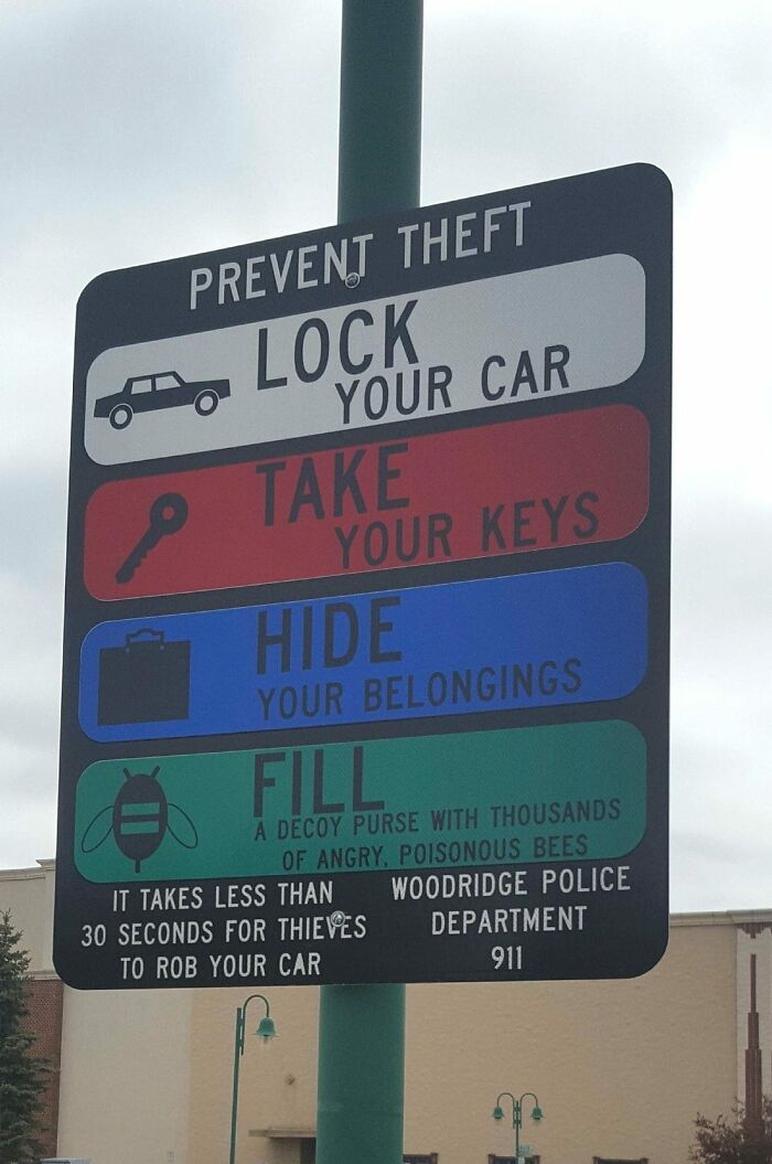
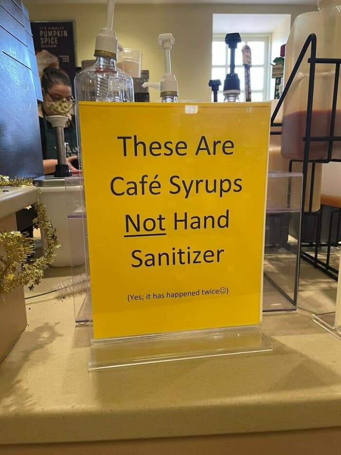
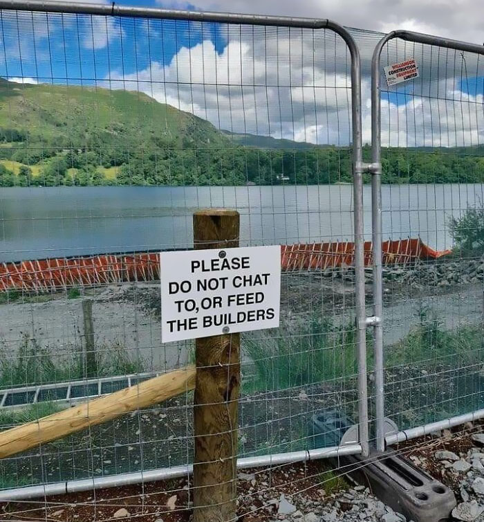
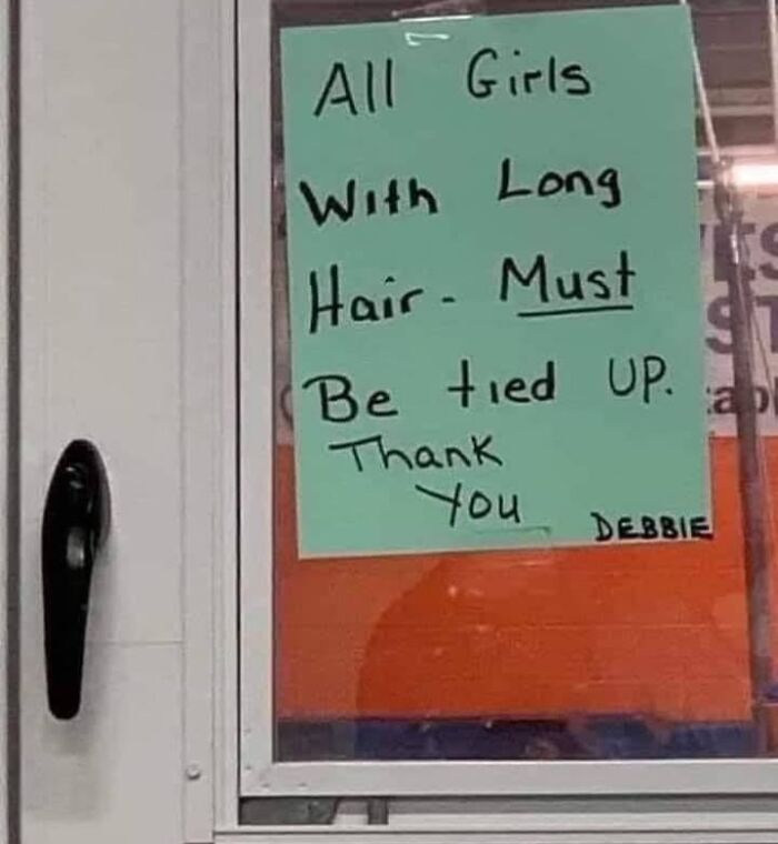
If you’re here reading this article, it’s a sign: the next few minutes of your life will be very enjoyable! (If you don’t click away, that is.) Below, we’ve gathered some of the most amusing pics from Silly Signs Funny Signs Dumb Signs Stupid Signs that we think you’ll get a kick out of, pandas.
From signs with spelling errors that completely change their tone to messages that were questionable from the beginning, we’ve got them all waiting for you on this list. Keep reading to also find an interview with the creator of this silly Facebook group, Paul Austin, and be sure to upvote the signs that would certainly grab your attention!
This post may include affiliate links.
Signs are everywhere we go. They’re on billboards off the highway, plastered on the entrances of buildings, scattered around the street advertising concerts and events, and in the metaphorical sense, they can appear where we least expect them. It can be easy to ignore signs when it seems like we’re bombarded with them everywhere we turn, but occasionally, we encounter some that are so brilliant or captivating that we just can’t help but look away. In fact, we might even want to snap a picture!
That’s where the Silly Signs Funny Signs Dumb Signs Stupid Signs group comes in. This Facebook group, which has been around since July, 2018, is the perfect place to share all of those eye-catching signs we come across in our daily lives. The community, which has amassed nearly 13k members over the past 5 years, welcomes “unwittingly funny, nonsensical or outright baffling signs [members] have seen on [their] travels.” So to learn more about how this entertaining group came about, we reached out to the page’s creator, Paul Austin, on Facebook.
Paul was kind enough to have a chat with Bored Panda and fill us in on how Silly Signs Funny Signs Dumb Signs Stupid Signs became such a success. He shared that the initial inspiration for the group was a sign on a campsite that said, “Any children found in the freezer will be asked to leave.” Because of that, “The site started as funny campsite signs, but grew much bigger than I expected,” Paul went on to share.
We were also curious what the community in the group is like, now that there are nearly 13k sign-loving members. “There are a lot of signs coming in everyday that need my personal admin approval to keep the quality high, so things are very busy,” Paul said. Running a page like this must be tons of fun, given the subject matter, but it can also take up plenty of time. To help keep members on the same page as Paul when it comes to what kinds of photos are allowed in the group, there are several ground rules, including no signs that need explanation, no videos, and no material aside from real signs that had zero intention of being hilarious.
"Roses are red
Mercury's in thermometers"
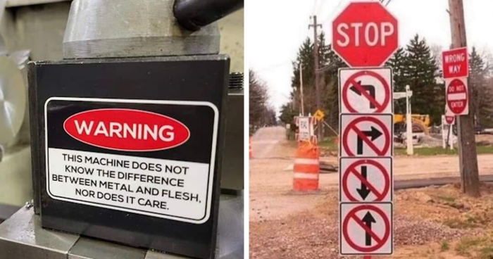
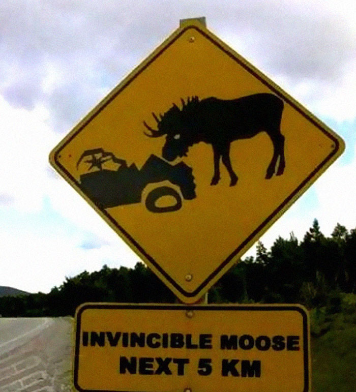
Does this mean that I might run into a moose in the next 5km, or that the entire next 5km consists of one invincible moose?
We also wanted to hear the group’s creator’s opinion on what kinds of photos are ideal for Silly Signs. “The best ones are the ones that the sign maker never intended to be funny, and probably still haven’t noticed are funny,” Paul shared. “The rule is we only publish signs that were never intended to be funny, as the quality of these never drops. The funniest ones are, of course, the ones that read the rudest.” While many of these photos may appear to be intentionally funny to us, it’s easy for spelling errors or messages that have gone through Google Translate to end up with a completely different meaning than intended. Lucky for us, there are people out there who will capture those signs and share them with this hilarious group!
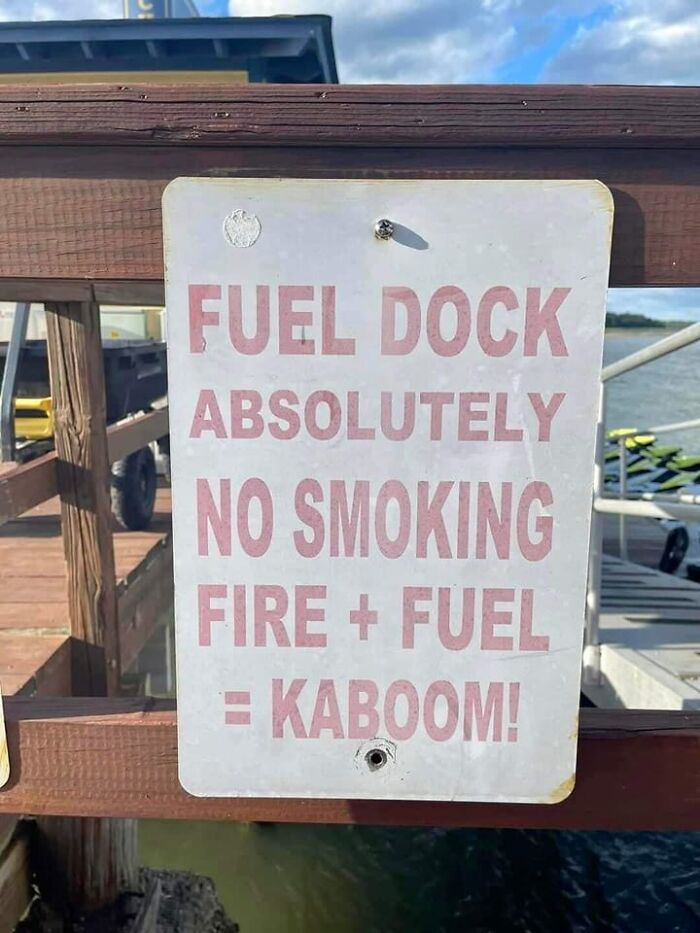
You're not the boss of me. *lights cigar* *explodes leaving a pair of smoking boots behind*
Understandably, Paul, as the creator and admin of this sign-loving page, finds himself constantly on the lookout for new signs that can be shared with his fellow group members. “I do like to find my own and publish them, and I encourage the group to do the same,” he told Bored Panda. We also asked if he had any favorite photos that he’s seen featured in the group, to which he replied that there are plenty of examples. “These are usually so much better than ones simply taken off the internet,” he added. “When I spot one, it has to make me laugh and pass my family's sanity check that it is funny.” He noted the example of a simple sign directing drivers to a dead end with an arrow, because it’s questionable why that needs to exist.
Finally, Paul shared that he does not necessarily have any big plans for the future of Silly Signs Funny Signs Dumb Signs Stupid Signs, as he never expected it to become so popular in the first place. “It was a good learning exercise in growing a community through social media cross promotion and awareness," he told Bored Panda. And I’m sure the community will continue to grow, and the group members will continue to be active, as the world clearly has no shortage of amusing signs!
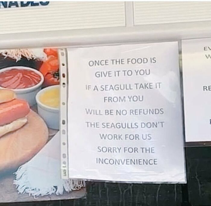
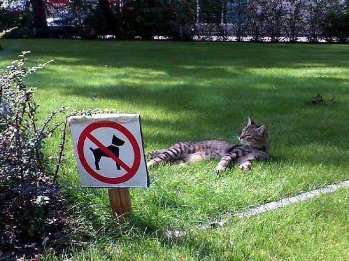
They have been known to grow attached to people who give them beer and hot dogs.
For a previous Bored Panda article featuring brilliant signs that have been spotted around the world, we reached out to Tim Harrelson, CEO of The Sign Chef, to hear his thoughts on why great signage is so important. “Between the physical world and the online world, the competition for attention is at an all time high,” he shared. “Simultaneously, attention spans seem to be at an all time low. Our senses are constantly being bombarded! Moving forward, organizations need to be strategic in how the content is displayed on their signs.”
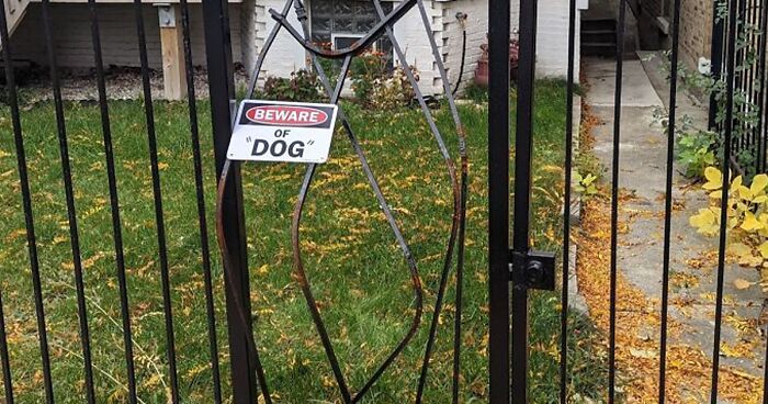
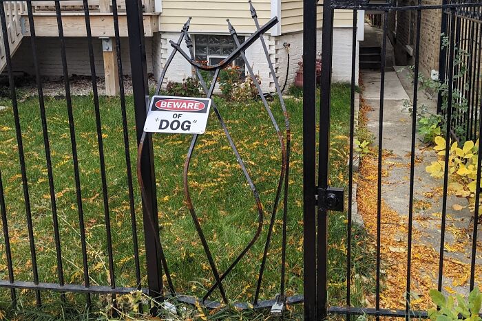
The scariest part of this is that 'DOG' is in quotes... what actually escaped?? Edit: We have established that it was simultaneously a chupacabra, Zuul, Kyle from Despicable Me, a hellhound, several of our fellow pandas, and definitely not Stitch
Tim also explained the method that his team uses to ensure that they design signs that won't end up on a list like this. “Most graphic designers start with the size of the sign - then the lettering & graphics are added. Think backwards," he explained. "A more strategic approach can be taken by having the design reverse engineered for maximum impact. This design strategy starts with the viewing distance. How far away does your target audience need to be able to read the sign?”
“Once the distance is measured, a Letter Sizing Calculator can be used to scientifically determine the very best letter sizes,” Tim continued. “As an example, what is the best letter size if the viewing distance is 110 feet? When you type 110 feet into the calculator, you’ll instantly see 22 inches is recommended for maximum impact - easy.”
And if you’re curious what the Sign Chef himself considers to be the most important factor when designing a sign, Tim told Bored Panda, “The legibility of the message is the single most important factor. Of equal importance is the message itself. What is the core message people need to grasp in an instant?” It seems like the people who designed signs that are featured on this list could learn a thing or two from Tim and his team!
We hope this list is turning you into a connoisseur of signs, pandas. If you’re ever planning on creating signage in the future, now you know what not to do. Or perhaps, what you should do, depending on your goal! Keep upvoting the pics that you find particularly amusing, and let us know in the comments what the most brilliant signs you’ve ever seen were. Then, if you’re interested in checking out another Bored Panda article featuring useless, unsuccessful and/or unpopular signs, you can find that piece right here!
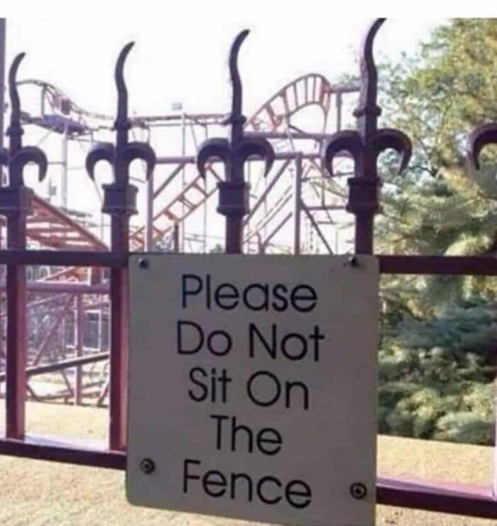
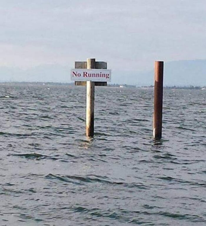
This is at Lagoon amusement park in Utah and I laugh every time I see it 😂
My brain tried to add logic and read it as, "see food." Took me a minute... 🤔
I was in Sydney and came across a sign saying "HOUSE OF CRABS". I wasn't brave enough to go inside and find out whether it was a seafood joint or a really shady low-grade escort agency.
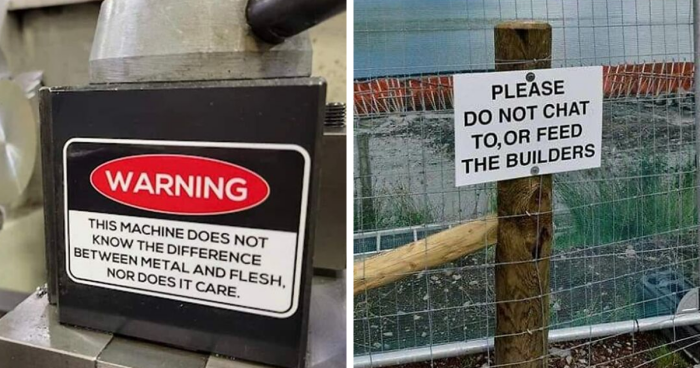
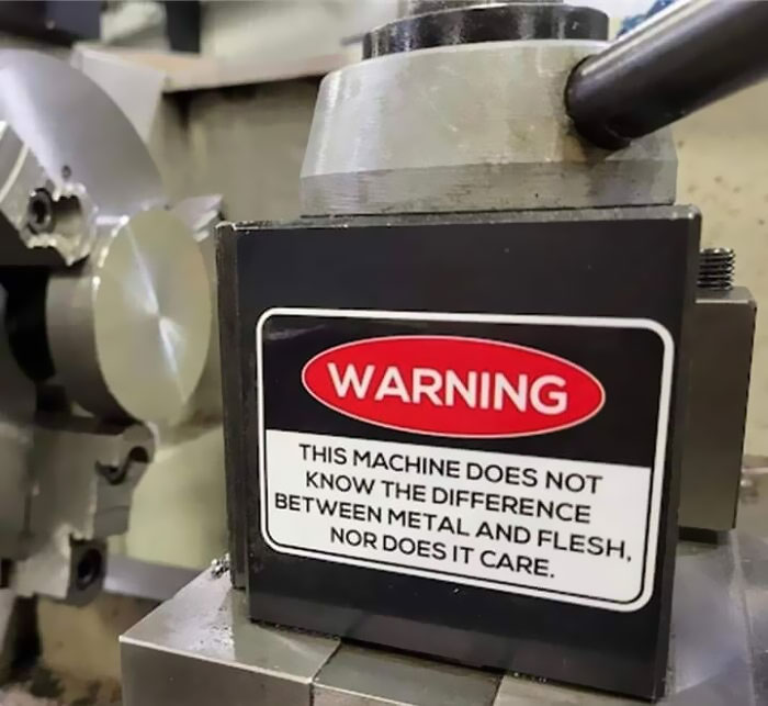
Sign on industrial woodchipper: "This machine has no brain. Use your own." For added understanding of that sign, they often perform demonstrations of the chipper for new customers by turning it on and throwing a large frozen chicken through it. This pretty accurately demonstrates why the result of a human going through the chipper is described on the death certificate/autopsy as "complete morselization of the body." Believe it or not, that *still* doesn't make it clear enough for some people...
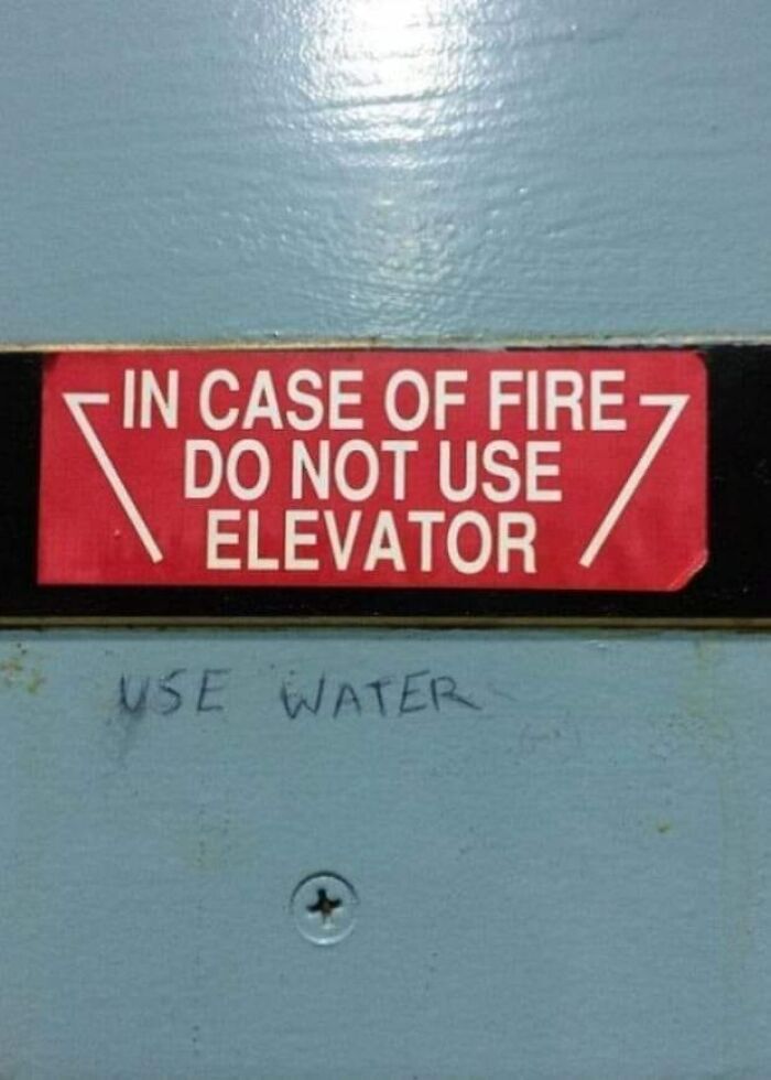
"Please only enter elevator backwards and only when lit up" was another amaaaazing one. My two all-time favourites : Family Planning signage indicating "Please Use Rear Entrance" and the one I attached. natural-se...856d34.jpg 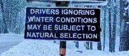

 Dark Mode
  No fees, cancel anytime


