50 Of The Scariest Signs Spotted Around The World You’d Probably Want To Be As Far Away As Possible From
When you think about it, the goal of a sign is pretty basic, isn’t it? We put them up to give us directions, send messages, and warn us about dangers lurking around the corner. But while sometimes they hilariously fail to fulfill their purpose by looking like the most random and absurd announcements ever created, others seem to carry a somewhat threatening aura.
We’re talking about signs that remind us the world is filled with unforeseen hazards that make us want to stop and quickly run the other way. So let us introduce you to the 'Scary Signs' subreddit. This online community with over 379K members has set out on a mission to share pictures of terrifying messages from all over the world "that you don't want to be near".
Some of them are scarier than the danger itself, others are so creepy we can’t help but wonder why they got put up there in the first place. Whatever the case may be, these warnings definitely catch one's attention. Bored Panda has collected some of the most frightening posts from the group, so continue scrolling to check them out for yourself, and let us know what you think about them in the comments!
This post may include affiliate links.
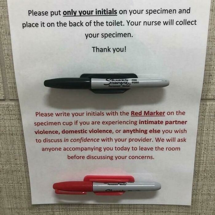
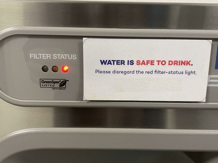
Scary-Sad, But Comforting To Know You Can Be Safe
That's not a scary sign I "don't want to be near" - that's a fantastic sign that we're all glad to see
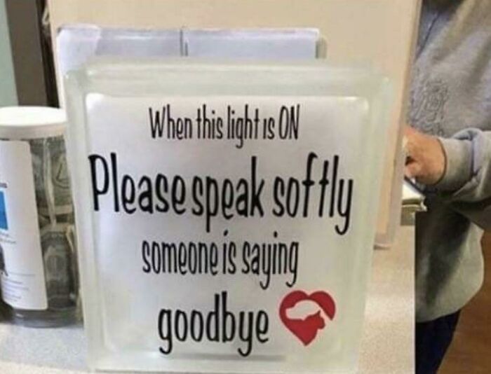
Sign A The Vet
Oh...ok I Understand
Since its creation in 2014, the 'Scary Signs' subreddit has amassed more than 379K members who are eager to share the daunting messages they come across in every corner of the world. Nearly every post consists of terrifying or confusing signs that warn us of potential hazards up ahead and uneasy consequences we will face if we refuse to obey.
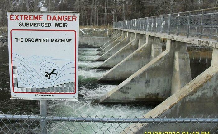
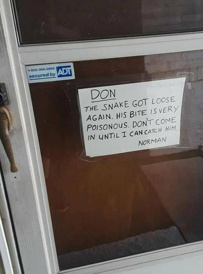
While we're used to seeing safety signs and not batting an eye, people on this online community prove that some of them have a slightly threatening nature that everyone should take notice of. After all, most of us are hoping to avoid falling into "the drowning machine", getting attacked by aggressive geese, or encountering a venomous snake that's missing from its exhibit.
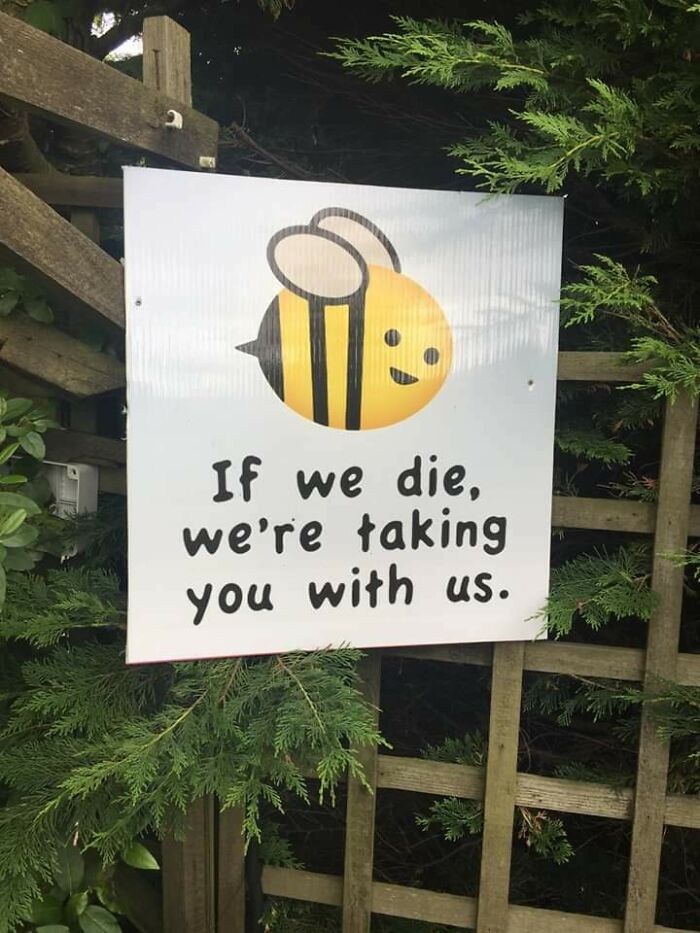
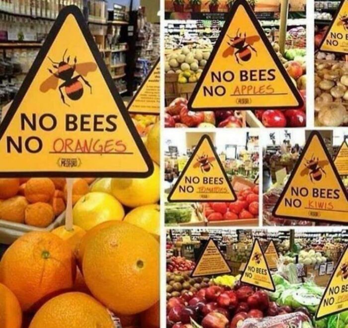
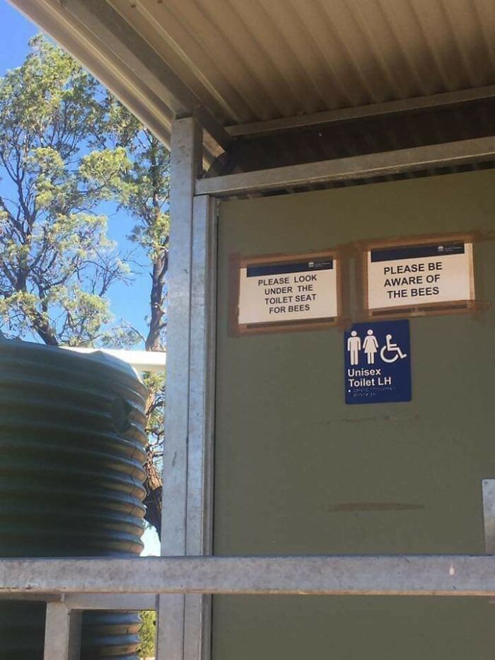
Save The Bees
More Than Sad Scary, But Still
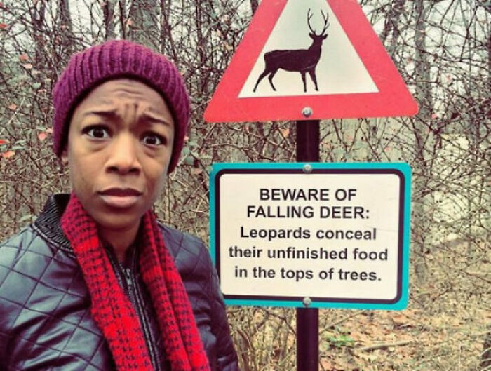
Beware Of Falling Deer
Yet, there seem to be many factors that can make people disregard even the most frightening messages. Maybe you're an adrenaline junkie looking for new adventures every chance you get. Perhaps you think the sign is scarier than the danger itself. I mean, it's better to be safe than sorry, but who really wants to be told to watch out for falling deer? How often does that really happen?
Marc Green, Ph.D., is a human factor expert who has extensive experience in perception, attention, human factors, and related areas. According to him, warning signs often fail to change people's behavior. They can either go unnoticed or, more often than not, they are seen but ignored by the viewer. "For many years, designers focused their concern on sensory aspects of warnings: color, shape, location, pictures vs. text, size and so on. However, recent research suggests that effective warning design depends as much on the contents of the viewer's head as on the contents of the warning's message," he explained.
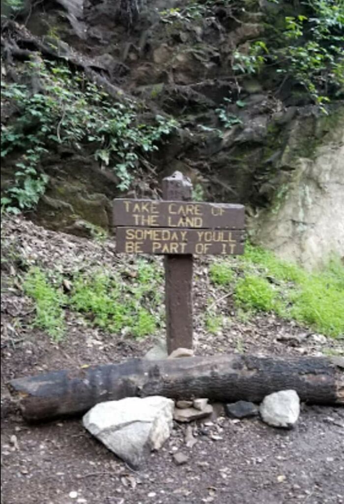
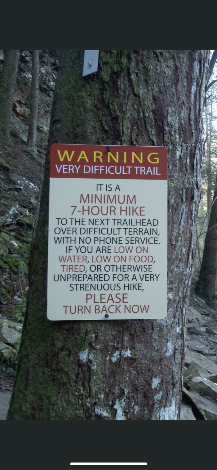
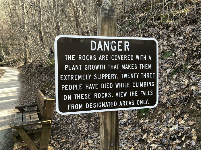
Trailhead In Tennessee
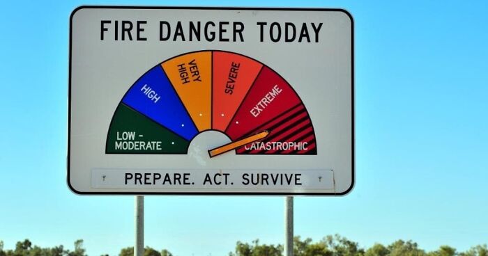
Well, this is a great sign. I have encountered a few similar sign in Australia, and I find them rather helpful.
Don’t Do Meth
No Bees, No Oranges
You see, when people stumble upon alarming messages, they then have to make a decision whether or not to comply. But let's not forget that people who are the intended audience of these signs are not blank slates. They rather start with a thought process containing three components: "First, the viewer has general knowledge about the world and how it works. Second, s/he has a set of beliefs and expectations based on experience with the same or similar environment, product or technology."
"Lastly, the viewer enters the situation with a goal and strategy for achieving that goal," Green continued. "The goal can be specific ('I want to arrive at my destination as soon as possible') or more diffuse ('I want to feel good about myself')." So to create an effective warning sign, the designer must understand what the observer "brings to the table".
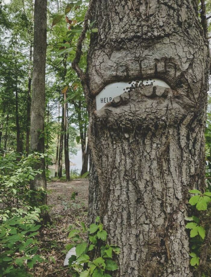
Umm
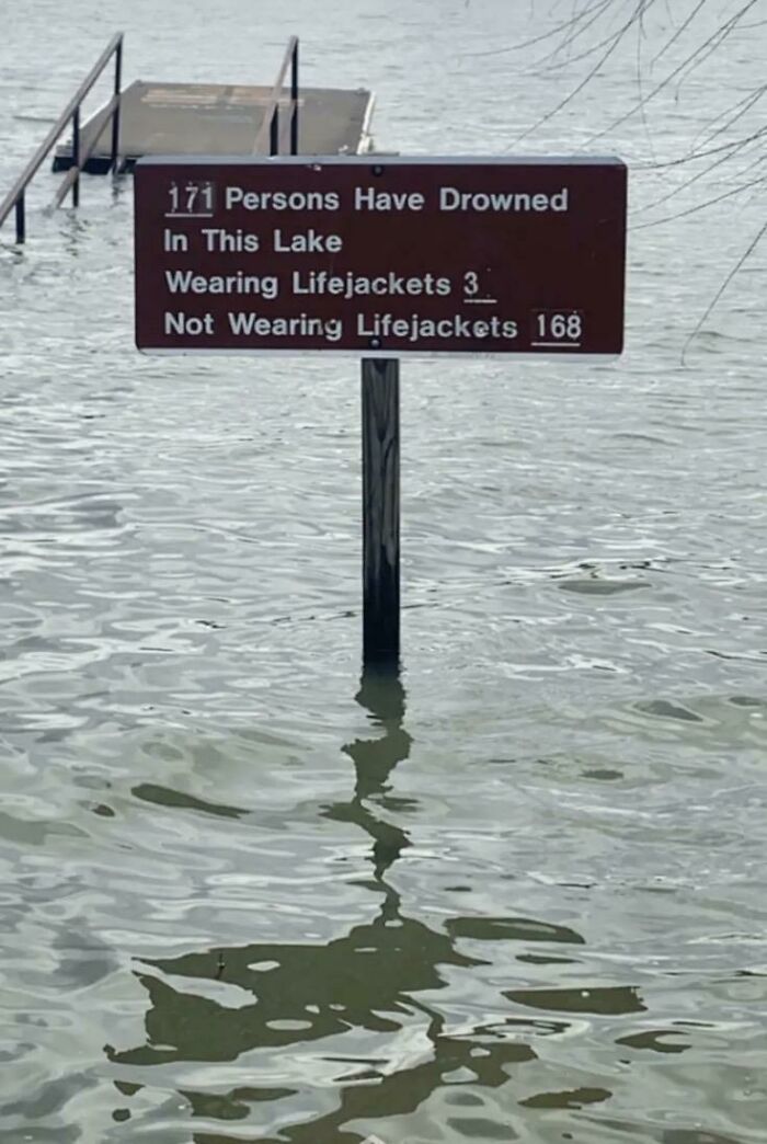
Percy Preist Lake In Nashville, Tn
See? They drowned even if they wore lifejackets! Why should people wear masks/seatbelts/get vaccinated/wear protective gear/etc when you can still die!? /sarcasm, if that was not obvious
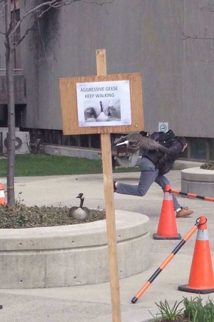
Scary Geese
As viewers, we’re aware that safety signs are placed there for our own benefit. Their purpose is to draw our attention to important information that might prevent us from doing harm to ourselves or the people around us. Unfortunately, sometimes they are less likely to be effective when they are placed in the wrong area or use vague messaging. This could lead to tragic accidents, so it’s always best to make sure the sign will be crystal clear to virtually anyone.
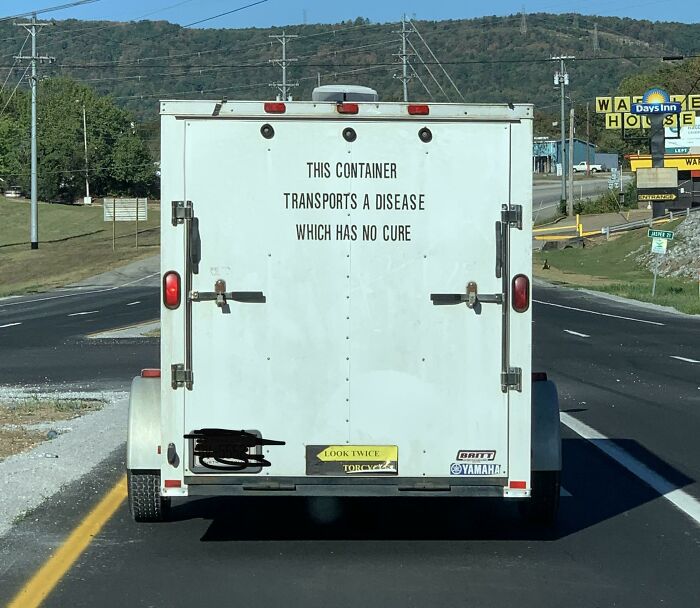
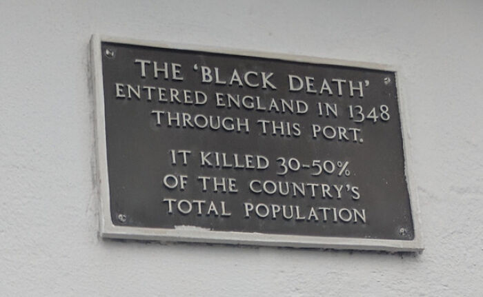
A Disease Which Has No Cure
Something About This Unsettles Me
Straight To The Point, Don't Become Soup
However, even when signs are compelling and tick every box on the list, we humans have a tendency to overlook them. Green explained that when a warning tells us to refrain from behavior that would enable us to quickly achieve our goal, we then make a cost-benefit analysis. "In some cases, the viewer might lose the goal altogether ('No Smoking' signs), or exert more effort ('Detour' signs)," he mentioned some examples of the cost.
When it comes to benefits, they can be practical (like injury avoidance), and psychological. "A driver deciding whether to comply with a speed limit sign might calculate the costs of arriving later," he added. But one benefit of compliance is feeling safe and less anxious, like thinking "I won't be as likely to get in an accident," or "I won't have to spend time and effort looking for a radar trap." Other psychological advantages could be the sense of being "a good citizen" or "a team player," Green argued.
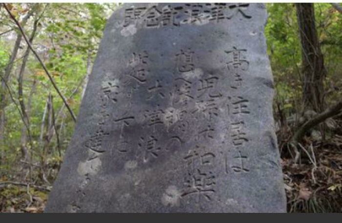
19th Century Japanese Tsunami Warnings. This One Reads: “Remember The Calamity Of The Great Tsunamis. Do Not Build Any Homes Below This Point”
And they still built below that point. I was watching a Geographics video and most of the people who died in the 2011 tsunami were in buildings situated below the tsunami warning points.
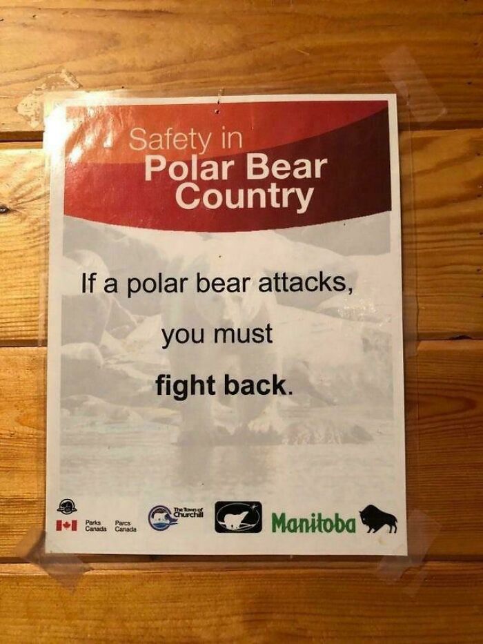
Fight Back
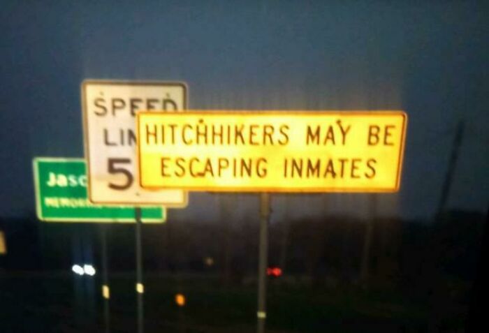
Road Sign I Found In Texas
Reminds me of the time a colleague stopped for a hitchhiker. A couple of miles down the road she accidentally ran over something (squirrel I think). Hitchhiker went to have a look. While he was out of the car she decided to have a look in his bag as she felt uneasy. He had a knife and rope in there. She yeeted out of there so fast. She was traumatised for a long time afterwards. But what a lucky escape.
Another factor that affects how we see the size of the benefits is the perception of danger, which has two elements — hazard and risk. The viewer of the warning sign must take them into account when making the calculation. "If the person believes that there is great danger, then s/he will see a larger benefit in compliance. Conversely, perception of small danger means low benefit and compliance will decrease," he explained.
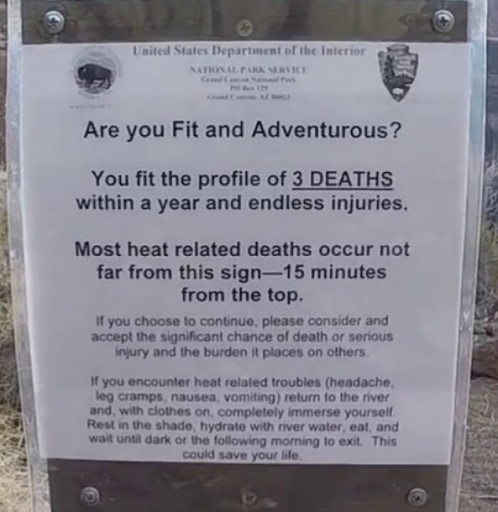
Sign At Lava Falls In Grand Canyon
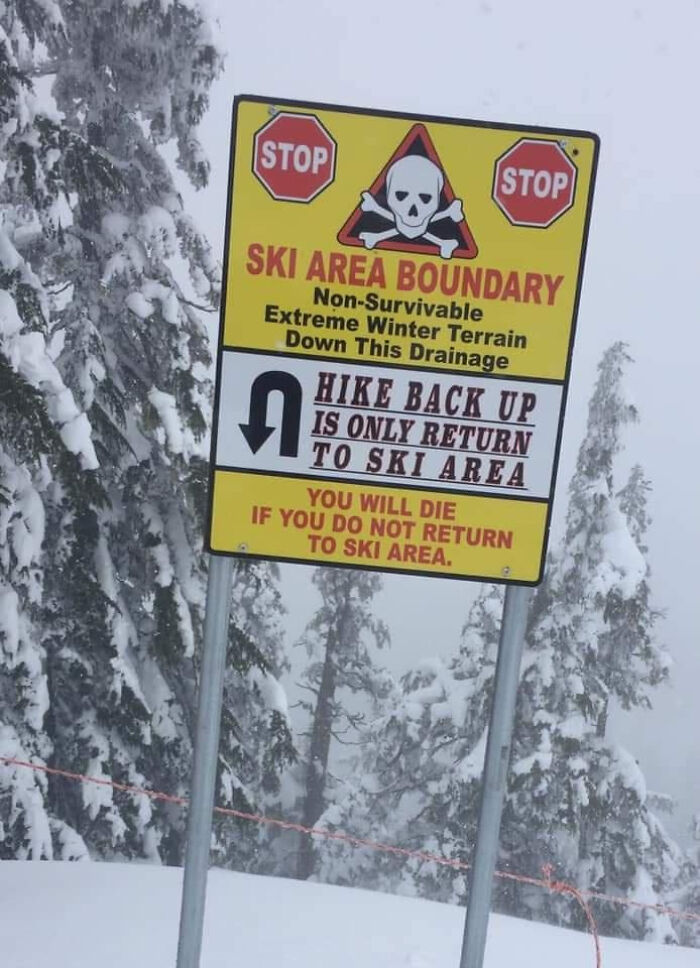
You Will Die
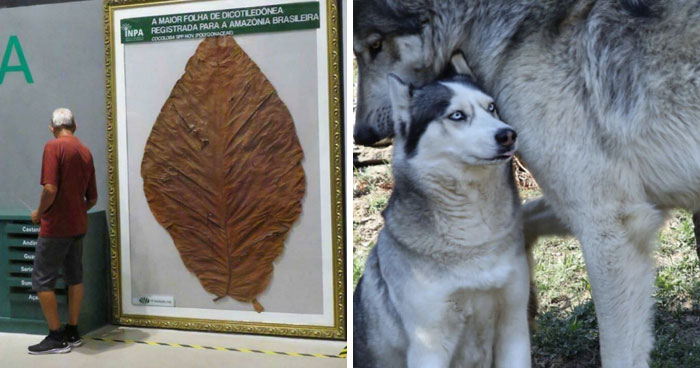
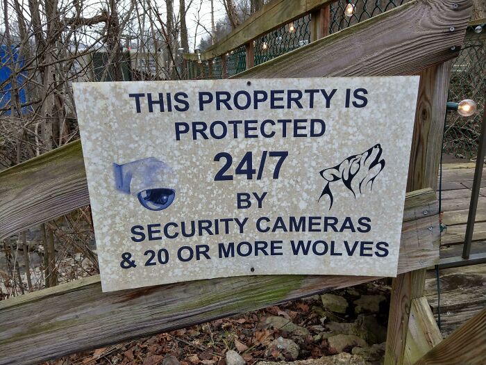
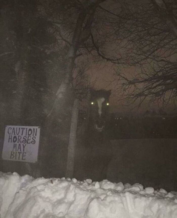
At A Nearby Wolf Sanctuary
Lastly, our personal, social, and cultural backgrounds also affect our decision-making. Green explained that even when two people make the same cost-benefit analysis, they could go two different ways — one might ignore the sign while the other doesn't. "People accept different danger levels, have different attitudes about their ability to control danger and are differentially affected by social and cultural norms," the expert added.
So for warning signs to be persuasive, designers should focus more on the psychological factor. Sure, the bright glaring colors and terrifying symbols catch our attention and might stop us from falling into dangerous threats, but harmony between human behavior and design would reduce accidents even further.
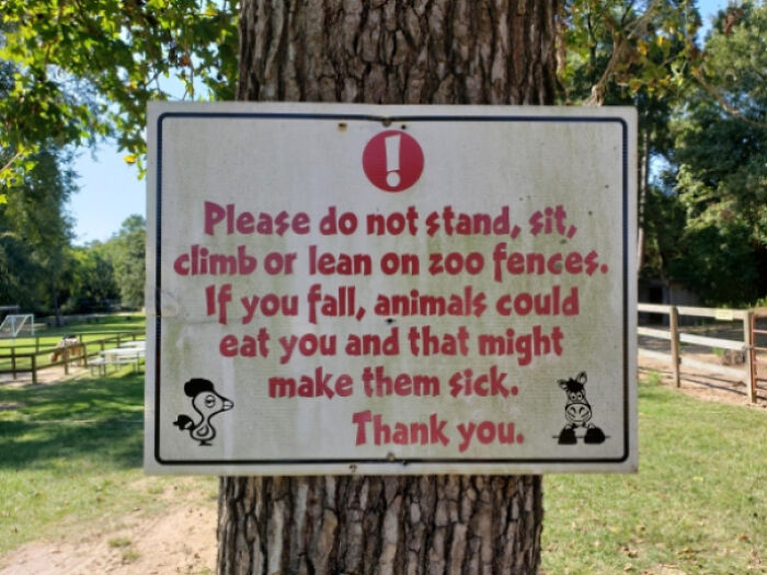
Bronx Zoo
Just Another Day In Alaska
Just think if people closed their bins properly and didn’t litter (or encroach on bears habitats) then they wouldn’t come looking for food in houses / public spaces.
"The Drowning Machine"
I bet that somebody stupid will go in hoping to make a great TikTok video
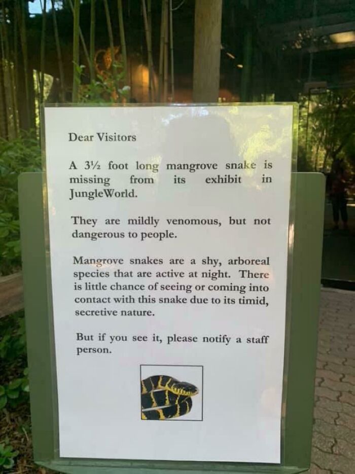
Uh Oh. Keep Out Of The Danger Noodle Room
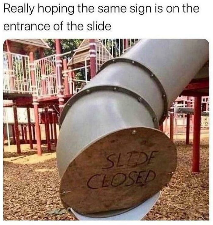
This Slide
Bush Fire Rating Signs All Over Australia
Yikes
Trust Me, I Won't
Nope.
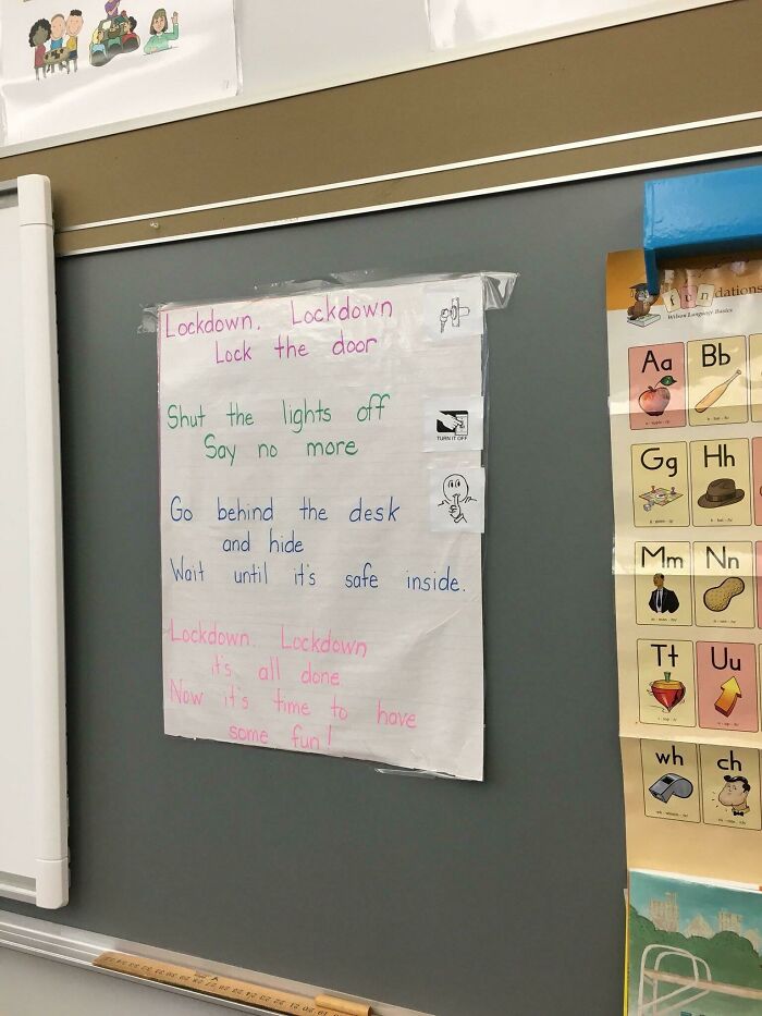
The School Lockdown Song
Worst sign ever. Nothing like a funny shooters song 🙈 for the little ones. Awful.
How Fast Is It Going To Move?
This Got Dark Real Quick
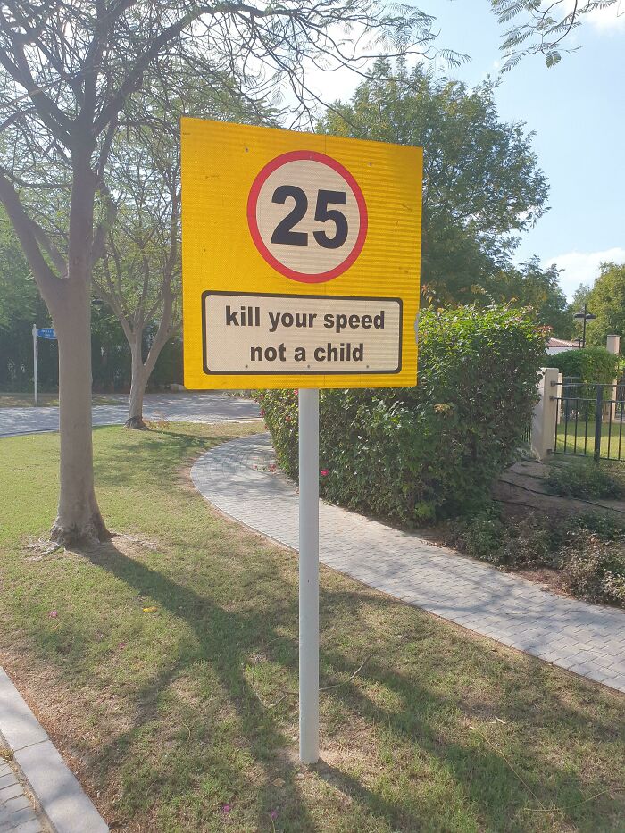
Common all around the UK for a while. Now, probably prompted by research findings, we have signs written by children, with childish drawings, that say 'Twenty is Plenty'.
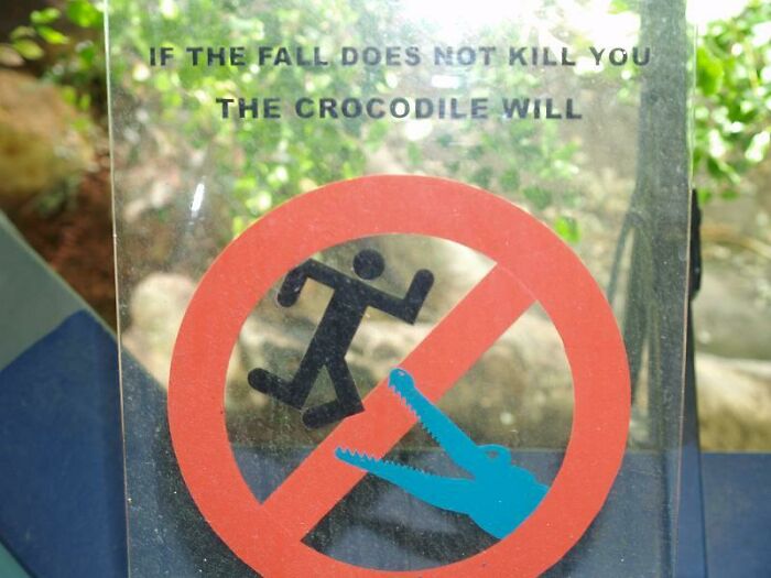
Crocodile Enclosure At Sydney Aquarium
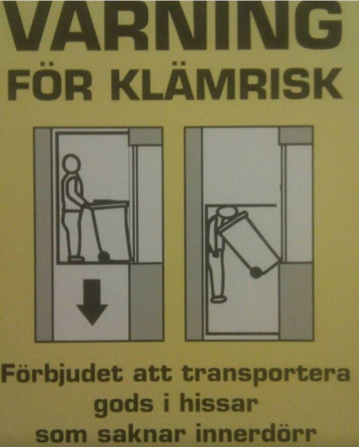
You Get The Gist, Even Without A Word Of Swedish
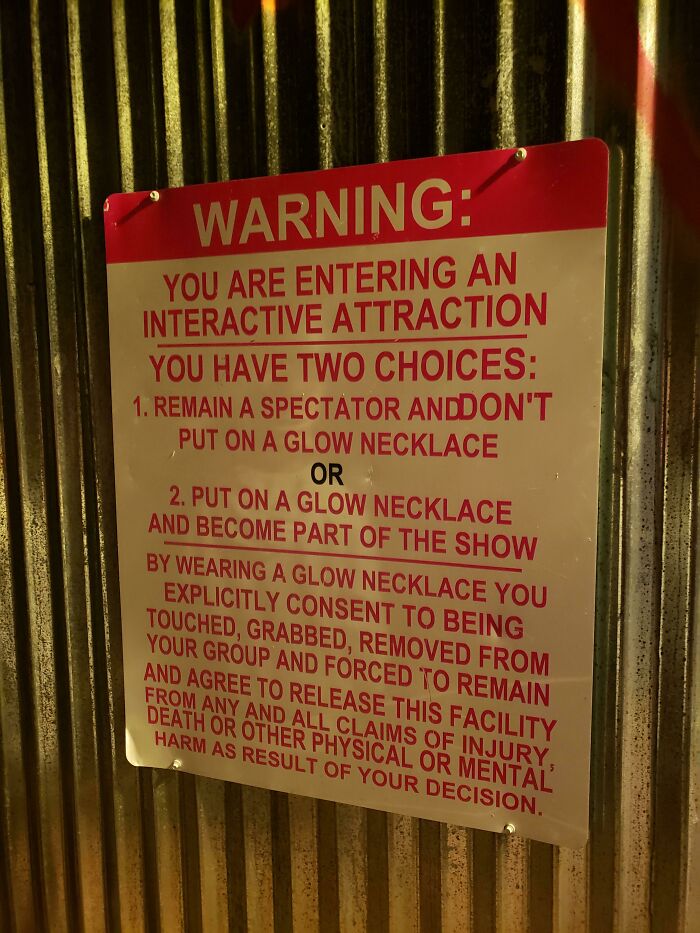
At Least They Give You A Choice.
Not Sure If This Counts
At My Apartment Complex
Yeah I Think I’ll Pass
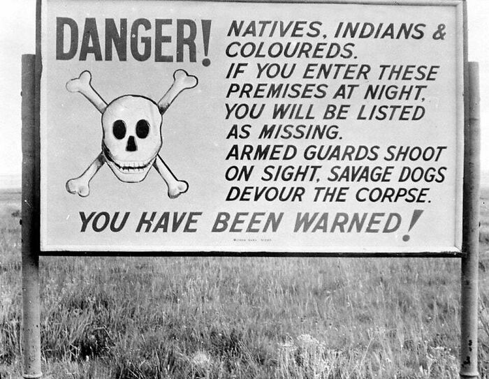
Apartheid-Era Sign Near Johannesburg, South Africa (1953)
I had the misfortune when I was young to have a brief conversation with a white "Rhodesian" (young man) and yes, attitudes really were that vile.
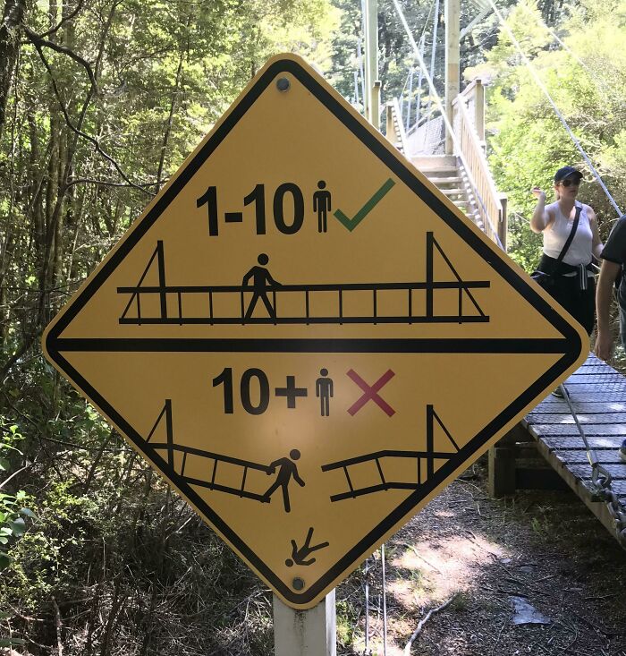
Crossing A Swing Bridge In Nz
Think This Belongs Here!
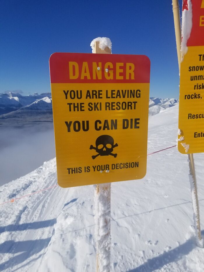
Careful When Skiing
Heart Rate Increasing
Slowly Puts Shovel Back In Trunk
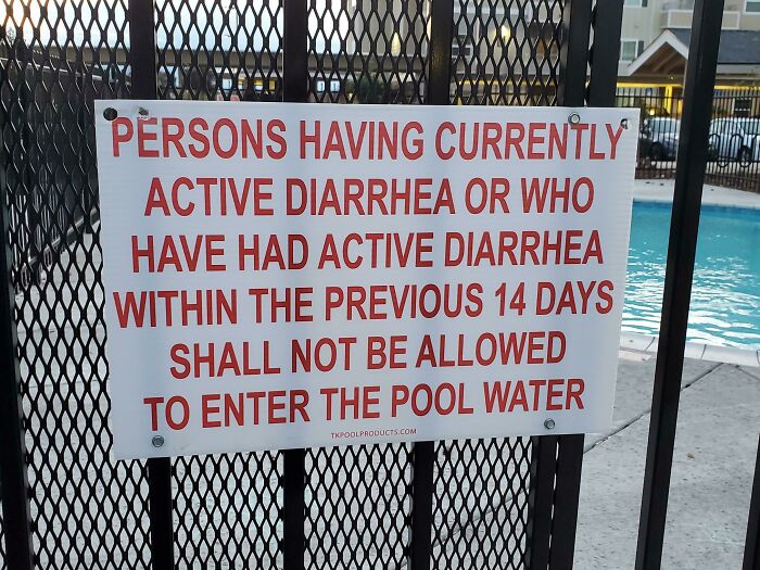
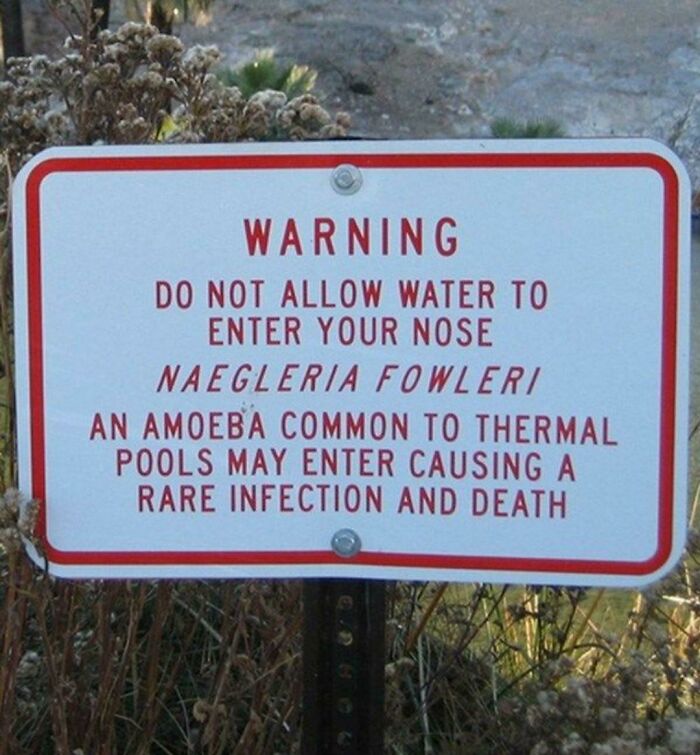
Ok, Let's Just Go To The Public Pool?
Water somehow always enters my nose while swimming. I’d avoid this pool no matter what
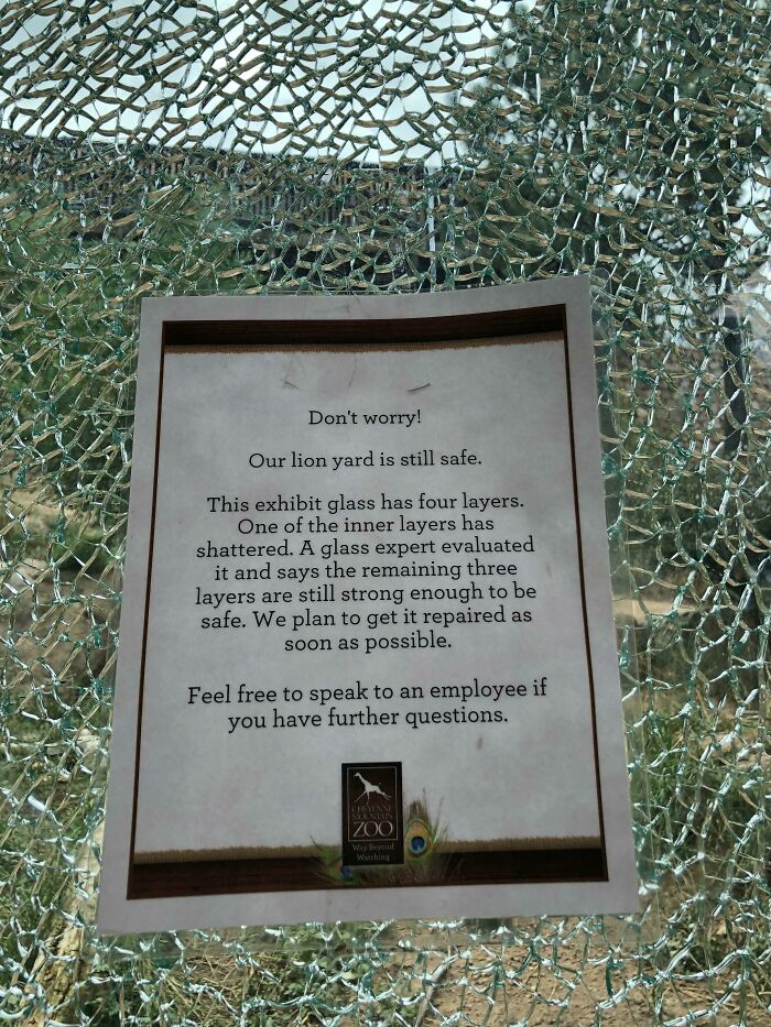
No Worries, 3 Layers Of Glass Still Remain To Protect You From The King Of The Jungle!
Yeah but how did it break? Accidental damage or was the lion testing the fence like a Dino in Jurassic Park. If those lions are looking to escape we need to know!
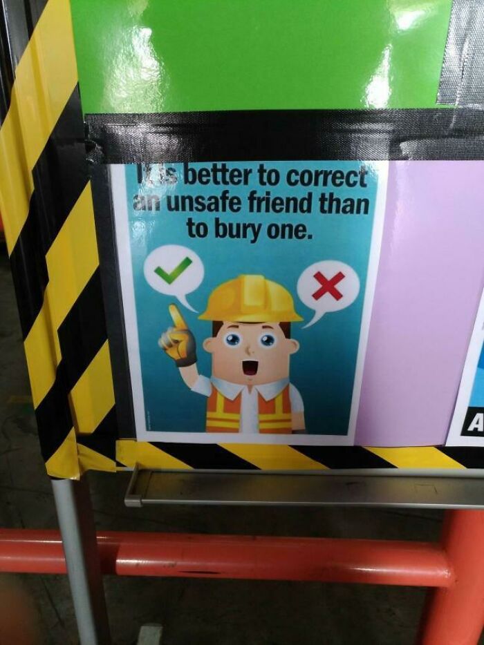
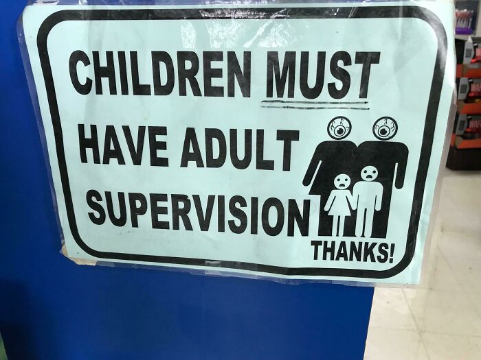
Cute Cartoons Don’t Make Creepy Messages Better
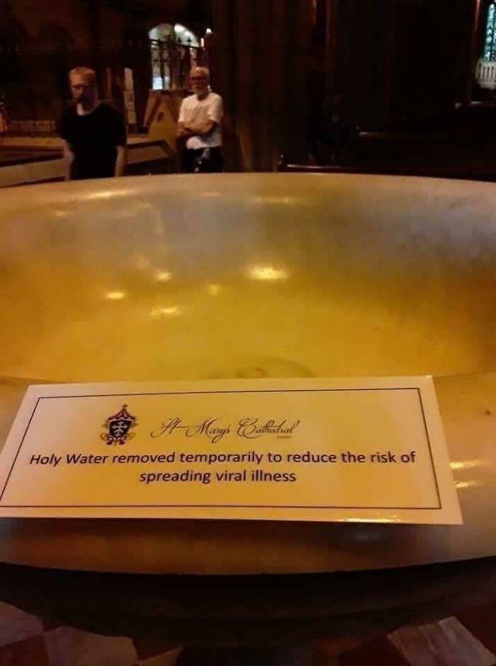
“Holy Water Removed Temporarily”
Saw This Walking Through My University After Hours
Unusual signs have the potential not only to warn but also to amuse and intrigue their audience.
If you're captivated by the underlying theme of threat and humor found in certain signs, you might want to look at an Instagram page dedicated to showcasing quirky and entertaining messages that convey a similar vibe.
Wear Mask Or Die !
Found This Gem At A Local Bulk Foods Store
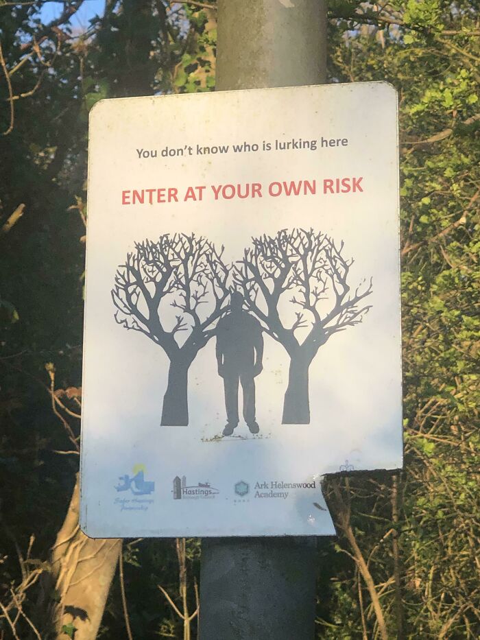
You Don’t Know Who Is Lurking Here
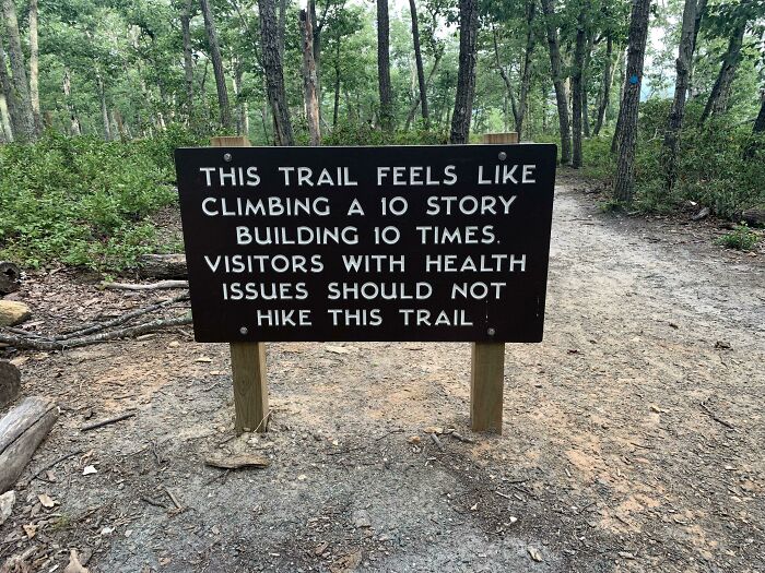
Posted On A Hiking Trail At A Very High Waterfall
Hikers Beware
I wonder how many people were surprised to discover they had health issues when hiking this trail? Like, TDIL...
More Cute Than Scary
I'll Just Hold It
I’ve seen these signs but for spiders and snakes. In some countries it’s just best to check for everything!
"Not Advisable To Enter" A Wetlands Sanctuary Reserve.
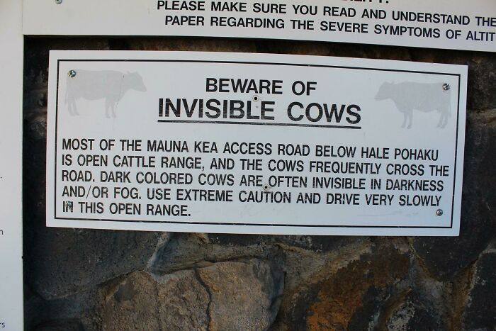
Udder Terror!
Yeah boss sorry I'm late. I've been attacked by the invisible cow. Again.
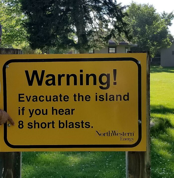
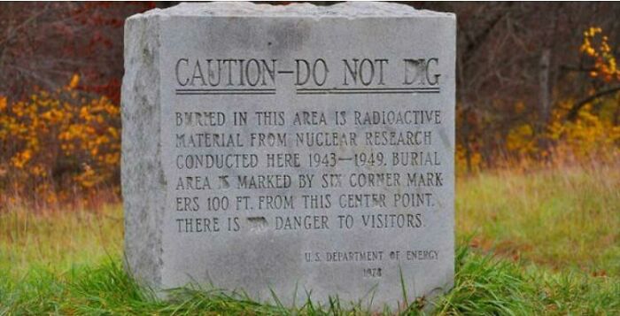
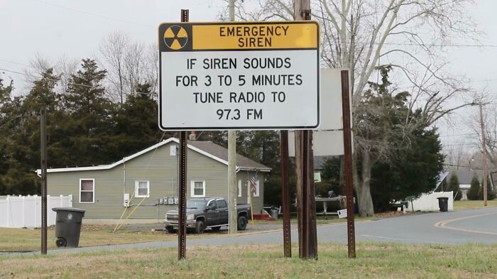
Sign Near Nuclear Plant In Nj
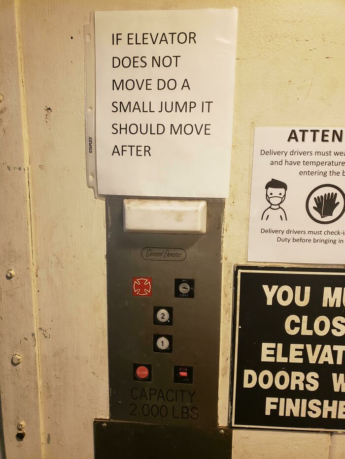
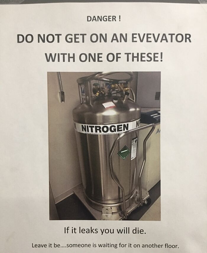
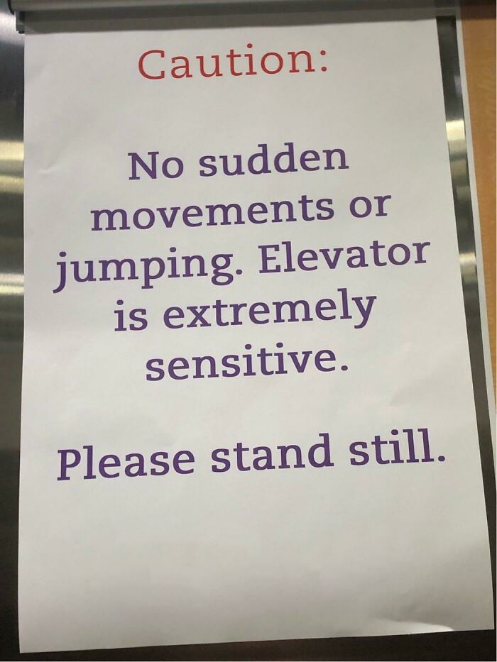
I Think I’ll Just Take The Stairs Next Time...
I’d never jump in an elevator irrespective of the condition of it
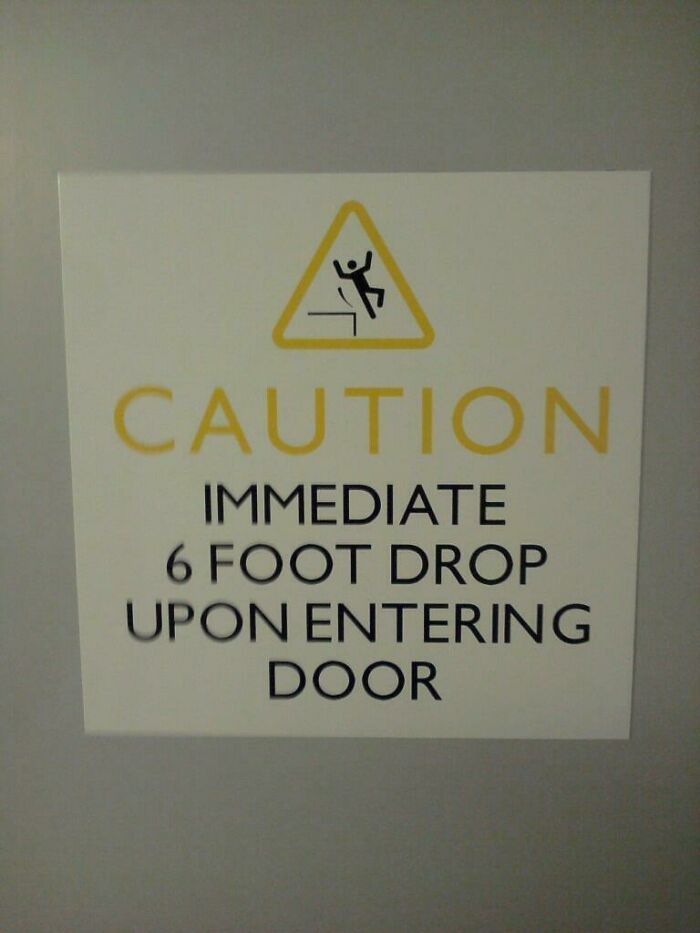
Good To Know
Where is this - the Winchester Mystery House? (If you haven't seen it, it actually does feature a door about two storeys up which opens onto nothing but a painful fall into the rose bushes).
Do I Trust The Sign Or The Sensor?
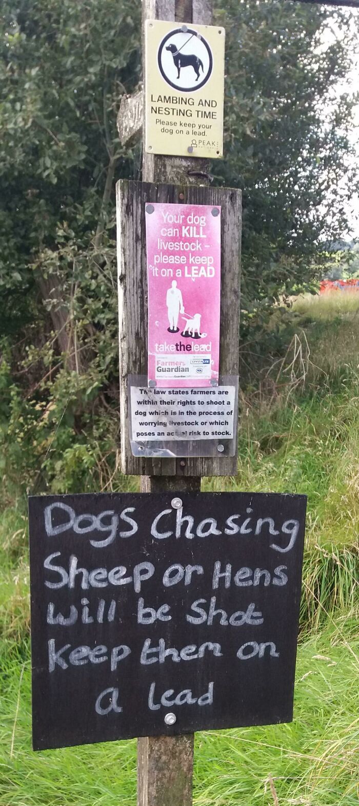
On A Public Trail Through Farmland In The Peak District, UK
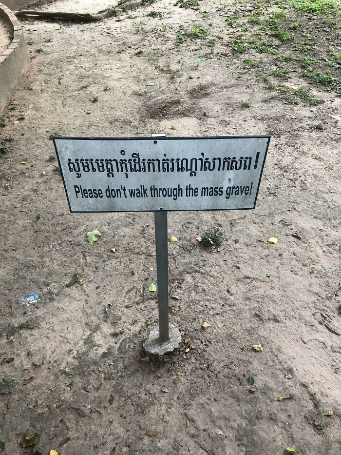
Casual Sign I Took A Picture Of In Cambodia
If you’re a tourist visiting Cambodia you should know about the killing fields. If you don’t then educate yourself before going.
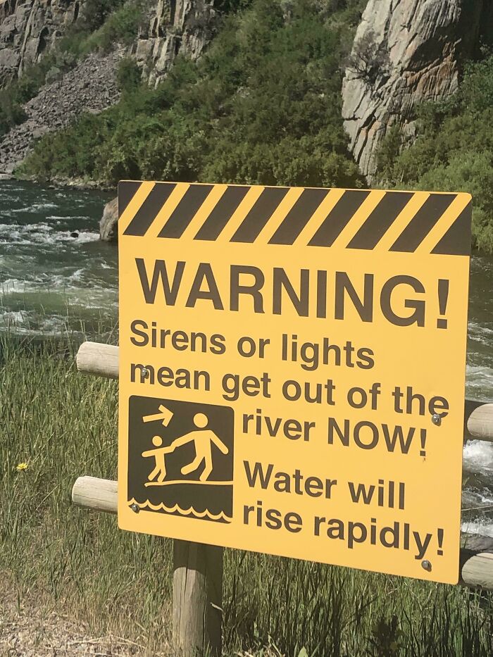
In Bear Trap Canyon, Montana
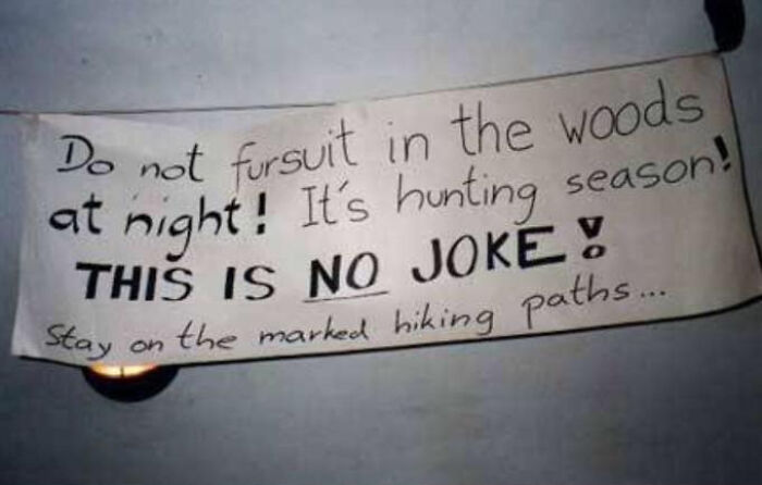
Hunting Season.
Saw This At My New Job, Wish Me Luck Guys.
Any Questions?
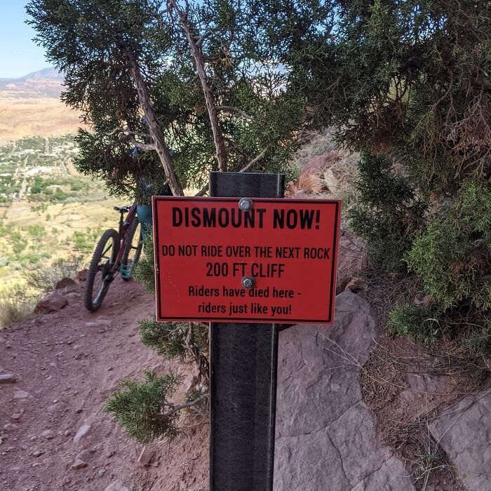
Found On The Portal Trail. End Of Mag 7 In Moab, Ut.
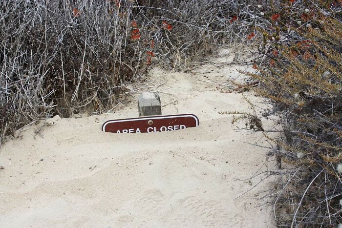
Area Closed
Ominous Signs Like This All Through Amarillo On People's Property. Some Guy Named Stanley Marsh Put Them There And Then [passed Away]. That's All We Know
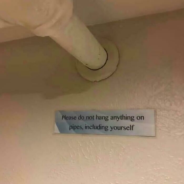
Do Not Hang Anything
If they need that sign then they should box in the pipes. Problem solved.
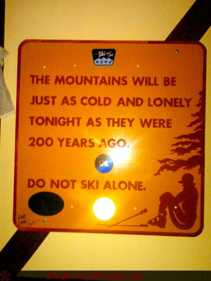
Apparently From Killington Ski Resort.
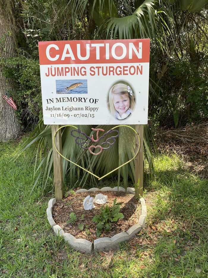
Watch For Jumping Sturgeon
LAKE CITY - Funeral plans are set for a 5-year-old north Florida girl who died after being struck by a sturgeon that leaped into the boat she was riding in with her family. The Gainesville Sun, citing a funeral announcement, reports the funeral for Jaylon Leighann Rippy is planned for Saturday in Chiefland. She died last Friday, hours after the sturgeon jumped into the family's boat. Officials say the girl's mother Tanya Rippy suffered facial injuries and her 9-year-old brother Trevor Rippy suffered a broken wrist.
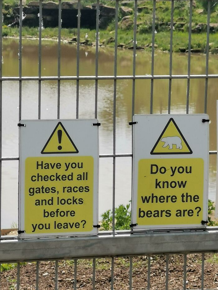
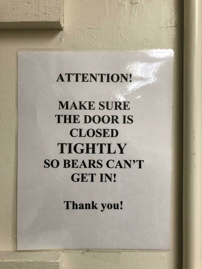
Do You Know Where The Bears Are?
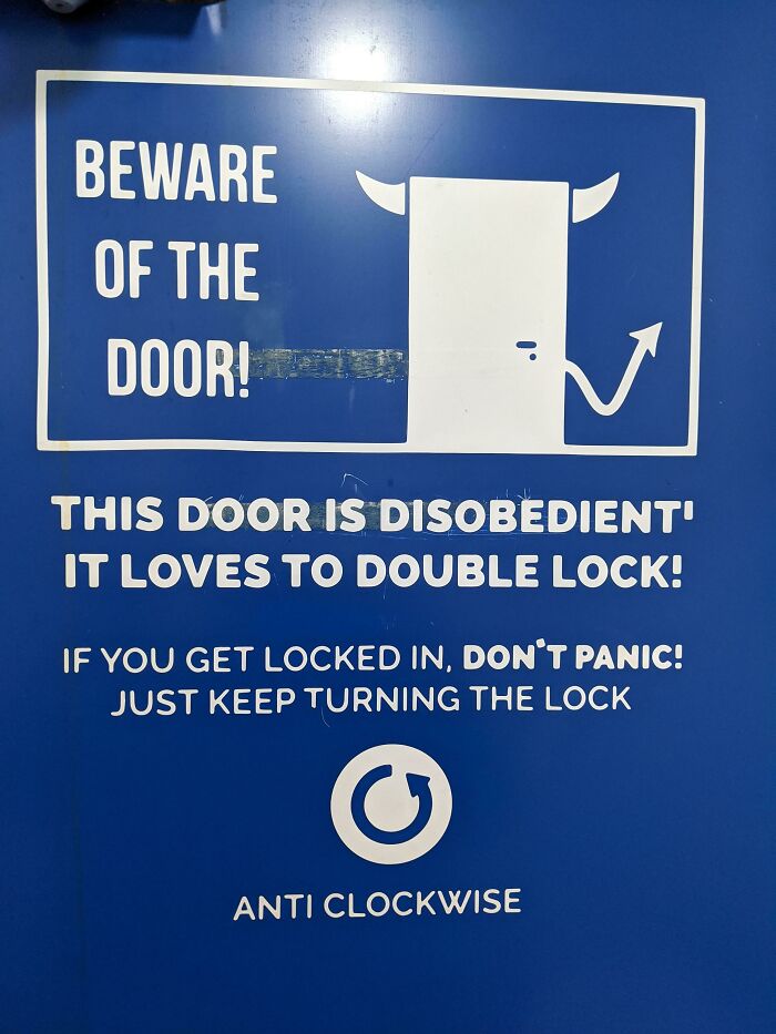
Outside Toilet. One Door.
I got locked in my bathroom twice and it’s so scary. I’d stay clear of this door
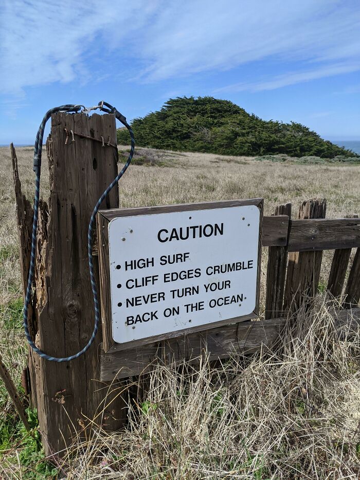
Oddly Poetic Sign In Sea Ranch, Ca
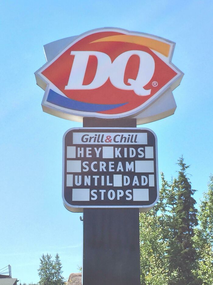
Um... Are We Still... Are We Still Talking About Ice Cream...?
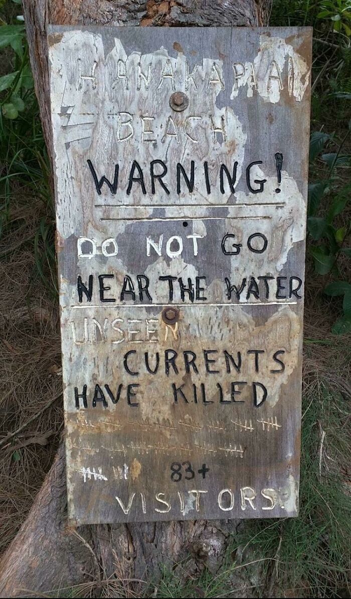
At A Beach Along A Hiking Trail In Kauai, Hawaii
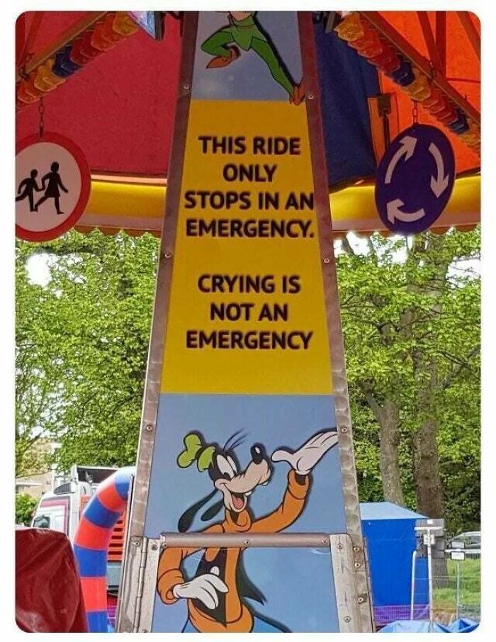
Is Not An Emergency Yahauh
*50,000 demons posses a child causing them to cry* “the ride ain’t gona stop snowflake”
Is That A Threat?
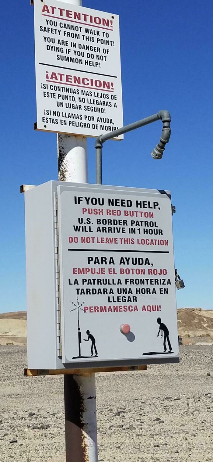
Took This Picture A Few Years Ago In Near The Border
Yeah just hang around and wait an hour for that zombie to catch up with you!
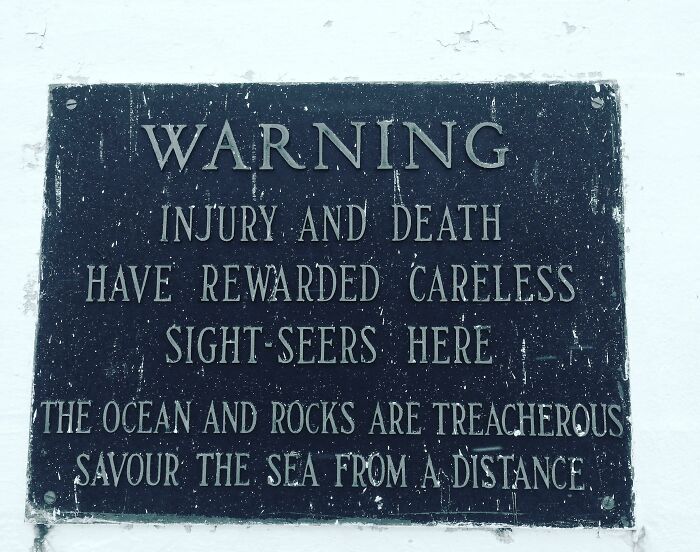
Warning Sign Near Peggy's Cove Lighthouse. Nova Scotia, Canada.
If you want to see and feel power, check out the Bay of Fundy which has the highest tides in the world. From low to high, about the height of a 3 story building. About an hour from Peggy's Cove.
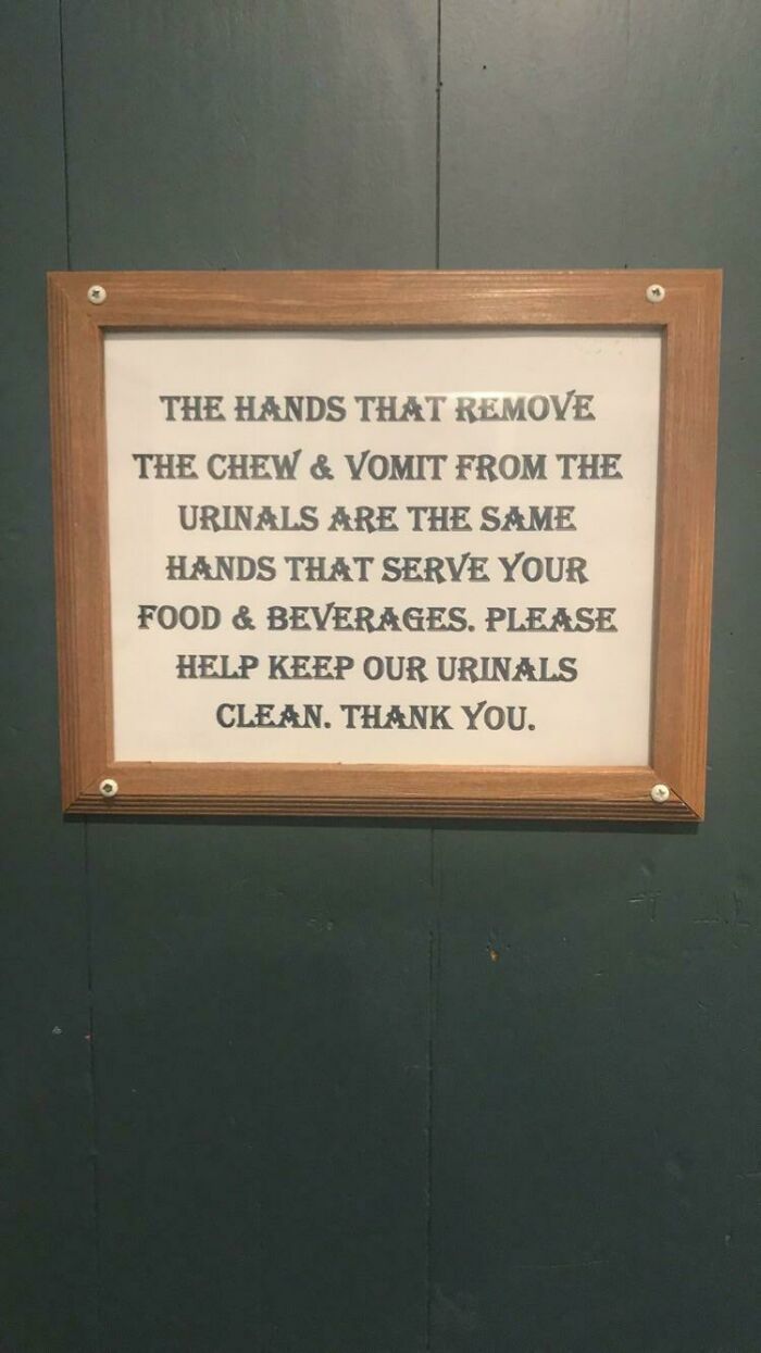
"Emergency Medical Staff Has Been Infected. We Will No Longer Treat Patients. Quarantine Underway."
The Thought Of This Makes Me Want To Cook At Home Even More.
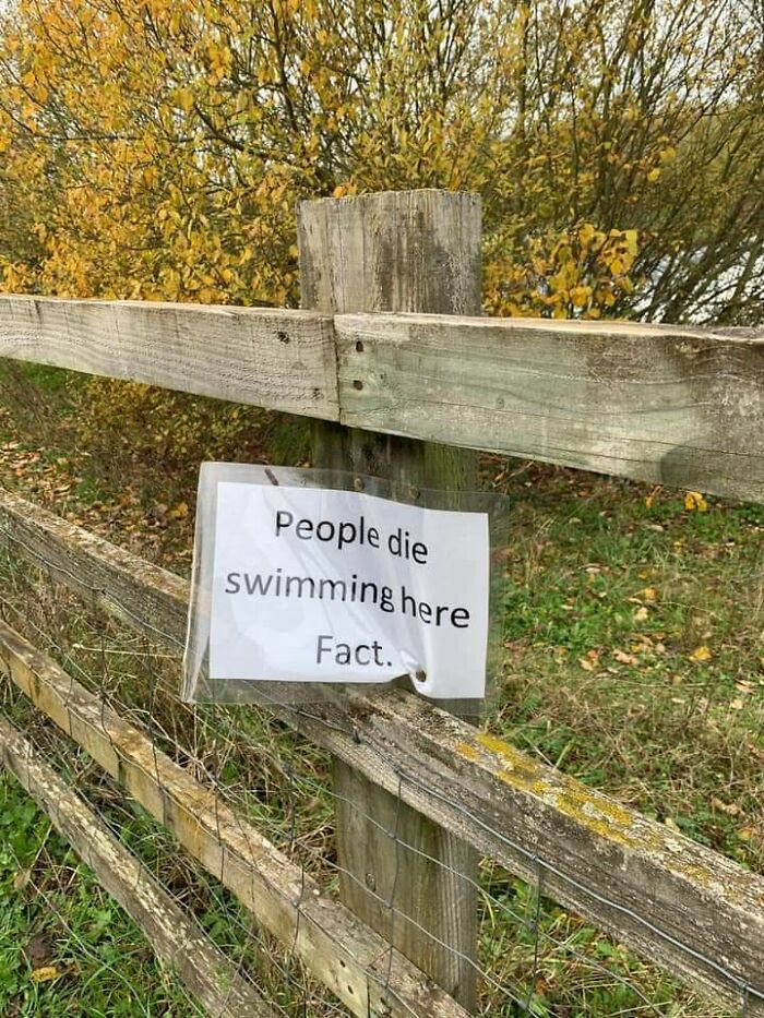
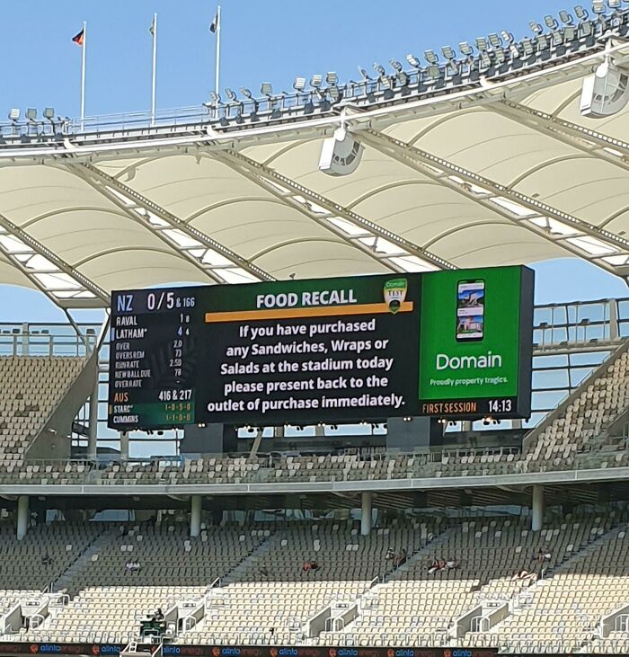
Fact.
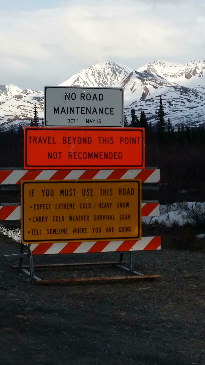
In Alaska
Towns in Alaska are very far away by road and can be dangerous during the winter. Please do follow the sign's instructions, make sure you have winter tires, food, water, bells... etc. I am Alaskan and this really is no joke.
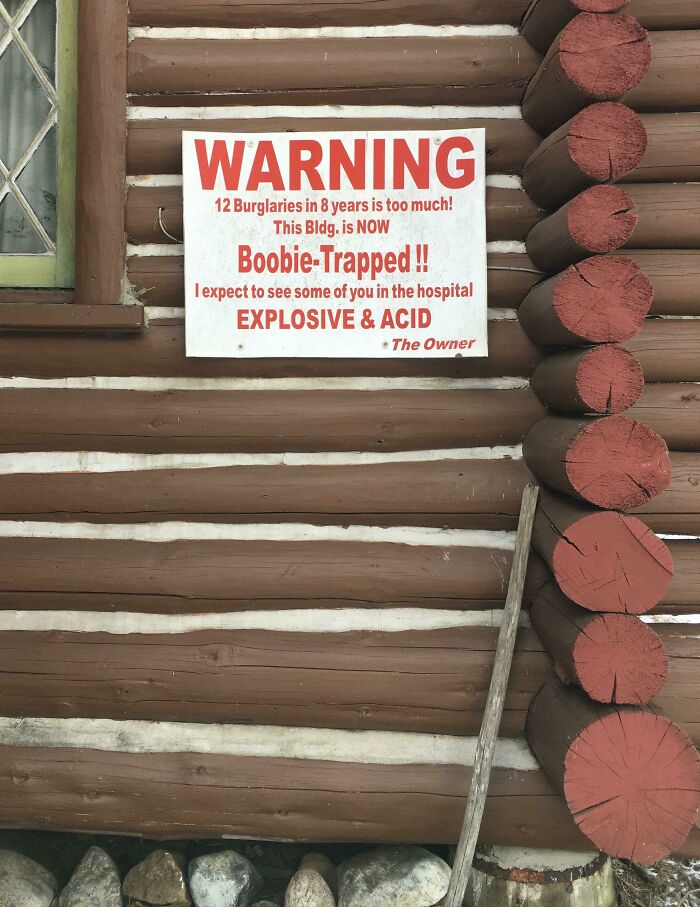
Found In The Adirondacks. Explosive And Acid Is A Good Combo.
That Will Make Your Hair Stand Up.
Watch Where You Step
Whatever you do, do NOT take it home with you and use it to get rid of that stubborn stump in your back yard
Yeah, I'm Not Going In There...
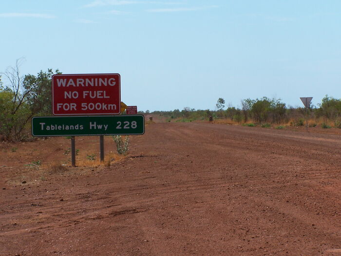
You Know When You’re In The Australian Outback When You See A Sign Like This..
Which direction and how far is the nearest fuel? I mean, is it already too late?
Ryan Dam, Montana.
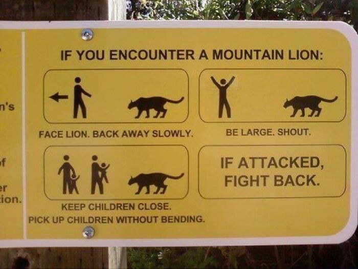
If Polar Bear Attacks, You Must Fight Back
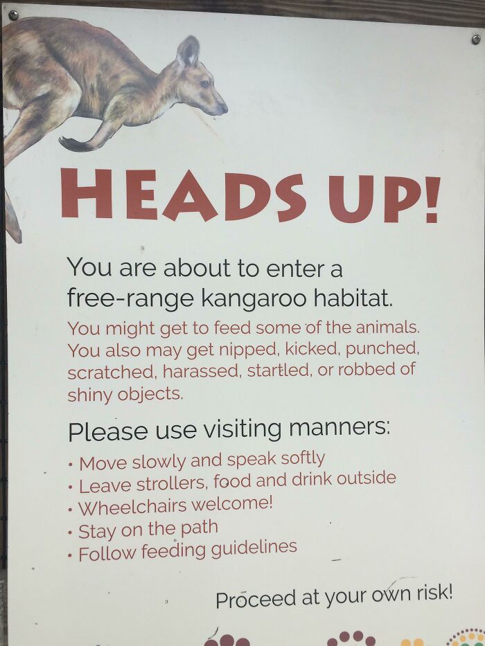
Heads Up!
“Wear A Mask”
I’m inclined to think that this is chinese writing but it may also be korean or japanese. Can anyone tell me?
A Happy Little Sign At My Work
That’s A Nope From Me Boss
That’s Reassuring
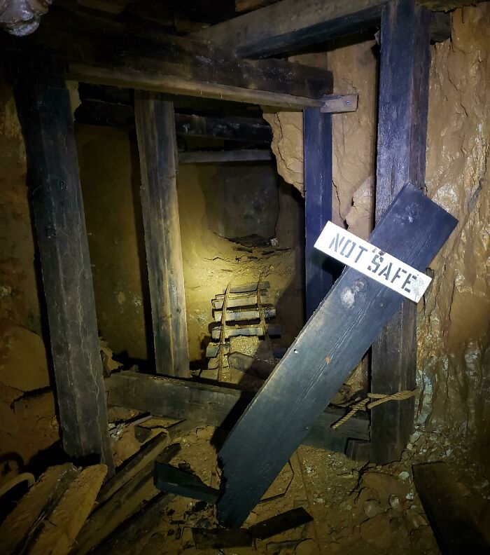
I Explored An Abandoned Mine This Weekend. The Floor Drops Down Into An Abyss Past This Sign.
Scary yes but also that’s a mine dude (probably one you’re trespassing in). Kind of expect them to be scary and full of hidden horrors.
Saw This On My Walk Earlier On...
On A Gas Station Outside Of Valdosta
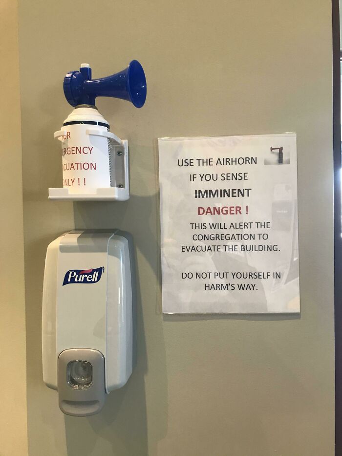
This Sign By The Entrance To My Church.
(To answer the “why” questions) Active shooter or terror attack 😔
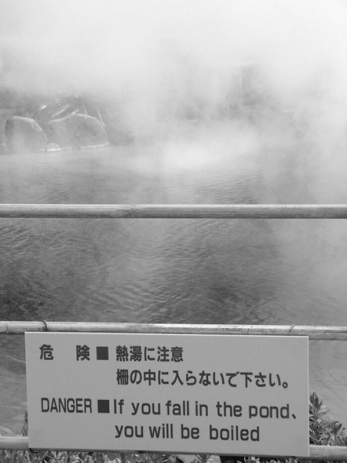
Stay Out Of The Water Or You’ll Get Burned.
Hold Your Breath
A Sign In Hefei. It Reads, “Early Detection, Early Report, Early Quarantine, Early Diagnosis, Early Treatment”
One I was sure I'd see: Trespassers will be Shot! Survivors will be Shot Again!
One I was sure I'd see: Trespassers will be Shot! Survivors will be Shot Again!

 Dark Mode

 No fees, cancel anytime











![Ominous Signs Like This All Through Amarillo On People's Property. Some Guy Named Stanley Marsh Put Them There And Then [passed Away]. That's All We Know Ominous Signs Like This All Through Amarillo On People's Property. Some Guy Named Stanley Marsh Put Them There And Then [passed Away]. That's All We Know](https://www.boredpanda.com/blog/wp-content/uploads/2022/05/6278d3ccf24e8_nxbzd65iz0m41__700.jpg)
