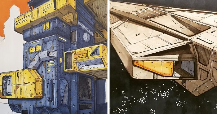
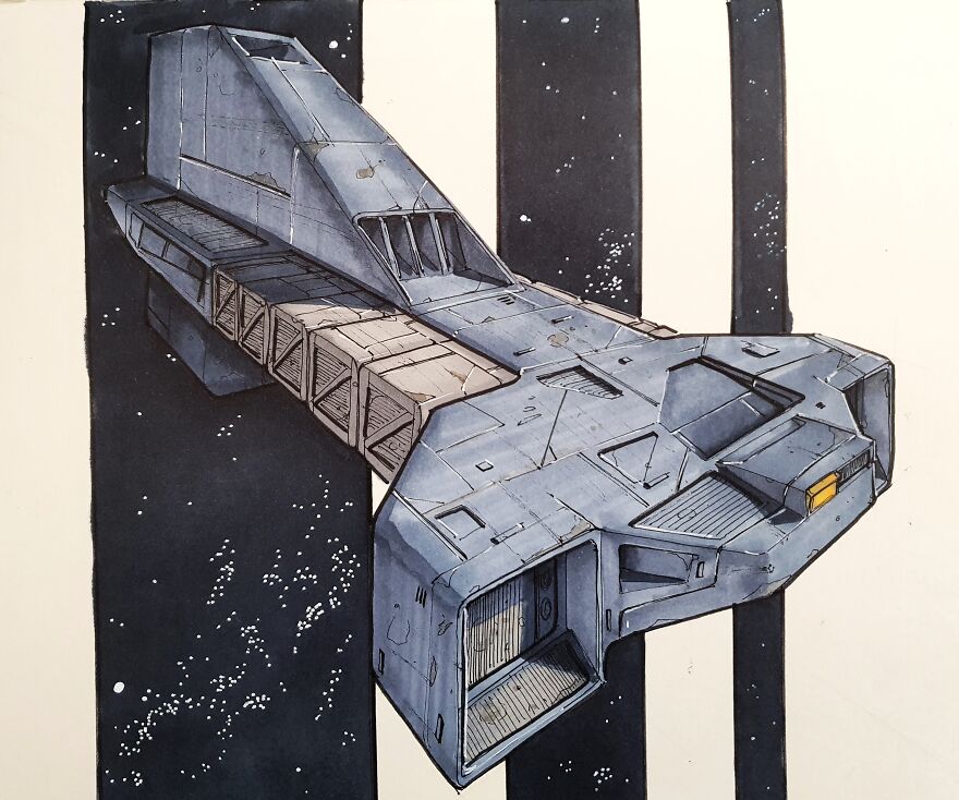
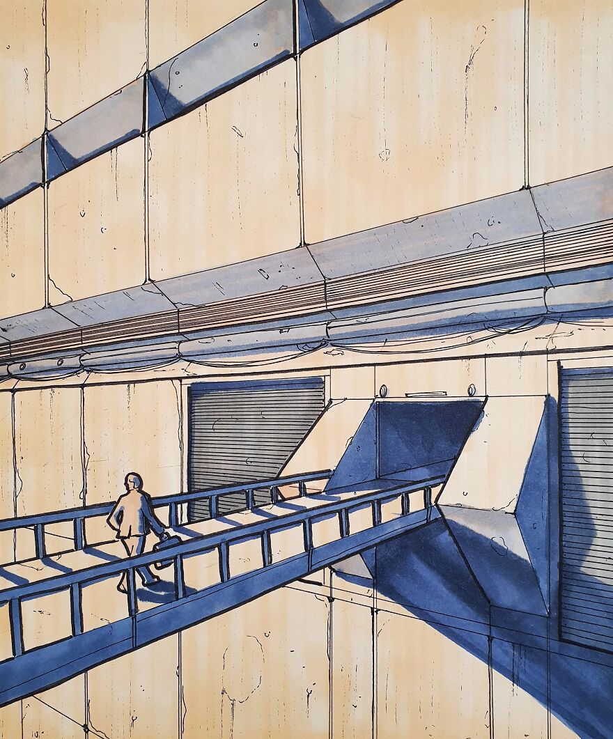
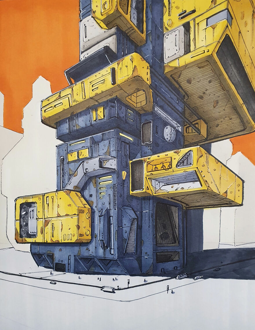
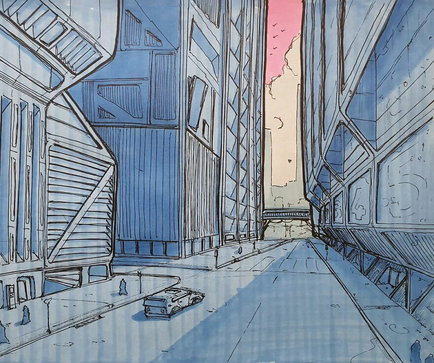
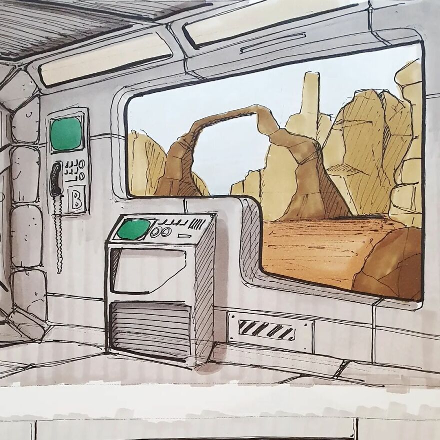
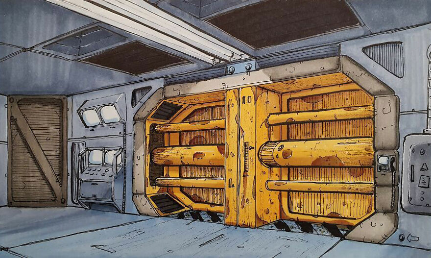
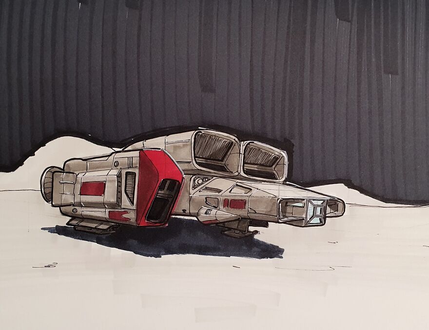
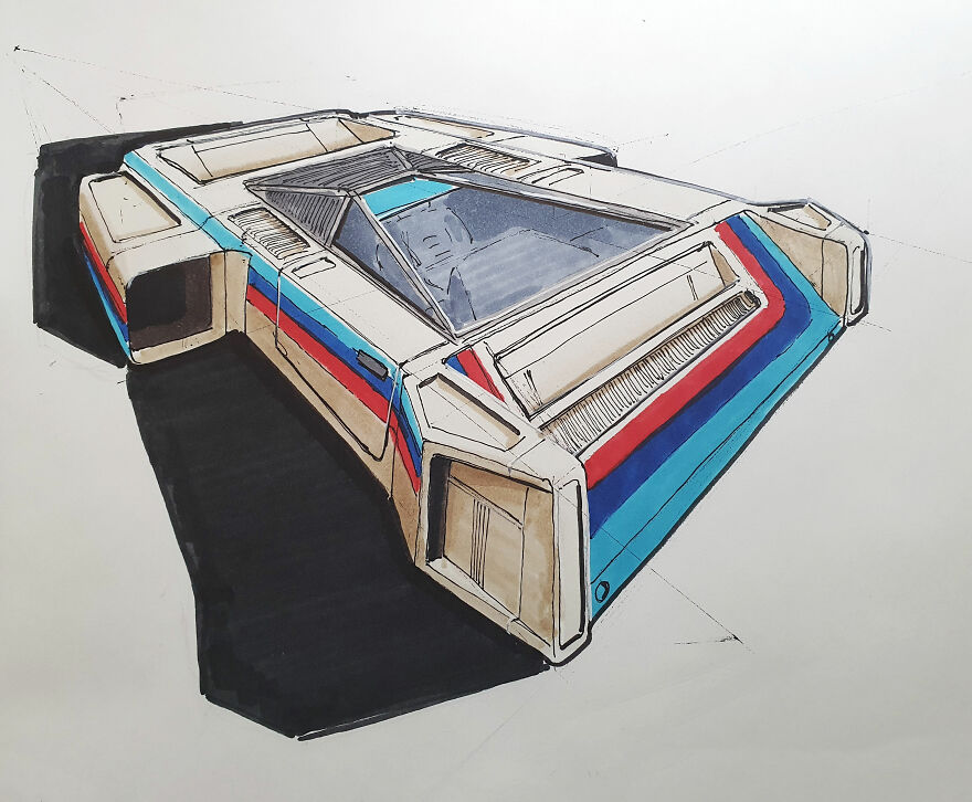
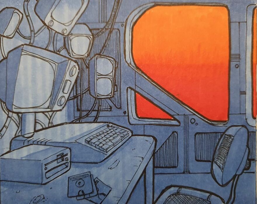
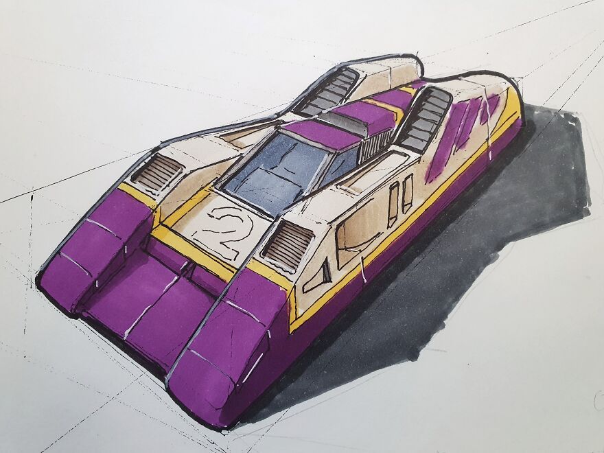
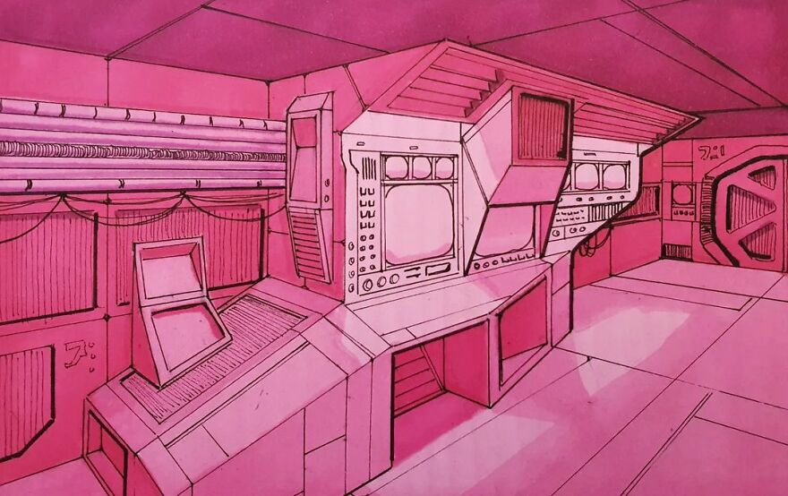
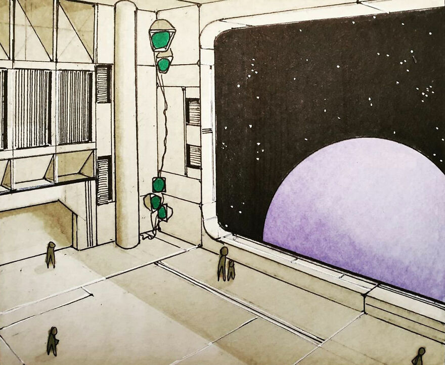
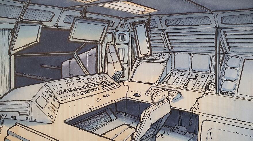
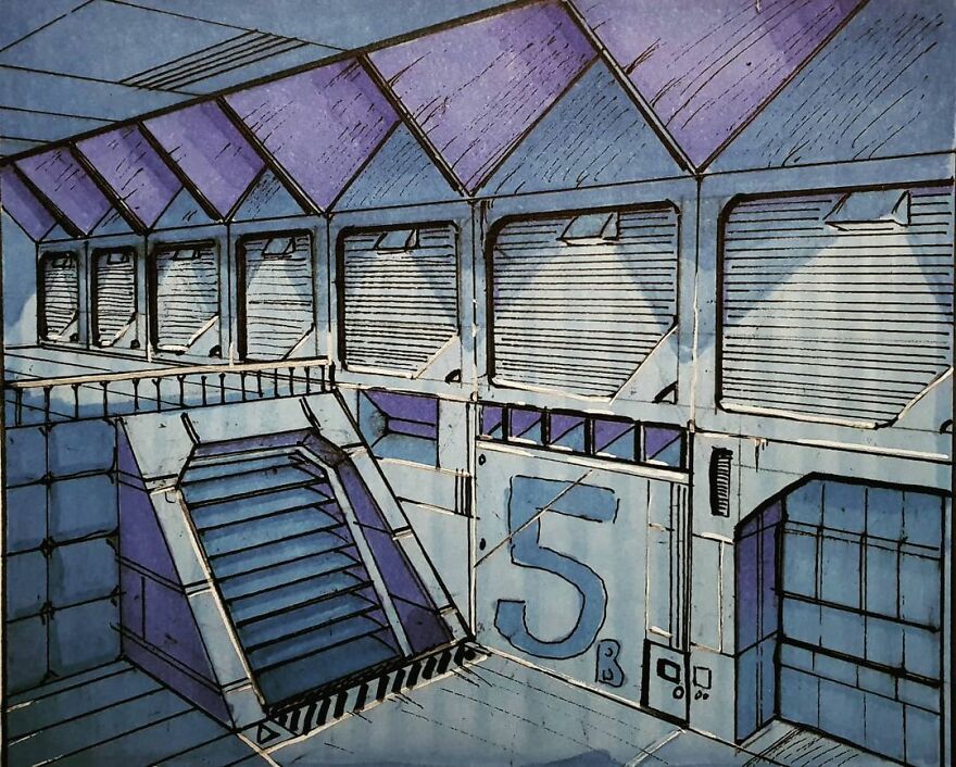
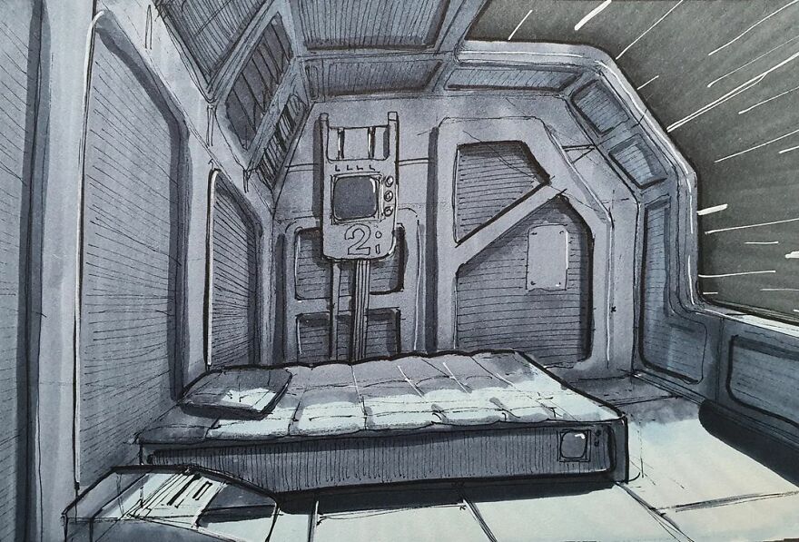
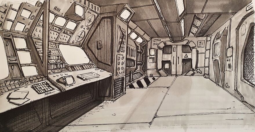
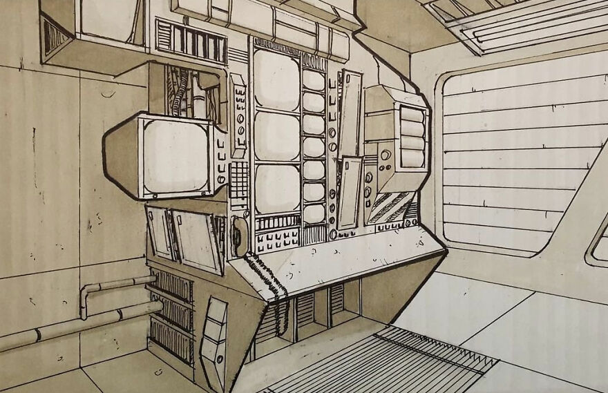
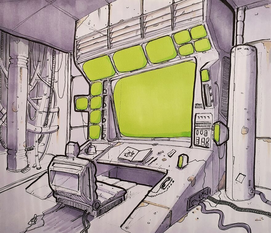
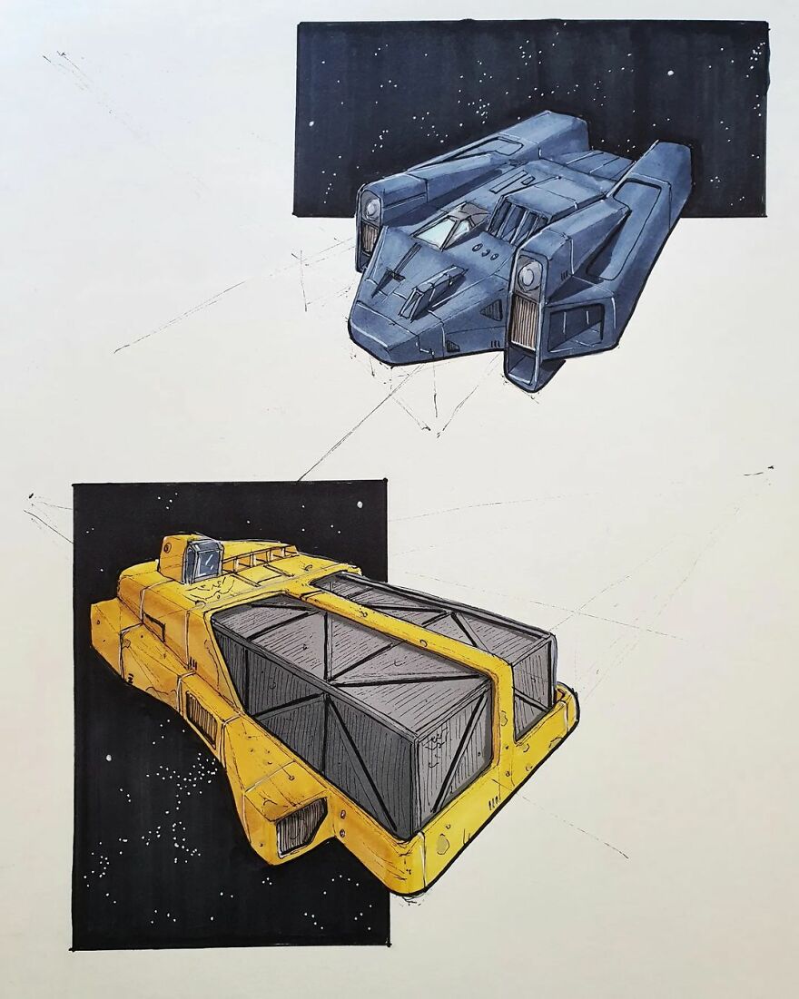
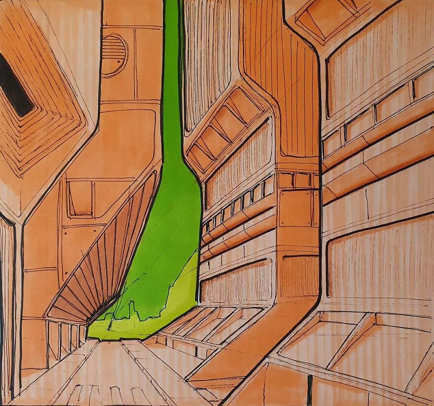
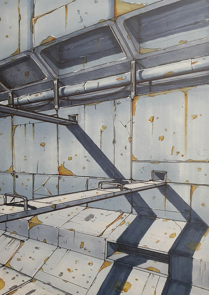
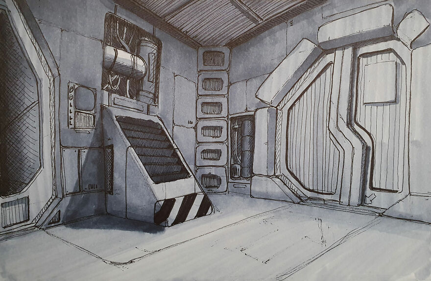
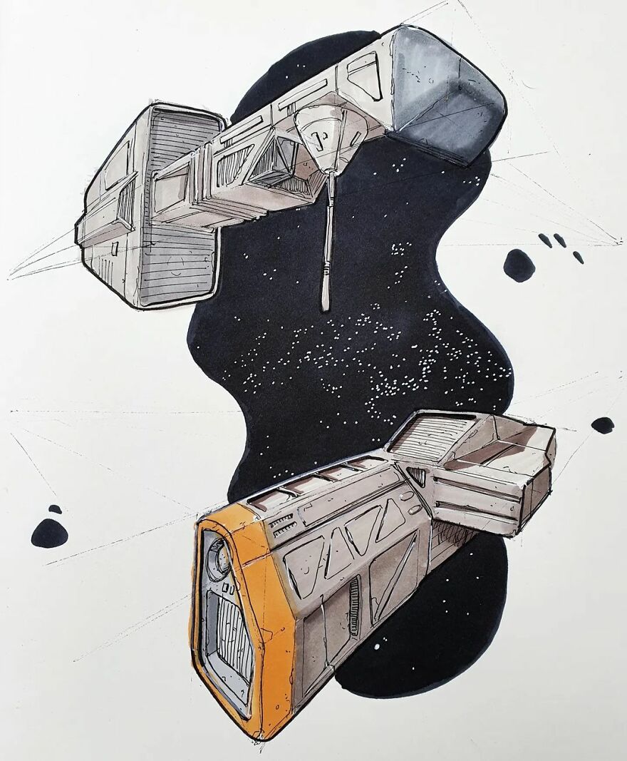
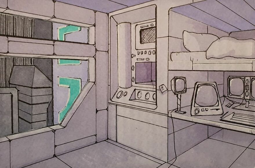
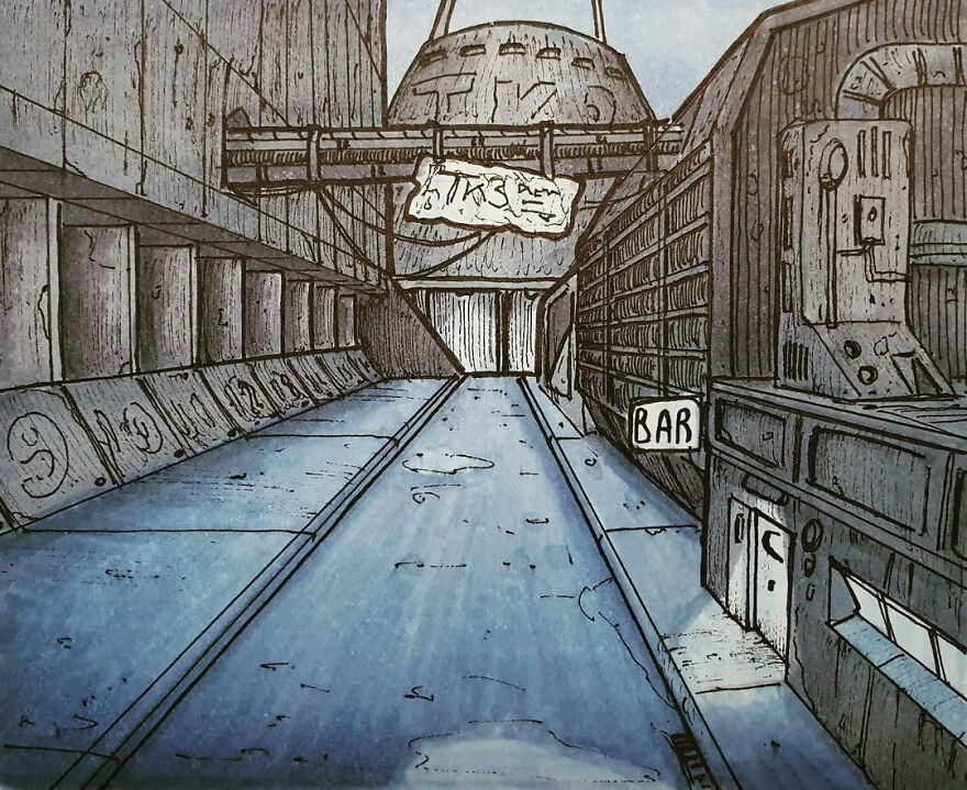
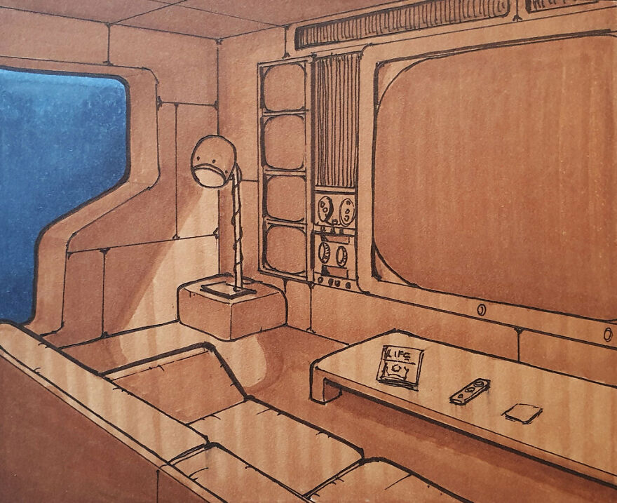
As a traditional illustrator and concept artist passionate about retro-futurism, these sketches are a glimpse into my inner universe.
Retro-futurism is a unique artistic style that combines elements of the past and future to create a nostalgically futuristic aesthetic. This often includes incorporating mid-20th-century technology and design elements with vintage styles.
Welcome to my world.
More info: Instagram | Facebook | youtube.com | penguinkstudio.myshopify.com | Patreon
This post may include affiliate links.
I am a 47-year-old French expat living in Denmark. I was diagnosed late in life with Asperger and ADHD. At 41 years old, I was a stay-at-home dad with 2 young boys and I picked up a pen looking for nothing more than a hobby. As my skills grew, so did my interest in my work, leading to me now working as an illustrator and concept artist. It all happened pretty organically and I feel very lucky to have caught some attention on platforms like Instagram and Reddit.
As for drawing, I've been a lifelong sci-fi lover, so drawing spaceships and, later, environments came naturally.
I think all parts of the drawing process have their challenges, but the most difficult one for me is probably the coloring. Light can make or break a drawing and the traditional process is quite unforgiving. Strangely, it's also the part I enjoy the most. Additionally, I encounter the frustration of one of my markers consistently running out of ink in the midst of the creative process.
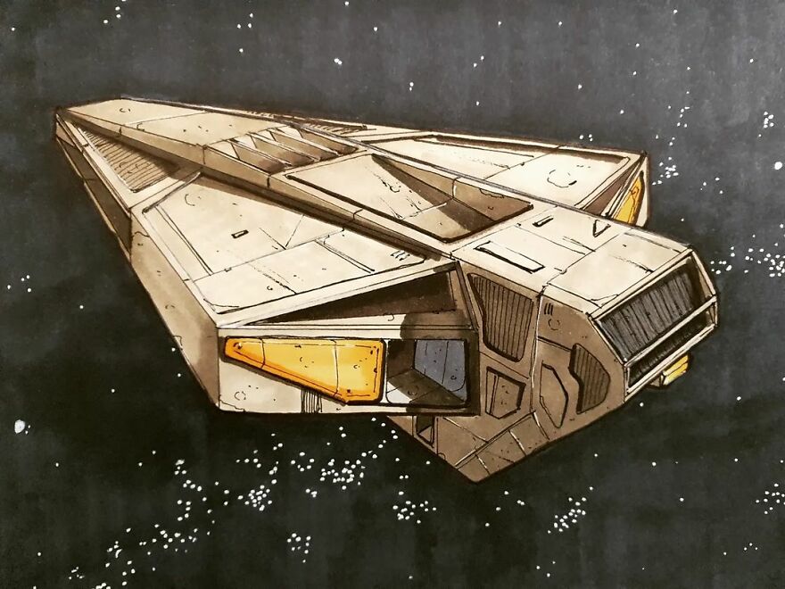
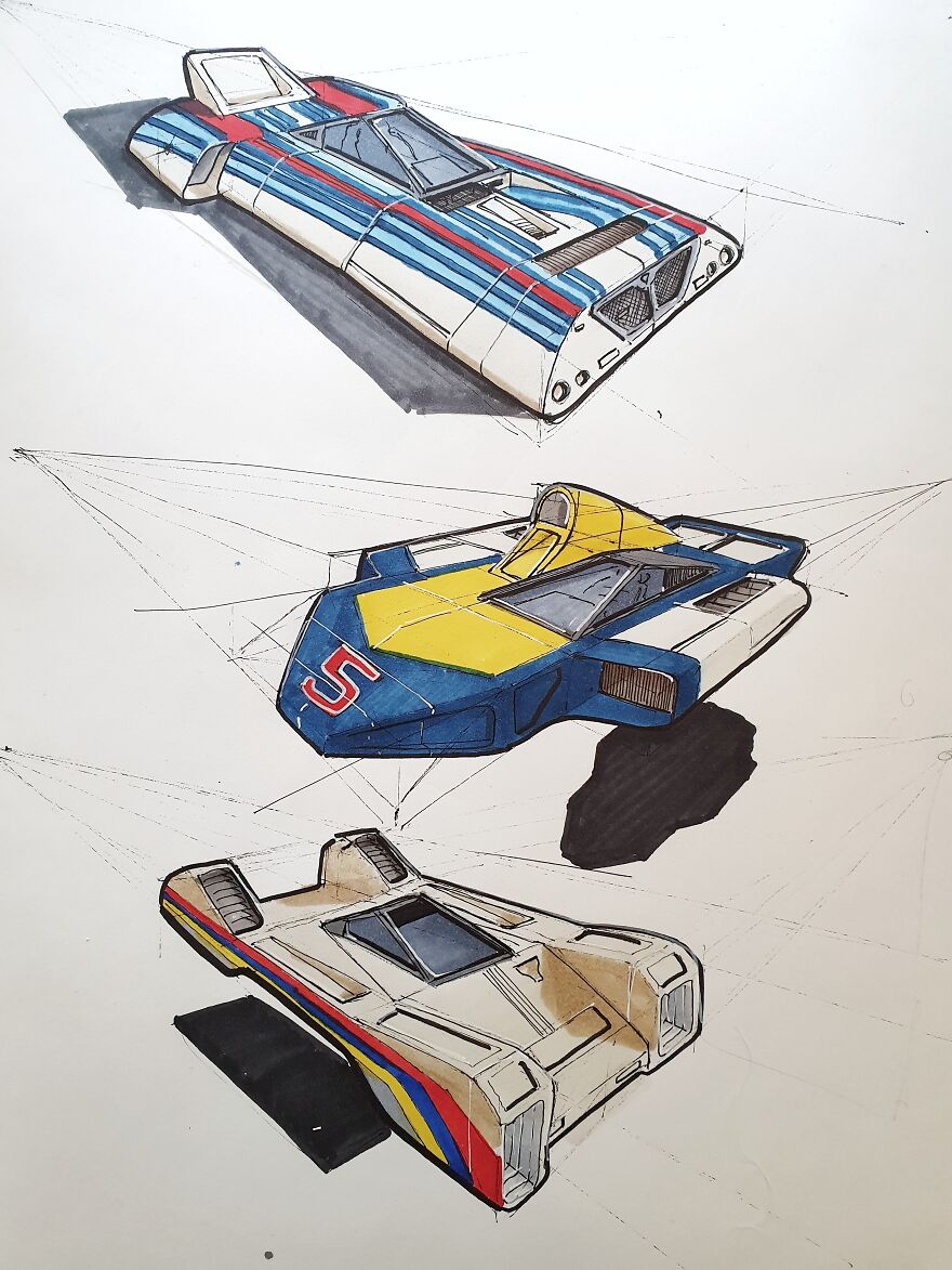
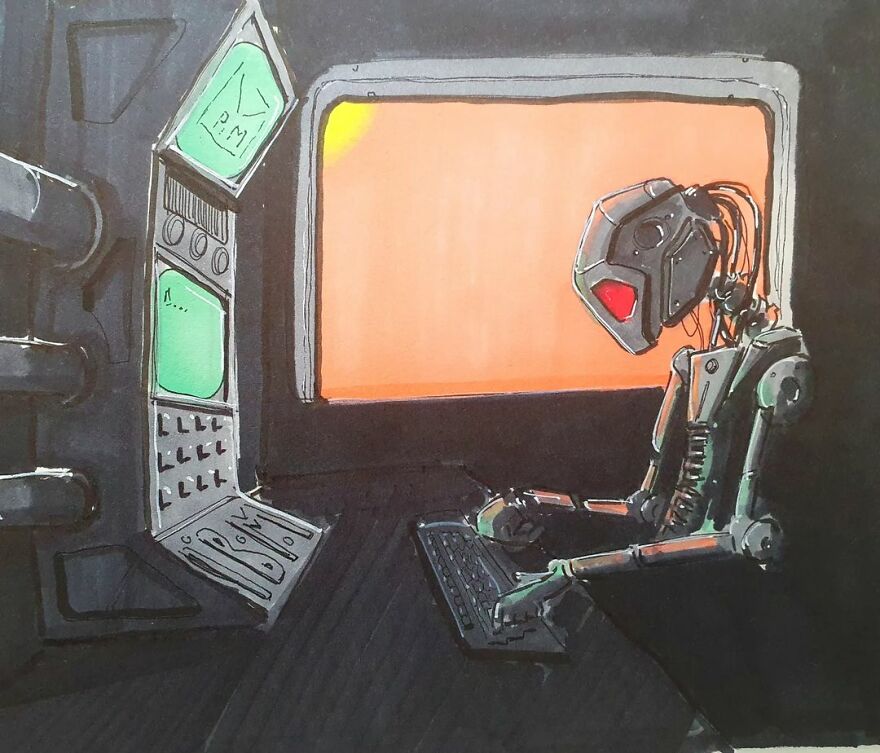
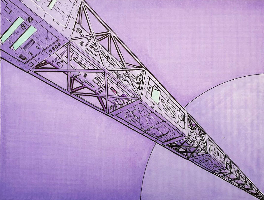
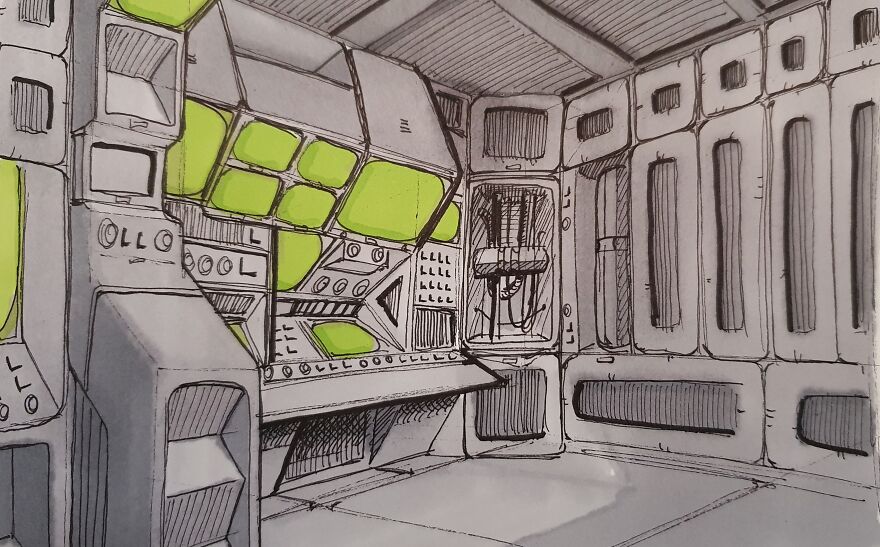
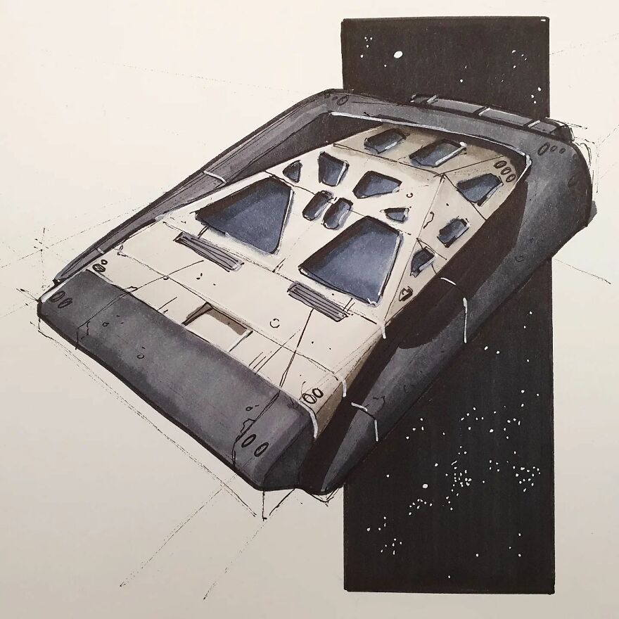
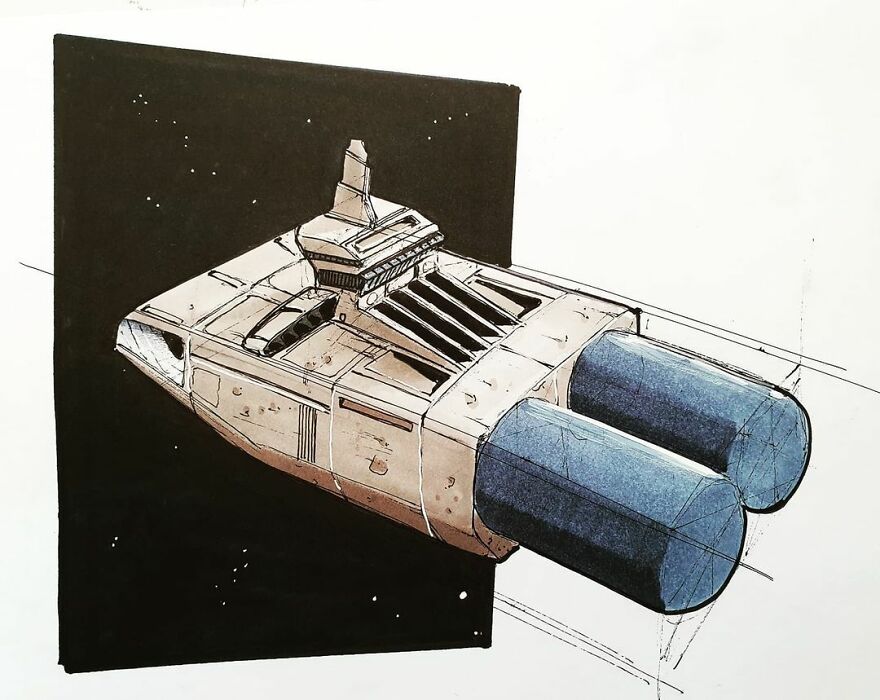
Kind of a 'Dark Star' vibe, from the John Carpenter / Dan O'Bannon film.
For the most part, my inspiration comes from my childhood: the sci-fi movies, series, and cartoons of the '70s and '80s. Think of the first Alien movies, Outlander, 2010, Blade Runner, etc. Later in life, I developed an interest in architecture and design (especially the '60s/'80s era) that fit the sci-fi/cyberpunk/dystopian themes of my drawings.
I don't consciously imply a message or emotion in my drawings, yet they all seem to carry some political and social satire as well as a sense of nostalgia and isolation. So even if I don't necessarily mean it, my drawings are infused with my own views and feelings... it's as inevitable as it is strange to me.
Lastly, I'll just say that I feel very lucky and privileged to be able to extract these images from my head and put them on paper. The fact people now seek me out and trust me to bring their concepts to life with my own touch and personality is incredibly rewarding.
I have also created a print store where high-quality, limited-edition prints of some of my personal works are available. You can find it here: penguinkstudio.myshopify.com.
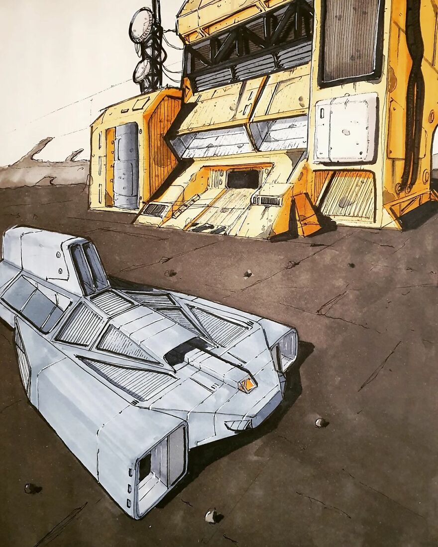
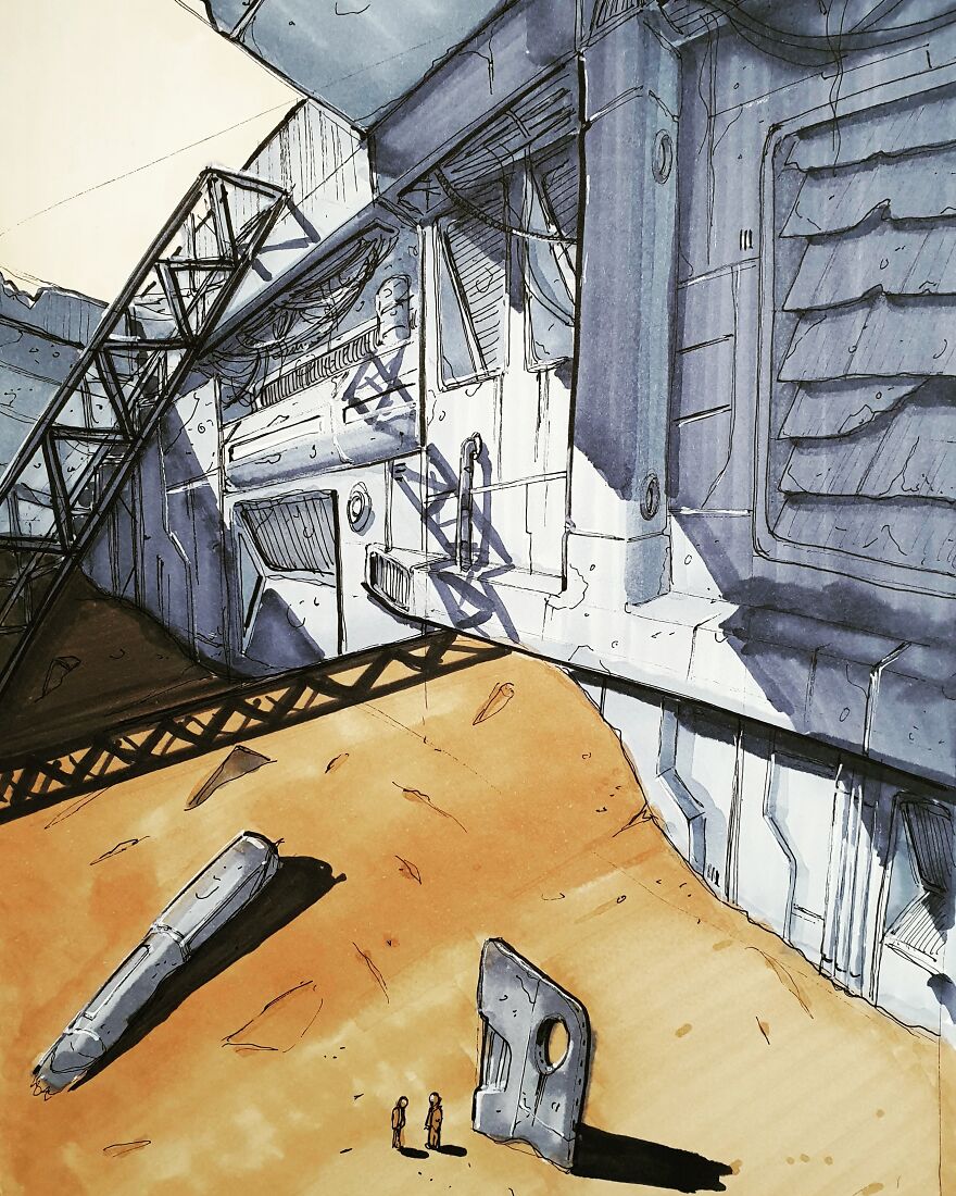
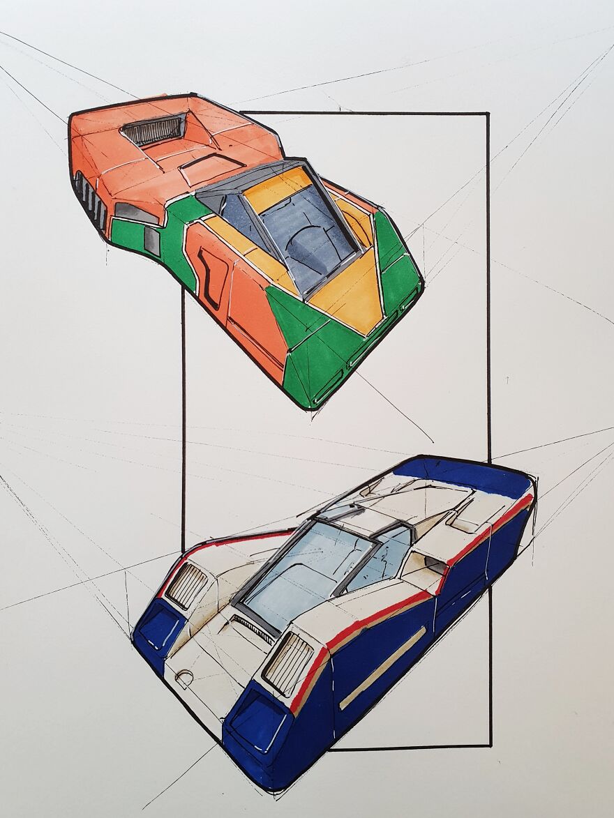
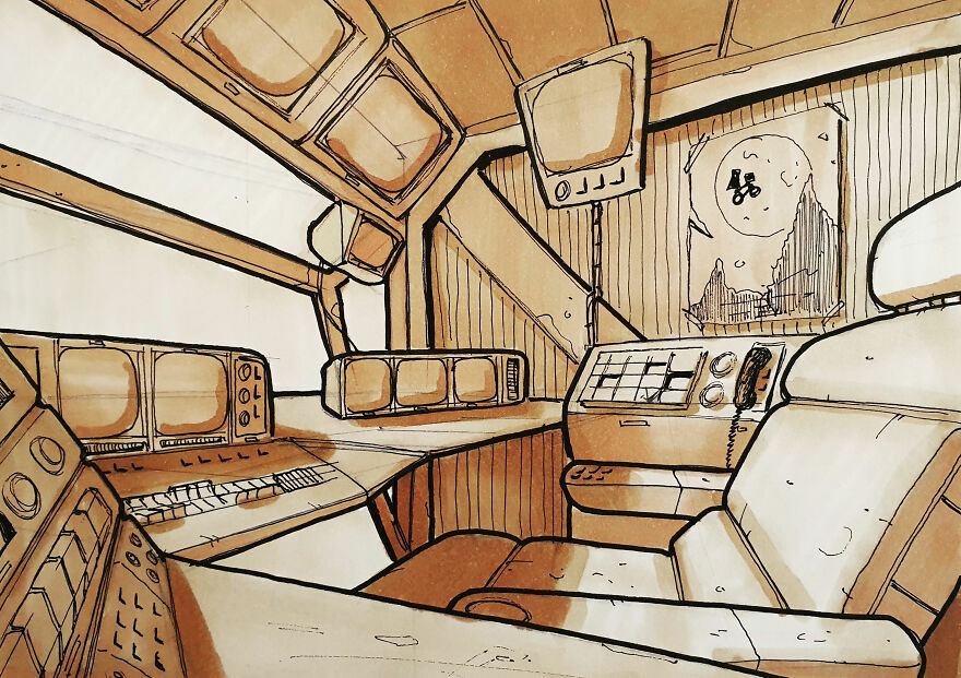
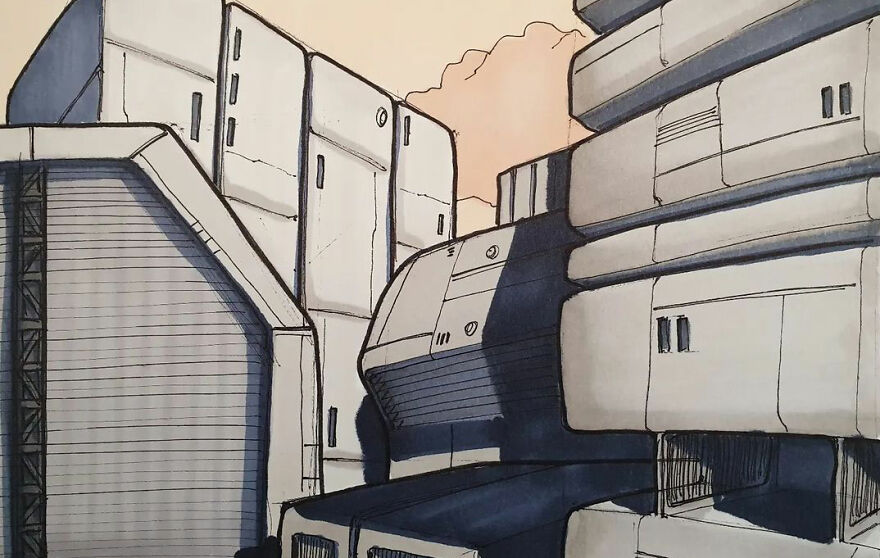
Love the " Martini " colors on the 1st One ( for those of you that have no clue whatvim talking about Google " 037 Martini "
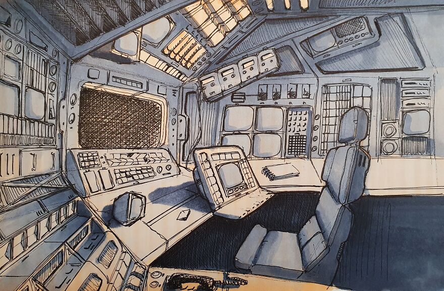
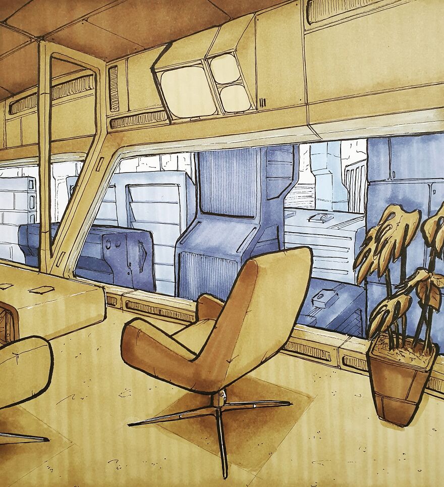
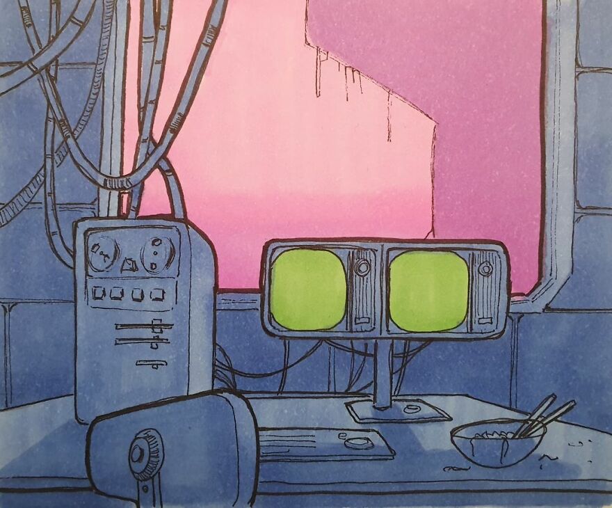
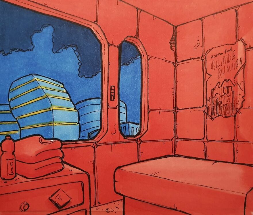
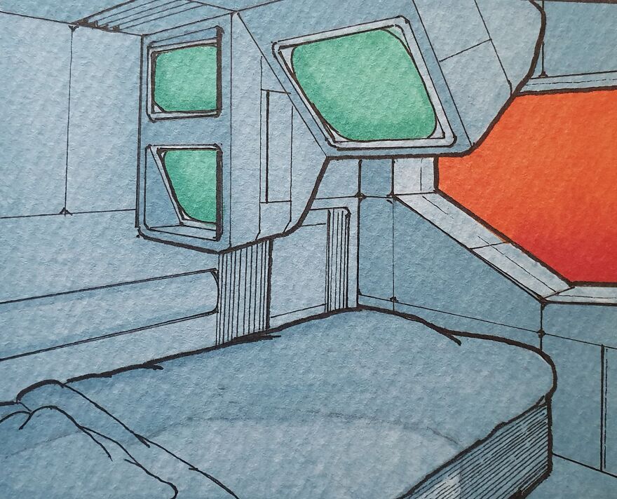
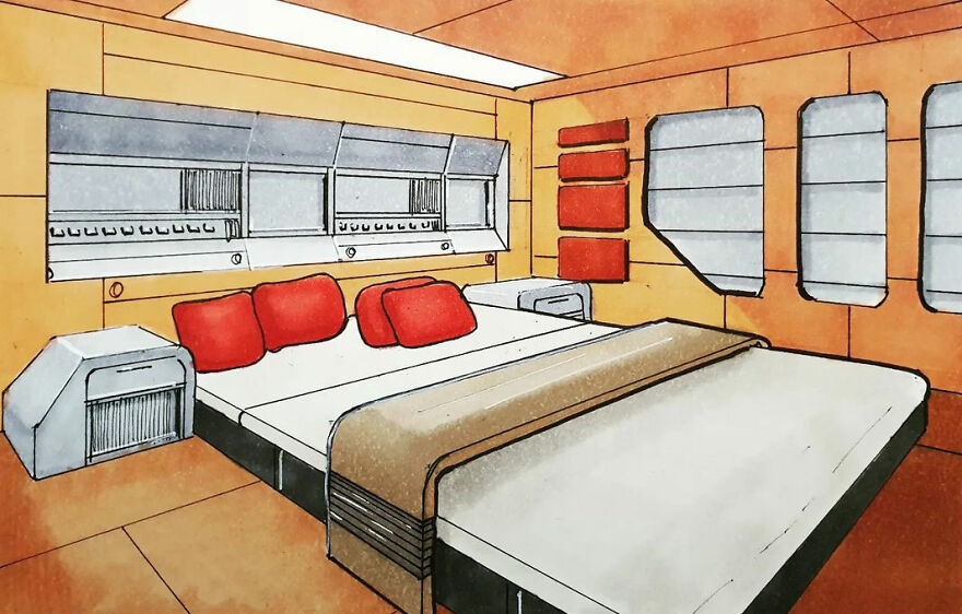
Comfy chair - but I wouldn't like to live with a view like that :D
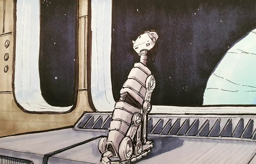
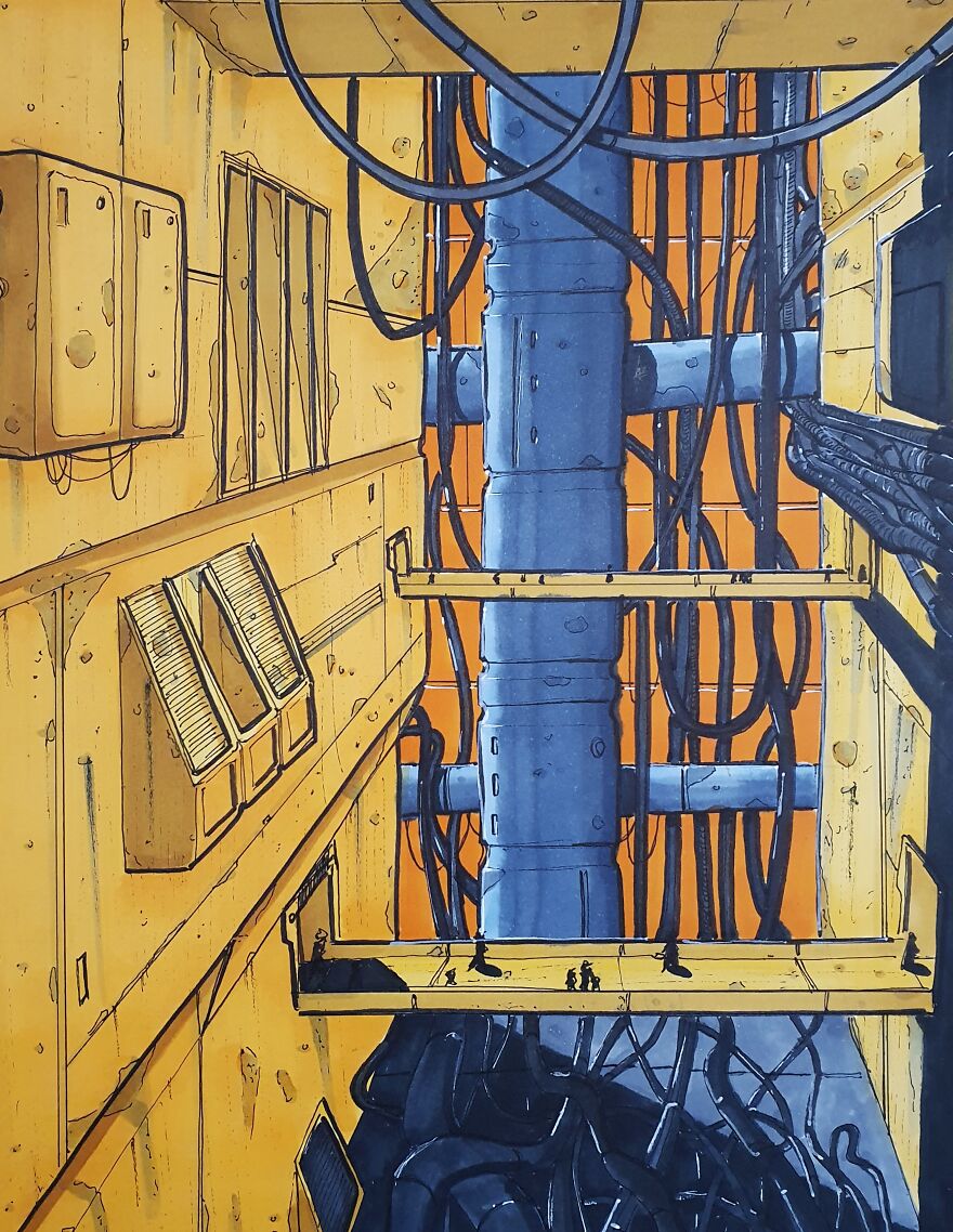
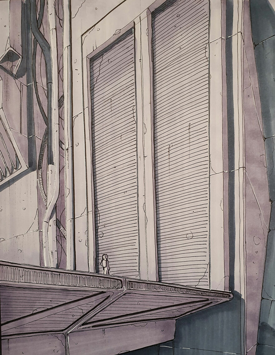
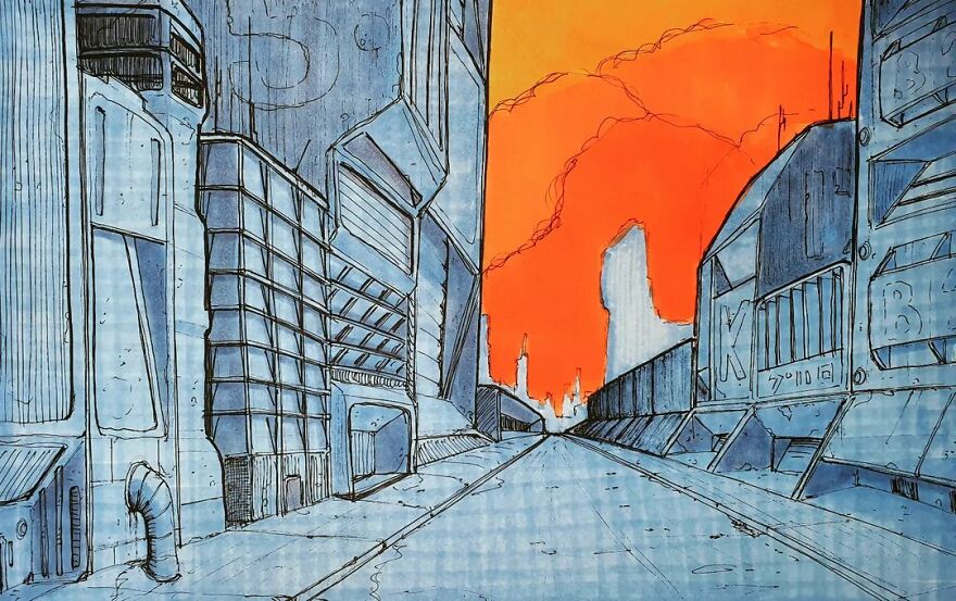
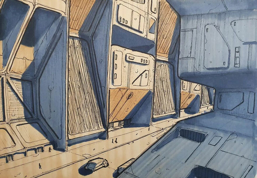
For some reason, the colors and the emptiness of this image make me feel sad . . . Although there are no ruins, I feel like it's post-apocalypse. It's beautifully done.💙
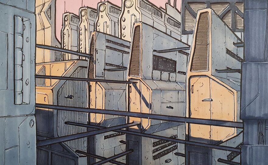
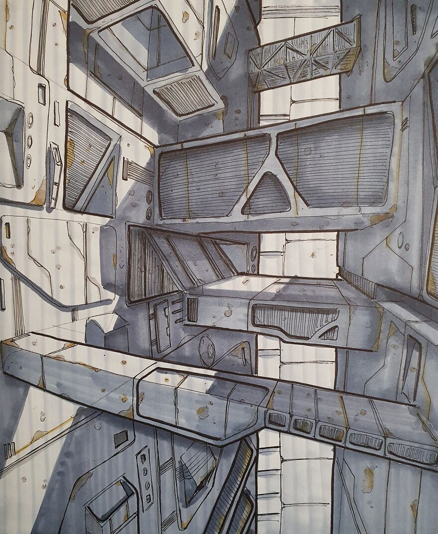
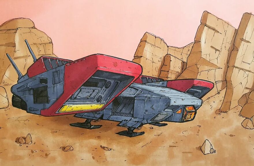
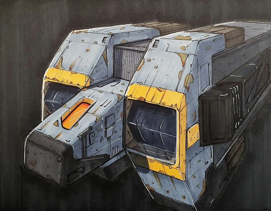
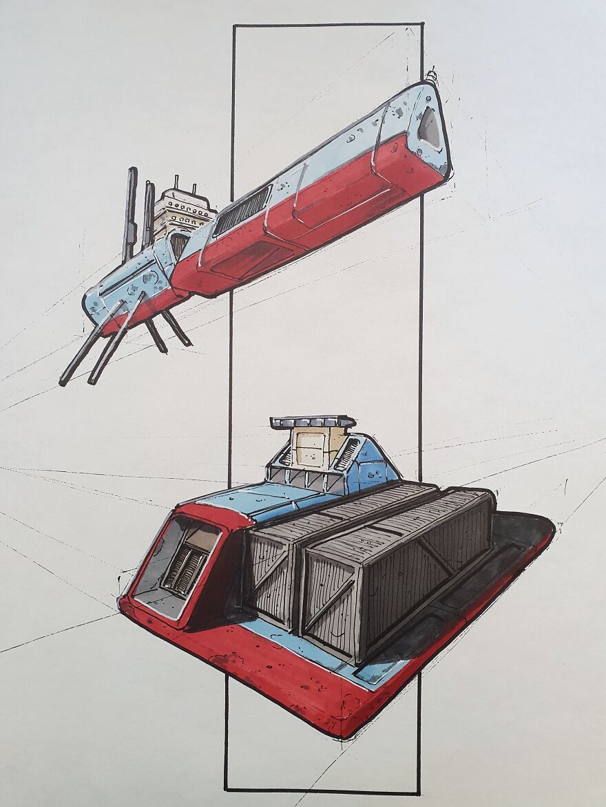
I feel like you could expand beyond normal rust colors to give a futuristic take on metal decay. Maybe new metals age differently, or normal metals just act differently in space. Think patina on copper, tarnish on silver. Iridescent sheen on titanium that's been heated. Solar scorch marks? Space corrosion!
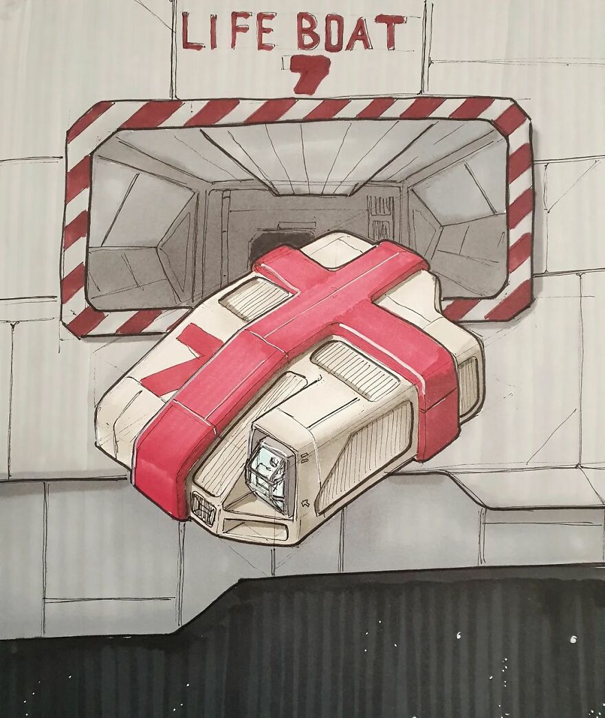
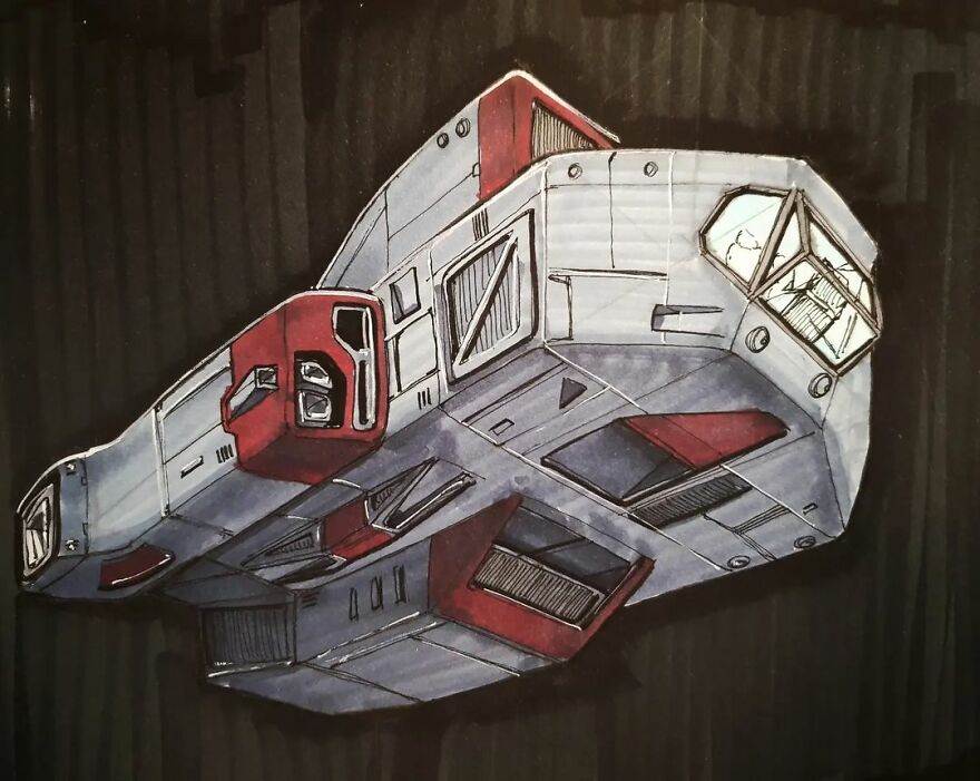
If you asked me to name this I would call it a Rapteridopter slaycraft.
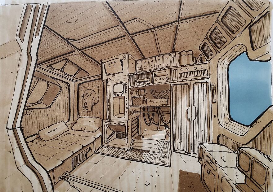
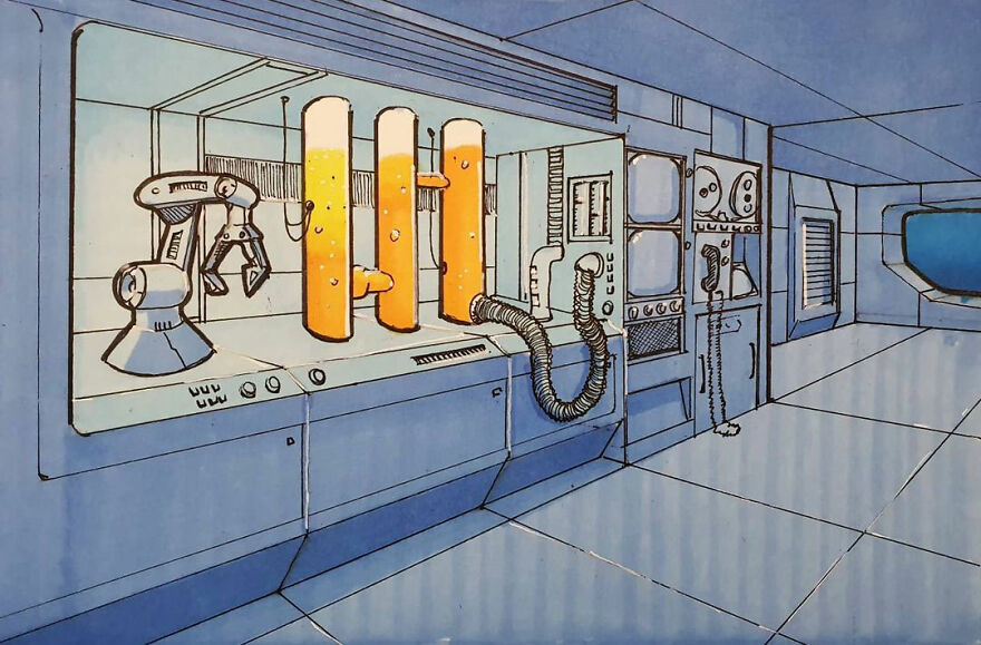
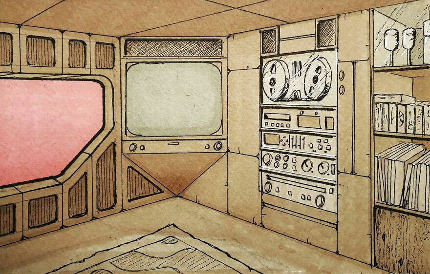
Almost reminds me of the interior of a Star Trek Next Generation shuttle.
Love the faint perspective lines. It actually adds to the art. I see it like the ships are just about to be finished being made and they're ready to leave the (paper) Station and enter into space through the hole in the (paper) Station.
Life Magazine. This room gives me an "its the year 2267 but we love decor from the 1967's" feel.
Your art reminds me of the work of Moebius and some of the artists that were published in Métal Hurlant (Heavy Metal in the US).
Load More Replies...these are REALLY cool. you should consider making a graphic novel based on these, I would be first in line read it!
I second that. If storylines aren't your thing, you could make concept art for others on a commission. It's crazy you call these sketches, they're all so good!
Load More Replies...This reminds me both of Original Trilogy StarWars & of an old Swedish cyberpunk rpg called "Mutant" (the 1989 edition). Really nice.

 Dark Mode

 No fees, cancel anytime