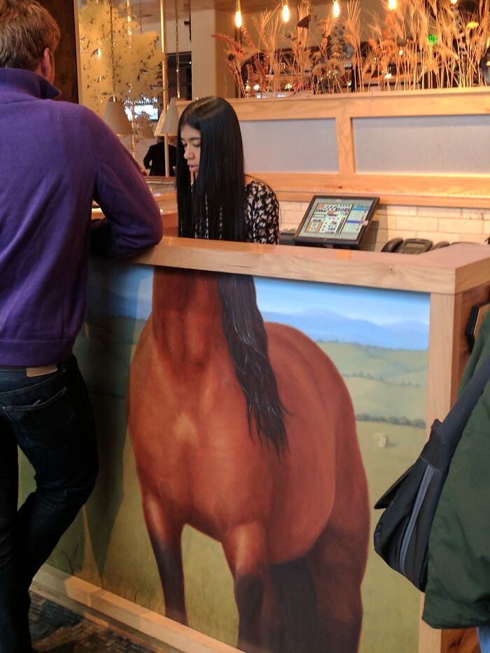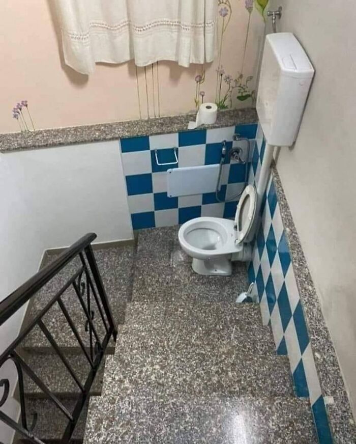
50 Times People Spotted Stupid Design Decisions In Public Places And Just Had To Share
We often form our opinion of a city by judging the quality of its public spaces. If they give us a hard time, most likely we won't be too psyched about returning to it.
And unfortunately, there are plenty of ways urban planners and interior designers ruin our everyday life and force us into dreadful anxiety-inducing situations.
They make us sit on uncomfortable benches, walk around trippy floors, and go number two in bathroom stalls so revealing, others are able to see our facial expressions.
To show how ridiculous it can get, Bored Panda has put together some of the worst public space "solutions" ever created—we deserve better!
This post may include affiliate links.
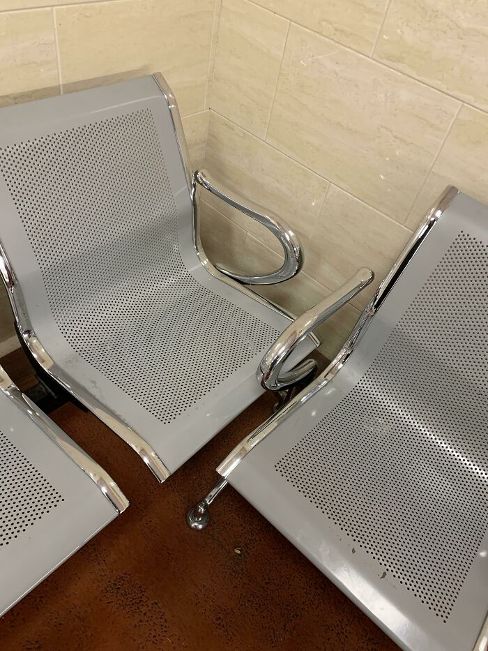
The Chairs Waiting For You In The Laser Eye Clinic's Reception
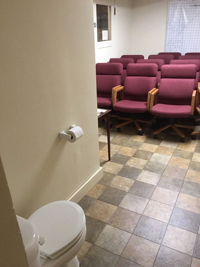
"I'm Sure You're All Wondering Why I've Gathered You Here Today"
To learn more about the topic, I got in touch with interior architect and lecturer of interior design at Vilnius College of Design, Judita Striukienė.
When we hear the term public space, we usually think of the outdoors. "Places like parks, gardens, and squares are often popular city attractions," Striukienė told Bored Panda. "They not only provide environmental and recreational benefits but also form a city's identity."
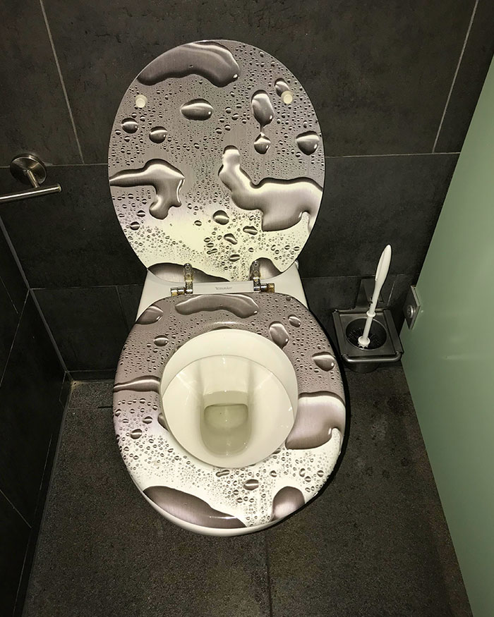
No Words Needed Here
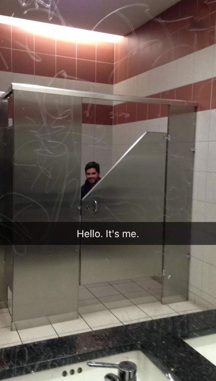
As If Public Toilets Didn’t Give Me Enough Anxiety
However, public spaces can also be indoors. "These interiors can be both functional and aesthetic," Striukienė said.
"Think of health service establishments, for example. A well-executed professional interior design can even have a positive effect on the patients. It can relieve their stress and put them in a calmer state of mind."
In fact, Kjetil Trædal Thorsen, the co-founder of the architecture firm Snøhetta, argues that architects must begin considering indoor space just as public as outdoor space.
"Maybe with the sole exception of railway stations, public space is generally understood as outdoor space," Thorsen wrote. "Whether in the United States or in Europe, especially now with heightened concerns around security, there seems to be this determined way of privatizing everything that is indoors, even as we are increasingly aiming to improve access to public space outdoors. But in the layered systems of our cities of the future, we will need to focus on the public spaces that are found inside buildings—and make them accessible."
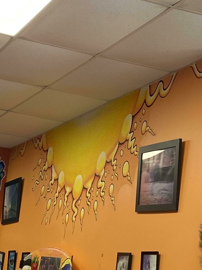
At First Glance, I Didn’t Recognize This Restaurant Mural As The Sun
To get his point across, Thorsen highlighted a map of Rome made in 1748 by Giambattista Nolli. It only had two distinctions—what was private and what was public. "Whether it was indoor or outdoor, whether there was a church space or a plaza, it didn't really matter. [The map] told a different story of the city."
"There are some examples from today—the roof of our Oslo Opera House is outdoors, for instance, but it's on the building and publicly accessible. Opening up the Louvre and trying to let people walk through it 24 hours a day—as with the museum's recent takeover by the artist JR—is another way of not making a distinction between indoor and outdoor public space."
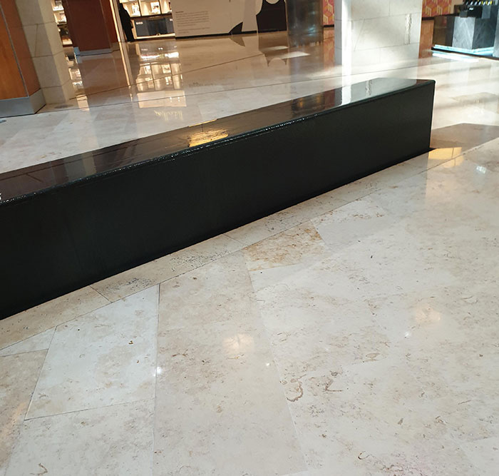
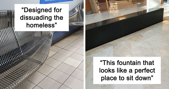
This Fountain That Looks Like A Perfect Place To Sit Down
I wonder how many people realised that when it was to late...
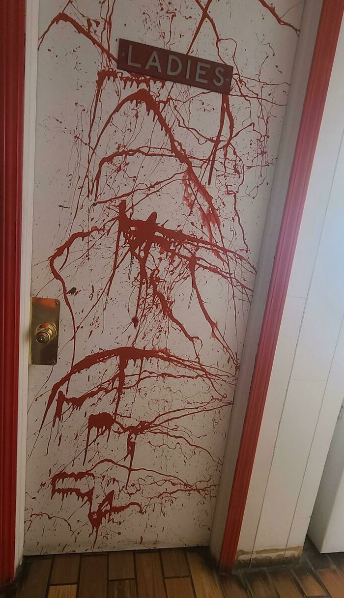
Gas Station In Nebraska. The Station's Color Scheme Was Red. They Tried To Get Artsy
No Broken Legs I Know Of
Thorsen thinks such decisions are essential to the way new architecture typologies develop, and architects should definitely have an influence on them.
"In certain situations, accessibility to indoor public space is enough," he said. "In other situations, you have to define the program for the particular indoor or outdoor spaces to be adequate. To use the example of the roof of the Opera House in Oslo again, it was basically programmed only for one thing, and that's to be walked on, for a promenade. But on occasion, it could be reprogrammed to hold an outdoor concert. Or it could be reprogrammed against the original intention by skaters or by a biker who actually drives his motorbike up and down the roof."
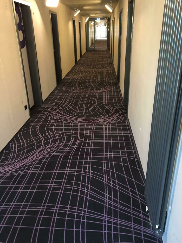
Flat Carpet In A Hotel In Cologne, Germany Imitating A Curvy Surface
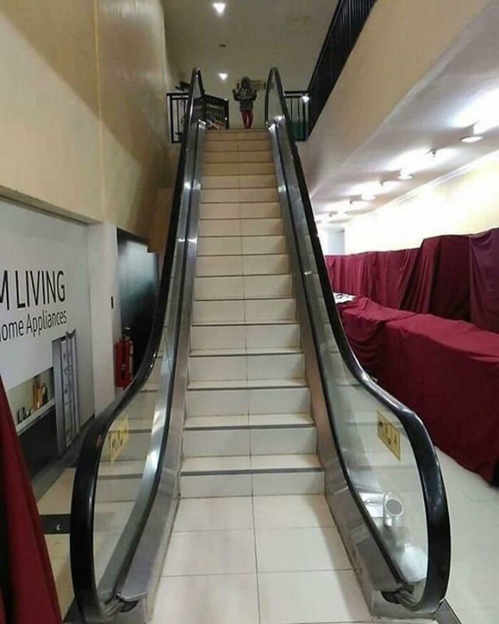
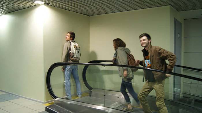
Fake Hope Escalator
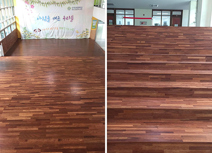
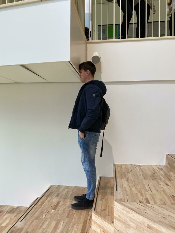
The Design Of My School - This Is The Place Where Every Hallway Intersects
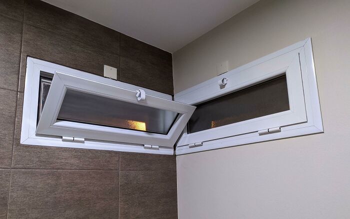
Two Windows Of My Workplace Are Constantly Fighting For The Honor Of Being The One Who Is Going To Be Opened
The city belongs to its citizens. No matter if we're talking about what's inside or outside. And, according to Thorsen, these two dimensions can even intertwine.
"Maybe the outdoor can be programmed in such a way that it unlocks the possibility of the public spaces indoors. There's always a bit of urban planning in designing interiors. There's always a bit of interior design in an urban space. There's no question that interior architecture is professionalizing itself as well—interior architects are not seen as decorators of interior space anymore. The same is true of landscape architects. And those are only the traditional design professions," the architect said.
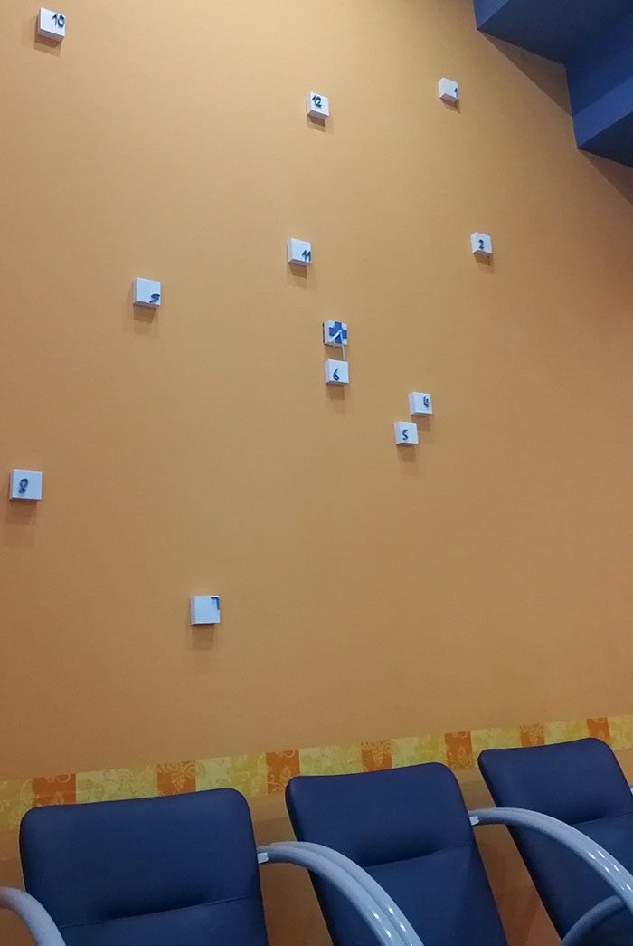
The Single Worst Clock I Have Ever Seen. I Actually Said Aloud "Whyyy"
They Built This School Like One Month Ago
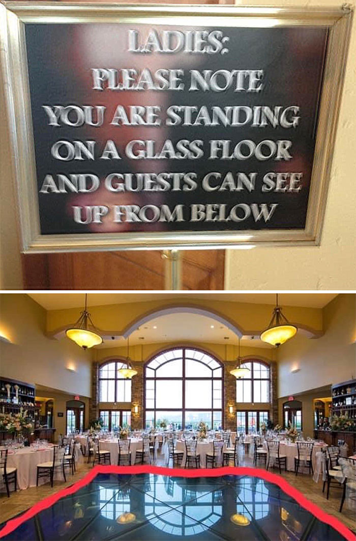
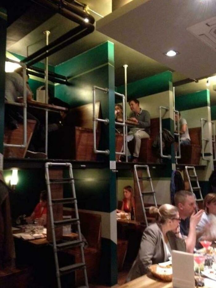
Ballroom Where Everyone Downstairs Can See Up Your Skirt
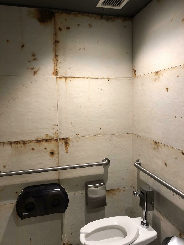
This Is Not Rust. “It’s The Design”
Of course, that doesn't mean that every architect needs to be trained in every specialized profession. What Thorsen meant was that the industry is lacking an overall understanding of how people should collaborate.
"That's why we've introduced transposition as a working method in our office, where you not only sit around tables with a lot of specialists, but you actually swap professions during creative workshops," he said. "The only thing that can save the essence of architecture is some kind of collaborative model like this."
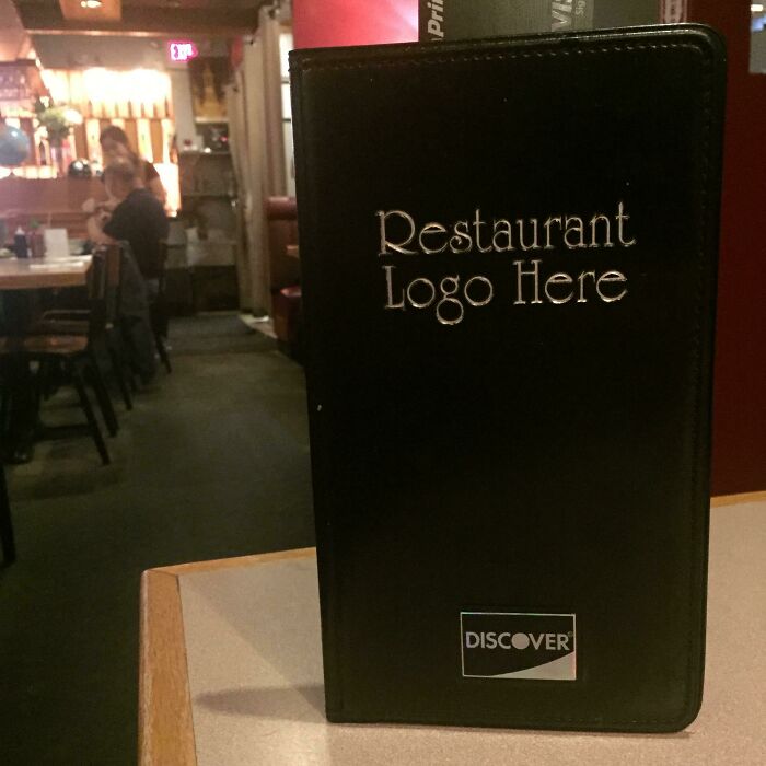
I Love Eating At Restaurant Logo Here
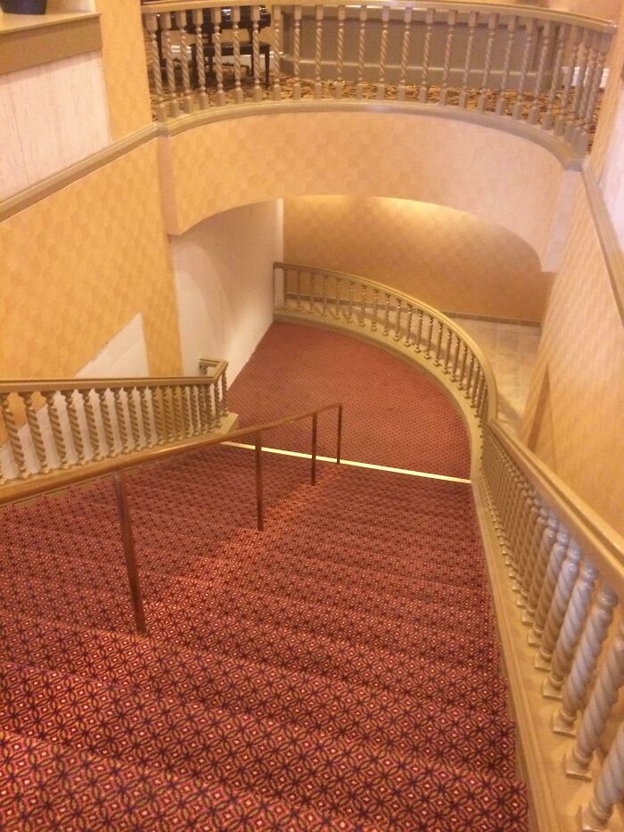
This Fancy Staircase Leads Directly Into A Wall
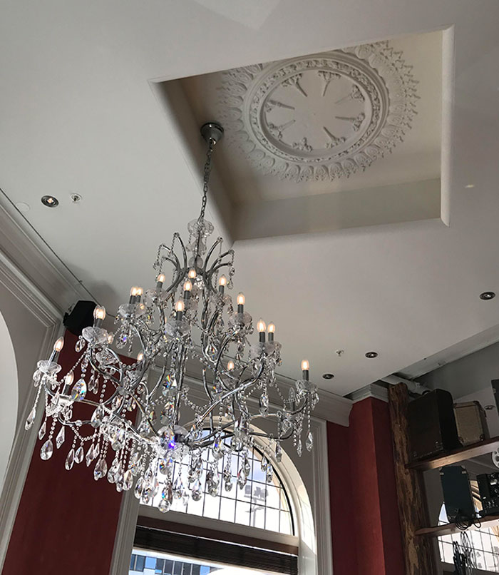
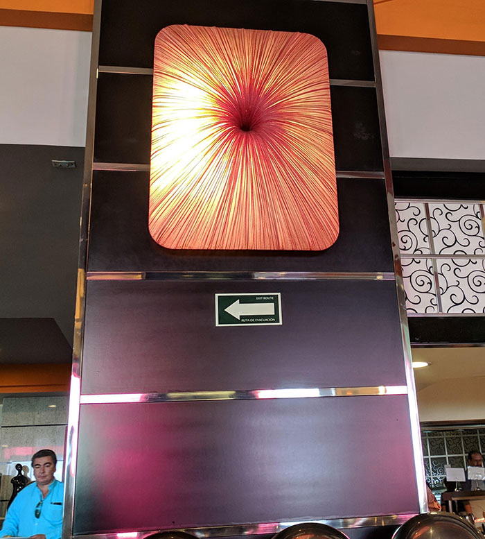
This Chandelier At A Restaurant I Ate At Bothers Me So Much
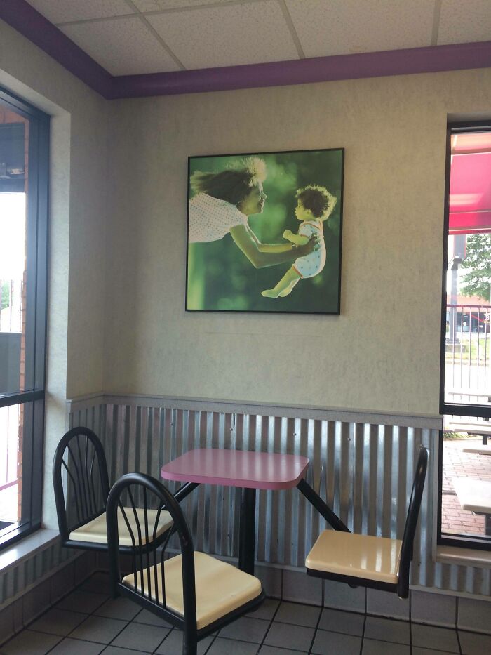
This Picture In McDonald's Was Hung Sideways
By adopting this model both in education and practice, Thorsen believes we would be better equipped to fully understand the effects of programming.
"We are usually generalists enough to understand that a change of use is sometimes demanded and that we shouldn't try to desperately hold on to certain kinds of programming. But the profession itself should, in my opinion, really contain that kind of knowledge, simply because it’s so tightly connected to the actual design task."
As these pictures show, we need to improve the relationship between buildings and the public. And Thorsen thinks there's no way we can do that without getting directly involved in programming ourselves.
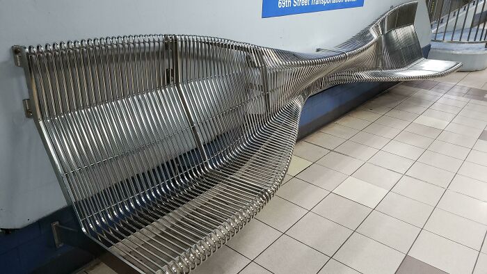
Designed For Dissuading The Homeless. Literally Just Uncomfortable For Everyone Else
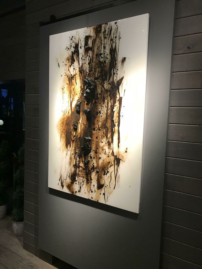
This Painting Inside A Local “Fancy” Restaurant
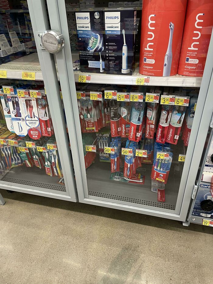
$1 Toothbrushes Locked Behind Glass At Walmart. Walked Around The Store For 15 Minutes Looking For Someone “Qualified” To Unlock The Glass Case
Then had to be escorted to the register with said $1 toothbrush. I could walk out of here with an air fryer easier than a toothbrush
That's really odd. I've never seen regular toothbrushes locked up behind glass. Maybe there are some town hooligans going around stealing toothbrushes...
Some People Just Want To Watch The World Burn
This Restaurant In London (Waiters Love It)
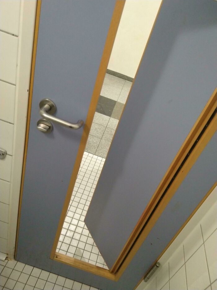
Toilet Door With Another Door In It That Won't Stay Closed
You Gotta Pay Attention On These Stairs In A Cinema
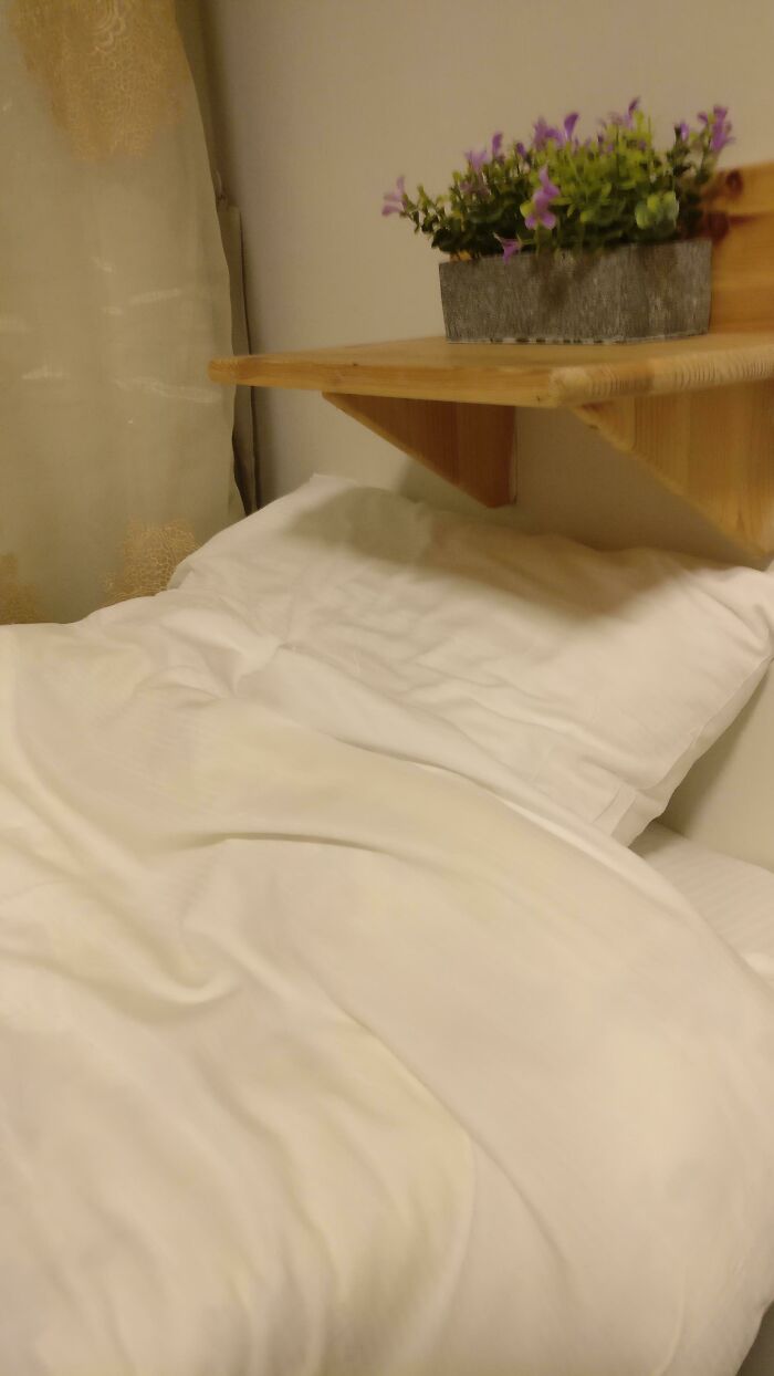
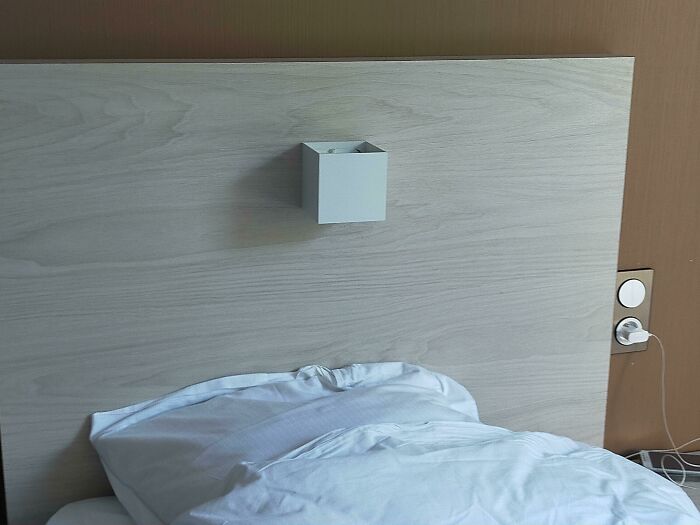
My Bed At A Hotel I'm Staying In
So, you wake up, bonk your head at this, and then the flower pot falls on you
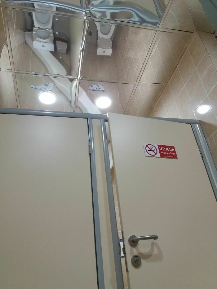
Public Restrooms With Reflective Surfaces
This Is Russia
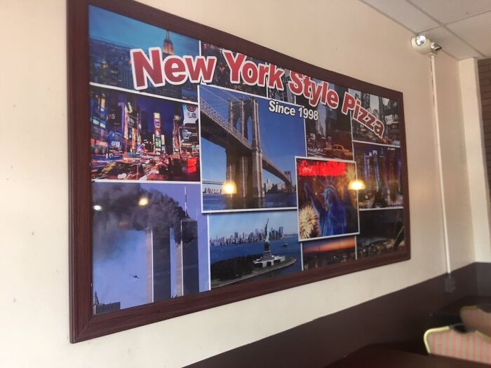
This Is The Logo For A "New York Style" Pizza Place In Ponce, Puerto Rico
It gets worse when you realize it's a picture of the moment before the second plane hit the other tower.
Load More Replies...I was focusing so much on the clipped off text I didn’t even notice the 9/11 for a little bit…wow
gotta love remembering the death of people during 9/11 while eating, isn't it so relaxing
I think there might be some animosity for being virtually enslaved by the US and not even getting to vote in elections. For context https://www.quora.com/How-has-the-US-exploited-Puerto-Rico?ch=10&oid=45087188&share=66358b0c&srid=ui1Dvo&target_type=question
There are bigger problems in Puerto Rico than not getting to vote for president. We can vote for president if we live in the US.
Load More Replies...Someone got lazy and just googled NYC images and printed the first dozen that popped up, I'm guessing...
So no one told them they should take the 9/11 pizza off the menu.
I'm sorry but you have got to be f*****g kidding me with this...what kind of psychotic ass**** actually put this up in the first place and whoever picked out the image DEFINITELY, AND I MEAN DEFINITELY, picked out that image..this is not some random picture people this f**kstick did this on purpose to send a message....and that person can go straight to hell
F.A.R.!, ROBERT KNIEP!.... I AM APPALLED THAT SUCH IS A "REAL" PHOTO. IT HURTS ME DEEPLY TO RECALL THIS AND THE OTHER PLANE CRASHES AND SO MANY LIVES LOST....
Load More Replies...Oh, THAT New York! Lucky the picture of the burning towers is included... Otherwise I'd have thought it was a different New York.
The statue of liberty just chilling watching the twin towers get totally rekt
Guess they really wanted to represent an important piece of Americana?
Did the graphic studio literally just grab the first ten pictures of New York that came up on Google Images?
Saw "1998" first and thought "maybe it still has a picture of the twin towers", but I definitely wasn't expecting a picture of the twin towers actually being attacked.
They just slapped this together, putting absolutely no thought into it.
Since I am from PR and I have been in this place I can honestly say NO ONE pays attention to decorations in restaurants and the owner probably didn't even pay attention to that when they got it... Or it was commissioned, the damage was done and they could not afford to replace it. Looking for political explanations is how ignorant you all are about how my culture is.
So sad- I assume they just picked the most popular pics of New York and didn't give it a second glance.
WTH???? Who’s idea was that ?? I’m puertorrican and in VERY embarrassed about this 🫣
This is the shibboleth for the terrorists. So they know where to meet
I was born a day before 9.11.2009 so when I was in preschool I wasn't allowed to show my toys because we were supposed to be sad.
"But it just seemed so appropriate. All our customers have called 911 after eating here."
hahahahahahahhahahahahahahahahahahahahhahahahahahahahhahahahahahahahahahhahaha
There used to be a chain of restaurants in the UK called the Great American Disaster. The decor was newspaper articles of events you might prefer not to remember.
Dude....WHAT. no. And not like a "damn, that's too soon" this is absolutely NOT OKAY PERIOD.
That is a very sad sign of human intelligence going down the drain real fast!
Oh man. I didnt notice the world trade towers at first. Not cool
Whoever thought it was a good idea to put 9/11 on that board, they should not be hired anymore.
well, we still watch the footage and hear the recordings as young as 6, and are still being sent off to war for it, so....
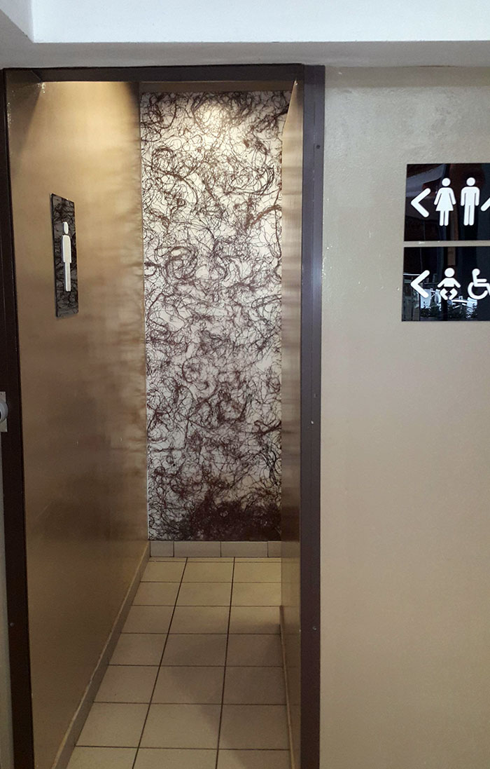
Load More Replies...I Don't Know Why Brown Strings Is A Welcoming Wallpaper To This Toilet Entrance. It Just Feels Gross And Unwelcoming. I Mean, This Is A Public Place
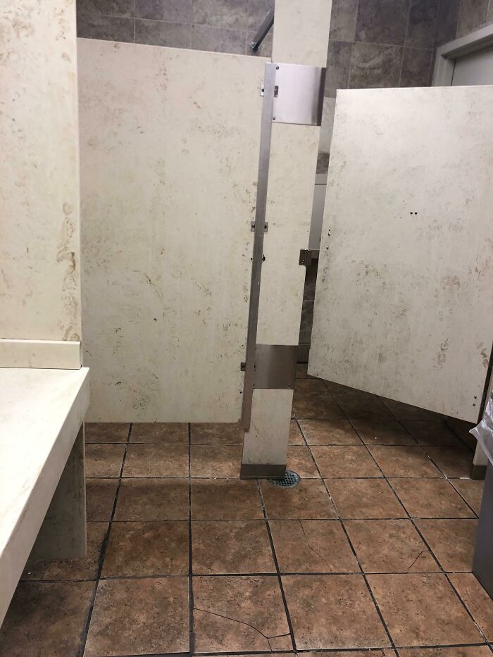
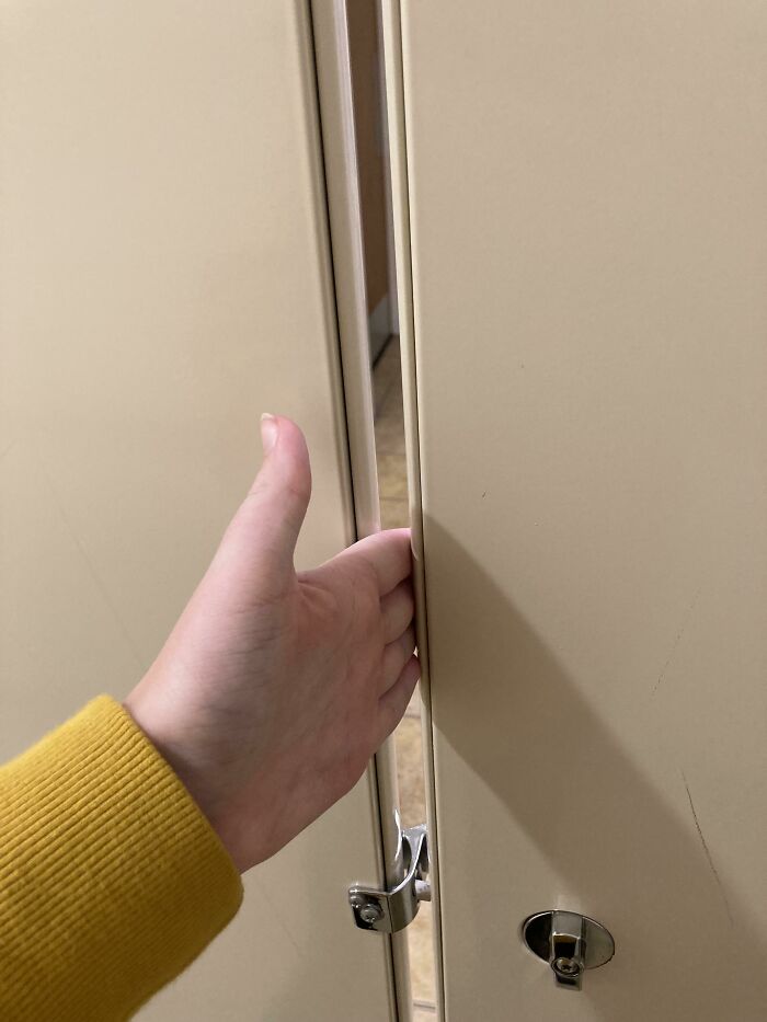
These Restroom Stalls Have Translucent Doors
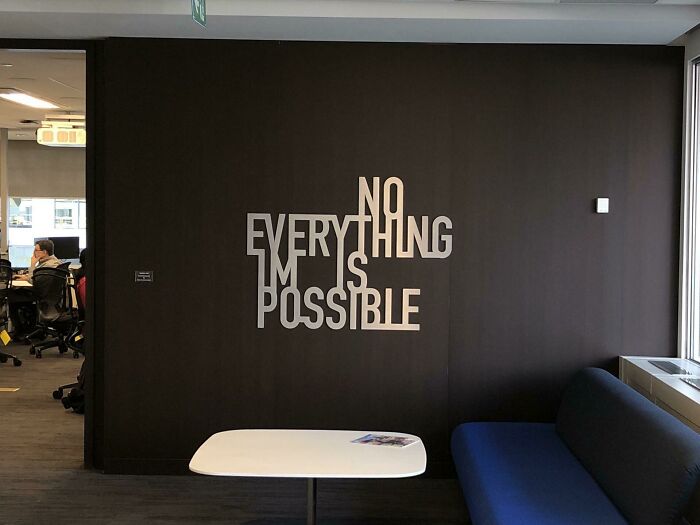
This New Wall Art In My Office
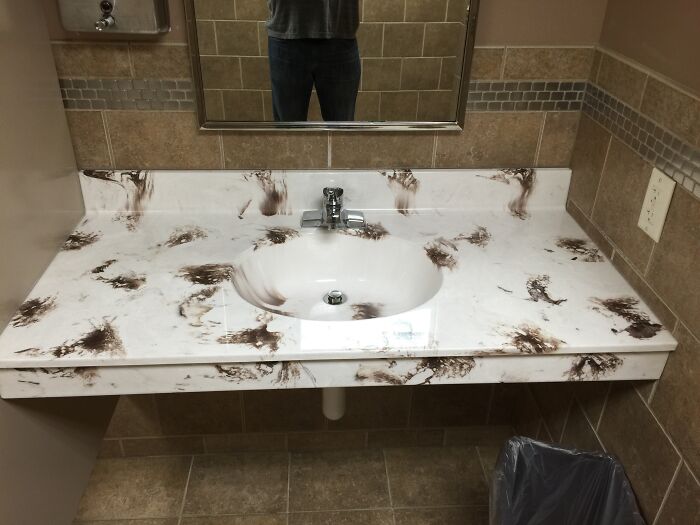
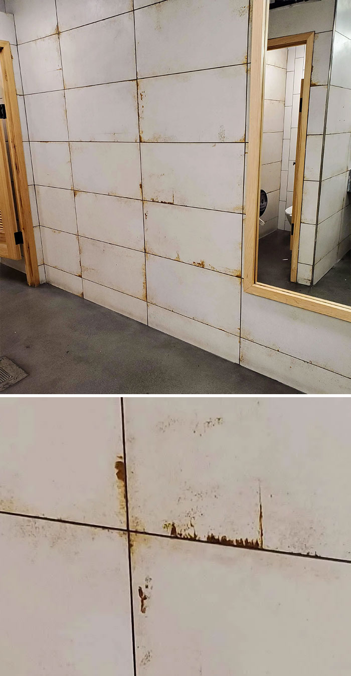
Upon Walking In This Bathroom At The Supermarket I Was Initially Disgusted At Filth And Lack Of Cleanliness Until A Closer Look Revealed It Was Designed This Way
And it is designed that way so you don't see the filth that is definitely still there.
The Lobby Of This Medical Office Has An Alligator In The Floor
Not Exactly The Color Pattern You Like To See In A Bathroom
"Not the pattern you want to see in the bathroom"? OK, I'll bite: Where on earth would you want to see this pattern?
Love To Shutterstock See This Kind Of Stuff
They didn't just print the stock photo without noticing, someone hand painted this with the stock photo as reference 💀💀💀
The Paint In This Public Restroom
Sometimes People Use The Left Part
The Decorations On This Hotel Restaurant
This Poster In My School Cafeteria Is So Badly Designed They Put Arrows So You Can Read It Correctly
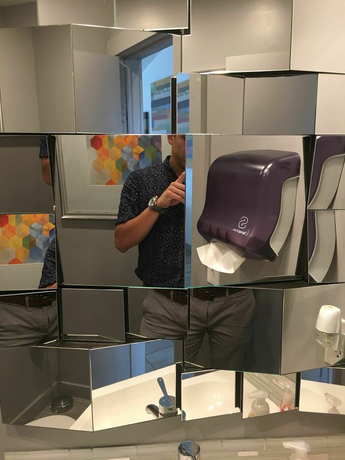
I'm Sure This Mirror Sounded Cool In Theory
Not Sure If This Belongs Here But In My Opinion This Is The Real Problem With America. It's A Toilet Stall If You Were Wondering
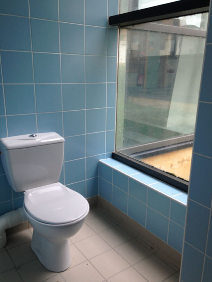
New Toilets At Work, Wonderful View On Our Interior Courtyard
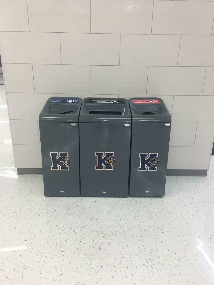
These Trash Cans At My School
Given their outdated school logo, I would say awareness of racism isn't their forté.
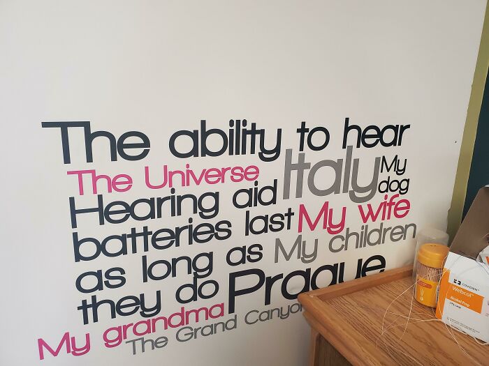
A Poster At My Mom's Audiology Office
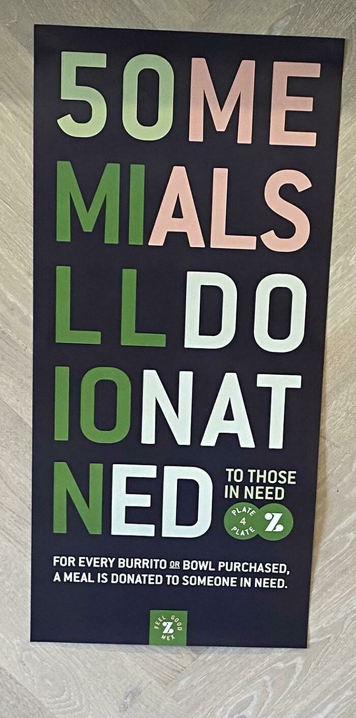
I Had To Stop While Ordering Food At A Local Restaurant Because I Saw This Poster
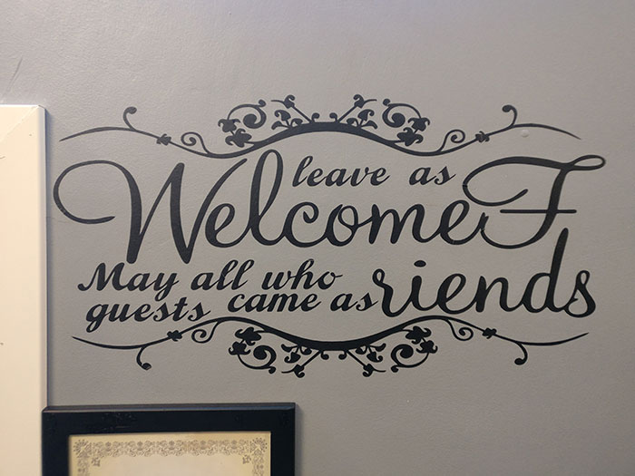
50me mials lldo ionat ned. Ah yes. Just summoning a demon. Don't mind me.
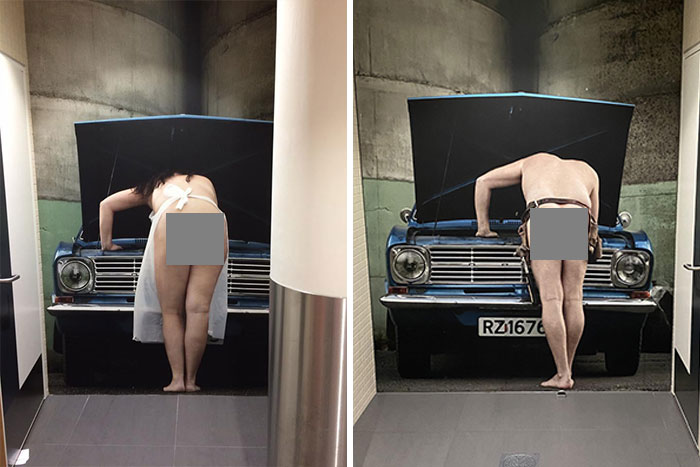
Went In To A Bathroom In Airport And Was Surprised With This. Almost Turned Towards Exit Before Realization
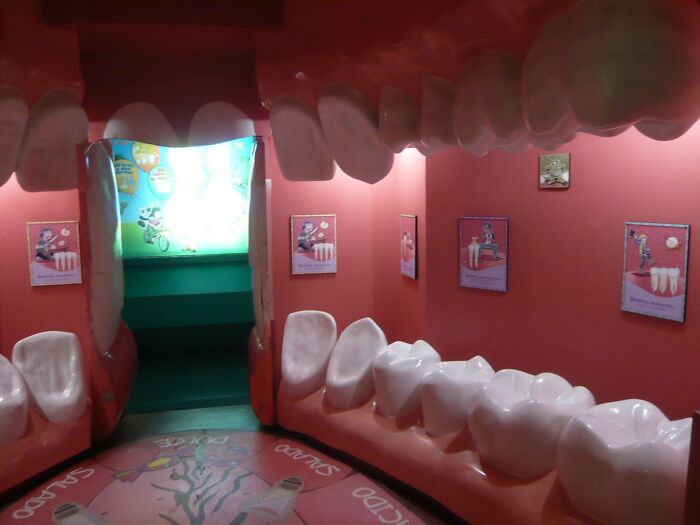
Dentist Waiting Room
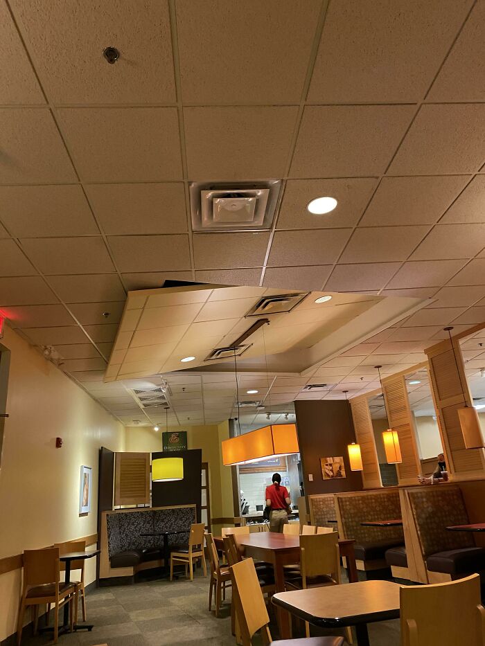
I Can’t Tell If This Is Modern Architecture, Or If The Panera Is About To Cave In On Me
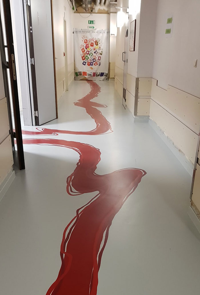
This Is Not A Crime Scene, But A Hospital Hallway
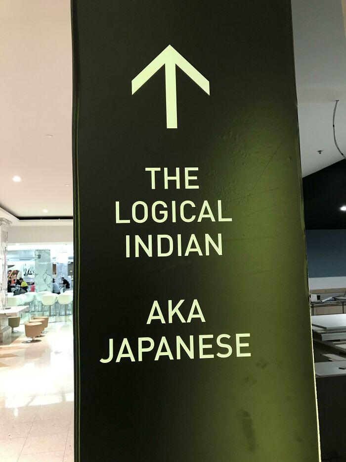
Two Different Restaurants. No Affiliation. Located Just Up Ahead
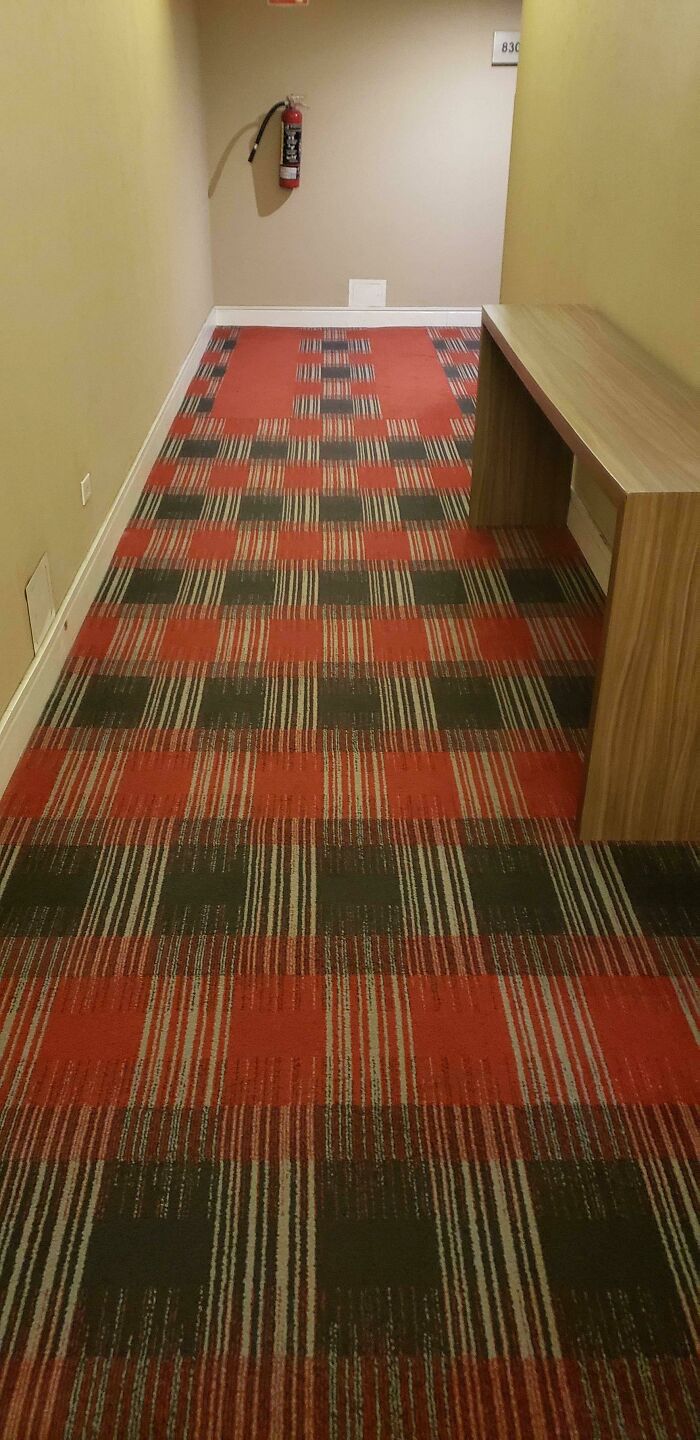
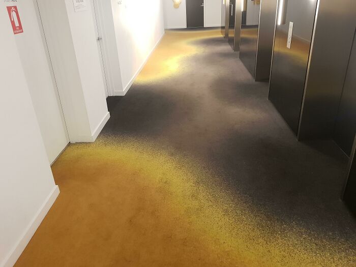
The Carpet In My Hotel Makes Me Feel Drunk Without Having Even Had A Single Drink
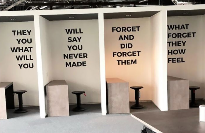
Working Spaces In An Office
They you what will you? Will say you never made ! Forget and did forget them ! What forget they how feel ? This looks like a special conversation between 2 two year old kiddos playing in the park
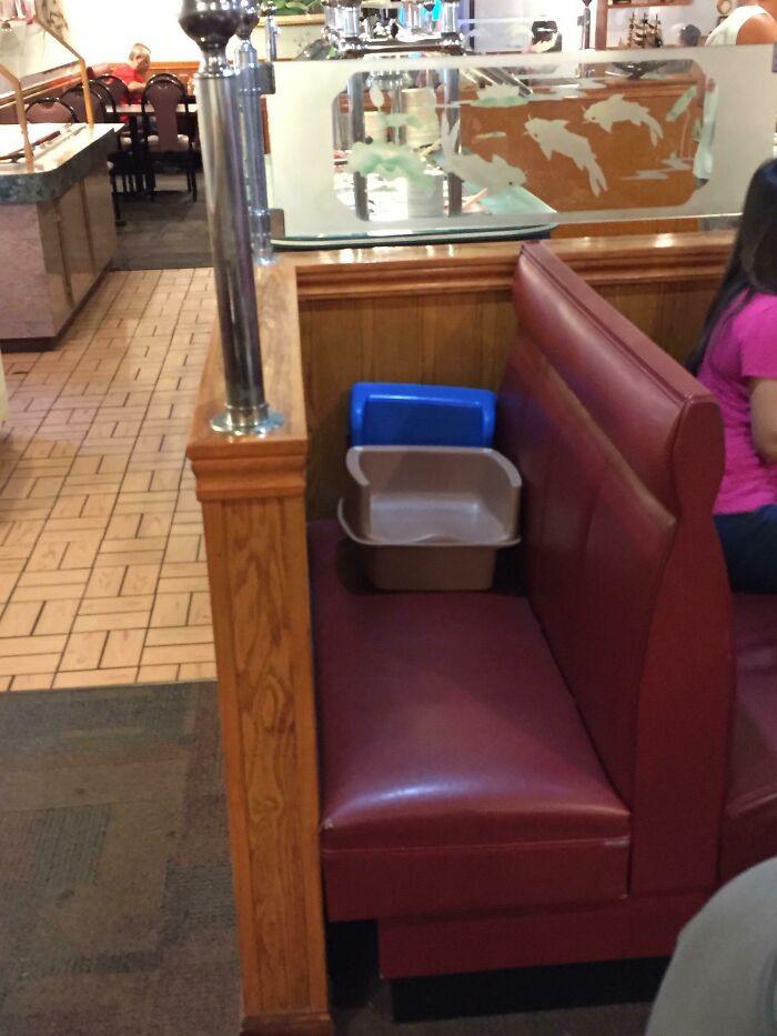
I'm Not Sure They Entirely Thought This Through
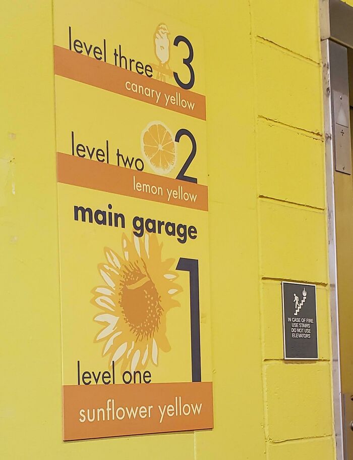
Hey Dude Where's My Car? I Think It's On Yellow Man. Parking Garage Design At A Local Hospital
All The Privacy You Need
Found In A Newly Renovated Middle School
They can tell everyone, "This is where we put the kids that misbehave."
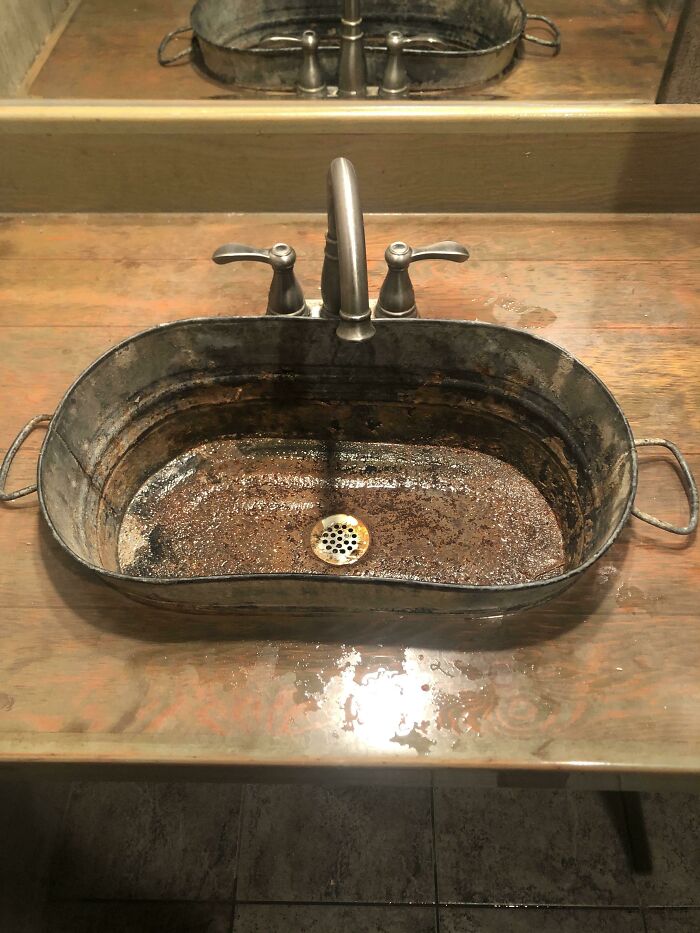
Rusted Sink At Restaurant
"Well, boss, I finally got all the rust out of the bathroom sink." "You did what? That rusty sink cost $$$ - it was a (obscure artist)!."
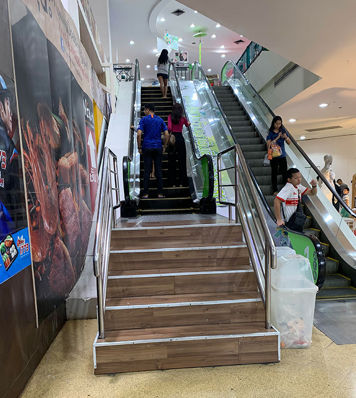
Escalator/Stairs Combo
Found This Beauty At My Local College
It’s Even Smaller In Person
You've Seen Jorts, But Have You Ever Seen A Jillar
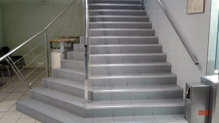
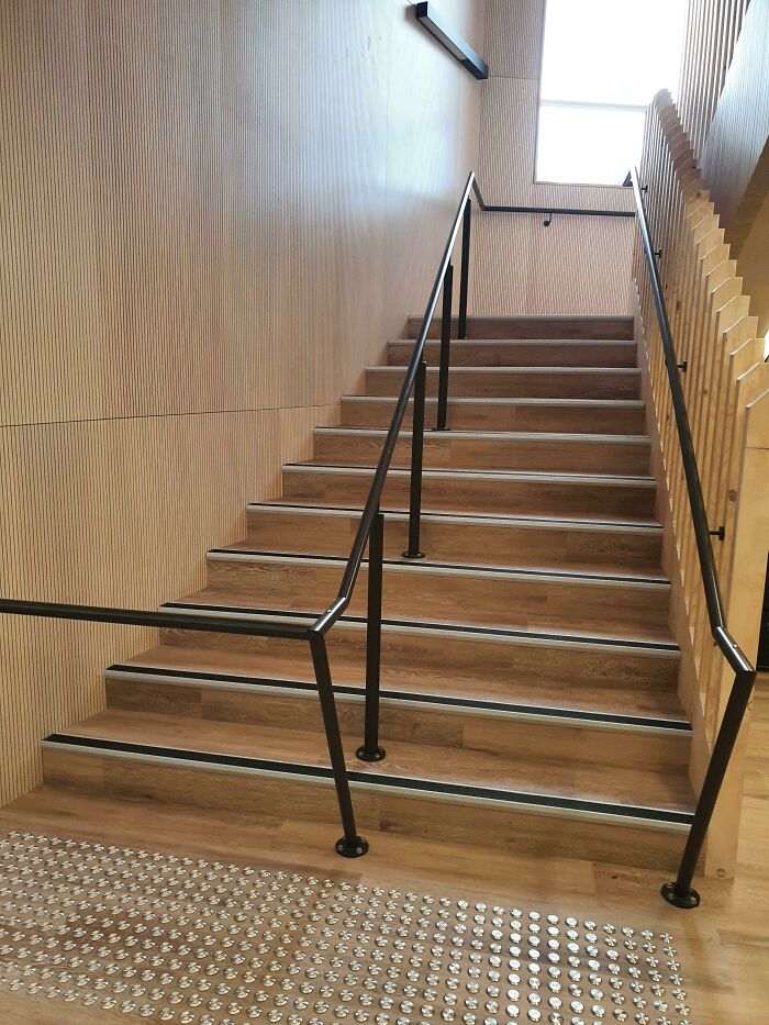
New Staircase At My School
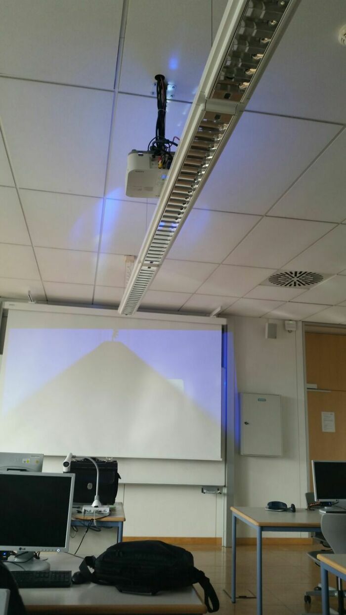
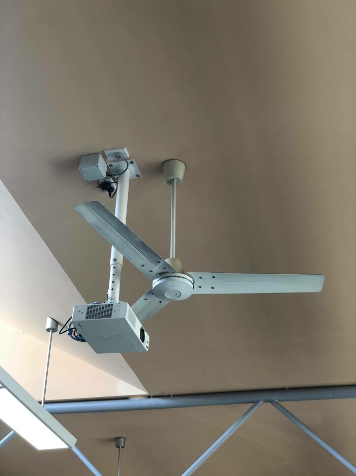
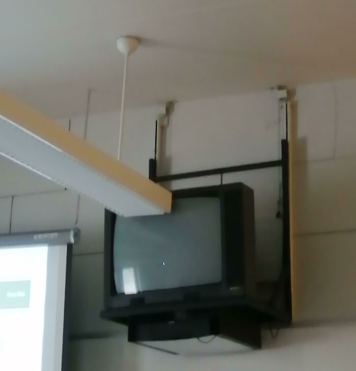
The Way My School Installed The New Projector
The Design On The Floor In The Bathroom At The Restaurant I'm At Right Now
Russian Architecture
This Image In The Restaurant Will Haunt Me Forever
Amanda Collins was a 9 year old kid . Her parents , Mr and Mrs Collins , decided to take her for a long drive for her birthday and try the amazing Hot dogs of Estrella Galicia. Amanda was a very patient and well mannered child. Her parents wanted their daughter to enjoy the special day. But everything was ruined when a hot dog truck , A Big , Giant hot dog truck crashed into their car. Amanda got hit on her head with a piece of broken glass and fainted. When she woke up , she couldn't remember anything. At that moment , A hand offered her a hot dog. She couldn't see whose hand it was as she still had the piece of glass in her head and couldn't wake up properly. The hand shoved the hot dog in her mouth , forcing her to eat it all. And that moment , she realised. The ketchup in the Hotdog, Wasnt ketchup....
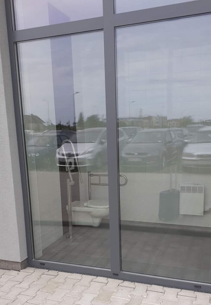
This "Public" Toilet On Gdansk Airport, Parking P6
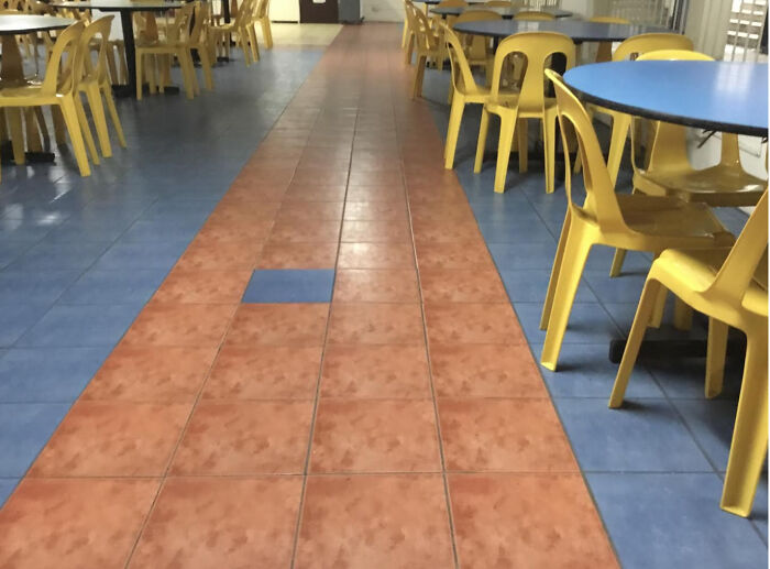
These Tiles At My School Canteen
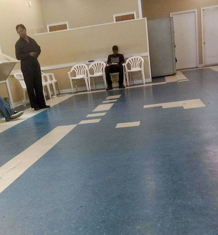
The red floor is lava. Only the blue tiles are safe for walking on. This is the crossing point.
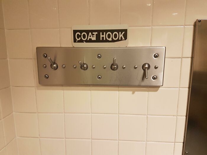
This 'Coat Hook' At The Airport Bathroom That Hinges And Drops Everything On The Floor
What’s This Supposed To Say?
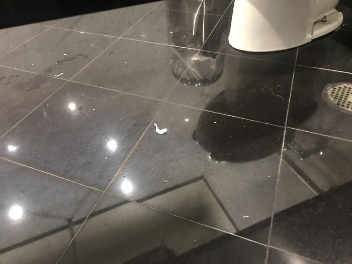
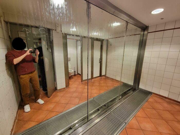
This Mirrored Floor In A Public Restroom
This photo doesn’t make it that obvious, but - this was the stall next to me, and I took it while sitting on the adjacent toilet.
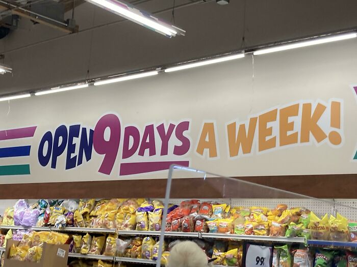
This Store Trying To Have Everything 9 Related
This Design At My University, The Classroom Is Inside Of The Bathroom, Nice
This Damned Toiled
This Sign In My Office Causes Me To Have A Small Existential Crisis Every Time I Pass It
Hey High School Bulldog, Meet My High School Wildcat
All Of The Hotel's Hallway Lights Were Like This
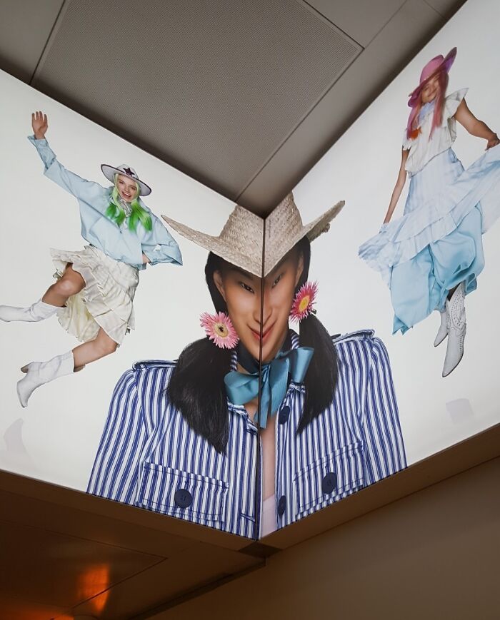
People Will Never Learn To Not Put Faces In Corners
My Engineering Classroom
Went To Go To The Bathroom At A Local Restaurant
My School Library
Brand New Apartments And Someone Thought This Was A Good Carpet Design But It Just Looks Like The Floor Is Rotting
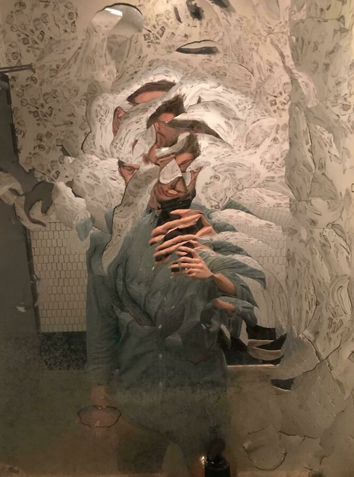
This Really "Artsy" Mirror At A Fancy Restaurant
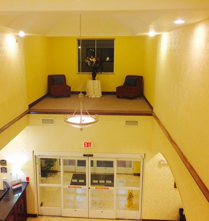
My Hotel Has A Sitting Area With No Possible Way To Access It
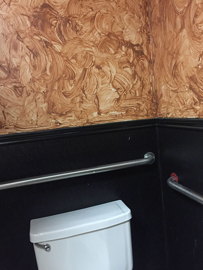
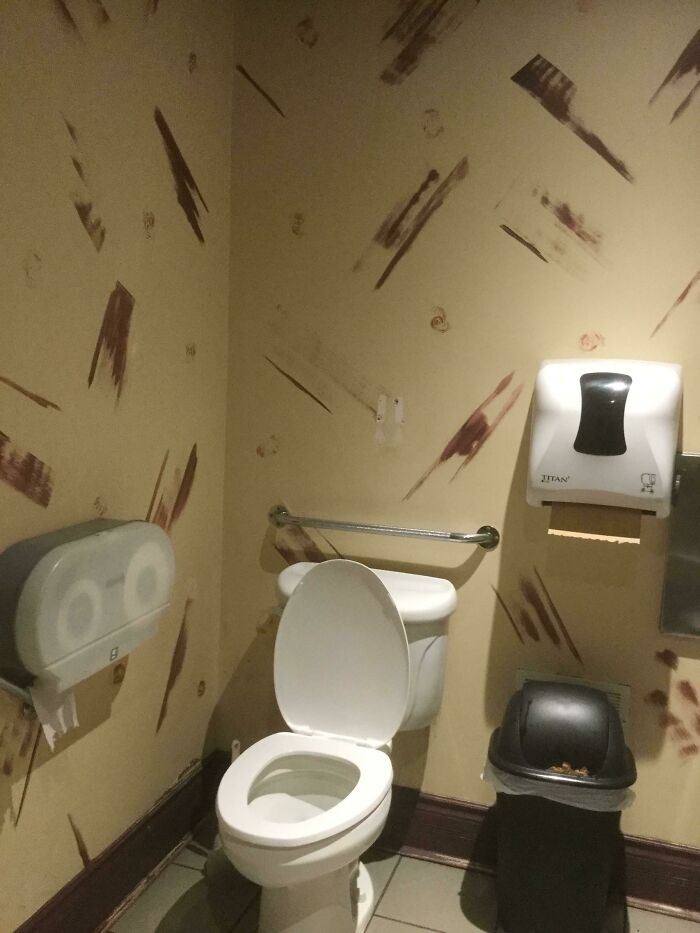
This Washinton DC Whole Foods Restroom's "Industrial" Design That Looks Like Someone Smeared Poop Everywhere
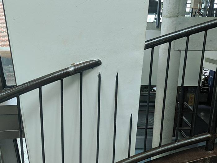
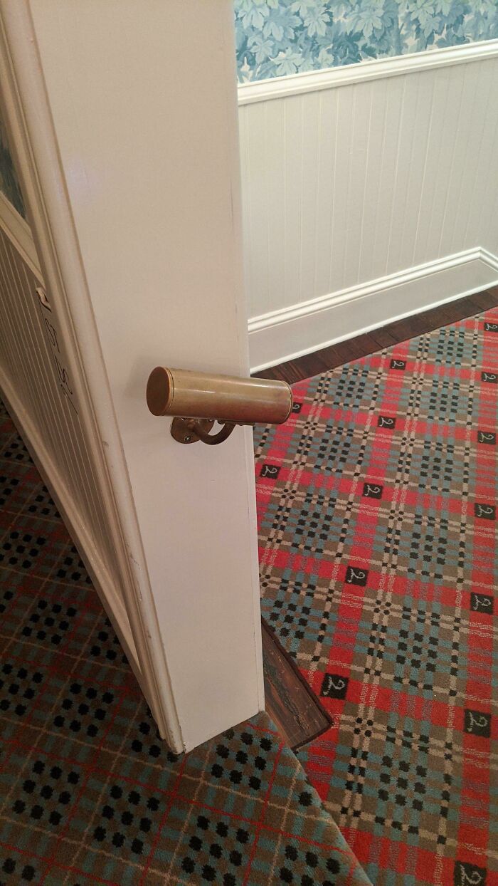
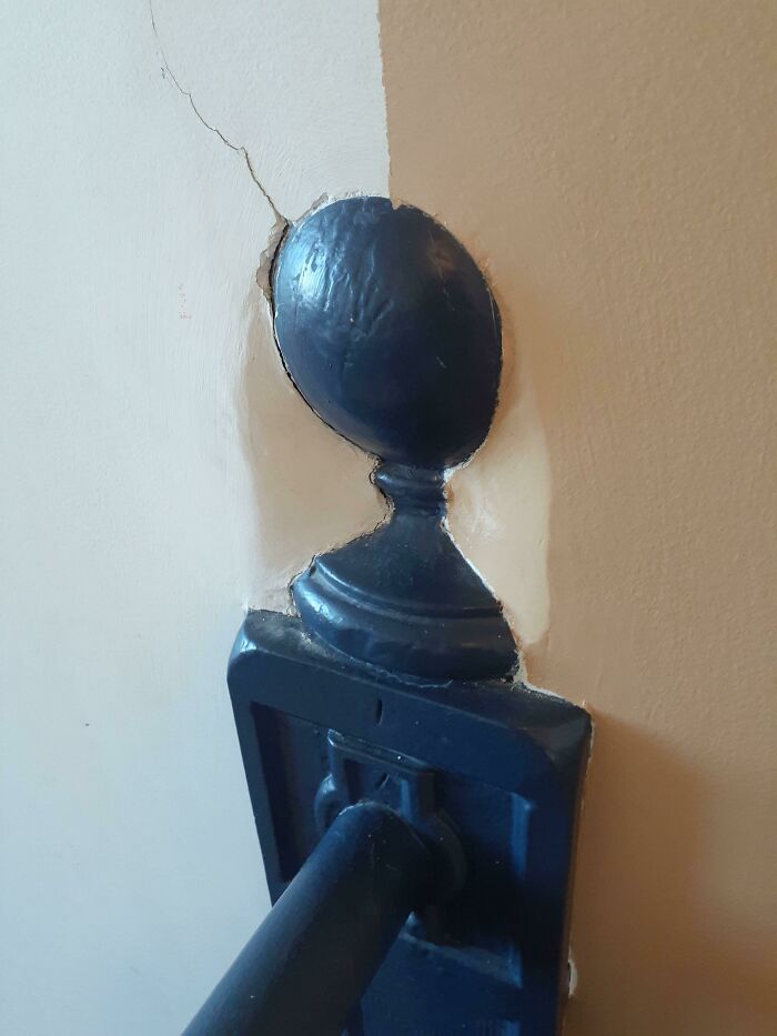
The Smallest Handrail You've Ever Seen
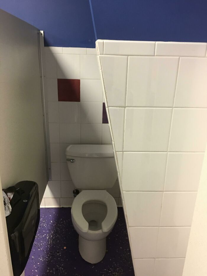
I Just Wanted To Use The Restroom
Took me a minute to realize that this was a single image, not two images spliced together.
This Chunk Of Stairs That Pokes Out Of The Wall At My Work
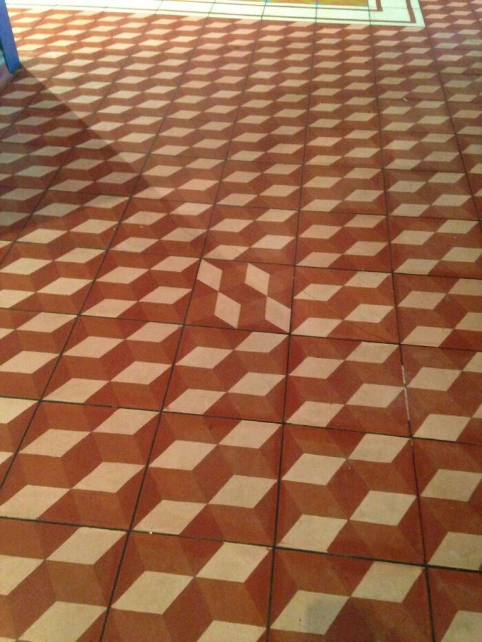
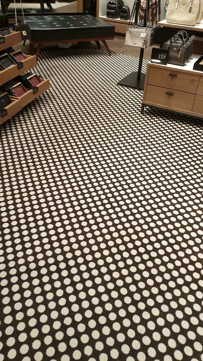
This Floor At This Store Hurts Your Eyes As You Walk Around
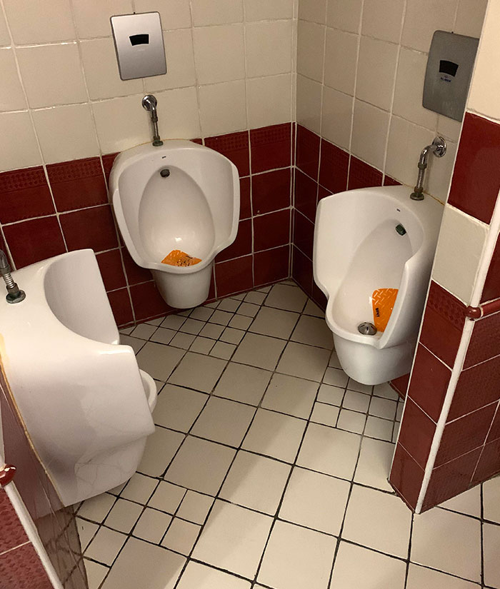
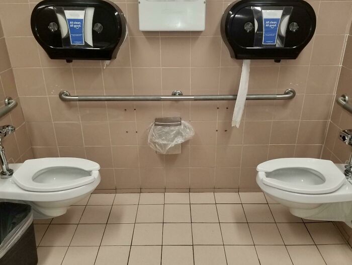
This Public Restroom Has Facing Toilets
Yess, Milk
So, if white cows make white milk, and brown cows make chocolate milk, what kind of cows make orange milk?? 😂😂😂
A Urinal In Germany With A Full Length Mirror For Inspecting Other Dude's Junk
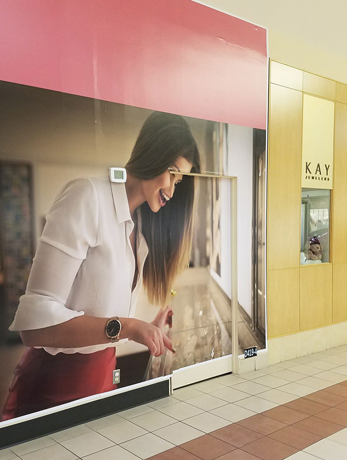
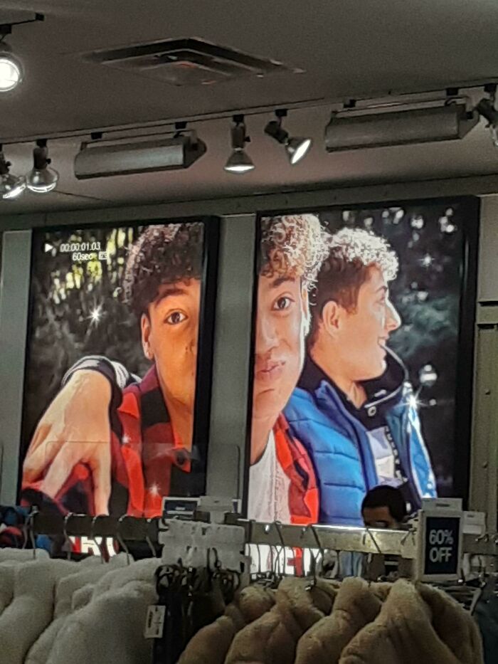
An Ad In My Local Mall
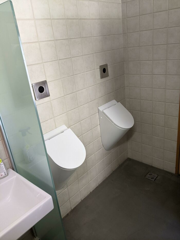
"Aesthetic" Urinal Covers In Public Restroom Must Be Touched With Your Hands In Order To Open
To be fair, you wash your hands after doing your business, right? Right?
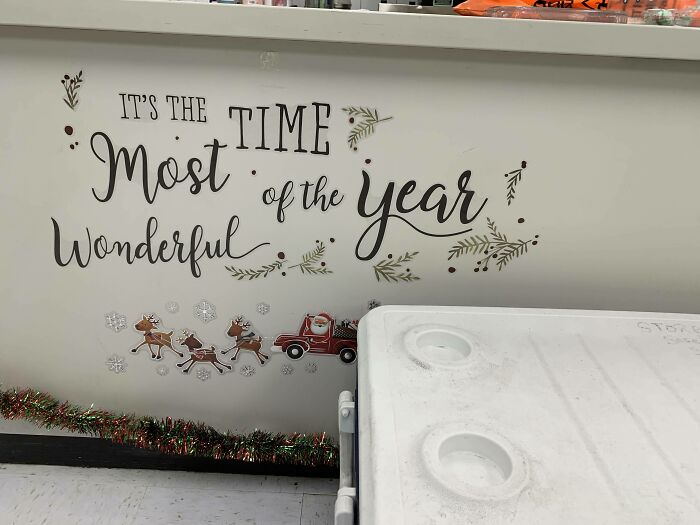
It's The Time Most Of The Year Wonderful
🎶it's the tiiime most of the year wonderfuuul..... with jingle kids belling telling and everyone be you of cheer gooood🎶
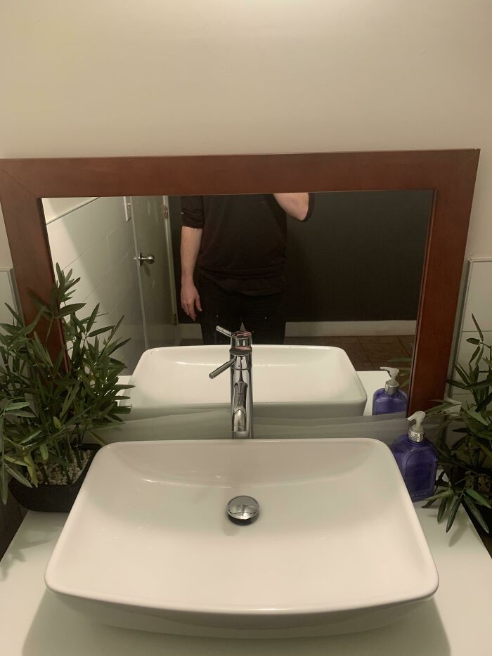
It Was Nice To Be Able To See I Don’t Have Anything On The Bottom Half Of My Shirt
Being 6'3 (190.5 cm) I experience this anytime I go to a restaurant. I just want to know how my hair looks but all I see is my chin.
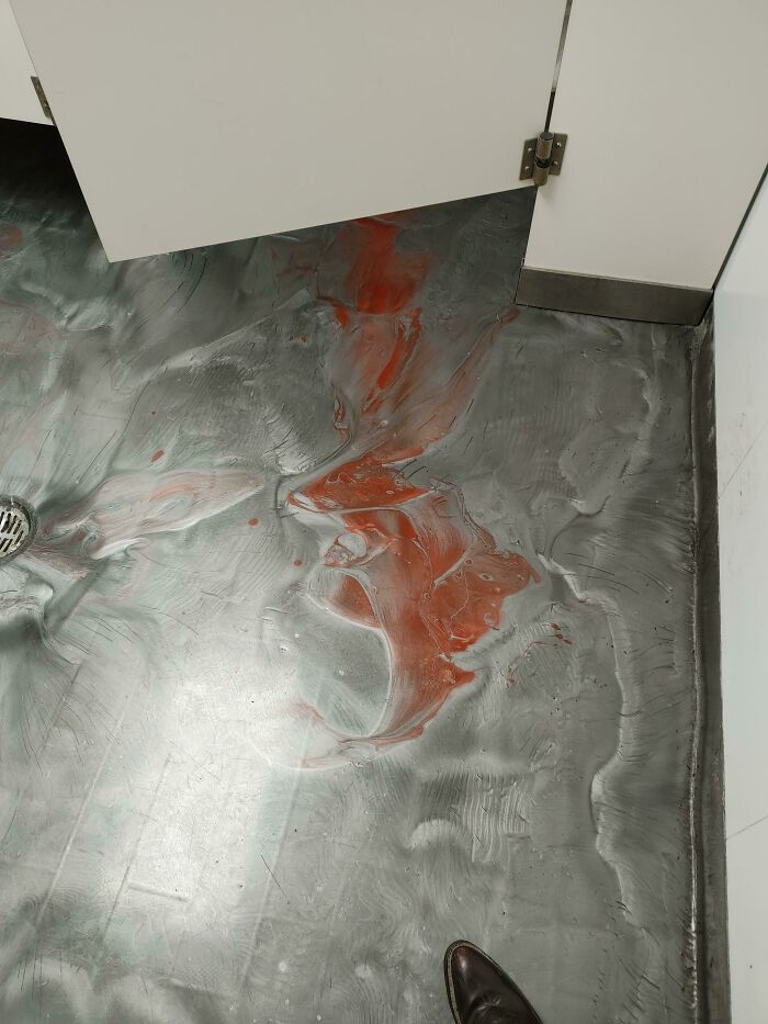
This Tile In The Bathroom At A Restaurant
Ok, who spilled the paint and said it was art to cover their asses?
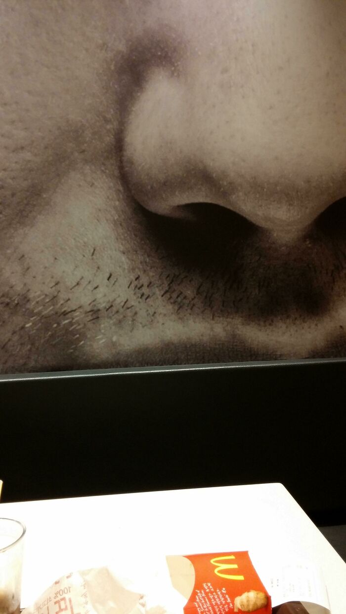
This Is What I Have To Look At While Eating At McDonald's
Mind if I NOSE in on your conversation? Don't mind me, I'm just being NOSY. Who NOSE some good jokes?
Pointless Stairs Found At The National Children’s Hospital
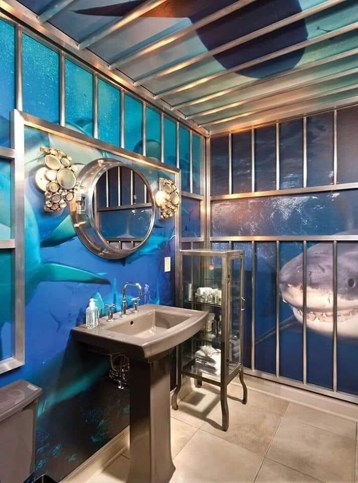
Shark Cage Bathroom
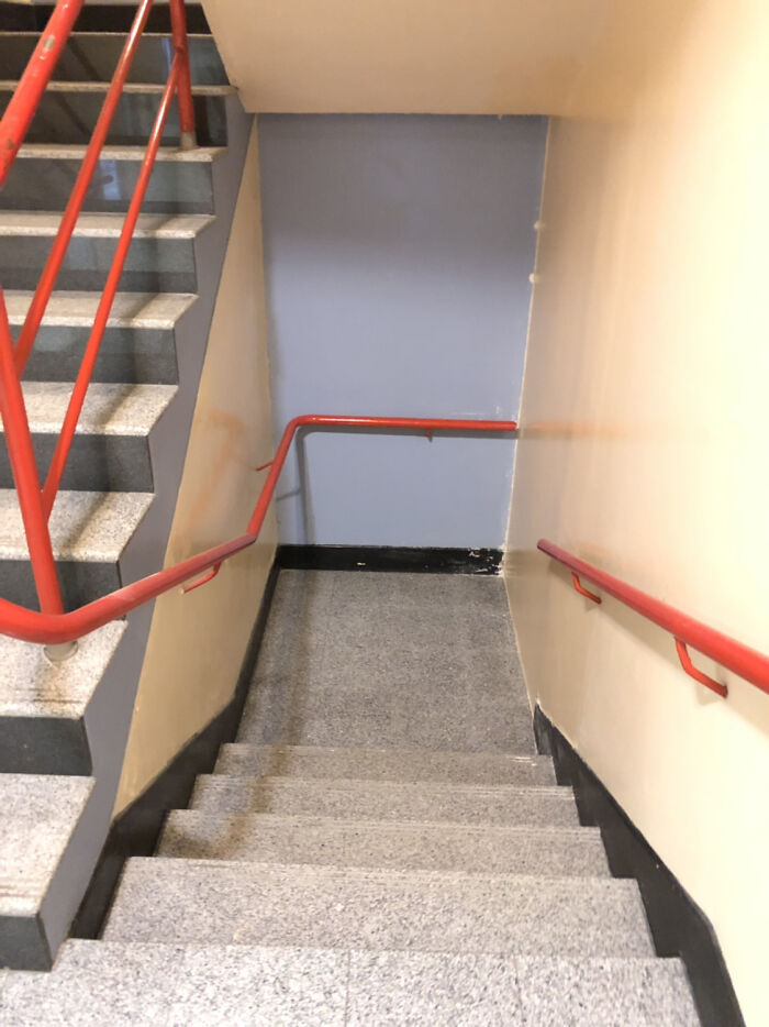
The Stairwell At My School
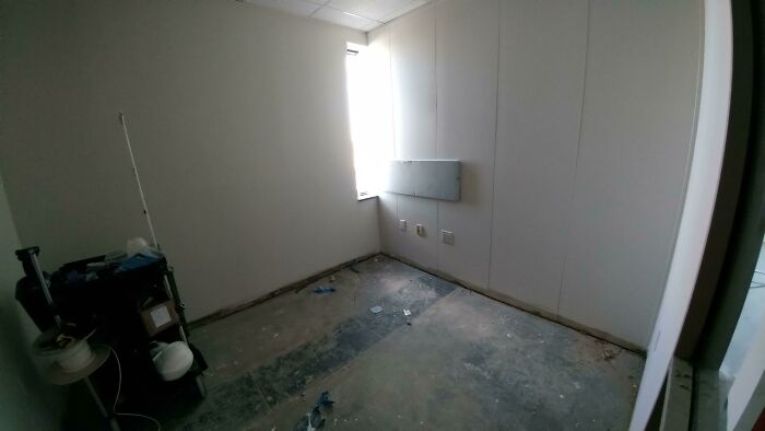
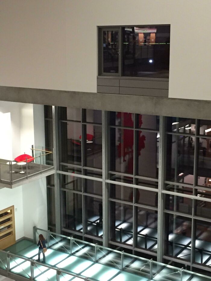
You've Got A Window Office
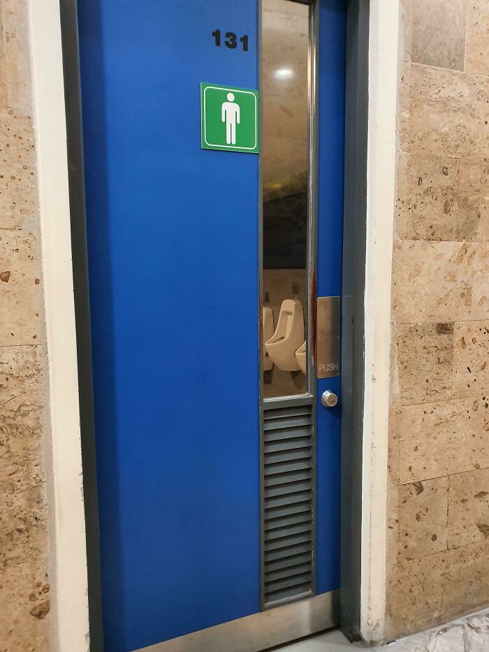
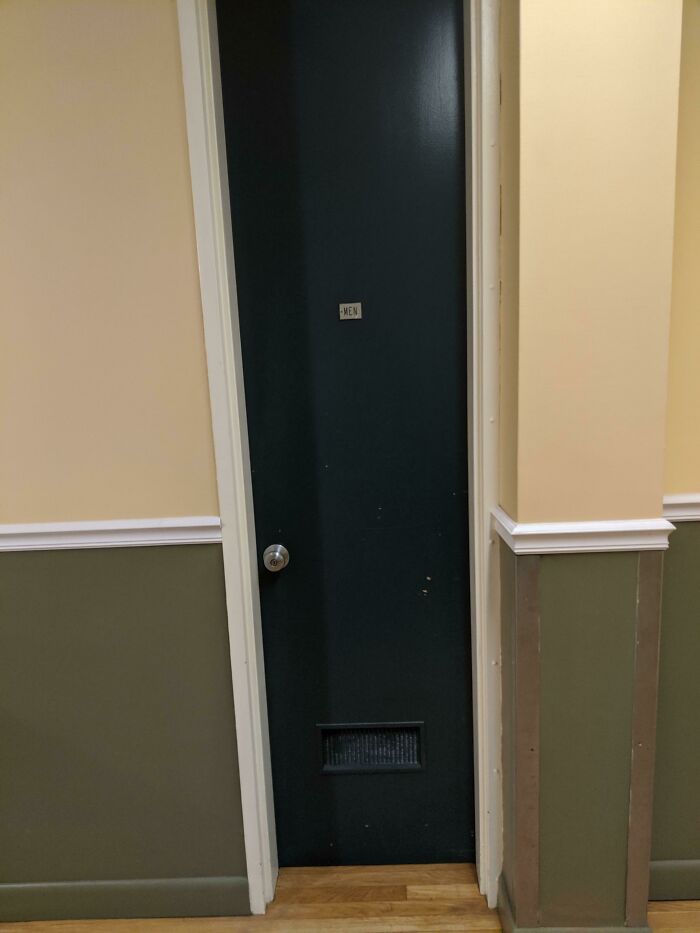
Men's Room Door At A Local Hospital. I Had To Turn Sideways To Get In, I Am Not A Large Man
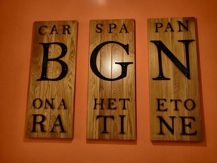
Beautiful "Car Spa Pan" Board At The Italian Restaurant, I've Visited Yesterday
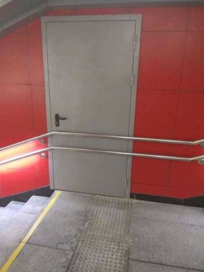
Well, I Think We Can't Escape This Way
Ugh... I told the Riddler to stop, but did he listen? No.
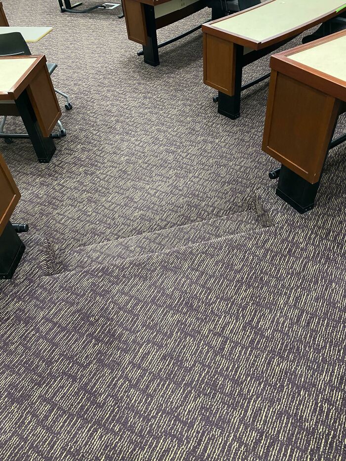
These Stairs Carpeted With A Pattern That Makes It Hard To See The Edge
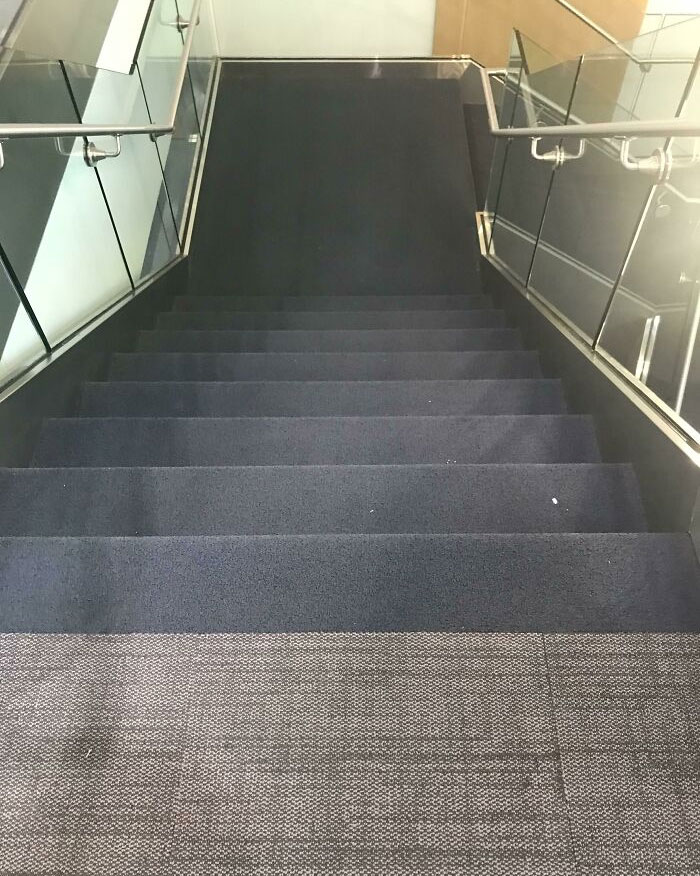
My Office Just Redid Their Stairs. The Blue Starts On The Floor In Front Of The Stairs. It Throws Me Off Every Time
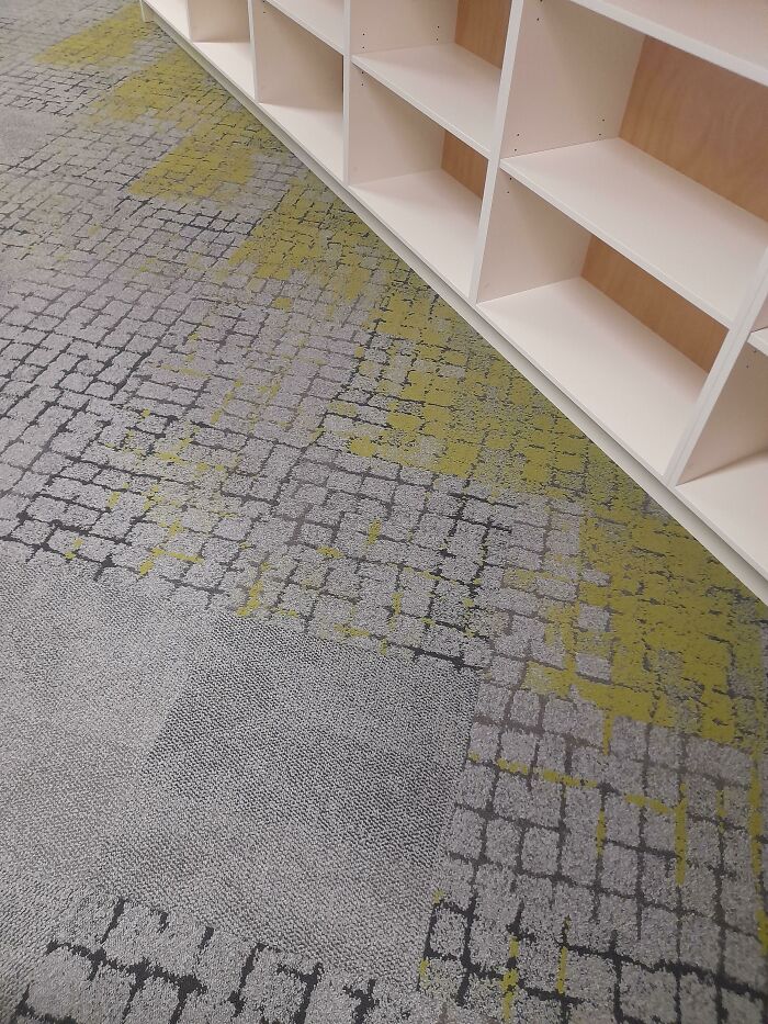
Carpet Design At My School That Looks Like Moss
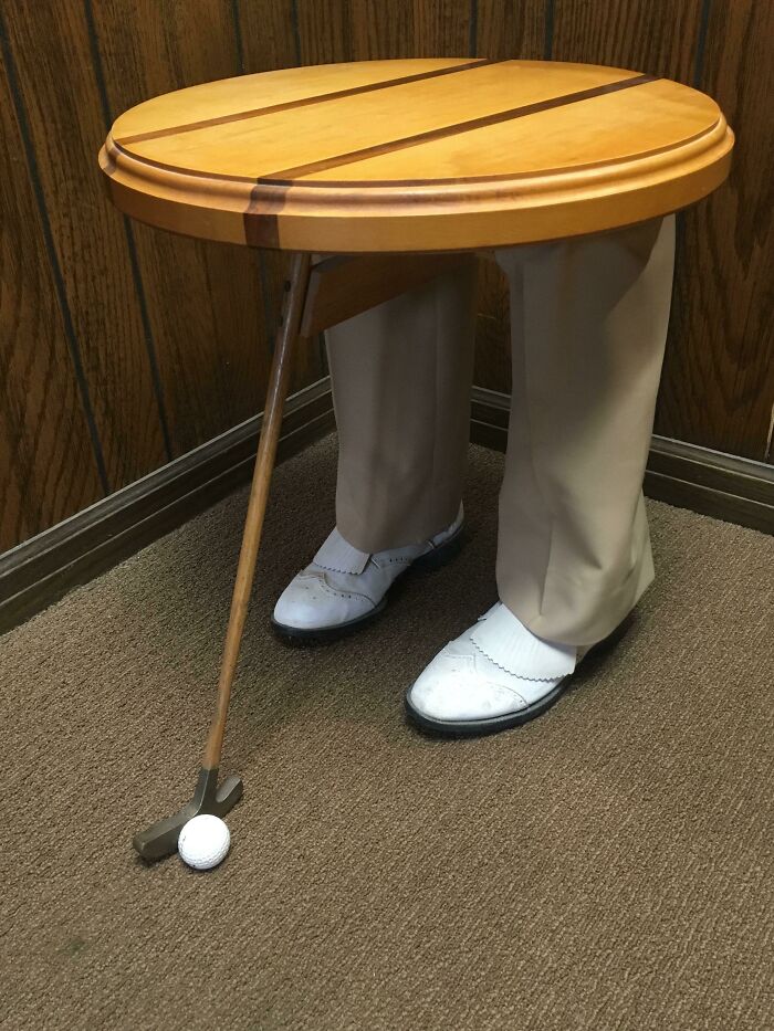
Three-Legged Table That My Boss Found And Put In My Office
This Floor's Tile Design Keeps Me Up At Night
Ate At A Local Restaurant
My School
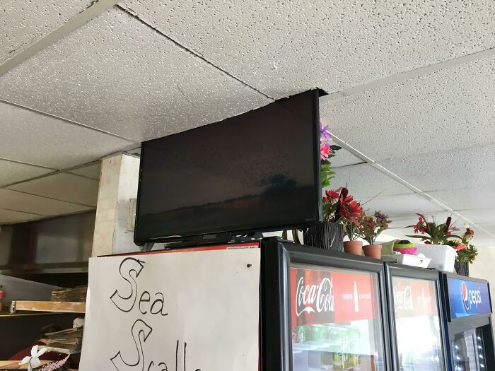
Local Pizza Place Cut A Hole In The Ceiling For The TV
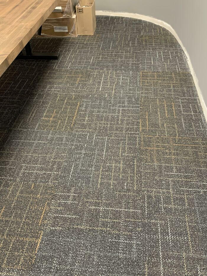
This Brand New Carpet In One Of My Customer’s Office Buildings That Looks Like It’s Covered In Mud
Hallenge Ruup 4the
Oh. Where's the C? I know! Around the shark cage powder room.
Guy Is Being Cut In Half By The Design
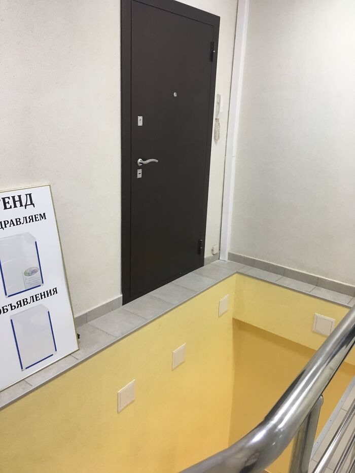
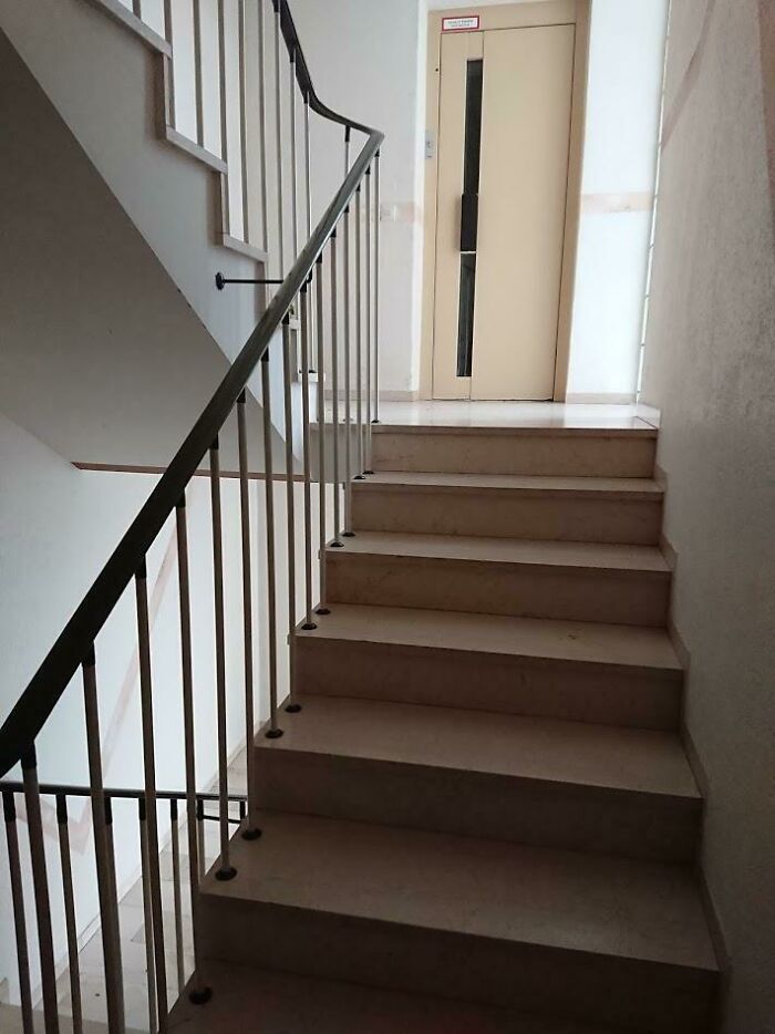
The Lift In This Building Is On Every Alternate Half-Level From Where The Doors To The Houses Are
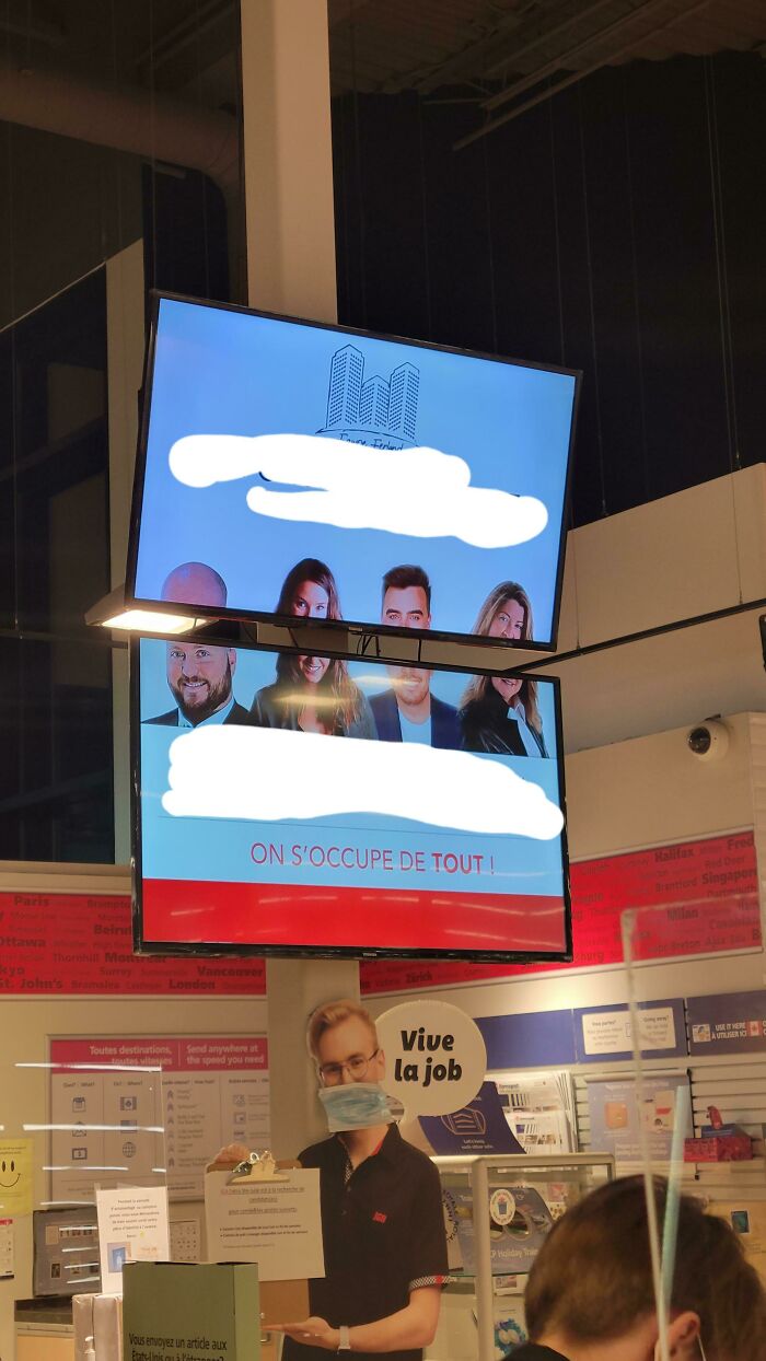
This Publicity In The Grocery Store I Work At
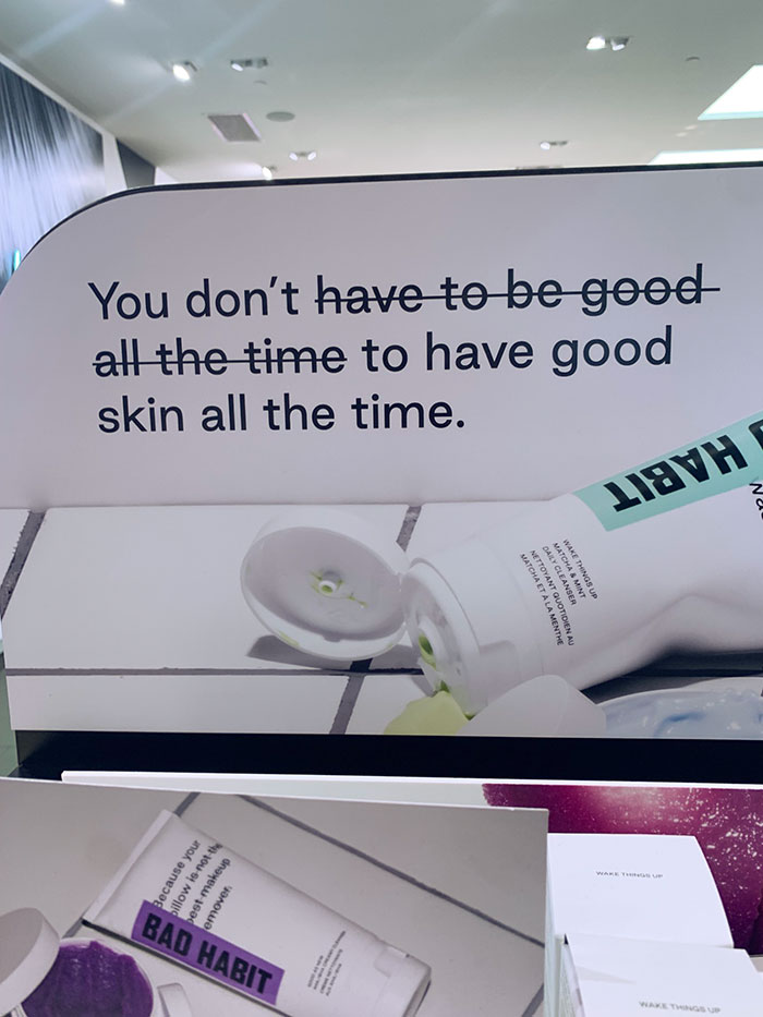
This Sign At A Beauty Store
"because your pillow is not the best makeup remover" is personnaly aggressive :D
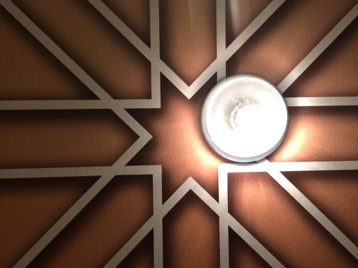
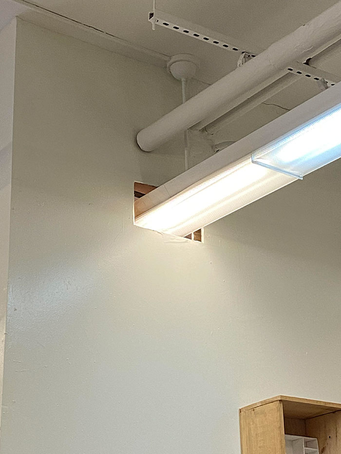
Perfectly Placed Light At A Hotel
How Am I Supposed To Sit Here
This Door In The New Austin Public Library
Great Place To Sit
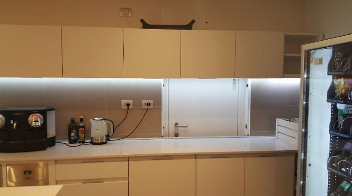
This Office Kitchen
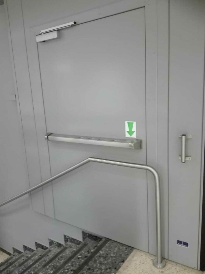
Found This Interestingly Placed Emergency Exit
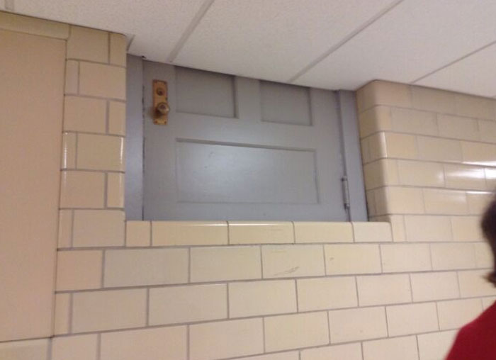
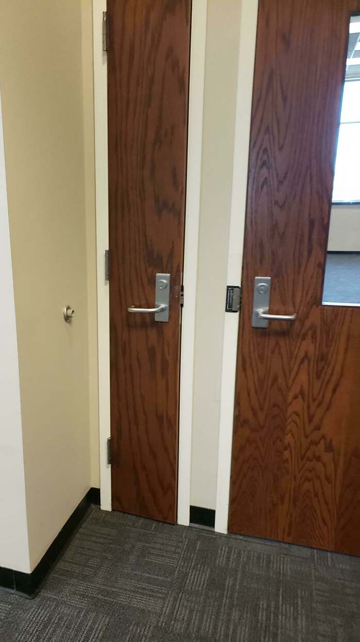
This Tiny Door
How do some things even get finished without someone somewhere saying that it is a bad idea. To all to all those companies with tiles that look like that have poo on them, were you drunk when you designed it and all the way through to conception?
Because someone is getting paid. They don't care that it is screwed up. They just finish the job so they can collect their pay check. They are not going to wait for some on to correct the problem, which could take weeks, months or longer.
Load More Replies...This was so funny 😂😂😂😂I couldn't hold my laugh at all. I just keep questioning WHY?! JUST WHY?!
None of these people went to design school, they're just horrible people.
Load More Replies...So can you do one on excellent and functional design in the public space. For example, In Switzerland the airports have free luggage carts that are equipped to go up and down the escalators. Brilliant! We need more smart design and less "just gettin' by."
For those Brits (or just people in general who don't like the space between bathroom stall doors... such as myself), there was a stall like that at my school when I was a kid that had a crack directly aligned with the mirror. Anyone could look in the mirror at the right angle and see right where the toilet sat. Needless to say, barely anyone used this particular stall :)
I found the one with the hearing aid batteries hilarious. I love you can supposedly "hear" the Grand Canyon, Italy and Prague! Lmao?
I will never understand the “fashion, never function” aesthetic.
Yoh I looked at all these pictures n am shocked.peoples or designers have a s**t sense of humour .you really get some whacked stuff out there.thanks to the photographer for showing us these n making me laugh
Both my parents are engineers... Should I show them this or not?
I worked at a school where the teachers bathroom was also the supply closet. There were shelves and boxes of documents. And then they just put a toilet and a sink in there. Didn't seem sanitary *at all*
Or the other way around most likely. And no it's very unsanitary especially with COVID 19. The virus (found in fecal material) that people cough in that room lives on inanimate objects for 48 hours so could easily be spread to the entire school population within hours.
Load More Replies...It's entirely possible considering the enormous size of the internet, it's continual growth and the length of time in existence. You may have seen some but it doesn't mean others have.
Load More Replies...Sirs I am only saying that because I genuinely want to teach them the difference. I mean I'm 20 and I can read and write better than 25-30 year Olds and up, when I correct someone I'm not trying to be a grammar nazi I'm trying to teach them the proper way to spell and pronounce something. And yes I do believe teenage slang has a part to play because people will sit there and say u, ur, etc. I am only saying it could influence them not knowing the difference between your, you're, you've. And even words like they're, their, they've, I have seen those used wrong so many times and by people alot older than me. Not trying to be rude or mean towards anybody her I am just genuinely wanting to teach some of them. P.S. not talking about people who currently have A's in english, I'm talking about the ones who are failing. (and I'm also not talking about the ones who have reading/writing disabilities they get free passes)and sure I may not be a dictionary but when I read outloud and wrote back in middle school my teacher set me as a prime example for people in 8th grade.
P.s.s, just trying to teach older generations proper etiquette.
Load More Replies...How do some things even get finished without someone somewhere saying that it is a bad idea. To all to all those companies with tiles that look like that have poo on them, were you drunk when you designed it and all the way through to conception?
Because someone is getting paid. They don't care that it is screwed up. They just finish the job so they can collect their pay check. They are not going to wait for some on to correct the problem, which could take weeks, months or longer.
Load More Replies...This was so funny 😂😂😂😂I couldn't hold my laugh at all. I just keep questioning WHY?! JUST WHY?!
None of these people went to design school, they're just horrible people.
Load More Replies...So can you do one on excellent and functional design in the public space. For example, In Switzerland the airports have free luggage carts that are equipped to go up and down the escalators. Brilliant! We need more smart design and less "just gettin' by."
For those Brits (or just people in general who don't like the space between bathroom stall doors... such as myself), there was a stall like that at my school when I was a kid that had a crack directly aligned with the mirror. Anyone could look in the mirror at the right angle and see right where the toilet sat. Needless to say, barely anyone used this particular stall :)
I found the one with the hearing aid batteries hilarious. I love you can supposedly "hear" the Grand Canyon, Italy and Prague! Lmao?
I will never understand the “fashion, never function” aesthetic.
Yoh I looked at all these pictures n am shocked.peoples or designers have a s**t sense of humour .you really get some whacked stuff out there.thanks to the photographer for showing us these n making me laugh
Both my parents are engineers... Should I show them this or not?
I worked at a school where the teachers bathroom was also the supply closet. There were shelves and boxes of documents. And then they just put a toilet and a sink in there. Didn't seem sanitary *at all*
Or the other way around most likely. And no it's very unsanitary especially with COVID 19. The virus (found in fecal material) that people cough in that room lives on inanimate objects for 48 hours so could easily be spread to the entire school population within hours.
Load More Replies...It's entirely possible considering the enormous size of the internet, it's continual growth and the length of time in existence. You may have seen some but it doesn't mean others have.
Load More Replies...Sirs I am only saying that because I genuinely want to teach them the difference. I mean I'm 20 and I can read and write better than 25-30 year Olds and up, when I correct someone I'm not trying to be a grammar nazi I'm trying to teach them the proper way to spell and pronounce something. And yes I do believe teenage slang has a part to play because people will sit there and say u, ur, etc. I am only saying it could influence them not knowing the difference between your, you're, you've. And even words like they're, their, they've, I have seen those used wrong so many times and by people alot older than me. Not trying to be rude or mean towards anybody her I am just genuinely wanting to teach some of them. P.S. not talking about people who currently have A's in english, I'm talking about the ones who are failing. (and I'm also not talking about the ones who have reading/writing disabilities they get free passes)and sure I may not be a dictionary but when I read outloud and wrote back in middle school my teacher set me as a prime example for people in 8th grade.
P.s.s, just trying to teach older generations proper etiquette.
Load More Replies...
 Dark Mode

 No fees, cancel anytime


