50 Times People Spotted Stupid Design Decisions In Public Places And Just Had To Share (New Pics)
Good design is aesthetic and pleasing. But truly great design is deeply empathetic—it always puts the user first. And nothing could be more important than empathetic designs when it comes to public places. They’re meant to be for the public’s benefit after all!
However, the world is full to the brim with examples of poor design. From truly awful restrooms that anyone would think twice about using to unfriendly restaurant seating, disruptive decor, and stairwells that go nowhere. Our team here at Bored Panda has collected some of the worst public place design decisions to prove to you that everyone deserves better. Scroll down for the crème de la crème of bad interiors and upvote the pics you loved to hate.
This post may include affiliate links.
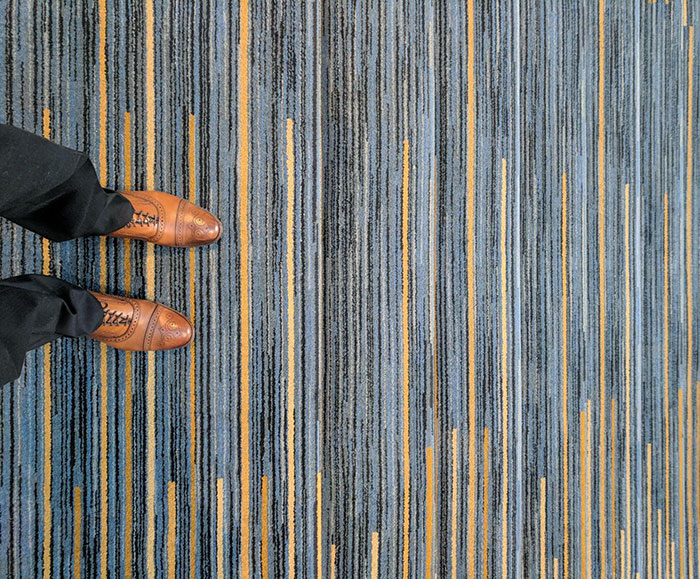
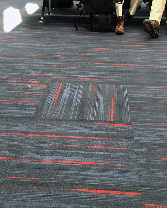
Not A Good Carpet Choice For Stairs If You Ask Me
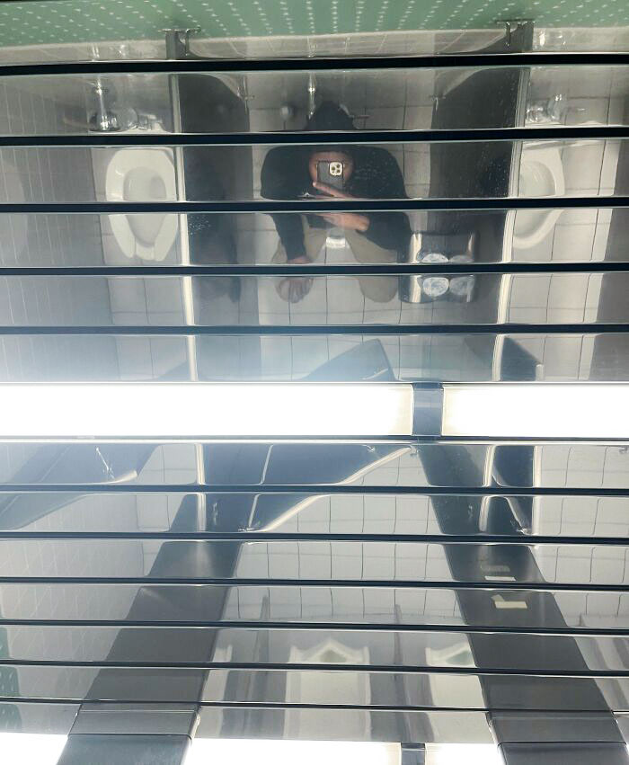
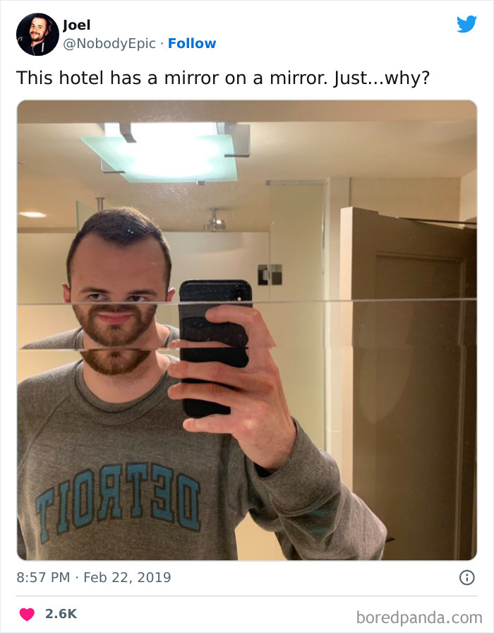
This Mirrored Ceiling In Our Bathroom At Work
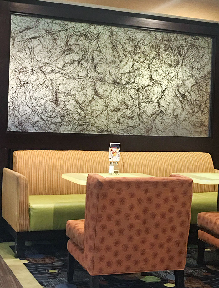
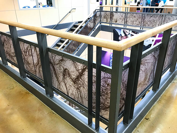
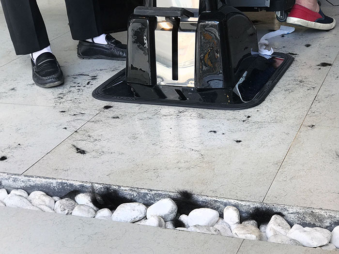
This Picture In The Hotel Lobby Looks Like Pubes
Dr. Steve Soifer, program manager for the American Restroom Association, was kind enough to share his thoughts on public bathroom design with us.
According to Soifer, privacy is the key factor when it comes to restroom use. "People want privacy, in general, for their business," he stressed the fact. And so, this is the factor to keep front-of-mind in terms of design.
Unfortunately, privacy is often a forgotten concern. "In the U.S., so many public bathrooms aren't designed for that—if you can find one!" the ARA program manager noted that there's a noticeable lack of public restrooms. Especially quality ones.
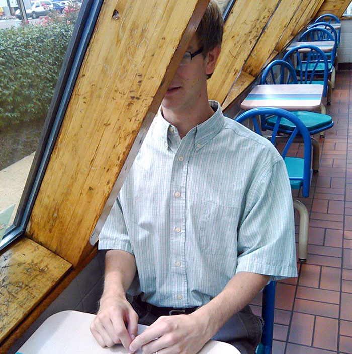
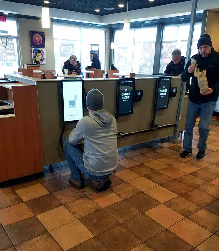
Waiting To Engage In A Dining Experience At My Favorite Taco Establishment
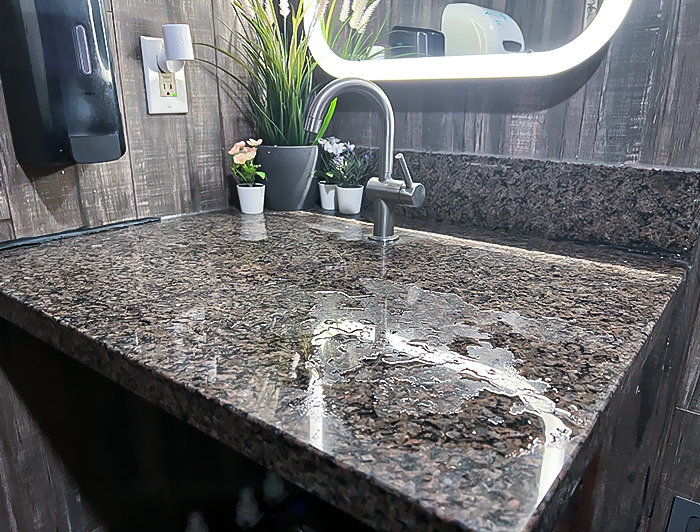
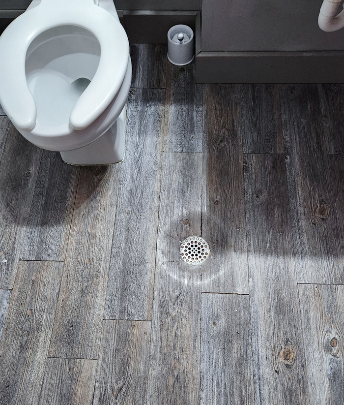
It's Not Even Angled Or Anything To Guide The Drainage. It Just Dribbles Onto The Floor
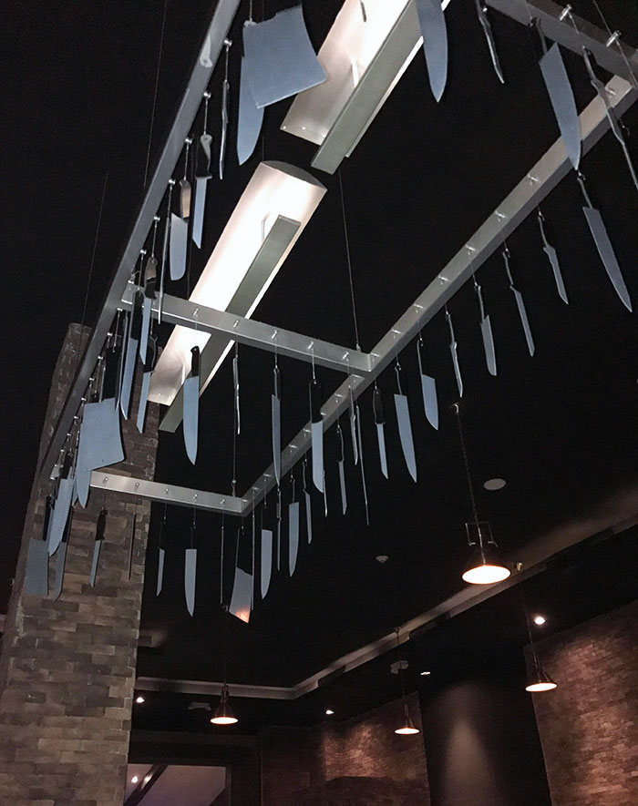
Best Item To Hang Above Your Head At Dinner? Ah Yes, A Chandelier Of Knives
We were interested to learn about the main factors that would drive someone away from using a public restroom. "Well, of course, a shy bladder, or medical concerns like emptying a colonoscopy bag," Dr. Soifer told Bored Panda.
It's situations like these that make privacy so paramount in the first place. A poorly-designed bathroom that makes someone feel like they're being watched by others won't instill much confidence.
According to Dr. Soifer, the main issue for the American Restroom Association is SOAG—single-ccoupancy, all-gender toilets. These offer more privacy, and people tend to prefer them, especially if they have thicker doors and partitions that extend further down to the floor.
Meanwhile, larger SOAGs can help accommodate individuals with disabilities. And, of course, if these facilities are cleaned well and regularly, they'll only be more appealing to the public.
The Lighting At This Bar
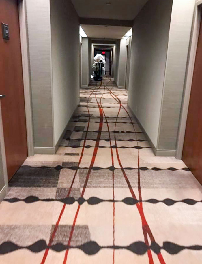
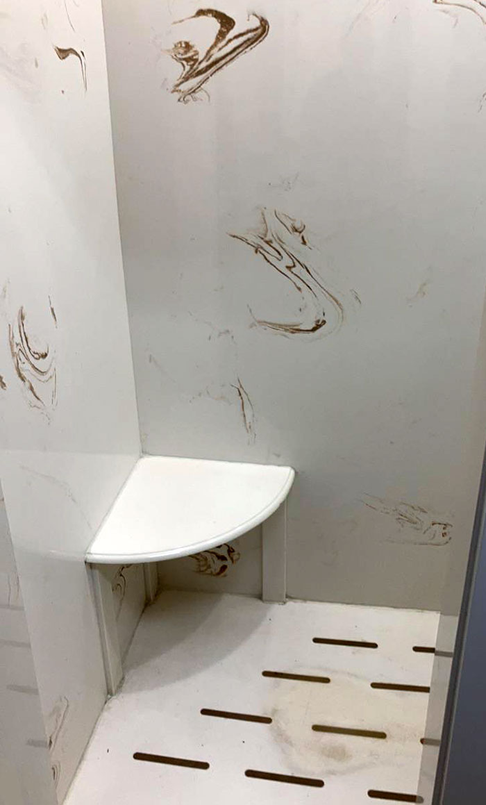
It Looks Like The Hotel Cart Ran Someone Over And Is Dragging Their Blood Through The Halls
Happens a lot when you’re trying to use the cart to move the body when it’s still dripping blood, or a limb ends up hanging over the side. Not that I’d know that from experience…
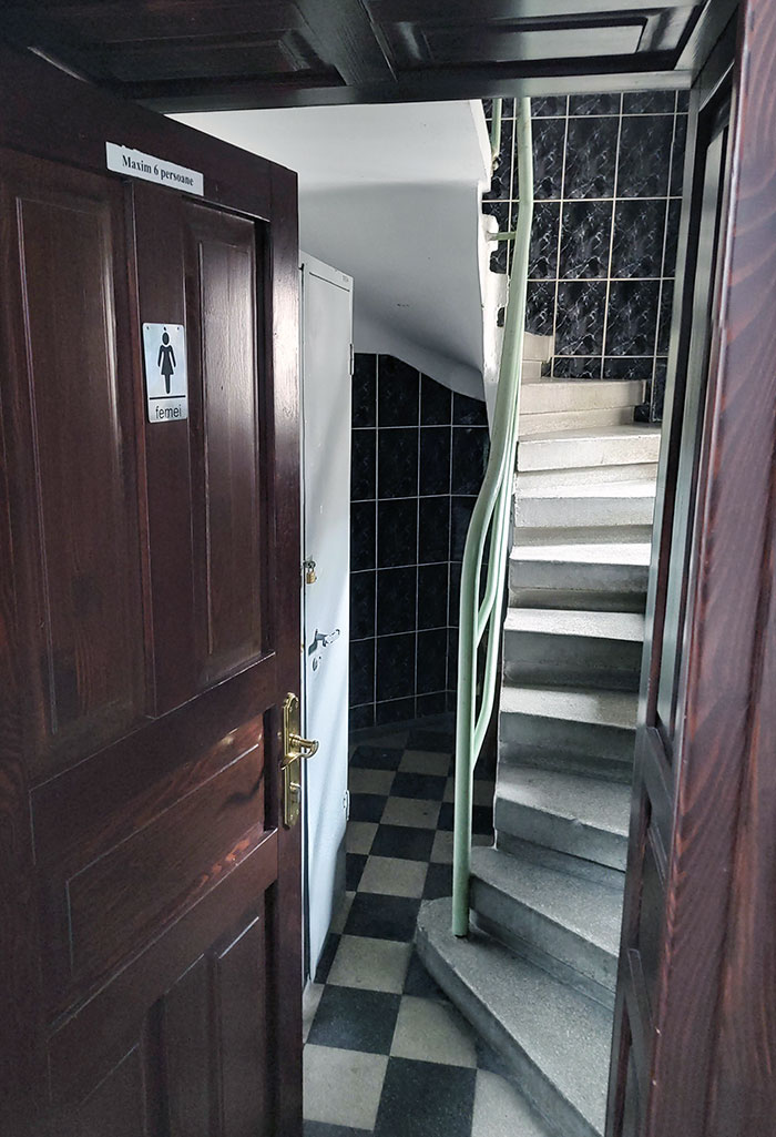
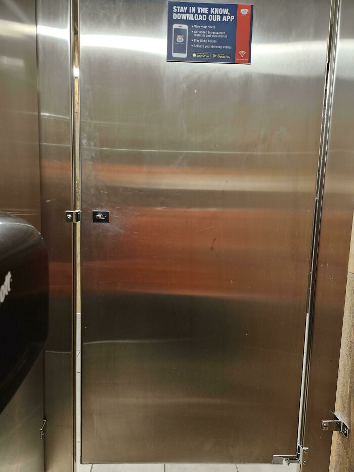
Toilet Door In A Pub, London
Arch Daily notes that the best public places will be easily accessible, create a good first impression, and will make people feel comfortable.
It’s one thing to have a poorly designed interior at home—if you love it, you love it, no matter what your guests might think. It’s another thing entirely when those same bad design decisions make their way out into the public sphere.
In public, you have to be far more acutely aware of common denominators and what most people would agree that comfortable design looks like. You can’t go about designing everything based on deeply subjective factors: you have the so-called common good to look out for.
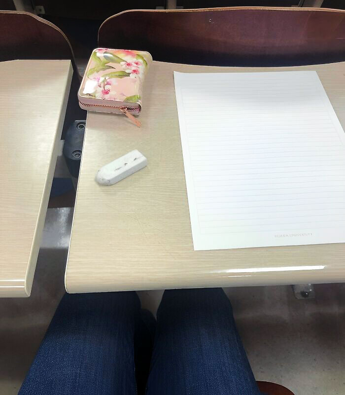
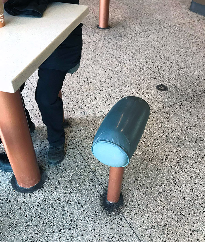
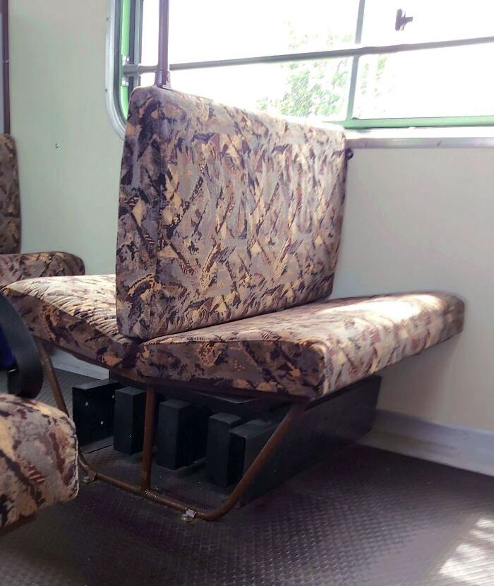
The Seats Doesn't Match With The Desks In The Lecture Hall I Take My Exams In. This Is The One Of The Engineering Buildings
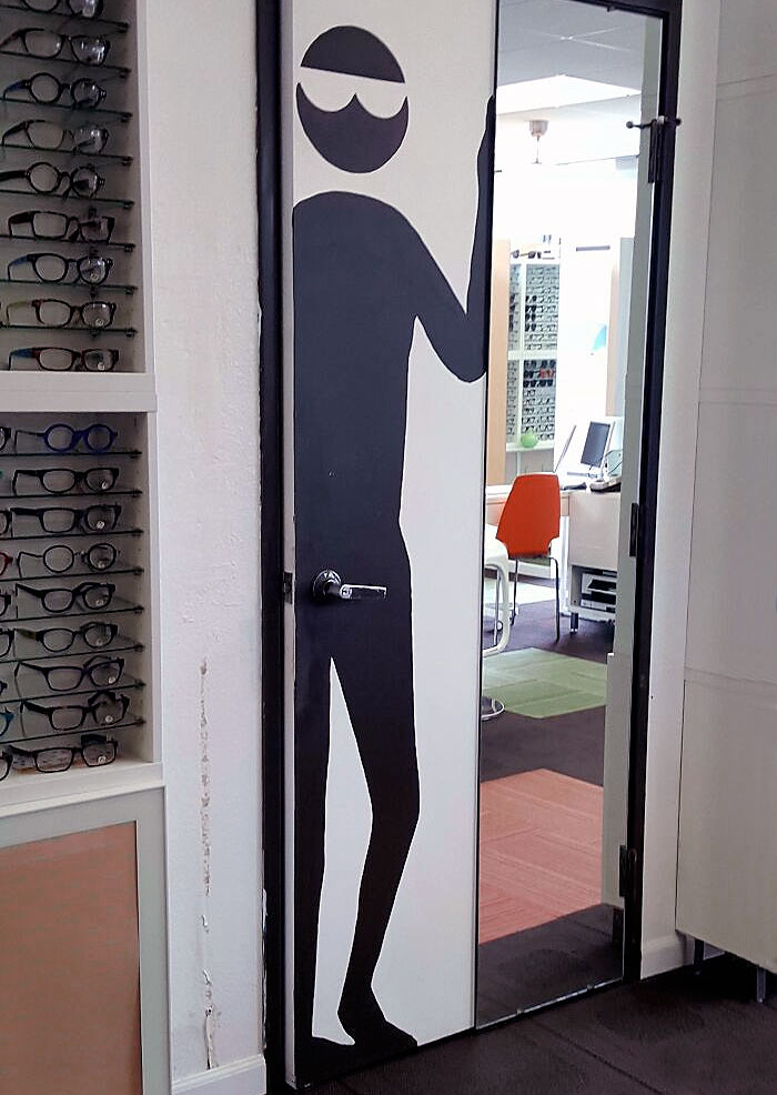
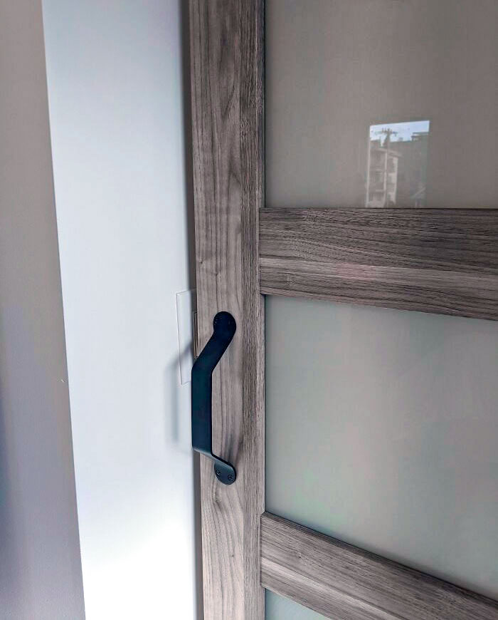
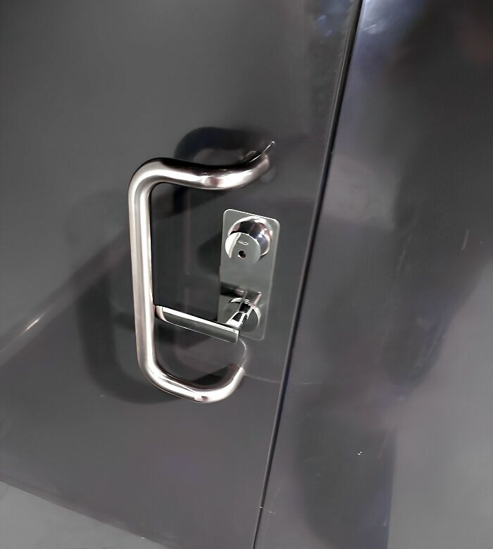
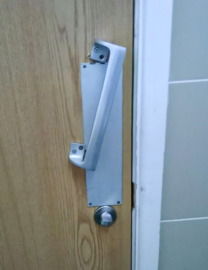
This Door Handle
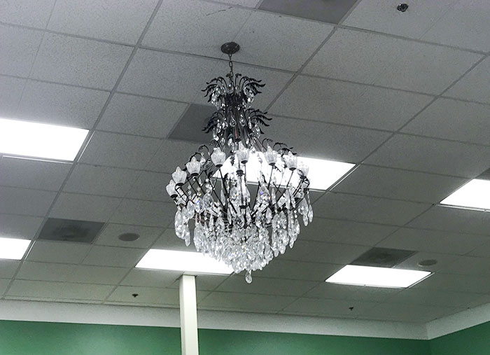
A Chandelier Would Really Tie All This Florescent Lighting And Ceiling Tiles Together
You can’t, for instance, design public places as though you yourself were the only person using them. You have to keep in mind that people come in all shapes and sizes. So you have to be equally aware of how certain decisions, decorations, and interior quirks will affect someone who’s taller or shorter, bigger or smaller than you.
Not only that, you have to ensure that these spaces are accessible to everyone. If everything’s extremely cramped, someone who’s using a wheelchair may have difficulty navigating the area. The more accessible these spaces are to people regardless of their physical abilities, the more universal they truly are.
Moreover, public places should also be designed with comfort and safety in mind. You want people to be able to relax, instead of constantly being on edge. That might mean investing in good lighting and security, as well as ergonomic furniture design. Not only that, you could also focus on environment-friendly, sustainable materials that are both pleasant to look at and touch.
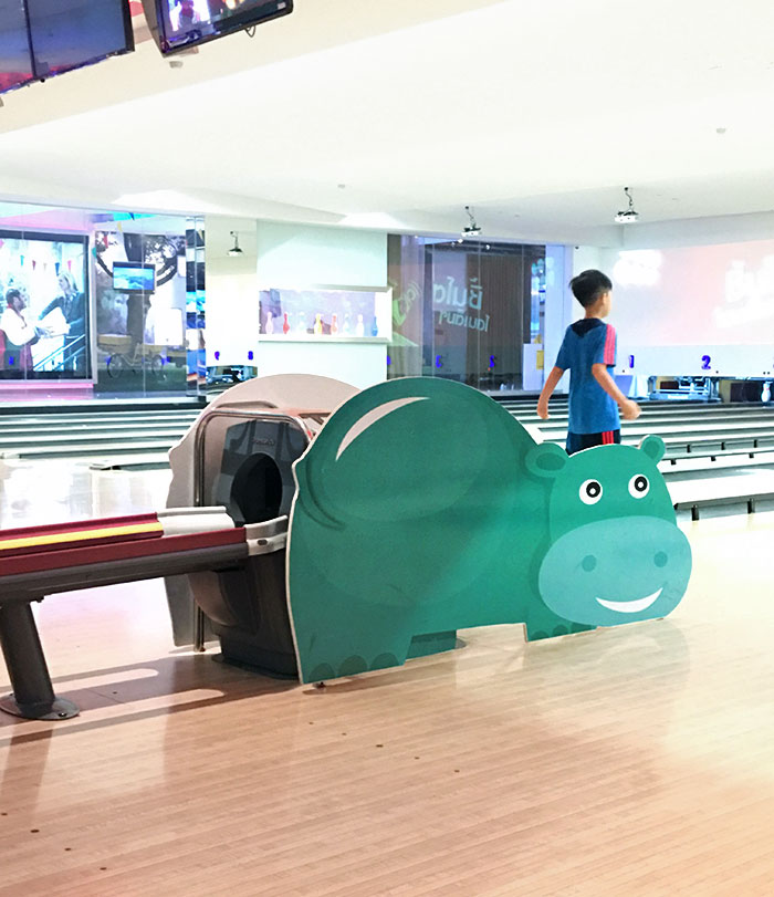
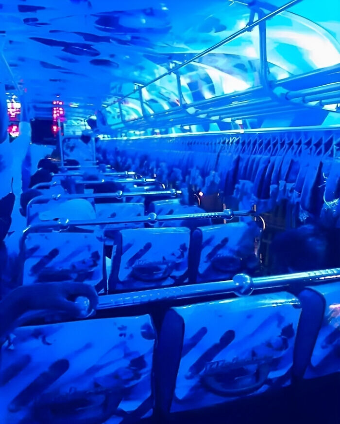
Bowling Alley Located In Bangkok. Cracks Me Up When The Ball Rolls Out From That
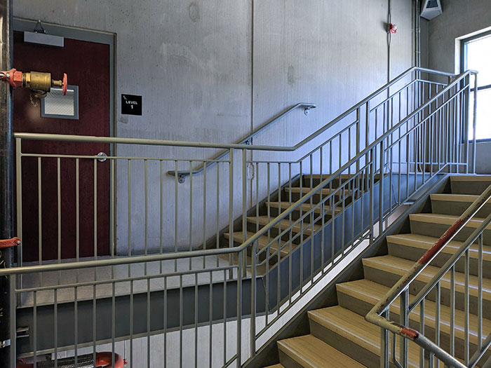
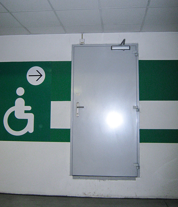
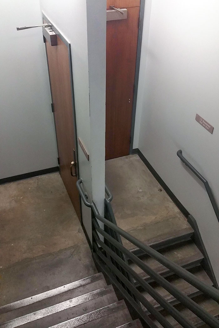
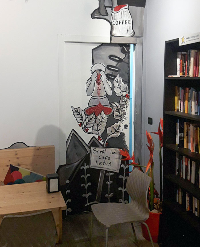
You Have To Go Up The Stairs, And Then Down The Stairs To Get To The Door
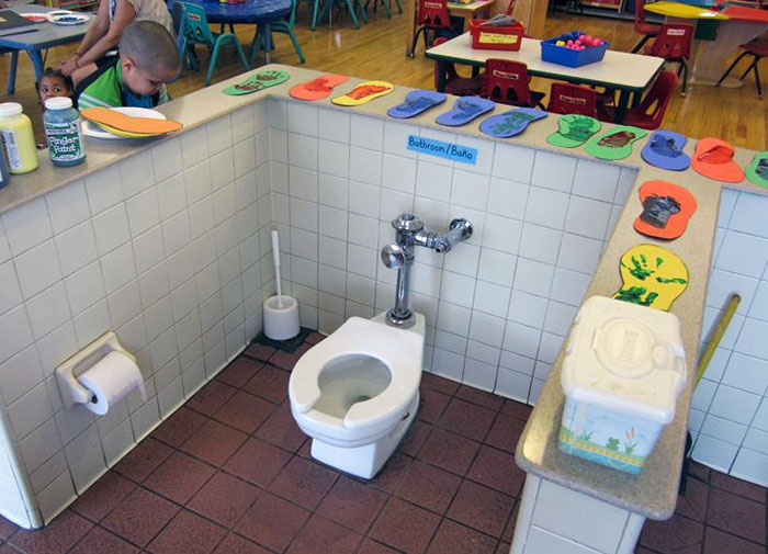
All Toilets Must Be Centered In The Middle Of The Classroom So Kids Eating Their Snacks Three Feet Away Can Bare Witness To Their Classmates Defecating
Meanwhile, everyone would appreciate it if the environment they’re in isn’t too hot or too cold. If the public is shivering from the cold, groggy from the heat, or wondering why the place smells so bad, they’re going to have a bad time. Thinking about these kinds of details sets the best designers apart from the rest.
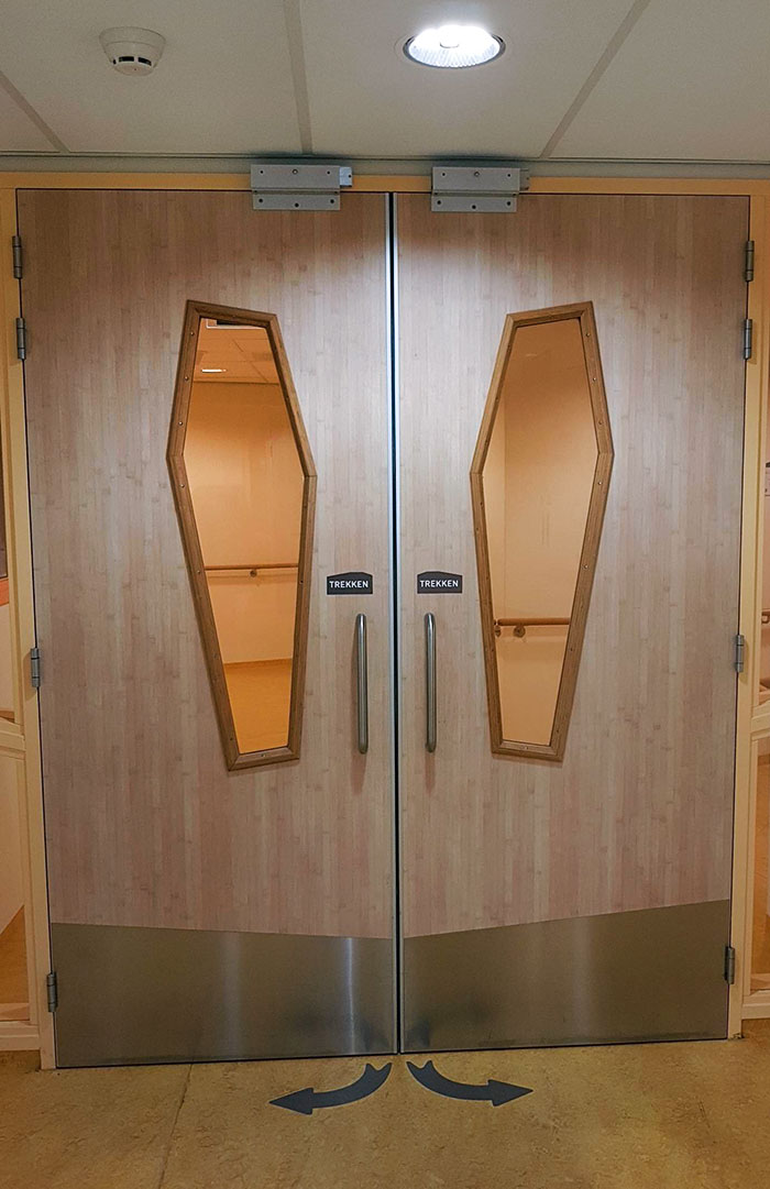
These Coffin-Shaped Door Windows In This Hospital
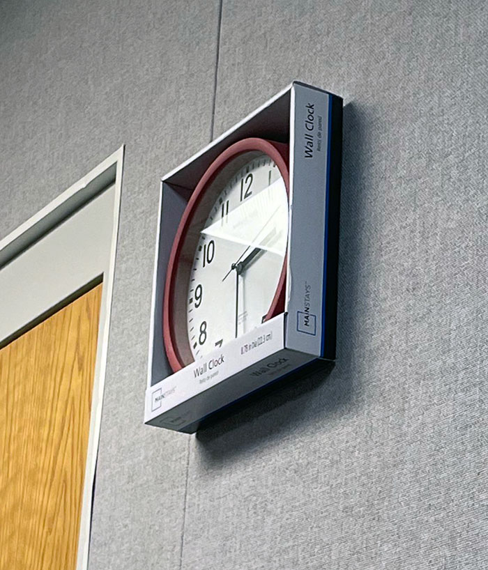
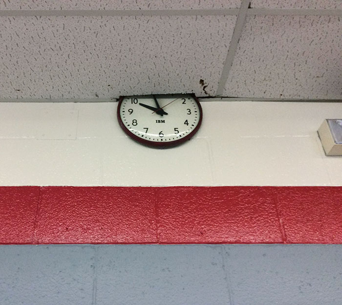
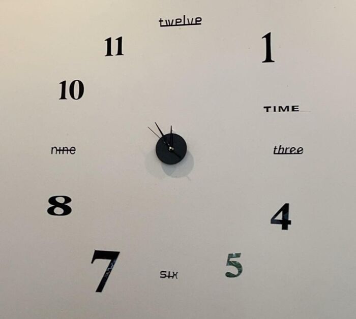
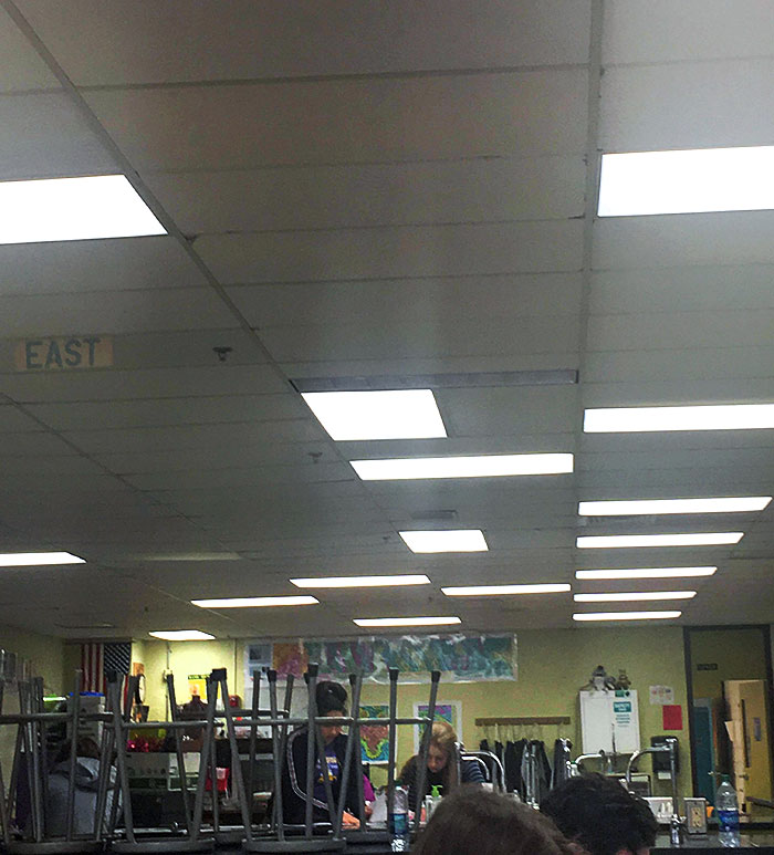
The Clock In My School's Band Practice Room
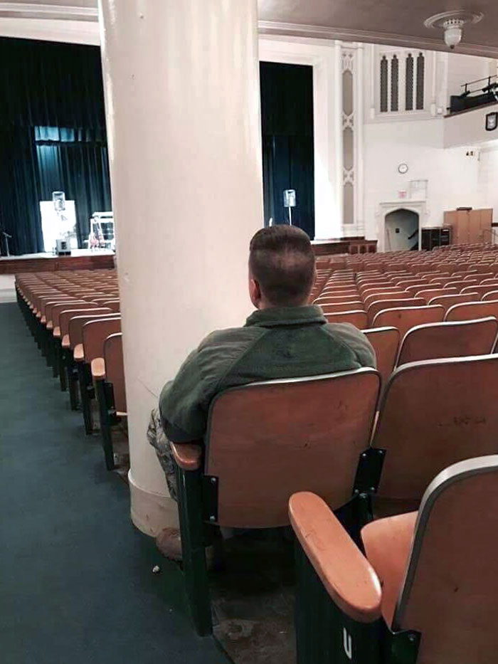
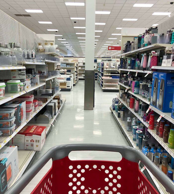
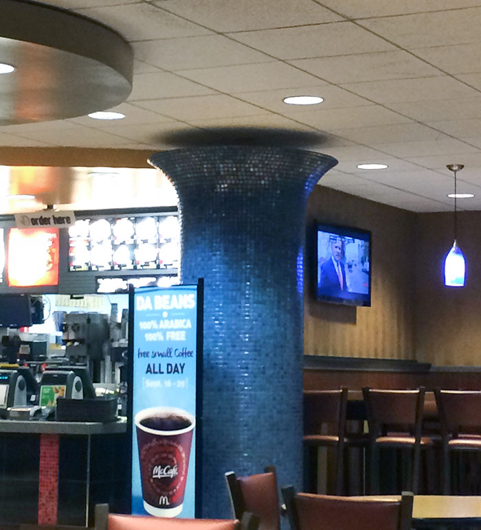
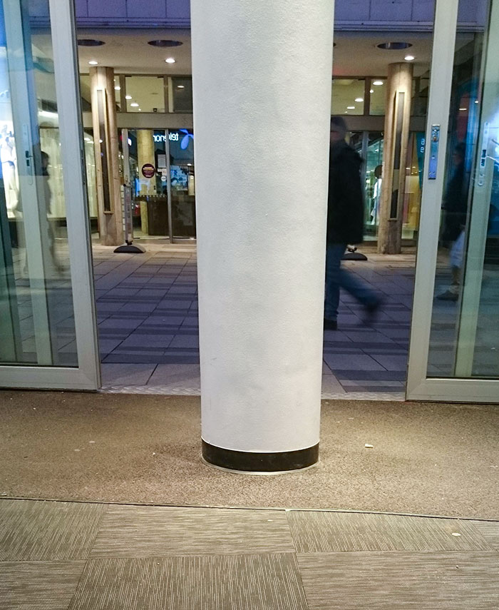
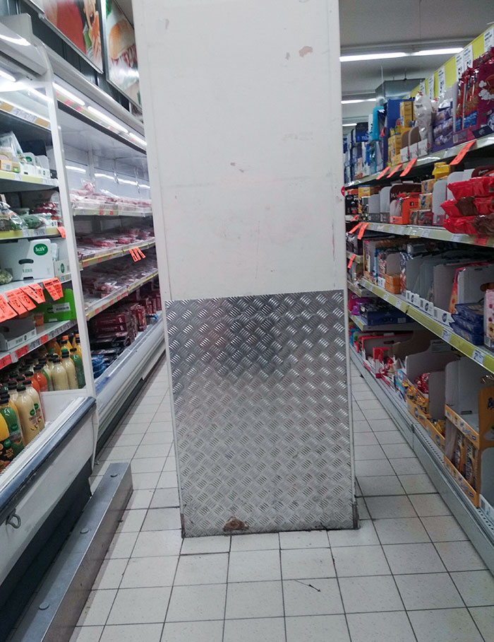
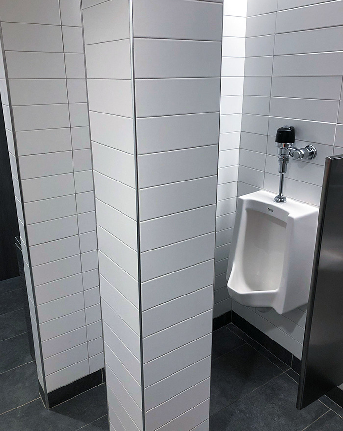
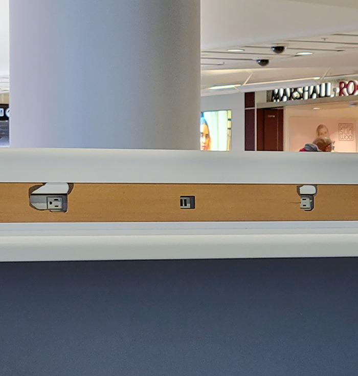
This Pillar
Well-designed interiors aren’t just about aesthetics, after all, even though creating a pleasant first impression is important. There has to be a balance between beauty and functionality. If your public library looks Instagram-worthy, for instance, then congratulations. However, if there isn’t enough space for folks to actually sit down and read, the library fails in its duty to the public.
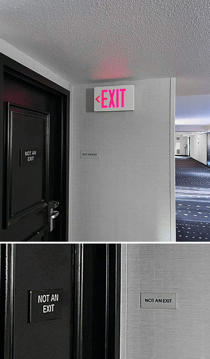
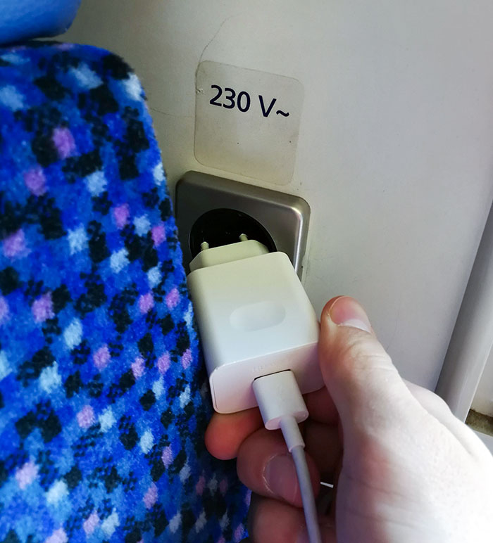
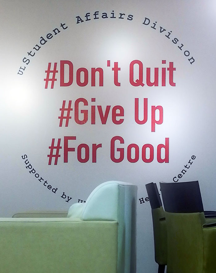
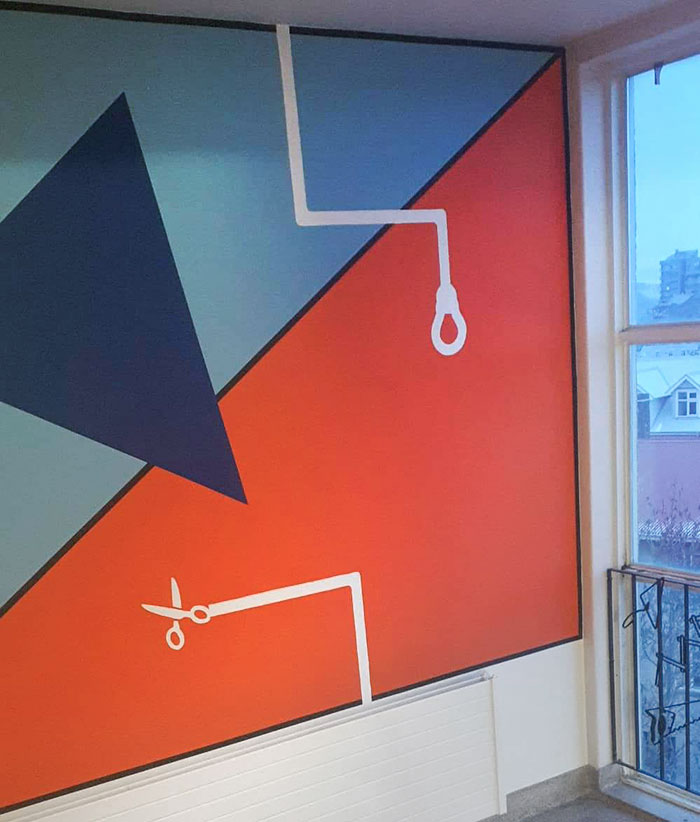
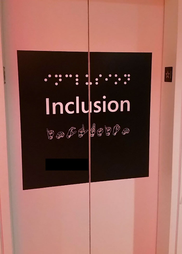
When Life Tries To Give Me A Sign
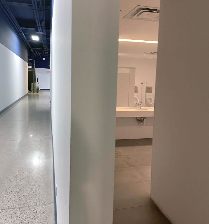
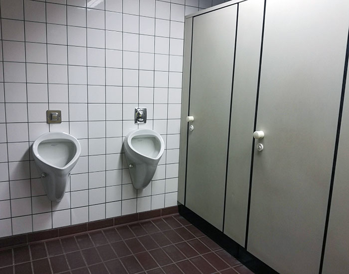
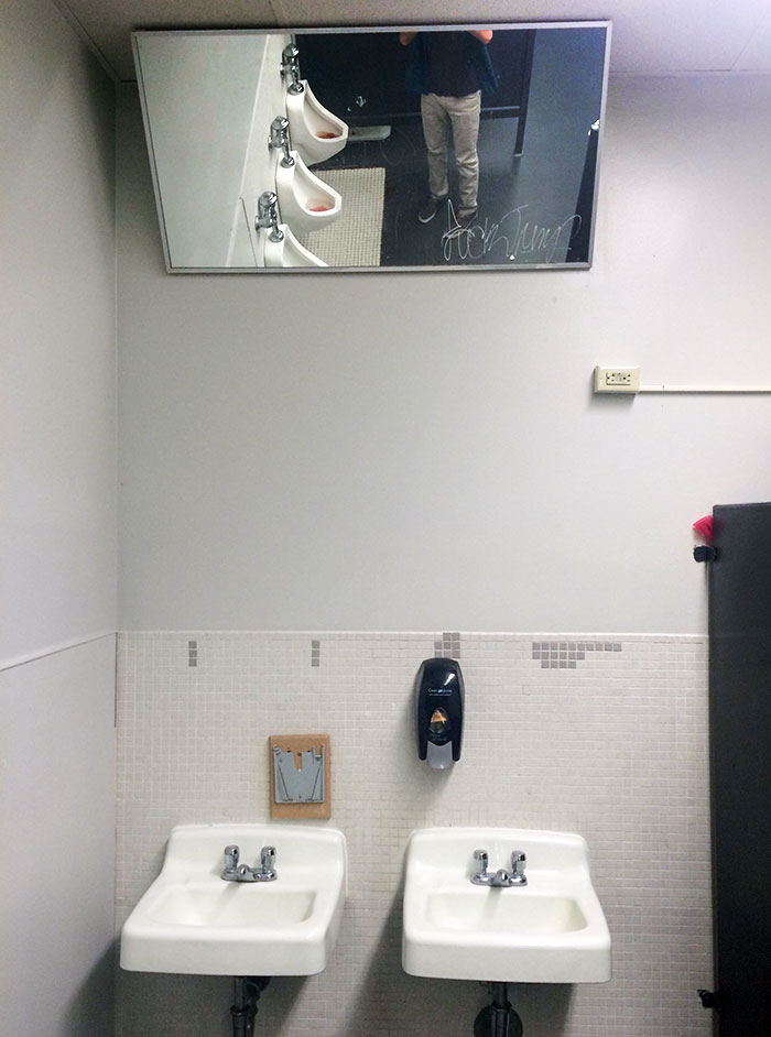
The Positioning Of The Mirror And Urinals In Our Office Building. This Is The Main Hallway
Easy to track down co-workers for a meeting. "Hey John, there you are! Boss needs to see you in Conference Room A"
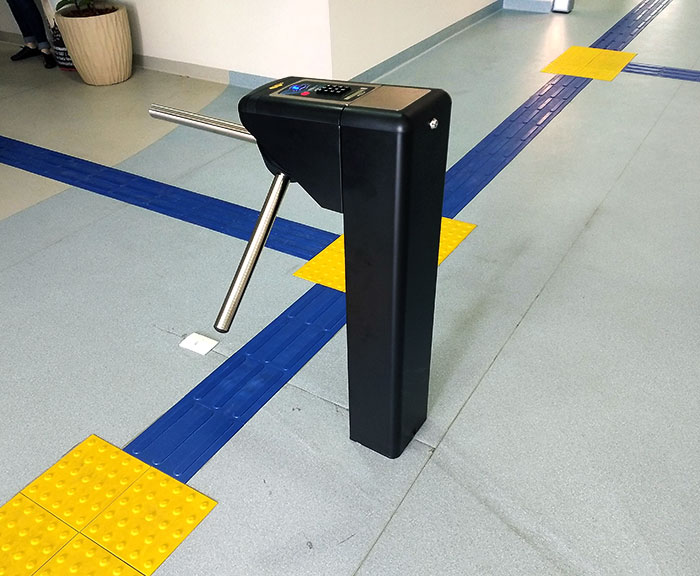
This Ticket Gate At My School
Previously, Bored Panda spoke about good design with an urban planning expert from Sweden. “Most of the time, the elements of the built environment should be in harmony amidst each other and with the surroundings. However, sometimes, something bolder and out-of-the-box might form an engaging contrast,” she shared that built environments have to engage the public and stimulate people’s minds and senses.
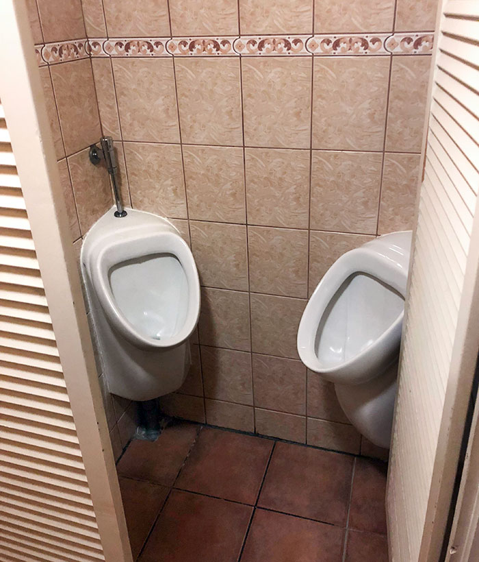
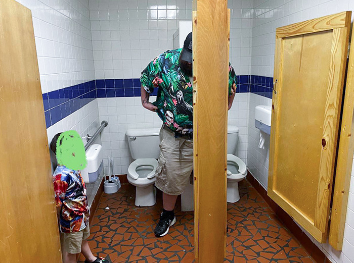
Imagine Walking Out Of That Cabin, And There's A Guy Doing His Business Right In Front Of You, Blocking Your Way. So You Have To Wait There Until He Is Done, And You Can Pass
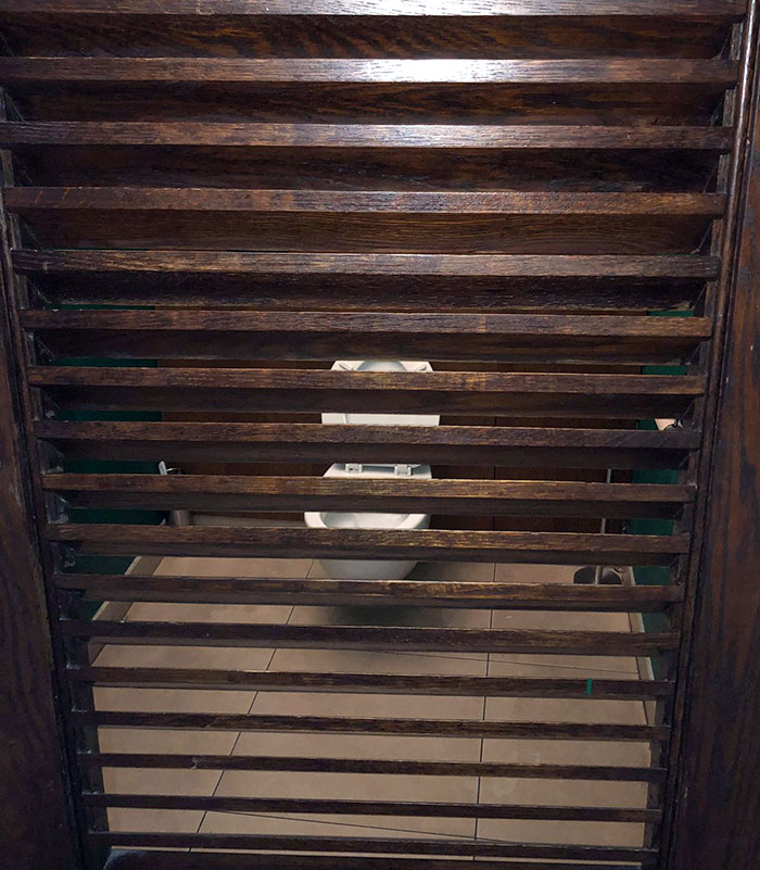
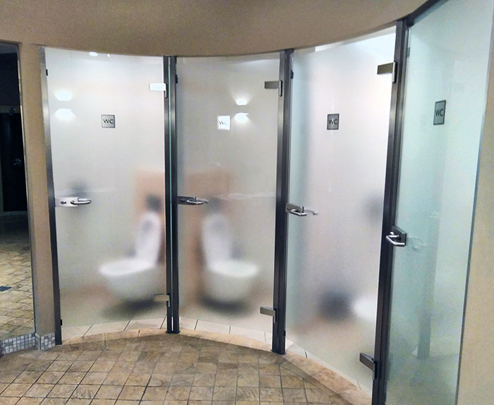
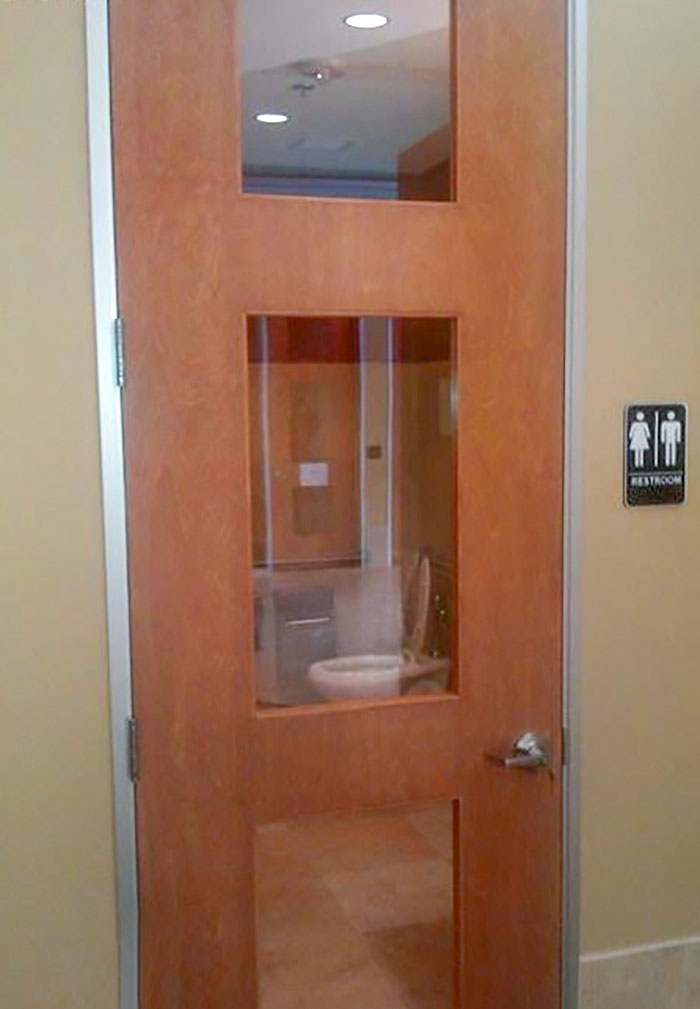
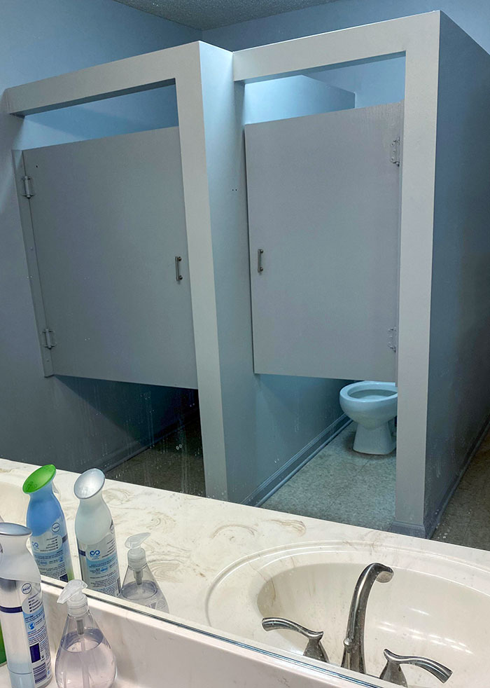
Semi-Transparent Bathroom Stall Doors
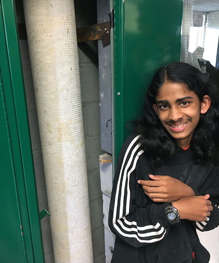
My Friend's New Locker Has A Huge Pipe Running Through It
“There are circumstances where the architecture should create a sense of calmness and safety, yet there are instances in which it is not bad if the architecture provokes us and makes us think, ‘Why don't I like the look of this building?’” the urban planning expert noted that when it comes to private property, there’s far more flexibility for creativity.
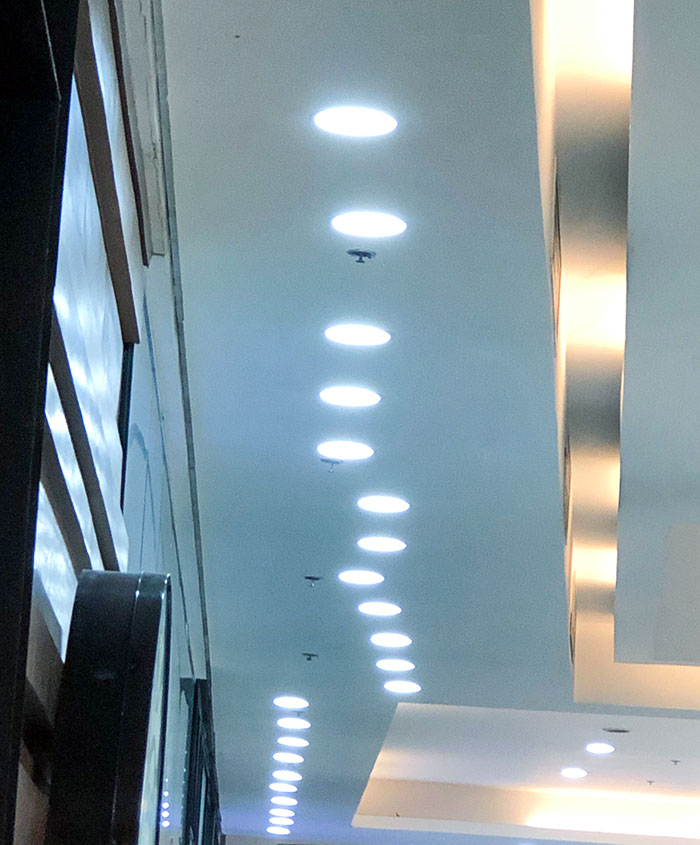
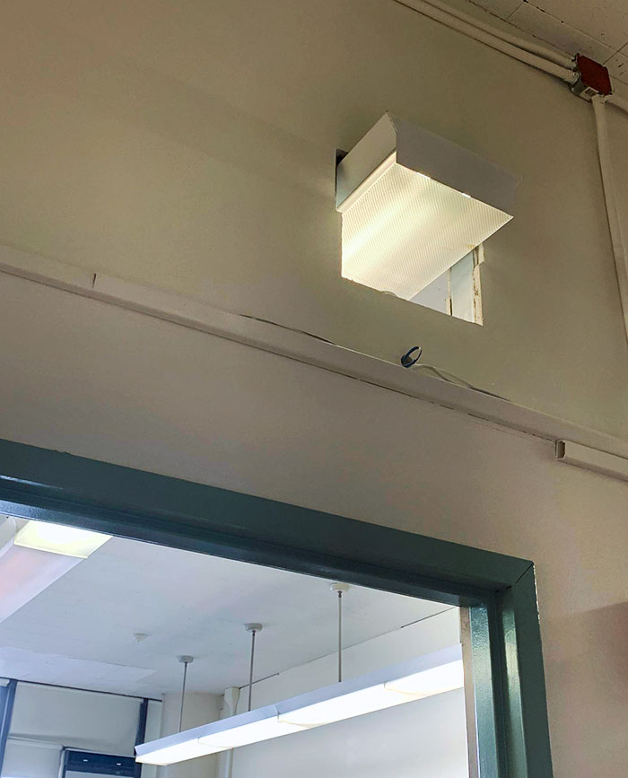
These Lights At The Mall
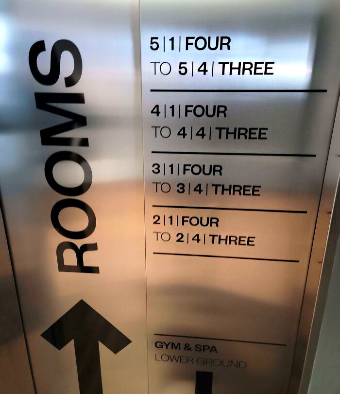
Hotel In Iceland. It's Supposed To Tell You Which Rooms Are On Which Floor
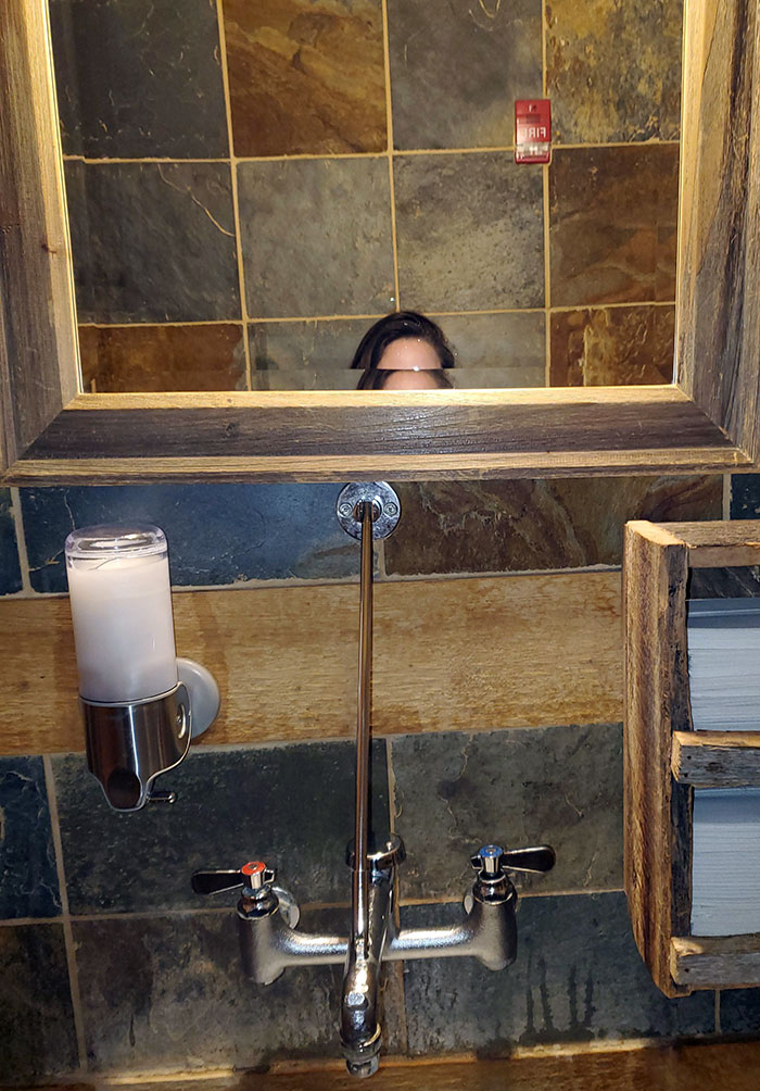
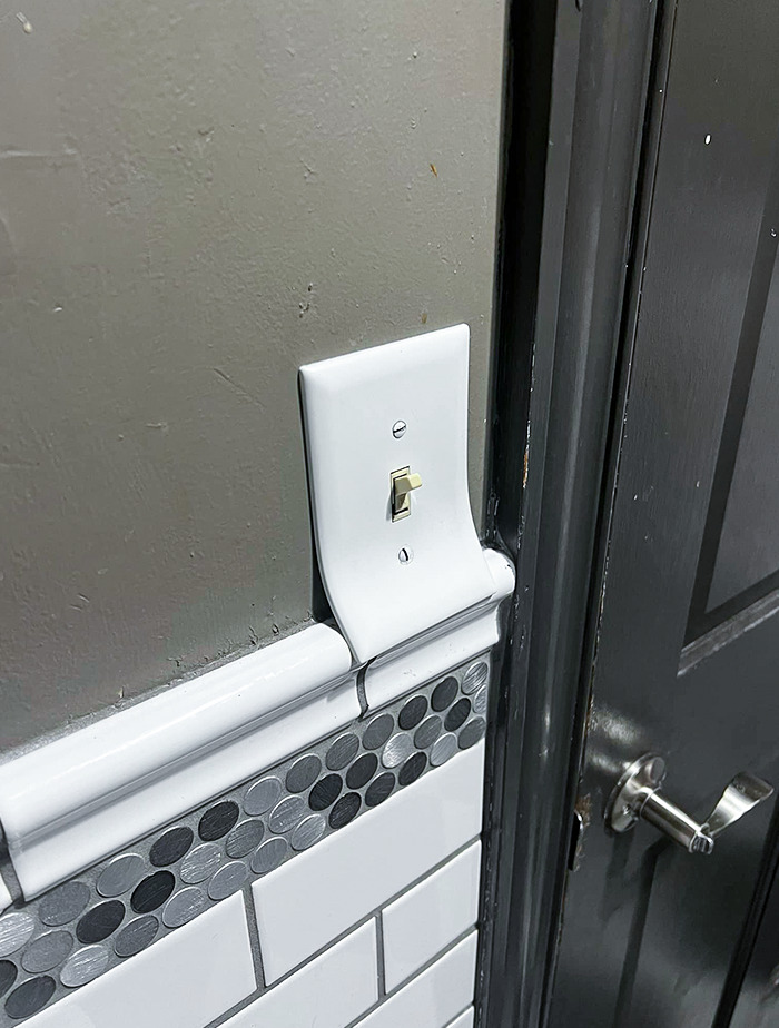
They Couldn't Put It In Between The Mirrors?
“Quirky architecture comes from our innate desire to demonstrate our uniqueness. However, not everyone who has the means has an average taste for aesthetics. Yet, as long as it is for the people who inhabit or use their private space, I mean why not?”
This Disastrous Thing In A German Restaurant
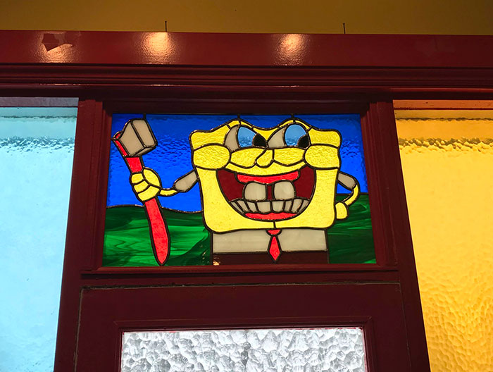
This Horrific SpongeBob Stained Glass Panel At The Dentist
These Taco Bell Self-Serve Kiosks
Just giving you practice of being that position a couple of hours after eating there!
However, at the same time, the expert noted that some believe that even private property has to be fully in harmony with the public spaces surrounding it.
“But, I think that we should not cross that thin line where architecture becomes reserved for only the wealthy and for those with ‘good taste’ (whoever decides that). I’m only talking about private property here, though. When it comes to public space, there should be a consensus between the public and the professional about the design,” she told Bored Panda.
For some more public place design fails, check out our earlier piece right over here.
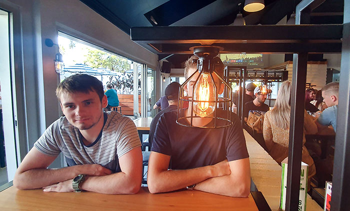
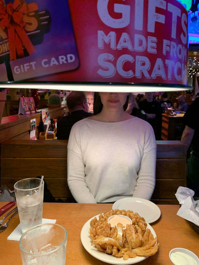
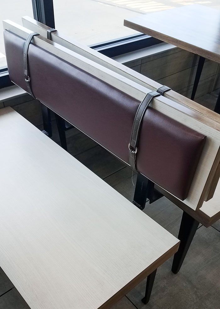
I Love Not Being Able To See The Person I'm Eating Dinner With
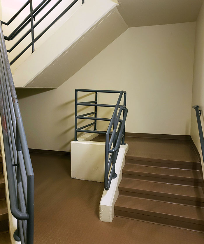
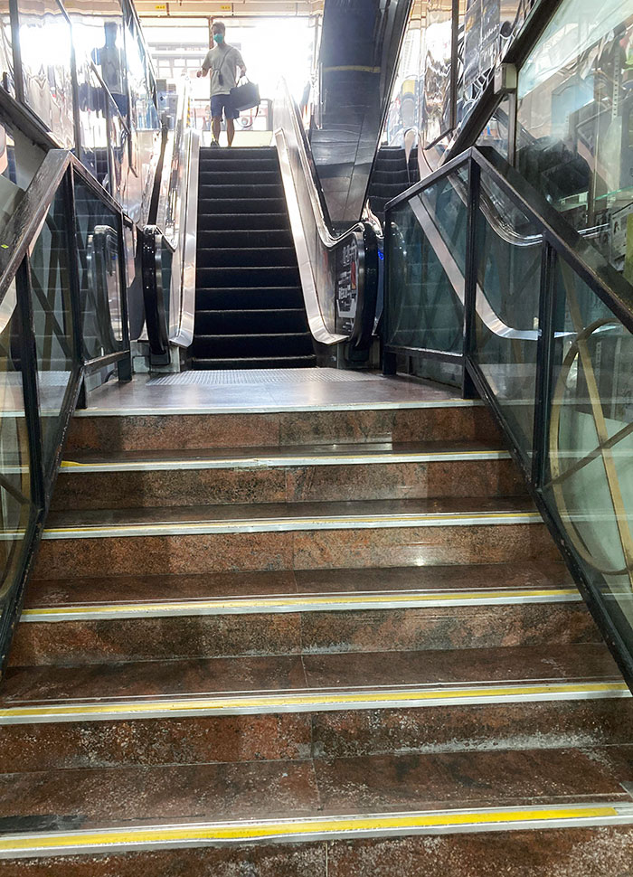
The Stairs To Nowhere
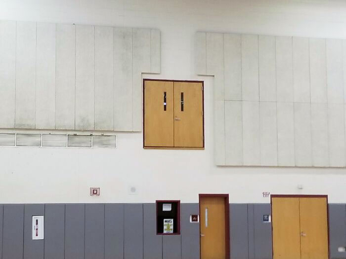
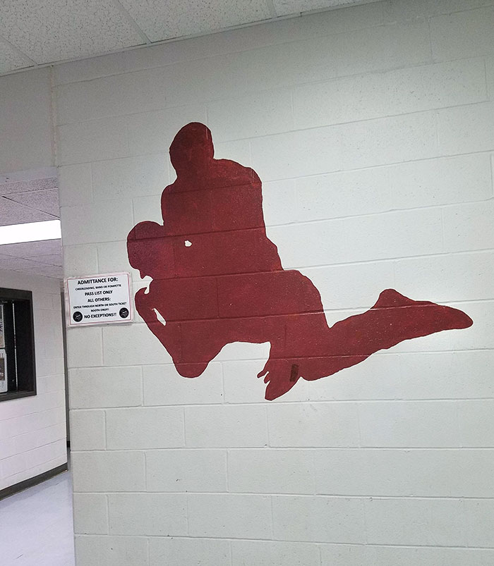
An Extreme Entrance To School Gym
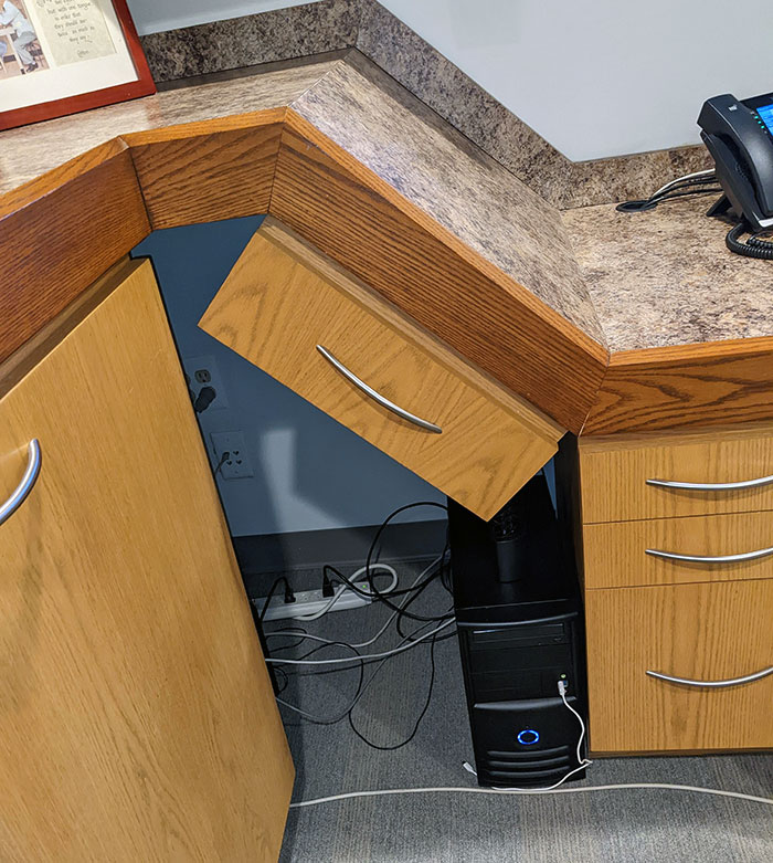
One Of The Drawers At My Doctor's Office That Always Annoys Me
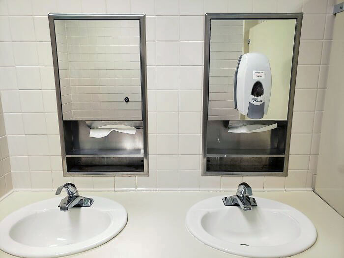
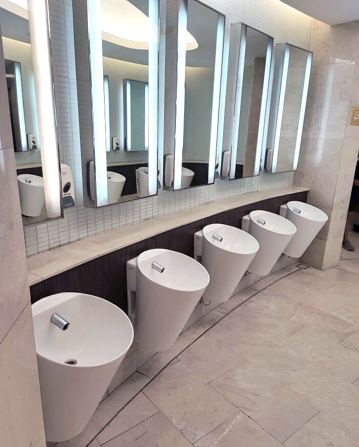
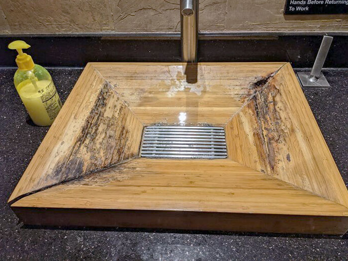
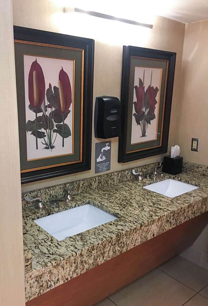
These Bathroom Sinks Looks Similar To Urinals
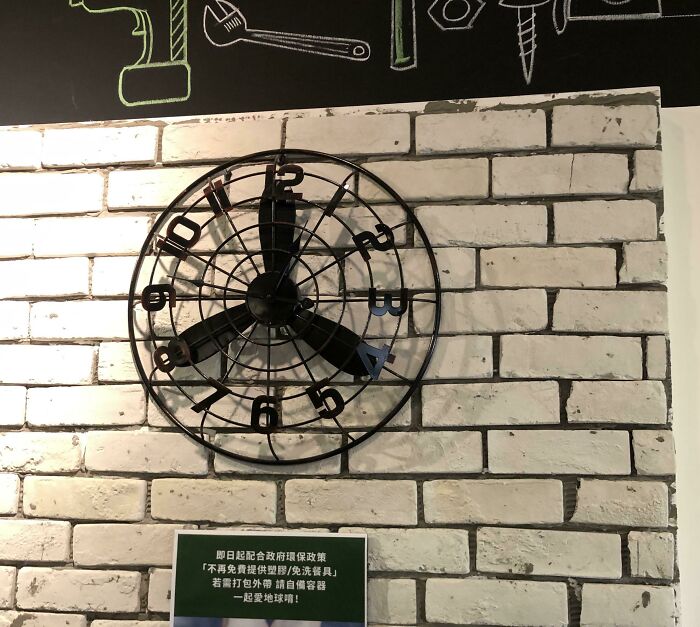
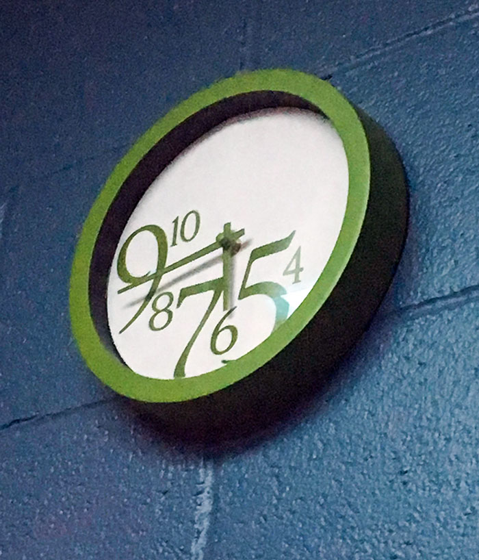
This Clock. Can You Tell Me What Time It Is?
Maybe Wait Until You're Home
Somebody heard about "public restrooms" and didn't understand what it means.
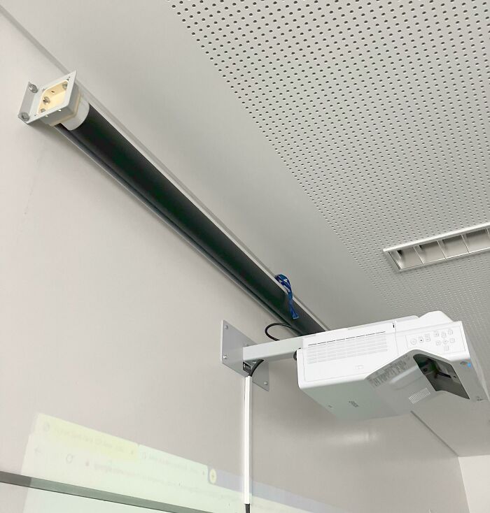
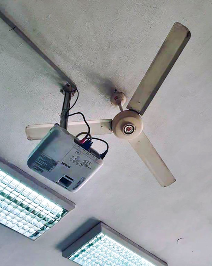
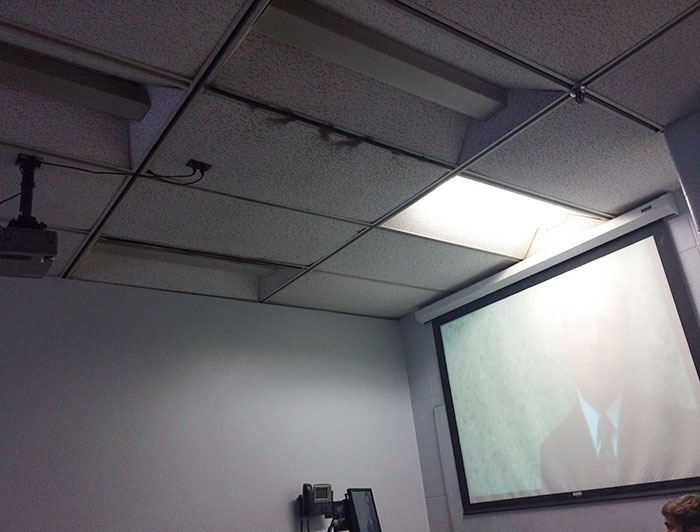
My School Bought Modern Stuff. The Projector Was Placed Under The Screen
There's Not Enough Room For The Cart To Get By
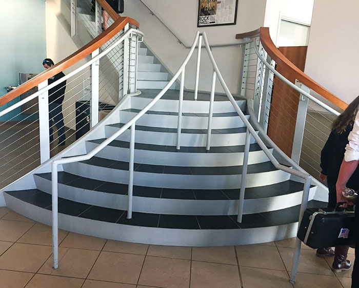
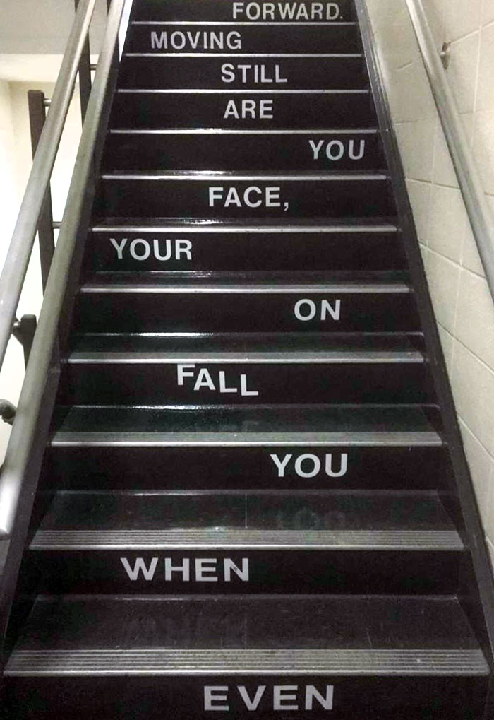
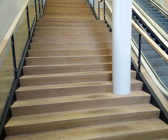
These Stairs In A College I Visited Had People Confused
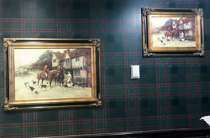
This Wrestling Painting At A High School
for once, i don't see anything sexual. i see a dying person hug by his best friend and asking him to take care of little Billy Bob for him. i see to much westerns when i was a little child :D
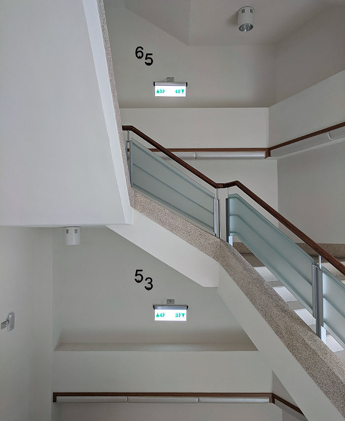
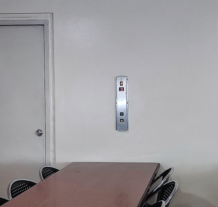
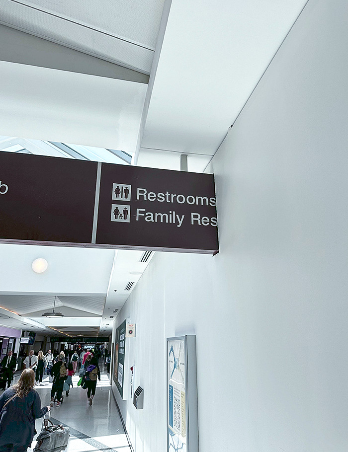
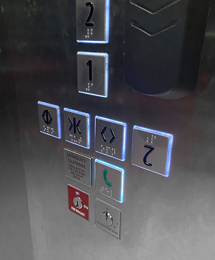
I Have No Idea What Floor I'm On
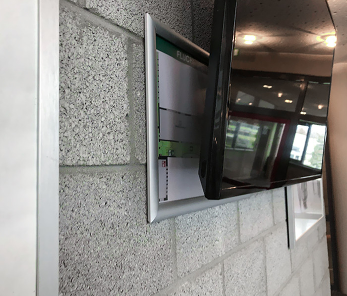
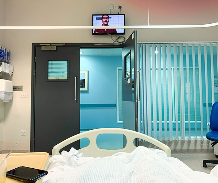
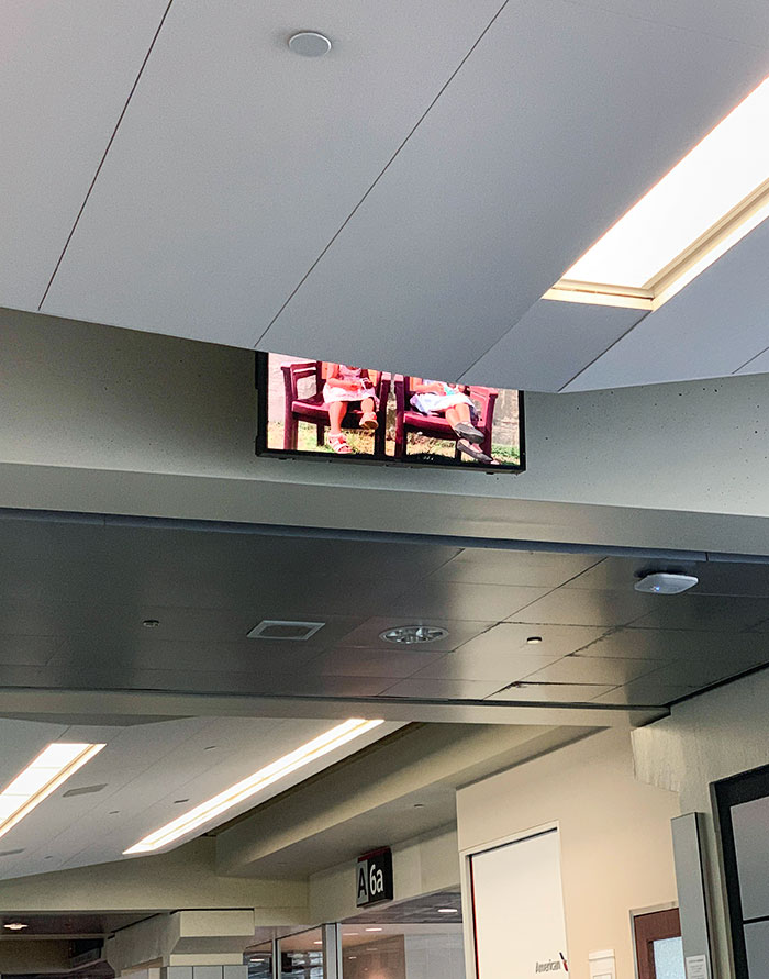
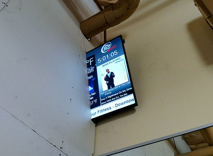
This TV In Front Of The Evacuation Plan
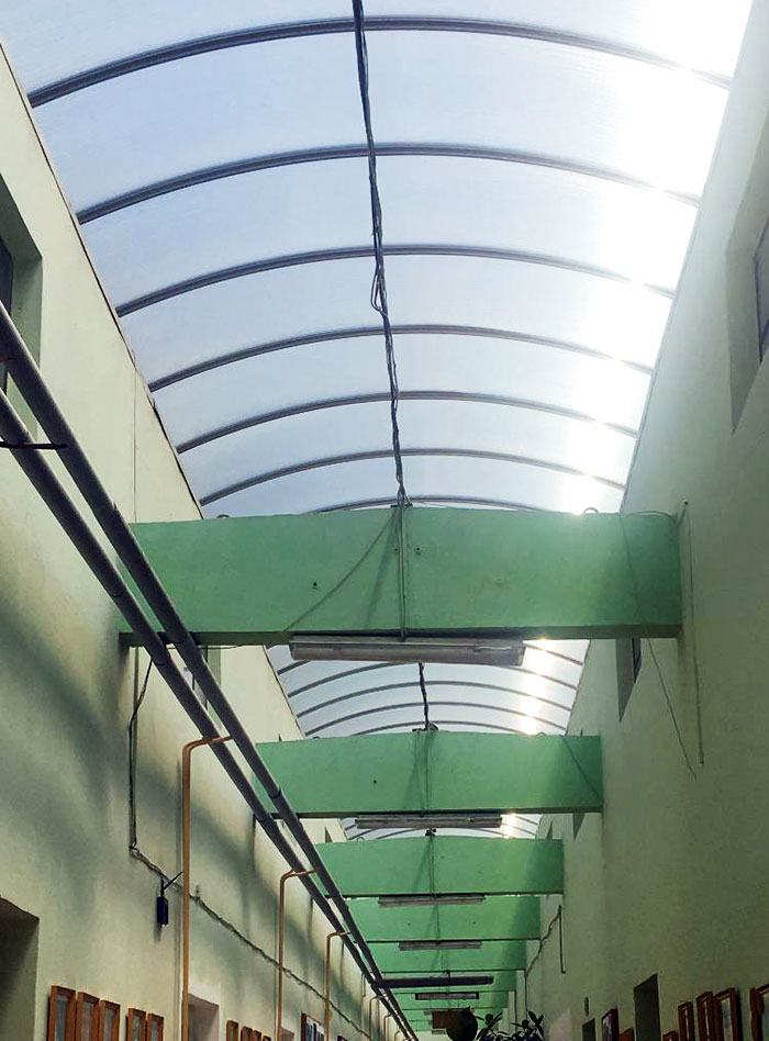
The Main Hallway's Roof In Our School Is Made Out Of Plexi-Glass So It's Like We Are In A Sauna. We Can't Stay In Classrooms During Breaks, So We Have To Burn Here
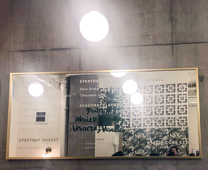
This Busy Ice Cream Shop In Seattle Put Their Menu On A Mirror So It's Impossible To Read
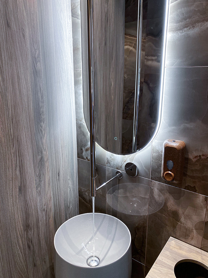
This Sink In The Toilet Of A Restaurant In Amsterdam. It Seems It's Suppose To Look Like That
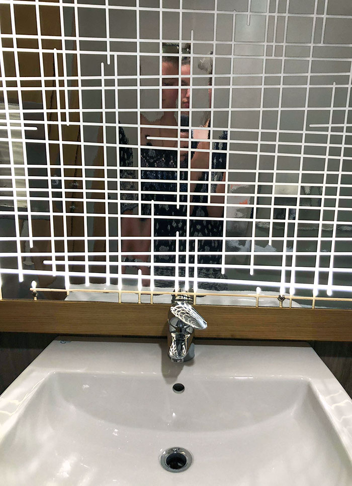
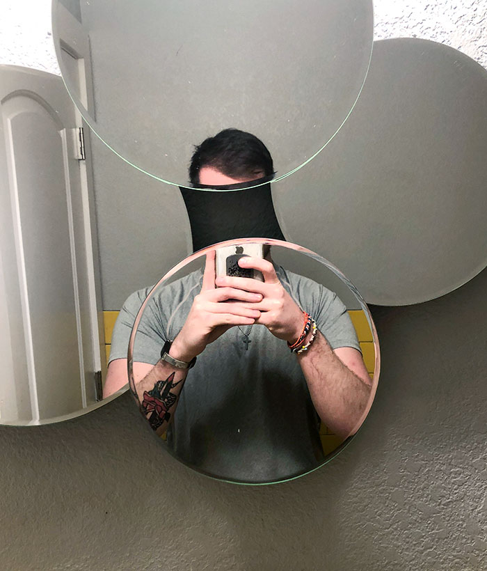
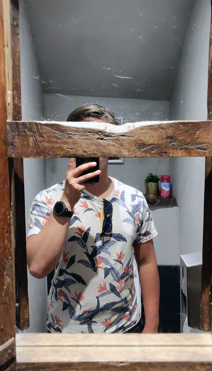
Bathroom Mirror At A Bar In Italy
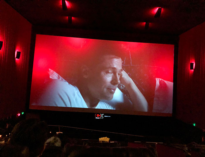
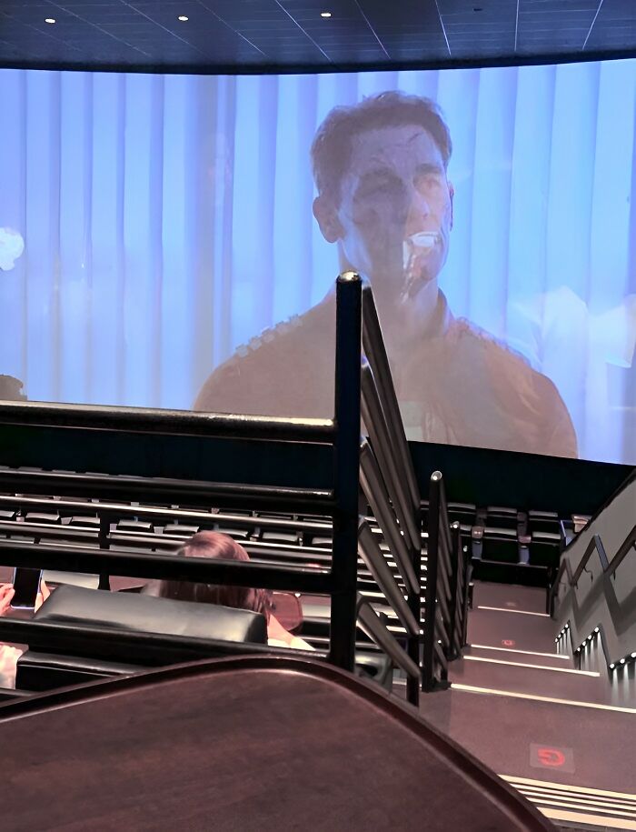
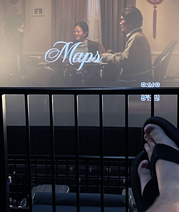
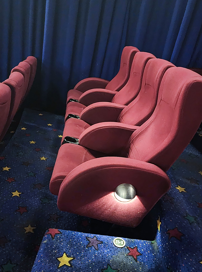
These Red Lights Leaking Into The Screen
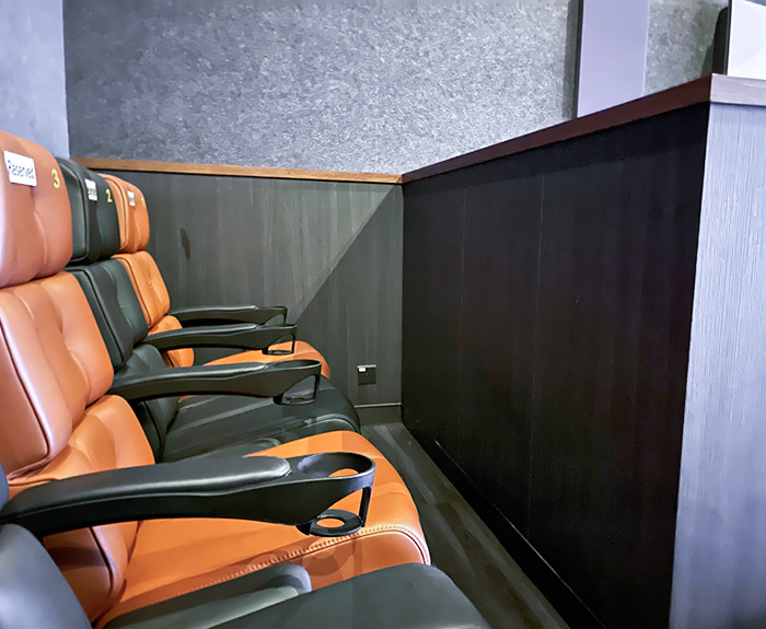
I'm hoping that's because someone accidentally forgot to turn them down once the movie started.
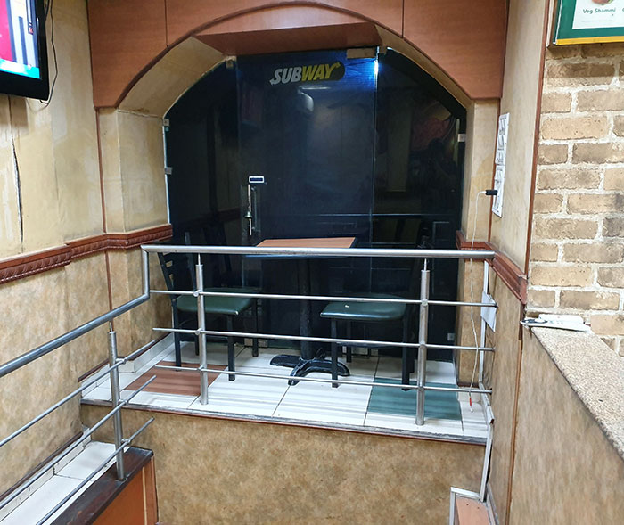
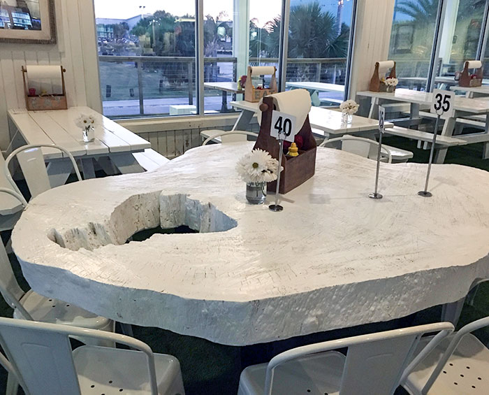
A Table For Two, Please
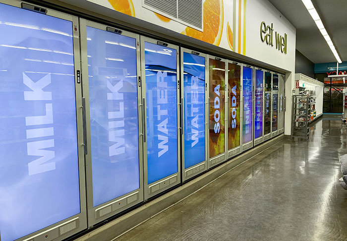
I Went To Walgreens, And All The Drinks Are Like This. You Can Wave Your Hand To See Pictures Of The Drinks In Each Case, But You Would Know What's Sold Out Once You Open It
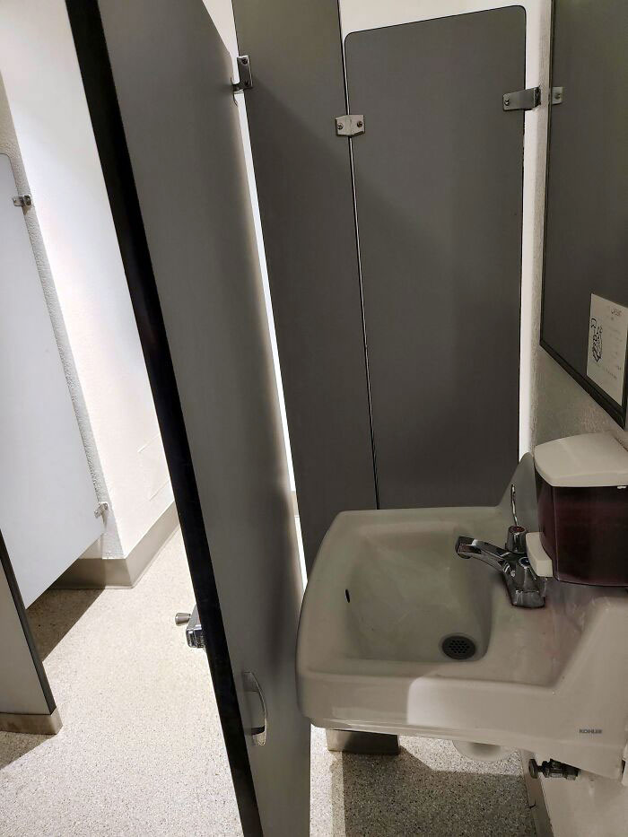
Stopped at a big rest stop/vista point in California to use the bathroom and the stalls were super short. A lady next to me stood up at the same time as I did and we just looked at each other and just started cracking up. The walls ended at like shoulder height. So weird. I don't understand why we can't just have a little privacy!
And so the staff can remove people who have ODed or suicided without breaking the door down.
Load More Replies...It should be againt fire code (and might actually be) to arrange store aisles with supporting pillers blocking them. It's a potential danger in case of emergency evacuation and is likely discriminatory to those that use mobility assistance devices. It's not like the architect's, engineers and interior layout designers of big box stores don't know where they're going to require a piller; or where the shelves, racks, etc will be.

 Dark Mode
  No fees, cancel anytime


