
For This Women’s Day We Transformed 8 Iconic Brand Logos Into Female Versions
Many big brands that we’ve come to know and love over the years have cemented their place in our home. Mostly thanks to the addition of a quirky mascot. A defining, relatable character that champions the brand, a familiar face on the shopping aisles of the supermarket – all designed to catch and hold your attention.
Generally, you might not give a famous brand mascot much thought, but when you look past all the bright colors and charisma, there’s one thing that seems to be quite apparent about the bigger picture – where are all the female characters at?!
Many mascots have been around for decades, and as the product design and advertising industry was predominantly male-led, branding had a more masculine bias. But, when male brand mascots outnumber female mascots two-to-one, is there still a place for this approach in today’s society?
As new brands forge their way into our homes, it would seem that the industry is moving away from gendered branding in favor of a more neutral approach where gender equality becomes a priority, and rightly so. Women aren’t defined by the color pink anymore, and men like to cook and clean, too.
With this in mind, British appliance manufacturer, CDA posed the question… is there still a place on our shelves for the older, famous characters?
With International Women’s Day on the 8th March, CDA Appliances wanted to do something that would cast a light on these outdated brand mascots and famous logos leveling the playing field a little bit. While they certainly don’t want to reinforce female stereotypes, they do want to point out that women are capable of being strong enough to represent cleaning products for tough jobs. They can be mischievous without being sexy, and they like to eat food, too.
More info: cda.eu
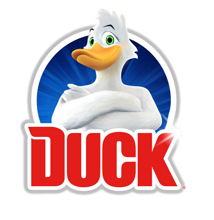
Toilet Duck
Image credits: www.cda.eu
A somewhat household essential, the Toilet Duck brand (and all of its pseudonyms) has held its place in many bathrooms since the early 1980s. While the brand logo and mascot for Toilet Duck took a more androgenous form in the beginning, it actually became more masculine over time, leading to the muscular, imposing incarnation we see today. This almost feels like a backstep on the journey to advertising neutrality.
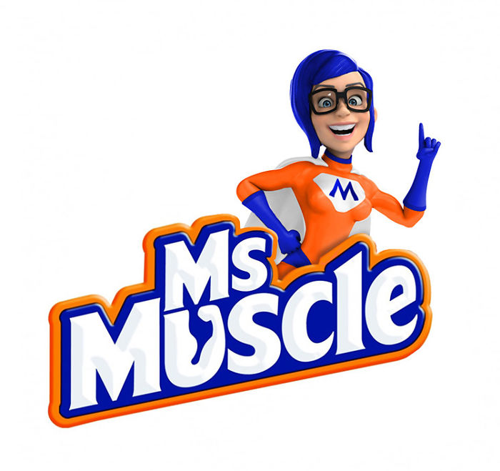
Mr Muscle
Image credits: www.cda.eu
Another household cleaning brand that began life in the ’80s, Mr. Muscle, was reported to “love the jobs you hate,” backed up by ad campaigns featuring a somewhat effeminate male character eager to get stuck in. Again, over the years, this image has been transformed into a more literal representation of the name, and the mascot is portrayed as a giant, muscular male superhero ready to save the day.
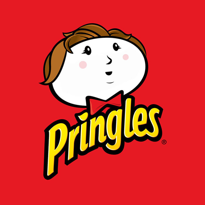
Pringles – Julius Pringles
Image credits: www.cda.eu
The stylized cartoon character of “Julius Pringles” has become just as iconic as the saddle-shaped crisps themselves. With his full mustache and bowtie, the figure seemingly represents a traditional gentleman, one that would be in the upper levels of social class – suggesting that Pringles were deserving of a higher status than other crisps.
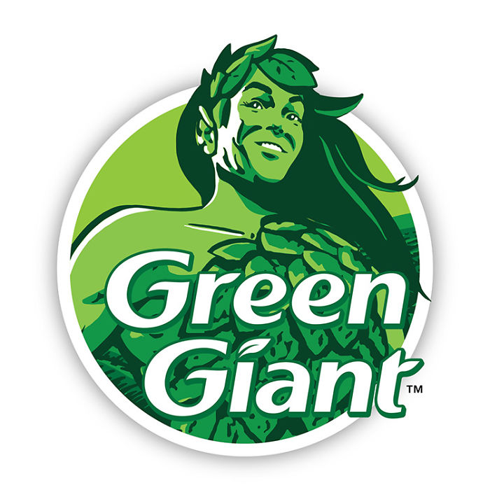
Green Giant Sweetcorn – The Jolly Green Giant
Image credits: www.cda.eu
The Jolly Green Giant has represented tinned sweetcorn since the Minnesota Valley Canning Co came up with the concept in the late 1920s. Since then, little has changed as far as his image goes. A towering figure of strength and typical masculinity, the chiseled jawline, and strong legs promote good health, while the colors used signify natural goodness.
But the Jolly Green Giant wasn’t always so jolly. In the early years, he wasn’t well-received as he was deemed too scary, he had to be “softened” with a sunny smile and a more inviting posture to add a certain level of tenderness to his image.
Kellogg’s Rice Krispies – Snap, Crackle and Pop
Image credits: www.cda.eu
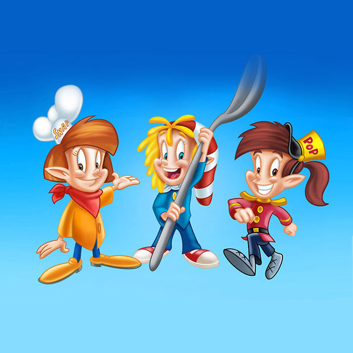
The mischievous elf-like trio known as Snap, Crackle, and Pop came around way back in the early 1930s. But, it wasn’t until the late 1940’s they were reimagined with youthful, more proportional features to appeal to a younger audience.
High energy mischief seems to be their game, but the idea that only boys are capable of this is something of a falsehood. On a side note, it appears that there are very few branded kinds of cereal that promote a female mascot, is it time the industry as a whole had a complete overhaul?
Captain Birds Eye
Image credits: www.cda.eu
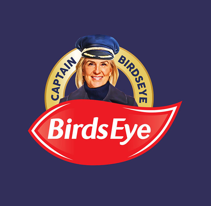
An icon of 1960’s food advertising, the captain has represented frozen food since the brand’s inception. Generally depicted as a clean living, an older sailor with a white beard, it’s a very typical representation of what we’d expect a naval captain to be. These days, the role of captain is no longer reserved just for men, and an increasing number of women continue to take up the position.
Kellogg’s Frosted Flakes – Tony the Tiger
Image credits: www.cda.eu
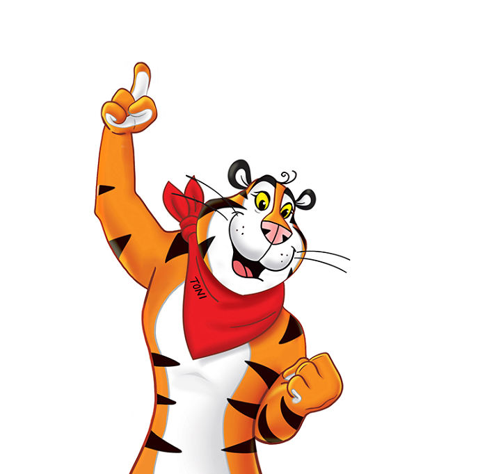
As we mentioned before, the female of the species is severely underrepresented when it comes to breakfast cereals. Tony the Tiger has become somewhat of an icon since his debut in the early 1950s. The character we see today was created by a group of former Disney animators and was the result of a competition run by Kellogg’s to come up with a new mascot for their latest cereal. Interesting fact, that same group of animators also designed The Jolly Green Giant and Snap, Crackle, and Pop.
Homepride – Fred the Flour Grader
Image credits: www.cda.eu
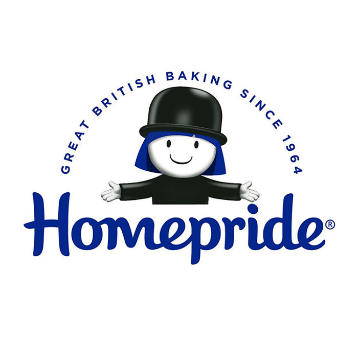
Fred the Flour Grader (as is his full name) has been the smiley, bowler-hatted mascot for Homepride since his creation in 1964. Promoted as “mum’s special helper,” he’s seemingly capable of saving any family from mealtime woes. The character has even turned to a range of kitchen products and utensils. Interestingly, Fred had been on a 15-year hiatus until Homepride decided to bring him back in 2014.
419Kviews
Share on FacebookI feel like "adding eyelashes to some of the cartoons" doesn't fully constitute a gender swap. I like the idea, and some of them definitely go beyond adding eyelashes... but some of these look like they haven't left the workshopping phase.
I'm a man and I have eyelashes . . . *shrugs*
Load More Replies...This is kind of weird... I'm all for promoting gender equality, but I'm not sure how this does this.
It's all up for debate, and I respect your opinion, but gender equality and international women's day are different things, in my opinion, even though they overlap in some sense. It's less about the equalizing and more "here's one to women," because it's women's day, not equality day, you know? But that's just my perspective, I don't assume it's absolute or righteous.
Load More Replies...I get it but why not make new characters, instead of adding eyelashes to male mascots?
Because they have no originality and imagination left.
Load More Replies...Does it matter though? I couldn't care less whether they were boys, girls, or neither, just lemme eat my freaking pringles
This is not a good representation of an International Woman's Day. It's just cross dressing cartoons. You want to impress me, then make original product designs for different companies using women only.
Putting eyelashes and adding long hair doesn't make them look like women. It makes them look like young boys (pringles) or feminine looking males. Granted some have more effort than others. Make new female characters, not feminize the male characters that already exist
Yea real “original”. This was done a year ago. Creative Equals who did the exact same campaign 2 years back: https://digitalsynopsis.com/design/female-brand-logos-womens-day/
I agree with others who think most of them look more gender-neutral. The green giant still looks more masculine to me, but good to see Hillary Clinton's got some work as the Captain now. :D
This isn't honerhing women. It's just again bashing men by changing them into women. If you want to honor women. Put them in the spotlight for what they do and what they are good at. Not chaning male characters into female. That way you are again again focussing on the so called difference.
This might not be the best art ever, technically they aren’t even making them females, just adding eyelashes and longer hair. But I have to say, at least they did some effort in making it. :p
instead of that why don't they just have more brands with women as the logo. I love the idea!
This are very good good job and people put lots of effort in to these and they need more credit.
Hey who said the pringles guy is male it might be a female with a mustache.
I don't understand why women could not advertise strong cleaning products when they are doing the cleaning and using them?
So what you basically did was put the logos in drag. Now sashay away.
Most hare-brained! Equal pay is more important than equal branding.
A couple of those were good, but the rest looked like "Drag Queen" versions.
Having seen the birth of Feminism, it now is clear as daylight, woman have a pathological need to be all things male. Why? Because men built skyscrapers, and subways, and built boats, cruise liners and submarines, and they created marketing in their image as they were the primary breadwinners and bread makers. Today Taylor Swift dresses like a man, wears a full beard and mustache, dresses in a in ivy league motif, and acts generally like a male chauvinist pig, and she celebrates being in the role to be able to do that. Here's the thing. It's a video, a fantasy, it's not real. What else can be given to you? Don’t moan, don’t cry, here. Your thanks is destroy what man has built. People like you make me glad I’m going to die. How's that for unsavory.
And on Men's day all the female brands will be gender-bent to have male logos, right? ( cue a bunch of psychotic feminists insisting that every day is men's day... )
This definitely missed the mark. Feminism is about promoting women’s rights and working on things that actually matter, like making menstrual products free. Most feminist’s priorities definitely aren’t giving cartoon tigers breasts “for Women’s Day.”
I love the jolly green giant woman! I feel really sad that there are so many negative comments here. I do feel like people have missed the point. It's a fine line between keeping brand recognition and actually changing the icons. I liked it.
I want to see some the other direction. Mr Buttersworth and Little Devin snack cakes :)
In our hypersensitive society, is it even allowed to assume what a woman looks like? Aren't we supposed to be blurring the lines and erasing distinctions? Hail the amorphous blob!
Imagine being the type of person who's 'triggered' because they find a toilet duck too masculine. Good grief.
I'm so glad you left this comment. I needed a chuckle after the absolute ridiculousness of this post.
Load More Replies...I feel like "adding eyelashes to some of the cartoons" doesn't fully constitute a gender swap. I like the idea, and some of them definitely go beyond adding eyelashes... but some of these look like they haven't left the workshopping phase.
I'm a man and I have eyelashes . . . *shrugs*
Load More Replies...This is kind of weird... I'm all for promoting gender equality, but I'm not sure how this does this.
It's all up for debate, and I respect your opinion, but gender equality and international women's day are different things, in my opinion, even though they overlap in some sense. It's less about the equalizing and more "here's one to women," because it's women's day, not equality day, you know? But that's just my perspective, I don't assume it's absolute or righteous.
Load More Replies...I get it but why not make new characters, instead of adding eyelashes to male mascots?
Because they have no originality and imagination left.
Load More Replies...Does it matter though? I couldn't care less whether they were boys, girls, or neither, just lemme eat my freaking pringles
This is not a good representation of an International Woman's Day. It's just cross dressing cartoons. You want to impress me, then make original product designs for different companies using women only.
Putting eyelashes and adding long hair doesn't make them look like women. It makes them look like young boys (pringles) or feminine looking males. Granted some have more effort than others. Make new female characters, not feminize the male characters that already exist
Yea real “original”. This was done a year ago. Creative Equals who did the exact same campaign 2 years back: https://digitalsynopsis.com/design/female-brand-logos-womens-day/
I agree with others who think most of them look more gender-neutral. The green giant still looks more masculine to me, but good to see Hillary Clinton's got some work as the Captain now. :D
This isn't honerhing women. It's just again bashing men by changing them into women. If you want to honor women. Put them in the spotlight for what they do and what they are good at. Not chaning male characters into female. That way you are again again focussing on the so called difference.
This might not be the best art ever, technically they aren’t even making them females, just adding eyelashes and longer hair. But I have to say, at least they did some effort in making it. :p
instead of that why don't they just have more brands with women as the logo. I love the idea!
This are very good good job and people put lots of effort in to these and they need more credit.
Hey who said the pringles guy is male it might be a female with a mustache.
I don't understand why women could not advertise strong cleaning products when they are doing the cleaning and using them?
So what you basically did was put the logos in drag. Now sashay away.
Most hare-brained! Equal pay is more important than equal branding.
A couple of those were good, but the rest looked like "Drag Queen" versions.
Having seen the birth of Feminism, it now is clear as daylight, woman have a pathological need to be all things male. Why? Because men built skyscrapers, and subways, and built boats, cruise liners and submarines, and they created marketing in their image as they were the primary breadwinners and bread makers. Today Taylor Swift dresses like a man, wears a full beard and mustache, dresses in a in ivy league motif, and acts generally like a male chauvinist pig, and she celebrates being in the role to be able to do that. Here's the thing. It's a video, a fantasy, it's not real. What else can be given to you? Don’t moan, don’t cry, here. Your thanks is destroy what man has built. People like you make me glad I’m going to die. How's that for unsavory.
And on Men's day all the female brands will be gender-bent to have male logos, right? ( cue a bunch of psychotic feminists insisting that every day is men's day... )
This definitely missed the mark. Feminism is about promoting women’s rights and working on things that actually matter, like making menstrual products free. Most feminist’s priorities definitely aren’t giving cartoon tigers breasts “for Women’s Day.”
I love the jolly green giant woman! I feel really sad that there are so many negative comments here. I do feel like people have missed the point. It's a fine line between keeping brand recognition and actually changing the icons. I liked it.
I want to see some the other direction. Mr Buttersworth and Little Devin snack cakes :)
In our hypersensitive society, is it even allowed to assume what a woman looks like? Aren't we supposed to be blurring the lines and erasing distinctions? Hail the amorphous blob!
Imagine being the type of person who's 'triggered' because they find a toilet duck too masculine. Good grief.
I'm so glad you left this comment. I needed a chuckle after the absolute ridiculousness of this post.
Load More Replies...
 Dark Mode

 No fees, cancel anytime










100
97