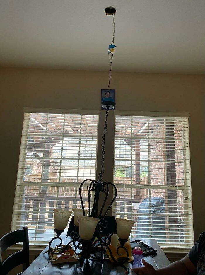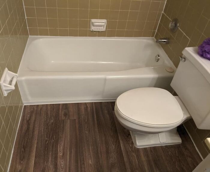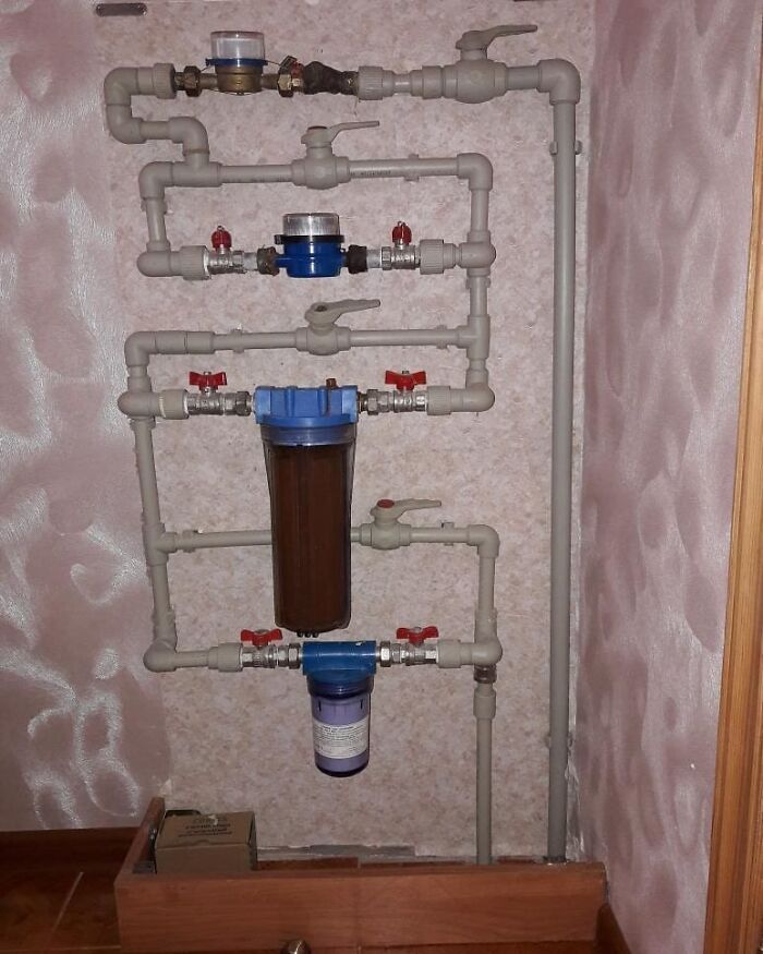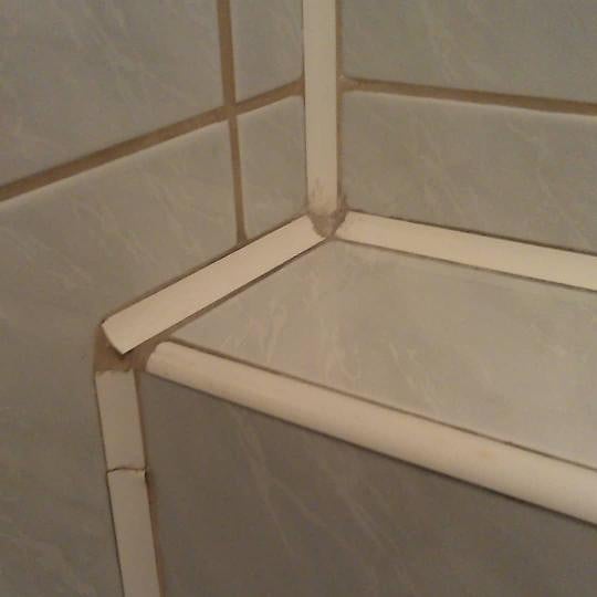
40 Design Solutions That Don’t Solve Problems, Only Create Them, As Shared By This Instagram Account
Good design is all about putting the user first. If the customer can’t make sense of the design and if their every single move is impeded by the bad decisions that the designers and builders made—we’ve got a serious problem. Sometimes these problems all come down to bad craftsmanship, shoddy design, and unaesthetic, hurried, and impractical shortcuts that builders take without a care in the world.
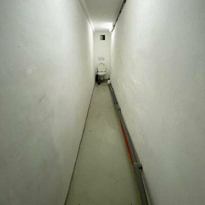
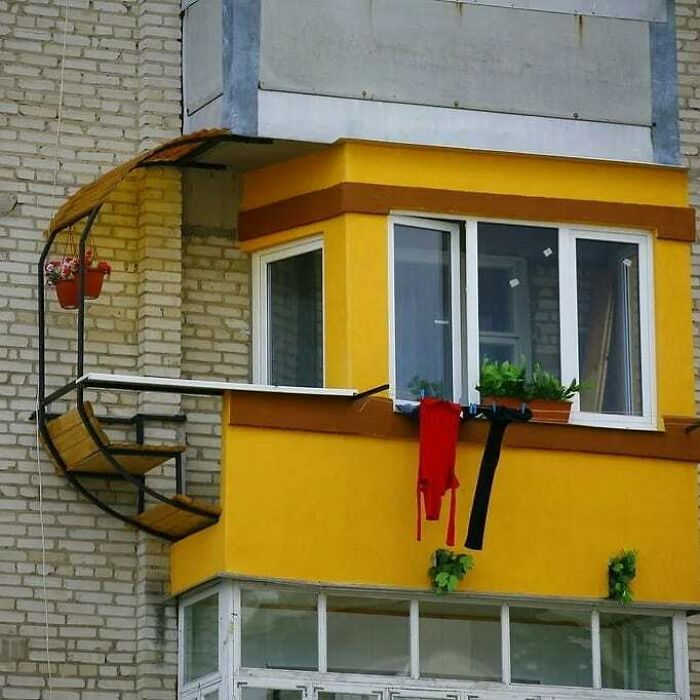
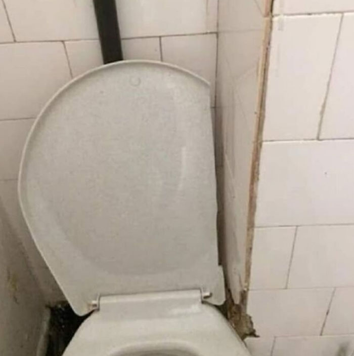
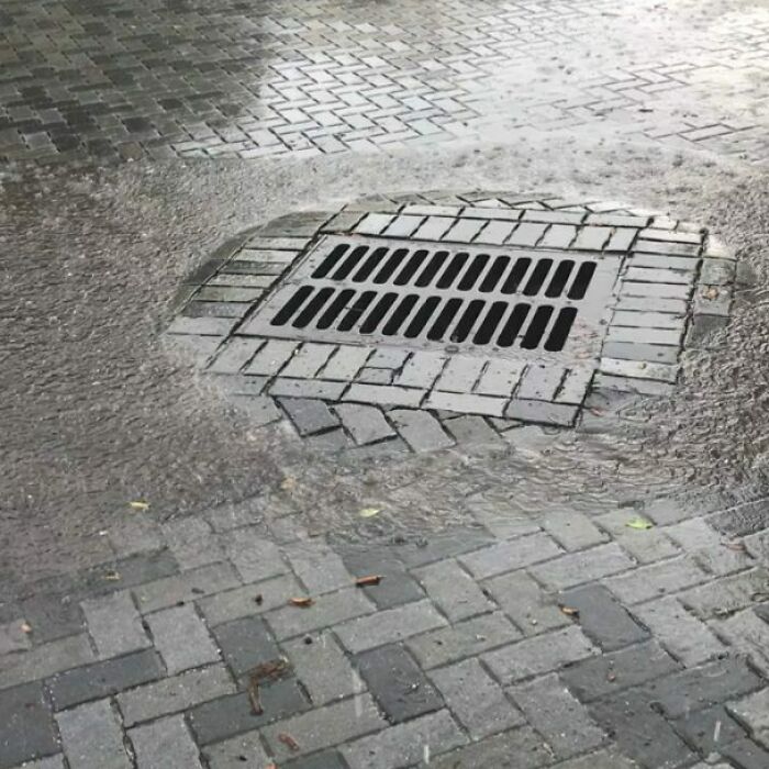
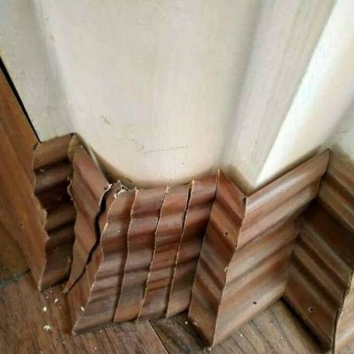
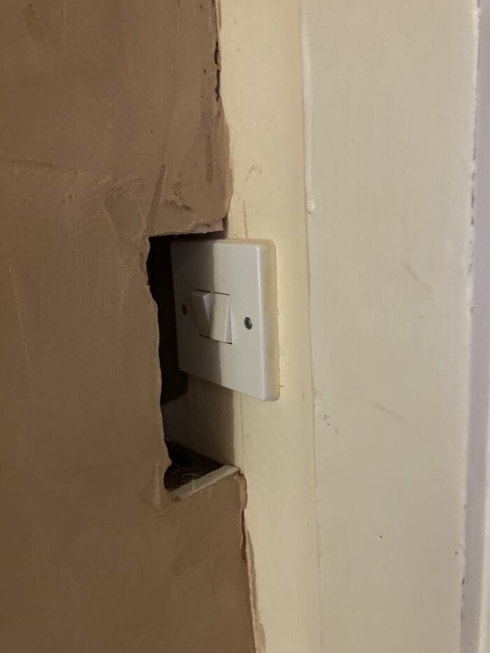
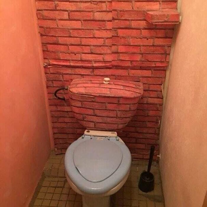
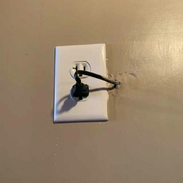
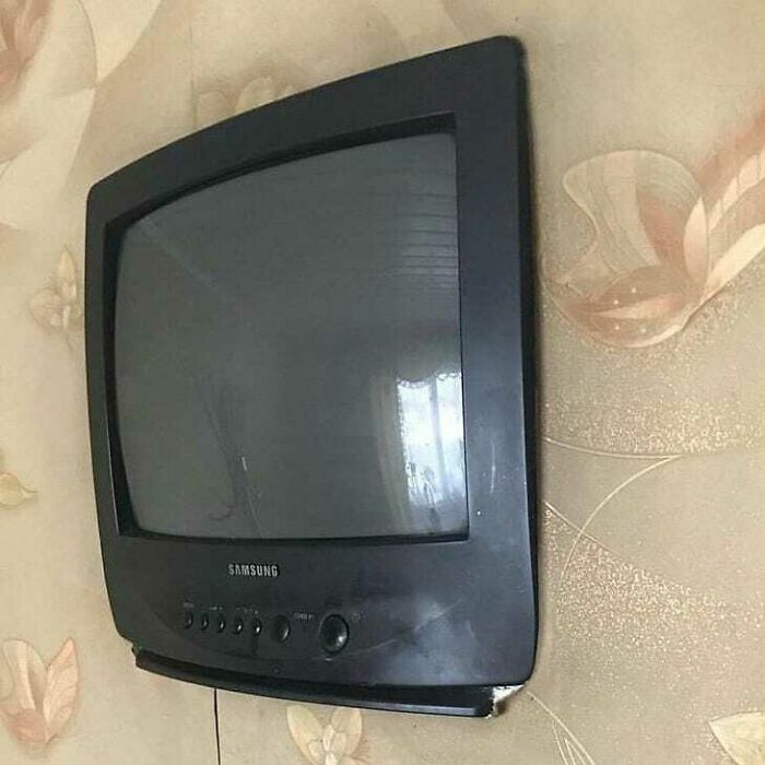
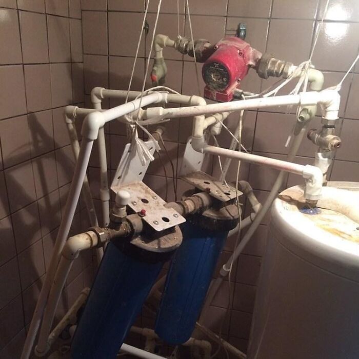
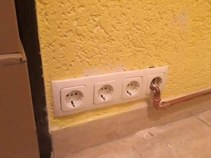
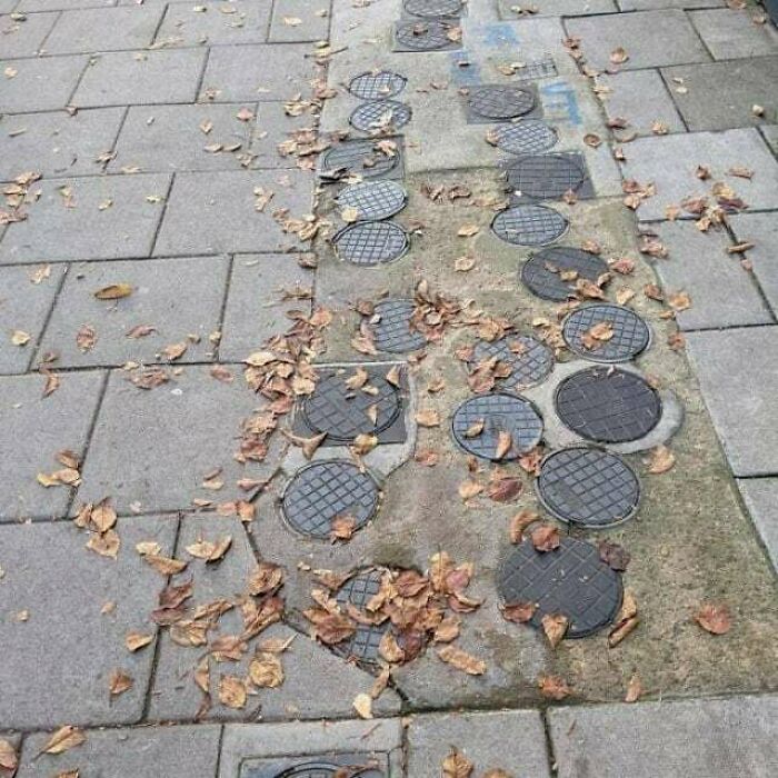
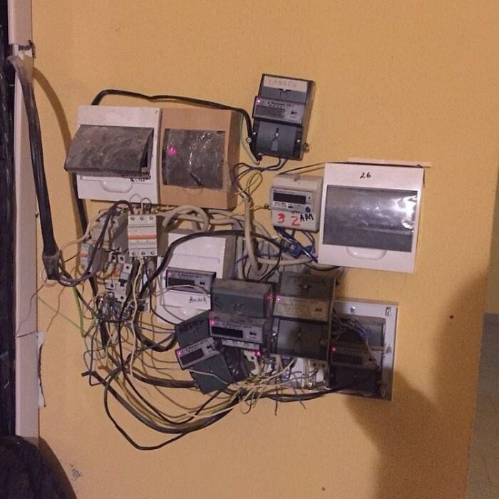
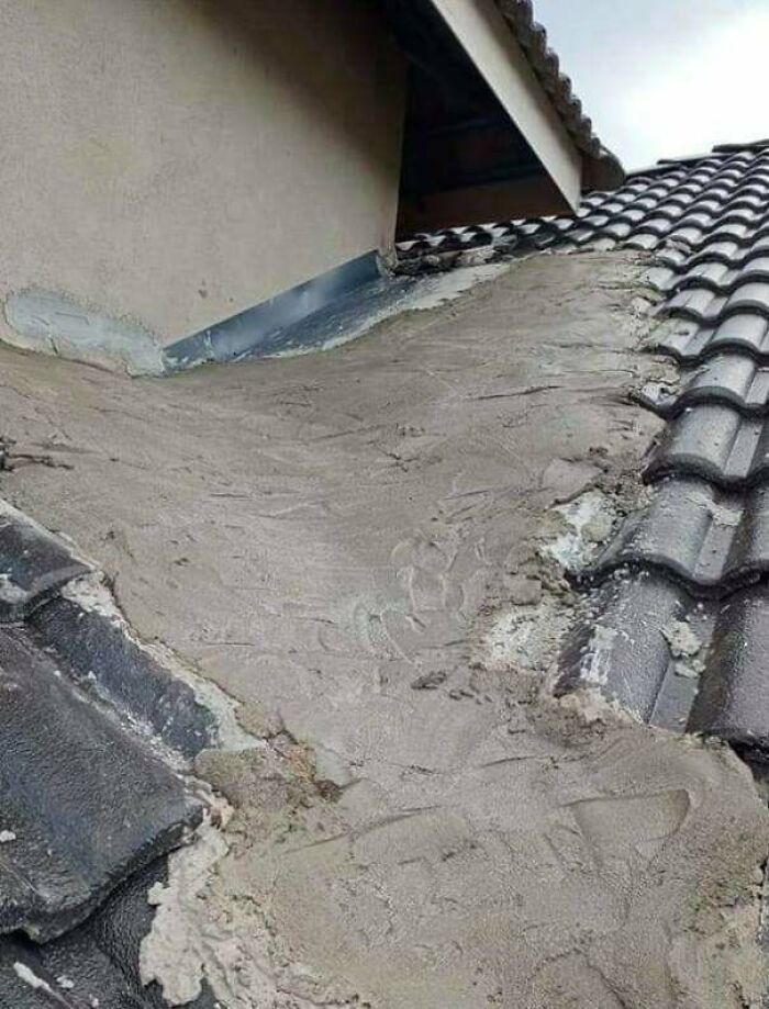
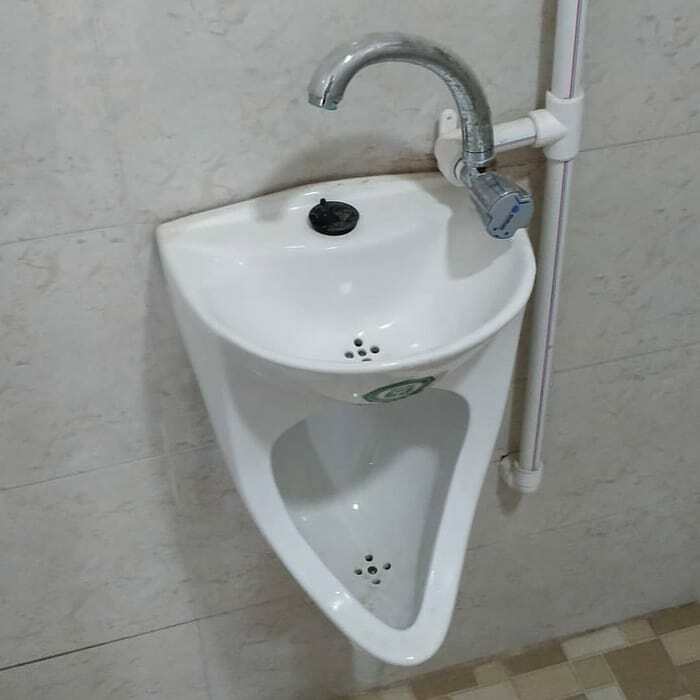
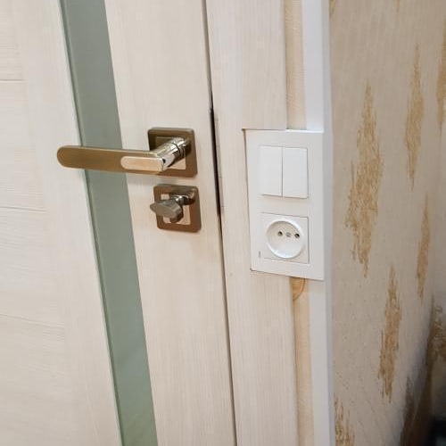
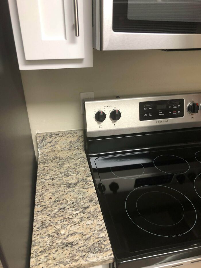
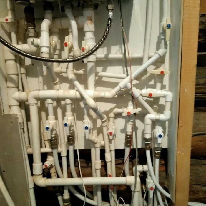
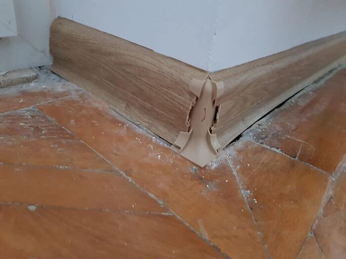
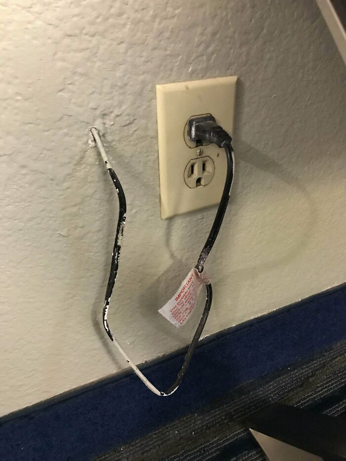
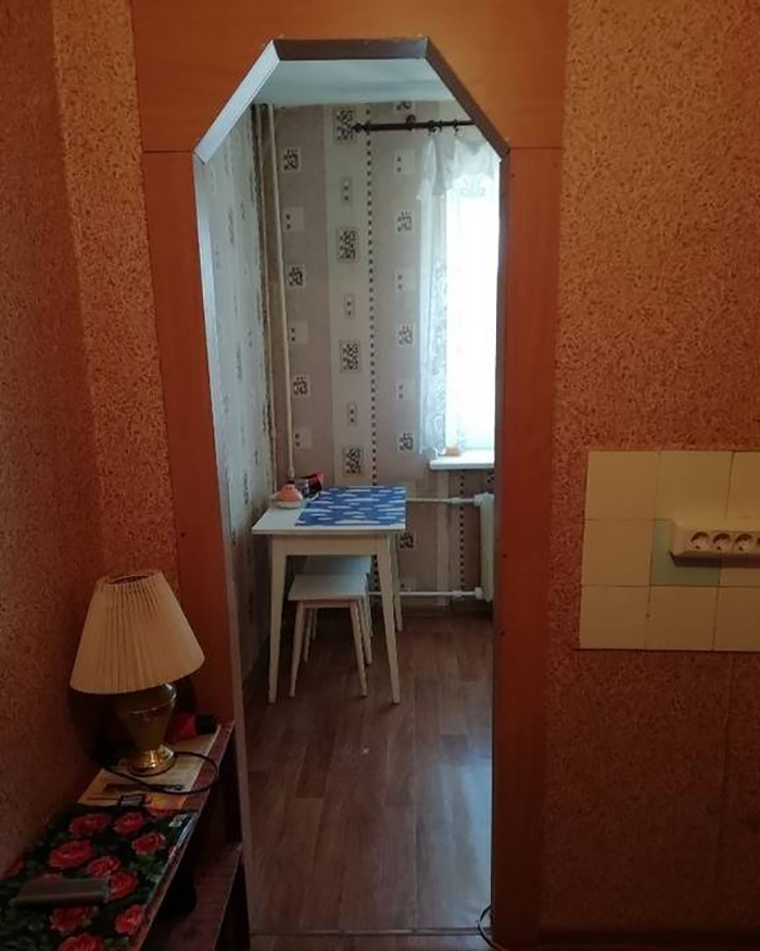
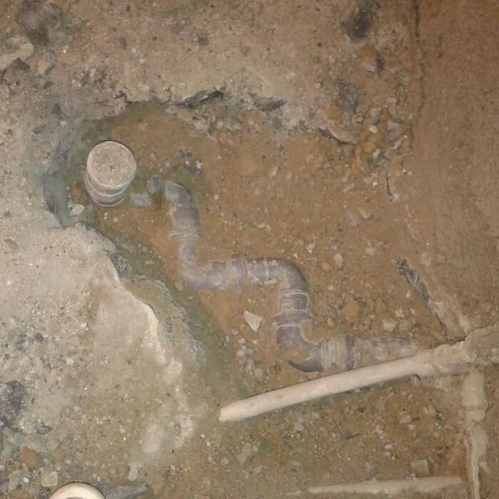
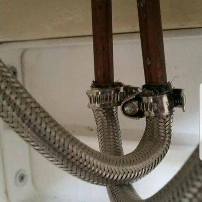
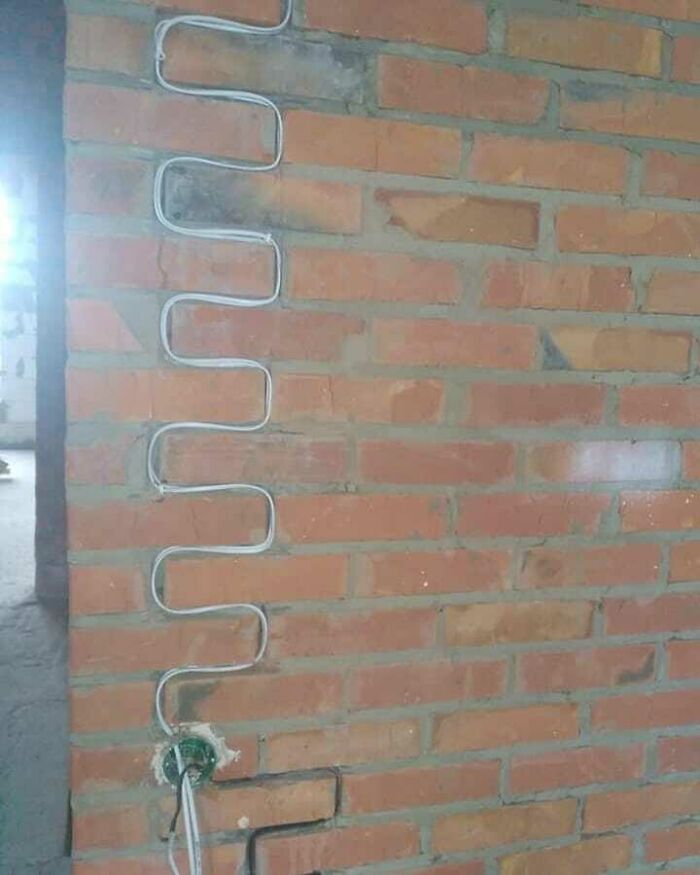
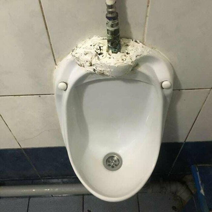
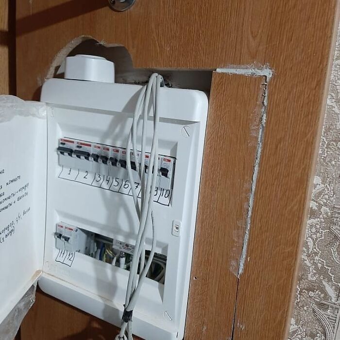
The ‘Typical Rykozhop’ Instagram page documents how some homeowners have to live with utterly ugly, just plain bad, and downright dangerous interior design decisions. Scroll down to see the best of the worst, upvote the pics you wouldn’t touch with a ten-foot pole, and let us know in the comments if there’s anything similar in your own homes, dear Pandas.
Bored Panda reached out to Tim Antoniuk, an Associate Professor of Design Studies at the University of Alberta, to hear his take about where most of the responsibility falls, whether on the designer in charge of the vision or the builders who turn it into reality. Antoniuk explained that it's up to the designer to ensure that their project (which means their client's project) turns out well. The focus should be on the clarity of the designs so that the intent is communicated without any 'fuzziness.' "Certainly, this is frustrating and it puts extra pressure on the designer, but everything, in my view, rests in the designer's hand. This is why some of the most outstanding designers in the world have such a deep knowledge of materials, manufacturing processes, of the problems that can happen during installation."
This post may include affiliate links.
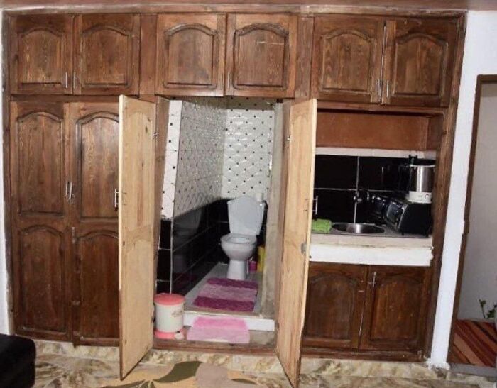
the smell of mothballs isn't the worst smell coming out of that wardrobe
You jest, but that's what wardrobes or garderobes were - the privy where you also hung your clothes, because it was thought the ammonia smell would keep moths and fleas away. It's why "cloakroom" is another word for toilet.
Load More Replies...Oooooooooooooooooooooooooooooooooooh! Now... what were you doing in that closet, eh? 😄
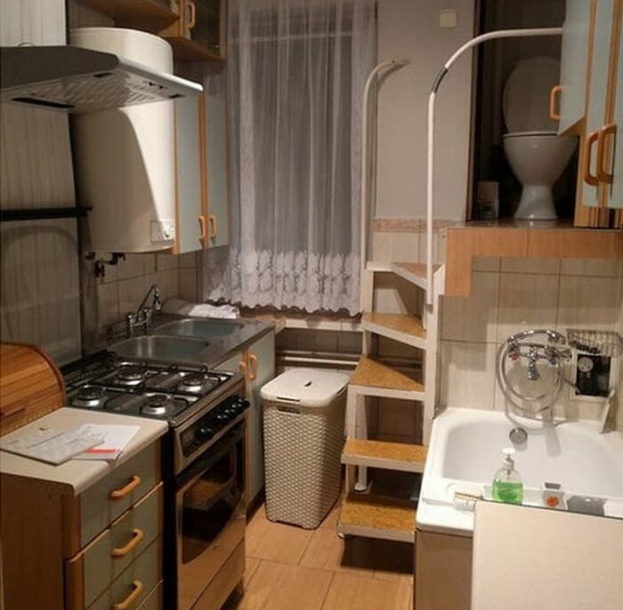
Load More Replies...Surprisingly, the fact that the toilet is only 3 steps away from the kitchen is not the thing I find the most alarming -but the lack of straight walls is really freaking me out.
Don't, some kind of question can be left unanwsered...
Load More Replies...Is that a bedroom? Toilet + sink + coffee maker, no need to get out? Or maybe just hold hostages???!! I don't want to believe someone actually lives there...
For some reason, doesn't look like the kitchen. I mean, that's a tiny sink on the right!
And we want the toilet in the kitchen. Just ease it in among the cabinets. No one will notice.
There was a loo like this in Mrs Brown's Boys under the stairs. LOL!!
I'd kill for a toilet like this. What I mean is I'd kill whoever designed this catastrophe.
Let's Make A Deal : "Monty, I'll take what's behind door # 2............"
Makes me think of Mrs. Brown's Boys when they built the "lew" in a closet under the stairs...
Definitely a good hiding spot in case of intruder or maybe cops
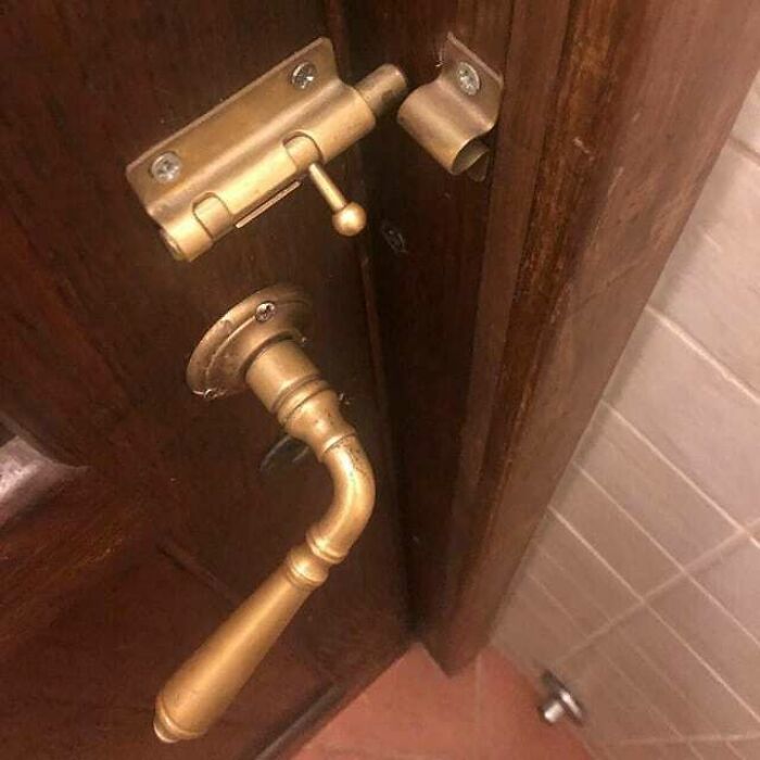
With those door handles, you could lock someone in. But I don't see a way to lock someone out.
Well he slept in a cabinet under the stairs, so maybe this is where Harry Potter did his poops?
"Lemme get some bread out of the pantry!" "Whoops! That's the bathroom!"
Who needs a house with a multi-functional closet like that? Kitchen on the right, and probably bathroom on the left, too
Antoniuk said that it's the designer who has to provide clarity and foresee at least some of the possible issues when it comes to the actual building and the interior design: "It's hard, but that's why the best designers get paid so well for their outstanding work. They do great design/aesthetic work, but they also create efficiencies and they foresee and spot (some) problems from happening."
The Associate Professor highlighted that some things will go wrong, no matter how much we plan for them. What's more, the builders have to be on the designer's side, too, but the latter still shoulders most of the burden. "Many jobs can not just stop because a designer is not onsite or is not able to be reached. That said, builders need to honor the designer's vision, but again, if there is 'fuzziness' in the drawings or plans, decisions will be made by people that we may not want to make them."
On a very practical level, ensuring that builders follow through with the designer's vision comes down to communication, doing "great drawings and visuals," and becoming "exceptionally well educated" in the field of construction. "We exist in a field that is ever-changing with the introduction of new materials, new construction requirements, and restrictions," Antoniuk said.
He also stressed the importance of creating honest relationships based on mutual respect. "It is simple to say, but communication and having an outstanding relationship with the builder is critically important. At 'Architure,' we constantly visit and hang-out with the Trades. We like to talk with the people that have 'boots-on-the-ground.' These are the people that are literally building our products and spaces. If you piss these guys off, treat them poorly, or don't communicate well, they can ruin a project. It may sound flippant, but we see these people as our partners."
In a previous interview with Bored Panda, Antoniuk also spoke about the differences between good and bad design. He said that there are, objectively, such things as good and bad interior and furniture design decisions—it’s not just about our subjective tastes.
However, our tastes are important, too, as they can create gray and blurry areas between what’s considered to be quality and, well, not. Though, I think, hardly anyone would mix up anything shown in this list with something that’s tasteful.
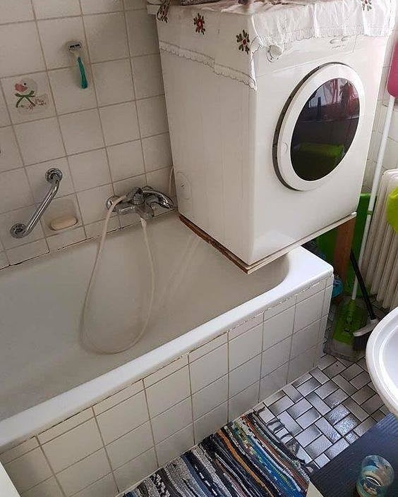
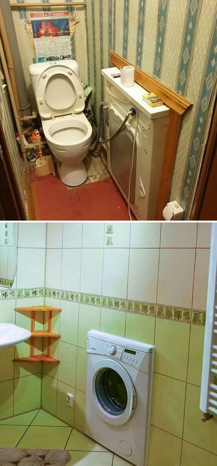
Don't be fooled people! This is just one of those hyperrealistic cakes looking like a washing machine.
After taking a relaxing dump you can dive head first into your bubble bath whilst simultaneously cooking dinner for your loved ones. I see no downsides here.
In Antoniuk’s opinion, we can all intuitively sense what good design is and isn’t. "Quite often, this relates to ergonomics and the usability or functionality of the products and services and systems. Having said that, I think far too many people expect poor design that doesn’t really work well," he said.
It’s not all just doom and gloom, however. Antoniuk highlighted that creating high-quality design that is objectively good is a skill that can be learned; just like people can learn the wrong skills and make bad design decisions. Naturally, this suggests that we have to unlearn bad skills before learning the right ones.
For Antoniuk, good design is “intuitive, [...] deeply sympathetic and empathetic to the user at all levels, and at some level, it is emotional,” just like Dieter Rams laid out in his principles of good design. “It is a catalyst for giving us feelings,” Antoniuk said about design.
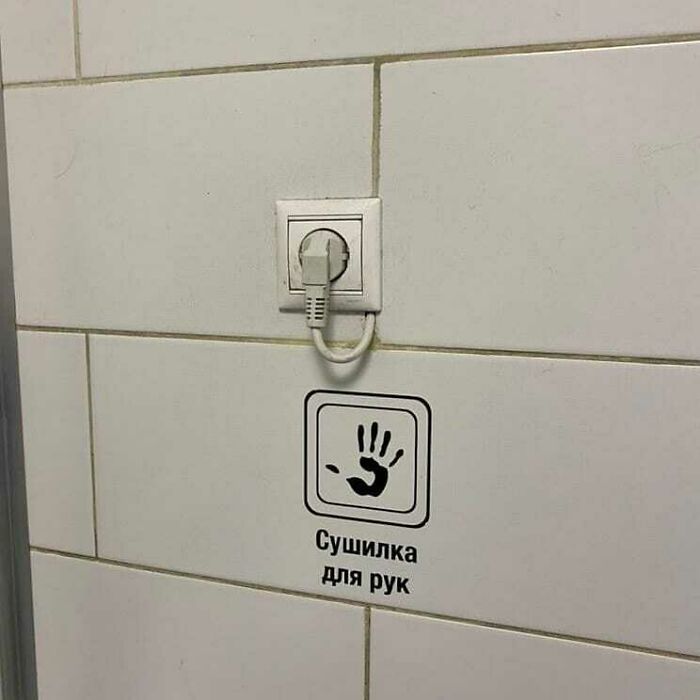
I keep having visions of a hand reaching out to grab me when I switch on the light. 😬
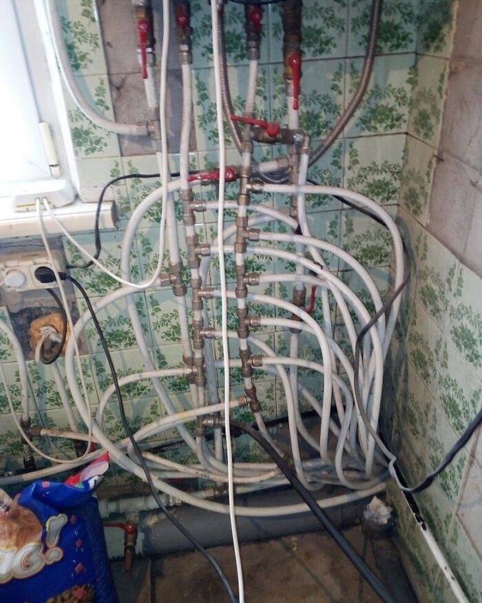
I can't unsee this. love the combination between water and electricity
Ivan: "Boris, clear a pathway to the steps. " *half a bottle of vodka later* Boris: "Finished!"
The second I looked at this, Randy Quaid in the “Shitter’s full!” scene from “Christmas Vacation” popped into my head.
Some of the designs have gone past "problematic", they are downright infuriating!
Most of these have nothing to do with designing. They are just bad DYI jobs.
Are these in America? Some of it looks from somewhere else. Of course, some of it looks like someone's uncle did it on a weekend for less. And other pieces look like old properties trying to be more modern. Rental properties will always be more shabby than something you own. Or it should be that way . . .
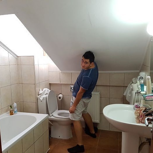
My sister’s house has a bathroom like #5. It’s under the stairs, so the ceiling over the sink is about 5 feet high. My brother-in-law is 6’3. He never uses that bathroom.
Some of the items in this thread reek of privilege. Sometimes people just do the best they can with what they have/can afford. Some are also just bad lol.
I am so glad for building code that makes it improbable for new buildings to end up like these. Most of these are bad DIY jobs and/or old buildings.
99% of those were just down right scary. It's hard to believe people have to live with that.
There aren't a lot of words that I would use to comment. But, I will start with everything seems to be multifunctional, there is a lot I don't understand and the others I don't know where to begin. I do know that there are probably a lot worse out there than these pictures are showing but being human beings if nothing else we can make something out of nothing and I don't know if that is a good thing or a bad thing.
I'm pretty sure the superintendent of my building did most of these.
my first house was built in the 1940's and never had the wiring updated. Later they installed a dishwasher. You could run the fridge or the dishwasher and there was a switch to turn off the fridge while you ran the washer. And yet, somehow, I feel better about that house after seeing these.
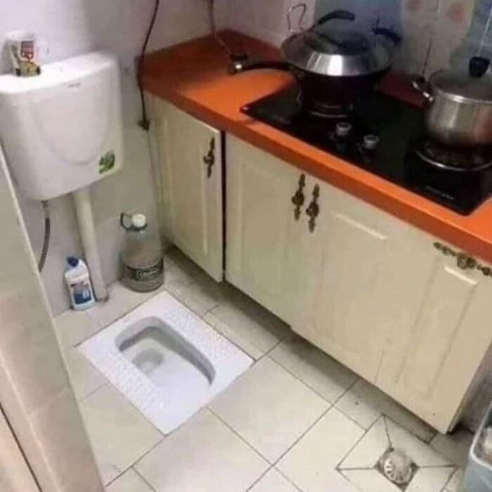
So many toilets in kitchens! This is why I never accept food from others!

 Dark Mode
  No fees, cancel anytime


