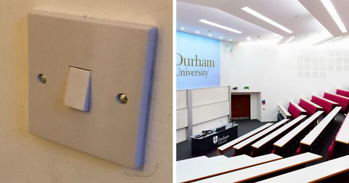
“The Problem With Modern Architecture”: This Twitter Account Shares Why Architecture Today Is No Good
When you think of the most beautiful architecture in the world, your mind might immediately go to Baroque buildings in Rome, the Taj Mahal or the Palace of Versailles. The ornate designs and extravagant attention to details are breathtaking. While it would certainly be a challenge to create masterpieces like those buildings today, modern architects seem to have thrown in the towel altogether.
Last week, the Twitter account The Cultural Tutor went on a rant detailing the problems with modern architecture. From a lack of beauty to a focus purely on cost-efficiency, they broke down precisely why modern structures leave much to be desired. Below, you can read The Cultural Tutor’s full thread, as well as some of the replies it has received, and decide for yourself what you think of today’s architecture. Then if you’re looking for another Bored Panda piece featuring architecture fails, we’ve got the perfect list for you right here.
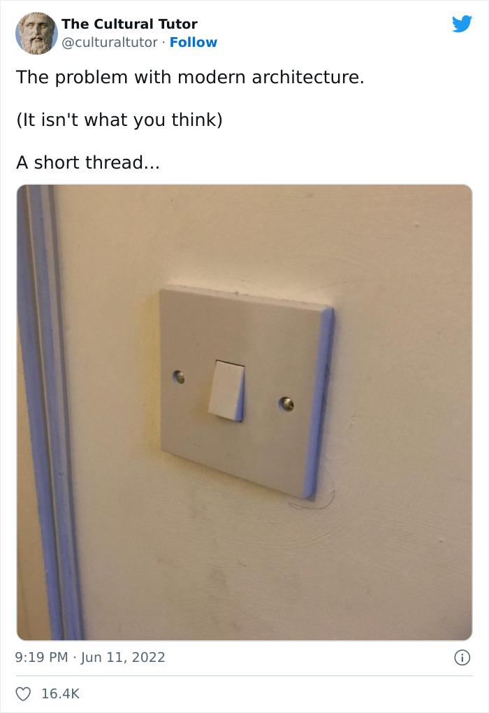
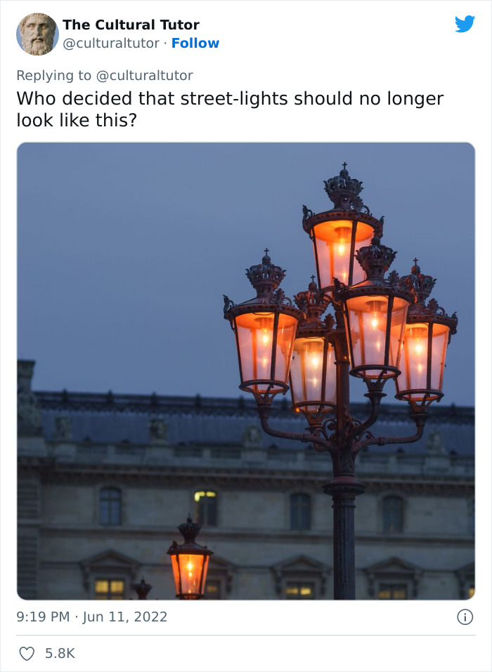
Last week, The Cultural Tutor detailed on Twitter everything that is wrong with modern architecture
Image credits: culturaltutor
Image credits: culturaltutor
Image credits: culturaltutor
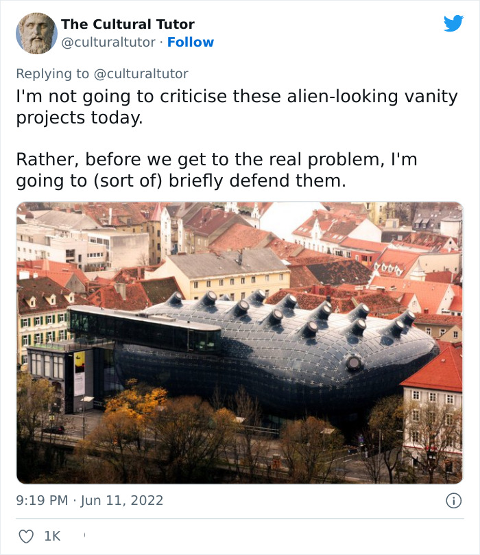
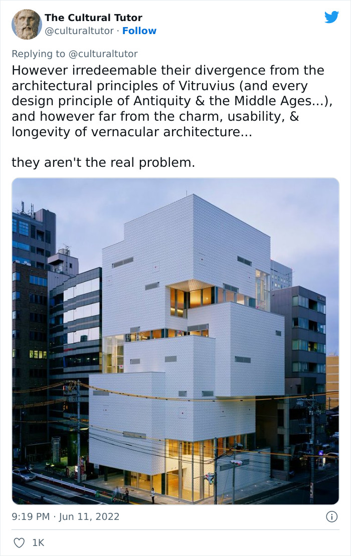
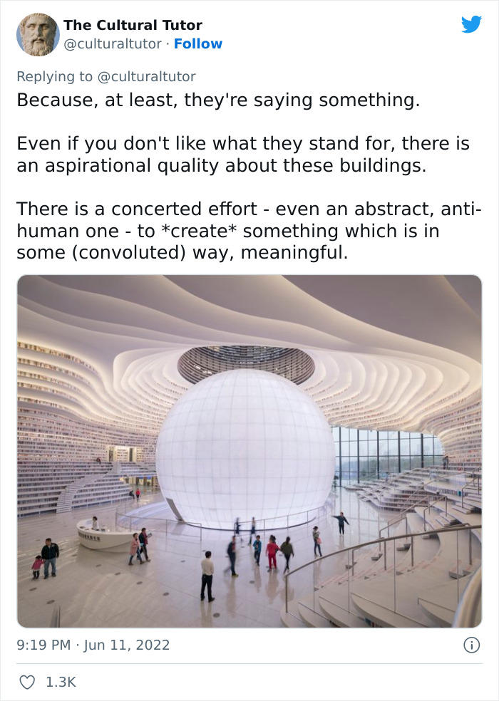
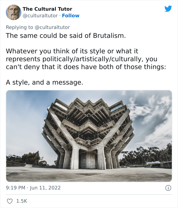
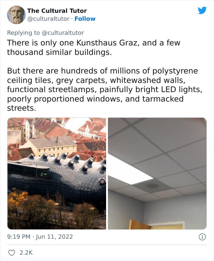
They noted that their critiques are not about unique, contemporary buildings because at least those make bold choices
Image credits: culturaltutor
Image credits: culturaltutor
Image credits: culturaltutor
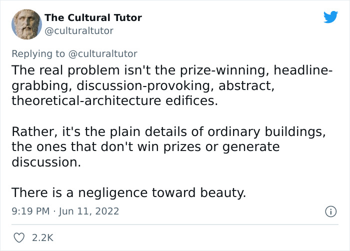
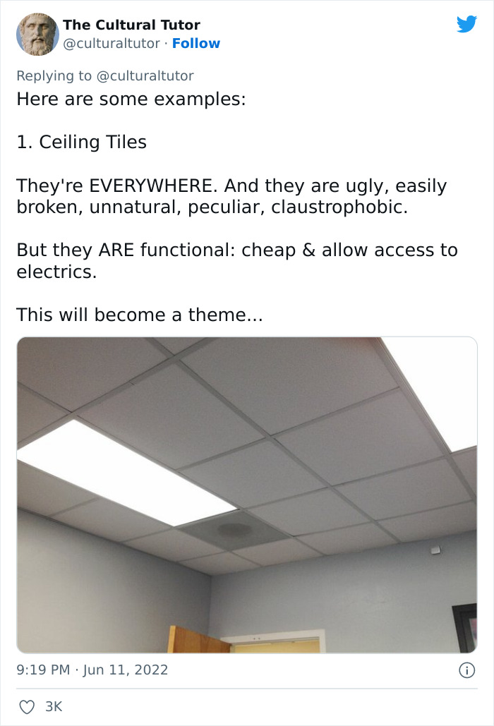
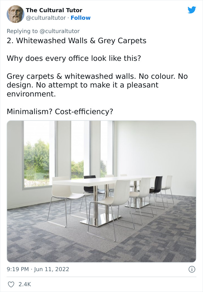
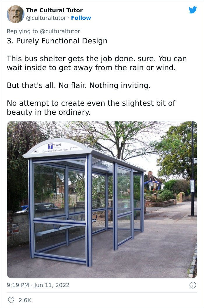
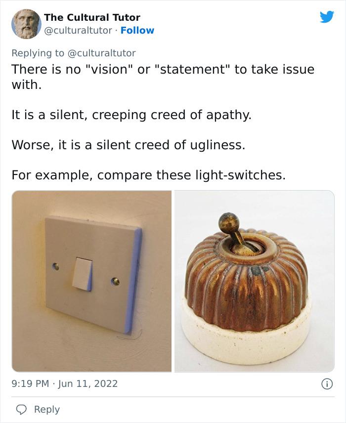
Their real problem is with the complete lack of beauty in many modern spaces
Image credits: culturaltutor
Image credits: culturaltutor
Image credits: culturaltutor
Image credits: culturaltutor
Image credits: culturaltutor
Image credits: culturaltutor
Image credits: culturaltutor
Image credits: culturaltutor
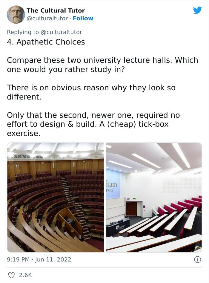
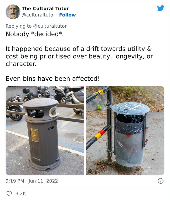
They went on to mention that these structures have become so ugly because cost-efficiency is now the most important factor for city planners
Image credits: culturaltutor
Image credits: culturaltutor
Image credits: culturaltutor
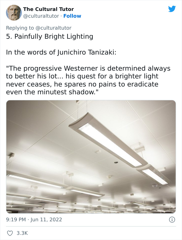
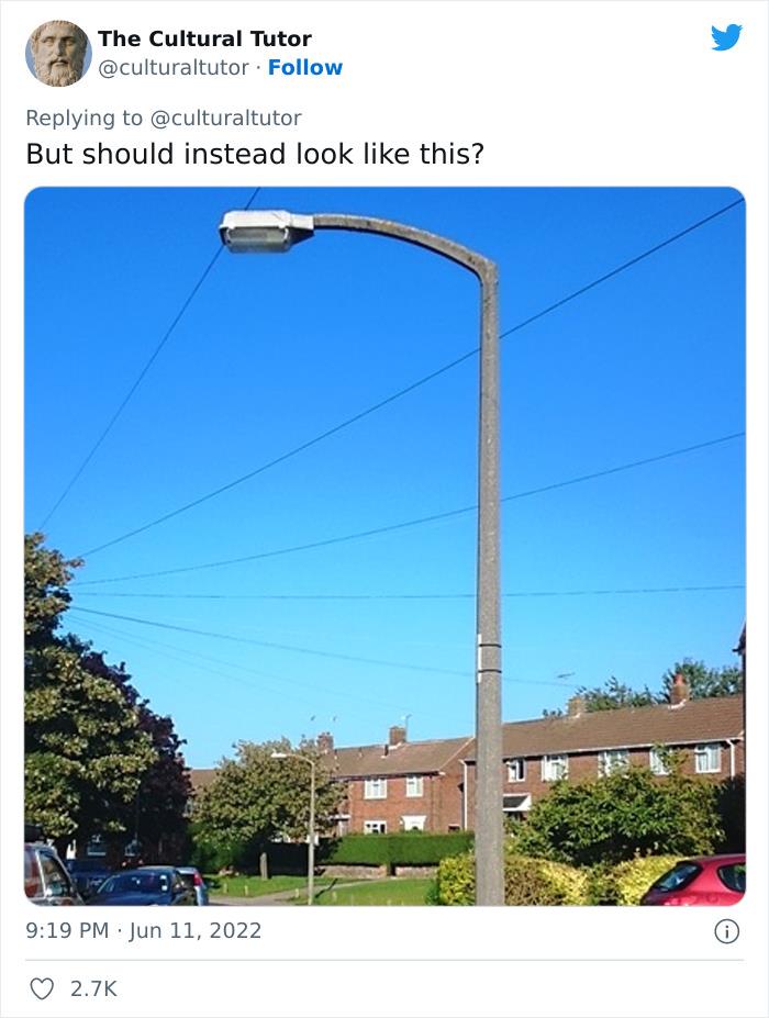
So when did architecture become so sterile? Did we all just wake up one day and suddenly every office and school was filled with white ceiling tiles and painfully bright fluorescent lights? Some of the replies to The Cultural Tutor’s Twitter rant mention that people nowadays simply don’t appreciate beauty as much as we used to, but I think we’ve just gotten used to being surrounded by ugly structures. I think if we were presented with the choice to replace all trash cans and street lamps with more aesthetically pleasing options, most of us would jump at the opportunity. Especially in places like our office buildings, where many of us spend forty hours a week, it would be nice to see some beautiful art or a bold light fixture, rather than a sea of fluorescent lights and beige walls.
Image credits: culturaltutor
In fact, a prettier office can even boost productivity and improve our wellbeing. Having access to natural light and being able to see artwork on the walls at work makes us more comfortable, less stressed and in turn, more efficient. Even having some plants displayed in an office space can go a long way, as one Harvard University paper found that employees working in “green” offices had double the cognitive performance of others working in more traditional spaces. So if you’re working in a soul-sucking beige cubicle, try throwing in some fresh flowers, artwork or succulents to liven the place up a bit.
Image credits: culturaltutor
Just because white ceiling tiles and grey carpets have become the norm does not mean we have to accept them forever. The Cultural Tutor pointed out some ugly features of modern cities, like bins and street lamps, that most of us don’t even notice as they’ve faded into the background of what we see every day, but now I can’t help but feel disappointed that our city planners and designers have given us the bare minimum. We’d love to hear your thoughts on modern architecture in the comments down below, and if you know of any examples of particularly pleasant modern spaces, feel free to share them with your fellow pandas.
Twitter users have responded with shared disappointment in modern architecture and their own theories as to how we got to this point
Image credits: AbuSheesha
Image credits: CatImperator
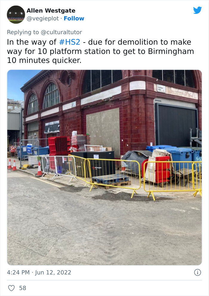
Image credits: vegieplot
Image credits: mannyfresh2099
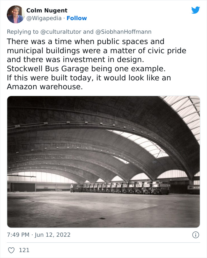
Image credits: Wigapedia
Image credits: RidetMortem
Image credits: WilTango
Image credits: rzeta0
Image credits: ballotharvest
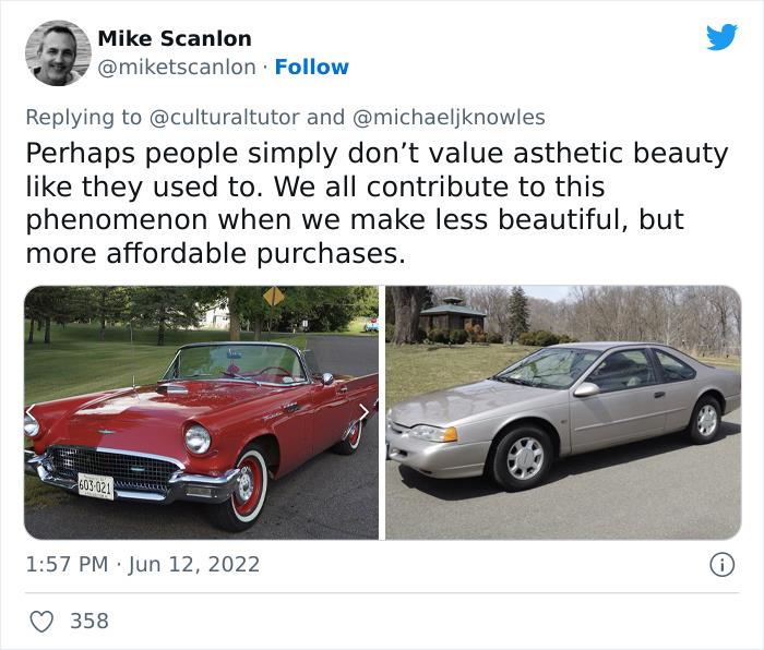
Image credits: miketscanlon
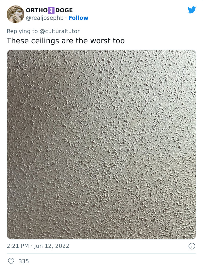
Image credits: realjosephb
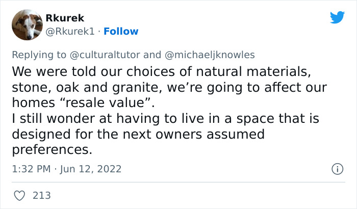
Image credits: Rkurek1
Image credits: grumbleagrumble
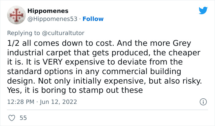
Image credits: Hippomenes53
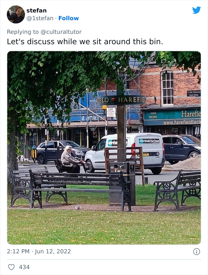
Image credits: 1stefan
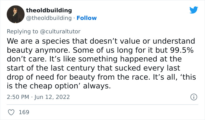
Image credits: theoldbuilding
Image credits: amitagarba
Image credits: RB3475
Explore more of these tags
Not only are some of these examples cherry-picked and subjective. Some of them are plain dumb. The wooden lecture hall might look pretty, but whoever is sitting on the sides wouldn't be able to see anything on the blackboard or any projected presentation. The old lamps look nice, but are super inefficient, not only because of the light source used, but also because the pretty shape isn't very good at light distribution. And there are many nice looking modern streetlamps, but the author chose the ugliest concrete abomination he could find. It's not even a fair comparison because the pretty lights are mostly used for illuminating areas meant for pedestrians, meanwhile the ugly modern one (which seems to be 30+ years old anyway) is intended to be used to illuminate roads and so needs to be easier and cheaper to manufacture in bulk. I have an old book of streetlights and I can tell you, lamps like this have always been ugly and minimalistic.
Street lights for the road are also about safety for the drivers. And those street lights, at least in my area, have lasted for decades. I've never seen any of them be replaced as long as I've lived here. Ugly they may be, but poorly made? No.
Load More Replies...The penultimate tweet here mentioning Christianity is so weird. This person has obviously never travelled. Go to India or Japan or Morocco or Mali and see the beautiful traditional buildings that have nothing to do with Jesus.
Cathedrals, temples, churches, mosques, and other religious buildings are generally very elaborate and beautiful. You're right that it isn't purely Christian. But I don't know that I agree that that's what's been lost. In fact, I look at modern churches in America and they look more like concert venues than beautiful sanctuaries.
Load More Replies...Good thread. But I have mixed feelings on bashing cheapness. If you could travel back in time, the differences between the haves and have nots was more stark than it is today. Cheaper materials allow more people to be housed in a functional home, rather than be stuck in shanty town tents. We still have homelessness, yes, but not nearly as much as we used to. More people live with running water and electricity today than in the past. We only have that because of cost efficiency. The beauty of the Gilded Age had a message of its own- objects were more important than people. No wonder communism started to sprout. More effort was put into a bus garage than safe homes for the bus drivers. There's an argument to be made for ugly, cheap architecture- no object is as beautiful as the people that make/use it. So while I see what this author is saying, I'd take housing a family any day over wrought iron curlicues.
the problem with this argument is that income disparity is worse now than it's ever been, and mass-producing something that isn't just a minimalist blank slate isn't dramatically more expensive - the point is to keep people bored in boxes and striving for the "luxuries" they don't have access to not to mention that things that are mass-produced cheaply like the things you're suggesting aren't magically just cheaper, they're produced by exploiting labour. i would rather house a family than have beautiful things, but that's not what the problem is: the people who hoard wealth and try and convince the rest of us that beauty is necessarily a luxury to earn are the problem.
Load More Replies...TBH I’m too burned out on the bigger problems in the world. I’ve picked my battles and I don’t have room in my head for this one.
I've worked on quite a few older buildings and they also had their share of ugly. I think a lot of it was budgetary. You may have had enough money for function but not flair.
Not to mention that many of the typical architectural features we appreciate from commercial and industrial buildings of the past were born out of necessity of the times rather than a desire for beautiful structures. One of the books my grandfather left me was G. Underwood's "Standard Construction Methods" c.1931. Mill buildings were all brick, glass, and timber. Not because it was natural and beautiful, but because reinforced concrete and steel truss building technology hadn't been developed yet. My favorite method out of that book was the Lamella Roof, which you don't see anymore because steel roofing can achieve the same effect more easily and cheaply.
Load More Replies...I disagree with the commenter who said we don't value or understand beauty anymore. I'm constantly blown away by the loving attention to beauty shown in contemporary movies, video games, websites, even humble TV shows sometimes. Maybe we've just changed our preferred environments for experiencing beauty.
What these people forget is, at the same time that those beautiful old buildings were being constructed, there were a lot of people crammed into miserable slum dwellings with no electricity or indoor plumbing. So sure, mass produced buildings may lack character, but they give a lot more people a roof over their head that doesn't leak and plumbing that works. Workplaces may be more blah, but they aren't dark, dangerous, and unhealthy for the most part.
I'm with him on interior lighting: The grey-ish, flickering, humming, bright flourescent lights in the office are one of the reasons I rather WFH.
Fluorescent tubes are largely being replaced by LED tubes that fit within the same fixture. No humming or flickering.
Load More Replies...What you do with the ceiling tiles is you pop them out, paint a picture on them, and put them back in. My middle school had this as an art class project and there were years worth of students' paintings on ceilings in every room.
I'm going to sound like a philistine but I think the author has lost touch with the common man. Cost has to be considered. Always. Being cheaper and more efficient is not an affront to "art". It is how the common man gets more. The world back then has a fraction of the population today. The economic divide is also far more profound. There are kids that are already destined at birth, to work in the mines for life. It is the efficiency in both cost and labor that narrowed this gap by affording more access to the essentials like food and education. In a way, the older architecture, though aesthetically pleasing, is lavish luxury at a time when we were ignorant enough to think resources will always be plentiful.
We are, perhaps unfairly, comparing the best of the past to the worst of the current day. I never lived anywhere with fancy lightswitches. They were the same shape but a little smaller and made of bakelite/plastic. Cheap and brown and not all that safe. Same with living conditions. Absolutely TINY kitchens called 'sculleries' and 'set-in beds' to ensure that a two bed house could sleep up to 8 people. No decorative features and very cold in the winter to the point of ice on the floor in the bedroom. SOME houses were beautifully made - most weren't..
The writer is deflecting away from the horrors of Brutalism, but he's not all wrong. It boils down to this: Economic growth doesn't mean that there are more hours in a day for creativity. It means we have become efficient. And we should praise that efficiency, but in taking time to do things the hard way, there was also a sense of investment. The real reason Brutalism was so common in the 1960s is that people believed the world was doomed by nuclear war, and built buildings that weren't made to last. If you build for centuries, you build grandly, If you build for ten years, tops, you build cheap, hideous, concrete slabs of aesthetic vomit.
Load More Replies...Blah. I think Mr. Tutor is confused and confusing. There are many examples of good, design nowadays, and of antique bad design. In common housing, the intentions have been more or less the same since forever. Of course there are things that are too expensive or take too long to buid today. And of course, there are countries / cities with design tradition which put a lot more value on it. You can't compare US design with Italian, Finnish, etc. for example.
How about solar street lights that are shaped like living trees that blow in the breeze. On holidays they could be programmed to pretty colors. The lower branches of the tree street light could have brighter lights that point down at the street.
Maybe the writer should also mention the no. of times he/she got turned down by corporations, institutions or manufacturers for trying to provide free consultation on aesthetically pleasing and yet cost-effective designs. Oh. Perhaps he/she is just an armchair critic.
Everybody should read Roger Scruton ! And this thread should be sent to the mayor of Paris. Check the hashtag #saccageparis
I bet even the author, if he's not some rich kid living apart from the real world, when having to choose between a standard light switch and a beautiful one that cost several times more would pick the cheaper one. Most of us would. The industry is just making what sells more and regular people want to pay less. Also maybe he's focusing on beautiful examples from the past when certainly there were a lot of ugly trash bins and light switches that we don't remember anymore. It's like music from the past, the bad ones are forgotten.
Most of us would pick the cheap light switch.. if we were renting, or we expected it to break in a year. But when we expect to live the rest of our lives with something, we do still choose beauty.
Load More Replies...If we take the great monumental buildings, particularly cathedrals, there's a strong sense of community ownership of the prestige. People wanted to shape them and to be connected with them. Even the Victorians understood this.
It's not like tithes were voluntary, so it's hard to know if a hungry peasant staring up at the gold-covered roof of a cathedral felt pride or not.
Load More Replies...I feel the thing about designing your house for the next owners, deep in my f****n bones. First of all the dog smell, leaking sun room only used for dusty storage and ugly a*s kitchen floor didn't stop me from buying the trailer that I lived in for ten years. I knew what I could fix, what I could clean, and that I liked the area enough to do it. When I became a house owner, the privilege I was really paying for was being in a safe neighborhood, a twenty minute walk from some of my favorite businesses and as a childcare provider two houses down from a city park. The ugly laminate in all the cupboards and the neglected state the house was in didn't stop me. Neither did the hideous textured floor in the bathroom or the hideous fake wood in the basement. These were all simply aesthetic issues that I could change. I also was able to pay way under market value for it. I intend to turn it into mine and mine alone and if I do resell someday - I won't be worried unless I do something *truly* bizarre. Don't fall for this 'but the next owners' b******t, people. You pay an enormous amount for your own house, you can decorate it however you want.
Totally agree. It sounds like they were getting punished for wanting their home to have lasting/timeless materials instead of plaster.
Load More Replies...I'll be honest - this is why I love seeing graffiti. Cafes with amateur paintings being sold for fifteen bucks. People making scrap sculptures in their front yards. If there's one thing modern, cheap, accessible architecture does really, really well, it's to provide a universal canvas. Your easy, daily resistance against this isn't to make a Tweet, it's to scrawl your 2AM drunk philosophy on a bank wall. It's to buy a dollar store canvas and badly but authentically paint whatever the hell lives in your soul. The world gave us this blank space and fights forever to get us not to use it, which is all the more proof that we should.
me too! I love well done graffiti, especially when it's been commissioned because then it's usually REALLY good.
Load More Replies...Designs also be based on the ideal of someone who actually does spend time in those environments vs people who don't spend time in those environments and think they are sufficient for those who do. Kind of funny and kind of sad.
Taste is included too. It's important too within both sides of context of my post here.
Load More Replies...The Art Deco movement was focused on having the modern machine-made-and-replicated objects be as beautiful as possible, so that the economies of manufacturing and scale would allow everyone to afford beautiful things in their everyday lives (almost like rich people who could afford to have custom-made things). Problem is, the efforts towards streamlined elegance was streamlined even further into smooth nondescript-ness by the next generation of designers, where somehow elimination of anything aesthetic became its own aesthetic.. Take flatware for eating; the press that shapes them could easily be minting traceries of design onto every piece, rather than just pressing them flat and polished, but flat and polished will definitely sell while multiple designs involve complications of inventory, distribution, retail, and people's taste.
If pretty architectural elements can be sold at an affordable price and made invulnerable to thieves and any who have a compulsion to damage property, then I think we would see more beauty in smaller things (vs. buildings) like the street lamps and trash bins in cities.
Among the examples the author gives, that one about the interior lighting is where he nose dives and crashes. The amount of light in a space, how it is distributed, its suitability to the function of the space and the color temperature are all important in lighting comfort of a space. You can have the best looking, most efficient light fixtures, can use LED light sources, and still have too much blinding light with the wrong color temperature and be miserable in an environment. This is an issue where a little knowledge of lighting criteria goes a long way even in the face of ugly capitalism. 1/3
Aand, the twit by Cashington, is absolutele BS. Plastics are among the most durable materials that we know. So much so that even now, as we try to make plastics last shorter, we still cannot find a way to completely get rid of them. Cheap plastics came about with the increasingly wider usage of plastic materials and that wonderous idea that did the planet in, Planned Absolesence (which is the actual crux of his twit). 3/3 +
Load More Replies...I worked in a very beautiful office space... five stories, lots of floor to ceiling windows, curved walls, beautiful colored accent walls, plum, teal, lavender and dove gray; teal carpet, huge meeting rooms. For whatever reason, the powers that be decided we needed to "remodel". They straightened the beautiful curved walls, and chopped them up to open onto rooms placed at weird angles without symmetry. They painted every wall institutional beige or gray. They bought the ugliest carpet known to man... it was brown and gray with stripes that made you disoriented and nauseous. The meeting room was chopped up into several smaller rooms, so we no longer fit into one room but had to stand in the hall for large meetings. All this disastrous work came at a huge price, and totally demoralized the workforce. I still haven't figured out why they did this... I'm thinking maybe some sort of kick back. I mostly agree, it is cheaper to make things plain and unattractive, but not always
I don't understand when building, why one would build ugly when building beautiful would cost close to the same. Same amount of material, same nails, same hammer. Same with automobiles. Same amount of metal, Why stamp metal an ugly curve, when you can stamp metal a lovely curve. Makes no sense to me.
For the same reason you hang a urinal in an art museum, like Marcel Duchamps: because you hate beauty, believing it to be a lie. The aesthetic nightmares of the downtown Washington and Moscow stem from the same nihilistic impulse that hates God, nature, beauty, hope, but most of all, the humanity of the bureaucrat's subjects. For however perfectly Brutalism reflects Stalin's cursed soul, you should see the beauty inside the Kremlin!
Load More Replies...I feel the same about clothing, but that's a different topic. About the "modern, urban architecture" which I think it's more about design than architecture, I understand why companies or governments would prioritize cost and efficiency over style, but I do think it wouldn't take that much to invest a little bit on beauty. I mean, any company or organization has a person that is in charge of these things, at some point has to decide what lamps, what benches what bins, floors, ceilings etc are gonna get installed. So if this person happened to be someone with a little notion of design, probably would make choices, efficient and as cheap as possible, but with a little bit more consciousness in the aesthetics. I'm not saying paint the street roads with bright colors, but I think urban landscapes could look more, alive?
Clothing is actually exactly the same topic. Mass (non-custom) production and chasing high profit margines are a problem in every sort of production.
Load More Replies...The last tweet sums it up totally. Esoteric "but we no longer value beauty" is hogwash. It's as ancient a phrase as "kids these days don't have respect". Nope, it's all about industrial efficiency.
I'm dumbfounded at the people who suggested the problem was capitalism. Brutalism dominated the Soviet Union, moved onto the socialist suburbs of Paris, and grew like a cancer from the Federal government of Lyndon Johnson, to the state governments, to the urban planners, hailed by elites who praised it as wonderful despite its obscene ugliness. But it's not only socialism to blame, either. It's nihilistic, reductionistic materialism, which infects capitalism as well and which is the state religion of the socialist, and finds haven now even in the Vatican, where the Pope abandons the Sistine Chapel for that bus-station of a chapel. 20191015T0...0-jpeg.jpg 

 Dark Mode

 No fees, cancel anytime





















148
82