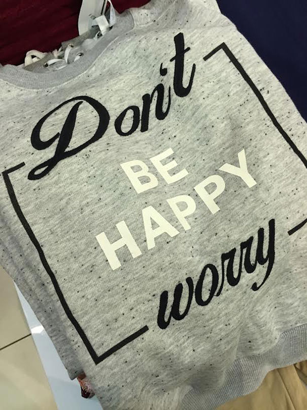
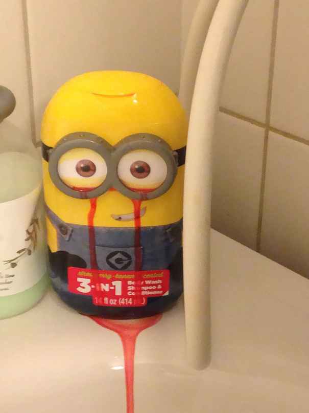
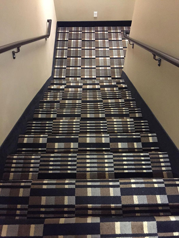
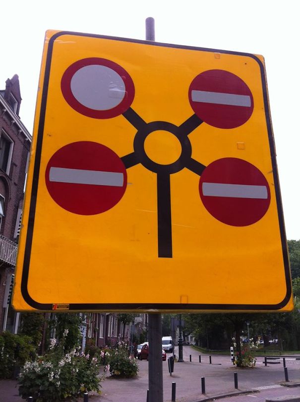
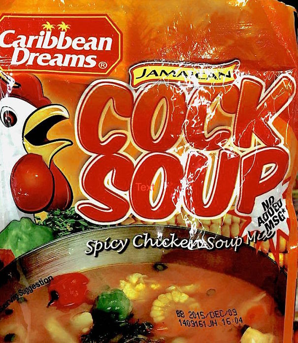
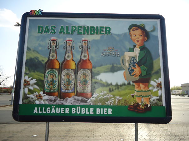
Before deciding on how your shop sign, book cover or even a newspaper is going to look, you should definitely reexamine the final draft. From these bad design examples, though, you can see, that they were not revised. Or were left as they are as some evil joke to the customer. If you do not desire to be left with doors that only open for a Jedi, a Minion shampoo bottle crying bloody tears, or a street sign that's utterly indecipherable - better not mess with the designer.
These funny design fails are here to show you, that good designers usually deserve more credit than they get. They put up with a lot more nonsense from clients than we think, and they can prevent you from making unfortunate design choices like the ones on this list. If you don't want to end up looking foolish, a good designer is worth the money!
So scroll through our list of design fails, and remember - what you pay for is what you get!
This post may include affiliate links.
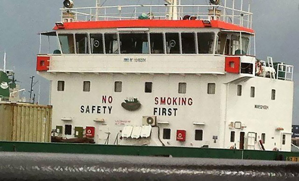
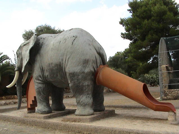
No Safety
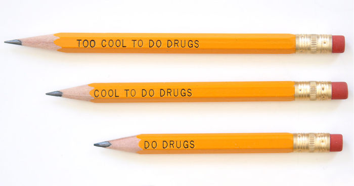
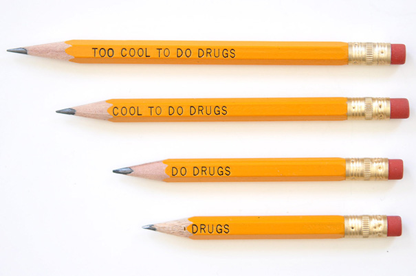
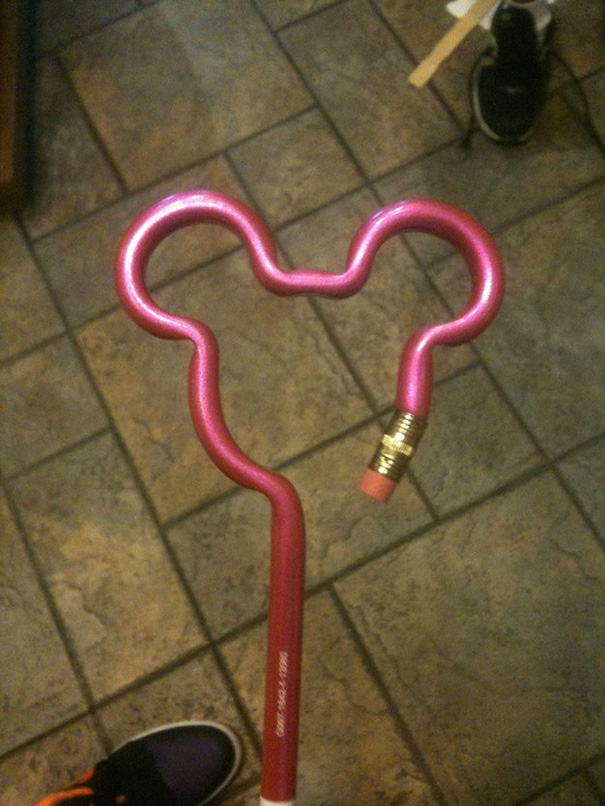
The Too Cool To Do Drugs Pencil
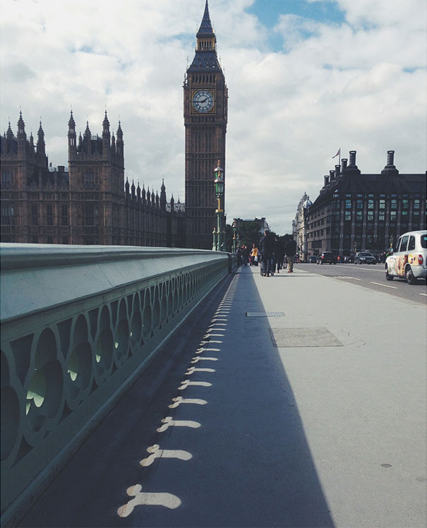
Westminster Bridge Design Fail Or Win?
Thanks For The Advice
My Mom Bought A Strawberry Scented Minion Shampoo For My Little Brother
Don't Think The Owner Of This Hotel Thought This Through
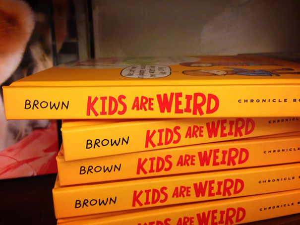
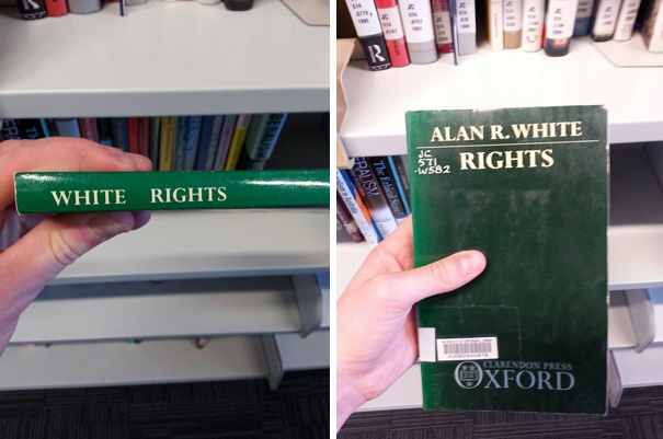
Probably Should Have Put The Author's Name Somewhere Else
being half east indian I think I am gonna get myself a copy and figure out why I'm so weird
Who Thought Up This Design?
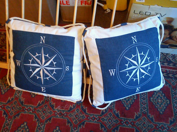
This Designer Hasn’t Looked At A Compass In A While
This Newspaper
Here in NL there is a wine shop called Grapedistrict. There was one opposite my house and the light of the G didnt work. So for a month or so I lived opposite Rapedistrict...
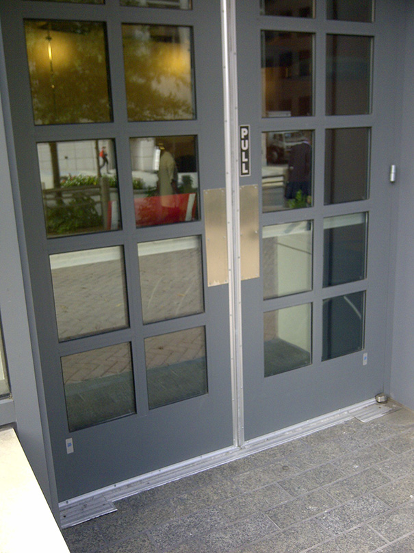
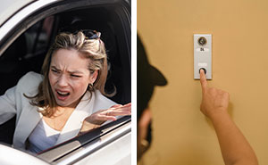
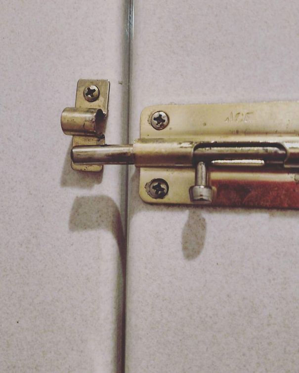
Jedi Entrance Only
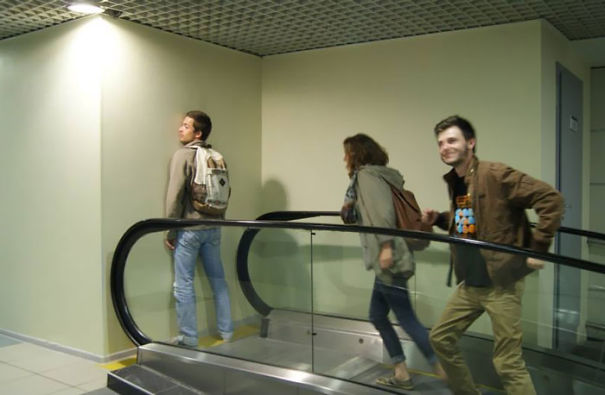
This Escalator
That Nose Job
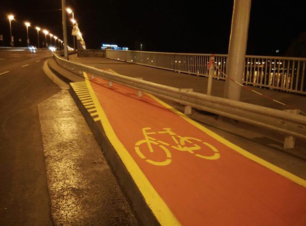
Take A Left And Then Bunnyhop To Your Destination
Hehe thisone is in Budapest, here that was still under construction, now it's 100% ready, and you don't have to bunnyhop anymore.:)
This Seems Like A Bad Idea
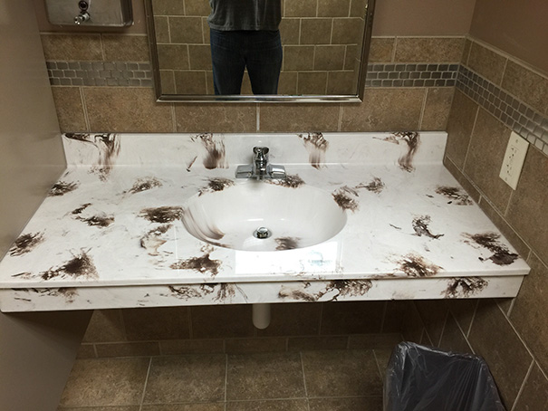
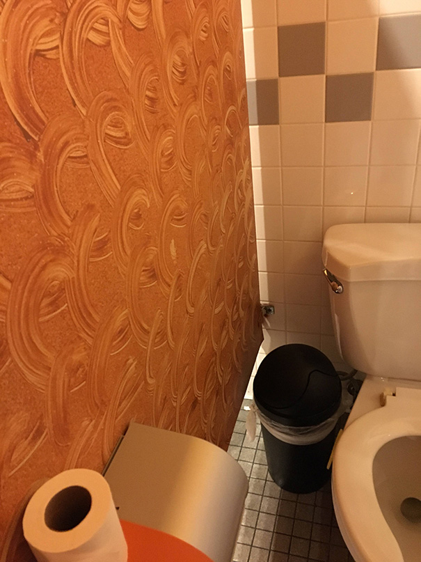
Not Exactly The Color Pattern You Like To See In A Bathroom
Looks like some kids took over, or someone was severely constipated!
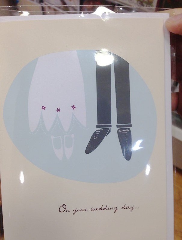
This Wedding Card Looks Like The Bride & Groom Hung Themselves
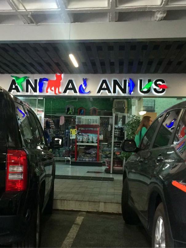
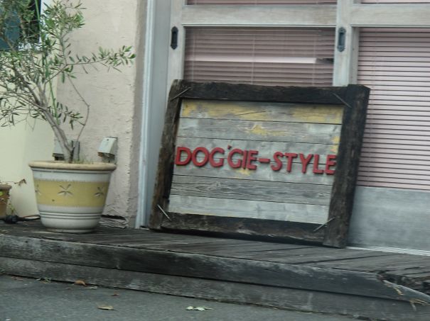
This Pet Shop Sign
Omg. Even if it didn't look like it says a**l a**s, that just practically impossible to read! Total design fail!
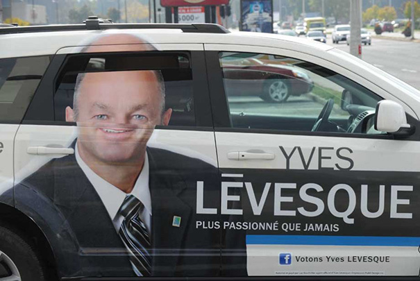
Vote For Yves Lévesque, Official Facefolding Candidate
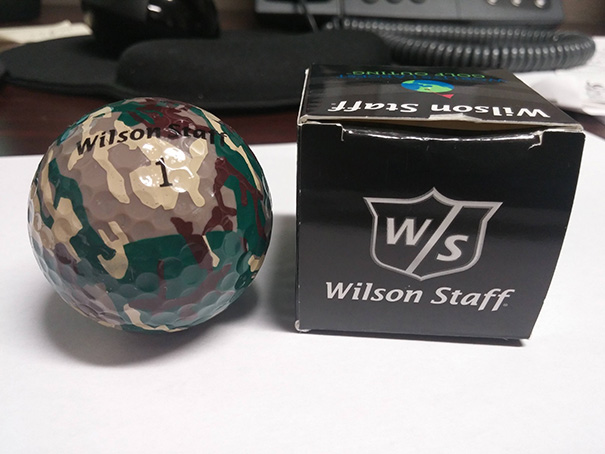
I Received The Most Useless Item Ever At A Golf Tournament
It's a golf ball, the joke is it's camouflage, you won't be able to find your ball
How Is This Supposed To Work?
Obviously for a unicycle wheelchair. They were all the rage in the 50s.
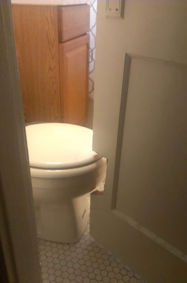
This Bathroom Door Is Cut Out So It Could Swing Past The Toilet
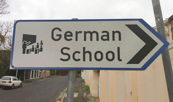
German School
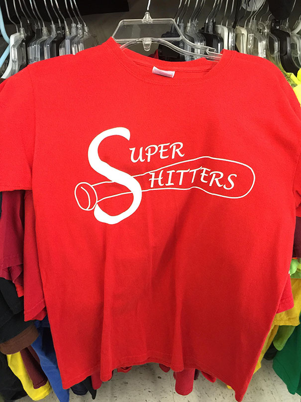
Seems Like An Appropriate Jersey
How Many Noses Does This Guy Really Need?
White Rights
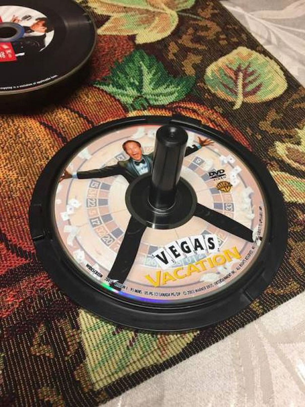
This Cd
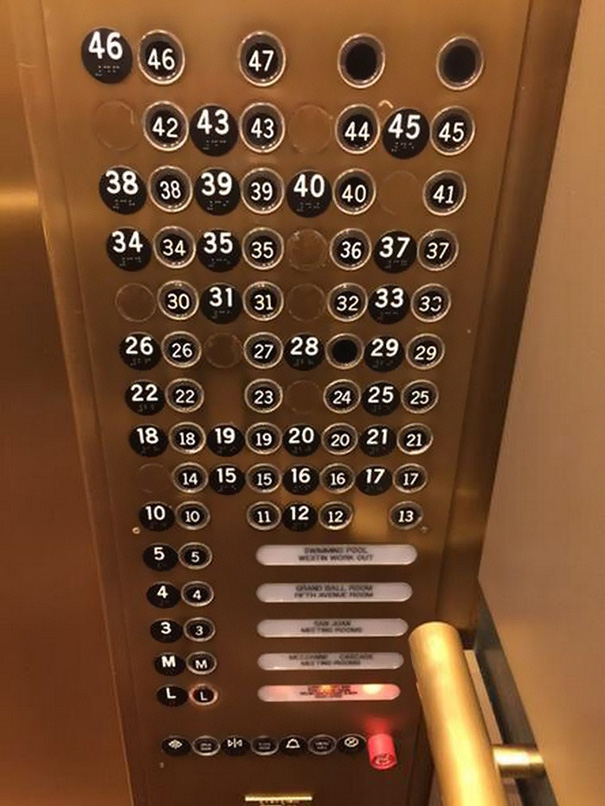
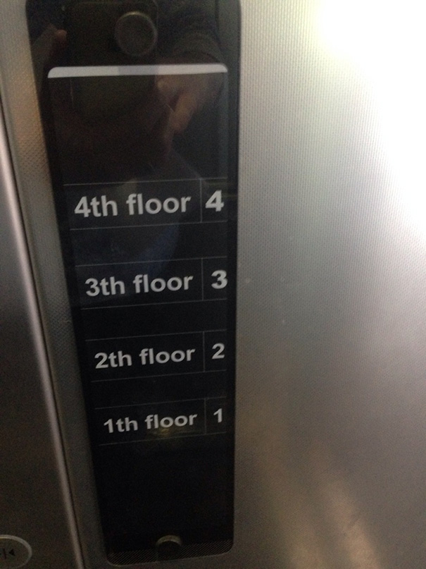
This Elevator Button Panel
They Tried
This Elevator
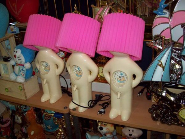
Kids Lamp Design Fail
This Insight Might Be An Oversight, But Then There's That Look On His Face....
What's The Point Of The Eraser?
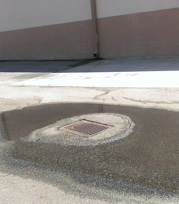
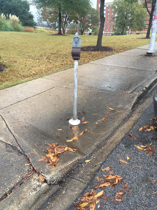
This Drain Is Higher Than The Ground Surrounding It
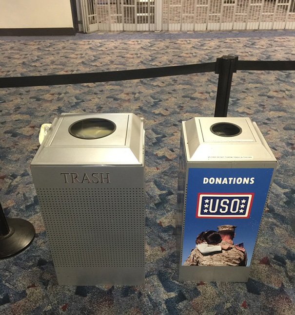
Maybe Don't Put It Next To A Trash Can Shaped Exactly Like It?
Seen these at the airport. Likely a sign beside it explaining it is for unopened liquids that are too big to get through security. Actually a neat idea.
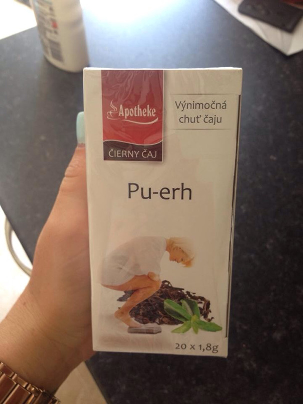
Apparently The Tea Helps You Lose Weight. The Picture And Name Must Be How You Lose It
Lol no, 普洱茶 which you pronounce it as 'Pu-er' in Chinese is a very healthy tea that dose indeed help with digestion (+ other health benefits). Reason why it is called 'Pu'er' is because the tea originated from Pu'er city located in Yunnan Province in China, hence Pu'er tea. Its other name is 滇青茶 which means 'Yunnan green tea'.
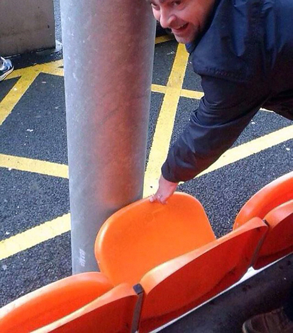
A Bolton Fan Paid £25 For This Seat In The Away End At Blackpool
Hope This Toilet Never Needs A Repair
Bad Product Design
This Painting Design Looks Literally Crappy
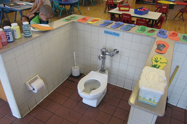
All Toilets Must Be Centered In The Middle Of The Classroom So Kids Eating Their Snacks Three Feet Away Can Bare Witness To Their Classmates Defecating
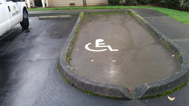
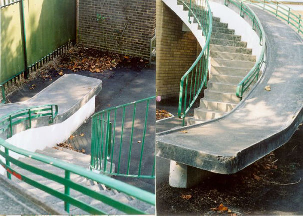
Wheel Chair Ramp
Instituto De Estudos Orientais
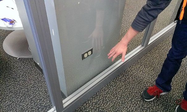
This Outlet Is Unreachable
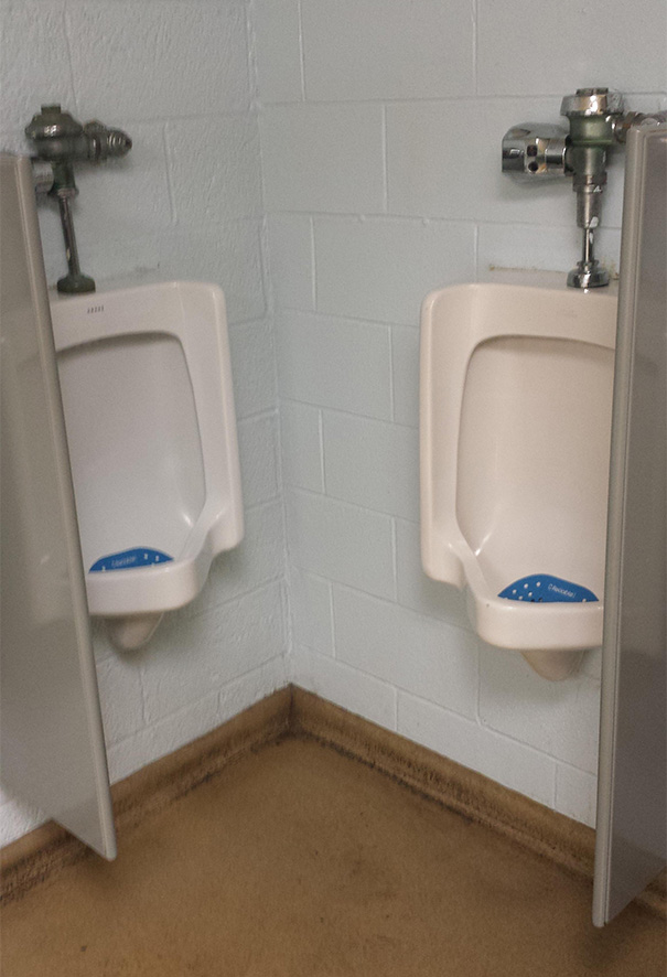
Our Freshly Remodeled Bathroom At Work
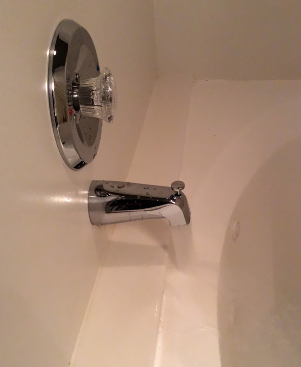
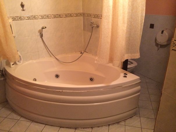
My Hotel's Jetted Tub
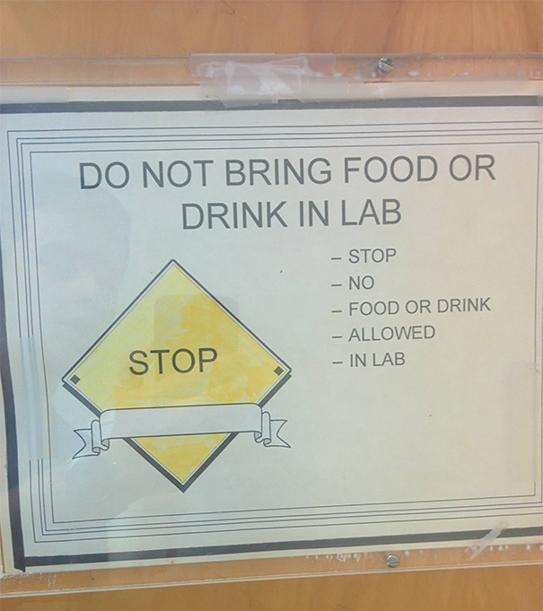
This Sign From Work
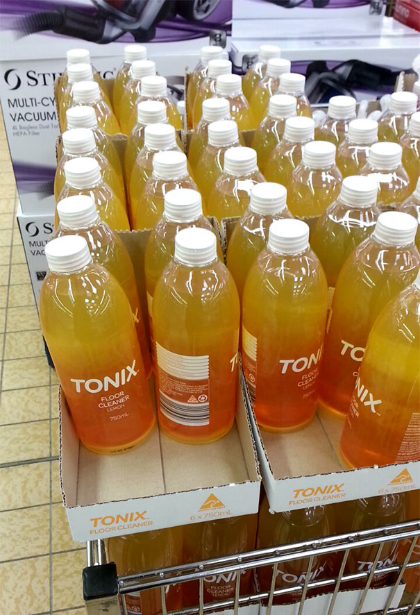
Tonix Sounds Like A Soft Drink
Ikea Fail
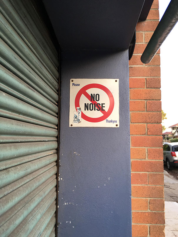
No No Noise
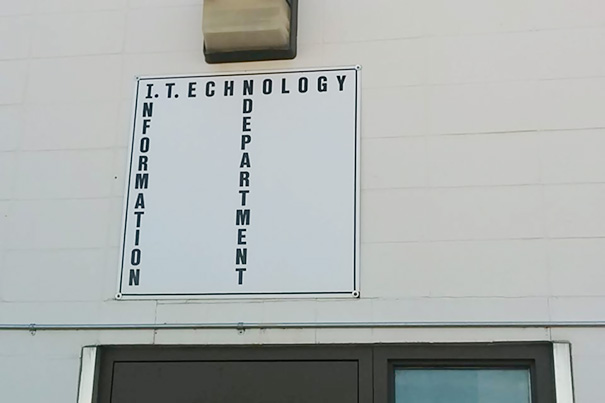
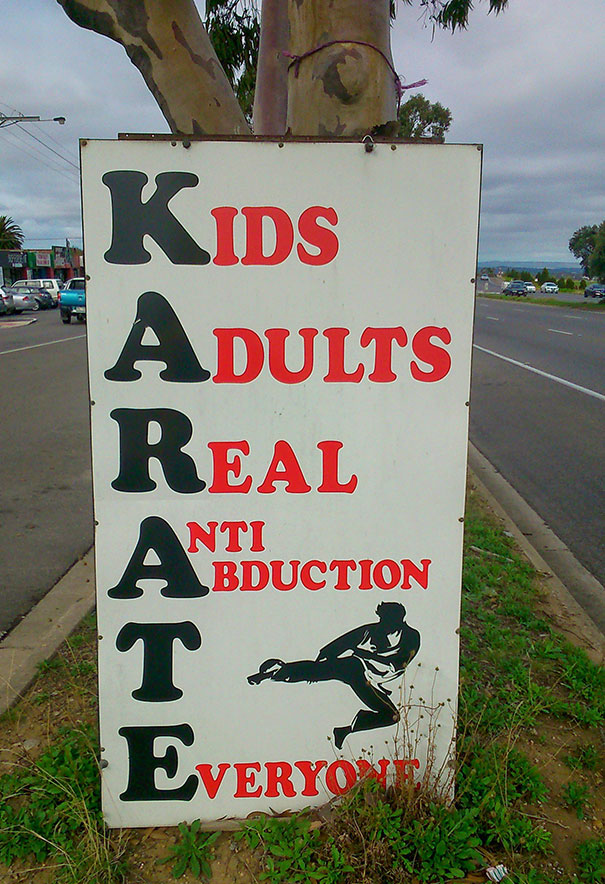
Don't Declare The Winner Of The 'most Forced Acronym' Award Just Yet
Local High School, Why?
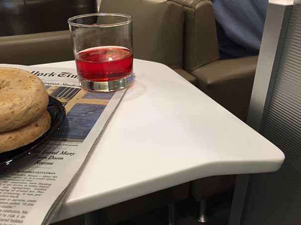
Worst. Table. Ever. Set Down Your Drink On That Side, It Ends Up On The Floor
It looks like a cramped area. Maybe it was designed so that people don't leave their drinks on the edge of the table where it might be knocked off? Potentially a rather clever design.
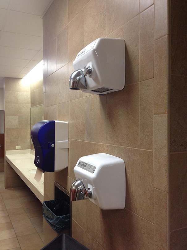
Yea, Right On Top Of Each Other Should Work
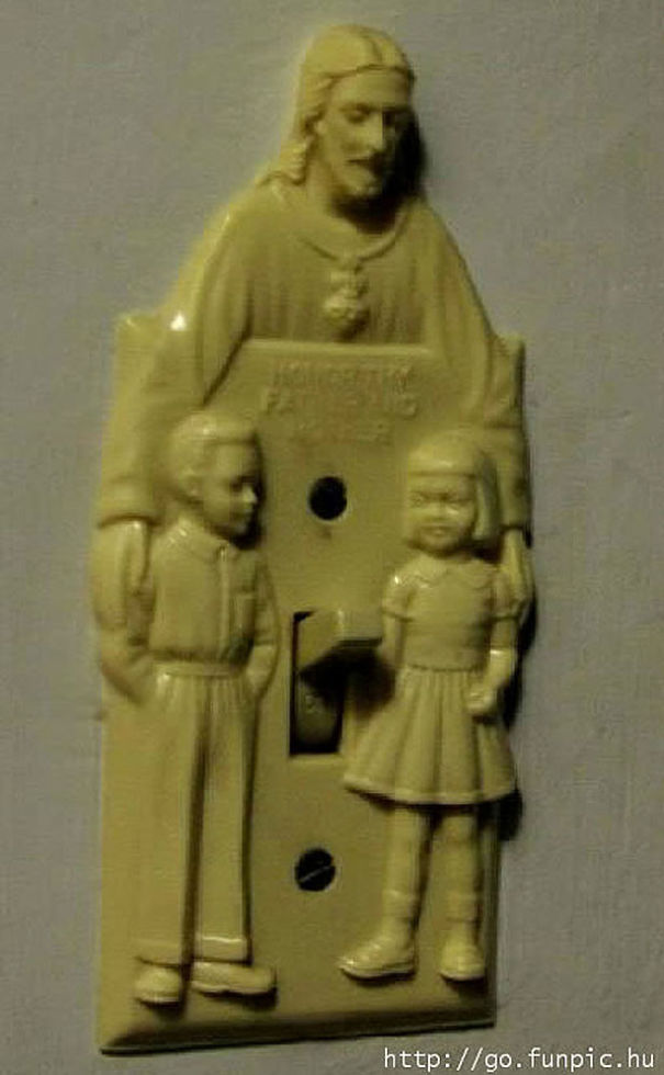
Turn Jesus On, And See The Light.
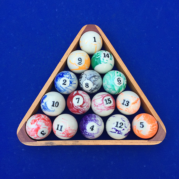
Am I Swirls Or... More Swirls?
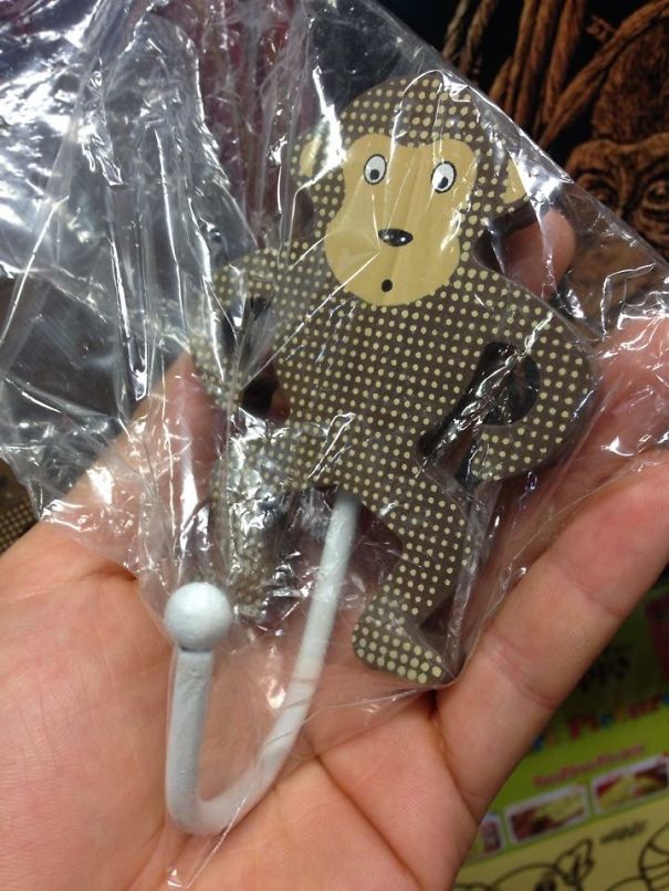
Hilariously Inappropriate Children's Coat Hook.p
Wheelchair Escape Route
This is at the back of a care home, now demolished but not because of its poor safety provision...
Painfully Crappy. On A Door At My Local College
Optical Illusion
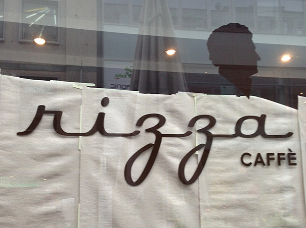
The Rizza Caffè
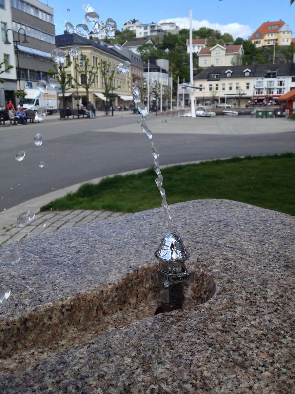
Drinking Fountain
Vintace? That's A New Designer, Right?
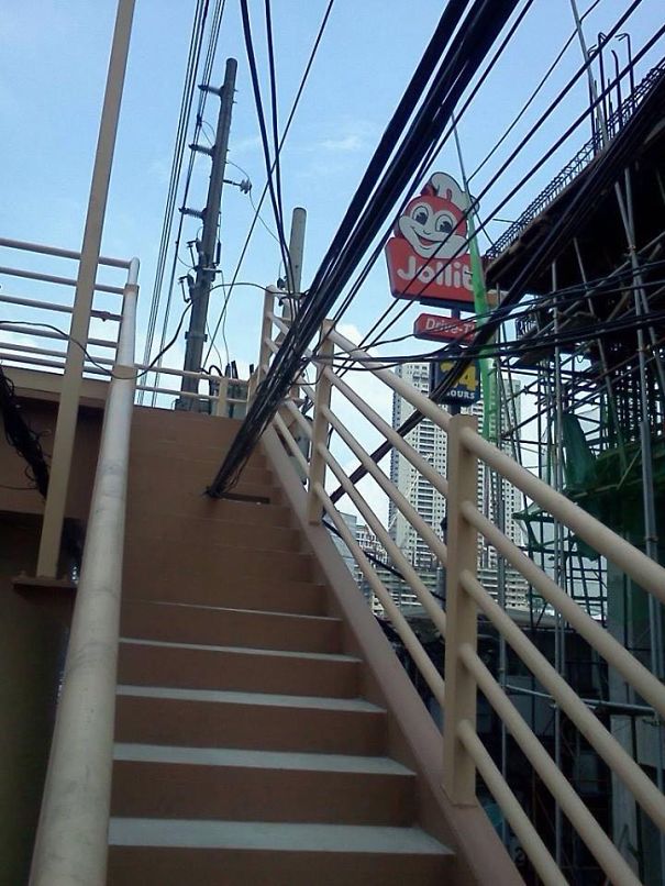
#onlyinthephilippines
Going Nowhere
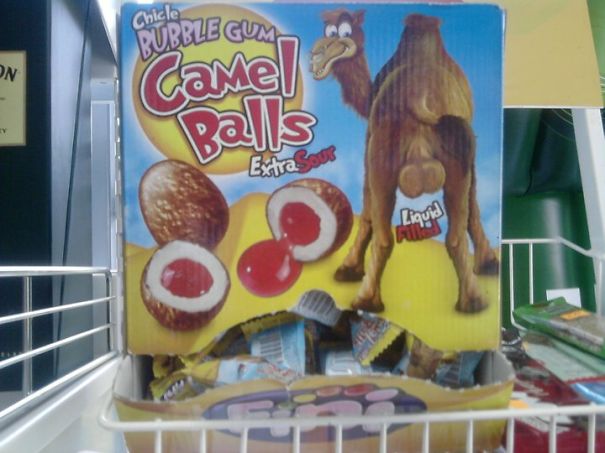
Gum?
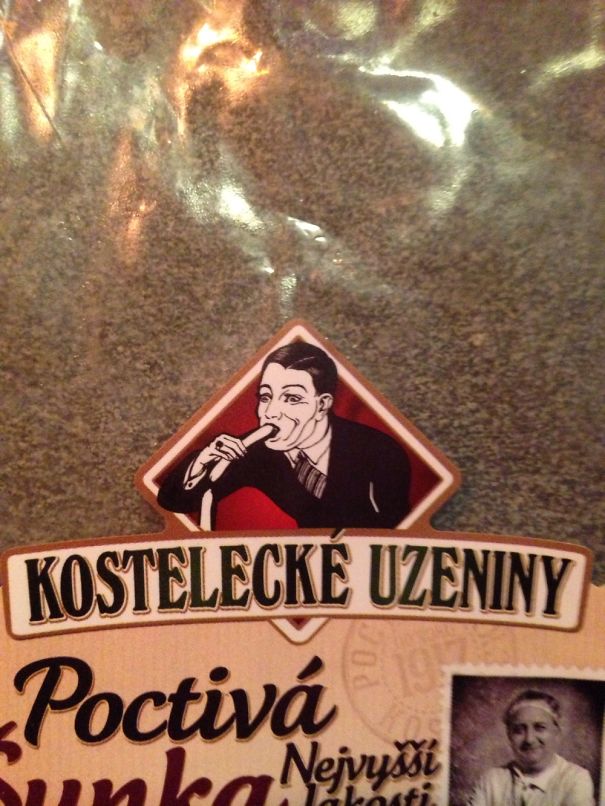
Much Taste, So Yummy Sausage!
The Sign Says It All.
Strangle-me Elmo?
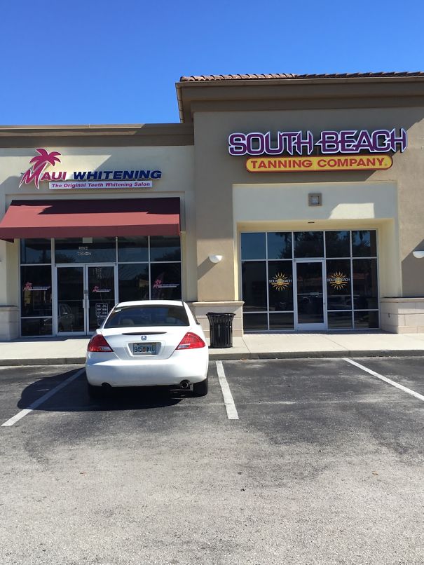
There Have Been A Lot Of Bad Tanning Reviews Recently...
I guess tanning on one side and whitening on the other? Not sure though
I Don't Know, This Is Too Risky....
Nitra, Slovakia (shared Form Fb Page Bekim /život=párty/
This is from nitra in Slovakia and if you look closely you'll see the disabled sign after the doors. The text basically says "Disabled in the nitrian shopping center should park for example also inside the doors.
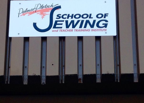
Do I Bring My Sewing Kit Or A Dreidel?
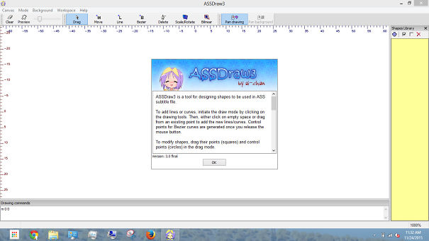
Assdraw3
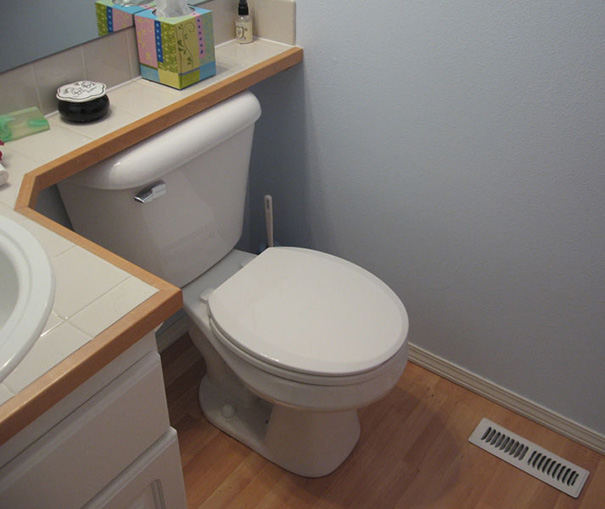
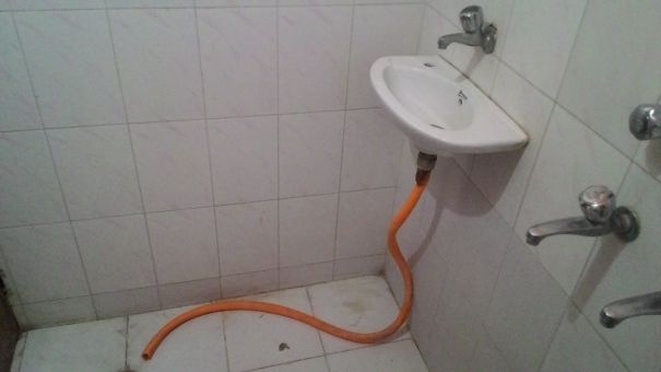
When The Wash Basin Was An Afterthought Rather Than Part Of The Plan
Did The Architect Confuse Left And Right?
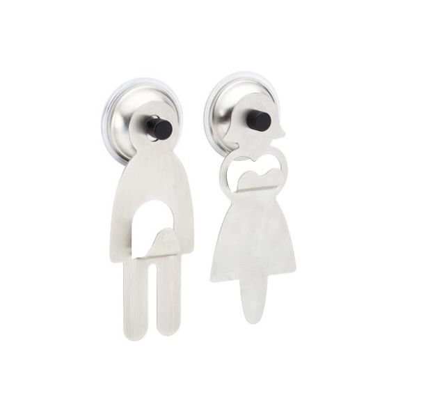
"decent" Towel Hanger For Your Bathroom
cuz that's totally appropriate! The woman has boobs and the man has a d**k"

 Dark Mode
  No fees, cancel anytime


