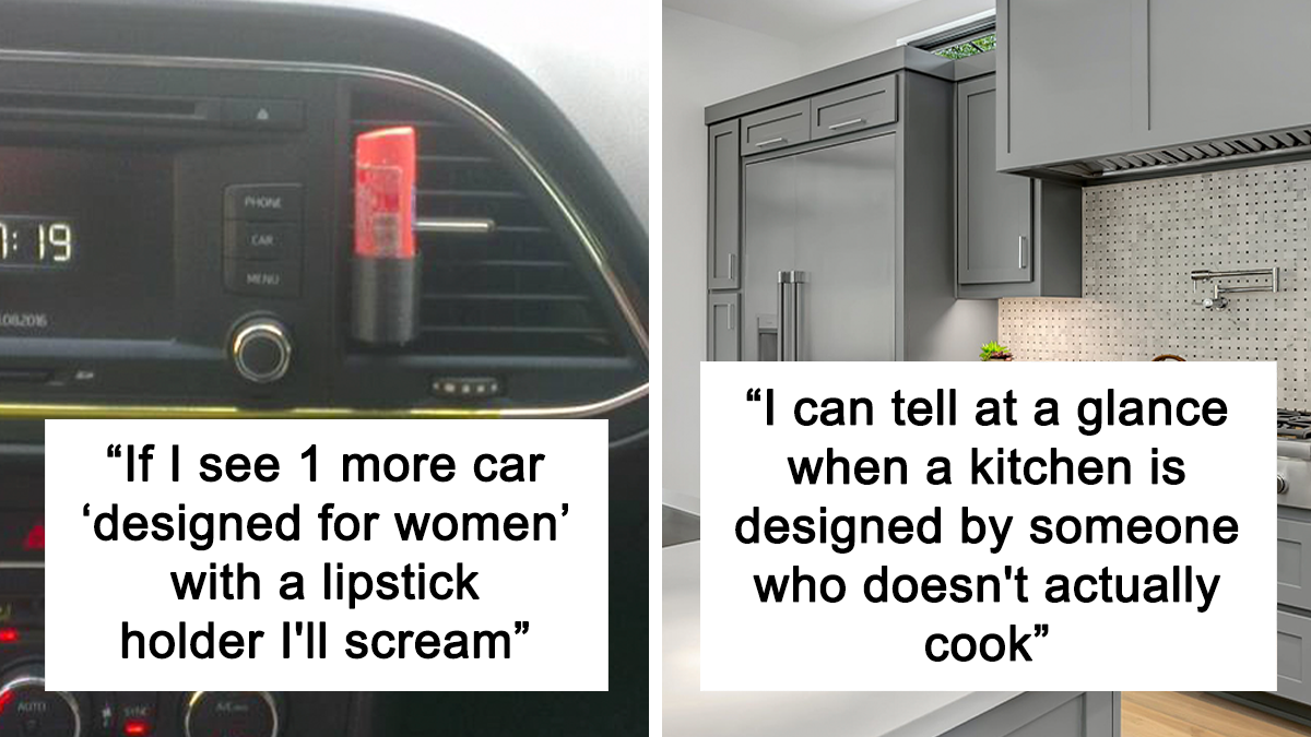
30 Mistakes Made By Designers And Architects Who Didn’t Think Of The Person Who’d Be Using Their Designs
When it comes to designing things for city living, whether it’s the infrastructure or even little details—like park benches or public washrooms, you expect they will be made with people in mind. But it turns out that’s often far from the case.
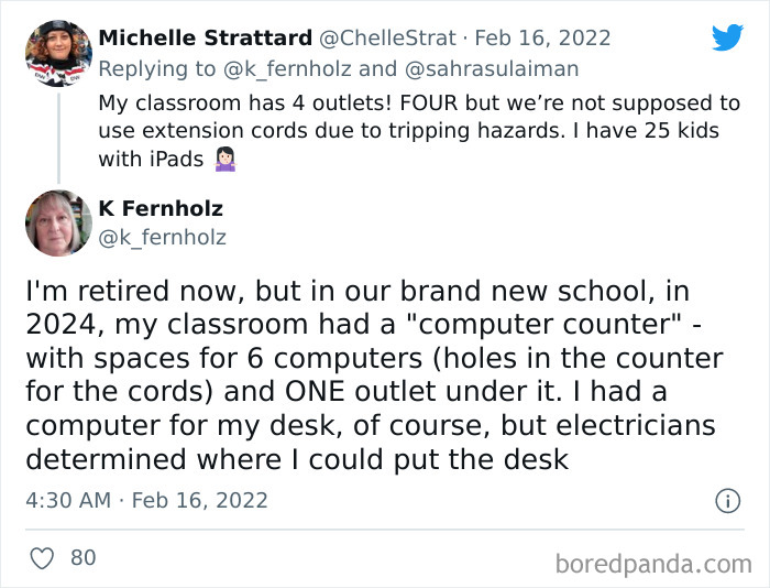
Recently, Sahra Sulaiman, the communities editor for Streetsblog L.A., shared an illuminating thread about soap dispensers in LAX bathrooms. “The worker struggling to refill soaps in the LAX bathroom said she just wished architects and designers consulted with the workers that had to maintain the spaces about whether their form would actually be functional,” she wrote in a tweet amassing 126k likes.
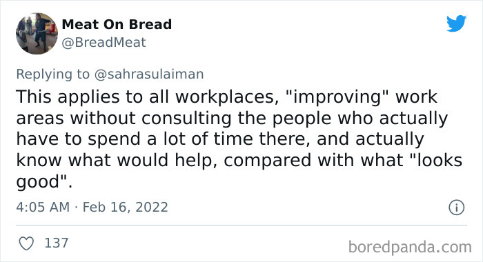
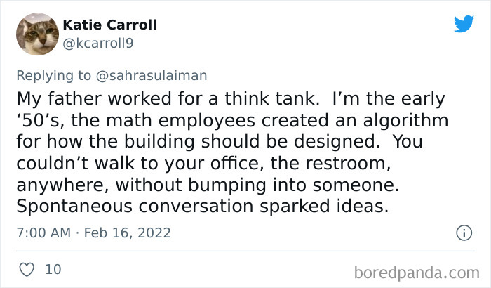
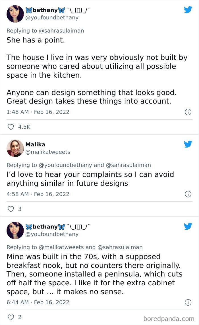
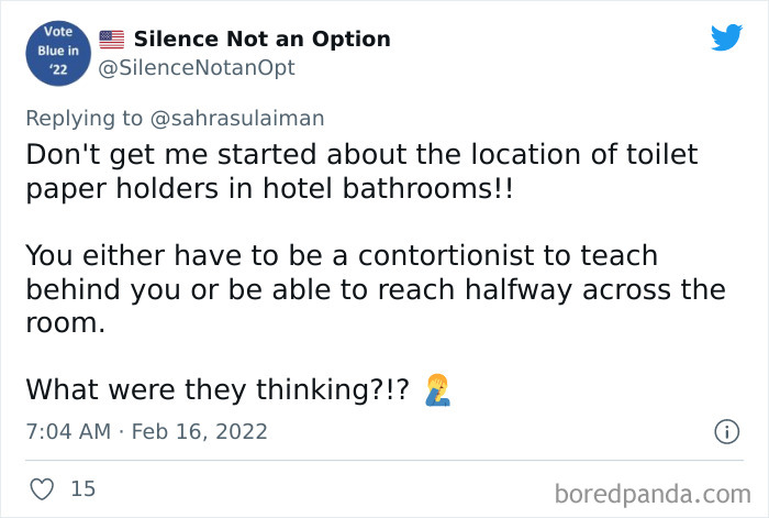
Soon it became clear that Sahra is not the only one frustrated by how nonfunctionally public spaces are sometimes designed. More people joined the thread to share their own observations and experiences, so dear designers and architects, please take notes!
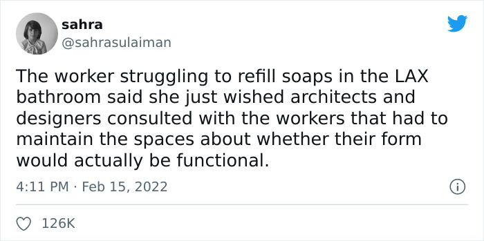
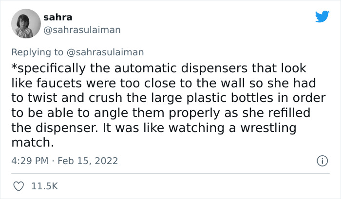

Image credits: sahrasulaiman
This post may include affiliate links.
Oh yeah the neverending ponytail and bun struggle is real... my SO always tells me I look like the Bendneck Lady when I drive lol
Urban design is concerned with the arrangement, appearance and function of our suburbs, towns and cities. It is both a process and an outcome of creating localities in which people live, engage with each other, and engage with the physical place around them in the modern world.
According to the United Nations (U.N.), 68% of the world’s population will live in urban areas by 2050, compared with 2% at the beginning of the 19th century, 30% in 1950 and 55% in 2018. The current urbanization is represented in hard-to-believe figures. The world’s largest city, Tokyo, which had a population of roughly 37 million in 2020, is expected to be overtaken in 2028 by New Delhi, the capital of India.
Also, in Japan, bathrooms have a sort of ledge where you can place your stuff while using the urinals. There are also hooks to hang your umbrella or bags.
Because that would be using common sense! Apparently this too is a waning commodity!
But you don’t have to look at metropolises to realize how much and how fast our environment is changing. Pick just about any city, the one that you live in right now, and it will seem both familiar and new at the same time. So today designers and urban planners face incredible challenges—to make sure the public spaces, infrastructure, and resources cater to the people who live there.
There are many ways to approach urban development that promote healthy living and longevity through a variety of design practices. Areas called “Blue Zones” are one of them. Dan Buettner, the author of the concept who wrote about for National Geographic, found that these communities had lower incidents of cancer and heart disease, fewer cases of dementia and Alzheimer’s disease, a higher percentage of the population in their 90s and 100s, and were generally happier.
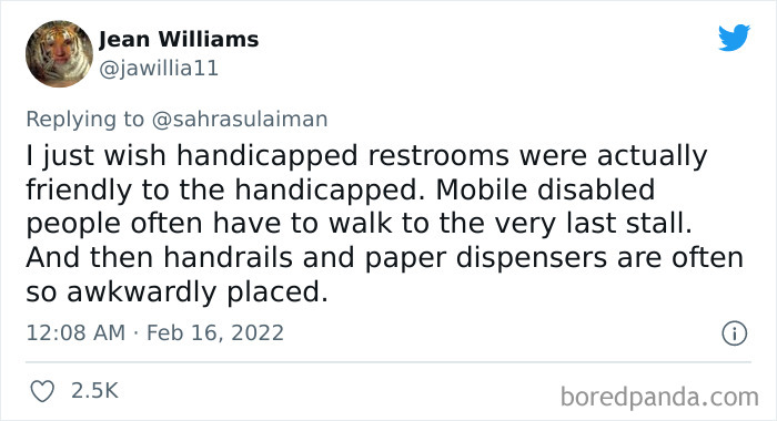
In general things are designed with the worst way for handicap people. Urban architects and engineers should live a month in a wheelchair or with a stroller before they do things. For example the metro at my parents city is """adapted""" for us, they put a beautiful sticker and cheered of how amazing they are. The metros are taller than the platforms and it leaves a small step. Small enough that a walking person wont notice but bit enough that my disabilities scotter cannot get there...
BP taught me that those gaps in the stalls i an American thing. Sooo happy we dont have those
According to Joe Pobiner, Planning and Urban Design expert and advisor, urban design that follows the concept of Blue Zones includes: walkable environments to reduce the need for cars; increased vertical density and mixed-use diversity to encourage walking; a mix of housing options to encourage a multi-generational population; a mix of development types beyond residential and office spaces; local gathering places, parks, and plazas; locally owned farm-to-table restaurants; community gardens and rooftop gardens, and so on.
Yeah, we got a new delivery ramp years back, so we do not need to use the public entrance anymore. Turns out we use the public entrance since them anyways, because the ramp is highly unsafe and horrible to work with. The architect is still mad at us, he think, it was a great idea.
Pobiner argues that today, walkability and access to green spaces are top selling points. “Buyers want neighborhoods that offer new architecture, land uses, and technology—areas that create 'intelligent' density conducive to walking and biking, and that are less costly and more sustainable,” he explains.
You can't hang it on the hook at the top of the door if it has one - it can be reached by a determined thief. And who wants to put it on the floor
I had to get a glob of soap on my hands and let a little girl swipe it off because the soap dispensers were impossible for her to reach. This was at a ski resort, with ski schools and everything. Main lodge at the bottom of the mountain
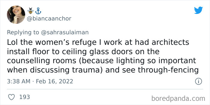
Yeah, place where I used to work had floor to ceiling glass walls on conference rooms. Then they had to add curtains because you know, sometimes you might be sharing something you can't announce to the whole company. Also it is a distraction when you are in a meeting in a glass cube and you see people outside the cube passing by.
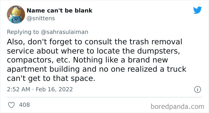
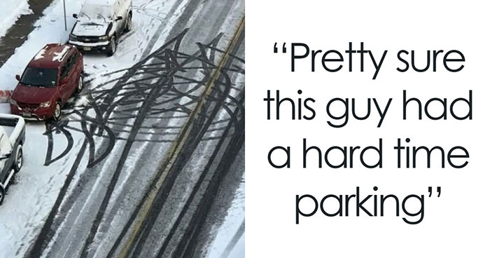
And how about designing parking lots in northern climates that snow plows can actually maneuver around
I have repeatedly seen paper towel dispensers that you grab the towel to pull some out, but the damn thing is set so tight all you get is a very small handful of paper. Bloody useless.
At a school I taught in they put the drains in the center but sloped the floors UPWARDS towards the drains. So nothing would run in the drain unless the entire room was flooded with 1.5 inches of liquid. Our poor janitor was always fighting with the bathrooms and especially the ones for the little kids with bad aim. He'd have to hose the floor down and then sweep the pissy water towards the drains for a half hour to attempt to clean things.
The Communications Building at my University was built with such thick walls no one had cell service inside.
Also dishwashers! It's bad enough having to bend down to load one (really, can't the top be higher than the bench without causing armageddon?) but when you have to twist as well to reach the place where dirty dishes are stored before going in then that's just beyond irritating. Also, if I can't walk past it when the door is open I am not happy.
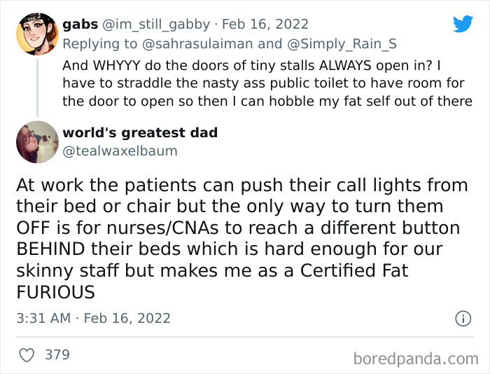
Airport Bathroom stall doors should always open out, so you can wheel your suitcase in and still be able to close the door.
Well. That IS the point of a sloped roof, especially when the weather gets warmer, you don't want that heavy combination of snow and water on your roof. Homeowners should remove the snow from the sidewalk, though.
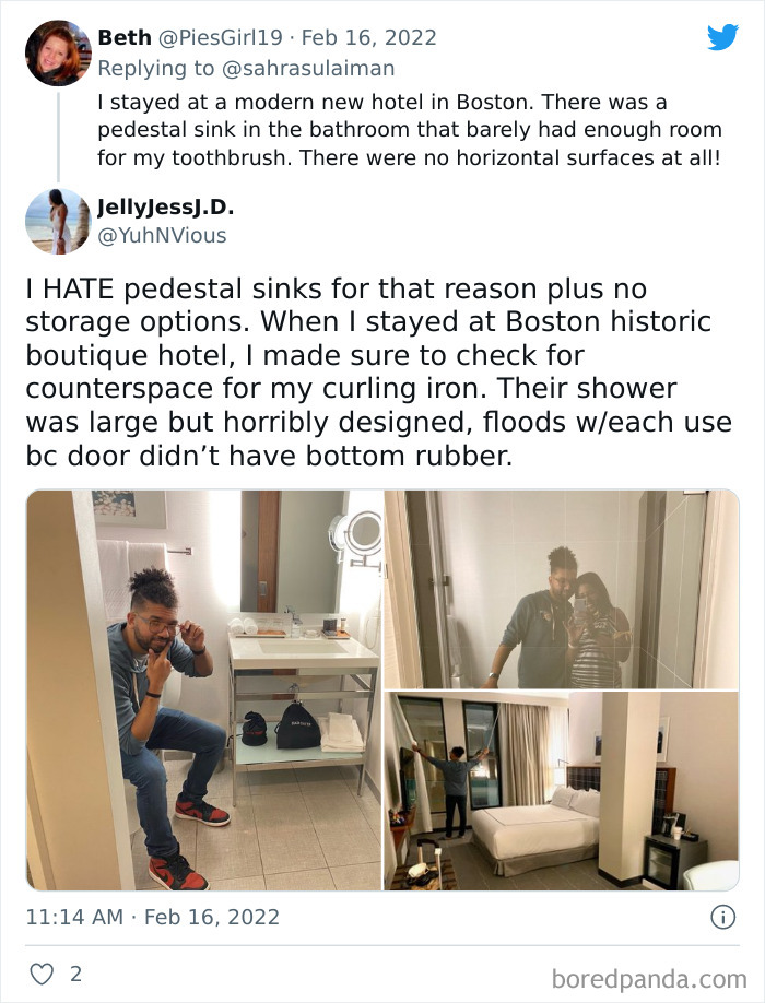
I personally like a pedestal sink. It discourages clutter and is easy to clean and very sleek looking
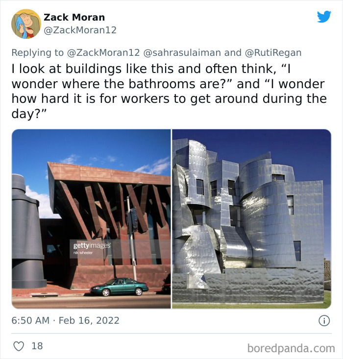
in the case of the second one "If I park here will the building melt my car"
I'll add to this - architects who design hospitals. It's all lovely having double/triple-height ceilings to create the feel of light and space, but try cleaning up there! Skylight windows also get full of cobwebs our cleaning teams struggle to reach without injuring themselves. Architectural features with little dust-collecting ledges are also a pain. We wish they would think about how their designs might make cleaning difficult and therefore not help us control infection so well.
100% agree with that, have seen some really great hospital designs (for example one where the linoleum in corridors curved up and ended up flush with the wall surface, so there were no skirting ledges to gather dust or corners that couldn't be mopped). Then when they built a new local hospital near me, standard hallways and rooms, then a central atrium which everything looked over with glass lifts and windowsills at every window. Result was it was impossible to keep clean, soon every room has a view of a sill with dust and detritus on it, and the top of the lifts are filthy and can be seen from inside, as well as all the windows above.
Load More Replies...Like I said in another comment. I hate how badly designed things are if you are handicapped. Urban architects and engineers should live a month in a wheelchair or with a stroller before they do things. For example the metro at my parents city is """adapted""" for us, they put a beautiful disabled sticker and cheered of how amazing they are. The metros are taller than the platforms and it leaves a small step. Small enough that a walking person wont notice but bit enough that my disabilities scotter cannot get there... The apartment where my grandma lives got their entrance renovated a few years ago to add a ramp to the elevator. They spent a fortune making it fancy. But to get to the ramp you need to go up two steps. My gran goes on a wheelchair and cannot get out of her appartment without help...
I absolutely agree. Chair user here. Things might be "ADA compliant" but the designers who decided on minimum standards weren't doing us any favors. I've got more scrapes on my knuckles from rooms what were supposedly wheelchair friendly but were too narrow to move in. Take our town hall - the handicap ramp is located down the block and it's closed off by a chained and locked gate which nobody knows where the key is. However, handicap parking is in front, so you have to roll down the block to come back up (if they have the key). I tried to go to a town meeting to complain and couldn't even get in because of the stairs. Their response - "we put the parking close, that's good enough." WTF?!
Load More Replies...Once a public restroom I was using regularly was vandalized in the most useful way possible: Someone brought a large nail and drove it into the door on the inside. He was heavily fined for it and banned from the presmises, but of course they let the nail in place, as it was the perfect height to hang coats, as none of the original planners had thought of adding a clothing hook. Of course, this was a european style toilet, with an actual door and no gap...

 Dark Mode

 No fees, cancel anytime


