A logo is a very important asset to any brand, but what sometimes really makes it stand out is a friendly mascot. Some of them are with the companies from the very initiation of the business and some come along over the years, creating that special touch in branding. The mascots change over the years, anything from slight touch-ups to completely successful revamps or occasionally spurring a ‘why tho’ reaction.
Bored Panda selected a few mascots from popular companies to compare the now-and-then looks of these now-iconic symbols. Some of them might take you down memory lane and a few new ones might make you look twice. Share in the comments whether you think the older or newer versions are better!
This post may include affiliate links.
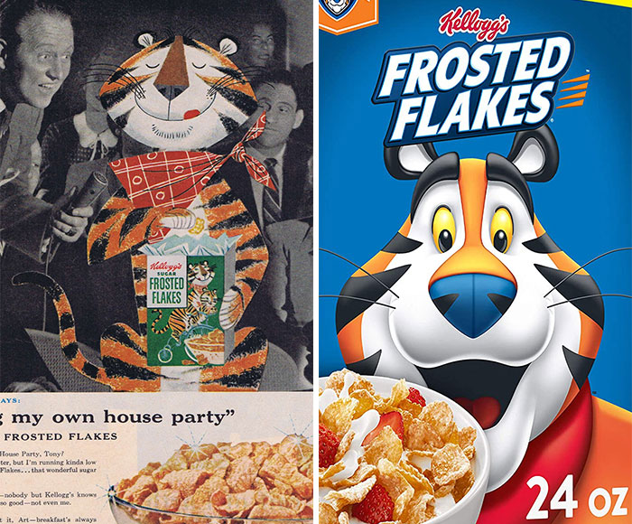
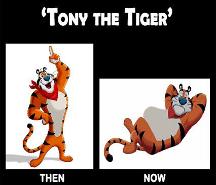
Tony The Tiger
The original design is pretty cool looking. Like something out of a children's book.
The Tiger who came to tea? tiger-6048...f2606d.jpg 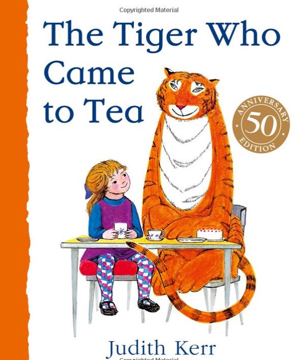
I quite like the more unique style of the older illustration.
Why did they change him to this modern one? The old one was grrreat! Plus, notice how they removed the word sugar from the box?
The "sugar" disappeared some time in the '80s, if I recall correctly.
Load More Replies...The mascots make their respective brands really easily recognizable and become a part of the product or service itself. The responsibilities that land on designers’ laps can be immense as, at the point of refreshing the recognizable icon and giving it a facelift, they can be facing quite a vast audience that sets the bar high. The expectations vs reality do not always balance out, but when the result exceeds it all, it can definitely be rewarding.
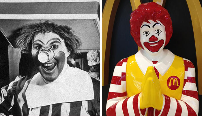
Ronald Mcdonald
IT has got absolutely nothing on the cursed Ronald McDonald. I feel like the older mascot would lurk in the "ball pit" and lure unsuspecting children with soggy nuggets and lead them to their untimely doom.
Why the random cup on his nose? I don't mind today's version, but damn, the original one is nightmarish.
Yes, because the current one brings sweet dreams???
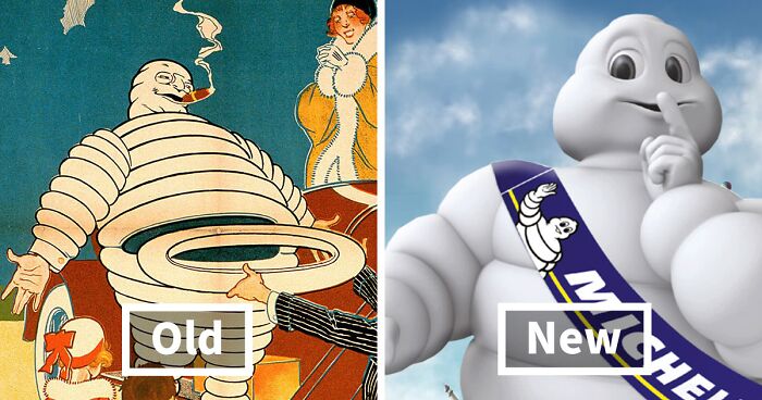
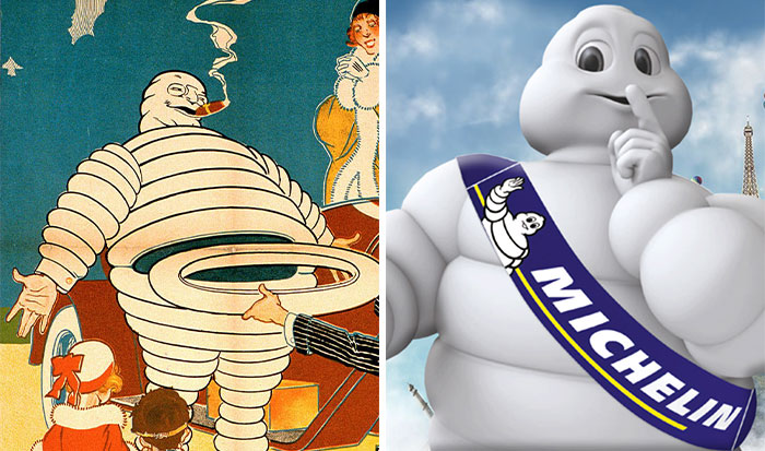
Load More Replies...Michelin Man
He's supposed to represent a stack of tires, so this does make sense.
Load More Replies...New one is better. First one looks like some sort of dream of someone who had LSD for dinner.
why why did he do it WHY Holy heck! (also, plz like this comment, I have none)
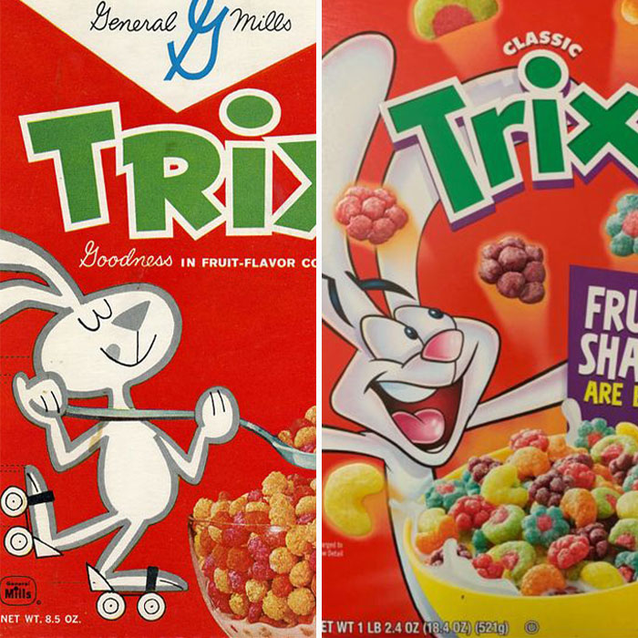
Trix Rabbit
Both boxes are old. Trix no longer have different shapes, just circles now
new one more accurately depicts the 'sugar content' and reaction
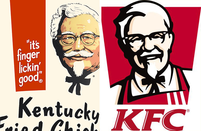
Colonel Sanders
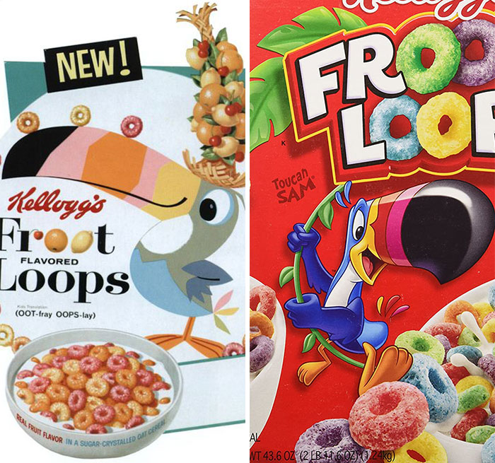
Toucan Sam
That's actually not the new Toucan Sam. The new one is just... weird. Ultra bright colors, and a mouth on the side of the beak
https://www.google.com/search?q=toucan+sam&rlz=1CABUJY_enUS863&source=lnms&tbm=isch&sa=X&ved=2ahUKEwjw1Zn1kabvAhWDGs0KHRlmD6kQ_AUoAXoECBQQAw&biw=1517&bih=750&safe=active&ssui=on#imgrc=g9VOaiSb-KQQgM
Load More Replies...Doesn't he look like this now? I love the original one--very cute. d69-6047d4...449c72.jpg 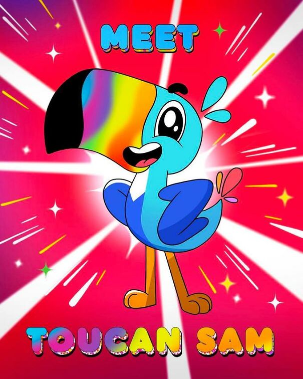
what ze f*ck he looks like he shredded the corpse of the powerpuff girls reboot and snorted it
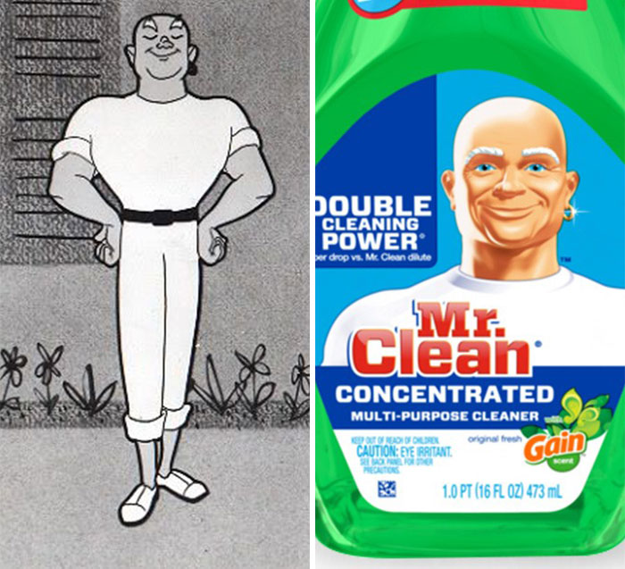
Load More Replies...Mr Clean
his products clean so well he cleaned his hair off
Load More Replies...The new one looks just like an ex neighbour of mine who has just been done for rent fraud 😄
What the hell is Mr. Clean supposed to be? A genie? A sailor? Or just some rando white dude who shows up in your home?
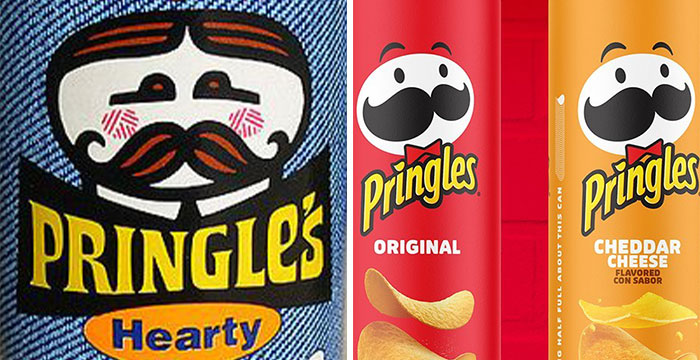
Julius Pringles
then come on over to the Philippines we still got the old one here
Load More Replies...That last one is the newest design!! They changed it recently and I miss the previous one.
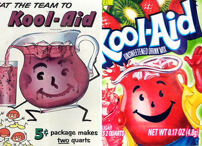
Kool-Aid Man
One is the creepy quiet kid the other is the abonoxious popular kid
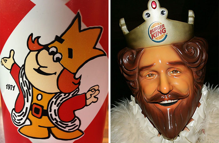
The Burger King
I don’t understand the reason for a plastic face when you could just hire an actor
Looks like he got his start in Peabody and Sherman ; and not the cgi version.
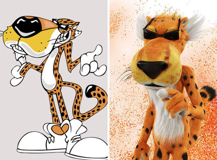
Chester Cheetah
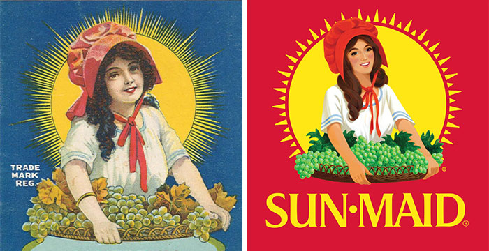
Sun-Maid
She looks like she has just been adjusted to fit current beauty standards
She went from a girl in a French vineyard to a latina-esque woman without the beauty mark.
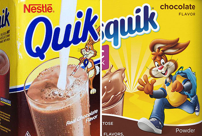
Quiky
Their consumers at the time were younger so, just for targeting consumers
Load More Replies...being able to have a giant glass of chocolate milk
Load More Replies...You know what's scary? My family has the one on the left in our food storage :0
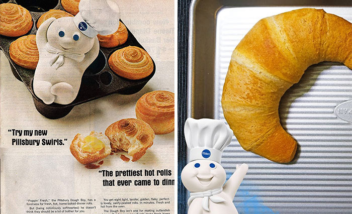
Pillsbury Doughboy
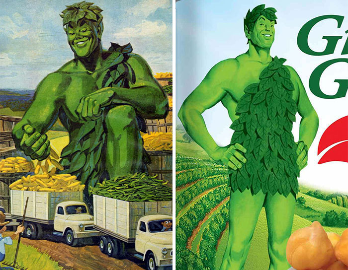
Jolly Green Giant
Old one has more life to it and texture. New one is basic/boring.
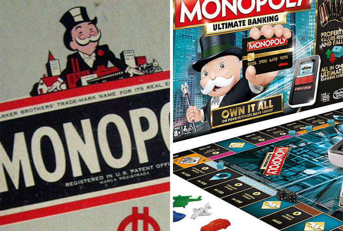
Rich Uncle Pennybags
owen was slain by suddenly realising monoply man has a name this a minecraft death message
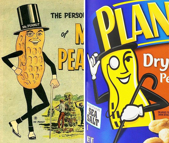
Mr Peanut
Kinda random but I can see that.
Load More Replies...LMAO THE OLD FACE LOOKS LIKE IT JUST CAME STRAIGHT OUT OF A MEME BAHAHAHAHA
Yes... as the unfortunately named "Baby Nut".
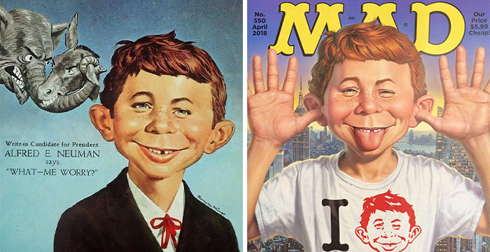
Load More Replies...Alfred E. Neuman
different shading, but not necessarily better shading. first is done by hand by an actual artist, second one is done with assistance of computers - this takes away a lot of the character and warmth and individuality. IMHO
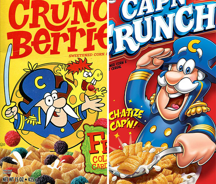
Load More Replies...Cap'n Cruch
i was wondering why there was two stripes to now three thanks
Load More Replies...He got promoted from Lieutenant to Commander. He is Commander Crunch.
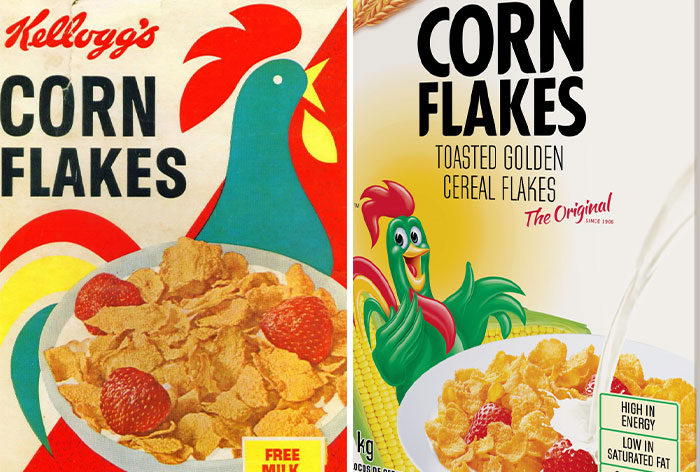
Load More Replies...Cornelius Rooster
their slogan was "breakfast is the most important meal of the day" so it isn't true, only marketing
But honestly, to all those people who skip it, you shouldn't.
Load More Replies...The new one doesn't look bland enough. Being bland was the entire point of cornflakes.
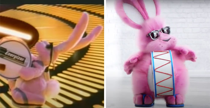
Energizer Bunny
I had no idea there was a new version and I don't like it. You want a sporty-looking rabbit to exemplify how the batteries don't wear out, not a puffy and slow-looking one.
It's not a new version, just a commercial where he gets extra floofy from putting in a new kind of batteries in.
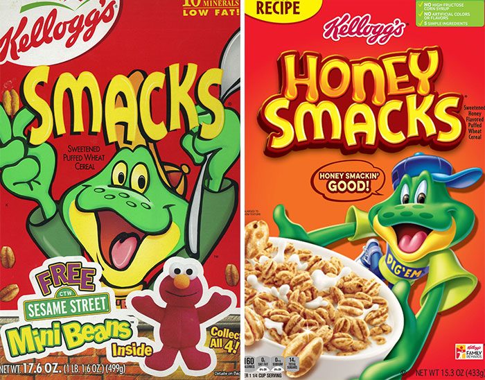
Load More Replies...Dig'em Frog
The bear with blue shirt was Super Sugar Crisp. (which also got renamed to remove the word sugar)
Load More Replies...They used to be called "Sugar Smacks" and had Quick Draw McGraw on the box!
I know them as sugar puffs and they were advertised by a huge yellow furry monster who I always wanted a hug from lol
I agree but I think this because simpler “retro” designs are coming back after the over-the-top transition logos went through in the 80s/90s.
Load More Replies...even ronald mcdonald? and the koolaid guy? and michelin man? and mr peanut? and the pringles dude?
Load More Replies...It was "Moneybags." Pennybags wouldn't make you very rich, would it?
Load More Replies...I agree but I think this because simpler “retro” designs are coming back after the over-the-top transition logos went through in the 80s/90s.
Load More Replies...even ronald mcdonald? and the koolaid guy? and michelin man? and mr peanut? and the pringles dude?
Load More Replies...It was "Moneybags." Pennybags wouldn't make you very rich, would it?
Load More Replies...
 Dark Mode

 No fees, cancel anytime