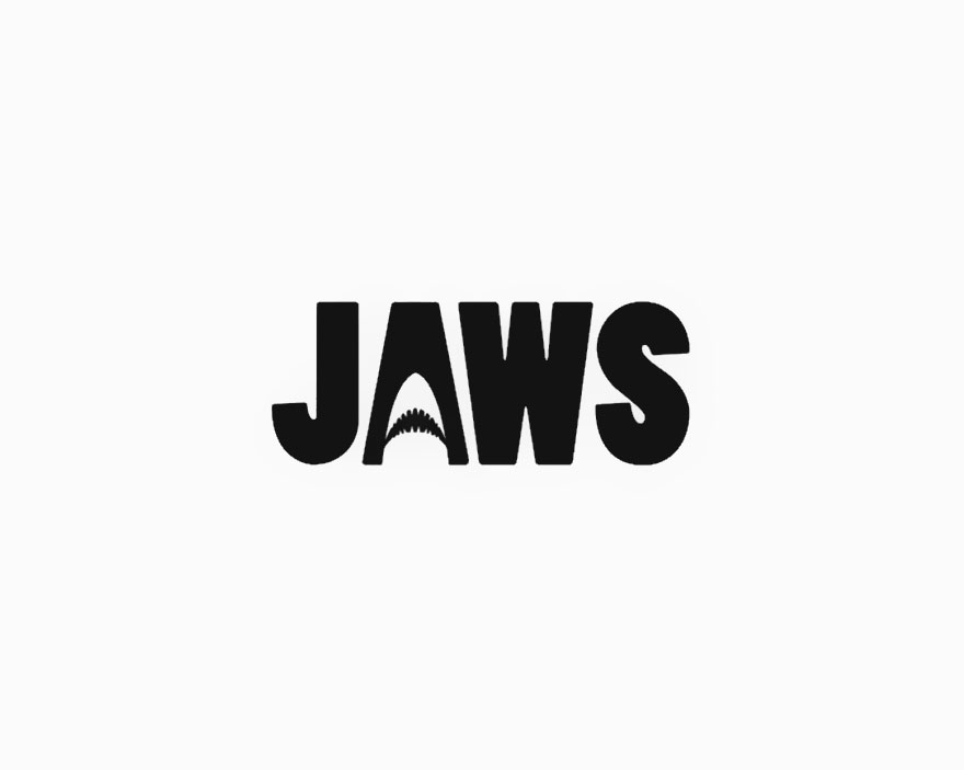
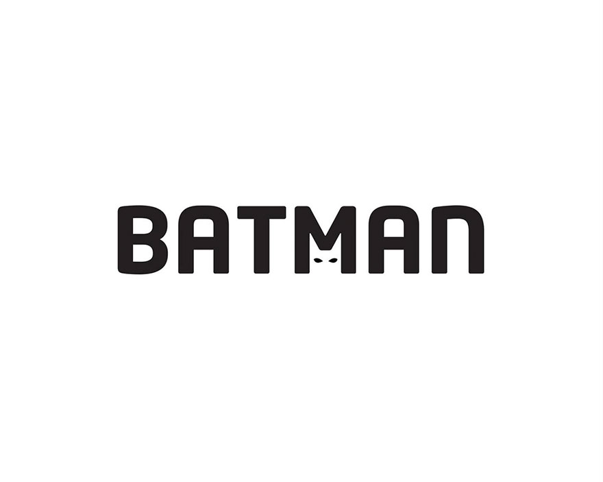
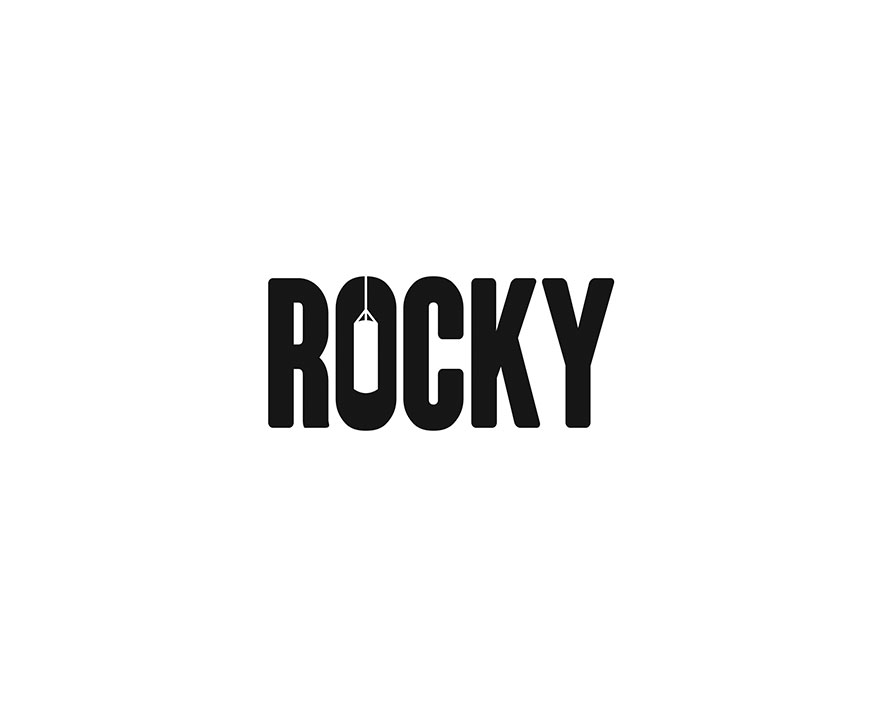
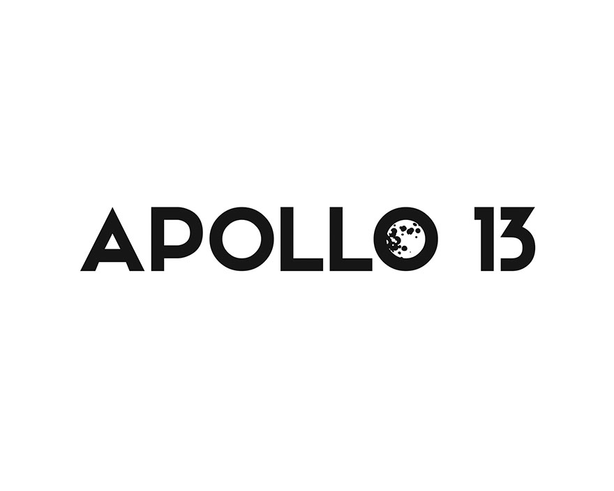
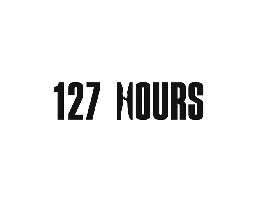
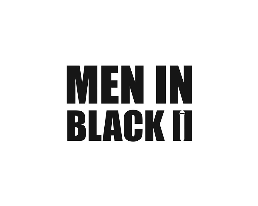
In a world already full of negativity, two junior advertisers have found some space in a personal project. As you would expect out of any personal work, Eduard Cîrstea and Luca Costea managed to find a pleasant subject they were both keen on: feature films. Starting from this, they let their imagination run loose.
Some may see them as some kind of spoilers, because what they did was find a representative feature from each film and showcase it using the negative space in the movie titles. For a bigger impact, they only used black and white design. Did they nail it? See for yourselves!
This post may include affiliate links.

 Dark Mode
  No fees, cancel anytime


