Get Premium
Dark mode theme is available exclusively for premium users. Learn more about the benefits of subscribing.
No fees, cancel anytime.

 Dark Mode Ad-Free Browsing Unlimited Content
 Ad-Free Browsing Unlimited Content Dark Mode
Join 1.2 million Panda readers who get the best art, memes, and fun stories every week!
24submissions
Finished
Legendary German industrial designer Dieter Rams, who has 'carved' many of Braun's consumer products over the years, developed the 10 principles of good design, sometimes also called the 10 commandments. These principles state that the end result has to be useful and understandable, innovative, aesthetic, unobtrusive, honest, long-lasting, thorough to the last detail, environmentally friendly, and involve as little design as possible.
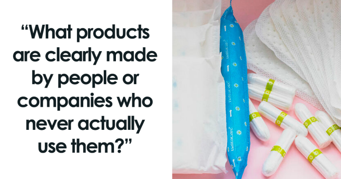
However, as illustrated in one Reddit thread, many things that are being sold to us fall short in multiple of these categories. Started by platform user DongLaiCha, it asked everyone the question, "What products are clearly made by people or companies who never actually use them?" and people were quick to respond. From clothing items to food packages, here are some of the most popular answers from the discussion.
This post may include affiliate links.
 Customer facing software. Developers should be required to hire grandmas under the explicit condition that if grandma can't look at a menu option and decide what to click without giving up and calling the help desk your functionality has failed.
 Economy airplane seats. I bet things would change if airline CEO’s had to spend 100 hours sitting in the economy seats they approved.
 Not a product, but most laws meant to support low income households are designed by people who have no concept of poverty. The hoops you have to jump through are meant to be prohibitive, and the income thresholds for who gets help are arbitrary. Even in France and Germany, where I am and where there are lots of social benefits.
 Those who make the "pull this flip to open" on plastic packaging of cold cuts.
jonnyoxl:
I don't even bother with bacon packs anymore.easier to just pierce the plastic with a knife.
 I swear that people who design some shampoo and conditioner bottles have never tried to use them while wet.
 So many baby products!
Baby gates - I don't want a baby gate that requires two hands to open, because one arm is busy *holding the baby*. Ideally there would be one with a foot operated lock/unlock mechanism, so I can hold the baby and (luxury!) up to one other thing as well. Baby wipes that stick together when you pull them out of the container, so you end up with a long damp string of wipes that you can't pull apart because the other hand is busy holding the squirming baby legs up off of the pile of diaper contents.
Strollers that require two hands to collapse, and assume that all parents possess the grip strength of a silverback gorilla. I want to be able to open and close that thing with one hand, people. One hand!
If you've found hacks to get around these issues that's great - my point is they shouldn't be issues in the first place. For the amount of money you pay for baby products, they should be designed in such a way that a parent *holding a baby* can actually use them.
 Period products.
veggie_saurus_rex:
I've always thought this, glad there has been a call out! Blood and mucus are not easily absorbed like "mysterious blue liquid".
elfowlcat:
Stupid sticky wings that leave all the sticky on the outside of the underwear!
 In education, the administration (especially the board of education) are too far from the work that actually goes on in the classroom. I've taught for a long time and have never seen a Board of Education member in a classroom. Principals think they know what's going on because they do observations, but the part they don't understand is how the layers of "c**p" they add to the workload affects the teachers...or how that eventually affects the students. Administrators add layers of c**p because they think that is their job. Instead, they should view their job as removing c**p so that teachers have the time and freedom to have the most purely academic and meaningful interaction with the students.
 Maybe a bit off topic, but in a meeting with a former colleague of mine, the person in charge of the metro for a nearby city admitted that he had never used the metro. Not that he didn’t use the metro, but that he had never used it in his life, even once. I suspect that this kind of thing isn’t uncommon for government services.
 Bras.
Bras.
Critical-Adeptness-1:
“Where is the most sensitive part of a woman’s breast?” “I’d say the nipple, sir.” “Great, thanks, I agree. So yeah let’s put the thickest, mostly bothersome stitch in the entire cup straight across where that nipple’s gonna be, ‘k? Cool, thanks team, get to work”
 Strollers. I swear they only tested them empty or with a tiny doll inside a store while having nothing else to do. Now, try to use it on a tilted pavement with a huge baby bag, 2 toys, an almost 2 years old, 2 big shopping bags, a car trunk to open with someone honking at you for your parking spot after having 2hours of sleep per night since months. And it's raining.
 My over-ear headphones that for some unexplainable reason have touch, as in you have to swipe at the side of the earpiece to change volume, song etc. But it just doesn't work. 50% of the time when you want to turn up the volume you switch song. Especially when you are walking. Even worse, the headphones are unusable with a hood on because the touch reacts to the inside of my hood.
It's just horrible, and it serves no purpose! I swear nobody actually tested that product. STOP PUTTING TOUCH CONTROLS ON THINGS THAT DON'T NEED THEM!
My over-ear headphones that for some unexplainable reason have touch, as in you have to swipe at the side of the earpiece to change volume, song etc. But it just doesn't work. 50% of the time when you want to turn up the volume you switch song. Especially when you are walking. Even worse, the headphones are unusable with a hood on because the touch reacts to the inside of my hood.
It's just horrible, and it serves no purpose! I swear nobody actually tested that product. STOP PUTTING TOUCH CONTROLS ON THINGS THAT DON'T NEED THEM!
 Celebrity makeup and perfumes.
I doubt any of the celebrities have even tried them, let alone used them on a regular basis. Kylie makeup is the best example of this. Cheap makeup with an expensive price tag.
Celebrity makeup and perfumes.
I doubt any of the celebrities have even tried them, let alone used them on a regular basis. Kylie makeup is the best example of this. Cheap makeup with an expensive price tag.
 Plus sized clothing.
I don't understand how the boobage factor can be so small and the tent like dress part be sooooo tent-like.
Or that plus sized people don't get to have the same type of clothing pattern as a smaller piece of clothing.
Plus sized clothing.
I don't understand how the boobage factor can be so small and the tent like dress part be sooooo tent-like.
Or that plus sized people don't get to have the same type of clothing pattern as a smaller piece of clothing.
 Paper towel dispensers (in public restrooms) that are operated by pulling on the paper towel itself. If you don't think to prep one before washing your hands, good luck pulling a whole sheet without it dissolving into tiny pieces of useless wet paper.
 The little foil seal (hiding under the plastic cap) that insists it's "for your protection" and requires needle nose pliers to remove. Bruh, I just want to add creamer to my coffee. And now my fingers hurt. ?
Edit to include: and let's not forget the body jolting frustration that consumes you when you FIRST attempt to use/squeeze/pour said product only to discover your little foil friend has "safety first!" in mind.
The little foil seal (hiding under the plastic cap) that insists it's "for your protection" and requires needle nose pliers to remove. Bruh, I just want to add creamer to my coffee. And now my fingers hurt. ?
Edit to include: and let's not forget the body jolting frustration that consumes you when you FIRST attempt to use/squeeze/pour said product only to discover your little foil friend has "safety first!" in mind.
 Those pull tabs on the inside of the necks of olive oil bottles or sesame oil. So small, a finger barely fits in it, let alone grasp and pull it.
 Hospital beds. From the standpoint of the person who has to push it around and mess with rails that get caught in the mattress and plug it in with a long dirty cord that gets mixed up with another random cord that no one knows its purpose. No retractable cords so they constantly drag on the ground and try to trip you when pushing the bed. Brakes that are in the most awkward position that you have to invert your knee to reach with your foot. And worst, the screeching, ear-piercing alarm that they emit to “warn you” that the bed is not locked. Hospital beds are obnoxious.


 No fees, cancel anytime


")
")


