This Instagram Page Collects Incredible Examples Of Modern Design, And Here Are 50 Of The Very Best Ones
Your home is your castle. But your castle doesn’t have to have chilly corridors, flickering torches, crumbling walls, and chain-clanking ghosts. It can be comfortable and cozy. It can look great and inviting. It can look, well, like a home.
However, interior design isn’t something that everyone’s great at. Sometimes, we need a bit of help. A tad of inspiration. And a splash of scrolling through Instagram. That’s where the Call It Design IG page comes in.
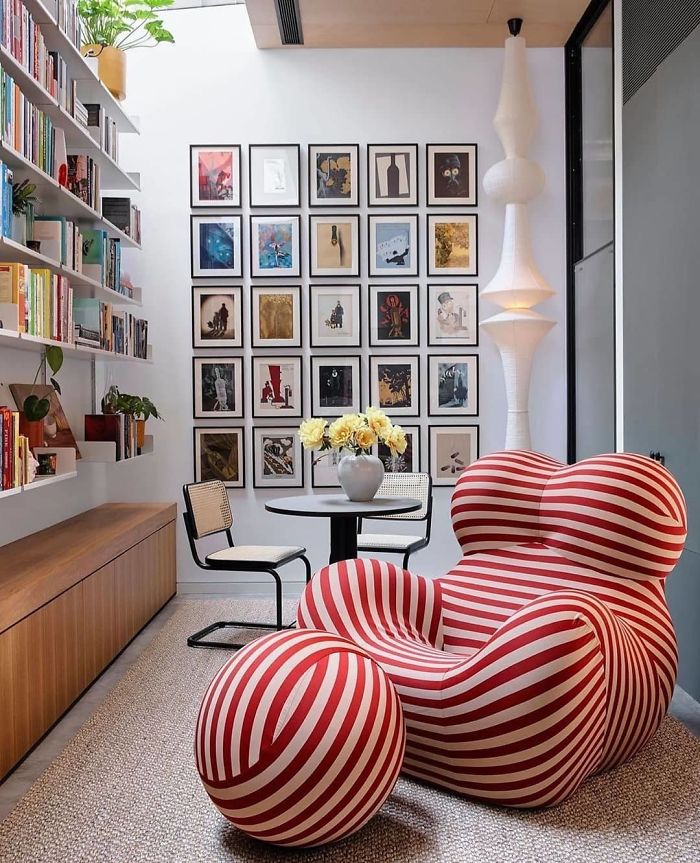
It’s an account with nearly 55k followers and it features some truly incredible examples of modern design decisions from around the world. From interior design and architecture to artistic pieces of furniture and flair, it’s a real treasure trove for anyone who wants to liven up their home. We’ve collected some of the best design pics from them for you to enjoy, so scroll on down, and remember to upvote the ones you loved the most, dear Pandas.
This post may include affiliate links.
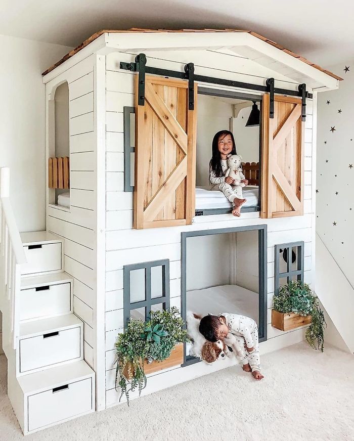
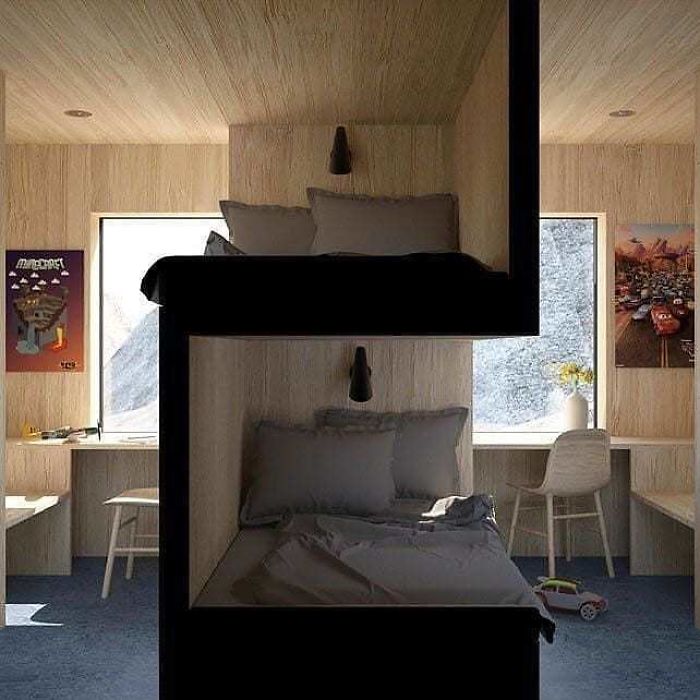
Lovely Bunk Bed
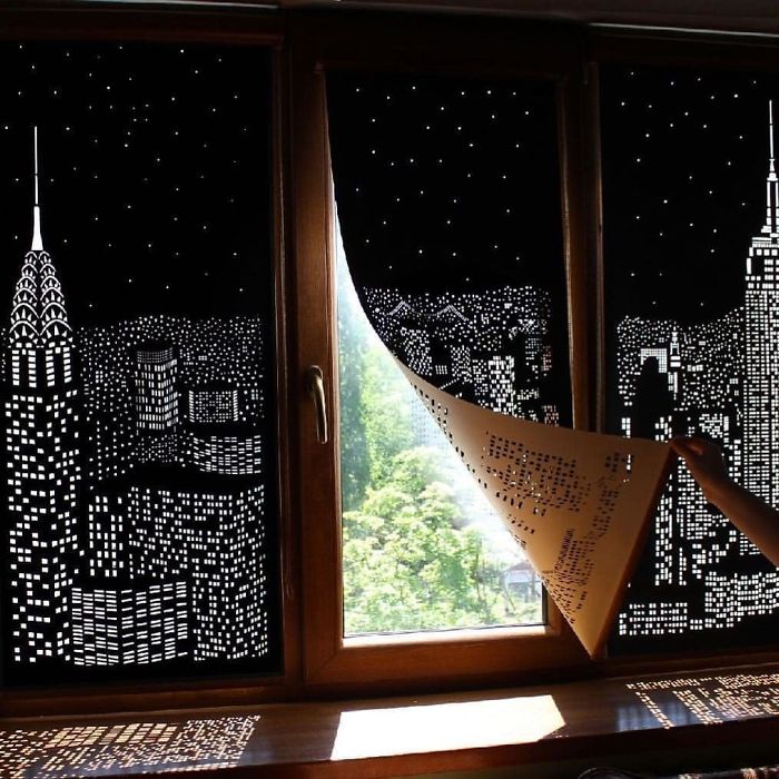
Buildings And Stars Cut Into Blackout Curtains!
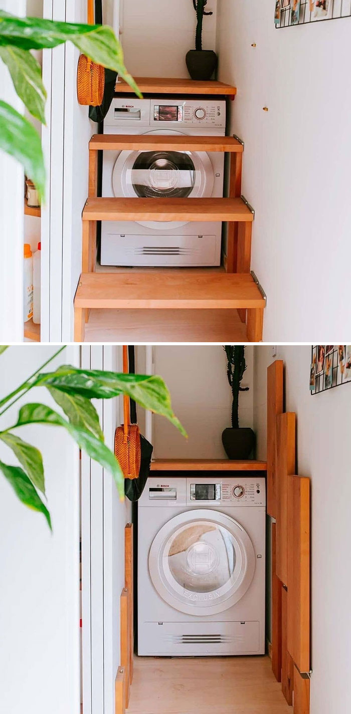
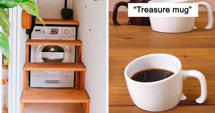
Folding Loft Stairs With Access To Washing Machine
What makes modern interior design look good depends on whom you ask. There’s a lot of artistic choices involved and we all know that beauty is in the eye of the beholder. So what might look incredibly stylish and minimalistic to one person might look bleak and dreary to someone else. Nonetheless, beauty isn’t completely subjective and there are certain things that make contemporary design look good.
According to San Francisco Design, modern designs are all about “emphasizing a few key pieces without overwhelming the space.”
Less. Is. More.
Keep. It. Simple.
Don’t. Overdo. It.
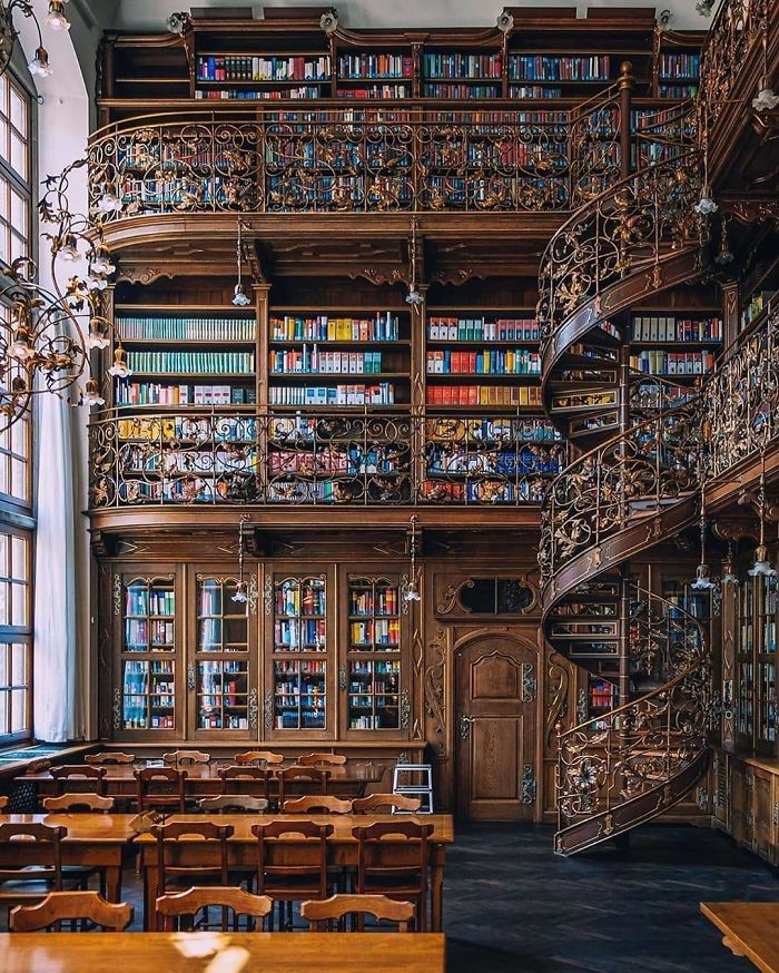
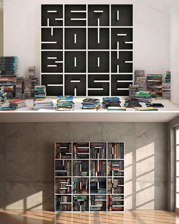
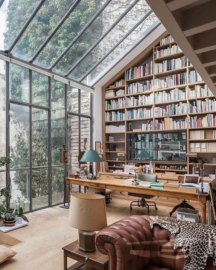
This Library Left Us Speechless
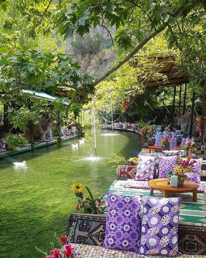
Saklikent Restaurant
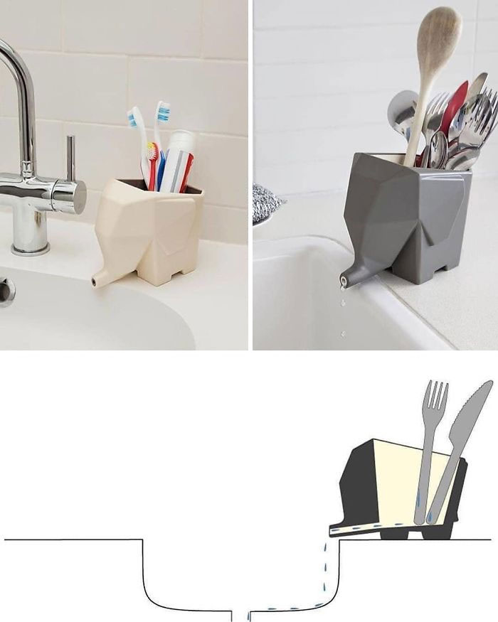
Creative Cutlery Drainer By Peleg Design
The San Francisco Design team explains that modernism goes incredibly well with minimalism. So when you’re picking out furniture and other design pieces, try to focus on simplistic and functional things.
“Modern style incorporates bold and rigidly structured design in a captivating way. In your home, focus on bold, sharp edges to add the angular structures that are so characteristic of modern design,” they explain, suggesting that we also look at edges and angles and how they fit in with the entire space.
Meanwhile, when it comes to modern materials, you should aim for those that give off a clean and straightforward energy. Stainless steel, muted metal, and glass are materials that can modernize your home and make you look like a real interior design expert. And don’t forget about wood!
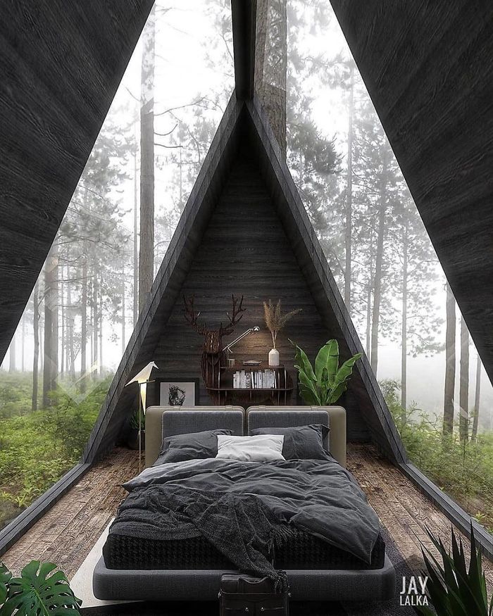
Cabin In The Woods By Jay Lalka
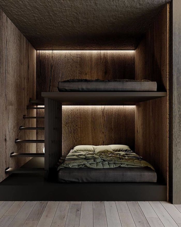
Bunk Bed Inspiration
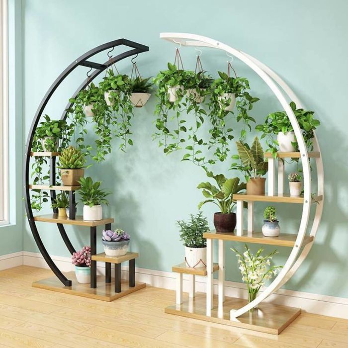
Circular Flower Stand By Zhi Lian
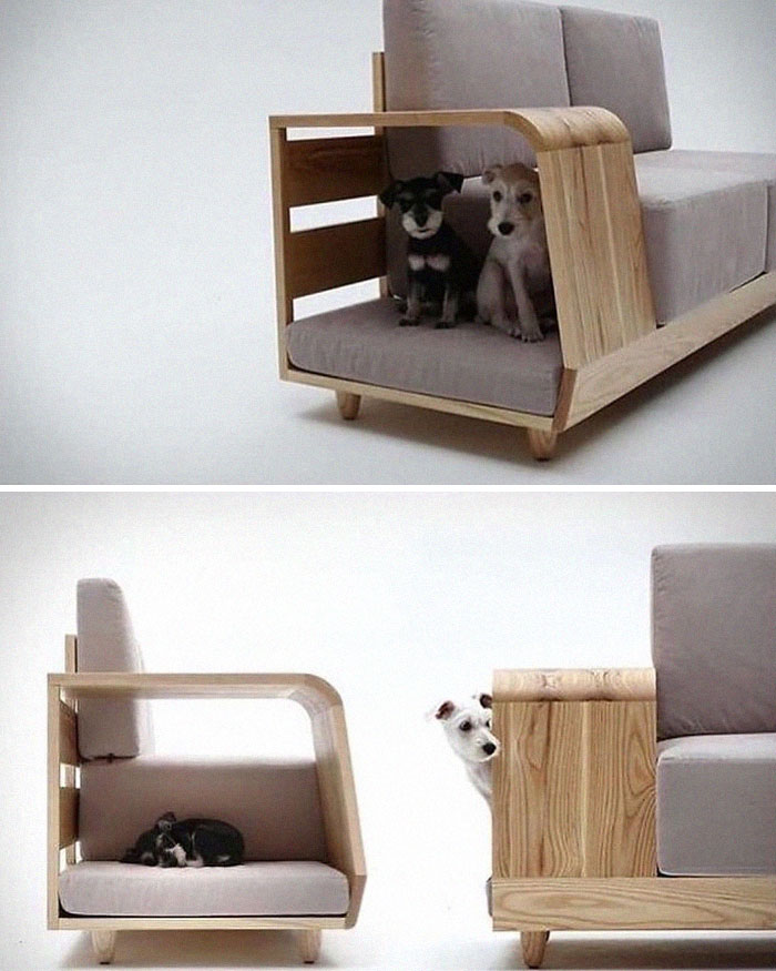
The Dog House Sofa By Seungji Mun
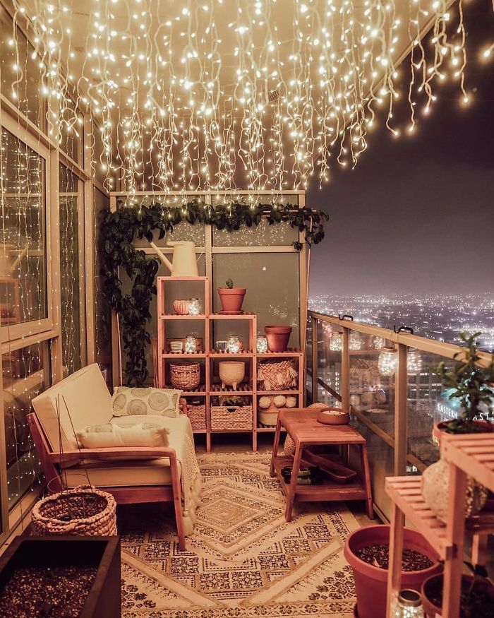
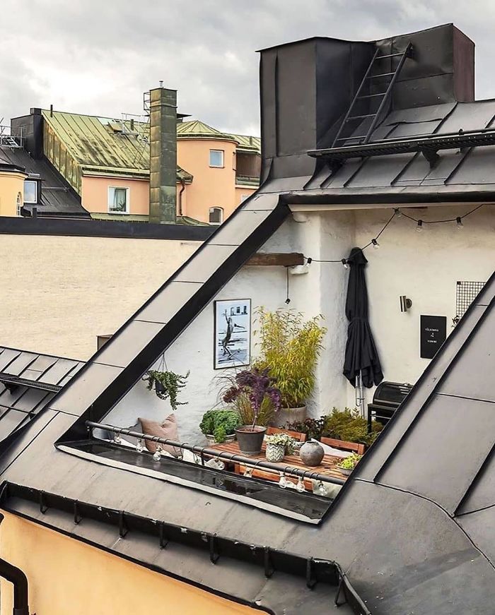
Cozy Balcony
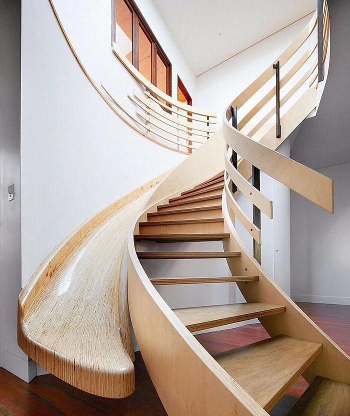
Indoor Wood Slide / Staircase By Archology
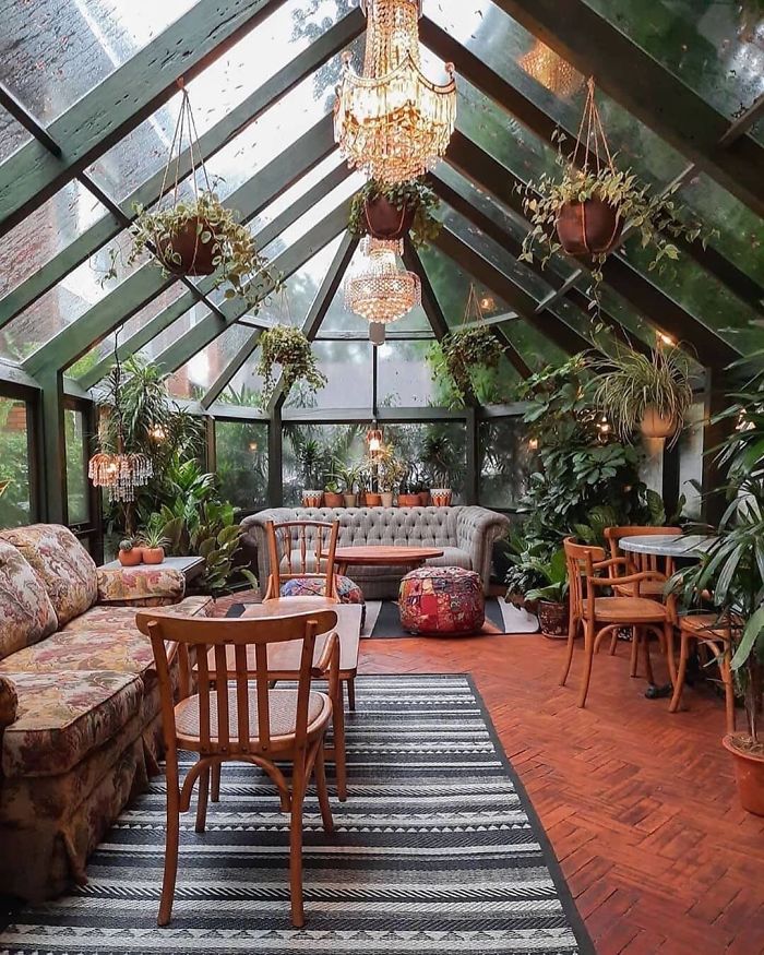
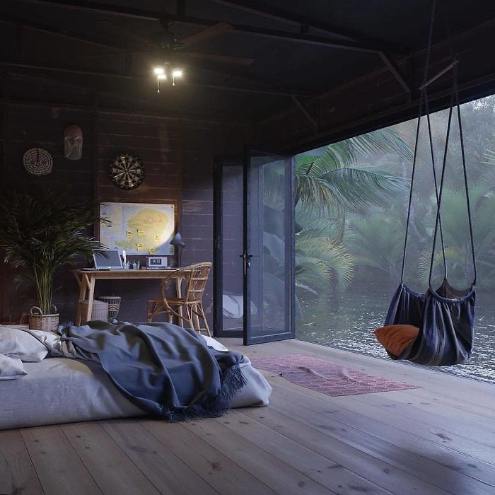
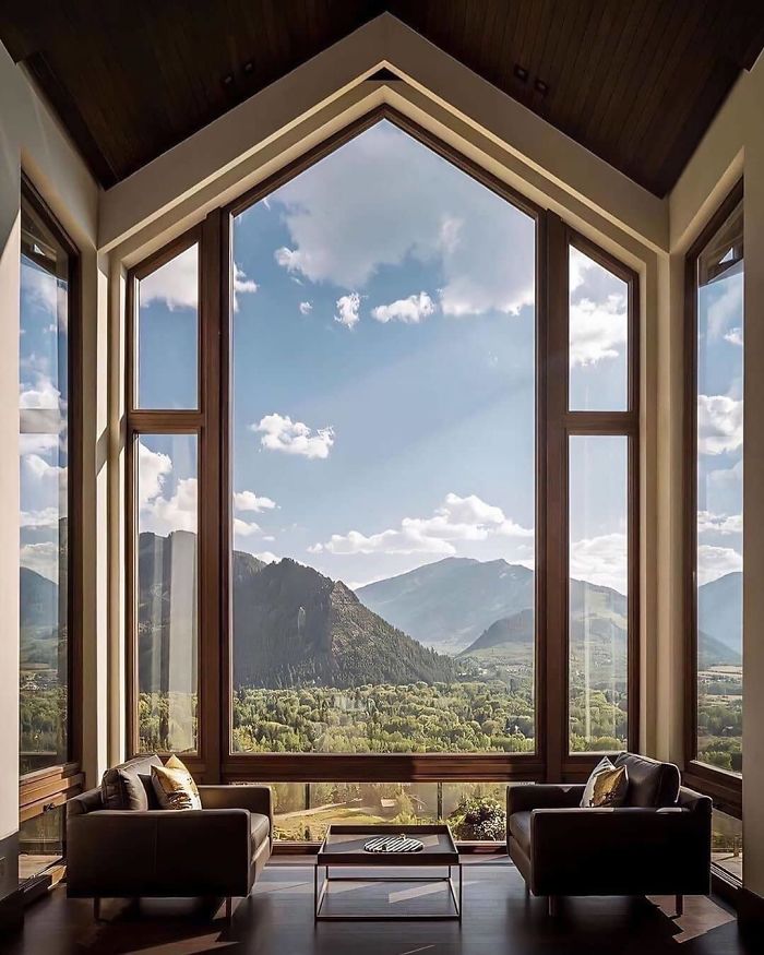
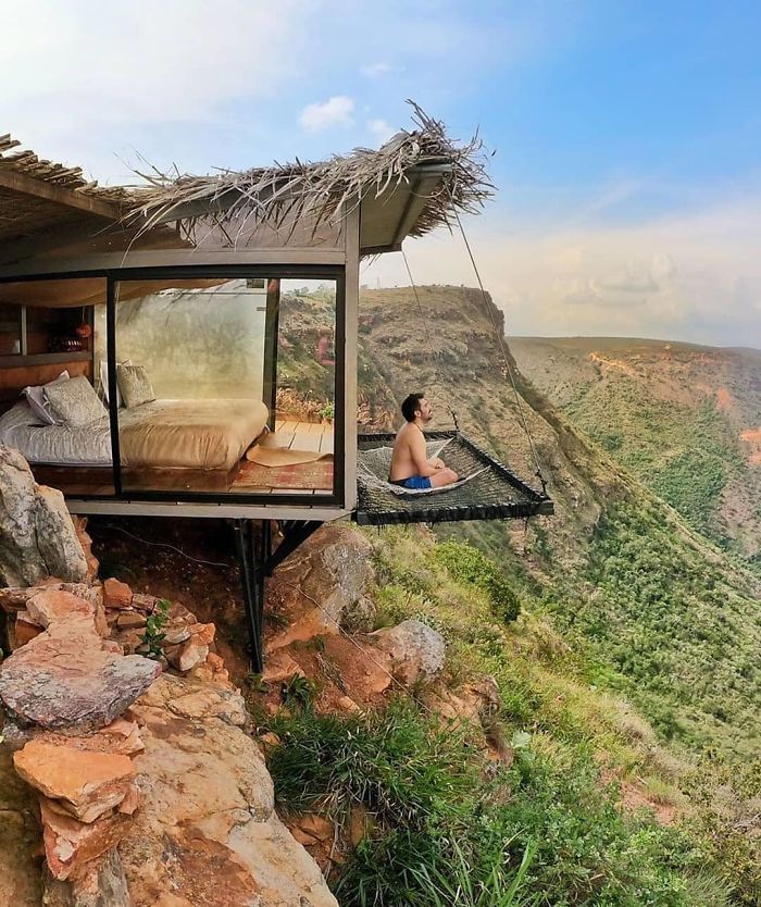
Cozy Place With Green Fresh View!
Only thing it is missing is a bookshelf and a cat. This would be perfect.
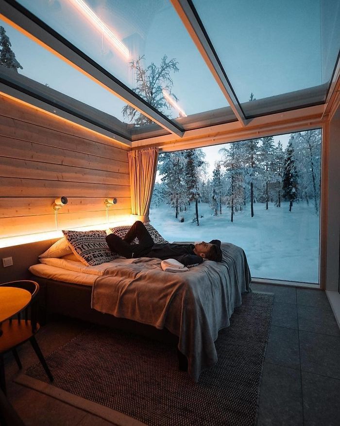
Northern Lights Ranch In Lapland, Finland
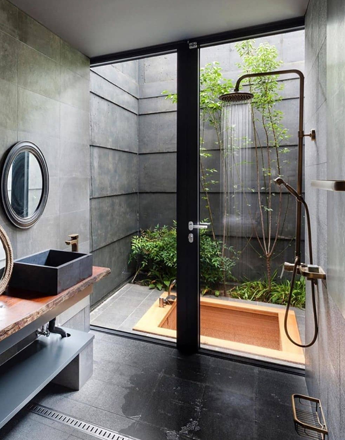
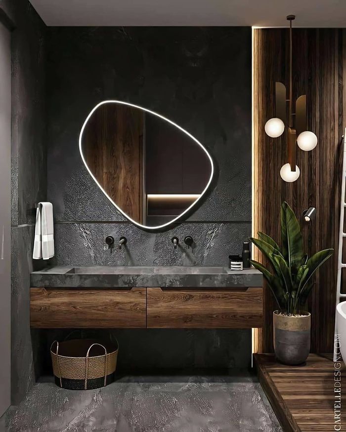
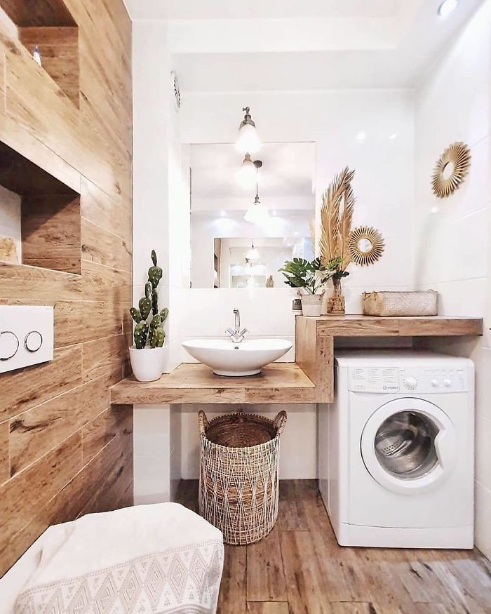
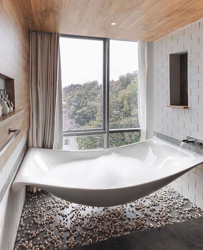
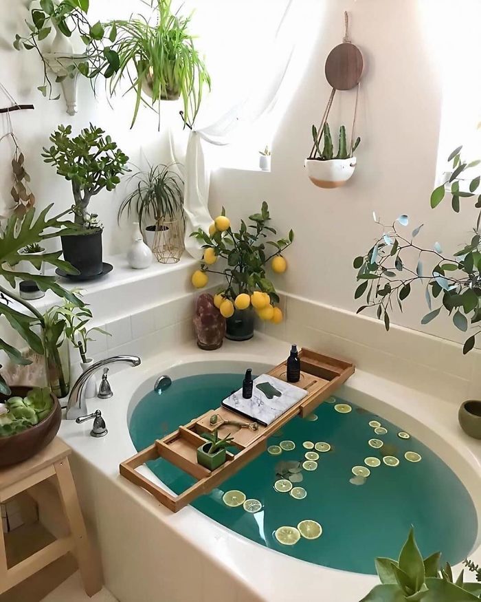
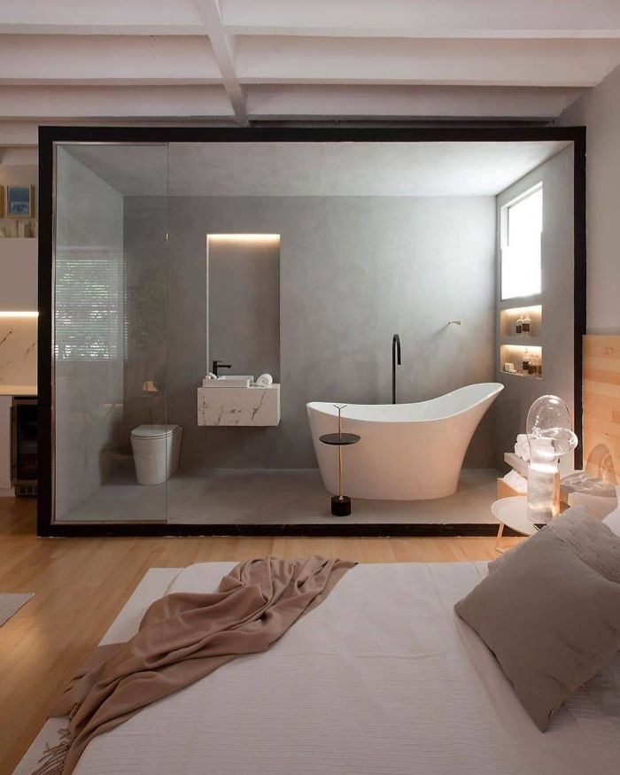
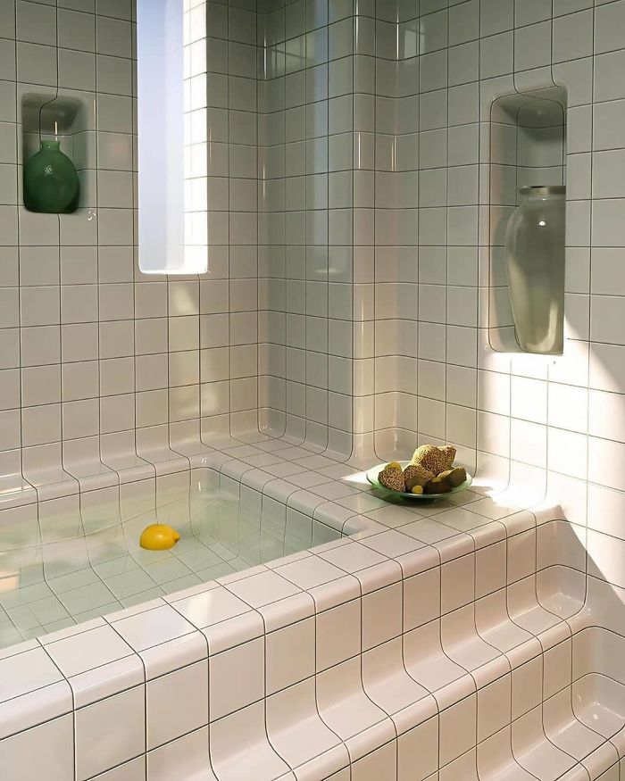
Beautiful Bathroom Design!
Yeah that’s cool, but I’m not sure how I would feel being exposed to the cold winds. 😜
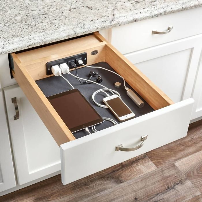
Charging Drawer By Rev-A-Shelf
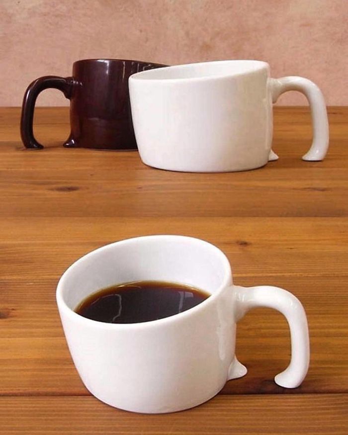
Treasure Mug By White Rabbit Express
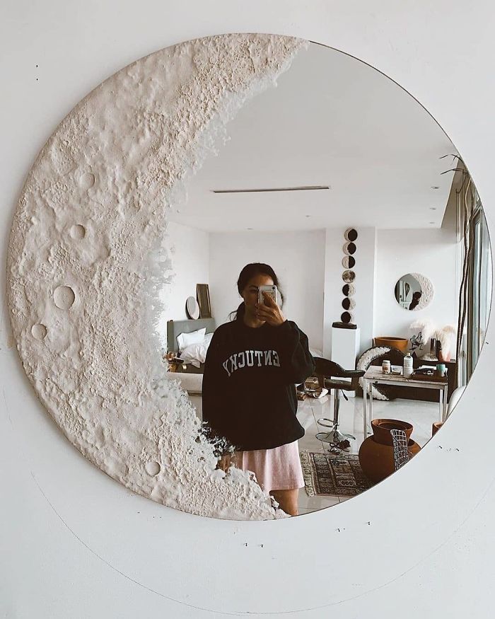
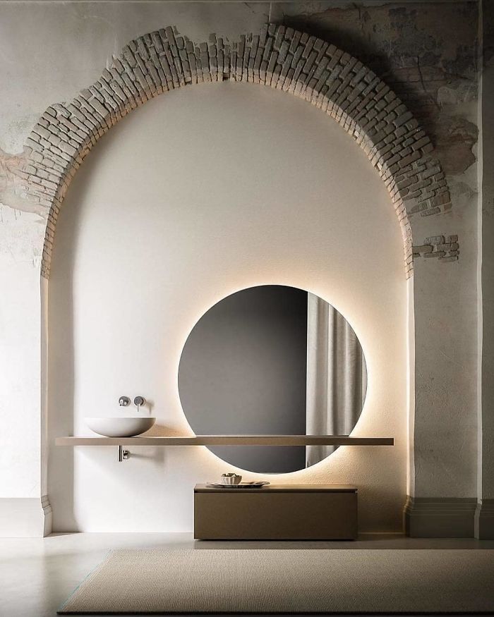
Luna Mirror
Hut Adventurer By Dmitri Reviakin
Design By @mousarris
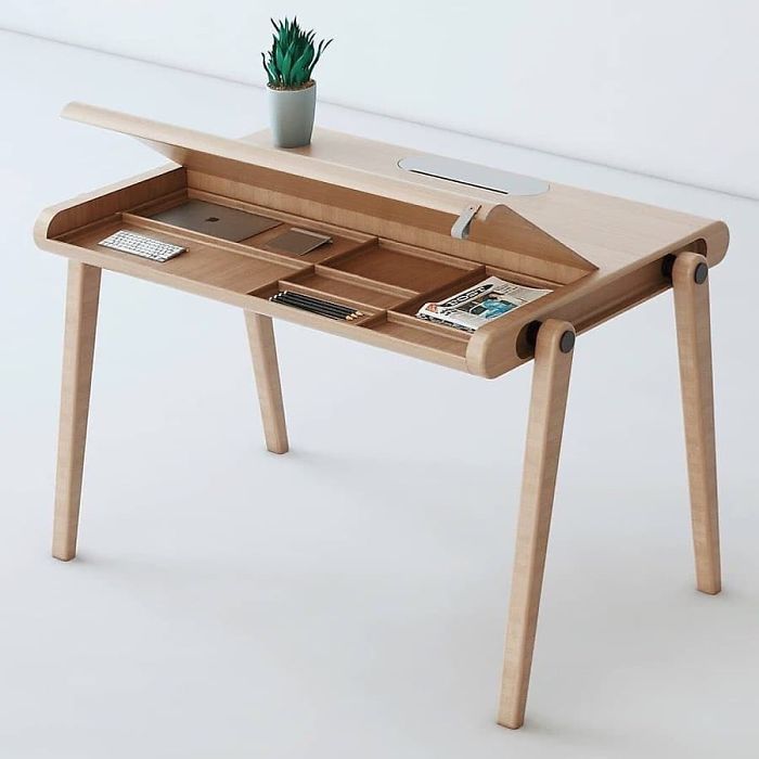
Work Space Design
The Terrace
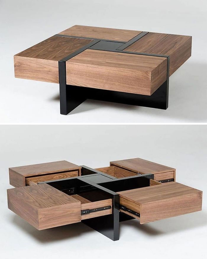
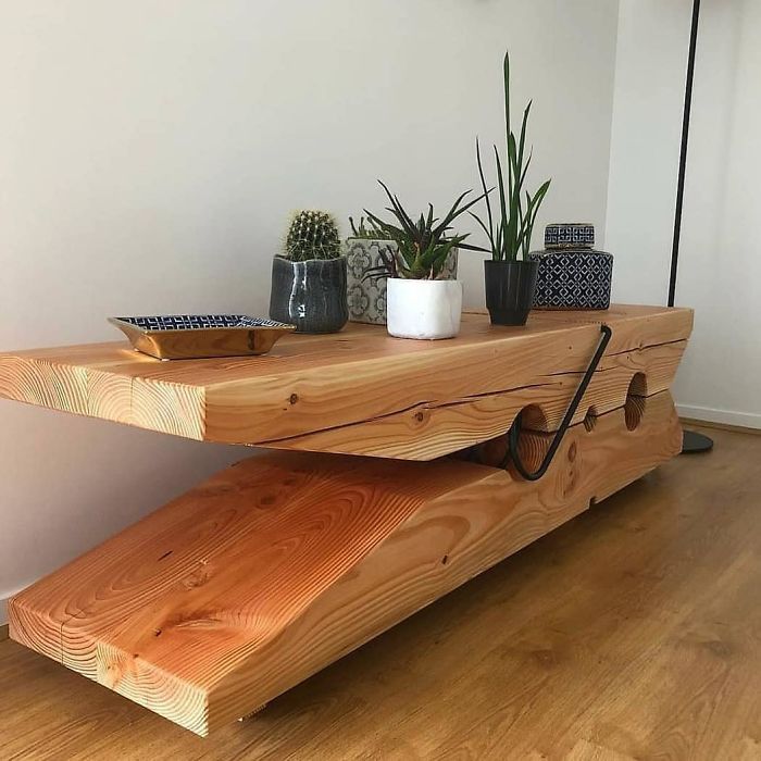
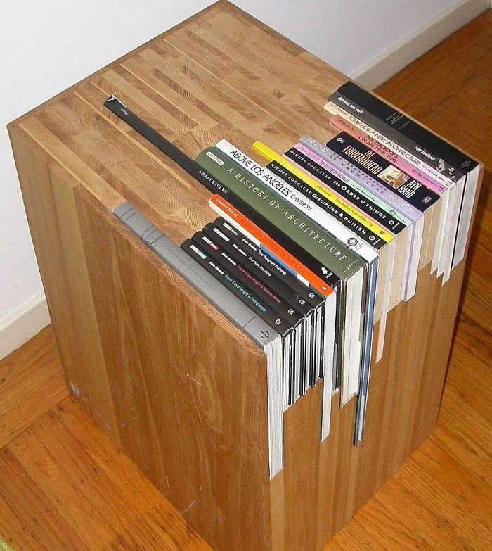
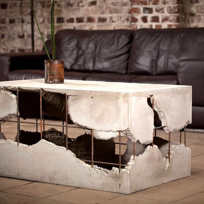
Cool Coffee Table
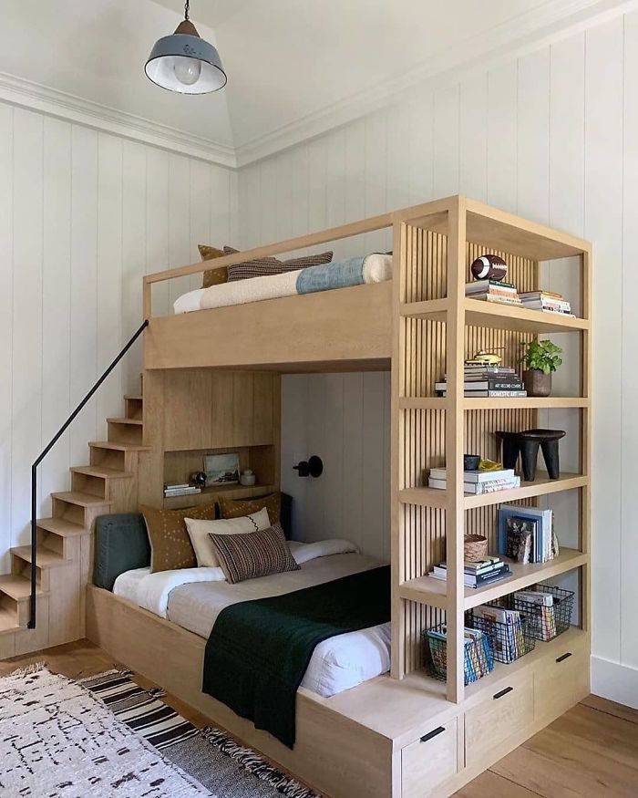
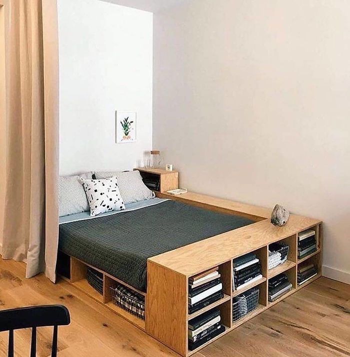
Amazing Bunk Bed
Bottom bunk has well decorated spacious homey feeling - top should look like the bottom (except for outer shelves).
Custom Made Wrapping Barn Door
A nice idea for another place perhaps. But it neither blends in nicely or seems necessary in this place...
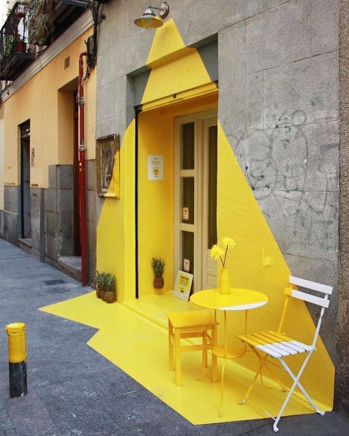
Amazing Restaurant Entrance
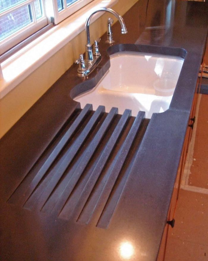
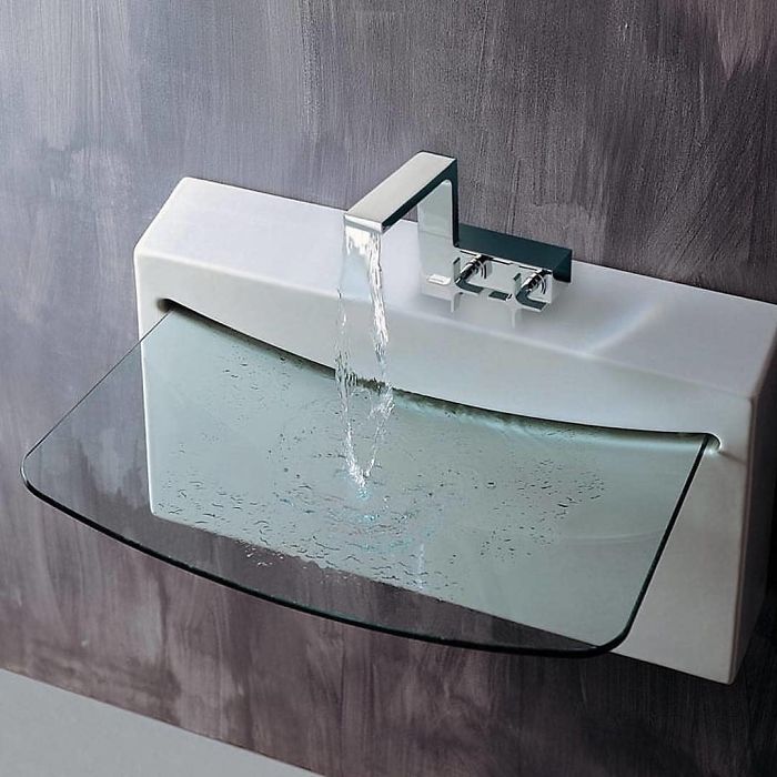
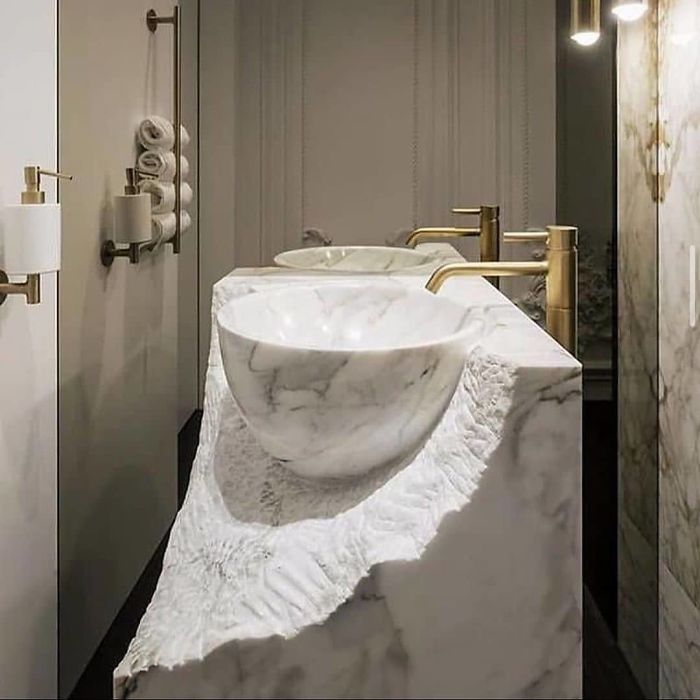
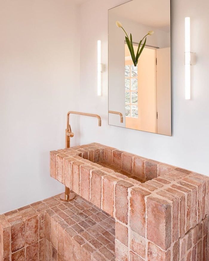
Sink Design With Drying Area
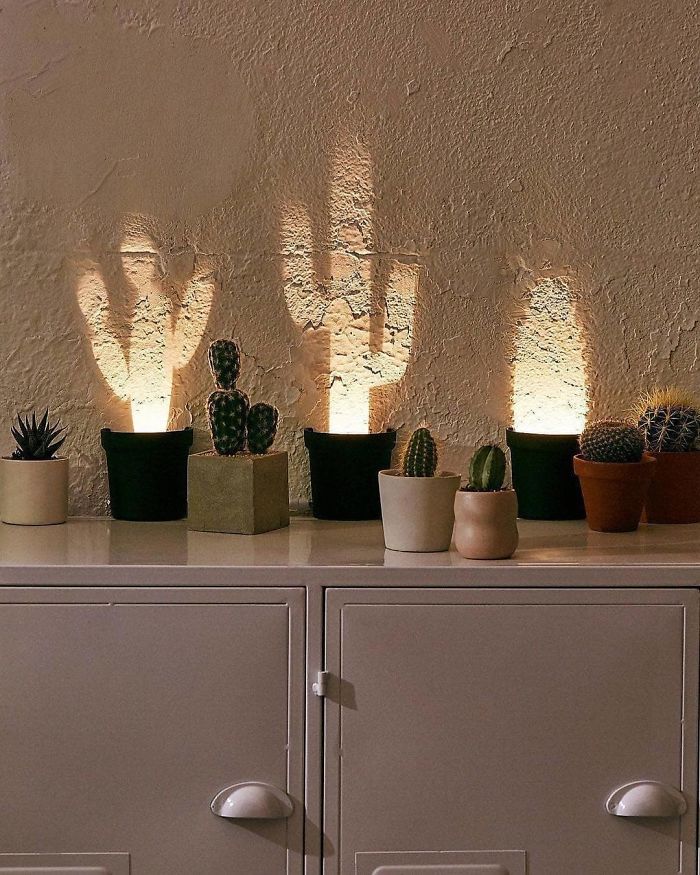
Pop-Up Cactus Light
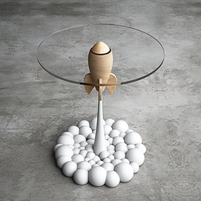
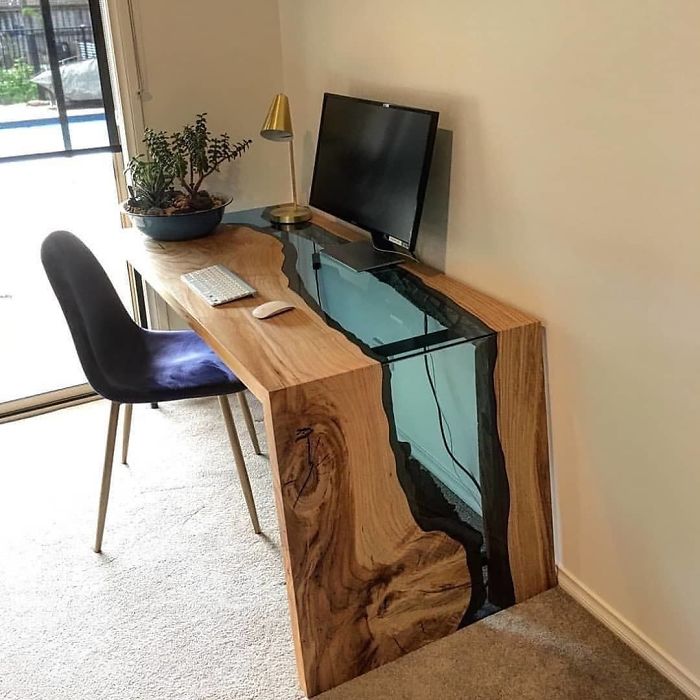
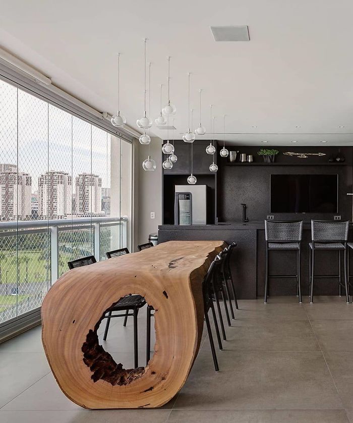
Beautiful Table Design
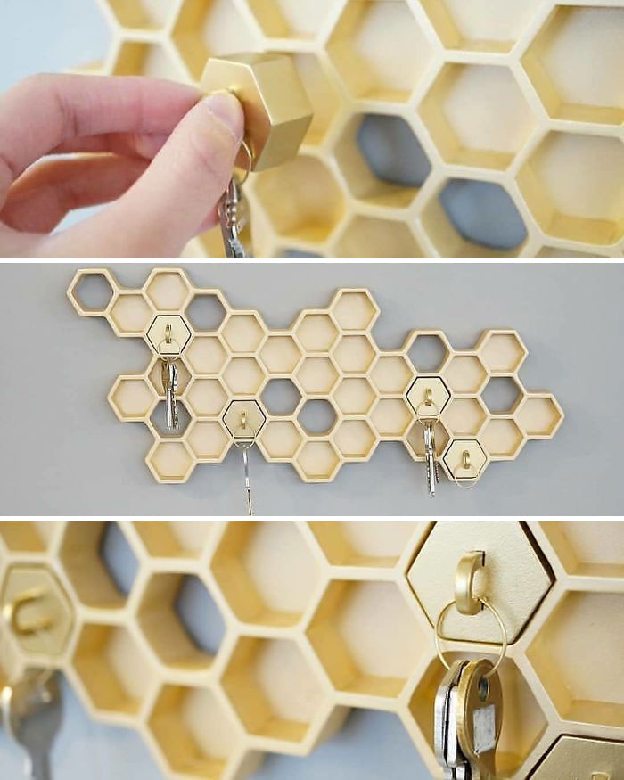
Awesome Honeycomb Keyholder
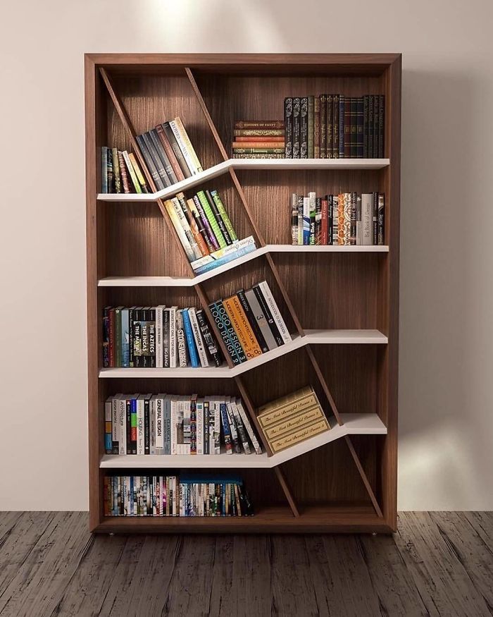
The Book Shed
Nope.. Books should not placed in direct sun.. The cover will fade quickly
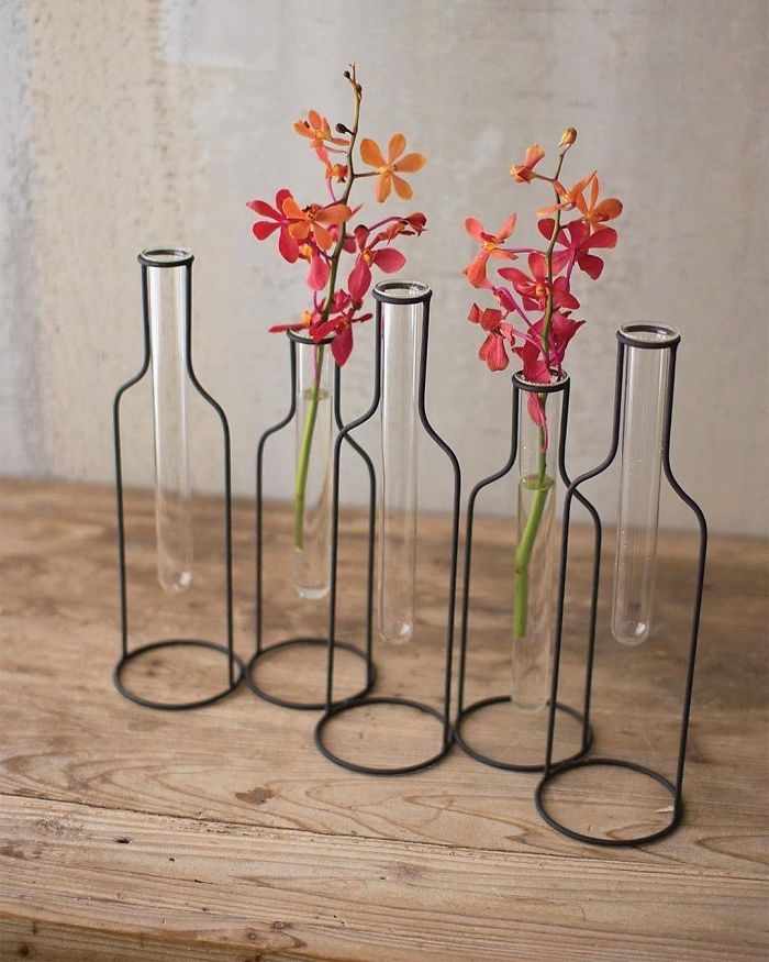
Five Wire Bottle Bud Vases By Kirklands
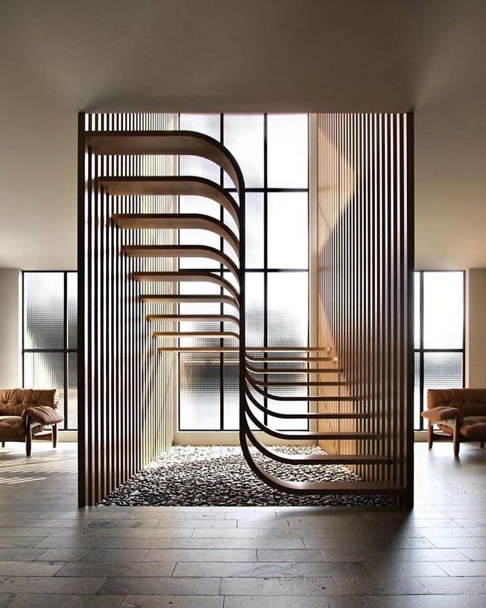
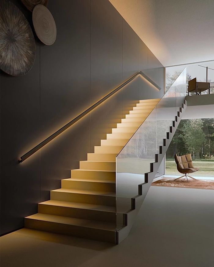
Staircase Designed By Ander Alencar
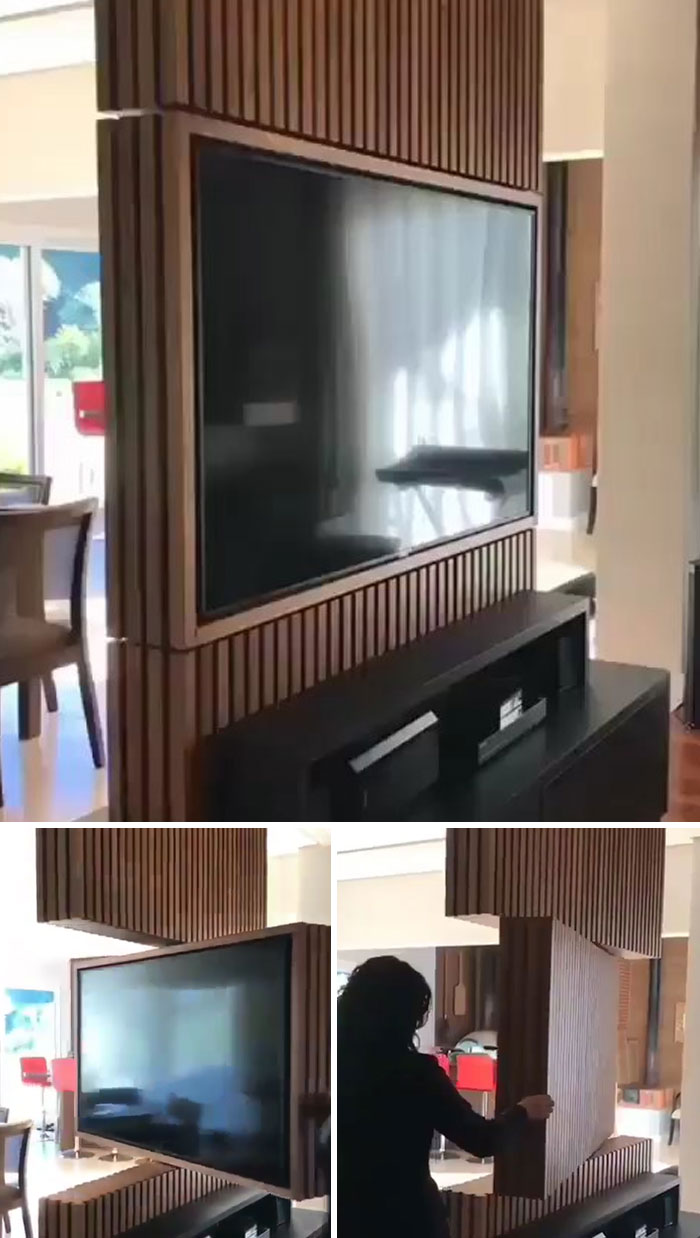
Rotating TV Panel By Holzk Móveis
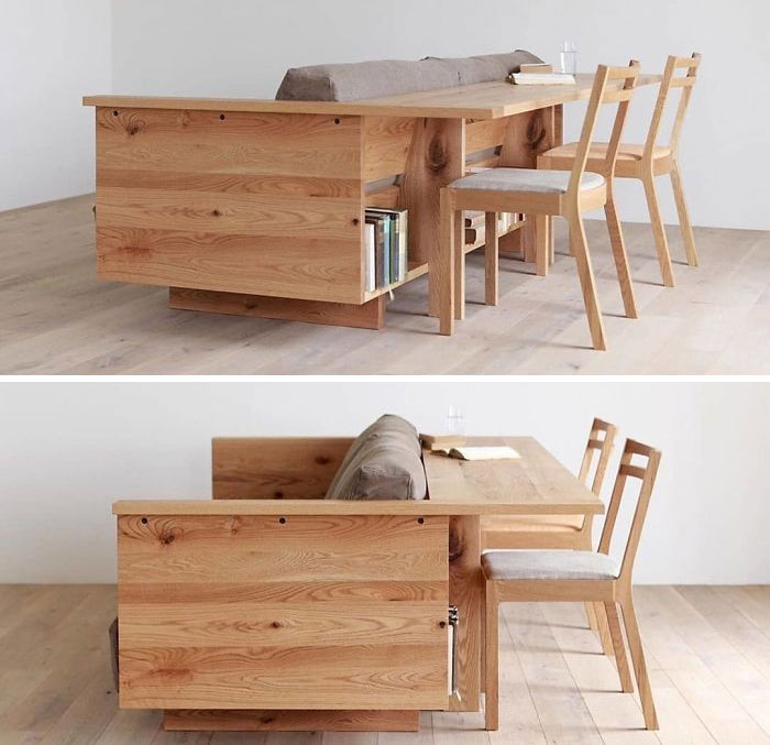
The Ideal Working From Home Piece? Caramella Counter Sofa
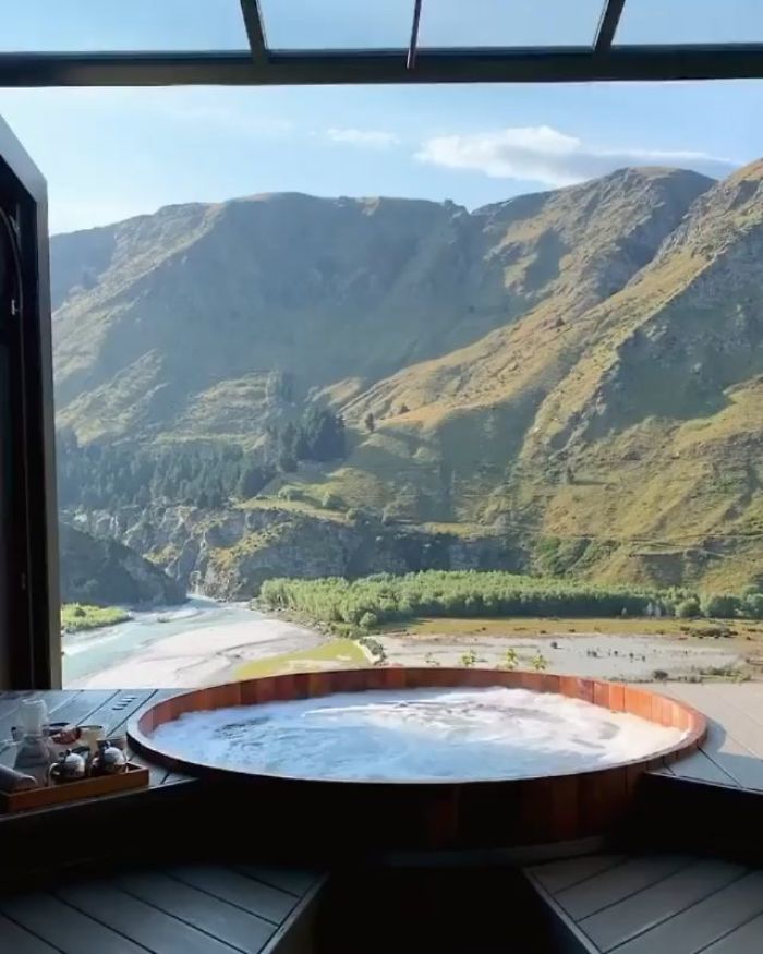
Gorgeous Pool
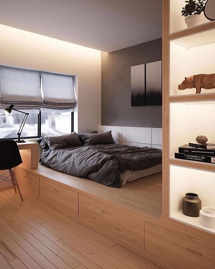
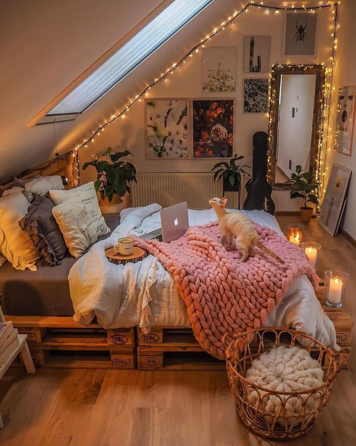
A Place To Recharge, Relax, And Dream!
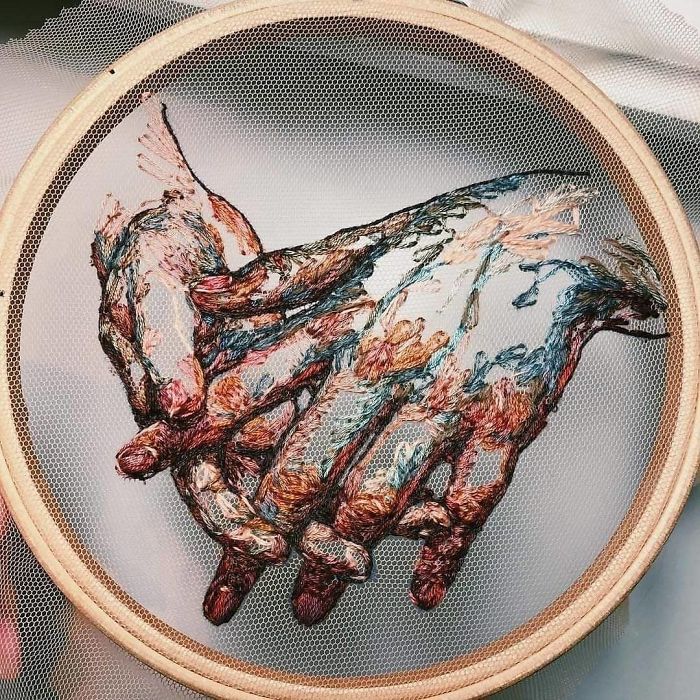
Embroidery Design
Setenil De Las Bodegas / Spain
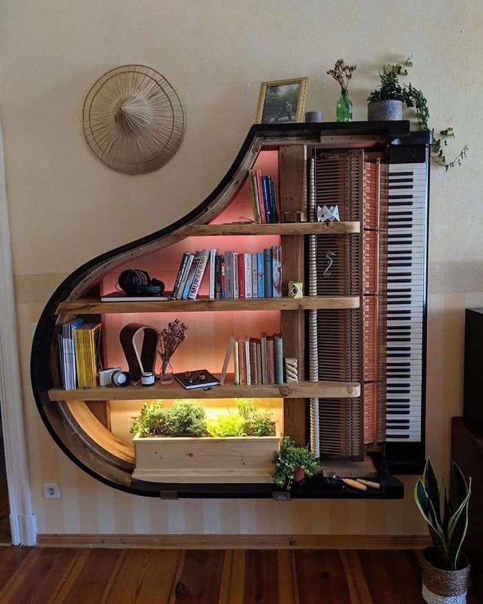
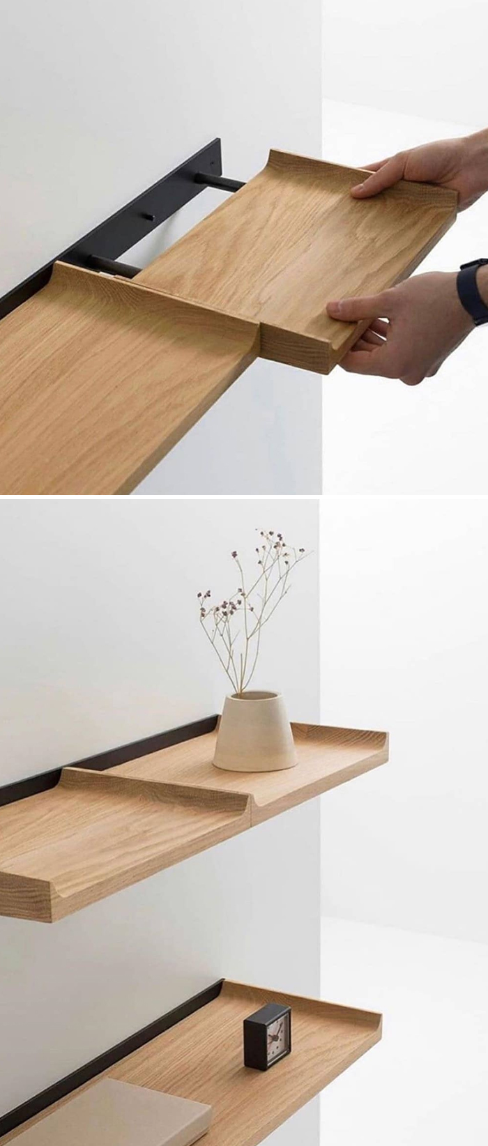
Piano Shelf
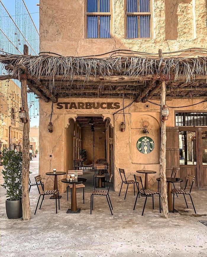
Starbucks In Dubai
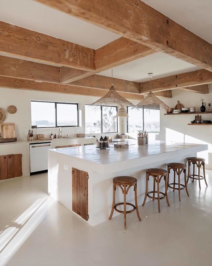
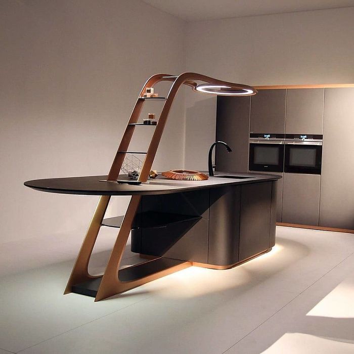
Contemporary Kitchen
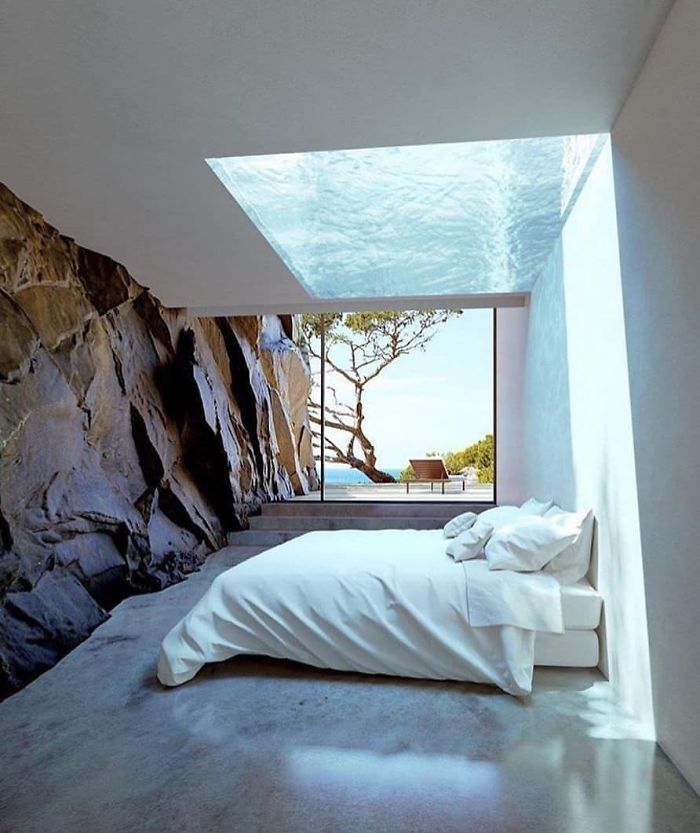
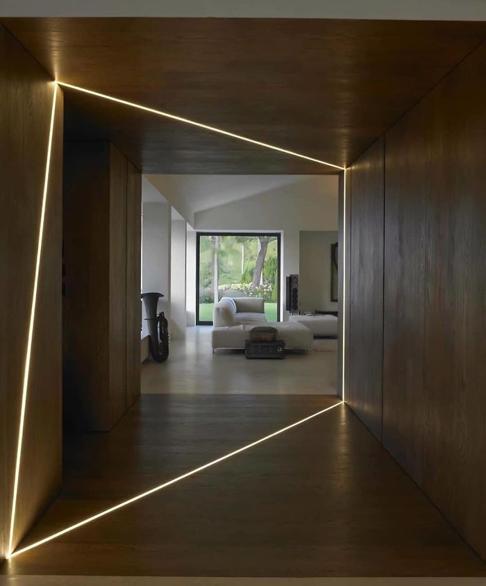
Residence In Théoule-Sur-Mer, France By Mir Studio
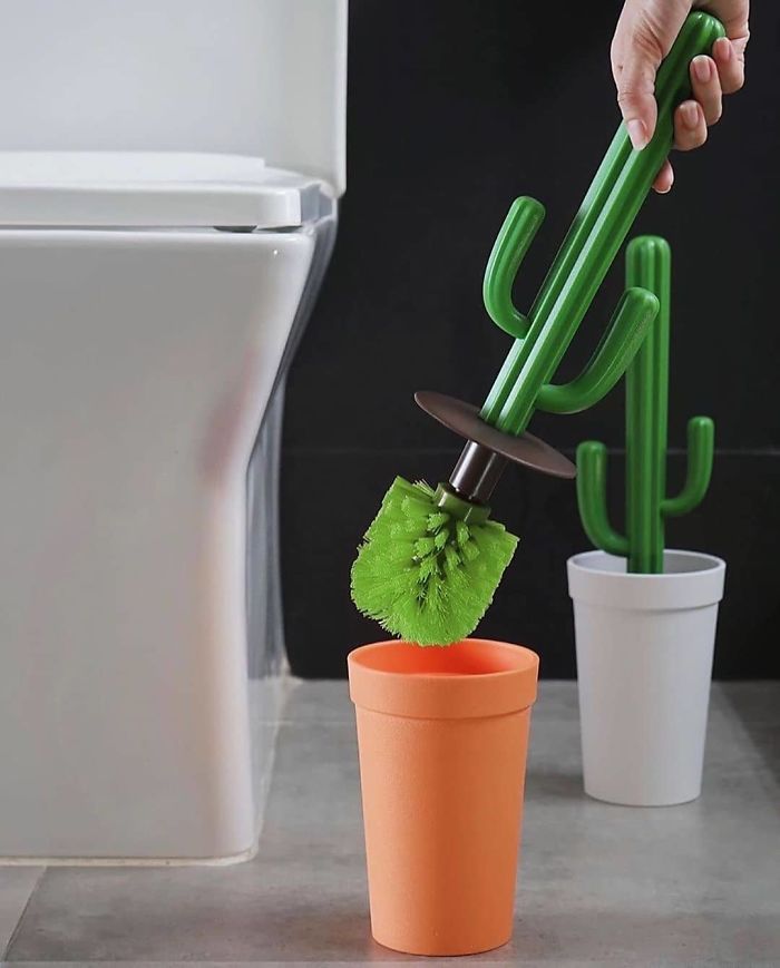
Cactus Toilet Brush By Qualy Design
House In The Woods
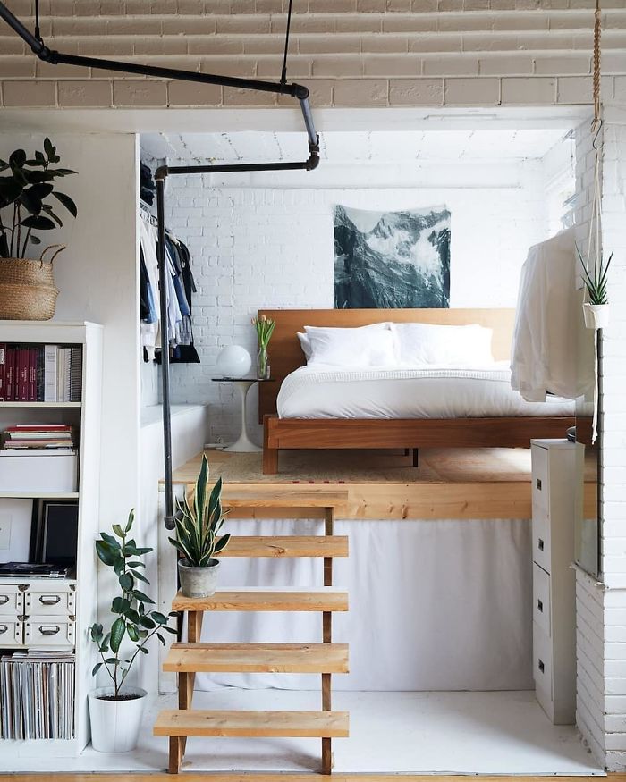
Studio In Toronto Design By Nikole Herriott And Michael Graydon
That water lines scares the crap out of me. I can imagine losing my balance going up/down and reaching out to grab the water pipe. Opps.
Villa Kuro Designed By @miniinno
I wonder where the door leads to that's on the end of the kitchen island? Wouldn't that be fun if it was a passage to another room in the house?
Safe Space Bed By Diana Zhelnio
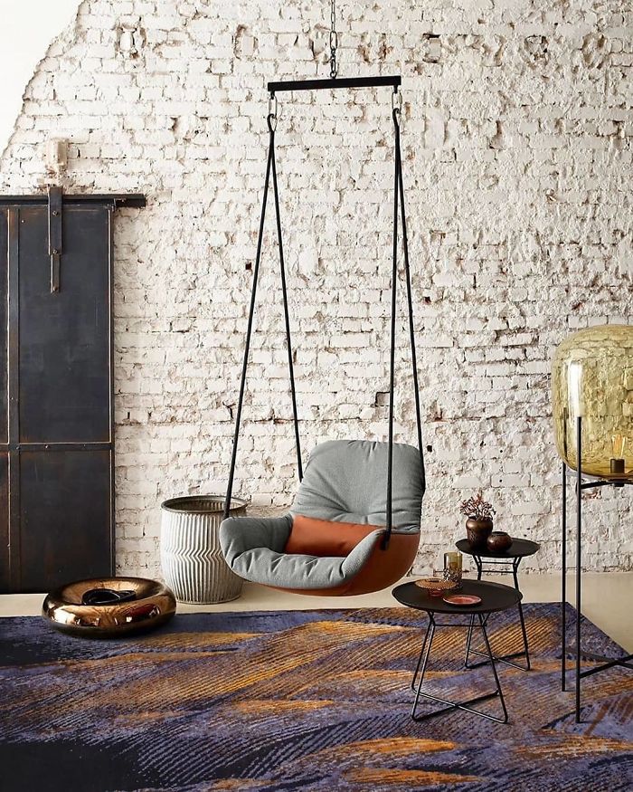
Leya Swing Seatby Freifrau
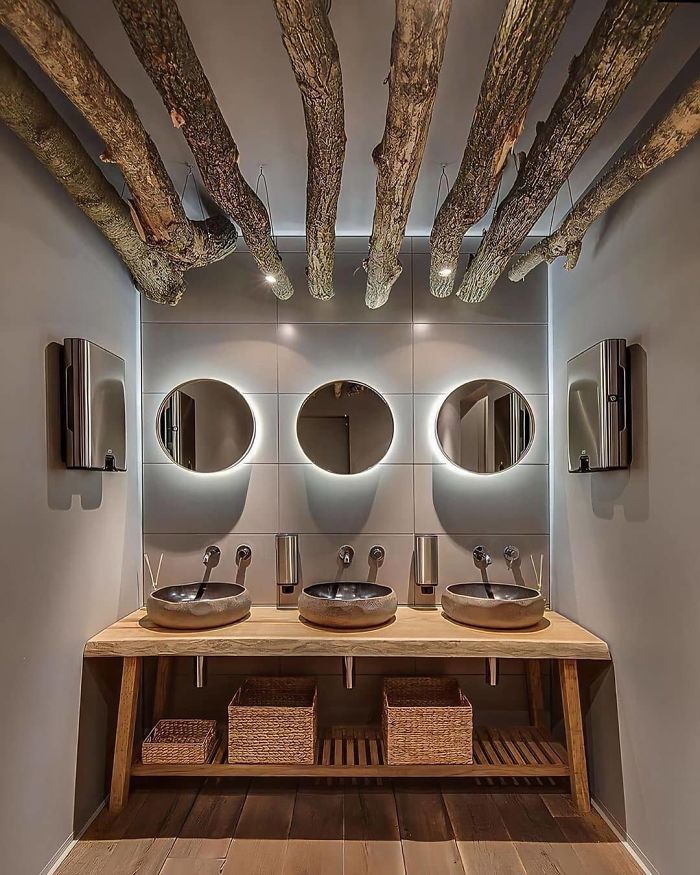
Gorgeous Bathroom
My goodness, reading just the first comment on most of these pictures just sound soo negative - 'why doesn't it do this, do that, that can't be comfortable? ' blah blah blah... Just enjoy them for what they are 🙄
Agreed. Some of these weren't for me, but I understand and appreciate the "art" in them. Most of the comments made me think that 1) people are afraid of colour and texture and 2) there are a lot of negative people out there.
Load More Replies...Right? I thought, “what would it be like to afford that...”
Load More Replies...My goodness, reading just the first comment on most of these pictures just sound soo negative - 'why doesn't it do this, do that, that can't be comfortable? ' blah blah blah... Just enjoy them for what they are 🙄
Agreed. Some of these weren't for me, but I understand and appreciate the "art" in them. Most of the comments made me think that 1) people are afraid of colour and texture and 2) there are a lot of negative people out there.
Load More Replies...Right? I thought, “what would it be like to afford that...”
Load More Replies...
 Dark Mode
  No fees, cancel anytime


