Russian Designer Gave These 4 Milk Product Packages Adorable Makeovers
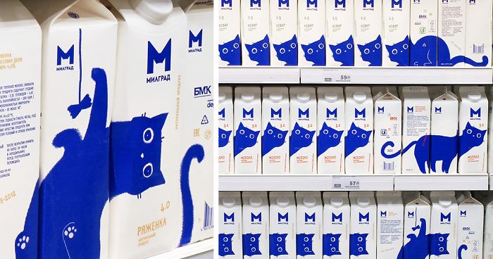
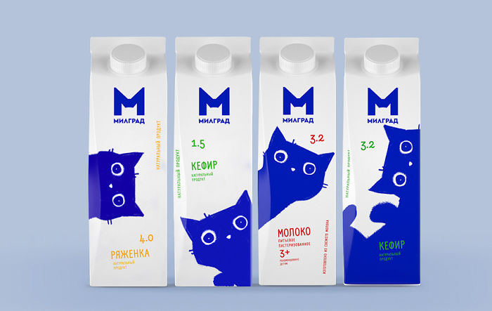
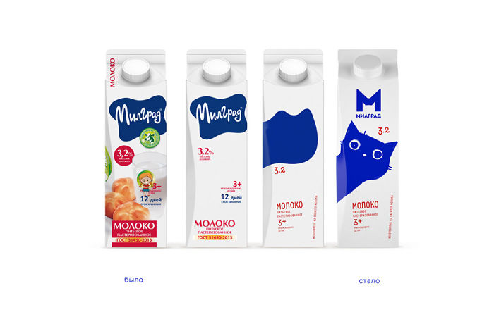
Russian art director Vera Zvereva is the one responsible for this adorable cat-inspired design which landed on the packaging of four milk products of Bryansk Dairy Plant’sМилград (Milgrad) product line. And, as it seems, people have been loving this new design quite a bit.
Apparently, since the dairy market occupies more than 22% of the FMCG food products structure, the designer was aiming to create a unique design that would help the brand stand out on the dairy shelf, increase sales, and expand the geography of representation and distribution channels. And that’s how this adorable cat-inspired packaging design came to be.
More info: Depot | Behance | Facebook
Here’s what the new packaging design looks like
Image credits: Vera Zvereva
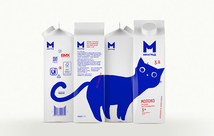
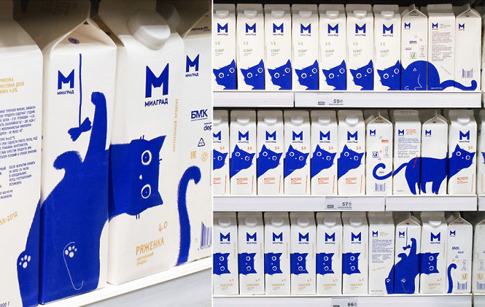
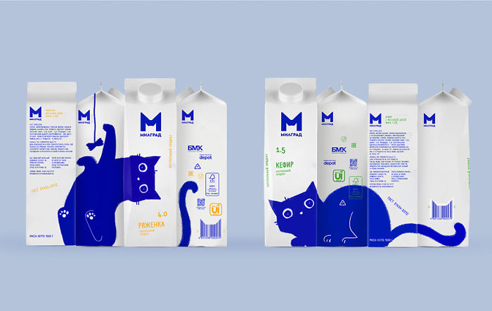
As you can see, the main detail of these designs is an adorable blue cat that travels through the package, creating different images as users rotate the boxes. “He looks at the consumer with interest, plays with a string, looks out or freezes in anticipation. The illustration moves from one side of the package to the other, creating additional shelf display options,” the branding agency Display, which the artist Vera Zvereva works for, writes on their web page.
The new captivating design offers many different shelf display options
Image credits: Vera Zvereva
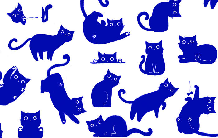
“Although the concept was inspired by Brunhilde, the cat of our art director and author of the concept, Vera Zvereva, each owner can recognize the habits of his pet in the illustrations,” the description of this design project reads.
There’s a blue kitty on each side of the box
Image credits: Vera Zvereva
Initially, the agency suggested three different possible design options
Image credits: Vera Zvereva
The first suggested design was “updated, but consistent with the previous design,” the second one was described as being “technological, showing the rhythm of a big city,” and the third one—”very cute, establishing an emotional connection with the target audience.”
Depot also redesigned the old Milgrad logo
Image credits: Vera Zvereva
The new logo is in the same blue color as the old one, but looks more modern and minimalistic. The main element of the logo is the letter “M” that also includes outlines of a cat.
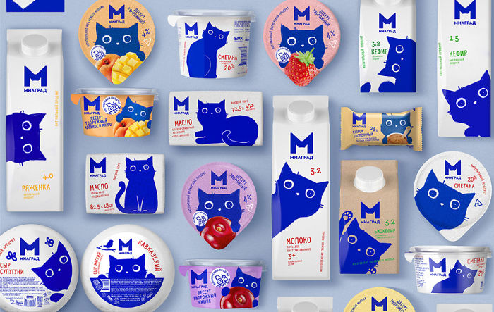
The same redesign was given to the whole product line
Image credits: Vera Zvereva
Image credits: Vera Zvereva
Here’s what people are saying about this adorable design
20Kviews
Share on FacebookExplore more of these tags
These should be sold globally so everyone can buy it
Load More Replies...These should be sold globally so everyone can buy it
Load More Replies...
 Dark Mode

 No fees, cancel anytime





































252
12