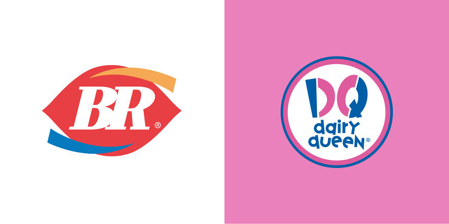
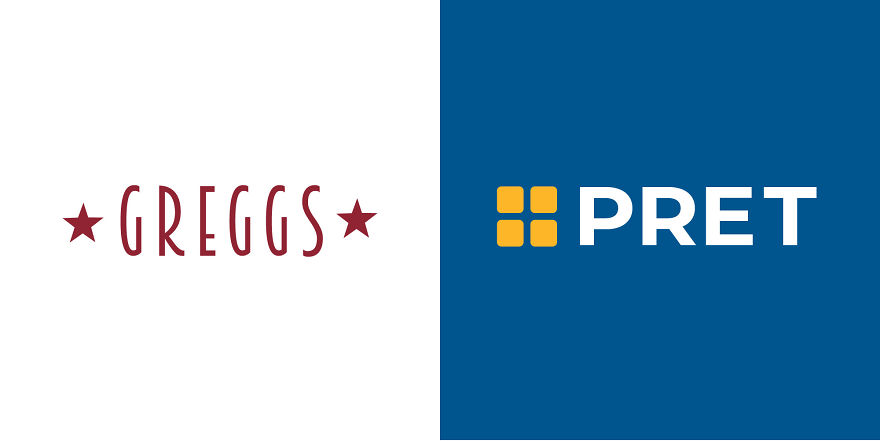
Many of the fast-food chains that we know and love are not only famous for their food and drinks but for the company logo that represents them. The familiar golden arches of McDonald's, the iconic two-tailed mermaid of Starbucks… Instantly, we know exactly what big brand we’re dealing with and the type of refreshments we can expect.
For many, these logo designs are cultural icons, emblems of a lifestyle that we’ve become accustomed to. But how deep into our subconscious are these famous logos ingrained? Would we still recognize the big companies behind if they weren’t quite the same?
As a brand, the recognisability of your logo idea is a crucial component for driving success. This is why you’ll hardly ever see drastic changes made over the years. A perfect example of this is the Coca Cola logo: despite a slight deviation in the late 1800s, the logo has remained largely the same. A classic case of if it ain’t broke, don’t fix it, some might say. But CDA wanted to mix things up.
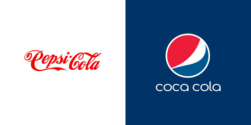
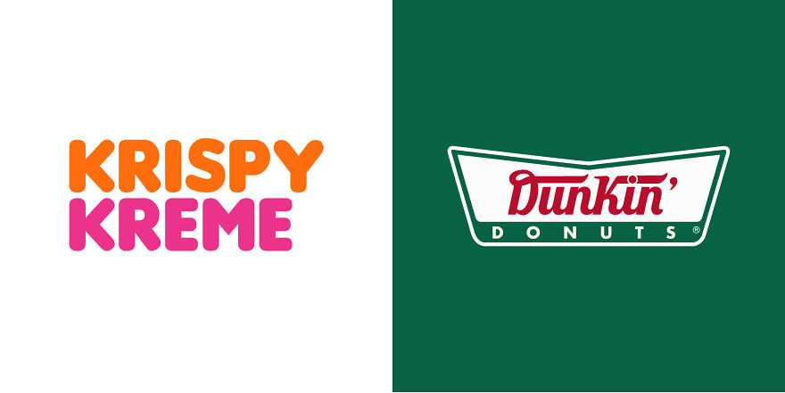
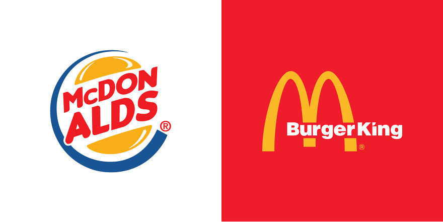
The rivalry between famous brands is inevitable, and no more so than in the food industry. But what if rival brands wanted to collaborate? Could they really work together from a branding point of view? We took this totally hypothetical situation and decided to have a little fun, so we’ve “mashed up” some of the most well-known fast food logos out there to see just how malleable they really are… and we have to say, and our brains are now a little fuzzy because of it!
Check them out below and let us know what you think!
More info: cda.eu
This post may include affiliate links.
What's disturbing is that I didn't notice anything wrong with the coca cola on the right for a minute
Okay... so... why did I read the right one in my head as "McBurger King"?
Looking at those hurt my head. The funny thing is that, if we weren't so used to the originals it would all look just fine
As someone who barely knows half of them, I can confirm.
Load More Replies...Looking at those hurt my head. The funny thing is that, if we weren't so used to the originals it would all look just fine
As someone who barely knows half of them, I can confirm.
Load More Replies...
 Dark Mode

 No fees, cancel anytime


