Get Premium
Dark mode theme is available exclusively for premium users. Learn more about the benefits of subscribing.
No fees, cancel anytime.

 Dark Mode Ad-Free Browsing Unlimited Content
 Ad-Free Browsing Unlimited Content Dark Mode
Join 1.2 million Panda readers who get the best art, memes, and fun stories every week!
Maps are our passion. We like looking at them. We enjoy drawing them. But most of all, we love seeing a map that gives us a wholly new perspective on the world—something we can share with our friends and blow their minds as well. Or something we can refer to during a fancy dinner party to sound super up-to-date with what’s happening in the world.
The ‘I [Effing] Love Maps’ online project is one of the best niches on the internet for cartographers and map lovers—veteran and amateur—alike. They share maps that are unusual, unique, and (in some cases) a little bit out there. All for the sake of informing and entertaining us and keeping our spark of curiosity burning bright. We promise you, after this list, you won’t see Planet Earth the same ever again.
Put on your safari hats and check out some of their best maps below, dear Pandas. While you’re scrolling down, upvote your faves and share why you liked them. And if you’d like to continue the adventure, be sure to plot a course to Bored Panda’s previous feature about ‘I [Effing] Love Maps’ right over here.
More info: Facebook | Instagram | Twitter | Mapographics.shop
This post may include affiliate links.
The eight billionth human being will enter the world, ushering in a new milestone for humanity. In just 48 years, the world population has doubled in size, jumping from four to eight billion. Of course, humans are not equally spread throughout the planet, and countries take all shapes and sizes. This visualizations aim to build context on how the eight billion people are distributed around the world
That happened forever ago. There have been approx 115 billion people that have already lived and died on earth.
Load More Replies...China and India need to calm the heck down. Get some hobbies besides banging and having kids.
Anybody out of asia:china..China.. yeah you... could you give us some SPACE PLEEASSE
current population is at around 7.98 Billion, so we're super close, it'll either happen by the end of this year or early next year. Scary, really. We're too overpopulated and we're killing the planet :I
So I remember a story that my 10th grade biology teacher read us. It was about someone using time travel to give advanced technology to the ancient romans. From that the world became so overcrowded it couldn't sustain the population. Everyone was miserable. So someone else went back in time to assassinate that first time traveler after he went to Ancient Rome but BEFORE he gave the technology. I wish I could remember what it was called and who wrote it. But that was like 20 years ago. But I think the message was about the perils or over consumption and if we don't work on saving the planet and sustainability now, we're gonna be in trouble. We already are.
My daughter was born on World Population Day in 1987 when the World Population reached 5 Billion.
It's large, but sparsely populated. And it's not so large at it seems from mercator projection map. Generally speaking, further the country is from equator, the larger it seems. If you look at this map https://www.visualcapitalist.com/mercator-map-true-size-of-countries/ You might be surprised how small actually russia is in comparison to size on maps we are used to seeing :)
Load More Replies...We're about 13 million people away from 8 billion, and judging from the growth over the year so far, we're more likely to hit 8 billion in 2023, I think.
It's impossible to tell for sure even after the fact, but the UN are calling it for 15th of November.
Load More Replies...Just about 700.000 people to go. They expect it to reach 8 billion next week. https://www.worldometers.info/world-population/
Lars Erik, one of the founders of 'I [Effing] Love Maps,' was kind enough to answer Bored Panda's questions about the project. We had a chat about the passion for cartography, how the information presented in each one is verified, and where the line between a good map and a great one lies.
"Maps are powerful in many ways. It is an effective way to communicate a phenomenon that has geographical or spatial relevance. From demonstrating the obvious of how neighboring countries see each other, to conveying complex information about the state of nature using remote sensing data," Lars told us.
"In an ever-complex world, with apparently ever-complex challenges, from climate, nature, geopolitics, war, energy security, and human rights issues—maps enable us to understand and navigate the ever-evolving complexity of our societies," he explained just how powerful maps really are.
I'd say that instead of shaming them we should aid them as much as we can so they can transition to a better source.
Load More Replies...Bored Panda suspension rules are BS. I've had literally two comments that got negative votes - EVER - and got a five day suspension. I've had the account for a couple of years. Just ludicrous.
Load More Replies...Thank you! I was trying to figure out exactly which country that was.
Load More Replies...Researchers at Yale University and Columbia University collaborated with the World Economic Forum to measure the cleanliness and environmental friendliness of over 180 countries around the world. This index is calculated by taking 32 different parameters into account. Environment specialists calculate this index with the information available on national and international organizations. , EPI stands for Environment Performance Index. Cleanest Countries in the World 2021 : 1. Denmark (82.5) 2. Luxembourg (82.3) 3. Switzerland (81.5) 4. United Kingdom (81.3) 5. France (80.0) 6. Austria (79.6) 7. Finland (78.9) 8. Sweden (78.7) 9. Norway (77.7) 10. Germany (77.2) 11. Netherlands (75.3) 12. Japan (75.1) 13. Australia (74.9) 14. Spain (74.3) 15. Belgium (73.3) 16. Ireland (72.8) 17. Iceland (72.3) 18. Slovenia (72.0) 19. New Zealand (71.3) 20. Canada, Czech Republic & Italy (71.0) 24. USA (69.3)
But also a very small country - it is a mater of determination
Load More Replies...I wondered the same. I think maybe it's because hydro is an older form of commonly used renewable energy, and because it's not equally accessible to all countries - you have to have large bodies of water and the right kinds as well.
Load More Replies...Definitely, and nuclear power is second. Oil and gas is around 1,8% of the total production...
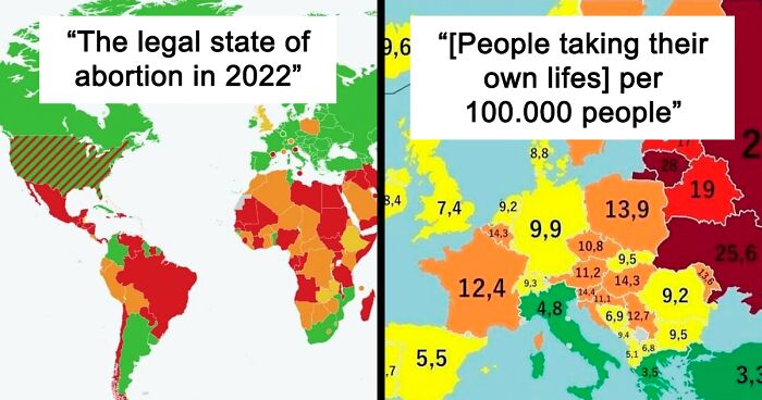
Load More Replies..."States in the US that still consider women to be property, as of June 2022"
The issue isn't just that they forbid abortions, it's also the breach of privacy. When the government/police/prosecutors gets the right to go through womens medical history, to go through their phones, e-mails, track their movements and so on, just to prove someone has had an abortion and prosecute them(or just to prove that someone has been thinking of having an abortion). These things is already happening and it's gonna get worse. Many in the US screams about privacy but neglect this just for the sake of feeling that abortion is wrong, everyone should be horrified over this.
Vote Blue, Americans. Our midterms are tomorrow (8 Nov) and this is why you can't skip elections in "off years" or "it's just midterms". There are state and local races that have helped shape this map, not just national.
The right to choose did not take away the right of not having an abortion for those who didn't want it. But now those who didn't want it, took the right to do it from everyone else. Shame! Healthcare is human right, and that includes abortions. It used to be that doctors decided at what age an embryo becomes a baby, now politicians do. Shame, just shame...
Abortion really shouldn't be banned since it's blatant government overreach. I wish the people of my ideology would accept that :l
Bored Panda was interested to hear about how the information on the maps is verified and how the reliability of the sources is checked. Lars noted that it's essential to separate the maps that they sell through their company, Mapographics, and the maps they repost on 'I [Effing] Love Maps.'
"For the maps we sell, all the data is acquired from peer-reviewed academic studies or satellite data from trusted sources such as NASA or ESA," Lars explained.
"For the maps we repost, we do a general review of the source of the data, but we do not either endorse or fully check all the background data. For instance, if we republish a map of the most common beer sold in various countries, we are not in the position that we can verify whether the sales volumes of the beer are really what the map says," he noted.
"Furthermore, for some posts, we receive a lot of feedback when they denote a politically controversial subject, such as the sovereignty of west Sahara or the acknowledgment of Palestine. We take no official position when posting these maps, but we do select maps we believe are of interest to our followers."
I actually live in an area where it is pretty normal for us to have 40-48 degrees on a normal summer day, so I was years old when I found out it's actually pretty hot. It's 26° right now and I'm wrapped in blankets with a hot cocoa living the life
Load More Replies...The UK experienced it's hottest day ever in July with temperatures reaching 40°c. We really weren't built for those temperatures. Very few of our homes have air conditioning. 🔥
and said homes are built to insulate heat, so it was like living in an oven. I'm surprised I survived it.
Load More Replies...Phoenix Arizona hit 123F a few years ago and soon they will be facing a water Crisis. The whole southwest is in a mega drought. Thank I left and moved to the Midwest. Con: it’s a very conservative area and my liberal mouth has to shut up a lot. Pro: at least it rains here a lot so that’s a plus if anything
Why do American 'world' maps so often drop off Australia? Like, that map isn't properly to scale .. it's just weird. And in summer, we often go over 45 Celsius !
Southern Europe looking good - either a lot of suicidal people just need a bit of sunshine and good food to cheer them up, or more religious countries have a lot of misreporting of suicides.
I think it has a lot to do with yes, sunshine, but also the pace and expectations of life in those places. The Hussle culture and long work hours just don't exist there. You are a human being, not a productive worker.
Load More Replies...In sweden suicide is the number one cause for death among people between the ages 15-24 and men between 15-44. Even though suicide has declined very much through the years in the whole, it increases for the people between 15-24. And we could speculate that the winter and dark months has something to do with it since mars and april is the most common months and winter depression effects more people, and how insulting it might sound(because many feel why tf should vitamin matters when I'm depressed) vitamin d-deficiency can put a real big toll on peoples mental health. I think we all up here needs to eat extra vitamin D during the darker months. We aren't made for getting 1-4 hours of light for five months. Even in the sunnier months we barely get enough.
Quick note on Russia: "It was a suicide" from the Soviet days for "irritated the Kremlin", so that may still hold true... Or it's living under Tsar Vlad.
The official 2018 data for Hungary is 16.9 instead of 14.3. In details, it's 27.3 for men, and 7.4 for women. So sad :( Source (in HU): https://www.ksh.hu/ffi/1-16.html
More likely that speaking out against the government is considered suicide!
Load More Replies...Mental health stigma needs to end. There is no shame in needing help when you’re feeling overwhelmed and it actually will help if you talk to someone (a professional trained in counseling/psychiatry/etc) and people need to stop with assuming it’s just a lack of sunshine or people needing healthier eating habits. There’s a lot more than just telling someone to be happy or eat right.
When I was a kid I decided that they said “biurrk biurrk” on my own accord so I’m glad to see I’m not that crazy 😝
Load More Replies...This is hilarious and could probably make a really funny song with the back beat of the frog sounds of Europe
Switzerland has 4 official languages, so our frogs quak, gra and coa and I am not too sure, what they do in Grischun, probably also gra.
*annoyed kum kum in Poland* - it's not "rechu-rechu", it's "rede-rede"
Funny enough, it used to be brekeke in Ancient Greek. Udv Lengyelorszagból! ☺️
Load More Replies...According to Lars, finding the line between a good and a great map is tricky. A lot depends on the audience in question.
"For our followers on IFLM, I think the maps are very effective in communicating a message, and where that message either confirms a former belief or surprises you are the ones that get the most attention. For our customers purchasing maps from Mapographics.shop, it's the design and ability to look nice on a well. And for the maps, we make aimed at more professional customers, such as international organizations, it is the ability to convey a policy-relevant message based on credible data sources and analysis," he shared that different people value slightly different things.
"And if we make maps for map nerds—it's all about the details. So there is not a single recipe, we need to consider our target group and try to make or publish maps following their viewpoint and interest."
Idk why you were downvoted, downvote troll is back, here have an upvote
Load More Replies...I would love to see this same map for other areas of the world using the exact same criteria. It would assist in giving people living outside of Africa a better frame of reference for the statistics they are seeing. I think it could help to drive home the severity of the situation.
Exactly! I was brought up to finish my meals with the saying "there's starving children in Africa!" but the scope is so hard to really imagine! Like, would the green zones here be the "best" in a European country, too, or would they only be yellow or orange compared to our availability of food? Would there be a colour for "oversaturated"? It's just hard to put into context like this.
Load More Replies...come to Africa and train people in skills or lobby your governments to stop using extractive economic methods, e.g. underpaying miners and making huge profits off the extracted minerals. Also lobby for world bank debts to be written off, and interest rates to be reduced. Your economies buy our bonds because they give over 10% returns. However that comes at the cost of our poor having to pay more for fuel and housing than you can even imagine, given their incomes. Source: I live in africa.
that's soooooo sad and depressing that this is even in existence.... ;(
And whose fault is this? I have lived for years in both Zimbabwe and Swaziland. Both countries had serious corruption problems. In Zimbabwe, food aid has been routinely used as a political weapon and only handed out two supporters of the ruling party.
So Denmark is on renewable resources and low on religion....you all looking for an extra citizen? I can be of help.
I think the importance of religion in the UK is increasing due to migration, the most common male first name the last few years has been Muhammad. I know attendance at Christian churches has been declining over the years, where I live several churches have combined because they can't afford to run all of them.
Eh... As a matter of fact Muslims are only 4.4% of the UK population compared to 38% Christians of all denominations and 52% atheists. Also, the reason that the name Muhammad is overrepresented is simply that the onomasticon (or name repertoire, in non-Greek) is far more limited for Muslims than other groups - that is, if you take a 100 Christian lads, there will be like 5 Aidens, Bradleys, Conors, Davids, Ethans, Finns, Georges, Harrys, Ians, Johns, Kevins, Liams, etc. each... while 10 Muslim boys may have 6 Muhammads (or some variant thereof, as one of their names) so technically it would be the most common male name (though I think the most common baby name is Oliver at the moment). I'm pretty sure religion has been pretty important for Christian Britons too, so all the Catholics/Protestants likely account for a good chunk of that "religion is important" statistic (considering the ongoing denominational prejudices in Scotland and Ireland, people are still being judged based on which school they went to and which football team they support). Edit: To be clear, I'm not saying any of this to denigrate any religion or naming convention, just thought some extra facts could bring some perspective to the statistics.
Load More Replies...as an Irish/Romanian, I apparently should think that religion is 73% important to me. It's 0% actually >.> idc if another person is religious, but if they use that as an excuse for hate such as homophobia, racism, etc, or they try to shove it down peoples throats, then they can go to hell.
Looks like I should take up residence in my paternal grandparents home country of Denmark. 🤔
My dad, who was an atheist, used to always say "religion is good for those who need it". So my question is, is religion for people who lack morals and ethics. Is religion a away to teach people how to act or be a good person? Teaching morals and ethics based on fear? And I know that fear is not working on many religious people yet they think atheist= no morals or ethics. It confuses me that they think atheist are all bad people and all religious people are good. There are all kinds of good and bad people in belief/non belief groups of people.
Unfortunately, I think the number is probably a little lower in Ukraine these days
This chart needs more colors before green... if I don't get my 9 hours, don't talk to me.
To make up for everyone else I will commit to sleeping 10 hours or more every night thank you
The ‘I [Effing] Love Maps’ project has carved out a sizable niche for itself on the internet. On Facebook alone, it has 800k followers, followed by 364k fans on Instagram, as well as a further 36.8k Twitter followers. In other words, there’s well over a million internet users who love the project for its educational and informative content alike.
The team running the show notes that they keep their audience “updated about global events via maps.” And that’s exactly what they continue to do.
Whether you’re an academic or simply want to know more about the world, the maps they share are great for expanding your knowledge. They’re also fantastic primers for getting you interested on specific topics, whether economics, geography, or demographics.
It comes from the biggest forum in China - MOP. Apparently emoticon no 233 represents a "LMAO". You can say 23333 or 23333333... the number of 3s is quite flexible and depends on how funny the thing is
Load More Replies...Pretty sure British people actually laugh (ha ha) and don't say lol unless they don't think it's actual that funny
in Portuguese the letter K is pronounced "kah" so kkkkk is like a cackle. A lot of people use "hahaha" or "hehehe" as well
Load More Replies...Nope, kkkkk is in Brazil, not in Portugal. We just say ahahahah or lol
For comparison's sake, the US gun death rate in the same year was 13.3. It increased to 15.1 the following year.
13.6 per 100 000 apparently. The US number also includes suicide with firearms, don't know if that's also the case for the numbers in the map above. https://www.pewresearch.org/fact-tank/2022/02/03/what-the-data-says-about-gun-deaths-in-the-u-s/
Load More Replies...Here’s the list of death by firearm or gun per 100,000, for each country. So go ahead and add it to the numbers on the map. And remember kids: statistics can be skewed to support any outcome even if they’re completely opposing. https://en.m.wikipedia.org/wiki/List_of_countries_by_firearm-related_death_rate
Can someone explain to me like I'm five, why gun deaths is a relevant statistic? Shouldn't homicide rates be what we measure?
Why? Is accidental death not also a good reason for better controls?
Load More Replies...Fewer guns on the market = fewer guns to get hold of illegally. Prices go up, barriers to purchase arise (meaning you have to know the right people), supply falters (fewer legal owners means fewer legal guns stolen from homes, for instance). Consequently, opportunist criminals like junkies find it harder to get hold of guns because even if they have the connections, they don't have the money, because if they DID have the money, they'd spend it on drugs. So yes, basic supply and demand says that restricting supply makes it harder for people to get hold of guns illegally.
Load More Replies...This chart is wildly inaccurate. A few examples: Abortion is generally legal in much of Mexico. Abortion is illegal under the German constitution, but exempt from criminal prosecution early in the pregnancy or with many social grounds later; this keeps the German abortion rate at a small percentage of that of nations like China, the U.S., etc. HELP ME! I've been cancelled because I expressed astonishment so much of Europe relies so heavily on oil for electricity. Please upvote me here: https://www.boredpanda.com/maps-keep-you-updated/?comment_id=12766073 (A net of 10 downvotes results in an account suspension.)
Agreed. People weren't sneaking across the border in the '50s from Mexico to the USA for abortions. It was the other way around. Sadly that may be the case once again in the near future.
Load More Replies...Just because it's legal, it doesn't mean that it's accessible. Try getting an abortion in some of the Eastern European countries and see how easy it is. Hell, getting on birth control was a pain in the neck. My ob-gyn (staunchly Catholic with crucifixes all over her office) gave me hell for wanting it "at my age when I should be focusing on getting married". God, was I grateful for access to Depo in the UK. All I had to say was that I was from a very religious country and immediately we discussed so many options for long-term birth control! I discussed it a bit with the nurses, turns out that many EE girls reported their families tempering with their BC, so they immediately go for options that cannot be tampered with. It's horrific.
Feel for you. That's appalling. People need to mind their own business and keep their religion OUT of medicine.
Load More Replies...Finland recently eased its abortion laws to 'on request', likely in response to Roe v Wade overturn.
Mexico's supreme court made abortion legal in all of that nation well before this map was made. Statista needs to update its source material. Abortion is now legal in every Mexican state. Access is still not equal, I'm told, but it's legal.
Technically, the classification is true for the UK. One of the conditions is "that the pregnancy has not exceeded its twenty-fourth week and that the continuance of the pregnancy would involve risk, greater than if the pregnancy were terminated, of injury to the physical or mental health of the pregnant woman or any existing children of her family" However if a person is within the 24 week period they can pretty much have an abortion on demand.
I think most countries which are classified as 'on request' have gestational limits around 24 weeks (give or take a few weeks), unless there's a serious medical issue in which case you need approval from a doctor (or perhaps two). That's certainly the case in all states in Australia.
Load More Replies...That map is wrong at least when it comes to Scotland and Poland. In Poland, you can technically get an abortion for 3 reasons: rape, pregnancy being life-threatening or the baby being a result of an incestual relationship. In reality, no doctor is willing to do it because they will be prosecuted anyway. In Scotland, however abortion is entirely legal and allowed for anyone (Can't say for ireland, Wales and England, but Scotland has their own health system)
The Finnish government JUST voted to chillax on the regulations, all you need now is to ask for one from a single doctor and you can get it, up to 12 weeks. Used to be two doctors and a good excuse. Yay.
Yeah, it's hard for me to believe that Russian women have more bodily autonomy than American women.
Load More Replies...For our previous feature about the project, my colleague got in touch with the founders, Pablo Izquierdo and Lars Erik. The twosome, who live in Oslo and Madrid, have been developing maps together for more than a decade, and have founded the company, Mapographics.
According to the founders, the goal of Mapographics is to make informative, educational, and aesthetic maps. “We have developed a lot of maps and analysis in the sustainability domain, and lately we have also started to sell maps for decoration. We love to merge scientific data with design,” they told Bored Panda.
The ‘I [Effing] Love Maps’ project was created over a decade ago. Pablo and Lars wanted to have a place on social media where they could share their love for maps. And it all started on good ol’ Facebook.
“It started with a Facebook page, and then moved on to Twitter and Instagram. We’re super happy to have several hundreds of thousands of followers, which to us is only a testimonial that many people share our love of maps,” Pablo told Bored Panda during an interview earlier.
According to him, people nowadays live in an ever more globalized society, meaning that the distances between us are getting smaller and smaller. It’s all thanks to cultural exchange and technology.
Well, US likes to lead, and they don't have much left.
Load More Replies...The 10 people living in greenland should avoid throwing out whale bones, seems to skew the chart poorly
Part of Denmark, i think they took it as a whole
Load More Replies...Ulaanbaatar (the capital city) is notoriously polluted, due to the fact that coal is still common use for heating, given nearly half the population of the city still lives in Ger areas (aka those traditional tents) and the city is very cold in winter months. The pollution levels are 27x higher than what the WHO considers safe. It's a shame, Mongolia is a stunning place to visit otherwise.
Load More Replies...Not your fault that your government sells out its beliefs to the wealthiest lobbyists. You just stay a good person and make good decisions in life, thats the best you can do.
Load More Replies...In case anyone ever asks you, what do Mongolia and the United States have in common
People actually believe China and Russia are reporting accurate numbers?
Denmark has surprised me, given a map earlier in this list said that nearly half of energy in denmark came from renewable sources, I figured they'd be greener.
The low waste production in most of Africa is due to the low consumption rate of goods.
It would be interesting to see how many countries that either Russia or China have bases in..
China's only foreign military base is in Djibouti. A country in the east coast of Africa, bordering Somalia, Ethiopia and Eritrea. Russia has about 20 foreign bases. https://military-history.fandom.com/wiki/List_of_Russian_military_bases_abroad
Load More Replies...New Zealand has two US military bases - Hereford Base at Christchurch Airport and there's a satellite surveillance base at Mt John near Timaru...
Funny enough, US Army expects that each soldier will serve a period of time overseas. For my eldest brother, Alaska was considered overseas. For my husbands friend in the barracks, he got Hawaii.
We have 1 in Australia. Having the whole country coloured, makes it look weird.
Interesting fact - I am Ukrainian (Southern East region) who migrated firstly to Poland, and than to Albania. Don't know how most of Ukrainians are migrating to Russia, if when I was in PL (before war times), more than 2mln Ukrainians were living there and around 400,000 Ukrainians were granted PL residence permit YEARLY. Just in my university percentage of Ukrainian students was over 30%. Through my life I knew only several people who migrated to Russia (all of them are my distant relatives), and dozens of those who migrated to Poland, some of them have even got the citizenship already. Considering the fact that I am from a region not far away from RUS border, it's curious.
I feel the maps means the other way round? Like people moving from Russia mostly to Ukraine? I am German and the largest number of people migrating here is certainly not US Americans. It might be the other way round though.
Load More Replies...Latvians going to Russia? Yeah no. Never. Even the Russians living in Latvia ain't going there!
How interesting that most Russians migrate to Ukraine. I scared my Mother because I laughed so loud
Inverted immigration from France to Portugal: Portugueses came in the 1950s, French go now :D
I'd like to point out that if you're moving west to Germany, it's b/c of Russia is my best guess. And I don't blame anyone a damn bit.
The ongoing war must have significantly changed the proportions for Ukraine
We migrated to Australia in 1967 and I have never left even for a visit. The UK is far too cold for my liking.
“In addition, themes such as those that relate to environment, climate, sustainability, man-build-environment, and more, nurture more interest in the spatial dimensions of things. Maps can represent how things are tied together in the spatial dimension, or geographical sense,” Pablo said.
“We experience a much higher interest in maps, more advanced spatial analysis, and more lightly, storytelling.”
So, we're all just pranking Charles? EDIT: HELP ME!!! I've been censored from BoredPanda because I expressed astonishment that much of Europe still relies heavily on oil! It's post #2 right now!
Technically she was the last one, as Charles is the current one. Still makes see sad tho whenever it’s brought up in the news
Load More Replies...This one had me scratching my brain, because I was irritated that not Czar Nikolai II was the last monarch of Finland, but a guy I never saw. Then I remembered Finland's short-lived idea of becoming a monarchy with the aid of a German prince. Charles Frederick of Hesse was elected King of Finland, but declined the throne, because the fast paced political going ons made the idea of a monarchy in Finland obsolete. He never actively ruled and is at best a footnote in the history of Finland.
Thank you, I was wondering about that German-looking guy in Finland ;)
Load More Replies...His nose is visible a little south of Lofotten :-)
Load More Replies...Our swedish king is the latest, not the last. No plans on going republican and a nice princess waiting to be queen.
Except for Queen Elizabeth II of Great Britain and Tsar Nicholas II of Russia, I don't know any of these other royals
Hungary is totally understandable. If your corrupt lying politicans own all the news sources and distort the truth on a daily basis, you would avoid the "news" too.
I don't avoid news on the whole, but I'm trying to limit how often I check out the news sites to closer to 1-2 times a day. Got into a bad doom scrolling habit in 2020 and it's not good for anyone's mental health
Mine started with trump in 2015 and got to the point of crowding out book reading. I couldn't stop. He messed with my quality of life.
Load More Replies...I wonder how recent this is. Finland is in a precarious situation these days. It's one of the few ways OUT of Russia for people fleeing the draft.
Poland - TV is mostly in hands of politics from 1 party and some people don't know how to find better sources.
A. E. Houseman. Ale, man, ale's the stuff to drink For fellows whom it hurts to think: Look into the pewter pot To see the world as the world's not.
Personal opinion for Bulgaria, the news is a sham, corrupt and heavily biased, so yes avoid the scripted lies and watch a movie or sth instead....
Food and aid should not be an item involved in war. Sadly it's one of the first to be effected.
and yet here in the UK our government is blaming everything about the cost of living crisis/shortages etc on the war in Ukraine. When in reality, it's all because of brexit, not getting us a good trade deal, the effect covid had on the economy and how badly it was handled here, the corruption in the government, and the fact that our previous PM (truss, as of speaking, because who knows when the next one will be, could be next week for all we know rn) selling off out gas reserves. :')
Not trying to devaluate the much more important crisis in Africa, just want to add a fact: even though Germany does not suffer from a food shortage, the prices have gone up significantly.
“From a social media point of view, people love maps that are spot-on in conveying a message of stereotypical characteristics and differences between countries. From a more professional point of view, the interest in sustainability related topics in maps has skyrocketed in recent years, such as maps showing degradation of nature or the effects of climate change. But more generally speaking, what we see is that maps, as a way to represent data or tell a story, are increasingly used in media, by the government, NGOs and even in the business community.”
What does the massive pig in Italy mean? Lots of porkies from the Vatican?
When you defeat all the other countries' pigs, you get to fight the Pig Boss in Italy
Load More Replies...I wish they'd made the borders visible in this one, too. I can't tell where Germany starts and France ends and, historically, that's a huge problem...!
I live in Budapest, Hungary, having 1000Mbps (1GBps). It could be upgraded to 2GBps but for what? Netflix in 4K needs 15MBps (0.015GBps). We have 1-2ms ping time to the service provider. Everything is lightning fast.
My face when I moved to the UK and had to pay £36 for 264 mbps. Meanwhile, in Romania 1800 mbps + 155 TV channels is £10.38
It's the average, again... I'm glad when my husband and I can watch two different Netflix shows at the same time, he sometimes has to stop gaming so I can share pictures and videos with my mother. It's very different 5km East in the next big city...
Load More Replies...iceland is the best country. warm geothermal vents, beautiful scenery ^great internet^ and best of all. NO MOSQUITOES
But unfortunately nearly total dependency on other nations
Load More Replies...Ah, one of the few "benefits" of Brexit that has actually been realised - returning to dark blue passports - forgive me if I don't sound too excited. :(
It doesn’t even look blue; it’s almost black. What a pointless change to make.
Load More Replies...Ours used to be like the UK one but they changed it to black a few years ago.
Ooh how nice to see all the emblemes. I wish one could see them in whole. Some of them are so beautifully intricate.
However, it’s far from easy to create a map that looks good, tells a story, and is also based on advanced data. There’s a lot of trial and error involved here!
“To put it simply, the process starts from the idea on what story/data the maps should express, to identification of data source, quality assurance, data processing, GIS [Geographical Information Systems] processing, and working to ensure the final print has crisp and flawless details when it turns into a final product."
Allegedly Russia has always kept nuclear weapons in Kaliningrad, too. Not US-owned, but still ready to party. All too many everywhere
Not sure why you're concerned - I thought roaches could easily withstand a nuclear explosion..? ;)
Load More Replies...Yeah cool so I live about 130 km away from Volkel, Kleine-Brogel and Büchel. It was nice knowing you guys.
Yeah, that's another facet of the issue with Russia now claiming they traditionally "own" Ukraine and invaded to protect Russian-speaking people. Ukraine gave up all their nukes in 1994 only after Russia recognized them as their own independent country. Basically, the world took Russia at it's word, and now Ukraine is in a fight for its life because, among other things, they have no nuclear deterrent to Russian agression.
Load More Replies...I want to see a map of the percentage of broken IPhone users 😄
Every time I get a garbled, distorted phone call from someone I ask if they are using an Apple phone. The answer has always been yes. They make great personal computers, but lousy phones.
Yet every time someone tries to email me for work and it doesn't arrive I know they're using Apple...
Load More Replies...I love how the Monaco flag is identical to Indonesia's and it always confuses me for a second. Let's invite Indonesia to join Europe and remove the confusion for good? 🙃
In Germany it‘s so low, because most of us like to safe money. We don‘t buy because of brand names, but because of a need.
In my household is exactly 50/50. There's 4 of us.
Load More Replies...I have problem with the Indian map here (incorrect about our territory) otherwise I am sleeping a good 9 hours per day.
Considering that the map shows "average time in BED", you must be sleeping 2h13m somewhere else 🙃 Check your sleepwalking patterns, just to be sure.
Load More Replies...Basically no one in Asia, and few people in Europe are getting enough sleep. Maybe we’d have fewer wars if people were better rested.
A while back, Bored Panda spoke to land surveyor Patrick McGranaghan, the founder of another major community for map lovers. He explained to us that there are a variety of different reasons why someone chooses to make a map in the first place.
“Sometimes for navigation, sometimes for showing statistical phenomena, and sometimes for fantasy. While artistic skill helps, it is not absolutely necessary. The important thing is to make it easy for users to glean useful information. Most maps should have a thesis or a story it is going to tell and this needs to be told through the map," he told us.
The fact that Russia and China are both still part of the UN is an atrocity. Both countries commit constant human rights violations.
For the record, our budgetary cycle in the US differs from the UN's, and taht often affects what is seen as "late payment" or "not paid in full for this budgetary cycle".
This is misleading as “payment” is not always done with money but also military support
Maybe it is time to make their voting worth proportional to the payment made. Those that pay on time 100%. Those pay late will have their votes worth 50% only.
except the US pays 17% of the entire UN Budget, most countries contribute less than 1%, the reason why the US has not paid in full is bc congress passed laws banning US money to certain UN Orgs for "promoting hate", and therefore the US doesn't officially meet its obligation. There are 190 countries in the UN, as long as you pay your 1/190th of the budget, you paid in full, regardless of other oblgations you agreed to
Load More Replies...I’ve spent over 19 years in full time education. Sadly my brain is only good for studying or doing nothing- no inbetween.
Quality is as important (or more so) than quantity. Mexico (not in Asia, I know) has 12 years of compulsory education, plus widely available kindergarten and free universities, but the system is generally c**p.
1. Canada – most popular relocation destination for 50 countries 2. Japan – most popular relocation destination for 31 countries 3. Spain – most popular relocation destination for 19 countries
It's safe, advanced technologically, and jobs opportunities. Plus beautiful areas outside of the cities.
Load More Replies...This is just silly. The number one destination for Chinese is the U.S., with more than twice the number of immigrants (even counting only legal immigrants) than Canada. Yes, for its own relatively small population, Canada takes in a massive number of worldwide immigrants, 400,000. And while that's proportionally double what America takes in, it's 1/5th the total number America takes in. Japan takes in a still smaller number than Canada. The top nations for people emigrating from South Africa are: 1. Australia, 2. UK, 3. U.S. Canada is only #9, after American Samoa and the United Arab Emirates! For India: 1. U.S., 2. U.A.E., 3. Malaysia, 4. Saudi Arabia, 5. Myanmar. For China: 1. Indonesia. 2. Thailand, 3. Malaysia, 4. US. For Brazil: 1. US., 2. Paraguay, 3. Portugal, 4. UK. 5. Japan. Canada isn't a top destination for ANY nation shown. HELP ME! I've been cancelled because I expressed astonishment so much of Europe relies so heavily on oil for electricity. Please upvote me here: https://www.boredpanda.com/maps-keep-you-updated/?comment_id=12766073 (A net of 10 downvotes results in an account suspension.)
Ironically, the one nation shown where Canada is a top destination (sort of) is the United States. No, only a very tiny portion move to China. The official #1 country is Mexico, but while this only includes people born in the U.S., it does include a massive number of children born whose parents are from Mexico. #2 is Canada. #3 is India (!), #4 is the Philippines , #5 is Germany... and we're still talking six times more than who leave for China!
Load More Replies...Aaand.. where is this data sourced from? Post pandemic, nobody is really going anywhere. Aussie here- the only thing I can think of is that pre pandemic this is picking up the programme of teaching English in Japan for 1 year post bachelor. Other than that - this is a big ole nope for Australia!!
Sourced only from what people googled. And only a few terms were counted, all in English. So nothing official
Load More Replies...This is completely crazy. I'm argentinian and I've lived abroad in many countries. If I have to guess, Spain, Italy, the us, Uruguay and México are no doubt more popular to emigrate than Japan
The land surveyor noted that many beautiful maps these days are made using Blender. “Blender has a great ability to show light and shadow patterns that are almost photo-realistic. I think there are ways to use this program beyond showing maps with realistic terrain,” he explained that the computer program can help mapmakers achieve the effects that they desire, e.g. showing realistic terrain and more.
Finland not only teaches their students how to identify accurate information, but critical thinking is a required component of every subject.
Load More Replies...Wow, must be nice. Hopefully the new sources in the countries above 50% actually have honest news sources. USA have 0 trustworthy sources.
Does zero trustworthy sources actually seem possible to you or is it just hyperbole?
Load More Replies...I trust the news but then I picked my news outlets carefully full stop if it's owned by a billionaire it's probably not any good
So none from France or Japan, the two countries with the most top of the line restaurants in the world (with Italy and Spain just behind). How serious is that… Any dumbass can make a ridiculous list but it shouldn’t be relayed.
I can pretty much guarantee you that if an average person ate at one of these places you would be UNDERWHELMED. Often times this type of food is not that good. You would probably enjoy a $1 taco from a street cart in Mexico more than most of these & I know it’s so expensive. I went to a fancy, high rated place in NYC that did Scandinavia food. Was one of the worst, most expensive meals I ever had. I would have been happier with a $3 slice of NY pizza 🍕
Load More Replies...For those wondering, William Reed Business Media is a media company that specializes in advertising for catering and restaurants. To qualify to even be considered, a company must: A. Use William Reed for advertising/promotion, B. Pay to enter the running for the top 50 and C. Carry S.Pellegrino & Acqua Panna brands of water, the official water of the "contest". So yeah, it's rigged.
So it's like a JD Power award. Every vehicle gets one in every category, but you can only advertise the fact that you have the award if you've paid the royalty.
Load More Replies...Who the hell is William Reed and why am I supposed to care what they think?
I count four. Then one in Catalonia and one in Euskadi (Basque Country). 26% of Peruvians speak a language other than Spanish as a first language. But Lima is predominantly Spanish for sure.
Load More Replies...Whichever organisation rates restaurants is grabbing a tiger by the tail. It’s going to be subjective. I would have expected Michelin Stars to be the best guide, myself.
If an average person ate at one of these places you would be UNDERWHELMED. Often times this type of food is not that good. You would probably enjoy a $1 taco from a street cart in Mexico more than most of these & I know it’s so expensive. I went to a fancy, high rated place in NYC that did Scandinavia food. Was one of the worst, most expensive meals I ever had. I would have been happier with a $3 slice of NY pizza
"09/03/2013 · Food poisoning at Noma, a Danish restaurant often hailed as the world's best, has left over 60 people suffering from vomiting and diarrhoea."
Load More Replies...Is this taking account of rice in liquid form? A lot of beer uses rice these days.
"Wercome to rice fierds mutafukar"
Load More Replies...Source? I just did a quick googling (so these #s might be wrong) and in 2022 our military spending was at $1.94T, and in 2021 our GDP was like $23T, which would be over 8%?
Load More Replies...Probably. According to a few different sources, North Korea spends ~22-24% of their GDP on their military.
Load More Replies...The time period makes it meaningless. Many counties had closed borders for covid for 2/4 years covered by the graph.
Beat me to it. Statista is really about cute maps, not actual information, from what I'm seeing on this BP post.
Load More Replies...So much for the racist idiots who claim Britain is being overwhelmed
Why are so many people leaving Greenland? With global warming, you'd think it would be the place to go. Finally, it's habitable!
It seems a little misleading, since it's taking a percentage of the country's population, rather than actually numbers. You can see where people are leaving and where they are going, but you can't actually compare the countries against one another, since their populations are different. It would be interesting to see a map that does that.
Positive = blue shades = immigration. Negative = pink shades = emigration
Load More Replies...Ireland is skewed upwards by foreign conpanies using ireland as a tax haven. More worrying is the UK which is also skewed upwards by the City of London, and international trading. Meaning the country as a whole is much poorer than GDP would suggest.
The GDP should never be used as a measure of the quality of life for the general population.
Load More Replies...Just curious, but why people in Northern Europe consume so much ice cream. After all, they live in a very cold place, next to the arctic.
Maybe there it is just right room tempreture food :)
Load More Replies...How do they know if it;s an italian who buys kilo of icecream in Italy or a tourist. Because of the weather and holiday feeling, as a dutchman I almost only consume icecream when in Italy. By the way: please a map where the amount of icecream is connected with the hours of sunlight / good weather
Colder the climate, more to eat (and hotter the climate, more to eat)
I like how Finland is always at the tops of the list, no matter how good or bad, they are just click farming
Nah! Thats because they are still not sure whether they part of Asia or Europe :)
Load More Replies...I would so totally trust anybody in Russia or China saying they're hardly ever angry.
I guess the US doesn't appreciate the irony of abortions being illegal while the death penalty is legal.
<--- This American does. Although I've never paid for an abortion, I'm pretty sure my tax money has paid for multiple executions.
Load More Replies...I had to look up "retentionist" and "abolitionist" in the context of this post. Deathpenaltyinfo.org describes "retentionist" as a country that has includes the death penalty as a legal possibility for sentencing. "Abolitionist in practice" means a country that technically allows the death penalty but doesn't actually use it. https://deathpenaltyinfo.org/policy-issues/international/abolitionist-and-retentionist-countries
Brazil's constitution prohibits the use of the death penalty except in cases of war crimes or genocide. The last execution in Brazil was in 1876. This was when Emperor Pedro II abolished the death penalty. And the foundation of the Republic in 1889 codified that into law. So not really sure we still have it, as this map suggests.
Brazil doesn't have a death penalty on practice. It's provided in the constitution only and only on the instance of a war. There's nothing about "war crimes".
Makes me sad knowing there's potentially millions of people that never see the ocean in their lives.
I met a guy from Northern Ireland who like taking Americans from the midwest to the seaside. If you've never seen the sea before Antrim is a pretty impressive place to start: large North Sea Cliffs with geometric granite rocks
Load More Replies...only 3,311 individuals—represent almost $11.8 trillion in wealth. The global billionaire population continued to grow in 2021, increasing by 3%. Over the same period, billionaire wealth also increased by 18%. This map uses data from the Wealth-X Billionaire Census to visualize where the world’s billionaires live and breaks down their collective wealth.
Can we please send all these people to Mars and be done with them yet?
no, it's 57%, so it is correctly shown. source: https://www.bfe.admin.ch/bfe/en/home/supply/renewable-energy/hydropower.html/
Load More Replies...While countless academic researchers have tried to get to the bottom of this, the truth is, it’s a complicated question to answer. Happiness levels depend on a number of factors, including one’s financial security, perceptions of social support, feelings of personal freedom, and much more. This map pulls data from the World Happiness Report to uncover the average happiness scores of 146 countries. It shows average scores from 2019 to 2021, and highlights which countries are the happiest—or unhappiest—and why
Ukraine least happy and that's BEFORE this year :( edit: says 2022 at the top but the blurb at the bottom says average 2019 - 2021
Devon County Council doesn't let the grass grow under their feet full stop that's what the middle of the road is for.
So they're measuring prices in gallons because one country out of 192 uses this measurement?
Because crude oil is measured in barrels @ exactly 42 US gallons.
Load More Replies...That's why we're so freakin' excited for the coming winter in Europe
The US is like that nosy neighbour down the street who thinks they're the boss of everyone.
So i guess they were wrong in some places. In Poland currently almost 18%, and probably going to be 20+ something soon
Well would you look at that. That state run economy in China looks pretty good doesn't it?
No better than Australia, Norway, Sweden, Finland, France, Portugal and a bunch of others, so no, not especially.
Load More Replies...Would love to see this side by side with a map of the same data for 50 or 100 years ago, etc.
So much more of the Amazon, Pacific Northwest and Great Lake Region would be dark green. :( a tragedy that they were lost.
Load More Replies...Germany probably would be darker, but we lack prisons (ours are at full capacity)
It's interesting how Turkey is included in Europe in some of the images, not in others, and in Asia in yet others.
Istanbul was Constantinople. Now it's Istanbul, not Constantinople.
Load More Replies...And out of the woodworks come all the little neonazis that are to chicken to admit what they are. Claiming the European far right is "moderate"
The US far right does it, too. They claim anyone to their left is a “radical” while they’re “common sense” and “moderate.” And the far right in the US is much more sizable than the far left.
Load More Replies...the right themselves arent a bad group, if we compiled together all the left and the right ideas and needs, we will see that we want 80% of the same things, its not them who're the problem, its the bad right wing, my family is from hungary and they have no problem with the government, please dont judge our beautiful country for politics. probably going to be downvoted though lol
Load More Replies...The gain in popularity is linked to the immigration from the Middle East and Africa since 2014 with the biggest concern being security reasons. Issues are increases in violence, antisemitsm and attacks on LGBQT groups. That central and left wing parties are against stricter regulations and/or promote it further also boost right wing popularity. (Just an observation)
ARe you sure tha in Hungary there were so much refugees/immigrants? Or I'm just blind not to see them?
Load More Replies...The data and title don't really match though, if the title and subtitle are both correct. The vast majority of "major right-wing parties" (as described in the subtitle) are going to be moderate-right, not far-right. So if the dataset is as it is claimed, then this is the sway of the right-wing as a whole, not just the far-right.
It actually really represents the percentages of far right parties. If you combined these percentages with moderate-right parties they would be way higher.
Load More Replies...🇪🇦 Spain, 🇫🇷 France, 🇮🇹 Italy, 🇬🇷 Greece, 🇦🇱 Albania, 🇩🇪 Germany, 🇨🇿 Czech republic, 🇭🇷 Croatia, 🇸🇰 Slovakia, 🇷🇺 Russia, 🇬🇧 United Kingdom. I think that's all of the ones on the map. Had a 10 (that's like A+) in geography back in the day.
Load More Replies...I have never heard of anyone in Hungary going on vacation to Germany. Most of the time we go to Croatia, Italy, France and Spain, and in winter to Austria.
Same for Poland. Must be a mistake. Do they count seasonal workers as holiday goers or what? :D
Load More Replies...ALOT of Germans also go to the western coast of Jutland in Denmark
FFS, less than 10%? In America, that number is 15%, and we have to go friggin' FAR to go abroad! You all can go abroad as easily as most Americans can visit their parents! I read the colors wrong; I see most of what I saw as under 10% is 15-30%. Not sure why the people below me are getting votes for being cancelled. I was just cancelled. I can only edit old posts. Apparently expressing astonishment that oil is still used for electrical generation in Europe is a terrible offense to a website where people still talk about what a wonderful person a rapist, murderer and attempted cop-killer was.
A once in a lifetime opportunity to live in Canada. Hell, I'll take it.
Think of the snow in the US in the winter. Now realise that almost all of UK and Ireland is further North than almost all the contiguous US.
Load More Replies...Strange to think of grizzly bears living somewhere like the mojave desert... seems unlikely!
No surprise for Argentinia drinking mostly wine, they produce very good wines there
Yep. I live in Oklahoma and we had like 10 heat advisories (When the temp reaches 100 or above) in July
But what types of goods are most commonly imported throughout different parts of US? This graphic by OnDeck shows the top import in every U.S. state, using January 2022 data from the U.S.
My theory on why gas is so expensive nowadays is that most of our gas probably comes from Russia, who we've since cut ties with since the war in Ukraine. Therefore, gas is harder to access so it's cheaper. Correct me if I'm wrong about this!
THIS Is how you measure gas prices! Not by the Dollar/Pound/Euro, but by hours worked!
And since it’s still one of the most popular beverages worldwide, it seems we haven’t gotten sick of it yet. The latest available data shows that beer consumption exceeded 177 million kiloliters around the world in 2020. Beer consumption occurs all over the world, but the amount varies greatly depending on the location. So, which countries drink the most beer? This graphic by @visualcap uses data from Kirin Holdings to compare global beer consumption by country. Kirin is a Japanese company that has been tracking beer consumption around the world since 1975
Isn't total consumption a bad measurement? China has over 15 times more people than Germany but the consumption is only 5 times higher
It would be good to have two images, one with total consumption, and the other with per capita.
Load More Replies...If it was per Capita Denmark would be in the top countries but because we are only ca 5,5 million people it doesn't show on this one.
totally agree with you ! and I love the beer in Denmark ! cheers !
Load More Replies...Via Visual Capitalist The United States spends an unparalleled amount of money on its military—about $778 billion each year to be precise. Additionally, the U.S. military also owns, leases, or operates an impressive real estate portfolio with buildings valued at $749 billion and a land area of 26.9 million acres, of which around 98% is located within the United States. This visual, using data from the Department of Defense (DoD) reveals how much of each state the U.S. military owns, leases, or operates on. This map visualizes the share of a state comprised by military sites, which the Department of Defense defines as a specific geographic location that has individual land parcels or facilities assigned to it. The geographical location is leased to, owned by, or otherwise under the jurisdiction of the DoD.
So no military bases in South Dakota, Nebraska, Minnesota, Michigan and West Virginia? ☮
Makes sense that the west has the highest percentages, given that's the direction Russia or China would invade from (also the locations of the US ICBM arsenal is mostly located there)
A land invasion of the US would be a loser, even for China. The reason the largest sites are in the west is that there is a lot of empty space.
Load More Replies...Funny, I thought Colorado would be higher. What with NORAD and Colorado Springs.
The site itself isn’t that large; none of Colorado Springs is part of the military installation.
Load More Replies...After rice and corn (maize), wheat is the third most-produced cereal worldwide, and the second-most-produced for human consumption. And considering wheat’s importance in the global food system, any impact on major producers such as droughts, wars, or other events, can impact the entire world. Which countries are the largest producers of wheat? This graphic by Kashish Rastogi visualizes the breakdown of 20 years of global wheat production by country
When exotic goods traveled to new regions, their native names sometimes hitchhiked along with them. Naturally, the Germans have a term – Wanderwörter – for these extraordinary loanwords that journey around the globe, mutating subtly along the way. This map, produced by Haisam Hussein for Lapham’s Quarterly, charts the flow of Wanderwörter along global trade routes.
Ukraine as well, given how many the russians leave behind
Load More Replies...100% Russia is lying about their numbers. What is their definition of "In Service"? I suspect a lot of them are mothballed old relics that would take a month to get moving again.
Hey, can Bored Panda get their common posteriors out of where ever they lost it! N*I*G*E*R is a country, one of the biggest in Africa, and not a slur or swear word.
Seems like automatic censoring, as I typed N I g e r out in full.
Load More Replies...So if people don't recognize these land masses, Chukchi Sea is the north sea between Russia and Alaska. The island in the lower middle with a lot of blue-green is St. Lawrence Island. The area between the two countries is the Bering Strait, leading to the southern Bering Sea.
Bulgaria & Romania: More of that, please! I like to be able to cook eggs on the pavement.
I didn't even knew Saxonia (the dark green part of Germany) had that big of an Internet culture. There live mostly old people I thought... Every day you learn something new!
So, if the UK is losing them already - why are governments so worried about taxing the wealthy? I'm joking of course! It's obvious why. The government IS the wealthy.
Your screen isn't wide enough to show where the USA would fit on this chart. The last time we were below 100% was when Bill Clinton was president. It's only gotten worse since.
Housing bubbles are a tricky phenomenon. As a market gathers steam and prices increase, it remains a matter of debate whether that market is overvalued and flooded with speculation, or it’s simply experiencing robust demand.
Of course, once a bubble bursts, it’s all obvious in hindsight.
One common red flag is when prices decouple from local incomes and rents. As well, imbalances in the real economy, such as excessive construction activity and lending can signal a bubble in the making.
Based on data from the Real Estate Bubble Index by UBS, examines 25 global cities, scoring them based on their bubble risk.
Can we get this done by county, I think there are some outliers changing the overall result
As a foreigner, I always wonder why people dislike New Jersey. Can someone tell me please?
For me it's the traffic; makes me angry. Other than that, don't really know
Load More Replies...It's really not fair to throw Washing DC on this one. It's not a state.
In South Africa you can also get contraceptives (pill, implant, injection) from any clinic, including most pharmacies that have a nurse and family planning clinic. So you can't just get it OTC, but you don't need to go to a GP or gynae to get a prescription.
A bit useless. China have facilities but don't want foreign tech and still rely on they uneficient vaccine formula. So, youmay have production capacity, but political choice are more important. Let's do a map of coutries that want this pandemic to stop instead.
Why is this map excluding EU/USA/Canada? There's a motive here, but without context I can't tell what it is.
Because they are manufacturing mrna vaccines maybe?? The others could, but don't??
Load More Replies...It's easier to sabotage an unmoving object, and also distance could be a factor
Load More Replies...Danish person here and I've never heard of Rummelpot. We go on Fastelavn in the spring.
Northern-german here, never heard of Rummelpott either. We call it Fasching
Load More Replies...It must be nice to live in a country that has more than two parties... SIGH...
Especially in Romania it is showing that there is a change in voting pattern depending on whether or not that chunk of the country was part of the austro-hungarian empire full stop you can also see the edge of the old Prussian Empire reflect Polish voting
Load More Replies...In Poland, it would be good to show not the part stolen by Austro-Hungary but the part stolen by tzarina Katherine - you would see it mostly fits the division for blue (PIS, currently rule, far right) and orange (centrists). It explains a bit how the easter of Poland suffered underdevelopment under that time "glorious" Russian leadership
As a color blind person I found some of these kinda hard to figure out.I'm looking for an offended color blind peoples group to boycott color coded maps.
Most computers and mobile devices have settings to adjust for red-green and blue-yellow color blindness. I'm an app developer. Apple has been educating and pushing developers to use their growing list of accessibility features. So more software should be accommodating a variety of visual and auditory needs.
Load More Replies...I'd like to point out something about these color-coded maps/graphics: "Green = good" and "red = bad" will instill a bias against those things coded in that way (or light blue vs dark blue in case of European religiosity). So that you do not see any other map without thinking of this. This is how political divides grow wider and prejudices grow. It's the psychology of statistics (AKA lies or damned lies or at least very misleading).
Also note that certain colors have triggers, both culturally and inherently. Ergo, red in the West is "dangerous", but green is "soothing"; blue is "weak"; and so forth. Lots of studies on how people react to color, and if you apply it to these graphics, you start re-thinking your own reactions. Fun thought experiment for you on Monday morning :-)
Load More Replies...I counted. Out of 35 posts, only 1 is specifically on the US. This guy is dilusional.
Load More Replies...As a color blind person I found some of these kinda hard to figure out.I'm looking for an offended color blind peoples group to boycott color coded maps.
Most computers and mobile devices have settings to adjust for red-green and blue-yellow color blindness. I'm an app developer. Apple has been educating and pushing developers to use their growing list of accessibility features. So more software should be accommodating a variety of visual and auditory needs.
Load More Replies...I'd like to point out something about these color-coded maps/graphics: "Green = good" and "red = bad" will instill a bias against those things coded in that way (or light blue vs dark blue in case of European religiosity). So that you do not see any other map without thinking of this. This is how political divides grow wider and prejudices grow. It's the psychology of statistics (AKA lies or damned lies or at least very misleading).
Also note that certain colors have triggers, both culturally and inherently. Ergo, red in the West is "dangerous", but green is "soothing"; blue is "weak"; and so forth. Lots of studies on how people react to color, and if you apply it to these graphics, you start re-thinking your own reactions. Fun thought experiment for you on Monday morning :-)
Load More Replies...I counted. Out of 35 posts, only 1 is specifically on the US. This guy is dilusional.
Load More Replies...


 No fees, cancel anytime


")


")


, By Country/Territory")


")
")


")


")
")


")


")


")


")

")


")
")