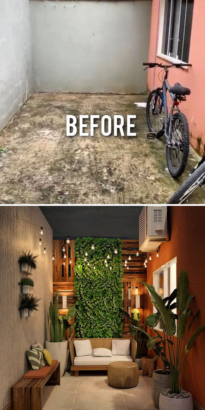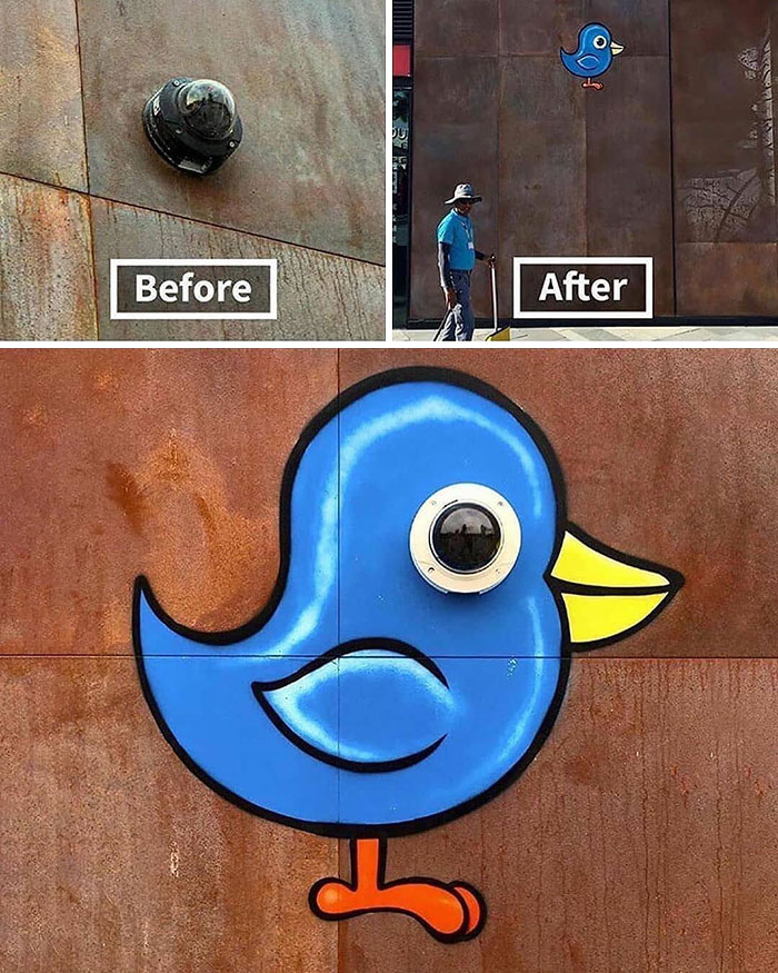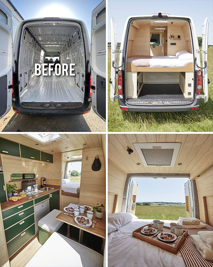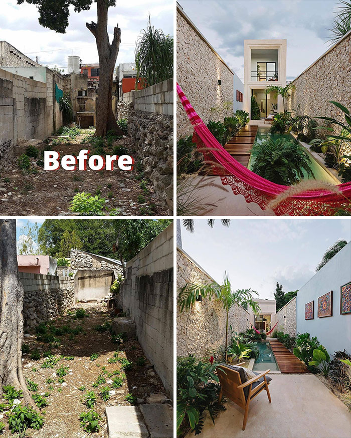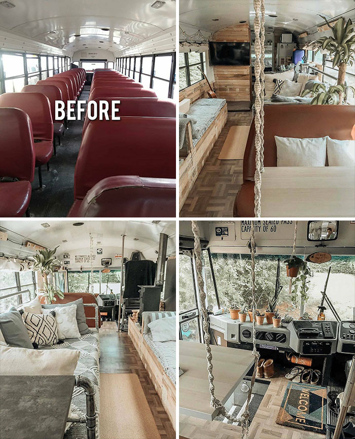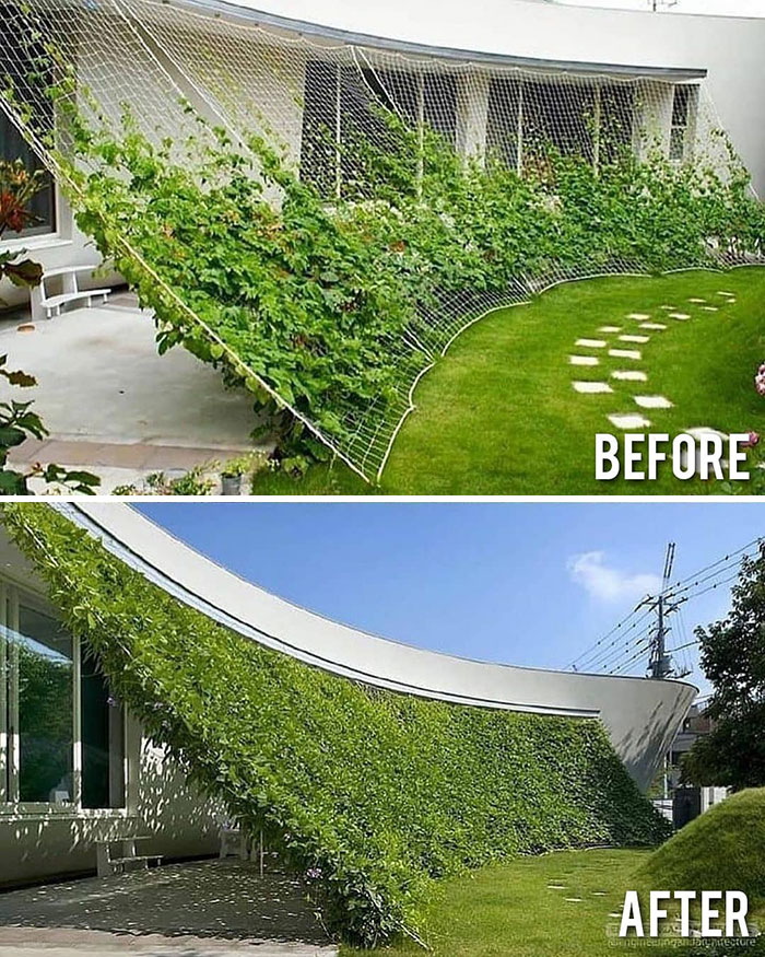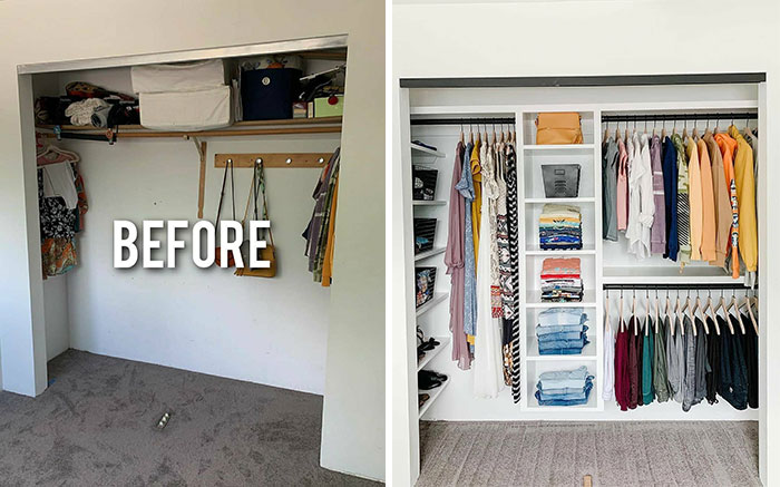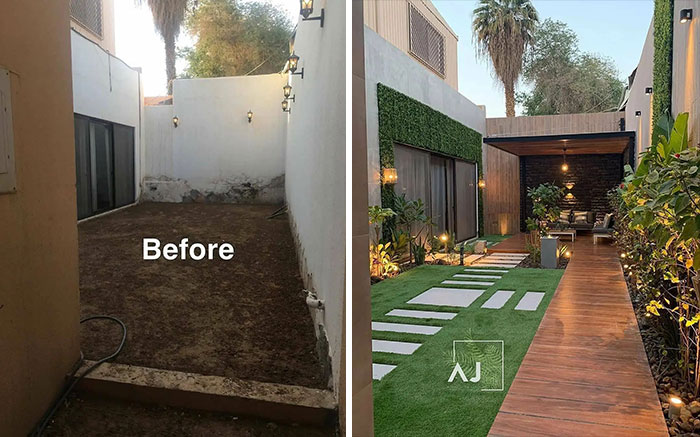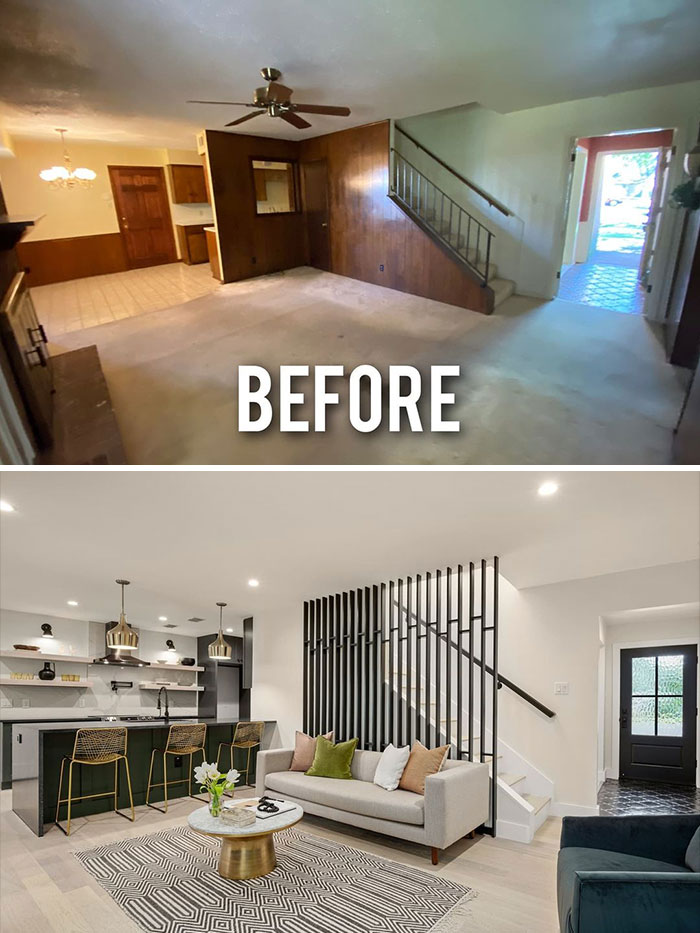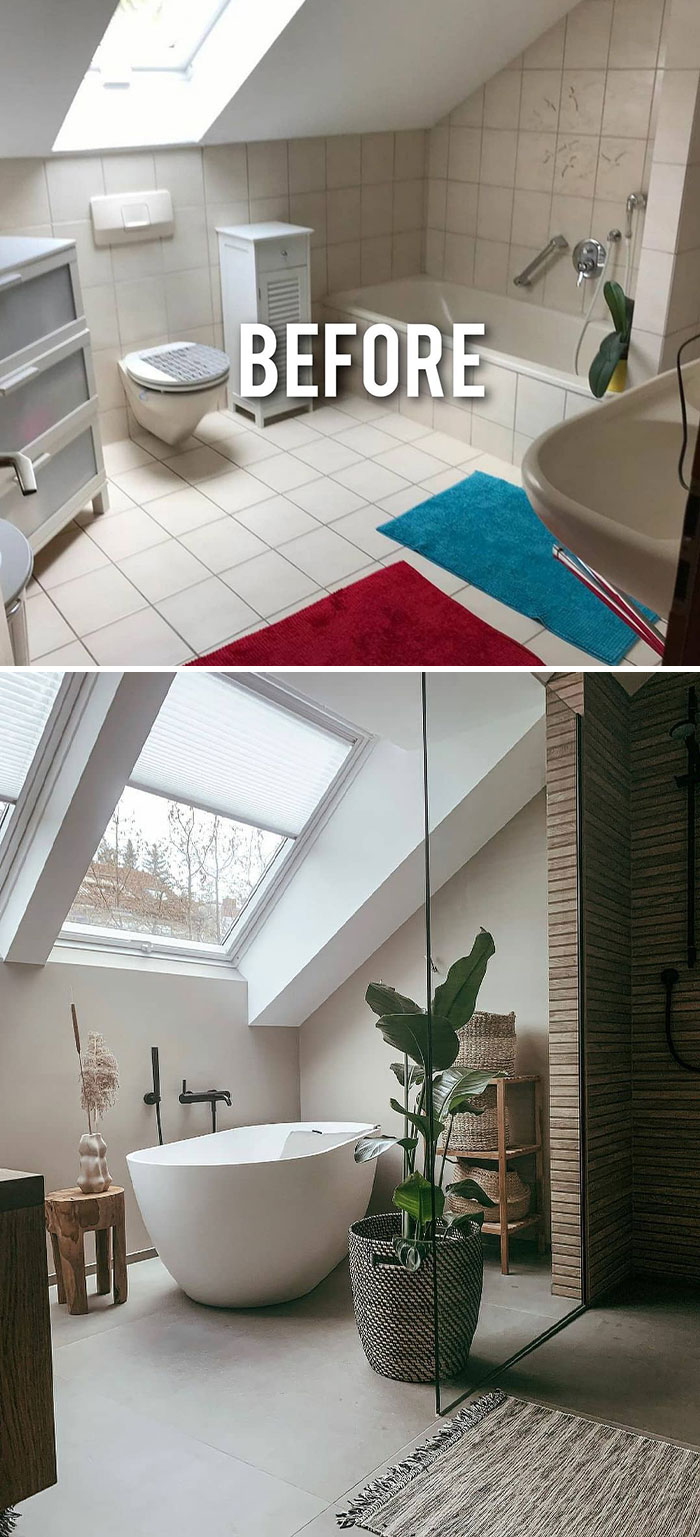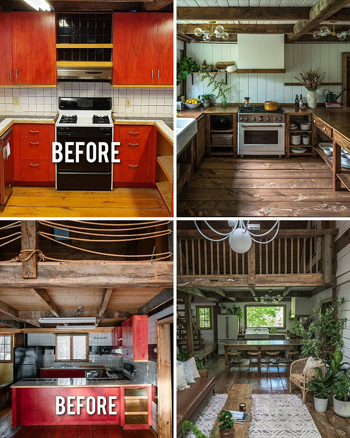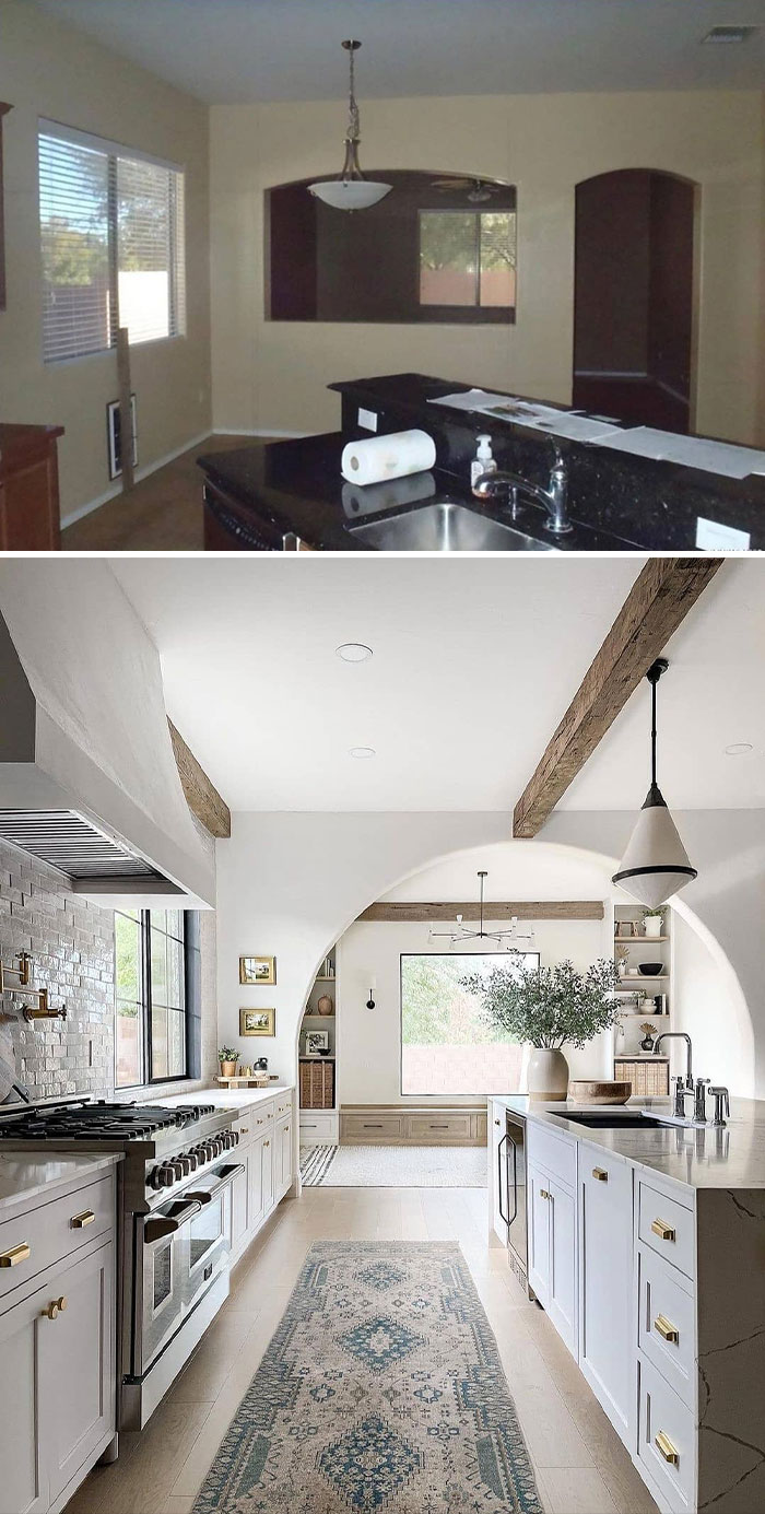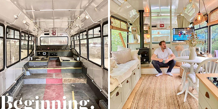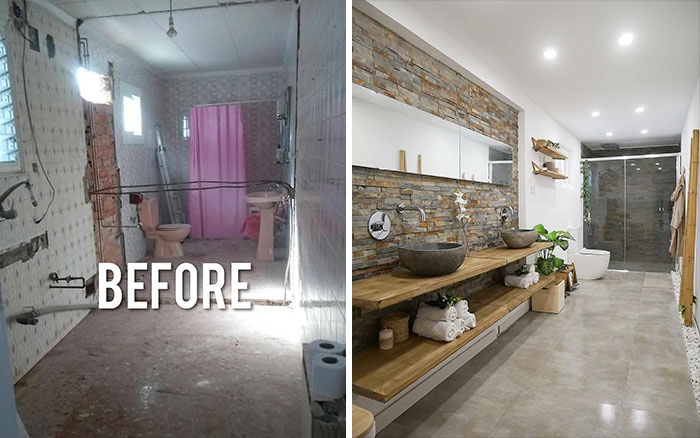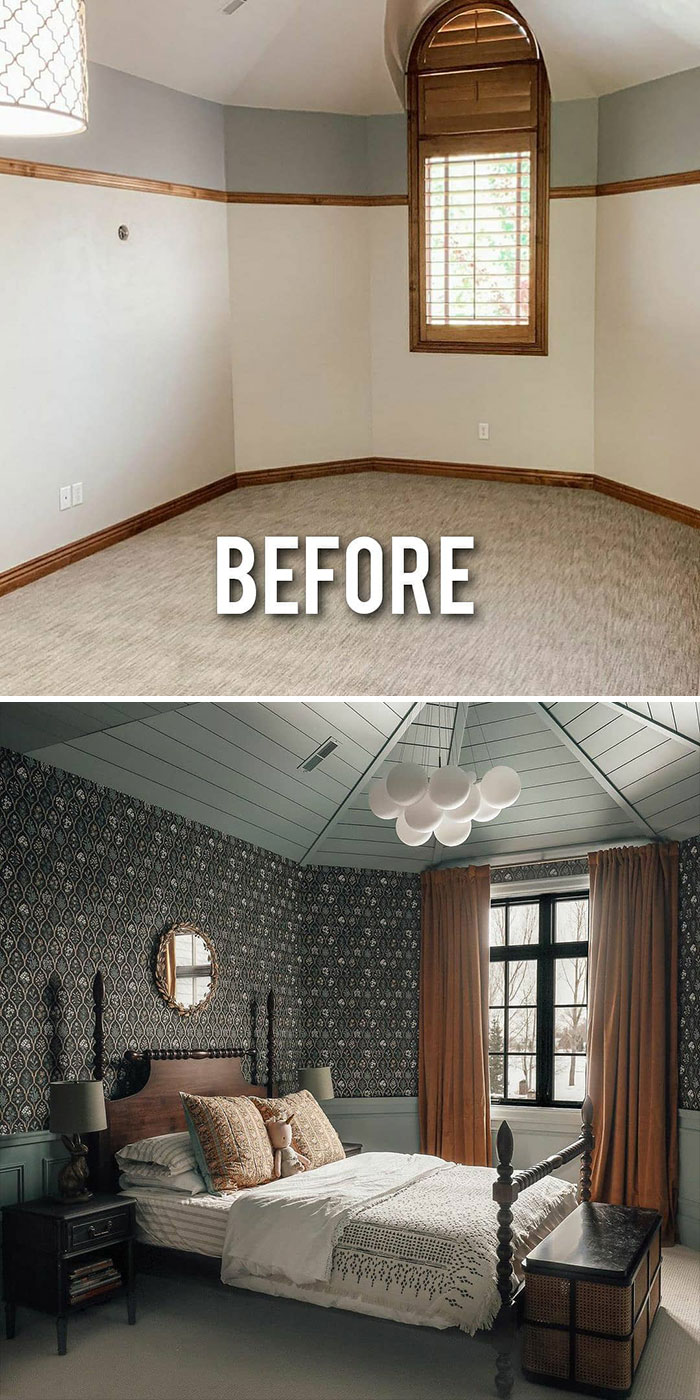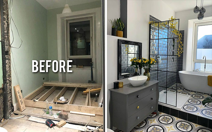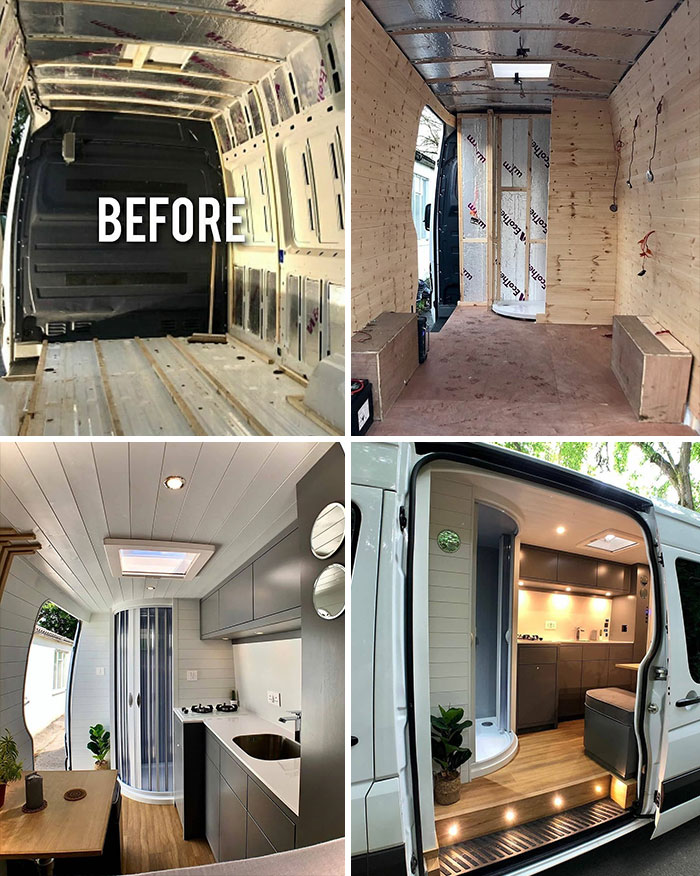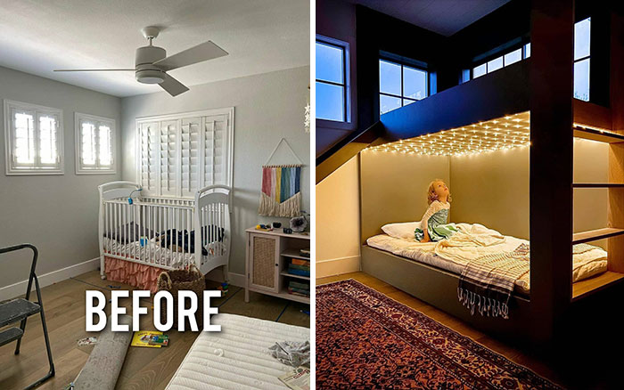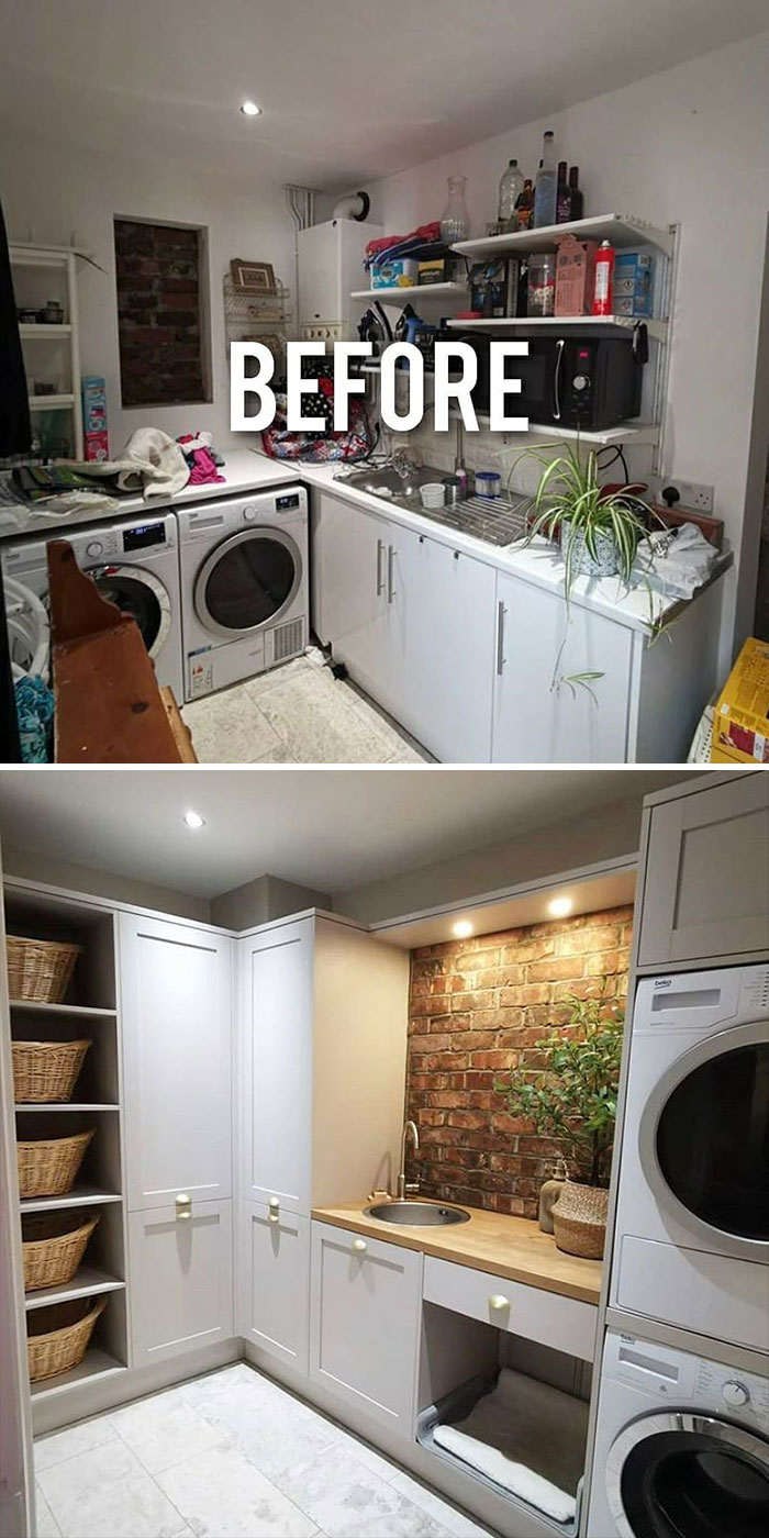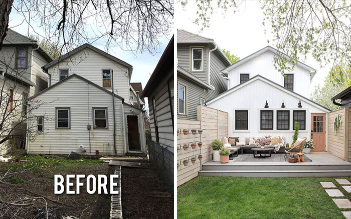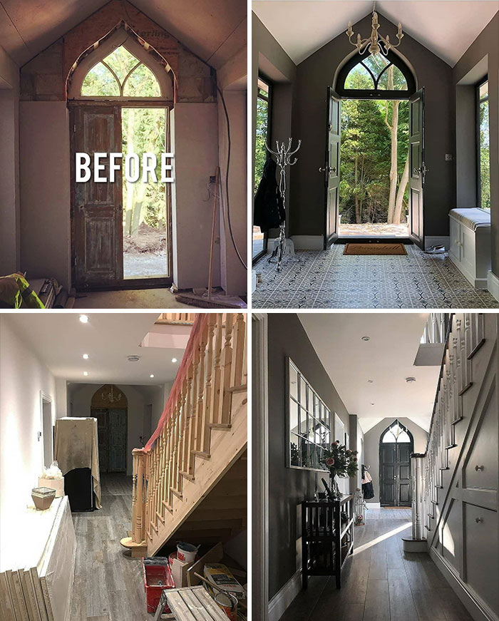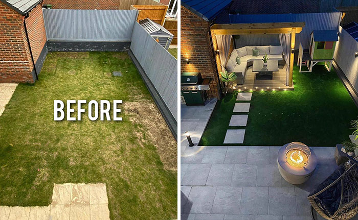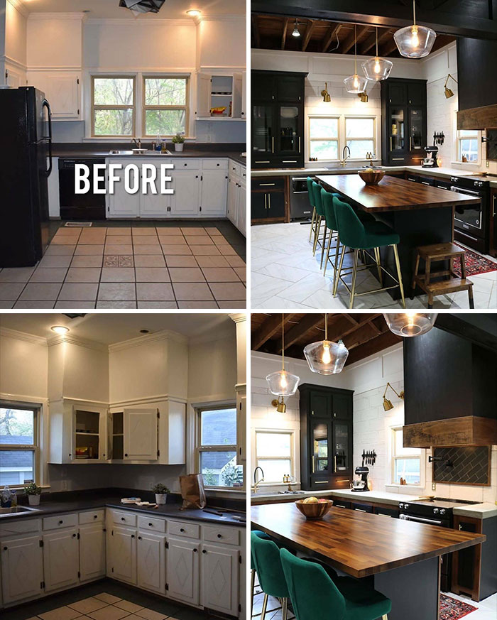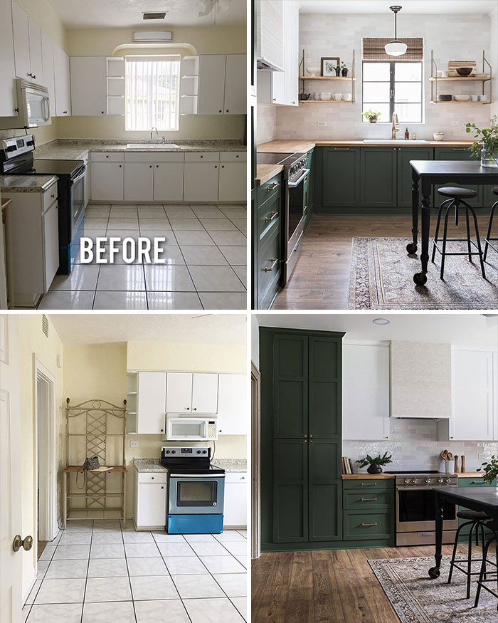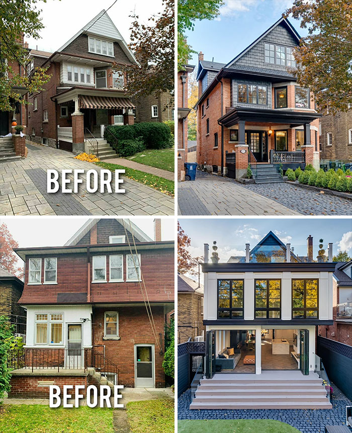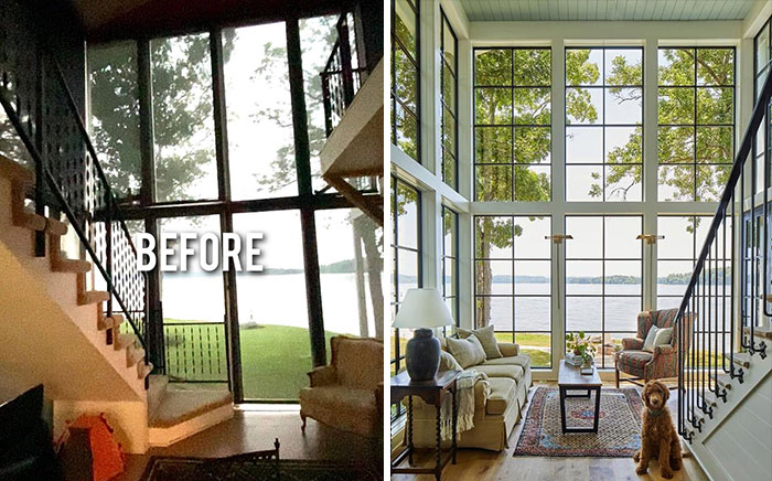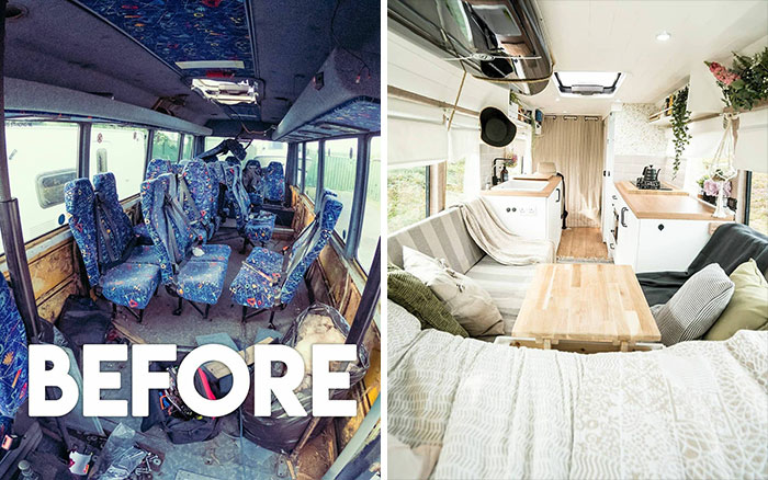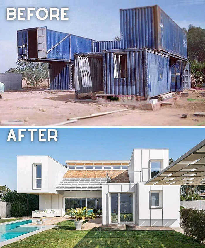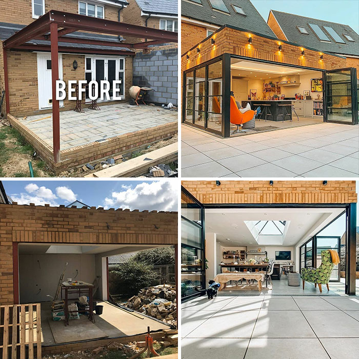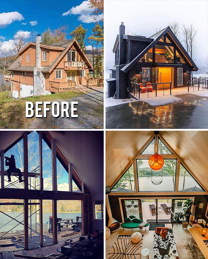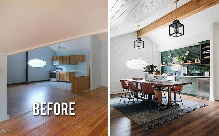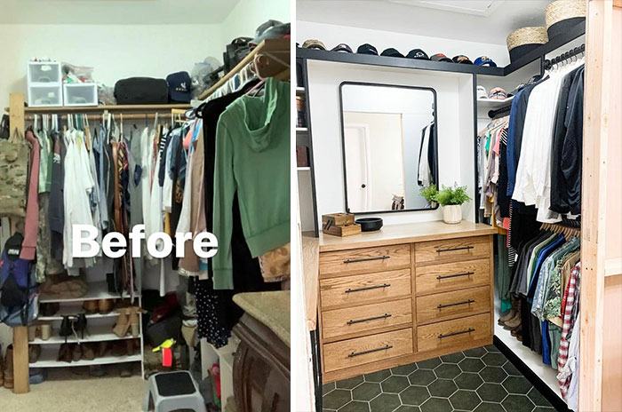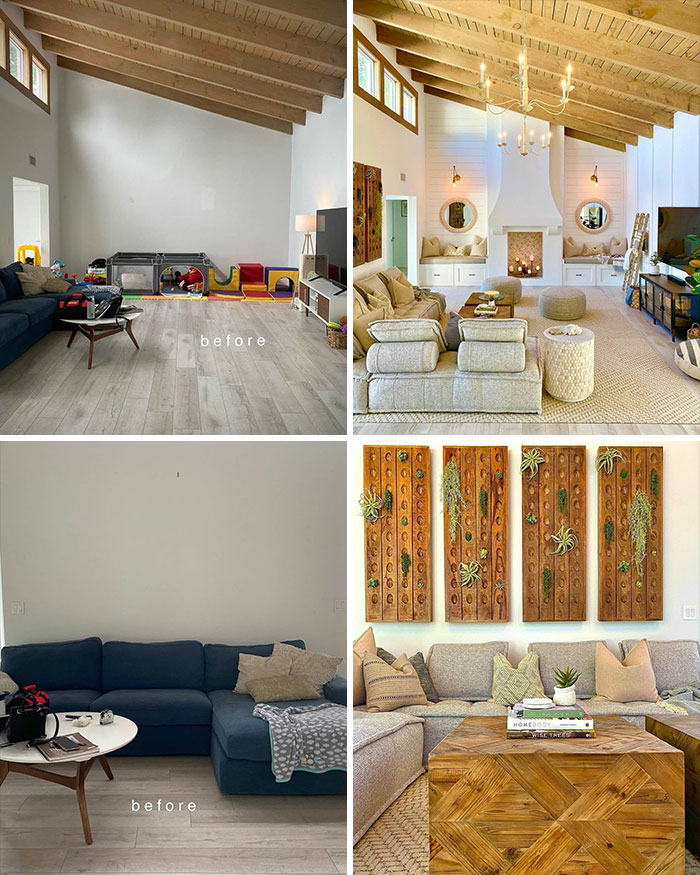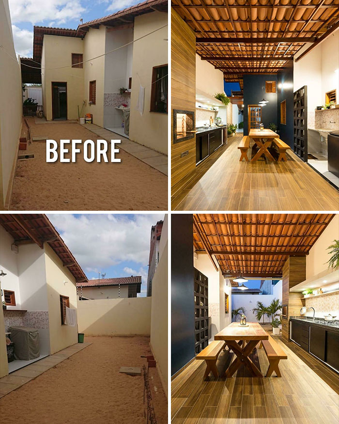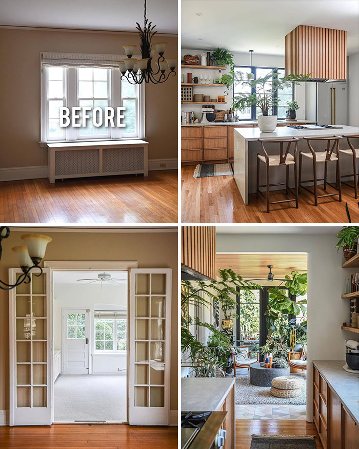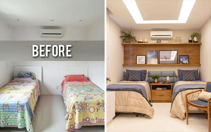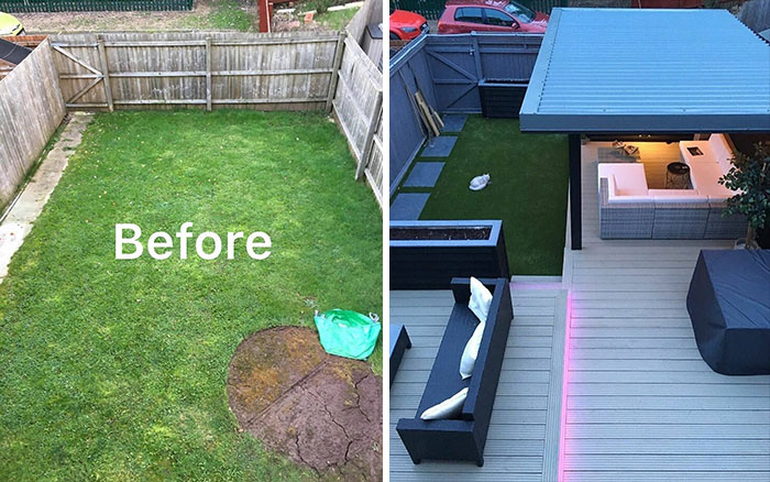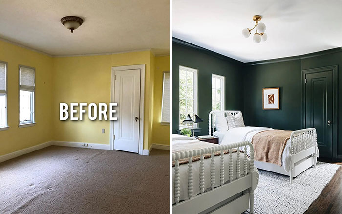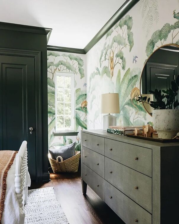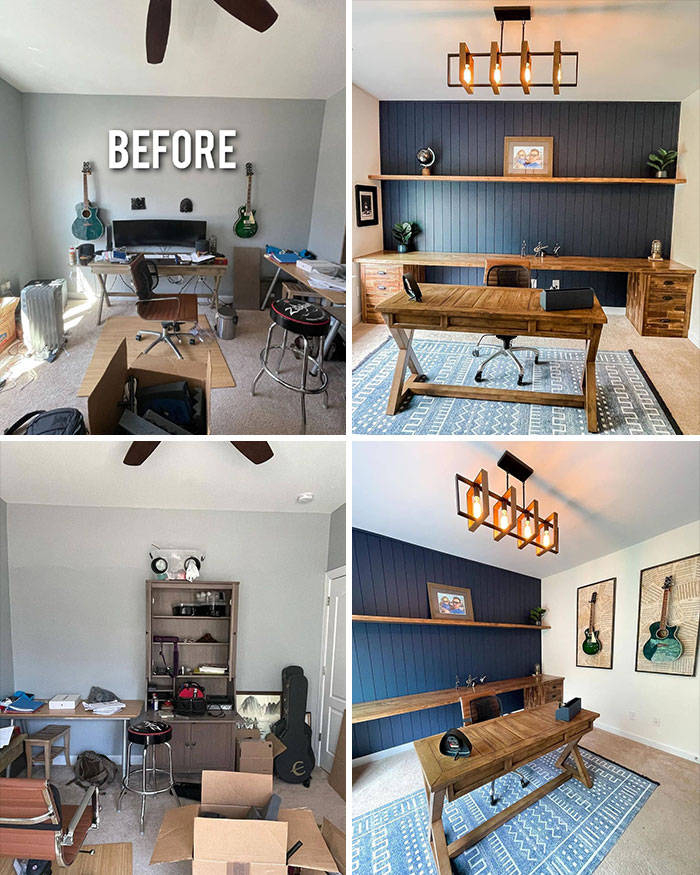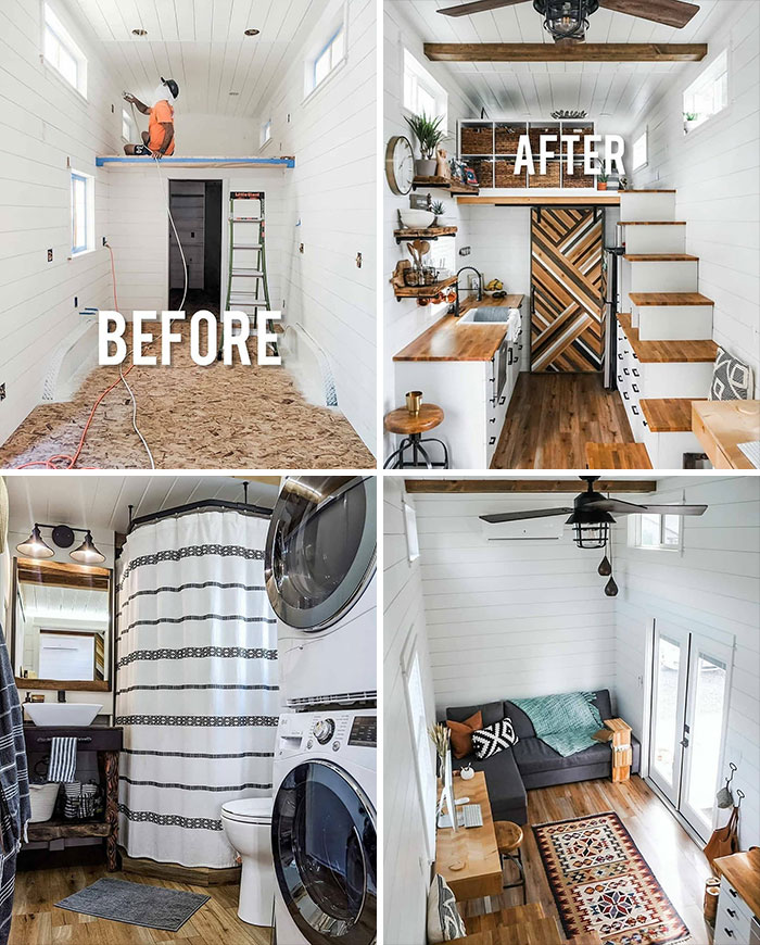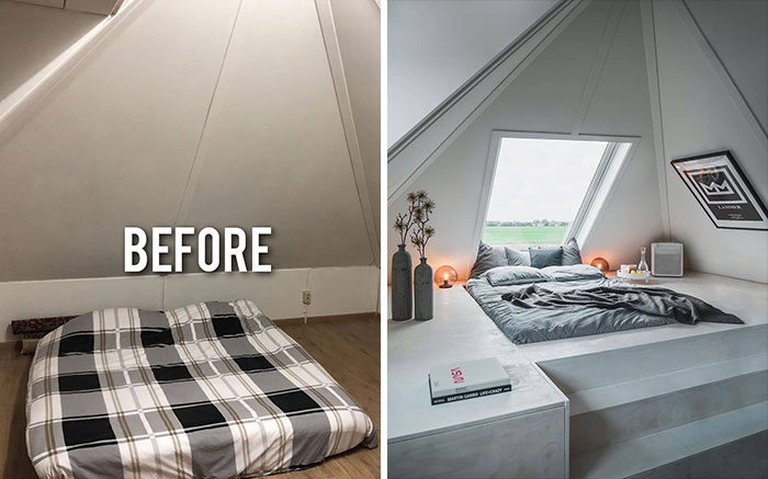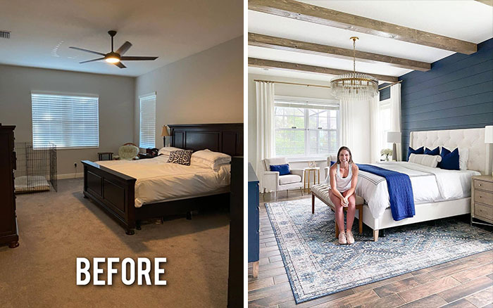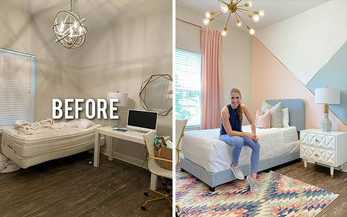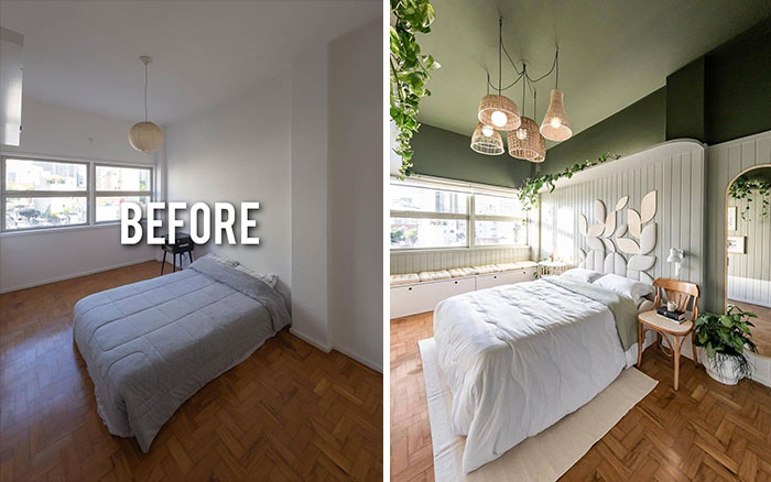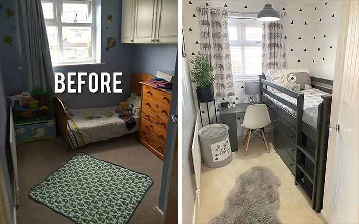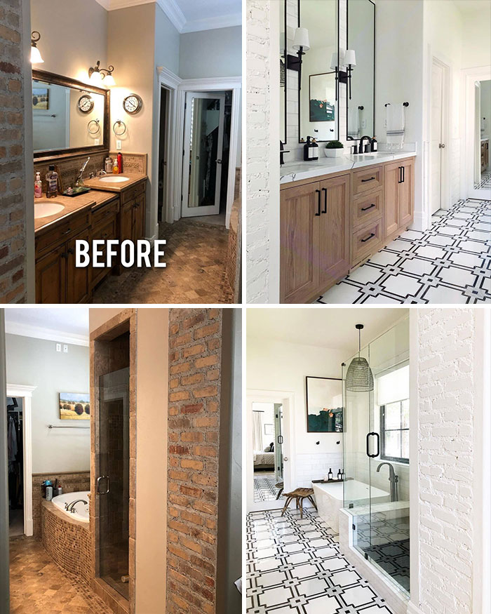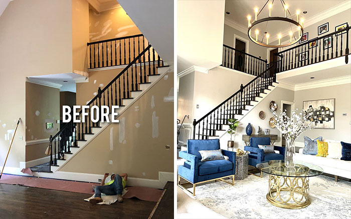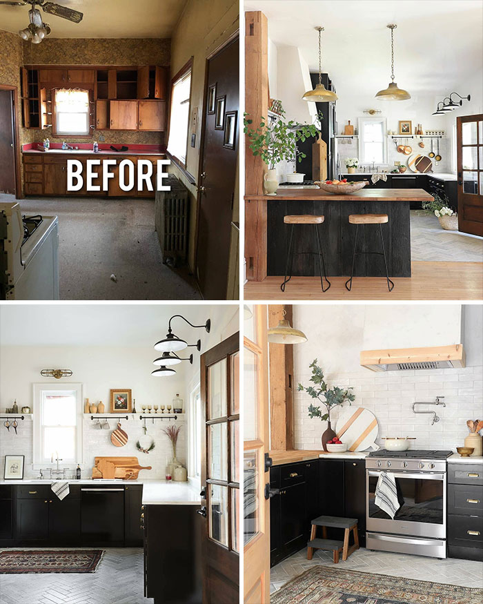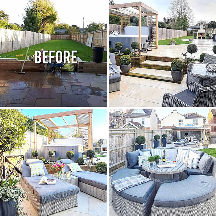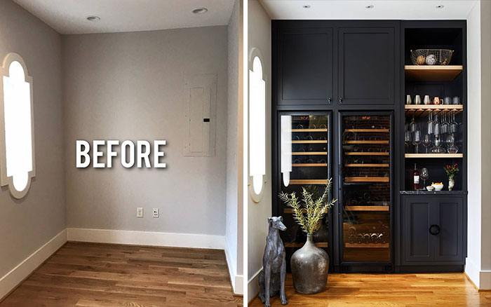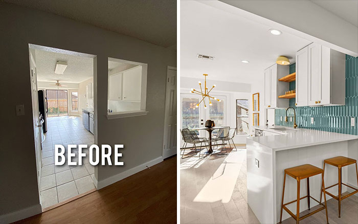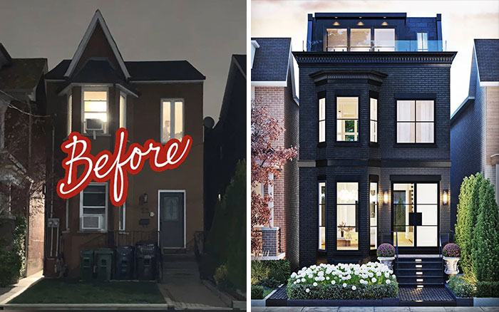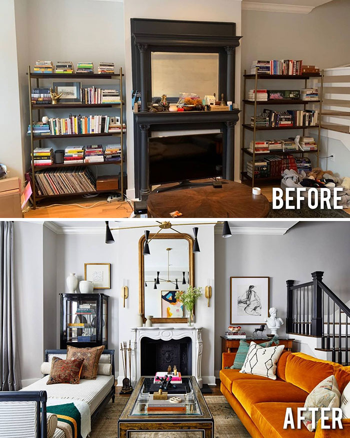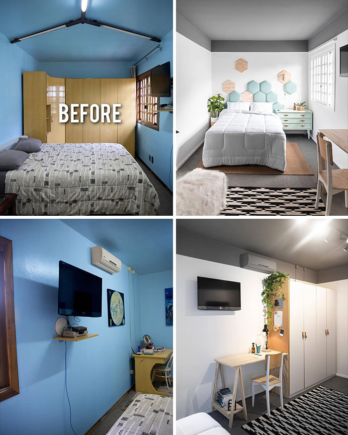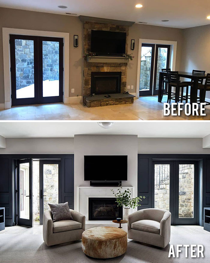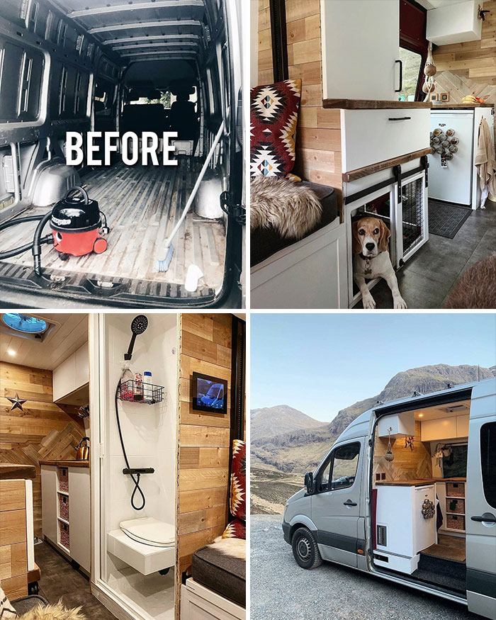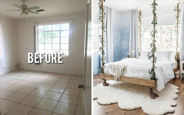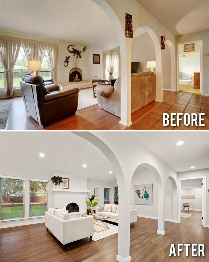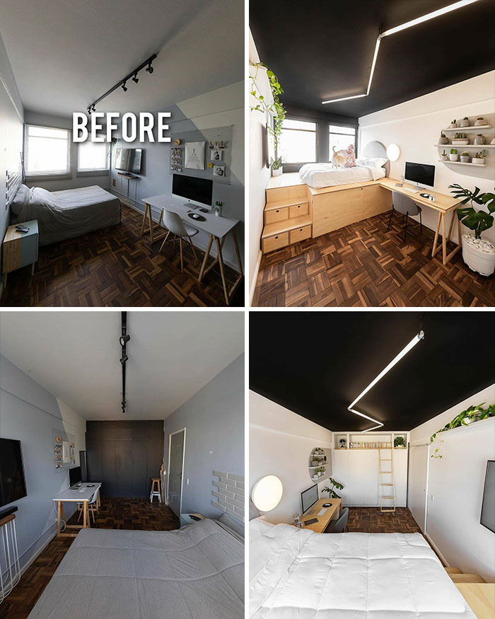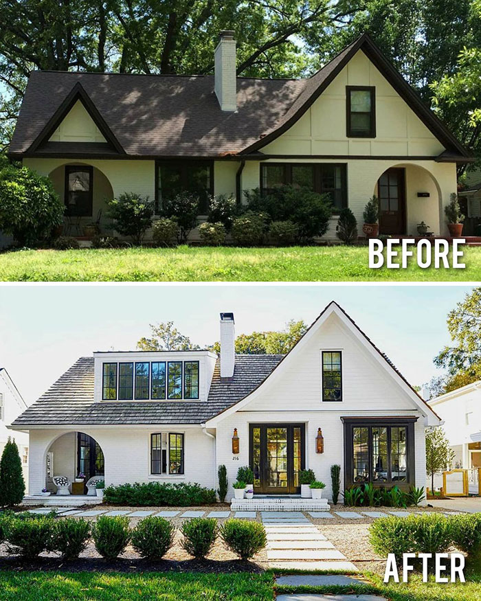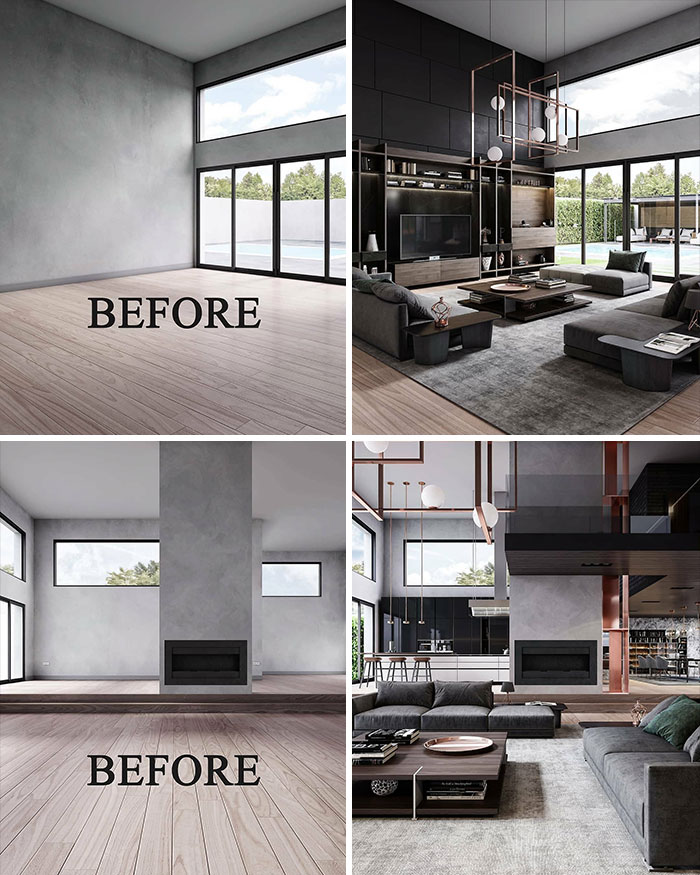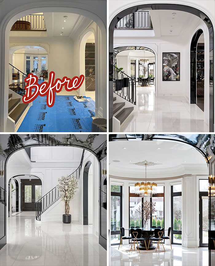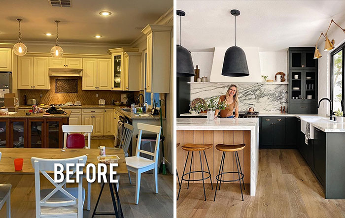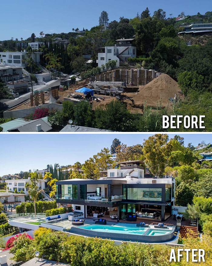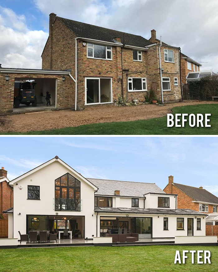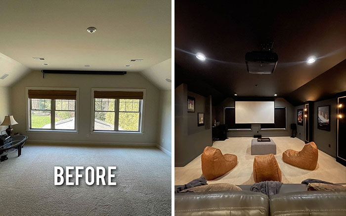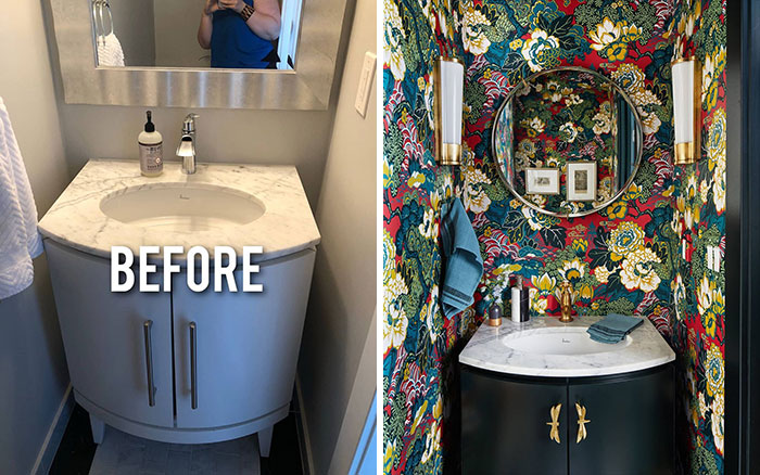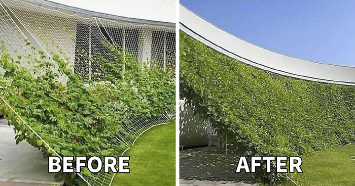
Instagram Account Showcases How Good Design Can Transform A Space And Here Are 30 Of The Best Before & After Pics (New Pics)
The pandemic had a massive impact on the way we see our lives and many of us had to make the shift to working or schooling remotely. Constantly sitting at the same desk or looking at the same wall can leave us feeling sick and tired. No wonder that so many people had the irresistible desire to tear everything down and re-do their living spaces out of sheer boredom.
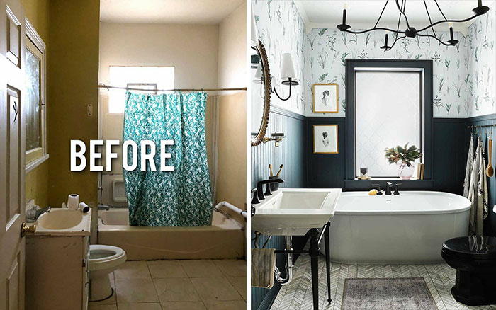
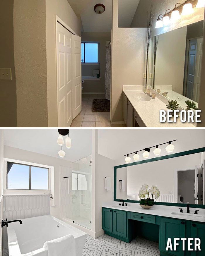
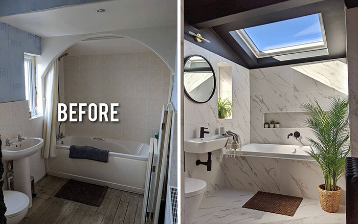
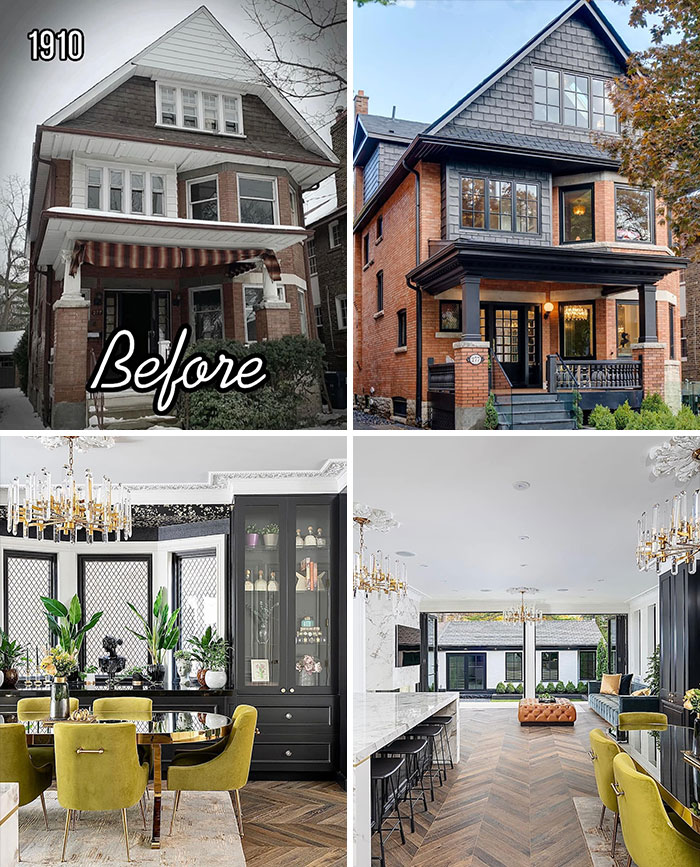
If you're one of them, one place where you can find inspiration for such makeovers is an Instagram account called Before&After Design. With over 1.6M followers, it's a massive gallery showing how to completely transform your house, backyard, or even your van. Full of entertaining videos and the most breathtaking renovations, it's the place to look for different styles and cool interior ideas.
If you wish to receive your daily dose of inspiration, just keep on scrolling! And when you're done, don't forget to check out Bored Panda's previous article on before-and-after pictures of the best house renovations.
This post may include affiliate links.
Home renovation platform Houzz suggests that Americans are fixing up their properties in record numbers, based on a survey of more than 70,000 people. It means that the pandemic lockdowns and lack of activities made people invest in makeover projects. According to Houzz, 53% of surveyed homeowners reported renovating their houses or apartments and most of their work focused on kitchens, office spaces, and outdoor areas.
In 2020, people spent 15% more on renovation projects. This could have something to do with people being able to save more money as well as an increase in the price of labor and materials. Travel restrictions and business shutdowns that happened during the pandemic caused shortages in many fields and the costs just skyrocketed.
36% of respondents said it was because they finally had the financial means to move forward and 44% said they moved ahead because they actually had the time to do them.
If you wish to make a change to your surroundings, there's quite a few things to consider. As Lindsay T. Graham, a researcher at the Center for the Built Environment in UC Berkeley, said, “Our homes can be incredibly important tools for shaping our daily experiences.” So first, you should think about what you like and don't like about your place. Graham mentioned that the way our homes are organized, decorated, and furnished can evoke a varied palette of feelings.
Secondly, see if you have too much clutter in your home. It can increase your stress levels so you should try to get it under control. It's a visual reminder of the things you still have to do, so decluttering will help you feel more at ease at the end of the day.
Also, color therapy can affect your mood and physical health. While reds and oranges might require your eye to adjust and help boost your energy, blues and greens require very little adjustment and are considered more restful. As Graham explained, you can “level out” the energy in your house accordingly, but keep in mind that everyone finds different tones soothing.
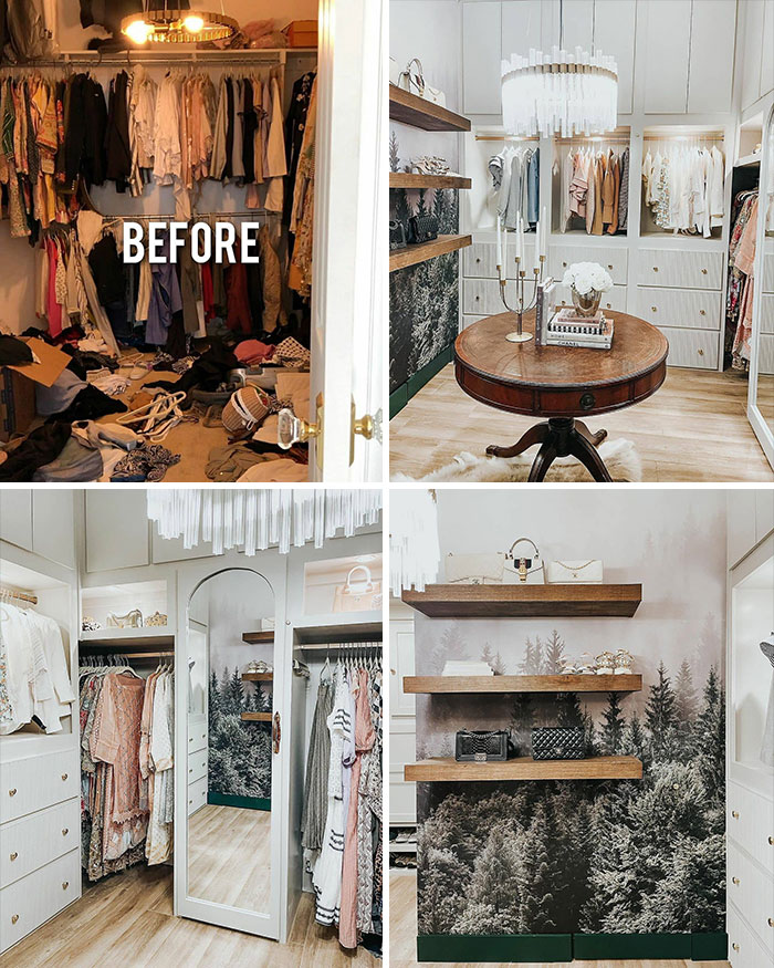
I want one! Now! Ready to quit my job and travel to the north and into tranquility.
We spend so much time in our homes that we can forget the kind of impact it has on our mindset. There's a new trend that's taken the interior design world by storm and it's called comfort decorating. It's all about choosing furniture, artwork, and the basic feel of your place based on coziness and familiarity, not on aesthetics.
According to Apartment Therapy, the past years have changed the way people see their living spaces and they advise to look inward for decorating inspiration. Grace Dowd, an Austin-based therapist said that “it’s more important than ever to fill your space with things that make you feel like yourself, even if they’re not ‘Insta-worthy.’”
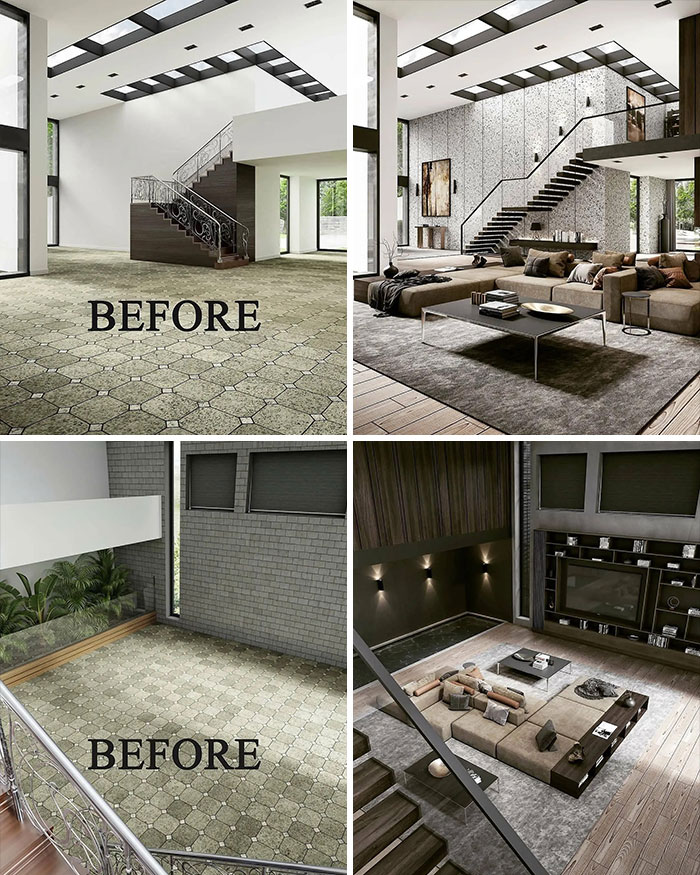
It's not bad, but do people really enjoy living in sterile looking show rooms?
It will look very different once people are living there and the camera is off. It’s a photo of the design, not a photo of life in the house. All the life stuff is hidden just outside the photo down the hall. 😂
Load More Replies...Haha, I was going to respond that it's fine for a basement kitchen, it's really nice actually. Then I noticed it's not a basement! Does anyone else think this looks like a basement?
Load More Replies...Sorry, I absolutely dislike this one. The floor looks cold and unwelcoming, the pattern of the rug makes me want to vomit and don't even get me started on this monstrosity of a banister. I much prefer a cozy den to a lifestyle catalogue cover!
I normally love this palette, but in this setting it doesn't really work for me. The kitchen is too... gray... I guess, it looks cold. I love the black entry way, but the thing behind the couch doesn't work for me either... prison vibes. Incitatus says it looks like a basement, and I think maybe that's the vibe I'm getting too.
Whether it's an old teddy bear, a family heirloom or a seashell you brought back from your vacation, it's important that it would remind you who you are. As you can guess, nostalgia is one of the key aspects of comfort decorating. If you choose objects that evoke feelings rather than look good, it gives your surroundings meaning and lets you get away from the difficult reality we have today.
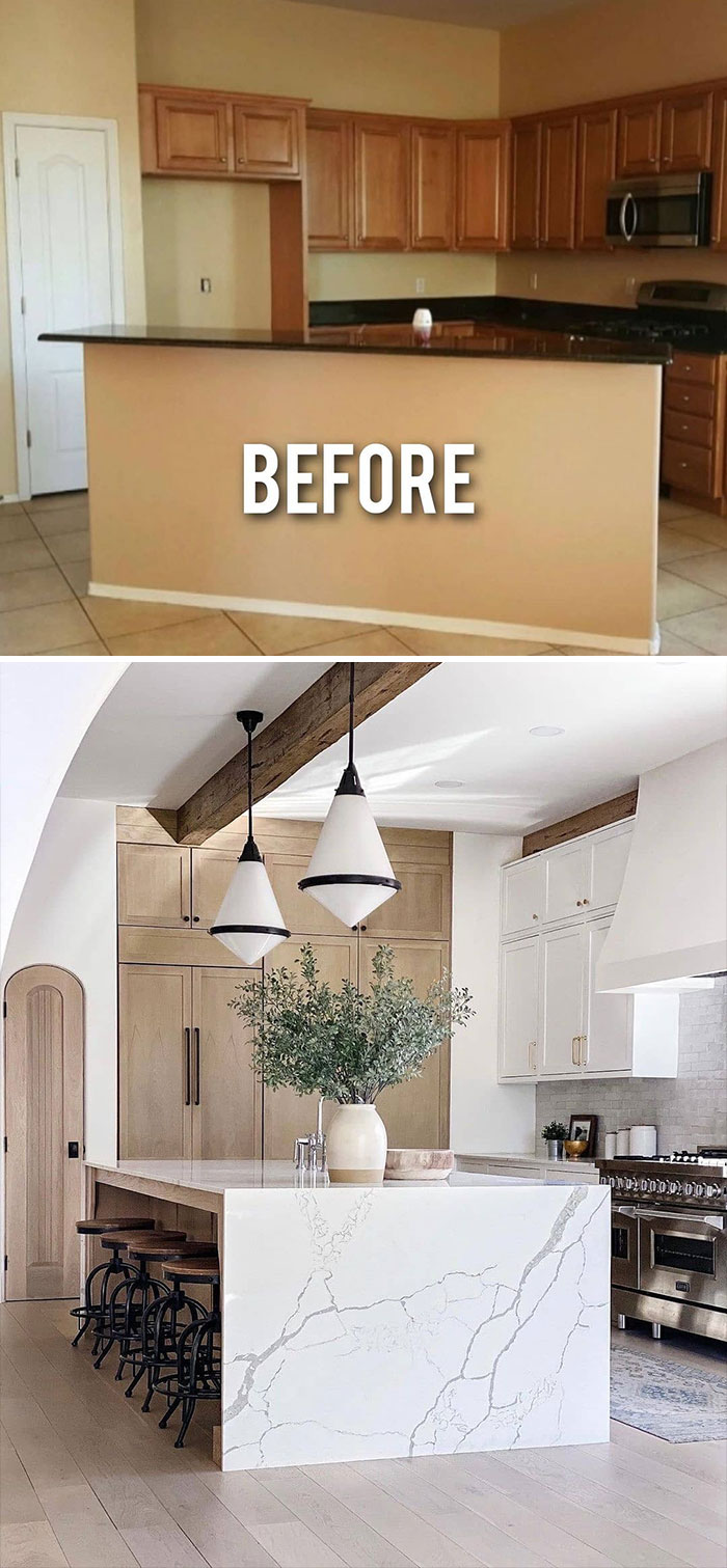
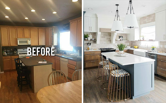
Ah yes, so very easy to transform this outdated kitchen into a modern design (if you have a spare $20,000 or so). Anyone can do it!
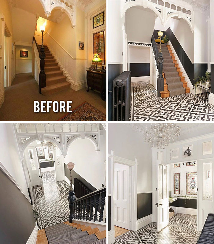
I wonder if that was underneath. I helped renovate an 1800s house in London and when we did the stairs we found a) three layers of carpet, each one just put over the other, and b) when we scraped off the horrible brown enamel paint from the railing, it was SOLID MAHOGANY. They covered up all kinds of things in the 1950s and 1960s; mind-blowing. We found other treasures too, like tilework around fireplaces under paint or even plaster.
This is one that looks reasonable to do and yet HUGE WOW factor on upgrade
But comfort decorating should not be only about nostalgia. If a thing makes you feel good or brings pleasure to the five senses, it's reason enough to keep it: “Running your fingers along that tattered quilt or even smelling it can ground you in the present moment, which can help to alleviate anxiety about the past or future,” says Dowd.
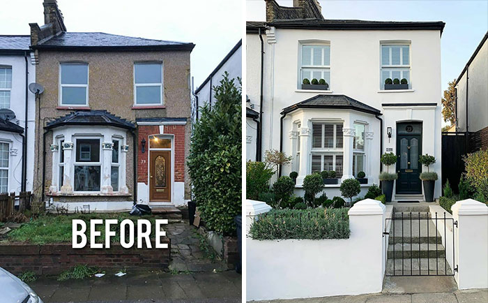
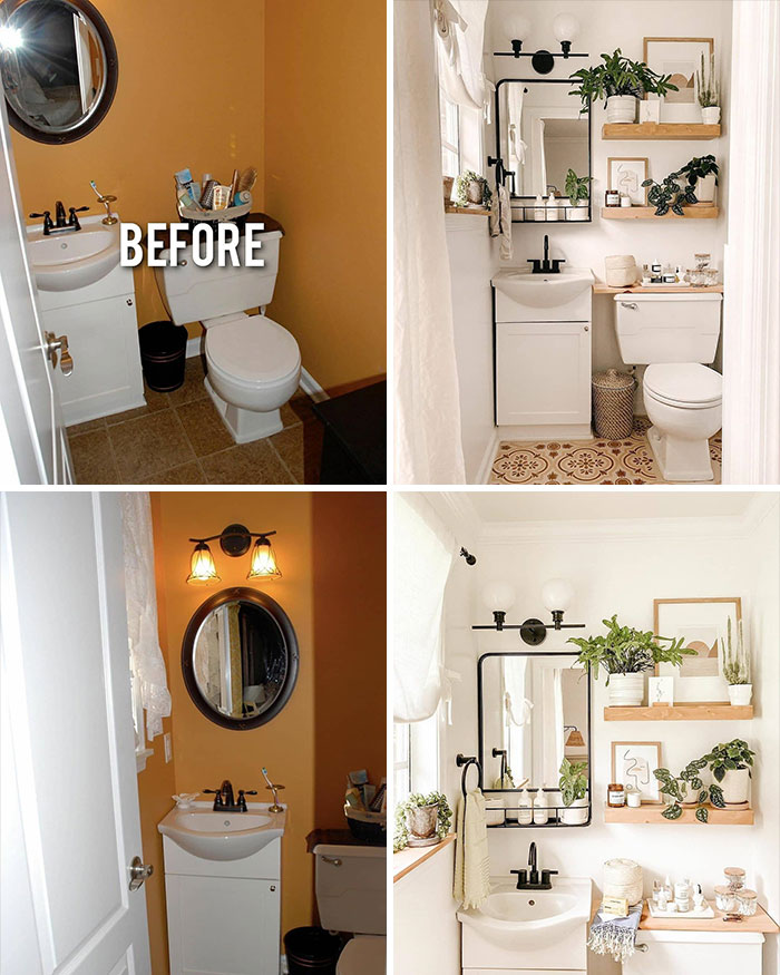
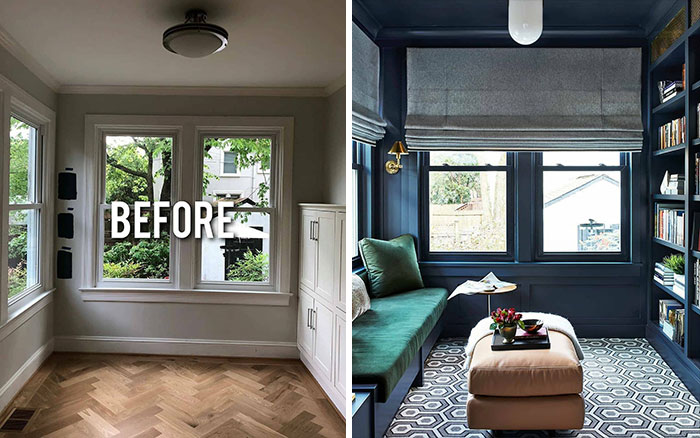
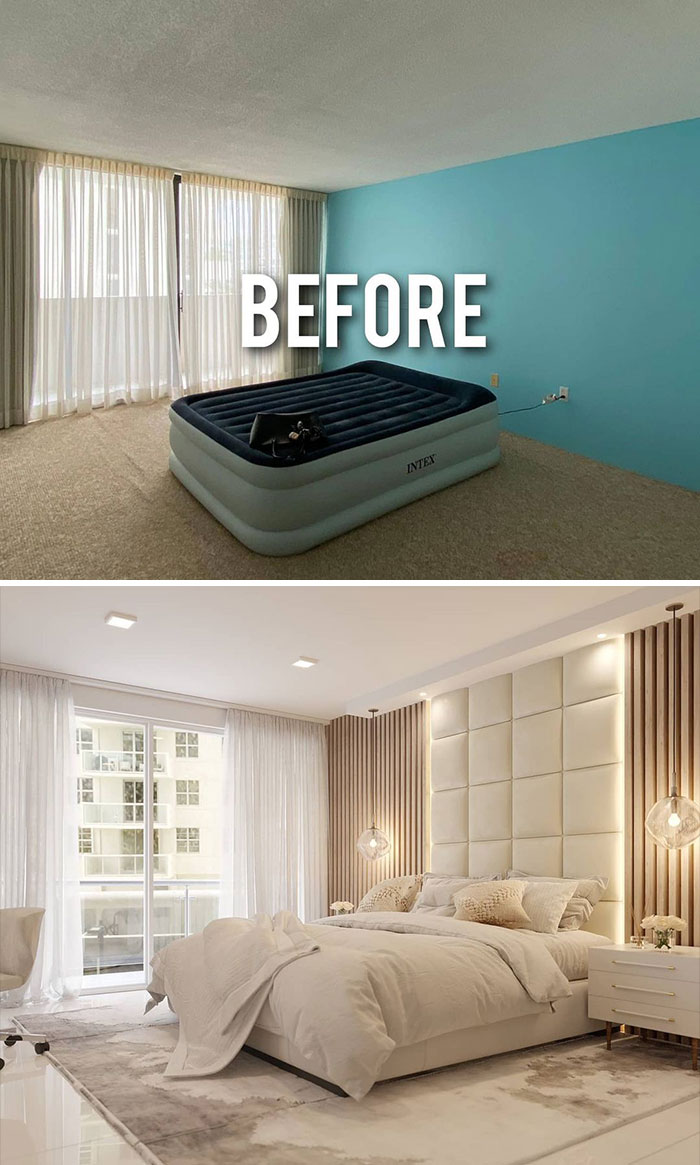
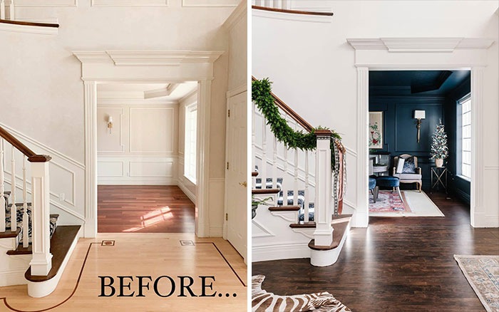
Shows what a new coat of paint and the right decorative touches can do. Guarantee this entire reno cost less than $500. Love it.
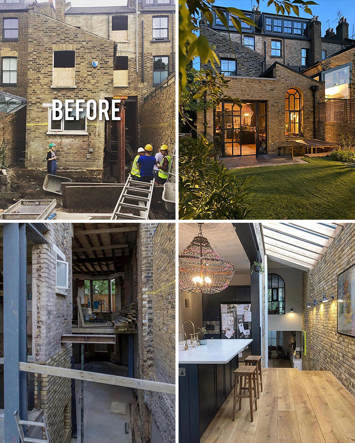
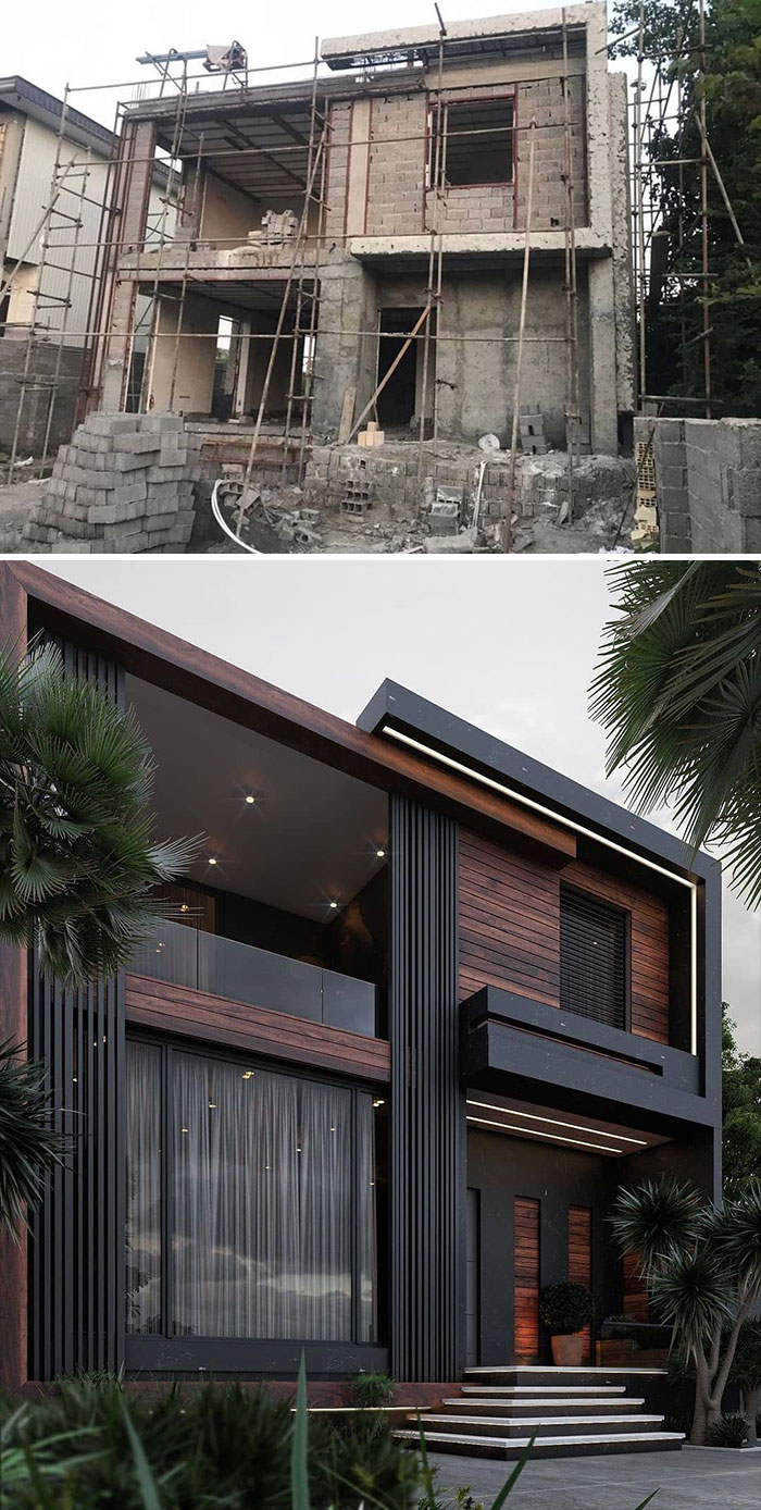
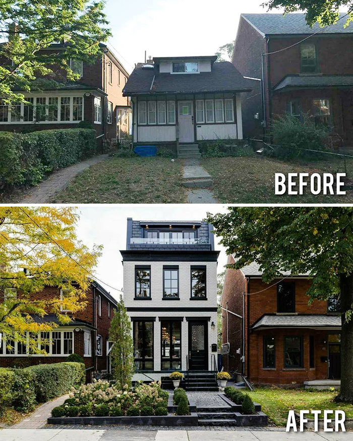
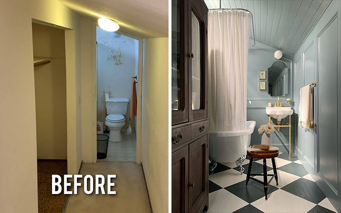
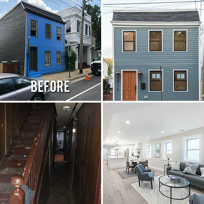
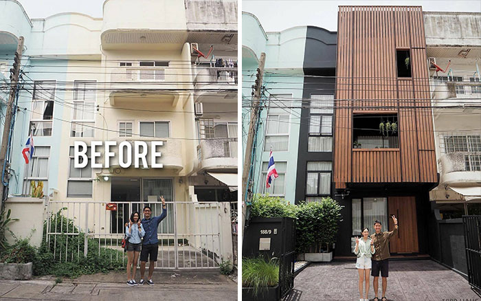
That's not redecoration.. That's converting a tiny house into a three storey building.. (Beautiful though)..
So if you didn't even start renovating but already feel overwhelmed, Before&After Design is a great place to look for inspiration. And just remember, in the end, your room does not have to be unrealistically perfect, it should be filled with things that make you feel good about yourself.
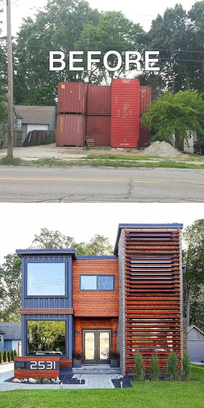
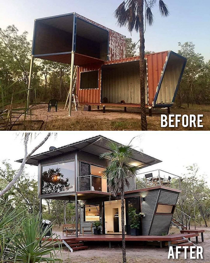
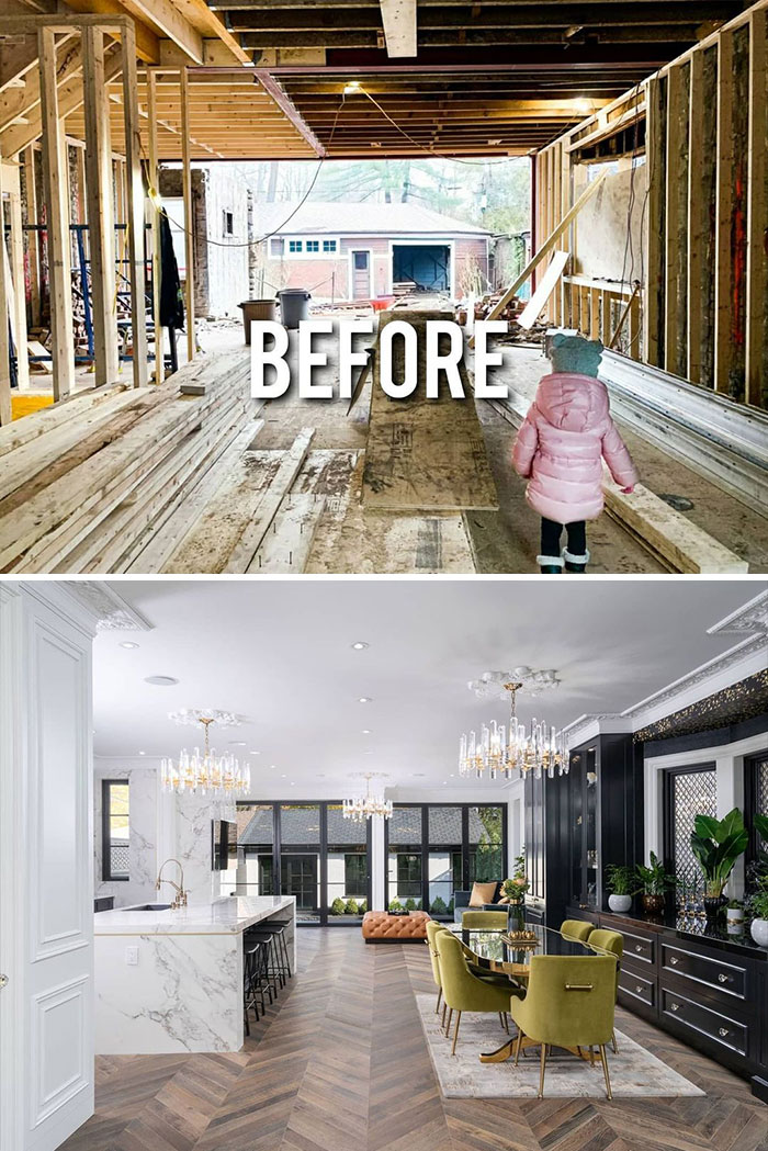
That’s more like half way through a storage container house and the end.
This is the same kitchen as above! I recognize the pendant light and ceiling beams
I'm not a fan of novelty furniture in my home, but I admire the concept.
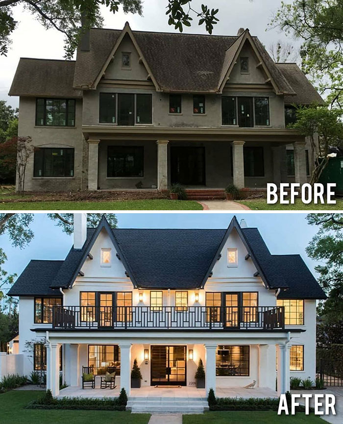
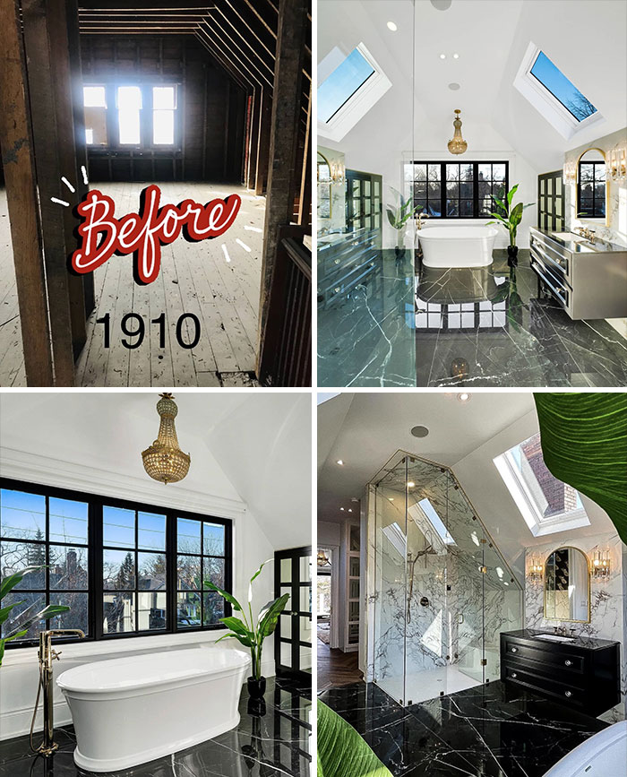
This isn't redecoration. This is what a boatload of money, a good contractor, and a decorator can accomplish. Not really surprising.
Seems like every time BL posts stories like this it's the same thing. People with money spending massive amounts of money. Like where are the teachers with well decorated homes at.
Load More Replies...It's amazing what a great renovation you can do when you have a team of architects, builders, interior designers, an already huge house, and unlimited funds!
I am so surprised by such negative comments. The results on most are very nice. Of course it takes money to upgrade a home but doesn't mean they weren't well done.
Totally BS. Except for a few ones the rest is really bad fashionable interior renewals picture perfect and unpractical. And really expensive
Yes picture perfect for the after picture. Nobody puts an after picture all messed up ! Let’s see your space Steve I’m sure its a haven of practicality!
Load More Replies...I can't wait until this trend of the all-white interior, paired with greys and blacks, goes away. It looks so soulless to me.
No, not necessarily. There are a lot of ways to make life and your home beautiful, without a lot of money.
Load More Replies...These show me how little imagination I have for redecorating. I'll throw on a coat of paint and put in some new light fixtures and think it's a great new look.
I bet it is a great new look! But for me thats the point of looking at this stuff! You can get ideas and maybe do something similar on your budget. You don’t always have to retexture a wall or totally replace a floor or add a wall of foliage to transform your space :)
Load More Replies...How good design can transforms a space? Also: how changing a space can transform a space!
Love how the commenters are reacting like they're going to live there. You're not. Let people do their stuff, their homes means their taste.
That was nice to see 🤩 so I don't really understand the negativity here. It is inspirational design not per se cheap or doable. However when you are buying a house for example it can be very helpful to see a post like this and be inspired to look through ugly colours and style. You can make things how you like it and you might even get an extra mortgage for it. It does not always have to cost a buttload of money. And this is coming from someone who did big renovations in 2 houses.
I’ve never seen such a heated comment section!! People get real sensitive when it comes to design 😂😂😂
I've done a lot of repair and renovation to my homes. TIL : Make the minimum necessary change to upgrade the look of a room. Paint degrades over time, getting darker, developing a powdery surface, and getting dings/scratches; so always clean surfaces first, then repaint in lighter colors to bounce light around the room. Sand and refinish hardwood floors. Lightly sand, clean, and use a furnture/cabinet paint to revive old cabinets. Not sure why reno shows advocate ceramic tile and stone in a kitchen; they stain, grout is hard to clean, and destroy dishes; give me laminated tops and cushion floor; also why do you need a backslash in area where you don’t splash? Regarding the minimum necessary change MNC: lumber, moldings, hinges, and fittings have changed size or been discontinued over time. Old moldings are apt to shatter when removing them. Old wiring may be 2 wire (no ground); motion sensing switch electronics need a ground, 3 wire. Houses go out of square and level with age.
The slide would be infinitely more functional if it were raised -- the edge could be a handrail and the slide wouldn't dump you flat on the floor.
Most of these should be re-labeled "How Good Design AND A HUGE SUM OF MONEY Can Transform A Space." I gather that a least a few Panda agree with me.
buttloads of money, loads of time, and little bit of pixie dust... what do you get? Posts for us to crib about our 1990's styled 1 bed room house for a family of 4

 Dark Mode
  No fees, cancel anytime


