When you’ve been on the internet as long as we have, you might think that it has nothing surprising to offer anymore. But in our experience, that’s always wrong: there is always something new, exciting, and unusual to capture your attention.
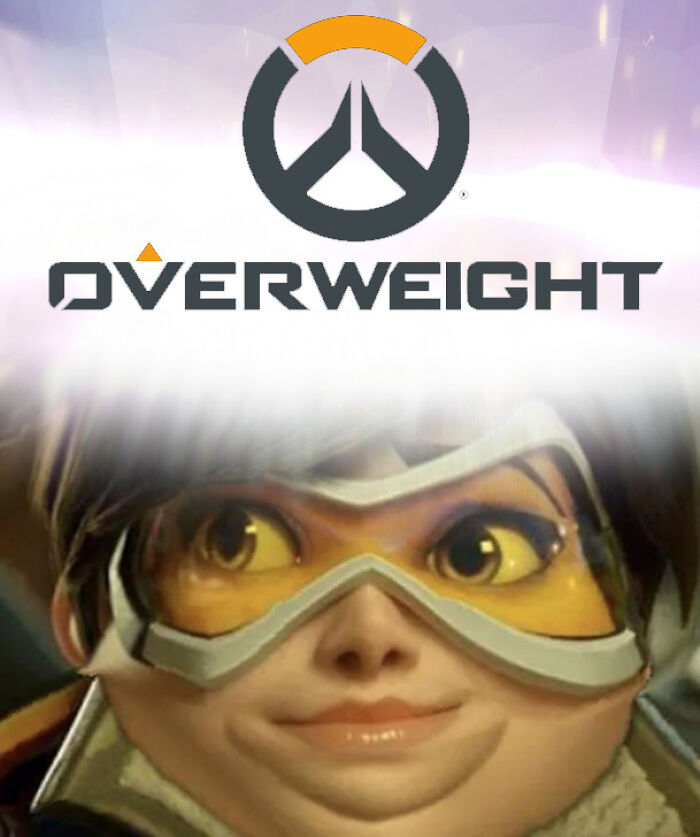
Case in point, the ‘Sbubby’ subreddit is full of hilarity. The online group’s members cleanly edit and share various logos—including those of well-known companies—so that they’re read as something funny. We’ve collected some of the community’s top pics to share with you. Check them out below. We hope you’re ready for some uncontrollable giggling!
More info: Subreddit | Wiki | Guide
This post may include affiliate links.
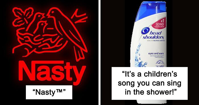
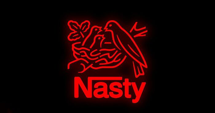
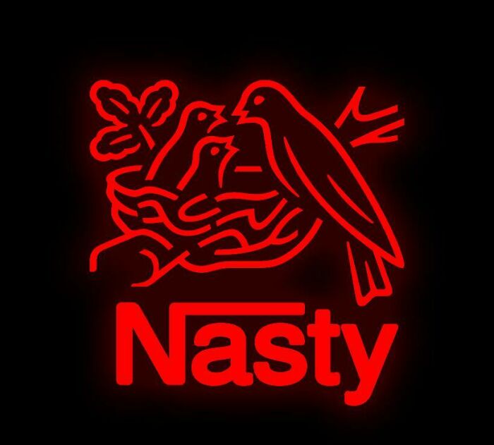
Nasty™
Nasty company, to be sure. I hope this stays first.
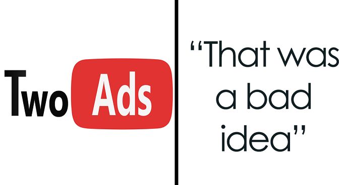
That Was A Bad Idea
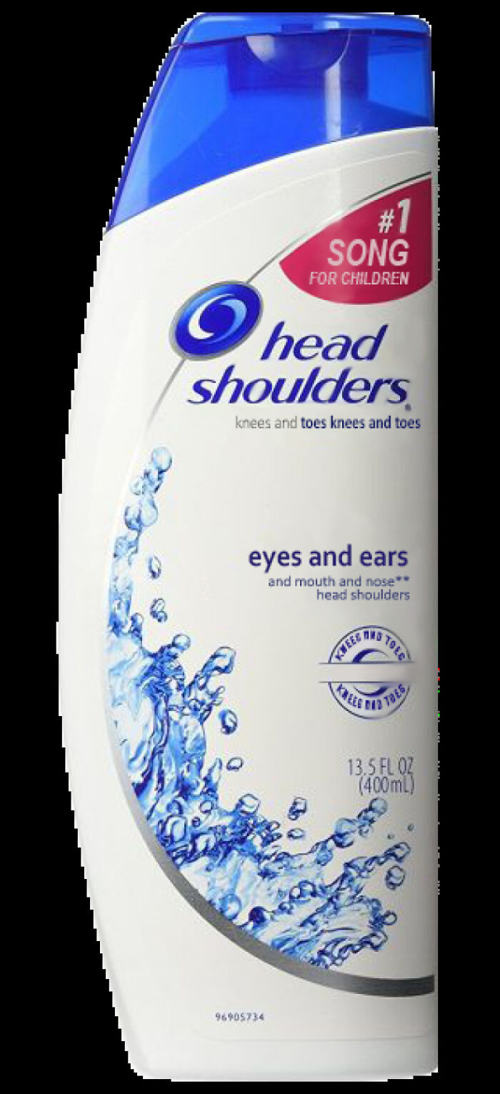
It's A Children's Song You Can Sing In The Shower!
The ‘Sbubby’ subreddit was created all the way back in November 2016. However, the project has even deeper roots. Everything started in February of that year, on Tumblr.
According to ‘Know Your Meme,’ a few Tumblr users got the ball rolling by photoshopping well-known fast food chain logos to make them full of mistakes so that they’d sound hilarious when read.
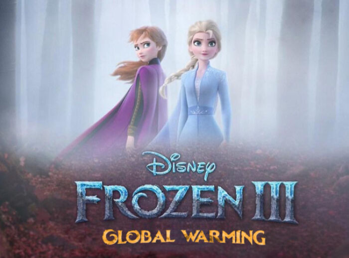
A Predictable End To A Trilogy
Sure To Be A Classic
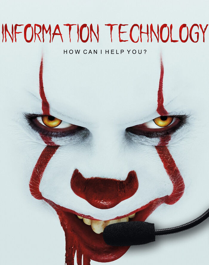
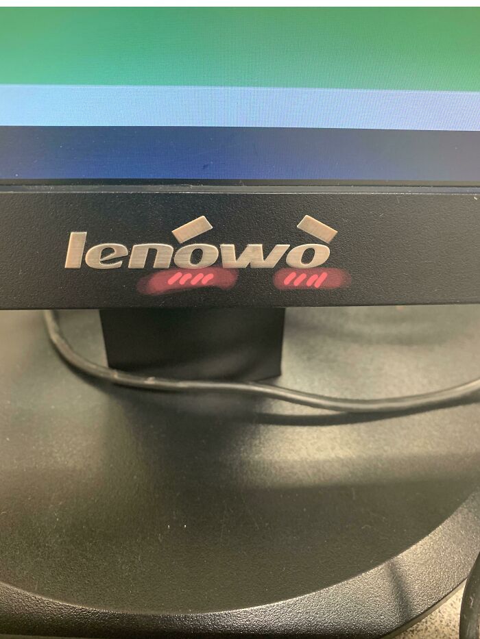
Did You Call For It Or I.t?
One of the logos that were edited was that of ‘Subway,’ the sandwich place. It was spelled ‘Sbubby’ with the tag line ‘eef freef’ (aka ‘eat fresh’) underneath.
The trend soon spread to other corners of the internet, including to Imgur and, eventually, to Reddit. The sub was launched and took on the name ‘Sbubby.’
Dear Americans,
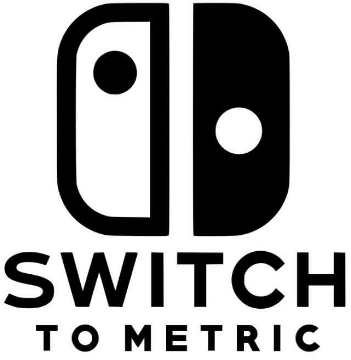
Yes. Please. Don't want to pull up Google every time someone used feet or mile.
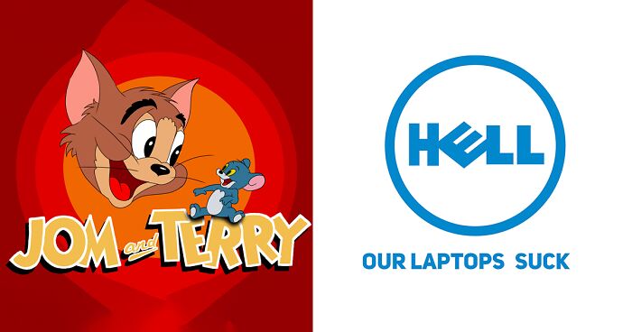
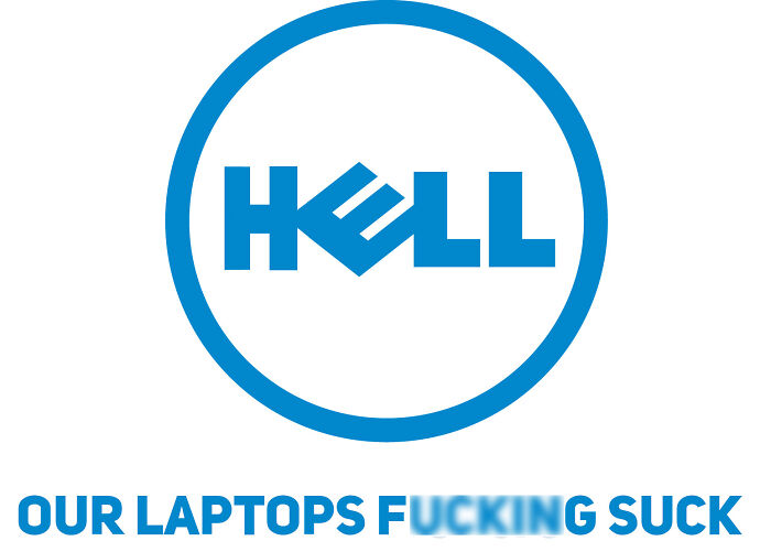
Dell Laptops
It's A Pity That They Went
At the time of writing, the r/sbubby subreddit had over 660k members (or ‘Sbubbscribers’ if you will). According to the moderator team running the entire community, sbubbies are “logos whose text has been edited cleanly, such that it resembles the original logo but reads something else.”
The team has created a very detailed wiki and photo-editing guide that they recommend all of their members check out. They’re great reads, so be sure not to miss out on them.
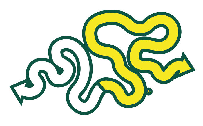
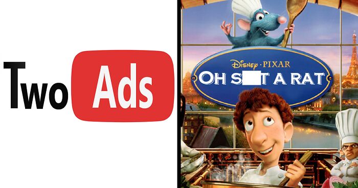
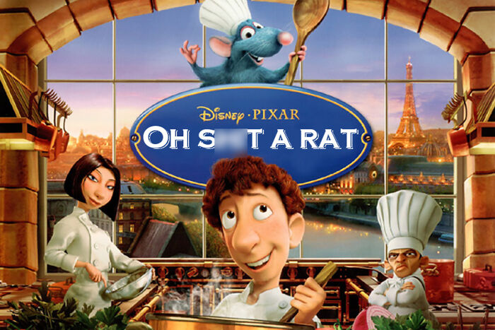
Oh S**t A Rat
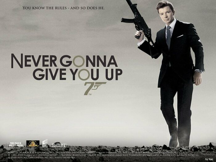
Remember This Movie?
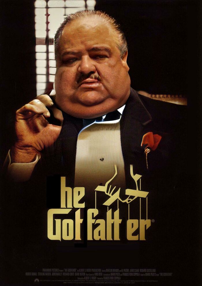
I’m Gonna Make Him A Meal He Can’t Refuse
All of the logos have to be as clean as possible so that, at a distance, the image would seem authentic. “The best part about sbubbies is that they look like the original logo, giving an absurd, abstract feel via edits. Unclean edits, inauthentic edits, and edits with the wrong font do not belong here,” the mods explain that they value high-quality work and effort.
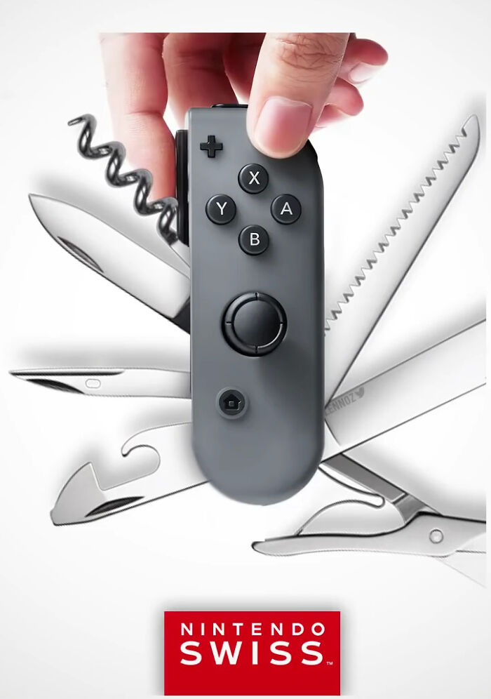
It's Practical
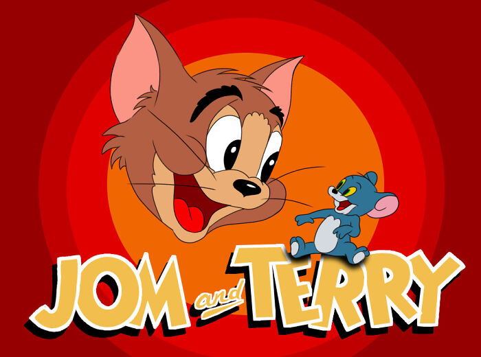
Jom And Terry, Either The Worst Or Best Thing I Ever Made
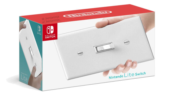
Nintendo Lite Switch ®
This looks like either a Dad joke or a clueless grandparent's gift to the kids.
On top of that, cropped logos or edits that only erase portions of the logo also shouldn’t be posted on r/sbubby. Meanwhile, you should also refrain from reposting your logos or those of others, unless the original posts have been deleted. The moderators also have a list of sbubbies and titles that they ask the community not to reference, including Hogwarts Legacy, Loss, REEEEEEE, Big Chungus, Hot Pockets, Bepis, and others. Otherwise, you’ll be banned for a week.
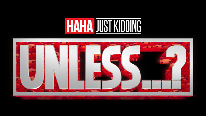
New Marvel Series Is Looking Pretty Lit
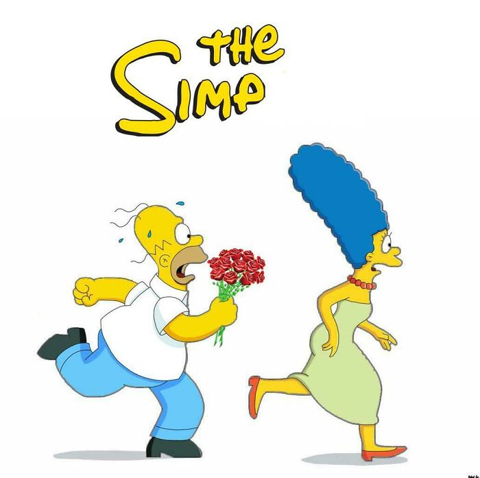
Homer Simp
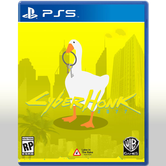
Wake The Honk Up. We Have A City To Burn
On the technical side of things, the images that you post have to be larger than 433x433 pixels. If they’re too small, they’ll be too blurry for anyone else to enjoy if they’re on their mobile phones. Any watermarks that you add to your creations have to be subtle so that they don’t draw attention away from the logo itself, defeating the point of the post in the first place.
What’s more, the moderators want their Sbubbscribers to put some effort into their titles, making them related to the images they post. And don’t forget to flair your posts correctly! The mods go into quite a lot of detail in their guide to explain what each category means, as some of them are quite vague.
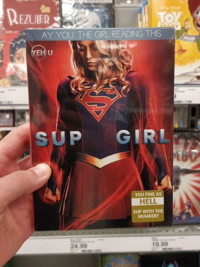
Ay U
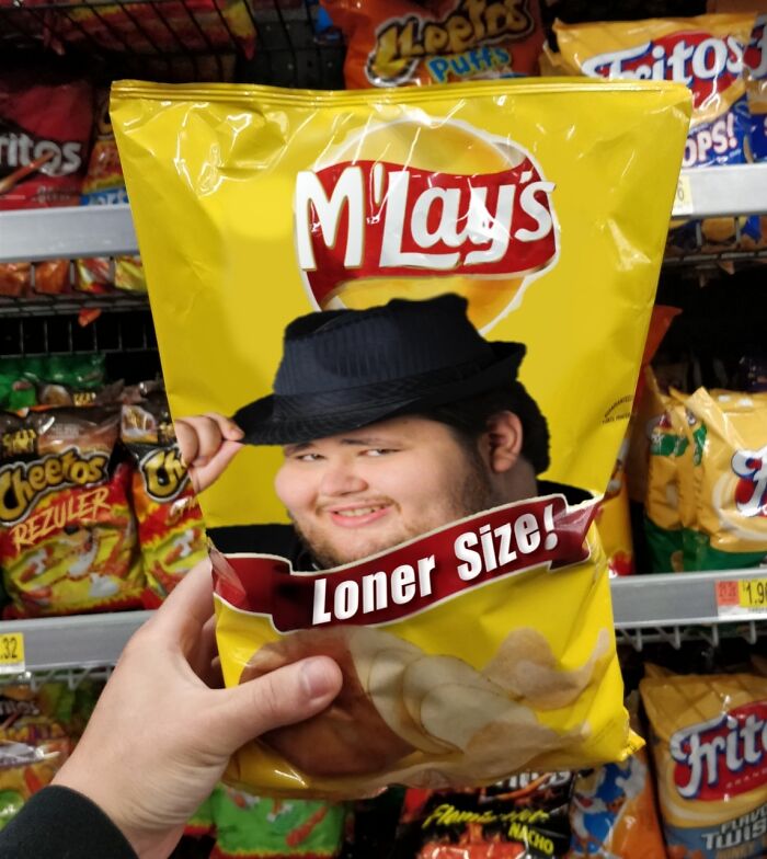
M'lays
Man, I need me some M'Lays, Aw, They're Loner Size, I was gonna share them with my girlfriend. Hold on... I don't have a girlfriend... Damn it.
Minecraft's Cake Day
Obviously, if you want to be a proper member of this and other online communities, you’ve got to respect your fellow redditors, too. There’s no tolerance for anyone being hateful toward others.
Naturally, no matter how good and creative your brand, product, or project logo looks, no matter how serious your company is, there’s nothing stopping someone from editing it and posting the funny version on the internet.
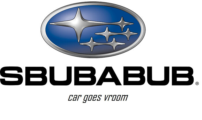
Sbubabub
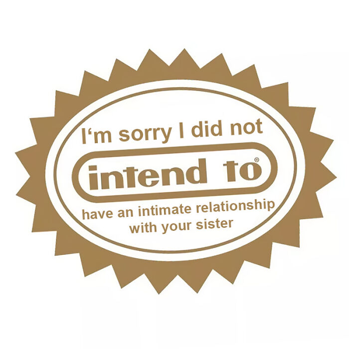
I Am Very Sorry That You Found It Out Like This
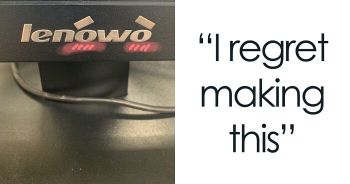
I Regret Making This
The best thing to do here, for businesses, would be to embrace what’s happening instead of getting all angry and bothered about it. You’d only damage your reputation if you started criticizing some random Reddit user for poking fun at your logo like they’ve done with dozens or even hundreds of other ones. Any publicity is good publicity, right?
Regardless of what r/sbubby might do to your logo, it’s a good idea to put in the effort to truly make it shine. Ideally, your logo should be unique enough to stand out from your competitors’ brands, without being overly complex. In a sense, you want to find the right balance between simplicity and memorability.
Yes We Are Aware We Printed [messed] Up Cards Thanks
̀͢͠ ̨̕͞ ̴̴́̕̕ ̡̨́ ̡̧́͘͝ ̴̷͟͝͠ ̢͢҉̕ ̸̵͘͞ ̡̢͢ ̶̢̕͢͝ ҉
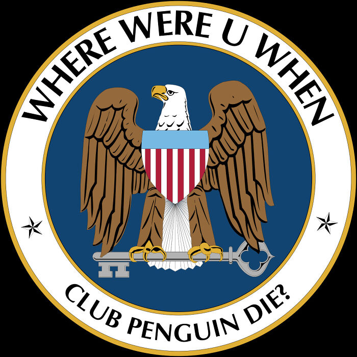
Rip Penguino
Using lots of swirly, fancy fonts and a smörgåsbord might look great as a mural on your office wall, but it might not work well as a logo. You really want to choose the fonts and colors with care so that your target audience can immediately understand who you are and what your brand represents.
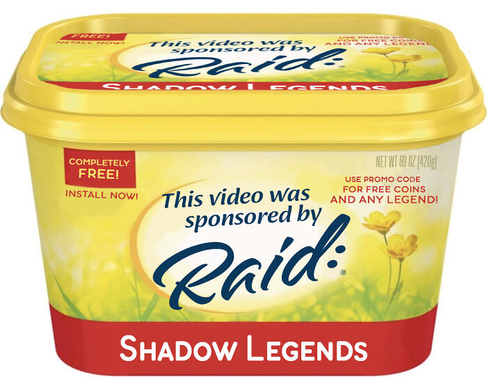
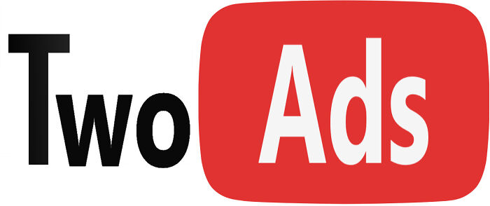
Link In Description
How many of those youtubers actually play or use the c**p they throw at us?
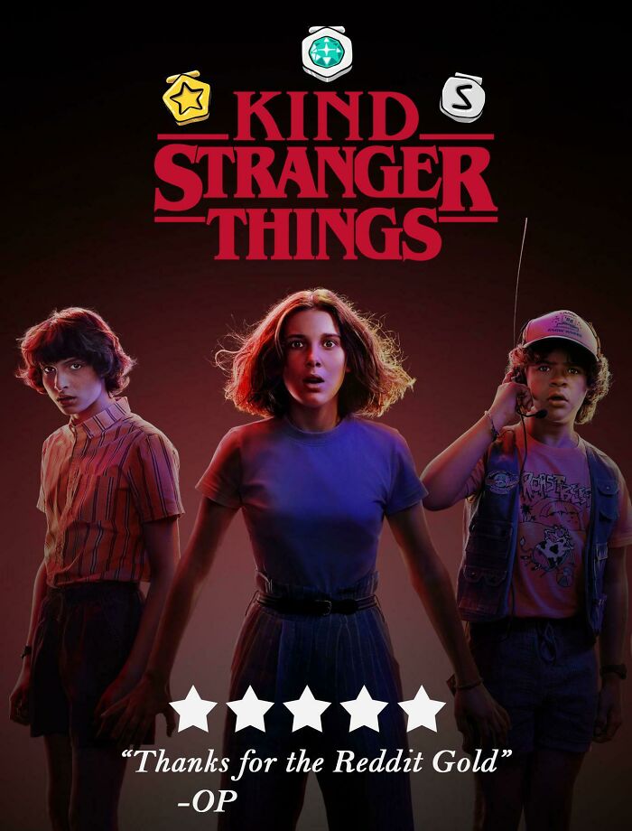
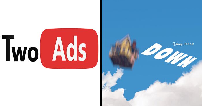
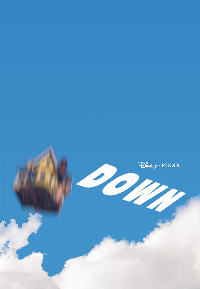
Does This Make The Comment Section The Upside Down?
I Am Definitely Not Playing This Character
And there’s no way that you can get the optimal result without getting some honest feedback from your friends, coworkers, and strangers. They can help you look at your design with fresh eyes so you can make the right edits for the biggest impact. The same goes for the very best sbubbies—you may want to get some opinions before posting the final version on the subreddit.
I’d thought it was just me being too old and out of it, but I’m reassured now that the problem is the entries and not me, so thanks! 💋
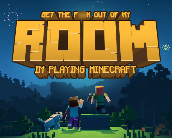
Load More Replies...Starting off with "Nasty," I thought this was going to be satire (Nestle has done some evil stuff), but in most cases, I just don't see the point. When I saw Sbubabub, I thought maybe I didn't get the reference. Then Binger Kurb? Cyber Honk? Room (instead of Roblox)?
No it's get to our of my room I'm playing mine craft ITS SUPOSED TO BE FUNNY
Load More Replies...Am I the only one who thought these were hilarious? The title is a bit misleading, they're just funny edits of logos.
Yeah, they weren't all comedy gold but still much better than some of the "funny" stuff on BP
Load More Replies...Back in college our dining out options were Burger Thing, Taco Hell and Dead Lobster.
The title of this article "30 Logos Edited To Represent What People Actually Think Of The Brands" has nothing to do with the contents of the article.
Tombstone frozen pizza, Hot Pockets frozen sandwiches, and KitKat candy are all Nestle, sadly. I can't eat three of my favorite junk foods .

 Dark Mode
  No fees, cancel anytime










![Yes We Are Aware We Printed [messed] Up Cards Thanks Yes We Are Aware We Printed [messed] Up Cards Thanks](https://www.boredpanda.com/blog/wp-content/uploads/2023/09/65140f55adda7_2eporrnv3iw31-png__700.jpg)
