Get Premium
Dark mode theme is available exclusively for premium users. Learn more about the benefits of subscribing.
No fees, cancel anytime.

 Dark Mode Ad-Free Browsing Unlimited Content
 Ad-Free Browsing Unlimited Content Dark Mode
Join 1.2 million Panda readers who get the best art, memes, and fun stories every week!
Hey there, logo enthusiasts! We sincerely hope you've had your daily dose of coffee because we're about to take a wild ride through the weird and wacky world of logo design fails (I mean, who doesn’t like funny things?). So Pandas, strap in, because we're about to showcase some examples where designers took 'thinking outside the box' a little too literally.
This post may include affiliate links.
I thought it was Canadians who had maple in their blood. And their urine...
But how do these unfortunate logos come to be, you may wonder? And more puzzling, how do they get past marketing teams and into the public eye? Well, usually one of the main reasons these logo fails occur is due to lack of research and planning. A well-designed logo requires a deep understanding of the brand, its values, target audience, industry trends, and things alike.
oh damn, it's upside down! i was like "how the hell is this ismart?" (at least is +jews and not -jews)
It's not just about creating something visually pleasing (well, in the case of this post, perhaps this shouldn't be applied); it's about creating something that accurately represents the business and resonates with its consumers. When these factors aren't considered, you end up with logos that seem simply absurd or just highly inappropriate in context...
Of course, another case for failure may be due to the design being reviewed in isolation without considering how it might be perceived in the real world, or it might be that those reviewing the logo are too close to the project to see potential problems. Like when you are working on something for such a long time that your perception of it becomes frazzled (especially if you don't get feedback on it).
So Pandas, with all of that out of the way, tell us, which of the failed design logo was your favorite and why? We will be looking forward to your answers both under the photos and the post itself.
And remember, even if something doesn't turn out perfect on the first try, it's always possible to learn from the mistakes of others and make necessary adjustments. As these examples show, even the best of us can fail at times when working on something for far too long...
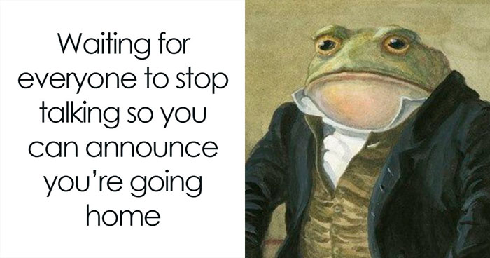
Age is just a number, jail is just a place... (brilliant title)
You guys notice how most of these are in the boring corprate art style?
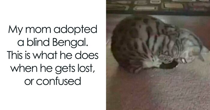
I have a florist near me that has zebra finches in the shop. sometimes i stop by just to look at the little cuties.
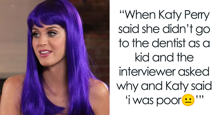
To reach the optimum level of wellness, you must gain the ability to mutate into.......
Never ever separate the C and A in the word canal. It happens way too often.
Looks like the Edinburgh golden turd! https://www.edinburghnews.scotsman.com/business/consumer/you-cant-polish-a-turd-but-you-can-clad-it-in-bronze-coloured-steel-3301450
Why did they have to draw the bodies like this?? There are literally so many other, more reasonable ways. Did they just want to be original or sthng?
The heck is this? The red F kind of looks terrified, blue F looks creepy like he knows what he’s doing and the C is just staring out into the distance because he doesn’t have a mouth so he can’t use the pacifier
Good morning, today could I please have 200g of your finest Sample Text? Oh and could I please buy a backpack with the Sample Text logo? Thx
Well as long as you are not allergic to polyester fiber it should be safe to use. So, have fun.
y'all see a too much in everything lol, looks like the symbol of division to me
to pass the entrance exam one must decipher the code to prove one's intellectual skills and patience. they award scholarships to those that can do it in under 1 hour.
wait what is that lol is it a calculator or fake credit card
I dunno, you ever smelled the boys locker room at high school after a game? Might just be pretty accurate.
Why would you want to stay who you are? You're supposed to grow and change as a person! If you're the same as you were ten years ago, you're doing it wrong.
omg I love that place, they have the best blood baths and their weekly summoning rituals are to DIE FOR. 5/5
Hah, this place is just off Carnaby street in London. They make a great lychee martini
Copied from Fedex is a strong word... What makes the FEDEX logo is the arrow formed by the whitespace (negative space) between the E and the X - They didn't copy it, because they were trying to cram in the Exxon logo as well !!!!!! Here is an explainer I made (too much time on my hands!) mix-646ccc...a96d40.jpg 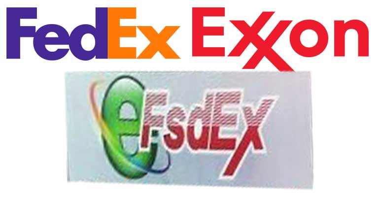

In the USA graphic designers are notoriously under paid & under appriciated. I wonder how many of these the designer knew exactly what they were doing for a company that had pissed them off
A lot of these i see are just businesses looking to do a logo on the cheap or they think graphic design is super easy.
People. Search Google for "polish post logo" it should be a horn. I am always seeing there a relaxed person and a second head doing blow job.
Lol, true, I forgot about that. It's hilarious 😆
Load More Replies...In the USA graphic designers are notoriously under paid & under appriciated. I wonder how many of these the designer knew exactly what they were doing for a company that had pissed them off
A lot of these i see are just businesses looking to do a logo on the cheap or they think graphic design is super easy.
People. Search Google for "polish post logo" it should be a horn. I am always seeing there a relaxed person and a second head doing blow job.
Lol, true, I forgot about that. It's hilarious 😆
Load More Replies...


 No fees, cancel anytime


 Looks Like 3 Dudes In A Hot Tub")


")
")


")