40 Awesome Examples Of Modern Design Collected By The ‘Call It Design’ Instagram Account (New Pics)
Call It Design is an Instagram magazine that shares eye-pleasing examples of what it considers modern design, and it has earned itself 105K followers by doing so.
The last time Bored Panda released a publication about it was in October 2020, and at the time, this number stood at 55K. You might think, "Surely the people running the account must've done well to ensure such growth, right?" And you'd be right.
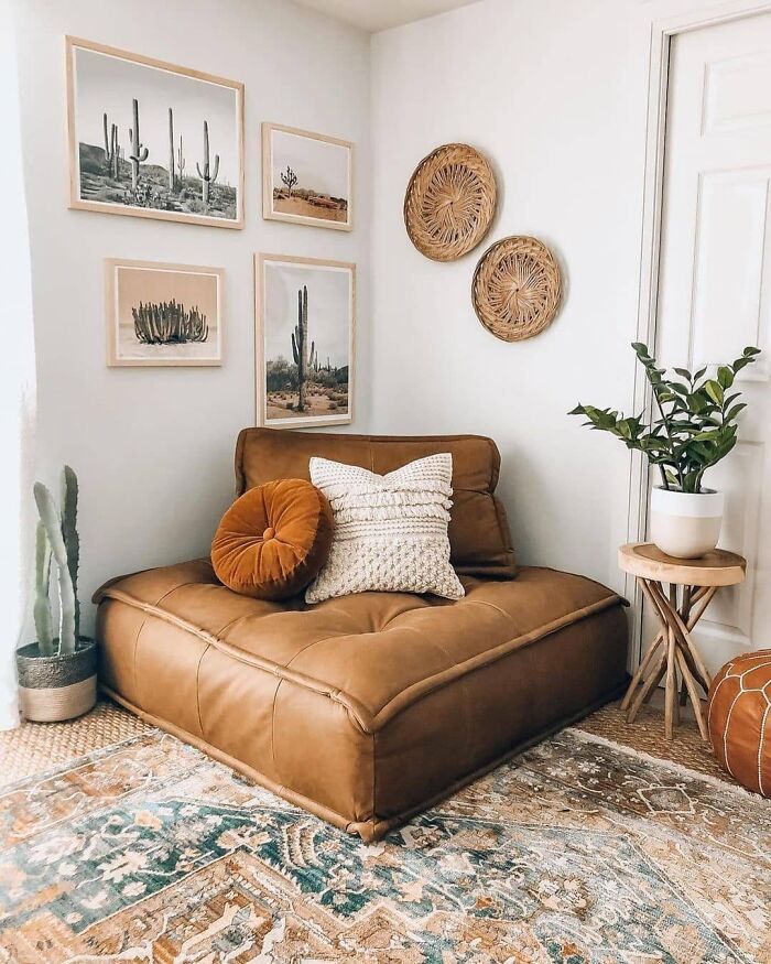
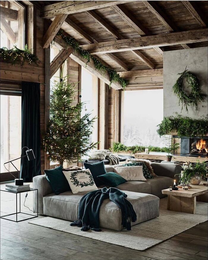
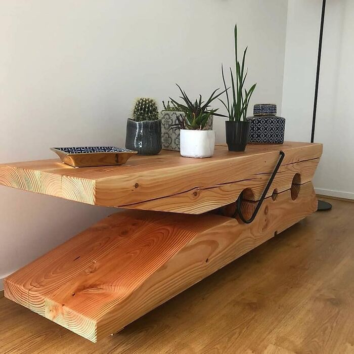
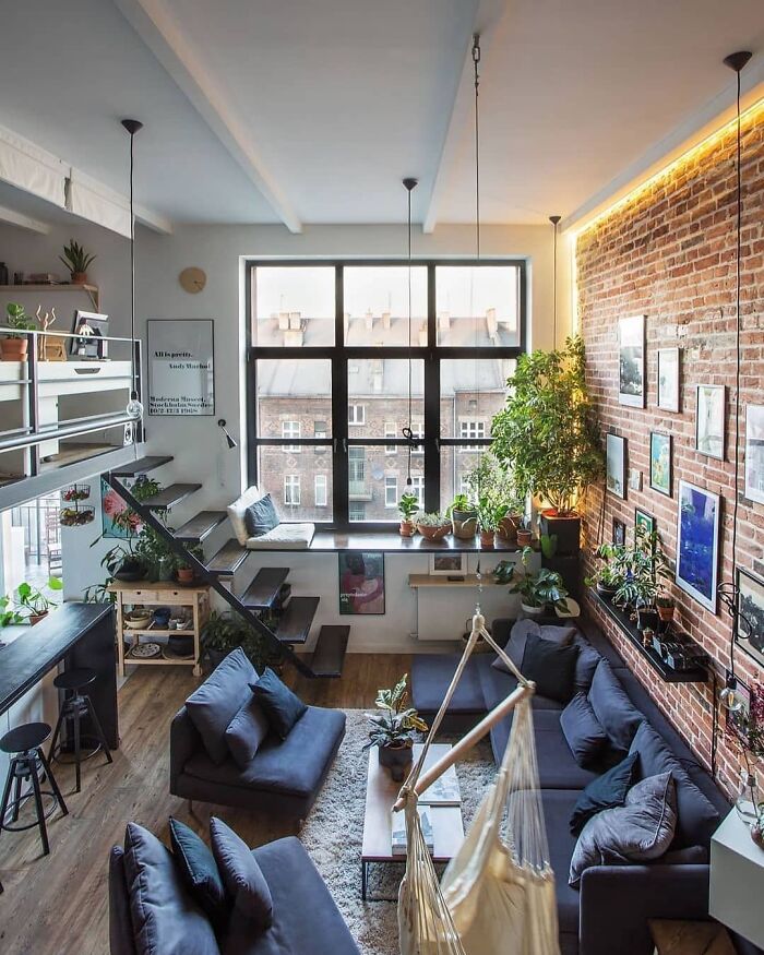
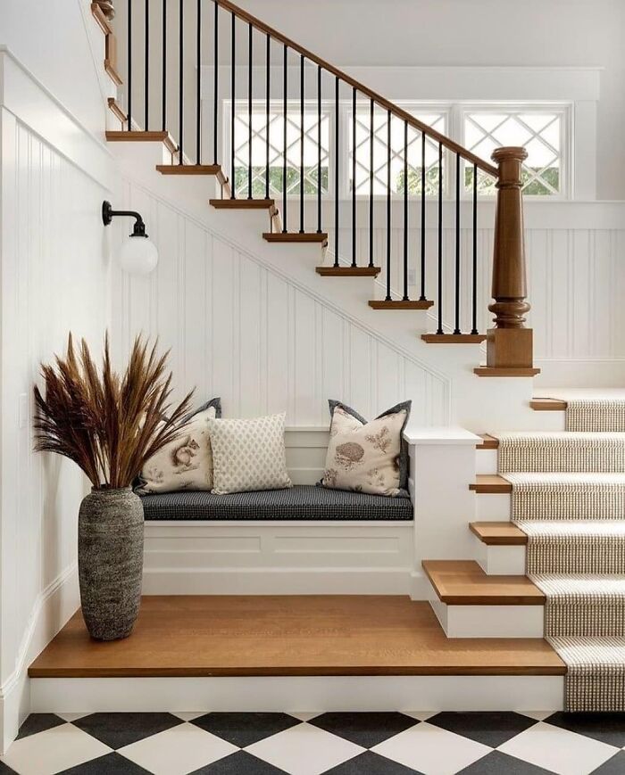
Call It Design continues to collect pictures of stunning staircases, multi-purpose tables, cozy bedrooms, and the content it features continues to inspire homeowners and design enthusiasts. Check out some of its most popular recent posts below.
More info: Instagram
This post may include affiliate links.
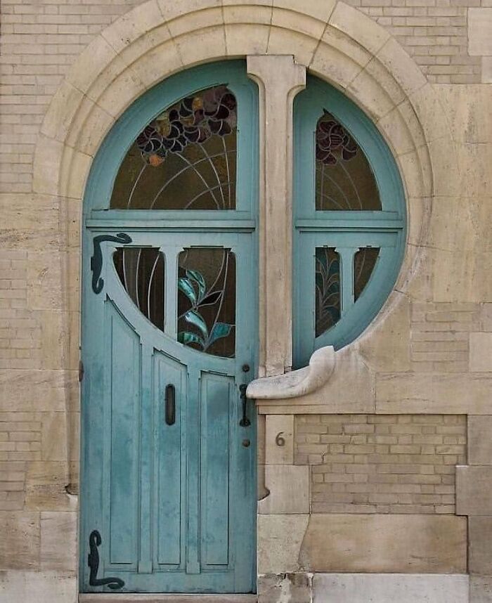
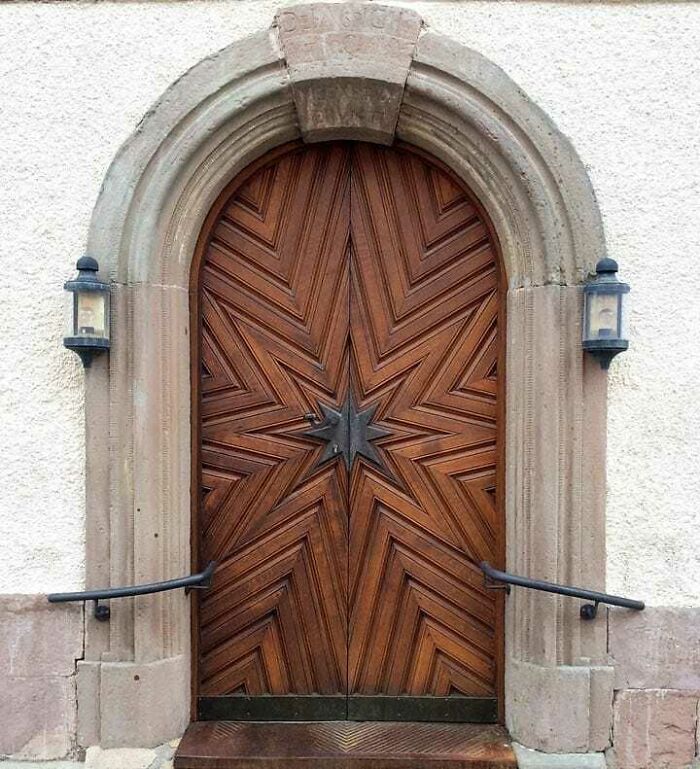
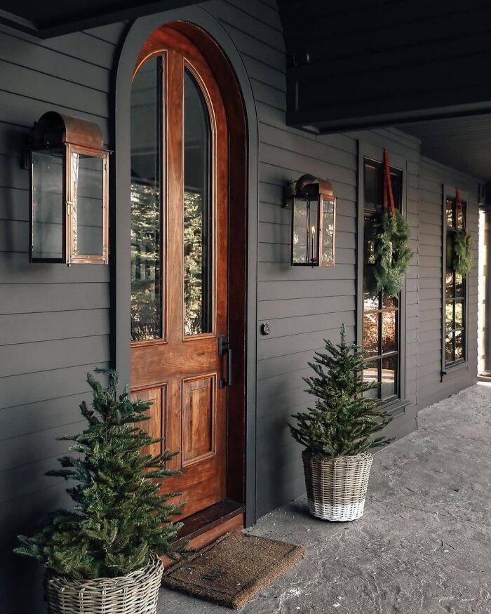
Stunning Door Design
The Door By Ernest Delune
Ali, the person behind Call It Desin, created it out of personal passion. "I started getting into modern design when I wanted to renovate my 1-bedroom apartment," Ali told Bored Panda. "I myself try to avoid the extra fluff, that's why I started digging into modern design, and appreciating its simplistic and unique look."
Ali believes people are drawn to modernism due to their inner desire to express themselves through simplicity. Think of it like this: when your space has no unnecessary details, you can't get bored of it. If everything has its purpose, you don't question its presence.
"I started this page 18 months ago and made over 1,300 posts" Ali continued. "Based on the posts that have had the biggest engagements and interests, I can see clearly what design features my followers like the most."
"For example, they're attracted by the most simple and minimalist architecture; boxy style, linear elements, flat roofs... They may seem basic, but they give that amazing, stunning, and artistic look to a place."
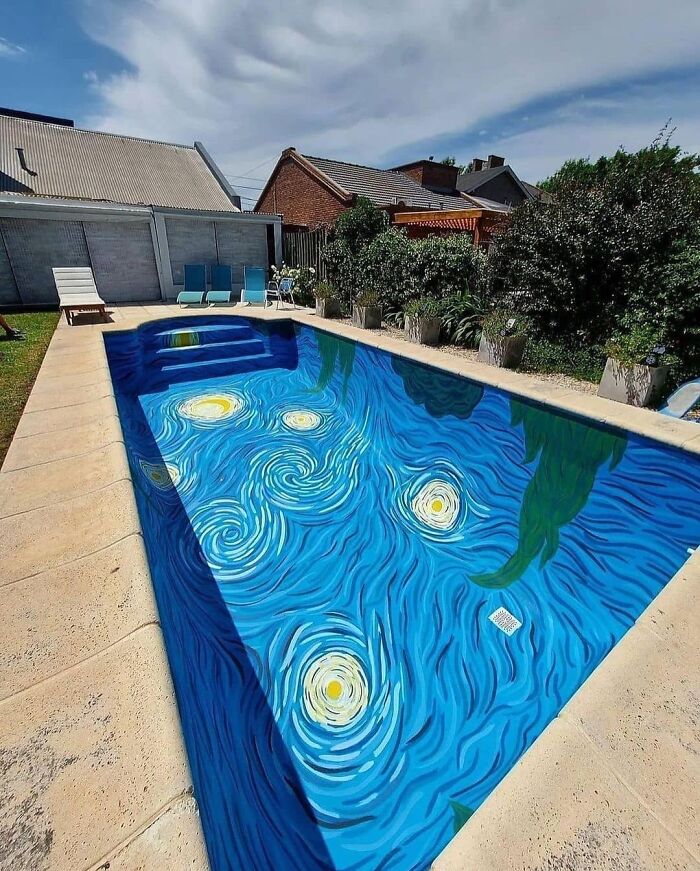
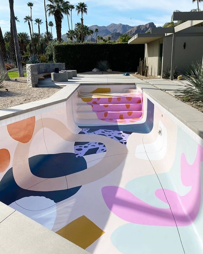
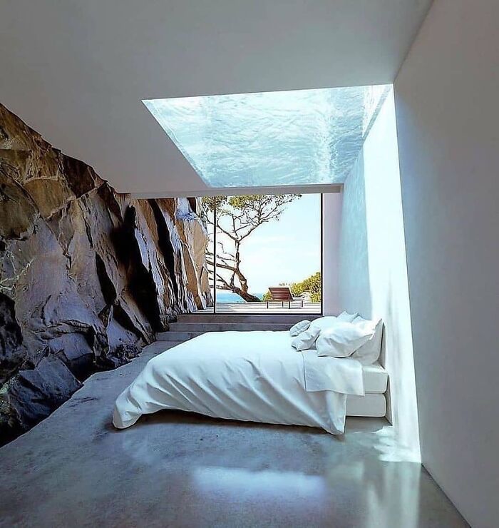
Stunning Pool Art Design!
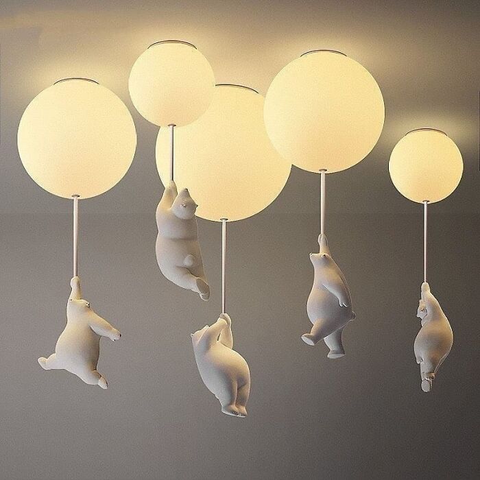
Teddy Bear Ceiling Lights By Elle Home Decor
This like Winnie the Pooh combined with that scene in Mary Poppins Returns where they're all flying on balloons!
When talking about design, the words 'contemporary' and 'modern' are often used interchangeably but, although there are similarities, they are two distinct design styles from different periods.
First, there was modernism, then came contemporary interior design; modern design flourished in the mid 20th century while contemporary design is still forming at present. But it's an easy mistake to make.
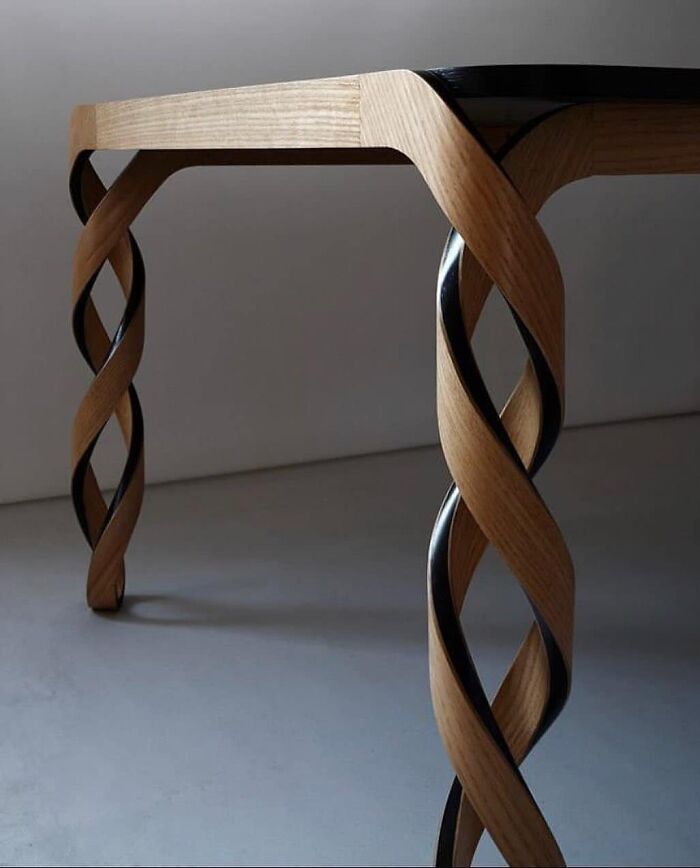
In Love With This Awesome Woodworking Art
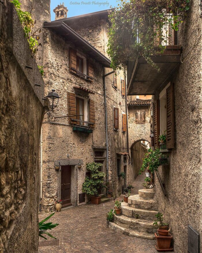
Italia
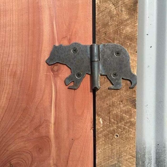
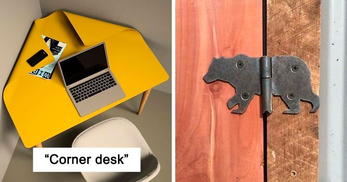
Creative Door Hinge
The modernism movement began to unfold as it moved away from using traditional building and design materials like wood, stone, and brick, focusing on industrial materials such as glass, steel, and concrete instead.
The most recognized and influential design philosophy was created by the German Bauhaus school of design in the 1920s.
"The basic principle of the Bauhaus is 'Form follows function,'" interiors writer, stylist, and designer Cate St. Hill writes. "That means that designs were made to be functional, practical, useful, and simple, often before their beauty was considered."
According to St. Hill, Bauhaus designs are defined by a lack of ornament, the use of clean lines, smooth surfaces, and geometric shapes.
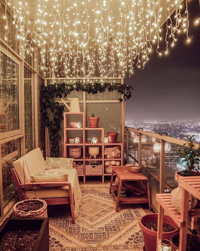
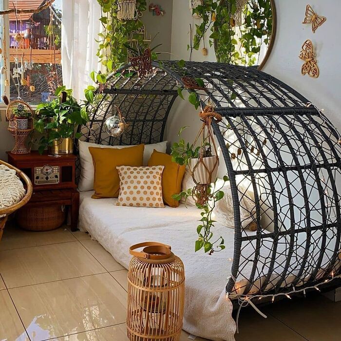
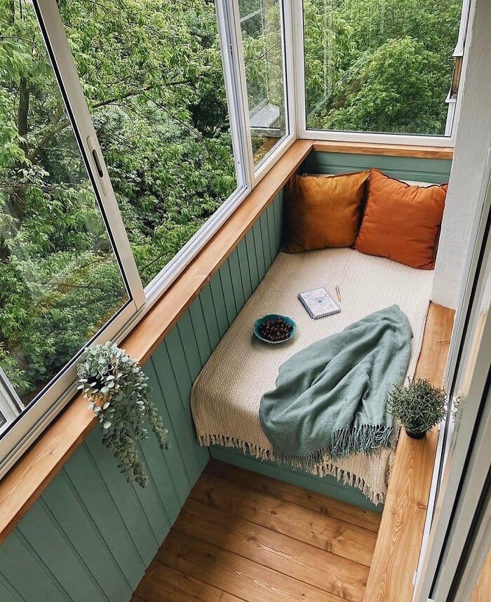
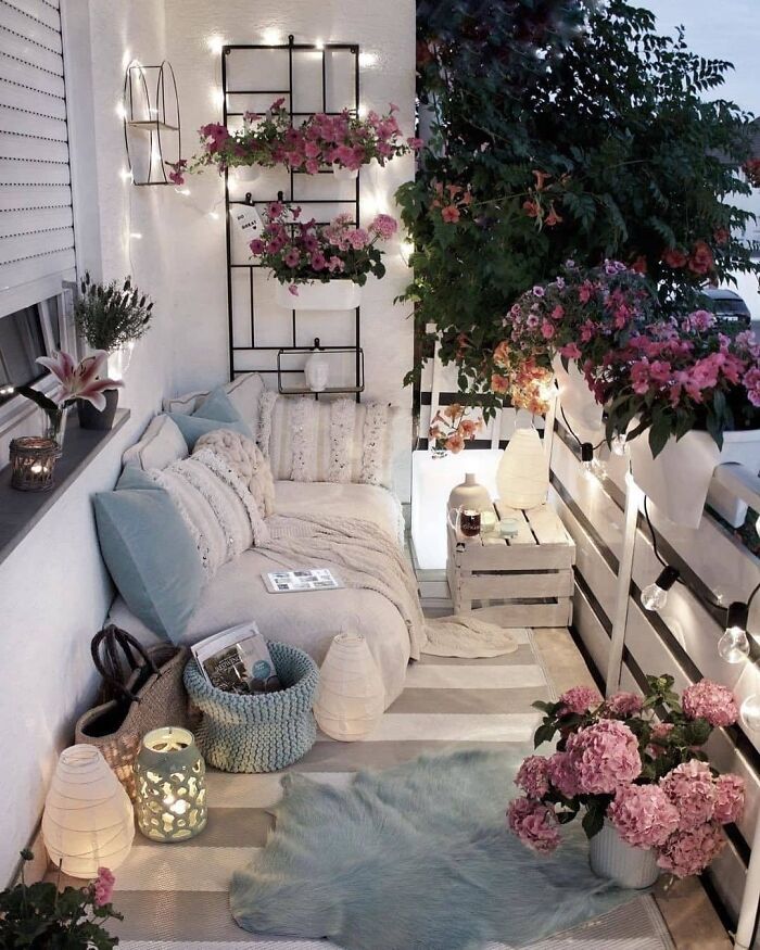
Cozy Balcony
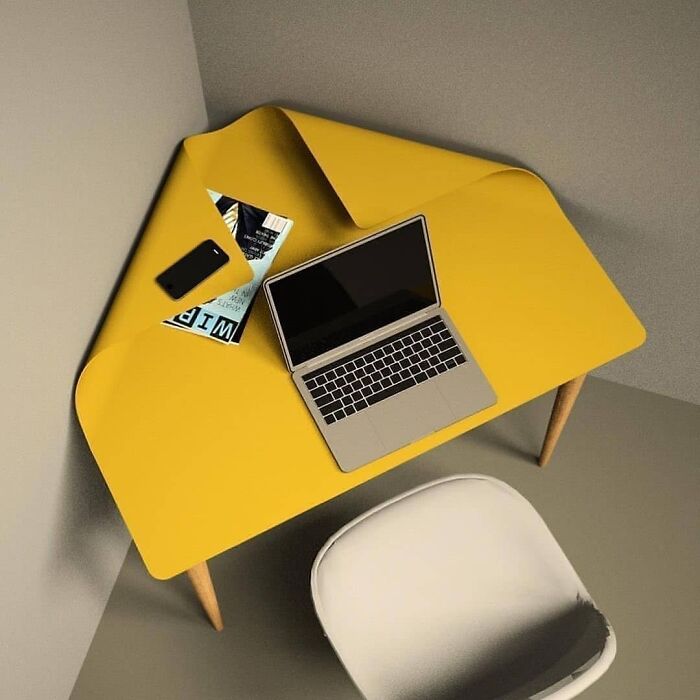
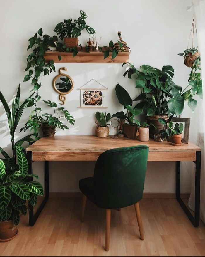
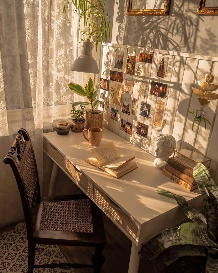
Corner Desk
Absolutely In Love With This Cozy Space
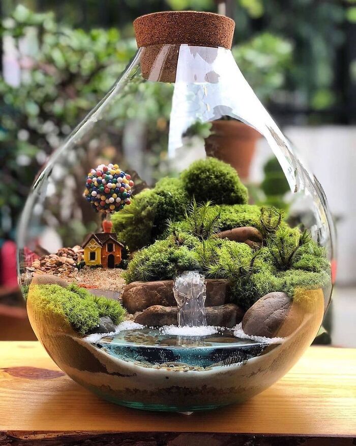
Miniature Terrarium by Jardim No Pote
She thinks its core idea is exactly the reason why Bauhaus has persevered. "Because Bauhaus designs prioritized function and were carefully considered in relation to space, they have endured – this wasn't style over substance (although some would argue they didn't always put comfort first)."
"Bauhaus designs still fit seamlessly into today's homes – because they're refined and functional, they still look contemporary. Simplicity just doesn't date. I think Bauhaus design is particularly relevant at the moment in relation to small space urban living and today’s multifunctional homes," the designer explained.
Of course, there's more to modern design than Bauhaus. For example, there's Modern Rustic, Modern French, and other variations. And you can find pretty much all of them on Call It Design.
A Cozy And Warm Spot
Villa Melzi Garden
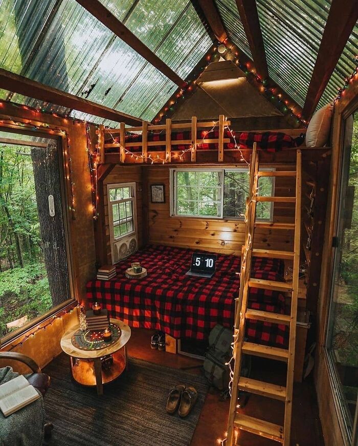
Jack’s Treehouse
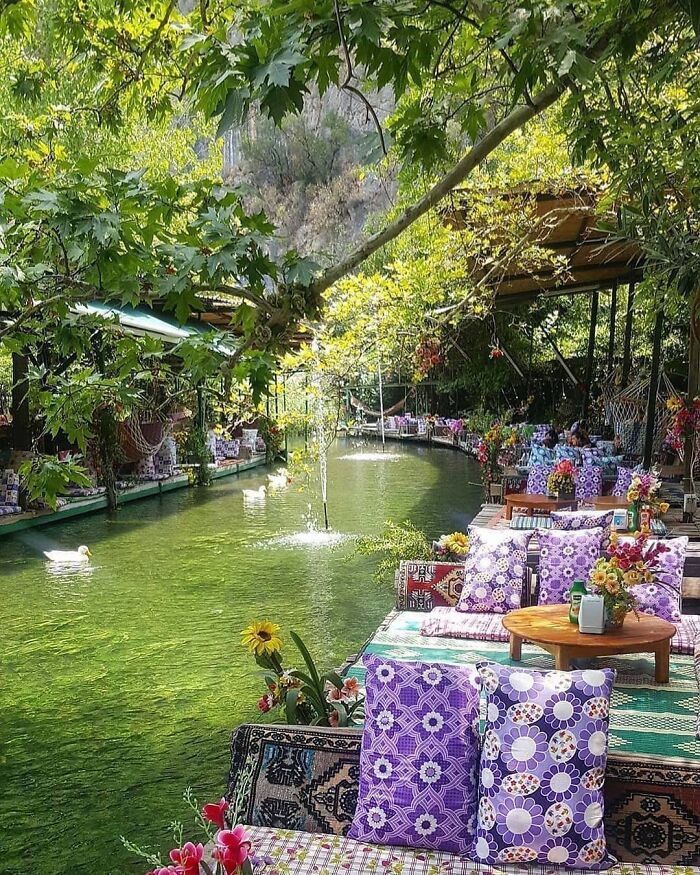
Saklikent Restaurant
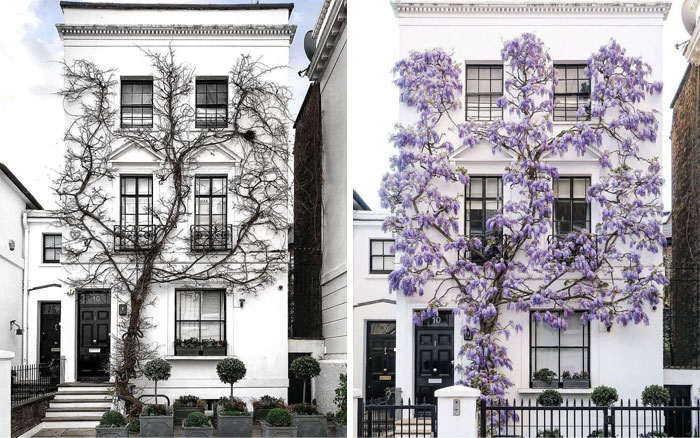
South Kensington Townhouse Photo By Bei.bei.wei
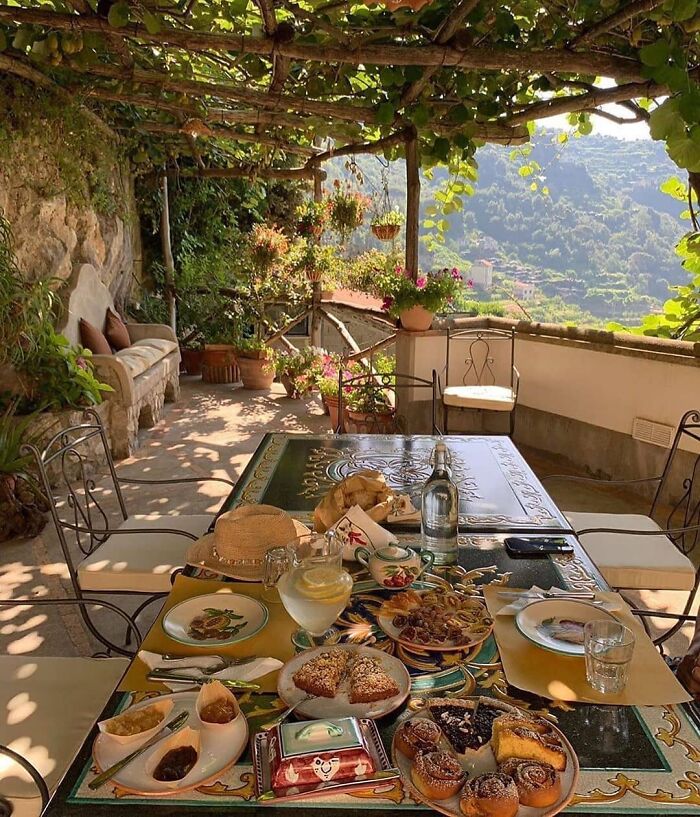
Imagine Waking Up And Having Breakfast In Amalfi Coast
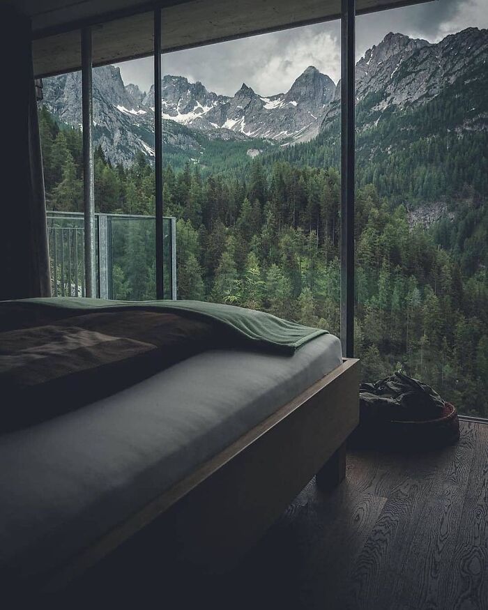
Mountain Cabin In Austria
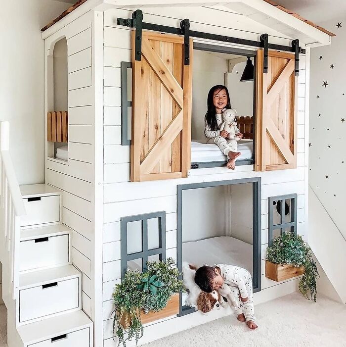
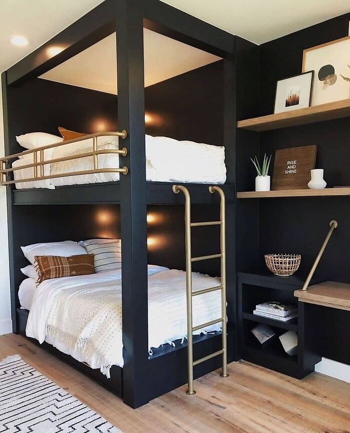
Bunk Bed By Aenny Chung
Take A Look At This Beautiful Space
Gorgeous Door Design
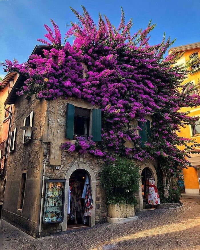
Unique House In Sirmione, Italy
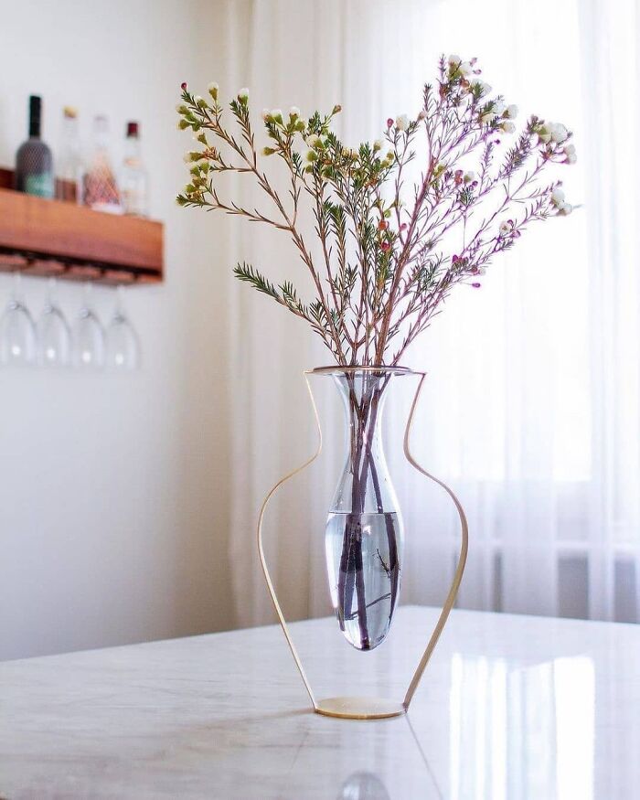
Droplet Vase By Kitbox Design
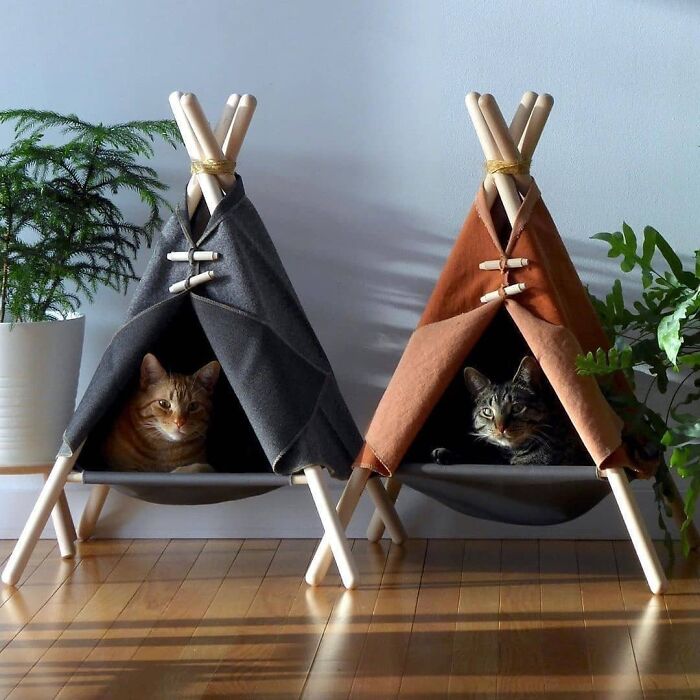
Adventure Tent Cat Bed By Tinkertradingco
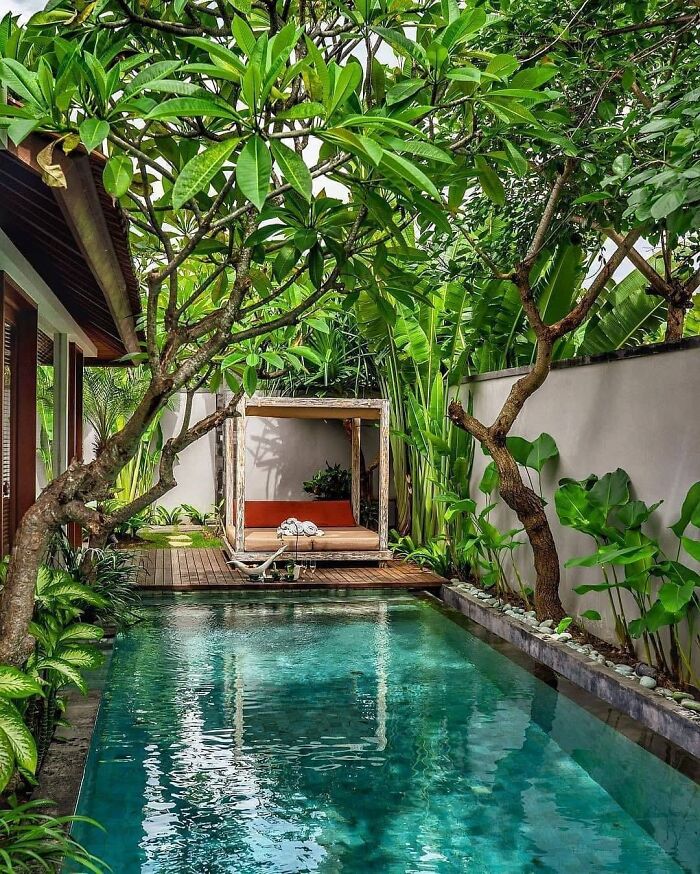
Tropical Swimming Pool / Bali
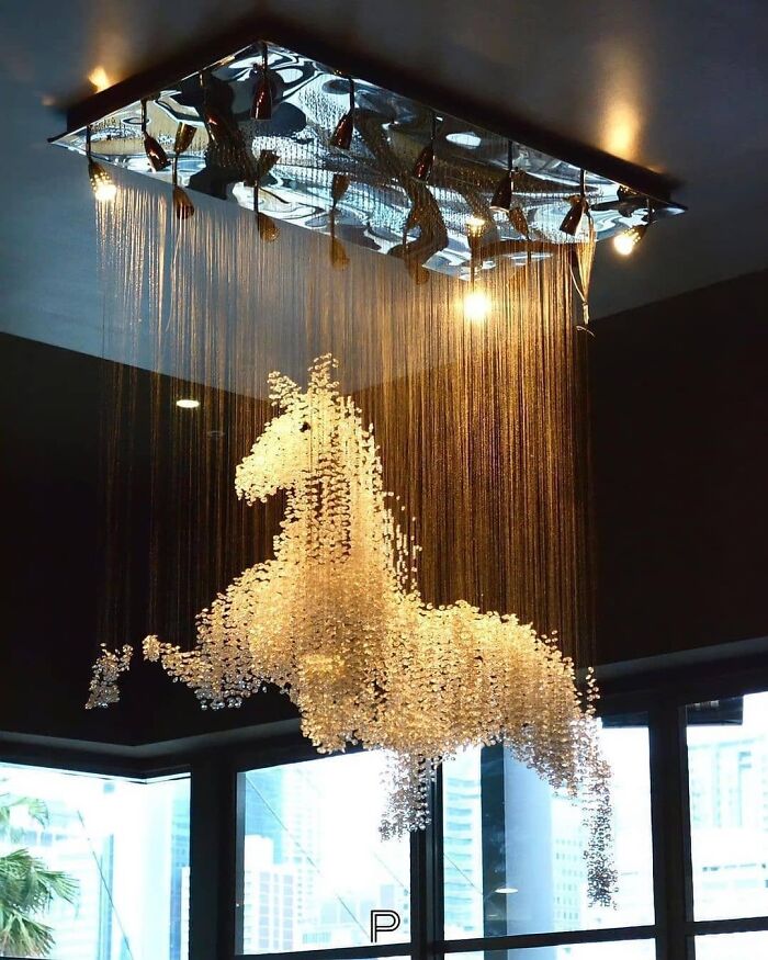
The Horse Chandelier By El Jewel Lighting
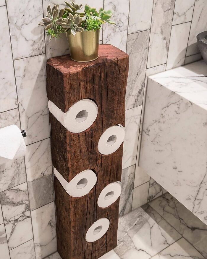
Toilet Paper Holder By Bill Jackson-Martin
this MIGHT stop our Weimaraner from stealing rolls and eating them!
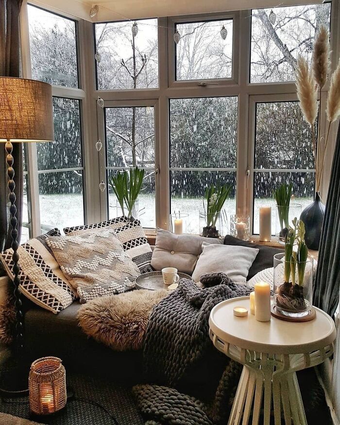
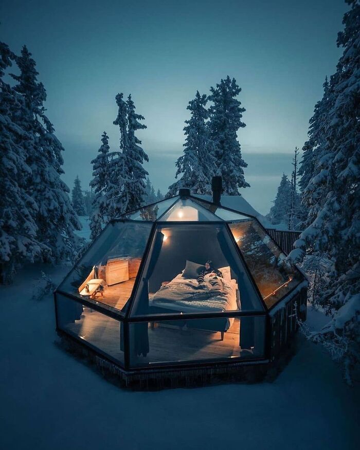
The World Changes When It Snows
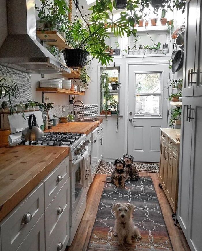
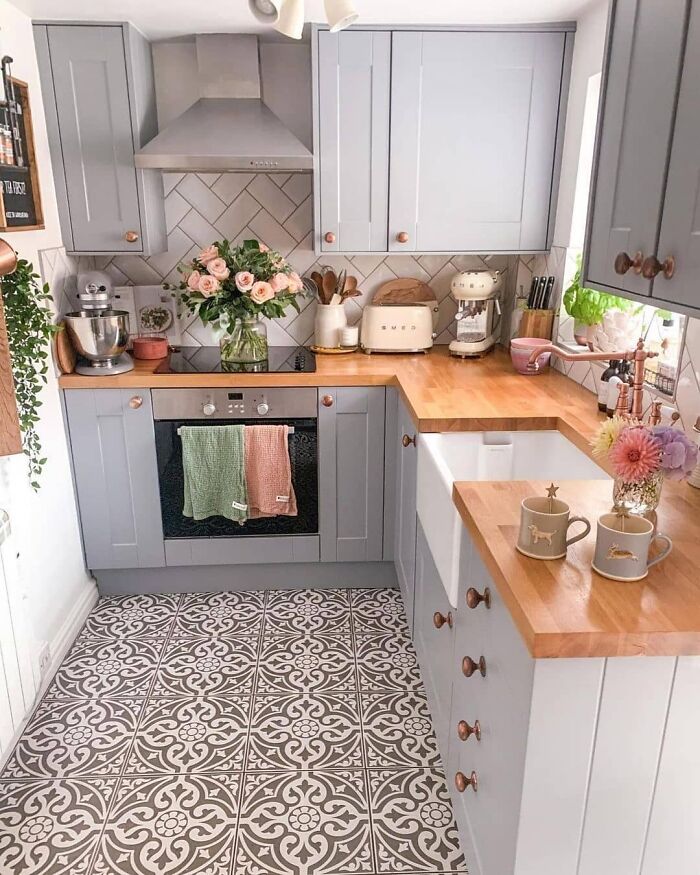
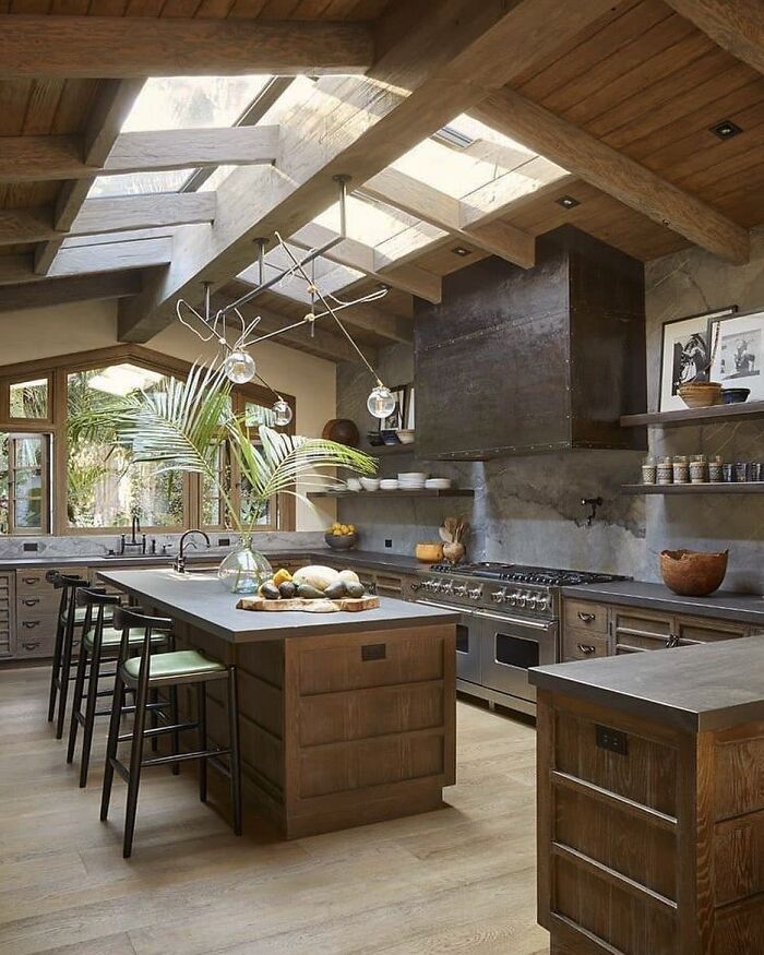
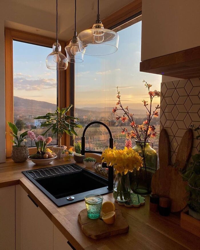
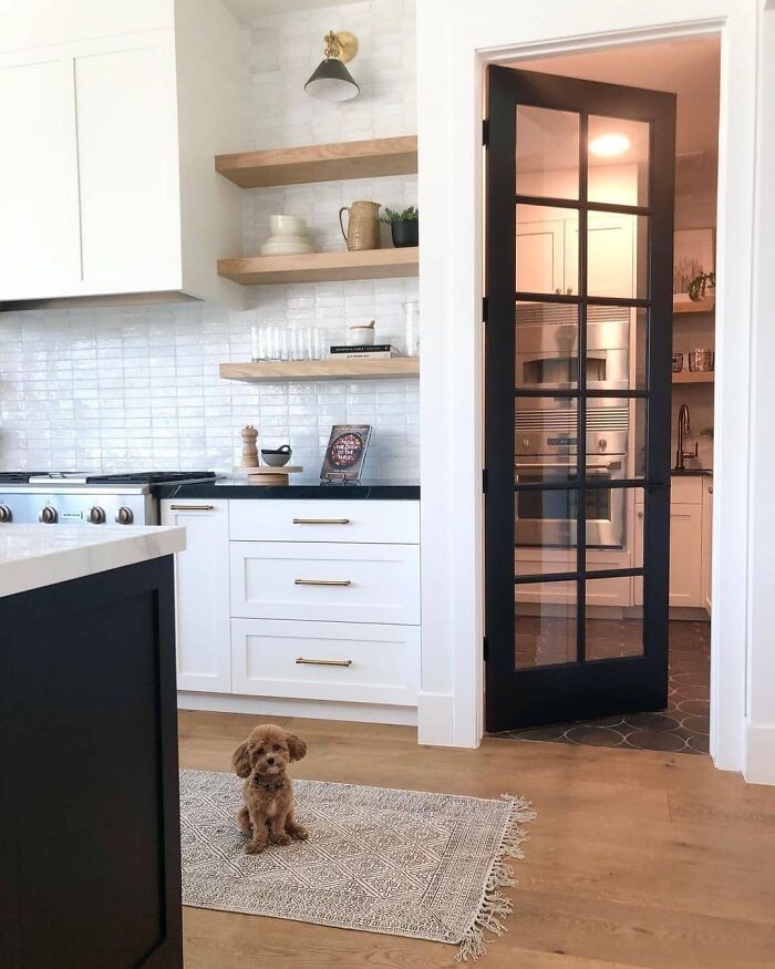
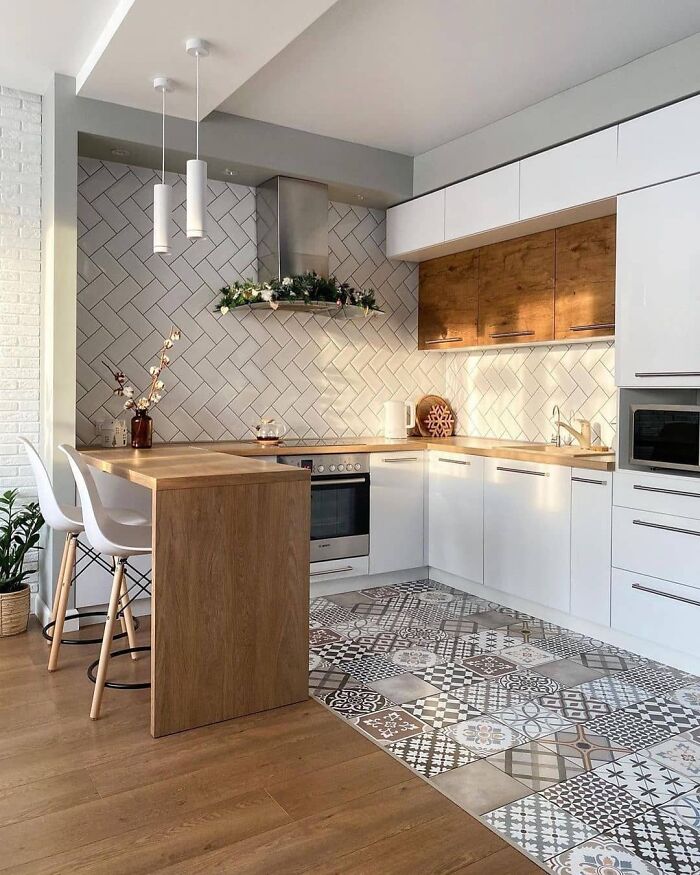
In Love With This Lovely Kitchen!
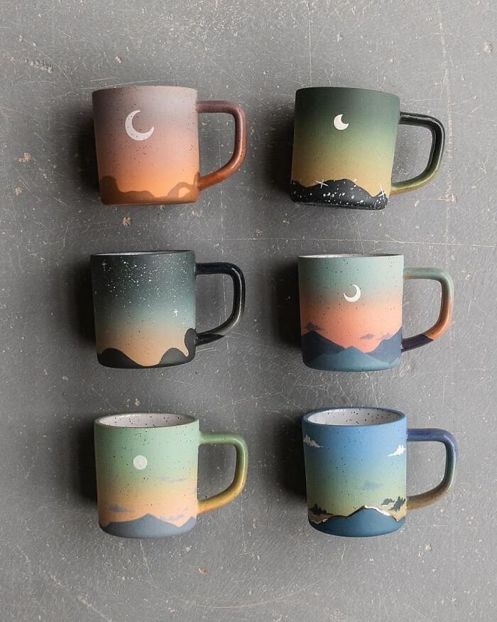
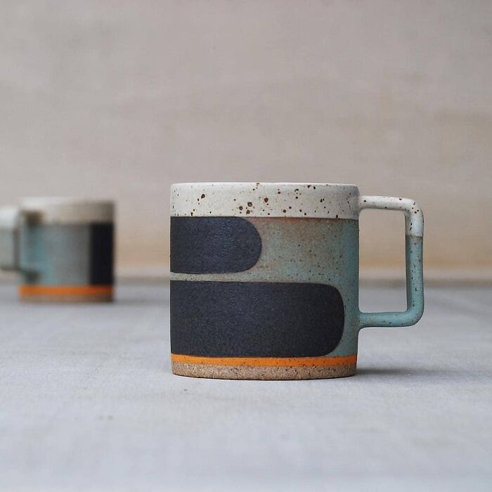
Beautiful Mugs
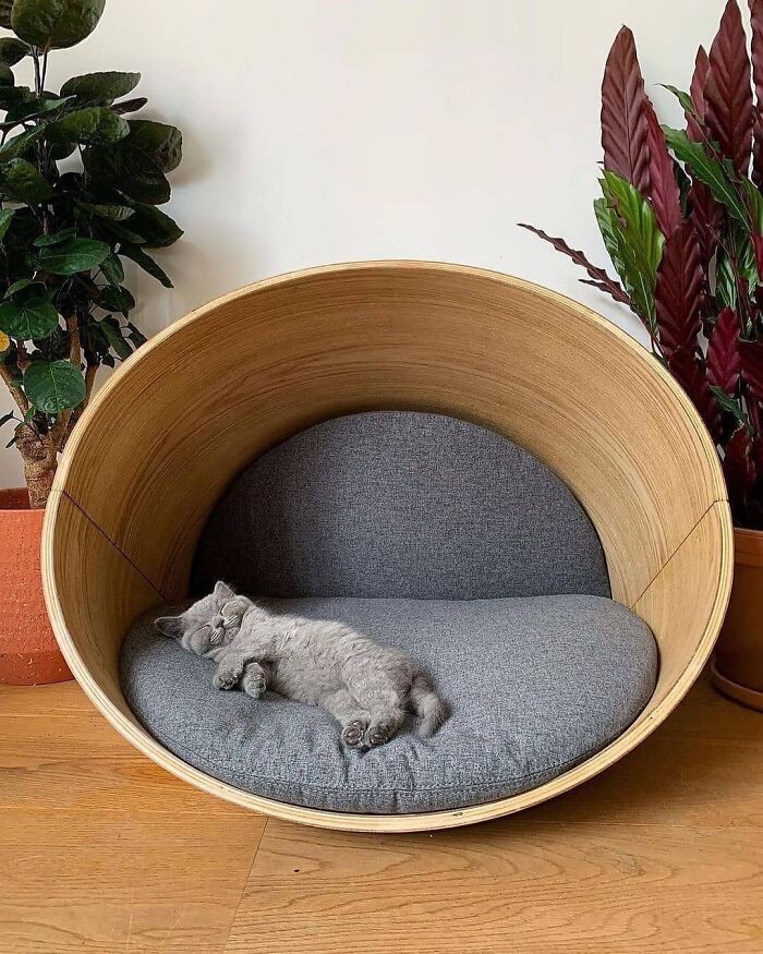
Kyali Oval Pet Bed
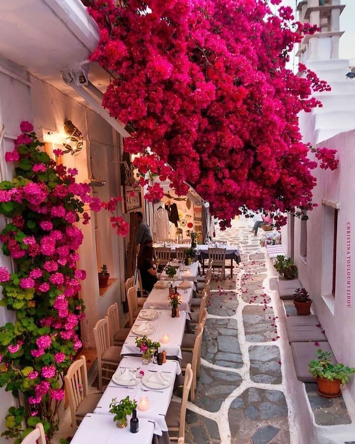
Stunning Blooming Spot
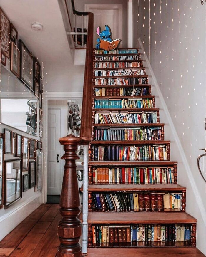
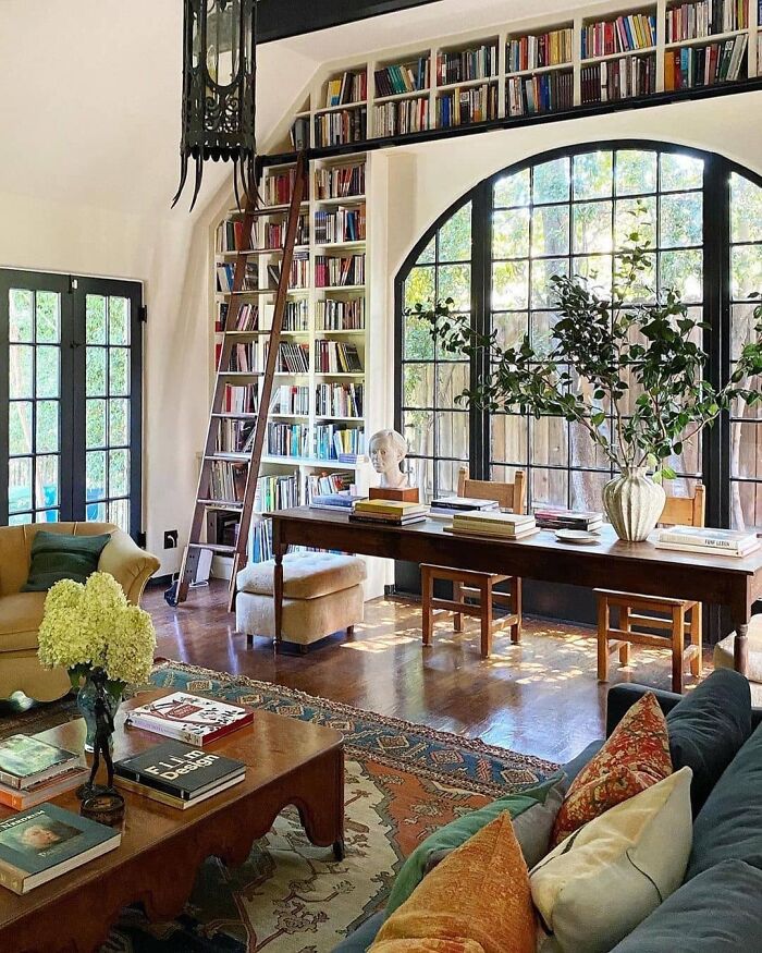
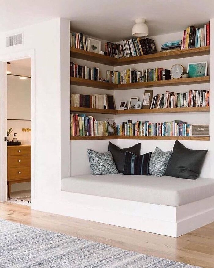
The Perfect Staircase For Book Lovers Edit By Lulumoonowlbooks
It looks beautiful, but I, personally, wouldn't want to stamp on my books..it seems kind of disrespectful.
How Beautiful Is This?
a cool way to have a coverd space without destroying nature - love it
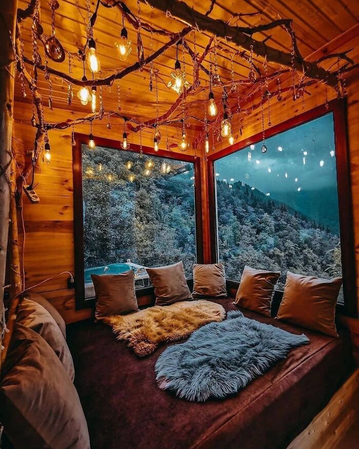
Eco House Merisi Is A New Eco-Style Hotel Located In The Highland Adjara, 50 Km From Batumi, With Stunning Panoramic Views
For an Eco house, that looks like a lot of lights, apparently plugged in on a power strip. Lovely room, though and fantastic view (with apparently hot tub outside!).
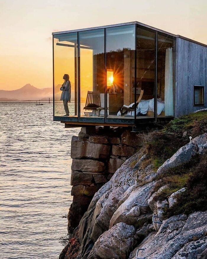
The Perfect Spot For A Saturday ! Have A Great Weekend Manshausen_island In Leinesfjord, Norway
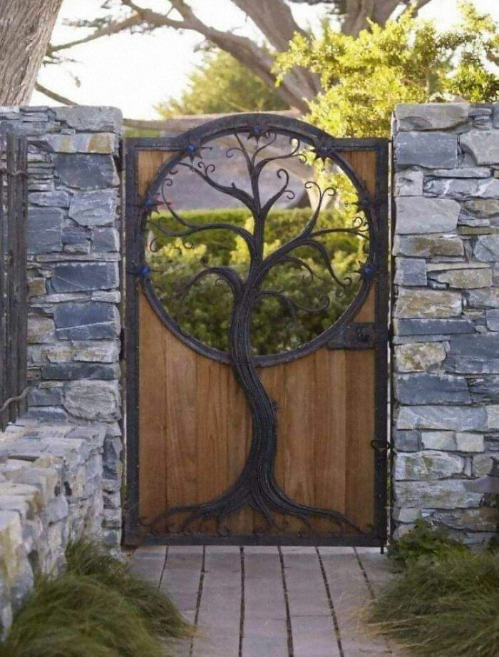
Awesome Door Design
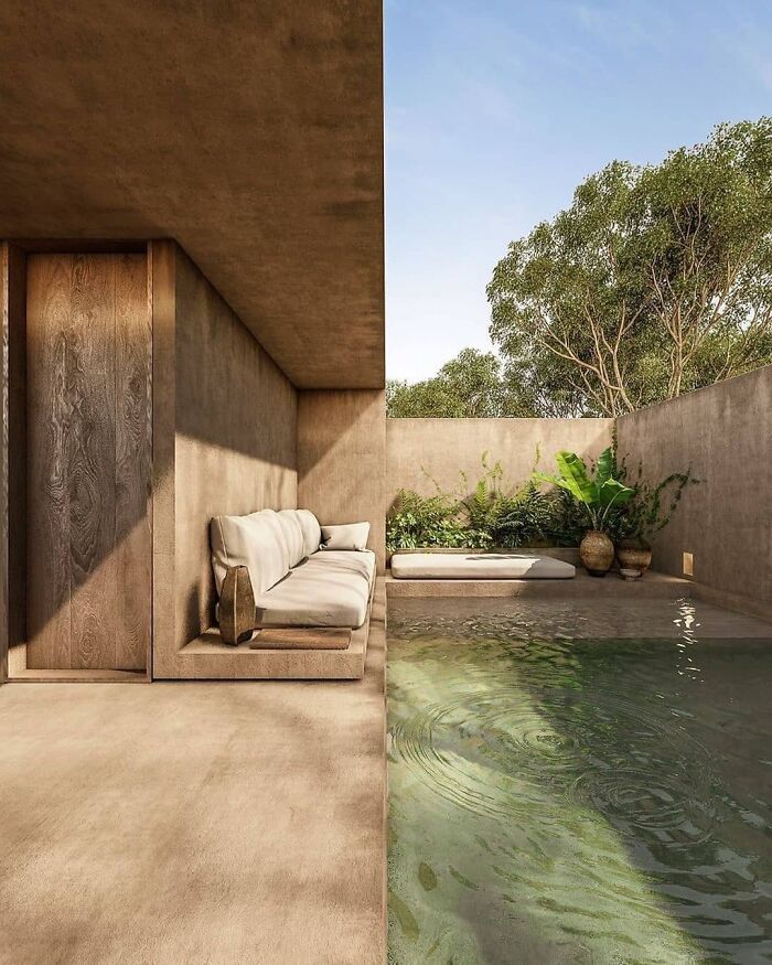
Casa Gu By Estudioeva.mx
In Love With This Lovely Kitchen
Absolutely In Love
Lovely Space
Side Table By Vincent.bergogne
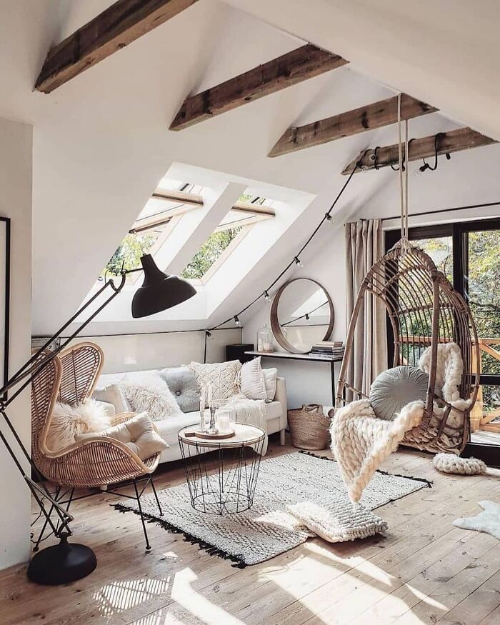
Loft In Krakow, Poland
This space strikes me as very functional and comfortable. Natural light is certainly the way to go here.
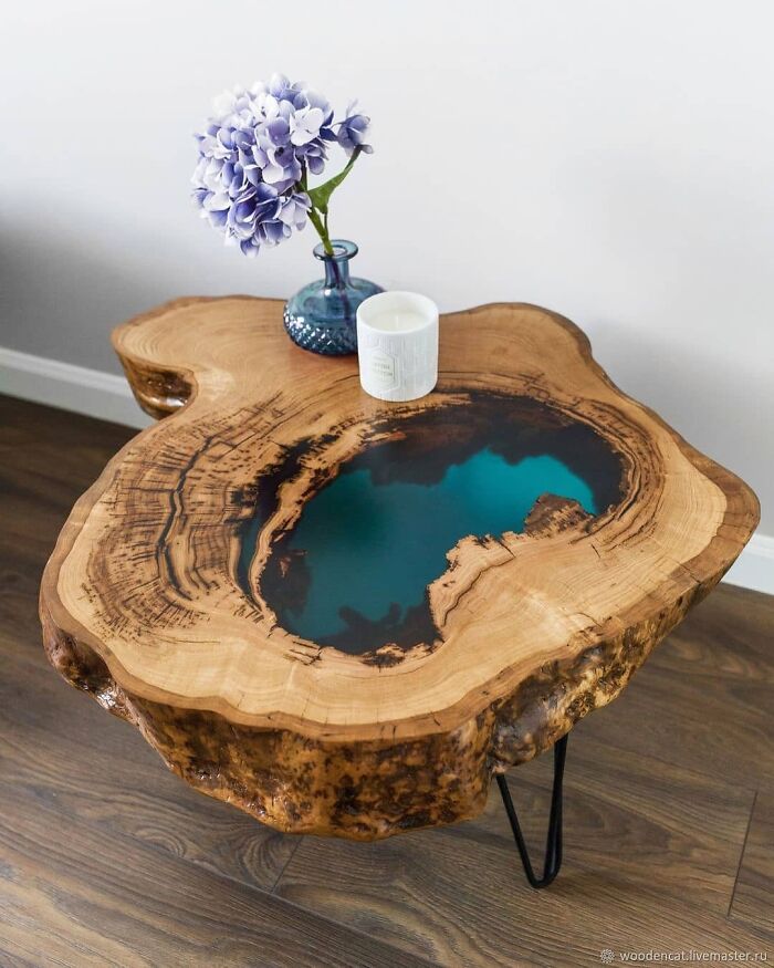
Wooden Side Table By Grant Greefkes
Absolutely In Love With This Space By My.life.in.colour
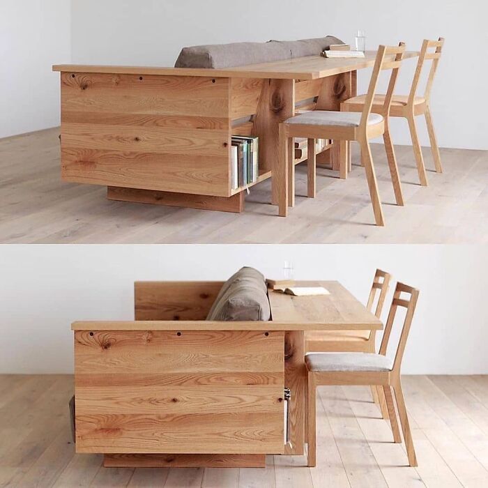
Caramella Counter Sofa
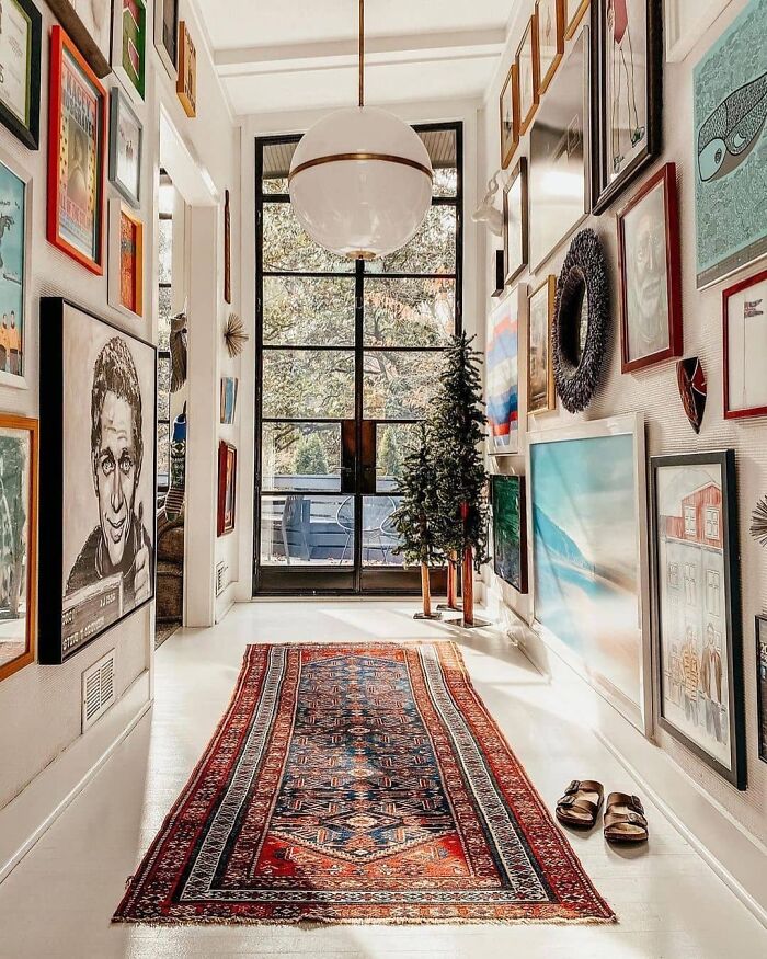
Entryway Goals!
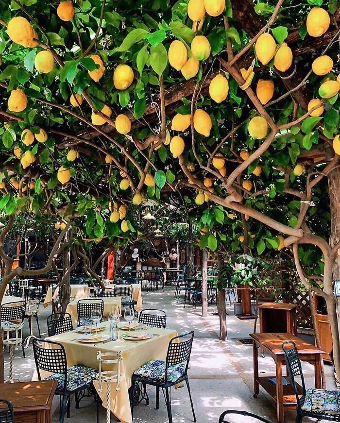
Dining Under The Lemon Trees
It looks really idyllic, but I’m imagining being brained by a lemon while eating my dinner.
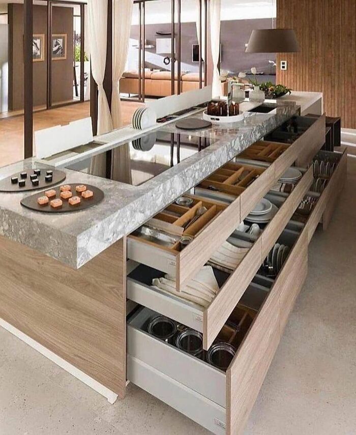
Stunning Kitchen Design
I would love to have all of my dishes in drawers rather than cabinets. Great idea.
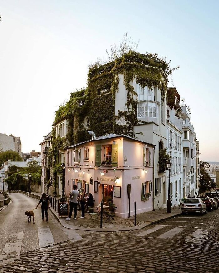
La Maison Rose In Paris
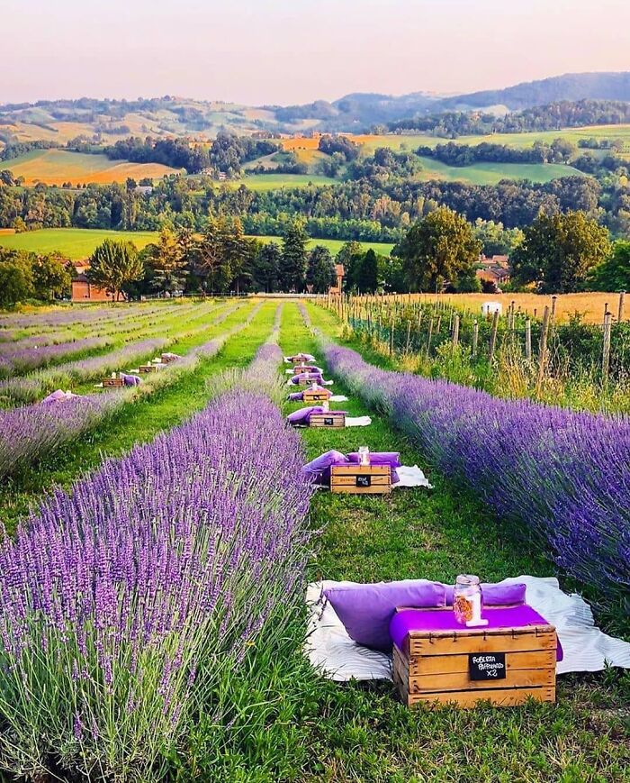
Dinner In A Lavender Field
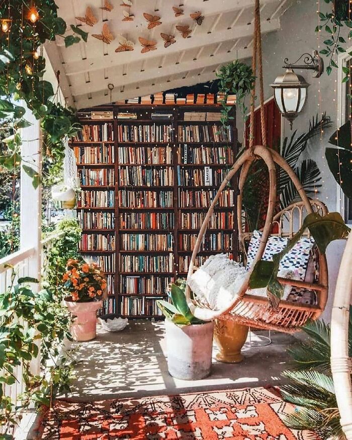
Bookshelves And Hanging Chair
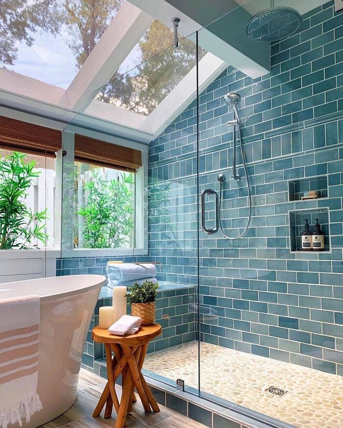
Bathroom Goals!
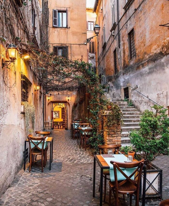
Rome
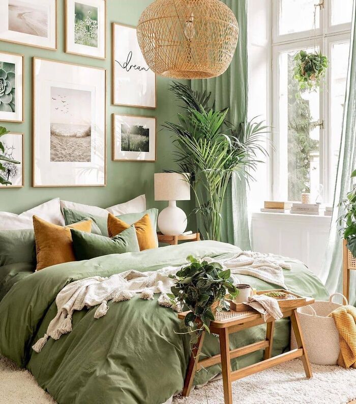
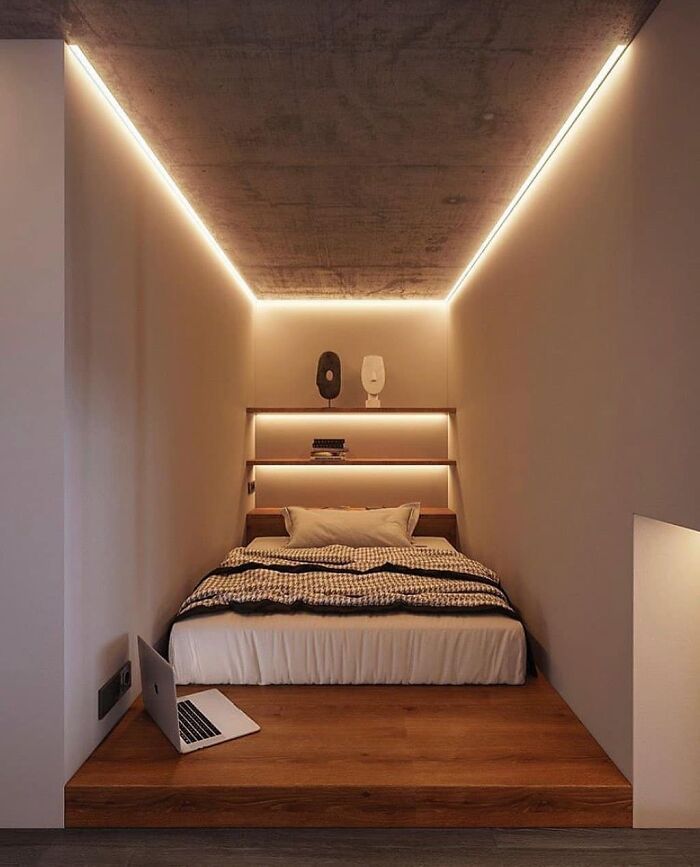
In Love With This Bedroom Style
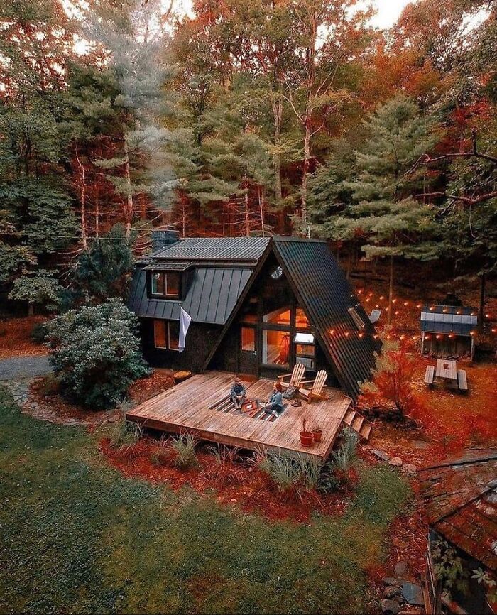
Forest Cabin House
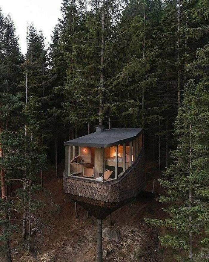
Stunning Treehouse!
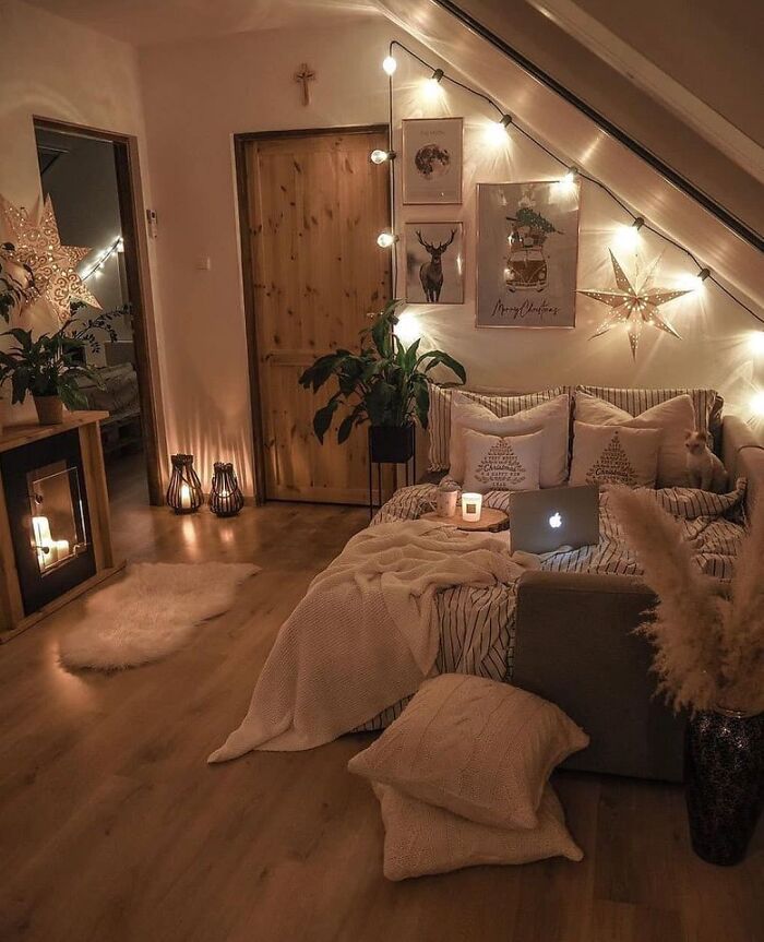
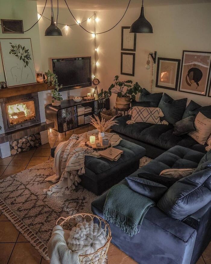
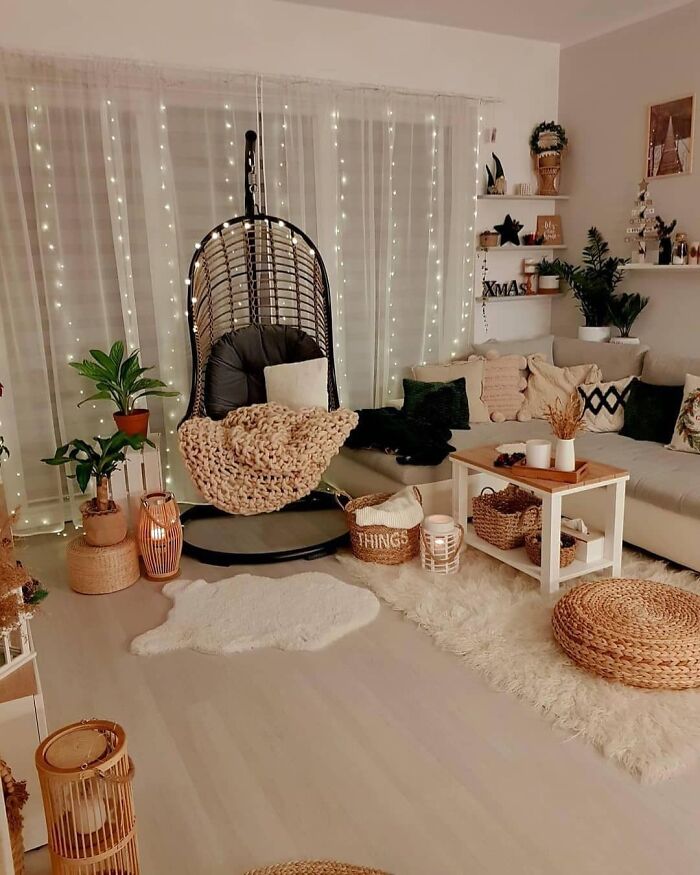
A Cozy And Warm Winter Spot Is Always Necessary
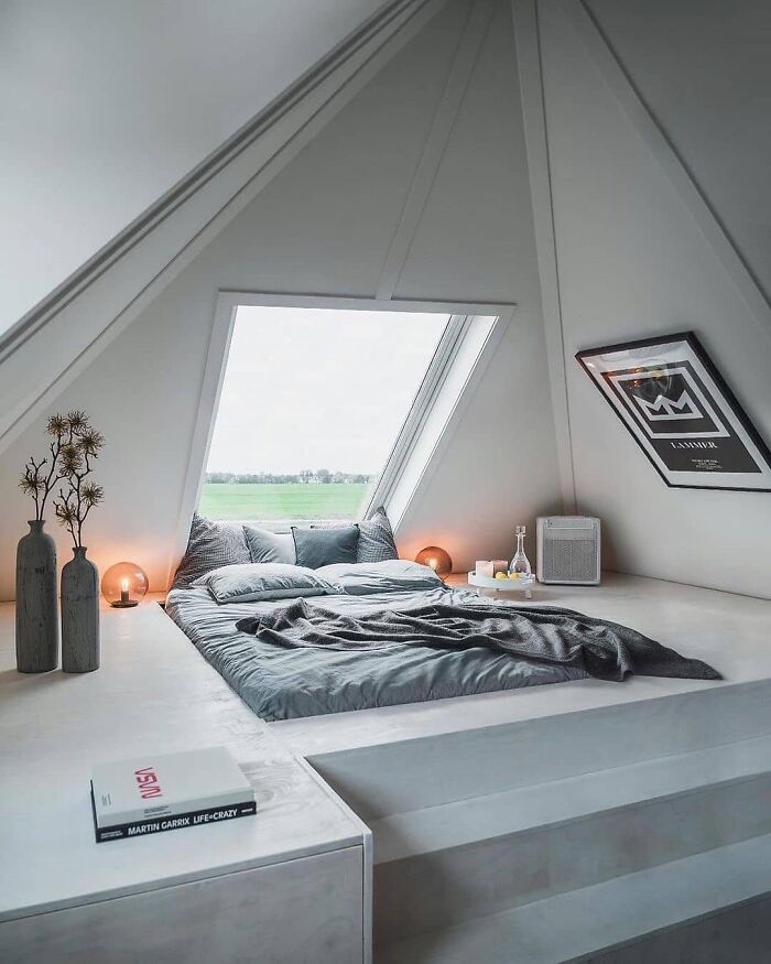
The Pad. Located In The Netherlands
My back hurts by the thought of making that bed! It's us, however, beautiful!
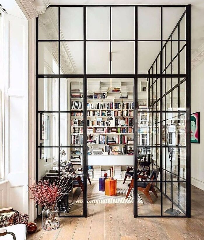
A Unique Office Space. Small Room With Steel And Glass By Michaelisboyd
This Space Is Decorated So Cozy
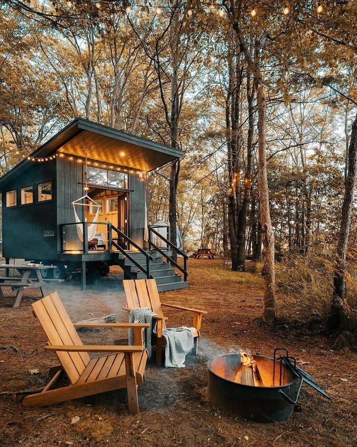
Cabin Living Dreams
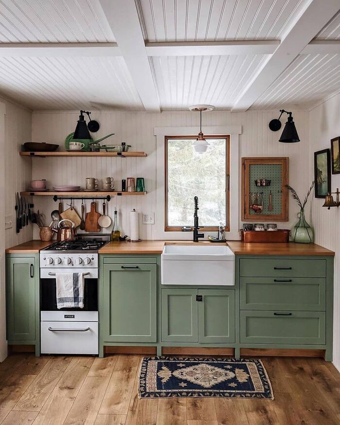
Stunning + Simple Kitchen By Acorn_cottage_
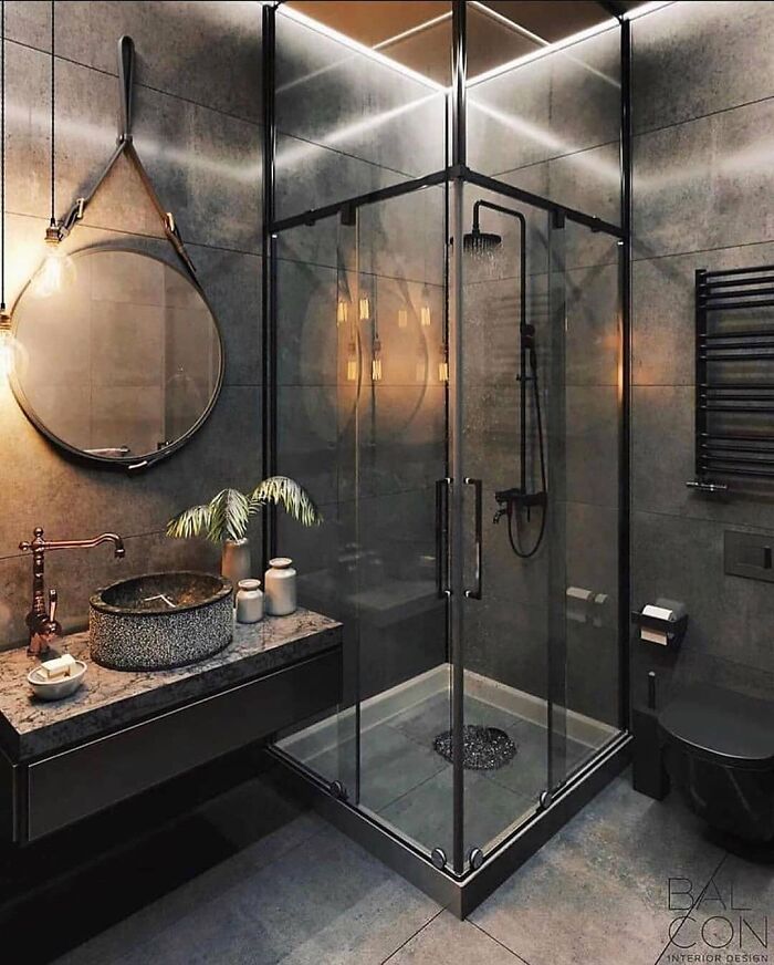
A Very Creative Bathroom
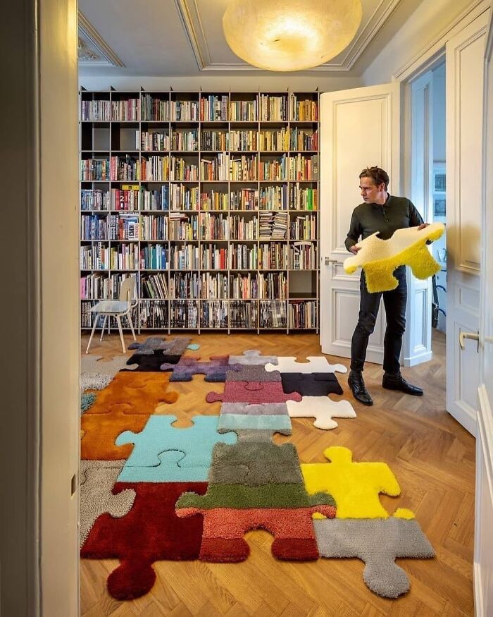
The Puzzle Rug By Jacob Van Rijs
Lovely Bunk Beds By Beckiowens
This Kitchen Is Gorgeous
N Love With This Porch By Chrislovesjulia
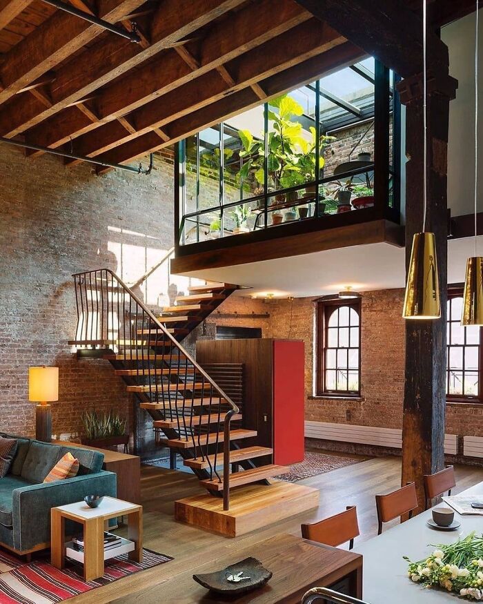
Tribeca Loft Design By Andrewfranzarchitect ⠀
In Love With This Lovely Kitchen
A Unique Office Space
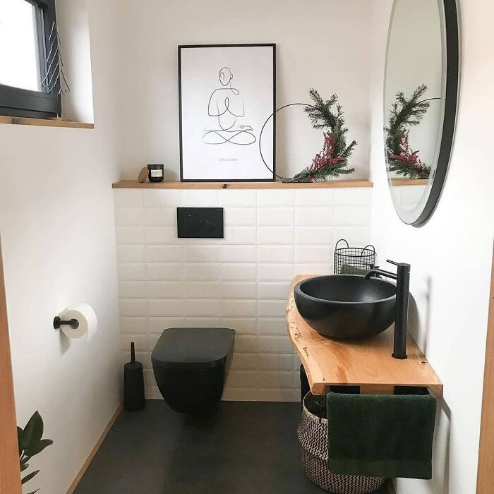
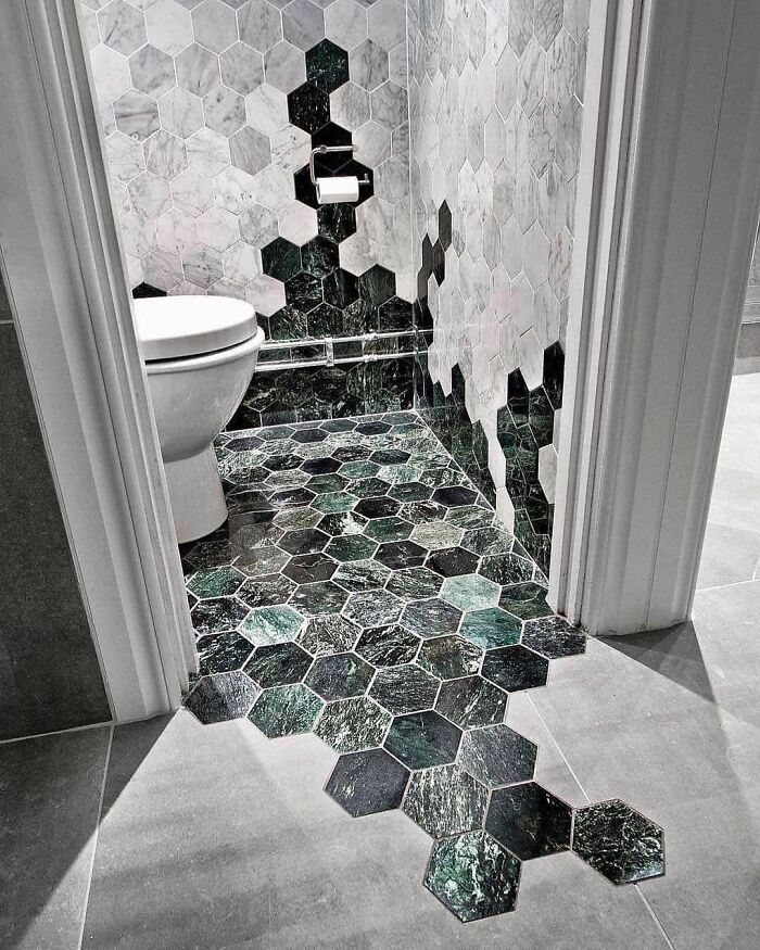
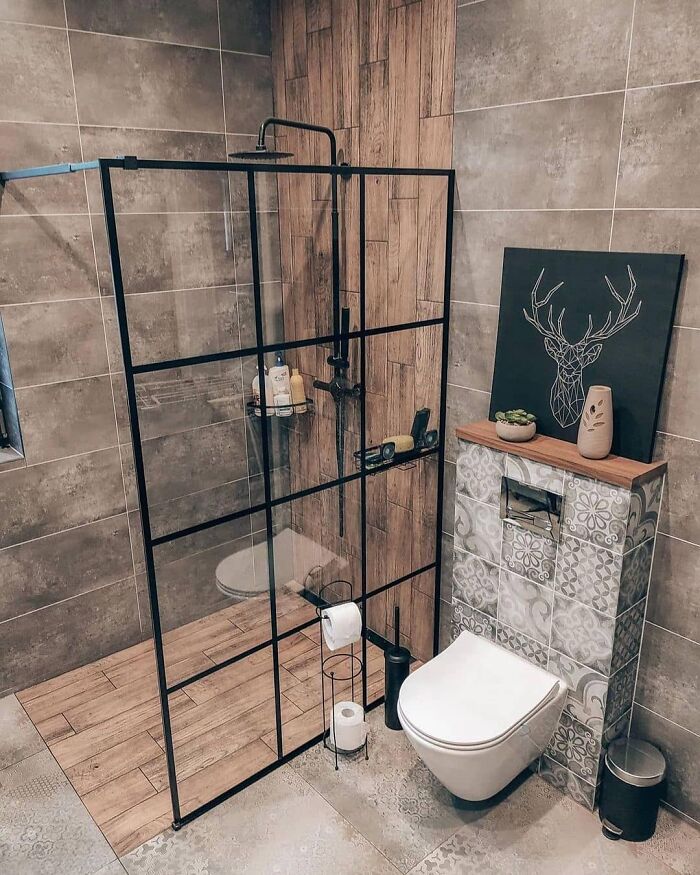
Bathroom Designed By Bricmate
I do like how the tiles spill out of the bathroom, almost as if water were spilling out
Absolutely In Love With This Lovely Space
In Love With This Cozy And Warm Space By Tatiana_home_decor
Keep Close To Nature's Heart
In Love With This Beautiful Corner By Alisonbernier
Simple And Cozy
A Unique Office Space
A Stunning Kitchen With Floating Shelves
Cool And Unique Mug
Scandinavian-Style By Marzena.marideko
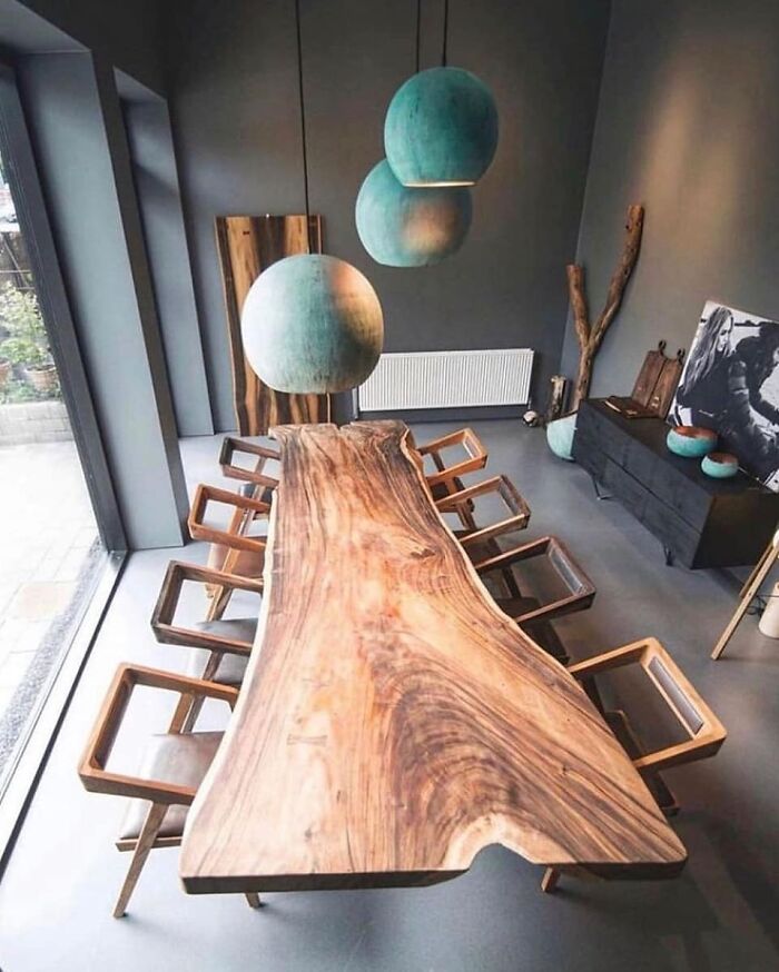
Stunning Table By Formelwood
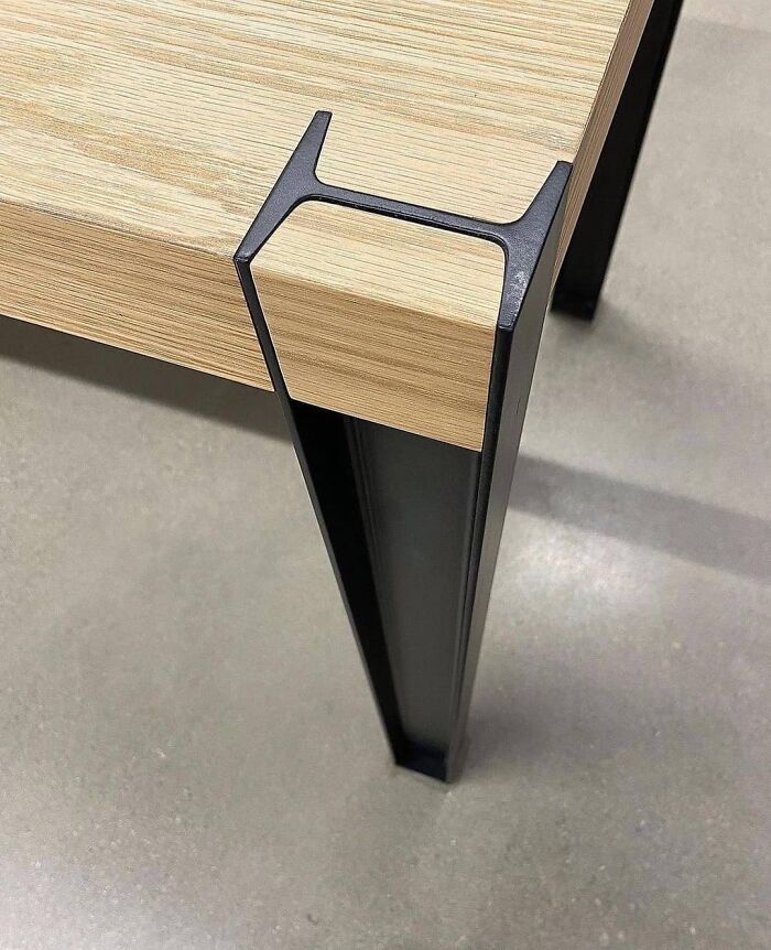
Amazing Details. Wood & Steel Table By @slickdesignusa
This Bathroom Looks So Beautiful
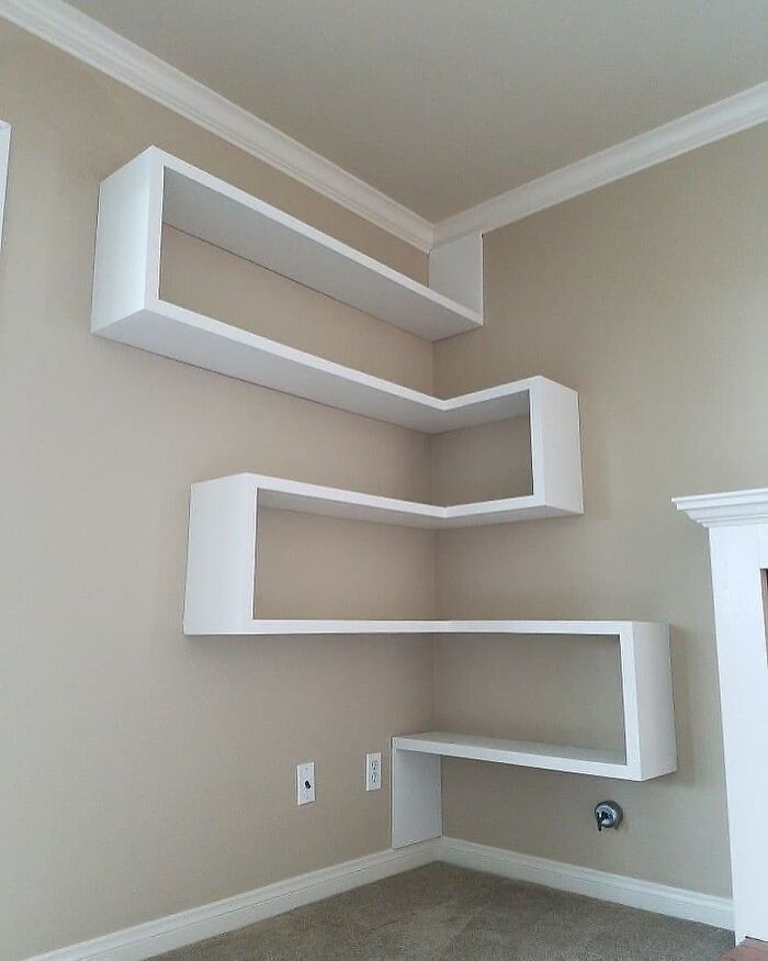
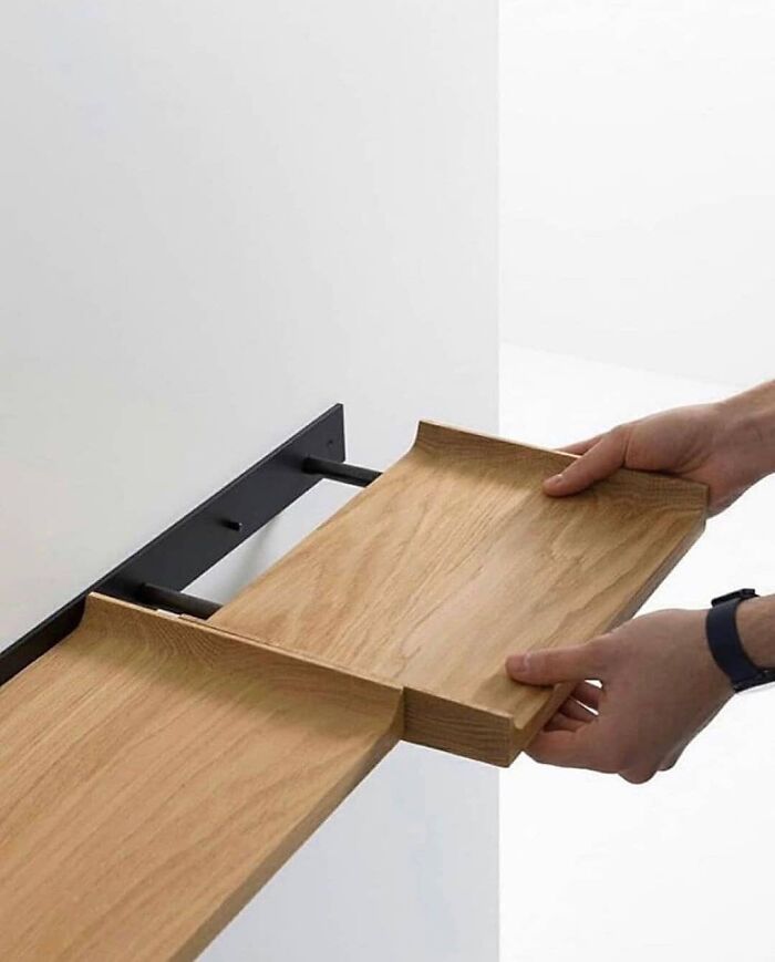
Gorgeous Shelf Design
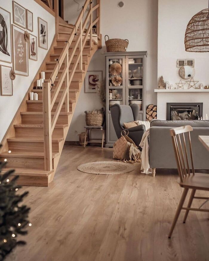
Stunning Living Room
Absolutely In Love With This Space
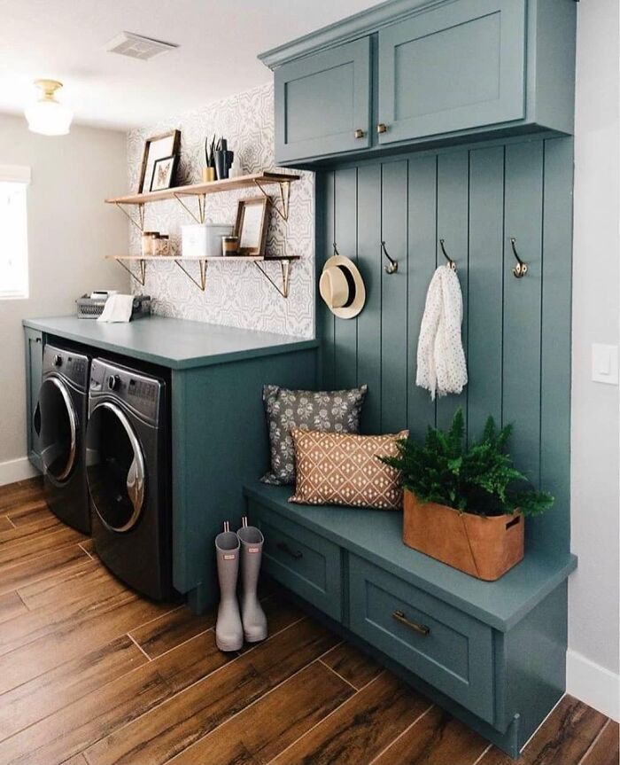
A Bright And Gorgeous Laundry Room That Makes Washing Clothes Fun
“That make washing clothes fun “ Are you having a laugh ? Nothing not even taking the washing basket with you on a rollercoaster would make washing fun
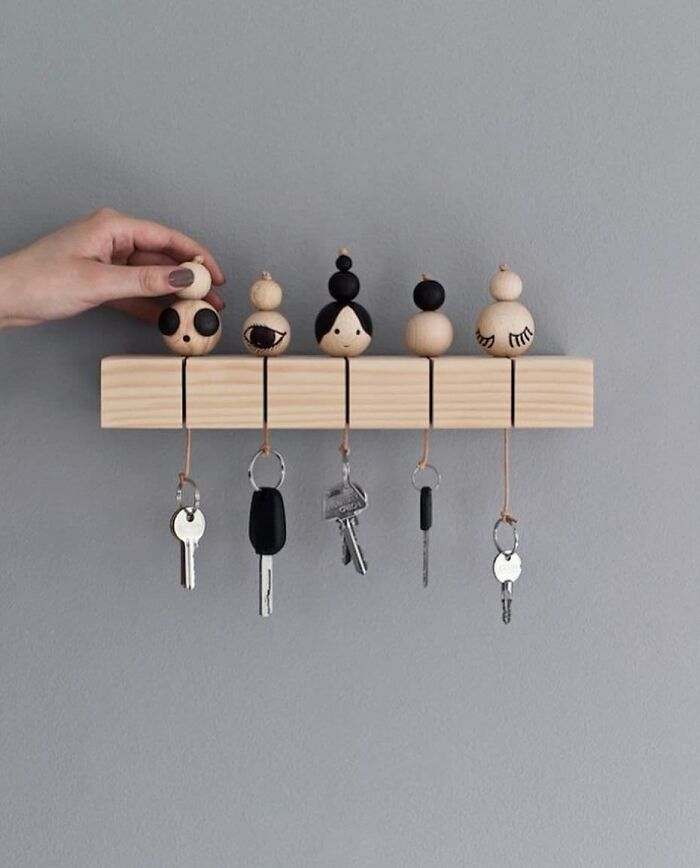
DIY Key Holder By Rikke Graff Juel
Gorgeous Bathroom
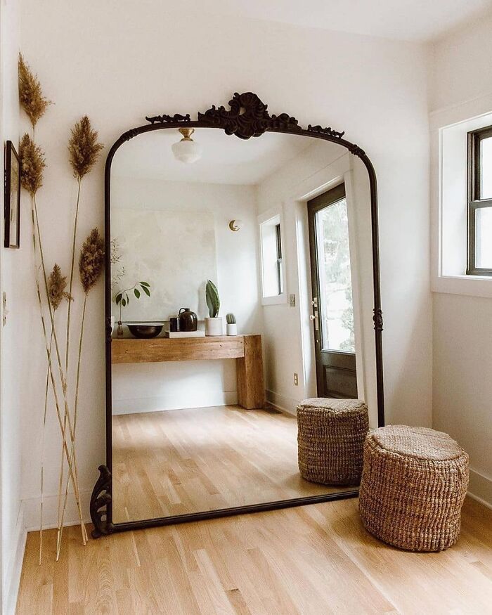
Absolutely In Love With This Sunny Room And The Beautiful Mirror
This Space Is So Beautiful
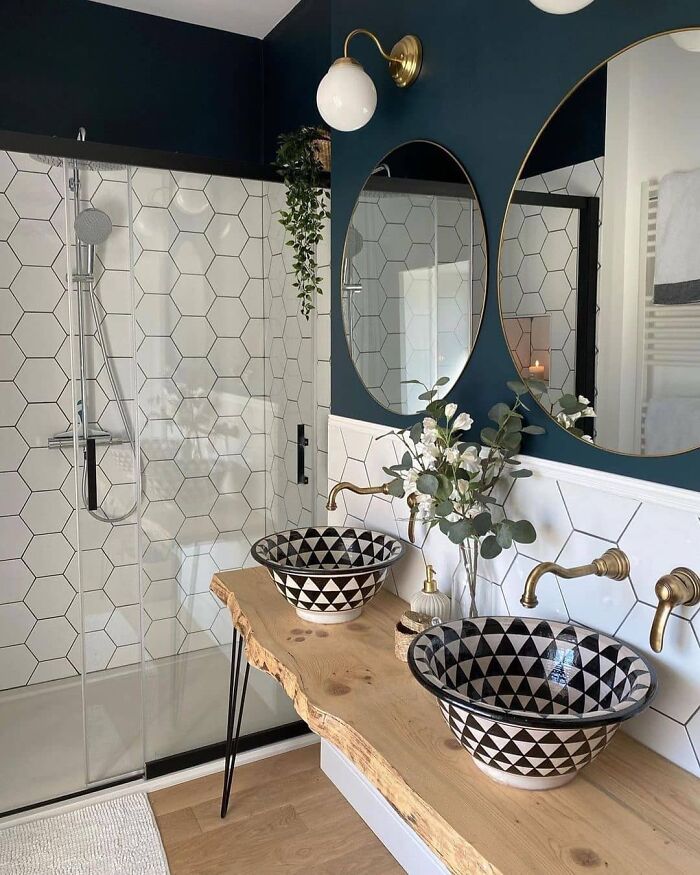
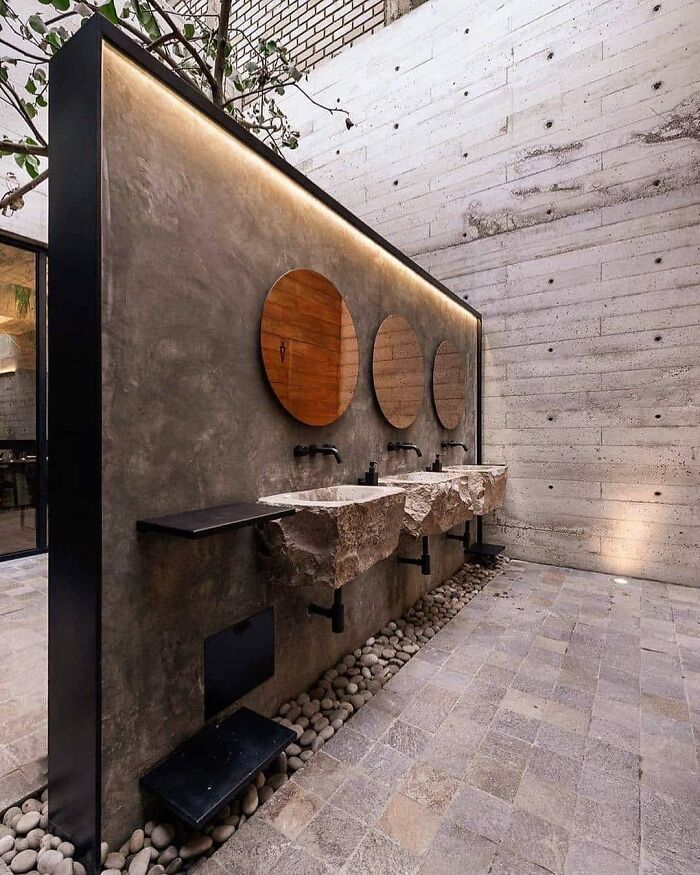
Sink Design
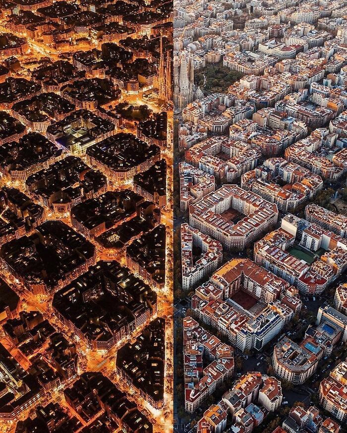
Contrasting Day And Night
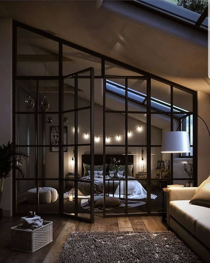
Industrial Bedroom
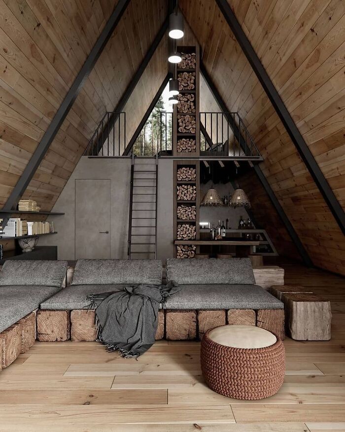
Cabin House
Floor-to-ceiling cubbies filled with firewood, but no fireplace or wood stove in sight? Also, the greys and greiges just suck up the natural light; this room should showcase the natural light.
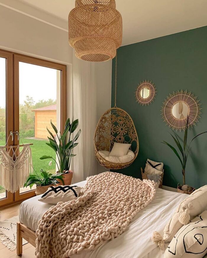
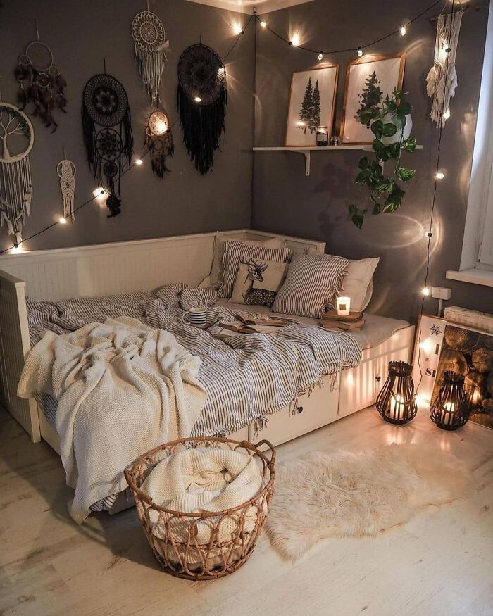
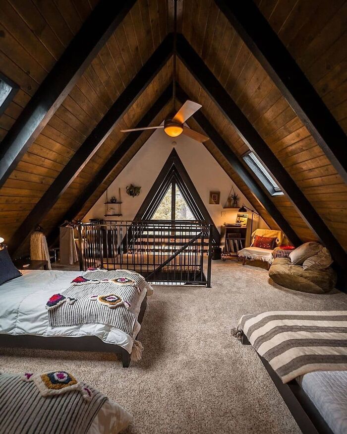
Rustic And Cozy Bedroom
That accent wall makes this room. I'd love to see it echoed in the blankets/pillows.
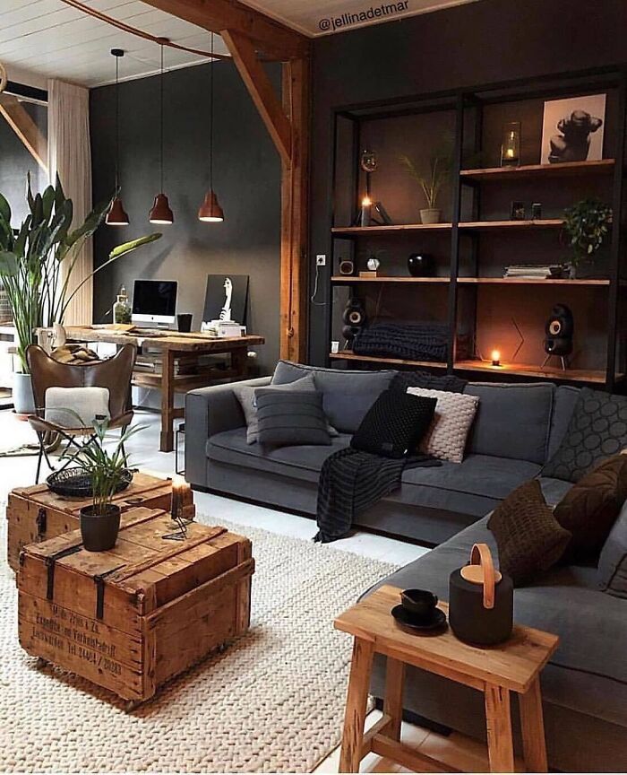
Industrial Living Room
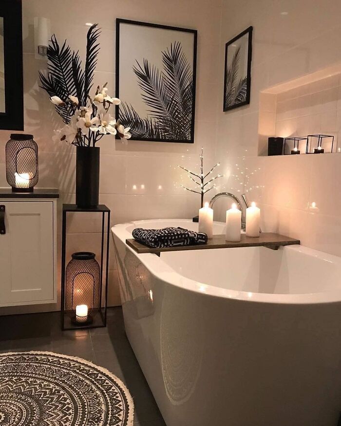
Lovely Bathroom
Cozy Vibes By Tatiana_home_decor
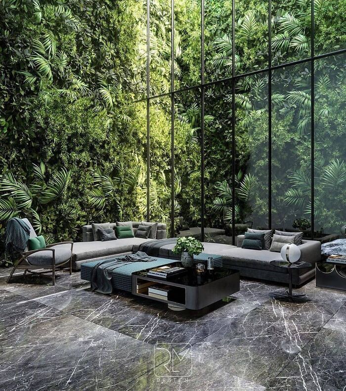
Green Life Visualization By Raw Mix Design
So it’s not real. It’s computer designed , that anyone could do
Comfy And Cozy Space By Tatiana_home_decor
This room is so inviting and says "kick off your heels and take a load off", to everyone who enters.
Amazing Pool Painting
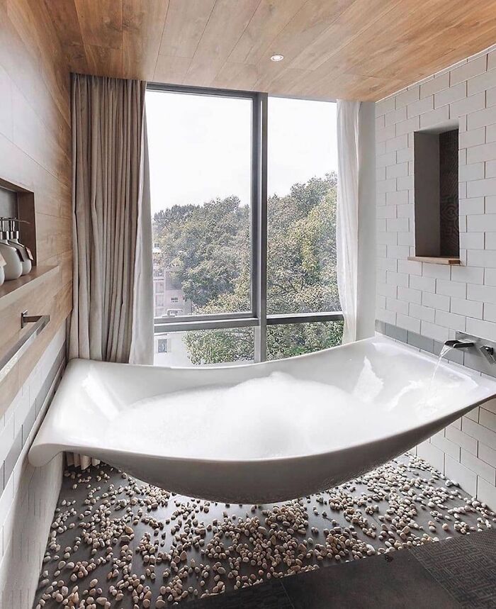
Hammock Bathtub
Imagine trying to get out of that bath when the bath is wet/slippery.........
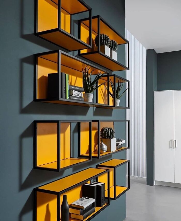
Metal Frame Shelf By Bck Interiors
Incredible Bedroom Design
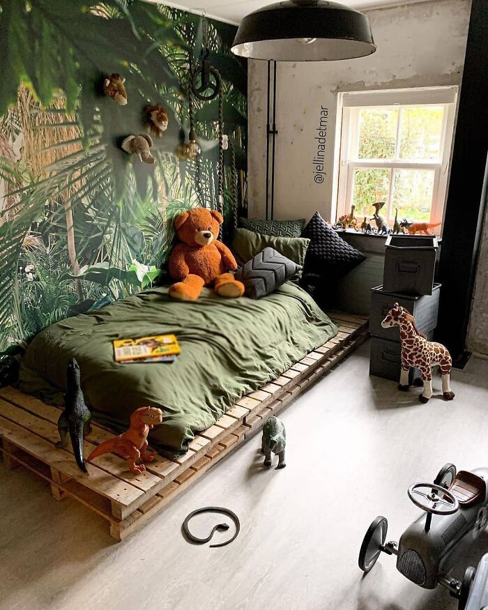
Lovely Kids Room
'Kids room'??? It's too dangerous! There is a freaking snake on the floor! Not to mention dinosaurs all over the place!
This Kitchen Is Gorgeous
Whiskey Ridge In California
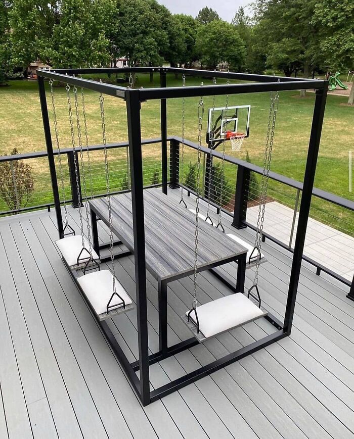
Garden Swing Table
The Notes Shelves
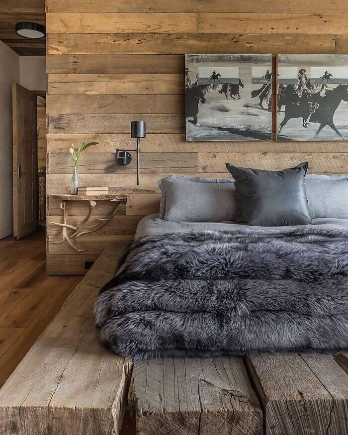
Wooden Bedroom
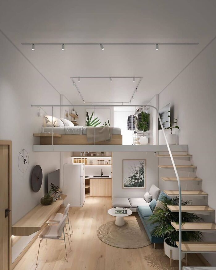
What Do You Think About This Loft!! T95 Loft Designed By Tung Nguyen
I would break my legs multiple times a day..thanks to the stairs
Bathroom Goals By Co.dzis.robimy
Simple And Cozy Design
Eco-Loft Apartment
Interiors are a bit bland for me at the moment. Too much white, beige and black and not enough colour! Also why aren’t people putting curtains or blinds up! They must be mad!
I feel like a broken record, but the stair designs really need to be a bit better. I didn't work in safety engineering long (got burned out reading about accidents all day long). On the plus side, I'm much more aware of safety and safety issues, but on the downside, everywhere I look, I now see potential safety hazards: trip and fall, slip and fall, fall from heights, fall down stairs, falling objection, confined space entry, fire, electricity, explosives, compressed steam (that one gave me nightmares), lightning strikes (gave me nightmares), car accidents, train accidents, airplane accidents, boat accidents, and those are just the investigations we did. That doesn't even cover all the industrial accidents I was exposed to organizing an entire library with one of the country's most extensive and impressive collections of OSHA, ANSI and ISO regs, newsletters, documents, etc. Sorry. Makes me a bit high strung on safety issues.

 Dark Mode

 No fees, cancel anytime


