ADVERTISEMENT

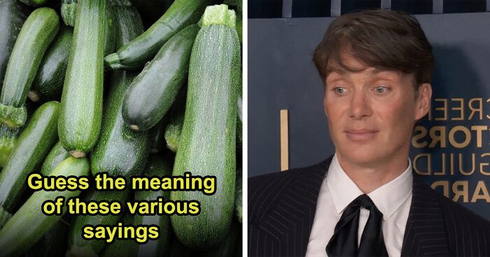
Who doesn’t love a good visual breakdown of data, neatly packaged for easy consumption? I’m talking rows, bars, tables, graphs, maps—the works. 2D, 3D, black and white, color-coded, all beautifully laid out for maximum clarity.

That’s exactly what you’ll find on r/charts—a subreddit dedicated to, well, charts. From serious and insightful to glaringly obvious and hilariously unnecessary, this place has it all. We’ve rounded up some of the best ones below. Enjoy!

RELATED:
    #2

    Friend: "You Can't Make Genetics Easy To Understand In Just One Image". Me:

    Gummy bears arranged in a chart form, creatively summing up the world in a fun way.

    4reddityo Report

    ADVERTISEMENT
    #5

    What Do You Use Most?

    Chart comparing train, buses, and cars to transport 1,000 people efficiently.

    Gallits Report

    Add photo comments
    POST
    Kim Kermes
    Community Member
    1 month ago DotsCreated by potrace 1.15, written by Peter Selinger 2001-2017

    When busses go where and when people need to, without an hour wait for the next bus, without having to go into the city center then back out so as to reach a neighboring area, when they run late enough, they might be a viable option.

    View more commentsArrow down menu
    ADVERTISEMENT
    #7

    Literal And True

    Pie chart humor showing eaten vs. uneaten pie sections for a fun world summary.

    keith2301 Report

    ADVERTISEMENT
    #8

    Illustrated Chart Of Wild Mustard Evolution Via Artificial Selection For Specific Traits

    Chart showing the evolution of various vegetables from the wild mustard plant, illustrating interesting global agricultural insights.

    Heath-Relecovo Report

    Add photo comments
    POST
    Bored Sailor
    Community Member
    1 month ago DotsCreated by potrace 1.15, written by Peter Selinger 2001-2017

    And people say GMO is bad, but all of those are Genetically Modified Organisms.

    View more commentsArrow down menu
    #9

    M**der Rates In The Us And Europe

    Map and chart comparing 2020/2019 murder rates in the US and Europe in an interesting visual way.

    proce55or Report

    Add photo comments
    POST
    Corvus
    Community Member
    1 month ago DotsCreated by potrace 1.15, written by Peter Selinger 2001-2017

    Gee, it's almost as if people in the US have some sort of free access to guns... oh wait!

    View more commentsArrow down menu
    ADVERTISEMENT
    #10

    Breakfast Is A Lot Of Work

    Pie chart humorously showing activities while waiting for toast, highlighting "stare at toaster," adding fun to the world.

    keith2301 Report

    Add photo comments
    POST
    Multa Nocte
    Community Member
    1 month ago DotsCreated by potrace 1.15, written by Peter Selinger 2001-2017

    Isn't staring at the toaster actually critical for it to toast?

    View more commentsArrow down menu
    #11

    Feelings Chart

    Colorful emotion wheel chart, displaying different emotions in a visually engaging way.

    American_Manhood Report

    Add photo comments
    POST
    Kira Okah
    Community Member
    1 month ago DotsCreated by potrace 1.15, written by Peter Selinger 2001-2017

    I use this one in my writing quite a bit, useful. There is a chart that breaks it down even further out there, but my sleepy brain forgot to save it for reference and I haven't found it since.

    View more commentsArrow down menu
    #12

    A Chart Of My Weight Loss For The Last 4 Months!

    Blue bar chart depicting weight distribution, illustrating an interesting data visualization.

    reddit.com Report

    ADVERTISEMENT
    #13

    Gerrymandering Explained: How Elections Are Stolen By Redistricting

    Gerrymandering charts showing three ways to divide voters into districts, illustrating fairness and outcomes.

    Heath-Relecovo Report

    Add photo comments
    POST
    Verena
    Community Member
    1 month ago DotsCreated by potrace 1.15, written by Peter Selinger 2001-2017

    The US really need to dump that fixation on two parties. In a solid democracy there are 20 parties to choose from, every vote is counting directly for the result without filters, no winner-takes-it-all and a % bar that prevents a tunnel view. This results in a coalition of 2 to 3 parties in power of governing a coumtry and 3 to 4 i opposition = the sound of reason is always present.

    View more commentsArrow down menu
    ADVERTISEMENT
    #15

    Was Trying To Figure Out My Dogs Age, Found This Great Chart

    Chart converting dog age to human years based on dog size, providing an interesting visual representation.

    reddit.com Report

    ADVERTISEMENT
    #16

    1996 Was Peak Year For Colourfulness Of Cars

    Chart showing car colors by year, illustrating trends with black and silver leading in popularity over time.

    reddit.com Report

    Add photo comments
    POST
    PhaseWitFact
    Community Member
    1 month ago DotsCreated by potrace 1.15, written by Peter Selinger 2001-2017

    Go back further, there's even more color. I'm so sick of looking at grayscale cars. No personality, just endless shades of grey. What free car colors we're offered are often blue-grey, green-grey, brown- grey. Like how many shades of boring are there???

    View more commentsArrow down menu
    #17

    The UK's Political Sudivisions

    Venn diagram showing the relationships between the British Isles, Ireland, Great Britain, and the United Kingdom in a fun way.

    keith2301 Report

    #18

    Population Info Chart

    Chart depicting global birth and death rates, with 7 billion currently living, as an engaging way to visualize population data.

    keith2301 Report

    Add photo comments
    POST
    WindySwede
    Community Member
    1 month ago DotsCreated by potrace 1.15, written by Peter Selinger 2001-2017

    Must be old,the latest number I saw was 8.2B? Or the number I saw is wrong?

    View more commentsArrow down menu
    ADVERTISEMENT
    ADVERTISEMENT
    #20

    Gun Control Laws Across The World (Blue = Permissive, Red = Restrictive)

    World map with countries in red and blue, illustrating interesting charts globally.

    Mental_Rooster4455 Report

    Add photo comments
    POST
    Wang Zhuang
    Community Member
    1 month ago DotsCreated by potrace 1.15, written by Peter Selinger 2001-2017

    So does the gray mean that in those areas, there are no gun laws at all?

    View more commentsArrow down menu
    #21

    Venn Diagram Of States And Elements

    Venn diagram of interesting charts comparing chemical elements and US states using abbreviations.

    keith2301 Report

    ADVERTISEMENT
    #22

    Number Of Land Animals K**led For Meat In 2013

    Chart showing numbers of various land animals killed for meat in 2013, highlighting chickens with over 61 billion.

    iboughtarock Report

    Add photo comments
    POST
    Min
    Community Member
    Premium
    1 month ago DotsCreated by potrace 1.15, written by Peter Selinger 2001-2017

    That's a lot more camelids than I would have guessed.

    View more commentsArrow down menu
    #23

    5 Months Of Job Searching While Working Part Time

    Flowchart of job application outcomes: contacted, interviews, rejected, offers, highlighting world trends in an interesting way.

    TheGreatLeviathan17 Report

    Add photo comments
    POST
    Corvus
    Community Member
    1 month ago DotsCreated by potrace 1.15, written by Peter Selinger 2001-2017

    Clearly, you didn't go there in person and shake hands while looking them firmly in the eye, while wearing a tie. /s

    View more commentsArrow down menu
    #24

    Which Animals Do Americans Think They Could Beat In A Fight?

    Chart showing survey results on which animals Americans think they could beat in a fight, highlighting fun global perspectives.

    YouGov_Official Report

    Add photo comments
    POST
    WindySwede
    Community Member
    1 month ago DotsCreated by potrace 1.15, written by Peter Selinger 2001-2017

    Housecat... are you kidding me! A cobra you could run from. But a cat fighting for its life will f**k you up completely!

    Ace
    Community Member
    1 month ago DotsCreated by potrace 1.15, written by Peter Selinger 2001-2017

    The problem with a fighting cat is that it's trying to hurt you (to get away) while you're trying your best not to hurt it.

    Load More Replies...
    Novel Idesa
    Community Member
    1 month ago DotsCreated by potrace 1.15, written by Peter Selinger 2001-2017

    A cat fighting for it's life? Hell, a cat a little mad about getting it's nails clipped could f**k you up completely.

    TheElementalGod️️ (He/him)
    Community Member
    1 month ago DotsCreated by potrace 1.15, written by Peter Selinger 2001-2017

    To be fair, the cat's nails are connected to the bone, so it's basically like clipping it's bones.

    Hiram's Friend
    Community Member
    1 month ago DotsCreated by potrace 1.15, written by Peter Selinger 2001-2017

    A frightened puppy will whine and roll over; a frightened kitten will puff up its tail and prepare to die fighting.

    Lila Allen
    Community Member
    1 month ago DotsCreated by potrace 1.15, written by Peter Selinger 2001-2017

    Plus they waaaaay overestimate how many of them could defeat a goose. Those things are scary AF

    trixiefly11
    Community Member
    1 month ago DotsCreated by potrace 1.15, written by Peter Selinger 2001-2017

    I've seen video's of housecats taking people out. I wouldn't want to fight a cat, unless its a fat lazy cat. Even then I'd get roughed up pretty good.

    Annabel Again
    Community Member
    1 month ago DotsCreated by potrace 1.15, written by Peter Selinger 2001-2017

    They go for the throat and once they latchon they won’t let go until whatever they’re fighting drops.eff around and find out

    David Morgan
    Community Member
    1 month ago DotsCreated by potrace 1.15, written by Peter Selinger 2001-2017

    6% of Americans are insane, or have absolutely no idea what a bear is. There is nothing wrong with wanting to appear tough, or being willing to try defending yourself even against superior force, but thinking you could beat a grizzly is a level of delusion I don't understand. So, for context, the average weight (varying by gender and age) of a grizzly is 450/850lb or 207/389kg. The average human weighs (etc etc) 60-120kg. They are around 6.5ft-10ft in length (on all fours) compared to a human 5-7ft. Totally discounting the ability of grizzlies to outrun, outclimb and outswim most humans, AND totally discounting their paws with claws the length of human fingers, grizzlies are notorious for shrugging off bullet wounds. Early American settlers blasted them with long rifles and got torn apart for their trouble. But sure, your punches will work.

    Nina
    Community Member
    1 month ago DotsCreated by potrace 1.15, written by Peter Selinger 2001-2017

    8% think they can win in a fight with an elephant... They are quite a bit larger, have tough skin, a nose made out of muscle and if you're unlucky big tusks.. but sure you can beat them

    Mr E
    Community Member
    1 month ago DotsCreated by potrace 1.15, written by Peter Selinger 2001-2017

    A chimpanzee?! No thank you. That would not be pretty at all.

    justagirl
    Community Member
    1 month ago DotsCreated by potrace 1.15, written by Peter Selinger 2001-2017

    There is a surprising amount of people thinking they can beat a goose in a fight. Maybe they thought they'd have a gun. HAH! no. You wanna fight it? get in there.

    Susan
    Community Member
    1 month ago DotsCreated by potrace 1.15, written by Peter Selinger 2001-2017

    I'll just hang out with the sea turtles and manatees... thanks

    Auntriarch
    Community Member
    1 month ago DotsCreated by potrace 1.15, written by Peter Selinger 2001-2017

    I could probably win against a spaniel. Not a chihuahua though

    Lady Eowyn
    Community Member
    1 month ago DotsCreated by potrace 1.15, written by Peter Selinger 2001-2017

    A spaniel might kiss you to death. A chi? Death from the ankles down. Although the only two chihuahuas I've known in person were nice, my friend has an amazing way with them.

    Lyone Fein
    Community Member
    1 month ago DotsCreated by potrace 1.15, written by Peter Selinger 2001-2017

    People are delusional. Lion? Chimpanzee? They will immediately tear out your throat and gonads.

    MsPlants
    Community Member
    1 month ago DotsCreated by potrace 1.15, written by Peter Selinger 2001-2017

    ok first of all NO wins in a fight with a chimpanzee, they look cute but they are jacked under that fur and with those teeth. shudder. I would rather fight the crocodile or cobra than a chimpanzee or gorilla. knowledge comes from working at 2 different zoos both teaching at them and working in the primate diets area.

    Tucker Cahooter
    Community Member
    1 month ago DotsCreated by potrace 1.15, written by Peter Selinger 2001-2017

    The chart doesn't indicate whether the respondents were drunk or sober. I think you would see much larger numbers if you polled drunk people

    Alex Ruddies
    Community Member
    1 month ago DotsCreated by potrace 1.15, written by Peter Selinger 2001-2017

    I think it's funny that people think they can take on a chimpanzee more easily than a king cobra or a crocodile (assuming on land). I'd rather face off against a bear than a chimpanzee. At least you can scare it off and if not, it'll be a quick end. But MF chimpanzee? That beast will tear off my face and testicles with no remorse. Bite off my fingers one by one and keep me alive while playing in my blood. Hell, a gorilla wouldn't even come close. At least they're docile by nature. And why the hell isn't the moose on here? Predators at least try to keep themselves safe, but the steroid Bambi will royally mess you up just because you're there.

    Lady Eowyn
    Community Member
    1 month ago DotsCreated by potrace 1.15, written by Peter Selinger 2001-2017

    Have you ever been attacked by a Canada goose? You will be lucky to escape with only minor damage!

    April Pickett
    Community Member
    1 month ago DotsCreated by potrace 1.15, written by Peter Selinger 2001-2017

    I couldn't beat any of them. They all have more survival instincts than I do, and I can't run very well.

    Nice Beast Ludo
    Community Member
    1 month ago DotsCreated by potrace 1.15, written by Peter Selinger 2001-2017

    I'm assuming that by a "fight" it means hand-to paw/teeth/talons etc combat? I imagine most of these deluded people look just like the photo. I want to see part 2 of the kanga fight- where it dropkicks dude clear across the woods

    Robin Roper
    Community Member
    1 month ago DotsCreated by potrace 1.15, written by Peter Selinger 2001-2017

    Offer this 6% who are idiots by the way, $1,000 to fight a Grizzly. Walk them up to the case holding the Grizzly and I'd like to see how fast they back down.

    Nice Beast Ludo
    Community Member
    1 month ago DotsCreated by potrace 1.15, written by Peter Selinger 2001-2017

    Geese are CRAZY !!! One time I was walking by the river eating a sandwich and the goose wanted it. I threw it a piece. Big mistake. It raised up, put it's wings out, head down and CHARGED AT ME!! It was huge and taller than me. I threw my sandwich in the sand and RAN.

    Michael Largey
    Community Member
    1 month ago DotsCreated by potrace 1.15, written by Peter Selinger 2001-2017

    Beat a grizzly? In a fair fight? Well, give us both AK-47s and the same amount of ammo, and I might prevail.

    Alex Ruddies
    Community Member
    4 weeks ago DotsCreated by potrace 1.15, written by Peter Selinger 2001-2017

    Well, that is until you realize that bear is the Polish bear that fought in World War 2...then you might be fugged...

    Stygtand
    Community Member
    Premium
    1 month ago (edited) DotsCreated by potrace 1.15, written by Peter Selinger 2001-2017

    never fight a rat, its the diseases that will kill you

    Panda Cat
    Community Member
    2 weeks ago DotsCreated by potrace 1.15, written by Peter Selinger 2001-2017

    None of them. Rats have nasty teeth but my allergies would double up on wiping me out.

    Kelly Hartle
    Community Member
    4 weeks ago DotsCreated by potrace 1.15, written by Peter Selinger 2001-2017

    The 61% who think they could beat a goose has never been exposed to many geese. My husband used to work at a zoo and he tells tales about when kids who normally messed with geese would try it during the mating season.

    Doodles1983
    Community Member
    4 weeks ago DotsCreated by potrace 1.15, written by Peter Selinger 2001-2017

    People underestimate the size of eagles, man. And the power and size of feet and talons!

    Rizzo
    Community Member
    4 weeks ago DotsCreated by potrace 1.15, written by Peter Selinger 2001-2017

    Some Americans also think that they live in the greatest country there is. Let's let them believe that.

    Pieter LeGrande
    Community Member
    1 month ago DotsCreated by potrace 1.15, written by Peter Selinger 2001-2017

    Depends if they all fight according to the Marquess of Queensberry's rules. Otherwise a rat up your trouser leg will win every time.

    Michael None
    Community Member
    1 month ago DotsCreated by potrace 1.15, written by Peter Selinger 2001-2017

    Honestly it would be hard to prove either way. You'd have to have every American fight one and then see the results. Also a control group could be Canida.

    CP
    Community Member
    1 month ago (edited) DotsCreated by potrace 1.15, written by Peter Selinger 2001-2017

    This list is messed up and sad. 100% of adults should have confidence in beating a rat or house cat. Lions are vastly overrated. King cobra is a non constricting snake, come one people the height weight advantage alone! Chimpanzee getting no respect. I would put Gorilla #1 Chimpanzee #2 and Grizzly number 3. Humans today vastly underestimate the advantages of being bipedal with long arms in a one on one fight. I am trying to think about which animal I would bet on in a fight. As always I think geese are overrated and only living off an overblown reputation.

    Lady Eowyn
    Community Member
    1 month ago DotsCreated by potrace 1.15, written by Peter Selinger 2001-2017

    1. Obviously, you have never been attacked by a goose, their reputation is, if anything, under-blown. 2. Gorillas are a lot more peaceful than people think. Leave them alone, they'll leave you alone. Chimps, on the other hand, are more aggressive than people think.

    Load More Replies...
    Christopher Walkies
    Community Member
    1 month ago DotsCreated by potrace 1.15, written by Peter Selinger 2001-2017

    But this survey allows that the bell has rung and the fight is ON. Most animals like gorillas will avoid violence if possible (Predator aside). For me, the most terrifying animal here is the chimpanzee.

    Bored Sailor
    Community Member
    1 month ago DotsCreated by potrace 1.15, written by Peter Selinger 2001-2017

    From a one day survey of maybe 10 people like most surveys that are not large scale or scientific it means nothing.

    StumblingThroughLife
    Community Member
    1 month ago DotsCreated by potrace 1.15, written by Peter Selinger 2001-2017

    I read that a chimpanzee has the strength of ten men (Allegedly), so the only (cheating/cowardly way) a man could beat a Chimp, is by shooting it - from a distance. Same with the last 5, lol.

    View more commentsArrow down menu
    ADVERTISEMENT
    #25

    History Of Pandemics

    Chart showing world pandemics by death toll, including Black Death, Smallpox, and COVID-19, in a fun visual style.

    FillsYourNiche Report

    Add photo comments
    POST
    WindySwede
    Community Member
    1 month ago (edited) DotsCreated by potrace 1.15, written by Peter Selinger 2001-2017

    Again old data? A quick googling found they estimate the deaths from covid is 7M?

    View more commentsArrow down menu
    ADVERTISEMENT
    #26

    World’s 25 Largest Lakes Side By Side

    Map showing interesting charts of the world's largest lakes labeled on a green landscape background.

    keith2301 Report

    Add photo comments
    POST
    Yayheterogeneity
    Community Member
    1 month ago DotsCreated by potrace 1.15, written by Peter Selinger 2001-2017

    The actual greatness of those lakes doesn't really show. There should be a scale at least...

    View more commentsArrow down menu
    #27

    Fun With Data. If You Make A Graph With Log Scale Of Covid Cases In Belgium And UK, You Get This Piggy

    Chart showing daily COVID-19 cases per million in Belgium and UK from March to June 2021.

    old-wizz Report

    ADVERTISEMENT
    #28

    I Cataloged 2020 By The Quality Of Each Day

    Color-coded chart of 2020 tracking daily moods from great to awful, illustrating the year's events in a fun way.

    GuntherGGSchneck Report

    #29

    America's Favorite Thanksgiving Pie!

    Pie chart showing America's favorite Thanksgiving pies, highlighting pumpkin pie as the top choice at 35%.

    YouGov_Official Report

    Add photo comments
    POST
    WindySwede
    Community Member
    1 month ago DotsCreated by potrace 1.15, written by Peter Selinger 2001-2017

    In general, pecan pie, but no thanksgiving here 🤷‍♂️

    View more commentsArrow down menu
    #30

    I Posted On R/Polls: Should Making Racist Comments Be Illegal? Here's The Breakdown Of Over 4,000 Responses

    Pie chart showing opinions on legality of racist comments. Majority (71.7%) view it as protected free speech.

    Familiar_Big3322 Report

    Add photo comments
    POST
    TotallyNOTAFox
    Community Member
    1 month ago (edited) DotsCreated by potrace 1.15, written by Peter Selinger 2001-2017

    I would agree on blue - Not for the racism, but it would get way easier for a government to label opinions they don't like racist and suppress an opposition that way. The discussion about immigration from the Middle East here in Germany is a good example, if the " true democrats" (self claimed term from politicians) run out of arguments they throw racism claims all around.

    View more commentsArrow down menu
    Continue reading with Bored Panda Premium
    Unlimited content
    Ad-free browsing
    Dark mode
    ADVERTISEMENT
    #31

    Population Of Each Continent

    Population chart showing Asia at 4.6B, Africa 1.34B, Europe 747M, N. America 592M, S. America 430M, Oceania 43M.

    Im-Cancer69 Report

    Add photo comments
    POST
    TotallyNOTAFox
    Community Member
    1 month ago DotsCreated by potrace 1.15, written by Peter Selinger 2001-2017

    Makes sense that the biggest continent has the most inhabitants (Also India being there)

    View more commentsArrow down menu
    #32

    I Have A Speech Impediment That People Often Interpret As An Accent. When People Ask Where I'm From, I Tell Them To Take A Guess. Here's The Result Of The Last Six Months Of That

    World map showing countries in different colors based on people's guesses of origin, illustrating interesting global perceptions.

    reddit.com Report

    Add photo comments
    POST
    Multa Nocte
    Community Member
    1 month ago DotsCreated by potrace 1.15, written by Peter Selinger 2001-2017

    And this person doesn't think that people from North Carolina have an accent?!?!?!?!?!

    View more commentsArrow down menu
    #33

    The Queen's Corgis: A Family Tree

    Family tree chart of the Queen’s corgis, tracing descendants from Susan to Willow in a fun way.

    VaticanFromTheFuture Report

    #35

    A Brief Timeline Of Animal Domestication

    A timeline chart showing the interesting domestication of animals around the world.

    Heath-Relecovo Report

    #36

    Where Rats Live

    World map chart showing inhabited (red) and uninhabited (blue) areas.

    keith2301 Report

    Add photo comments
    POST
    Ladedah
    Community Member
    1 month ago DotsCreated by potrace 1.15, written by Peter Selinger 2001-2017

    And one random rat-less spot in the middle Canada... I have questions...

    View more commentsArrow down menu
    #37

    Media Franchises

    Chart showing highest-grossing media franchises; Pokemon leads with $92.12 billion, highlighting interesting global trends.

    keith2301 Report

    Add photo comments
    POST
    PeepPeep the duck
    Community Member
    1 month ago DotsCreated by potrace 1.15, written by Peter Selinger 2001-2017

    I love how unpanman is ahead of Disney princesses 😂 his breadifull grace reigns supreme

    View more commentsArrow down menu
    #38

    Your First Apartment

    Venn diagram humorously summarizing furniture choices: IKEA, cheap, well-made, looks good, parents' old stuff, milk crates.

    keith2301 Report

    Add photo comments
    POST
    roddy
    Community Member
    1 month ago DotsCreated by potrace 1.15, written by Peter Selinger 2001-2017

    You forgot "stuff I found on the sidewalk, and ""stuff from the 2nd hand store". Still have a lot of that.

    #39

    And In USA?

    Map showcasing most learned foreign languages in Europe by country.

    Gallits Report

    Add photo comments
    POST
    Yvonne Dauwalder Balsiger
    Community Member
    1 month ago DotsCreated by potrace 1.15, written by Peter Selinger 2001-2017

    Really disbelieve this for Switzerland. Apart from English, you also have to learn a different national language in school. The German speaking part is by far the biggest part and we learn French. The Italian part can choose if they want to learn German or French, I think? So, all the Spanish learners would either have to attended a special school or learn Spanish in their spare time.

    View more commentsArrow down menu
    #40

    I Posted On R/Polls: Public Restrooms, Should They All Be Made Gender Neutral? Results Are From 5,642 Respondents

    Pie chart showing public opinion on making restrooms gender neutral: 30.4% yes, 69.6% no, from 5,642 responses.

    Familiar_Big3322 Report

    Add photo comments
    POST
    PhaseWitFact
    Community Member
    1 month ago DotsCreated by potrace 1.15, written by Peter Selinger 2001-2017

    Gender neutral bathrooms would be fine if they were single locking stalls and didn't have huge cracks in the doors to peek through.

    View more commentsArrow down menu
    #41

    Us Elections 2024 Gender Gap

    Gender gap chart of 2024 election showing voter preferences between Harris and Trump among men, women, and ethnic groups.

    1BrokenPensieve Report

    Add photo comments
    POST
    Verena
    Community Member
    1 month ago DotsCreated by potrace 1.15, written by Peter Selinger 2001-2017

    The US really need to dump that fixation on two parties. In a solid democracy there are 20 parties to choose from, every vote is counting directly for the result without filters, no winner-takes-it-all and a % bar that prevents a tunnel view. This results in a coalition of 2 to 3 parties in power of governing a coumtry and 3 to 4 i opposition = the sound of reason is always present.

    View more commentsArrow down menu
    #42

    First Org Chart Was Made For The New York & Erie Railroad In 1854, Not Only Is It Full Of Plant-Inspired Beauty, It Also Combines A Map Of The Physical Railroad & One Of Company Structure

    Intricate chart detailing the New York Erie Railroad's organization in a fun and visual way.

    High resolution picture.

    oddstellar Report

    #43

    Random But Interesting Info Graphic. Any Surprises Here?

    Chart of official and ceremonial vehicles used by world leaders, representing 45 countries.

    reddit.com Report

    #44

    A Timeline Of Notable Amazon Acquisitions. Any Guesses What Will Be Next?

    Amazon's acquisitions chart illustrates major purchases like MGM and Whole Foods in a visually engaging way.

    reddit.com Report

    #45

    Percent Of Companies (Small, Medium And Large Firms) Run By Women In Different Regions Of The World

    Chart showing percentages of female and male top managers globally in 2016, highlighting only 20% female leadership.

    QuirkyEdge4428 Report

    #46

    World Population By Region/Country 2022

    Chart visualizing global population distribution in colorful regions, highlighting China and India as major segments.

    Brave_Isopod Report

    Add photo comments
    POST
    Wang Zhuang
    Community Member
    1 month ago DotsCreated by potrace 1.15, written by Peter Selinger 2001-2017

    India overtook China to become the world's largest populated country in 2023

    View more commentsArrow down menu
    #47

    History Of World Civilization And How It All Comes Together, Worldwide, In One Snapshot

    World history timeline showcasing interesting charts in a colorful, layered format, detailing major empires and events.

    WestEst101 Report

    See Also on Bored Panda
    #48

    Population Of Each Country In South America

    Pie chart showing population distribution in South America, highlighting countries like Brazil, Colombia, and Argentina.

    Im-Cancer69 Report

    Add photo comments
    POST
    #49

    Racial Income Inequality In America

    Chart depicting racial wealth gap with income and net worth statistics by ethnicity.

    NovamoneyAI Report

    #50

    What The Female Reproduction System Needs During The Different Phases Of A Monthly Cycle

    Menstrual cycle wheel chart displaying nutrients for each phase with colorful sections.

    Outer ring is suggestions on how to fulfill those needs.

    Claireless21 Report

    #51

    I Created A Chart Of The First 100 Elements, Displaying The Temperature Ranges For Solid, Liquid And Gaseous. Then I Sorted It By "Solid"

    Chart of elements' states (solid, liquid, gaseous) at various temperatures, visualizing global data in a fun way.

    4_da_Lolz Report

    #52

    Real Wages And Output Per Production Worker In Manufacturing, Us, 1949 To 2019 From World In Data

    Chart showing U.S. manufacturing productivity and real wages indices from 1949 to 2019, highlighting global trends.

    reddit.com Report

    Add photo comments
    POST
    Ace
    Community Member
    1 month ago DotsCreated by potrace 1.15, written by Peter Selinger 2001-2017

    Shocking. Now work it back if the Billionaire CEO's earnings were redistributed among their workers.

    View more commentsArrow down menu
    #53

    The Countries Most Active In The Trans-Atlantic Slave Trade

    Chart showing countries' involvement in the transatlantic slave trade, highlighting Portugal and the UK as most active.

    reddit.com Report

    Add photo comments
    POST
    Lauren Wilder
    Community Member
    1 month ago DotsCreated by potrace 1.15, written by Peter Selinger 2001-2017

    In 1864, Black Americans were promised '40 Acres and a Mule' which included land and resources to formerly enslaved African Americans after the Civil War. It was the first major attempt to provide reparations to this population. An attempt to rectify virtually free labor for 400 years. As we all no president Andrew Johnson overturned the order and returned the land to white land owners. Effectively providing generational wealth for whites for centuries to come and cutting blacks out of their fair share.

    View more commentsArrow down menu
    #54

    Chart Of Earths Surface Area

    Colorful chart illustrating continents and oceans; a fun way to sum up the world.

    1: Antartica 2: Europe 3: Oceania/Australia

    Im-Cancer69 Report

    Add photo comments
    POST
    Ron Man
    Community Member
    1 month ago DotsCreated by potrace 1.15, written by Peter Selinger 2001-2017

    Not going to believe a map/chart made by someone who doesn't know that it's ARCTIC and ANTARCTICA, not "Artic" and "Antartica".

    View more commentsArrow down menu
    #55

    The Gender Ratio Of Users On Popular Dating Apps In The US

    Gender ratio chart for Hinge, Tinder, and OkCupid showing male and female percentages in 2020.

    Cat_in_the_hat113 Report

    #56

    Growth In Subscribers Of Major Music Streaming Services, 2016-2021

    Chart showing music streaming market share growth from 2016 to 2021 for Spotify, Apple Music, Amazon, and YouTube.

    giteam Report

    Add photo comments
    POST
    Susan
    Community Member
    1 month ago DotsCreated by potrace 1.15, written by Peter Selinger 2001-2017

    I wonder what this chart would look like now. I feel like Amazon would be higher now and Apple would be lower.

    View more commentsArrow down menu
    #57

    Brand Affinity By The Generations. Ford For The Gen Z/Millennials Is A Strange One

    Infographic showing the world's beloved brands by generation. Illustrates preferences of Gen Z, Millennials, Gen X, and Baby Boomers.

    reddit.com Report

    Add photo comments
    POST
    WindySwede
    Community Member
    1 month ago DotsCreated by potrace 1.15, written by Peter Selinger 2001-2017

    The years are 10-11 years of. So don't believe you are that age when looking at the chart.. 😅

    View more commentsArrow down menu
    See Also on Bored Panda
    #58

    Gemstone Rarity Pyramid

    Gemstone rarity chart displaying various gems like white diamond, sapphire, ruby, emerald, organized in a pyramid hierarchy.

    reddit.com Report

    #59

    Amount Of Blockbuster Stores Since 1986. (First Post, Hooray)

    Chart showing the rise and decline of Blockbuster stores from 1986 to 2019 in an interesting way.

    Specialist_Lie_6195 Report

    Add photo comments
    POST
    Divado
    Community Member
    1 month ago DotsCreated by potrace 1.15, written by Peter Selinger 2001-2017

    It was fun while it lasted. Please rewind after watching.

    #60

    Skyrocketing Food Prices

    Chart of Consumer Price Index trends for food at home from 1975 to 2022, highlighting key economic changes.

    somalley3 Report

    Add photo comments
    POST
    Carl Roberts
    Community Member
    1 month ago DotsCreated by potrace 1.15, written by Peter Selinger 2001-2017

    It's almost as if grocery stores & food companies used the pandemic as a means to increase profit. Oh wait...they did.

    View more commentsArrow down menu
    #61

    Infographic Diagram Of The Human Eye

    Diagram of a human eye with labeled parts, showcasing an interesting chart about eye anatomy.

    Heath-Relecovo Report

    Add photo comments
    POST
    Rick Murray
    Community Member
    1 month ago DotsCreated by potrace 1.15, written by Peter Selinger 2001-2017

    Your eye has its own special immune system (because white blood cells aren't very useful in a thing that isn't full of blood) and a special immunity privilege so the body's regular immune system doesn't attack it; however severe eye trauma can put eye antibodies into the blood which will, then, get a drastic immune response: drastic as in trying to kill off the other, working, eye. It's called sympathetic ophthalmitis.

    #62

    Visualizing The Largest Producers Of Natural Gas

    Chart depicting the largest producers of natural gas, highlighting the U.S. and Russia as major contributors.

    somalley3 Report

    #65

    The Most And Least Livable Cities Of 2022

    Infographic of livable cities worldwide with scores and rankings, highlighting most and least livable destinations.

    somalley3 Report

    #66

    Food's Cost Per Gram Of Protein vs. Protein Density

    Chart comparing cost of protein vs. protein density for meats, legumes, nuts, and vegetables.

    James_Fortis Report

    #67

    Pie Chart Of Australian State’s Population

    Pie chart showing Australian states' population distribution, highlighting New South Wales and Victoria with vibrant colors.

    Im-Cancer69 Report

    Add photo comments
    POST
    See Also on Bored Panda
    #68

    What Age Do Baby Teeth Fall Out? Infographic From Firstgrin Via Aapd!

    Chart showing ages when baby teeth fall out, featuring fun illustrations and age labels.

    MissNeverAlone Report

    #69

    Classic Cross-Country Road Trips

    Map of 11 classic cross-country road trips in the USA from Pacific Coast to Southern Pacific.

    keith2301 Report

    #70

    Flavor Ratio Of My Pack Of Fruit Tingles

    Colorful stacks of round candies on a wooden desk, illustrating interesting charts creatively.

    MyHarmlessSecret Report

    #71

    Would Be Fascinating To See This Across Other Sports/Positions

    Chart showing dementia risk in football positions; defenders at 6%, forwards 5.7%, based on research in Scotland.

    reddit.com Report

    Add photo comments
    POST
    Pernille
    Community Member
    1 month ago DotsCreated by potrace 1.15, written by Peter Selinger 2001-2017

    It's from Scotland, how many of the players were from Glasgow, and could there be other reasons for their head injuries?

    View more commentsArrow down menu
    #72

    Interesting. 4 Victims Is The Commonly Accepted Number For A "Mass" Shooting

    Chart showing U.S. shootings by location in 2020, highlighting parties, homes, and public spaces.

    Familiar_Big3322 Report

    Add photo comments
    POST
    Verena
    Community Member
    1 month ago (edited) DotsCreated by potrace 1.15, written by Peter Selinger 2001-2017

    Schools fall under ...? Edit: I overlooked the year. Smartly chosen. Now do 2024.

    View more commentsArrow down menu
    #73

    How Much Did Popular Cars Cost Every Year Since 1950? (Adjusted W/ Inflation)

    Chart showing car prices adjusted for inflation from 1918 to 2020, illustrating interesting data trends over the years.

    blaspheminCapn Report

    #74

    Breakdown Of Inflation By Segment

    Chart showing inflation breakdown for October 2022, highlighting various categories with notable year-over-year price changes.

    somalley3 Report

    Add photo comments
    POST
    Michael None
    Community Member
    1 month ago DotsCreated by potrace 1.15, written by Peter Selinger 2001-2017

    So bring lunch to work but make it not eggs salad and don't take a plane there.

    #75

    Global Income Distribution By World Region

    Global income distribution chart by region, showing percentages living on various income levels from under $1.90 to over $30 daily.

    LemonyLime118 Report

    Add photo comments
    POST
    #76

    Tripadvisor Reviews Of Each US Airline

    TripAdvisor chart showing US airline reviews with colored star ratings from 1 to 5.

    Sweet-Efficiency7466 Report

    Add photo comments
    POST
    #77

    Bar Chart Of How Much I Like Each Type Of Apple Sauce

    Stack of colorful yogurt cups on a kitchen counter, illustrating a fun way to understand world consumption habits.

    blarbrdorg Report

    Add photo comments
    POST
    Ace
    Community Member
    1 month ago DotsCreated by potrace 1.15, written by Peter Selinger 2001-2017

    I didn't even know there were different 'types' of apple sauce.

    View more commentsArrow down menu
    See Also on Bored Panda
    #78

    Americans More Confident Than Brits That They Can Beat Any Animal In A Fight

    Chart comparing confidence of Americans and Britons beating animals in a fight; U.S. shows higher confidence across most categories.

    wakeupagainman Report

    #79

    Executions vs. M*****s

    Chart illustrating the deterrence effect on murders and executions from 1979 to 2004.

    lacedemon408 Report

    Add photo comments
    POST
    Atom Bohr
    Community Member
    1 month ago DotsCreated by potrace 1.15, written by Peter Selinger 2001-2017

    Looks good as long as you don't then consider other factors such as lead exposure, parental and individual education and other socioeconomic factors. Never mind that the number of executions is graded by 10s while the number of murders is graded by 5,000s. And are they really suggesting there were essentially no executions before the 1980s, or is this range simply more convenient for the point they're trying to make?

    View more commentsArrow down menu
    #80

    Perceived Positivity/Negativity Of Common Phrases Shown As A Frequency Distribution. Wonder How These Differ By Country

    Chart displaying positive and negative word perceptions from 0 to 10, depicting global sentiment trends visually.

    reddit.com Report

    #82

    Dollar Bills In Circulation

    Chart showing US dollar bills in circulation from 2001-2021 with lines representing different denominations.

    GMapping Report

    Add photo comments
    POST
    #83

    How Much Of Spotify’s Revenue Actually Comes From Subscriptions? Answer: Almost 90%

    Chart illustrating Spotify's revenue streams, showcasing premium and ad-supported income, alongside operational costs.

    giteam Report

    Add photo comments
    POST
    Susie
    Community Member
    1 month ago DotsCreated by potrace 1.15, written by Peter Selinger 2001-2017

    Unpopular opinion (to Spotify): If one pays for Premium (ad-free), that should include podcasts.

    #84

    A Chart Of Roman Succession

    Chart visualizing historical empires and nations showcasing world evolution in a fun way, featuring Libya and Ukraine.

    ZodiacsStars Report

    Add photo comments
    POST
    Mark Wilson
    Community Member
    1 month ago DotsCreated by potrace 1.15, written by Peter Selinger 2001-2017

    I do all my charts with black type on dark blue backgrounds. Looks great!

    View more commentsArrow down menu
    #85

    Life-Time Earnings For Various University Majors

    Chart showing projected earnings for college graduates by major, comparing different percentiles in an interesting way.

    wakeupagainman Report

    Add photo comments
    POST
    #86

    Retro Activities People Currently Still Do By Age Group

    Chart showing retro activities by age group in the U.S., highlighting interesting trends in check mailing and music listening habits.

    Square_Tea4916 Report

    Add photo comments
    POST
    Kira Okah
    Community Member
    1 month ago DotsCreated by potrace 1.15, written by Peter Selinger 2001-2017

    Printer, letters, CDs, and physical road maps here. My partner always has a physical map on them, phones can always die/lose signal, the latter especially true in the rural areas around where we live.

    View more commentsArrow down menu
    #87

    Open Carry Gun Laws In The United States By State

    Maps showing U.S. open carry laws for handguns and long guns in various states with color-coded permissive levels.

    QuirkyEdge4428 Report

    Add photo comments
    POST
    Corvus
    Community Member
    1 month ago DotsCreated by potrace 1.15, written by Peter Selinger 2001-2017

    But the cause of school shootings is still a "mystery," isn't it? (rolls eyes)

    View more commentsArrow down menu
    See Also on Bored Panda
    #88

    Netflix's 2022 Income Statement Visualized With A Sankey

    Chart showing Netflix's 2022 profitability breakdown with content costs exceeding half of operating revenue.

    Square_Tea4916 Report

    #89

    Ben Stiller, Owen Wilson, Vince Vaughn, And Will Ferrell Comedy Movie Venn Diagram

    Venn diagram showing movie connections of Ben Stiller, Vince Vaughn, Owen Wilson, and Will Ferrell in a fun chart.

    shnanogans Report

    #91

    United States Power Outage Statistics (2000 - 2020)

    Bar chart showing weather and non-weather related power outages in the US from 2000 to 2020, for interesting charts analysis.

    stats_lover Report

    Add photo comments
    POST
    Mike F
    Community Member
    1 month ago DotsCreated by potrace 1.15, written by Peter Selinger 2001-2017

    Does a kid spilling a cup of water show up here? If not, it ought to.

    #92

    Happy September!

    Chart comparing favorite "September" songs among US age groups.

    YouGov_Official Report