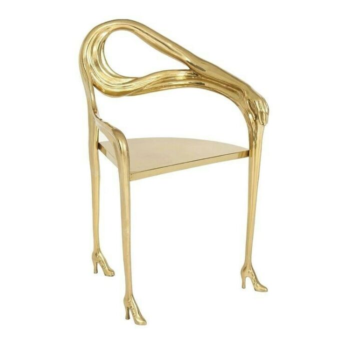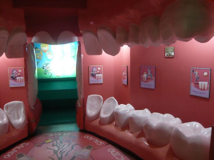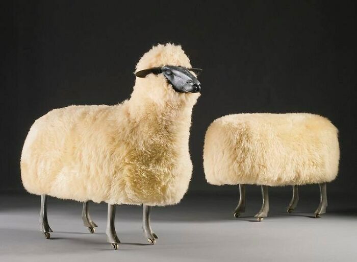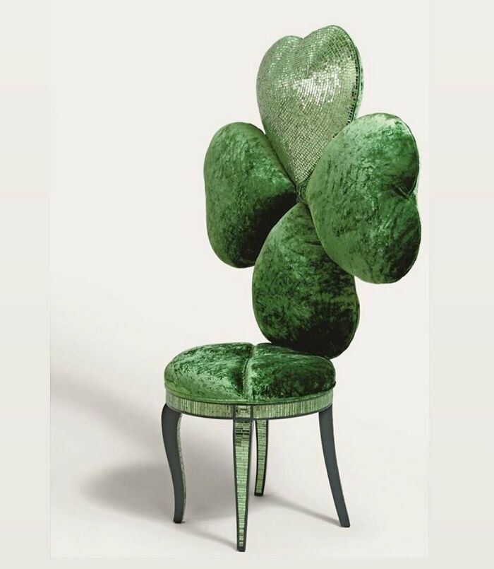
“Sorry For Design”: 50 Utterly Dreadful Designs Posted On This Instagram Account
All the fellow interior and furniture design aficionados, pull your seats closer. Also, those who enjoy the quirkier side of the internet. Today, we have a real treat for you!
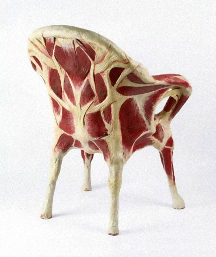
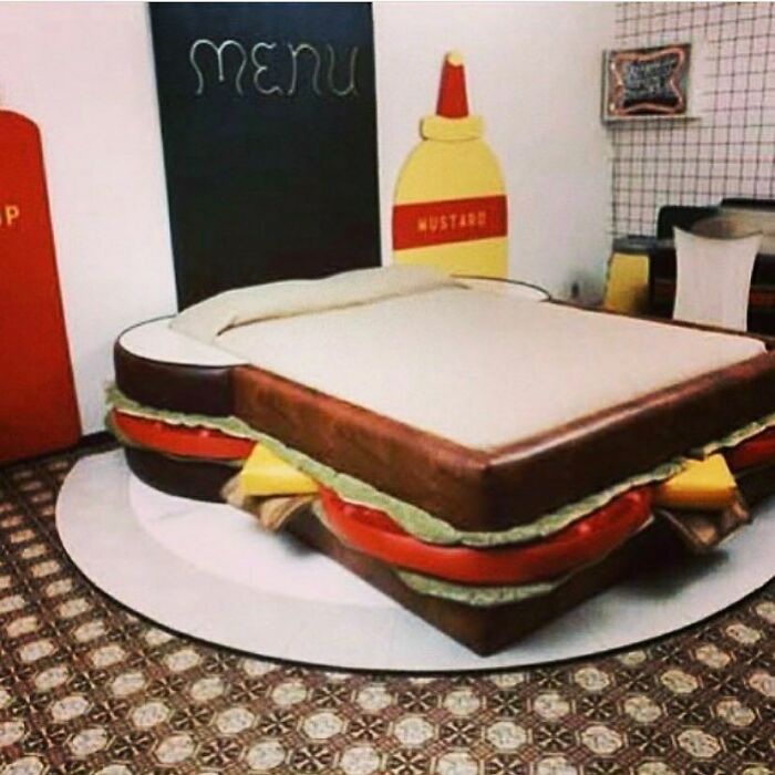
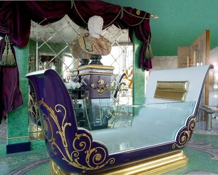
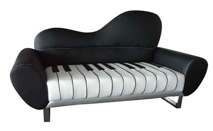
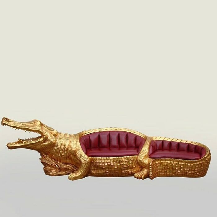
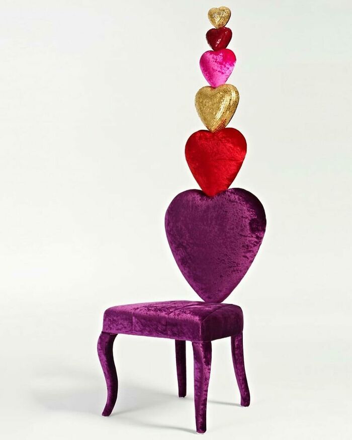
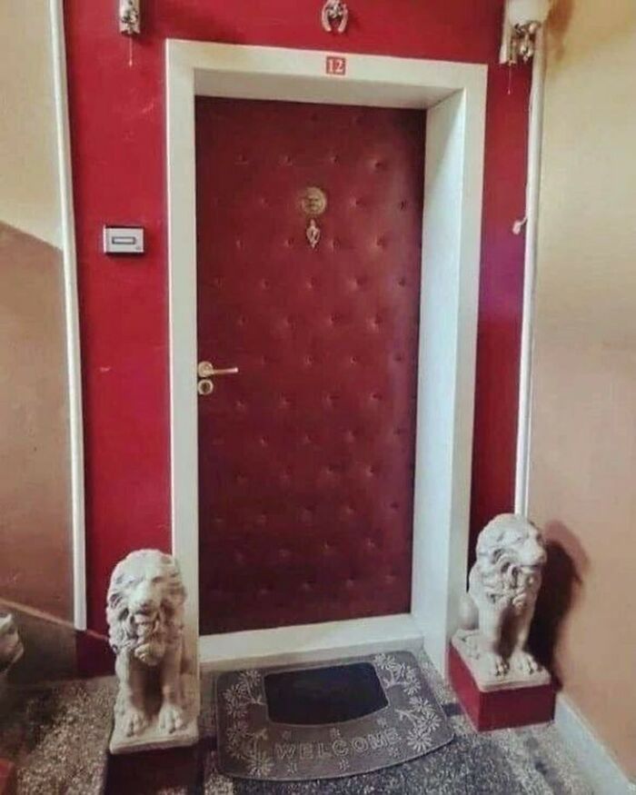
Welcome to “Sorry For Design,” an Instagram page that labels itself as “visual arts” entertainment and you can’t argue. The account, which seems to be still growing, features an impressive collection of the most eccentric, plain weird and totally bizarro pieces of interior decor.
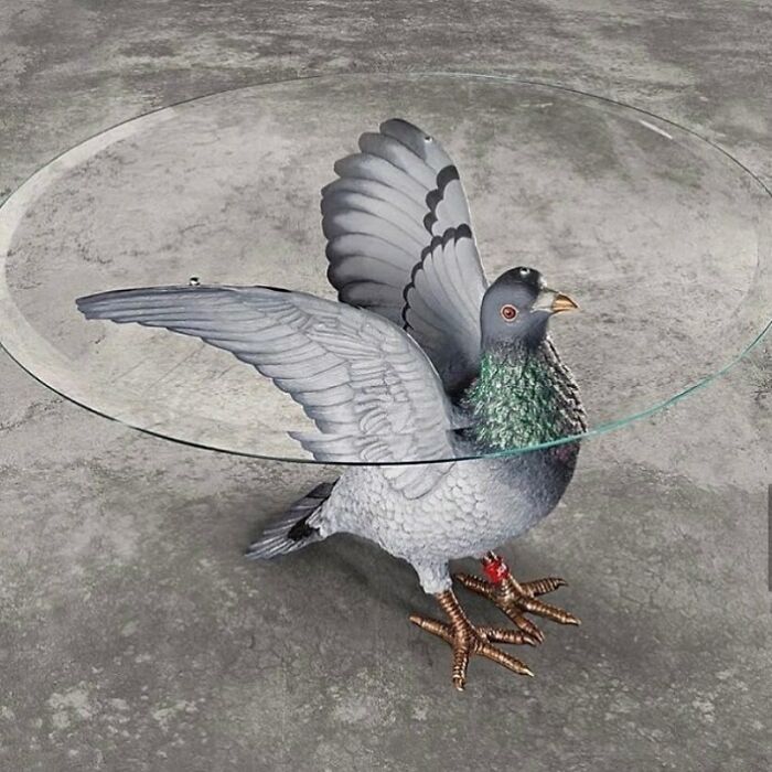
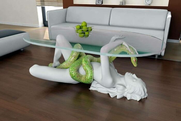
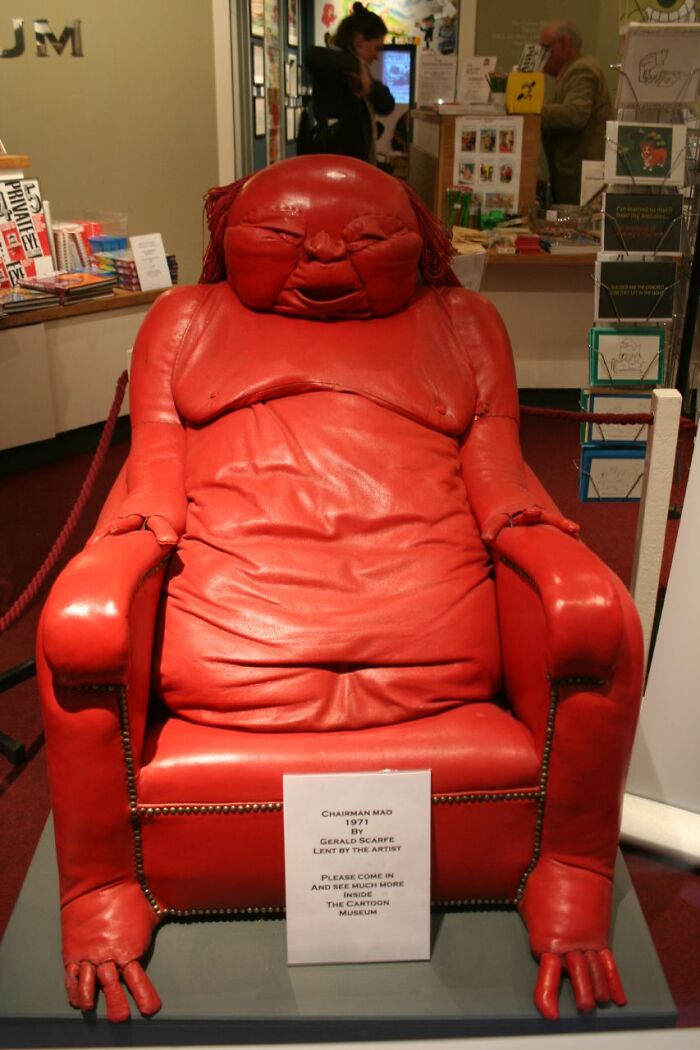
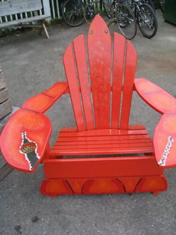
Think of a tarantula chair or a Jeff Goldblum-inspired bathroom: some of the designs shared here take insanity to an entirely new level. Below we selected the funniest and most eyebrow-raising examples, so enjoy and upvote your favorite ones as you go!
This post may include affiliate links.
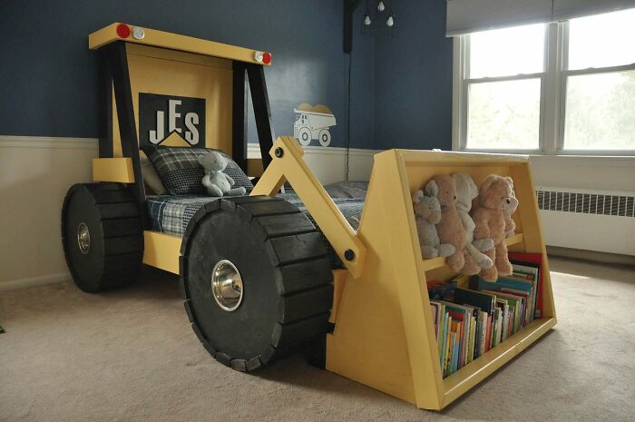
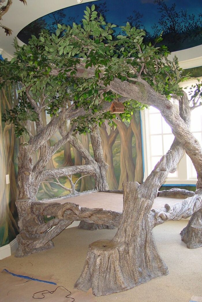
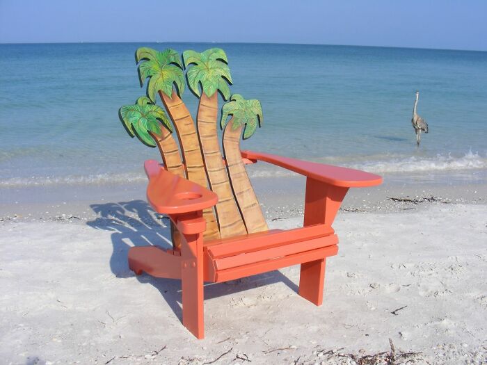
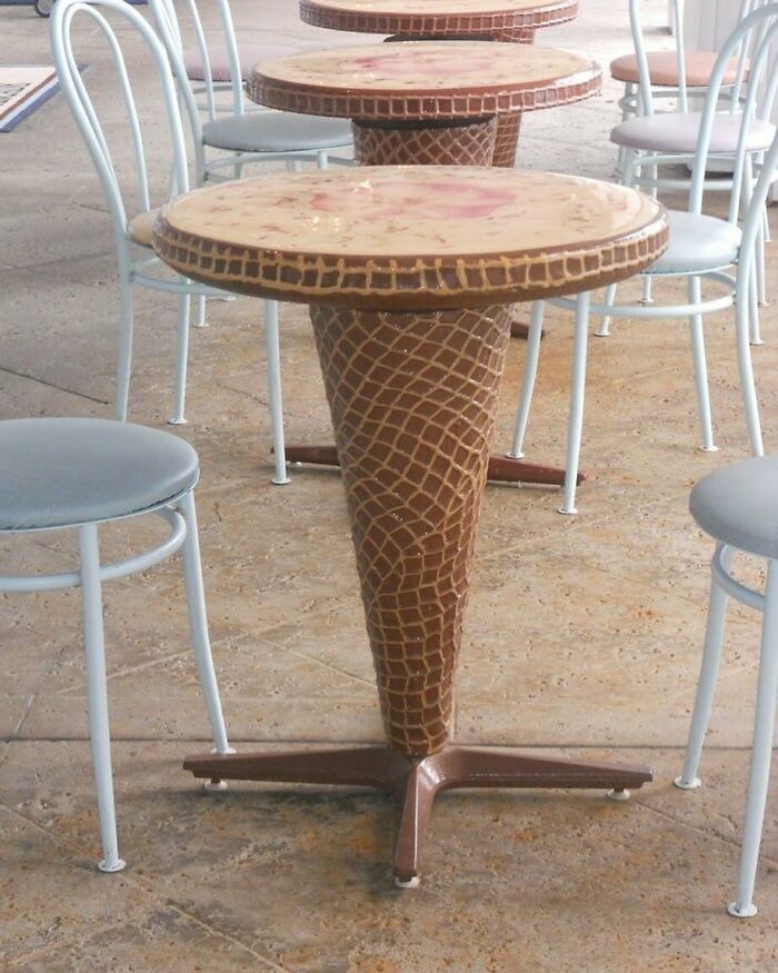
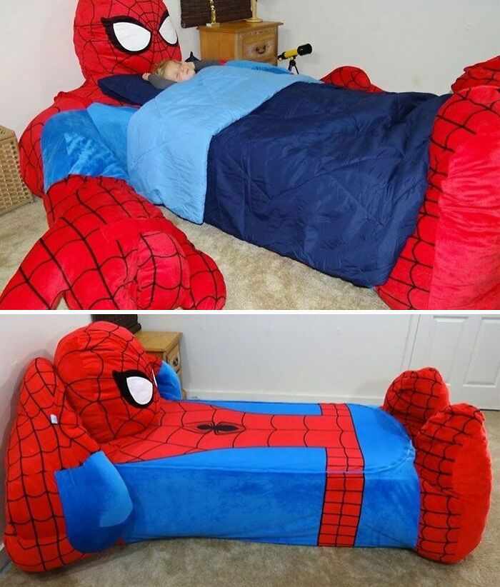
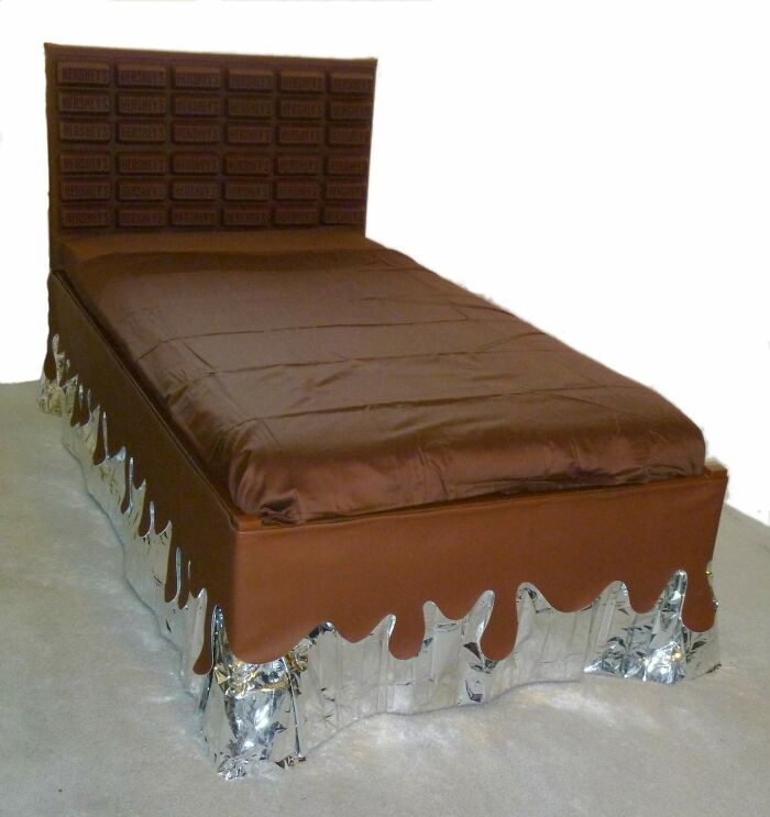
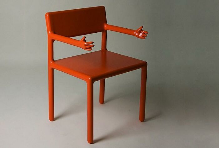
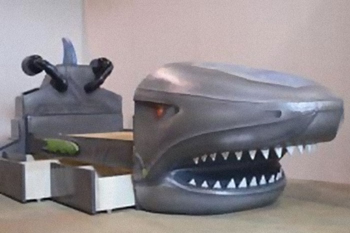
Come on, i would love this as a kid, c**p i want one now, and i'm in my 40s
Bored Panda reached out to Katia Tolstykh, a Berlin-based interior and furniture designer, co-founder of OddinShape studio, and the creator behind the Sorry For Design Instagram account. Today, Tolstykh has 9 years of experience in design. In 2020, she along with her husband founded Odd In Shape, a multi-disciplinary design studio that works mainly in digital art, dreamscape interiors, and furniture design.
Tolstykh told us that Sorry For Design was created as a source of inspiration and fun. “Instagram, Pinterest, and other resources focus on beautiful and professional products, while a massive number of things made by non-professionals are left out of the equation,” Tolstykh explained.
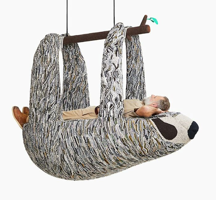
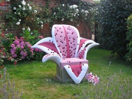
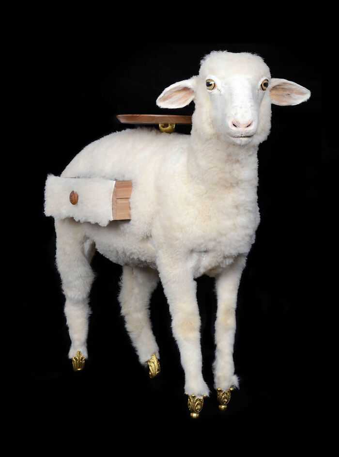
One step closer to the mother nature
According to the interior and furniture designers, they may be funny, vulgar, naive, or disgusting, but they are all worthy of attention. “My account is a collection of projects by notable designers, and by ordinary people. All these projects are done with soul,” Tolstykh said.
When it comes to eccentric and unusual design, Tolstykh believes that it not only catches the eye but also “cheers people up.” Moreover, “everyone has their own reasons to like this design. It's hard to speak for everyone,” she said.
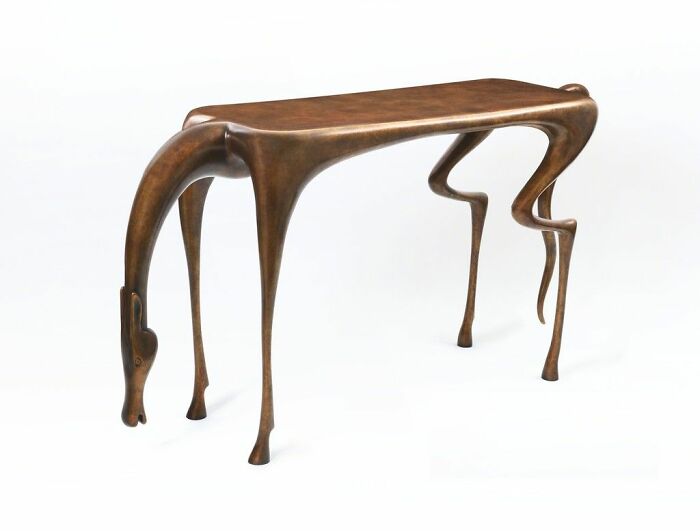
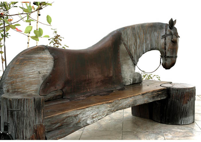
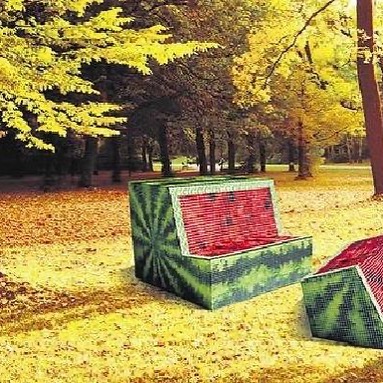
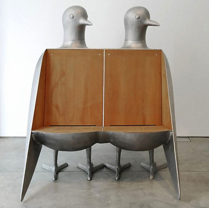
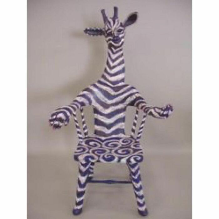
Oooh, definitely. This would go down so well in many horsey places. I can just see people sitting on this bench to try on new riding roots. (Ooops, Iconic is correct, I meant 'boots', not 'roots'.)
Moreover, the examples shared on Sorry For Design, Tolstykh argues, are really more about art and flamboyance than functional furniture. “They’re about the search for new forms, about scandal, about the rejection of common notions, about the expansion of the boundaries of the permitted and the familiar,” she explained and added that “This is art.”
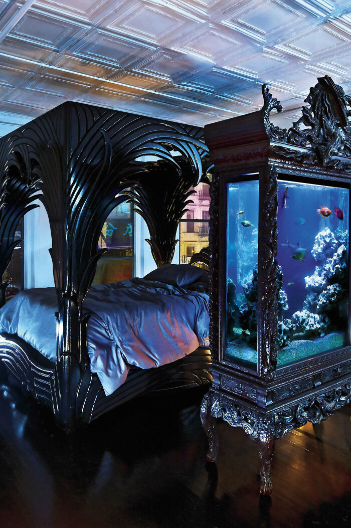
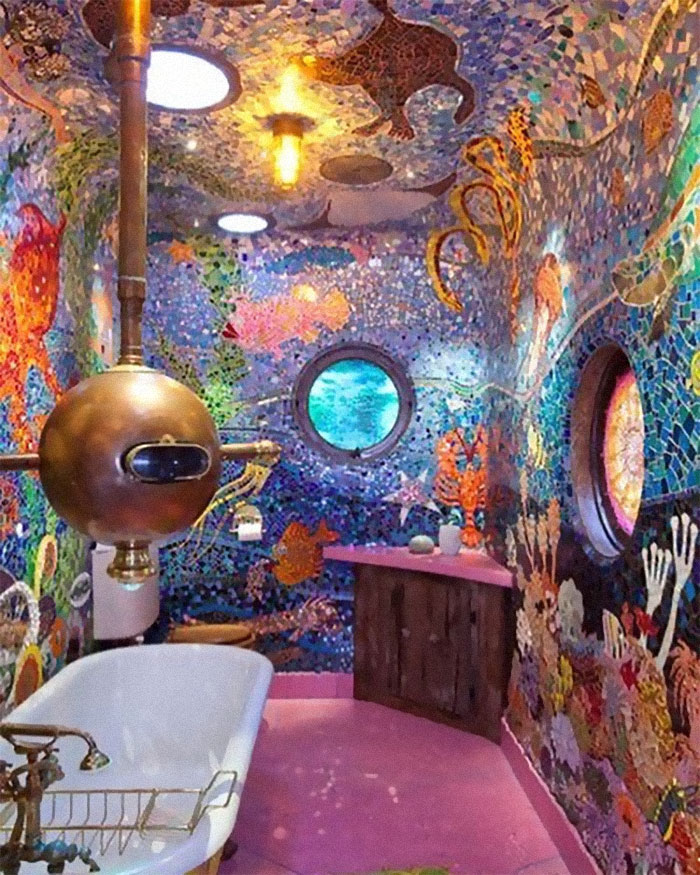
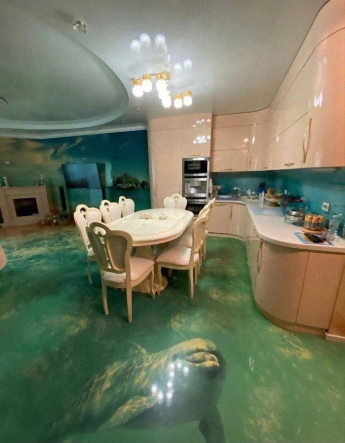
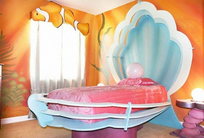
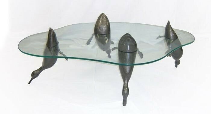
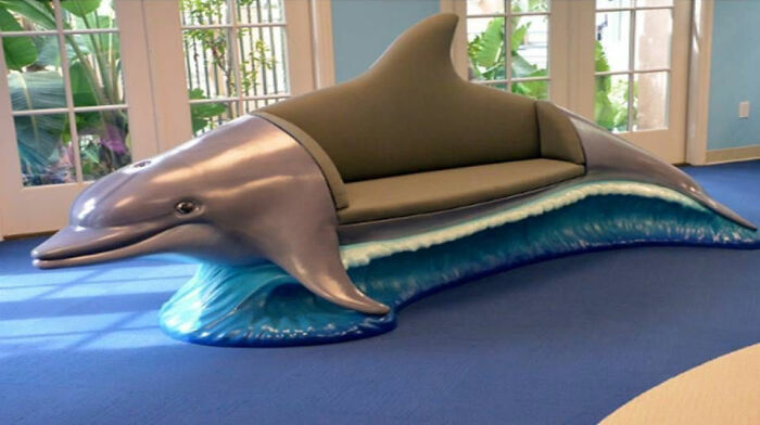
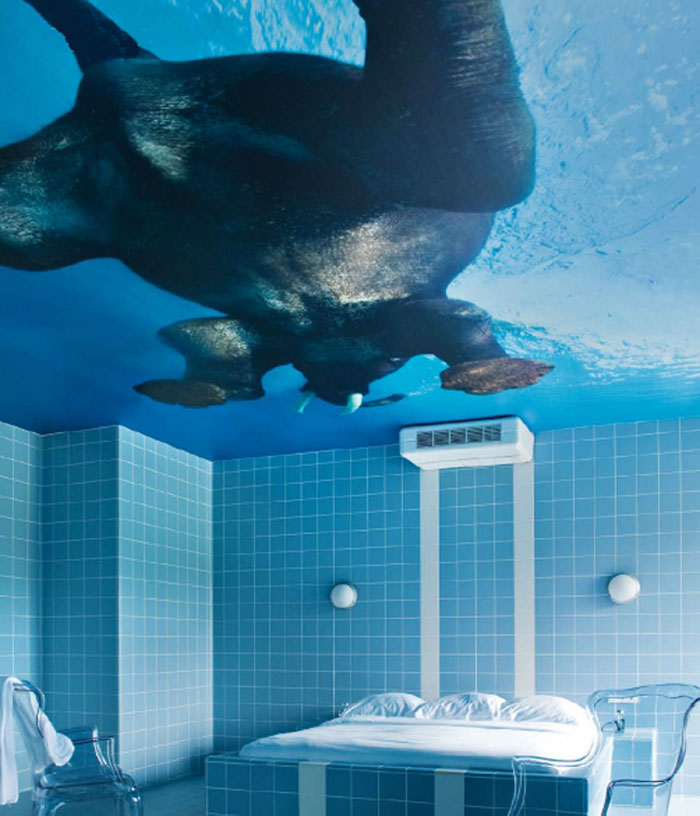
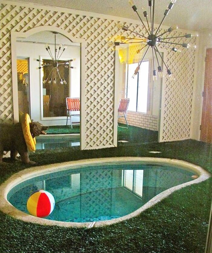
Under the Sea.
In many ways, interior design is no different than fashion. It has its own trends, styles that change with years, seasons and people’s lifestyles. Various external influences are also to blame for fleeting interior design styles, social change and technological advancement included.
Previously, our fellow Bored Panda writer Rokas spoke with an interior architect and lecturer at Vilnius College of Design named Judita Striukienė. According to her, nowadays eclectic solutions are on the rise; it's really popular to combine different interior design styles
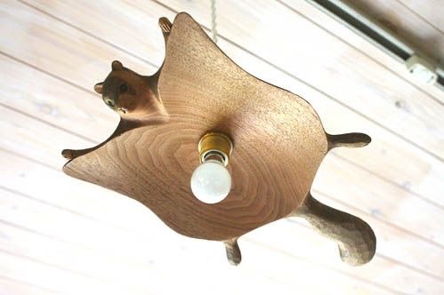
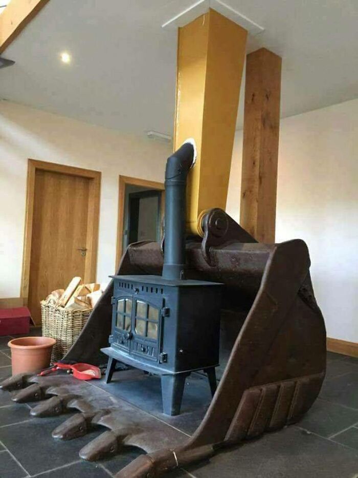
That feeling when you're being interrogated under a bare lightbulb, but your interrogators got really cute with the decor.
"In fact, it's quite rare to discover a place that is true to just one school. When you say a home was designed according to a certain style, you usually mean that some elements have an advantage in that place over the others or there is some sort of leitmotif throughout the entire space," the interior architect told Bored Panda.
On the other hand, there exist main aspects of good interior design that defy time and trends. According to Striukienė, living spaces have to be functional. Everything else is more or less decor, creating a certain mood," she said.
Jules Verne: novelist, playwright, master of bathroom design
This is why many interior designers start the design procedure by getting to really know the person or family who are going to live in a particular space. Their lifestyles, preferences, likes and dislikes all make up the end interior the designer comes up with.
Although most people would agree on what they call a bad or a good interior, that doesn’t mean that tacky and eccentric interiors don’t find their audience. On the contrary, it's no secret that the internet has been fascinated with quirky interiors, bizarre furniture, crazy McMansions and everything in between.
These unusual spaces seem to both transgress universal aesthetics on what we consider appealing and common sense, and show that there can also be no rules whatsoever.
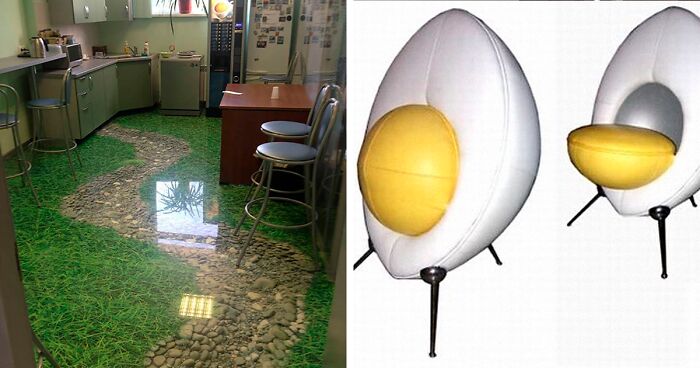
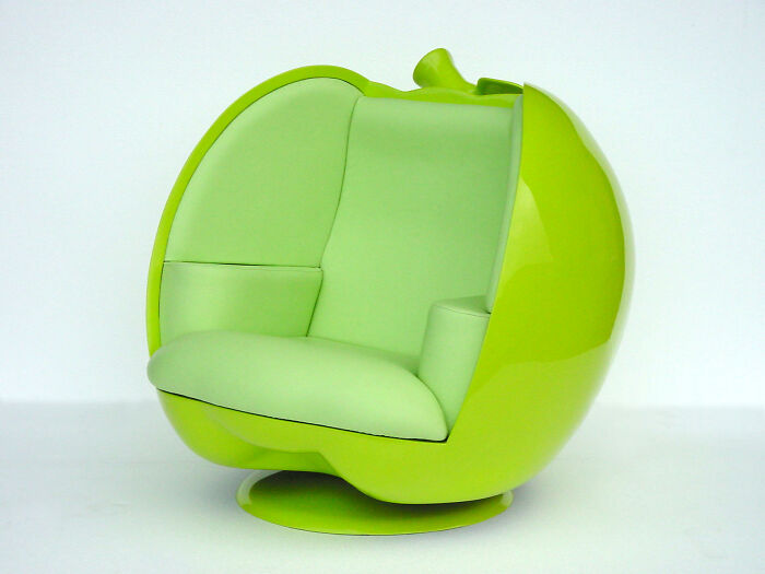
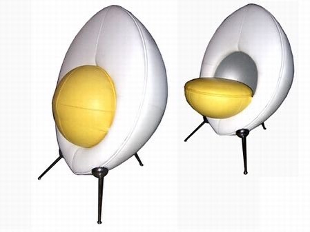
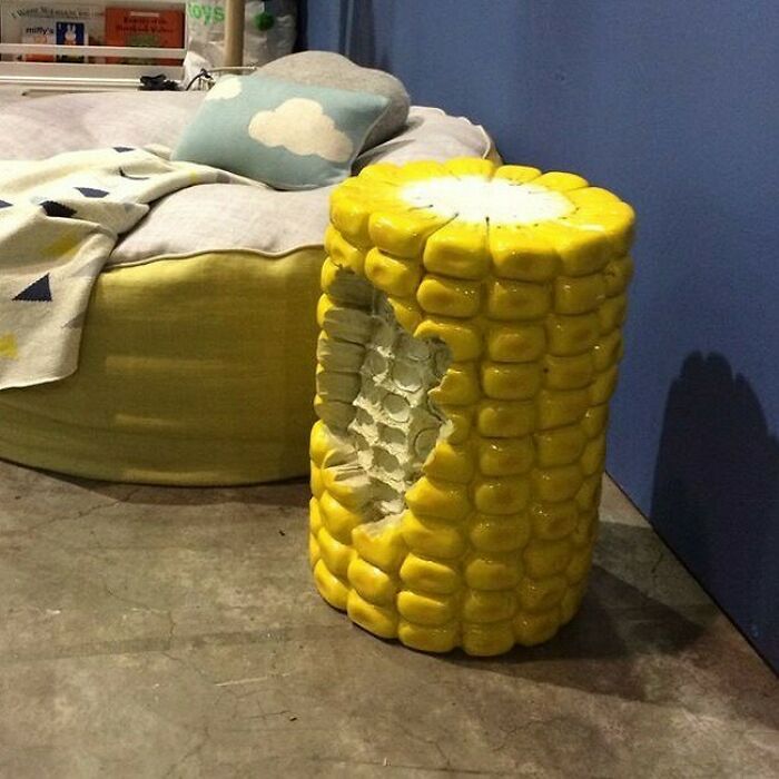
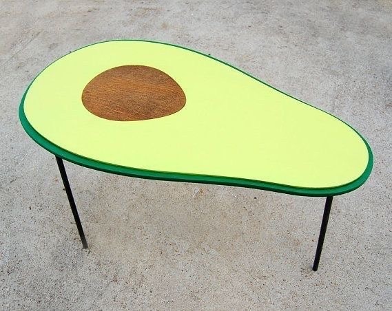
Eggsellent!
I was holding it together and then I saw the toes. Oh heck no
Spider Bed, Spider Bed / Groovy place to lay your head / Is it safe? Heaven knows / He's got radioactive toes / Hey you (who?) / Jump in the Spider Bed. (For the tune, see: https://www.youtube.com/watch?v=7OP8keCbSVU)
fr alex would love this. goes with the interior decor of his house too
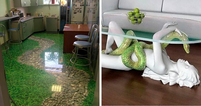
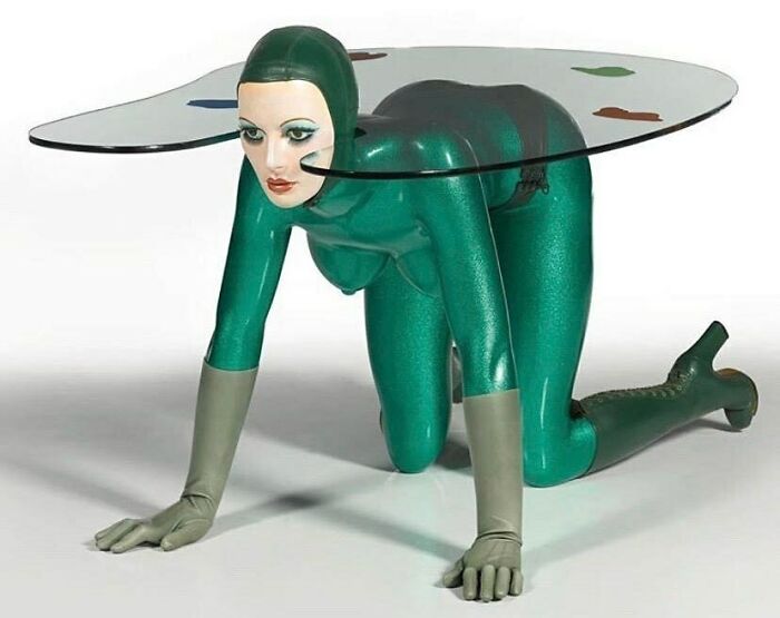
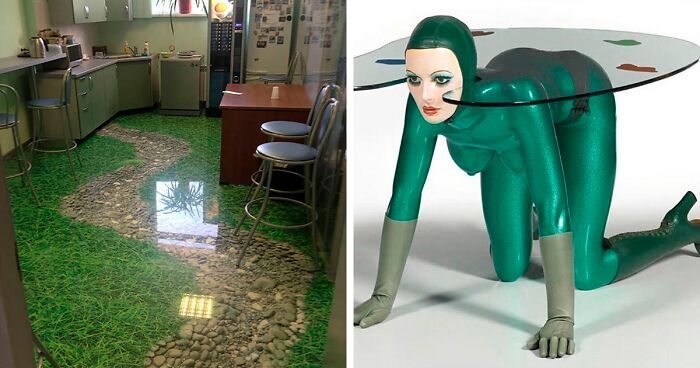
Load More Replies...Is it supposed to be a metallic green catsuit, or just a strange green woman?
Load More Replies...This just screams "I tried to kidnap a lady and make her my table, but she kept running away" so I settled for this.
My favorite part of this one (for some reason) is how she has boots, gloves and a swimming cap on but the rest of her body is nude, complete with visible, uncensored private parts (that means nipples). I kinda wanna see the back-side, tbh. Anyone saying they don't at least want to see it is lying. LOOK AT THIS THING.
I dont. I legit dont. This is a disgusting piece for so many reasons. So if this is the only time I see any part of it, I'll be happy.
Load More Replies...This is an Allen Jones (an artist who did a lot of erotic/fetish inspired stuff). It's art, not meant for your average living room. (I am not debating taste level here, it is what it is).
Some nice glass top tables previously but this just spoiled the vibe.
Agreed! The others range from just a bit tacky to actually pretty cool imo.
Load More Replies...the nipp-the shoe- theres so many things wrong about this like WHY DOES IT HAVE NIPPLES
Well, it's not something I would want in my living room. But I do think it's creative and fun. I could totally see this as decor in a sex chamber or something for people who are into that kind of kink.
OK, this one qualifies for Dreadful Design. Straight out of "A Clockwork Orange"
Now here's one for the Feminist Brigade to get their teeth into, she's even wearing her scrubbing gloves. No thank you, not for me.
Is she getting ready to do an examination wearing those rubber gloves 🐛
I can't help feeling relieved they shot the photo from this angle.
THIS WOULD BE PERFECT IF SHE HAS A FUNCTIONING BUT THOLE! BUT THOLE! BUT THOLE! BUT THOLE! BUT THOLE! BUT THOLE! BUT THOLE! BUT THOLE! BUT THOLE! BUT THOLE! BUT THOLE! BUT THOLE! BUT THOLE! BUT THOLE! BUT THOLE! BUT THOLE! BUT THOLE! BUT THOLE! BUT THOLE! BUT THOLE! BUT THOLE! BUT THOLE! BUT THOLE! BUT THOLE! BUT THOLE! BUT THOLE! BUT THOLE! BUT THOLE! BUT THOLE! BUT THOLE! BUT THOLE! BUT THOLE! BUT THOLE! BUT THOLE! BUT THOLE! BUT THOLE! BUT THOLE! BUT THOLE! BUT THOLE! BUT THOLE! BUT THOLE! BUT THOLE! BUT THOLE! BUT THOLE! BUT THOLE! BUT THOLE! BUT THOLE! BUT THOLE! BUT THOLE! BUT THOLE! BUT THOLE! BUT THOLE! BUT THOLE! BUT THOLE! BUT THOLE! BUT THOLE! BUT THOLE! BUT THOLE! BUT THOLE! BUT THOLE!™
some more from the the château in Roissy, or the abode of the Marquis de Sade, once again..
Might be OK down at The Milk Bar when you're hanging out with your droods...otherwise, not so much...
After the woman with the snake, I was waiting for this :-D lol
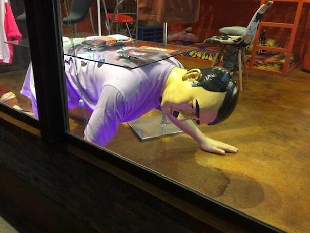
Blackadder – Your Highness, Sir Talbot Buxomly, MP. George – Ah, Buxomly! Roaringly splendid to have you here. How are you, sir? Buxomly – Heartily well, Your Highness. I dined hugely off a servant before coming to town. George – You eat your servants? Buxomly – No, sir, I eat off them. Why should I spend good money on tables when I have men standing idle?
Eh. Too much clothes. It also make her look bold, which is not very attractive.
So far this is the only one I have seen that I do not like. Yeah, this is definitely a BIG NO from me!
Oh finally a table for the incells with a 70s Sci fi esthetic fetish.
Anyone who would ever use this as an actual table would never actually any girls at it with them.
This is the only thing I've seen on this list so far that's actually bad
Ok, this one is a hard pass for me, but at least it has a personality.
Uhhhh.... Phil Parker, does your earlier comment stand?
Maybe in a single man's world. Have to pretty lonely to stoop that low especially with what's hangin' there!😙 Ain't saying a thing.😳 Vic.
Is it....anatomically correct? Ahem...just asking for a friend....
Over brutality.
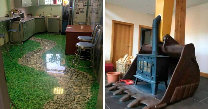
In fact, that's kinda clever way of fire protection if you like the style.
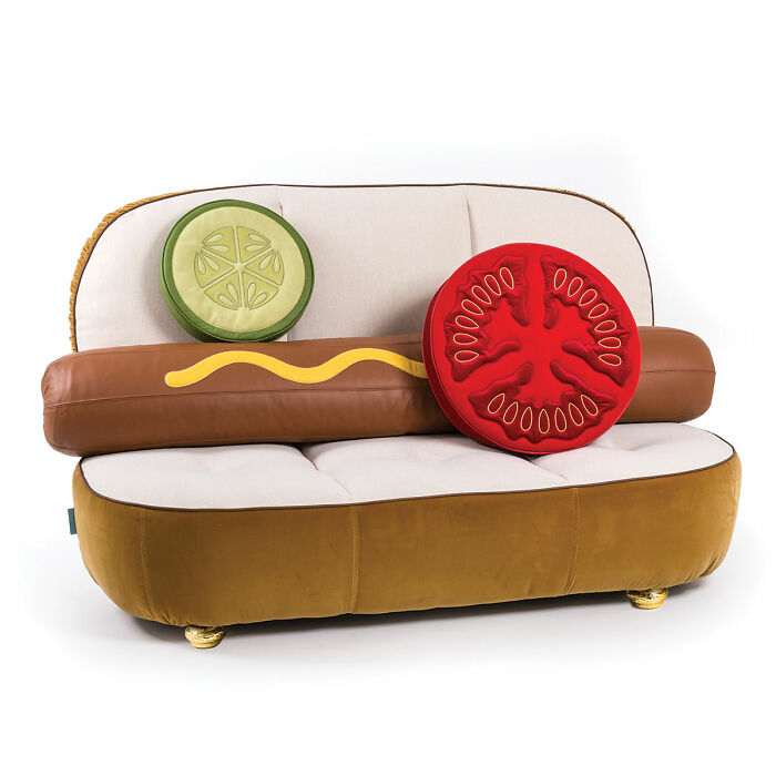
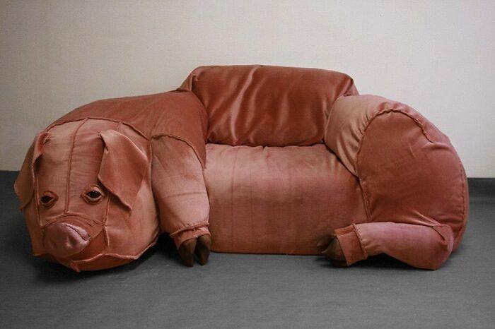
This little pig's expression sums up this sofa.. That's a whole lot of sofa for one seat...
Looks like this would be uncomfortable. Bring cushions. Better yet, throw the cushions on the floor and sit there.
The wheels are a nice touch. They allow you and your partner to play some kind of agarian bumper-car game in the house.
Yet another BP post of "horrible" designs where most are, in fact, wonderful, whimsical, and beautiful.
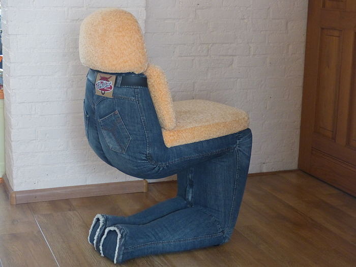
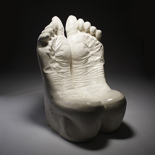
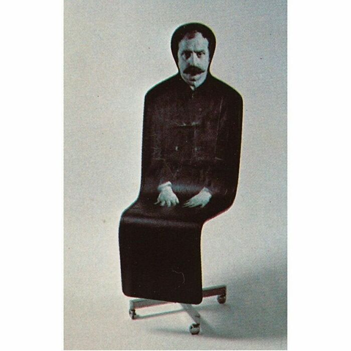
The second part of the entries were pretty weird though. Especially the double amputee chair *shudder*
Load More Replies...Yeah, I didn't hate any of them, and loved most of them.
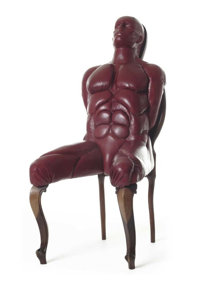
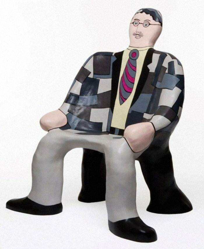
Load More Replies...Some of these are abominations (pig couch and human chairs, looking at you), but most of the rest are charming, clever, and quirky. Maybe we can stop shaming anything a little different? Not everyone is going for understated and tasteful. Some of us just want to have a little fun!
I'm getting the feeling some of the folks at BP don't know us and our tastes very well.
Most were okay and some even amazing in my opinion; others were fetish style and therefore also do not belong on this list - my best guess would be that BP wanted to show the pictures but had no idea for a fitting title...
Yeah, these were great. Does someone just hate non conformists? I love weird people. 1 life to live. Live it weird.
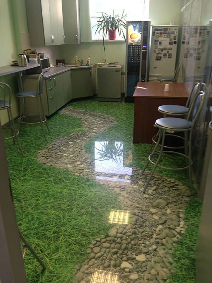
some of these are absolutely beautiful, plus very clever. i want the grass and stone path in MY kitchen :-)
A lot of these are actually fricken awesome. People are so creative.
Most of these were great. Did I miss something? Like, the obvious adult toy ones aren't my thing, but a lot of these are colorful, fun, well done, and interesting. Have things become so gray out there that anything fun is now "bad"? Dare to be a little weird.
Something must be wrong with me. I loved the majority of the designs.
most of these were actually pretty good. and this is an engineer talking.
Most of these are awesome and I would have in my house. Why are they categorized as bad designs?!?
Have you seen the "realistic cat backpack" on AliBaba ? It belongs here. I wish I could add images.
If you don't like them, don't put them in your house. Problem solved. Many of these were quite amazing!!
Most of these are actually hideous, unlike so many BP "design fail" posts!
Alternate title: Incredible designs with a few horrid ones sprinkled in for flavor
This is a cool listing of designs with an incorrect title, as most of these designs are actually pretty cool! Seriously, only a handful are what I would call dreadful. I guess beauty is subjective.

 Dark Mode
  No fees, cancel anytime


