41 Instances Graphic Designers Didn’t Quite Think Through Their Works When Creating Logos
How many times, looking, for example, at the logos of Nike, Adidas or Apple, have we asked ourselves just one question: “Well, couldn’t we have drawn such a simple logo ourselves?” If yes, then let's move on reading. If not, we still move on. How many times have we read the news that some famous design studio redesigned the next big corporate logo for a check with an obscene number of zeros, and in the end just made the font thinner or simply reduced the distance between some details?
And so, every time we read such news, we come across dozens, if not hundreds of comments that the designers simply scammed their clients for money, but actually nothing in the logo has changed. In fact, as is often the case, things are not so clear cut.
Firstly, the famous swoosh was most likely a manifestation of spontaneous genius insight (for which, however, they paid only 35 bucks), and the original version of the Apple logo was complex, artsy and as old-school as possible. Secondly, any change in the logo in a large company is preceded by a long and thorough marketing analysis. Yes, sometimes it turns out a complete fail, as was the case with the 2012 Summer Olympics logo, but more often than not, the idea of saving on logo design doesn't justify itself at all.
Do you want proof? Voila! As many as 47 examples collected by Bored Panda, when the designer just drew something, the marketing manager was either absent or did not think at all, and the boss approved the logo without looking. And the result is what we have - this incredible selection of logos from around the world, on the one hand, beautiful and stylish - but completely inappropriate, you just have to look at it from a different angle. So please feel free to think different, as Steve Jobs once urged us, scroll this selection to the very end, and just enjoy these absolute masterpieces of human short-sightedness.
This post may include affiliate links.
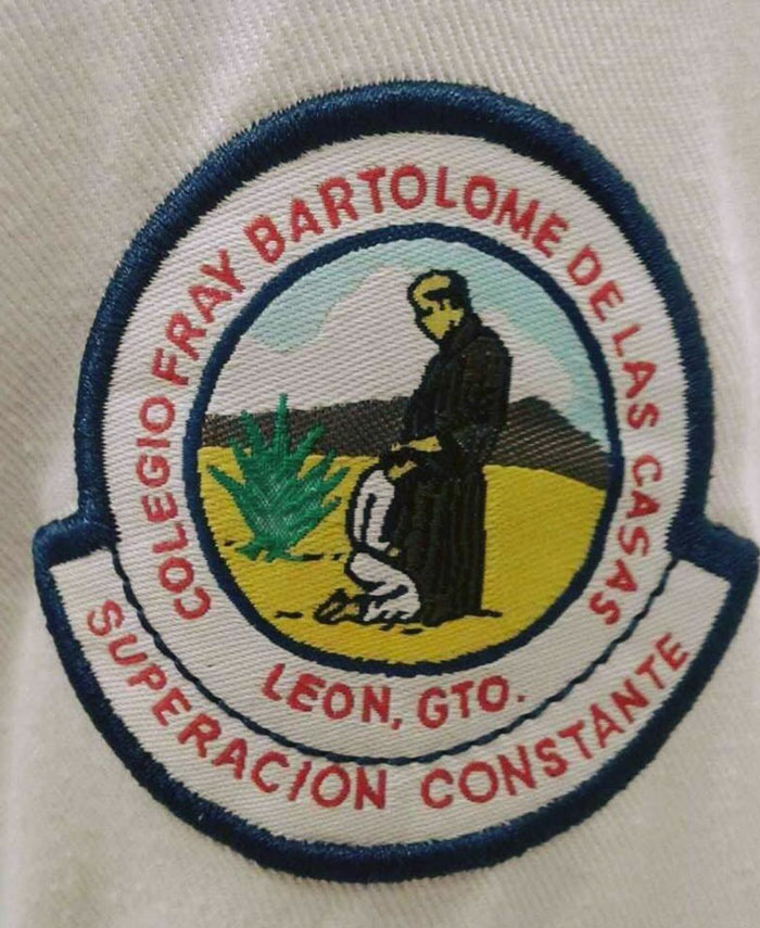
This Catholic School Logo
No. Why? Really? A catholic school? Who designed this?what the fck!?
Truly. And at first I thought it translated to "constant supervision" which would've been sooo on-point, but it's actually "constant overcoming" which is arguably also hilarious given the visual
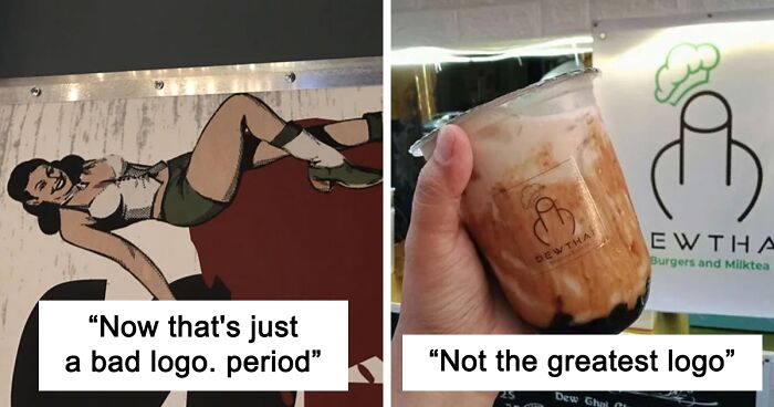
Load More Replies...Now That's Just A Bad Logo. Period
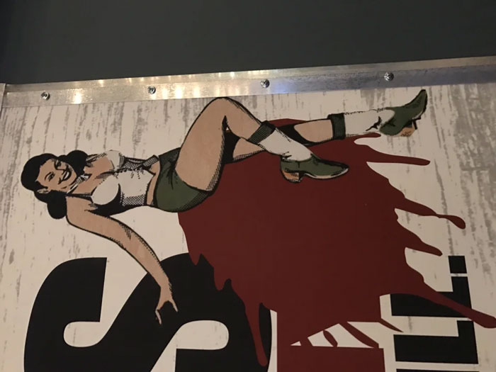
What was this even supposed to be? Other than the obvious, of course.
That is the logo for Lagunitas Little Sumpin sumpin ale or one of its offshoots.
Load More Replies...The Logo For This Spicy Apple Jelly
Its a " double entendre " and its hilarious lol, you can see it as half an Apple lol, of a fire spitting a*s, thats actually Smart.
Yeah, that spicy apple jelly is gonna hurt later, according to the logo.
It looks very much intentional, really. If it were unintentional, the "apple stalk" would look more like a stalk and less like fire 😂
Load More Replies...This Medical Centre’s Logo Is A Flat Line
Might have been better if the line was just inverted...and ended with a heartbeat.
If they had only put the heart beat measure at the end it would look like some one was brought back to life
Unfortunate Door/Logo Placement On This Plane
I was amused by how much a snowboarder loved a swag sticker he got from D¡ck's Sporting Goods that said "I ❤️ D¡ck's!"
We have a small local owned sporting goods store in my town called Dave's. When D**k's moved in they started giving out bumper stickers that said "Shop Dave's, we're not D**k's."
Load More Replies...I swear they did. It looks like there's enough room to shift the letters to the left enough so that it doesn't end up showing that with the door open.
Load More Replies...I was imagining a kid idling at the airport before a flight. someone who had just been learning to read, trying to pronounce that but struggling and ultimately asking their parents how to say it or what it meant 😅
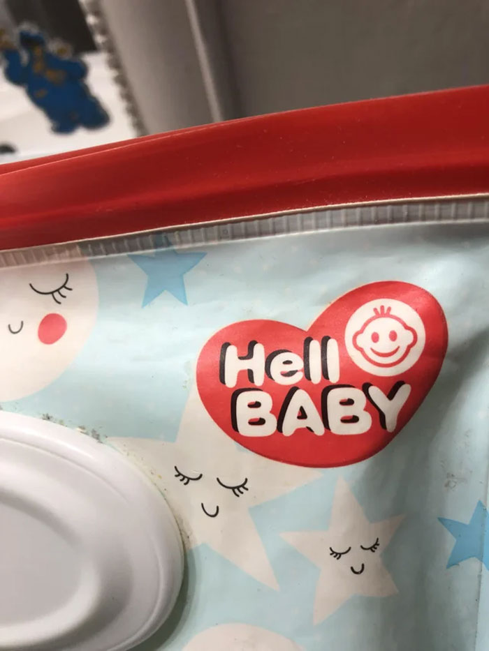
Load More Replies...My Son Who Just Started To Read, “Hell Baby. Hell Baby. Hell Baby!!!”
Hello? Is this John Constantine? Yea. So I got a Hell Baby? We might need to perform an exorcism..
lol. gotta love john constantine. knowing him, he'll adopt it.
Load More Replies...It's the air pressure changes; gives them an earache that makes them cry.
Load More Replies...All parents have had a Hell Baby at one stage, usually in the middle of shopping
I've come across some Hell babies and Hell toddlers in the stores I've shopped at many times before.
Load More Replies...An honest name...all babies have a tiny demon inside that comes out to play at the worst moments
Sounds like a horror movie. "Hell Baby. You can't baby proof your home from this one."
Made specifically for Hellboys newborn. "For that special little bundle of joyous hell."
Girls' Water Polo Team Logo
I am quite irate... that I didn't pot this first!
Load More Replies...I think “playing water polo” is gonna be my new euphemism for “doin the hippity dippity”
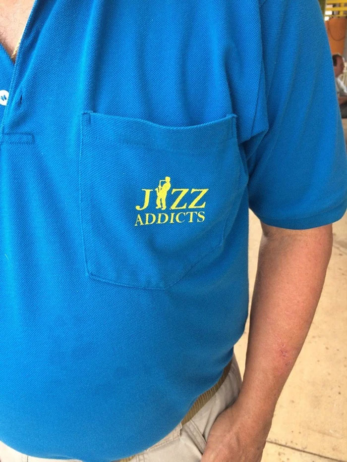
Whoever Designed This Logo Made A Terrible Mistake
The style of music played in the Cantina scene in the original Star Wars movie is called Jizz. So, this shirt could be accurate!
Not Kay Jewelers. Look up Jizzy Jewelry. Was the second option when I typed in Jizz to see what y'all are talking about. Never heard of it in my many decades of life.
Load More Replies...A "Cheerleading" Logo In A Town Close To Me
What gets me whoever made this logo, had to spend a fair bit of time getting the butt crack right. And at no point were they ever like "maybe I shouldn't do this"
I think it’s just where the two boards were joined.
Load More Replies...You won't convince me the name of this place isn't Victory Vcheer Vacademy.
So they couldn't come up with the idea of showing a cheerleader doing a V with her hand?
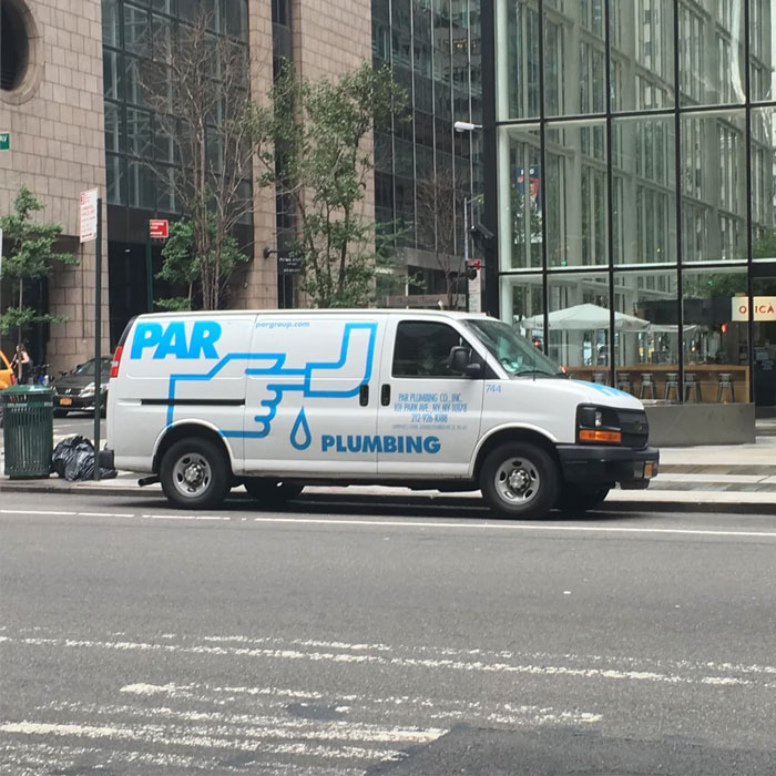
Designer: Can You Describe The Logo You'd Like? Client: It Should Have A Leaky Pipe. But Instead Of Fixing It, Our Plumber Just Puts His Finger In There. And Btw, It Should Still Leak After He Does That
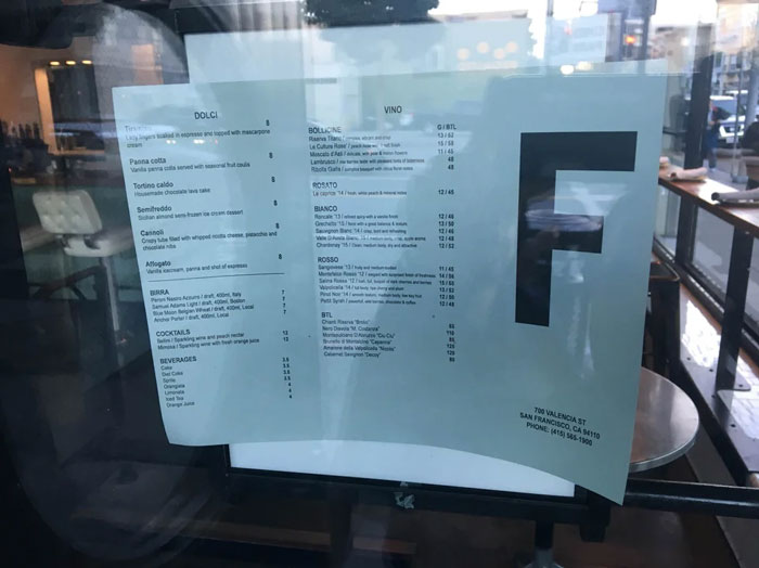
This Restaurant’s Logo That Looks Like A Health Grade
The city I live in doesn't HAVE health inspections. What's the worst that could happen?
You mean it looks like a BAD health grade. If the logo was A it could have been a different thing.
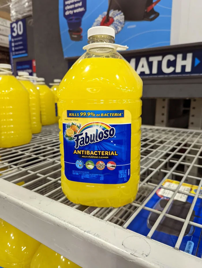
Design Of The Bottle And Logo Looks Way To Close To A Sunny D Like Drink. If A Kid Couldn't Read This Would Go Bad
I don't think you realize how likely I'm gonna drink garage soda
Load More Replies...Kids need something to wash down all those laundry detergent pods they eat.
I said that as soon as I saw this picture😂😜😂
Load More Replies...Kids have actually had some issues with trying to drink Fabuloso. It comes in other colors that also look just like punch drinks.
That is terrible and should be pulled until they can package it properly. It really does look delicious.
There are different scents that are different colors. You have been forced to use the flowery one. In Georgia, the dollar store has yellow, green, purple, blue, and I think pink.
Load More Replies...Is there any difference to sunny D? Both contain 100% artificial liquid...
When I was learning about caring for a parent with dementia, the class was warned to keep Fabuloso out of reach -- and detergent pods, too.
I just recently read an article about restaurant patrons having to get their stomachs pumped because a server served them what looked like a bottle of juice but was actually a bottle of disinfectant. Maybe cleaning products manufacturers should go back to using the tried and true bleach bottle design.
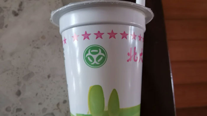
This Yogurt Using Biohazards Symbol As Its Logo
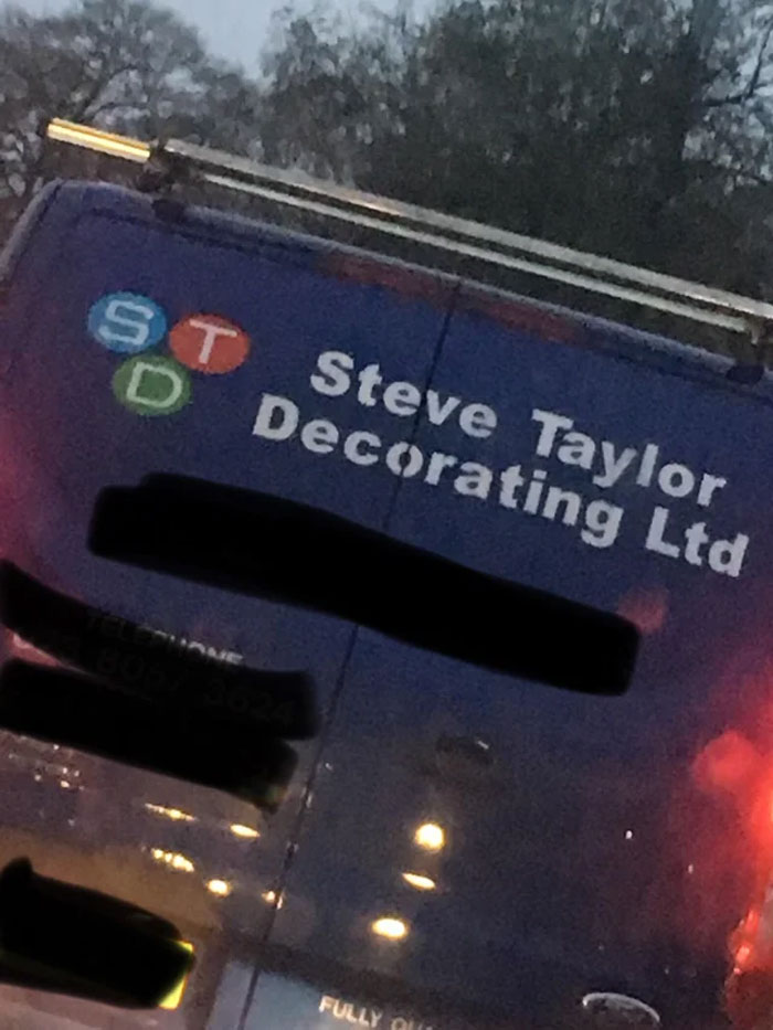
Was Stuck Behind This Unfortunate Logo Today
We call them STIs in the UK apparently. I hope Steve Taylor does interiors too.
Should change the name to Steve Taylor's Ultimate Decorating 😉 Pay me at your usual rate.
That's what she said! But now she's itching too.
Load More Replies...Received a work announcement for some mandatory education c**p that lead off with "STD" in a commanding font. Smh.
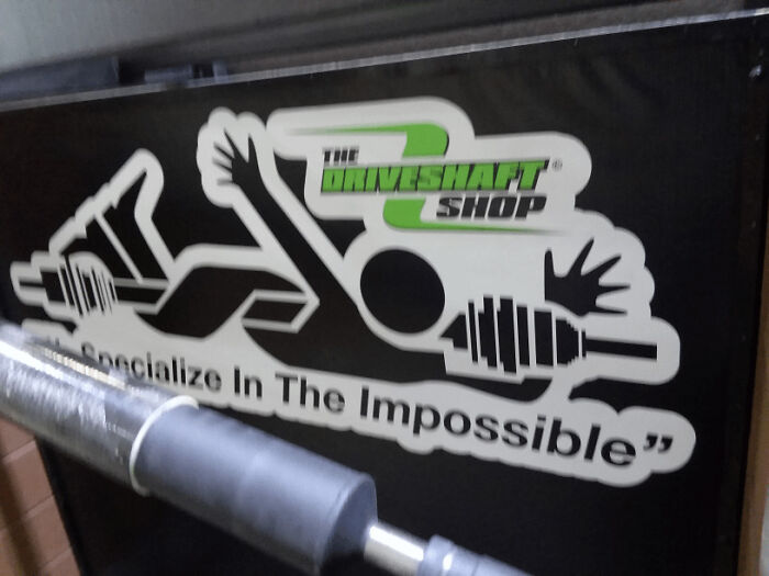
This Company's Logo Looks Like Somebody Got Pulled Into A Lathe
That is actually the design for the warning label for a 'Rotating Shaft Hazard'!!
Reminds me of when Mr. Burns got stuck in the medical equipment like a paper jam, lol. Mr-Burns-p...d4b241.jpg 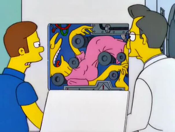
I'm thinking this was intentionally designed AND a job box sticker, which caters to a different crowd. The driveshaft shop with the warning symbol logo and saying they specialize in the impossible...
No, they got pulled into a driveshaft. 😬 "Hey Tom, how're we gonna commemorate Bill in the new logo?" The new logo:
When you slip in the gym and wrap yourself around a barbell; it can happen!
The Flip Zone Has A Rule Of "No Backflips" When There Is Literally A Guy Backflipping In The Logo
Maybe you're supposed to look at the logo the other way, so it's a front flip.
Yeah that's what I think. Folks designing/requesting should recognize Conventionally people will read left to right
Load More Replies...PSA: These places will kill you when you're over 35yrs and have smoked since you were 12yrs old also haven't jumped on a trampoline since you were 12yrs old. You forget how much effort it takes to jump and you can't move proper for days without making a weird yelping sound
Could also be that the flipper is starting at the right side of the banner and he is doing a forward front flip?
It looks like the blocks have formed a dark shadow person emerging? Just me seeing?
“This is the flip zone.” “So I can do a backflip, right?” “No?” Also, it never said anything about front flips, so the logo is probably doing that.
That is absolutely not what that means or how that works. That refers to: instead of reading from left to right like other people, you turn the book around and read it from right to left, making the book look backwards to non Japanese people.
Load More Replies...I think it's meant to be looked at from right to left, which it a forward flip... but that's weird in countries where you read left to right.
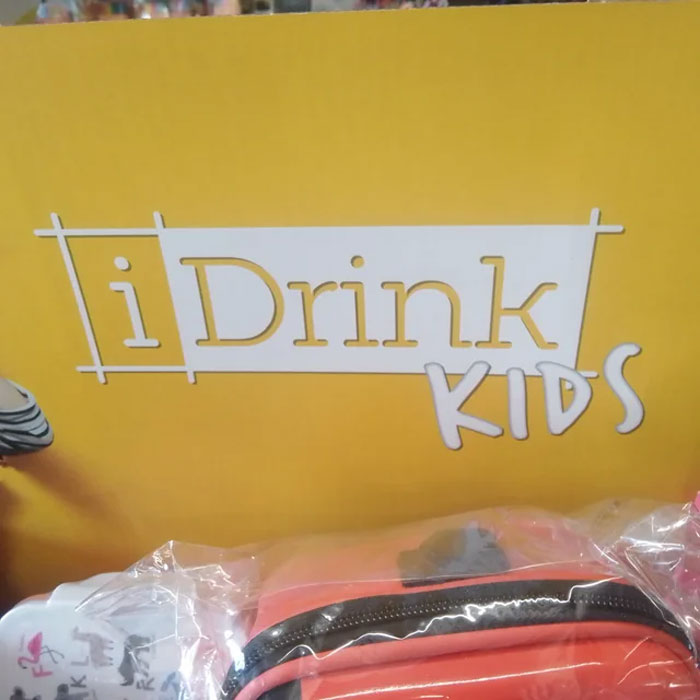
I Love Drinking Kids Too!
Doubt it. They do come in annoying af, a*****e, and complete terror though.
Load More Replies..."I love kids! Couldn't eat a whole one though" - my uncle Glyn, perennial joker and wind up merchant
Load More Replies...I just found the lyrics to the song of one of their adverts: If you like Pedo Coladas, And find Chris Hansen a pain, If you drive a toyota, If you have candy canes, If you have a teddy bear night light, and an awesome superman Cape, Then I'm the love that you've looked for, Come to the fire escape
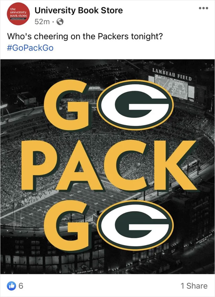
It Really Feels Like The Packers Logo Could Have Replaced A Different Letter Here…
As a Packers fan, I can only guess this was created by someone from Chicago....
The bears logo could qualify here as well considering it's a toilet seat....
Load More Replies...As a Packers fan, I would find this a little confusing, even though I know what they’re advertising.
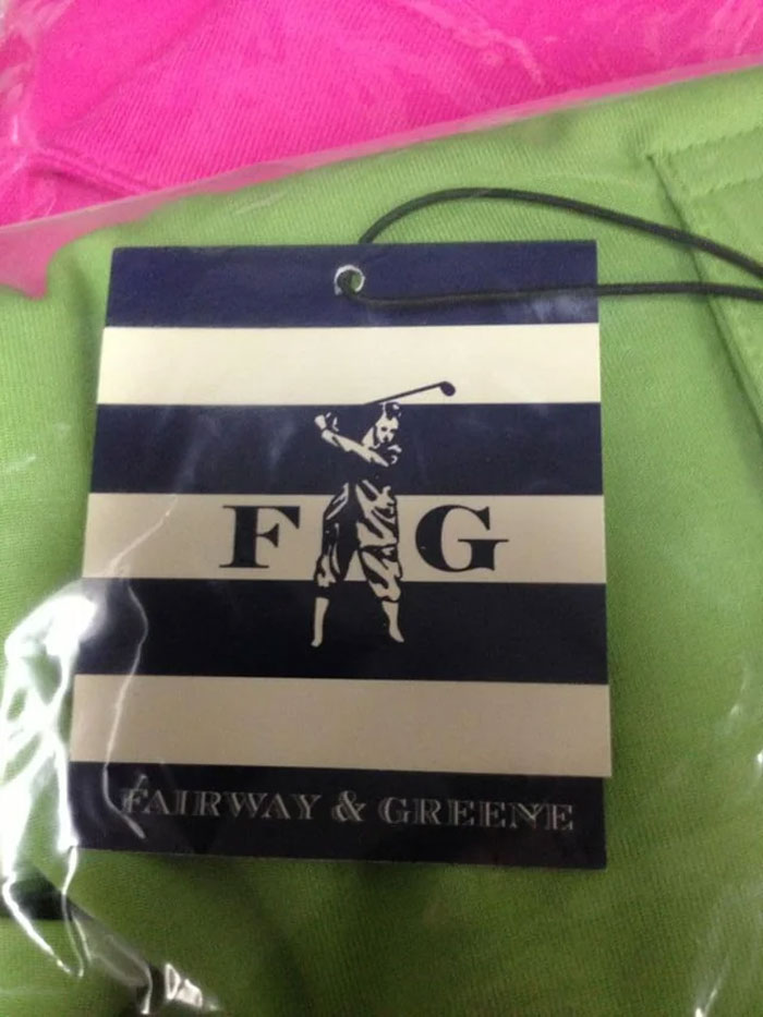
A Clothing Tag With Unfortunate Logo Design
When you need the "I" to look like an "a". The Jizz Addicts should learn from this.
so I seriously had to look that up, and when I looked it up, a 2020 election flag came up. It had the US flag and everything.
Load More Replies...Prizes On Offer At The Clinic
Congratulations Panda, You have Officially won diabetes!! (If I offend anybody I'm so sorry)
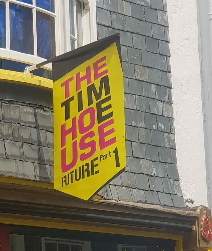
The Tim H*e Use - Supposed To Read 'The Time House'
Thank you. It took me wayyyyy too long to figure this one out.
Load More Replies...We’re Going To Contact Them With A New Logo Hopefully
Nah, I think Pat drew it, directly on the truck.
Load More Replies...Your two year old is the designer, didn't you hear?
Load More Replies...This Logo Of A Company In My City
Ride On Spac Eship
🎶 We’re going on a trip in our favorite Spac Eship! Zooming through the sky! Lil Einsteins!
Climb aboard, get ready to explore. There’s so much to find, little Einsteins (that show is so nostalgic for me, back when I had nothing to be stressed over)
Load More Replies...Graphic designer: Let’s do Spac Eship instead of Space Ship, it’ll add character
Probably designed using Microsoft word... Let's just shift this picture 1mm to the right... Ah!!! Why is all the text completely rearranged now! Seriously, we got AI writing college essays and Word can't figure out what font I want to keep using and how to best arrange text around a picture.
Been there. You think you got enough space, but BAM! You hit the edge.
Planning team: Let's write a spaceship there. The Design: aw haill nah Spac Eship
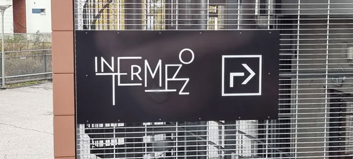
This Sign In The Office Building Where I'm Attending Training
I see a bunch of letters playing rugby on a jungle gym for some reason
Load More Replies...Is... Is it supposed to say "Intermezzo"? Who looked at this and said, "This is a great logo. I did a good job today!" ??
The little man at the end is clearly doing a good job
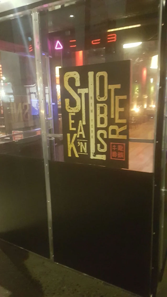
Load More Replies...Just Another Restaraunt Logo That Was Edgy And Cool In Someone's Head. Spotted Near My Gym, Midtown Manhattan
My brain went weird and I read Steamed Abortions
Load More Replies..."NEW YORK STEAK 'N LOBSTER." Followed by a Chinese chop at the end. Someone was super proud of this.
omg thank you I could not figure the lobster part out
Load More Replies...I can make the word ‘stroke’ which is what I’m having right now trying to read this.
It look like when you write a happy birthday sign without measuring how big the letters should be
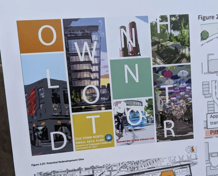
This Logo For "Old Town North"
"LOOK AT HOW COOL AND WITH IT OUR CITY IS!" It wreaks of "Hello, fellow children."
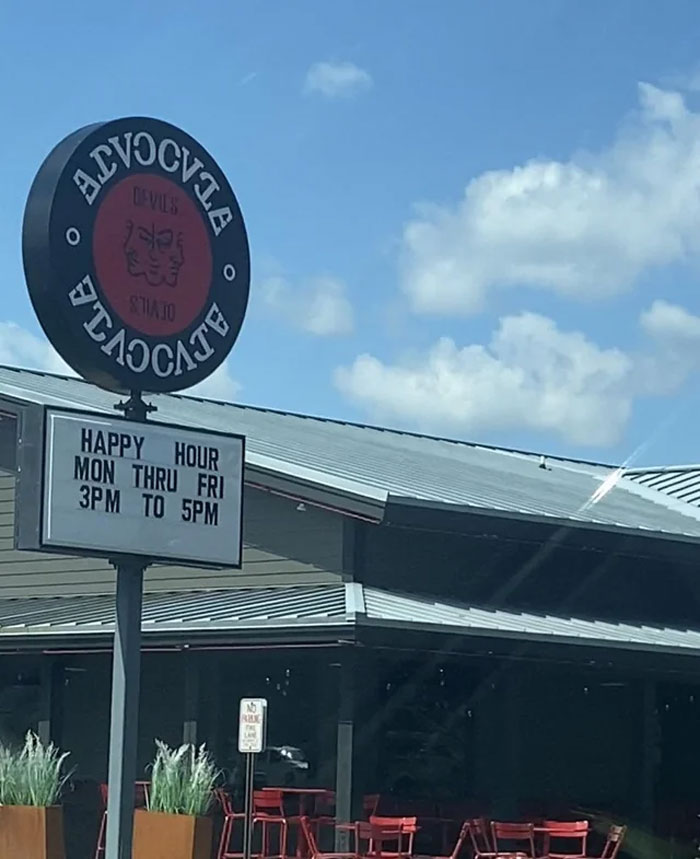
Welcome To Devil’s… Alvoole? Elvccle? (Advocate). I Like The Idea, But The Execution Is Not The Best
I think it’s supposed to be ambigram, but they messed up on the V and A Edit: an ambigram is a word written so that you can read it both upsidown and right side up. You can see how the A and E are combined at the start and end, but the V and A were not properly combined (could work with a line through the V tho)
I drive past this several times a week. I had to actually look it up on Google maps to see what it was called. For weeks I could not read the sign as I drive by at 55 mph. Worst design ever!
I hate that I actually managed to guess what it was supposed to say. I get what they were going for, the appearance of a palindrome, the problem of course is that "ADVOCATE" isn't a palindrome. Maybe next week it'll be Tex Mex place named Taco Cat.
They didn't. The sign is an ambigram (word or phrase stylized in a way that it reads upside down and right side up).
Load More Replies...This Pub Is Supposed To Be Called “Bunch Of Grapes” And I Saw This Unreadable Logo And Asked My Mate “How Far Is The Pub Then?”
Well the person that put up the sign certainly did.
Load More Replies...Robert you have won the internet today. And possibly a slap from my mother
Load More Replies...I get that it's supposed to look like a bunch of grapes, but it's still not a great design.
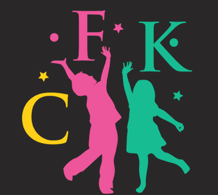
Jingleheimer Junction, Cartridges For Kids Logo
Cartridges for kids? What kind?... Ok, upon swooping: CFK is a company that recycles inkjet cartridges and raises money for schools. Ok then...
This Horrific Cafe Logo
Yes that's Martel. It's a high end chocolaterie in Switzerland.
Load More Replies...It's terrible and a little interesting at the same time. Not what I would've gone with, but it almost looks the way chocolate or icing does when you are using a piping bag and trying to write in cursive. If that's what they were going for, it's a bit clever.
Martel. It's a Swiss chocolate company that's been around since 1818. And probably hasn't updated their logo since then 😆
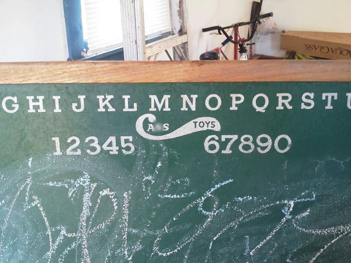
Load More Replies...They Didn't Think Their Logo Design Through Too Well
But your name is just 3 letters...
Load More Replies...Even though the logo looks fine its hard to miss the a*s toys in there. Its not a dirty mind problem, it really is design problem.
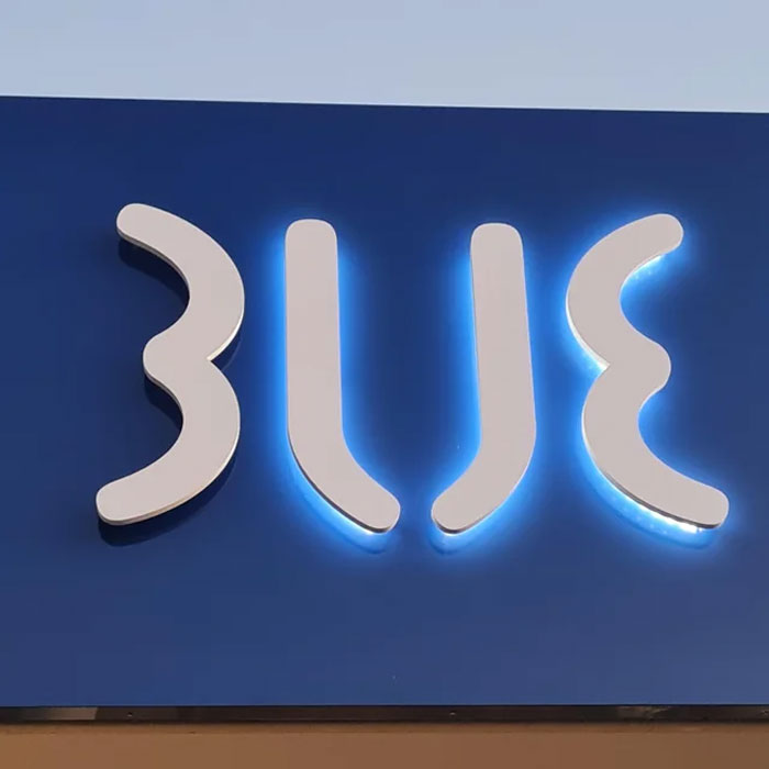
Load More Replies...3lje Or Blue?
This is one of those instances of trying to make a non palindrome into a palindrome. Just spell out "Blue" No one wants to stop at 3LJE
The Actual Logo Of A School Near Me
Someone just ran over her foot with an RC car... I mean it is a school for it.
Load More Replies...Check out the hands: "It's gonna be a great school, the GREATEST school, tremendous...I think we have the best numbers of all the schools, tremendous numbers"
She looks like she is saying, "Okay,that is enough excellence for now."
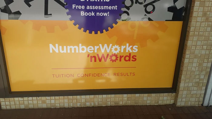
The Second Line Of This Logo Did Not Age Well
My brain didn't even go to anything racist until everyone started making a fuss about it. I know and you know that was not this places intentions.
Of course we know it's not their intention, but it still doesn't sound right if you separate that second part from the first. It's well known, in English, what the phrase "N word" refers to, so putting it on a separate line like that makes it hard to miss (if you say the whole name at once, it sounds fine of course.)
Load More Replies...I used to work for NumberWorks’nWords. It always annoyed me because it's short for 'and' so it really should have two apostrophes 'n' but it only has one, which is really bad given half of their thing is English tutoring. But they also have an ad that says something about getting your child on the right track, but it literally has the outline of a child standing on a track with a train coming up behind......
Maybe they were advertising to the people who don't like their children?
Load More Replies...To be fair, there are multiple n words that are inoffensive. Ninja, Noodle, Noun, Name....
It's probably missing because , and besides, . Wait! Is 'n a word? I think not.
in afrikaans in south africa, yes, it means "an".
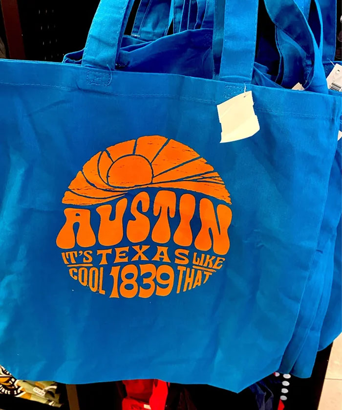
Load More Replies...Found At The Austin Airport - It's Texas Like!
Don’t worry. They probably stole this from Portland OR too. Remember when they stole keep Portland weird?
5 minutes on Google reveals the opposite to be true. 🧐
Load More Replies...Keep Portland Weird was unashamedly stolen from Austin in 2003 by Terry Currer, "the father of Portland's weird movement, according to The Oregonian newspaper.
I think I'm supposed to read this as "Austin Texas, it's cool like that." Terrible word placement tho
Chonoo Zendle Noodle Bar
My wife and I refer to this place *exclusively* as Chonoo Zendle. Never use the actual name, it's not even in a joking tone anymore
Is that the picture in lots of memes with what, I presume, is a screaming housewife and a cat at a table?
Load More Replies...There Is An Extra "R", Normal Name Is Chuck Burger
Chuck R. Burger sounds better anyway, like Harry S Truman or Samuel L. Jackson 😛
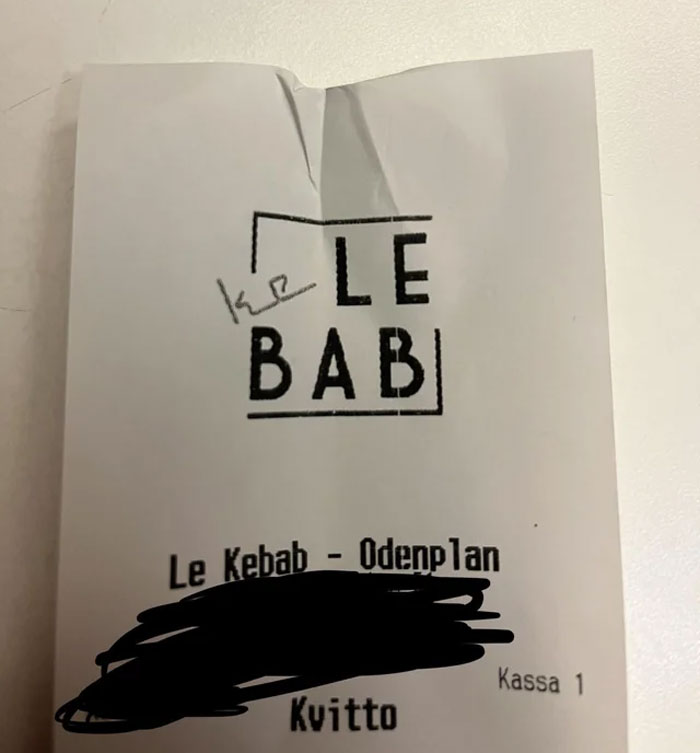
Ke Lebab. Restaurant In Stockholm
in every film set in Stockholm, one stop at the Odenplan is mandatory
Load More Replies...I was about to comment 'I read it le kebab lol' before realizing that no I'm right. I'm weirdly good at reading these on first glance, idk what's up. They just come easily to me
It was like they just had “Le Bab”, and told their 10 year old to fix it
They spell words left-to-right but read words right-to-left in Stockholm?
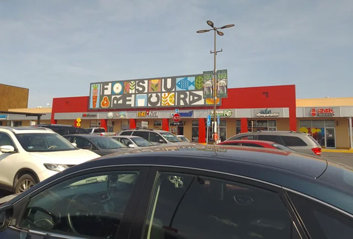
Saw This At My Local Heb. It's Supposed To Say "Frescura" (Freshness)
not.loading . . . human.exe. . . . not.loading . . . human.exe . . .
Load More Replies...Bro I loveeee HEB!!! Moved from Texas to Utah and that’s the one thing I truly miss besides the people. Bluebell and HEB brand food forever!!
I DETEST HEB! I couldn’t wait to get away from them! Moved to CO, and now I’m like DIE KING SOOPER DIE!!! and all I want is my crappy HEB back! This is my first and last winter in CO!
Load More Replies...HEB — it’s a chain of large grocery stores in Texas with faithful shoppers who believe no other grocery store compares. And for the most part — we’re right! They use a lot of Texas-made/grown products.
Load More Replies...I genuinely can't figure out what this is supposed to say. FSU Records? No bloody clue...
Ah, they edited the post's caption later on. It's supposed to say "Frescura". Still, trying way too hard to seem fun/funky.
Load More Replies..."Just throw the letters in the spaces between the pictures, it doesn't matter which way..."
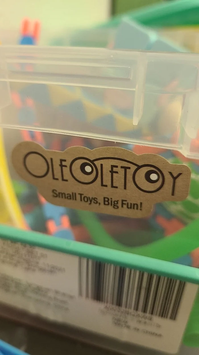
Ole Let Y, No Matter How I Read This I Will Always Have Questions
Oleo Le Toy? Ole Ole Toy? They look like sensory counting toys. No idea what their brand name is supposed to be...
Any sign that takes this long to decipher, and gives me a headache doing it, is just not working. 🥴🤪
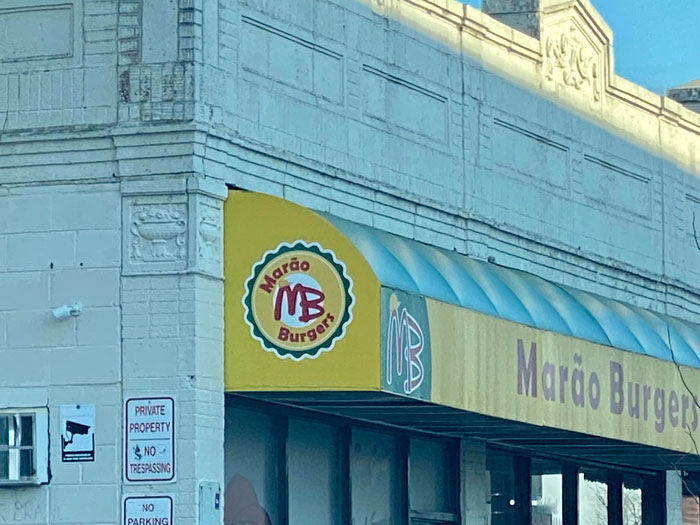
Such A Unique And Original Logo Design
HMMM..that B looks familiar! Where have I seen it before!? The M looks original but that B…HMMM…HMMmMmmMmMmm
I'll give it points for being completely legible though! I know what they're selling and what they're called. So really, they really kinda win this list.
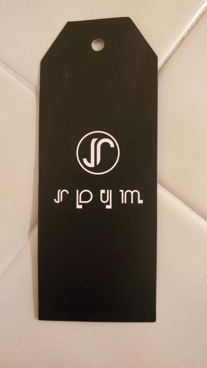
The Logo On My Jacket's Tag... How Am I Supposed To Read This?
Long press on the image. Search with Google Lens. Have it translate it. It writes upsidedown, "we in the dur."
This should be way higher up. This looks like some sort of alien code, not legible English.
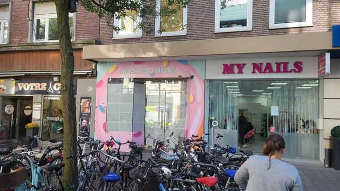
Magicd Nuts For Sale
Nah, that's totally legible. A 🍩 for an O is not bad. This one's just nitpicky. Pass.
I'll take a magic donut if it magically makes my life better. Well, if the cost is reasonable anyway!. 😁
Looks like a popular place judging by the number of bicycles out front.
"Magic Donuts", but the o is a pink donut that is barely visible against the pink background
Load More Replies...People attend art school to major in graphics, mainly to master concepts and technology. For four years they create logos and layouts, then rip each other to shreds for errors much much lesser than these.
My mom went to college for graphic design for 4 years. Nearly this whole list made me cringe horribly.
Load More Replies...I can't stop laughing at #15, that company is in the town I grew up in, I've seen that logo a million times and never realized how bad (good?) it really is! Then again this is the same place where one year the girls lacrosse team made and sold *female empowerment* t-shirts with the slogan, "We'll beat you on the field, and then we'll beat you off!" and not one coach/teacher realized until it was far too late. 100% true story. 🤣
These get re-ordered according to votes. Which one are you referring to?
Load More Replies...Have you seen the Torres Strait Islander flag? torres-str...-image.jpg 
My inner artist has been triggered by this post. I want to redesign a lot of these.
You should redesign them then create a list for bored panda :)
Load More Replies...The title is assuming professional designers created all of them. There are lots of business owners who think a pro designer is too expensive and unnecessary...
Oh, come on BP. 48 images shortened to 45 is just silliness.
TIL if you want to score big on the upvotes, just repeat what the title of the image is and/or make a crude sex reference.
either a doggo or not something good. i prefer seing the dog
Load More Replies...People attend art school to major in graphics, mainly to master concepts and technology. For four years they create logos and layouts, then rip each other to shreds for errors much much lesser than these.
My mom went to college for graphic design for 4 years. Nearly this whole list made me cringe horribly.
Load More Replies...I can't stop laughing at #15, that company is in the town I grew up in, I've seen that logo a million times and never realized how bad (good?) it really is! Then again this is the same place where one year the girls lacrosse team made and sold *female empowerment* t-shirts with the slogan, "We'll beat you on the field, and then we'll beat you off!" and not one coach/teacher realized until it was far too late. 100% true story. 🤣
These get re-ordered according to votes. Which one are you referring to?
Load More Replies...Have you seen the Torres Strait Islander flag? torres-str...-image.jpg 
My inner artist has been triggered by this post. I want to redesign a lot of these.
You should redesign them then create a list for bored panda :)
Load More Replies...The title is assuming professional designers created all of them. There are lots of business owners who think a pro designer is too expensive and unnecessary...
Oh, come on BP. 48 images shortened to 45 is just silliness.
TIL if you want to score big on the upvotes, just repeat what the title of the image is and/or make a crude sex reference.
either a doggo or not something good. i prefer seing the dog
Load More Replies...
 Dark Mode

 No fees, cancel anytime


