“Hostile Design”: This Twitter Account Is Sharing 35 Sad And Infuriating Examples Of Design Against Humanity
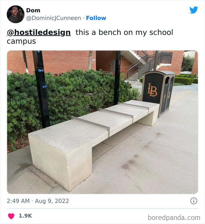
InterviewWhen you stroll around your favorite city, what do you notice about its architecture? Its famous landmarks? The beautiful greenery among the towering skyscrapers? Or perhaps the lively and inviting public spaces? These elements certainly grab our attention, but that's not all there is. See, bars on benches and spikes on window sills are also a part of the urban landscape, and it’s put in place to control how the environments are used.
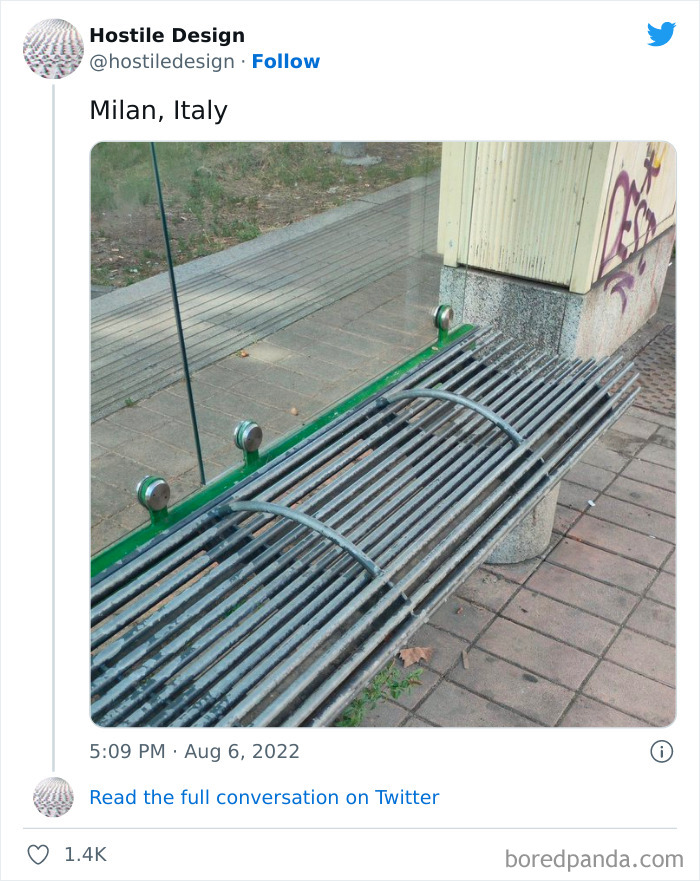
There are many things that influence how we feel in our surroundings that we almost never notice. But unfortunately, such aggressive measures are more common than you may think, according to the eye-opening Twitter account titled 'Hostile Design'. The creator of this page collects pictures that show the dire reality of how public spaces target the houseless and don’t actually do any good to the public.
If you’re unsure of what we mean, then take a look at the compilation of pictures we gathered from the account. Just to warn you though, it’s one of those things that once you learn about it, you start seeing it everywhere. Keep reading to also find in-depth interviews with the founder of this page and public space researcher Cara Chellew. Upvote the examples that stunned you most, and if you've ever detected cases of hostile design in your own city, be sure to let us know about them in the comments below.
Psst! More urban madness can be found in our earlier post right here.
This post may include affiliate links.
I understand homeless and homeless camps are undesirable and can be problematic, but a lack of compassion is not the answer.
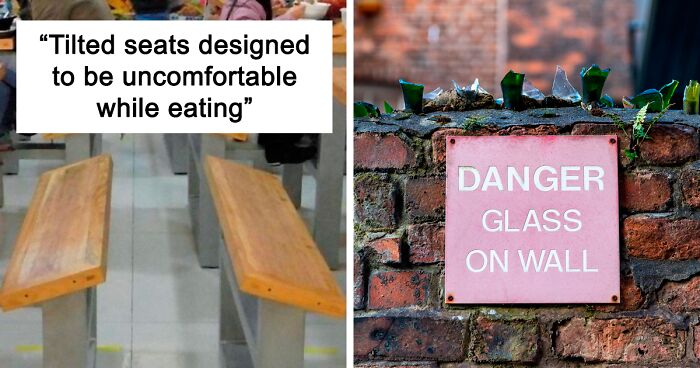
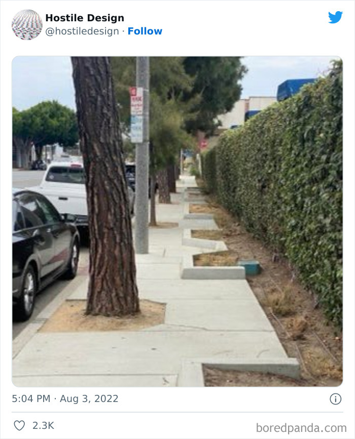
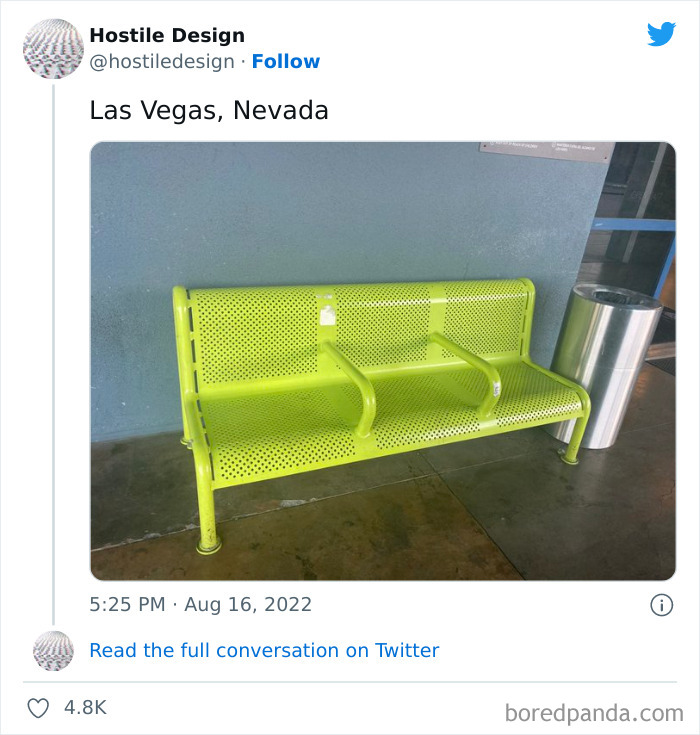
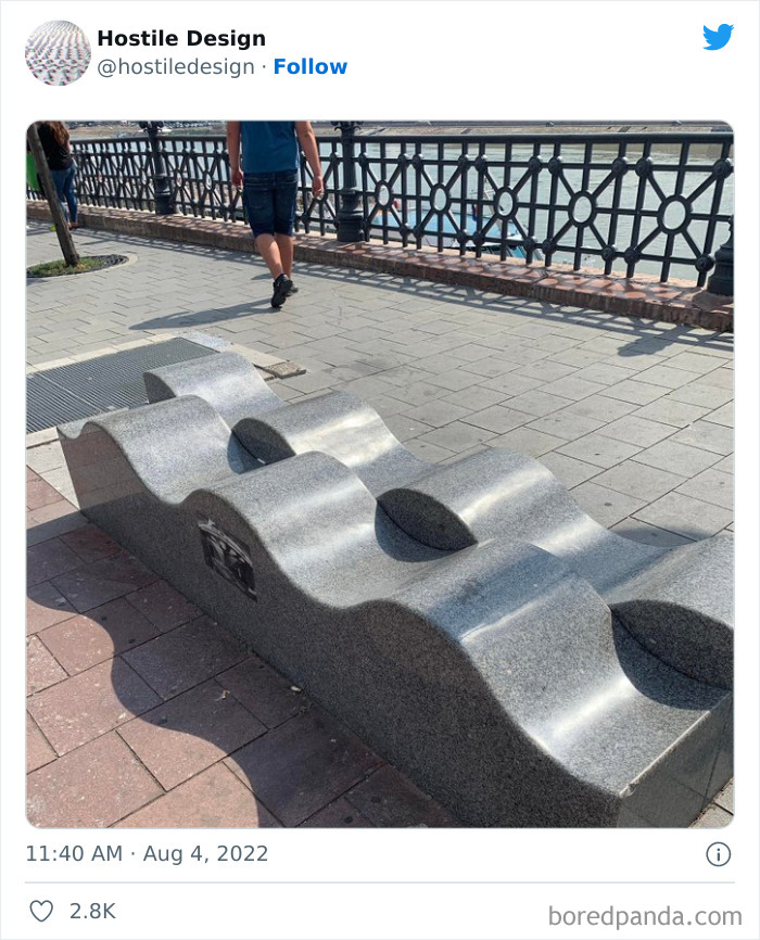
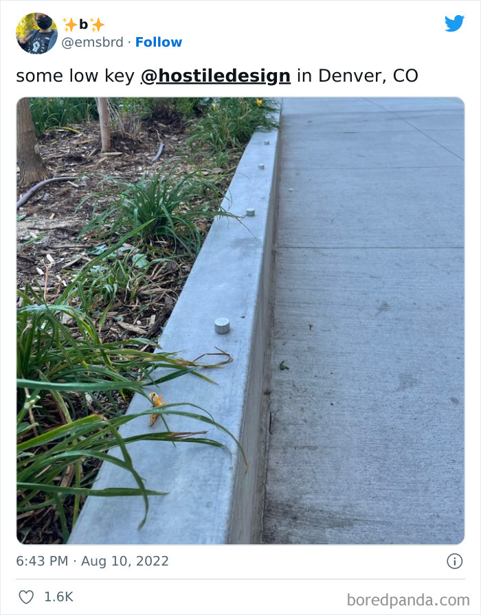
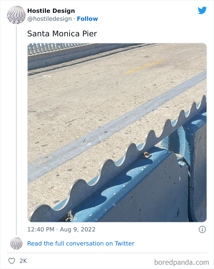
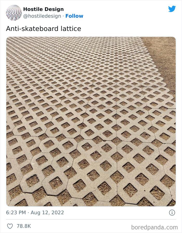
For some time now, the concept of hostile design (or defensive design) has been at the center of a complex and heated debate, as people and advocates who use these public spaces have started documenting examples they encountered. These design features are made to intentionally exclude, harm, or hinder the freedom of human beings. Whether they target loitering teens, skateboard enthusiasts, or houseless individuals, they’re designed to remove a certain part of the community from a public space.
To gain insight from an expert in the field, we reached out to Cara Chellew, a public space researcher, writer, and PhD student in Urban Planning, Policy & Design at McGill University. She is also the founder of the Defensive Urbanism Research Network, as well as defensiveTO, a site aimed to shed light on how defensive urban design influences how we interact with public spaces. When it comes to terminology, Chellew prefers to use the word "defensive" to describe this design and spatial management strategy "because it defends space against unwanted use."
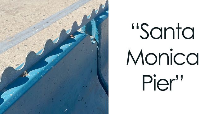
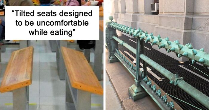
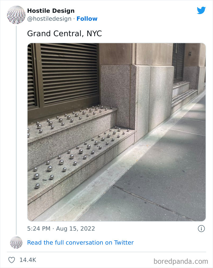
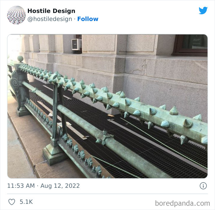
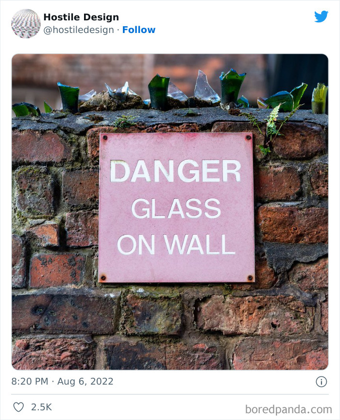
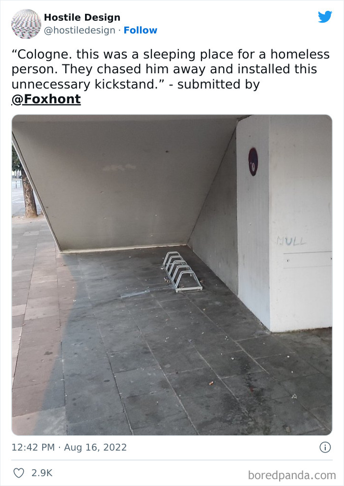
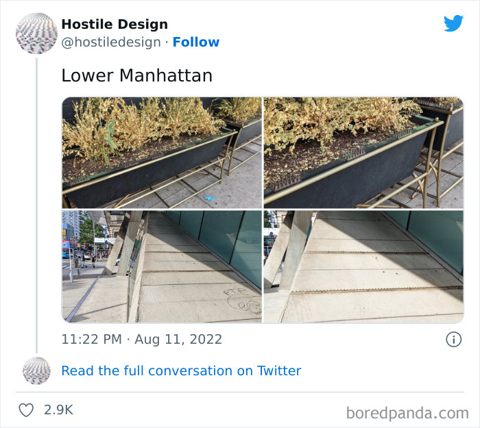
"This term includes objects like planter boxes that are installed in doorways to prevent people from seeking refuge but are not inherently hostile. Defensive urbanism can create hostile environments," she told Bored Panda. "Of course, some design is inherently hostile like spikes installed on ledges to keep people from sitting."
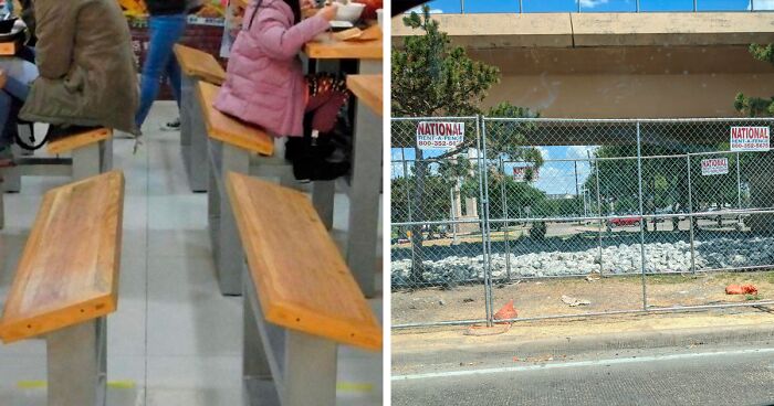
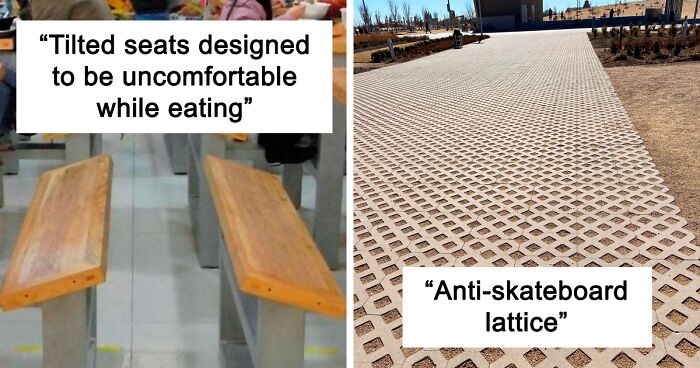
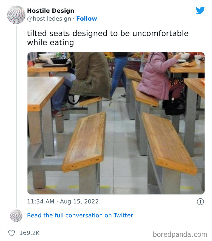
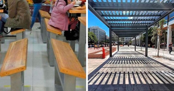
Uncomfortable people will not linger and talk with their friends. So, less tables are needed because they will be vacated quickly. Does anyone besides me notice that the short people, be they children or short adults, must prop their feet on the table framework in order to not slide off their uncomfortable seat?! What about people with knee or other leg problems? Did anyone consider them? Is this design a direct violation of the ADA? Shame on the designer, and shame on the people that allowed these table / bench combinations to be set up on their premise.
According to Chellew, defensive or hostile urbanism uses elements in the built environment to guide or restrict behaviors in urban space. "The behaviors targeted are those that are associated with people who use and rely on public space the most, like people who are unhoused and youth. Many of the behaviors targeted for people that are unhoused are essential for their survival — sleeping, going to the washrooms, finding food, panhandling, etc."
Chellew pointed out that these measures are what makes the practice especially cruel. "It does nothing to address the widespread problem of housing affordability and lack of free mental health and addiction supports. Defensive/hostile design attempts to displace people who need help rather than creating spaces that could support human wellbeing."
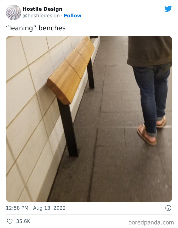
Isn’t that a railing, isn’t it’s intended purpose to be to have people lean and or hold onto it??!?!
We also managed to get in touch with the creator of 'Hostile Design', Kristi, who was kind enough to chat with us about the background of their social media project and its community. When asked what inspired them to launch the page in the first place, Kristi explained that people have been documenting Savehostile design for years. "I’m just highlighting what people find. I’m not an expert in any way, shape or form," they said.
Even though the account was created only last month, it has already gained a strong foothold on the platform. With over 89K followers, the page is the perfect outlet for people to contribute with their own examples and participate in meaningful discussions surrounding the matter. "The followers all seemed as annoyed about this behavior in public design as I am."
"It’s only been a few weeks [but] I probably have 200 message requests right now," Kristi explained how many submissions the followers send over. Although it may seem like a high number, the founder said it’s quite easy for them to manage the account. "Open a DM, save the photo, credit it to the user, post."
If they don’t want people sitting on it, then don’t even build it !
Hostile design seems to flourish in the big cities around the globe, as supporters say it’s sometimes necessary to put an end to unwanted behavior. But opponents, activists, and academics who spend time researching these measures call it an inhumane practice as it targets specific sections of the community, especially the houseless.
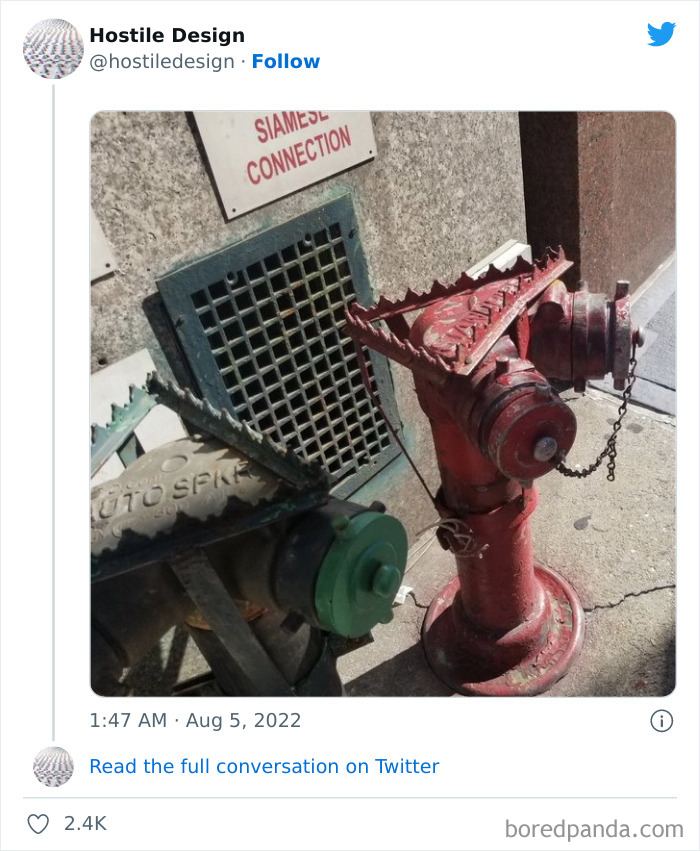
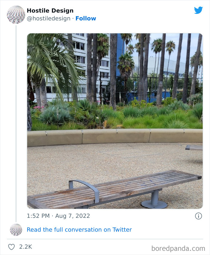
When asked Kristi to share their own opinion about this, they were completely against it. "You should remove as many bench handles as you can when you see them in public. If you see pointless instructions under a bridge or spikes on top of a fire hydrant, you should remove them if possible. Again, I’m not an expert on this stuff. There are academics doing research that are far better at explaining the history and flaws."
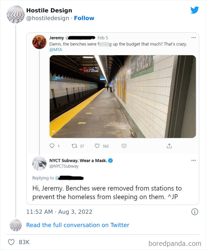
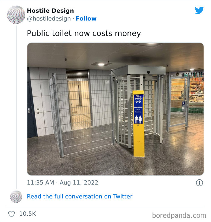
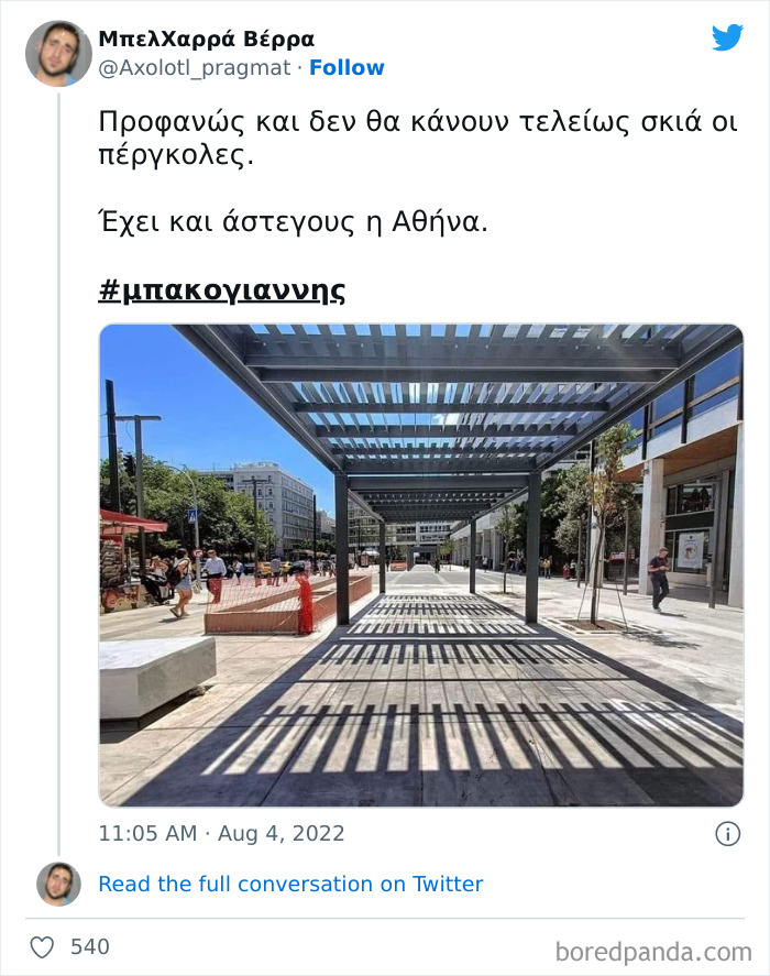
Speaking of the biggest faults of defensive design features, Chellew said they create public spaces that are hostile to us all. "For example, the most common form of defensive urbanism in North American cities is the absence or removal of public amenities that make public spaces comfortable for people to use — benches, public washrooms, places of shelter and shade."
"When these public amenities are removed or omitted for fear of misuse or 'loitering', it affects how everyone can use and access the space," she added. "It especially makes it difficult for people who are elderly, people with disabilities, people with chronic illness, families with young children, etc. to navigate the city and access public space."
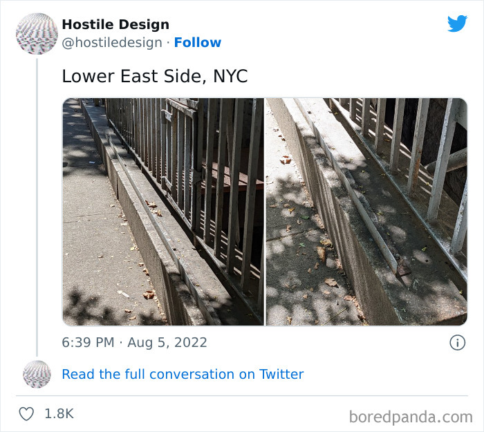
You see this in cities a lot to keep people out of private yards. Often in older parts of the city. Looks better than barbed wire, for sure. In New Orleans, it deters the drunk tourists from using your yard as a toilet.
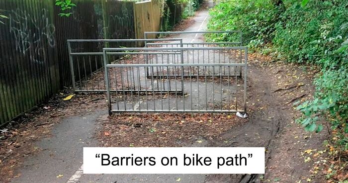
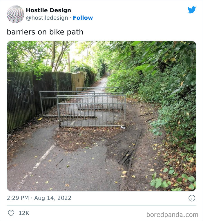
This looks like it is in the UK and the barriers are across a public footpath. Public footpaths, as their name suggests, are for pedestrians only, cycling is not permitted along them. Cyclists can use bridleways, cycle paths, byways and roads.
The divider line down the middle seems to indicate a bike path...
Load More Replies...To keep motorized vehicles off the trail. It is essential for safety.
Not very effective ones, cyclists appear to just be going around them. Worse for prams and wheelchairs
It would hopefully still slow down the cyclists (hopefully), which is what it is meant to do, it would be wide enough for a pram or wheelchair to access.
Load More Replies...I feel like this doesn’t belong here. These exist where I leave to prevent quads and cars and other motorized vehicles from using the paths and putting pedestrians and cyclists in danger. If only they worked on motorcycles.
It also makes it difficult for people with mobility aids to navigate. Those hairpin turns aren't exactly wheelchair- or crutches-friendly.
Load More Replies...These are common in the UK, and meant to stop people going too fast on paths that have a lot of people. But I also love how the cyclists just went around.
His looks like a footpath or shared walkway/bikepath, it's to make them slow down, for pedestrian safety.
As you can see people are going around it on the right. Next they'll put a bunch of big a$$ rocks there.
First what is the point of the bike path then and second i love how you can see the tracks of people who just went around it
Barriers on a bike path? That's nuts. Just to show how stupid that idea was, the cyclists made their own path around it. Oh, and as shown in the image, fencing does collect leaves.
My car could fit on this path. I could probably even make it around these.
It's a real pain for cyclists but also a challenge - not to get off, manoeuvre through or around !!
the fact it's open at the side is stupid. but these are generally because it's about to go onto a busy road, and they are meant to force cyclists to slow down of stop, so they dont go straight out onto the road. so i'm not as bothered by these than some of the others. (also this picture is definitely in the UK, where i live, i've seen lots of these)
Totally required on this shared path to protect pedestrians from A) Cyclists going too fast B) Scumbags on motorcycles who should not be using the path.
I disagree with this one. It looks like the UK and there is a line down the path which suggests it is a shared footpath/cycleway and it is on a hill. The barriers are to stop cyclists going too fast and knocking down pedestrians. Or also pushchairs/buggies rolling into roads.
I think these are intended to keep cars off the path, but they put them much too close together.
That's so useless and unnecessary. And I bet it cost an unreasonable amount of money.
This I can appreciate. The pedestrians also need a safe place to walk through a park or something like that without having cyclists racing by left and right ;)
This is a shared pathway, cyclists have the right to ride in a safe area too. This design is hostile to them and also impossible to cross for a family with cargo bike or trailer. This won't "prevent" anything, it's just discrimination and narrow minded design.
Load More Replies...Are you sure it's a bike path? Looks more like a walking/jogging path and they're trying to prevent bikes.
All this will do is gradually wreck the greenery off to the side as walkers and cyclists go around it.
Well that makes no sense. There's a back-story we don't know about here. Maybe the bike path ends abruptly around a bend? Flood washed it away?
There is no backstory, these are common in the UK. These are to make bikes slow down
Load More Replies...Is that designed to stop people with pushchairs? God, yes, ban the baby-carriage pushing slackers! How dumb are town councils?
Pushchairs fit fine. The gap between the gates is plenty big enough
Load More Replies...They do that on some trails so that horseback riders can't use the trail. Shame. But as you can see, Theres a work around hehe
While there seems to be a number of reasons these public spaces get designed in a way that doesn’t actually serve the public, Kristi said the main goal is to keep out "the undesirables". "This doesn’t just include the houseless but also the working class that might need to loiter for a bit waiting on public transportation or resting between shifts. It’s a way to keep people always on the move instead of having public spaces that are inviting and welcoming. And a city that keeps its houseless away is a city that can pretend it doesn’t have any."
First time a firemen gets cut on one of these bet there will be hell to pay.
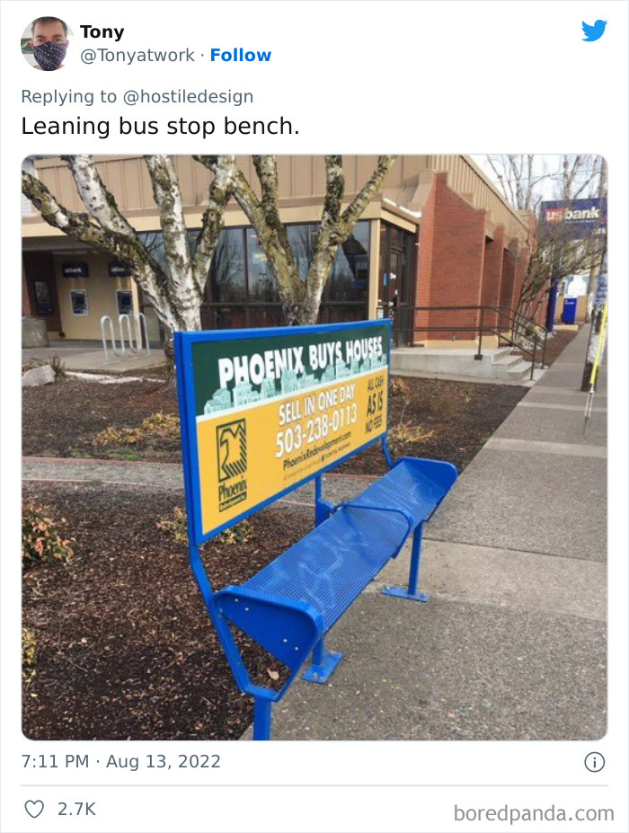
OMG! That's the exact bench that I was about to post! It's the one on 39th Ave. In my hometown of Portland OR.
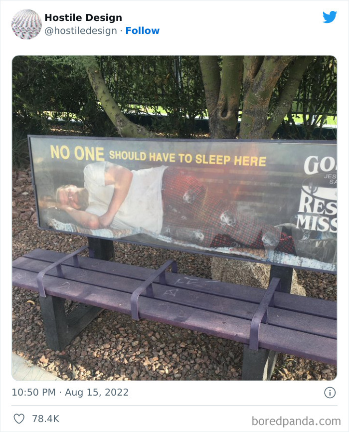
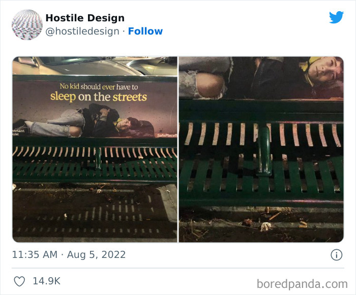
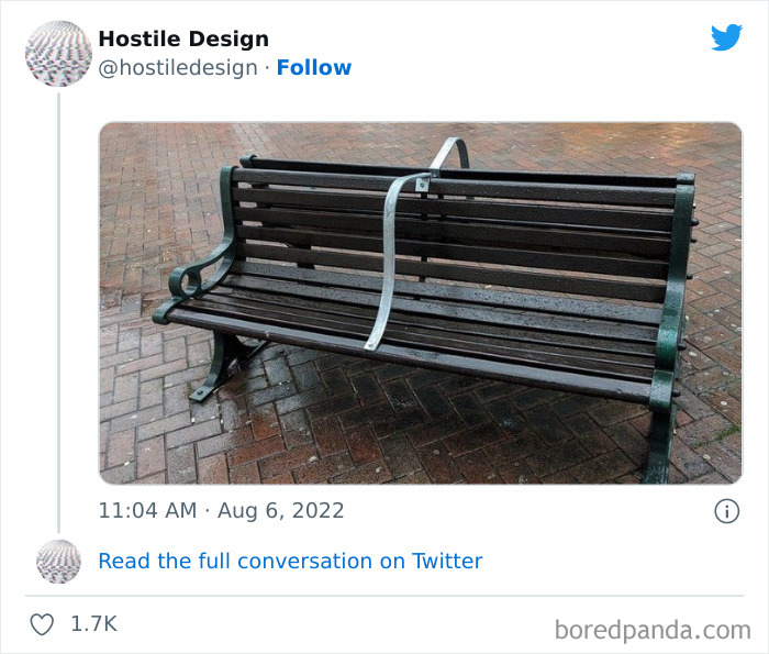
The recurring examples of hostile design are not to say designers and architects themselves are encouraging it — that’s rarely the case. As Chellew told us, it happens because cities and private developers are looking for quick-fix solutions. "If there are complaints that people are sleeping on benches it is easier to put center bars on benches rather than looking at why people have to sleep on benches in the first place."
If we want to see change and create public spaces that would feel inviting to all, "we must also address the lack of affordable housing and lack of free mental health and addiction supports," she explained. "It is all interconnected."
Chellew said the use of defensive design to govern public spaces is a political and ethical decision. "Policy must be changed at the municipal or even provincial or state level to prohibit design and management approaches that are meant to make spaces less accessible and more uncomfortable."
"People can engage with their local political representatives through requesting meetings or creating petitions. In addition, professionals like planners, designers, and architects must take a stand against the practice as unethical as it does not promote the public good," she concluded.
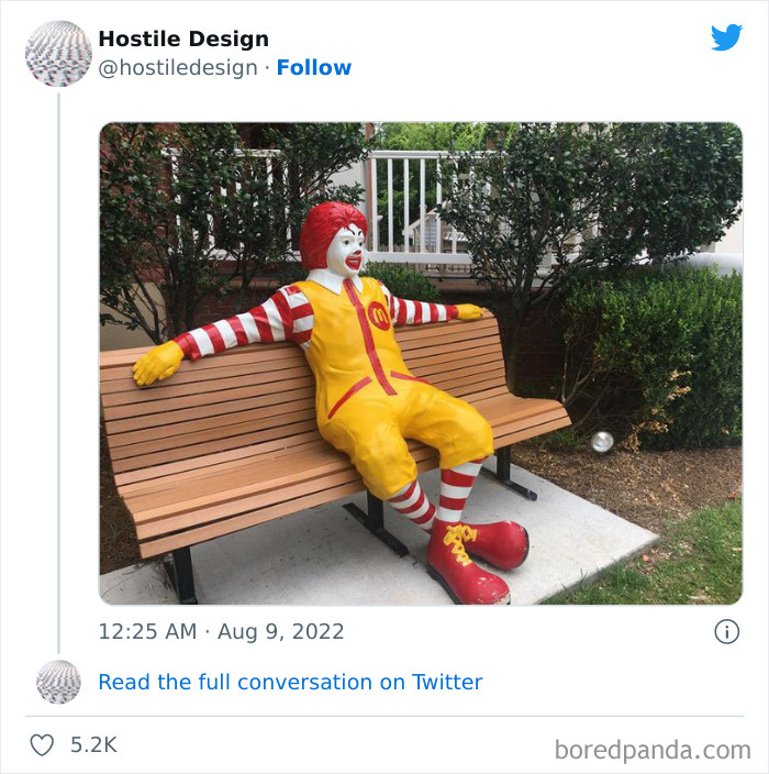
Which is more hostile here, the clown or the multi-national corporation?
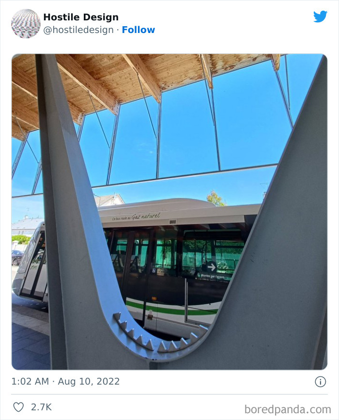
Come on. These are clearly to help get up from a particularly low bench. Benches that low can be a serious problem for the elderly or other people with mobility issues. This page is getting more ridiculous the farther you scroll down...
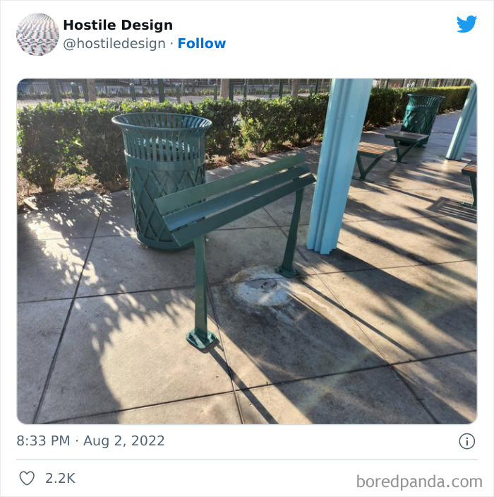
I'm not seeing the hostility here. You sit in the bottom of a curve and it deters a stranger from sitting right next to you. If someone does sit next to you on the top of a curve, then you know to get the helloutta there.
My guess on this is that sitting on a semi-temporary barrier along a roadside is not very safe.
Let's see. Rain drains better, less muddy to walk on and not slippery. Oh, and skateboarders won't take up the space. And since we can't see what's around this space, who knows what the purpose is here.
My guess is that many of you don't have to deal with homeless people on a regular basis. I'm a commercial property manager and have to deal with many issues directly caused by homeless people. My responsibilities are to the property owners and rent-paying tenants. I have had too many instances of break-ins, defecation on the sidewalks/landscape, broken water lines/backflows, threatening behaviors, discarded drug paraphernalia, setting fires, and vandalism. A majority refuse social services or interventions when offered to them. I would like to say that there is a clear answer to address the homeless situation. But there isn't. And unfortunately, I have to deal with what's in front of me - not what I wish things could be.
Yeah, I used to work in a small store, the office and safe was one floor up from the store via a stairway that we shared with one private flat, but the stairway had a door to the main street, as well. The door to the main street closed automatically. We had to carry the register-drawer from the shop to the office and back in the morning and evening (both doors had to be opened with a key) and guess what? Some homeless people broke the closing mechanism on the door to the main street and slept next to the stairs. So one morning I found myself alone with 3 sleeping strangers, in a position where I'd have had to carry several hundred Euros past them. You can bet your a** I called the police to make them go away, I've rarely ever felt so unsafe in my life! And I'm all for helping people to get out of those circumstances, but not when they do sh*t like that!
Load More Replies...I understand the point of these photos of benches, but often I see elderly people using the bars to help them up, it helped when I was pregnant or had the baby in the carrier, and too many times they've prevented people from sitting too close to my kid or me, there is a practical side to it.
Maybe they could make the bars retractable somehow? Able to lock up or down. That would be great accessible design I think
Load More Replies...Do people on here realise that sometimes benches toilets etc cost money to keep being replaced!? How about blaming people in power for doing nothing to help the homeless situations !
you mean the elected officials who run councils. what has money got to do with making them in accessible. most this would be cheaper without making them unfriendly to people with disabilities or the homeless.
Load More Replies...It makes me so angry to see designs that are obviously a deliberate attack on the homeless (and as a side effect, are hostile to the elderly or disabled). Councils have a civic duty to help their residents (even the ones who don't pay taxes or rates) and the homeless need compassion and assistance. I realise it can be confronting and uncomfortable to work with them but they doesn't make it an excuse to do nothing. And imagine if doctors and nurses said they didn't like dealing with difficult people, or with unpleasant bodily fluids...
Homeless people don't pay property taxes and can't vote for you (need an address to vote in that precinct). If you want to stay in power, screw over the least fortunate in favor of those who will contribute to your re-election.
Load More Replies...Idk but maybe, just maybe a solution to homelessness is possibly providing some type of housing. I know, sounds crazy.
While we do not know the perfect answer there are other countries that are finding better solutions than putting spikes and bumps in places.
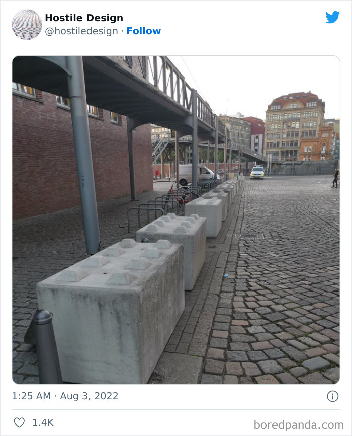
Load More Replies...As the list went on some of these either concerned private property or had designs that didn't feel like they were intentionally hostile. Also quite a few that had legitimate design additions that happened to also be bad for the homeless(the giant cement Lego blocks are a good example)
Maybe those people who are upset about the devices on benches to prevent the homeless from sleeping on them should invite those homeless people to come live with them. That would be a good way to demonstrate your compassion.
Or substancially support homeless shelters, other initiatives that help homeless people, or initiatives that help people on the brink of homelessness avoid becoming homeless. Inviting a stranger into your home is something a lot of people are not comfortable with, and I think that's fine, but I do think all of us have a responsibility to help solve the homelessness problem. If the politicians aren't fixing this problem we can't just sit back and wait until they do, we should take actions ourselves as members of our society, and help vulnerable people out.
Load More Replies...I'm not sure all of these are deliberately hostile or that we're getting the whole story.
Maybe you all are talking about the nice homeless man or woman with some bags, but When you’re dealing with a bunch of drunk homeless everyday.... Thanks for removing the benches 🤝🏽
The point of the comments is: do something positive to help the homeless, don't just make life difficult for them. If they are drunk they have an addiction problem and that's a health problem.
Load More Replies...If they put half as much effort into helping the homeless as they do in thinking up ways so they cant sleep, there would be no problem
This is beyond disgusting. We, as a society, should be ashamed of ourselves. Besides the homeless people we are treating like trash, what about people with mobility problems? Or eyesight problems? or that just need a rest? My dad is a bit large, and has bad knees. My mom has a depth problem, and they are both starting to feel the effects in their body from old age. I'm now terrified of them doing any of the traveling they dream of - all of this could hurt them.
Why on earth did someone downvote Lea S? What's wrong with her comment? I have upvoted her and I hope other people do as well.
Load More Replies...They mostly hate homeless people. If you’re not one you’ll be fine
Load More Replies...Multiple surveys in San Francisco have shown that the worst of the worst do not want to stay in any kind of shelter. Shelters have rules. They would rather sleep, pee, and oops on the streets. Crews have gone out in inclement weather to try and coax some of them inside but they won't go. We need to bring back the State Hospitals of yore. Where people who cannot or will not take care of themselves can be placed. For the benefit of the patient and society as a whole.
I had a university professor once who had a theory that people, as a kind of emotional protection, have to believe that people less fortunate than themselves deserve it. We have to believe that they made bad choices, or were lazy, or they're weak, or immoral, that it's drugs, etc. etc. etc., because if we don't, then we have to admit that anyone could be homeless (or end up in other bad circumstances) and that would mean it could happen to us. He said this attitude of characterizing people with troubles as somehow deserving it, or having done something to cause it, is a kind of denial that it could easily be US in that situation, and through no direct fault of our own.
Some of these look like lawsuits waiting to happen. Not just hostile design but dangerous to the general public who happen to be walking by and might fall against them.
I know there is little compassion from the government (and many fellow humans) for the homeless…. But I also feel like a lot of these were done to keep skateboarding at bay?
Yeah, these designs are just nasty, but face it, if people see an opportunity to do something, they’ll use it. Then misuse it. Then overuse it. Then just flat out abuse it. They once tried to bring in the homeless and get them help., here in NYC. One homeless woman promptly got a lawyer and sued, because she said being homeless was her choice and the authorities couldn’t stop her. She won, so that was the end of that attempt. Face it, humans are their own worst enemies.
"Because homeless people want to be homeless, they'll choose the bench every time"

 Dark Mode
  No fees, cancel anytime


