“Hostile Design”: This Twitter Account Is Sharing 35 Sad And Infuriating Examples Of Design Against Humanity
InterviewWhen you stroll around your favorite city, what do you notice about its architecture? Its famous landmarks? The beautiful greenery among the towering skyscrapers? Or perhaps the lively and inviting public spaces? These elements certainly grab our attention, but that's not all there is. See, bars on benches and spikes on window sills are also a part of the urban landscape, and it’s put in place to control how the environments are used.
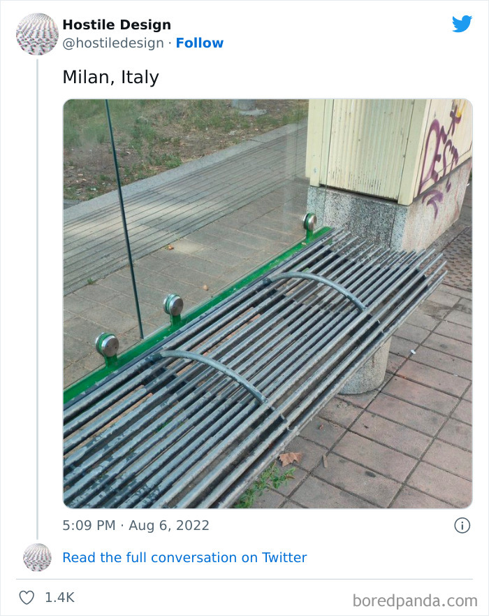
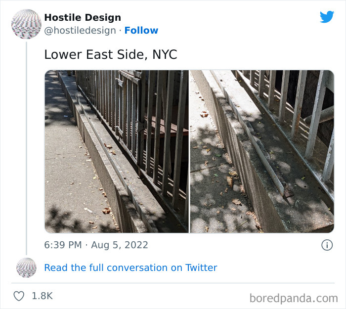
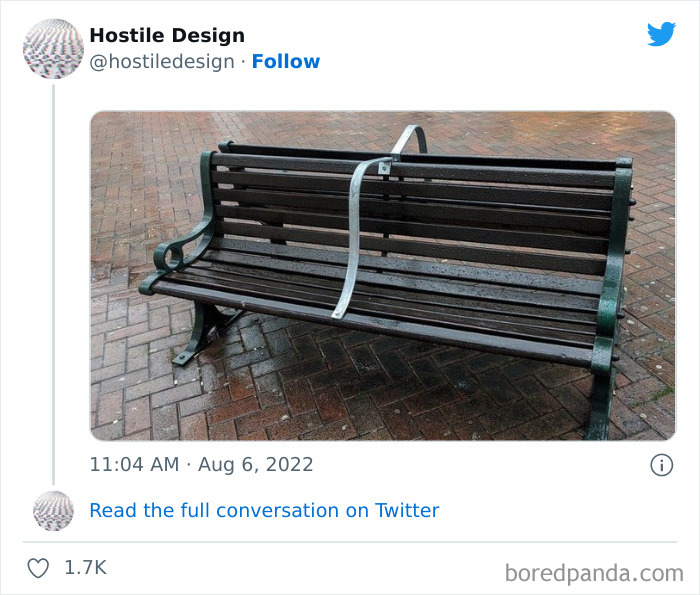
There are many things that influence how we feel in our surroundings that we almost never notice. But unfortunately, such aggressive measures are more common than you may think, according to the eye-opening Twitter account titled 'Hostile Design'. The creator of this page collects pictures that show the dire reality of how public spaces target the houseless and don’t actually do any good to the public.
If you’re unsure of what we mean, then take a look at the compilation of pictures we gathered from the account. Just to warn you though, it’s one of those things that once you learn about it, you start seeing it everywhere. Keep reading to also find in-depth interviews with the founder of this page and public space researcher Cara Chellew. Upvote the examples that stunned you most, and if you've ever detected cases of hostile design in your own city, be sure to let us know about them in the comments below.
Psst! More urban madness can be found in our earlier post right here.
This post may include affiliate links.
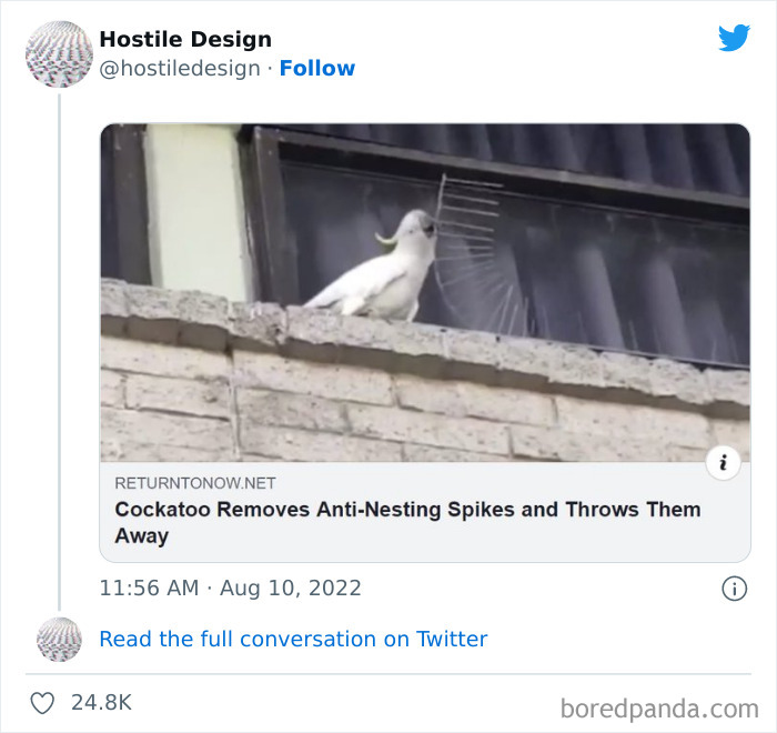
I’ve lived with an Umbrella cockatoo for 35 years and I have never been prouder of his species. Good on him!
This is actually a great design. These spikes divert a bird to a new location rather than using poisons that can disorient or kill birds.
People who are against those spikes never had to clean pigeon s**t from their balcony
Or listen to baby cockatoos that start screeching for food before sunup and continuously throughout the day..
Load More Replies...Honestly if you lived there you would not want birds living there & s******g & spreading disease. Birds are really dirty especially in large numbers. I or two would be ok but it’s never that way- it’s hundreds. Buildings have to cleaned all the time
I understand homeless and homeless camps are undesirable and can be problematic, but a lack of compassion is not the answer.
Homeless people aren't undesirable. They're people just like the rest of us
Load More Replies...Homelessness is undesirable, and there is a solution: give the homeless accomodation. It reduces crime, unpaid medical bills, policing costs, waste management costs, and makes the area safer and more pleasant for everyone.
I agree. I wish governments would stop arguing about it and just be like us.
Load More Replies...This priest, FatherJulio Lancellotti, from São Paulo, Brazil, is one of the most amazing living creature on this planet. At the time of the picture he was over 85 yo.! Everyday he does actions to help the poor and the homeless. I'm an atheistic, but I have their man as an example of empathy, love, caring and strength! Check him out at Instagram: https://instagram.com/padrejulio.lancellotti?iqshid=YmMyMTA2M2Y=@padrejulio.lancellotti
Having spent a few years homeless, this kind of stuff really makes me red in the face. If another polar vortex hits, unless they are *wildly* prepared for it, or another heat wave with little to no shade, exposure will devastate the unprepared. Hint: it isn't those with homes usually.
It's sad to see. But what I'm going to tell you is the truth. Few months ago had to to the airport to receive my sis. The homeless sleep under the the bridge and there is a road under the bridge that connect to where I stay. I was driving on my way back and was extra careful. But surprise, half the road was covered by the homeless sleeping under the bridge. I could have accidentally ran over someone. I would have been charged for reckless driving and arrested on the spot. What I mean to say is there should be a designated area in every city and town where the poor homeless can sleep sagely.
This priest, FatherJulio Lancellotti, from São Paulo, Brazil, is one of the most amazing living creature on this planet. At the time of the picture he was over 85 y.o.! Everyday he does actions to help the pure and the homeless. I'm an atheistic, but I have their man as an example of empathy, love, caring and strength! Check him out at Instagram: https://instagram.com/padrejulio.lancellotti?igshid=YmMyMTA2M2Y= @padrejulio.lancellotti
Then. Provide. Housing. Rehabilitation and jobs too. It is the hallmark of a truly evolved civilization that they take care of their members who have fallen on hard times and/or can’t take care of themselves. We are obviously NOT an evolved civilization yet, because there are too many knuckledraggers with power and money, who keep f*****g up all the best efforts of the rest of us.
Well, then, help them out instead of punishing them. You may find yourself there one day. I did.
It's extremely heartbreaking how horribly some people are treated. These are human beings FFS! There's no excuse for anyone to go without a home or food on this planet. Yet every single one of us will be denied the things that were put here for us all to exist if we don't have enough money or any money at all. It's insane and inhumane and wrong. When we were all born into a world that has everything we need given to us somehow someway. Be it God or whomever created it, it was handed/given to us so all humans and animals can exist and thrive. So there is no reason or excuse to deny any of us those vital resources that are meant for us to use/consume in the 1st place.
Our species can afford to feed and house all of us. ALL OF US, read it again. The ones in power - the ones who personally own the most resources and are categorically far better off than the vast majority of even average citizens - are the ones who decide how comfortable we make our homeless people.
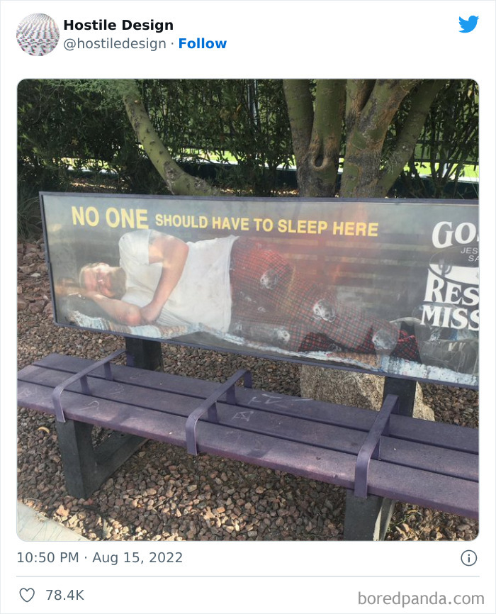
Load More Replies...I *think* it's an ad for a Rescue Mission (see right side, writing in white). That seems a lot more compassionate.
Did anyone else notice the advertisement for GOD on that bench! No hate like Christian love!!
It’s advertising the mission exactly bc you can’t sleep on that bench and no one should have to. It’s offering support not hate.
Load More Replies...This is terrible, but it reminds me of airport seating too. Once you get to the boarding gate, you've spent hundreds of dollars to be there, and they still make it impossible to lie down. "Against humanity" is more or less what humanity is.
Some airports like Singapore have seats like this at the entry areas but long benches suitable for sleep in the terminals, so if you get stuck there overnight waiting for a cancelled or delayed flight, you can get some rest. Other airports like this in USA or Australia have these hostile seats everywhere so you can only sleep on the floor if you have a long wait.
Load More Replies...If I were tired enough I'd make it work. Just need enough material to use in between the spaces.
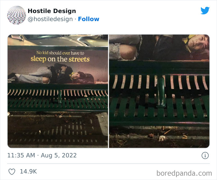
Just want to point out that the sign is from a rescue mission telling people denied the bench where they can find a bed. I think the placement there is partly to point out that it's not the answer to just block the bench. They are offering an alternative.
For some time now, the concept of hostile design (or defensive design) has been at the center of a complex and heated debate, as people and advocates who use these public spaces have started documenting examples they encountered. These design features are made to intentionally exclude, harm, or hinder the freedom of human beings. Whether they target loitering teens, skateboard enthusiasts, or houseless individuals, they’re designed to remove a certain part of the community from a public space.
To gain insight from an expert in the field, we reached out to Cara Chellew, a public space researcher, writer, and PhD student in Urban Planning, Policy & Design at McGill University. She is also the founder of the Defensive Urbanism Research Network, as well as defensiveTO, a site aimed to shed light on how defensive urban design influences how we interact with public spaces. When it comes to terminology, Chellew prefers to use the word "defensive" to describe this design and spatial management strategy "because it defends space against unwanted use."
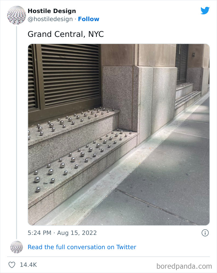
"This term includes objects like planter boxes that are installed in doorways to prevent people from seeking refuge but are not inherently hostile. Defensive urbanism can create hostile environments," she told Bored Panda. "Of course, some design is inherently hostile like spikes installed on ledges to keep people from sitting."
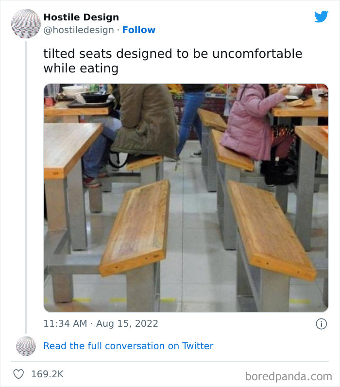
Uncomfortable people will not linger and talk with their friends. So, less tables are needed because they will be vacated quickly. Does anyone besides me notice that the short people, be they children or short adults, must prop their feet on the table framework in order to not slide off their uncomfortable seat?! What about people with knee or other leg problems? Did anyone consider them? Is this design a direct violation of the ADA? Shame on the designer, and shame on the people that allowed these table / bench combinations to be set up on their premise.
Huge shame on the designer - as a designer, I’d honestly refuse a project like this (as well as anti-homeless architectural designs.) just because it was cool to be mean to people 40 years ago doesn’t mean it’s cool now.
Load More Replies...Ummm... I don't think they thought this one through. If I'm choosing between various places I could eat out, 'the place with the deliberately uncomfortable benches' ranks only a little higher than 'that Wendy's location out by the shopping center that always smells kind of like vomit.'
I think it is a homeless shelter that feeds people. They don't want people sleeping in the benches or having seconds.
Load More Replies...Where is this? I would never get food there specifically for this reason. Not even take-out or delivery.
I simply wouldn't go here for food - seems odd as they'll lose business as a result! I have a chronic pain condition, sitting on these would cause me immense pain that could last days, not worth it
HK food courts because of the lack of space. They want you to be away asap. I went there and sat on those, and I hated every second of it.
Those seats are ergonomically designed to be MORE comfortable. Keeps the pressure off the spine and encourages proper posture. image-6302...58-png.jpg 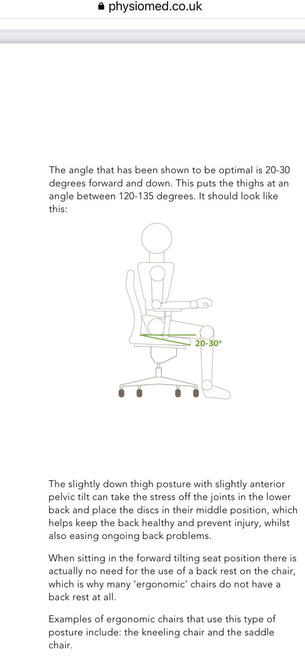
They take everything away from a human and tell them “just go to the shelter” without realizing that there isn’t nearly enough room in the defunded shelters and it’s not a safe space for everyone. Then they get mad at us for costing a small money to buy shelter mattresses that don’t have bedbugs baked into them (“wait why do these people need new clean mattresses?” Me:”because they’re just people like the rest of us?”) but we need billions for weapons and the defence budget. (To defend the worlds biggest joke?) How is this not a dystopia yet? When can we revolt cause I’m ready with my pitchfork?
Load More Replies...Ok but what about pregnant people, disabled people, elderly people, crippled people..
seems they didn't think that far ahead. Shameful.
Load More Replies..."well, yes, they do and they also don't allow people that need to sit down for a while, sit down." (pregnant, elderly, disabled, etc.)
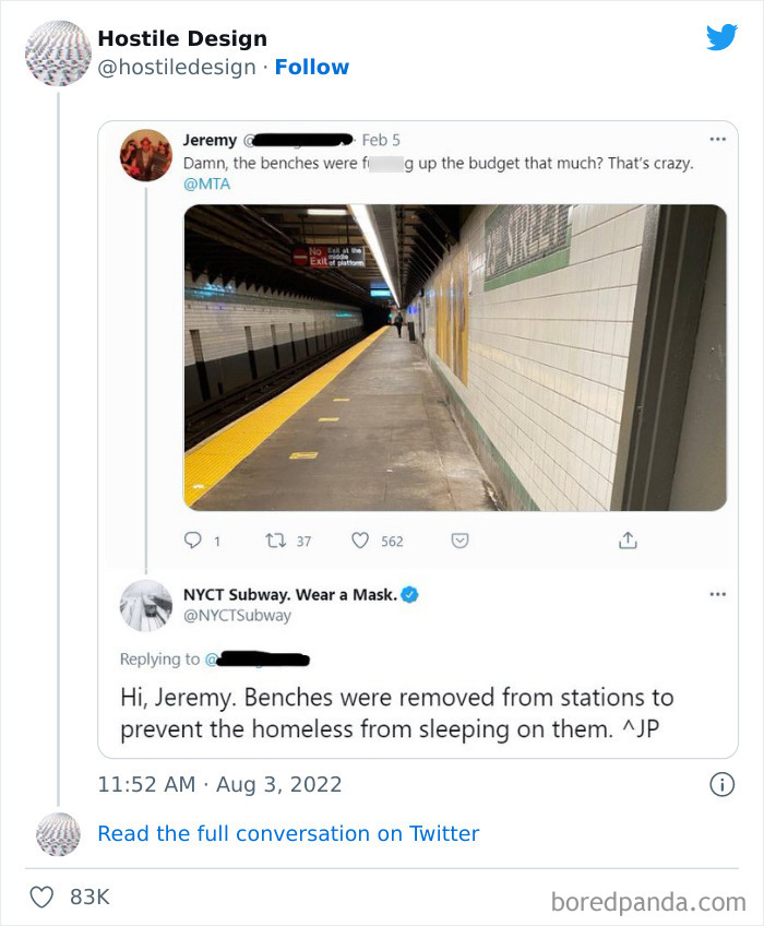
If they think removing benches will prevent homeless people from sleeping down there, then these people are dumb as rocks. Desperate people will sleep ANYWHERE. That includes on bare naked cement. All they've done is create an added hardship for the elderly and disabled. Great job 👏 👏👏😡😡😡
This is a narrow platform, not sure its suitable for seat anyway, but the whole idea of removing them to combat use by the homeless is utterly counter-productive -- those same homeless people would have just got on a train and slept on the seats there instead -- much warmer and often safer than a station anyway, but now the elderly traveller has nowhere to rest while waiting.
I was wondering if anyone would comment about that! Yes, I'd like a word.
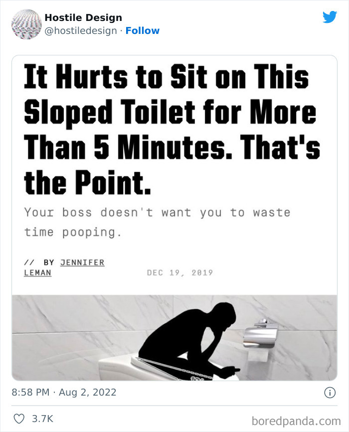
Load More Replies...The boss makes a dollar while I make a dime. That's why I poop on company time.
Ive sat in worse positions than that in an emergency. You ever try pooping in the desert with no toilet paper?
That's also the anti-squatty-potty position, people might take longer to empty their bowels and end up with a messed up back. Great idea. Fire the middle management genius who implemented that instead, saves more money.
Lol, just lay cable proud and walk back in the office like nothing.
Load More Replies...I think this is the one time that having and incredibly well padded a**e would be of benefit 🤣
According to Chellew, defensive or hostile urbanism uses elements in the built environment to guide or restrict behaviors in urban space. "The behaviors targeted are those that are associated with people who use and rely on public space the most, like people who are unhoused and youth. Many of the behaviors targeted for people that are unhoused are essential for their survival — sleeping, going to the washrooms, finding food, panhandling, etc."
Chellew pointed out that these measures are what makes the practice especially cruel. "It does nothing to address the widespread problem of housing affordability and lack of free mental health and addiction supports. Defensive/hostile design attempts to displace people who need help rather than creating spaces that could support human wellbeing."
I can, but you'll hear a *pop* when I stand up
Load More Replies...The US, supposedly Land of the Free, supposedly the most developed country in the world... Homeless people everywhere and the best the various state governments can do is remove abortion rights and make sure everyone can buy an assault rifle... Bizarre.
The city should take responsibility and do something about the problem.
I don’t know where this picture is set but cities can only do so much. It’s the federal system that has to take responsibility to ensure no members of the community are left behind. People don’t deserve to exist in a living hell because they’ve been dealt unfortunate cards.
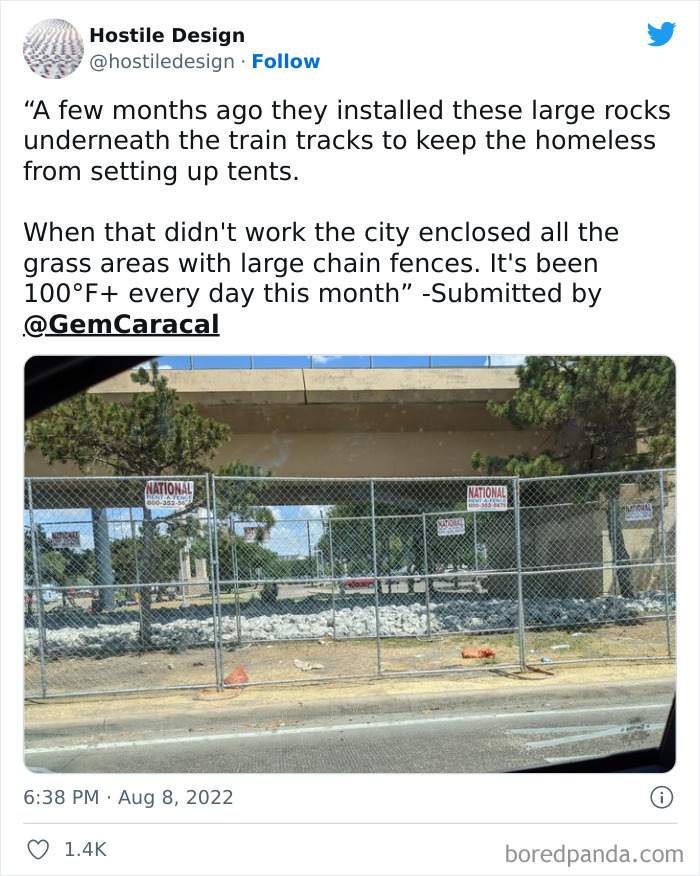
Load More Replies...Yeh, because having massive, ugly fences around all of the green areas looks like a lovely and tranquil city I would like to visit What's worse, seeing a homeless person sleeping or these horrible things. Help people, this method is just stupid
They put so much money into preventing something, they could just as well put that money to use to help the homeless.
Lol. Like here in TN. It's illegal to camp in public places if your homeless. America.... 😑
So if I own a home I can set up a tent in Nashville?
Load More Replies...Here's an idea, stop electing stupid politicians that send all our money oversees while doing nothing for our own citizens! Send the illegals packing, build the dang wall and the money saved from what gets spent on illegals would house all the homeless people in the country.
In Oakland, thehomeless are starting BIG fires weekly under the BART and freeway overpasses.
Just let them rest under bridges! It's not like that space is being used!
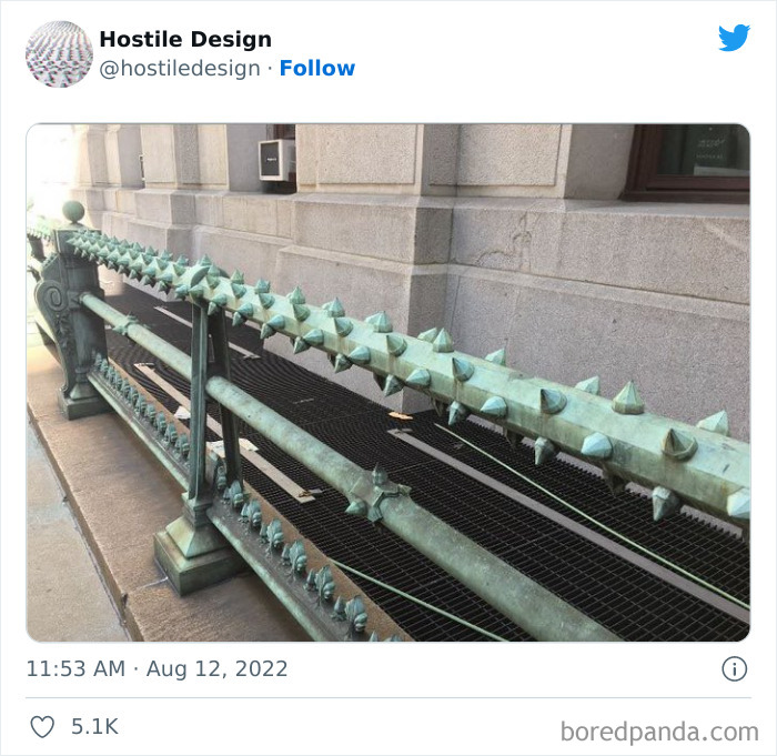
Isn’t that a railing, isn’t it’s intended purpose to be to have people lean and or hold onto it??!?!
I think it's intended to block the grates over the subway - they attract homeless people because warm air rises from the subway station.
Load More Replies...Why am I getting an image of the skewers from Mario Maker in my head
I'm almost positive this is along the exterior of Philadelphia City Hall.
We also managed to get in touch with the creator of 'Hostile Design', Kristi, who was kind enough to chat with us about the background of their social media project and its community. When asked what inspired them to launch the page in the first place, Kristi explained that people have been documenting Savehostile design for years. "I’m just highlighting what people find. I’m not an expert in any way, shape or form," they said.
Even though the account was created only last month, it has already gained a strong foothold on the platform. With over 89K followers, the page is the perfect outlet for people to contribute with their own examples and participate in meaningful discussions surrounding the matter. "The followers all seemed as annoyed about this behavior in public design as I am."
"It’s only been a few weeks [but] I probably have 200 message requests right now," Kristi explained how many submissions the followers send over. Although it may seem like a high number, the founder said it’s quite easy for them to manage the account. "Open a DM, save the photo, credit it to the user, post."
If they don’t want people sitting on it, then don’t even build it !
Actually these are more accessible for some people with mobility issues. For example some elderly people can have trouble getting out of seats so are given 'perching stools' to use around the house when you want a quick rest. I have back problems & also find these more comfortable
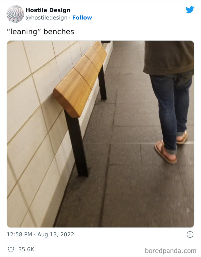
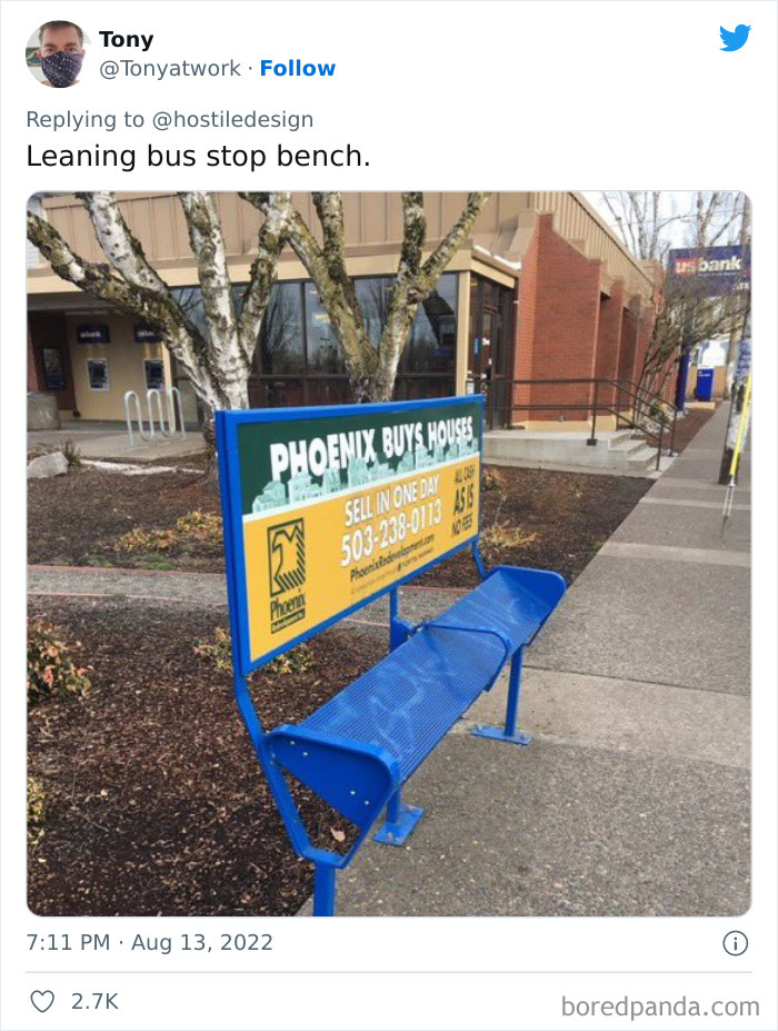
Load More Replies...I don't even understand this one. Is it the back of a bench with the bench removed?
It's a 'leaning' bench; you're just supposed to lean against it instead of actually sitting, so no one can even try to sleep on it.
Load More Replies...There is a choice here. There are benches for sitting (notice in back) and these meant for just leaning for a rest while standing. No problem here. Different purposes.
I hope the person who approved this design is constipated for the rest of forever. This is so cruel.
Somebody could really get hurt on that. Can you imagine an old lady losing her footing and hitting that?
I was just thinking that local cats probably love it.
Load More Replies...That could have been a simple, safe, one-piece welded haunch instead of 10 sharp lawsuits waiting to happen.
What exactly is a haunch? I feel like I've seen the term before
Load More Replies...When I need to sit down I'll sit on anything that's the right height, spikes or not.
As a narcoleptic person, i need to sit a lot when I'm out and about to rest and recharge a bit. These "benches" are so useless that i don't even see the point in having them at all
Load More Replies...Actually, there are many times I wouldn't have minded something like this. I don't necessarily want to sit because I'll only be there for a few minutes and leaning would be a preference.
I have a knee injury so it hurts to sit down. I'm really comfortable using those benches.
Load More Replies...What is the point? If I want to lean, I can do it against the wall.
These are installed in the NYC subways where benches used to be (see post #5 which is the 23rd St. F/M stop). There are a few benches at other stations that have dividers between each seat which is actually good that it keeps other people from monopolizing the whole bench when you need to put your bags down or if you had a foot injury and really needed a break to take your weight off of it.
Hostile design seems to flourish in the big cities around the globe, as supporters say it’s sometimes necessary to put an end to unwanted behavior. But opponents, activists, and academics who spend time researching these measures call it an inhumane practice as it targets specific sections of the community, especially the houseless.
When asked Kristi to share their own opinion about this, they were completely against it. "You should remove as many bench handles as you can when you see them in public. If you see pointless instructions under a bridge or spikes on top of a fire hydrant, you should remove them if possible. Again, I’m not an expert on this stuff. There are academics doing research that are far better at explaining the history and flaws."
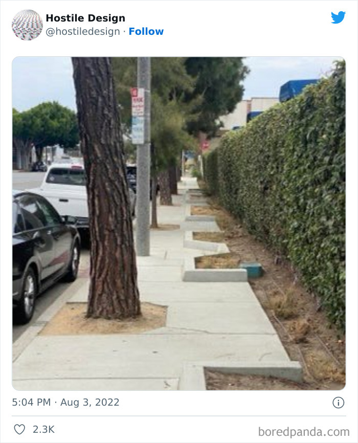
I have depth perception issues. I definitely couldn't walk down this sidewalk!
Load More Replies...Hostile to anyone in a wheelchair or pushing a stroller!
Also to visually impaired people, anyone with a balance/mobility handicap... this was clearly not well thought out, at all.
Load More Replies...I literally, just today, listened to a presentation on being welcoming to people with disabilities, where it was mentioned that curb cuts benefit not just wheelchair users, but the whole community by making the sidewalk more usable for people with strollers, wheeled carts and bags, and anything else that makes it hard to navigate a curb. This could not be more opposite of that if it tried.
This might have been the one: https://99percentinvisible.org/episode/curb-cuts/
Load More Replies...My nearly blind and severely mobility impaired 90 year old mother can only manage independent access to shops etc by using a mobility scooter. I would be on the council's doorstep in an incandescent rage if this was done in a street in my city. (And before anyone suggests I help my mother out - I do most of her shopping and cooking for her but she likes to feel independent by popping out to the shops for an emergency cabbage or something).
Oh fantastic! Now wheelchair users, people with strollers, and plain 'ol fed up pedestrians will just have to use the street. Another brilliantly well thought out design 🙄
I think the curb bits are supposed to be for landscaping. This looks like a strong case of "nobody reviewed the designer's print before starting construction."
Load More Replies...I don’t disagree with this. My local public toilet is a haven for drug users and used as a beat.
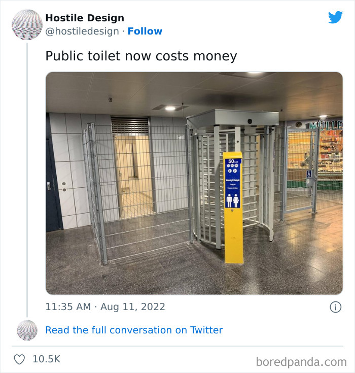
I think this is an American post where your public toilets are normally free, yes? (Very different culture in some other countries)
Load More Replies...Living in Germany, this is a normal sight. The positive sideeffect of this is, that you actually can use these, because they are clean. There usually is a person paid for cleaning them.
I know these from Germany too but I've often found them filthy and stinking. Granted they were inner city but if I'm going to pay 2 euros to use a toilet, that's not okay.
Load More Replies...They've been doing that for years where I come from. Also, in some of our public toilets that doesnt cost money you have to send a text and then get a code to enter in return. Pretty clever, because they will know who was there if destroyed
i understand why you need to pay, but they could've made it look nicer and less like a prison cell.
In the US women's bathroom stalls charged a dime to use. This was back in the 1950 and 60s.
70's, too. I remember them. We just crawled underneath.
Load More Replies...I guess maintaining it and keeping the toilets clean isn't exactly free, either.
And it's a rotten job. That's why we have so little. I work for a govt. We had to plan a bike route. Hey there are almost no toilets on this route. Oh who cares. They can bother a restaurant or pee in the bushes. Else it's gonna cost us a load and someone has to keep em clean.
Load More Replies...There's good reason for this. If you've ever had to clean a public toilet, you know why.
The person who built the bench isn't the person who put the ad on... the two groups have different objectives.
Load More Replies...Then don’t put money into those advertisements, help the people who have to sleep on the streets.
Some deliberate cropping going on here. I suspect that the ad gives contact details for some kind of help centre.
The beginning of a website name is visible on the lower right side.
Load More Replies...Then provide housing, health care and help, don't just make their lifes harder
But, sometimes, some children don't have a choice....why punish them further for it?!
No one *should* have to =/= no one does. It's amazing how reality doesn't always conform with what is right.
Speaking of the biggest faults of defensive design features, Chellew said they create public spaces that are hostile to us all. "For example, the most common form of defensive urbanism in North American cities is the absence or removal of public amenities that make public spaces comfortable for people to use — benches, public washrooms, places of shelter and shade."
"When these public amenities are removed or omitted for fear of misuse or 'loitering', it affects how everyone can use and access the space," she added. "It especially makes it difficult for people who are elderly, people with disabilities, people with chronic illness, families with young children, etc. to navigate the city and access public space."
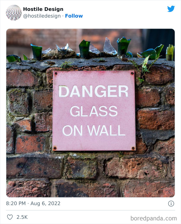
You see this in cities a lot to keep people out of private yards. Often in older parts of the city. Looks better than barbed wire, for sure. In New Orleans, it deters the drunk tourists from using your yard as a toilet.
This isn't bad if its a residential/private home. They've probably had people hopping over a few times. I'd do the same
You see it a lot in south Africa, high crime rate and a lot of violence. If the person/criminal gets into your house, it is a very violent situation that the home owner will end up severely physically maimed or dead, including the children. Its sadly a necessary evil to protect your family in certain areas and countries.
Most people have razor wire or electric fences now. There's a house near me that has glass atop the walls (Jozi South - new South, not, like, Turffontein) and just a garage on the property. Always wondered what was in there. One day I passed and the door (there was a door in the wall instead of a gate) was open. I looked in and there was a giant hole the entire length of the property! Like, whoever owned the property had just been excavating it for the sand? rocks? Goodness knows.
Load More Replies...Very common in Latin America. It's used to keep people out of your home. Also bars on windows. We don't put up warning signs though.
This used to be common in Taiwan, to keep out thieves, unless the thieves remembered to bring along an old blanket to throw over it.
I saw a lot of this in Honduras. Keeps burglars from climbing over your wall.
In the U.K. that isn't illegal in itself to do that but you are wide open to all sorts of claims, even if you have a sign.
But it also stops people from lying down if they are in pain or dizzy or something.
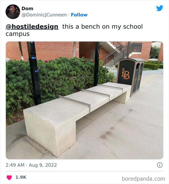
Load More Replies...That's Long Beach State University too. Can tell from the logo on the trash can. Fitting
Some skateboarders are rude stupid and reckless. Don't mess it up for the rest of us.
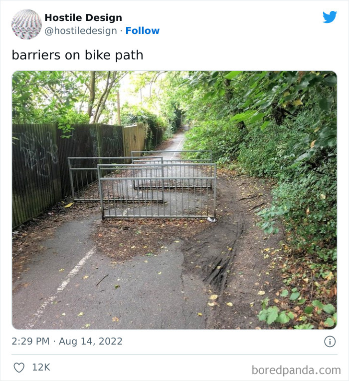
This looks like it is in the UK and the barriers are across a public footpath. Public footpaths, as their name suggests, are for pedestrians only, cycling is not permitted along them. Cyclists can use bridleways, cycle paths, byways and roads.
The divider line down the middle seems to indicate a bike path...
Load More Replies...To keep motorized vehicles off the trail. It is essential for safety.
Not very effective ones, cyclists appear to just be going around them. Worse for prams and wheelchairs
It would hopefully still slow down the cyclists (hopefully), which is what it is meant to do, it would be wide enough for a pram or wheelchair to access.
Load More Replies...I feel like this doesn’t belong here. These exist where I leave to prevent quads and cars and other motorized vehicles from using the paths and putting pedestrians and cyclists in danger. If only they worked on motorcycles.
It also makes it difficult for people with mobility aids to navigate. Those hairpin turns aren't exactly wheelchair- or crutches-friendly.
Load More Replies...These are common in the UK, and meant to stop people going too fast on paths that have a lot of people. But I also love how the cyclists just went around.
His looks like a footpath or shared walkway/bikepath, it's to make them slow down, for pedestrian safety.
While there seems to be a number of reasons these public spaces get designed in a way that doesn’t actually serve the public, Kristi said the main goal is to keep out "the undesirables". "This doesn’t just include the houseless but also the working class that might need to loiter for a bit waiting on public transportation or resting between shifts. It’s a way to keep people always on the move instead of having public spaces that are inviting and welcoming. And a city that keeps its houseless away is a city that can pretend it doesn’t have any."
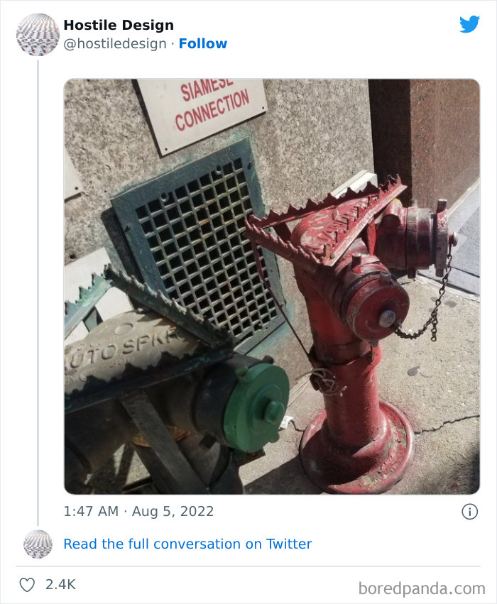
First time a firemen gets cut on one of these bet there will be hell to pay.
It's to stop people sitting on them because after decades it would come loose & could be faulty when needed. In heatwaves vandals sonetimes brake off/open to make a kind if street fountain- meaning a big fixing bill and lots of water lost
Load More Replies...Super unnecessary. No one was going to sleep or loiter here, it's just mean. Also seems dangerous for any firefighters who actually have to use the hydrants.
They were never comfortable to sit on anyway, I don't think that thing serves a purpose apart from look ugly
People sitting on these pipes outside my apartment building have managed to dislodge them somehow to the point a crack appeared, and water flowed for a week under the structure and nearly created the foundation to shift.
It’s to prevent pigeons pooping. When folks want to sit, it’s not that sharp, actually. 😉
Remember that episode when Peter Griffin had a fight with a rooster and how it ended? Imagine if it was on this fire hydrant.
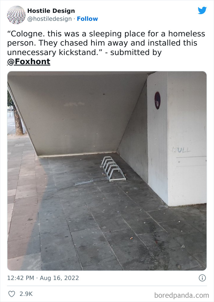
Pretty sure this is a bike rack to lock your wheel on to. If it was a sleep deterrent it would block the whole space
Load More Replies...I have never heard of a bike rack being called a kickstand before. I know a kickstand to be something that you install on your bike so you don't have to prop it up against a short wall or bench or have it lying flat on the ground.
Load More Replies...Homeless in my city would lock their own bikes there, often without seat or wheels.
They sometimes have shopping carts/trolleys which can be chained conveniently to these racks.
Load More Replies...OMG! That's the exact bench that I was about to post! It's the one on 39th Ave. In my hometown of Portland OR.
I used to love Portland. What a nasty dangerous place it is now..and no one cares to even do anything.
Load More Replies...I don't know what's wrong with my eyes. At first it looked like a flat bench to me, but maybe a little narrow. Couldn't tell it was slanted for a solid 2 minutes
I know what you mean - the image is a bit deceptive so I don't think it's you (or me)!!
Load More Replies...stupid. there ARE still lots of people who need these to be decent. taking away our privileges now too? ( i am disabled)
This still puts weight on your feet and core. Not much point to it. I have chronic pain and have to actually sit for relief. This is ridiculous.
The recurring examples of hostile design are not to say designers and architects themselves are encouraging it — that’s rarely the case. As Chellew told us, it happens because cities and private developers are looking for quick-fix solutions. "If there are complaints that people are sleeping on benches it is easier to put center bars on benches rather than looking at why people have to sleep on benches in the first place."
If we want to see change and create public spaces that would feel inviting to all, "we must also address the lack of affordable housing and lack of free mental health and addiction supports," she explained. "It is all interconnected."
They don't like to be reminded that there are homeless people, otherwise their conscience might reawaken.
Load More Replies...She's his cousin. I think she gets her powers when she gets a blood transfusion from him.
Load More Replies...So serious question. What if an elderly or disabled person was coming along and needed to sit down for awhile, but couldn't because a homeless person was sprawled out across the entire bench and refused to move so you could sit?
If this really is a common problem, then build another bench.
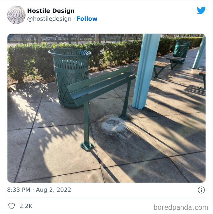
Load More Replies...The raised dividers prevent someone from sleeping on the bench.
Load More Replies...Ohh? So I could hop on and 5-0 the ledge then pop up and crook the bar? Cool.
I wouldn't trust it. Catch a truck in a bad groove and you're a$$ over tea kettle
Load More Replies...Chellew said the use of defensive design to govern public spaces is a political and ethical decision. "Policy must be changed at the municipal or even provincial or state level to prohibit design and management approaches that are meant to make spaces less accessible and more uncomfortable."
"People can engage with their local political representatives through requesting meetings or creating petitions. In addition, professionals like planners, designers, and architects must take a stand against the practice as unethical as it does not promote the public good," she concluded.
Huh? This helps people with mobility issues to get up from a sitting position, yet is still high enough that a homeless person could lie under it. It's literally the opposite of antisocial design...
Could be from the angle, but I don’t think it’s in the middle
You would have to be slim, but I reckon you could slide yourself in here. Would also stop you falling off.
Could negotiate a position on the side - wouldn't fall out? Treat as a double bed, hold hands !!
Does anybody realize that all of this hostile design is not going to stop the homeless problem. Spend the money on housing, education, and jobs. And along with some mental health help for people who have suffered from being homeless.
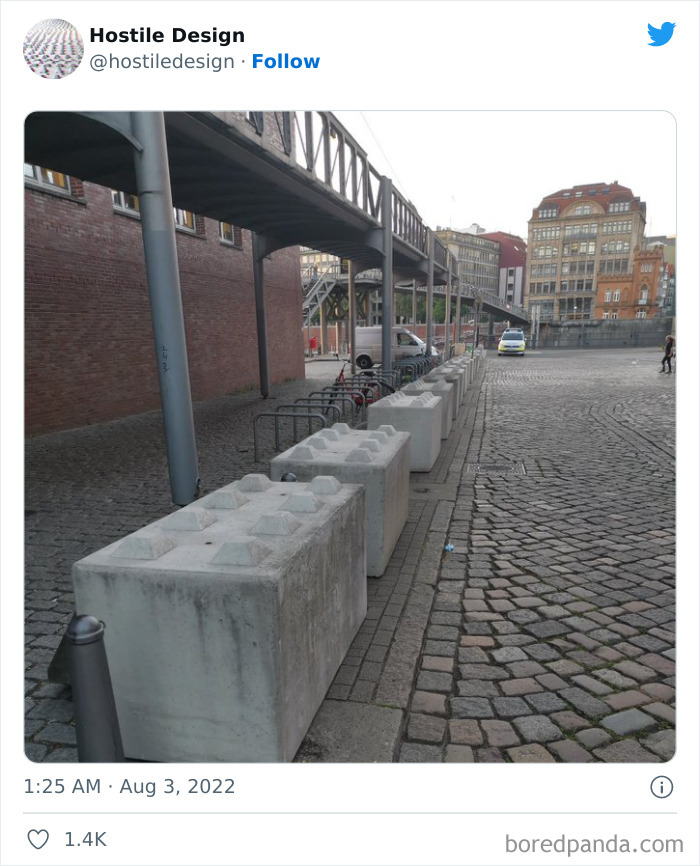
They actually pretty much are. Precast interlocking concrete blocks.
Load More Replies...These are not meant to get rid of homeless people. I've seen this appear after the terrorist attack in Nice (France) on many places and the attacks in my country on march 22. They were meant to prevent someone in a truck to ride into people at an event.
The bottoms are molded to fit the protrusions in case they do need to be stacked. They indeed are giant concrete legos.
These are standard to stop cars I was actually at legoland last week and they have them painted in primary colours to look like lego.
I'm OK with having car barriers like this to make sure they don't swerve into pedestrians or the posts holding up that elevated walkway.
They put these up around town after a car rampaged purposefully trying to hit pedestrians
These appeared in Germany a couple of years ago, they are to prevent terrorists driving vehicles at crowds (I first saw them at Christmas markets) and they are lego bricks:they can be stacked
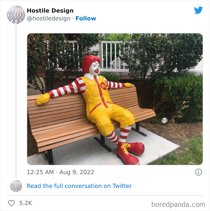
Which is more hostile here, the clown or the multi-national corporation?
You guys know these benches are outside of every Ronald McDonald house. They are free housing for families of children who are going through life saving treatments or are going through end of life hospice.
You're absolutely right! He's still kind of creepy though.
Load More Replies...This is a whole different kind of terror than the anti-homeless spikes.
about 6 years ago i stayed at the rmch (charity house for children and their family undergoing surgies) in detroit for for a few surgeries. they had this exact bench by the entrance and it freaked me out!
yeah, it would be like sitting next to the orange one (he who must not be named, except by the FBI)
Load More Replies...These benches are at Ronald Mcdonald houses that support kids and their parents going through serious medical problems
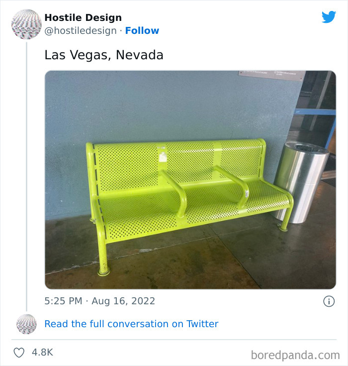
Come on. These are clearly to help get up from a particularly low bench. Benches that low can be a serious problem for the elderly or other people with mobility issues. This page is getting more ridiculous the farther you scroll down...
Then why are your "armrests" only in the middle and not at the ends ?
Load More Replies...You could probably slide under the bars… in that case they would help you not fall of!
But it's Las Vegas. What did you expect?
Load More Replies...Bars in the middle of the bench to prevent homeless people from sleeping on it.
Load More Replies...sleeping is hereby banned! sit your fat butt on it but do NOT allow anyone to sleep cause they don't deserve it. (sarcasm)
good thing YOU never need to sleep but all of the homeless are still people and need the rest
Load More Replies...I don't think that will be an issue on that very steep architectural feature which doesn't provide access to anything.
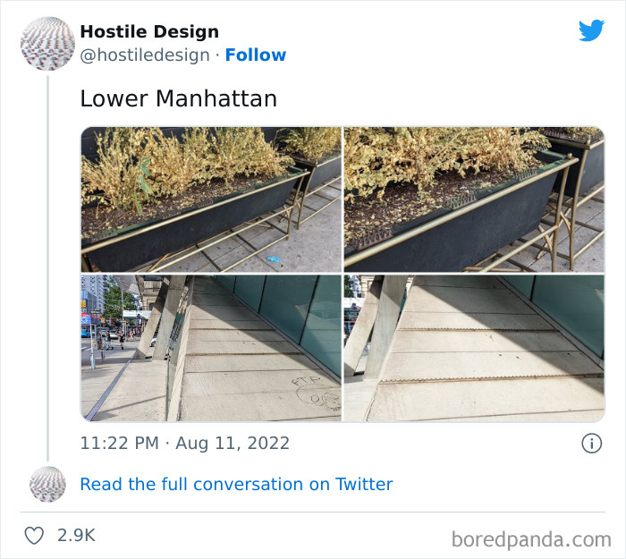
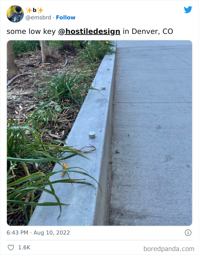
Load More Replies...Though to be a little fair, the top could be an attempt to keep people from destroying these giant planters from excessive weight and reduce garbage left; people leave c**p where they sit. The other may be to prevent skateboarders
I noticed the FTP that was etched in when the cement was drying.
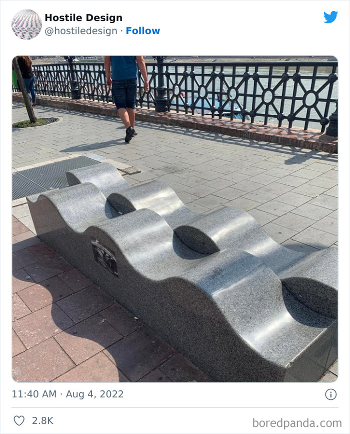
I'm not seeing the hostility here. You sit in the bottom of a curve and it deters a stranger from sitting right next to you. If someone does sit next to you on the top of a curve, then you know to get the helloutta there.
I don't think these were meant to prevent homeless it's just a cool design and functional
For the love of... This is CLEARLY a nice-looking design choice and nothing more. Doing things like adding spikes to benches after the fact is one thing - but now any objects you can't lie shouldn't be allowed to exist in the first place? Man, people with this logic must completely lose their minds when they encounter objects like picket fences, traffic bollards, or trash cans...
this is the Promenade next to the Danube in front of Corvinus University, Budapest, Hungary
Load More Replies...This one is less egregious than the benches with the bars across. At least this is still ascetically pleasing to look at.
Considering some of the spikey or non existent benches, with enough padding there's a better chance of being able to sleep there...
This was designed to look pretty, waves because it is right next to the Danube river. And yes comfy to sit on.
This one is stupid, first off, it looks too narrow to lay down any how and PLENTY of space in-between to sit.
This one is DUMB. Those pegs are clearly to deter people from trying to do tricks on their skateboard, rollerblades, or scooter...
Maybe it's for disuading skateboarders? Can't think what else this is for...
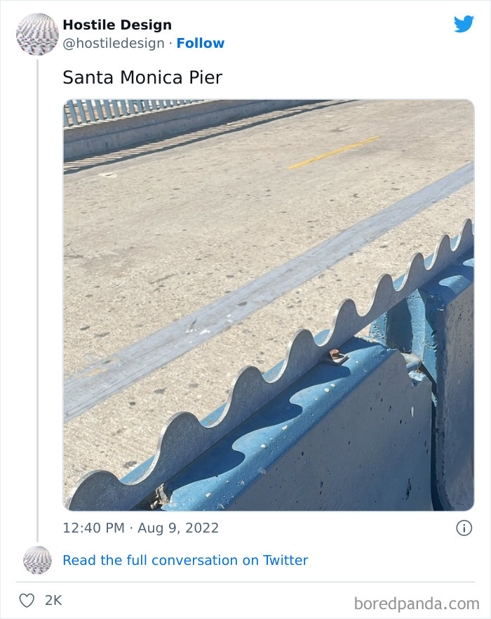
My guess on this is that sitting on a semi-temporary barrier along a roadside is not very safe.
The barrier's permanent; it separates the road from the walkway. Before it was there, there'd be times when there were so many people, they'd block all traffic to and from the parking area.
Load More Replies...This is good. This seems to be the road that goes down the pier. The sidewalk is often very crowded, so preventing idiots to hang there and chat and take selfies and s**t is a good idea. Move along and find another place, there’s plenty of spots around there to sit, lay down, and do whatever you want without bothering anyone
Um, there seems to be a road behind it if I'm understanding right? If so this is actually not bad, because someone sitting on it would be unsafe (And it could also have been installed to deterr people from hopping over the barrier to jaywalk).
LOL. Not sure you want to sit on a hot piece of concrete on a 100+ degree summer day.
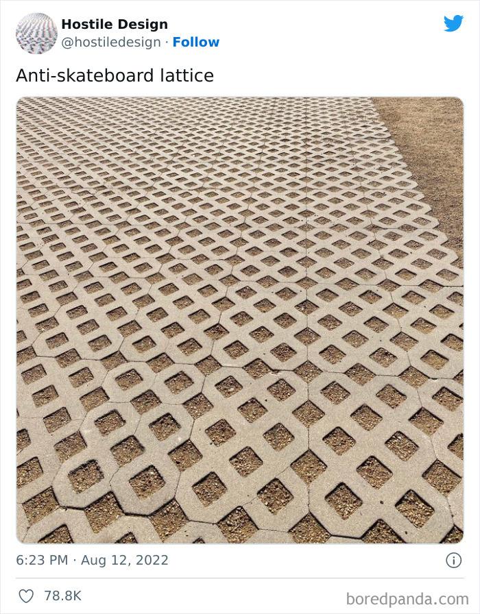
Load More Replies...Let's see. Rain drains better, less muddy to walk on and not slippery. Oh, and skateboarders won't take up the space. And since we can't see what's around this space, who knows what the purpose is here.
It actually looks like a dirt path. Skate boarders would not use it if it were dirt, so...
Load More Replies...This is an ecologically responsible path. Rain can penetrate the ground here. There is no reason at all to assume that skaters are being targeted here. Not everything is designed in a certain way to bully a part of the population. Unfortunately, every advantage also has disadvantages (for some).
It's actually great thing. Rains can drain through, ground can "breath", Sometimes even grass will grow in this holes. People, bikes, and cars can still relatively easy move on it.
EMS vehicle path. Nothing to do with boarders. I have one just down the street from me.
It's got nothing to do with skateboards. We use them a lot. It's a perfect compromise if you don't want to seal the ground with concrete and lawn wouldn't be practical.
Architect here - there are also areas where you're not legally allowed to put down pavement, for example on top of an underground gas/oil/gasoline pipeline, because they need to be able to get down there and inspect it without having to rip up the pavement and also in case there's a leak it wouldn't form a captive gas bubble under the pavement and instead just disperse in the atmosphere, so these kind of pavers are the compromise.
Load More Replies...This is something completely different: they encourage people and builders to use this instead of normal concrete because it allows the rain to to be absorbed by the ground instead of going straight to the sewer. In case nobody noticed this year (2022) was one of the driest years. We need more water to be absorbed by the ground so groundwater levels increase again.
in my area this is done for rain water control. so much of your yard has to let water pass through it.
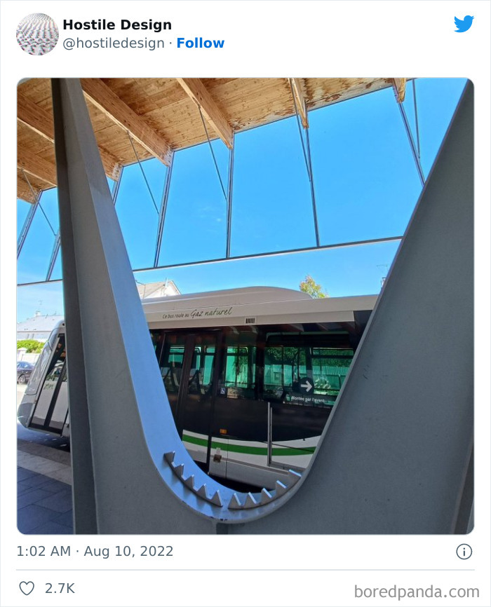
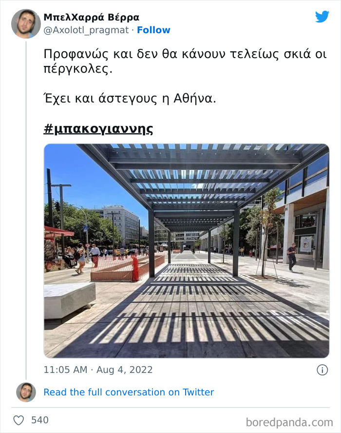
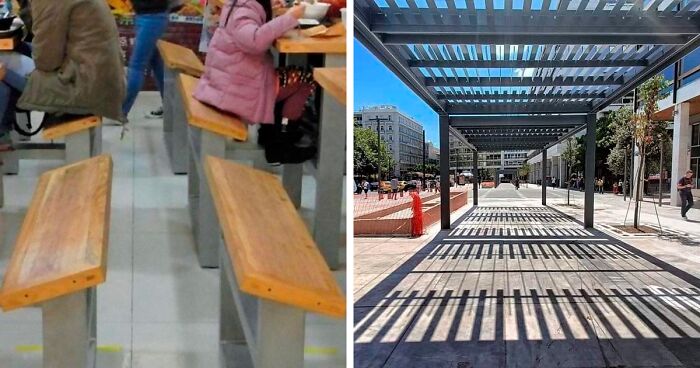
Translation: Obviously, the pergolas will not provide complete shade. Athens also has homeless people.
Load More Replies...I don't see the hostility - unless there was an actual solid covering before. Pergolas aren't meant to provide shelter per se, but to break up the light and provide a small measure of shade, cooling the areas underneath. The lack of roof means they require next to no maintenance. More cities are going to have to start considering adding pergolas to the landscape. Waiting for a bus at a terminal can be brutal - no trees - no shade...
That's not a pergola, that's a "brise soleil", used to reduce the amount of light passing through but not remove it completely. They have several applications, among them avoiding sharp dark-light transitions on motorways, provide some shadow and cooling on pedestrian areas (such as this) or reduce the cooling requirements for buildings with large facades. Good urban planning, not hostile architecture.
And this is payed by the citizens of Athens! The nephew of the prime minister of Greece is the mayor of the city. A big family...........
Russian looks similar because it was derived from Greek (the alphabet, not the language). Russian no longer has a theta or psi letter, so you can see immediately this is Greek.
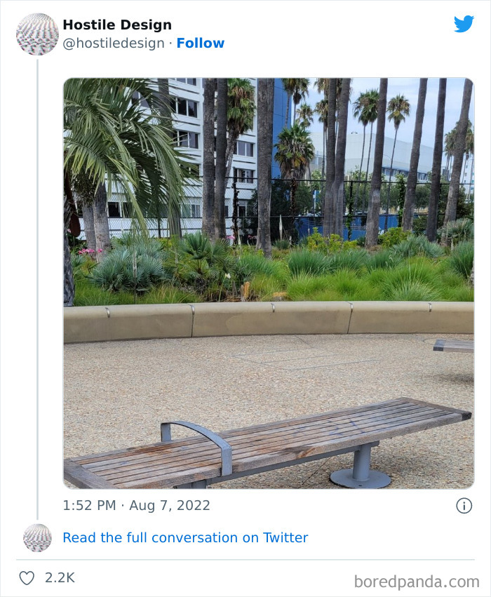
Load More Replies...? I want to see the rest of the surrounding park, because this reminds me of a bench for sit-ups like can be found on a exercise circuit at my local park.
Also, someone wanting to stretch out on a bench could stick their feet through that end, so not hostile. It's like a seatbelt for your legs!
Load More Replies...oh oh bad job! they can still use it! on no and it is softer than metal A+ for a failed job
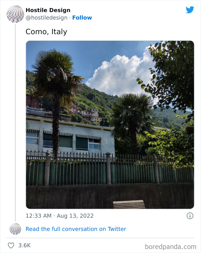
Oh..you have to click the user name to see the whole picture. The bench that this is about got cut off in the above picture.
Because noone sees the problem without looking at the image on Twitter
Load More Replies...i think this is the first post i've seen on BP that has been down voted into the negatives
Trust me, this is not the first, nor will it be the last.
Load More Replies...My guess is that many of you don't have to deal with homeless people on a regular basis. I'm a commercial property manager and have to deal with many issues directly caused by homeless people. My responsibilities are to the property owners and rent-paying tenants. I have had too many instances of break-ins, defecation on the sidewalks/landscape, broken water lines/backflows, threatening behaviors, discarded drug paraphernalia, setting fires, and vandalism. A majority refuse social services or interventions when offered to them. I would like to say that there is a clear answer to address the homeless situation. But there isn't. And unfortunately, I have to deal with what's in front of me - not what I wish things could be.
Yeah, I used to work in a small store, the office and safe was one floor up from the store via a stairway that we shared with one private flat, but the stairway had a door to the main street, as well. The door to the main street closed automatically. We had to carry the register-drawer from the shop to the office and back in the morning and evening (both doors had to be opened with a key) and guess what? Some homeless people broke the closing mechanism on the door to the main street and slept next to the stairs. So one morning I found myself alone with 3 sleeping strangers, in a position where I'd have had to carry several hundred Euros past them. You can bet your a** I called the police to make them go away, I've rarely ever felt so unsafe in my life! And I'm all for helping people to get out of those circumstances, but not when they do sh*t like that!
Load More Replies...I understand the point of these photos of benches, but often I see elderly people using the bars to help them up, it helped when I was pregnant or had the baby in the carrier, and too many times they've prevented people from sitting too close to my kid or me, there is a practical side to it.
Maybe they could make the bars retractable somehow? Able to lock up or down. That would be great accessible design I think
Load More Replies...Do people on here realise that sometimes benches toilets etc cost money to keep being replaced!? How about blaming people in power for doing nothing to help the homeless situations !
you mean the elected officials who run councils. what has money got to do with making them in accessible. most this would be cheaper without making them unfriendly to people with disabilities or the homeless.
Load More Replies...It makes me so angry to see designs that are obviously a deliberate attack on the homeless (and as a side effect, are hostile to the elderly or disabled). Councils have a civic duty to help their residents (even the ones who don't pay taxes or rates) and the homeless need compassion and assistance. I realise it can be confronting and uncomfortable to work with them but they doesn't make it an excuse to do nothing. And imagine if doctors and nurses said they didn't like dealing with difficult people, or with unpleasant bodily fluids...
Homeless people don't pay property taxes and can't vote for you (need an address to vote in that precinct). If you want to stay in power, screw over the least fortunate in favor of those who will contribute to your re-election.
Load More Replies...Idk but maybe, just maybe a solution to homelessness is possibly providing some type of housing. I know, sounds crazy.
While we do not know the perfect answer there are other countries that are finding better solutions than putting spikes and bumps in places.
Load More Replies...As the list went on some of these either concerned private property or had designs that didn't feel like they were intentionally hostile. Also quite a few that had legitimate design additions that happened to also be bad for the homeless(the giant cement Lego blocks are a good example)
Maybe those people who are upset about the devices on benches to prevent the homeless from sleeping on them should invite those homeless people to come live with them. That would be a good way to demonstrate your compassion.
Or substancially support homeless shelters, other initiatives that help homeless people, or initiatives that help people on the brink of homelessness avoid becoming homeless. Inviting a stranger into your home is something a lot of people are not comfortable with, and I think that's fine, but I do think all of us have a responsibility to help solve the homelessness problem. If the politicians aren't fixing this problem we can't just sit back and wait until they do, we should take actions ourselves as members of our society, and help vulnerable people out.
Load More Replies...I'm not sure all of these are deliberately hostile or that we're getting the whole story.
Maybe you all are talking about the nice homeless man or woman with some bags, but When you’re dealing with a bunch of drunk homeless everyday.... Thanks for removing the benches 🤝🏽
The point of the comments is: do something positive to help the homeless, don't just make life difficult for them. If they are drunk they have an addiction problem and that's a health problem.
Load More Replies...If they put half as much effort into helping the homeless as they do in thinking up ways so they cant sleep, there would be no problem
My guess is that many of you don't have to deal with homeless people on a regular basis. I'm a commercial property manager and have to deal with many issues directly caused by homeless people. My responsibilities are to the property owners and rent-paying tenants. I have had too many instances of break-ins, defecation on the sidewalks/landscape, broken water lines/backflows, threatening behaviors, discarded drug paraphernalia, setting fires, and vandalism. A majority refuse social services or interventions when offered to them. I would like to say that there is a clear answer to address the homeless situation. But there isn't. And unfortunately, I have to deal with what's in front of me - not what I wish things could be.
Yeah, I used to work in a small store, the office and safe was one floor up from the store via a stairway that we shared with one private flat, but the stairway had a door to the main street, as well. The door to the main street closed automatically. We had to carry the register-drawer from the shop to the office and back in the morning and evening (both doors had to be opened with a key) and guess what? Some homeless people broke the closing mechanism on the door to the main street and slept next to the stairs. So one morning I found myself alone with 3 sleeping strangers, in a position where I'd have had to carry several hundred Euros past them. You can bet your a** I called the police to make them go away, I've rarely ever felt so unsafe in my life! And I'm all for helping people to get out of those circumstances, but not when they do sh*t like that!
Load More Replies...I understand the point of these photos of benches, but often I see elderly people using the bars to help them up, it helped when I was pregnant or had the baby in the carrier, and too many times they've prevented people from sitting too close to my kid or me, there is a practical side to it.
Maybe they could make the bars retractable somehow? Able to lock up or down. That would be great accessible design I think
Load More Replies...Do people on here realise that sometimes benches toilets etc cost money to keep being replaced!? How about blaming people in power for doing nothing to help the homeless situations !
you mean the elected officials who run councils. what has money got to do with making them in accessible. most this would be cheaper without making them unfriendly to people with disabilities or the homeless.
Load More Replies...It makes me so angry to see designs that are obviously a deliberate attack on the homeless (and as a side effect, are hostile to the elderly or disabled). Councils have a civic duty to help their residents (even the ones who don't pay taxes or rates) and the homeless need compassion and assistance. I realise it can be confronting and uncomfortable to work with them but they doesn't make it an excuse to do nothing. And imagine if doctors and nurses said they didn't like dealing with difficult people, or with unpleasant bodily fluids...
Homeless people don't pay property taxes and can't vote for you (need an address to vote in that precinct). If you want to stay in power, screw over the least fortunate in favor of those who will contribute to your re-election.
Load More Replies...Idk but maybe, just maybe a solution to homelessness is possibly providing some type of housing. I know, sounds crazy.
While we do not know the perfect answer there are other countries that are finding better solutions than putting spikes and bumps in places.
Load More Replies...As the list went on some of these either concerned private property or had designs that didn't feel like they were intentionally hostile. Also quite a few that had legitimate design additions that happened to also be bad for the homeless(the giant cement Lego blocks are a good example)
Maybe those people who are upset about the devices on benches to prevent the homeless from sleeping on them should invite those homeless people to come live with them. That would be a good way to demonstrate your compassion.
Or substancially support homeless shelters, other initiatives that help homeless people, or initiatives that help people on the brink of homelessness avoid becoming homeless. Inviting a stranger into your home is something a lot of people are not comfortable with, and I think that's fine, but I do think all of us have a responsibility to help solve the homelessness problem. If the politicians aren't fixing this problem we can't just sit back and wait until they do, we should take actions ourselves as members of our society, and help vulnerable people out.
Load More Replies...I'm not sure all of these are deliberately hostile or that we're getting the whole story.
Maybe you all are talking about the nice homeless man or woman with some bags, but When you’re dealing with a bunch of drunk homeless everyday.... Thanks for removing the benches 🤝🏽
The point of the comments is: do something positive to help the homeless, don't just make life difficult for them. If they are drunk they have an addiction problem and that's a health problem.
Load More Replies...If they put half as much effort into helping the homeless as they do in thinking up ways so they cant sleep, there would be no problem

 Dark Mode

 No fees, cancel anytime


