Often, people can intuitively tell whether something’s been designed well or poorly. When it comes to products, furniture, and logos, there has to be a balance between function and form. Without it, you risk alienating your customers or even worse—having your project ridiculed by millions of people online.
There’s one massively successful subreddit that does just that. Members of the online group share the most epic design fails they’ve ever stumbled across and it’s a masterclass in what to never ever do. We’ve collected some of the worst examples of design to share with you, so scroll down to check them out. Don’t forget to upvote the worst of the bunch!
Bored Panda reached out to consumer psychology specialist Matt Johnson, Ph.D., to get his thoughts on what designers can do to ensure the quality of the end product and how to pick between designs that seem equally good. You'll find our full interview with the expert as you read on. Johnson is the host of the human nature and marketing psychology blogs, as well as the author of ‘Branding that Means Business.'
This post may include affiliate links.
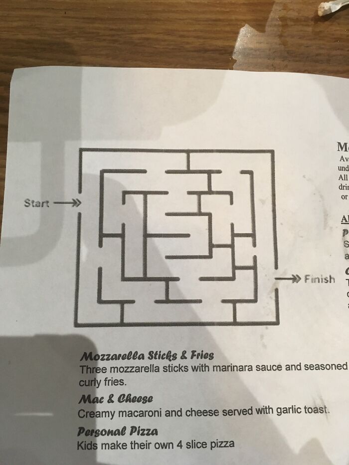
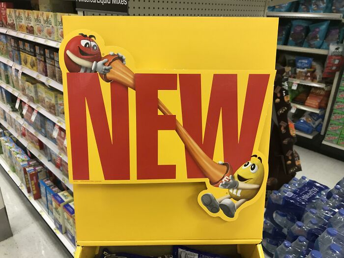
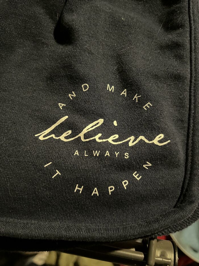
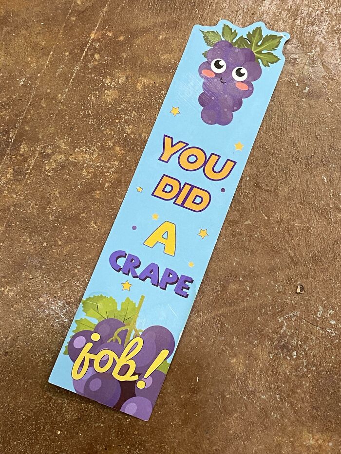
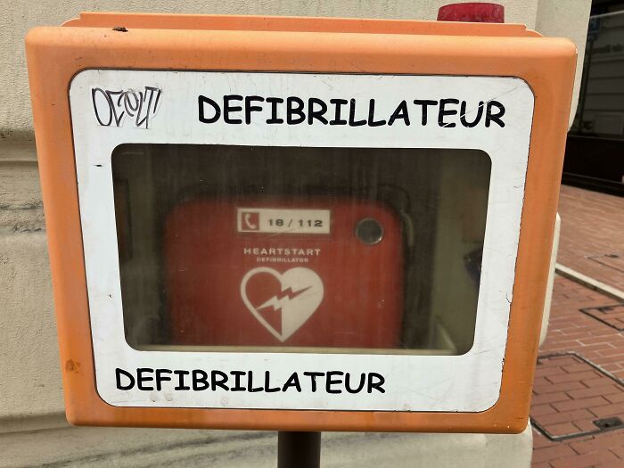
I Think I Know Why
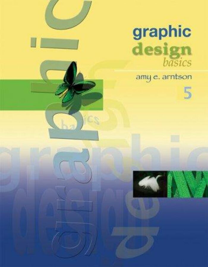
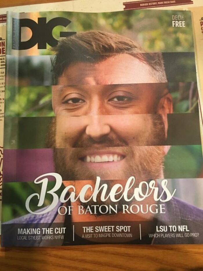
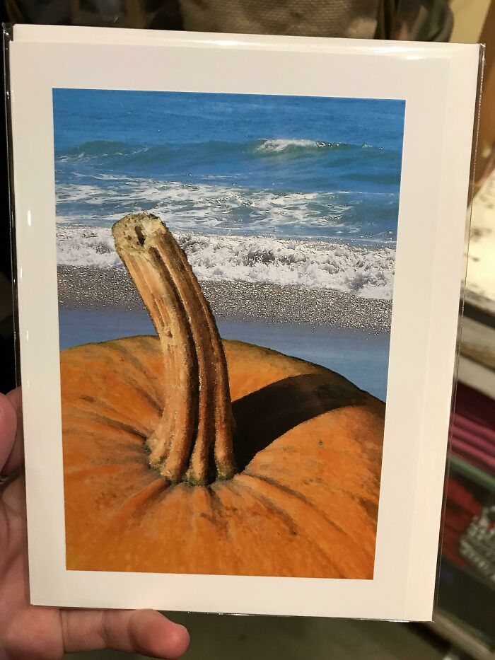
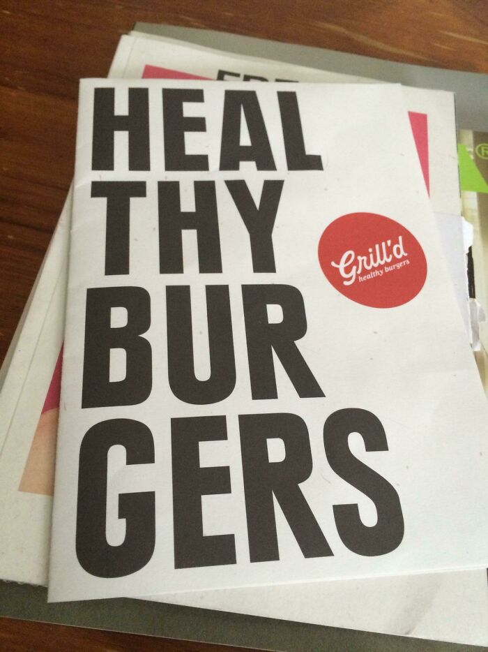
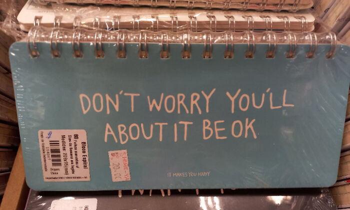
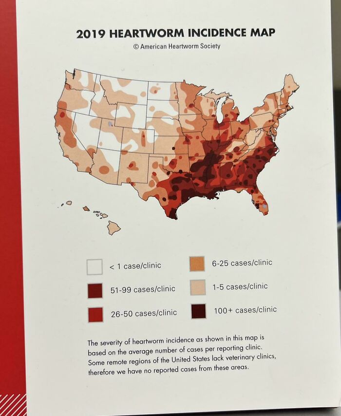
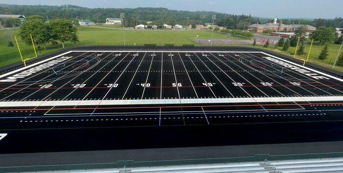
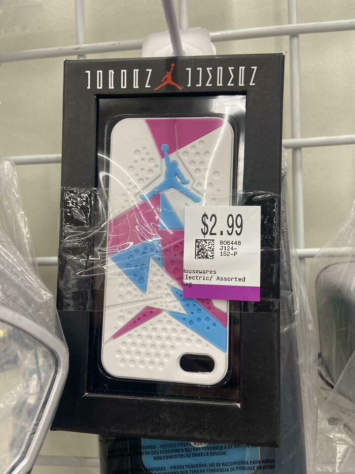
Sometimes It's Okay To Judge A Book By Its Cover
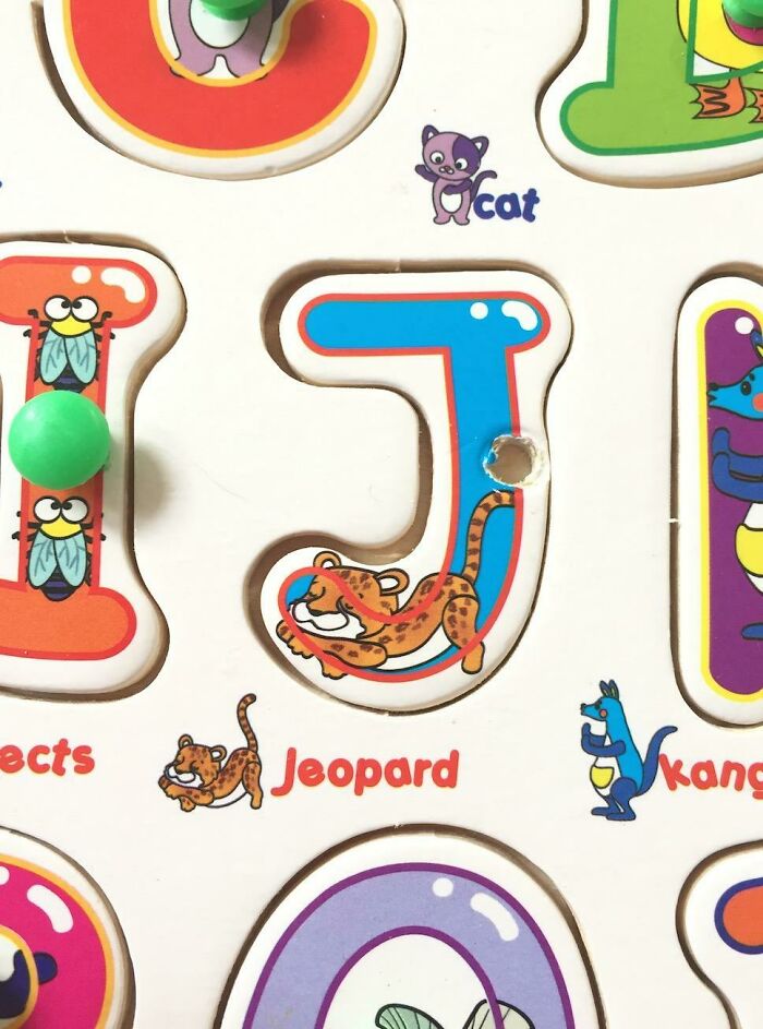
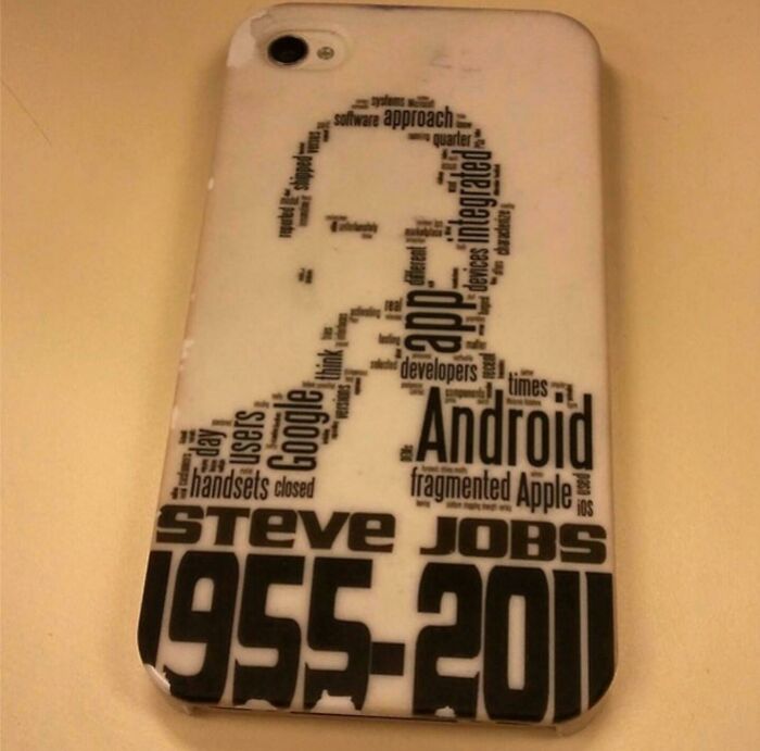
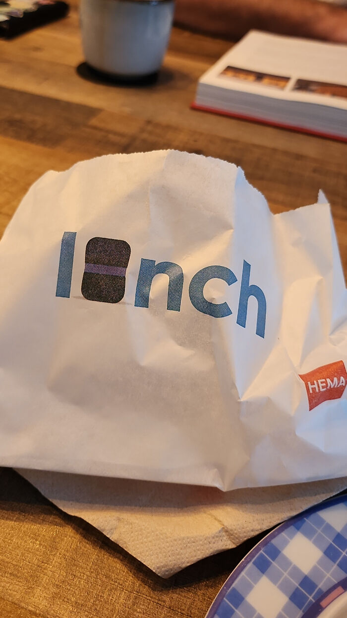
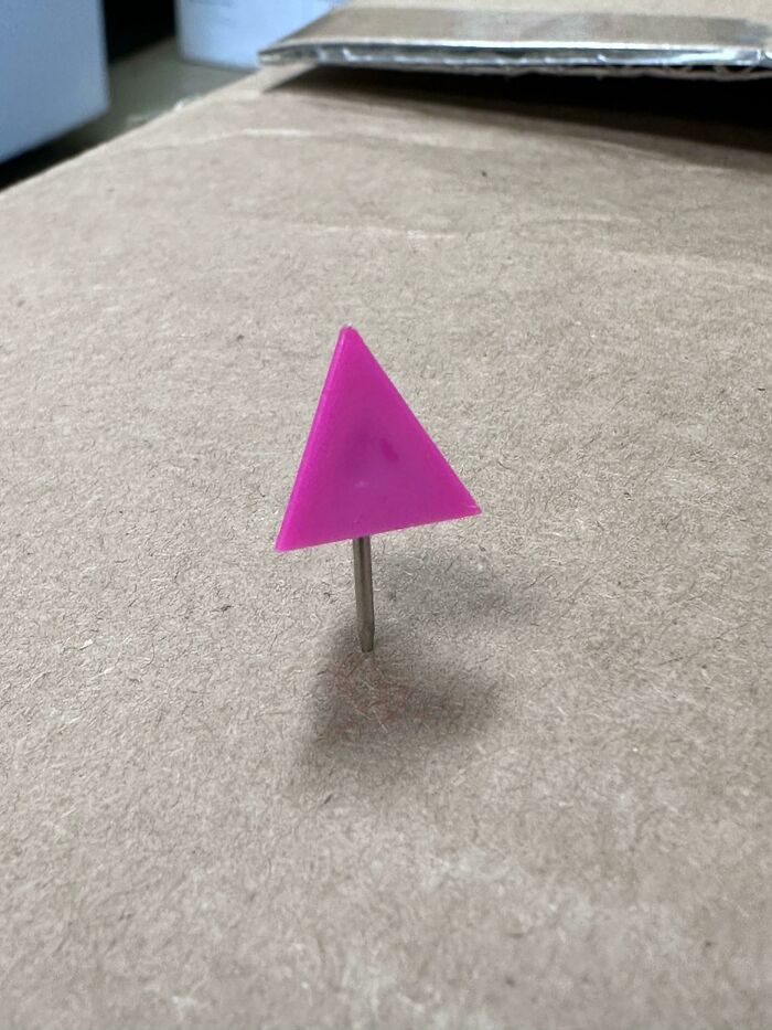
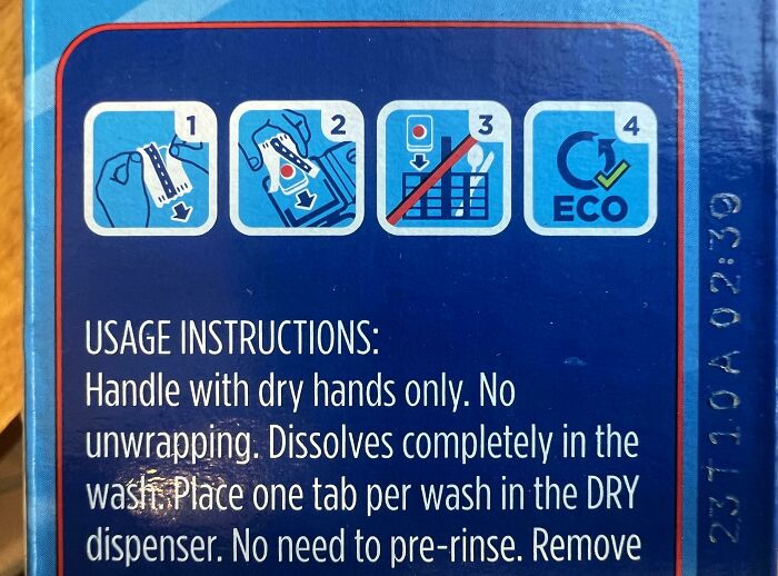
Just Why
We asked Johnson, the host of the human nature and marketing psychology blogs, about the steps that designers can take to make sure the end product is a quality one. "Designers play a vital role in creating products that are not only beautiful but also function well and meet the needs of the people who will use them. The first step is understanding the 'who' and the 'what': 'who' they are designing it for, and 'what' they plan on using it for," he shed some light on the issue.
"The 'who' is paramount. First and foremost, designers need to listen to the people who will use their products. This means talking to potential users, gathering feedback, and conducting research to truly understand what these users want and need. This initial step is crucial because if a product doesn't meet the real needs of its audience, it won't be considered high-quality, no matter how polished it looks," Johnson explained to Bored Panda.
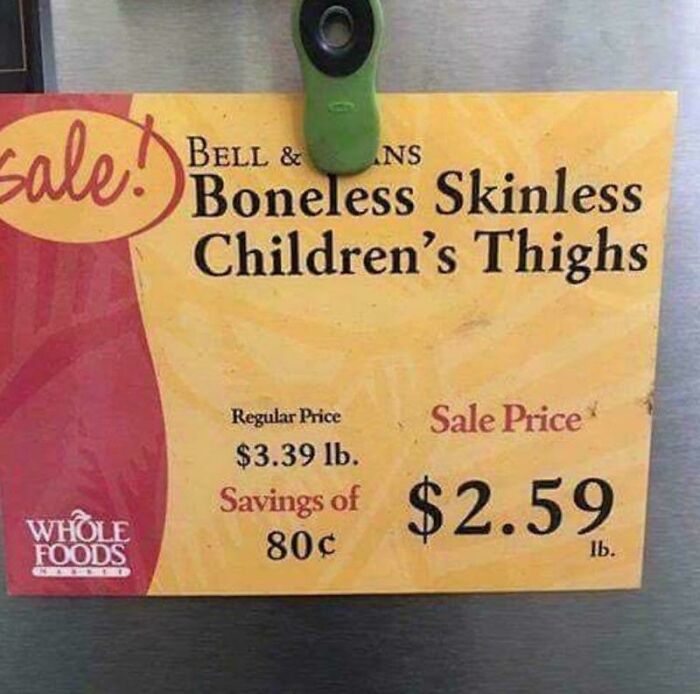
I Don't Know If This Fits Here, But Do Not Leave Children Unattended At Whole Foods
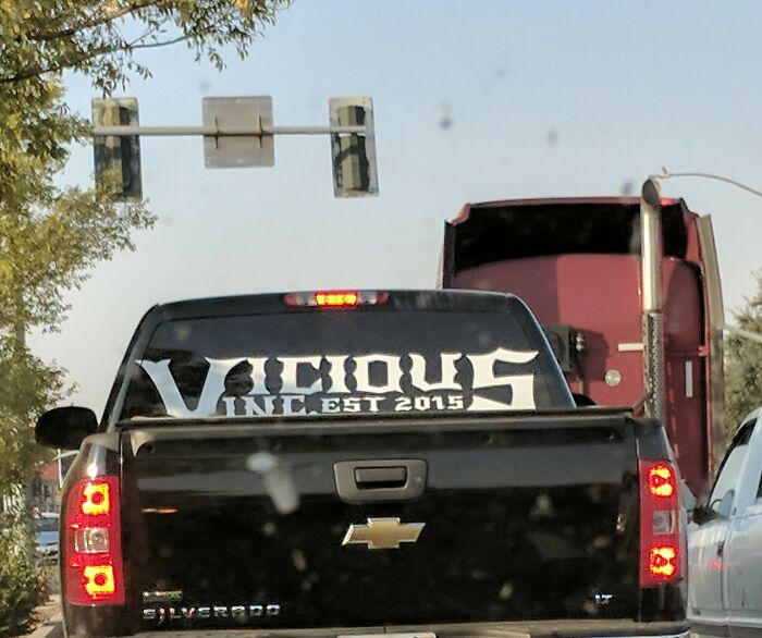
Vicious Incest?!
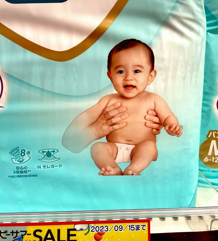
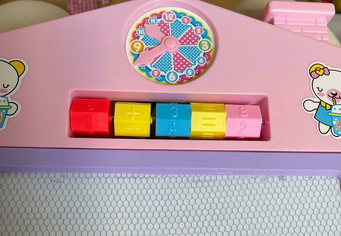
Diapers For Mutant Baby
The author of 'Branding that Means Business' said that once designers have a good grasp of what users want, they then set out to create clear objectives and goals for their designs. Having a plan here is paramount. "They need a clear roadmap to follow, like a GPS guiding them to their destination. These objectives help keep the project on track and ensure that the end product fulfills its intended purpose."
On top of that, collaboration can be a big asset when it comes to creating quality—Johnson calls it a key ingredient. "Designers must work closely with various teams, including engineers, marketers, and quality assurance professionals. Their input and expertise are invaluable in ensuring that the design aligns with both technical feasibility and market expectations. Collaboration fosters innovation and helps avoid potential roadblocks down the road."
Finally, the designer has to focus on prototyping and iteration to fine-tune everything. "Designers often create rough drafts, known as prototypes, to get a sense of how the final product might look and feel. They share these with users to gather feedback, helping them to improve the design incrementally. Think of it like sculpting with a piece of clay—it gets better with each pass."
Architect: So How Many Windows We Thinking? Client: Yes
I'm Just Gonna Let The Fire Consume Me
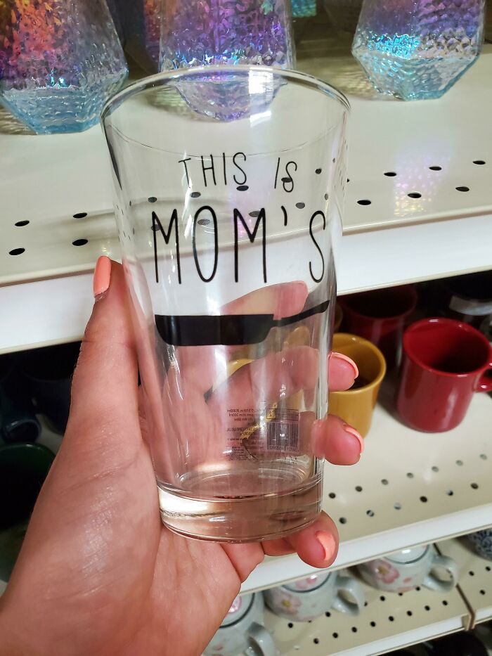
Please Don't Season The Birds
In the meantime, we were curious what the consumer psychology specialist would advise designers who can't seem to choose between two seemingly equally good designs. "A product designer can consider a few factors to make the decision," the host of the human nature and marketing psychology blogs told Bored Panda.
"First, they should revisit the initial objectives and goals of the project. Which design aligns better with these goals and the intended user experience? Second, they can involve potential users or stakeholders to gather their opinions and preferences. Sometimes, a fresh perspective can highlight subtle differences that make one design more appealing," the expert listed what designers should consider when making the choice.
"Third, think about practical aspects like cost, production feasibility, and maintenance requirements. Which design is more cost-effective or easier to produce and maintain in the long run? Last but not least, consider the long-term impact and adaptability of the design. Will one design accommodate potential future changes or trends better than the other?" he said.
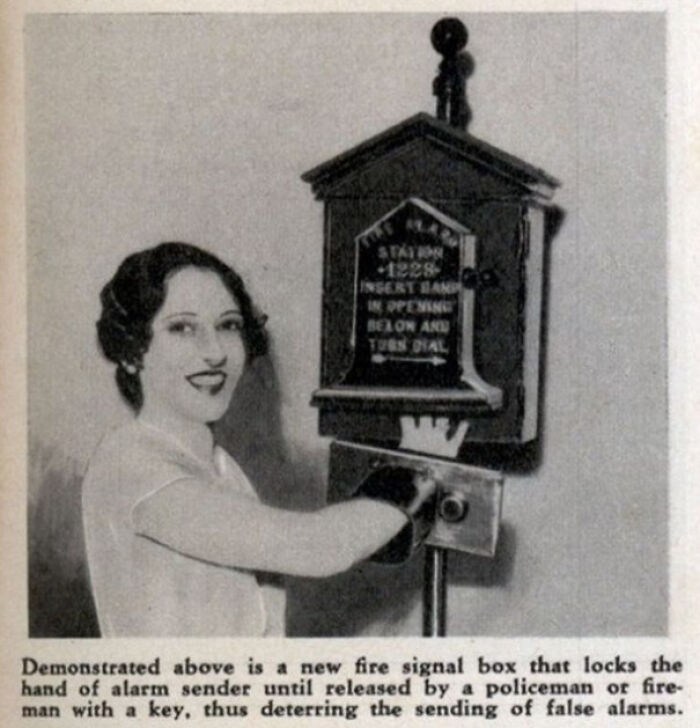
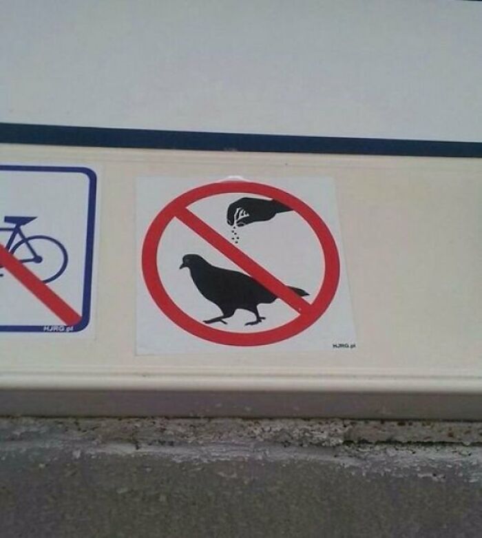
"How Do We Make It Clear That It's A Male Hand Without Seeing The Nails?"
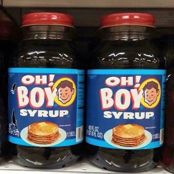
Correct Punctuation Is A Must!
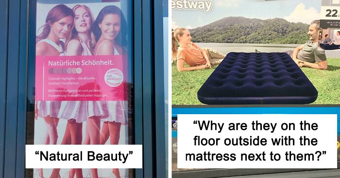
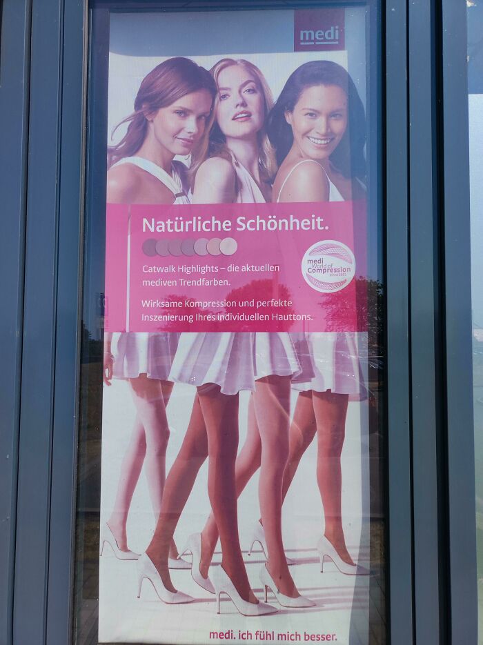
Natural Beauty - Four Pairs Of Legs For Three Enourmous Torsos
"Making the choice might involve a combination of these factors, guided by a deep understanding of the project's core objectives and the needs of the end users. Ultimately, there's no risk-free scenario here, as there is always a bit of uncertainty about how a product will be used and interpreted in the real world," he said.
But by testing, iterating, and gathering as much data as possible, product designers can hedge their bets to the more likely option," Johnson shared. To read more of his insights, be sure to check out his human nature and marketing psychology blogs where he tackles a variety of interesting topics.
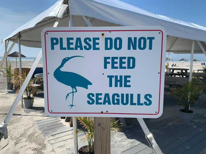
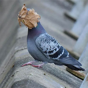
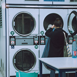
Mate, I Don't Think That's A Seagull
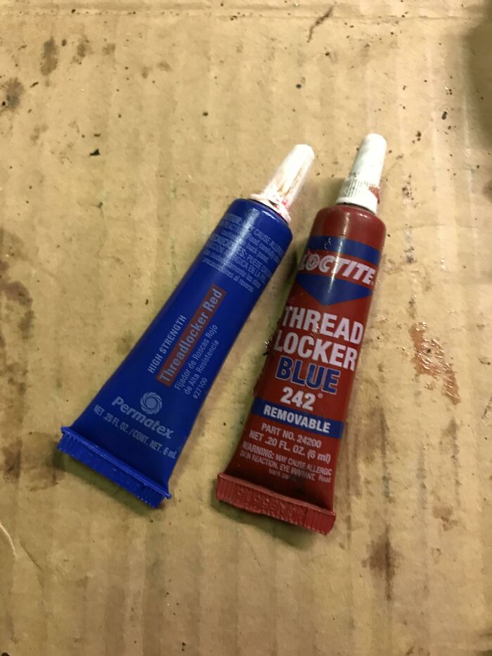
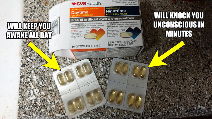
I Needed Red. Guess Which One I Grabbed At First
Thanks For Reminding Me
The awful design-focused subreddit is an integral part of Reddit as a whole. If you ever go on the site, it’s very likely that you’ve seen their posts in your feed.
At the time of writing, the sub has been around for over 12 years. The community currently stands at 3.8+ million members and it seems like it’ll continue to grow. Things might change, but bad designs are a timeless classic!
All active members are expected to maintain a high level of quality in terms of what they submit, from the content itself to the descriptions. For one, their posts have to be related to bad designs, otherwise, they may end up getting removed.
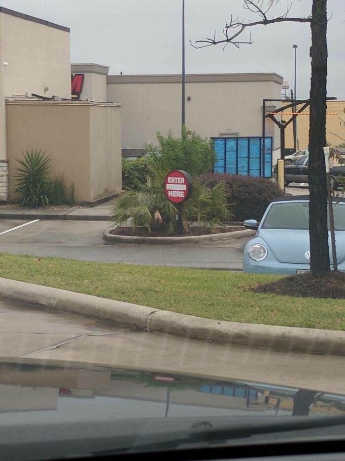
I've Been Conditioned To Recognize This As "Do Not"
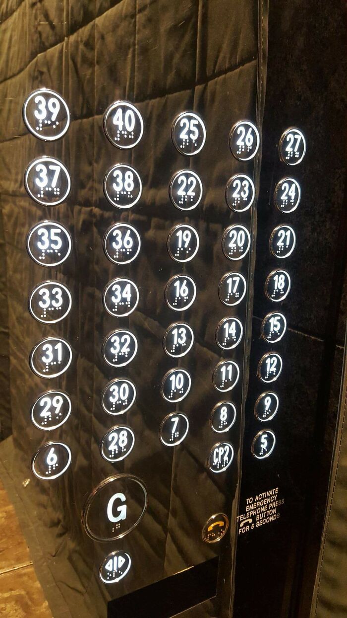
This Elevator
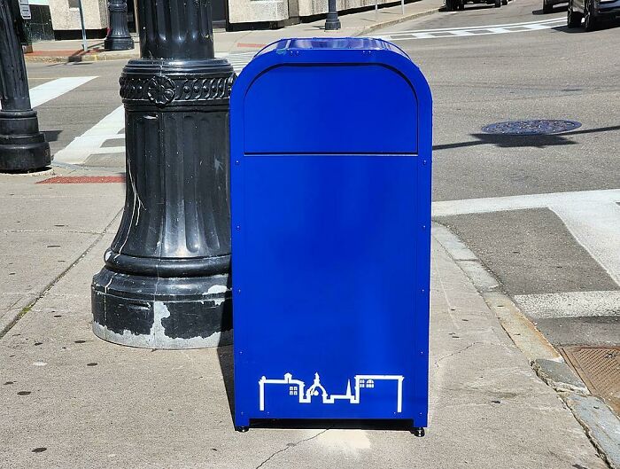
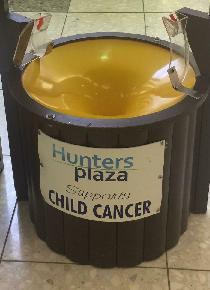
These New Public Trash Cans In The Us City I Live In (Binghamton, NY) That Definitely Won't Confuse Older Folks Trying To Send Mail
Low-effort and low-quality posts can also end up being trashed if the moderators feel like they don’t meet the standards they set for the community.
Aside from that, all redditors are expected to avoid common reposts and steer clear of bad software design posts (those belong on other, more tech-focused online groups).
Memes are also to be avoided: the design fails should be obvious to the audience without having to poke fun at it with image macros. As in other parts of Reddit, all members of the sub are to respect their fellow internet users and treat them with dignity.
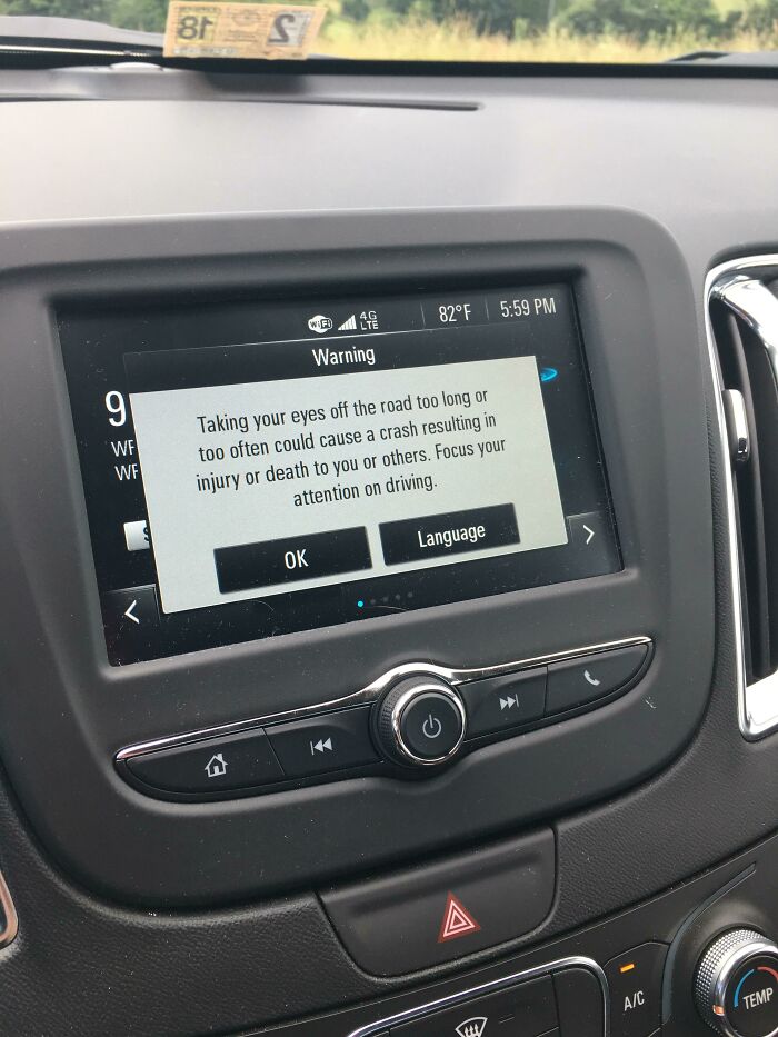
Very Long Message Warning (While Driving) Not To Take Your Eyes Off The Road For Too Long
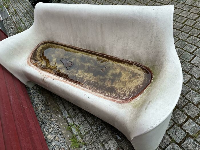
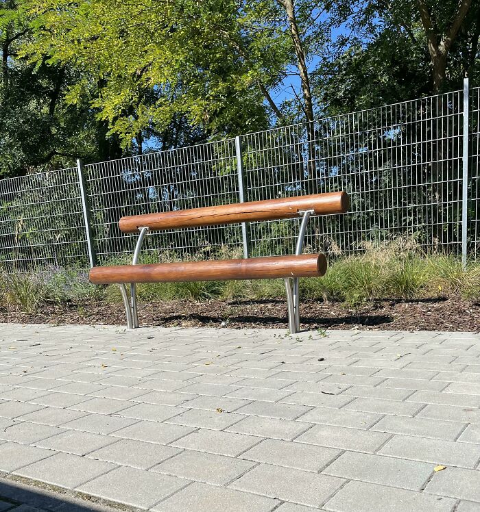
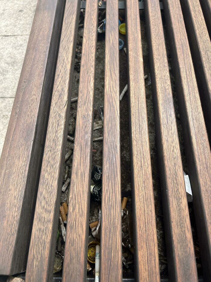
A Water Filled Bench, As There Are No Holes…
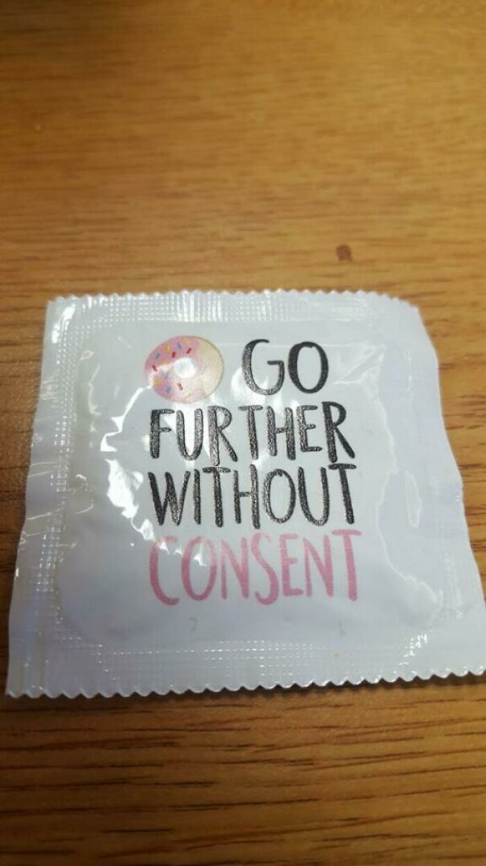
Safe Sex Campaign On My Campus Handed These Out
Even though taste can be a very subjective and individual thing, there are some universal design rules that help differentiate between ideas that work and ones that are bound to fail miserably.
At its core, bad design is about an inability to do what’s expected of it. Say, for instance, if a product is unwieldy or hard to use, or a poster doesn’t inform the audience of what it should.
Design legend Dieter Rams had 10 principles of design that practically everyone in the field knows. According to him, good design should be innovative, instead of rehashing the same old ideas over and over again. As such, designers need to start thinking outside of the box, instead of focusing only on derivative projects. Otherwise, you’ll end up stagnating.
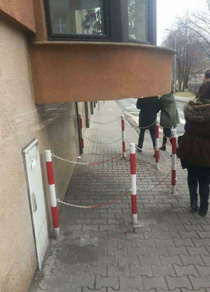
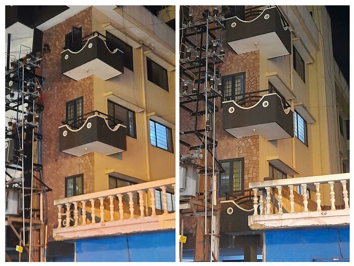
This Balcony Blocking Half Of The Pavement
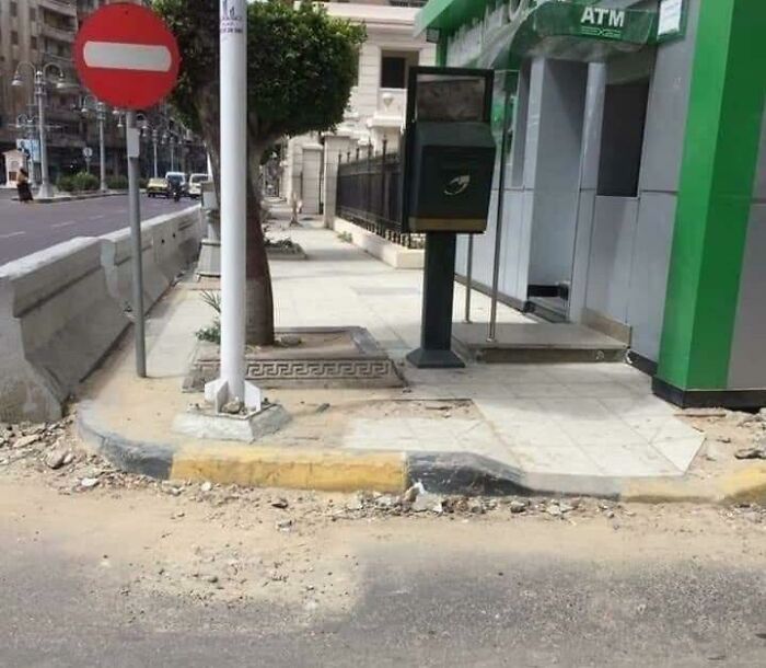
Thanks To The Ramp People With Disability Now Can Access The Curb, Make A 360° Turn And Leave
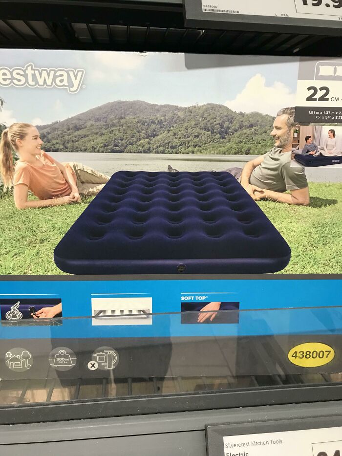
The Mattress Is Edited On The Photo And Why Are They On The Floor Outside With The Mattress Next To Them? It Just Makes No Sense
In the meantime, products have to be useful, as well as aesthetic. And these two concepts have to flow into one another. Designers who focus purely on aesthetics will find that nobody will want to use their products because they’re user-unfriendly.
Meanwhile, products that are purely functional might appeal to extreme minimalists, but others might steer clear of them due to how bland they look.
Rams believes that well-designed products should be easy to understand. Someone who looks at them should immediately know what they do and how to use them. Ideally, the products would also be designed in such a way as to make them last as long as possible and be eco-friendly to avoid waste.
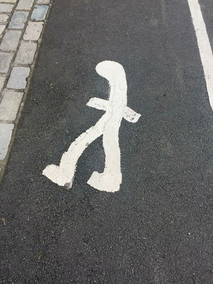
This Painting In The Pedestrian Lane
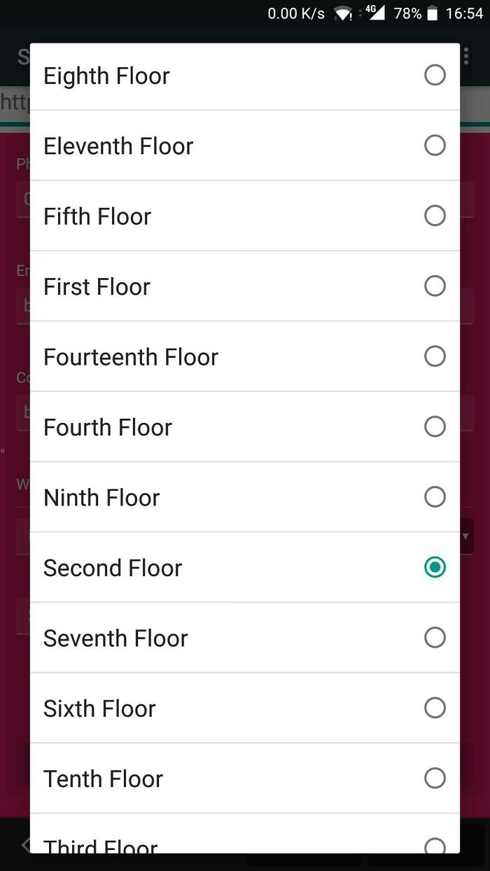
Let's Alphabetically Order The Floor Numbers
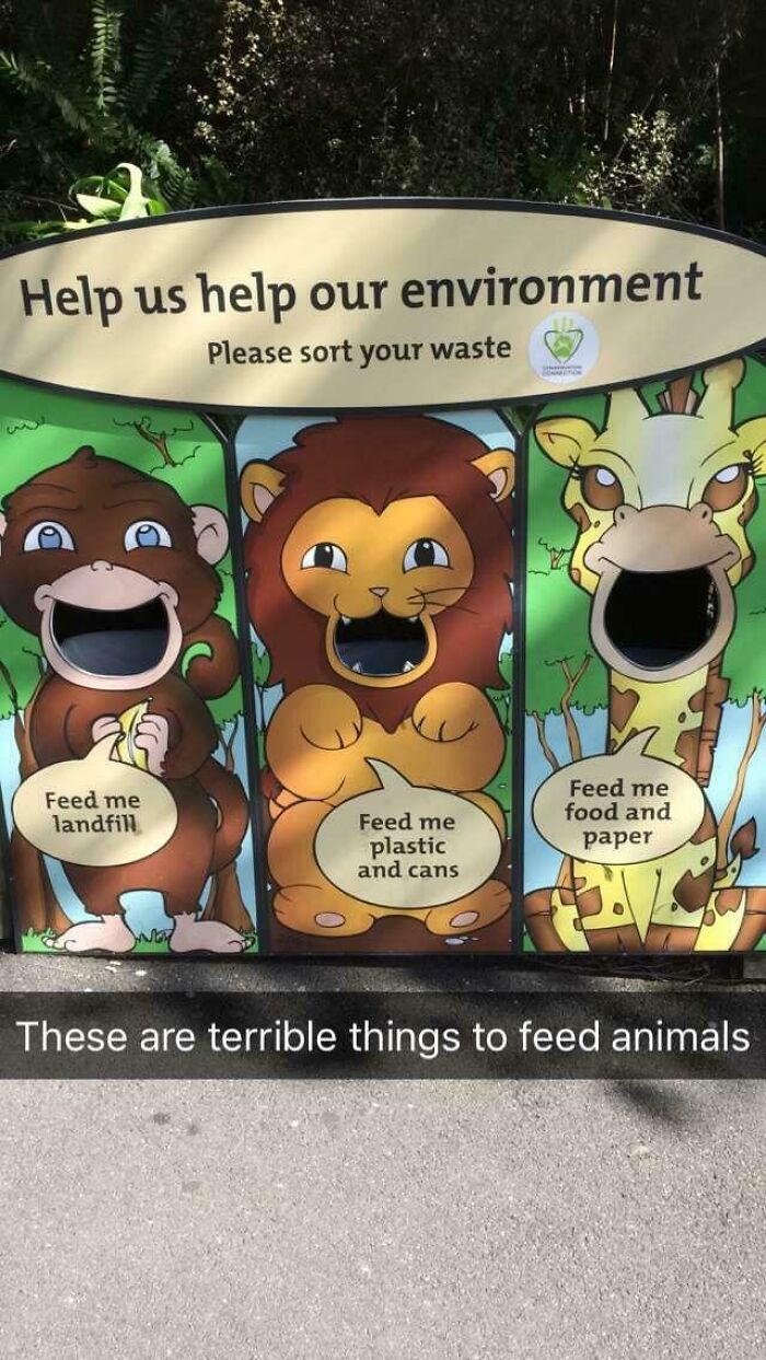
Teaching Kids Terrible Things At Wellington Zoo
The same principles broadly apply to architecture and public spaces as well. "A modern design should not only look beautiful, but it should also be functional and serve a purpose,” the founder of the ‘Call it Design’ project on Instagram explained to Bored Panda during a previous interview.
“A well-designed space should feel open and uncluttered, with each element having a purpose and contributing to the overall aesthetic," the design expert said.
"[The] space should not only be beautiful and functional now. It should also stand the test of time and continue to look relevant and modern for years to come,” they told us about the importance of thinking ahead into the future.
I Don’t Think That’s Where The Eyes Are Supposed To Be On The Gorilla
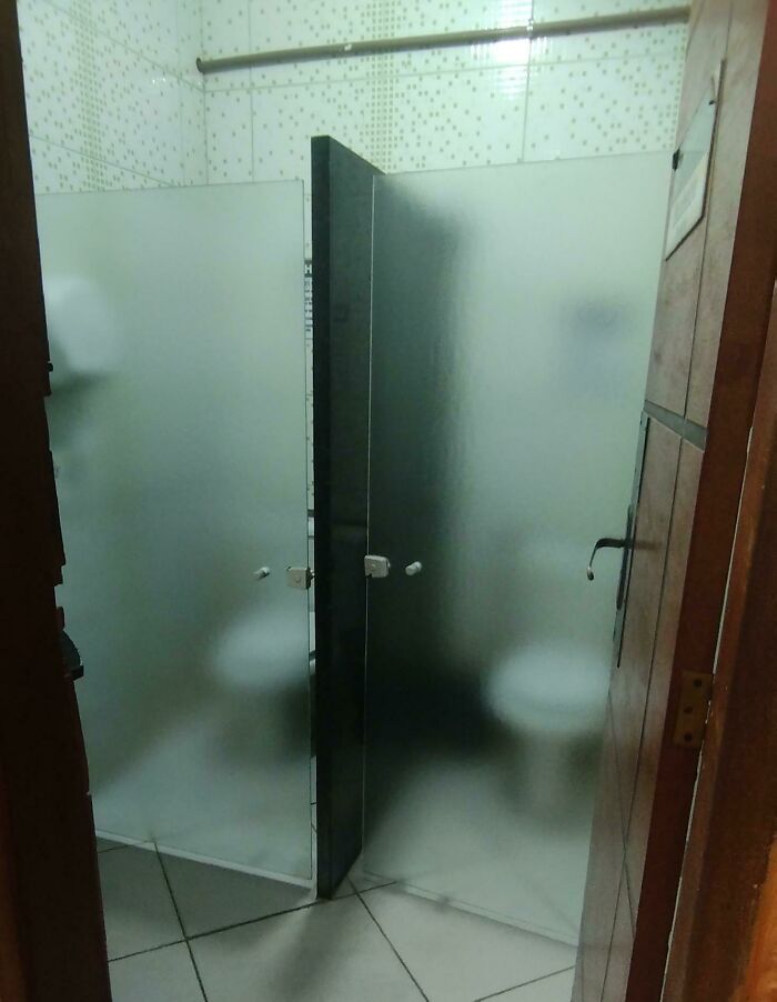
The Students At My Course Complained About Not Having Enough Privacy And They Decided To Install Glass Doors To Solve The Issue
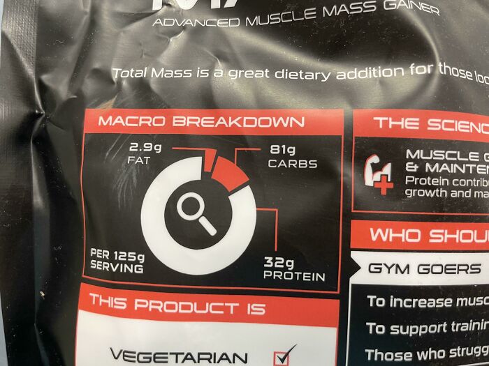
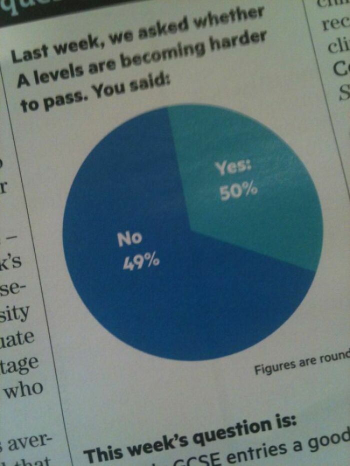
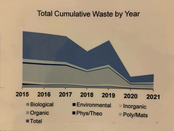
Crappy Misleading Pie Chart
We’d love to hear your thoughts about the designs featured in this list, dear Pandas. Which ones did you personally think were the worst of the bunch and why? Were there any products or graphics that you thought weren’t all that bad? Scroll down to the comment section to share your opinions. In the meantime, for some more splendidly horrendous design fails, take a peek at Bored Panda’s earlier posts.
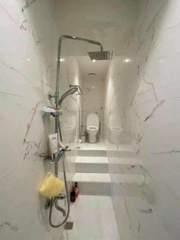
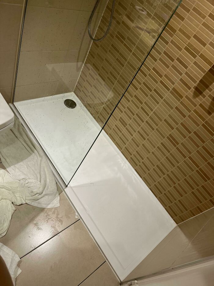
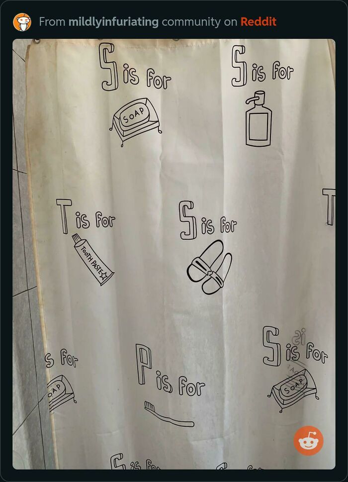
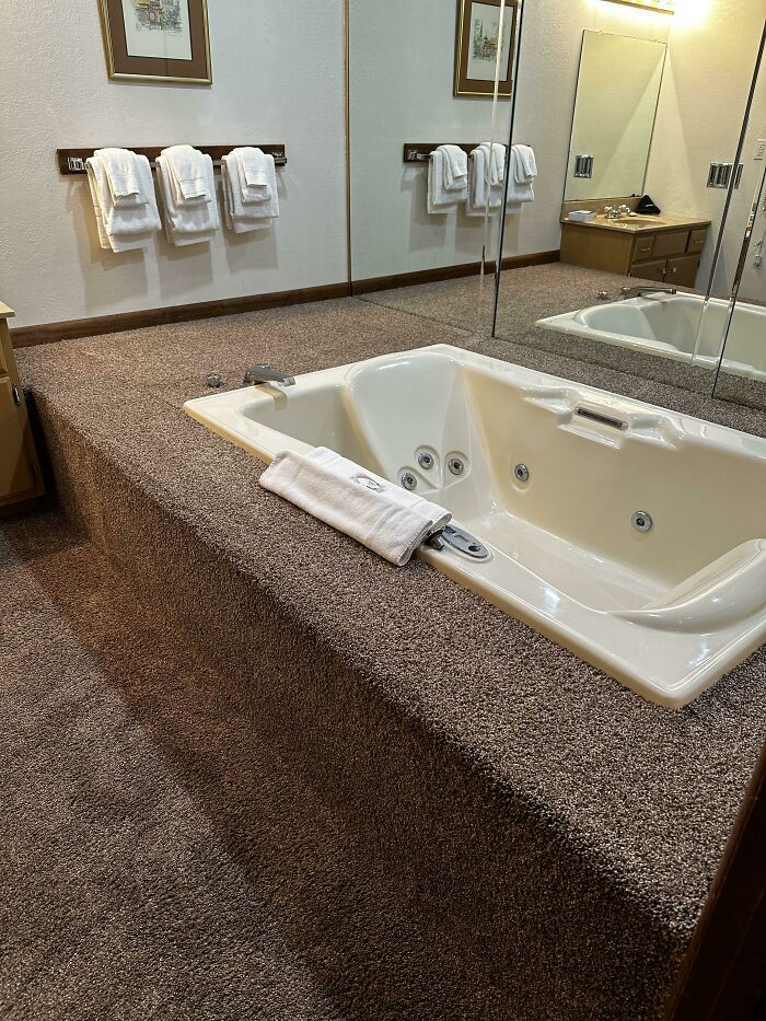
Not Only The Shower And Bathroom Are Together,it Wasn't Built For Claustrophobic
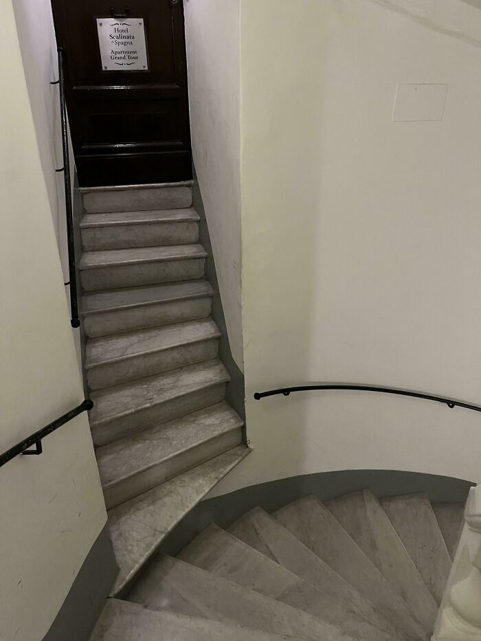
The Staircase At My Hotel Room Just Drops Off
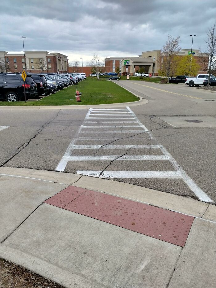
Brand New Handicapped Ramp At My Local Public Park
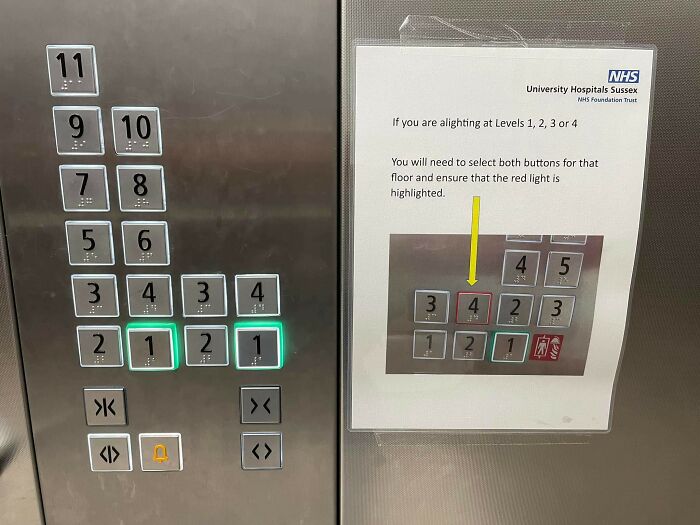
Someone Found A Way To Make 'Press A Button, Get To A Floor' Complicated
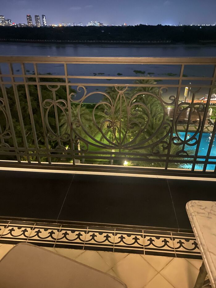
This Tiny, Almost Invisible Ledge Has Made Multiple People Trip Up - And It’s On A Balcony
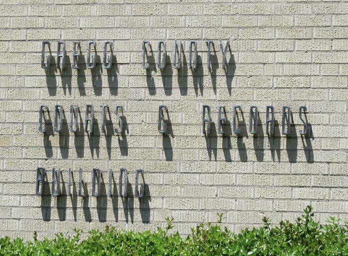
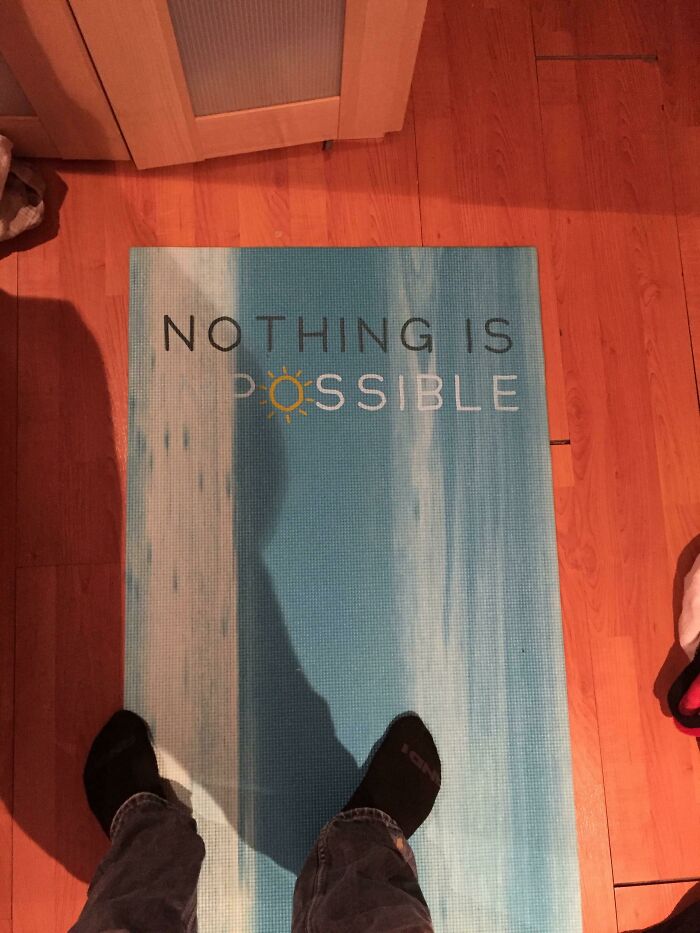
This Signage Is Impossible To Read In The Sun
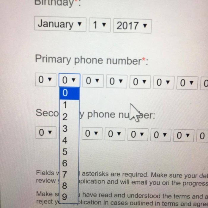
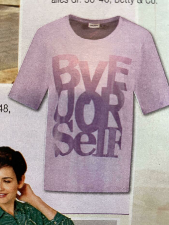
Yeah Okay Makes Sense Thank You
I Think This Belongs Here
Fire Exit In Case Of A Fire
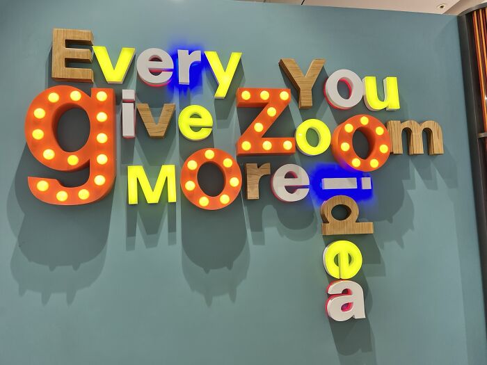
Every You Give Zoom More Idea?
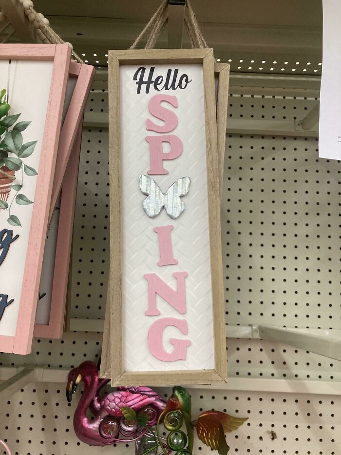
I Love Sping
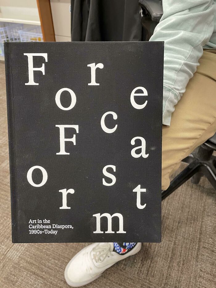
Forcea Forsmt
Why Would You Publicly Admit This
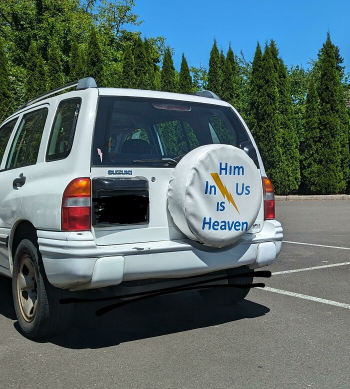
Him In Us Is... Heaven?
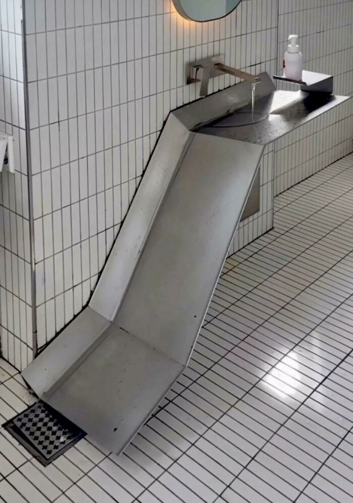
Just Connect It With Pipes Wtf
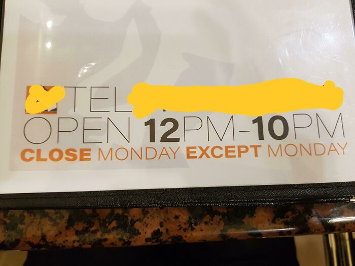
Close Monday Except Monday
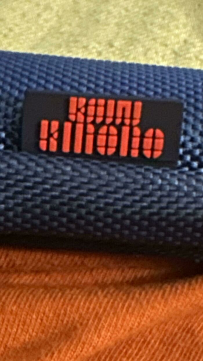
My Stylus Pen And Case Have This Weird Font For The Name And I Can’t Figure Out What It Says Anymore
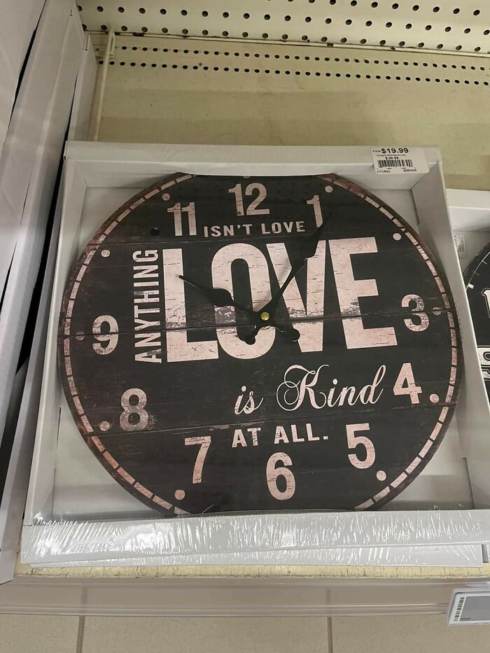
Isn't Love Anything Love Is Kind At All
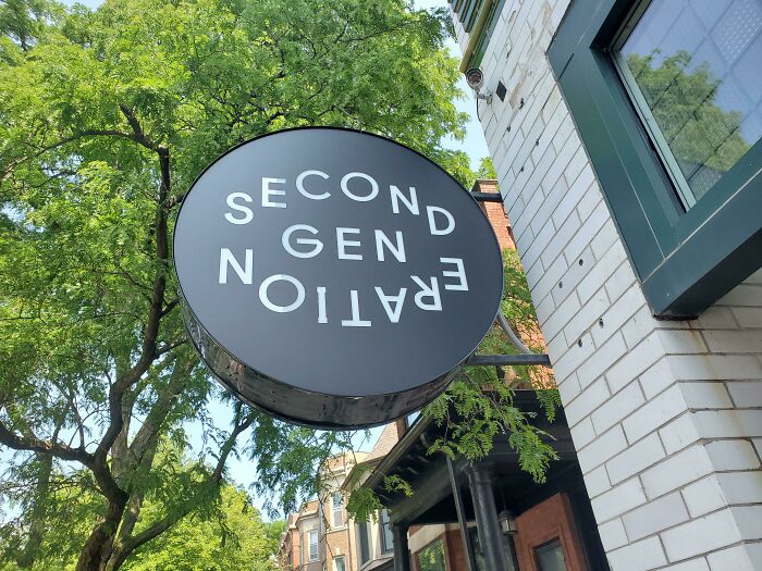
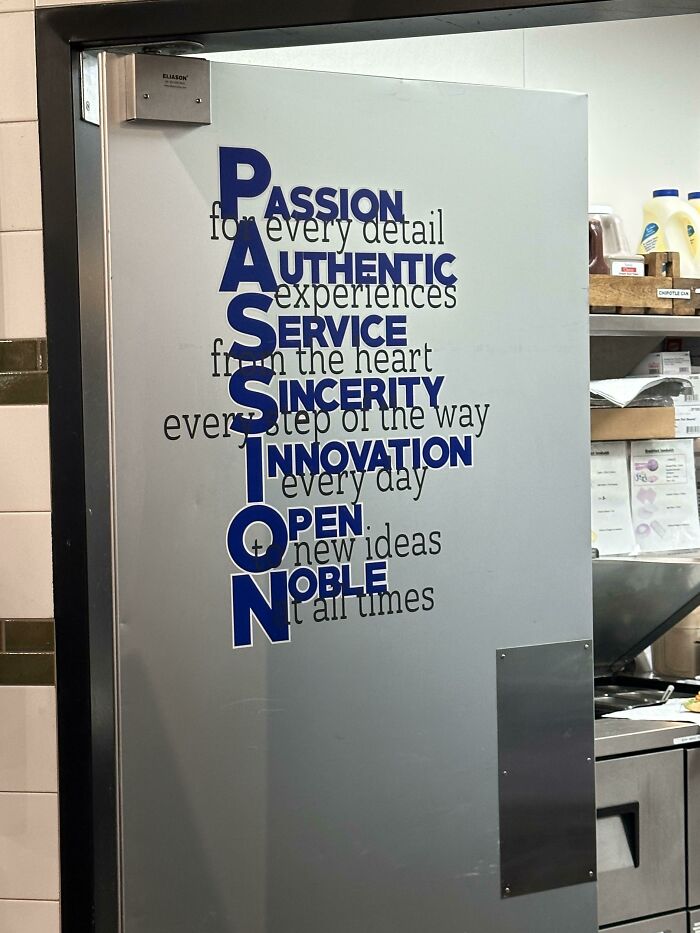
Restaurant In Chicago
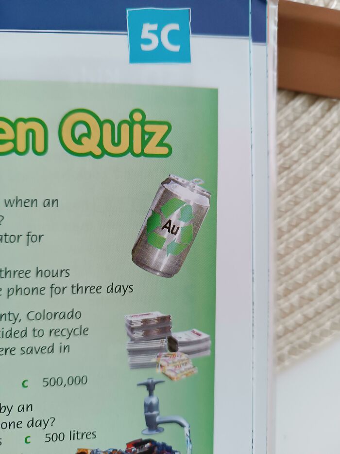
I Love Gold Tins, What About You?
I don't know why there's an app if half the lists aren't going to work on the app.
Dammit Bored Panda, sort it out! I will downvote every article that doesn't load, and I encourage others to do the same. Maybe then they'll fix it.
I like this collection. Not the same old tired ones over again. And all are supremely awful.
Greta Jaruseviciute - most of your posts and your profile are broken links for app users.
I just read this list's author's bio, and I guess of that's what he does now, journalism really is dying. It's kind of depressing. 🥲
Good to know, as Oops... something went wrong.
Load More Replies...I don't know why there's an app if half the lists aren't going to work on the app.
Dammit Bored Panda, sort it out! I will downvote every article that doesn't load, and I encourage others to do the same. Maybe then they'll fix it.
I like this collection. Not the same old tired ones over again. And all are supremely awful.
Greta Jaruseviciute - most of your posts and your profile are broken links for app users.
I just read this list's author's bio, and I guess of that's what he does now, journalism really is dying. It's kind of depressing. 🥲
Good to know, as Oops... something went wrong.
Load More Replies...
 Dark Mode
  No fees, cancel anytime


