We want our homes to look beautiful. If not for a sense of pride or vanity when showing it to others, then for our own pleasure. Coming home after a day of hard work to a home that's cozy, practical, and visually pleasing can help us de-stress greatly.
Unfortunately, we can't all be interior designers and home decor experts. Sometimes, people's attempts at following trends can go awfully awry. Other times, the trends themselves are questionable. TikTok creators Ethan Gaskill and Robert Gigliotti decided to call out the home decor trends that they find questionable. This prompted other people to share their interior design icks as well – check them out below!
@ethancgaskill go to @robertgigs page for part 2! PSA we all did these things at one point so absolutely no ill will intended 🖤 #homedecor #interiordecor #icks ♬ Chopin Nocturne No. 2 Piano Mono - moshimo sound design
This post may include affiliate links.
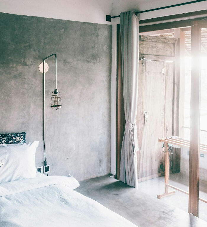 Overly industrial/minimalistic spaces.
This got really popular with the Kanye and Kim house, everything was concrete or plain metal. It feels so cold and detached, it's not comfortable.
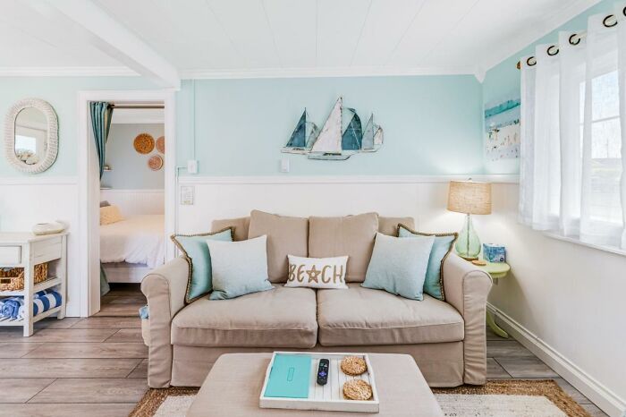 Overdoing the theme.
I love a beach house, but people get too literal. You don't need a 'beach' sign to prove that you like the beach.
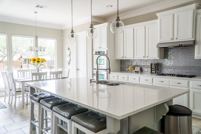 Following the home decor bandwagon.
I feel like social media said white kitchens are horrible, I still think a white kitchen can be so beautiful. Also when shiplap got put into every single home. It's gorgeous in a beach cottage or in a lake house, I don't know why it got brought into high rises in like Denver or Los Angeles. Follow trends carefully and ask yourself 'is this right for my space?' and 'am I just getting this because it's trendy or do I love it?'
Half the fun of decorating is changing your space from what you've got to what you want. Just because my house is Georgian terrace in England, doesn't mean I can't turn my attic into a Moghul tent. (Just to clarify, nothing that we've done to our house can't be put back to the way it was. And if we can ever afford to replace the upstairs flooring with the chestnut planks it used to be, we will)
Ethan and Robert made multiple videos in the series where they named their home decor icks. Part one is on Ethan's account, while part two can be found on Robert's channel. The pair have a disclaimer under their videos, saying they mean no ill will to anyone and that it's all done in good faith. "We all did these things at one point," says one of the captions.
"Don't take us too seriously," Robert said in part two. "We're just having fun and bantering. Honestly, a lot of people found our last one helpful," he added. And he's not wrong: the pair went viral with their "Home icks" series, with the most popular video garnering 2.5 million views. One commenter even said: "This series needs to be picked up by Netflix, seriously, I would watch this for hours."
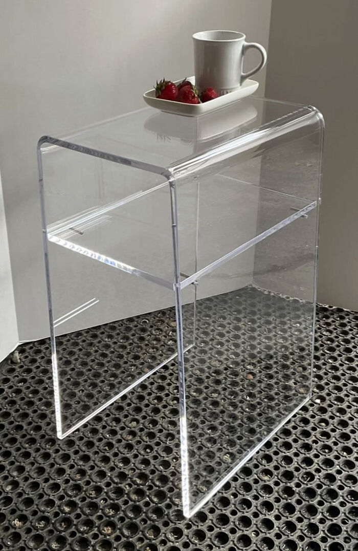 Lucite furniture.
I in general don't like clear furniture or clear surfaces. Lucite is better suited in your bathroom drawers, to help organize your products, not to be used to dine on or as a coffee table.
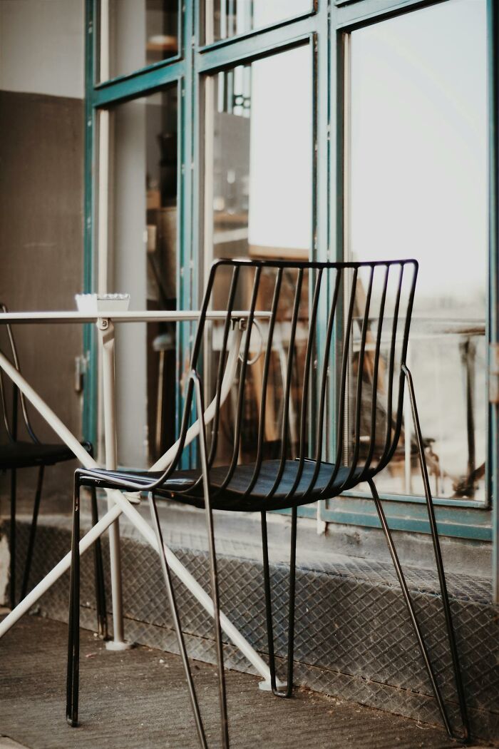 Indoor furniture that looks like outdoor furniture.
That powder coated black steel silhouette or any furniture that looks too concrete or bulky. They look like they're meant to be on someone's back patio with a fire pit between them.
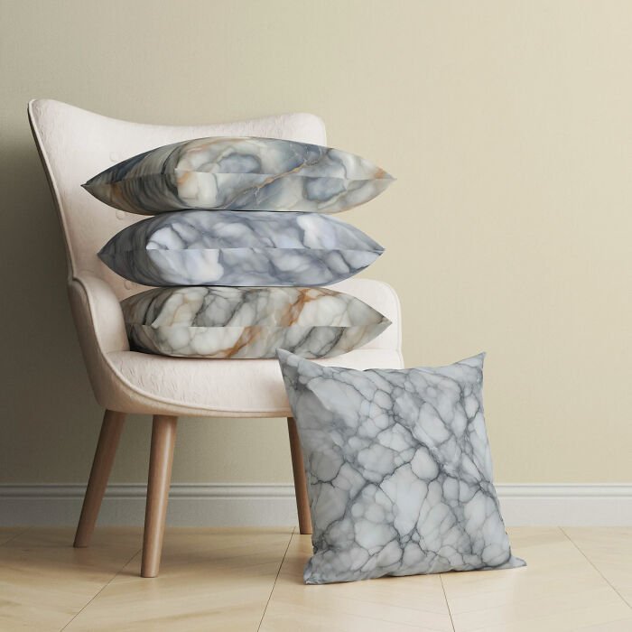 Faux marble curtains, bedspreads, ect.
Anything that is printed in marble. I don't know why this became such a thing. I fell like marble is the new galaxy print.
Ethan and Robert are not professional interior designers, but both have a very keen eye when it comes to home decor aesthetics. Robert told Business Insider that his mother flipped houses when he was growing up in Connecticut, so he's seen his fair share of interiors. He started helping her pick out tiles and other finishes when he saw that many houses were what he calls "builder gray."
Both of Ethan's parents were in the house business, too. His mom was a real estate agent, and his father built custom houses. "My mom was always around the house and really ingrained in my brain the idea of keeping a tidy space and making sure your space is a kind of reflection of who you are, in the way that it sort of impacts your mind," he told the publication.
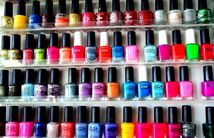 Displaying toiletries as decor.
Toiletries, nail polish, makeup if you're over 14 years old. I don't need to see your Essie nail polish collection stacked like it's a spice rack.
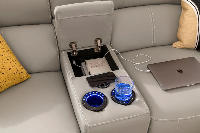 Furniture that has technology built into it (charging ports, recliners, ect.).
It has never sat right with me. In theory it seems like such a good idea, having a charging port that close to you is great, but what happens a year later when the fuse burns out on that? Or the plug type changes?
If the fuse burns out, you replace it. And, while USB plugs are constantly changing, the good old "standard" USB (usually on the other end of the cable) is still in wide use. Sure older versions are slower etc, but they will still work. If i'm watching TV, i probably won't mind if my phone charges in 1 hour instead of 30 mins. If it's urgent i'll get my äss off the couch and use a fast charger
 Jonathan Adler.
Specifically the drug pillows or drug coasters and drug jars. Are you showing off that you do pills? Is that funny?
The pair says they're not trying to be the authority on what people should or should not do. They're simply pointing out what decor mistakes they or their friends and family made throughout the years. "This is a lot of stuff we've done ourselves, or we grew up with siblings that have done this, or parents, it's all things that people kind of agree on or relate to in a way, that they can kind of laugh about," Ethan told Business Insider.
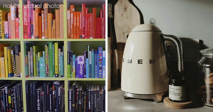
 Color coded book shelves.
A home needs character, needs charm, mix-match looks good, don't do smallest to largest, just put them in order of weather you've read them or not.
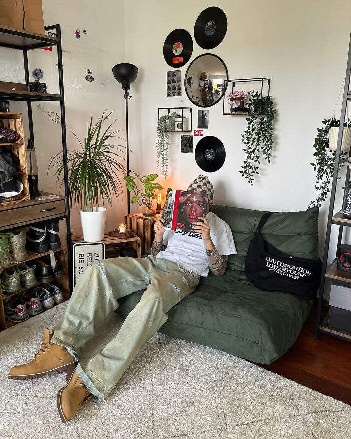 Using too many iconic designer pieces.
Too many notable pieces. When everything is just a name. This relates to fashion too, if someone's wearing designer everything it can get tacky.
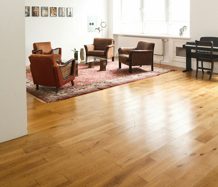 (Bad) vinyl flooring.
House flippers are buying the coolest homes and absolutely destroying them, and the flooring is the one that I see most often. These really high contrast, printed looking vinyl wood floors - it's bad. Your floor doesn't need to make a statement.
What's wrong with it? Unless you go for the really cheap ones, it looks elegant, is waterproof, it's easy to install and not that expensive. You can get really good quality, in different textures and styles for a fraction of the cost. It also does not need actual wood, which are normally high end like basswood, redwood, teak or oak, which add to deforestation.
Robert also says it's not about calling people out for their poor decor choices. "We're not just saying, 'Don't get this ugly chair. You're pathetic.' We're trying to find ways to make everyone's life easier and have a space that's lasting, that's better for the environment because we're not throwing things away, making people happier."
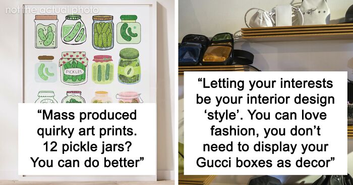
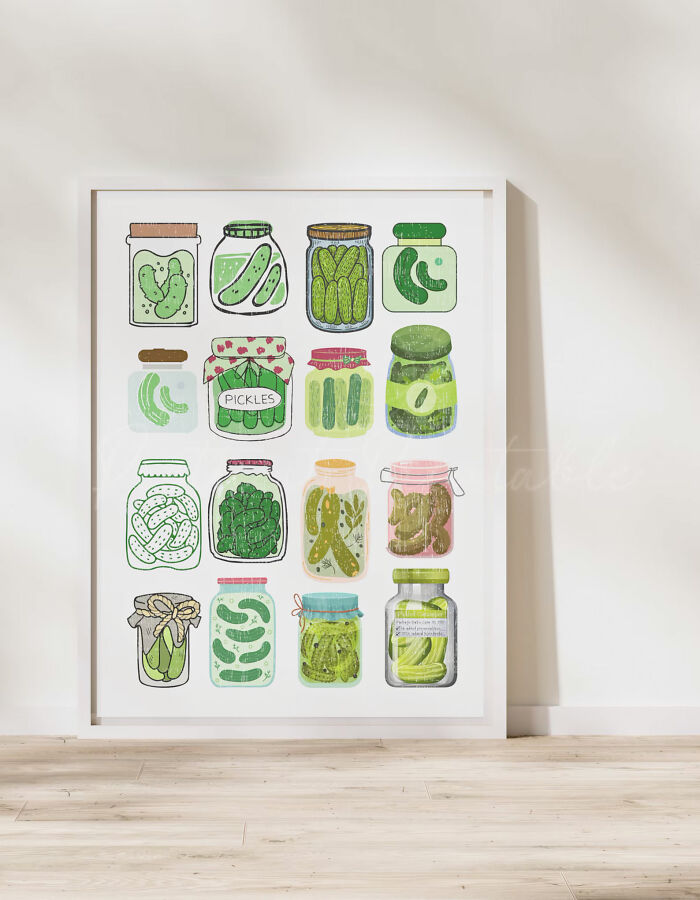 Mass produced quirky art prints.
These are the new 'Live, Laugh, Love' signs. They're always a food pun or a cowboy hat. An art print of 12 pickle jars? You can do better
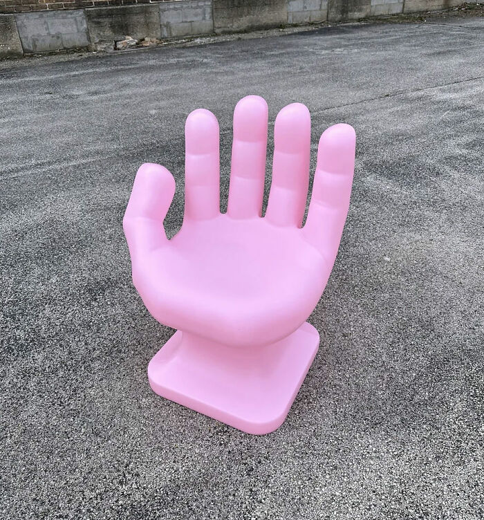 Oversized objects.
Those chain link marble things, they can be wood too, oversized glasses, paper clips, even those hand chairs. They bother me for some reason, they're very tacky.
But mini stuff is okay? And what about my dice box in the shape of a big dice?
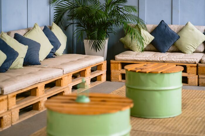 Hardware store supply furniture.
That's the wood pallet coffee tables, using cinder blocks as night stands, or God forbid you take that polyurethane and make that foam cloud mirror. I don't want my home to look like that, leave it to the bars.
Don't insult my giant wooden spool end tables. I worked hard on making those pretty.
Creating your personal interior style can be difficult. Similarly, as with fashion, we tend to be persuaded by trends and the media about whether a piece of decor or furniture is acceptable or not. I, too, like to scroll through Instagram and TikTok for home design inspiration, but, ultimately, it should be about developing your personal style rather than chasing fads, right?
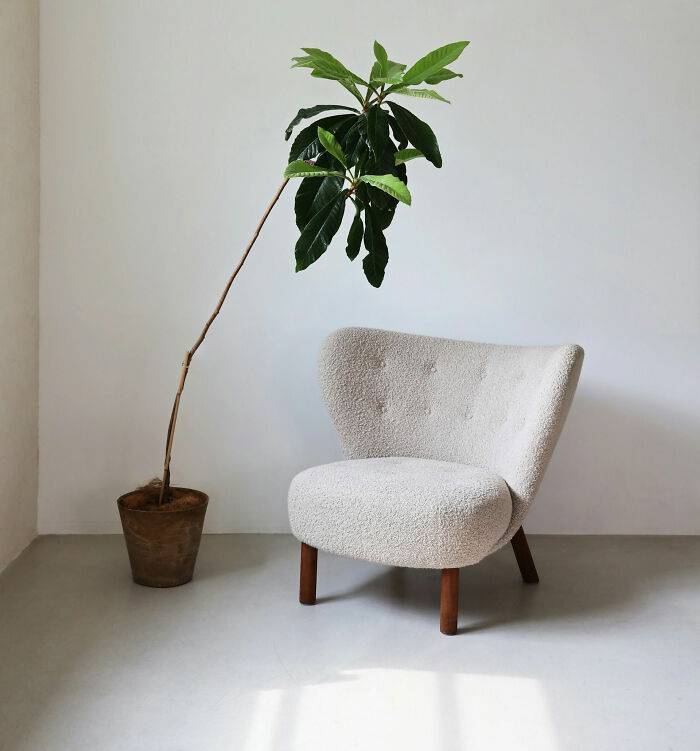 White/cream boucle.
It never looks good, it collects dust, it does not hold up over time. It looks like it always has clumps of hair in it.
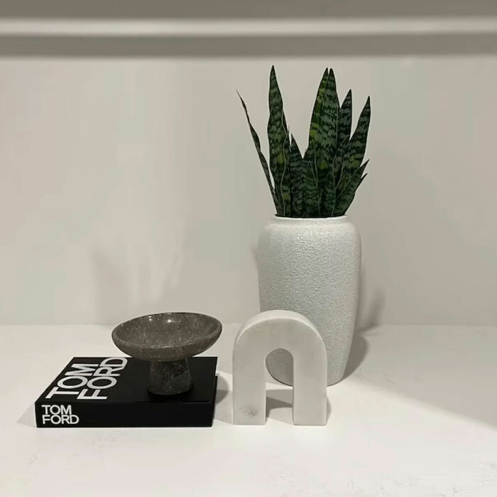 Uninspired coffee table books.
There are so many coffee table books, and I see only this Tom Ford coffee table book. There are so many, I think I thrift 10 a week with the coolest imagery in it and they're inspiring.
Where is OP going that they only have this one very specific book? :)
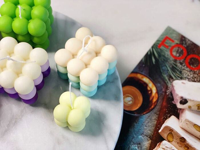 'Quirky' candles.
Specifically these cube-ball candles or the squiggle candles in general. I feel like they're always collecting dust, no one ever lights them.
Leonard Bessemer, a furniture designer and the founder of Objects for Objects, told The Washington Post that what you see on the screen won't necessarily look nice in your home. "People want to imitate really cool aesthetics they see on Instagram, which I think is great, because then your home is going to look nicer, but the fallacy is that it isn't necessarily your personal style."
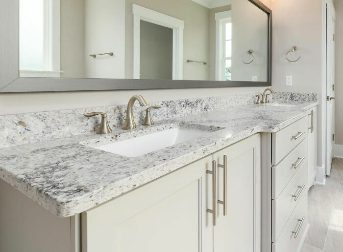 Peel and stick / amateur DIY project.
Overly DIY'ed spaces. I don't want to have the edges of my countertops peeling. It just feels so temporary.
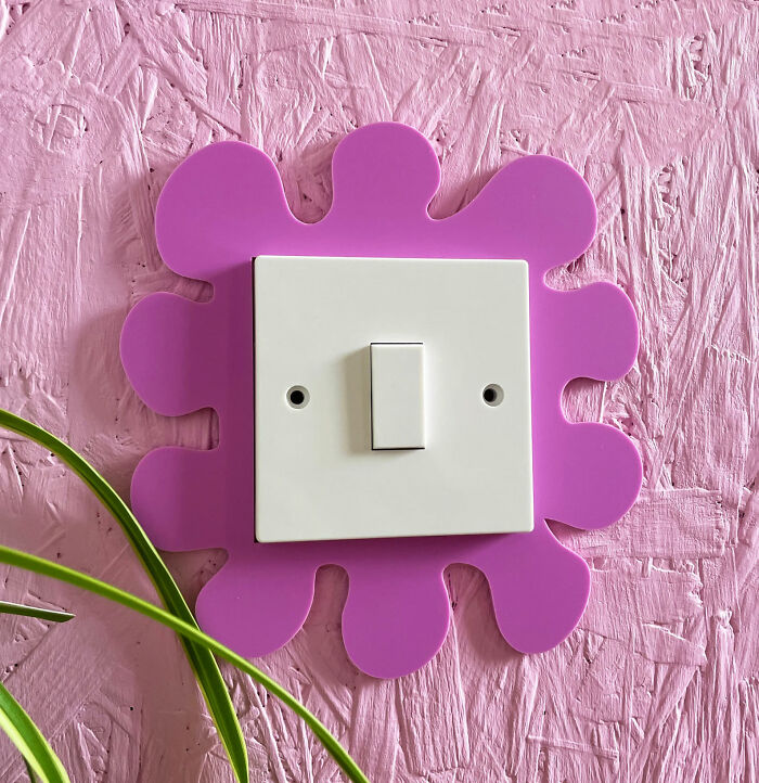 Making everything a moment.
Your appliances don't need to be a moment. Now I'm seeing squiggle light switch covers, your light switch doesn't need to be a moment. Some things can just be simple.
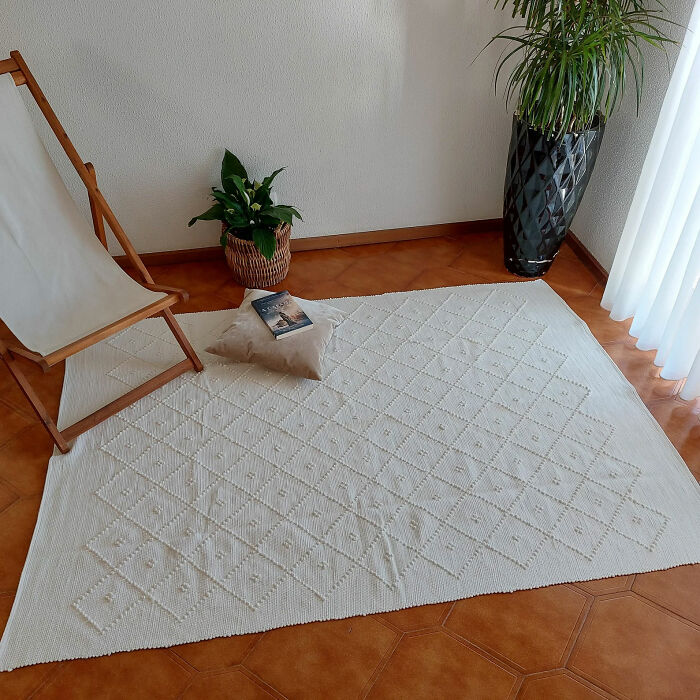 Washable rugs.
In theory this is a good idea, but you end up with a very weird piece of fabric on the floor that looks wrinkly.
Aren't all rugs washable? How else are you going to keep them clean? You just need to send them to the cleaners.
So, how can people find their own home aesthetic? Stylist Allison Bornstein has an interesting suggestion – the three-word method. You choose the three words that best describe what you want your home to look like and build your aesthetic around that. Bornstein herself used the words "classic, '70s, and elegant" for her home.
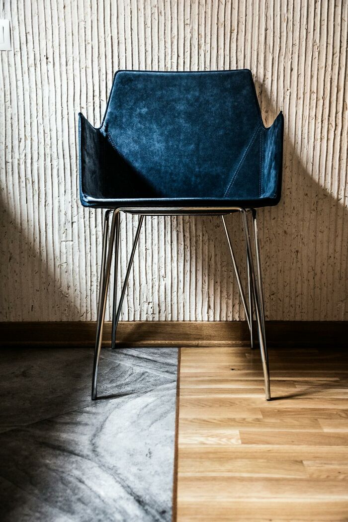 Using dining room chairs as accent chairs.
Using the chairs as a wrong function. You can't tell if it's a dinning room chair or a living room chair, they're a little to flimsy to be either or.
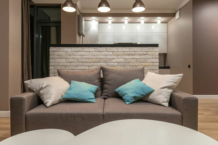 A pop of color (in an all white/beige/grey space).
I'm talking about those all neutral rooms with three teal pillows. Color intertwined throughout your space is way better.
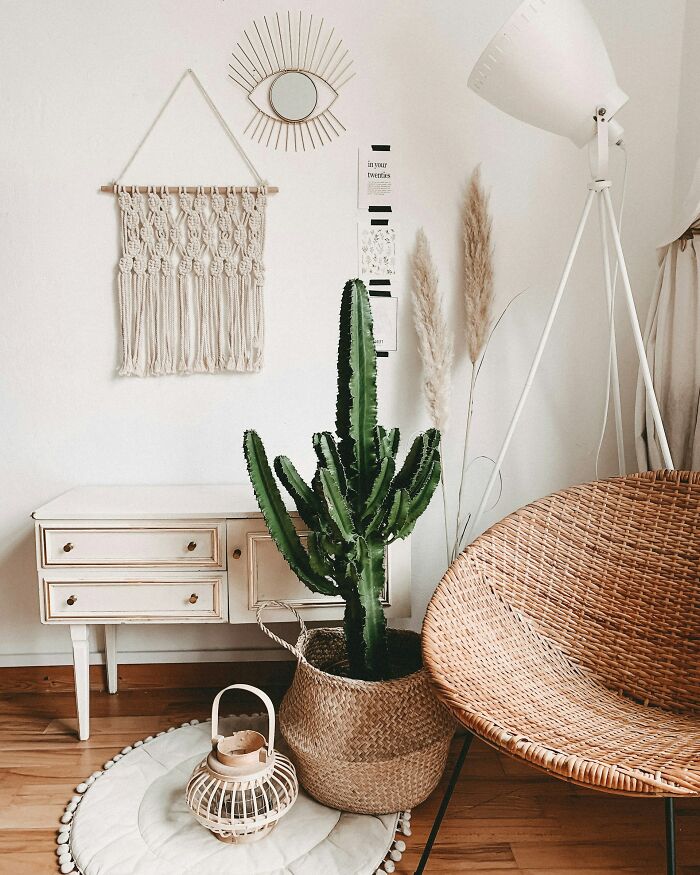 'Boho chic aesthetic.'
It's so trying too hard. The whole aspect of bohemian style is going with the wind, travelling, eclectic and this is too much. It looks like a lot of nail salons. Just go more simple, you don't need to nail a basket to your wall.
The stylist also suggests adding one more word for every separate home space. So, a living room could be playful, modern, and colorful. Then, you'd add one more adjective, like "warm." Bornstein told The Washington Post that mistakes are going to happen, and they might help you filter your three keywords.
 Waterfall edges on a kitchen island or a countertop.
To me this just reads cold and heavy. Even worse - when they do it only on one side.
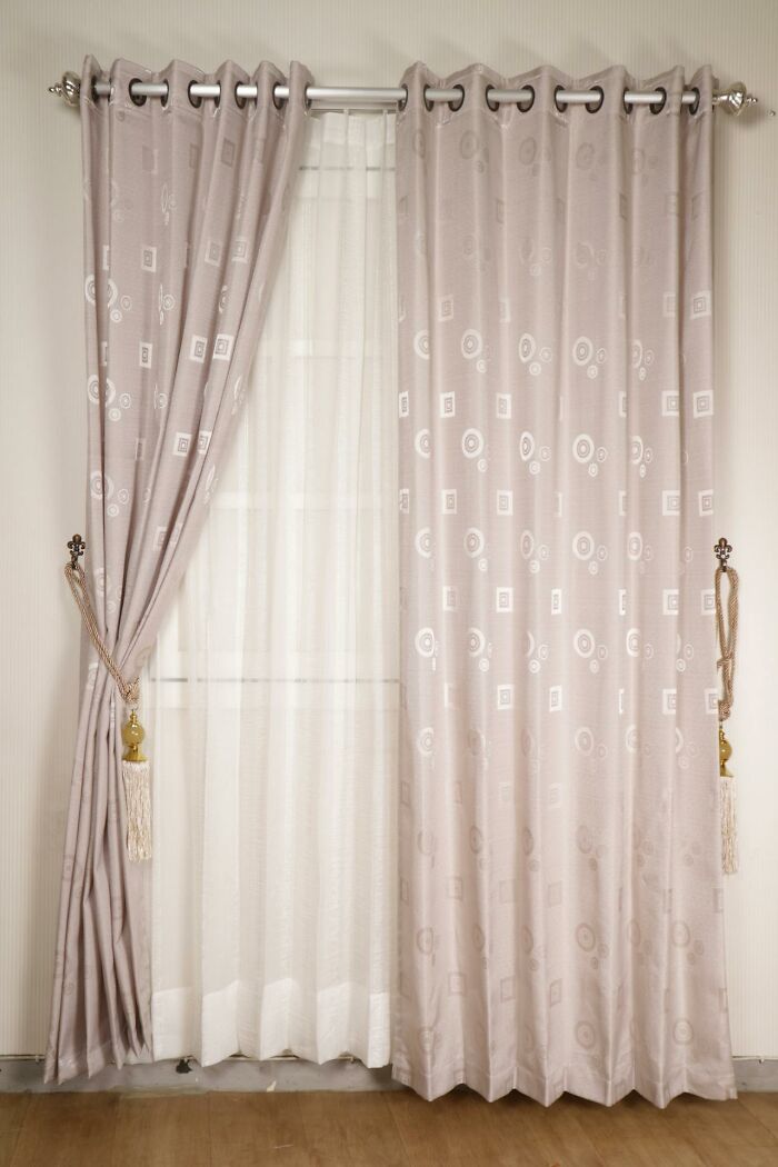 Grommet curtains.
Curtains with those really thick, metal or plastic circles at the top. It's like you have a shower curtain hanging in your living room.
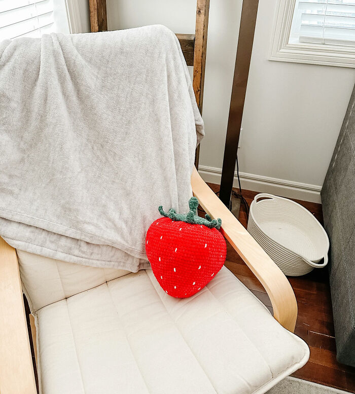 Fake food decor.
Croissant and baguette lamps, egg shaped pillows or cheese block candles. Every food object has become a pillow.
Designer Kati Curtis told Homes & Gardens that her strategy is to mix several styles. That way, no piece of furniture or decor ever really goes out of style. "This approach avoids the ephemeral nature of trends and embraces a design philosophy that stands the test of time, creating a home that feels both lived-in and loved," she explained.
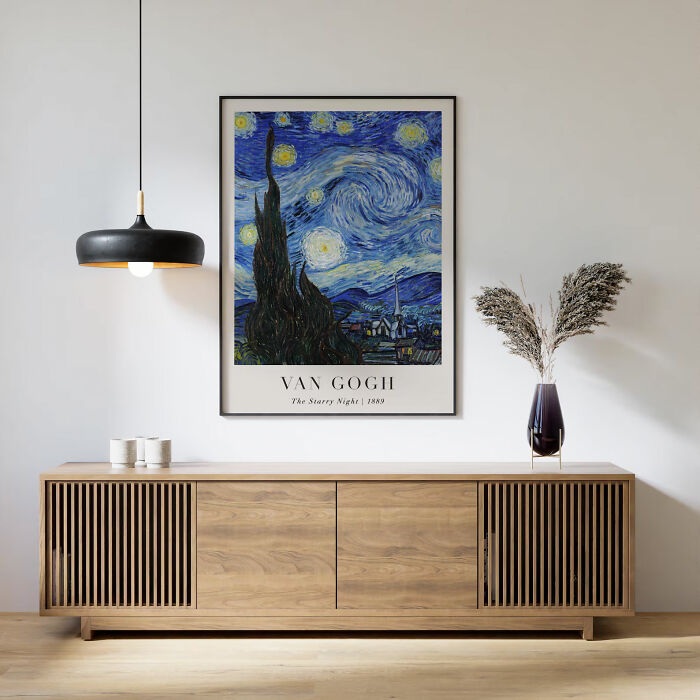 Big box store / mass produced art.
The fake Van Gogh paintings, the Banksy prints. It's like home staging. We know that those aren't original, you know that, you're not trying to fool anyone into believing that, but there's just such better artwork. Support local artists, print a piece of art from your travels.
Meh. If people like something, even if it is massively overhyped and a reproduction, that's cool. There's a reason why many people like looking at a Klimt, Monet, or a Vermeer, so if that's what makes you happy, go for it. Buying or thrifting real artworks is great, but if you can't find something that you like and can affort, no shame there
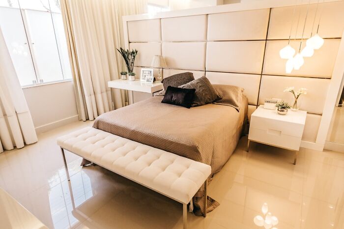 Bedroom sets (all from the same exact collection).
In theory it seems like the obvious solution having a very cohesive space, they all go together, but it feels way less unique and is so much more expensive.
as long as you think you can do better with mismatched furniture, go for it. most of the time, you will spectacularly fail :)
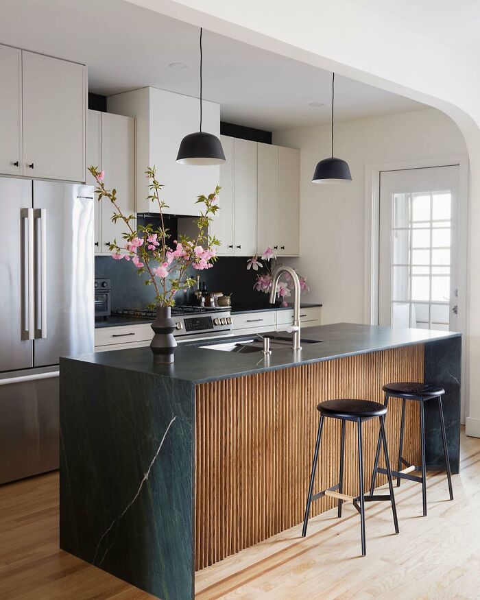 Tambour.
It doesn't fit the vibe of many homes and it's way too overdone. Every piece of furniture has it now. Unless you're into loom or really japanese looking style home.
That photo is (in my opinion at least) a perfect example of a kitchen where the tambour fits the vibes, is not overdone and matches the rest of the furniture perfectly
Well, if we're already doing this for fun, would you share some decor items you don't like, Pandas? It might help others realize what interior design mistakes they're making or, perhaps, what they're missing. Let us know in the comments!
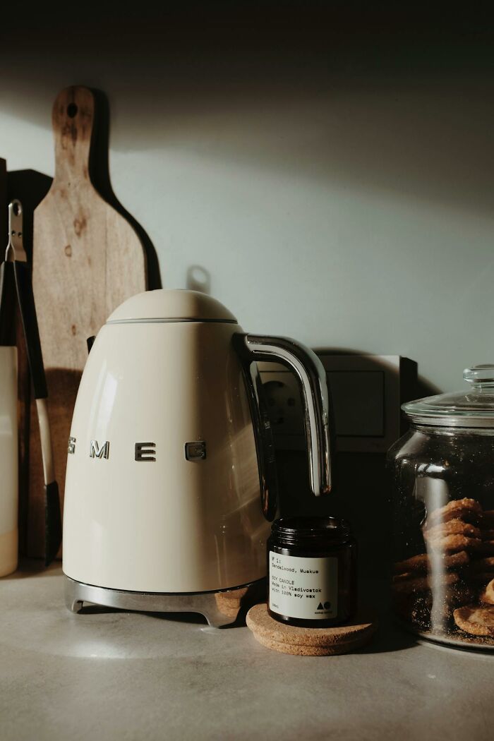 Fake vintage/retro appliances.
I hate things that are like a 'groovy' or retro design. Even if it's authentic, I'm really not a fan of that style.
Idk, those Smeg appliances do look very good. All appliances have some sort of inspiration, so why cant it be retro too? I personally quite enjoy the variety so that not all fridges etc have the same chrome space-coffin looking design.
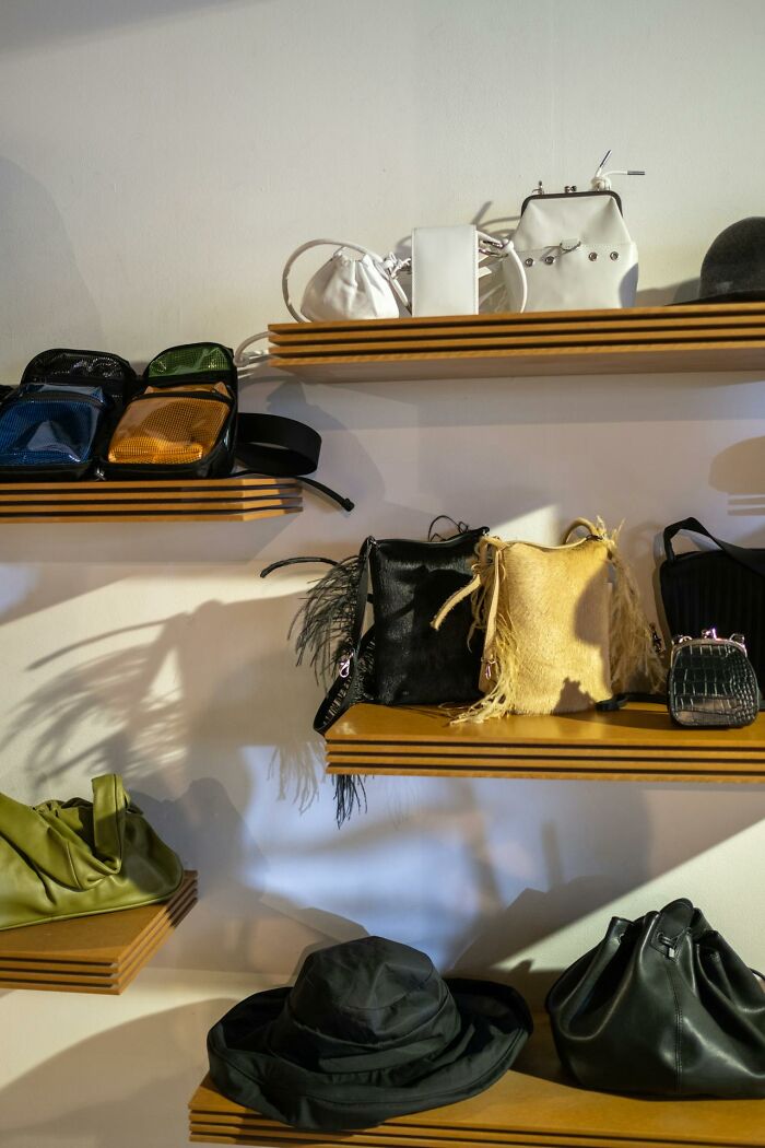 Letting your personal interests be your interior design 'style'.
You don't need too much of one particular thing or style in a space. Your home can speak to your interests in more subtle or timeless ways. You can love fashion, but you don't need to display your Gucci and Hermes boxes as decor.
Your interior design style *should* reflect your personal interest. That is what makes a house a home. It adds character, personality and uniqueness. Otherwise your house will look like a hotel. Trick is not to overdo it, and be tasteful. And also, be you.
 Keeping old Aesop / Le Labo soap bottles and refilling them with cheaper alternatives.
If you want an attractive soap situation in your bathroom there are plenty of cool refillable soap dispenser options.
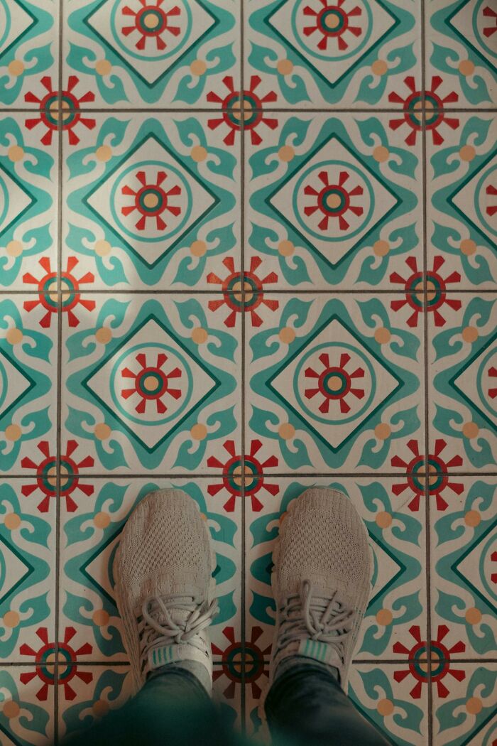 Patterned tiles.
They're giving AirBnb core, trying to be quirky. They look cheap to me.
I'd rather have this than the 1950's era linoleum in my kitchen that, no matter how hard I try, never gets completely clean despite weekly vacuuming and mopping. It's just too old. I wish my dad was still alive so I could ask him why every room in the house was renovated over the years EXCEPT the kitchen.
This article is just, 'My taste differs from other people's, and you need to hear about it!' Let other people like what they like!
As a huge fan of extremely tacky decorations, I can tell I'm not this article's target audience xP
I both respect you for that, and will probably get burning eyeballs if I look at your house ;) I hate it, and love that you go for it!!
Load More Replies...I say this as someone who is passionate about design: people take interior design way too seriously, and are needlessly judgy about it. If it's too trendy, or not unique, people are immediately scolded for liking something. Trends are trends for a reason: they are something that many people happen to like. Want your house to look like a 50's Berlin carpark? Go ahead. Want your house to look like the trendiest of all tiktok trends? If that's what you truly like; do your thing. Don't want to think about it at all, and just buy whatever is available at your local store/thrift shop? I mean, I may think that the only real place for a 'live laugh love' sign or a fake flamingo is inside a burning fireplace, but if you do truly like it: go for it, it's your house.
I'd be careful burning a fake flamingo but other than that I completely agree
Load More Replies...After reading this, i think i'll just go home and burn the place down. Who knew i was doing everything wrong?
Well.. This article was a waste of time. Moral of the story-dont fill your comfort zone with things you appreciate, its ick.
The person who wrote this needs some chocolate, maybe ice cream too. He/she is too angry with life. Especially others lives.
They probably just need to watch fewer makeover programmes on the telly.
Load More Replies...What a bitter, mean, and small-minded excuse for an article. Decorate your home how you like and leave everyone else alone.
It’s certainly very arrogant to say that an item looks cheap or tacky just because it isn’t to your taste.
These are merely opinions, and OP makes them sound arrogant, pretentious and sanctimonious without supporting any of its views in merely the "I don't like it" vibes.
That was the most pretentious piece of opinionated garbage I have ever wasted moments of my life reading. Let people make their safe space however their heart likes it without trying to appease the designer goons.
Honestly, who cares if things are in fashion, belong to this or that style or whatever? Unless you're staging a home to sell it, use whatever you like! Enjoy your tacky oversized homemade c**p! It's fun & makes *YOU* happy. I'm 65 & have more fandom posters/pics on my walls than when I was a teen! And don't get me started on the Funko Pops & manga on my shelves!
So often these design influencers talk about interior decor do's and don't from the perspective of what a visitor might see or think of your taste. They fail to understand that a home should be styled for the people living in it. If a visitor thinks it's tacky or dated, who cares! I invite people to my home to have a nice time and enjoy each others company, not to have my home critiqued. Anyone, guest or otherwise, who is critically viewing other people's living spaces needs to get over themselves!
I only agree with two points. I'll add that the light neutral style is impractical for anyone with pets or children. First, the industrial look has zero personality and I can't imagine someone truly enjoying living in its coldness. Second, choosing a style only because it's popular will make a home look cookie cutter, dated and won't satisfy you in the end. I've seen to many remodels that went overboard on farmhouse style. Some elements are timeless, but there's always a better option than half- functioning barn doors folks. They're impractical as well as shiplap which is a magnet for dust and must be vacuumed.
There might be one or two things I disagree about, but the most amusing part is how DEFENSIVE the comments are. If you actually believe your home should reflect "quirky" you, why did you bother to read the whole article? You wouldn't care one way or the other. Obviously they struck a nerve. Particularly for their age, these guys are right on target. Some of you should hire them ASAP.
OMG Let people decor their houses the way they want! Like we say here in Brazil, que gente chata do ca*alho!!
I read this article with interest, because it seemed to me, that the author tried to warn about design fads, that will make you wish to do it all over in a year or less, which can be terribly expensive. I didn't really agree with most of the posts, but I liked the idea, because I see a lot of stuff in second hand shops, that could be from here, that is not very old, and often there are several of the same.
These OPs are probably just cranky and constipated. Because why else would you think your decor decisions matter in someone else's personal space. Go take a laxative OPs!
You are not welcome in my house. Extremely judgy. Each bedroom has its own personality. Our office is very long and my side is not decorated as the other side, except for the wall, floor, and cupboard. Our family room has 3 distinct jobs but made to be comfortable: pool table, movies, reading. Our living room is to receive people so it's welcoming but not for too long. LOL. If you don't like people's ideas, change your profession.
Excuse me interior design gatekeeper, can we all enjoy our own homes or is that too much for your to tolerate.
With only a few exceptions, I disagree! For many, financial considerations limit how much you can spend on decor. More importantly my tastes are no one else's business. Especially a stranger! I do agree the color-sorted books are just a bit too much, but only for my home. These articles, that throw out opinions like they're gold, are awful and degrading. Especially to us poorer folk.
The title of the article is, "34 Interior Design Icks That Might Make You Feel Called Out". Virtually every comment I've read seems to be from people that feel called out. Relax, people, it's just an opinion on the internet.
You're right of course but it is nice to have something to moan about that isn't politics for once. I doubt anyone here really cares what others think of their homes, if they do then too bad really.
Load More Replies...i wanna go to this boring peoples houses and tell them they decorated their house wrong.
Because we all know Tik-Tok users are the epitome of taste. I don't understand the point of articles like this- it's YOUR living environment, you get ONE LIFE. Make the most of it while you still can't. Every room in our home is grey- from all the woodwork to the ceilings but each room has a different colour main feature wall and everyone that has visited LOVES IT!

 Dark Mode
  No fees, cancel anytime


