Associated with stone, rock, and ancient monuments, gray color has a long history of symbolizing power and longevity. Although gray became more dominant and widespread in the 21st century, it was used in interior design much earlier. Starting in the 1920s and 1930s, gray was often used to contrast lilac purple, jade green, and glossy black.
During World War II, the gray color represented calmness and neutrality, indicating an absence of color and a fear of exposure. In the 1950s and 1960s, The mid-century modern style embraced gray simplicity and functionality, complementing organic forms and natural wood tones. Finally, in the 1970s and 1980s, gray color was used to contrast with the bright neon colors, the metallic finishes, and the eclectic mix of styles in postmodernism. Following interior design history, gray appeared on trend again in the 2010s.
Marked by code #808080, gray is a neutral or achromatic color, which is versatile and easy to combine with other colors. Putting that together, gray shades will definitely make your room feel like a true sophistication and subtlety. Think of gray as a perfect match for any interior style!
Assuming you are here to improve your home decor using the gorgeous gray color, in this article, we’ll share everything you have to know about this timeless shade. So let’s go ahead and discover popular shades, trending grey color combinations, and gray color room ideas and discuss whether this shade will still be popular in 2024.
Is Grey a Good Color for a Room?
A versatile, elegant, and timeless gray color is a great way to add a cool or warm hue to your interior. Depending on the undertone, a neutral varying gray can be either a warm or cool color. Cool gray has a cold blue, purple, or green undertone, while warm gray has a warm yellow, red, or brown undertone.
Popular Gray Paint Color Ideas
Suppose you are considering painting your walls in a gray color palette. There are a few different ways to go about it, whether you want to cover the whole room or create a stunning accent wall. To help you get started, here are some of the best gray paint color ideas recommended by experts and designers.
Classic Gray OC-23 by Benjamin Moore
Classic Gray OC-23 is a soft, light, near-neutral paint color that exudes timeless sophistication and understated beauty. This versatile shade is a perfect blend of gray and beige, offering a neutral yet warm tone that complements a wide range of design styles.
Agreeable Gray SW 7029 by Sherwin-Williams
Agreeable Gray SW 7029 is a subtle, warm, soft gray that works well in any room. Its slight beige undertone makes it easy to pair with other colors. It is one of the most popular and best-selling gray paints because of its versatility and neutrality.
Chelsea Gray HC-168 by Benjamin Moore
Chelsea Gray HC-168 is a warm, medium-depth gray paint color. This solution will work wonders if you’re seeking a well-lit space and a darker ambiance. It has rich brownish-violet undertones that can create different moods and styles depending on the lighting and decor of the room.
Peppercorn SW 7674 by Sherwin-Williams
Peppercorn SW 7674 is a dramatic dark gray shade with a cool, moody undertone. Opting for accent walls is a daring decision that can bring a touch of elegance to any room. The effect it creates is sleek and minimalistic. The color pairs harmoniously with metallic shades, blacks, bright pops of color, and whites.
Thundercloud Gray 2124-40 by Benjamin Moore
Thundercloud Gray 2124-40 is a paint color described as a medium gray with blue undertones. It resembles the sky during a cool summer rain and reflects about half the light on it. A room’s ambiance can be moody yet buoyant with the addition of this color.
Ammonite No. 274 by Farrow & Ball
Ammonite No. 274 is gentler and lighter gray compared to previous paint examples. It can take on a soft white hue when paired with a daring wall color. It’s the perfect way to add a touch of gentle gray without committing to a darker shade.
Down Pipe No. 26 by Farrow & Ball
Down Pipe No. 26 is a paint color described as a dramatic lead grey with definite blue undertones. If you want to add a modern, glamorous, and chic look to your interior, look no further than Down Pipe No. 26. Although it has an industrial vibe, pairing it with bright and warm colors creates a calm and cozy feel.
What Colors Go Well with Grey?
Gray’s add a touch of balance, harmony, and calmness to any interior. However, as every color has nuances, gray can also be tricky because it can look dull, cold, or depressing. This usually happens if not paired with the right colors, lighting, or accessories.
Therefore, it is essential to choose the right shade of grey for your room and to add some contrast and warmth with other colors and elements. Depending on the undertone, shade, and style, gray works well with many colors in interior design. Thinking color compatibility is not your cup of tea? Let’s dive deeper and take a look at the most soothing combinations!
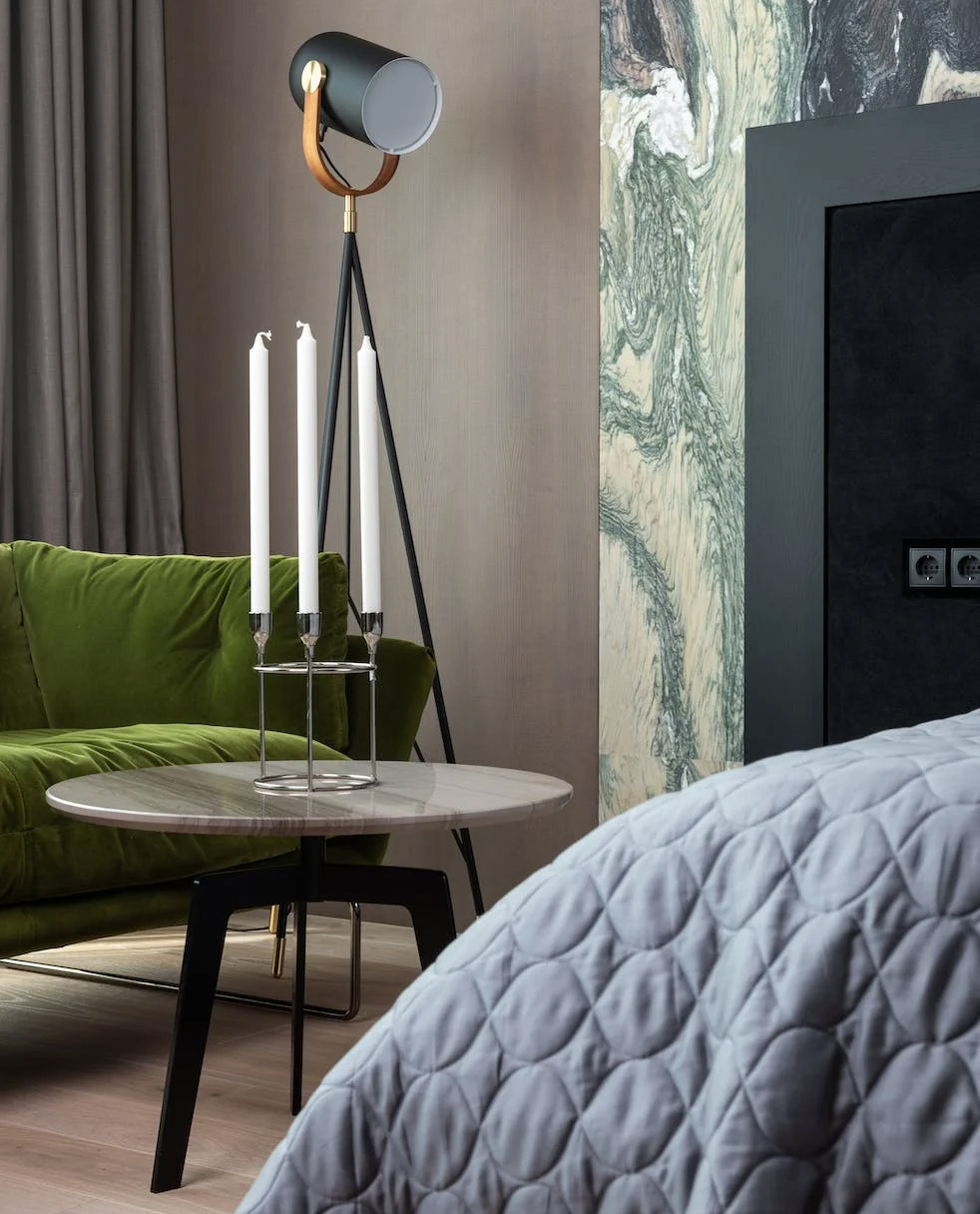
Forest Green
Image credits: Max Rahubovskiy
Forest green is an excellent choice because of its slight gray undertone. That’s why it plays well with different shades of gray. For a more natural and earthy vibe, a mid-colored green is perfect. And if versatility is what you’re after, you can’t go wrong with gray. It’s a neutral color that goes with various interior styles.
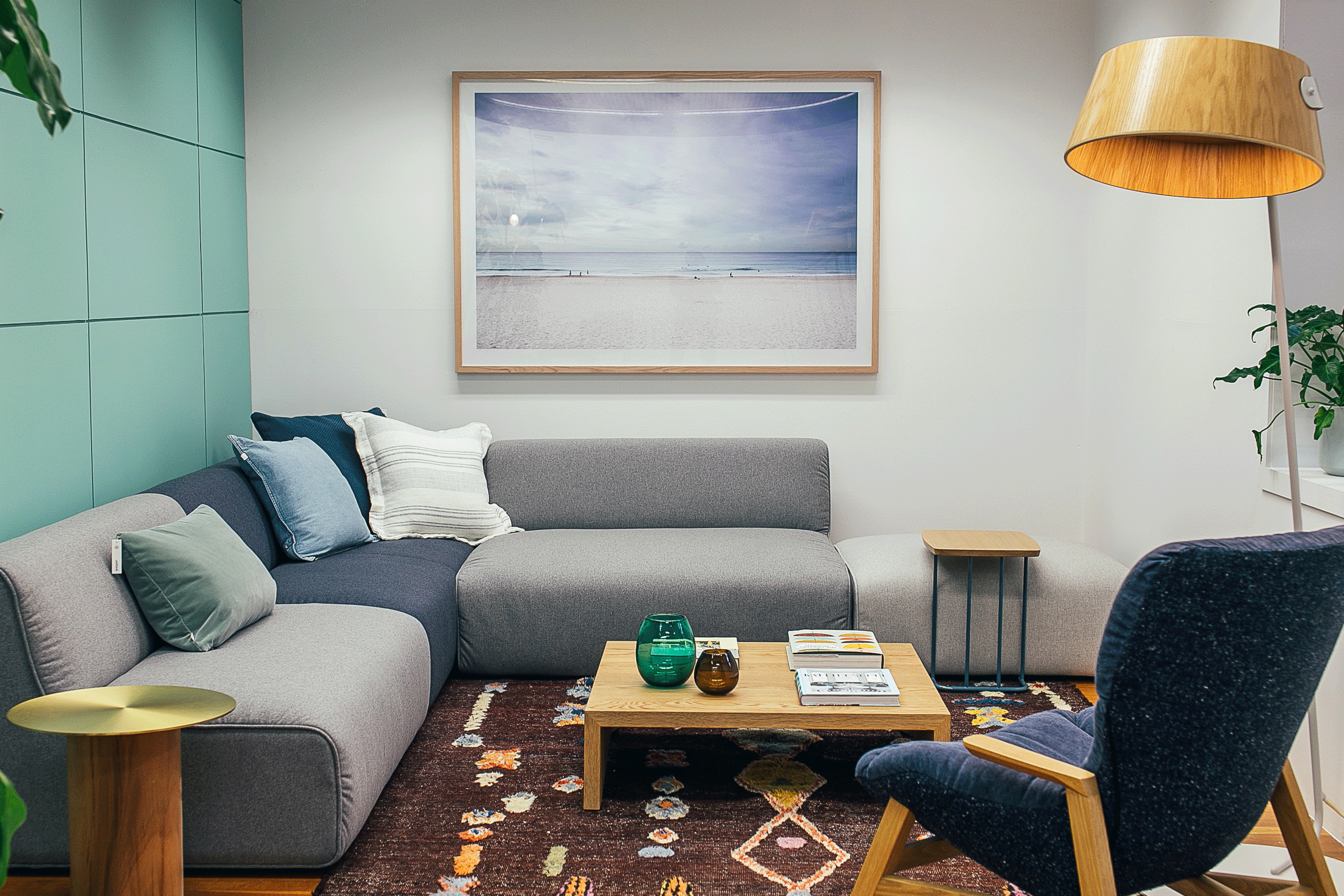
Mint Blue
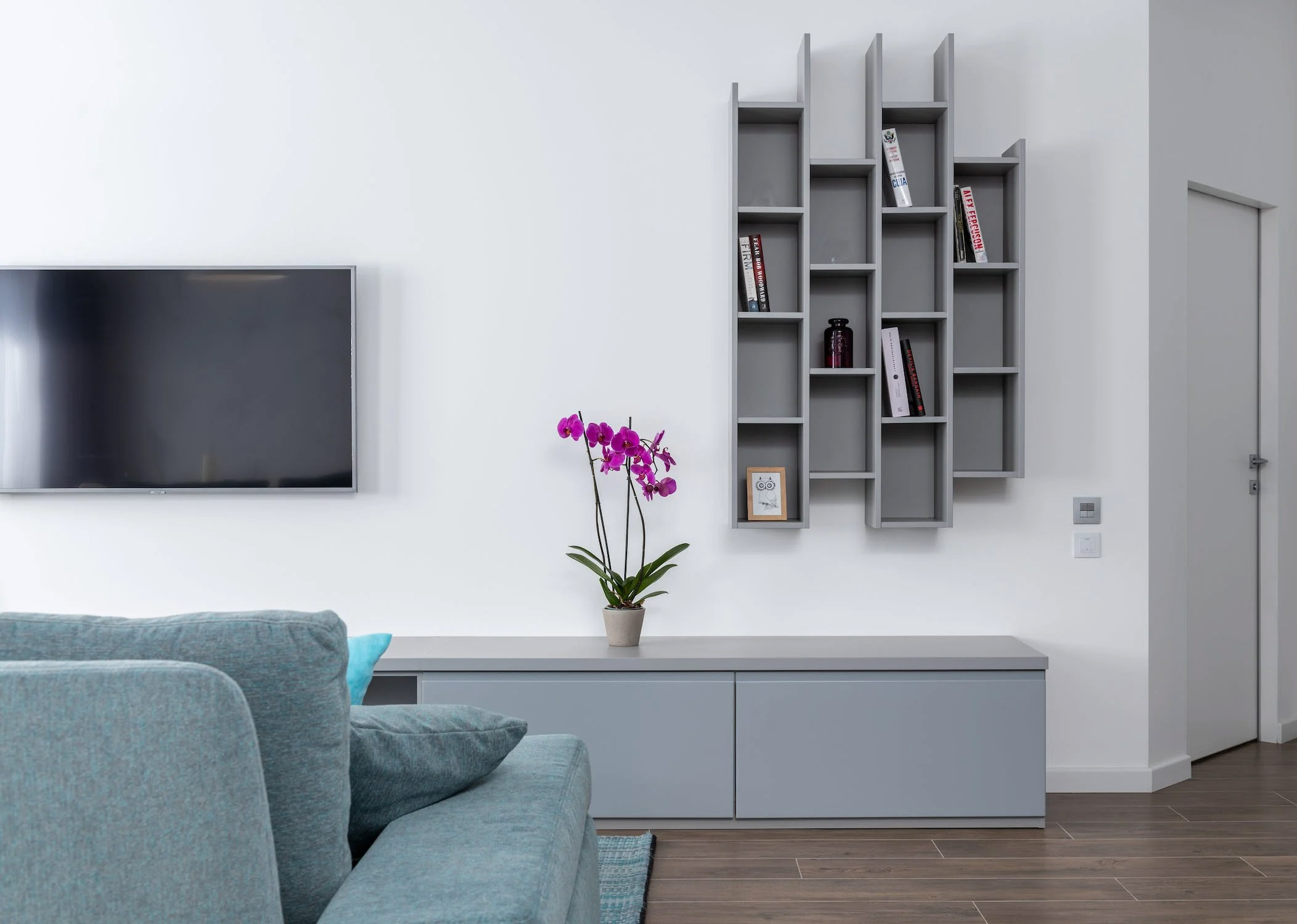
According to color theory, mint blue and gray are analogous colors, meaning they are next to each other on the color wheel. They have a similar mood and tone, and they can create a cohesive and pleasing color scheme. Mint blue is a light green shade with a cool and refreshing feel. Gray is a neutral color that can balance out the brightness of mint blue and create contrast.
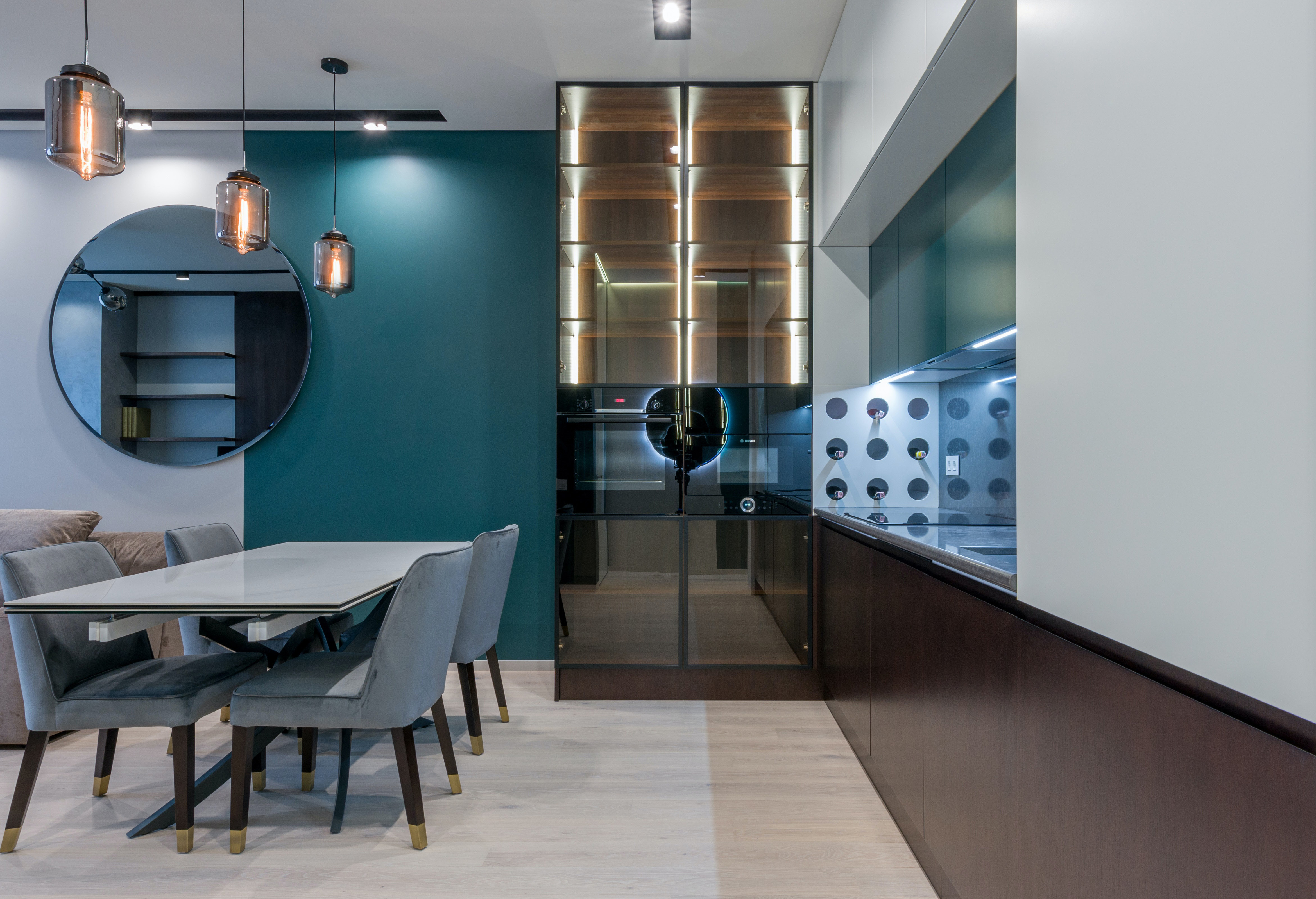
Teal
A bit darker than mint blue, teal is a mixture of blue and green. Its vibrant and saturated hue creates a lively and energetic look with grey. According to color theory, teal and gray are complementary colors, meaning they are opposite each other on the color wheel. These two colors deliver contrast between a warm and cool shade.
Tangerine
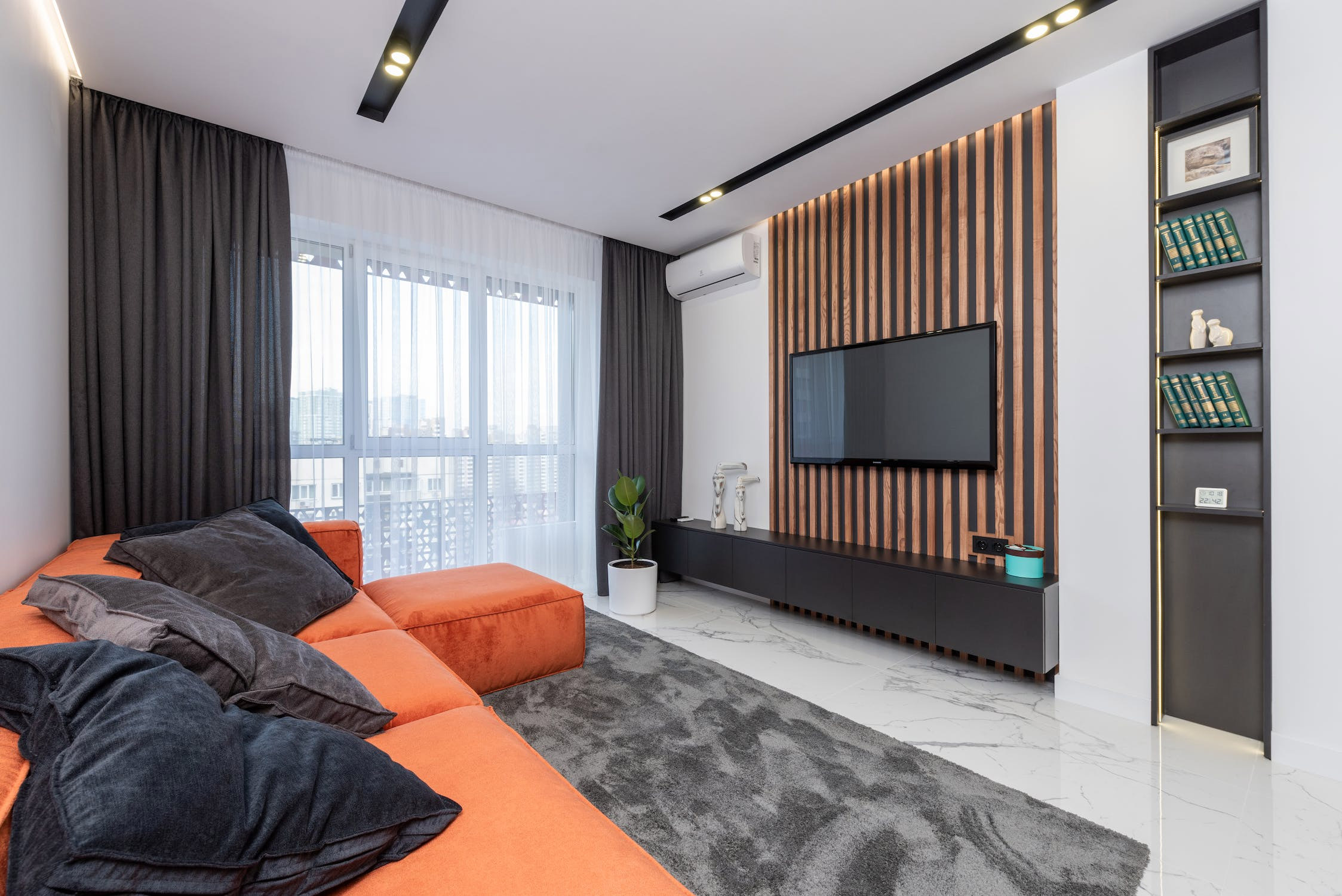 Image credits: Max Rahubovskiy
Tangerine and gray are complementary colors, creating a strong contrast and harmony, making each color appear more vivid and vibrant. Tangerine is a warm and energetic color, while gray is cool and neutral. Combining tangerine and gray can create a balanced, modern look and a lively and cheerful mood.
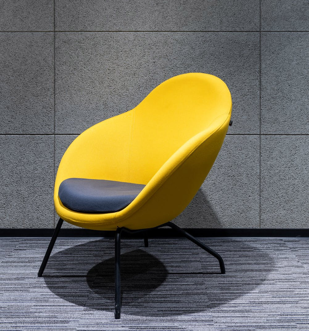
Bright Yellow
Cheerful and sunny yellow creates a happy and playful atmosphere. It is a more intense and saturated version of yellow that builds a stronger contrast paired with neutral, darker gray. This combination creates a dynamic, lively look and a fresh, sunny mood.
Burnt Sienna
If you’re aiming for a charming yet rustic and cozy ambiance, consider experimenting with a different combination of complementary hues. One color that fits the bill is burnt sienna, a warm and earthy shade of brown. When paired with gray, this duo brings any space an incredibly refined and sophisticated vibe.
Beige
Gray and beige are two neutral colors that can work well together. However, there are some factors to consider when choosing the best shades and combinations of gray and beige, such as the undertone, the temperature, and the contrast of the colors. Generally, it is advisable to pair gray and beige with the same undertone to create a harmonious and balanced look.
Soft White
Neutral colors like gray and white can create a warm and cozy ambiance or a cool and sophisticated atmosphere, depending on the shades and tones of each color. Soft white is a light and pale color, whereas gray is a dark and robust color. This combination creates a balanced and harmonious effect that generates contrast and interest.
Ivory
Ivory is a color that has a hint of yellow undertones, creating an off-white hue. It pairs well with gray, another neutral color that can make a warm and cozy or a cool and sophisticated aesthetic, depending on the shades of both colors. Ivory adds elegance to any space, whether used as a primary or accent color.
Midnight Blue
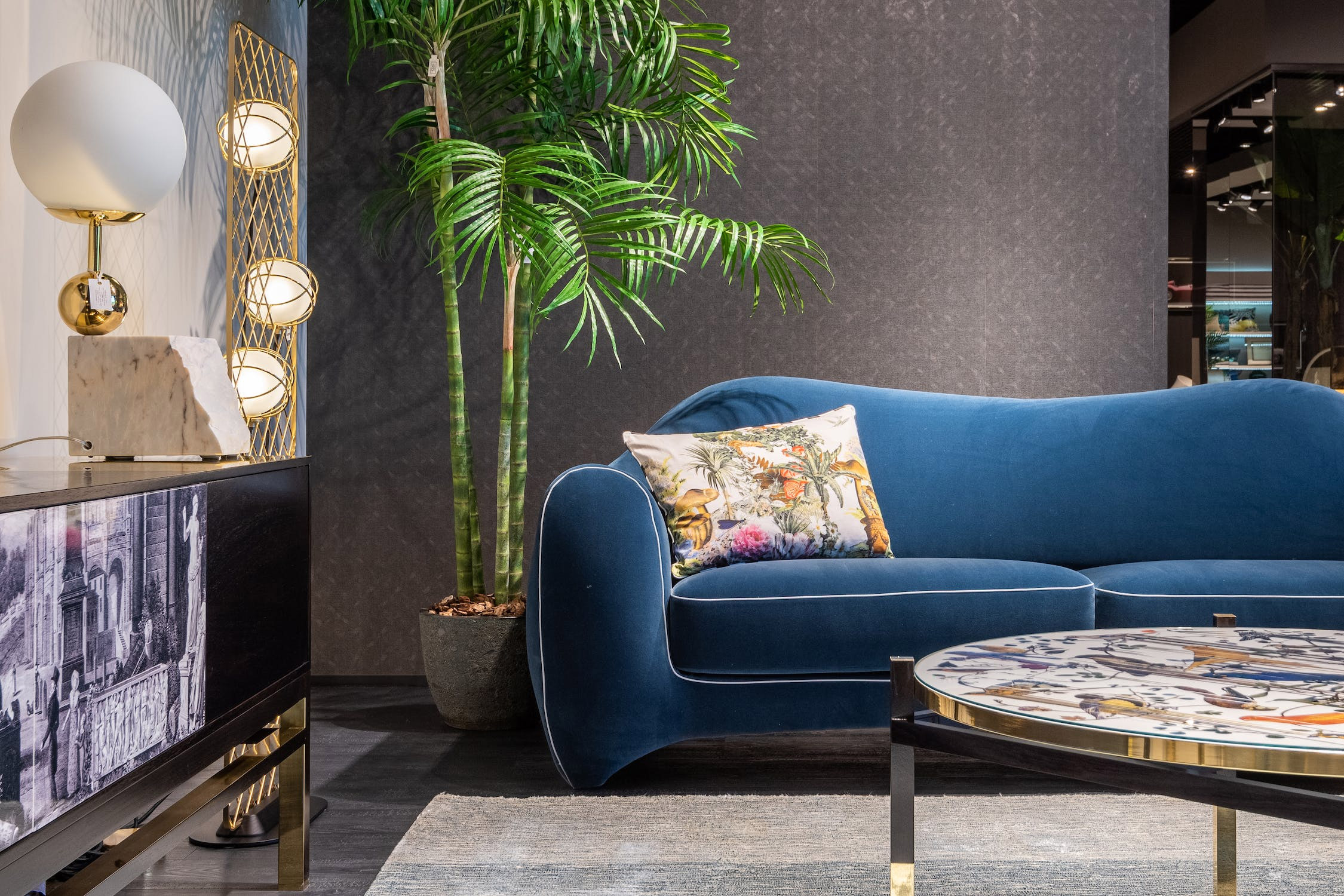
This is a deep and cool blue that has some purple undertones. It can create an elegant, deep, and mysterious look with gray. These opposite colors create a solid but harmonious contrast, making each color appear more vivid and vibrant.
How Do You Style a Room with Grey? Gray Color Room Ideas
Decorating with gray is a cool trend that has many benefits. Gray is a neutral, versatile color that suits many styles and moods depending on your chosen tone and shade. Whether you want to decorate a cozy, airy, elegant, or modern space, gray can help you achieve your desired look.
Below, we have compiled some gray color room ideas and tips on how to decorate a room, from furnishing your space with different textures and materials to adding some pops of color and natural elements. Learn how to transform any space into a stylish and sophisticated one and create an airy, sophisticated, inviting gray room design.
Gray Rug and Wall Color Ideas for the Living Room
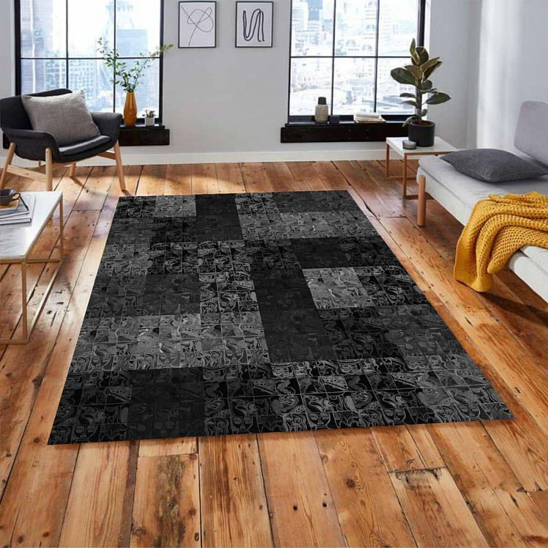 Image credits: mersanaco
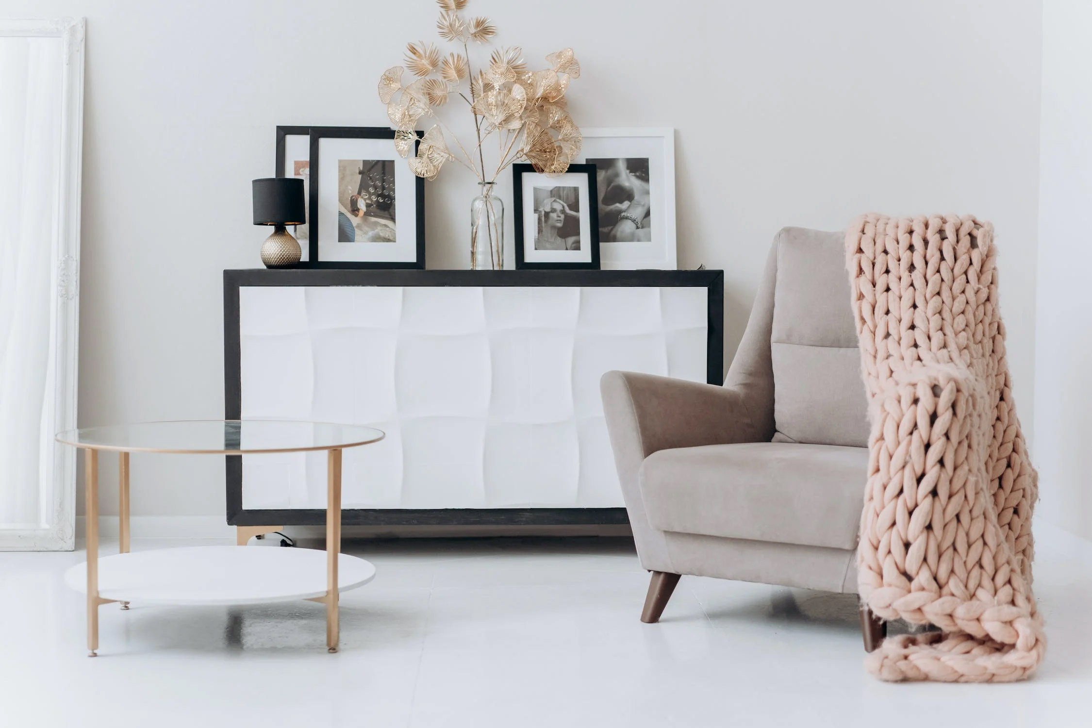
Light gray walls + Warm wood floors + Minimalistic light gray furnishing
If you want to redesign the central space of your home, you probably are looking for timeless living room ideas. One of the really excellent opportunities to create a dainty living room is combining dark and light shades of gray and adding a natural touch.
When opting for a dark grey carpet, the wall color ideas you can choose from can vary between lighter shades. As the example above shows, wood floors add a fantastic natural, super warm touch that goes well with a deep, dark gray carpet. The sofa perfectly matches the wall color, which looks even more fab with throw pillows in various gray shades.
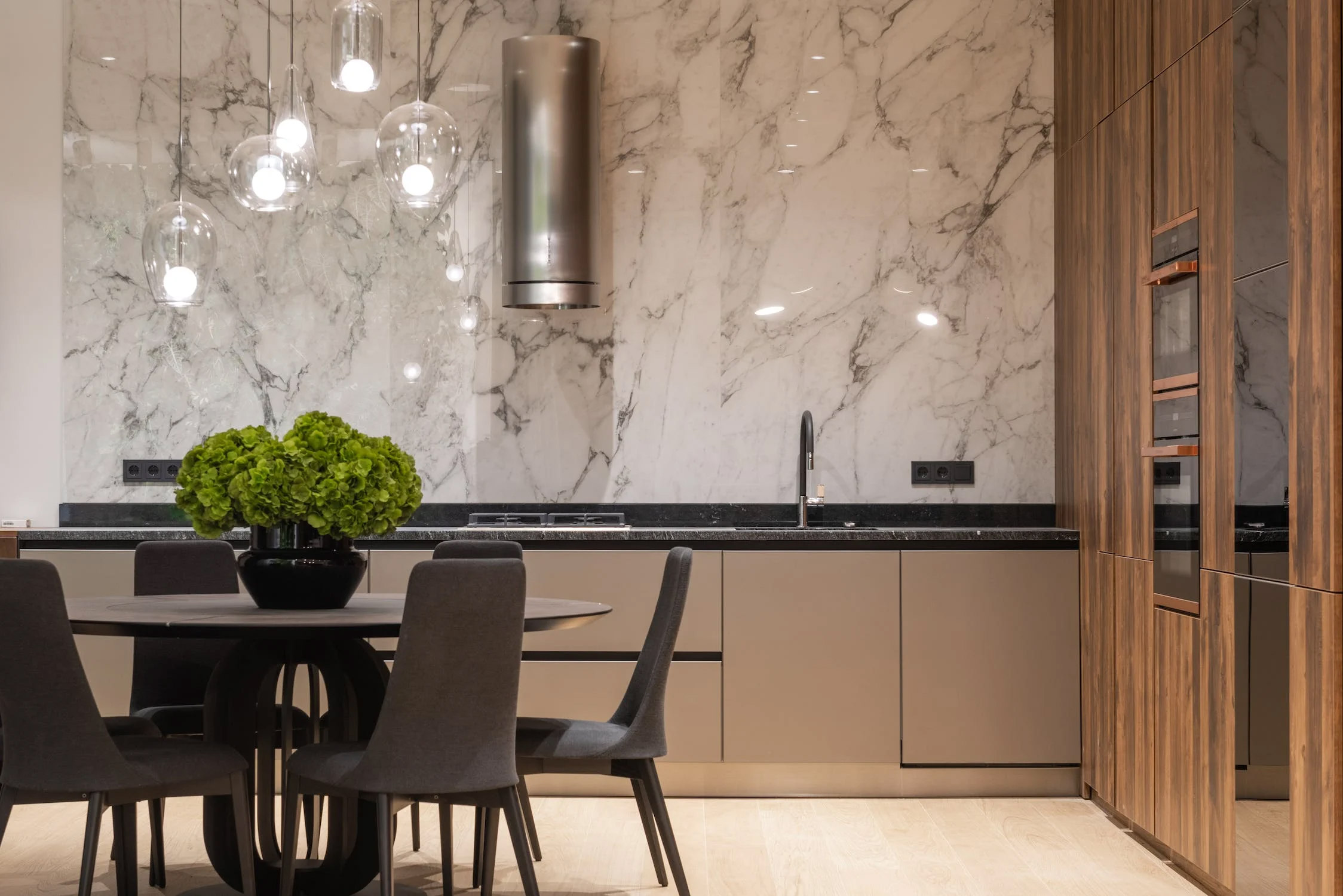
Gray Kitchen Cabinets and Wall Color Ideas
Warm gray kitchen cabinets + Wall color ideas + Marble backsplash
Use gray kitchen cabinets to update your space and give it a fresh and modern look. You can combine them with marble or other natural stone kitchen backsplash. Finally, spruce it with natural materials, like wood details.
Cold and warm colors are perfectly matched in this kitchen interior. The warm beige-gray color of the cabinets perfectly aligns with the off-white wall color. Modern glass sconces give a feeling of abundant natural light.
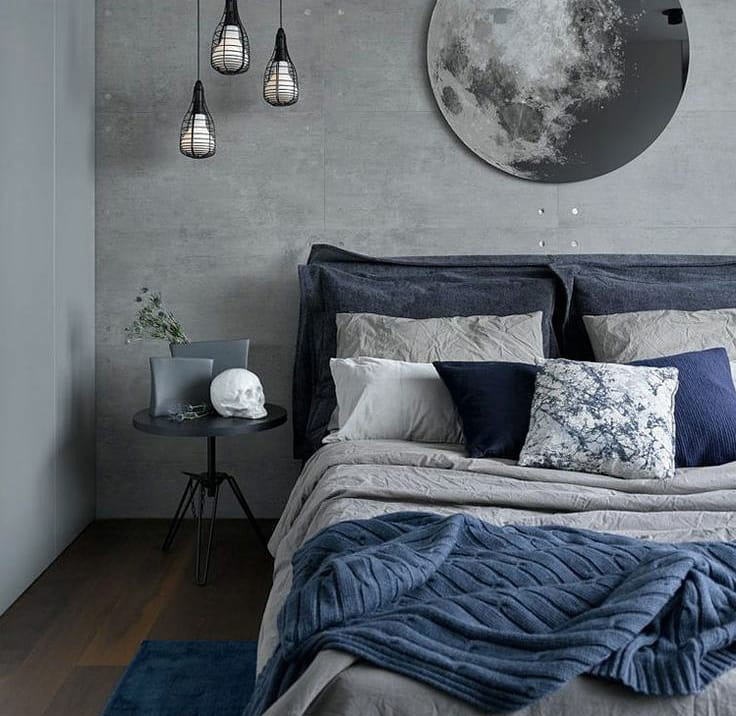
Grey Color Bedroom Ideas and Calm Decor
Image credits: evok_interiors
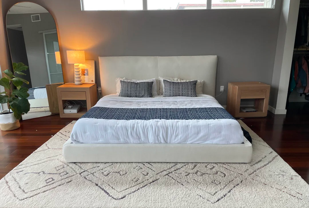
Medium gray walls + Pop of blue + Black details
Those going after modern bedroom ideas must consider using gray because the right shade of gray can be very calming. Gray bedroom color creates a perfect mood for your sleeping area and goes well with a pop of another calm color like blue.
You can choose a headboard with deep gray upholstery and decorate it by adding blue pillows and black decor details like black night tables, sconces, chandeliers, or paintings. If you are considering window treatments, go through the list of bedroom curtain ideas to find a solution that pleases you.
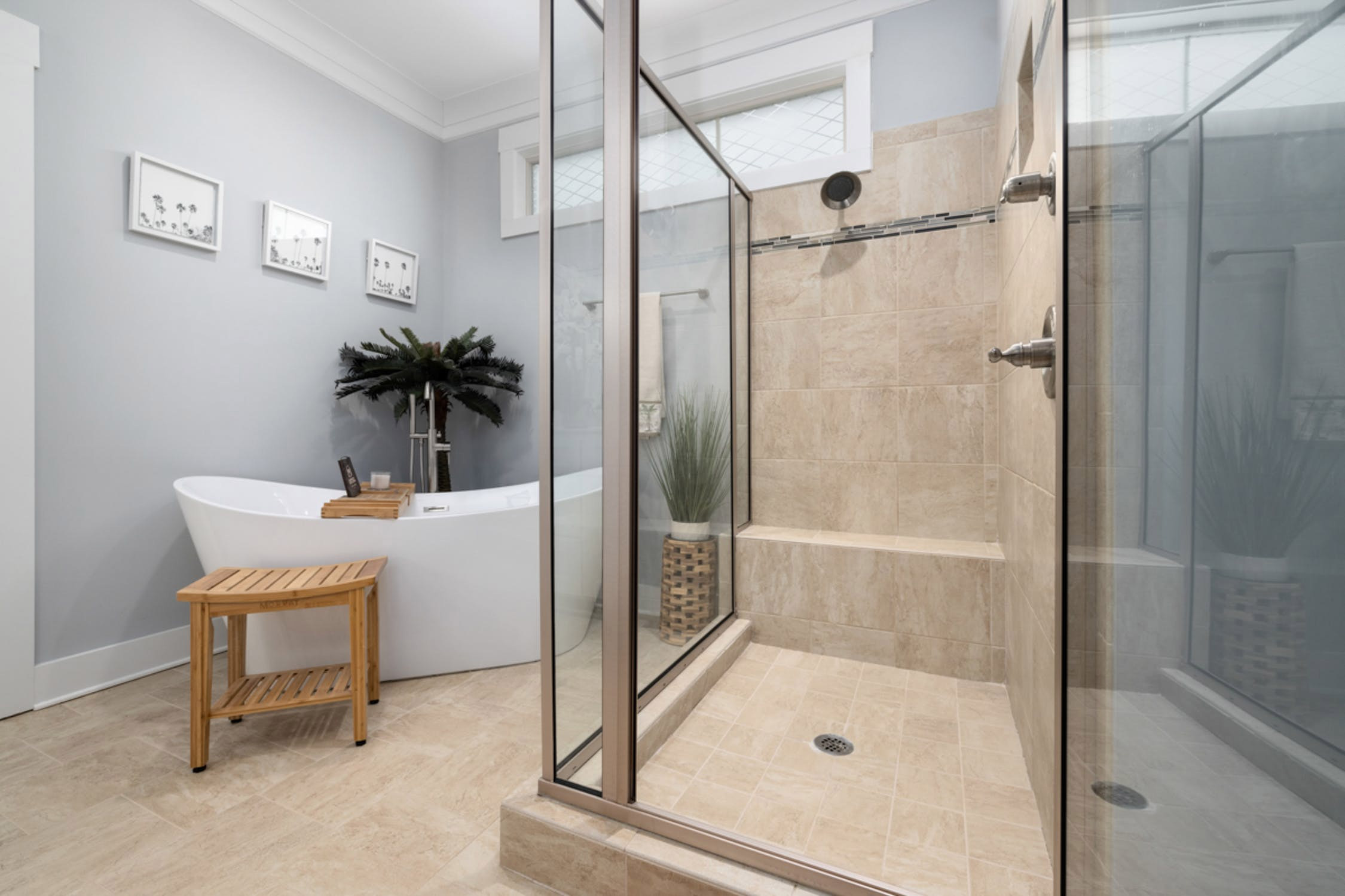
Stylish Gray Walls in the Bathroom
Light gray walls + Marble table top + White vanity
As this is a true sanctuary and a spa of your home, the gray color would fit any bathroom ideas and designs. Stylish, light gray walls create a sophisticated and elegant look for the space.
Pair gray walls with white details, like floor tiles and vanity cabinets, to create a fresh, contemporary, and sleek look. The white details stand out brightly against the gray background. Light marble table top finishes the interior with sophistication and a touch of whimsy.
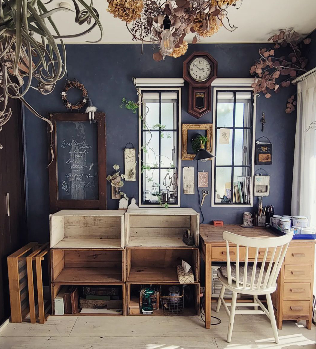
Monochromatic Gray Workroom Design
Charcoal wall paint + Light and dark wood + Organic decorations
The mood usually wanted for a workroom is serene, allowing one to concentrate, and gray fits the mood better than any other color. As gray is traditionally considered a color for contemporary interior design, it also fits with more eclectic environments.
The example above shows an artistic workroom with walls painted with a charcoal color similar to Peppercorn SW 7674 by Sherwin-Williams. This dark and deep shade is energized by adding warm wood furnishing and decor details, which look stunningly illuminated by sunlight.
Tranquil Light Gray Entryway Interior
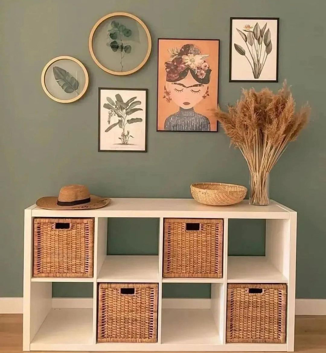 Image credits: interiors.and.diys
Greenish-gray paint + Natural, warm decor details + Wall art
A tranquil entryway interior is a great way to create a welcoming and sophisticated impression for your guests. Greenish-gray is an adaptable and ageless color that adds warmth and comfort to your space.
Light grays make the entryway look more spacious and airy, leaving some space for mixing and matching different textures and materials, such as wood and wall art of various colors and floral patterns. These accessories and accents finish the ambiance of the space.
Is Grey Color Here to Stay?
Gray has been a dominant color in interior design for over a decade, but will it still be popular in 2024? The answer is yes and no (which shouldn’t be surprising). It started to gain popularity around 2008 when interior designers wanted to create a more modern and sophisticated look for their spaces. There are a few more reasons why grey has become such a popular choice for interior design in recent years.
Its adaptability, timelessness, and neutrality work with any style, mood, and color. Gray is an ideal color for households with children or pets as it hides dirt and imperfections well. And finally, gray is just plain stylish — timeless and chic. However, trends and preferences are evolving as people seek warmer and more colorful options.
What Color is Replacing Grey?
Gray is not replaced by one color but rather by a range of colors that can complement and enhance gray. One of the colors that is making a comeback in 2024 is beige. If you want to create a peaceful and calming vibe in a room, you can’t go wrong with beige. This warm and inviting color has a way of making any space feel cozy and relaxing.
Beige can also add warmth and contrast to gray, making it look more lively and inviting. Beige can be paired with gray in different ways, such as using beige as an accent or a base color. To create a sophisticated and harmonious palette, beige can also be mixed with other neutrals, such as white, black, or taupe.
Other than beige, many more colors can create different effects and moods when combined with gray, such as blue, green, yellow, pink, or purple. The key is to choose the right shade and tone of gray and the other colors, depending on the desired style and mood. To put it briefly, it’s a versatile color that will still stay in fashion in 2024, but in a different way than before.
Style-wise, gray is passe, negative feng shui, boring, and depressing when used excessively. It tends to minimize the effect of contrast.
This article is trolling both Brits and Americans. On 12 occasions it's spelled grey and on 101 it's spelled gray. It's almost like it was cobbled together from other articles, some British, some American.

 Dark Mode

 No fees, cancel anytime







































9
3