From Bizarre To Embarrassing, Here’s 30 Pics Of Architectural And Interior Design Mistakes
There comes a point when a supposedly quirky architectural design becomes questionable. It’s usually when the chosen theme diminishes the structure’s functionality and purpose, like in the designs you’re about to see.
These photos are from the “That’s It, I’m Architecture Shaming” Facebook group. If the name isn’t a total giveaway, it calls attention to building and home designs that cause puzzlement.
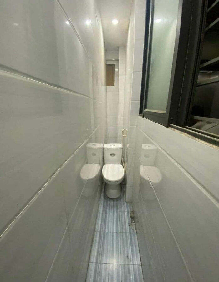
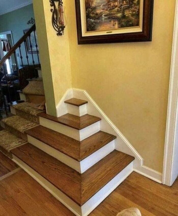
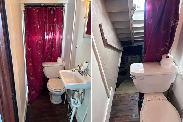
Here, you’ll find images of staircases you wouldn’t dare step on, oddly placed toilets and urinals, and houses that look haphazardly built in The Sims.
More than 855,000 people keep the page alive, and we’ve picked those that stood out in the most baffling way. Hopefully, seeing these also gives you a good enough idea of what to avoid for your future designs.
This post may include affiliate links.
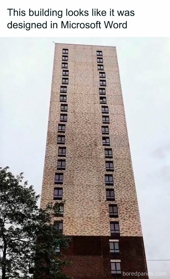
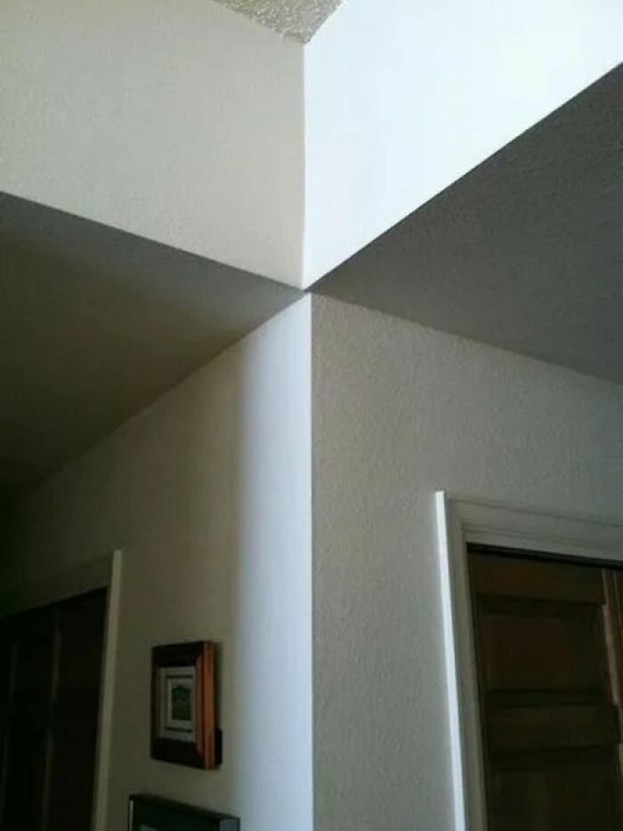
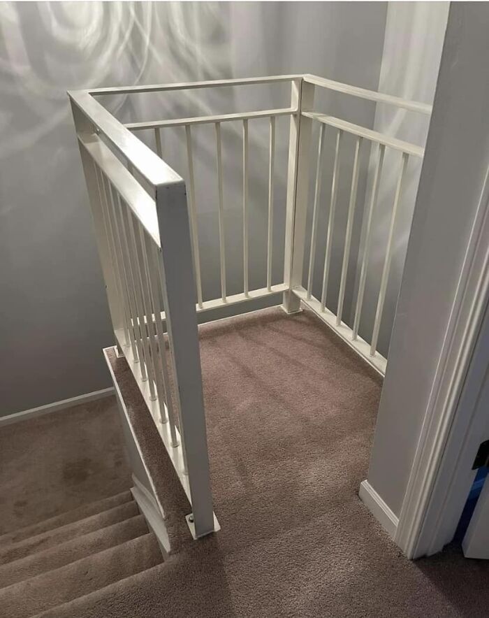
Difficult To Align
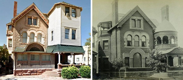
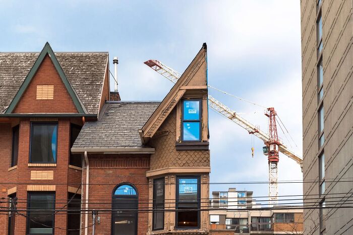
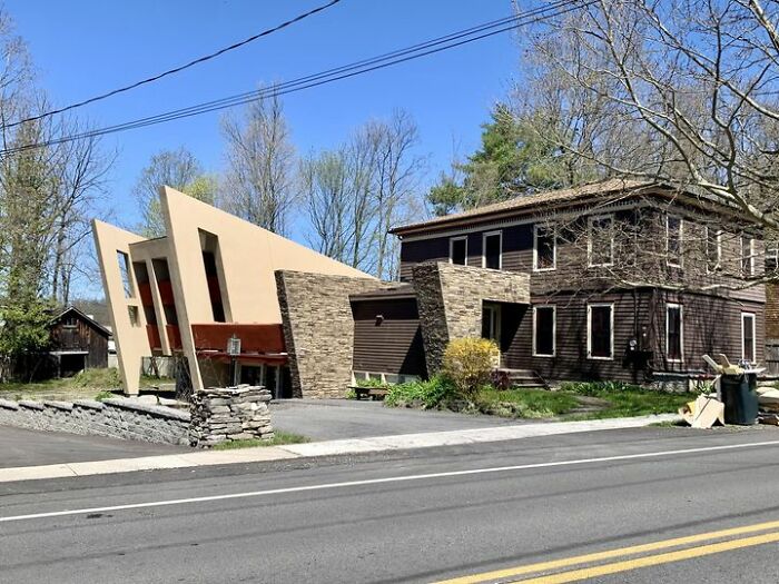
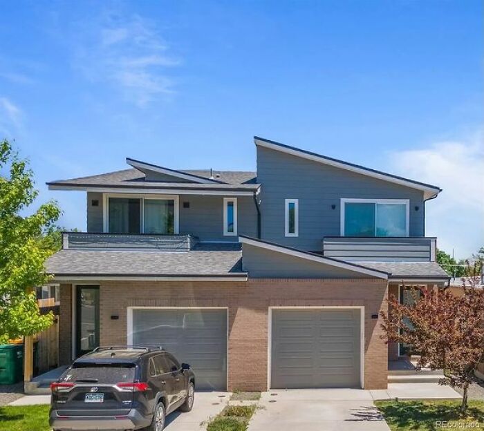
Gotta Love An Add-On. Denver, Colorado
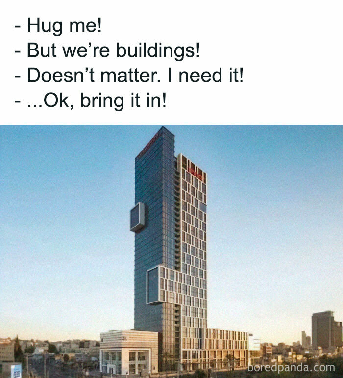
Hug Me!
Experts have revealed a connection between architecture and people’s emotions. A BBC report mentioned recent findings by neuroscientist Colin Ellard about how we are most affected by building facades.
In the study, Ellard and the participants walked past a Whole Foods store in Lower Manhattan. According to wristband readings and surveys, the store’s smoked-glass frontage caused a drop in their arousal and mood states.
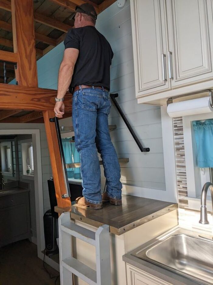
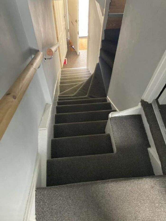
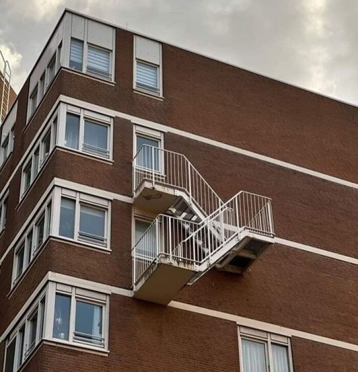
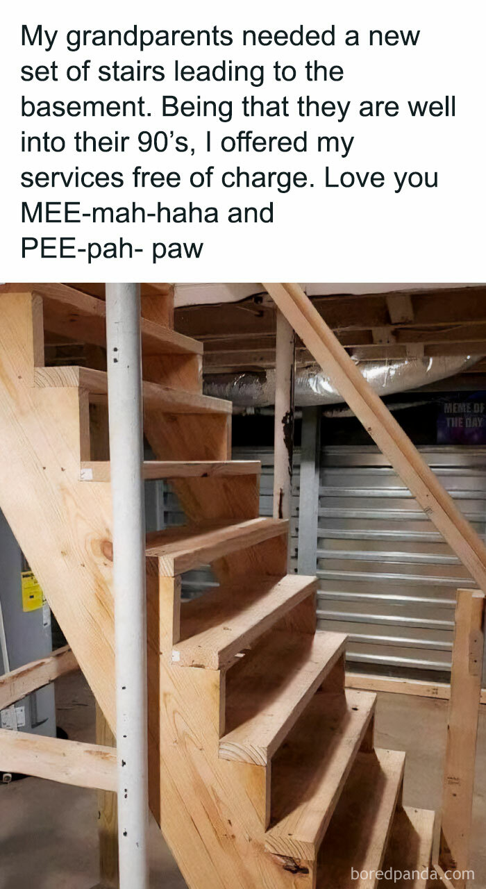
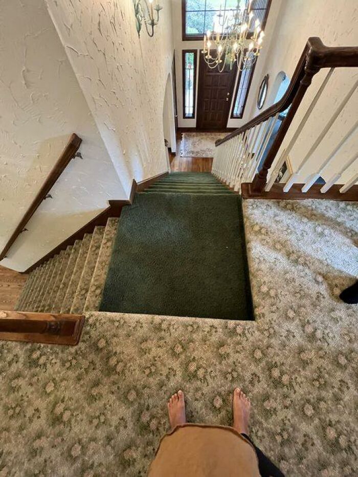
Death Stairs
The starts aren't even the biggest problem imo, but the fact that you have to walk on the kitchen counter. 🤮 From outside too with shoes on!
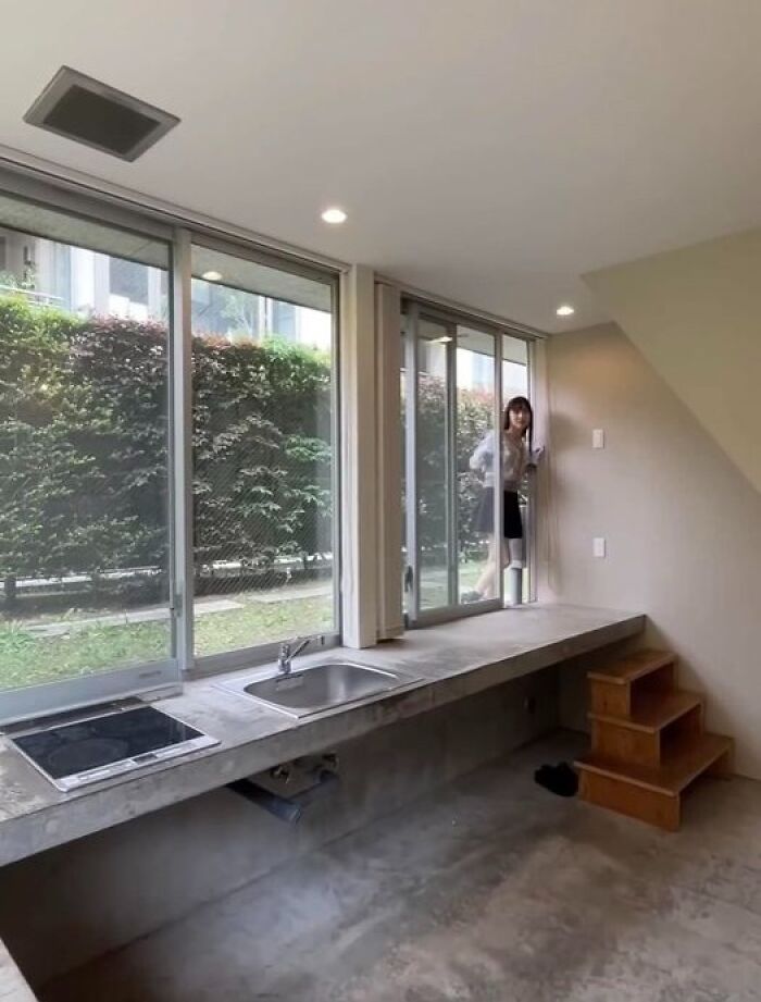
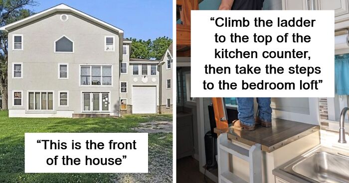
Climb The Ladder To The Top Of The Kitchen Counter, Then Take The Steps To The Bedroom Loft. Never Mind That The Hand Rail Is Where Your Feet Are. It's Fine
(Tiny house Airbnb in Colorado, husband for scale.)
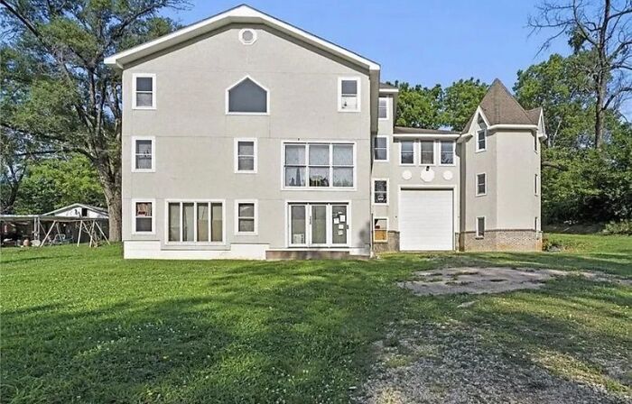
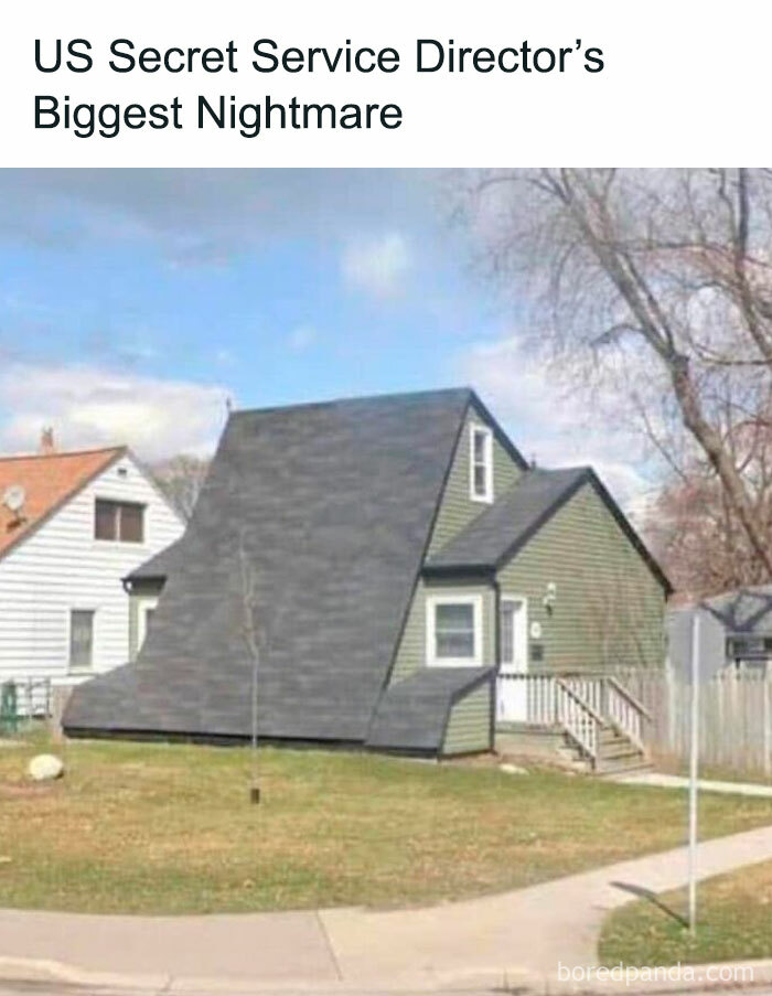
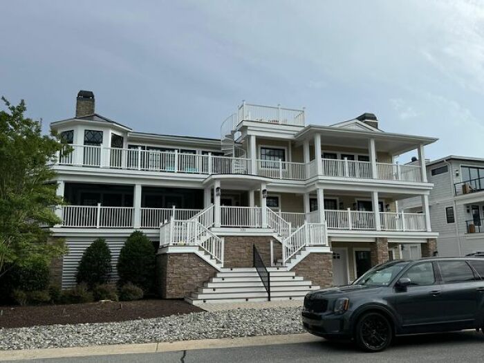
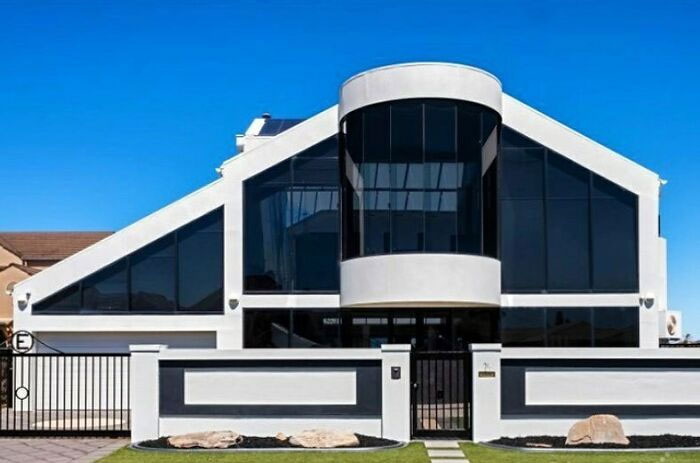
This Is The Front Of The House
The report mentioned the Seattle Central Library’s interior architecture, describing it as “one of the most notoriously disorienting buildings.” According to architect and Northumbria University professor Ruth Dalton, the building’s one-way escalators could be a problem. As she told BBC, we have specific expectations regarding navigation.
“There are very few situations in the real world where you can go from A to B via one route, and you’re forced to take a different route from B back to A,” she explained, noting that it can confuse people.
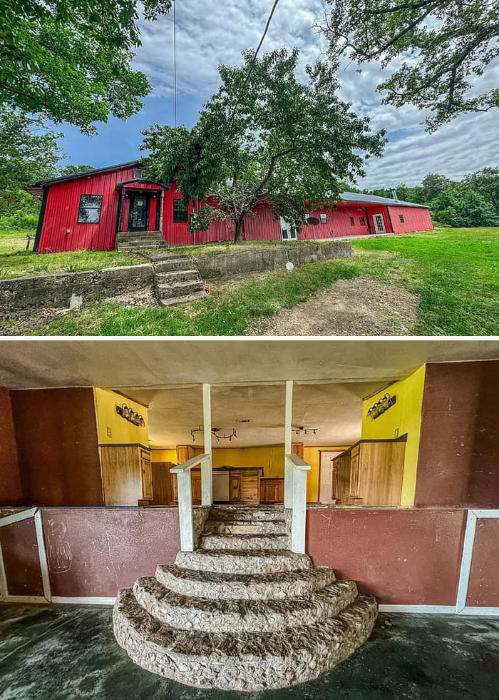
Found A Hillbilly Barn Mansion On Zillow. The Crazy Fred Flinstone Esque Stairs Connecting The Kitchen To The Living Room Are What Noteworthy
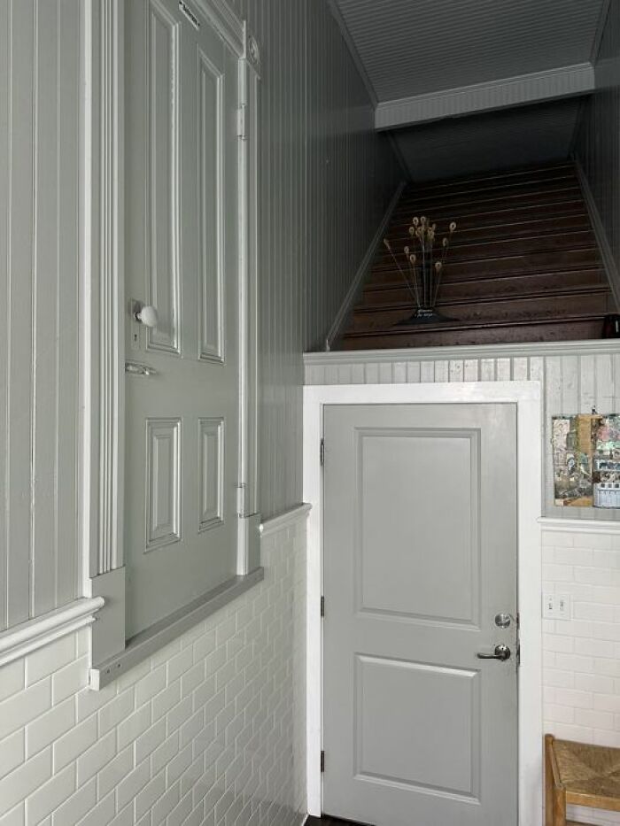
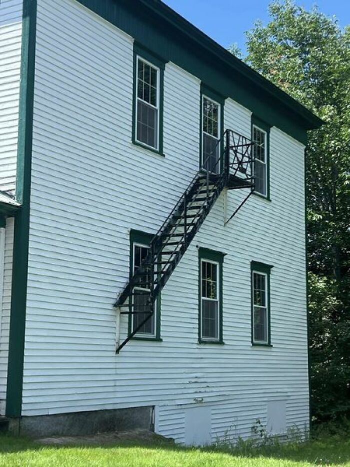
Sure Hope That Door Is Locked
My Husband Found This On His Page
Architecture critics seem to be uneasy about current trends, but they’ve been vocal about them. Veteran critic Rowan Moore wrote an article for the Guardian expressing his displeasure with the Ilona House in London.
He had choice words, describing the pinkish, rounded building as “plasticky” while calling out its “quite expensive” concrete surface.
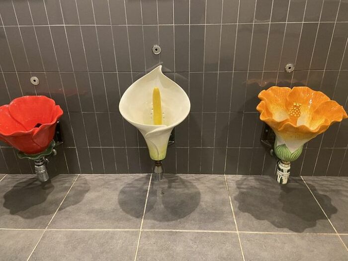
These Are Urinals
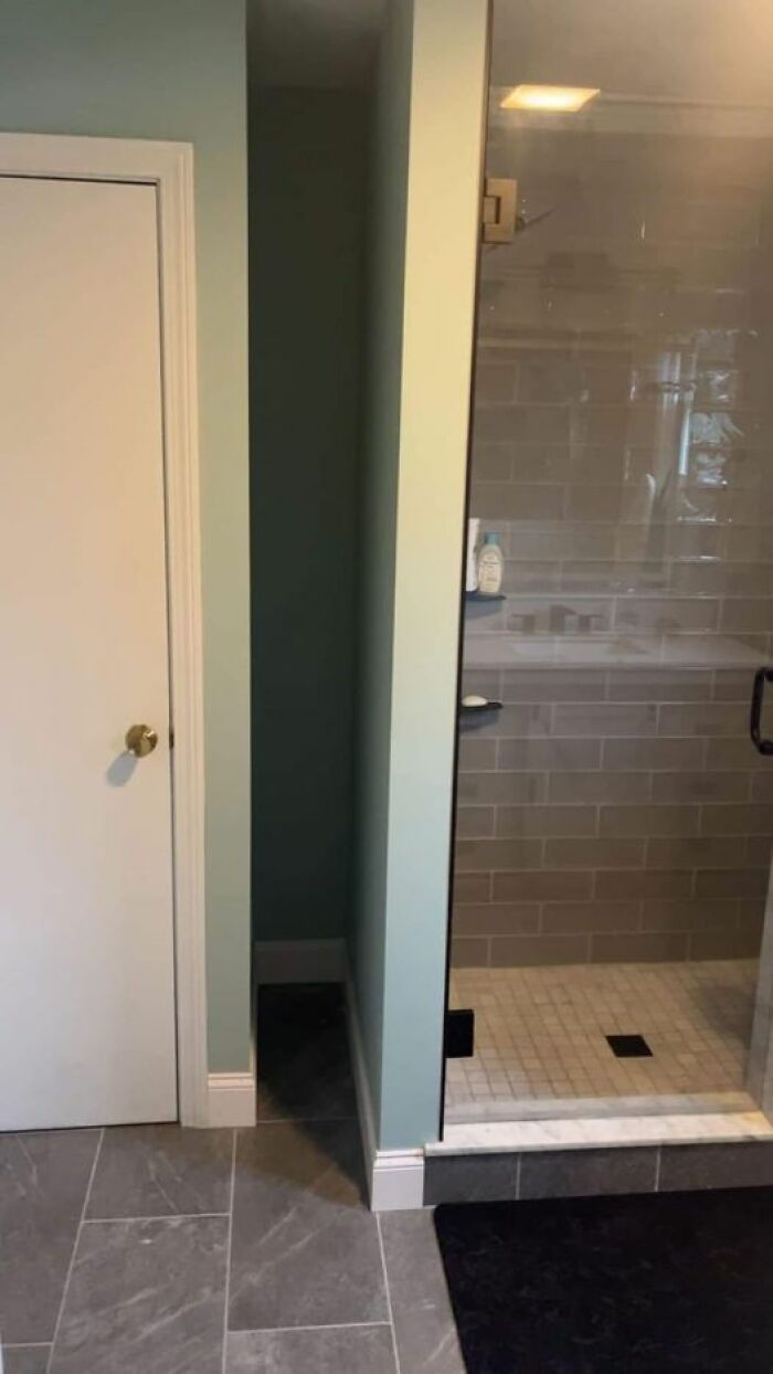
Why?
I Have No Words
The water from the washing machine flushes the toilet. Poor execution bur A+ for saving water.
For Moore, it's all because of the "meanness and greed" of property developers who want the most floor area and pay the least. He bluntly stated that "ugly buildings have always been with us."
More says there is "no magic bullet" to fix the aesthetic situation. Still, he believes it would help if all professionals involved had one thing: "a stronger idea of what makes a building good."
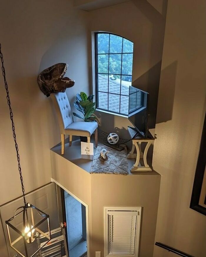
Just Add A Ladder And Don’t Move Too Much On That Chair
Friends Who Wanted A Seperate Entrance?
Whyyyyyyyy?
We’d like to hear from you, too. Which of these structures were the most/least appealing? If you’re a professional, can you still make improvements on them? Comment below!
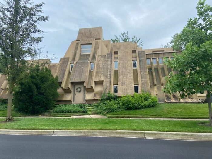
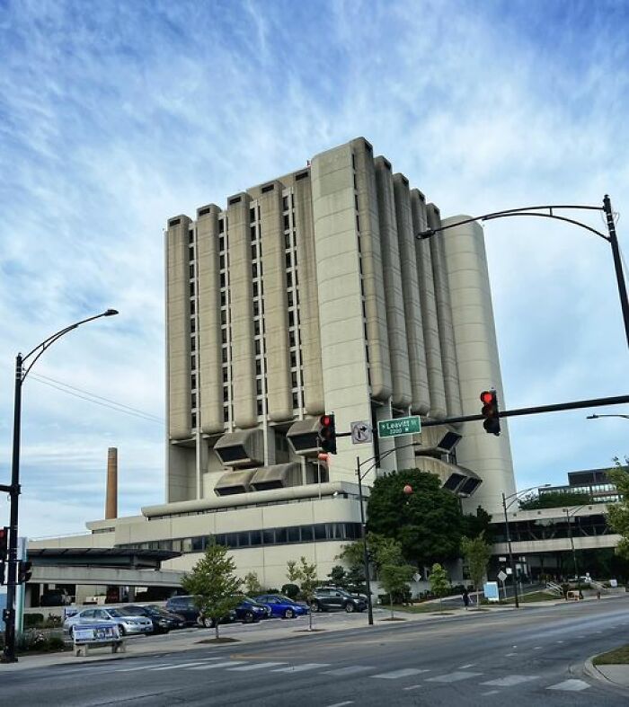
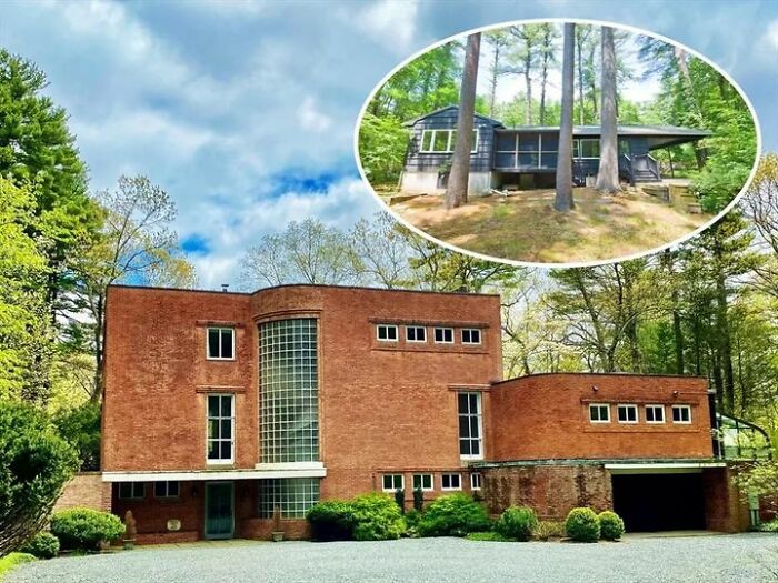
Brutalist Architecture Should Come With A Free Power Washer
Looked it up. Aesthetically a case of one man's trash being another's treasure, but it was also built to be highly energy efficient. I rather like it especially when seen in its entirety though it looks distinctly odd in it's suburban setting among what looks like cod-historical buildings. https://www.oakpark.com/2021/11/24/oak-park-home-in-spotlight-on-new-wttw-show/
In My Boyfriends New Rental Home
Because You Need A Safe Place To Stand To Request Things From Upstairs
Please Give Me Ideas On How To Make His Space Feel Larger
Imagine if you're a bit chubby (no good for me, I'd prob get a bit wedged, lol). Maybe it's the Slender Man's house?
Saw This House Awhile Back. Thought It Was…. Intriguing
Umm
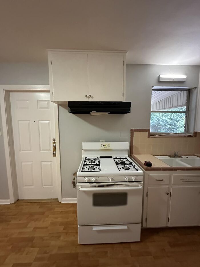
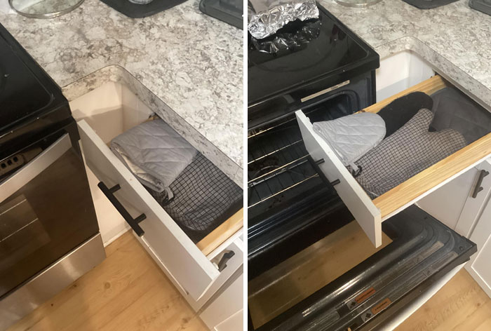
You Can Only Open This Drawer All The Way If You Open The Oven Door First. In My Own House
The range was sticks out because it was likely designed for a built in style range that is more or less flush with the end of the counter. Those are a bit more shallow. That would have worked fine really.
"This Has To Be A Joke Post. Unless They're After Some Inheritance"
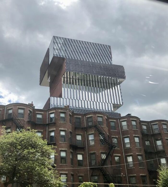
Towering Over The Back Bay Of Boston
Nuff’ Said. As Seen In La
Hey Bubba, Bring Me Dem Blueprints And Anuther Beer (Belch!) I Needa See Something
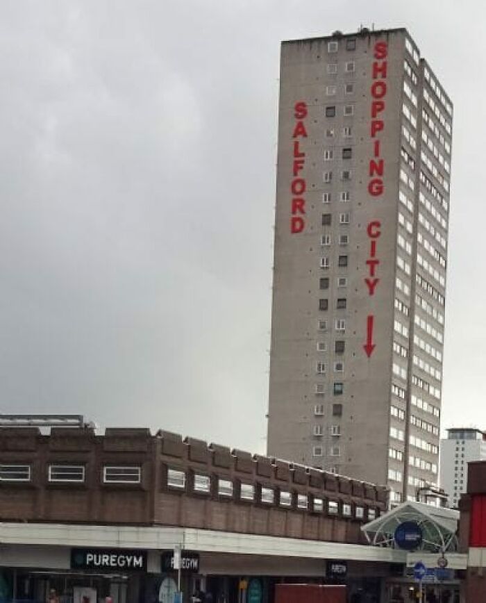
Salford, United Kingdom
I used to live by here. Salford Shopping Centre was a dangerous place to go, at one time. The whole place is an eyesore and needs demolishing and starting again. Where I used to live was three tower blocks all near each other. Because so many gay men lived there, it was known as ‘Fairy Towers’. And The Gays™️ who came up with the name.
Hostile Gay Architecture Shaming
For those who haven't realized, the colors have been added. It's actually just gray.
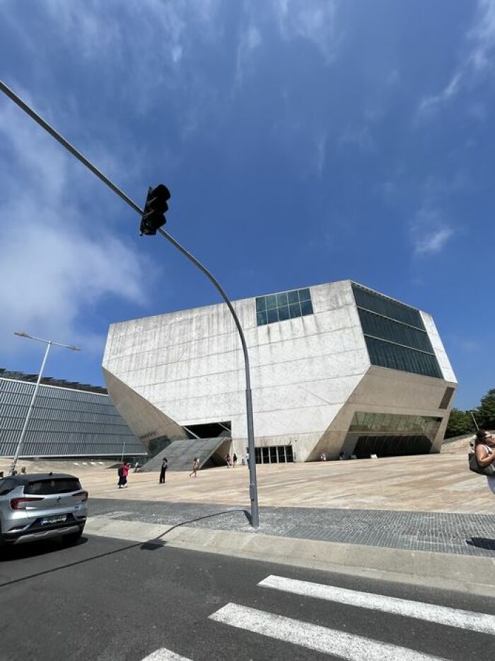
Just Got To Oporto, Portugal A Few Weeks Back! Thought I'd Share This Weird Air Conditioner Looking Building That Looks Like Something A Kid Would Make On Roblox
Bem-venido a 'Casa Da Musica'
People really don't appreciate Brutalist architecture. Wish there was more public education about the history of of things like this.
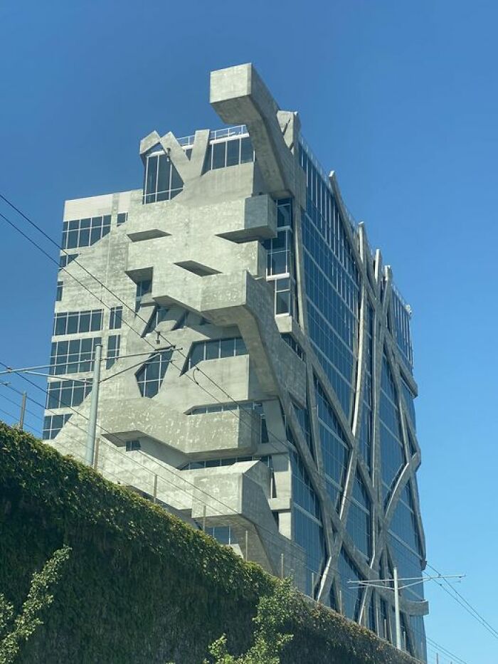
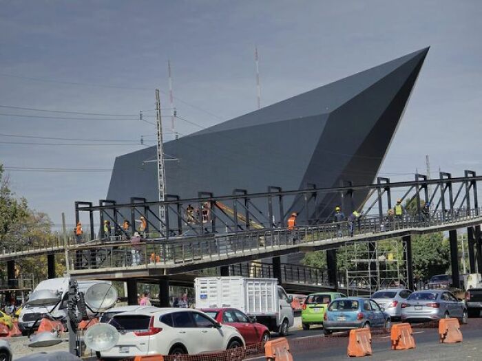
Secretariat Of Security Of The State Of Queretaro In Mexico
For What?
Does This Count? Or Is This More Interior Shaming LOL
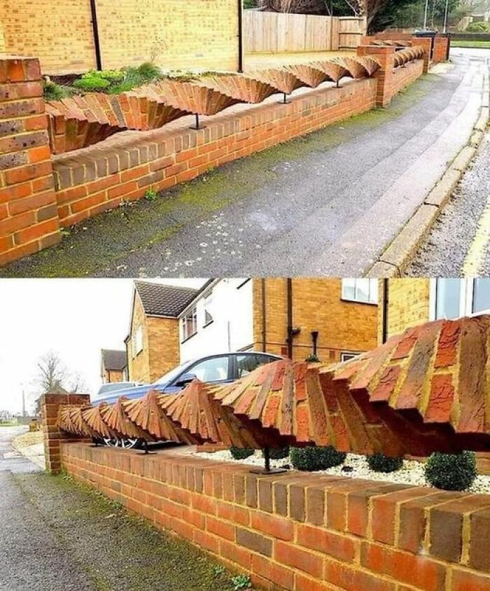
Stole From Another Group But This Is Definitely Awesome Brick Work
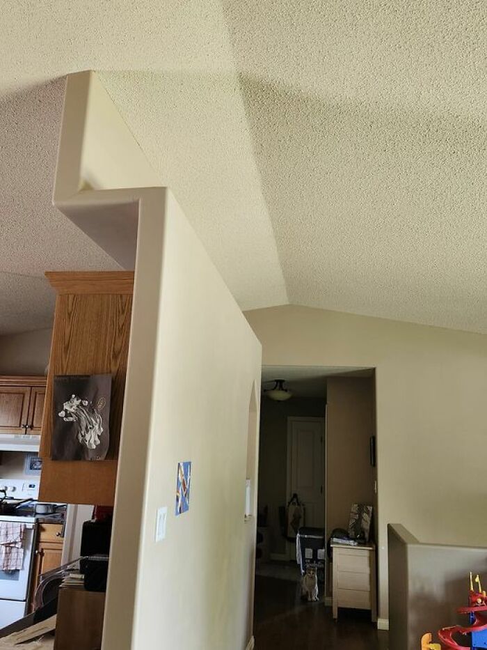
What In The Load Bearing Wall?! Seriously Why Not Center It Make It Straight And Call It A Day. On The Bright Side My Friends Cats Love The Cubby They Believe Was Made Just For Them
Why?
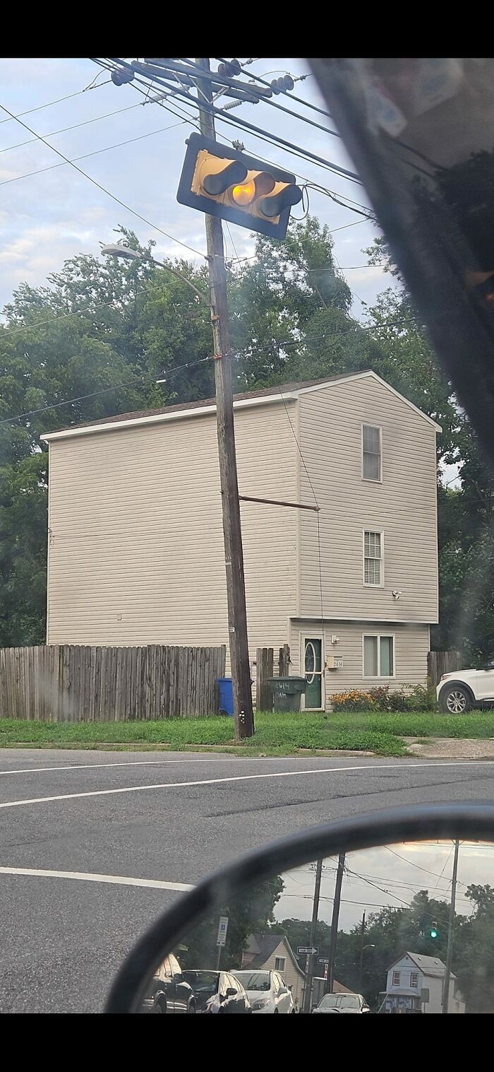
What? A Half House
New Build In My Neighborhood (Mostly Early 90s Era Homes). Their Privacy Fence Around Their Deck Goes Right Through The Middle Of The Window
Idk Maybe It's Just Me But The Wooden Part Of The Exterior Of The House Is Just... Not It
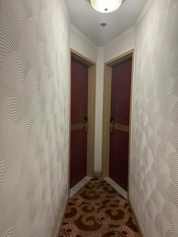
A Hotel In NYC A Friend Is Staying At
Here's One For 1/4 Million In Gold Country, Ca That Features......"A Unique And Thoughtful Layout" ?!
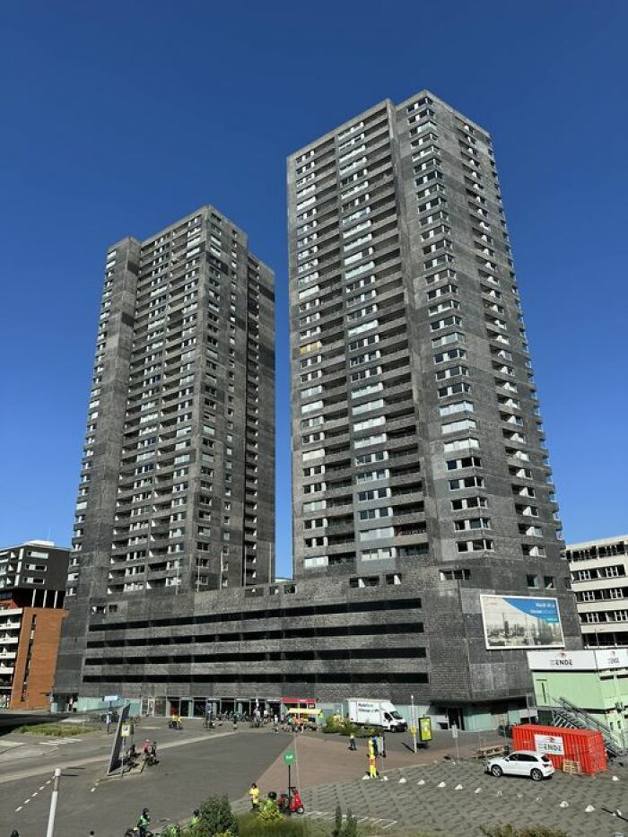
Have These Buildings In Rotterdam Been Posted Yet? I Thought They Were Particularly Unattractive
These types (Council Properties mostly) were common back in the day, esp UK. A lot of cities here have knocked down masses of them and replaced them with tiny houses with shared playgrounds/greens.
Never Seen A House With Such A Big A** Forehead
Fayetteville NY - Not Sure What To Say ?
Is it just me, or does it look like the cream house thinks that the other house smells and is trying to get away from it?
Random Creekside Cabin In Industrial Part Of Anchorage, Alaska
And you get in how ? Actually, I'd be more concerned about getting out ...
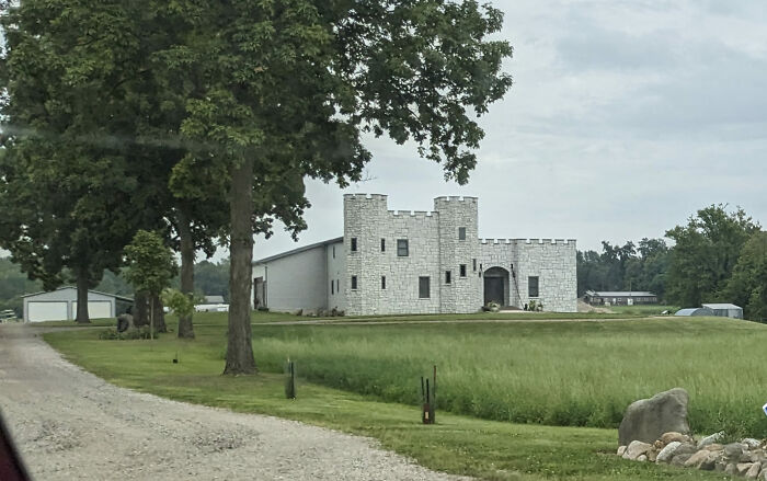
Spotted This Curiosity In Northeast Indiana... A Castle Facade On An Otherwise Normal House?
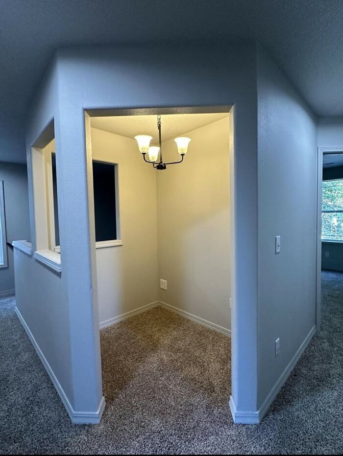
Need Ideas, What Would You Put In This Square?
Linen. A study. A guest you want to encourage to only spend two nights.
Um
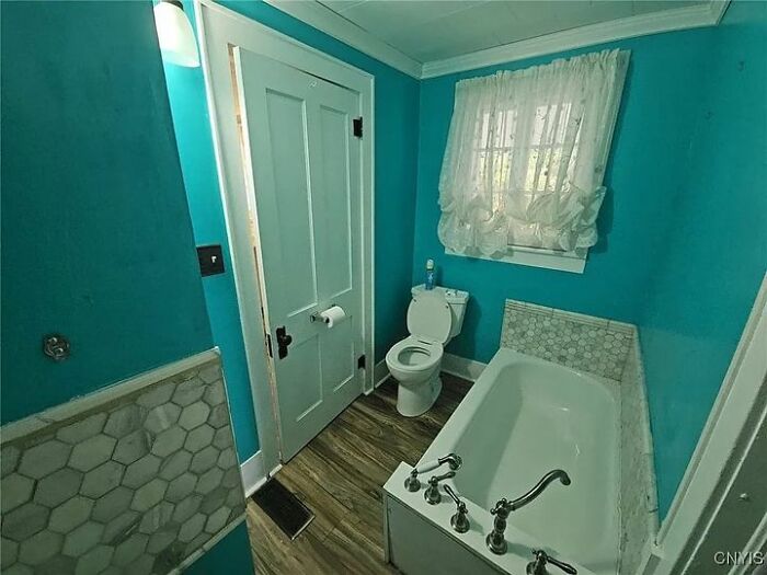
There's A Part Of Me That's Kinda Impressed. I Mean, It's A Bit Of A Squeeze To Get Into The Bathroom
Flip side of that, hanging the toliet paper roller on the back of a door is a pretty good use of space
Like To Meet The Inspector That Passed This
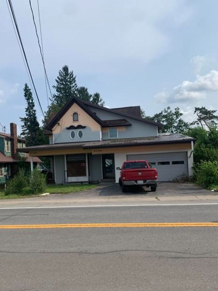
Nice Eyebrows
The apex above it needs to be embellished with a hat for each of the holidays 🙂
Ukrainian Village, Chicago - In An Otherwise Charming Neighborhbod, This Building Looks Like A Massive Crematorium
I Have No Words
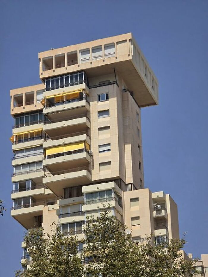
This One In Benidorm, Looking Like A Half-Finished Game Of Jenga, Although It Has Nothing On The Sheer Scale Of Vulgarity Of The Intempo Building
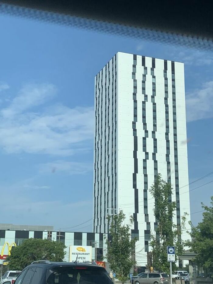
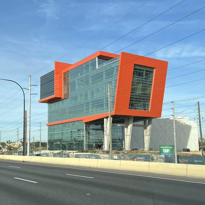
The New Eyesore On I-4
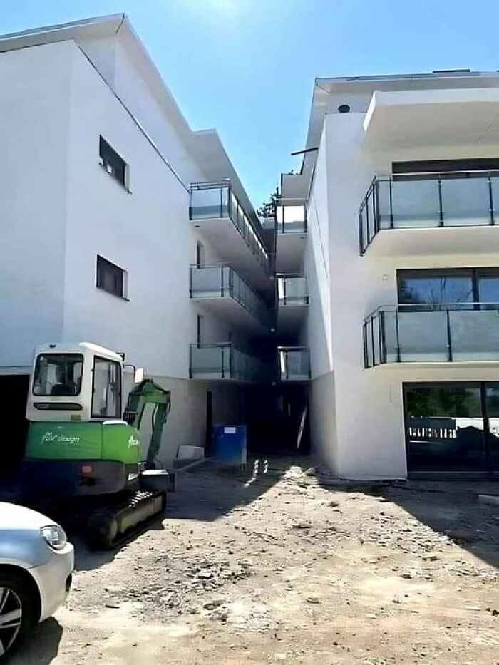
I’ll Have A Balcony With A Side Of House, Please
One River North, Denver, Colorado
I think this is kind of cool, actually. Looks like there's open air green space woven into the design on numerous floors.
Oh No
Jersey Barriers On Windows?
As A Classic Example Of Brutalist Architecture, I’m Surprised This Iconic Building Was Commissioned By A Church
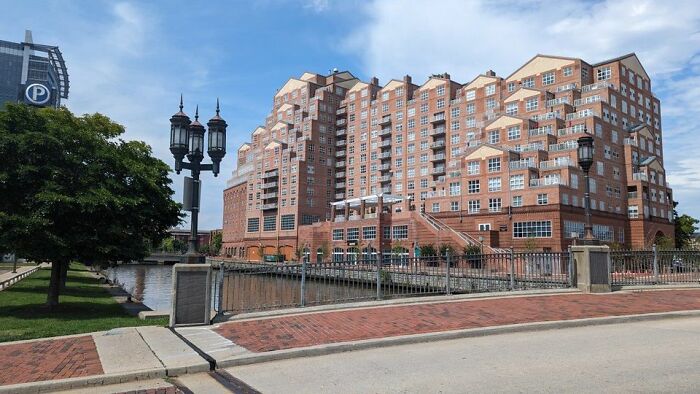
Baltimore
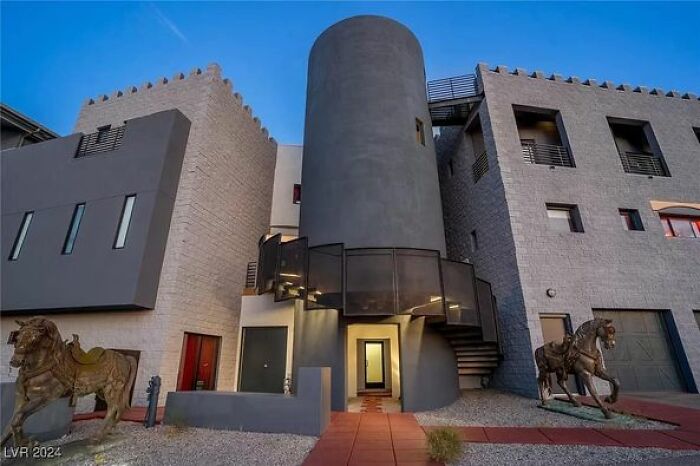
1280 Scooter St, Henderson, Nv 89002
The Back… Welcome To The Bad Things Happen Here Motel
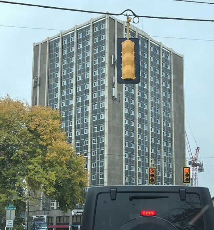
University Towers In Ann Arbor, Mi
Ugly as hell, but if managed properly, offers neat cheap living space for lots of people. It is simply not possible to have a single home with yard for everybody. Not only because of the costs, but the pressure on nature, too. Concreted over suburbs with concreted, easy yards are a danger
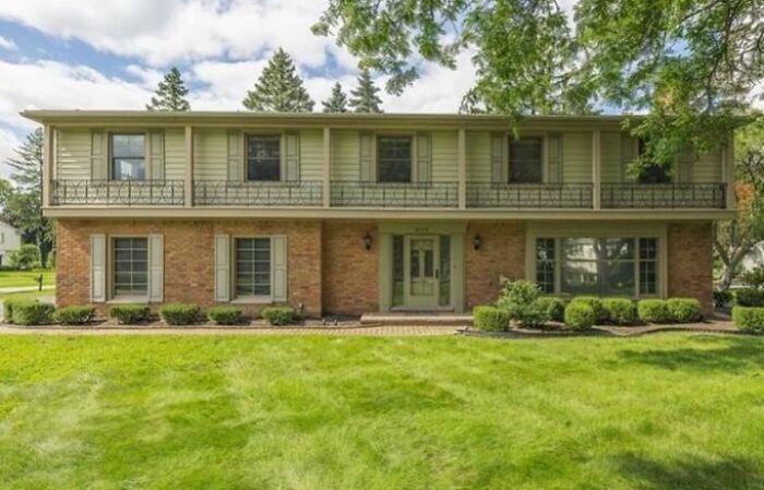
Too-Narrow Shutters? Useless Decorative “Porch”? Totally Asymmetrical Front Door? There Is No Lesser Of Any Evil Here, It’s All Pretty Sinister
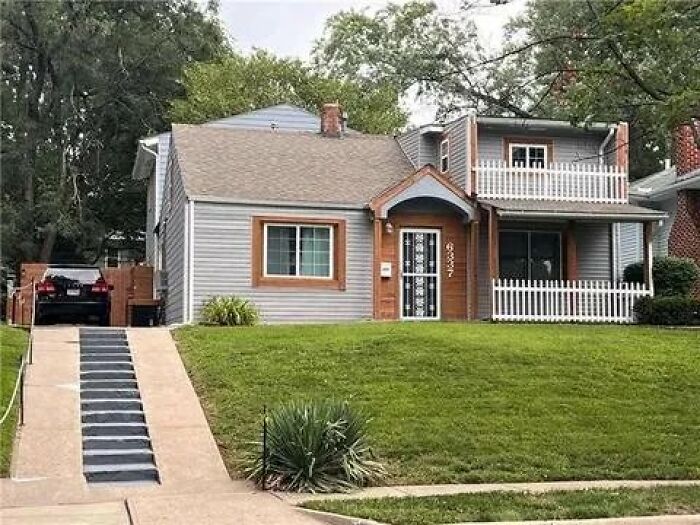
This House Has Driveway Stairs. I Repeat, Driveway Stairs
This One Was The Home Of Someone Quite Internationally Famous. I Won’t Say Who, But I Will Say, As An Architect - He Makes An Excellent Tennis Player
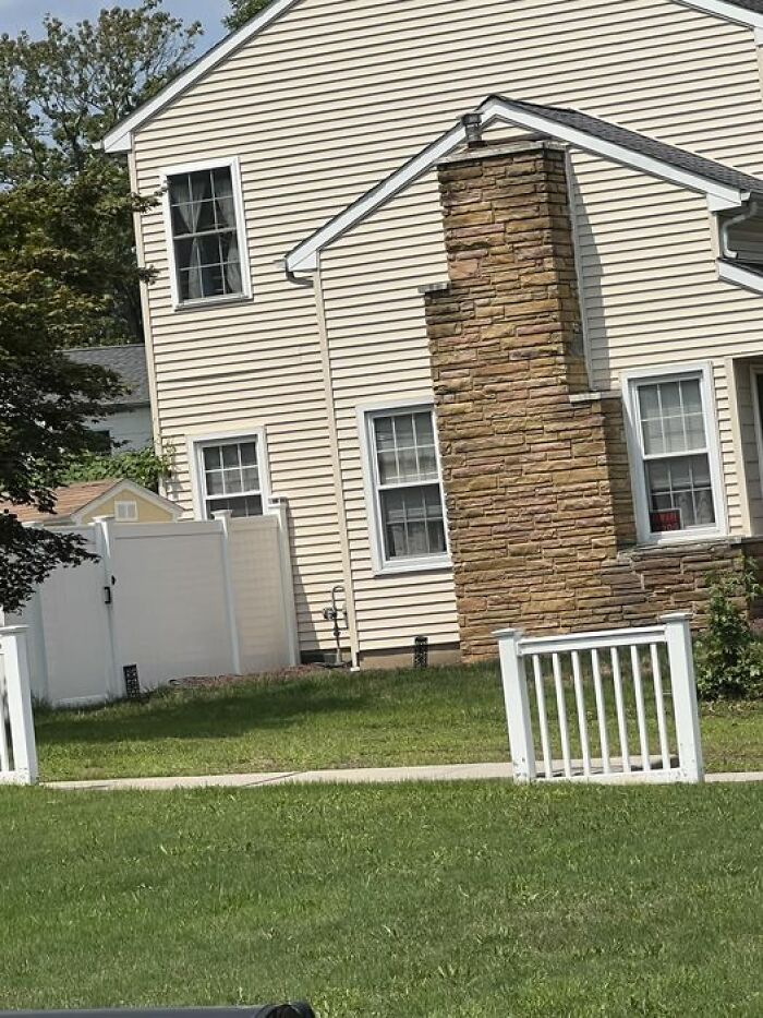
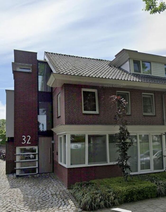
This House Is Near My Home And I Have Never Gotten That Weird Extension … Like Why? It Just Doesn’t Fit. It’s Not An Elevator! I Repeat; It’s Not An Elevator!
Saw This On A Church In Maine!
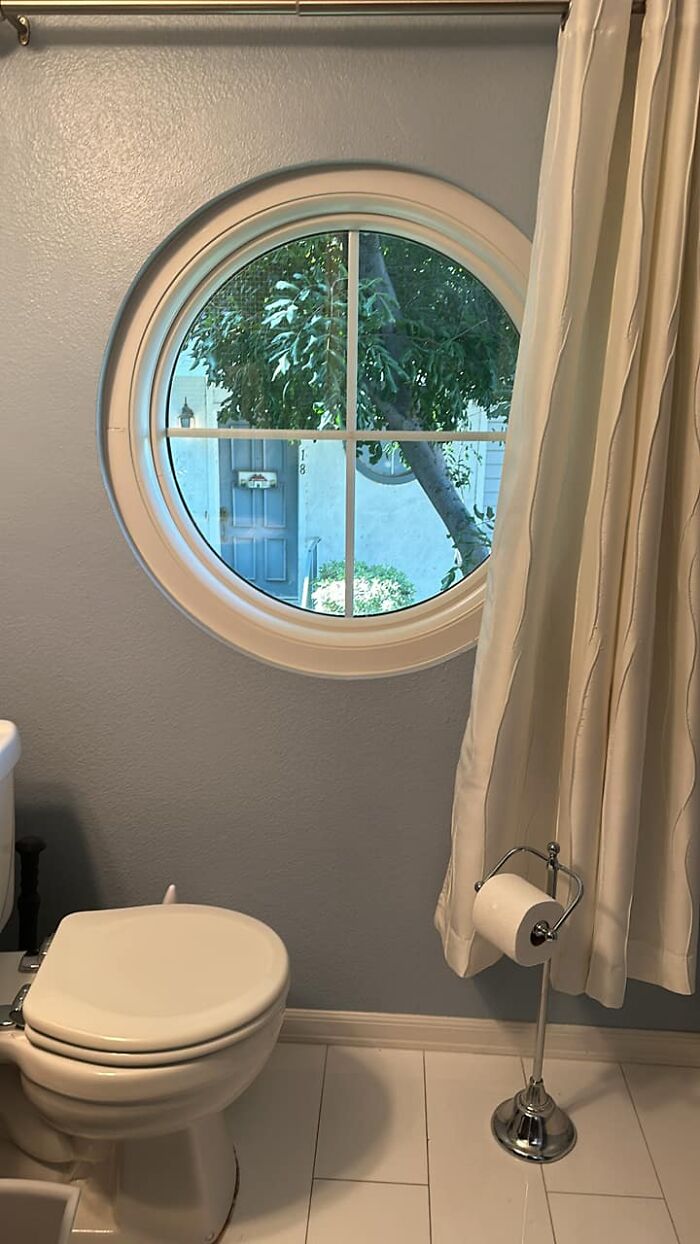
The Guest Bathroom In My Townhouse. The Window Placement Looks Ok From Outside, But Is A Big Failure For Guys Who Need To Use The Toilet
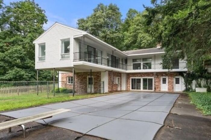
Not A Fan...it's For Sale If You Have A Cool $2.5m And Pretty Inside, But The Outside Not So Much
Umm
This Building Is Part Of The University In My Hometown, Aachen/Germany
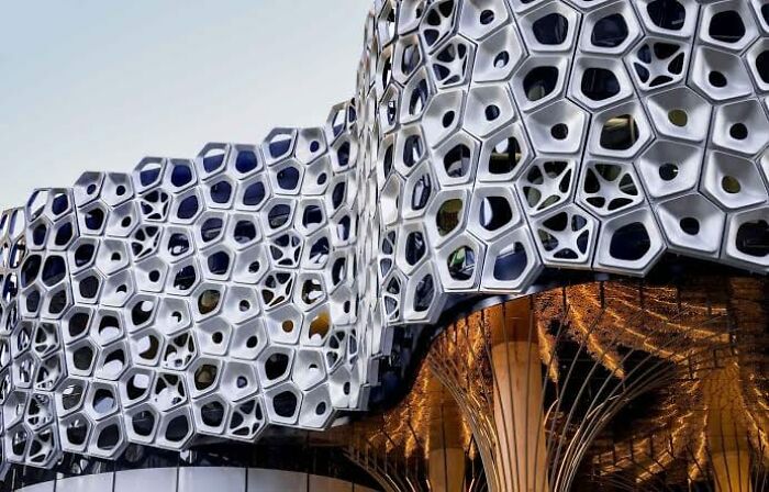
Calling Out This Monstrosity In Brisbane (Aust) On Behalf Of All Trypophobes. I Couldn't Physically Look At It For The First 5 Years I Lived Here
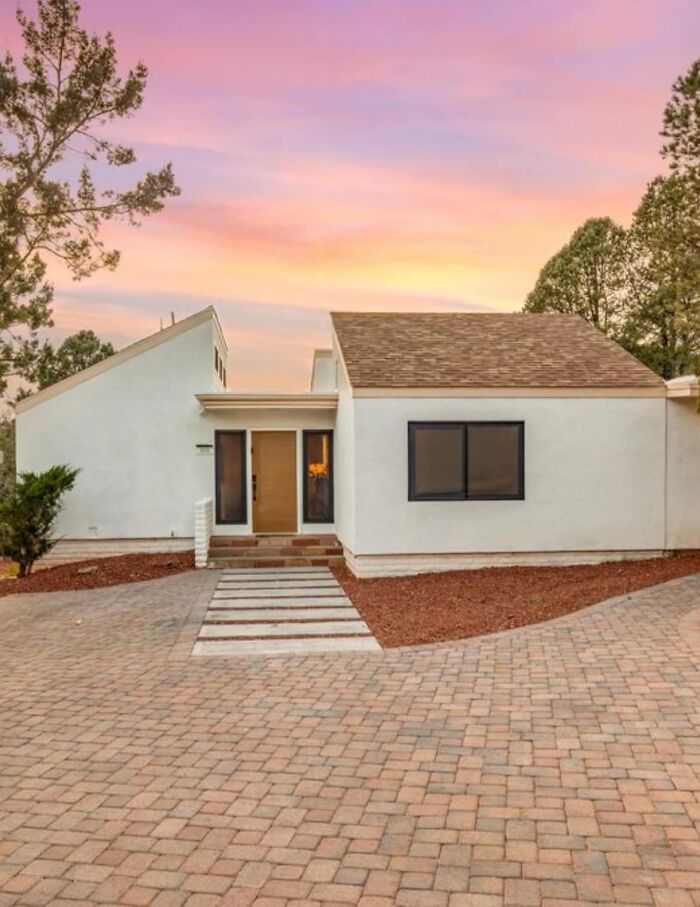
From A For Sale Listing. The Windows Are Too Small (Imo) And Having No Windows On The Other Side Makes It Feel Unbalanced
I would imagine that there is a lot of glass on the backside of the house. Not uncommon and this looks pretty appealing IMHO.
A strange mix of interior design fails, architecture fails, and actually unusual and creative architecture that doesn't deserve to be shamed.
Some of these buildings are only UGLY in the eyes of the viewers. Some of the images have nothing to do with buildings being ugly. Just wrong designs, like a useless gap. The publisher should do better work in giving a realist list of ugly buildings and not just throwing a bunch of images they found on internet in a list.

 Dark Mode

 No fees, cancel anytime


